EUR/CHF bears just one pivot step away from 6-months lows EUR/CHF bears just one pivot step away from 6-months lows to break long lasted range – Tunnel spreads for speculation and near month futures to hedge:
On intraday charts (4H charts), despite the upswings in the last couple of trading sessions, we traced out an engulfing bearish candle pattern at 1.0695 levels after testing resistance at 21SMA that evidences the weakness again in this pair.
Double top formation and breach of neckline: The bears managed amid price spikes have broken below the double top neckline at 1.07 levels.
Please be noted that the every attempts of upswings have constantly been hindered below SMAs, bears breaking major supports with bearish DMA crossover, current prices have gone below DMAs
If you’ve to plot weekly charts, the current swings are drifting in a narrow range, bears breaking major supports with bearish EMA crossover, current prices have gone below EMAs, downswings likely to break below long lasting range.
Consequently, it is spotted out that the downward convergence between price curve and leading oscillators. Almost same is the case on monthly plotting.
RSI and stochs of both timeframes signal selling interests, while weekly MACD signals the extension of the price declines.
For the daily trading, tunnel spreads are best suitable considering intraday technical indications. So, snap the rallies to deploy higher strikes in the binary puts while shorting lower strikes simultaneously.
Alternatively, at this juncture, contemplating lingering bearish indications, on hedging grounds we recommend shorting near-month month futures as the underlying spot FX likely to target towards 1.0539 levels in near run.
Writers in a futures contract are expected to maintain margins in order to open and maintain a short futures position.
Search in ideas for "PLOT"

The Daily HeatMaps US JP GB EU AU CADaily HeatMaps of my latest script modifications.
The colorful plots had no sense when i oculd not see what is gaining and what not so here:
** GAIN is always in GREEN
** FALL is OTHER
The kind of increadible suprise to me was that after the numbers came up (numbers used to convert to colors) i realized
that this numbers can create the PERFORMANCE INDEX of The Currency in respect & context to all Other currencies.. furthermore, to othe Major's Curr Indexes. Suprisingly ploting the index in line from the numbers i have here mada a increadibly CLOSE resamblance to the real time Calculated , for example, USDOLLAR index. .. but here, i know which fracture of the index made it to raise or fall and by this to plan my actions.

Swing trade on EUR/GBP recovery, major downtrend seems intactAs the saying this way "history repeats always", EURGBP holding stronger at 0.7010 at which the price behavior was similar in many times in the past (see circled areas where the moment price touches 0.7010 & sharp bounces were seen at that juncture).
However, we cannot afford to gauge this as trend reversal but a mere consolidation.
EOD technical charts that have shown continuous down-streak took a brief pause to get supported, as a result we are seeing slight recovery from 0.7010 to 0.7019 levels.
But there is no substantiation from other leading indicators except stochastic which has shown a slight buying pressures but not beyond 0.7075.
We predict intraday sentiments are bullish only up to 0.7475.
One would certainly understand if weekly and monthly chartings are plotted as to how the bearish technical indications moving in sync with price declines.
There exists a cleat convergence on RSI is seen on daily, weekly and monthly charts with a supportive signal from stochastic curve as well, %D line crossover has been maintaining consistently except on daily charts which can be considered selling pressure is still intensified.
Trade Tips: The euro continues to flow its long lasting loses against sterling and GBP to hold sturdy as there nothing dramatic happening on weekly or monthly plotting.
So we believe, things seem like taking bearish track onto its usual business on GBP side.
These signals can be attributed as positive movers for those who expect price slumps; however small bounces can used for fresh short build ups.
On a swing trading perspective, it is smart to sell on rallies, we advocate buying binary delta puts for targets of 20-25 pips.

High-Prob Decline To Wolfe 1-4 TP Line | $XAU $XAG $Gold #forexPATTERN PROFILE:
Bill Wolfe's Wolfe Waves Pattern - Completed
Target = 1-4 Line ("Take-Profit" Line)
Trigger = 2-4 Line R/S action/reaction
SL = 1232.55
PREDICTIVE/FORECASTING MODEL:
- Future R/S Levels:
1177.42
and
1165.85
- High-Prob Reversal:
TG-1 = 1153.76 - 11 DEC 2014
INVALIDATION:
BACA > 1232.55
-------------------------
Note: Recent analysis suggested a rallying into the 1231.93-1226.34 range, which held per forecast. At this point, a background Wolve Waves completed (see pink plots: 1-2-3-4-5). The pattern's 2-4 Line acted as support until a recent breach and small rally, stomped at the line's underbelly.
Expectation here is a price compliance to background geometry, which demands further completion towads its 1-4 Line projection as dynamic support.
Static support is further defined by TG-1 = 1153.76 - 11 DEC 2014, a low-probability attainment, but high-probability reversal target.
David Alcindor
Predictive Analysis & Forecasting
Denver, Colorado - USA
-----
Twitter: @4xForecaster
------

GLD Overbought, but Could Become More SoGLD has become overbought as shown by the Hurst Bands. Price could possibly exceed the overbought Hurst Band (pink colored band).
The Starc - (minus) Band has crossed over the middle (light bluw) line of the Hurst Bands. This is typical when price action begins to become extreme. It does not mean that the extreme price action cannot or will not continue for a while longer. I'm thinking it probably will.
Price is approaching the top of the Keltner Channels (blue bands) which indicates strong price momentum to the upside.
Of note is the dark blue plot of the U.S. Dollar Index (DXY) price. As the dollar price has moved down from $86.74, the GLD price has recovered. As the dollar is at extreme overbought levels (not plotted on this chart) I expect it will continue to move lower giving GLD room to move up a little more.
At the bottom is plotted the Hurst Oscillator. It is the same information plotted by the Hurst Bands in a little easier to read form.
Overall, expect GLD to continue to move higher.

New Version! CM Gann Swing High Low V2 CM Gann Swing High Low V2
Added Improvements:
Used PineScript “linebr" code so solid lines plot only when condition = true.
Via Inputs Tab:
Ability to Turn On/Off Highlight Bars When Crossing Above/Below Swing High Low
Ability to Turn On/Off Back Ground Highlights When Crossing Above/Below Swing High Low
Ability to Turn On/Off linebr plots.
Other Features: All Available Via Inputs Tab
Ability to Adjust Moving Average Values to adjust Sensitivity.
Ability to Turn On/Off Triangles Above/Below Bars based on Indicator.
Ability to Turn On/Off Triangles at Top And Bottom Of Screen Showing Direction of Indicator.
***Basically you have Option to View Indicator about every way possible.
***Special Thanks to Glaz for Original Code.

sept 29: 1 loss, 2 winssept 29: 1 loss, 2 wins
I saw that price tapped the DAY FVG + EQH up there and has downtrended massively, so I looked for shorts.
Applied my AVWAPS, and my confluence filters(Orderflow+sweep+div+FVG), which was favorable so I entered.
I kinda rushed into the first trade because I woke up late, but basically would have also won there if I just plotted the AVWAP first(yeah), because if i did plot my AVWAP,
I would have seen that price has a few more pips before hitting the AVWAP line, so I could have put my entry higher and my stoploss higher.
Well I just moved my SL on the first trade, and then re-entered twice after it "respected" the AVWAP (plotted from the DAY FVG STING).
Standard 10TP5SL, and it won twice. so, good day I guess.

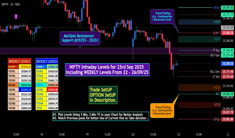
NIFTY Intraday Levels for 23rd Sep 2025NIFTY Intraday Levels for 23rd Sep 2025
Key Takeaways:
• Immediate Action: Watch the 25,154 - 25,308 range. The breakout/breakdown from this band will dictate the next immediate move.
• Warning Sign: The lower high at ~25,331.7 is the most significant technical red flag for the short-term bullish trend.
• Critical Level: 25,028 is the line in the sand for bulls. Holding it is crucial to maintain the positive structure.
Market View
Intraday View (For the next session)
• View: Neutral / Range-bound. BIAS: Cautious / Neutral to Bearish.
• Scenario 1 (Bullish) : A sustained move above 25,245- 25255 could trigger a short-covering rally towards 25,400.372. (In between some levels plotted in Chart)
• Scenario 2 (Bearish) : Break below the key support of 25,172 - 25154 could lead to a decline towards the strong support zone of 25,092-25,027.
• Strategy: Trade the range (buy near 25,092 support, sell near 25,305 resistance) with strict stop-losses. Wait for a breakout from this range for a directional move.
Iron Butterfly ( Most Suitable for Expiry )
• Sell ATM: 25,200 CE & 25,200 PE
• Buy OTM: 25,250 CE & 25,150 PE
• Max Profit: Premium received (works best if Nifty expires between 25,170-25,230)
• Ideal for: Low volatility, range-bound expiry day
* All levels mentioned on NIFTY spot Basis.
** Try to publish NIFTY Future with More OPTION Strategy.
# "WEEKLY Levels" mentioned in BOX format.
^^^^^^^ Plot Levels Using 3 Min, 5 Min Time frame in your Chart for Better Analysis ^^^^^^^
L#1: If the candle crossed & stays above the “Buy Gen”, it is treated / considered as Bullish bias.
L#2: Possibility / Probability of REVERSAL near RLB#1 & UBTgt
L#3: If the candle stays above “Sell Gen” but below “Buy Gen”, it is treated / considered as Sidewise. Aggressive Traders can take Long position near “Sell Gen” either retesting or crossed from Below & vice-versa i.e. can take Short position near “Buy Gen” either retesting or crossed downward from Above.
L#4: If the candle crossed & stays below the “Sell Gen”, it is treated / considered a Bearish bias.
L#5: Possibility / Probability of REVERSAL near RLS#1 & USTgt
HZB (Buy side) & HZS (Sell side) => Hurdle Zone,
*** Specialty of “HZB#1, HZB#2 HZS#1 & HZS#2” is Sidewise (behaviour in Nature)
Rest Plotted and Mentioned on Chart
Color code Used:
Green =. Positive bias.
Red =. Negative bias.
RED in Between Green means Trend Finder / Momentum Change
/ CYCLE Change and Vice Versa.
Notice One thing: HOW LEVELS are Working.
Use any Momentum Indicator / Oscillator or as you "USED to" to Take entry.
📢 Disclaimer
I am not a SEBI-registered financial adviser.
The information, views, and ideas shared here are purely for educational and informational purposes only. They are not intended as investment advice or a recommendation to buy, sell, or hold any financial instruments.
Trading and investing in the stock market involves risk, and you should do your own research and analysis. You are solely responsible for any decisions made based on this research.
"As HARD EARNED MONEY IS YOUR's, So DECISION SHOULD HAVE TO BE YOUR's".
Do Comment if helpful
A must-read for BTC trading before the Fed's decision#BTC BITSTAMP:BTCUSD
The current market focus is on the Federal Reserve's interest rate cut. This decision not only affects gold, but also has a certain impact on the BTC market. There are currently differences within the FOMC on the future policy path, and Trump is still continuing to pressure for interest rate cuts. Its internal divisions are likely to be reflected in the "dot plot," which shows Fed officials' projections of where they expect the benchmark interest rate to be in the coming years. The dot plot may reveal whether officials are inclined to continue cutting interest rates in October and December. At the same time, Fed officials will also release their interest rate forecast dot plots for 2026 for the first time, indicating how many more rate cuts they expect.
According to CME's "Federal Reserve Watch" information report: The probability of the Federal Reserve cutting interest rates by 25 basis points this week is 96.1%. Any dovish comments from Powell or confirmation of multiple rate cuts from the Fed would support BTC's upward trend, potentially pushing it closer to its all-time high.
Technically, the daily chart shows a doji candlestick pattern closing above the upper shadow, slowly breaking through the previous high. The 1-hour chart shows an oscillating pattern, with each rise followed by a fall, and the high point gradually moving up. Overall, the bullish momentum has not ended yet.
In the short term, if the price falls back below the 115500-114500 range without breaking, you can try to go long on BTC, and the target can be 117000-118000. If the data is strong, it is even expected to test 120000.
In any case, we need to pay attention to the market changes under data stimulation, and the focus during the day should be on risk control!

How to Identify a Head and Shoulders Pattern on TradingViewTo effectively trade the head and shoulders pattern, there are a few factors to consider. If you don’t have an Alpaca account but have a TradingView account, you can sign up for an Alpaca account.
Multiple Time Frame Analysis
Analyze the chart on different time frames—such as 4-hour, daily, and weekly—to get a complete view of the broader trend. If the weekly chart indicates a downtrend while the 4-hour chart shows an uptrend, it may be premature or risky to interpret price action as a head and shoulders pattern. Aligning trends across time frames generally increases the reliability of your findings.
In the image below, using Broadcom, Inc (AVGO) stock chart, the weekly chart shows a well-established uptrend, indicating bullish market sentiment. On the daily chart, an inverse head and shoulders pattern forms along the upward trend line. The 4-hour chart reveals another inverse head and shoulders setup on a smaller scale. Confirming this bullish structure across multiple time frames may increase a traders’ confidence in a continued uptrend, rather than relying on a single chart interval.
NOTE: "AVGO" is used for demonstration purposes and should not be considered investment advice.
Break of Swing High and Swing Low
Pay attention to recent swing points to confirm the pattern. In a standard head and shoulders formation, a decisive break below the neckline (often aligning with a previous swing low) typically validates the pattern. Conversely, in an inverse head and shoulders, a break above the neckline confirms a bullish reversal. Observing retests of the neckline can further strengthen your confirmation and help refine entry or exit points.
Use of Additional Technical Indicators
Supplement your visual analysis with a few simple indicators to strengthen your signal confirmation and filter out false moves:
Moving Averages (MA) : Use simple or exponential moving averages (such as a 20-day EMA and a 50-day SMA) to gauge overall trend direction. A crossover where the short-term MA moves above the long-term MA supports an uptrend, and vice versa.
Bollinger Bands : Look at Bollinger Bands to assess volatility and identify overbought or oversold conditions. If the price approaches or breaks out of these bands, it can signal a potential reversal or continuation, adding context to your swing points.
Moving Average Convergence Divergence (MACD) : Monitor the MACD to spot momentum shifts. If the MACD lines diverge from the price action, it might indicate that a breakout is less reliable.
Attached is an image showing the head and shoulders pattern on AVGO stock with the MACD (12,26) displayed below. The MACD enhances the analysis by confirming momentum: a bullish crossover and expanding histogram support the pattern's validity, while divergence, such as flat or declining momentum despite rising prices, warns of a possible false breakout.
TradingView Implementation: Coding the Head and Shoulders Pattern with Pine Script
TradingView is a widely used platform that offers advanced charting tools and a scripting language called Pine Script. The head and shoulders pattern, being a powerful reversal indicator, can be detected automatically using a custom indicator with a Pine Script.
Let's explore how to implement this using the example:
Setting Up the Detection System
The example Pine Script indicator below automatically highlights both traditional head and shoulders (bearish) and inverse head and shoulders (bullish) patterns on any chart. As shown in the screenshot, the indicator successfully detected inverse head and shoulders patterns on both 4-hour and daily timeframes, coinciding with an uptrend on the weekly chart.
Understanding the Pine Script Code
The script begins by declaring version 6 compatibility and creating an overlay indicator. The leftbars and rightbars parameters allow traders to adjust the sensitivity of the pattern detection—smaller values detect shorter-term patterns while larger values find longer-term formations.
//@version=6
indicator("Head & Shoulders", overlay=true)
// Input parameters
leftbars = input.int(4, title="Left Bars")
rightbars = input.int(4, title="Right Bars")
The core of the detection relies on identifying pivot points—local highs and lows that form the shoulders and head of the pattern.
// Find pivot points
ph = ta.pivothigh(rightbars, leftbars)
pl = ta.pivotlow(rightbars, leftbars)
For the inverse head and shoulders (bullish pattern), the script checks if:
The right shoulder low is higher than the head low (condi1)
The head low is lower than the left shoulder low (condi2)
When both conditions are met, a purple background highlights the pattern.
// Bullish (Inverse) Head and Shoulders pattern detection
condi1 = ta.valuewhen(na(pl) == false, pl, 0) > ta.valuewhen(na(pl ) == false, pl , 0) ? 1 : 0
condi2 = ta.valuewhen(na(pl ) == false, pl , 0) < ta.valuewhen(na(pl ) == false, pl , 2) ? 1 : 0
colorbull = condi1 == 1 and condi2 == 1
Similarly, for the traditional head and shoulders (bearish pattern), the script verifies if:
The right shoulder high is lower than the head high (condi3)
The head high is higher than the left shoulder high (condi4)
When detected, a gold background highlights this bearish pattern.
// Bearish Head and Shoulders pattern detection
condi3 = ta.valuewhen(na(ph) == false, ph, 0) < ta.valuewhen(na(ph ) == false, ph , 0) ? 1 : 0
condi4 = ta.valuewhen(na(ph ) == false, ph , 0) > ta.valuewhen(na(ph ) == false, ph , 2) ? 1 : 0
colorbear = condi3 == 1 and condi4 == 1
Visual Indicators and Alerts
The indicator uses distinct visual cues:
Purple background (#7331FF) with an upward arrow (↗) for bullish patterns
Gold background (#EBC003) with a downward arrow (↘) for bearish patterns
These visual markers make it easy to spot patterns across multiple timeframes, as demonstrated in the screenshot where inverse head and shoulders patterns appear on both 4-hour and daily charts.
// Background colors for pattern visualization
bgcolor(colorbull ? color.new(#7331FF, 50) : na, title="Bullish H&S", offset=-leftbars)
bgcolor(colorbear ? color.new(#EBC003, 50) : na, title="Bearish H&S", offset=-leftbars)
// Alert signals
plotchar(colorbull, title="Bullish H&S", char="↗", location=location.belowbar, color=color.new(#7331FF, 0))
plotchar(colorbear, title="Bearish H&S", char="↘", location=location.abovebar, color=color.new(#EBC003, 0))
Setting Up Trading Alerts
The script includes three alert conditions that can notify traders when:
A bullish (inverse) head and shoulders forms
A bearish head and shoulders forms
Either pattern appears
This allows traders to receive timely notifications without constant chart monitoring.
As seen in the screenshot above, this indicator successfully highlighted multiple inverse head and shoulders patterns that aligned with a broader uptrend, demonstrating its effectiveness as a trend confirmation tool when used across multiple timeframes.
// Alert conditions
alertcondition(colorbull, title="Bullish H&S Detected", message="Bullish Head and Shoulders Pattern Detected")
alertcondition(colorbear, title="Bearish H&S Detected", message="Bearish Head and Shoulders Pattern Detected")
alertcondition(colorbear or colorbull, title="H&S Signal", message="Head and Shoulders Pattern Detected")
The head and shoulders pattern is a fundamental tool in technical analysis, offering insights into potential trend reversals. By understanding its structure, variations, and the context in which it appears, traders can make more informed decisions.
While the pattern often provides valuable signals, it's essential to consider its limitations and corroborate findings with additional technical indicators and thorough analysis. Combining theoretical knowledge with practical application on platforms like TradingView and Alpaca can enhance one's trading strategy and execution.
=====================================================================
Disclosure
Alpaca and TradingView are not affiliated and neither are responsible for the liabilities of the other.
All investments involve risk, and the past performance of a security, or financial product does not guarantee future results or returns. There is no guarantee that any investment strategy will achieve its objectives. Please note that diversification does not ensure a profit, or protect against loss. There is always the potential of losing money when you invest in securities, or other financial products. Investors should consider their investment objectives and risks carefully before investing.
Securities brokerage services are provided by Alpaca Securities LLC ("Alpaca Securities"), member FINRA / SIPC , a wholly-owned subsidiary of AlpacaDB, Inc. Technology and services are offered by AlpacaDB, Inc.
Cryptocurrency services are made available by Alpaca Crypto LLC ("Alpaca Crypto"), a FinCEN registered money services business (NMLS # 2160858), and a wholly-owned subsidiary of AlpacaDB, Inc. Alpaca Crypto is not a member of SIPC or FINRA. Cryptocurrencies are not stocks and your cryptocurrency investments are not protected by either FDIC or SIPC. Please see the Disclosure Library for more information.
Cryptocurrency is highly speculative in nature, involves a high degree of risks, such as volatile market price swings, market manipulation, flash crashes, and cybersecurity risks. Cryptocurrency regulations are continuously evolving, and it is your responsibility to understand and abide by them. Cryptocurrency trading can lead to large, immediate and permanent loss of financial value. You should have appropriate knowledge and experience before engaging in cryptocurrency trading. For additional information, please click here .
This is not an offer, solicitation of an offer, or advice to buy or sell securities or cryptocurrencies or open a brokerage account or cryptocurrency account in any jurisdiction where Alpaca Securities or Alpaca Crypto, respectively, are not registered or licensed, as applicable.
Please note that this article is for general informational purposes only and is believed to be accurate as of the posting date, but may be subject to change. The examples above are for illustrative purposes only. All examples are for illustrative purposes only.
Past hypothetical backtest results do not guarantee future returns, and actual results may vary from the analysis.
The Paper Trading API is offered by AlpacaDB, Inc. and does not require real money or permit a user to transact in real securities in the market. Providing use of the Paper Trading API is not an offer or solicitation to buy or sell securities, securities derivative or futures products of any kind, or any type of trading or investment advice, recommendation or strategy, given or in any manner endorsed by AlpacaDB, Inc. or any AlpacaDB, Inc. affiliate and the information made available through the Paper Trading API is not an offer or solicitation of any kind in any jurisdiction where AlpacaDB, Inc. or any AlpacaDB, Inc. affiliate (collectively, “Alpaca”) is not authorized to do business.
Alpaca is not affiliated with this third-party website, which is not actively monitored by us. We do not review or update content here regularly and are not responsible for user comments or third-party content. For full disclosures, visit: alpaca.markets/disclosures

USDJPY Pending Short at 146.32In this idea, I have plotted all the necessary information on the chart itself. But allow me to point them out in words:
1. A resistance zone drawn with a rectangle that shows 5 red down arrows, out of which 4 are historical price rejection points and the last one is an expected rejection point at the top of the resistance zone which will be our short entry.
2. An Elliott Wave count update that shows a double combination wave 2 showing that we are now in a C wave of the double combination Y wave.
3. 3 different trendlines: The purple is expected to break, the blue is where price is expected to be rejected that will coincide with the top of the resistance zone, and the green which will be our stop loss if break above.
4. A take short position risk-reward plot where SL is set is initially set up at 147.187 but this should really be following the green trendline, and a TP that is initially set at the blue H&S neckline at 141.042 (see previous USDJPY idea for the big picture H&S plot).
Overall, I am expecting a final push for USDJPY to move up that will be in-line with the equity markets last leg up) and then a higher degree wave 3 down for USDJPY that will also be in-line with equity markets downturn.
Good luck!

BTC & SP500 - MFI says LongA couple months ago “Camel” showed a chart made by someone, can’t remember who, who used the MFI indicator on a weekly scale specifically, to show the “TOPS” of cycles. With the indicator set at standard 14 length, you would use a trend line to touch the lows in an “uptrend”, and where the MFI crosses down below that trend line, that’s the top.
In the BTC chart I’ve plotted the trend lines and put “white circles” indicating the area where the MFI crosses below the trend line. I gotta say, it’s pretty accurate. I used the “vertical red lines” to show the “tops”. In the SP500 chart below, the plot and tops are indicted again and again, it’s pretty acurate. And that was the point of Camel showing this fellows indicator. However …
I got to thinking, I’m an RSI guy, and I plot the “bottom” of a cycle via trend line bottoms showing a bullish divergence. In a weekly time frame it’s very accurate at calling bottoms or, more specifically, the beginning of the uptrend. Using the same technique on the MFI brings the same results.
It wasn’t possible on the SP500 chart, but the BTC chart showed again accurate “bottoms” which are shown with trend lines and a “vertical green line” showing the beginning of the “uptrend”. In all the downtrends (the vertical red lines), the first MFI downtrend reversal was in fact, the low energy point for the downward portion of the cycle. This is indicated with the “red arrows”. From that point onwards the cycle basically bottomed and a reversal uptrend happens.
The moral of the story here is looking at the far right of the chart where we are now, the indications show a bottoming of energy and the beginning of a reversal uptrend. The indications do not in any way show the “top of cycle” is in . There’s just no room for the MFI to continue downward any great length to substantiate a “cycle top lots of downtrend to follow”. The MFI has entered the green band area where all reversals happen.
It appears in this bull run, BTC moves up in steps, three so far, and is at or very near the point of another upstep move soon to happen. The pullback in the prior two steps is a 21% in the first step and a 33% pullback in the second step. So far in this step we’ve have a 30% pullback possible saying the price is at or very near completed the pullback.
In summary, I’m watching for the MFI to turn upwards creating the v bottom. From there it’s upwards.
My thoughts, not financial advice Oklah. Cheers

HIGH - Very attractive long term/shot Take Profit zones.Looking macro we see a beautiful setup on the horizon this year.
We saw a100% gain over a 492 day period. Similar macro swing looks to be forming once again.
My thought process was to plot another 492 days out which puts un end of October 2025 for a possible 100% Fibonacci correction with a gain well over 1500%.Even the first take profit is showing a 350%+ return.
I plotted a 1-5 course to highlight the TP zones and a A-E course to finish the plotted path back to 100% Fib. As you can see this is a long shot/long term play.
The risk is worth the reward given its low buy zone price.
Way more upside potential than downside.
As always NFA DYOR...best of luck to us all willing to take this trade.
I will post an update when there is significant movement.

THE STABLE TRADER - EMA Cross Dynamic High-Low FiltersThis indicator is designed for traders seeking refined entry and exit signals based on precise EMA crossovers. By leveraging dynamically calculated average high and low thresholds over a customizable lookback period, this tool enhances decision-making by filtering out noise and providing clear, actionable signals.
Key Features:
Dynamic Thresholds: Calculates average high and low values over a specified number of candles, ensuring adaptability to market conditions.
Refined Signal Logic: Generates buy signals when the EMA crosses above the average low, and sell signals when the EMA crosses above the average high or drops below the average low. This ensures logical progression and avoids redundant signals.
Customizable Settings:
Lookback period for high-low averages.
EMA period for precise crossover calculation.
Signal appearance: Choose between arrows or labels for better chart visibility.
Adjustable signal colors to match your preferences.
Alerts: Set alerts for buy and sell signals, enabling you to stay updated in real-time.
How It Works:
The indicator calculates average high and low prices over a user-defined number of candles.
An EMA is plotted based on the closing price and your selected period.
Buy and sell signals are triggered based on how the EMA interacts with the dynamic high and low levels:
Buy: EMA crosses above the average low and no active buy signal exists.
Sell: EMA crosses above the average high or below the average low after a buy signal.
Visual Guidance:
Plots the average high (red), average low (green), and the EMA line (blue) for clear visualization of key levels and price interactions.
Signal markers are plotted directly on the chart for quick identification of potential trades.
Use this indicator to enhance your trading strategy, reduce noise, and focus on high-probability setups.

Testing //@version=5
indicator("Range Filter with Support and Resistance", overlay=true)
// Inputs for Range Filter
length = input(10, title="Range Length")
multiplier = input.float(1.5, title="Multiplier")
// Calculate Range Filter
src = close
basis = ta.sma(src, length)
range = ta.stdev(src, length) * multiplier
upper = basis + range
lower = basis - range
// Trend Detection
trendUp = src > upper ? 1 : na
trendDown = src < lower ? -1 : na
trend = ta.valuewhen(trendUp or trendDown, trendUp ? 1 : -1, 0)
// Support and Resistance Levels
lookback = input(20, title="Lookback Period for Support/Resistance")
support = ta.lowest(low, lookback)
resistance = ta.highest(high, lookback)
// Plotting
plot(upper, color=color.new(color.green, 70), linewidth=1, title="Upper Range")
plot(lower, color=color.new(color.red, 70), linewidth=1, title="Lower Range")
hline(support, "Support", color=color.blue, linestyle=hline.style_dotted, linewidth=2)
hline(resistance, "Resistance", color=color.orange, linestyle=hline.style_dotted, linewidth=2)
// Background Color for Trends
bgcolor(trend == 1 ? color.new(color.green, 90) : trend == -1 ? color.new(color.red, 90) : na)
// Alerts for Breakouts
alertcondition(src > resistance, title="Price Above Resistance", message="Price broke above resistance!")
alertcondition(src < support, title="Price Below Support", message="Price broke below support!")

PRICE ACTION HAS SPOKEN: Unleash the BULLNew update with additional BULL SOURCE INFORMATION. Blue Wave Plot reader is at Bull service. It's signaling it's almost ready to move now but it reads on July 18th.
New targets added. Previous targets of FWB:65K , above $70k, and $85k are still valid. Nothing has changed.
Dotted green guidance is a calculated prediction
Blue Wave Plot is one of my other calculated plots which I've circled the color blue where the bull was unleashed.
The green arrow and arrows pinpoint to price action guidance.
Smart Money Contractions: the first contraction has a value line that points out to the trend's destination but ends up surpassing it within time.
The second contraction points to one of the next targets which is the value line.
My custom indicator helps give me price action guidance which is part of my smart money management.
Hope this brings some encouragement
