LongBreak through the effective fractal, step back on the support and do long. The rebound target is 1:1 in the early stage. See the profit and loss ratio chart for details.
Search in ideas for "RATIO CHART"

Dow vs Silver's daily ratio chartUS equities have topped since 2018 vs silver.
Now below important breakdown line (now resistance).
Retest complete + below declining 200 day moving average.
Waterfall movement in favor of silver to resume.
#silver $slv #fintwit #wallstreetbets

SILVERBased on gold/silver ratio chart, as ridiculous as it looks here it is, markets are not known to be rational.. I am curious myself how is this going to unfold ..

GOLD / SILVERHere is a "ridiculous" gold/silver ratio chart .. We know markets love extremes, so it is perfectly "normal" for a swing in one direction (gold/silver = 120) to swing in the other direction (gold/silver=25) .. so even though it is ridiculous for a rational mind to expect gold +$2400 and silver +$110 by May, that is what the chart says ..
I could try to rationalize it:
- money temporarily leaving crypto currencies (gold/bitcoin ratio chart suggests the same)
- money leaving stock market - optimism has reached ridiculous^2 levels (I expect flash crash into March/April)
- or horde hordes of retail investors after running out of small stocks to melt up will melt up silver for a change ..
only time will tell.

CNX Realty Index - Not Yet out of WoodsThe ratio chart of Realty/NIfty, just looking to cross above 0% - Not Yet. Requires a whole BIG Push. Only reforms in Budget may do the trick. Keep an eye on this index. If it does some magic and goes past pre-covid highs, we have some mega bull run on this one.
DISC: Not a SEBI Registered. I post charts for my own study.

Nasdaq vs Silver Monthly Ratio ChartTop morphing in progress on monthly chart for Nasdaq vs Silver. The last bastion for US equities. When this falls, they all realize this was just another Fed sponsored bubble. #silver #gold #nasdaq #tsla #spx #inflation #commodities $slv $gld $silj $gdxj

Silver vs M2 Yearly Log Ratio ChartA Tavi Costa inspired UBER bullish chart for Silver's upcoming melt-up. Enjoy!

NEOUSD Is Looking For Lower Support LevelsHello traders and investors!
Today we will talk about cryptocurrencies, specifically NEOUSD, its price action from technical standpoint and wave strcuture from Elliott Wave theory.
Well, we all know the king BTCUSD is in a massive rally, but this si mainly because of BTC.Dominance, while other weaker ALTcoins remains slow, sideways and under bearish pressure. When BTCUSD drops into a higher degree correction, ALTcoins will probably face another bigger sell-off.
One of those weak ALTcoins is definitely NEOUSD, which we see it trading in a deeper, higher degree a-b-c corrective decline. Current slow price action and corrective wave structure looks like a consolidation as part of a bearish running triangle formation in wave "b" before we may see another drop into wave "c" down to 9.0 - 6.0 support zone.
The main reason is definitely NEOUSD Longs/Shorts ratio chart, which is still trading at the upper side of a range, at the resistance zone. It means that there are a lot more long orders opened than short orders and that's why bulls might not be ready yet. As you know, usually the opposite happens. So for a bullish view, we need to see that ratio back to the lower side, at the supportive zone, so ideal buy opportunity would be definitely at lower prices.
Be humble and trade smart!
If you like what we do, then please like and share the idea.
Disclosure: Please be informed that information we provide is NOT a trading recommendation or investment advice. All of our work is for educational purposes only.

US Equities versus Silver's Yearly Ratio ChartHey, hedge fund managers and pension fund gurus... you should check out what is coming you way! Some gold or silver will help your investors preserve some wealth.

SMID vs Large CapsJSE Small and Mid Caps (EW) vs Large Caps | The relative out-performance of SMID Caps versus Large Caps continues with the ratio chart showing the price continuing to steepen on a multi-month basis. It has regained it's pivot and trades just below "R1" with the price being supported by rising 20 and 50-day moving averages. The RSIs are moderately strong to strong while the MACD is in a bullish regime. Look for the ratio price to clear 2.00 as a trigger for further advances.
[ES/UVXY] New Perspectives: Lets See Where This is Going! B)Continuing my quest for the Holy Grail of volatility and market correlational data.
Another ratio chart to add to the collection!

Silver is the definition of Volatile!Gold vs silver ratio chart is breaking down. Look for support levels along the way. Since this is fast moving, specially on daily chart, look at diagonal trend lines for faster reaction time. #inflation #debt #gold #silver $slv $gld #fintwit $sil $silj $gdx $gdxj

EW Analysis XRPUSD: Bears May Not Be Over YetHello traders!
Today we will talk about Ripple (XRPUSD), its price action from technical point of view and wave strcuture from Elliott Wave perspective.
Ripple is moving to the downside since August with a five-wave drop from the 0.3295 highs. So, this appears to be wave A, as part of ongoing bearish reversal. In fact, current recovery looks very slow and choppy which usually indicates for a corrective (a)-(b)-(c) movement, ideally into a wave B that has already reached the first resistance at the previous wave four.
Another reason why we think it's worth to keep an eye on another drop on Ripple is XRPUSD Longs/Shorts ratio chart, which we see it at the upper side of a range, at the resistance zone and it's telling us market is positioned long, expectations are for the rise, so simply it may not happen so easily, especially if we respect the past two cycles.
Be humble and trade smart!
If you like what we do, then please support us with a like and share.
Disclosure: Please be informed that information we provide is NOT a trading recommendation or investment advice. All of our work is for educational purposes only.

Potential Increase In Infrastructure and Housing. Monitor CementThis is a Ratio Chart between the Cement Sector Index (consist of SMGR and INTP) and Composite.
The Chart has been in Downtrend since 2013 so that means Cement Stocks are Underperforming Composite. But this trend might be over soon since the Chart (or Ratio Chart) is moving Sideways since 2017. The sideways move might end the Downtrend (that happened since 2013) so there is a possibility that Cement Stocks will Outperform Composite - if the Ratio Chart starts to move Upward.
I'm monitoring the Cement Sector because there is a possibility that the Housing Sector (and Infrastructure Sector) will increase in 2021. That will increase the demand for cement.

Cadila Healthcare DailyTrading in a Channel, taking support on a LMH of an Uptrending Pitchfork. On Ratio chart wrt Nifty breakout from a Triangle.

[VXX/UVXY] My Wildest Volatility Ratio Chart Yet!Was just playin around with VXX and stumbled upon something neat... I don't fully understand what a VXX/UVXY ratio means exactly yet but boy I see many consistent patterns here and one epic divergence that we're in right now!
Also always remember to check out DIX: squeezemetrics.com
It hasn't been this limp since early 2018, when the first Correction of this megaphone pattern we're in hit. The Divergence area of GEX/DIX is greater than anything we've seen previously aside from again late '17 early '18 and this while shorter in time is far more divergent.
We're quite possibly in the midst of a blowoff top on this massive 6M wedge.
Just some friendly weather data from your local Stock Farmer B).


High Beta / Low Beta Ratio ChartBullish when rising --> Risk-Seeking market
Bearish when falling --> Risk-Off market
Another ratio that demonstrates non-confirmation as the market lunges to new all-time-highs.

IVT vs J201Invicta (IVT) vs JSE Mid Cap Index
- A chart of IVT relative to the JSE Mid Cap Index the ratio chart reveals the price clearing it's 200-day moving average following the breakout of an inverse head and shoulder formation.

GOLD rally to begingold silver ratio chart shows
gold is about to rally strongly and silver
to move even stronger.
even at just under $2K/oz the rally hasnt even
started yet.
people are waking up to the fact their
currency is being debased.


Pair Idea: Long GFI/ Short HAR Pair: Long GFI/ Short HAR
Currently trading on Support Level (S3) and 200-SMA - short term indicators looking oversold.
Current level 2.00 as per the relative/ratio chart.
Stop: 1.93
Traget: 2.18-2.22

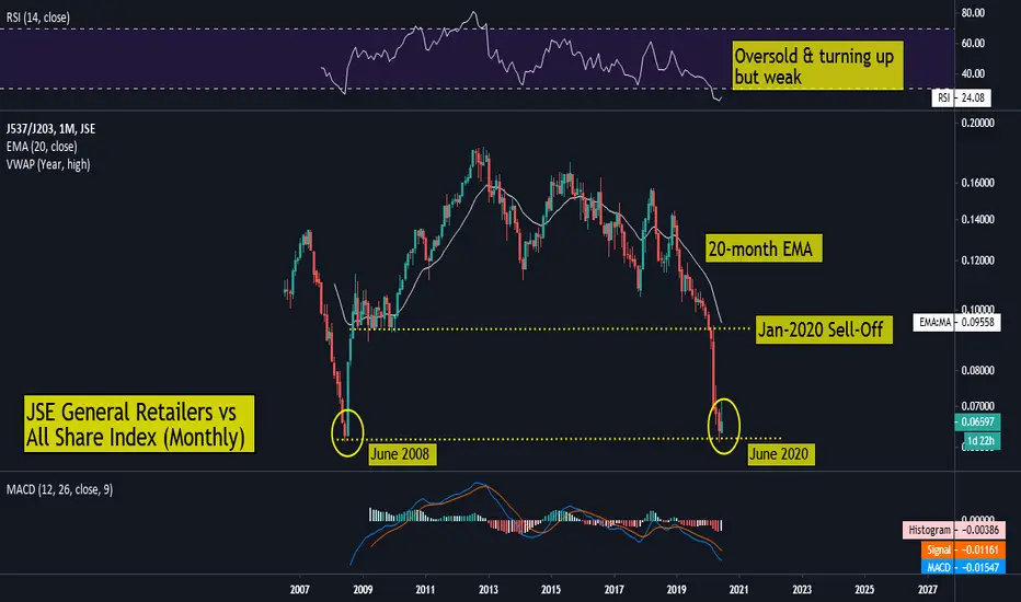
JSE General Retail Index vs JSE All Share Index - Price & MemoryJSE General Retailers vs JSE All Share Index
It's been a torrid two years for the JSE General Retail sector as it battles an extremely tough economic backdrop which includes high unemployment and an ever-waning consumer confidence. It also never helped that these stocks were 'priced for perfection' with the price-to-earnings ratios often in the mid-20s to early-30s. As the Rand started to losing significant ground, and the economic realities started to hit home, many of these names started to unravel as earnings and revenue growth slowed dramatically, leading to share prices and valuations unwinding as market participants began to discount the fiercely competitive environment. On the chart, it's once again proven why prices have memory and key level should not be ignored. During January 2020, as Covid-19 started to make the mainstream news, we saw the price on the Relative/Ratio chart lose key support which was held from November 2008 to February 2010. This hard break resulted in the price making a sharp decline which saw the price go on to test the June 2008 lows - from which we saw a bounce (JSE Retailers then out-performing the broader market). The current candle structure has seen some selling pressure, possibly reflective of the waning of 'SA Inc' shares versus the overall market. Whilst this long term level offers temporary support, it should be noted that a breakdown is possible, which would signal the continued under-performance of the General Retail Index versus the All Share Index. In terms of the technical indicators, long term momentum remains down with the RSI in oversold and turning up but in weak territory and the MACD below the zero bound. One possible glimmer of hope for this relative chart is the price being extended well below the 20-month exponential moving average, which often acts as a magnet when it is extended too far from the price.