DASHUSDT rally from support tests daily resistance Dash has shown significant growth, rising more than 75% from the daily support range of 37.30-38.65. The upward movement was accompanied by active participation from large volumes, indicating attempts by major players to defend the support and immediately exit accumulation.
The rally paused at the daily resistance zone of 65.70-69.56, where bears responded with volume to limit further upward movement. This shows that this area remains a key level for price control.
For bulls, it is now critical to break through the resistance and hold above it. Otherwise, bears could establish accumulation or even push the price back down using their volume.
Accumulation in the current situation appears more like a neutral scenario, with a balance established between the sides. However, bulls still hold the advantage, and bears will need significantly more volume to push the price lower.
Thus, Dash is caught between support and resistance, with the balance of power currently tilted toward bulls. The next move will depend on which side takes control of the key level first.
Supportandresitance

XAUUSD Bullish Structure – BUY Setup Toward 4530 & 4560Price has broken above the trendline and is holding above the support zone at 4,485–4,495, where former resistance has now turned into support. As long as price stays above this support area and respects the rising trendline, bullish momentum is likely to continue. The first target is 4530, and if strength sustains, price can extend toward the main target zone at 4,550–4,560. A clear break back below 4,485–4,495 support would invalidate the bullish setup.

XAUUSD | Market Structure & Key LevelsPrice is trading in a strong bullish ascending channel, with buyers defending the support zone at 4,280–4,310, which continues to act as a key demand area; as long as price holds above this support, the bullish structure remains intact and pullbacks can be considered healthy. With current price around 4,445, continuation is expected toward the target zone at 4,520–4,560, where major resistance and profit-taking may occur, while a strong close below 4,280 would invalidate this bullish outlook.

MNQ: De-Risking Into NFP After Trendline FailureTLDR
Early-year strength → positioning likely crowded
30m trendline loss + failure below weekly VWAP suggests short-term de-risking
Weekly pivot acts as a natural downside reference into NFP
After a strong start to the year, I’m leaning toward short-term de-risking into NFP, not because the trend is broken, but because positioning + timing matters.
On the 30m MNQ:
We’ve lost the rising trendline that guided the recent leg higher.
Price has failed back below weekly VWAP (red), which has acted as dynamic support throughout the move.
That combination suggests momentum cooling, not outright bearish continuation yet.
With NFP approaching, this looks like a risk-off pause rather than aggressive selling. Markets often lighten exposure ahead of high-impact data, especially after early-year gains.
Levels I’m watching:
Acceptance below weekly VWAP keeps pressure on.
A move toward the weekly pivot zone would make sense as a natural de-risking target.
Reclaiming VWAP would invalidate the pullback thesis and reopen upside.
Bias:
Short-term defensive / de-risking into NFP
Bigger-picture trend still intact unless structure continues to deteriorate
Not predicting the number. Just respecting positioning.

SOLUSD: Deciphering the Neutral Zone with Intrabar⚠️ ANALYTICAL METHODOLOGY: READ FIRST ⚠️
This analysis utilizes a 100% VOLUME-BASED ALGORITHM powered by Lower Timeframe (LTF) intrabar data . unlike standard Price Action, we are scanning the internal structure of every candle to pinpoint liquidity.
📊 DATA PRECISION USED:
For this specific SOL/USD reading, the system is running on 1S (1-Second) data resolution. This ensures that the Support/Resistance zones shown below are derived from real-time volume distribution, not just visual highs and lows.
💡 WHY THIS MATTERS:
Standard charts hide the battle between buyers and sellers. By using intrabar volume geometry, we filter out the noise and only focus on where the "Smart Money" is actually defending positions.
SOLUSD: Trapped in the "Dead Center" Liquidity Void 📉
Most traders guess where the breakout will happen. The math suggests we are currently in a "No-Trade Zone."
Using the DSRTL-ML engine, we have identified a "Neutral / Choppy" regime (S3-D3 State).The price is literally sitting in the dead center of the structure, sandwiched between dynamic buying and selling pressure.
1. The Structural Squeeze
The market is compressing. We are seeing a classic "Energy Build-up."
The algorithm flags this area as Low Probability for trend setups. Why? Because we are far from the "Iron Floor" (Value) and equally far from the "Iron Fortress" .
📐 CRITICAL LIQUIDITY LEVELS:
Static Resistance (Supply Wall):
Dynamic Control Zone (Immediate Cap):
Static Support (Demand Floor):
2. Order Flow & Delta Divergence
Total Volume: 43.24K
Net Delta: -10.45K (Sellers Dominant)
The Trap: Although price is trading ABOVE the Point of Control (POC at 133.08), the negative Delta indicates that every small rally is being sold into. The buyers are not aggressive here; they are merely absorbing. This divergence often precedes a liquidity flush or a fake-out.
🧠 The Smart Play (Scenario Logic)
We do not predict; we react to confirmed structure breaches.
🐂 Bull Confirmation: Price must reclaim 142.69 with positive Delta to prove buyers have absorbed the supply.
🐻 Bear Confirmation: A loss of the dynamic floor at 135.95 validates the negative delta and likely targets the 131.00 demand zone.
Current Verdict: Patience. Let the liquidity reveal its hand before committing capital.
⚠️ DISCLAIMER:
This reading is generated entirely by the algorithmic calculations and outputs of DSRTL-ML; it is absolutely NOT financial advice . Always Do Your Own Research (DYOR).
⏱️ REAL-TIME DATA SNAPSHOT:
Please note that the Volume, Delta, and Level figures presented below are captured at the exact moment of analysis . Since the DSRTL-ML algorithm processes live intrabar ticks in real-time, these numbers will naturally evolve and update on your chart as new market activity occurs from the time of writing to publication.

SEAMEC LTD - Weekly Falling Trendline Breakout📊 SEAMEC LTD – Weekly Falling Trendline Breakout Attempt 🚀
📅 Updated: Dec 03, 2025 | ⏱️ Timeframe: 1W
CMP: ₹987.85 (+2.81%)
Ticker: NSE:SEAMECLTD
🔍 Technical Overview
SEAMEC is showing strong bullish momentum on the weekly timeframe, attempting a breakout above a 1.5-year falling trendline drawn from 2024 highs.
A strong base formation is also visible:
🟦 Demand Zone (Support Block): ₹830–₹870
Price has respected this demand zone multiple times, creating a rounded accumulation base.
📈 Current Move:
Breakout candle touching the trendline
Higher lows forming since August 2025
Volume expansion on recent bullish candles indicating accumulation
A confirmed breakout above the falling trendline could mark the beginning of a fresh medium-term uptrend.
🎯 Chart Summary
SEAMEC is showing signs of reversing its prolonged downtrend.
Breakout confirmation above ₹1,030 may open the path toward:
🎯 Targets:
₹1,120 (supply zone)
₹1,210 (swing high)
A close above the trendline with volume would validate the reversal.
⚠️ Disclaimer
This analysis is for educational and chart-study purposes only. Not financial advice. Always do your own research before trading.

GOLD at Major Support — Big Move IncomingPrice is reacting from a well-defined support zone at 4280–4320, showing signs of a short-term bullish recovery.
A break and close above 4360–4380 would confirm upside momentum, opening the way toward the first target at 4395–4400.
Sustained strength above 4415 can accelerate price toward the main target at 4460–4480, while a decisive break below 4280 would invalidate the bullish setup.

NIFTY,BANK NIFTY, S&P 500 – ATH Close, Key Fibonacci Tests Nifty closed at a fresh all-time high of 26,328, up 286 points from last week. The index made a high of 26,340 and a low of 25,878. Despite the strong close, Nifty continues to trade within my broader 26,400–25,700 range, indicating strength with selective supply overhead.
An ATH close confirms positive momentum, but price is still hovering just below the important Fibonacci resistance at 26,492, making this level a decisive acceptance zone.
On the daily timeframe, structure remains bullish, suggesting this is a trend-resumption phase rather than a euphoric blow-off top.
Upside Scenario (Bullish Acceptance)
If Nifty sustains above 26,492 (Fib level) with consecutive closes:
Upside opens towards 26,700
Expected Trading Range (Next Week):
26,700 – 25,900
False Breakout Risk:
A brief move above 26,492 without follow-through for 2 sessions can turn into a bull trap, potentially pulling price back towards 25,900 / VWAP / short-term averages.
Downside Scenario (Momentum Breakdown)
A consecutive daily close below 25,900, especially with RSI slipping below 50 or weakening market breadth, can drag Nifty towards:
25,570
25,400
With the holiday season now over, traders should be prepared for stronger trending moves and faster momentum expansion.
BANK NIFTY – LEADERSHIP INTACT, VOLATILITY AHEAD
Bank Nifty delivered a record weekly close above the key Fibonacci level of 60,092, reinforcing bullish leadership.
Upside Continuation:
If Bank Nifty sustains above 60,100:
Targets: 60,500 → 60,700 → 60,975 (important Fib level)
Expected Range:
61,000 – 59,300
The 60,500–60,700 zone may act as a momentum pause / time correction area before any further extension.
A breakout or breakdown beyond 61,000 or 59,300 can trigger sharp, high-volatility moves—position sizing and trailing stops are crucial.
S&P 500 – TECHNICALS ABOVE HEADLINES
The S&P 500 closed at 6,858, down 71 points week-on-week. While geopolitical headlines may increase volatility, price structure remains the primary guide.
The index remains bullish as long as it holds above DEMA 100, currently near 6,661.
Trading Plan:
Every dip towards DEMA 100 remains a buying opportunity
Above 6,945: Upside targets at
7,026 (important Fibonacci level)
7,122 (major Fibonacci extension)
Risk Management:
Consecutive daily close below DEMA 100 + follow-through can pull the index towards DEMA 200 near 6,416
For positional investors, DEMA 100 should act as a trailing stop-loss
Alternatively, a daily close below 6,800 is a clear cue to protect profits
Market Regime Summary
Current market structure suggests trend continuation with controlled risk, not a runaway top.
Strategy: Buy strength, avoid chasing failed breakouts, and trail profits aggressively.

XAUUSD Bullish Continuation Setup Gold is trading in a bullish structure after respecting the key demand zone, with price holding above support and showing strong buying interest. A minor pullback toward the 4520–4530 area is possible, but as long as this zone holds, bullish continuation is expected toward 4550 and 4600, where short-term resistance may appear. A break below 4500 would invalidate the setup. Overall bias remains bullish while price stays above support.

GOLD BUY TODAY | Demand Zone Holding, Upside Targets Open🔓 Entry: 4380 – 4390
❌ Stop Loss: 4365
🎯 Target: 4430 Next Target: 4450
GOLD BUY (XAUUSD) Price is holding above a key demand zone with bullish price action and trend support intact. Looking for upside continuation as buyers remain in control. A sustained move higher can push price toward the next resistance levels. Trade is planned with clear risk management and favorable risk-reward, suitable for intraday to short-term continuation.

XAUUSD Sell Setup | Gold Rejects Key ResistanceGold is trading below a key resistance zone and showing clear bearish price action. As long as price remains under this level, selling pressure is expected to continue toward lower liquidity areas. Risk is well defined with invalidation above resistance.

Why Price Can Open Flat Or Gap DoneThis video explains why price can open flat or gap down by observing market context, prior-day structure, and overnight behavior. The discussion focuses on how weak momentum, lack of follow-through, and positioning near key levels can lead to a flat or gap-down open. It also highlights why, in certain conditions, price may show continued downside pressure toward lower areas, based on structure and reaction zones.
The objective of this video is to help understand opening behavior and early-session price dynamics from a price-action perspective. This analysis is shared purely for educational and awareness purposes and does not provide any trading or investment recommendations.

NIFTY Moved EXACTLY As Analyzed | Live Entries, SL & Target Hit
Today’s video has been recorded live during market hours —> no hindsight, no edited stories.
I tracked the price action candle-by-candle, explained the structure as it was forming, and shared the exact trades I took.
You will see:
• My stop-loss getting hit (full transparency)
• My targets getting hit
• Why the analysis played out perfectly
• How to adjust your plan when the market shifts
• How I manage trades in real time
This is pure live price action + real psychology.
If you follow the whole breakdown, you’ll understand exactly why the market moved the way it did and how I planned the next setups.
Let me know if you want more live breakdowns like this.

Chumtrades XAUUSD ATH Is Not a Reason to ShortMacro bias:
US CPI cooled, while expectations for Fed easing in 2026 remain intact. Japanese bond yields surged, signaling capital rotation away from speculative assets and into safe havens like gold. The macro backdrop continues to support gold.
Structure:
Gold has broken above ATH, with the previous high around 438x now acting as support. Short-term high is forming near 4420. The uptrend remains dominant on H1 & M30.
Bias:
👉 Prefer BUYs in line with the trend
❌ Avoid FOMO chasing
⚠️ SELL only for short-term scalps after lower-timeframe structure breaks
BUY zones:
438x (previous ATH)
4350–4353
4336–4330
Invalidation:
A clear close below 4320 opens a move toward 4310 / 4300
In this case, the H1–M30 bullish structure is invalidated
Risk note:
Momentum is very steep → sudden pullbacks are possible. Manage risk tightly and focus on buying at key zones, not emotions.

BTC DAILY: 84K OR 100K – WHICH HITS FIRST?Here’s how this BTC move is mapped out.
-If Bitcoin falls below 84,000 and stays under it, it can drop toward 78,500 and, if selling keeps up, even down into the 73,000–71,500 area.
-If Bitcoin pushes up and breaks above the 93,800 zone, then the next big target on the chart is 100,000, which has been a major level before.
If you’re feeling lost with levels or risk in this range and want a second pair of eyes, just drop a comment or message and can walk through your plan together
Trade What You See/ Mindbloome Exchange
Kris

Sell Zone Ahead for NZDUSDAfter reaching a low just under the 0.56 figure — just above the 2025 lows — OANDA:NZDUSD finally found support and began reversing to the upside. The pair then broke above the falling-wedge resistance, confirming short-term bullish momentum.
At the time of writing the price is 0.5782, and is approaching the 0.5850 major resistance zone.
Given:
- the significance of this resistance level,
- the prevailing long-term bearish trend,
- and the broader fundamental landscape,
I believe 0.5850 offers an attractive sell zone for a longer-term swing trade.
A rejection from this area could send the pair back toward the lows.

ETHUSD — Bearish Retracement Toward Demand ZoneETHUSD is currently trading inside a broader distribution structure, with price repeatedly rejecting the strong supply zone near the 3,230–3,260 area. Multiple seller zones, along with the breakdown from the recent range, indicate weakening bullish momentum.
Price has shifted from an earlier UTA uptrend channel into a more corrective DTA structure, showing clear signs of distribution. After failing to break above supply, the market is forming lower highs and consolidating near 3,120—suggesting bearish pressure is building.
If the current range fails to reclaim upside levels, ETHUSD is likely to continue its downward corrective move toward the marked support around 3,030. A deeper drop could extend to the 2,910–2,950 demand zone, which is the next strong liquidity pocket. This is where buyers previously stepped in aggressively, making it a high-reaction area.
Overall, structure favors downside continuation unless price reclaims the upper seller zone with strong bullish momentum.
If this chart helped you understand the market structure more clearly, show some support! Like the post, drop a comment, and follow the profile to get more consistent updates, smart money concepts, and high-quality trade setups.

Review and plan for 1st December 2025 Nifty future and banknifty future analysis and intraday plan.
Stock analysis- KAYNES
This video is for information/education purpose only. you are 100% responsible for any actions you take by reading/viewing this post.
please consult your financial advisor before taking any action.
----Vinaykumar hiremath, CMT

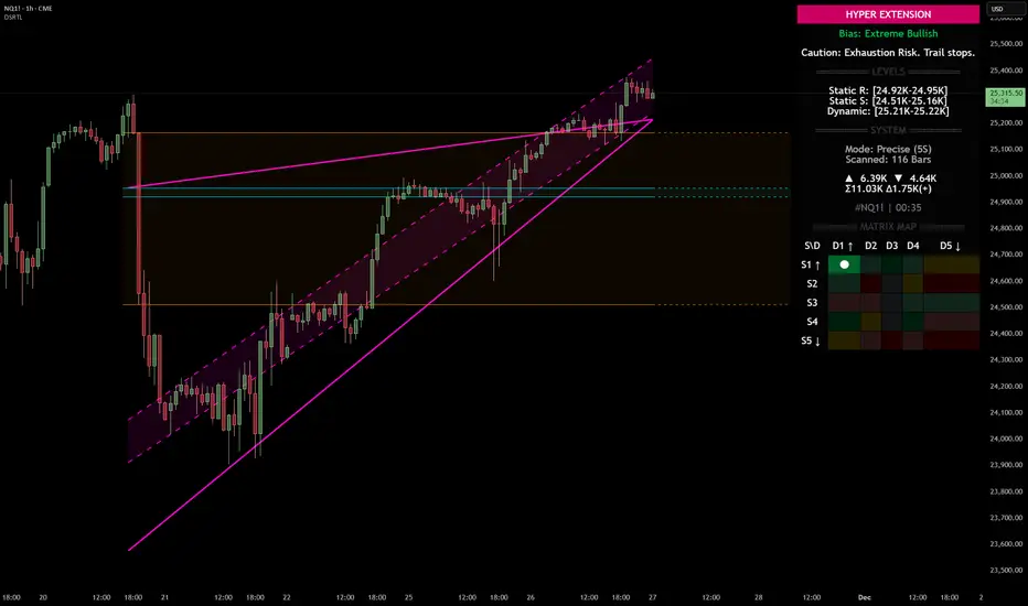
Nasdaq 100 (NQ): Hyper-Extended Momentum – Breakout or Exhaust
Category: Trend Analysis / Support & Resistance
Ticker: NQ1! (CME)
Analysis:
We are looking at the Nasdaq 100 Futures (NQ1!) on the 1H timeframe using the Dynamic Support & Resistance (DSRTL) system. The market is currently displaying a textbook example of a high-momentum breakout that has pushed into statistical extremes.
Here is the breakdown of the current technical landscape based on the indicator's Matrix Logic:
1. The "Hyper Extension" State (S1 / D1)
The indicator’s dashboard has triggered a "HYPER EXTENSION" alert. This specific state occurs when two conditions are met simultaneously:
• Static Breakout (S1): Price has cleared the horizontal resistance structures (indicated by the volume clusters).
• Dynamic Overextension (D1): Price has pierced above the upper limit of the dynamic trend channel (the purple trendlines).
2. Bias: Extreme Bullish
The current bias is rated as "Extreme Bullish". The trend is undeniably strong, confirmed by the positive Volume Delta (+965) shown on the dashboard. The price action is aggressive, creating a steep angle of ascent that has moved away from the mean.
3. The Warning Signal: Exhaustion Risk
While the trend is up, the system issues a cautionary note: "Exhaustion Risk. Trail stops."
In technical terms, when price action moves into "D1" (Dynamic Overextension), it indicates that the asset is trading significantly above its standard deviation or channel geometry. Historically, markets often seek mean reversion or consolidation after such rapid expansions to sustain the trend.
Key Levels to Watch:
• Dynamic Support (Immediate): The top of the purple channel (approx. 25,220) acts as the first layer of defense. A retest of this level is common after a breakout.
• Static Support (Structural): The breakdown level of the previous resistance, now turning into support around the 24.95K region.
Scenario Conclusion:
This is a pure momentum play. Traders should be aware that while the path of least resistance is up, the probability of a "snap-back" or consolidation increases the further price stretches above the dynamic channel. This is not a signal to short the trend immediately, but rather a signal to manage risk tightly on existing long positions.
Disclaimer: This analysis is for educational purposes only and explains the logic of the DSRTL technical indicator. It does not constitute financial advice.
BTC’s Toxic Relationship with Support LevelsMarket Prophecy is back
Price made a rejection on the weekly timeframe and successfully broke through daily support at 98,920. Now, it looks like BTC might pull a classic move—retracing to the 50–61.8% Fibonacci zone, just like its previous wave—before continuing its dramatic dive toward the next support at 81,490. Traders call it ‘price action.’ I call it emotional damage
good luck all
**My trading strategy is not intended to be a signal. It's a process of learning about market structure and sharpening my trading my skills also for my trade journal**
Thanks a lot for your support

XAUUSD- Strength near 4000 key InflectionThe Support Level
The 4000 zone has acted as a key inflection point, both as support and resistance, since October. Price has been oscillating around this level, consistently finding strength above it and struggle below it.
At present, the market is once again retesting this crucial level. As price approaches 4000, several technical cues are signaling potential underlying strength.
Loss of Downside Momentum
To begin with, there is a clear loss of downside momentum. We witnessed a sharp 100-point decline from the 13 Nov swing high in just three candles. This was followed by a -179 point slide over six candles (acceptable) but then a much slower -106 point drop stretched across 18 candles.
Why did the market suddenly take significantly longer to cover a similar distance from the 14 Nov highs?
This deceleration suggests waning bearish momentum as price nears support.
This observation is further validated by a bullish RSI divergence forming at the lows.
Decreasing Volumes
Additionally, the recent downswing from 4054 has been accompanied by declining volume- a classic sign of seller exhaustion. When falling price is not supported by expanding volume, it often hints at an impending reversal or at least a relief bounce.
Potential for Buy
Structurally, the market is still in a short-term downtrend, printing lower highs and lower lows since the 13 Nov peak. Aggressive traders may look for a bullish reversal signal in the 4000 demand zone, while conservative traders might prefer waiting for a confirmed shift in market structure, a higher high followed by a higher low on lower timeframes, before positioning long.
At this juncture, it’s difficult to justify a fresh short, given the confluence of support, momentum divergence, and volume behavior.
How do you usually evaluate the market when it approaches major support or resistance zones?
📣Disclaimer:
Everything shared here is meant for education and general awareness only. It’s not financial advice, nor a recommendation to buy, sell, or hold any asset. Do your own research, manage your risk, and make sure you understand what you’re getting into.

USD/JPY –Bullish Double-Bottom Targeting Major Weekly ResistanceThis USD/JPY weekly chart is showing a clean double-bottom reversal structure formed at a strong higher-timeframe support zone (≈138.00–140.00). The first rejection created Swing Low 1, and the second rejection created Swing Low 2, both tapping the same demand block — a classic sign that buyers are aggressively defending this level.
Price then pushed upward, breaking toward the neckline, confirming early bullish momentum. Volume Profile on the right shows a clear low-volume pocket above current price, meaning once price breaks through the neckline area, it can accelerate very quickly toward the next major liquidity pool.
The primary upside target is the weekly resistance zone around 160.00–163.00, where previous supply and liquidity reside. The dotted projection on the chart represents bullish continuation, showing buyers likely stepping in on minor pullbacks.
Overall, this chart is signaling a high-probability bullish continuation, as structure, support, and volume profile all align for upside movement.

Support and resistance key guide (Volume, Trendlines, FVG, MA)Support and resistance key guide (Volume, Trendlines, FVG, MA)
1️⃣ Importance of Support and Resistance in Highly Volatile Crypto Markets
The cryptocurrency market operates 24/7/365, exhibiting far greater volatility than traditional financial markets. This volatility presents substantial profit opportunities, but it also triggers intense fear and greed among investors, creating significant psychological stress.
Support and resistance serve as key milestones in this chaos, signaling zones where price reactions are likely. Beyond mere technical analysis, they reflect the collective psychology of countless traders. Understanding them is essential for success in crypto trading.
2️⃣ The Nature of Support and Resistance and Their Psychological Basis
Support and resistance occur where buying and selling pressures strongly collide, slowing or halting price movement.
Support:
At this level, buyers see the asset as "cheap enough!" and stand ready, forming a psychological and physical barrier against further decline. Additionally, traders previously trapped in losing positions may sell at breakeven, adding resistance against further drops.
Resistance:
At this level, sellers perceive the asset as "expensive enough!" and offload positions, while traders previously trapped at highs may sell with a "better late than never" mindset, limiting upward movement.
※ Meaning of Support/Resistance Breakouts and “Fakeouts”:
When a support level is breached, existing buyers may panic and trigger stop-loss selling. Conversely, breaking resistance may prompt buyers to enter, accelerating the trend.
However, some breakouts can be “fakeouts,” designed to exploit trader psychology. Premature chasing of such moves should be avoided.
3️⃣ Key Support and Resistance Pattern Analysis
📈 Trendlines and Consolidation Zones: The Psychology Behind Market Order
Trendlines: Trendlines visually represent the shared expectation among traders that price will move in a certain direction. Touching an upward trendline triggers “buy at a bargain” psychology, while touching a downward trendline triggers “it can’t go higher” sentiment.
Consolidation Zones (Boxes): These are zones where buying and selling pressures balance each other. Traders plan trades around these zones, dominated by the “waiting for breakout” psychology to capture significant moves.
📈 FVG (Fair Value Gap): Market Inefficiency and Smart Money Footprints
FVGs occur when the market moves too rapidly through a price range, leaving a “price gap.” They often reflect sudden activity by smart money (institutions, whales).
Gap Filling:
Markets instinctively avoid leaving incomplete states (FVGs) unaddressed. When price re-enters an FVG zone, the players who drove the prior rapid move may close or re-enter positions, forming support/resistance. Beginners can treat FVGs as smart money footprints and follow their activity strategically.
📈 Moving Averages (MA): Collective Psychology and Trend Direction
Moving averages reflect the average price perceived by the market over a period. Being widely monitored, they act as psychological support/resistance levels.
Short-term MA (e.g., 50MA): Reflects short-term trader sentiment. Price below it can trigger “short-term trend broken?” anxiety, while above it fosters optimism.
Long-term MA (e.g., 200MA): Represents long-term trader psychology and trend direction. Price below 200MA creates fear of a long-term downtrend, while above inspires hope of a sustained uptrend. When acting as support/resistance, MAs carry strong psychological consensus as a widely observed benchmark.
📈 POC (Point Of Control) Volume Profile: Market Consensus and the Power of Volume
POC is the price level with the highest traded volume over a period. It indicates market agreement on price, with substantial volume concentrated there.
Price below POC: POC becomes strong resistance. Buyers trapped in losing positions may sell at breakeven, and sellers actively resist upward moves.
Price above POC: POC acts as strong support. Buyers believe “price won’t fall below this level,” and prior sellers may switch to buying.
POC represents the market’s “expected price” and the zone where loss-aversion psychology is strongest.
📈 Fibonacci: Natural Order and Human Expectation
Fibonacci retracements apply golden ratio mathematics to charts, reflecting the expectation that price will reverse at certain levels, forming support/resistance.
These levels are not coincidental; many traders plan trades around them, causing real market reactions.
Levels like 0.5 (50%) and 0.618 (61.8%) are psychologically significant, viewed by traders as buying or selling opportunities. Support/resistance forms through “herd psychology,” as many act in unison.
📈 CME Gap: Institutional Moves and Market Regression Instinct
CME gaps occur in Bitcoin futures dominated by institutional investors. They happen when the spot market moves over weekends while futures are closed, and the market tends to “fill the gap.”
Gap Filling: CME gaps represent periods without institutional activity, prompting the market to normalize these “abnormal” price zones.
Traders anticipate “the gap will eventually be filled,” making these zones potential strong support/resistance, reflecting future-oriented market psychology.
4️⃣ Managing Trading Psychology Using Support and Resistance
Even the best tools are ineffective without psychological discipline.
Confirmation bias and stop-loss discipline: Ignoring losses due to selective perception leads to ruin. When support breaks, acknowledge your prediction was wrong and act decisively to exit.
Overbought/oversold psychology and FOMO:
Avoid chasing price surges out of fear of missing out (“everyone else is profiting, why not me?”).
During crashes, resist panic selling at the bottom. Base trades on your rules derived from support and resistance.
Partial trading for risk management:
Avoid buying all at support or selling all at resistance at once. Splitting trades across multiple support/resistance levels provides psychological stability and reduces the impact of wrong predictions.
5️⃣ Comprehensive Strategy Formation and Practical Application Tips
Multi-level Support/Resistance Confluence: Overlapping zones (e.g., Fibonacci 0.618 + 200MA + POC + FVG bottom) create very strong support/resistance. These reflect collective trader agreement and can be traded with higher confidence.
Volume Analysis and Support/Resistance Strength: High volume at a zone confirms its significance. Reliable breakouts require strong volume, showing market participation and intent.
Develop Your Own Trading Plan: Don’t blindly follow all patterns. Choose indicators and methods that suit you to establish personal trading rules. Adhering to these rules maintains psychological stability and long-term success.
If you found this content helpful, please show your support with a Boost (🚀) and a comment (💬)! Your encouragement is a great motivation for us to create better analyses and content. You can also follow us to receive notifications about new posts.