CHoCH at Demand Zone – Targeting Liquidity Above Weak HighPrice is currently reacting from the support zone after a clean CHoCH (Change of Character) formation, indicating potential bullish intent. The structure shows multiple BOS (Break of Structure) confirmations suggesting accumulation within the range.
The entry zone aligns with the lower boundary of the support area, offering a high-probability buy setup. As long as the strong low holds, we can anticipate bullish continuation toward the TP1 (1.1560) and TP2 (1.1578) zones.
Bias: Bullish
Targets:
TP1 → 1.1560
TP2 → 1.1578
Invalid if: Price breaks below the strong low / support zone.
Supportresistace

Nzd/Usd - Breakout Setup Loading – Big Move Ahead?Price is currently trading around 0.57235, showing clear consolidation between well-defined supply and demand zones.
🔴 Resistance Zone (Supply): 0.57400 - 0.57480
🟢 Support Zone (Demand): 0.57100 - 0.57180
Scenario 1 – Bullish Breakout:
If price breaks and holds above the resistance zone, we could see a bullish continuation towards the next target at 0.57750+. Watch for a confirmed retest and bullish structure to enter long positions.
Scenario 2 – Bearish Rejection:
If price fails to break the resistance and moves below the support zone, this could trigger a move towards the next demand level around 0.56800, completing the bearish target.
Key Notes:
Consolidation suggests an imminent breakout.
Wait for confirmation and avoid chasing moves without structure or retest.
Volume and momentum can help confirm direction once a breakout occurs.
Bias: Neutral until breakout — prepare for both scenarios.

Usd/Jpy - Breakout Or Breakdown?Price is currently retesting a key resistance zone (highlighted in red) after bouncing off the support zone (blue). The key level aligns with previous structure and acts as a decision point for bulls and bears.
Scenario 1 – Bearish Setup:
Price fails to break and hold above the key level.
We may see a rejection and continuation downward.
First target would be a retest of the blue support zone, with potential extension toward 151.000 psychological level if bearish momentum strengthens.
Scenario 2 – Bullish Setup:
If price breaks above the red zone with volume and confirmation, it could signal a bullish reversal.
Targeting the 152.400+ area where previous highs sit.
Key Levels:
Resistance (Key Level): ~151.940
Support: ~151.600
Psychological support: 151.000
Wait for confirmation (price action, candle structure, volume) before entering. This is a crucial decision zone—stay patient and manage risk properly.

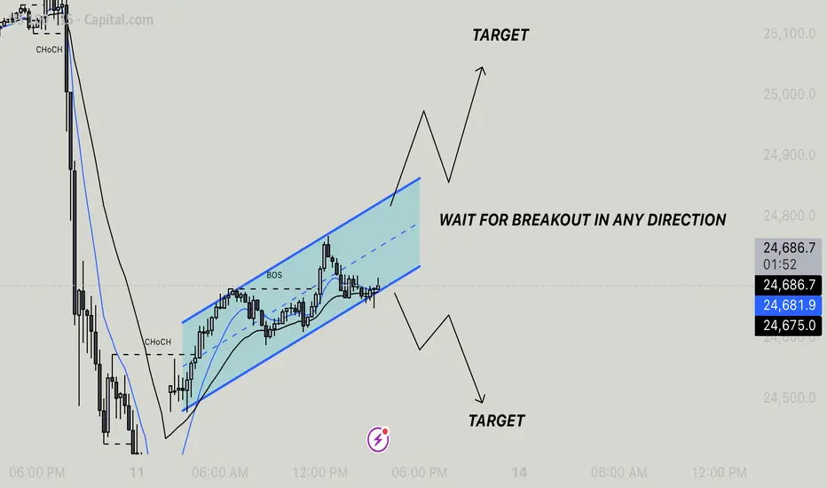
Us100 - Breakout Setup In PlayThe market has formed a rising channel after a significant bullish reversal marked by a Change of Character (CHoCH) and a Break of Structure (BOS). Price is currently consolidating near the midline of the ascending channel.
🔍 Key Insight:
We're in a wait-and-watch zone — a breakout from this channel in either direction could set the tone for the next move.
Trading Plan:
Upside Breakout: Watch for a breakout above the upper boundary of the channel with strong bullish momentum. Target the projected move equal to the height of the channel.
Downside Breakout: If price breaks below the lower channel support, expect a potential bearish move toward the lower target zone marked on the chart.
Important: Wait for a clear breakout and confirmation before entering a trade. Avoid entering inside the channel to minimize risk from false moves.
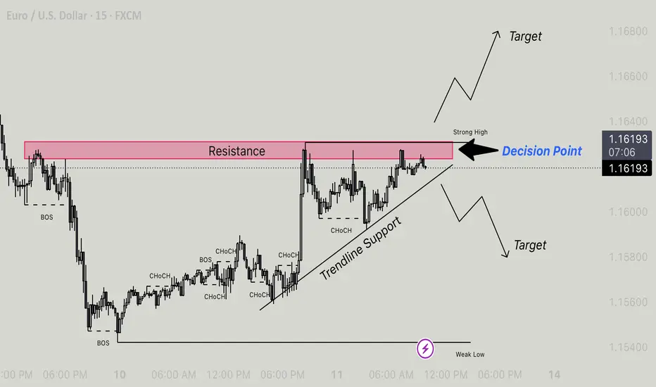
Eur/Usd - at Key Decision Point, Breakout or Reversal Resistance Zone: Clearly defined in red. Price has reacted multiple times from this area, indicating strong selling pressure.
Decision Point (DP): Price is currently sitting at a key decision point near the resistance zone. A breakout or rejection will dictate short-term direction.
Strong High: Needs to be taken out for bullish confirmation.
Weak Low: Vulnerable if price rejects the resistance and breaks below trendline.
Market Structure Highlights:
Break of Structure (BOS): Seen on the left side — marks bearish control initially.
Change of Character (CHoCH): Multiple CHoCHs observed during the upward move, signaling potential trend shift from bearish to bullish.
Trendline Support: Holding the bullish structure so far; price is respecting the ascending trendline, acting as dynamic support.
Scenarios at Decision Point:
Bullish Case:
Break and close above resistance and the Strong High.
Could signal continuation toward upper bullish targets (around 1.16600–1.16800).
Look for confirmation on lower timeframes for entries (retest + bullish engulfing or FVG fill).
Bearish Case:
Rejection from resistance + break of Trendline Support.
Opens path to bearish targets near 1.15800 and below (toward Weak Low).
A BOS to the downside would confirm bearish continuation.
Trading Tips:
Wait for clear confirmation (break and retest or price action signal) before entering.
Keep an eye on volume and momentum at the Decision Point.
Risk Management: SL below recent swing low (for longs) or swing high (for shorts).
NZD/USD - SELL SETUP TARGETING LOWER SUPPORT Price has recently broken below the ascending trendline, signaling weakening bullish momentum. It is now testing a key support zone around the 0.57770 level.
If the price breaks and closes below this current support zone, there's a high probability it will drop toward the next major support level near 0.57550, which is marked as the TARGET zone.
Trade Plan:
Sell Entry: On break and close below 0.57770 support
Target: 0.57550 zone (next support)
Stop Loss: Above recent highs or just above the broken support for protection
Key Notes:
Watch for a strong bearish candle close below support for confirmation
Favorable risk-reward setup toward the lower support zone
Be mindful of upcoming economic events (noted on chart)
This is a clean breakout-retest scenario. Stay patient and wait for confirmation before entering.

How to Identify Support and Resistance in Markets with AnologyHello Friends,
Welcome to RK_Chaarts,
Today we are going to learn & understand real work of Supports and Resistances in markets,
and Market structure with very good examples (Educational Post)
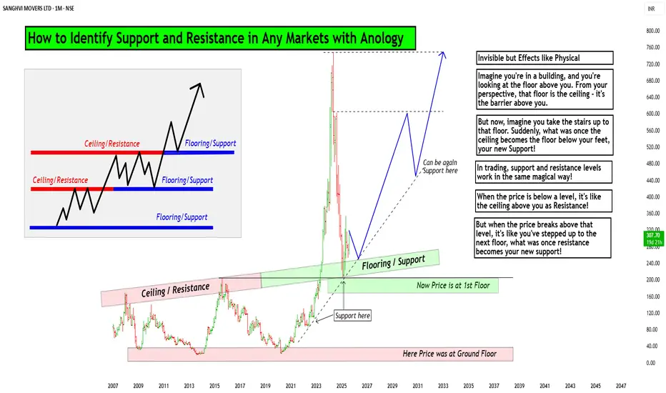
The Market's Architecture: Support and Resistance
This is an excellent analogy for understanding two of the most worthful concepts in technical analysis: support and resistance. By thinking of the market as a multi-story building, we can visualize how price moves and what happens when it hits certain levels.
- The Core Analogy: The Building and the Elevator
- Imagine the market as a large building with many floors. The price of an asset (like a stock or a cryptocurrency) is like an elevator moving up and down within this structure. The floors and ceilings of the building are not physical barriers but represent specific price points that the market has collectively agreed upon as important.
- The Floor (Support)
The floor of a building provides a solid base and prevents the elevator from falling further. In the market, this is called a support level. A support level is a price point where buying pressure is strong enough to stop the price from declining. When the "elevator" (price) reaches the floor, it finds enough buyers to give it a lift, preventing a deeper fall. A strong support level is like a thick concrete floor—it has been tested multiple times and holds firm, showing that there is significant demand for the asset at that price.
- The Ceiling (Resistance)
- The ceiling of a building sets the upper limit for the elevator's movement on a given floor. This is the market's resistance level. A resistance level is a price point where selling pressure is strong enough to prevent the price from rising further. When the "elevator" hits the ceiling, it encounters a large number of sellers who are ready to take profits, pushing the price back down. A strong resistance level is like a low ceiling—the price hits it and retreats, indicating that many investors believe the asset is overvalued at that point.
Breaking Through: New Levels
The most dynamic part of the analogy is what happens when the elevator breaks through a floor or ceiling.
Breakout (Breaking the Ceiling):
When the price has enough momentum to push through the resistance level (the ceiling), it has essentially moved to a new, higher floor. This is a significant event. The old ceiling, which was previously a barrier, now becomes the new floor. This is a key trading principle: old resistance often becomes new support. The market has established a new, higher trading range, and if the price falls back to that level, it will likely find buyers there, who now see it as a good value.
Breakdown (Breaking the Floor):
Once if price falls from that floor (Support level) which is called as Breakdown in technical language, then lower floor can be the next stop for elevator (Next Support for price), The old floor, which once provided support, now becomes a new ceiling. This is the reverse principle: old support often becomes new resistance. If the price tries to rally back up, it will likely get stuck at this old support level, as it's now seen as a good place to sell.
Structural Integrity (Volume)
Think of market Volume like a construction team. When a lot of people are involved (high volume), the structure is stronger.
Imagine a ceiling in the market. If lots of buyers (high volume) break through it, that's like a robust construction team building a new floor. It's unlikely to collapse.
On the other hand, if sellers break through a floor with high volume, that's a strong sign they're serious about the downward move.
But if the volume is low, it's like a weak construction team. Even if they break through, the move might not last. It's like a flimsy wall that could easily be reversed.
So, volume gives us a sense of whether the market's moves are strong and reliable, or weak and likely to change.
I am not Sebi registered analyst.
My studies are for educational purpose only.
Please Consult your financial advisor before trading or investing.
I am not responsible for any kinds of your profits and your losses.
Most investors treat trading as a hobby because they have a full-time job doing something else.
However, If you treat trading like a business, it will pay you like a business.
If you treat like a hobby, hobbies don't pay, they cost you...!
Hope this post is helpful to community
Thanks
RK💕
Disclaimer and Risk Warning.
The analysis and discussion provided on in.tradingview.com is intended for educational purposes only and should not be relied upon for trading decisions. RK_Chaarts is not an investment adviser and the information provided here should not be taken as professional investment advice. Before buying or selling any investments, securities, or precious metals, it is recommended that you conduct your own due diligence. RK_Chaarts does not share in your profits and will not take responsibility for any losses you may incur. So Please Consult your financial advisor before trading or investing.
EURUSD Breakdown Bearish Trend Continues or Demand Zone Reversal🔍 Chart Breakdown: EUR/USD (30-min TF)
Trend Overview:
Previous Trend: Bullish channel structure (highlighted in blue).
Current Momentum: Strong bearish breakdown following a clear range phase.
The chart shifted from consolidation → breakdown → aggressive bearish continuation.
🧱 Key Technical Highlights:
1. Bearish Breakout:
Price broke below the ascending trendline and exited the ranging box, confirming a bearish shift.
Multiple Breakdown Retests (highlighted with red arrows) confirming structure failures and validating resistance zones.
2. Range Zone (Distribution Phase):
Price moved sideways within the green rectangle (“RANGE”), indicating accumulation/distribution before the selloff.
The breakdown from this range confirmed bearish momentum.
3. Demand Zone Test (Now in Play):
Price is approaching/hovering around a demand zone (green box) marked as a critical support.
Buyers may react here, offering two key scenarios:
Bounce back to retest resistance around 1.1600 (highlighted).
Breakdown below demand, leading to further decline toward next major support zones (1.15354 and 1.15040).
4. Price Reaction Zones:
🔴 Resistance zones are clearly marked where breakdown retests occurred.
🟢 Demand zone with bounce-or-break logic provides directional bias.
🧭 Potential Scenarios (Marked on Chart):
✅ Bullish Case:
If demand zone holds, expect:
A corrective rally toward 1.1600–1.1620.
Watch for rejection signals here (could be ideal for re-entering shorts).
❌ Bearish Case:
If breakdown below green demand zone occurs, targets:
1.1535 (local structure support)
1.1504 (next confluence level; possible long-term bounce area)
📈 Indicators:
Ichimoku Cloud: Price is well below the cloud, confirming bearish control.
Structure: Lower highs & lower lows = confirmed bearish trend.

Ultimate Strategy ScreenerThis Strategy Screener is the ultimate tool which screens 40 instruments with a single strategy.
The Basic concept of using this is to create a strategy that has high win rate and screener scans for the required conditions and generate a buy or sell signals. The signals are valid for a short period. After which they disappear. Only the Strategy Entry point or Buy/Sell Signals are indicated in the screener.
The combination of Indicators used are displayed on the screener. Additionally the outcome of all unused indicators are also displayed as signals in the form of Direction Arrows below the Instrument Strategy Data.
You can get the Buy/Sell Signals Based on the settings of indicators you combine. Also you can filter out the unwanted signals using the Trend filter.
Zigzag Levels and Donchian Channel with Fibonacci Value are provided for entry and exit levels and stop loss values.
S/R levels are also provided.
The indicators that one can combine are as below.
EMA200
VWAP
Supertrend
UT Bot
SSL Hybrid
QQE
MACD
Stochastic
PSAR
Stochastic RSI
RSI
Awesome Oscillator
Linear Regression Candles
EMA Crossover
ADX
Directional Index
MACD
Momentum Oscillator
HVSA (hybrid Volume Spread Analysis)
Williams % Range
More Indicators can be added based upon requirements.

NZDUSD - Sell Stop on Break of 4-Hour SupportAnalysis
A divergence has been identified, and a rising wedge pattern has formed. The price is currently testing the 4-hour resistance level and is moving towards the 4-hour support. If the price breaks the second support level, we will enter a position, anticipating a bearish trend.
Trade Plan
Entry: 0.61284
SL: 0.61503
TP1: 0.61065
TP2: 0.60846

FIL ANALYSIS🔮 #FIL Analysis 💰💰
🌟🚀 As we can see that #FIL is trading in a symmetrical triangle and given a perfect breakout and already retest the levels. But there is an instant resistance of descending trendine. If #FIL breaks the descending trendline then we will see a good bullish move in few days . 🚀🚀
🔖 Current Price: $6.154
⏳ Target Price: $10.00
#FIL #Cryptocurrency #DYOR

INDUSIND BANK LONGNifty Bank is move upside around 2.5% in today session and in the category of top index gainers.
If we closely look the Bank Nifty chart, we can see the breakout on daily time frame with good decisive candle.
INDUSIND BANK is the top gainer in the BANK NIFTY, along with Index it give breakout.
As we can see in the chart INDUSIND BANK shrink the range from the last month with the same support zone.
It would be a good opportunity from here to TOP.

Mastering Support & Resistance This video dives into the fundamentals of support and resistance, the cornerstones of technical analysis.
We'll cover:
** Identifying trends:** Learn how to spot bullish and bearish trends using higher highs/higher lows (HH/HL) and lower highs/lower lows (LH/LL).
️** Support & Resistance Levels: Discover how to pinpoint key price levels where the market may bounce or reverse, creating potential trading opportunities.
** Fibonacci: Unlock the power of the Fibonacci retracement to identify high-probability trade entry points at the 61.8% level.

USD/BRLFOREXCOM:USDBRL price is at a major resistance zone and seems to be forming a double top on the daily time frame. Price should start heading down. Worst case it breaks the daily zone and hits the Monthly descending trendline (red). Price is currently overbought on the RSI and Bollinger Bands so there is a high probability it will go down.

NIFTY to start falling more than S&P500 from next week onwardsNIFTY/SPX chart has hit the upper trendline of ASCENDING WEDGE this week. it had hit the upper trendline 2 TIMES and the lower trendline 3 TIMES till now and has reversed every time since 2020
we can clearly see that whenever the price has reversed from the LOWER TRENDLINE , NIFTY has started performing better than S&P500 and whenever price has reversed from the UPPER TRENDLINE S&P500 has started performing better than NIFTY
Now that the REVERSAL is imminent in the WEDGE pattern and global markets are VERY BEARISH , hence we can expect that the BEAR RALLY of indian market is over and it will become MORE BEARISH than the USA market from the next week onwards
SP:SPX
NSE:NIFTY
Thanks a lot for reading...

nas100 30min demand zone reationnas100 30min demand zone reaction
demand zone reaction 1hr, 15min
possible inverted head and shoulder pattern on 5min chart
nas100 seems to be in an uptrend today and can close higher

NIFTY - (RECTANGLE BREAKOUT) NSE:NIFTY had broken out of the last few days' rectangle pattern yesterday and has hit the TP of that pattern
it had taken support and resistance at several points for the last few days within the rectangle pattern


EURCHF - Taking a chance on several daily rejectionsWhile the SNB hasn't really signals any policy change for short-medium term, considering that global inflation has started to cool down, there is quite a chance that they cannot keep hiking rate at some point. Meanwhile, the technical side of it shows a potential buying condition that hard to miss.
As you might see on the chart, based on those conditions, I prefer not to take an aggressive approach. Waiting for the price made a new high in lower timeframe, or at least a new daily high would be better before taking a long trade.
"Trading is NOT about how often you are right!! Trading is a mathematical calculation of the ratio of the results you WILL get to the risk you MAY spend!!!"

Btc at major resistance and obv making negative divergence Btc at major resistance and obv making triple negative divergence which is rear and all confluence stating that btc will tank hard

Support and Resistance Markup Here is how I markup my 4 hour chart for Bitcoin. The candlestick chart isn't used very much for marking up as it doesn't provide the same amount of data as the line chart. I also toggle between the bar chart to provide more data when it comes to seeking a specific wick.

XAUUSD - Price Action - Today's Key Zones - London/NY SessionToday's potential trades for #XAUUSD
📈Potential Buys on close above 1983.910
📉Potential Sells on close below 1980.930
Happy trading all & good luck!
