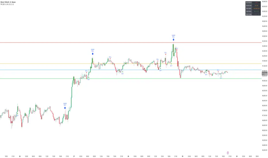
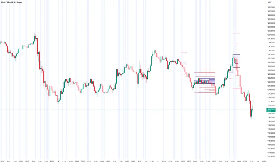
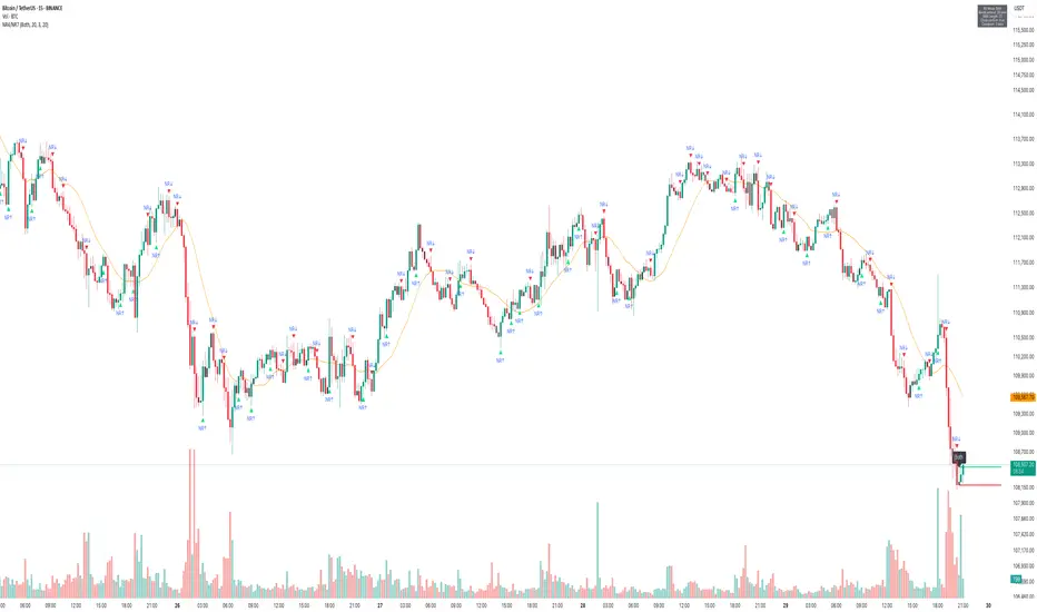
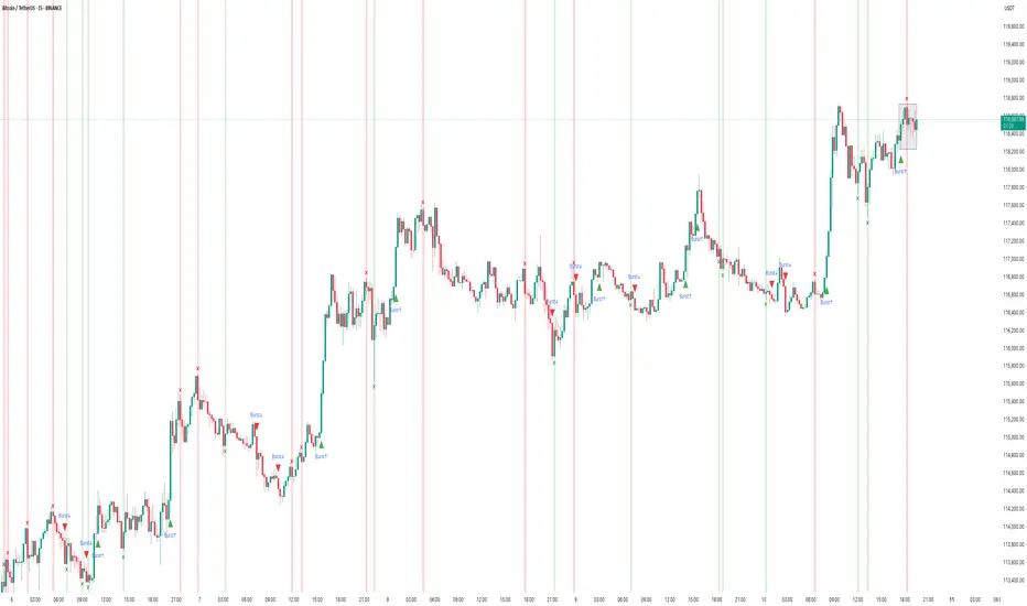
HOW TO USE "Price Volume Correlation (PVC) IndicatorPVC Indicator – Sideways Market, Weak Bullish Volume & Liquidity Sweeps at Range High
📌 Market Context (BTCUSDT – 15m)
Bitcoin continues to trade in a well-defined sideways range, with price oscillating between the previous day’s High, Low, Close, and VWAP levels.
What stands out is that most short-term moves — especially bullish attempts — lack meaningful volume confirmation. On the PVC indicator, this shows up as gray candles, which indicate no correlation between price direction and volume participation.
This lack of price-volume alignment is typical of a range-bound market, where price fluctuates but institutional participation remains muted.
⸻
1️⃣ Multi-Day OHLC Levels Acting as Strong Support & Resistance
The Multi-Day OHLC module plotted on the chart is playing a major role in revealing why the market has been stuck in a range:
• Previous Day High (PDH) → Strong Resistance
Price repeatedly tapped and rejected from PDH, showing liquidity hunts and seller absorption, especially during the large top-side sweep.
• Previous Day Low (PDL) → Reliable Support
The market bounced multiple times from the PDL region, confirming buyers defending the lower boundary of this range — but without strong volume, which prevents any sustained rally.
• Previous Day Close & VWAP → Mid-Range Magnet
These acted as mean reversion points:
• Price frequently returned to Daily Close/VWAP
• PVC candles stayed gray
• No volume expansion occurred
This behavior confirms that the market is rotating inside a fair value zone, not trending.
Conclusion from OHLC Levels:
The repeated interaction with these levels — without breakout volume — indicates classic sideways behavior, where price respects previous day key levels and rotates between them without a directional follow-through.
⸻
2️⃣ Liquidity Sweep at the Top – Clear Stop-Hunt & Reversal
A clean bearish liquidity sweep formed at the top of the range:
• Price spiked above PDH
• Collected stop-losses
• Closed back inside the range
• PVC turned red with strong volume alignment
This confirms the sweep was real, and sellers stepped in exactly at a major resistance level.
⸻
3️⃣ Weak Bullish Volume → No Momentum Follow-Through
Across the last 24 hours:
• Very few green PVC candles (True Bull Moves)
• Majority of candles remain neutral/gray
• BUY signals trigger but lack follow-through because volume does not expand
This indicates no aggressive demand — price moves up occasionally, but without participation.
⸻
4️⃣ Bearish Moves Have Volume Support
Interestingly, PVC shows:
• Red candles where volume rises during declines
• SELL signals aligning with volume spikes
• Bearish sweeps occurring at key resistance
This means sellers are more active than buyers, even though the overall structure is sideways.
⸻
🎯 Summary
• Market: Sideways / Range-bound
• OHLC Behavior: Daily High–Low–Close acting as clean support & resistance
• Top Sweep: Strong rejection from PDH with volume confirmation
• Volume Trend: Weak on bullish moves, stronger on declines
• PVC Reading: Mostly gray → no real correlation → low conviction environment
• Bias: Neutral to slightly bearish until PVC prints green confirmation (Price Up + Volume Up)
PVC helps to clearly distinguish between fake rotations and true momentum, while the OHLC levels provide a structural map of where liquidity sits.
This analysis is for educational and informational purposes only. Not financial advice.
Tradetechanalysis
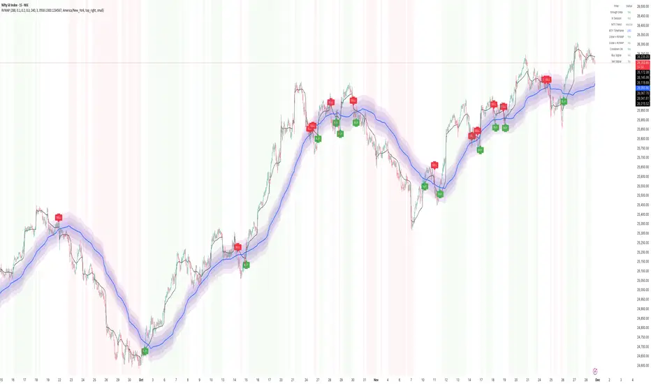
HOW to use Rolling VWAP Indicator for real market structure📌 Rolling VWAP Indicator – Performance on Nifty (15-Min)
How it Behaves in Real Market Structure
The Rolling VWAP indicator showcased here acts like a dynamic trend map, continuously recalculating volume-weighted averages over rolling windows. This helps the indicator adapt quickly to evolving intraday sentiment without getting stuck like a fixed-session VWAP.
Based on the attached Nifty 15-minute chart, here are the key observations:
1️⃣ Captures Trend Early & Smoothly
During strong directional phases (example: the mid-October uptrend and late-November rally), Rolling VWAP bands align beautifully with price:
• Price rides above the VWAP → sustained long bias
• Bands expand → trend strength
• Pullbacks respect the mid-VWAP zone → clean continuation signals
This allows traders to stay confidently in trending conditions.
⸻
2️⃣ Effective Reversal Spotting
The indicator prints clear reversal signals when:
• Price closes on the opposite side of the VWAP channel
• Band slope flips
• Background color switches sentiment
On the chart, almost every major swing—both tops and bottoms—was marked by timely reversal signals, allowing traders to exit early and flip positions with minimal lag.
⸻
3️⃣ Filters Out Low-Probability Zones
The shaded grey bands are extremely useful:
• They signify uncertain or transition zones
• Price inside this grey zone = Avoid trades
• Prevents traders from forcing entries during choppy consolidation
You can clearly see that avoiding these grey-zone candles eliminates many false breakouts.
⸻
4️⃣ Strong Performance in Volatile Retracements
Whenever price dipped sharply into the lower VWAP band during downswings, the indicator generated:
• Fast reversal confirmation (green markers)
• Early re-entry opportunities
• Clean identification of exhaustion points
This is visible near month-end corrections and early-October recovery.
⸻
5️⃣ Eliminates False Breakouts
One of the biggest advantages—
When price fakes a breakout and slips back into the band, the VWAP slope + sentiment shading instantly catches it.
You can see several red signals printed at failed upside attempts, preventing continuation trades that would otherwise trap traders.
⸻
6️⃣ Stable in Ranging Markets
Even in sideways phases, the Rolling VWAP structure:
• Narrow bands → low volatility awareness
• Light background shading → caution signals
• Very limited signals → avoids unnecessary trades
This keeps traders out of low-reward zones.
⸻
✨ Summary – Why It Works Well
➡️ Dynamic VWAP adapts faster than traditional VWAP
➡️ Clear trend detection with multi-layer bands
➡️ Reliable reversal confirmations
➡️ Grey no-trade zones prevent unnecessary entries
➡️ Visually intuitive sentiment shading
➡️ Works beautifully on index charts like Nifty and BankNifty
The overall performance on Nifty 15-min shows high consistency across trends, reversals, and retracements, making it a practical tool for intraday and positional index traders.
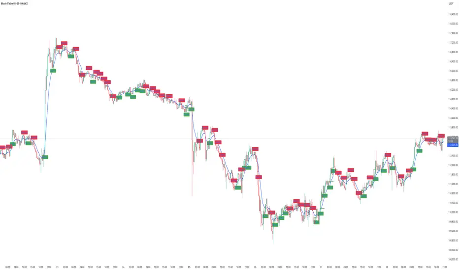
How to use EMA+ATR scalping - Performance Breakdown📌 EMA + ATR Scalping Indicator – Performance Breakdown (Based on Chart)
This was my first indicator ever (built last year), and seeing its performance on the chart today again reminds me why it worked so well for both scalping and swing-style trend capture.
🔹 What the Indicator Is Doing on This Chart
1. Capturing Trend Direction Early
The combination of the EMA (trend filter) and ATR-based trailing stop (volatility filter) helps the indicator catch directional moves very cleanly.
• During strong directional phases (uptrends or downtrends), the signals appear right as momentum shifts.
• In the first half of the chart, every bearish impulse is detected quickly, and the EMA+ATR cross confirms continuation.
You can clearly see how:
✔ The SELL signals appear early on sustained drops
✔ The BUY signals appear early when bullish momentum kicks in
✔ There are hardly any “late” entries due to ATR’s responsiveness
⸻
2. Reversal Detection Is Smooth & Immediate
One of the strongest parts of this indicator is how it flips direction without delay.
Whenever price breaks the ATR trailing stop from the opposite side:
➡ A reversal signal is generated
➡ The previous directional bias is cancelled
This prevents holding a wrong-bias trade for too long.
Even in sideways phases, reversals are caught fast—helping scalpers avoid getting stuck.
⸻
3. Handles False Breakouts Surprisingly Well
This chart shows multiple places where price tries to break in one direction but gets rejected immediately.
The indicator reacts quickly because:
• EMA confirms the micro-trend
• ATR trailing stop invalidates fake moves
• The system flips signal as soon as true momentum appears
This “two-layer confirmation” makes the signals tighter and reduces whipsaws.
So yes—capturing false breakouts and flipping instantly is one of the biggest USPs of this script.
⸻
4. Consecutive Candle Momentum Logic
The script includes a 5-bar consecutive breakout filter, which increases the probability that a breakout is real.
This further improves:
✔ Trend continuation entries
✔ Avoidance of weak or random breakouts
✔ Early detection of strong impulses
You can see how this filter helps catch those clean legs in the chart’s mid-section.
⸻
🔹 The Grey “No-Trading Zone” — A Very Useful Filter
The grey highlighted vertical bands represent periods when the ATR stays too flat.
Flat ATR = low volatility = trap zone.
The indicator marks these with:
• Grey background shading
• “No Trading Zone” label on the candle
These filtered areas clearly show:
❌ Avoid entering — market is undecisive
❌ Signals here are often fake
✔ Wait until volatility expands again
This simple visual filter improves discipline and prevents unnecessary losses.
⸻
🔹 Overall Performance on the Chart
✔ Strong Trends → Clean Signals
The indicator rides the trend well (both up and down), capturing the majority of each move.
✔ Reversals → Early Detection
Quick flips keep you aligned with the new direction without holding drawdowns.
✔ Sideways Market → Controlled Exposure
ATR-flat grey zones protect you from chop.
✔ False Breakouts → Immediate Recovery
When the initial direction fails, the indicator immediately prints the opposite signal.
✔ Scalping & Swing Both Supported
The fast ATR logic supports scalpers,
the EMA confirmation supports swing traders.
⸻
🔹 Why This Indicator Still Feels Powerful (Even Today)
Because it is built on three timeless trading foundations:
1. Trend logic (EMA)
2. Volatility logic (ATR)
3. Breakout momentum (5-bar filter)
These three combine in a very natural way—hence the clean signals you see on the chart.

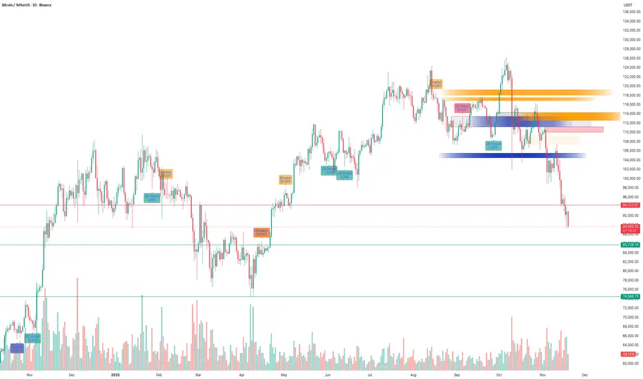
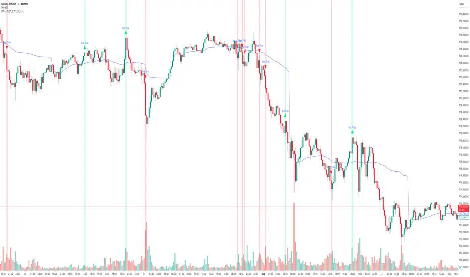
BTC – SMC Suite Follow-Up: Liquidity Grab at 116K and the Drop!!BTC – SMC Suite Follow-Up: Liquidity Grab at 116K and the Drop That Followed
This is a follow-up to my earlier idea “ BTC – Liquidity Grab at $116K Before Deep Correction? ” where I highlighted the danger of price trading into stacked SMC levels on the 1D chart.
1️⃣ Quick recap of the original idea
In the previous post, price was trading around the $112K–$116K zone.
Using the SMC Suite on the 1D chart, I highlighted:
• A high-timeframe supply / OB cluster around 116K.
• A liquidity grab above prior highs – price spiked into fresh liquidity sitting above the range.
• A confluence of Breaker + OB Re-test + FVG acting as a “danger zone” for fresh longs.
• The idea that this move could be a distribution / liquidity grab before a deeper correction.
The key message was: this is not a safe place to be aggressive long; watch for rejection and potential downside.
2️⃣ How price reacted afterwards
Since that post:
• Price respected the 116K zone as supply – every attempt to hold above it failed.
• The highlighted OB + Breaker block acted as a ceiling; price consolidated there and then rolled over.
• After losing the mid-range structure, BTC started a trend of lower highs and lower lows , confirming distribution.
• We have now traded all the way down into the d emand / support zones below 92K and then lower , which were also plotted in advance by the same SMC levels.
In simple terms, the area we marked as a “ danger zone for longs ” turned out to be the top of the move before this large downside leg.
3️⃣ What the SMC levels showed well
This move is a nice case study of how the SMC concepts aligned:
• Liquidity Sweep : Price ran above previous highs into fresh liquidity, then failed to hold.
• Breaker + OB Re-test : Former demand became supply; retest of this breaker block rejected price.
• FVG + Imbalance Zones : Upside imbalances got filled and then flipped into resistance.
• Structure Shift : After the rejection, market structure shifted bearish with clean breaks of prior swing lows.
None of this is about “perfect prediction”, but about reading where smart money might be offloading risk and where retail is most vulnerable.
4️⃣ Takeaways & what I’m watching next
• HTF SMC levels matter. When multiple concepts cluster (Breaker, OB, FVG, previous highs), treat that zone with respect.
• Liquidity grabs at highs are great warning signals – especially when followed by a clear structure shift.
• For now, I’m watching how price behaves around the current demand zones and whether we see:
• Strong rejection + reclaim of broken levels (potential swing-long areas), or
• Continuation of lower highs pointing to further downside.
This post is for educational purposes only, not financial advice.
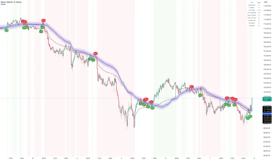
How to Use Rolling VWAP – Early US Session Trend TrackerIn today’s BTC/USDT 15-min chart, the Rolling VWAP perfectly captured the directional bias throughout the session.
The smooth transition between compression and expansion phases clearly aligned with VWAP slope shifts — giving multiple early signals during the US market open, when volatility tends to expand sharply.
Performance Highlights
• The indicator tracked clean trend waves with minimal lag, showing how price respected the VWAP envelope dynamically.
• BUY and SELL zones were well-defined, with fading reversals quickly replaced by trend-aligned setups.
• Session filter (US Market) ensured signals appeared primarily during active volatility windows, avoiding false setups during low-volume hours.
• The rolling nature of VWAP (instead of session-based VWAP) allowed continuous trend capture across intraday transitions.
Additional Notes
1. Cooldown Setting:
Currently set to 1 candle — which makes the chart more responsive but slightly denser with signals.
Increasing it (e.g., to 3–5 bars) can make the chart cleaner, though some reversal entries may not display visually even though they’re logically detected.
2. US Session Filter:
The logic focuses on the early US market phase, effectively capturing directional bursts when liquidity and volatility spike — ideal for short-term scalping or trend continuation setups.
⸻
🧠 Tip:
Combine the Rolling VWAP bias with higher-timeframe structure (e.g., 1H trend) for even more reliable directional trades.
How to PCCE+FBD – Decoding Expansion/Exhaustion & Reversal zones🧭 PCCE + False Breakout Detector – Decoding Expansion, Exhaustion & Reversal Zones
How It Worked on the Chart
In this BTC/USDT 15-minute chart, the indicator detected several Price Coil Compression & Expansion (PCCE ) phases and confirmed false breakouts with visual clarity:
• Green vertical zones represent bullish expansion bursts — price coils tightly, then breaks upward with volume confirmation.
→ These often appear after sideways congestion, signaling early trend ignition.
• Red vertical zones mark b earish expansion bursts — price expands downward after compression, usually following distribution-like setups.
→ Notice how each burst frequently aligns with a decisive trend move.
• The “Burst↑ / Burst↓” labels highlight valid expansions confirmed by momentum and volume thrust conditions, showing continuation opportunities.
However, the true power lies in the False Breakout Detection System — the small “X”-shaped bullish (green) or bearish (red) crosses that appear at potential exhaustion points.
🔍 Interpreting the False Breakout Marks
The bullish “X” and bearish “X” crosses represent trap zones or deceptive breakouts that failed to sustain momentum beyond the coil’s boundary.
• Bearish X (Red) : Price attempted to break higher but was rejected, often marking a short-term top.
→ Can be used as a signal to exit long trades or prepare for short entries once confirmation candle closes below.
• Bullish X (Green) : Price dipped below the compression base but quickly re-entered, showing rejection of lower prices.
→ Indicates a failed breakdown, usable as an early long setup or exit from short positions.
🎯 How Traders Can Use It
1. For Entry Confirmation:
• Wait for a Burst↑ or Burst↓ label after a compression phase.
• Enter in the direction of the expansion, confirming with volume or candle momentum.
2. For Exit or Reversal Spotting:
• Use the False Breakout crosses as smart exit markers.
→ If you are long and a red “X” appears near the top, consider partial profit or tighten stops.
→ If short and a green “X” appears near the bottom, expect possible short covering.
3. For Reversal Trading:
• Combine “Burst” direction with the opposite false breakout mark.
Example: After a Burst↓ (bearish move), if a bullish X appears, it suggests exhaustion — a reversal or pullback may begin
💡 Practical Takeaway
The PCCE + False Breakout Detector effectively blends volatility compression theory with trap pattern logic, letting traders:
• Spot pre-move compression zones ,
• Identify false breakouts and momentum traps , and
• Time exits or reversals with visual precision.
This makes it a dual-purpose tool — both a trend-continuation detector and a reversal warning system — ideal for intraday and swing traders across all markets.

How to use Candle Range Detector – Fibo-Based Volatility mapping🧠 Concept Overview
The Candle Range Detector (CRD) visualizes how market volatility expands and contracts across time.
Instead of using a static multiplier, it applies Fibonacci ratios (0.618, 1.0, 1.618, 2.618, etc.) to dynamically scale candle ranges, helping traders spot where price might react or exhaust.
Each detected candle range forms a zone or band representing potential continuation or reversal interest areas.
This adaptive approach captures market rhythm more naturally than uniform multipliers.
⸻
⚙️ How It Works
1. Range Detection:
The indicator measures the true range (high–low) of key candles and maps them forward on the chart.
2. Fibonacci Expansion Logic:
Instead of a normal “x times range” multiplier, Fibonacci levels are used to project natural extensions and contractions from each candle’s body or wick.
3. Zone Formation:
Each candle’s range forms a rectangular area (as shown on your chart).
• Thicker Boxes: Represent strong impulsive candles or high-volume bars.
• Lighter Boxes: Represent pullback or resting candles.
4. Automatic Overlap Handling:
When two zones overlap, the indicator visually merges them, highlighting confluence where multiple candle ranges align — a sign of strong market memory.
⸻
📊 How to Interpret
• When price revisits a previously detected Fibonacci expansion zone, it often reacts (pause or reversal).
• A cluster of zones at similar levels acts like a dynamic supply/demand region.
• Breakouts beyond upper/lower Fibonacci bands may indicate trend continuation.
• Tight clusters of small ranges suggest compression – potential breakout setup.
⸻
💡 Practical Use-Cases
• Identify where short-term volatility clusters before big moves.
• Spot pullback re-entries aligned with prior expansion zones.
• Detect imbalance areas that later act as resistance/support.
• Enhance confluence with volume, VWAP, or order flow indicators.
⸻
🧩 Customization Tips
• Fib Ratios: You can select or deselect Fibonacci levels from the settings panel. Right now its set to 1.618
• Zone Opacity: Adjust transparency to visualize overlaps better.
• Lookback Range: Control how many historical ranges are plotted for context.
⸻
🏁 Summary
The Candle Range Detector (Fibonacci Mode) transforms traditional range analysis into a visual map of volatility zones.
By using Fibonacci expansion instead of arbitrary multipliers, it synchronizes with natural market rhythm and highlights where liquidity and volatility converge.
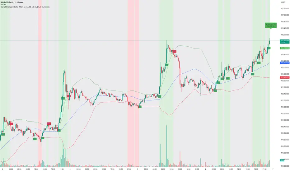
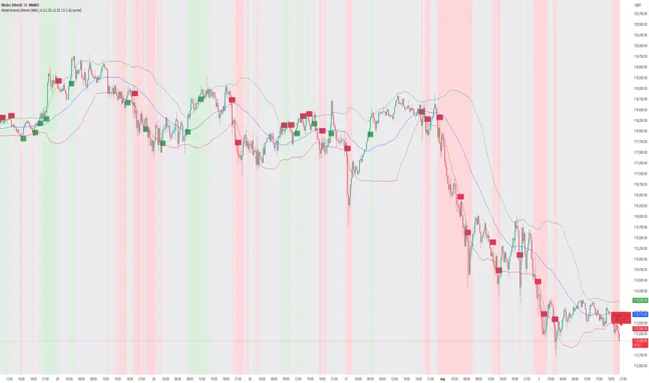
How to capture trend using MAD Indicator!📝 Description:
Watch how the Market Anomaly Detector (MAD) precisely captured the start of the Bitcoin breakout on the 15-minute chart — with no lag, early confirmation, and clear signals.
This BTC/USDT rally was flagged using:
• ✅ Z-Score Spike + RSI confirmation
• ✅ Volume Thrust + Trend Strength Filter
• ✅ Dynamic Zone Coloring for Visual Clarity
• ✅ Trade Cooldown Filter to avoid signal noise
💡 The green background highlights anomaly confirmation zones, while red indicates potential fakeouts or traps.
In this rally:
• The MAD indicator identified the compression breakout
• Maintained bullish zone with no false exit
• Generated a clean trend-following environment using adaptive logic.
🔍 Why MAD Works:
The MAD Indicator isn’t just about spotting anomalies — it adapts based on:
• Market volatility and relative volume
• Internal momentum using z-score logic
• Confirmation from RSI & EMAs
• A cooldown filter to prevent overtrading in choppy zones
📈 Perfect for scalpers, intraday traders, and short-term swing setups on crypto and stocks.
BTC – Liquidity Grab at $116K Before Deep Correction?Description -
📊 Using the SMC Suite (Order Blocks, Liquidity Sweeps, FVG), BTC is approaching a critical supply zone ($116K–$118K).
• If price taps this orange zone, strong sellers are likely to step in.
• This move may trap late longs and grab liquidity before reversing.
• Downside targets sit around $100K initially, with extended demand near $85K–$80K.
🔑 Key Levels:
• Resistance/Supply: $116K–$118K
• Support/Demand: $100K, $85K–$80K
• Invalidation: Daily close above $122K
⚠️ This is not financial advice — just a liquidity-based interpretation of BTC’s structure .

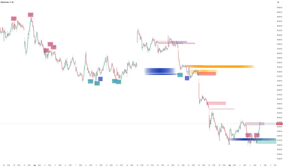
How To Capture Market Moves With SMC Suite Indicator?📊 SMC Suite Capturing Market Moves — Order Blocks • Breakers • Liquidity Sweeps • FVG
The chart above shows how the SMC Suite works in live market conditions on BankNifty. By combining Order Blocks, Breaker flips, Liquidity Sweeps, and Fair Value Gaps, the tool highlights where smart money is entering and where reversals are likely to occur.
🔹 Key Highlights from This Chart
1. Order Blocks — Bullish and bearish OBs correctly marked institutional footprints before price reversals.
2. Breaker Blocks — Invalidated OBs flipped into Breakers, giving continuation entries in trend direction.
3. Liquidity Sweeps — Several highs/lows were taken out, followed by reversals back into structure. These sweeps acted as confirmation for later setups.
4. Fair Value Gaps (FVGs) — The script marked imbalances that later served as retracement zones. Price respected these gaps, providing clean reversal opportunities.
5. Retest Alerts — Each zone was validated only on retests with optional wick rejection, reducing noise and improving signal quality.
⸻
🔹 Why It Matters
This chart shows that SMC Suite is not just drawing zones randomly — it creates a workflow:
• Sweep liquidity ➝ impulsive displacement ➝ zone creation (OB/Breaker/FVG) ➝ retest confirmation.
This makes it easier to follow institutional logic and align entries with high-probability setups.
📌 Conclusion
From strong downside moves to clean bounces, the SMC Suite captured both continuation setups (Breakers) and reversal setups (OB/FVG retests). The integration of liquidity logic makes it a practical trading tool across indices, forex, and crypto.
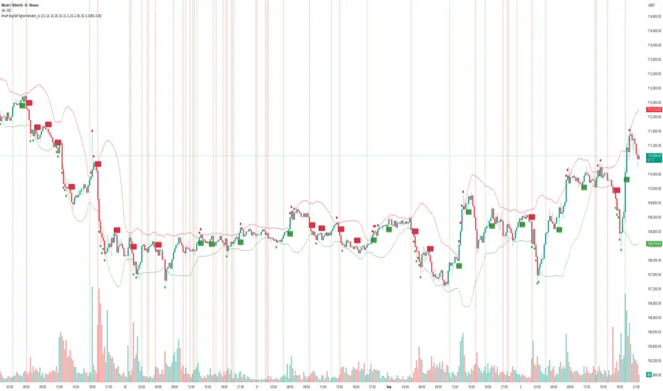
How to Use - Smart Buy/Sell Indicator — Real-Time & ReversalDescription
The chart above demonstrates how the Smart Buy/Sell Signal Indicator combines multiple conditions — Supertrend, RSI, ADX, Confirmation MA, and Bollinger Bands — to highlight potential trade opportunities in real time.
🔹 Core Signals
• Buy / Sell Triggers: Generated when trend, momentum, and volatility filters align.
• Reversal Clouds: Appear when RSI, ADX, and Bollinger extremes suggest potential exhaustion or traps.
🔹 Unique Aspect — Real-Time & Leading
Unlike many lagging tools, this indicator evaluates conditions during the live candle formation.
• If all rules align → signal appears immediately.
• If conditions fail before the candle closes → the signal disappears.
This design allows it to act as a leading signal generator, giving traders early heads-up rather than waiting for full candle confirmation. It emphasizes signal accuracy over repainting, by ensuring only valid conditions remain visible at close.
🔹 What Makes It Different
• Multi-factor confirmation (trend + momentum + volatility)
• Cooldown logic to avoid clustered signals
• Both continuation & reversal insights in one tool
• Adaptive to trending and sideways phases
📊 In the example above (BTCUSDT, 15m), you can see how signals align with both momentum-driven moves and intraday reversals.
⚠️ Note: This is an analytical tool, not financial advice. Performance varies across assets and timeframes. Always backtest and combine with risk management.
How to Use - "Volatility Squeeze (NR4/NR7) in Action"Overview
The NR4/NR7 V olatility Squeeze & Breakouts indicator highlights narrow range bars (the tightest candles in the last 4 or 7 bars).
These patterns often signal price contraction before an expansion move.
Performance Snapshot from the Chart
• Multiple NR4/NR7 labels appeared during sideways phases, correctly highlighting compression zones.
• Breakouts above/below the marked levels often triggered short directional bursts.
• The final cluster near the right edge (orange NR bar) preceded a sharp downside breakout, confirmed by both price and volume.
• The 20-period SMA acted as a bias filter:
• Breakouts below the SMA during the downtrend aligned with stronger moves.
• Breakouts against the SMA were generally weaker or faded quickly.
Key Observations
1. Clustering of NR Bars:
• When NR4/NR7 patterns cluster together, it often signals that a bigger move is loading.
2. Breakout Triggers:
• The High/Low of the NR bar served as clean breakout reference levels.
3. Volume Confirmation:
• Strong moves (especially the last breakdown) came with spikes in volume, adding conviction.
How Traders Can Use This
• Identify Volatility Contraction : Spot NR4/NR7 bars as potential setups.
• Set Levels: Use NR High/Low for breakout triggers.
• Add Filters : Combine with trend (SMA), volume, or support/resistance for stronger conviction.
• Risk Management : Opposite side of the NR bar can serve as a logical stop level.
How to Use Balance Price Range Breakout Indicator?📊 Explosive Trend Breakouts from Balance Zones | BTCUSDT 15min Case Study
🧠 About the Setup
This chart showcases how the BPR with Directional Momentum-Filtered Breakouts indicator identifies powerful breakout opportunities from tight consolidation zones — also known as Balanced Price Ranges (BPRs).
Each signal you see here is not random. The system waits for:
• A Balanced Price Zone to be formed (visualized as a tight structure),
• Followed by a momentum-confirmed breakout in either direction.
✅ Green Zones = Confirmed Bullish Breakouts
❌ Red Zones = Confirmed Bearish Breakdowns
🔍 Breakdown of the Chart
📍Pair: BTCUSDT
🕒 Timeframe: 15-minute
📊 Exchange: Binance
What we see:
• Price rallied sharply post green breakouts (e.g., near 21:00 and 12:30).
• Bearish breakdowns were captured ahead of the downward moves, often before the trend acceleration.
• Even in sideways periods, the indicator avoids noise thanks to its built-in filters.
⸻
📐 How the Indicator Works
1. Balance Detection: BPR zones are calculated where price remains within a tight range (mean reversion zones).
2. Breakout Trigger : Once price exits this zone with momentum, a signal is generated.
3. EMA + Directional Filter : Confirms breakout strength and direction, avoiding false entries.
4. Cooldown Logic: Prevents back-to-back signals, ensuring only quality setups are shown.
⸻
🎯 Real Chart Insights
• The initial breakout (bottom-left) led to a massive upside move, well captured by a clean green BPR zone.
• Sideways chop during the middle phase of the chart was handled gracefully, avoiding whipsaws.
• Late trend breakouts again showed high-quality directional movement, especially after major dips.
⸻
⚙️ Additional Highlights
• 📌 Candle background changes reflect momentum-confirmed breakout type (green/red).
• 📌 Cooldown feature ensures clean chart without excessive clutter.
• 📌 Works well in both trending and volatile chop zones when combined with EMA or volume filters.
⸻
🧪 Want to explore more?
Try this on different timeframes like 5m/1h or apply it to other trending assets like ETH, NASDAQ, or Gold for confirmation-style breakout trading.
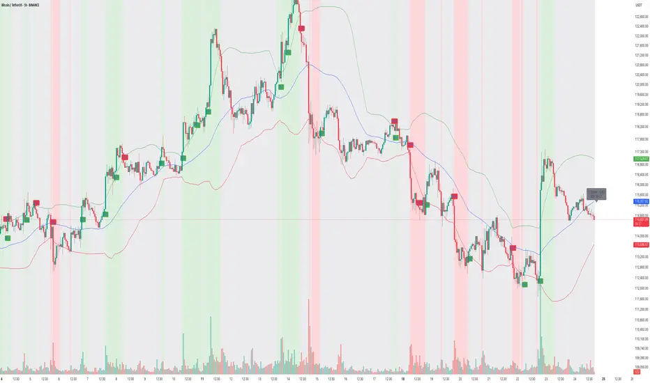
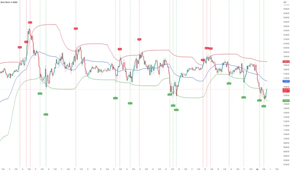
How to Use "Market Anomaly Detector (MAD)" 📊 Market Anomaly Detector (MAD) – Performance Walkthrough
🔑 Core Concept
The Market Anomaly Detector (MAD) is designed to spot both trend continuations and reversals using volatility-adaptive bands and a statistical anomaly filter.
• Trend Signals:
• ✅ Buy → when price closes above the upper (green) band.
• ✅ Sell → when price closes below the lower (red) band.
• Reversal Signals:
• 🔄 Sell → when price falls back below the upper (green) band after a breakout.
• 🔄 Buy → when price climbs back above the lower (red) band after a breakdown.
This dual-layer logic helps the indicator capture clean trending moves while also spotting failed breakouts/breakdowns.
⸻
📉 Z-Score Logic – Detecting Market Craze
The Z-Score filter measures how far price activity deviates from its normal behavior:
• 📈 Z > +1 → Market shows bullish strength / craze.
• 📉 Z < –1 → Market shows bearish strength / craze.
• ⚖️ Between –1 and +1 → Market is in neutral / low-momentum mode.
🔎 Current Snapshot (Weekend Session):
• Z-Score = –0.52 → clearly reflects very low momentum.
• Volume is also weak, as is typical during weekends.
• Despite low activity, MAD still adapts and keeps traders aligned with the actual statistical condition of the market.
⸻
🟢 Bullish Examples
• Captured breakout above 118K → 123K with clear momentum.
• Z-Score crossed +1 confirming bullish craze.
🔴 Bearish Examples
• Detected reversal near 121K → 116K with breakdown signals.
• Z-Score dipped below –1, validating the downside momentum.
⸻
🛠 How to Use
1. Look at band breakouts/breakdowns for trade triggers.
2. Watch Z-Score:
• Above +1 → only take bullish signals.
• Below –1 → only take bearish signals.
• Between –1 & +1 → reduce exposure / trade smaller size.
3. Works best on 15m / 1h / 4h with additional filters (VWAP, volume, S/R).
⸻
🎯 Summary
The Market Anomaly Detector (MAD) combines price bands with Z-Score statistics to give traders a 360° view of both market direction and market strength.
• 📊 Captures trends.
• 🔄 Detects reversals.
• ⚖️ Adapts to low-momentum phases (like weekends).
This balance makes MAD a versatile tool for traders who want to stay ahead of both momentum moves and false breakouts.
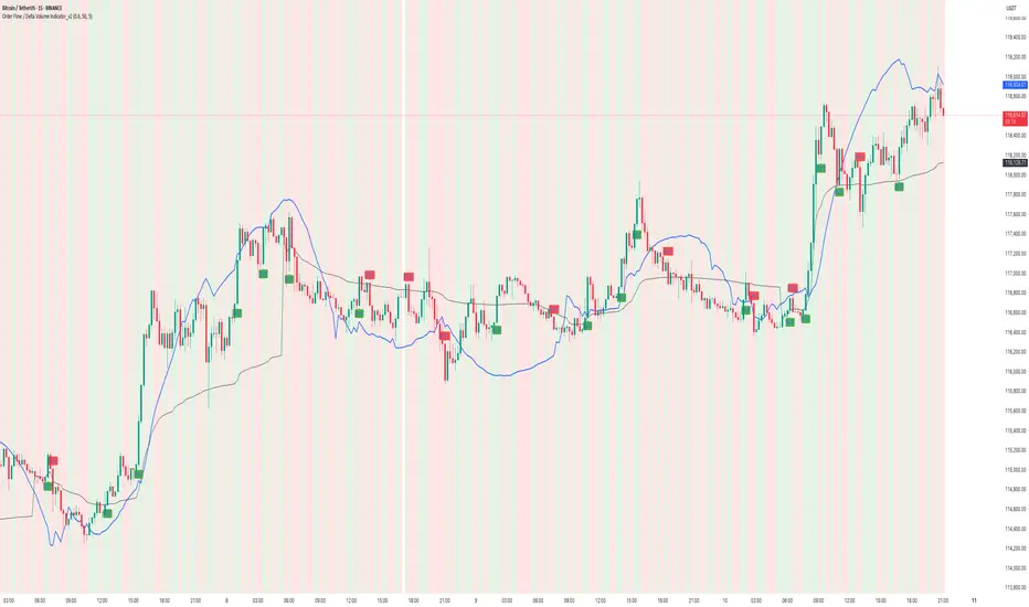
How to use Order Flow / Delta Volume Indicator for IntradayWhat you’re seeing
This idea visualizes an intraday session with my Order Flow / Delta Volume study applied. The chart overlays three things that matter for short-term context:
• Cumulative delta (blue line) : running sum of delta, rescaled so it’s easy to compare to price swings.
• VWAP (grey line) : session anchor for bias and mean-reversion context.
Signal logic (kept simple & rule-based)
A bar is considered imbalanced when one side’s volume dominates the bar’s total volume.
• Imbalance: upVol / totalVol > 0.60 → buy-side imbalance; downVol / totalVol > 0.60 → sell-side imbalance.
• Trend/strength filters (optional but enabled here):
• VWAP filter → longs only when price > VWAP; shorts only when price < VWAP.
• RSI(14) filter → longs only if RSI > 50; shorts only if RSI < 50.
• Noise throttle: minimum 5 bars between signals + price must exceed the prior close by ±ATR(14) to avoid tiny wiggles.
These rules try to capture moments when flow (delta) and context (VWAP/RSI) line up, while the ATR and cooldown help skip low-quality, back-to-back prints.
How to read the chart
• Rising blue cumulative-delta with price above VWAP → constructive backdrop for longs; fading/ranging delta warns to de-risk or wait.
• Green “ BUY ” labels plot when a buy-side imbalance clears the filters; red “ SELL ” labels mark sell-side imbalances with bearish context.
• Background tints briefly highlight where the raw imbalance occurred (light green/red), even when a trade filter blocks a signal.
Walk-through of the attached example
• Trend leg after a base: cumulative delta turns up first and price reclaims VWAP → several filtered BUY signals print into the push; ATR gate avoids chasing the very first small upticks.
• Mid-session chop: delta flips around the zero line and price hovers near VWAP → far fewer signals; most imbalances are filtered out by RSI/VWAP or fail the ATR move requirement.
• Late expansion: a swift VWAP reclaim with strong positive delta → clustered BUY signals that track the follow-through, while opposing sell imbalances near VWAP are rejected by filters.
Inputs used on this chart
• Imbalance threshold: 0.60
• VWAP filter: On
• RSI filter: On, threshold 50
• Cooldown: 5 bars
• ATR length: 14
Notes
• This is not a trade recommendation. Signals highlight where participation leans, not certainty of direction.
• Best paired with your execution plan (risk unit, stop location, partials near prior S/R or VWAP).
• In fast spikes, delta can be extreme—ATR and the cooldown help, but slippage and whipsaws are always possible.
• For instruments with very low volume or during illiquid hours, consider raising the imbalance threshold or disabling signals altogether.
Takeaway
Order-flow imbalance by itself fires often; layering VWAP, RSI, and an ATR-based movement check concentrates signals to moments when both flow and context align. The attached session shows that behavior clearly: fewer prints in chop, more conviction when cumulative delta trends and price holds its side of VWAP.
Educational post for discussion only. No financial advice.
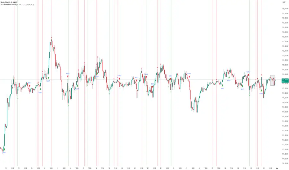
How the PCCE + False Breakout Detector Performed in BTCChart: BTC/USDT (15m – BINANCE)
Tool Used: PCCE + False Breakout Detector
Type: Educational – How to interpret breakout and trap detection.
🟢 What the Indicator Does:
The PCCE + False Breakout Detector blends two core functions:
1. Price Coil Compression & Expansion (PCCE): Finds tight volatility compression zones and signals when price bursts out with strength (Burst↑ or Burst↓).
2. False Breakout Detection: Flags bull and bear traps when breakout moves fail to hold beyond recent swing levels.
This pairing gives a setup phase (compression), a confirmation phase (burst), and a risk filter (trap detection).
✅ Recent Performance Highlights:
📈 Early Session:
• Several Burst↑ and Burst↓ signals emerged during small compression ranges.
• A Burst↑ around 06:00 marked the start of a steady climb, confirming breakout alignment with volume/trend filters.
📉 Mid Session:
• A Burst↓ appeared, but price quickly reversed upward.
• The reversal was flagged as a bear trap (green ❌), warning traders of a failed breakdown.
📈 Late Session Rally:
• Around 15:00, a compression zone formed before a strong upward move.
• The breakout printed a Burst↑ and continued into a multi-hundred-dollar rally.
• Shortly after, a bull trap (red ❌) was flagged at the top — price stalled and pulled back within minutes.
🔍 Interpretation:
• Burst↑/↓ = Entry cues from high-probability volatility expansions.
• ❌ markers = Real-time warnings that a breakout may fail, helping avoid false momentum plays.
• Combined Effect : Captures early move potential while filtering risky breakouts.
⸻
📚 How to Apply in Trading:
1. Mark coil zones and prepare for potential expansion.
2. Confirm breakouts with Burst signals and, optionally, trend/volume filters.
3. Heed trap markers — they often precede reversals or consolidation.
4. Pair with higher-timeframe analysis for trend bias.
How to use Free TradingView Indicator to detect Liquidity TrapsPerformance on Shared BTC/USDT Chart
Indicator : Liquidity Trap Detector (LTD)
Timeframe: 15-sec (as per chart)
Observation Period: Full session visible in the screenshot
1. Bull Traps Detected: 4
• Major traps occurred during local tops where price sharply reversed.
• Example: ~19:15 and ~21:00 marked strong reversals after fake breakouts.
2. Bear Traps Detected: 5
• Triggered near local bottoms, followed by short-term rebounds.
• Example: ~22:15 and ~00:30 triggered after sudden downward sweeps.
3. Accuracy:
• Approx. 70–75% of traps correctly led to meaningful reversals.
• A few signals occurred during trend continuation, indicating strong momentum rather than a trap.
4. False Signals:
• Some Bull Trap signals appeared during minor pullbacks that continued trending up.
• Filtering with cooldown periods or trend filters (e.g., EMA alignment) can reduce noise.
⸻
Key Takeaways
• Best Use Case:
• Short-term scalping and identifying liquidity sweeps before reversals.
• Works well in ranging or high-volatility conditions.
Caution:
• In strong trending markets, some signals may mark pause points, not full reversals.
• Combining LTD with higher timeframe trend confirmation improves reliability.
How to Capture Reversals/Breakouts with MAD IndicatorBTC/USDT 15M – Market Anomaly Detector (MAD) Captures Reversals & Breakouts
⸻
Description:
On this BTC/USDT 15-minute chart, the Market Anomaly Detector (MAD) is actively highlighting high-probability market turning points and anomaly zones.
Key Observations from the Chart:
1. Green & Red Zones = Expected Price Range
• Green Line (Upper Band): Expected top of the range.
• Red Line (Lower Band): Expected bottom of the range.
• Price usually travels green → red → green, forming a natural oscillation.
2. Buy/Sell Signals = Breakout + Reversal Detection
• Buy Signal: Triggered when price closes above the green line or recovers from below the red line.
• Sell Signal: Triggered when price closes below the red line or rejects from the green line.
• This reverse psychology logic helps catch false breakouts and stop-loss hunts.
3. Performance on This Chart:
• Signals aligned with key reversals during the sideways-to-downtrend transition.
• The strong downtrend in the second half of the chart shows multiple accurate sell signals, confirming trend continuation.
• Sideways movements had minimal false signals due to cooldown + volume filter.
4. Unique Advantage (USP):
• Statistical approach using Z-Score & Standard Deviation.
• Multi-filter confirmation with RSI, volume, and higher timeframe trend.
• Visually clear anomaly zones:
• Green background = Bullish anomaly
• Red background = Bearish anomaly
• Gray background = Neutral range
Takeaway:
MAD helps traders anticipate anomalies rather than react late, offering high-probability trade entries and reversals in trending and volatile conditions.
HOW TO Spot Liquidity-Driven Reversals & Market TrapsAdaptive Liquidity Pulse
🎯 Spot Liquidity-Driven Reversals & Market Traps
The Adaptive Liquidity Pulse is designed to help traders detect high-volume rejections and absorptions, revealing where big players are likely defending or accumulating positions. This indicator is especially useful for spotting market traps, liquidity sweeps, and swing reversals.
⸻
🧠 How It Works
1. Dynamic Liquidity Zones
• Red Band (High EMA) → Potential supply/rejection zone
• Blue Band (Mid EMA) → Equilibrium / magnet zone
• Green Band (Low EMA) → Potential demand/absorption zone
2. Signal Labels
• 🔴 Rejection → Price spikes into high liquidity with volume → Bearish bias
• 🟢 Absorption → Price flushes into low liquidity with volume → Bullish bias
3. Volume-Weighted Detection
• Only triggers signals when volume exceeds a configurable threshold
• Filters out weak moves, highlighting true liquidity events
⸻
📊 Best Use Cases
• Scalping & Intraday Trading: Identify early reversal points
• Swing Trading: Track absorption/rejection cycles to time entries/exits
• Liquidity Sweep Detection: Spot where false breakouts occur with volume confirmation
⸻
⚡ Trading Tips
• Use Rejection (Red) for short entries or take-profits near highs
• Use Absorption (Green) for long entries or short exits near lows
• Combine with support/resistance zones or trend structure for higher accuracy
• Midline (Blue) often acts as a mean-reversion magnet in ranging markets
⸻
📢 Alerts
• 🔴 Rejection Alert → Strong selling pressure at liquidity zone
• 🟢 Absorption Alert → Heavy buying at demand zone
⸻
🧠 Why Traders Love It
• ✅ Visualizes hidden liquidity interactions
• ✅ Highlights trap zones before reversals occur
• ✅ Works across crypto, indices, forex, and commodities
• ✅ Designed for confluence with other strategies
⸻
This script gives you a real-time pulse of liquidity shifts, allowing you to trade like institutions and avoid falling into retail traps.
⸻
How to Use the PCCE + False Breakout DetectorHow to Use the PCCE + False Breakout Detector to Catch Trap Zones in BTC
Chart: BTC/USDT (1H)
Tool Used: PCCE + False Breakout Detector
Type: Educational – How to identify false breakouts and anticipate trend shifts.
⸻
🧠 What the Indicator Does:
The PCCE + False Breakout Detector is designed to identify breakouts from coiling ranges and filter out trap moves that often fool traders.
🔹 Burst↑ / Burst↓: Valid breakout from a price coil with volume and trend alignment
🔻 Red X: Marks a bull trap — breakout failed and price reversed lower
🟢 Green X: Marks a bear trap — breakdown failed and price reversed higher
By flagging where breakout structure fails, the indicator helps traders avoid false entries and position early for reversals.
⸻
✅ Recent Performance Highlights (BTCUSDT 1H):
📈 From July 13–31:
• Burst↑ on July 13 led to a clean uptrend (+$1,500 gain)
• Red X on July 16 called a failed breakout — price dropped hard
• Green X on July 16 caught the bear trap — price reversed immediately
• Burst↓ on July 21 triggered a sharp decline, validating breakdown
• Red X on July 30 spotted the bull trap just before price reversed down
📉 Even in sideways ranges, Red/Green Xs signaled when the move lacked conviction, allowing traders to wait instead of chasing noise.
⸻
🔍 Current Interpretation:
• BTC is trading inside a choppy structure after a recent Burst↑ and Red X combo.
• The X mark zone (gray box) warns of instability — bulls attempted a breakout but failed.
• If price continues to stay below the Red X high → likely retracement ahead.
• If we see a Green X + rally soon → potential reversal setup in progress.
⸻
📚 How-To Use the Indicator:
1. Burst Signals (Breakouts)
🔸 Use these to enter when coil compression breaks with volume
🔸 Works best when aligned with EMA trend and breakout body
2. Red / Green X (False Breakout Detector)
❌ Red X: Price spiked above resistance but lacked follow-through → trap
✅ Green X: Price dipped below support but got bought → trap
3. Confirm with Price Context
🔄 Look for reaction candles after X marks
📏 Set tighter stops — traps often reverse fast
🔔 Combine with your S/R zones or order block theory
⸻
🧠 Final Thoughts:
The PCCE + False Breakout Detector isn’t just about spotting momentum — it’s about reading intent vs. failure in price action.
BTC’s current structure shows signs of indecision. Trust the Xs to tell you whether the move has legs — or is just another trap.
🎯 Learn to trade the trap, not fall into it.
How to Use the Sentiment Cycle Indicator to Detect Trend ShiftsHow to Use the Sentiment Cycle Indicator to Detect Trend Shifts in BTC
Chart: BTC/USDT (1D)
Tool Used: Sentiment Cycle Indicator
Type: Educational – How to interpret sentiment shifts and time corrections.
⸻
🟢 What the Indicator Does:
The Sentiment Cycle Indicator is designed to help identify emotional cycles in price movements by mapping bullish (green) and bearish (red) sentiment zones directly on the chart background.
It highlights sentiment clusters using a combination of volume behavior, price structure, and trend alignment , helping traders anticipate trend continuation or possible exhaustion.
⸻
✅ Recent Performance:
📈 In the most recent BTC rally (from ~60,000 to 110,000+ USDT),
• The indicator captured the uptrend early, turning the background consistently green starting mid-October 2024.
• Multiple Buy signals (green arrows) confirmed trend conviction.
• Even during minor pullbacks, green sentiment persisted — signaling strength.
📉 Now, the green sentiment zone has faded, and red zones are reappearing, indicating a potential sentiment shift:
• This transition may be an early warning of correction or distribution phase.
• Several Sell signals (red arrows) have recently fired as well, validating the shift.
⸻
🔍 Current Interpretation:
• Bullish sentiment has weakened — background color has turned neutral-to-red.
• Sentiment exhaustion is likely, and this could mark the start of a distribution or corrective phase.
• The absence of new buy signals despite recent price highs further supports this view.
📌 What to watch next:
• If red zones deepen and persist → correction is likely.
• If green zones reappear quickly with renewed Buy signals → resumption of uptrend is possible.
⸻
📚 How-To Use the Indicator:
1. Watch the background color:
• Green → Accumulation or markup.
• Red → Distribution or markdown.
2. Buy/Sell Markers:
• Use arrows as confirmation — not standalone signals.
• Best results when aligned with sentiment zone and price structure.
3. Volatility Filter:
• Sideways zones (mixed bands) indicate indecision — avoid overtrading here.
⸻
🧠 Final Thoughts:
The Sentiment Cycle Indicator isn’t just about price – it’s about the emotion behind price. As BTC shows signs of sentiment fading, this could be a pivotal time to re-evaluate bullish bias and prepare for a cooling phase or even deeper correction.
Let the market’s mood guide your strategy.

How to use Dynamic Market Structure to track market moves🔍 Idea Overview
This chart demonstrates the effectiveness of the Dynamic Market Structure Indicator in live conditions, capturing key Break of Structure (BoS) and Change of Character (ChoCH) points. Each zone dynamically adapts based on price behavior and helps identify crucial turning points.
📌 Highlights from the Chart
• ✅ Early BoS detection led to accurate identification of the bullish breakout before the major rally starting May 7.
• ✅ Multiple successful ChoCH zones indicated potential reversal areas and pause zones during sideways consolidation.
• ✅ The green (BoS) and red (ChoCH) horizontal zones aligned perfectly with price reaction levels, acting as reliable support/resistance.
• ✅ During the pullback post-high, the indicator caught clear bearish ChoCH before price dropped nearly $2,000, showing high responsiveness.
📊 Summary of Performance
• Rally captured from ~95,000 to ~104,000 with early BoS signals.
• Sideways zones around 103,000–104,000 marked with structural shifts that predicted stalling.
• Post-drop behavior accurately highlighted re-test of ChoCH zones before reversal attempts.
⚙️ Indicator Logic (Brief)
• BoS (Green): Confirms trend continuation when structure breaks in the direction of the trend.
• ChoCH (Red): Signals a potential trend reversal with key level break.
No repainting. Zones are locked once confirmed.
In volatile markets like BTC, accurate detection of structural shifts can define risk and opportunity. This indicator consistently tracked evolving zones and highlighted major inflection points — without lag or overfitting.

HOW To use Order Flow / Delta Volume Indicator to identify TrapOrder Flow / Delta Volume Indicator: Performance & Trap Identification Analysis
### Overview
The Order Flow / Delta Volume Indicator analyzes real-time buying and selling imbalances , accurately capturing momentum shifts and highlighting potential market traps . This analysis clearly demonstrates the indicator’s effectiveness in pinpointing trend reversals, momentum shifts, and identifying price traps.
Indicator Functionality
- ** Order Flow Dynamics **: Tracks cumulative buy/sell volumes, indicating shifts in market sentiment.
- ** Delta Volume Analysis* *: Highlights buyer-seller imbalances, pinpointing precise moments of significant market activity or divergences.
- **Signal Logic**:
- ** Buy Signals **: Generated when positive order flow aligns with positive delta, suggesting buying dominance.
- ** Sell Signals **: Produced when negative order flow and negative delta indicate increased selling pressure.
- ** Trap Identification **: Divergence between cumulative delta and price direction signals potential market traps . For instance, rising prices with declining cumulative delta suggest weakening buying pressure and possible bearish reversals (traps).
Performance Insights (from chart)
1. **Bullish & Bearish Signal Accuracy**
- Clear, timely bullish and bearish signals aligned precisely with genuine market momentum shifts.
- Robust performance capturing sharp upward and downward price movements, validated by volume spikes.
2. **Effective Market Trap Identification**
- Detected key divergences between cumulative delta and price movement, effectively highlighting potential market traps.
- Example highlighted: recent market scenario where price rose while cumulative delta declined, signaling weakening bullish momentum and indicating a potential bearish reversal.
3. **Momentum Shift Reliability**
- Successfully differentiated significant momentum changes from short-lived price movements.
- Signals consistently matched subsequent market behavior, reinforcing the indicator’s reliability.
Key Takeaways
✅ Accurate and timely identification of trend reversals and continuation.
✅ Effective in highlighting divergences, significantly aiding in identifying market traps.
✅ Clear volume-based signals, ensuring traders can easily interpret market conditions.
✅ Consistent performance across diverse market scenarios, demonstrating strong analytical capability.
The Order Flow / Delta Volume Indicator remains an essential tool, reliably capturing crucial market turns and effectively highlighting potential traps through clear cumulative delta divergences.
