EURUSD: Updated Support and Resistance Analysis 🇪🇺🇺🇸
Here is my latest structure analysis, important supports
and resistances for EURUSD for next week.
Consider these structures for pullback/breakout trading.
❤️Please, support my work with like, thank you!❤️
I am part of Trade Nation's Influencer program and receive a monthly fee for using their TradingView charts in my analysis.
Trading

TESLA Technical Analysis! BUY!
My dear friends,
Please, find my technical outlook for TESLA below:
The price is coiling around a solid key level - 404.39
Bias - Bullish
Technical Indicators: Pivot Points Low anticipates a potential price reversal.
Super trend shows a clear buy, giving a perfect indicators' convergence.
Goal - 426.96
About Used Indicators:
The pivot point itself is simply the average of the high, low and closing prices from the previous trading day.
Disclosure: I am part of Trade Nation's Influencer program and receive a monthly fee for using their TradingView charts in my analysis.
———————————
WISH YOU ALL LUCK

SPY Expected Growth! BUY!
My dear friends,
Please, find my technical outlook for SPY below:
The instrument tests an important psychological level -671.95
Bias - Bullish
Technical Indicators: Supper Trend gives a precise Bullish signal, while Pivot Point HL predicts price changes and potential reversals in the market.
Target - 677.89
Recommended Stop Loss - 668.53
About Used Indicators:
Super-trend indicator is more useful in trending markets where there are clear uptrends and downtrends in price.
Disclosure: I am part of Trade Nation's Influencer program and receive a monthly fee for using their TradingView charts in my analysis.
———————————
WISH YOU ALL LUCK

SILVER Trading Opportunity! BUY!
My dear subscribers,
My technical analysis for SILVER is below:
The price is coiling around a solid key level - 50.560
Bias - Bullish
Technical Indicators: Pivot Points Low anticipates a potential price reversal.
Super trend shows a clear buy, giving a perfect indicators' convergence.
Goal - 51.903
My Stop Loss - 49.919
About Used Indicators:
By the very nature of the supertrend indicator, it offers firm support and resistance levels for traders to enter and exit trades. Additionally, it also provides signals for setting stop losses
Disclosure: I am part of Trade Nation's Influencer program and receive a monthly fee for using their TradingView charts in my analysis.
———————————
WISH YOU ALL LUCK

USDJPY Analysis - Bullish Outlook The price is currently in a clear uptrend on the 1H timeframe, and the daily timeframe also supports bullish momentum. After breaking structure on the 1H chart, price pushed down to collect sell-side liquidity, and once that liquidity was taken, we saw a strong impulsive move to the upside.
Right now, price has moved back above the range and has formed a clean Imbalanced Fair Value Gap (IFVG). This IFVG sits in a highly important price zone that I’m watching for potential long setups.
🔵 IFVG Buy Zone:
154.14 – 154.23
This zone aligns perfectly with the 50% Fibonacci retracement, which adds even more confluence.
My plan:
If price returns to this IFVG zone, I will drop to the 5-minute timeframe. If we get a 5M Change of Character (ChoCH) inside this zone, it will be a high-probability confirmation for a long position with expectations of making a new higher high on USDJPY.
🎯 Next Target:
155.43

USDJPY Will Move Lower! Short!
Take a look at our analysis for USDJPY.
Time Frame: 1D
Current Trend: Bearish
Sentiment: Overbought (based on 7-period RSI)
Forecast: Bearish
The market is approaching a key horizontal level 154.543.
Considering the today's price action, probabilities will be high to see a movement to 151.281.
P.S
The term oversold refers to a condition where an asset has traded lower in price and has the potential for a price bounce.
Overbought refers to market scenarios where the instrument is traded considerably higher than its fair value. Overvaluation is caused by market sentiments when there is positive news.
Like and subscribe and comment my ideas if you enjoy them!

USDCHF Is Bullish! Long!
Please, check our technical outlook for USDCHF.
Time Frame: 1D
Current Trend: Bullish
Sentiment: Oversold (based on 7-period RSI)
Forecast: Bullish
The market is approaching a significant support area 0.793.
The underlined horizontal cluster clearly indicates a highly probable bullish movement with target 0.802 level.
P.S
We determine oversold/overbought condition with RSI indicator.
When it drops below 30 - the market is considered to be oversold.
When it bounces above 70 - the market is considered to be overbought.
Like and subscribe and comment my ideas if you enjoy them!

TSLA BULLISH BIAS RIGHT NOW| LONG
TSLA SIGNAL
Trade Direction: short
Entry Level: 404.30
Target Level: 433.84
Stop Loss: 384.55
RISK PROFILE
Risk level: medium
Suggested risk: 1%
Timeframe: 5h
Disclosure: I am part of Trade Nation's Influencer program and receive a monthly fee for using their TradingView charts in my analysis.
✅LIKE AND COMMENT MY IDEAS✅

AUD/JPY BEST PLACE TO SELL FROM|SHORT
Hello, Friends!
AUD/JPY pair is trading in a local uptrend which we know by looking at the previous 1W candle which is green. On the 1D timeframe the pair is going up too. The pair is overbought because the price is close to the upper band of the BB indicator. So we are looking to sell the pair with the upper BB line acting as resistance. The next target is 99.105 area.
Disclosure: I am part of Trade Nation's Influencer program and receive a monthly fee for using their TradingView charts in my analysis.
✅LIKE AND COMMENT MY IDEAS✅

The Market Is Loading Up for a Breakout… Here’s the Exact TargetUltra-Detailed Professional Analysis
Based on the visible structure, the chart is showing signs of a local exhaustion of bearish momentum and the early formation of a bullish reversal structure. Here is the full breakdown:
---
1. Market Structure Shift (MSS)
The price has been in a continuous downtrend, making lower highs and lower lows. However, in the most recent area (where you drew the black diagonal line), the slope of the lows is starting to flatten.
This flattening implies:
Bearish pressure is weakening
Selling is no longer accelerating
Buyers are starting to absorb liquidity at the lows
This is typically the earliest sign of a possible market structure shift.
---
2. Bullish Divergence Signatures
Even though your screenshot doesn’t show indicators, the shape of the price movement suggests a classic divergence setup:
Price is making equal lows or slightly lower lows
Momentum is decreasing (suggested by slowing downward volatility)
This often precedes a short-term bullish push into nearby resistance zones.
---
3. Liquidity Mapping
The clustered price action under the descending structure suggests the market is:
Gathering sell-side liquidity beneath the recent lows
Preparing to use that liquidity for a stop-run and reversal
The red arrow you drew aligns with a typical liquidity-based move:
break out of the diagonal, collect stops, then push upward into a liquidity pocket.
---
4. Imbalance (Fair Value Gap) Above Price
The chart shows a noticeable price void / imbalance above the current level.
Markets often retrace to fill these inefficiencies.
The blue line at the tip of your arrow sits right inside this imbalance zone, making it a high-probability magnet for price.
---
5. Supply & Demand Mapping
You have several purple zones drawn above — these appear to be:
Old supply clusters, created during previous sell-offs
Untested levels, meaning price hasn’t fully revisited them yet
Markets often return to untested supply/demand zones due to:
Algorithmic targeting
Liquidity replenishment
Market maker rebalancing
Your blue level aligns with this higher-timeframe supply magnet.
---
6. Break of the Micro-Downtrend Line
The black diagonal line you drew marks the local bearish control zone.
A breakout above this line often triggers:
Short covering
Breakout buying
Acceleration into the next liquidity pool (your blue line)
The chart suggests the market is coiling beneath this line, indicating a possible compression → expansion move.
---
7. Volatility Compression Pattern
The price action in the last segment is contracting.
Compression almost always leads to explosive directional expansion.
Given:
A flat support base
Weakening bearish momentum
Clear imbalance above
…the higher probability expansion direction is upward.
---
Final Professional Summary
The reason the price is expected to move toward the blue line above the arrow is due to a confluence of bullish catalysts:
✔ Weakening bearish momentum
✔ Market structure flattening
✔ Liquidity buildup below & liquidity vacuum above
✔ Imbalance (FVG) acting as a price magnet
✔ Untested supply zones overhead
✔ Volatility compression preceding expansion
Together these create a high-probability short-term bullish corrective move toward the level marked in blue.
---
If you liked this analysis, leave a like and drop a comment to share your thoughts!

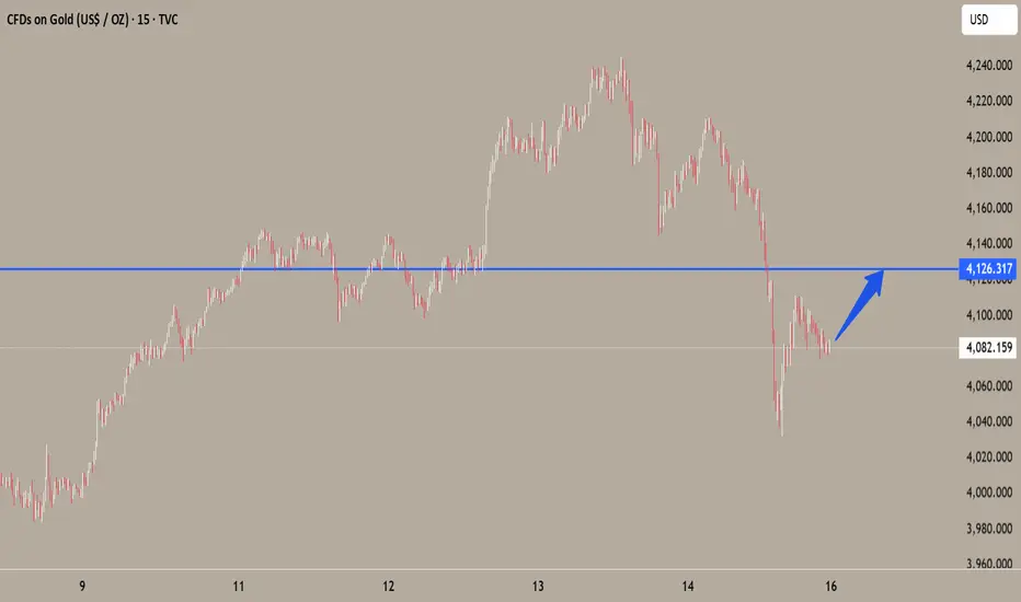
Gold’s Next Explosive Move: The Chart No One Is Talking About...Important assumption (stated clearly): I do not have the image of your exact chart or the numeric value of the blue-line target, so this analysis assumes the blue-line target is above today’s spot level and represents a meaningful resistance/target on the weekly/monthly timeframe. If your target is below current price the technical story flips — tell me the exact value or upload the chart and I’ll adapt.
---
Executive summary — the short thesis
Gold’s move toward the blue-line target is plausible because three mutually reinforcing themes are in play:
1. Macro tailwinds (inflation persistence + lower real rates expectation → higher gold demand),
2. Structural demand (central bank buying + ETF/institutional accumulation), and
3. Technical breakout dynamics (momentum, volume confirmation, and common extension targets).
Each theme alone can push price higher; together they create a high-probability path to the blue line — but risks (real yield rebounds, USD strength, rapid risk-on reversals) can abort or delay the move.
---
1) Macro and policy drivers (why gold wants to be higher)
Real interest rates are the single most important macro control on gold. Lower or falling real yields reduce the opportunity cost of holding non-yielding gold, improving gold’s appeal as an inflation hedge. Markets are pricing a path toward easier policy (or lower terminal rates) and that compresses real yields — a pro-gold environment.
Inflation expectations and uncertainty remain elevated. Where inflation expectations stay sticky, investors and treasuries use gold as insurance. If headline or core inflation surprises on the upside, that directly supports continued buying.
Geopolitical & risk-off shocks amplify the move. Any escalation in geopolitical risk (trade tensions, regional conflicts) increases safe-haven demand and often triggers large, fast price jumps.
(Load-bearing facts for this section: central bank buying, inflation drivers, Fed expectations — see cited institutional and market commentary.)
---
2) Structural demand and flows (why the rally can be sustained)
Central banks continue to add to reserves. Persistent, sizeable purchases by official buyers create a structural bid that is different from short-term spec flows — it’s long-dated accumulation. That reduces available supply for investors and supports higher levels over months/years.
ETF and institutional flows are material. Record or heavy inflows into gold ETFs and funds add persistent buying pressure; large inflows can sustain rallies beyond purely technical breakouts.
Retail and seasonal physical demand can reinforce rallies. Jewelry seasons and retail demand (Asia, Middle East) often coincide with price momentum, adding a final push toward technical targets.
---
3) Technical structure — how price actually gets to the blue line
(I’m speaking generically because I don’t have the exact chart; apply these to your time frame — weekly or daily — whichever your blue line sits on.)
Breakout + retest dynamic: If price has broken a multi-week/month resistance (or important swing high) and then retested it successfully with rising volume, the path to the next measured target (often a measured move or Fibonacci extension) becomes much more likely. Traders and algos use these confirmations to add size.
Momentum and moving-average alignment: A stack of moving averages (e.g., 50 crossing above 200 — a "golden cross" on longer timeframes) plus rising RSI and MACD momentum supports an extended impulse leg toward the blue-line.
Volume & open interest: Increasing cash/spot volume and rising futures open interest on advances indicates real participation (not just short covering). That structural participation reduces the chance of a quick reversal and helps sustain a push toward obvious targets like your blue line.
Common extension targets: Traders commonly use Fibonacci extensions (127–161.8%), prior range height projections, or measured moves from consolidation to set the “blue line” style targets. If the blue line aligns with one of these projections, it gains legitimacy as a target because many actors place orders there.
---
4) Market structure and supply-side constraints
Physical mine supply is relatively inelastic short term. Mines can’t quickly add meaningful tonnage, so when demand surges, price adjusts more than quantity. Capital spending and long lead times for new production create upward pressure if demand remains strong.
Scrap supply is cyclical and price-sensitive. As prices rise, scrap supply can increase, capping upside — but that often lags price moves, letting gold run first then supply grow later.
---
5) Alternative scenarios — what would stop it
Real yields rebound fast: A surprise hawkish central bank reaction or unexpectedly strong employment/inflation data could push real yields higher and crush the rally.
US dollar strength returns: A sharp USD rally would subtract from USD-priced gold and can stop a run toward the blue line.
Flow exhaustion / profit taking: If ETF flows stall and positioning becomes one-sided, a volatility spike could trigger a fast unwind.
---
6) Probability framing & tactical checklist (how I’d watch it as an analyst)
High-probability signals that validate the path to the blue line:
Spot > key resistance with a clean retest and higher-than-average volume.
Open interest in futures rising alongside price (not diverging).
Continued central bank purchases / ETF inflows reported weekly.
Macro path: market pricing of Fed easing or lower terminal rates, or at least declining real yields.
Warning flags: real yields spike > 50–75 bps, USD index sharply higher, or a sudden halt/ reversal in ETF flows.
---
Concrete near-term scenarios (example probability splits, adapt to your time frame)
Base case (45–55%): Macros stay supportive, technical breakout consolidates — price reaches the blue line over several weeks. (Most likely if volume and flows continue.)
Bull case (20–25%): Macro shock (big geopolitical event or accelerating inflation surprise) causes an overshoot beyond the blue line — fast, big move.
Bear / failed breakout (25–35%): Real yields rebound or flows reverse; price fails to sustain above resistance and falls back to prior support.
---
Practical phrasing you can post under the chart (English, professional + share CTA)
> Market-leading analysis (professional):
The blue-line target is a natural extension of the current multi-month breakout. Macro conditions — persistent inflation expectations, lower real yields priced by markets, and ongoing central-bank accumulation — create a structural bid. Technically, a confirmed breakout with rising volume and expanding open interest will propel price toward the blue line; Fibonacci and measured-move projections align with this target, increasing its credibility. Counter-risks are a rapid rebound in real yields or a stronger USD, which would likely stop or reverse the move. This is an analysis, not investment advice — monitor real yields, ETF flows and the breakout retest for live confirmation.
Like and comment — tell me your view and what time-frame you want me to focus on.
WIF/USDT - Fresh meme coin. Trading setup in chanal. Popular fresh meme coin – Dogwifhat
📊 CoinMarketCap Rank: #102
🐦 Twitter (X) : 152K followers
💬 Telegram : 50K members
✅ Highly liquid meme coin – traded on many major exchanges, including Binance.
After the hype phase , the coin is now declining along with the overall crypto market —no exceptions. Essentially, it broke below multiple channel supports , and the price is now sitting at the support of the outer channel.
I also notice a non-textbook Head & Shoulders pattern, which suggests a potential -64% breakdown . The last squeeze happened around this level.
Currently, we are seeing consolidation with increased volume , along with high-wick price action in this zone.
I've marked potential downside support zones as well as upside resistance targets on the chart. Consider this in your trading strategy!

BRIEFING Week #46 : Make or BreakHere's your weekly update ! Brought to you each weekend with years of track-record history..
Don't forget to hit the like/follow button if you feel like this post deserves it ;)
That's the best way to support me and help pushing this content to other users.
Kindly,
Phil

SPY FREE SIGNAL|SHORT|
✅SPY price rejects a major supply block after running buy-side liquidity, shifting intraday flow bearish. With displacement confirming downside intent, a draw toward the discount target zone is likely.
———————————
Entry: 671.95$
Stop Loss: 675.80$
Take Profit: 667.20$
Time Frame: 2H
———————————
SHORT🔥
✅Like and subscribe to never miss a new idea!✅

DXY LOCAL SHORT|
✅DXY rejects a premium-zone supply block, with intraday structure shifting bearish after collecting liquidity above recent highs. A drawdown toward the inefficiency below remains likely as momentum weakens. Time Frame 1H.
SHORT🔥
✅Like and subscribe to never miss a new idea!✅

CADCHF FREE SIGNAL|SHORT|
✅CADCHF price taps a clean supply block after an aggressive displacement lower, forming a premium-zone retracement ideal for continuation. Liquidity above minor highs has been harvested, favoring downside flow.
———————————
Entry: 0.56650
Stop Loss: 0.56740
Take Profit: 0.56480
Time Frame: 2H
———————————
SHORT🔥
✅Like and subscribe to never miss a new idea!✅

NZD-CHF Free Signals! Sell!
Hello,Traders!
NZDCHF taps into a clean horizontal supply after a displacement down, creating a corrective pullback into a premium zone where liquidity sits above minor highs. 3H setup favors continuation lower.
--------------------
Stop Loss: 0.45168
Take Profit: 0.45019
Entry Level: 0.45110
Time Frame: 3H
--------------------
Sell!
Comment and subscribe to help us grow!
Check out other forecasts below too!
Disclosure: I am part of Trade Nation's Influencer program and receive a monthly fee for using their TradingView charts in my analysis.

NZD-CAD Local Long! Buy!
Hello,Traders!
NZDCAD is reacting from a demand area after collecting liquidity below the equal lows, setting up a bullish continuation into the next premium target above. Time Frame 2H.
Buy!
Comment and subscribe to help us grow!
Check out other forecasts below too!
Disclosure: I am part of Trade Nation's Influencer program and receive a monthly fee for using their TradingView charts in my analysis.

EUR-USD Will Grow! Buy!
Hello,Traders!
EURUSD price is tapping into a clean demand zone after sweeping short-term liquidity, setting the stage for a bullish displacement toward the next premium target above. Time Frame 1H.
Buy!
Comment and subscribe to help us grow!
Check out other forecasts below too!
Disclosure: I am part of Trade Nation's Influencer program and receive a monthly fee for using their TradingView charts in my analysis.

Chart Analysis on SPY. Week of November 17 will be ImportantChart Analysis on SPY. Week of November 17 will be Important. Spy could go down to next support or next major resistance. Next week will be very interested

Elliott Wave Analysis and Key Levels for the Next MoveThis analysis shows how to apply Elliott Wave Theory together with fundamental and volume research. The content is professional, but it is also educational for anyone learning wave counting and market structure. I cover the full correction, the start of the impulse phase and the main levels that guide the scenario.

SPY: Long Trading Opportunity
SPY
- Classic bullish formation
- Our team expects growth
SUGGESTED TRADE:
Swing Trade
Buy SPY
Entry Level - 671.95
Sl - 668.83
Tp - 677.75
Our Risk - 1%
Start protection of your profits from lower levels
Disclosure: I am part of Trade Nation's Influencer program and receive a monthly fee for using their TradingView charts in my analysis.
❤️ Please, support our work with like & comment! ❤️

EURUSD My Opinion! BUY!
My dear followers,
I analysed this chart on EURUSD and concluded the following:
The market is trading on 1.1621 pivot level.
Bias - Bullish
Technical Indicators: Both Super Trend & Pivot HL indicate a highly probable Bullish continuation.
Target - 1.1642
Safe Stop Loss - 1.1608
About Used Indicators:
A super-trend indicator is plotted on either above or below the closing price to signal a buy or sell. The indicator changes color, based on whether or not you should be buying. If the super-trend indicator moves below the closing price, the indicator turns green, and it signals an entry point or points to buy.
Disclosure: I am part of Trade Nation's Influencer program and receive a monthly fee for using their TradingView charts in my analysis.
———————————
WISH YOU ALL LUCK
