Support near 222.61 is key
Hello, fellow traders!
Follow us to get the latest information quickly.
Have a great day!
-------------------------------------
(SOLUSDT 1D chart)
There are many lines drawn, but the important area is ultimately the 179.74-247.50 range.
Among these, a rise above 236.88-247.50 is necessary for a stepwise uptrend to continue.
The key is whether the current 202.45-222.61 range, i.e. the DOM (60) ~ HA-High range on the 1W chart, can provide support and allow for an upward movement.
Therefore, based on the 202.45-222.61 range, we need to monitor whether the price rises above 236.88-247.50 or falls below 179.74.
-
To break through this critical point or range and continue the uptrend,
- The StochRSI indicator must be trending upward. If possible, it should be below the overbought level.
- The On-By-Significant Volume indicator must be trending upward. If possible, it should remain above the High Line.
- The TC (Trend Check) indicator must be trending upward. If possible, it should remain above the 0 level.
-
Thank you for reading to the end.
I wish you successful trading.
--------------------------------------------------
Tradingstrategy

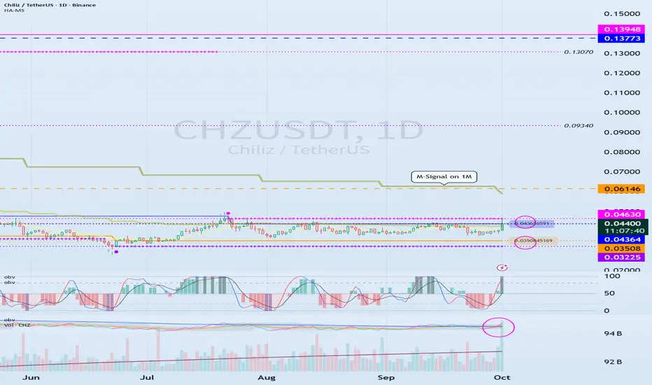
See if we can break above 0.04364-0.04630
Hello, fellow traders!
Follow us to get the latest updates quickly.
Have a great day!
-------------------------------------
(CHZUSDT 1D chart)
The OBV indicator is showing an upward break above the EMA 2 indicator.
If the price rises above the 0.04364-0.04630 range, it is expected to continue its upward trend.
However, since the price is below the M-Signal indicator on the 1M chart, a quick and quick response is required when trading.
Therefore, if possible, it is recommended to confirm that the price rises above the M-Signal indicator on the 1M chart, providing support, before trading.
-
(1M chart)
If the price rises above the M-Signal indicator on the 1M chart, it is highly likely that the price will attempt to rise to around 0.20790.
------------------------------------------
Considering the above, for medium- to long-term investment, it is recommended to buy when the price rises above the 0.04364-0.04630 range, providing support.
If you're looking to make a short-term investment, it's best to buy when the price rises above the M-Signal indicator on the 1M chart and shows signs of support.
Buying at a low price doesn't always lead to profits.
This is because some investors may not be able to wait for the price to rise and may give up midway.
Therefore, you should calmly consider your investment horizon for the altcoin you're currently considering.
Your investment size and trading strategy will vary depending on your investment horizon.
-
Thank you for reading to the end.
I wish you successful trading.
--------------------------------------------------
Next Volatility Period: Around October 3rd (October 2nd-4th)
Hello, fellow traders!
Please "Follow" to get the latest information quickly.
Have a great day!
-------------------------------------
(BTCUSDT 1D Chart)
This volatility period lasts until September 29th, but since the next volatility period is around October 3rd (October 2nd-4th), it's highly likely that the volatility period will continue until October 4th.
Therefore, we need to see if the price can sustain above 11696.21 after the volatility period.
If it fails to do so and falls below the 104463.99-108353.0 range, a sharp decline is likely.
If a sharp decline occurs, we need to check for the formation of new indicators such as the DOM (-60) or HA-Low indicators.
If new support is formed, it's important to determine whether there is support near that area.
If support is not found, a step-down trend is likely.
-
It is currently located near the M-Signal indicator on the 1W chart and the M-Signal indicator on the 1D chart.
Therefore, if the price rises above 111696.21 and holds, further upward movement is likely.
At this point, the key question is whether the price can rise above 115854.56 and hold.
To sustain the uptrend,
- The StochRSI indicator must show an upward trend. It must rise from the oversold zone.
- The On-By-Signal (OBV) indicator must show an upward trend. It must rise above EMA 1 and, if possible, above the High Line and remain there.
- The TC (Trend Check) indicator must show an upward trend. It must rise above the 0 point and remain there.
If the above conditions are met, the uptrend is likely to continue above 111696.21.
-------------------------------------------
The basic trading strategy is to buy in the DOM(-60) ~ HA-Low range and sell in the HA-High ~ DOM(60) range.
However, if the price rises in the HA-High ~ DOM(60) range, a stepwise upward trend is likely, while if the price falls in the DOM(-60) ~ HA-Low range, a stepwise downward trend is likely.
Therefore, the basic trading strategy should be a segmented trading approach.
This basic trading strategy principle was developed for trading on Heikin-Ashi charts.
Adding the M-Signal indicator on the 1M, 1W, and 1D charts allows you to see the overall trend.
The remaining indicators indicate support and resistance points or zones for chart analysis or trading strategies.
Trading is all about reaction, so understanding support and resistance points or zones is crucial.
However, you should interpret the charts based on core fundamental trading strategies.
-
Thank you for reading to the end.
I wish you successful trading.
--------------------------------------------------
- Here's an explanation of the big picture.
(3-year bull market, 1-year bear market pattern)
I'll explain more in detail when the bear market begins.
------------------------------------------------------
Resistance Zone: 977.90-1047.80
Hello, fellow traders!
Follow us to get the latest information quickly.
Have a great day!
-------------------------------------
(BNBUSDT 1M Chart)
We achieved our target by touching the Fibonacci level of 1.618 (1057.16).
We need to see if the price can rise towards Fibonacci ratio 2 (1259.05).
-
(1D chart)
The HA-High ~ DOM (60) range has formed at 977.90-1047.80.
Therefore, the 977.90-1047.80 range could act as resistance.
If it falls below 977.90, it could encounter the M-Signal indicator on the 1M chart.
Before that, we need to see if the price rises along the uptrend line (1).
-
Thank you for reading to the end.
I wish you successful trading.
--------------------------------------------------

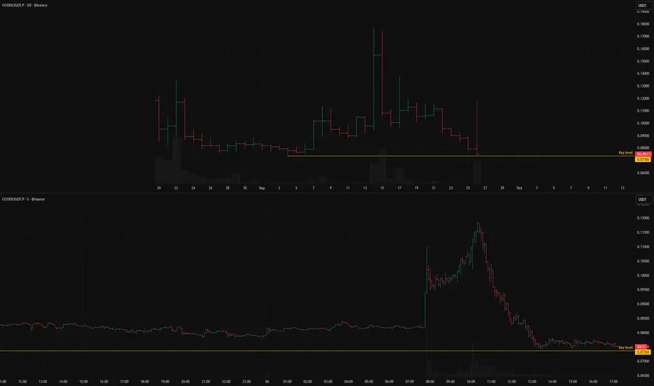
CUDISUSDT.P: short setup from daily support at 0.07366The situation here looks quite obvious: the BINANCE:CUDISUSDT.P is being slammed down hard.
There was an attempt to buy the dip, which led to a strong rally, but that rally was completely engulfed.
Now the price is once again near its all-time low. The fact that the decline continued after the failed rally clearly indicates a complete absence of buyers.
Key factors for this scenario
Global & local trend alignment
Price void / low liquidity zone beyond level
Liquidity grab (false move against the trend)
Volatility contraction on approach
Momentum stall at the level
Was this analysis helpful? Leave your thoughts in the comments and follow to see more.
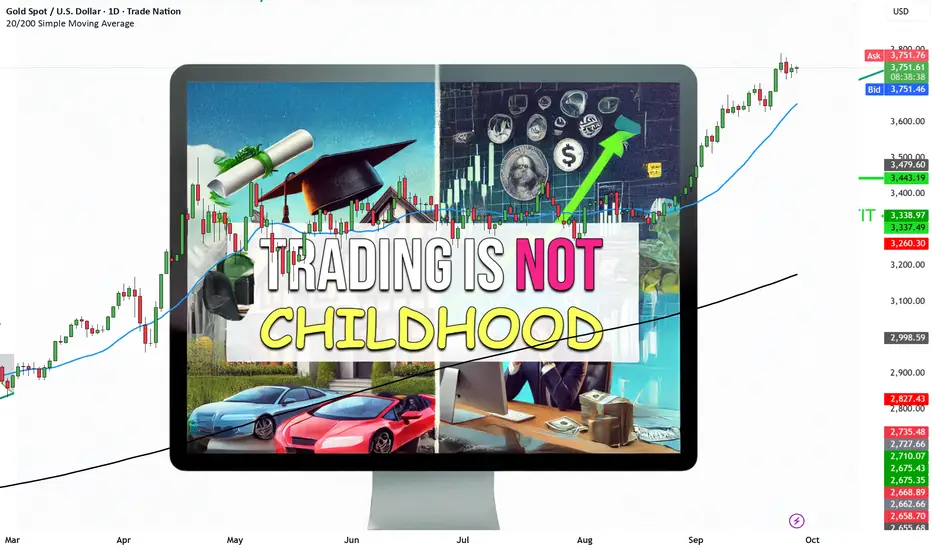
Why Trading is NOT like Childhood Growing up is very different to trading.
We are brought up to walk and talk quickly – WIN
We are brought up to have the best grades – WIN
We are brought up to buy the best cars and houses – WIN
We are brought up to have the best jobs and make a lot of money – WIN
Everything requires WINNING.
Losing? That wasn’t even an option!
Then we get introduced to trading where we need to LOSE to WIN.
We need to take small losses to make medium profits.
And then it’s all about consistency and persistence.
That’s why adapting to the LOSING mentality with trading is paramount for your trading success.
We need to ACCEPT losing with trading
Yep, you read that right.
The trick isn’t about avoiding losses altogether; it’s about managing them.
Imagine you’re playing a board game, and every time you lose a turn, you get closer to winning the game.
It sounds counterintuitive, doesn’t it?
But that’s the magic of trading. It’s not about avoiding losses; it’s about taking small, calculated hits so you can stay in the game long enough to hit that big, rewarding win.
How do you do this?
Accept Losses: Understand that not every trade will be a winner.
Cut Losses Quickly: Have a strategy in place to limit your losses.
Learn from Your Losses: Each loss is a stepping stone towards a better strategy.
We Aren’t Brought Up to Take Risks
As kids, we were told, “Look before you leap!”
We were encouraged to play it safe, avoid risks, and stay in our comfort zones.
As traders, we need to embrace risk.
But here’s the secret sauce: it’s all about taking calculated risks.
How to Embrace Risk Wisely:
Know Your Risk Tolerance:
Understand how much risk you’re comfortable with.
Are you happy to risk 0.5% to 2% per trade? GOOD – You’re on the right path.
Diversify:
Don’t put all your eggs in one basket. You need to adapt to different pre-market movers markets when trading.
Adapt more markets to build different portfolios during different market environments.
Use Stop-Loss Orders:
These will limit your potential losses. And adjust your stop losses to breakeven or just above – to lock in small gains along the way.
Trading Requires a Whole New Mindset
Trading isn’t like your childhood.
And that’s okay!
It’s not supposed to be.
It’s a whole new ball game with different rules. In trading, the focus isn’t on avoiding losses but taking and integrating them.
It’s not about avoiding risks but managing them.
It’s not about physical effort but intellectual strategy.
FINAL WORDS
Trading is NOT like your childhood.
We are humbled by the markets.
We drop our ego a bit.
And we keep consistent.
We lose battles but win the wars.
That is how it has and will always be.
That’s how we will strive to thrive and triumph with trading.
Love and accept your small losses. They are one step closer to your BIG wins.
Disclosure: I am part of Trade Nation's Influencer program and receive a monthly fee for using their TradingView charts in my analysis.
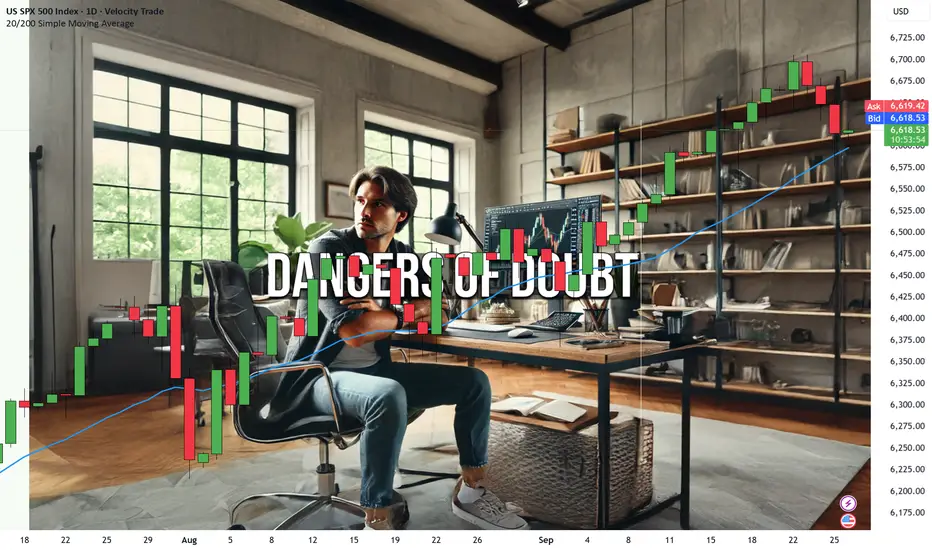
3 Dangers of Trading DOUBT (Part 2)Trading isn’t just about charts, indicators, and strategies —
It’s a battle of the mind.
And lurking in the shadows is one of the most dangerous opponents you’ll face:
Doubt.
Doubt stops you from taking action.
Doubt kills confidence.
Doubt leads you to giving up.
So let’s go into why doubt is so dangers and how we can destroy this silent saboteur.
DOUBT #1: Search for Something “Better”
Doubt is where you don’t think something will help you achieve what you want to.
And so you’re on the perpetual quest of finding something new and “better”.
But you need to realise something.
There is NO such thing as the perfect system.
Strategy hopping will you to wasting money, time, effort and energy.
Instead, you need to embrace the imperfections in trading.
You need to perfect your strategy, execution and mind.
Keep at it and you will find that you always had the Holy Grail at your grasp.
Stick to a strategy long enough to learn its nuances and understand its strengths and weaknesses.
Remember, the grass isn’t always greener—it’s just different grass.
DOUBT #2: Failure to Take the Trade
Ever hesitated to take a trade.
Whether you’re trading gold, Dow Futures, JSE or Forex!
Then you end up watching the “imperfect” trade head straight to your profit target?
That’s doubt working its magic.
When doubt clouds your judgment, you start second-guessing yourself.
You start questioning.
“What if it is a loser?”
“What if I am in the wrong trading environment”
“What if my system stops working from here?”
Not taking the trade is one of the most subtle yet dangerous forms of self-sabotage.
To combat this, it’s crucial to develop a routine that instills confidence.
Preparation is key.
When you’ve done your analysis and the trade setup aligns with your plan, just take the trade (J.T.T.T).
Trust your process and let the trade play out.
You can’t win a game you don’t play.
DOUBT #3: Failure to Follow Your Risk and Reward Criteria
Every trader knows that managing risk is paramount.
Yet doubt can lead even the most seasoned traders astray.
When doubt creeps in, it whispers dangerous ideas.
“Maybe I should move my stop loss further”.
“Maybe I should risk more in this trade”
“Maybe I should risk less in this trade”
“Maybe I should drop my take profit to lock in a premature profit”.
When you deviate from your established risk and reward criteria, you’re going against your one and only proven and profitable strategy.
Your risk and reward criteria are there to protect you.
They are the guardrails that keep your trading on track.
Conclusion
Trading doubt is a silent killer.
It can creep into your mind, and sow seeds of uncertainty.
Let’s sum up issues with Doubt.
Stop Searching for Perfection: Embrace the strategy you have and focus on mastering it rather than endlessly searching for a mythical “better” one.
Take the Trade: Don’t let doubt freeze you into inaction—execute your plan and trust the process.
Stick to Your Risk and Reward Criteria: Discipline in following your rules will protect you from doubt-driven decisions that can derail your success.

3 Dangers of Trading DOUBTDoubt.
It’s that little idiot in your head that whispers,
“What if you’re wrong?” or “Maybe this isn’t for you.”
It’s what stops you from achieving greatness.
It’s what keeps you in uncomfortable “comfort zones”
It’s what keeps you with the herd mentality of not doing anything.
And with trading, it’s the most dangerous trait to derail your hard earned work and progress.
Let’s stop the doubt and conquer those demons.
#1: DOUBT leads to Missed Opportunities
Have you ever hesitated on taking a trade?
Have you ever doubted your trading system?
Have you ever doubted your process?
Yep, that’s doubt working its dark magic.
Doubt makes you second-guess your analysis. It causes you to miss golden opportunities.
I am a big believer of risking money per trade in a way that it feels like pennies.
So whether it be 2%, 1% or even 0.5%.
Just think about this…
What do you have to lose? Very little right?
And whether you’re trading the JSE, Dow Futures or gold – you can manage your risk.
So, you might as well go ahead and risk little to make a little bit more.
The doubt might be there, but when you find that you’re taking the trades and winning and growing your portfolio more often than not – Doubt will disappear.
#2: DOUBT makes you Lose Confidence
Doubt and confidence are mortal enemies in life and with trading.
When doubt sets in, it gnaws away at your self-belief.
All of a sudden, you’re not just doubting your trades; you’re doubting yourself. And this destroys your integrity as a person.
And in trading, confidence is key.
Confidence is what will take you into battle with a plan and knowing how to protect yourself.
It allows you to execute trades with precision, even when there is a touch of uncertainty.
Doubt is like instead of grabbing a sword, you grab a feather duster.
So you need to learn how to build and maintain confidence in your trading.
How do you do that? Celebrate your performance, winning streaks, manage your losses and keep at it.
Doubt might try to shake your confidence, but resilience will keep you standing tall.
#3: DOUBT will lead you to change your System
Doubt doesn’t just mess with your mind; it messes with your system.
You start adding and removing elements.
You start changing and acting more on a discretionary manner.
When you start doubting your strategy, you’re tempted to tweak, tinker, and completely overhaul your approach.
These changes will make you feel like you’re back to the start of your journey.
And the inconsistency, doubt and confusion will manifest into another losing strategy.
Your trading system is your blueprint for success.
It’s built on research, experience, and fine-tuning.
But when doubt infiltrates, it can cause you to question the very foundation of your strategy.
Before you know it, you won’t even have a strategy anymore.
You’ll just act on impulsive trades. And this is one of the MAIN reasons traders blow their accounts.
Patience, Passion and Persistence are the keys to SUCCESS.
FINAL WORDS:
You now have the power to overcome doubt.
Save this article, print it and let’s stop doubting.
Missed Opportunities:
Doubt makes you hesitate and miss out on profitable trades.
Loss in Confidence:
Doubt erodes your self-belief, making you hesitant and indecisive.
Alter in Your Current Trading System:
Doubt leads to impulsive changes, disrupting your trading strategy.
Remember, every trader faces doubt.
It’s how you handle it that sets you apart.
Embrace confidence, trust your system, and watch your trading soar.
3 Types of Trades – HPT – MPT and NTTrading isn’t just about luck.
Trading isn’t just about strategy.
Trading is about stats and probabilities and know how to execute with the right money management.
Also, here is a surprise.
Not all setups are created equal.
There are three types of trades with trading.
Whether you’re trading Dow Futures, EUR/USD or Gold – the setups can come in one of three ways.
HIGH Probability Trade (HPT)
This type of trade is your bread and butter.It’s when the market conditions match your system’s criteria perfectly.
It’s where you get a full on 5/5 check markets all around.
And everything screams (J.T..TT – Just Take The Trade!)
For me a HIGH PROBABILITY TRADE is when I see the following with a long (buy).
Previous trend is up.
Breakout pattern has formed
Price has broken above the pattern and opened above
The price is above BOTH the 20MA and the 200MA.
There is a strong uptrend to follow
Damn!
That’s perfect and that’s where I risk 1% to 2% of my portfolio.
But why is it high probability?
Because your trading system, which you’ve backtested and trusted, shows a high success rate in these conditions.
HIGH PROBABILITY MEANS – You know the chances of success and winning are high.Moving on…
MEDIUM Probability Trade (MPT)
The market almost lines up with your system.
It’s close but not perfect.
This is where the likelihood is still HIGH but not as high as a HPT.
This is where your indicators could be mixed or some of your criteria aren’t fully met.
Yet, you still see potential and you will still risk (less) with your trade.
This is where a bit of trader’s intuition and experience come into play.
You decide to take the trade but with a twist.You risk a little less.
For me a MEDIUM PROBABILITY TRADE is when I see the following with a long (buy).
Previous trend is sideways .
Breakout pattern has formed
Price has broken above the pattern and opened above
The price is above 20MA but below the 200MA.
There is a strong uptrend to follow.
Not great but willing to risk 0.5%.
LOW Probability Trade (NO Trade) NT
You want the perfect or almost perfect line up when you trade.
And if the criteria do not line up – it should be a NO show.
The best decision?
Stay out.No trade means no risk.
No trade means – stay neutral.
For me a LOW PROBABILITY TRADE is when I see the following with a long (buy).
Previous trend is sideways .
Breakout pattern has sizzled
Price remains in the pattern and hasn’t crossed yet.
The price is above 20MA but below the 200MA.
There is a strong uptrend to follow.
FINAL WORDS:
You need to identify when a trade looks GREAT, GOOD and BAD.
You need to know when to take a trade and what to risk during the times.
HIGH probability trade (Just Take The Trade!)
– Market lined up perfectly according to the system and can risk 1% – 2%.
MEDIUM probability trade (Trade but with less risk)
– Market almost lined up perfectly but I will still take the trade and risk 0.5%.
LOW probability trade (NO trade)
– Market did NOT line up and therefore I’m not taking a trade.

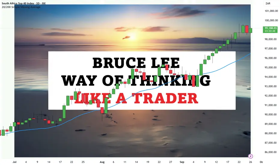
Bruce Lee’s Way of Thinking Like a TraderIt’s better to have 9 years of experience trading 1 strategy than 1 year of trading experience for 9 systems.~ Timon Rossolimos inspired by Bruce Lee.
Ever heard the saying…
“I fear not the man who has practiced 10,000 kicks once, but I fear the man who has practiced one kick 10,000 times”?
That’s Bruce Lee, the martial artist legend, and philosopher, dropping some timeless wisdom.
His principles can apply to your life, business and of course trading.
Let’s get into how Bruce Lee’s way of thinking can help you as a trader.
“Absorb What is Useful, Discard What is Not, Add What is Uniquely Your Own”
Bruce Lee was all about simplicity and efficiency.
He believed in cutting through the noise to find what truly works.
The same goes for trading.
When you start, you’re bombarded with endless strategies.
Day trading, swing trading, scalping, position trading…
You’re bombarded by different markets Forex i.e. EUR/USD, Commodities like Gold, Crypto i.e. Ethereum price, Indices i.e. Dow Futures
But here’s the kicker (no pun intended)
Not all strategies are needed nor will they work with you.
The key is to absorb what works and discard what doesn’t.
Take it what works for your trading personality and risk profile – and leave alone the rest.
Make it unique – Make it your own.
Customize it, tweak it, and master it.
“The Successful Warrior is the Average Man, with Laser-like Focus”
Trading isn’t about being a genius.
It’s about having focus.
Bruce Lee knew that extraordinary success comes from ordinary people who have an extraordinary level of focus and dedication.
Have you seen his one-inch punch that pushed the hell out of the guy onto the chair?
That is PURE focus.
As a trader, this means you need to:
Focus on your strategy
Focus on your execution.
Focus on mastering your mind.
Focus on each trade that lines up.
Imagine spending nine years refining a single trading strategy.
Think about the depth of understanding you’d achieve, the nuances you’d master, and the pitfalls you’d avoid.
This deep focus transforms you from an average trader into a successful warrior of the financial markets.
“Knowing is Not Enough, We Must Apply. Willing is Not Enough, We Must Do”
Knowledge alone won’t make you a successful trader.
You must apply what you learn.
Do you think Bruce Lee read books and then became a master martial artist? NO!
He practiced hours a day every day and integrated it HIGHLY into his life.
You can read all the trading books, attend seminars, and follow market news, but unless you apply that knowledge, it’s all for naught.
Without action, they are just ideas.
Trading is about execution.
It’s about taking that well-honed strategy and putting it into action.
Backtest it, forward test it, and refine it through real-world experience.
It’s the doing that separates successful traders from perpetual learners.
“ Mistakes are Always Forgivable, if One Has the Courage to Admit Them”
Mistakes are part of the journey.
Bruce Lee understood that failure is not the opposite of success; it’s a part of it.
In trading, you’re going to make mistakes.
You’ll face losses (what I call data points).
You will make poor decisions (at times) – To err is human.
And you will encounter unexpected market movements.
Take it ALL…
FINAL WORDS:
Bruce Lee’s wisdom transcends martial arts, offering valuable insights for traders.
This has definitely been one of my favourite articles to write.
I hope Bruce Lee’s wisdom and information will continue to linger and spread throughout for the countless generations to come.
One more thing…
Trading isn’t about being the jack-of-all-trades.
It’s about being the master of one.
So, channel your inner Bruce Lee and commit to the path of mastery.
Let’s sum up the powerful Bruce Lee quotes that we covered in this article:
“Absorb What is Useful, Discard What is Not, Add What is Uniquely Your Own”
“The Successful Warrior is the Average Man, with Laser-like Focus”
“Knowing is Not Enough, We Must Apply. Willing is Not Enough, We Must Do”
“Mistakes are Always Forgivable, if One Has the Courage to Admit Them”
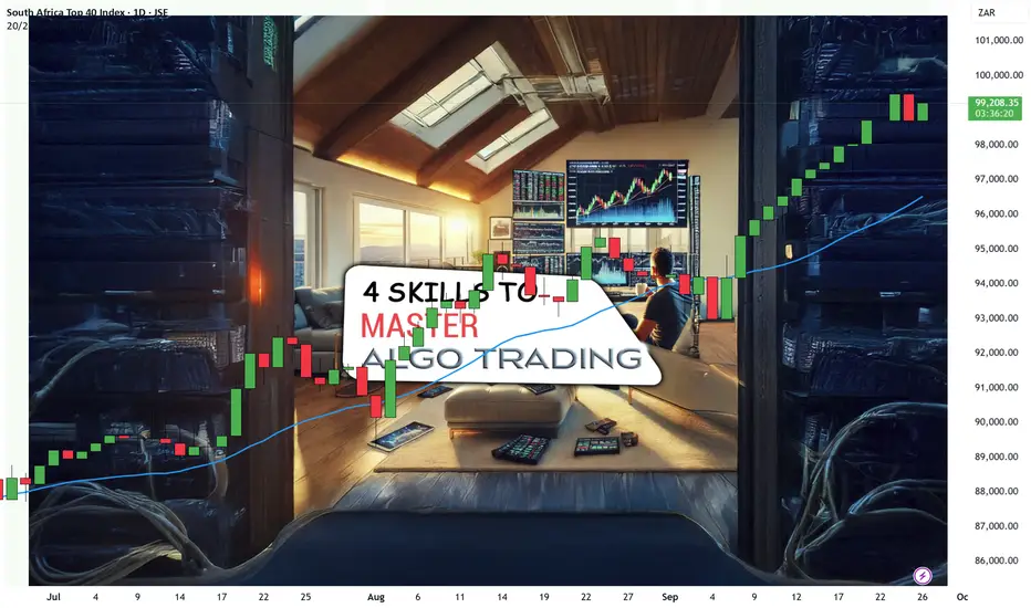
HOW TO Master Algo Trading: Essential Skills for Modern Trading🤖 Algo trading isn’t just about letting robots do the heavy lifting.
It’s also not letting a machine take over your trading.
Algo trading uses computer programs to help you to automate buying and selling in financial markets based on set rules.
So if you have a mechanical system with a track record, you’re on your way of becoming an algo trader.
BUT… There are always ways to improve your trading and there are elements you can use to become a more proficient algo trader.
Let’s get into them.
🔢 Element #1: Experience with Database Management and Data Analysis
Data is your best friend when it comes to algo trading.
You need to know the trading game plan before you take your first trade.
It’s like building your city with an end goal.
You need a map, you need the tools, you need a worst-case scenario plan etc…
Data analysis, on the other hand, allows you to extract meaningful insights from this data.
You need to know how back, forward and real test your system, strategy and results.
The more data you have, the more significant edge you’ll have over those who rely on gut feeling alone.
📊 Element #2: Knowledge of Statistical Analysis
Statistical analysis and machine learning are the backbone of successful algo trading.
They empower you to create models that predict market movements and optimize trading strategies.
This is where your important rules, criteria and decisions come.
E.g.
When do you halt trading after a drawdown.
When do you consider a medium and high probability trade.
When do you consider a medium to high probability day.
What do you consider high, medium and low probability markets.
Do you know how to handle Pre-market movers?
Remember, markets are influenced by countless factors, and understanding these relationships requires robust statistical tools.
💹 Element #3: Understand Financial Markets and Trading Strategies
While technology drives algo trading, understanding the financial markets is crucial.
You need to grasp how different markets operate, from stocks, indices, commodities and Forex with their unique characteristics of each.
Each market has it’s own personality and demeanor. For example, for the life of me my system does NOT work with the EUR/USD – The most popular currency of all time. And I’ve accepted that.
Without this understanding, you might as well be throwing darts at a board while blindfolded.
🕵️ Element #4: Strong Analytical and Problem-Solving Skills
Markets are unpredictable.
They are also random and uncertain.
They throw curveballs when you least expect them.
Your winning streaks can last longer than you think.
But so can your drawdowns.
And that period where the market moves sideways, can make a trader go crazy.
That’s why strong analytical and problem-solving skills are vital.
When an algorithm isn’t performing as expected, you need to diagnose the issue swiftly and effectively.
Think of it like being a detective in the trading world.
You need to analyze patterns, identify anomalies, and adjust your strategies to stay on top. This requires a sharp, analytical mind and a knack for solving complex problems under pressure.
🧠 Element #5: Attention to Detail and Ability to Work Under Pressure
In algo trading, the devil is in the details.
One small error in your system can lead to significant financial losses.
One wrong parameter in your moving average or indicator, and it could determine a failed strategy.
Therefore, meticulous attention to detail is non-negotiable.
And you need to adapt like a robot because trading is definitely working under pressure.
This is a skill that we are NOT born with but one must learn through sheer will and hard experience.
Financial markets operate at lightning speed, and decisions often need to be made in real-time.
The ability to stay calm and focused in such an environment can make or break your trading success.
Final words:
Mastering algo trading requires a blend of technical skills, market knowledge, and the right tools.
Let’s sum up what it is and what you need to master the skills.
Algo trading, or algorithmic trading, involves using computer algorithms to automate trading decisions based on predefined criteria and market data analysis. It aims to execute trades at optimal speeds and prices, leveraging technology to minimize human error and emotional bias.
The skills you need to master are:
Element #1: Experience with Database Management and Data Analysis
Element #2: Knowledge of Statistical Analysis
Element #3: Understand Financial Markets and Trading Strategies
Element #4: Strong Analytical and Problem-Solving Skills
Element #5: Attention to Detail and Ability to Work Under Pressure
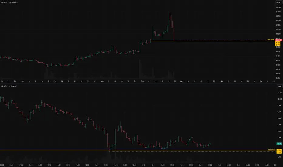
IPUSDT: short setup from daily support at 8.378A very sharp decline in the BINANCE:IPUSDT.P was stopped at the 8.414 level.
Usually, the natural reaction to such a drop is a correction, but we are not observing one here.
It is precisely this lack of a correction that is drawing my attention.
On the downside (for a short scenario), there is a consolidation zone that formed from Aug 30th to Sept 7th, which is a heavy area that could be difficult to break through.
Additionally, the asset has already covered a significant distance today, and there might simply not be enough energy left for a breakout.
Therefore, I will be watching very closely how exactly the price approaches this level.
Key factors for this scenario
Correlation with the market
Volatility contraction on approach
Momentum stall at the level
No reaction after a false break
Was this analysis helpful? Leave your thoughts in the comments and follow to see more.
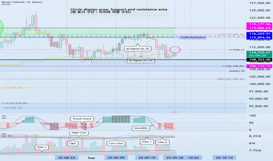
Volatility Period: Around September 19th (September 18th-20th)
Hello, traders!
Follow us to get the latest information quickly.
Have a great day!
-------------------------------------
(BTCUSDT 1D Chart)
This volatility period is around September 19th (September 18th-20th).
As this period of volatility progresses, we need to examine the direction in which the price deviates from the 115,854.56-119,177.56 range.
As previously mentioned, the key ranges are 87,814.27-93,570.28 and 104,463.99-108,353.0.
Therefore, if the price falls below 115,854.56, we need to check for support near these key levels.
-
It's perhaps natural for trading volume to decrease after a new ATH (Any New High).
If a new ATH (Any New High) is met with high trading volume, it could indicate a significant amount of profit-taking, increasing the likelihood of a downward trend.
Therefore, I don't think it's wise to interpret the current decline in trading volume as a sign of a decline.
We're using the On-By-Volume (OBV) indicator, which helps us understand the movement of trading volume, so we can roughly gauge the current trading volume trend.
-
The HA-High ~ DOM(60) range on the 1D chart is 115854.56-119177.56, and the HA-High ~ DOM(60) range on the 1W chart is 116259.91-119086.64.
Since these two resistance levels overlap, a breakout above this level suggests a potential surge.
-
Thank you for reading to the end.
We wish you successful trading.
--------------------------------------------------
- This is an explanation of the big picture.
(3-year bull market, 1-year bear market pattern)
I will explain in more detail when the bear market begins.
------------------------------------------------------

Bitcoin: What's Next?My Philosophy & Approach
My foundation is the pure chart. I don't consider news or outside opinions, as I see them as secondary. All primary information is already in the price. Of course, no one can give a 100% forecast. The crypto market can fall sharply just as it can rise sharply. This uncertainty must be accepted as the norm. This is why I work from risk, not from expectations.
General Market Sentiment & BINANCE:BTCUSDT.P Analysis
In my opinion, a bearish sentiment prevails in the market. After its drop, Bitcoin isn't having a deep correction but is re-testing the level where the decline stopped, which is a sign of seller pressure. Currently, the price is grinding the 111,959.5 level, but I don't see a strong reaction from buyers even on false breakouts. This indicates their weakness. Although the trading zone of Sept 3-10 creates an obstacle, I am still leaning towards a further decline.
Asset Selection Criteria in Current Conditions
After high volatility comes a dangerous time, so I am especially careful in selecting assets based on two criteria:
Strength Against the Market: Assets that are rising despite the general fall. This indicates the presence of a large buyer.
A Clear Stop: Assets that, after a sharp decline, stopped precisely at a level where large capital absorbed all sales.

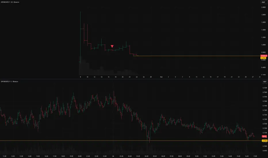
OPENUSDT: short setup from daily support at 0.7062BINANCE:OPENUSDT.P is holding above the 0.7062 level.
However, the more frequently this level is tested and the weaker the bounces from it become, the higher the probability of a short scenario.
An additional sign of weakness is that the asset is not reacting to Bitcoin's rally.
Key factors for this scenario
Global & local trend alignment
Price void / low liquidity zone beyond level
Asset decoupled from the market
Volatility contraction on approach
Immediate retest
Repeated precise tests of the level
Consolidation with price compression
This Volatility Period:Around September 24th(September 23rd-25)
Hello, traders!
Follow us to get the latest information quickly.
Have a great day!
-------------------------------------
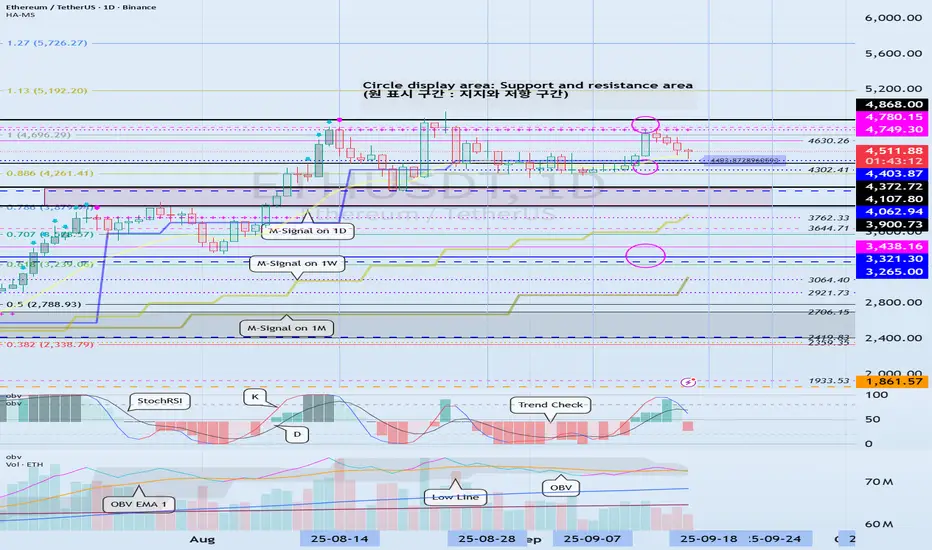
(ETHUSDT 1D Chart)
This Volatility Period: Around September 24th (September 23rd-25th)
Before this volatility period began, the price fell below 4403.87 and then fell to the 3900.73-4107.80 range.
The 4403.87-1749.30 range, which corresponds to the HA-High ~ DOM (60) range, is likely to act as resistance, as it represents a high point.
The 3900.73-4107.80 range represents the previous all-time high (ATH). If the price remains above this range, the uptrend is likely to continue.
Therefore, the key question is whether the price can find support in the 3900.73-4107.80 range and rise above the 4403.87-4749.30 range.
After this volatility period, we should examine whether the price can find support in the 3900.73-4107.80 range.
If not, support around 3265.0-3438.16 is crucial.
-
If the OBV indicator falls below the Low Line, the price is likely to decline again.
Therefore, support around 3900.73-4107.80 is crucial.
-
The basic trading strategy is to buy in the DOM(-60) ~ HA-Low range and sell in the HA-High ~ DOM(60) range.
Considering this basic trading strategy, it may be natural for the price to decline since it failed to rise above 4403.87-4749.30.
Since it fell in the HA-High ~ DOM(60) range, it is likely to decline until it meets the DOM(-60) or HA-Low indicator.
However, since important support and resistance points or zones have formed, the trend can reverse at any time depending on whether support is found at those points or zones.
In this sense, the K value of the StochRSI indicator is in the oversold zone, suggesting a potential uptrend in the near future.
While the K value of the StochRSI indicator is in the oversold zone, the possibility of further decline is high. However, the established support and resistance zones increase the likelihood of turning this crisis into an opportunity.
In this situation, what we can do is confirm the signs of an uptrend.
Otherwise, if we anticipate a new trade in advance, we may face another crisis as the volatility period progresses.
-
If you are currently trading, there is an opportunity to sell in the first installment when resistance is encountered in the 4403.87-4749.30 zone.
As mentioned earlier, this is based on the basic trading strategy.
Depending on whether support is found in the 3900.73-4107.72 range, you'll decide whether to sell in two installments or buy.
Since the stock market trades in single-share increments, selling before the price has more than doubled from the purchase price makes it difficult to buy again.
However, the coin market allows for decimal trading, making trading easier than in the stock market.
This freedom of buying and selling is the biggest advantage of the coin market.
If your buy price is below 3900.73, buying when the 3900.73-4107.80 range shows signs of support will increase your average buy price, potentially putting you under psychological pressure.
However, as mentioned earlier, the coin market allows for decimal trading, making it possible to separate your buy price into separate trades.
Therefore, you can record the purchase price and purchase amount separately, differentiating them from the existing average purchase price, and then trade them separately.
If you understand this principle, you'll find the coin market much easier to trade than the stock market.
This is one of the reasons why even those who have successfully traded in the stock market often fail in their initial trading in the coin market.
-
Thank you for reading to the end.
I wish you successful trading.
--------------------------------------------------
- Here's an explanation of the big picture.
(3-year bull market, 1-year bear market pattern)
I'll explain more in detail when the bear market begins.
------------------------------------------------------

The key is whether it can rise above 3.0361
Hello, fellow traders.
Follow us to get the latest information quickly.
Have a great day.
-------------------------------------
(XRPUSDT 1D chart)
The key is whether it can rise above 3.0361 and sustain the price after the next period of volatility, around October 2nd.
This period of volatility is expected to continue until September 25th, and we should examine whether support can be found around 2.9092 and whether it can rise.
-
If the price falls below the M-Signal indicator on the 1W chart,
1st: 2.5102-2.6013
2nd: 2.1453-2.2582
We should check for support near the 1st and 2nd levels above.
-
If the price remains above the M-Signal indicator on the 1D chart, further upside is highly likely, so it's important to determine whether support can be found near 3.0361.
The best time to buy was when support was found at key support and resistance levels, or around the 2.1453-2.2582 range.
Currently, a new buy is possible when support is found near 3.0361.
However, since this does not fit the basic trading strategy, a quick and rapid response is required.
-
The basic trading strategy is to buy in the DOM(-60) ~ HA-Low range and sell in the HA-High ~ DOM(60) range.
However, if the HA-High ~ DOM(60) range rises, a step-up trend is likely, while if the DOM(-60) ~ HA-Low range falls, a step-down trend is likely.
Therefore, the basic trading strategy should be a segmented trading approach.
-
The HA-High ~ DOM(60) range on the 1D chart is currently 3.4037-3.4540.
Therefore, a rise to around 3.4037 is possible.
However, since the DOM(60) point on the 1M chart is formed at 3.0361, if the price rises above 3.0361 and maintains, a long-term step-up trend is likely.
Therefore, the current buying opportunity should be when support is confirmed around 3.0361.
-
(1W chart)
To rise above 3.0361 and maintain support, the upward trend should continue.
- The StochRSI indicator should be trending upward. Ideally, it should not enter the overbought zone.
- The On-By-Value (OBV) indicator should be trending upward. Ideally, it should remain above the High Line.
- The TC (Trend Check) indicator should be trending upward. Ideally, it should remain above the zero level.
If the above conditions are met, the upward trend is expected to continue.
-
Thank you for reading.
We wish you successful trading.
--------------------------------------------------

Support and Resistance Area: 0.9563-1.0036
Hello, traders!
Follow us to get the latest information quickly.
Have a great day!
-------------------------------------
(TWTUSDT 1W Chart)
The key support and resistance area is 1.65-1.8839.
To break above this important support and resistance zone, we need to see if the price can maintain support near 1.0036 and rise above 1.4026.
-
(1D chart)
Since the HA-High indicator on the 1D chart was generated at 0.9563, it's crucial to see if the price can maintain above 0.9563-1.0036.
To achieve this, the key is whether the price can rise after finding support near 1.2224.
Therefore, if the price falls below 1.2224, support around 0.9563-1.0036 will be crucial.
------------------------------------
The basic trading strategy is to buy in the DOM(-60) ~ HA-Low range and sell in the HA-High ~ DOM(60) range.
However, if the price rises from the HA-High to DOM(60) range, it is likely to exhibit a step-like upward trend, while if it falls from the DOM(-60) to HA-Low range, it is likely to exhibit a step-like downward trend.
Therefore, the basic trading strategy should be a segmented trading strategy.
Buying when the HA-High to DOM(60) range shows support requires a short and quick response.
As mentioned earlier, the HA-High to DOM(60) range is considered a sell zone, or resistance zone.
Therefore, if possible, it's best to find a buying opportunity when the price declines and then rises.
1. The K indicator of the StochRSI indicator should be rising. If possible, it should not enter the overbought zone.
2. The On-By-Sign-Operative (OBV) indicator should be rising. If possible, it should remain above the High Line.
3. The TC (Trend Check) indicator should be rising. If possible, it should be above the 0 point.
When the three indicators listed above are met, the price is likely to continue its upward trend.
-
Thank you for reading to the end.
We wish you successful trading.
--------------------------------------------------

Volatility Period: Around September 18th (September 17th-19th)
Hello, fellow traders!
Follow us to get the latest information quickly.
Have a great day!
-------------------------------------
(ETHUSDT 1D Chart)
The 4403.87-4749.30 range, which is the HA-High ~ DOM (60) range, represents a resistance zone.
Therefore, we need to monitor the price movement after the current volatility period, around September 18 (September 17-19).
To sustain the uptrend, the price must remain above the 3900.73-4107.80 range.
From a medium- to long-term perspective, the 3265.0-3321.30 range is a key area.
Considering the above, if it falls below 4403.87,
1st: 4107.80-4372.72
2nd: 3265.0-3321.30
Therefore, it is likely to fall to the first and second levels above.
Therefore, the key question is whether it can find support near 4403.87 after this period of volatility.
-
When trading, it's important to understand the current price level.
I believe there are several ways to determine this.
My basic trading strategy is to determine when to trade.
My basic trading strategy is to buy when support is found in the DOM(-60) ~ HA-Low range and rise, and to sell when it touches the HA-High ~ DOM(60) range.
However, if the price rises in the HA-High ~ DOM(60) range, a step-like upward trend is likely, while if it falls in the DOM(-60) ~ HA-Low range, a step-like downward trend is likely.
Therefore, the basic trading strategy should be a segmented trading strategy.
If you were unable to buy in the DOM(-60) ~ HA-Low range, but the current price is within the DOM(-60) ~ HA-Low range, you should check for support.
Support is determined by checking whether support is found near the HA-Low or DOM(60) indicators.
If you bought when support was found near the HA-Low indicator, the first sell position would be near the DOM(60) indicator.
If you bought when support was found near the DOM(60) indicator, you should execute the trade quickly and effectively.
If the price falls below the purchase price, it would be considered a buy at the high.
To prevent this to some extent, we've utilized several indicators for verification.
First, we utilize the M-Signal indicator on the 1M, 1W, and 1D charts.
That is, if the M-Signal indicator is passing near important support and resistance levels, the presence of support in that area is likely to play a more important role.
Currently, the M-Signal indicator on the 1D chart is passing near 4403.87, so we should consider the area around 4403.87 as a potential important support and resistance level.
Second, we should monitor the movements of auxiliary indicators such as the TC (Trend Check) indicator, the StochRSI indicator, and the On-By-Signal (OBV) indicator.
For the price to continue its upward trend in this important support area,
- the StochRSI indicator must show an upward trend. If possible, it's best to avoid entering the overbought zone.
- The OBV indicator should be showing an upward trend. If possible, it should remain above the High Line.
- The TC (Trend Check) indicator should be showing an upward trend. If possible, it should remain above the 0 level.
By monitoring the movements of the three indicators above, you can determine whether there is support near important support and resistance levels.
However, you should not blindly trust the movements of auxiliary indicators. Even if you have identified the movements of auxiliary indicators, you should always monitor the price movement.
To determine support, you should monitor the price movement for at least 1-3 days.
This is especially important during periods of volatility.
Volatility is a period where you cannot predict the direction of movement, so extra caution is required.
Therefore, if possible, it's better to observe the situation and find a trading opportunity after the volatility period has passed rather than entering a new trade during a volatile period.
-
Thank you for reading to the end. I wish you successful trading.
--------------------------------------------------
- Here's an explanation of the big picture.
(3-year bull market, 1-year bear market pattern)
I'll explain more in detail when the bear market begins.
------------------------------------------------------
ETHFIUSDT: long setup from daily resistance at 1.6776BINANCE:ETHFIUSDT.P has a strong historical level that saw a false breakout yesterday and today.
Considering how long ago this level was formed and the fact that the price is testing it almost to the tick today, I am 99.99% sure that this is a level one not only can, but must work with.
I am expecting a breakout to the upside.
The lower timeframe looks very good: the price is gradually squeezing towards the level, making a smaller pullback each time.
Key factors for this scenario
Global & local trend alignment
Correlation with the market
Volatility contraction on approach
Immediate retest
Prolonged consolidation
Repeated precise tests of the level
No reaction after a false break

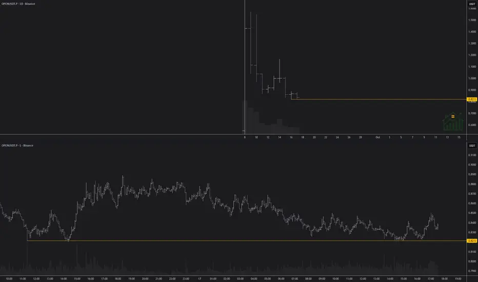
OPENUSD: short setup from daily support at 0.8213BINANCE:OPENUSDT.P
The level is local and fresh, which means it's not strong. However, below it lies a "clean zone" with no obstacles to a free fall. This factor lowers the requirements for the level's strength; a break below it, even though weak, could trigger panic selling as it serves as the only reference point. This panic, in turn, would only accelerate the fall.
Therefore, I am closely watching how the asset approaches this level. A sharp move into it is undesirable.
Key factors for this scenario
Global & local trend alignment
Price void / low liquidity zone beyond level
Volatility contraction on approach
Immediate retest
Repeated precise tests of the level ("sticking")
XAU/USD – Captain Vincent Weekly Plan🔎 Captain’s Log – Context
📈 Main Trend : Strong uptrend after BoS.
📊 Price moving sideways within the rising channel, staying below Weak High 3674 .
📌 EMA 50 > EMA 200 → bullish trend remains solid.
🎯 Captain’s Map – Trading Scenarios
1️⃣ Golden Harbor (BUY – Main Priority)
🎯 Entry:
FVG Dock: 3602 – 3593
FVG Deep: 3567 – 3560
OB Harbor: 3535 – 3540
⛔ SL: below 3520
✅ TP1: 3674 (sweep Weak High)
✅ TP2: 3720 – 3740
2️⃣ Quick Boarding (Short-term SELL – Counter-trend)
Condition: If price breaks 3674 first → watch for false break.
🎯 Entry: 3670 – 3680
✅ TP: back to 3602 – 3567
⚠️ Note : scalp only, don’t hold long.
3️⃣ Storm Breaker Alert (Bearish Scenario)
If 3535 breaks → short-term uptrend invalidated.
🎯 Bearish target: 3480 – 3500
Captain’s Note ⚓
“The golden sail still catches the wind after BoS, leading the captain and crew on the bullish tide. Golden Harbor 🏝️ (3593 – 3560 – 3535) remains the preferred docking point to load cargo and continue the voyage. Quick Boarding 🚤 at Storm Breaker 🌊 (3670 – 3680) is only a short ride when the ship sweeps liquidity at Weak High 3674 . Should 3535 break, the ship might be dragged toward 3480 – 3500, but as long as it anchors at Golden Harbor, the grand journey still heads north toward 3720+.”

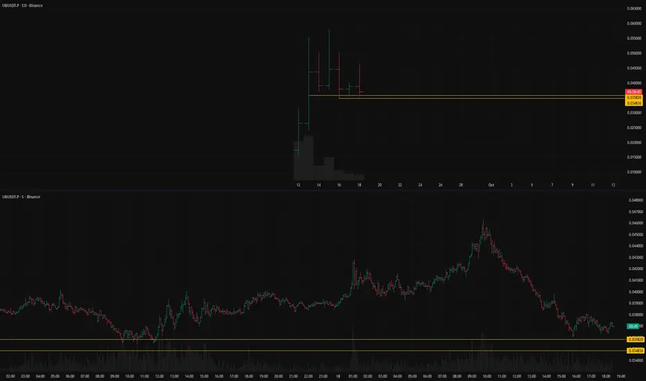
UBUSDT: short setup from daily support at 0.035820BINANCE:UBUSDT.P looks very attractive for a short setup.
There is a clear support level whose strength is not in doubt, as it has been confirmed multiple times.
Today, the asset showed a strong move up, but it ended with an even stronger drop that completely engulfed the prior rally.
Key factors for this scenario
Price void / low liquidity zone beyond level
Liquidity grab (false move against the trend)
Volatility contraction on approach
Immediate retest
Closing near the bar's extreme
Closing near the level