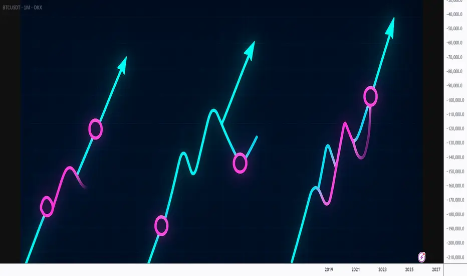
Why Most Traders Misread Trends!!! (Fix It in 10 Seconds)Every trader talks about trends.
Few actually understand how to read them.
Most traders think a trend is defined by:
- a diagonal line
- a moving average
- or a breakout
But the truth is much simpler... and far more powerful:
A trend is defined by the quality of its pullbacks.
📚Here’s the 10-second method professionals use:
1️⃣ Shallow Pullbacks = Strong Trend
When pullbacks barely retrace and reverse quickly,
it means one side is overwhelming the other.
Momentum is healthy.
Continuation is likely.
A shallow pullback tells you:
➡️ “Don’t fade this. Follow it.”
2️⃣ Deep Pullbacks = Weakening Trend
When price retraces deep into the previous leg,
momentum is slowing and imbalance is shrinking.
Buyers are less aggressive.
Sellers are gaining confidence.
A deep pullback tells you:
➡️ “Trend still alive, but the engine is cooling.”
3️⃣ Chaotic Pullbacks = Trend Is Dying
If pullbacks become wide, choppy, overlapping, messy,
the trend is no longer in control.
It’s not a trend anymore.
It’s a negotiation.
A chaotic pullback tells you:
➡️ “Stop trading the trend. Wait for structure.”
📚Final Thought
The market isn’t random ... it’s rhythmic.
And pullbacks are the rhythm.
Once you learn to read that rhythm, you’ll stop fighting trends…
and start flowing with them.
⚠️ Disclaimer: This is not financial advice. Always do your own research and manage risk properly.
📚 Stick to your trading plan regarding entries, risk, and management.
Good luck! 🍀
All Strategies Are Good; If Managed Properly!
~Richard Nasr
Trends
$USDJPY Short Position - Target 152 YenUSDJPY seems to be breaking support for positive volume. If it breaks support, it might retrace back down to at least 152 yen. The bollinger bands and the last 24hr volume is telling. As always, none of this is investment or financial advice. Please do your own due diligence and research.

$RDDT Long Setup - $280 Target During Q1 2026Reddit is one of those gifts that keep on giving since the IPO. Right now, support seems strong and it doesn't seem to be going away, at least from some current indicators. As always, none of this is investment or financial advice. Please do your own due diligence and research.

Platinum has a Potential Downtrend - $1500 ShortIf support breaks, especially considering the oscillation patterns, then we could be talking about a $1500 price point per oz. As always, none of this is investment or financial advice. Please do your own due diligence and research.

$BTC, $77.5K Target Before Retracement/Bull Run, LONG HoldBitcoin has the potential to drop as much as up to $77.5K as shown by the PnL and patterns setup. That said, holding and getting the dip or doing a short bet depends on your risk tolerance. As currently, I am very bullish on Bitcoin's long-term setup ignoring the in-between noise. As always, none of this is investment or financial advice. Please do your own due diligence and research.

$RIVN – Long-Term Base Breakout Setup + Sector Rotation PotentiaRivian ( NASDAQ:RIVN ) is finally showing signs of life after years of basing out. This is one of those setups that comes along only once every few years — a multi-year base breakout forming as speculative money rotates back into the laggards.
🔹 The Setup:
Big earnings pop ignited the first real move in months.
After that surge, NASDAQ:RIVN has been flagging tightly for 3 days, digesting gains with constructive price action.
The structure here is clean — it’s coiling just under breakout levels, setting up a potential long-term trend shift.
🔹 Macro + Sector Context:
The alt-energy sector is heating up — solars have been leading, and that strength could spill into EV names next.
We’re in a speculative phase of the market where beaten-down names are catching rotation money.
NASDAQ:RIVN fits that bill — it’s been left for dead, but the tape is finally turning.
🔹 My Trade Plan:
1️⃣ Entry: Building a position off the flag near current levels.
2️⃣ Stop: Using the 9 EMA on the weekly chart as my stop — giving it room to breathe.
3️⃣ Account: Tossing this one into the longer-term accounts — not a scalp, this is a swing for the fences type play.
Why I Like It (Even Though It’s a “Turd”):
Multi-year base = massive stored energy.
The chart finally aligns with the macro rotation.
It’s not about loving the company — it’s about recognizing when the cycle flips in its favor.

Adobe (ADBE): Undervalued AI Software Leader Amid #AI Boom? Adobe (ADBE): Undervalued AI Software Leader Amid #AI Boom? $456 in Sight? 📈
Trading at $364.08 (-0.50%), ADBE's P/E of 22.67 undervalues its AI-integrated creative tools, with analysts eyeing $456 (25% upside)—will surging #AI trends propel cloud subscriptions higher? 🚀
**Fundamental Analysis**
EPS (TTM) of $16.06 and revenue (TTM) of $23.18B underscore strong growth, with PEG at 1.04 indicating fair valuation for expansion; fundamentals highlight recurring revenue model, though competition in AI space pressures margins.
- **Positive:** Dominant market share in creative software; AI features like Firefly boost user adoption.
- **Negative:** High valuation multiples vs peers; dependency on subscription renewals.
**SWOT Analysis**
**Strengths:** Innovative AI ecosystem; loyal user base.
**Weaknesses:** Premium pricing limits accessibility; integration risks with new tech.
**Opportunities:** Expanding AI tools in enterprise; partnerships in digital marketing.
**Threats:** Open-source AI alternatives; economic slowdowns hitting ad spends.
**Technical Analysis**
Chart displays upward channel with recent pullback testing support. Price: $364.08, VWAP $365.
Key indicators:
- RSI: 55 (mildly bullish, approaching overbought).
- MACD: Bullish divergence emerging.
- Moving Averages: 50-day at $370 (short-term hurdle), 200-day at $400 (major resistance).
Support/Resistance: Support at $350, resistance at $380. Patterns/Momentum: Bull flag pattern, momentum building on AI news. 📈 Bullish | ⚠️ Bearish.
**Scenarios and Risk Management**
- **Bullish:** Break above $380, DCA on pullbacks to capture AI-driven rally.
- **Bearish:** Fall to $350 on macro fears, reduce exposure.
- **Neutral:** Range-bound until earnings clarity.
Risk Tips: Use trailing stops at 7%, cap risk at 2% per trade, diversify with non-tech, DCA for long-term holds. ⚠️
**Conclusion/Outlook**
Strong bullish potential conditioned on #AI momentum. Watch tech sector flows. Fits growth theme with upside. Take? Comment!

Noise or pattern?Since february 2024 silver shows like gold a four phase pattern but with a higher frequency leading to a phase shift. What do you think. What are the causes for this cycles? Why is there a difference in the frequency and what will happen when both phases are congruent again?
Disclaimer
This content is for informational and educational purposes only and should not be construed as financial or investment advice. The author is not a registered financial advisor. Trading and investing in financial markets involve substantial risk of loss and is not suitable for every investor. Past performance is not indicative of future results. Always conduct your own research and consult with a qualified professional before making any investment decisions.

$GOOGL .... LETS GET LOUD!!!Within the last month, we have watched NASDAQ:GOOGL get absolutely crushed, most of which has to do with a generally weak earnings report in early February. However, skepticism of this price action and investor sentiment is the only thing that should be on anyone's mind right now. One thing we know for a fact is that Google isn't going anywhere especially considering all the data they collect on their users. So why not apply this reasoning into buying the dip? To answer that, we should Look First/Then Leap ...
Here is the 4 Hour chart refencing back into September of 2024.
Let's start with the circle. The reason I have the area marked is because of the key factors in play that indicate we may possibly be bottoming out on this timeframe. Firstly, there are two lines to keep an eye on, a diagonal trendline and a horizontal price-level line. NASDAQ:GOOGL 's price action seems to obey these two levels (for whatever reason), which are coincidentally in the same area at the same time. Secondly, NASDAQ:GOOGL has just shown a rebound from the 400 EMA which also falls within this area giving a sort of "stars aligning" situation here. But the price action doesn't have to be the only thing we examine to analyze $GOOGL.
This is the MACD indicator on the 4 Hour timeframe referencing back to September of 2024.
This MACD chart shows the comparison between the last regional low for the MACD compared to the recent regional lows. Between these lows there is an interval of 76 to 78 calendar days (just over 2 and a half months) if I am not mistaken, which should strike some traders as very odd considering their similarity in distance. Amazingly, that's not even the weirdest part...
This is the combination of both charts.
How about that? Not only are the lengths between regional MACD lows similar, but NASDAQ:GOOGL 's returns between these periods are only roughly 2/3% in difference to each other. This just shows that there is more that what meets the eye when it comes to charting. Always look where others don't because that's where some keys are found.
In conclusion, I will be taking a long position on NASDAQ:GOOGL for the reasons stated above. When stars align like this, we are given no option but to act upon our rationality instead of our emotions...

LINK/USDT is Nearing The UptrendHey Traders, in today's trading session we are monitoring LINK/USDT for a buying opportunity around 15.20 zone, LINK/USDT is trading in an uptrend and currently is in a correction phase in which it is approaching the trend at 15.20 support and resistance area.
Trade safe, Joe.

BTC - Will we repeat last year price action?Bitcoin (BTC) has recently been trading within a relatively wide range, fluctuating between the $108,000 and $74,000 levels. Over the past several months, the asset experienced a notable decline from its local high of $108,000 down to a low of around $74,000. However, since reaching that bottom, BTC has been on a recovery trajectory, climbing back up toward the $106,000 region as of May. This rebound has brought renewed optimism to the market, but the key question now arises: is this upward momentum sustainable, or is it merely another temporary relief rally within a larger consolidation phase?
To evaluate the potential sustainability of this move, it is insightful to compare the current price action with that of exactly one year ago. In the same May period last year, BTC was also trading within a defined range, between $73,000 and $56,000. The pattern that unfolded then may offer clues as to what might happen next.
At that time, Bitcoin formed a double top, a classic technical pattern that often signals weakening bullish momentum. This structure developed over two distinct peaks, let's call them Point 1 and Point 2. Following the double top formation, the market began to retrace, initiating a decline that led to the creation of Point 3. This low established a key trendline, marking the beginning of a longer-term structural setup.
After bouncing from Point 3, BTC managed to rally once more, approaching a new all-time high but falling just short. This rally formed what can be referred to as Point 4, and notably, this occurred in May, exactly where we are now on the calendar. However, this attempt to break to new highs ultimately failed. The market lost momentum, and BTC turned downward once again, culminating in another test of the established trendline. This next low, which we can label Point 5, occurred in July and served as the third touchpoint of the trendline, reinforcing its significance.
Fast forward to the present, and it appears that Bitcoin may be following a similar structural path. The current price action suggests that Points 1, 2, and 3 have already been formed in recent months. The bounce that we’re witnessing now could potentially be developing into Point 4, mirroring the rally seen last May. If history were to repeat or even slightly rhyme, we may be approaching a local high, after which the market could face renewed downward pressure.
Such a move would align with a third touch of the longer-term trendline, potentially occurring in the coming months, perhaps around July, just as it did the previous year. Furthermore, this prospective downside move would also serve to close a daily Fair Value Gap (FVG) that has remained largely unfilled, a technical factor that many traders are currently watching.
In summary, while the recent price recovery in Bitcoin is encouraging, a closer examination of past market structure and recurring seasonal patterns suggests caution. The market may be setting up for a local high in May, followed by a potential retracement that would once again validate key support levels and trendlines. Whether this scenario plays out in full remains to be seen, but the parallels with last year’s behavior are worth noting for any trader or investor closely monitoring the charts.
Thanks for your support.
- Make sure to follow me so you don't miss out on the next analysis!
- Drop a like and leave a comment!

Solana Potential UpsidesHey Traders, in today's trading session we are monitoring SOL/USDT for a buying opportunity around 157 zone, Solana is trading in an uptrend and currently is in a correction phase in which it is approaching the trend at 157 support and resistance area.
Trade safe, Joe.

PEPE/USDT Potential UpsdesHey Traders, in today's trading session we are monitoring PEPE/USDT for a buying opportunity around 0.00001260 zone, PEPE/USDT is trading in an uptrend and currently is in a correction phase in which it is approaching the trend at 0.00001260 support and resistance area.
Trade safe, Joe.

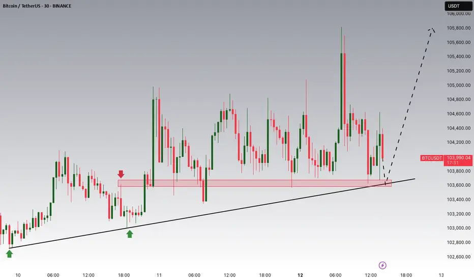
Bitcoin Potential UpsidesHey Traders, in today's trading session we are monitoring BTCUSDT for a buying opportunity around 103,000 zone, Bitcoin is trading in an uptrend and currently is in a correction phase in which it is approaching the trend at 103,000 support and resistance area.
Trade safe, Joe.
DXY – Key Level Broken, More Downside Ahead?Hello Folks , Long time no see .
The US Dollar Index (DXY) just broke below 106.5, and things are getting interesting. The trend has been weakening, and price is now sitting at a crucial zone.
📌 Here’s what I’m watching:
107.66 is the big resistance. If price can reclaim it, bulls might have a chance.
105.48 & 104.46 are the next major support levels.
👀 My Take:
If we stay below 106.5, I expect more downside towards 105.4 and maybe 103.3. If price bounces and reclaims 107, I’ll reconsider.
What’s your view? More downside or a bounce coming? Drop your thoughts below! 🚀🔥
🚨 Disclaimer:
Just sharing ideas here—this isn’t a trade advice . Everyone sees the market differently, and the goal is to improve our analysis, not tell anyone what to do. At the end of the day, your trades are your call, your responsibility. Trade smart! 🚀📊

Solana’s Cup-and-Handle Setup: A Bullish Trap or Opportunity?Recent analysis suggests Solana (SOL) is forming a large cup-and-handle pattern, with a potential false breakout on the fifth wave before a flash crash in mid to late April. Some traders believe this correction could set the stage for a stronger breakout on the seventh wave, possibly pushing SOL past its current pattern high and toward the upper boundary of a broadening wedge formation. Despite short-term volatility, this multi-year structure supports a long-term bullish outlook.
In the near term, market structure remains uncertain, with SOL facing downward pressure despite bouncing from $120. While this level has historically been strong support, the depth of the correction and multiple broken levels suggest caution. Analysts remain divided on the next move—some expect consolidation between $120 and $180, while others warn of a potential drop to $80 if market conditions worsen. Monitoring key support and resistance levels will be crucial for traders navigating the next phase.

$QS Quantum QrazyDon't miss this. Possible port changing play here. Quantum is disgustingly hot, this ticker has had larger highs year ago and above $9 this year. Trend in the sector and volume. IV% on options are exquisite, use it to your advantage. I grabbed $6c 1/17/2025 and $10c 1/17/2025. Talk to you soon.
Wall St. Lsr

xauusd analysis for mondayTechnical Analysis
Key Levels:
Support:
Primary Support: $2,630–$2,640, a crucial level that has consistently held over the past weeks.
Secondary Support: A breakdown below $2,630 could lead to further declines toward $2,600 and $2,570
Resistance:
Primary Resistance: $2,670–$2,700, a zone gold must clear to confirm bullish momentum.
Extended Target: A sustained move above $2,700 could push gold toward $2,720 or higher, with the long-term target near $2,750
Price Action:
Gold has been consolidating around $2,650, indicating indecision in the market. Traders are awaiting a catalyst for a breakout in either direction
Indicators:
RSI: Neutral, indicating no overbought or oversold conditions.
Moving Averages: Gold is trading near its 50-day moving average, reflecting a balance between buyers and sellers.
Elliott Wave Analysis: Suggests the current correction phase might end soon, potentially paving the way for an upward movement
Fundamental Analysis
Key Drivers:
1. Federal Reserve Meeting:
A dovish stance or pause in rate hikes could weaken the USD, benefiting gold. Conversely, a hawkish surprise could pressure prices.
2. US Economic Data:
Housing Data: Strong numbers may support the USD, weighing on gold.
GDP Report: A weaker-than-expected reading could bolster gold's safe-haven appeal, while strong data might strengthen the dollar
3. Global Economic Factors:
Geopolitical Risks: Persistent uncertainties may sustain demand for gold as a safe-haven asset.
Inflation: Gold's role as an inflation hedge keeps it relevant amid ongoing inflationary pressures globally
4. Seasonal Trends:
December traditionally sees increased gold demand, linked to year-end portfolio adjustments and festive purchases.
Trading Scenarios
Bullish Scenario:
Entry: Above $2,660
Targets: $2,700, $2,720, and potentially $2,750
Stop-Loss: Below $2,630
Strategy: Look for a confirmed breakout above resistance or positive market sentiment boosting gold.
Bearish Scenario:
Entry: Below $2,630
Targets: $2,600 and $2,570
Stop-Loss: Above $2,660
Strategy: Watch for rejection at $2,650 or stronger-than-expected US data supporting the USD.

XAUUSD sellXAUUSD sell. the price is right now in a price action zone and in a 4 h fib. we closed a 4h rejection candle and went down. i have a bigger stop loss for this position because the price could retrace a little. there is also a head and shoulders improved setup. happy trading

JAPAN 225 INDEX Bullish Projection CHART
Technical Analysis of Japan 225 Index (4H Chart)
Overview:
The Japan 225 index, as depicted on the 4-hour chart, is currently navigating through a complex pattern with multiple trend lines and Fibonacci retracement levels in play.
RSI signaling bullish technically, within zone of "overvalued." This is in alignment with both Trends and Horizontal Support along with multiple other indicators. Also to note, it is falling towards the 200 EMA, it is about to close a gap on a pattern that has broken out bullish, which aligns with a major trend and horizontal support area, which then takes us to the next trendline, which is a bearish trend trading in a bullish direction. Essentially, this is a really important zone. Price either breaks downward, and likely closes another gap showing in yellow on the chart OR price hits support and we really start to see an upward climb. This movement would be similar to how the SP500 is melting up towards the 6500 range.
Here's a detailed analysis:
Trend Analysis:
Support Trend Line: The price is holding above a key ascending support trend line, which has been in place for several months. This trend line acts as a bullish indicator, suggesting that the index has been in an uptrend.
Descending Resistance Line: There is a descending resistance trend line that the price is approaching. A breakout above this line could signal a continuation of the uptrend and potentially lead to higher targets.
Fibonacci Retracement Levels:
38.2% Retracement: The price is currently testing this level around 39,015.11. This is a common retracement level where price often finds support or resistance.
50% Retracement: Located at 38,015.11, this level could act as a strong support if the price breaks below the 38.2% level.
61.8% Retracement: Around 37,015.11, this is a critical level where a deeper pullback might find support before a potential reversal.
Volume Analysis:
Volume Indicators: There is a noticeable increase in volume at key support and resistance levels, indicating strong buying or selling interest. The recent volume spike suggests significant market activity, which could precede a major move.
MACD (Moving Average Convergence Divergence):
MACD Line and Signal Line: The MACD line is above the signal line, which is typically a bullish sign. However, the histogram shows decreasing momentum, which might indicate a potential slowdown or reversal in the current trend.
Price Targets:
Upside Targets: If the price breaks above the descending resistance trend line, the next resistance levels to watch are around 39,015.11 (38.2% Fibonacci), followed by 40,015.11 and 41,015.11.
Downside Targets: A break below the ascending support trend line could see the price retesting the 50% and 61.8% Fibonacci levels, around 38,015.11 and 37,015.11, respectively.
Conclusion:
The Japan 225 index is at a critical juncture, with multiple technical indicators suggesting both potential continuation of the uptrend and possible consolidation or pullback. Traders should watch for a breakout above the descending resistance or a breakdown below the ascending support for clearer directional cues. Monitoring volume and MACD for confirmation of these moves will be crucial for making informed trading decisions.

BBAI Is it ready to breakout?I have not looked into to this to deep yet. Based on the chart and latest volume it sure looks poised to take off.

DOW 41k, YOU'RE GONNA WANNA PAY ATTENTION TO THIS PRICE TARGET41k is a massive resistance price target
meaning, it is likely to hit allowing exits at profit.
If it hits there is potential to see it bounce around even as high as 54k in a short term, but ultimately, at some point it will need to retest the lower end price targets.
If it were to do that sooner rather than later, it allows for a more natural growth in the price.
Meaning, there is a lot of potential to see the price melt up from 41k and then keep going.
OR more likely, there is a lot of potential to see a drop, possibly even a steep drop from 41k.
Either way, the downside takes us around 20% and then as high as 40% down from 41k.
I included 9k as a potential target, but I don't think we see baring a nuclear bomb being set off on the moon, but anything is possible.
All in
Mark Cuban, Sold stake in Mavs
Jeff Bezos, Sold Amazon stock
Warren Buffet, Sold Apple
Ryan and Carl, Buying BBBY
Multiple sports teams for sale, sold or being shopped
Massive deals everywhere
If you need any more signs that a top is near, with potential to crash hard allowing for a buy the dip scenario. Here is a small sample of it.

PFE chart update, Medicine is expensive So essentially, I tried to follow the trends.
When doing so, it does form an interesting pattern.
It almost looks like a long position chance.
It depends on where support lands with price action, and where the trend breakout occurs, as there is a nice gap setup on the charts that puts PFE on a climb and allows it to form a bullish long term trend.
Should trend break down past last support and confirm that underside exit, it would probably signal a bearish move is more likely.
However, It's a neat setup to watch.
good luck
Link to other PFE chart will be attached.
