GOLD Still side move Gold Chart clear conform in 1H its come down side ,firstly of fall its a below on trend-line ,2ndly its fill a advances FVG level, 3rd its give a Bearish ENGULFING 4rth and last its BIG PLAYER remains order fill on current price moving up side after that ,price come down you take order in lower time frame as per conformation first target is DEMAND ZONE and 2nd Target price quickly move at 4573.284 and also may be Liquated Sweep area at 4435.484 .then possible move UP as per condition or waiting coming more deep analysis.
Now lets see what its does.
Volumepriceanalysis

Indus Towers | Monthly ChartIndus Towers is currently trading near a major long-term resistance zone, which has historically acted as a supply-heavy distribution area. The current structure is important because price is no longer in a downtrend — it is transitioning into a range-to-trend decision phase.
Market Structure Overview
Price has completed a full mean-reversion cycle from multi-year lows.
Strong rally from the long-term demand zone (~₹130–₹150).
Current price is testing a decade-old resistance band (~₹460–₹500).
Structure resembles a range expansion attempt, not a confirmed breakout yet.
This makes the current zone a decision zone, not a chase zone.
Key Zones Identified
Major Resistance (Supply Zone): ₹460 – ₹500
→ Historical rejection zone
→ Multiple monthly wicks earlier
Intermediate Demand / Base: ₹330 – ₹380
→ Recent consolidation box
→ Acts as first support on pullbacks
Major Long-Term Support: ₹130 – ₹160
→ Multi-year accumulation zone
→ Structural bottom already validated
Volume Analysis
Expansion in volume during the rally from lows → accumulation confirmed
Volume contracted during consolidation → healthy pause
No extreme distribution volume near resistance yet
→ Suggests smart money is waiting, not exiting aggressively
Final View
Indus Towers is at a make-or-break level on the monthly chart.
The stock has recovered strongly, but confirmation is still pending.

Gold Buy At this time gold on side move but wait for clear buy conformation after when price come at 5057.080 or its sweep a liquated area 5049.670 and its make a HH creation then we take a BUY order in 5Mints time frame or as you best.
DISCLAIMER
This is made for educational and informational purposes only.
It is not financial, investment, or trading advice.
Trading involves risk, and past performance doesn't guarantee future results.
Always do your own research or consult a licensed financial advisor
before making any trading or investment decisions.
The creator is not responsible for any profit or loss from your actions.
We don't offer paid signals or account management services.
Beware of scammers using our name - we are not connected to them.

S&P500 E-mini(ES) Intraday Volume Playbook (1/25-1/26)ES (S&P 500 E-mini Futures) — January 25–26 Overnight & Day Session Outlook
Current Price: ~6,928–6,930
Market context:
Price sold aggressively into the prior session, flushed into lower value, and is now auctioning back into a prior high-volume node around 6,925–6,935. This area is acting as short-term balance, not acceptance yet. Volume profile shows unfinished business above and thin structure below, making this a location-based market rather than trend-based for now.
Key takeaway:
Expect rotation first, then expansion. Direction will be decided by acceptance above or rejection below the current HVN.
Key Levels
Resistance / Upper Acceptance
6,955–6,965 (Prior VAH / Supply)
6,945–6,950 (Intraday balance high)
Current Balance / Decision Zone
6,925–6,935 (High Volume Node / POC area)
Support / Lower Acceptance
6,900–6,905 (Prior reaction & demand)
6,875–6,885 (Single prints / thin volume)
6,850–6,860 (Session extreme support)
Overnight Session Trades
Trade 1 — Now → 12:00 AM (Early Overnight Rotation)
Bias: Mean reversion / rotation
Price is sitting inside HVN — expect chop unless we see acceptance.
Long Scenario
Entry: 6,920–6,925
Target: 6,945
Extended Target: 6,955
Stop Loss: 6,905
Short Scenario
Entry: 6,950–6,955 (rejection)
Target: 6,930
Extended Target: 6,915
Stop Loss: 6,965
Expect slow, overlapping candles — this is not trend time yet.
Trade 2 — 12:00 AM → 9:00 AM (Asia → London → Pre-US)
This is where real structure develops.
Bullish Acceptance Scenario
If price accepts above 6,945 with volume:
Entry: 6,945–6,950 (pullback)
Target: 6,975
Extended Target: 7,000
Stop Loss: 6,930
Bearish Rejection Scenario
If price fails at 6,945–6,955:
Entry: 6,940–6,950 rejection
Target: 6,905
Extended Target: 6,880
Stop Loss: 6,965
Watch for range expansion after London open — that’s the trigger.
Day Session (RTH) — January 26
Primary Expectation
One-timeframe buyers only if price holds above 6,945
Failure there opens a full rotation lower
Day Session Long (Acceptance Play)
Conditions
Acceptance above 6,945
Pullbacks holding above value
Entry: 6,950–6,955
Target 1: 6,980
Target 2: 7,010
Stop Loss: 6,930
This is a trend continuation day if this holds.
Day Session Short (Failed Auction / Rejection)
Conditions
Rejection wicks + lack of volume above 6,950
Return below 6,930
Entry: 6,930–6,935
Target 1: 6,900
Target 2: 6,870
Stop Loss: 6,955
This becomes a range-to-range liquidation move.
Final Read
Above 6,945: Buyers regain control → continuation toward 7,000
Below 6,925: Failed auction → rotation into lower value
Inside 6,925–6,945: Chop & patience required
This is a location-based market, not a chase market. Let price come to your levels.

METC | Coal Making Moves In The Energy Space | LONGRamaco Resources, Inc. engages in the operation and development of coal mining properties. The firm deals with metallurgical coal in central and southern West Virginia, southwestern Virginia and southwestern Pennsylvania. Its portfolio consists of Elk Creek, Berwind, RAM Mine, and Knox Creek. The company was founded by Randall W. Atkins in August 2015 and is headquartered in Lexington, KY.

BITF | This BTC Miner Will Pop | LONGBitfarms Ltd. (Canada) engages in the business of mining cryptocurrency. The firm is also involved in the ownership and operation of server farms comprised of computers designed for the purpose of validating transactions on the Bitcoin blockchain. The company was founded by Emiliano Joel Grodzki and Nicolas Bonta in 2017 and is headquartered in Toronto, Canada.

Sideways No More?Waypoint REIT (WPR) has been range bound for nearly six years, but the current structure hints at a potential breakout. Price has retraced to the top of the long-term range and is now finding support at two key 50% levels projected from major swing highs and lows.
Trade Scenario 1: Aggressive Entry
Entry: Current levels
Stop Loss: Just below the bullish engulfing candle from the week ending 19 Oct
Target: Initial TP just under the yearly R2 pivot. Beyond that, trail your stop below new swing lows to manage risk.
Minimum Range Target: $3.70
This setup favors traders looking to front run the breakout with tight risk control.
Trade Scenario 2: Conservative Confirmation
Entry: Wait for a clean breakout and hold above the $2.82 high
Stop Loss & Targets: Same as above initial TP near R2, then trail stops with structure
This approach suits those prioritizing confirmation over early positioning.

ETH/USDC: A Gentle Unfolding of Harmonious Flow (3H Timeframe)In the serene cadence of the market, ETH/USDC presently dwells within a balanced range of 2685–3065 on the 3-hour chart.
From the perspective of the Harmonious Flow of Energy, this consolidation is not mere hesitation, but a quiet accumulation — a space where forces align in subtle proportion, neither overpowering the other, yet preparing for natural resolution.
The structure speaks of restraint: proportional waves, measured volumes, and a context that favours continuity over disruption. The energy here feels contained, yet directed — pointing toward an upward release when the balance tips with clarity.
A breakout above the range carries a calm probability of extension toward 3800–4000, a zone where past resistance may gently invite reflection. There, the flow could pause, allowing a harmonious correction — not a reversal, but a respectful return to test the conviction of buyers who entered within 2685–3065.
Such a retracement would serve the deeper rhythm: affirming strength without excess, protecting positions with poise rather than force.
This reading requires no urgency. When the elements — flow, harmony, proportion, and context — converge without pressure, the path reveals itself simply. Until then, we observe with lightness.
Wishing you clarity in the flow.

Monthly Structure Tightening — Wave 5 LoadingDDT is forming a clean Elliott Wave contracting triangle as a Wave 4 consolidation. As long as Wave E pulls back without breaking the Wave C low, the structure remains valid and a continuation breakout becomes the higher‑probability path.
The simple triangle thrust target is marked on the chart, while the broader range target will depend on where Wave E completes.
Key areas of interest for a potential Wave E low include:
A rally from current levels that sees the January candle break and close above the Wave D high, signalling early strength and a possible premature completion of Wave E.
A continued pullback toward the ~$8.46 region, ideally accompanied by declining volume and narrowing candle spreads, which would align with classic Wave E behaviour inside a contracting triangle.
If the structure holds, the next move should be the Wave 5 breakout.

Deep Structure, Clean Risk, Big PotentialAVL is starting to look genuinely interesting here. Yes, it’s a small‑cap, highly speculative commodity play, but the structure developing on the chart is hard to ignore.
The current accumulation range shows multiple Phase B rallies, which deviates from the generic Wyckoff schematic most traders are familiar with. Those repeated bumps strongly suggest the Composite Operator was distributing into breakout enthusiasm, while retail money chased the early strength. Once that liquidity was absorbed, price unwound into a clean corrective leg.
That pullback from the May 23 high appears to have completed into the July 25 low, which is now acting as a potential Last Point of Support (LPS). LPS identification is rarely obvious in real time, but there are constructive signs here:
- the descending trendline has been broken
- demand is beginning to show up on the right side of the structure
- the reaction into the LPS held above the prior support shelf
From a technical perspective, this gives traders a valid long setup with risk defined beneath the LPS.
That said, there’s still a realistic scenario where price rejects this area and rotates lower toward the S1 yearly pivot, forming a deeper Spring. For that to unfold, we’d need to see a decisive move down followed by a monthly close back inside the range. If that happens, the following month’s open becomes the high‑probability entry and the risk‑to‑reward expands significantly.
This idea gains further weight when you look at the new yearly pivot structure. When price moves sideways between the yearly pivot and S1, it often tests the nearest pivot first. In this case, the yearly pivot, before driving into S1 and then launching back above the pivot zone. It’s a behaviour almost no one understands, yet AVL is following it cleanly, and it aligns perfectly with the potential Spring scenario.
There’s still plenty to play out, but whether the LPS holds or we get the deeper Spring, the chart is offering some attractive upside targets. These are large TPs, not guarantees — simply the major resistance zones that stand out on the chart.
In short:
LPS may already be in → early long with tight risk.
Spring still possible → deeper test into S1 before the real markup.
Pivot structure supports both paths, with the Spring offering the cleaner confirmation.
Either way, AVL is entering a part of the cycle where the chart finally matters again.
*Please note arrows are not time based just overall price path expected

BTC Side-waives for BUY BTC this move on side-waives ,its come a down side below FVG hit back to up-side at RED-Line target OR 2nd is current price goes up and re-test back to up side for a BUY Formation its a clear up side make, and normal volume is down-ward its price doesn't want move for sell side, its made a trip where i said price come down then Movie UP-side. now lets see

BTC Quick Hits for Bullish Direction BTC Quick Hits for Bullish Direction they know our direction did you know there direction if not follow there self-talk.
=> BTC hits the liquated sweep here and trip the seller for a sell but its real direction is Bullish side again hits 2nd time FVG point hits or current price to BUY Side.
Now see lets what happened but our conformation is 100% Bullish side.
DISCLAIMER
This is made for educational and informational purposes only.
It is not financial, investment, or trading advice.
Trading involves risk, and past performance doesn't guarantee future results.
Always do your own research or consult a licensed financial advisor
before making any trading or investment decisions.
The creator is not responsible for any profit or loss from your actions.
We don't offer paid signals or account management services.
Beware of scammers using our name - we are not connected to them.

Relief rally Inbound? IMX is shaping up for a potential reversal.
After the aggressive October 10 sell‑off, price responded with a clean Automatic Rally (AR) before rolling over into a controlled pullback. This latest dip appears to be sweeping the October 10 lows, and the December 19 bullish engulfing candle is the first meaningful sign of demand stepping back in.
Crucially, price closed back inside the prior range, which keeps the structure constructive. While heavier volume on the reversal would’ve added confidence, the low‑volume nature of the sweep actually supports a spring narrative — supply has been drying up for weeks, and there’s been no evidence of aggressive selling pressure. That’s exactly what you want to see heading into a potential Wyckoff spring.
Trade Scenario
Initial TP would be just below the range EQ which lines up with the yearly pivot and 50% of the range retracement. From here, if the price can close, hold and form higher lows above this level, would strongly suggest that a bottom is in. The next meaningful upside target sits around $0.58, where prior resistance and structural alignment converge.
Market Context
A surprising number of alts are printing similar spring‑like structures right now:
• Washed‑out lows
• Diminishing volume
• Reclaims back into range
• Early signs of demand returning

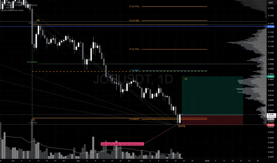
Relief Rally Inbound? JOE is shaping up for a potential reversal.
After the aggressive October 10 sell‑off, price responded with a clean Automatic Rally (AR) before rolling over into a controlled pullback. This latest dip appears to be sweeping the October 10 lows, and the December 19 bullish engulfing candle is the first meaningful sign of demand stepping back in.
Crucially, price closed back inside the prior range, which keeps the structure constructive. While heavier volume on the reversal would’ve added confidence, the low‑volume nature of the sweep actually supports a spring narrative — supply has been drying up for weeks, and there’s been no evidence of aggressive selling pressure. That’s exactly what you want to see heading into a potential Wyckoff spring.
Trade Scenario
Initial TP would be just below the range EQ which lines up with the yearly pivot and 50% of the range retracement. From here, if the price can close, hold and form higher lows above this level, would strongly suggest that a bottom is in. The next meaningful upside target sits around $0.1296, where prior resistance and structural alignment converge.
Market Context
A surprising number of alts are printing similar spring‑like structures right now:
• Washed‑out lows
• Diminishing volume
• Reclaims back into range
• Early signs of demand returning
Relief Rally Inbound? S is shaping up for a potential reversal.
After the aggressive October 10 sell‑off, price responded with a clean Automatic Rally (AR) before rolling over into a controlled pullback. This latest dip appears to be sweeping the October 10 lows, and the December 19 bullish engulfing candle is the first meaningful sign of demand stepping back in.
Crucially, price closed back inside the prior range, which keeps the structure constructive. While heavier volume on the reversal would’ve added confidence, the low‑volume nature of the sweep actually supports a spring narrative — supply has been drying up for weeks, and there’s been no evidence of aggressive selling pressure. That’s exactly what you want to see heading into a potential Wyckoff spring.
Trade Scenario
Initial TP would be just below the range EQ which lines up with the yearly pivot and 50% of the range retracement. From here, if the price can close, hold and form higher lows above this level, would strongly suggest that a bottom is in. The next meaningful upside target sits around $0.16593, where prior resistance and structural alignment converge.
Market Context
A surprising number of alts are printing similar spring‑like structures right now:
• Washed‑out lows
• Diminishing volume
• Reclaims back into range
• Early signs of demand returning

Relief Rally Inbound? VET is shaping up for a potential reversal.
After the aggressive October 10 sell‑off, price responded with a clean Automatic Rally (AR) before rolling over into a controlled pullback. This latest dip appears to be sweeping the October 10 lows, and the December 19 bullish engulfing candle is the first meaningful sign of demand stepping back in.
Crucially, price closed back inside the prior range, which keeps the structure constructive. While heavier volume on the reversal would’ve added confidence, the low‑volume nature of the sweep actually supports a spring narrative — supply has been drying up for weeks, and there’s been no evidence of aggressive selling pressure. That’s exactly what you want to see heading into a potential Wyckoff spring.
Trade Scenario
Initial TP would be just below the range EQ which lines up with the yearly pivot and 50% of the range retracement. From here, if the price can close, hold and form higher lows above this level, would strongly suggest that a bottom is in. The next meaningful upside target sits around $0.0194, where prior resistance and structural alignment converge.
Market Context
A surprising number of alts are printing similar spring‑like structures right now:
• Washed‑out lows
• Diminishing volume
• Reclaims back into range
• Early signs of demand returning

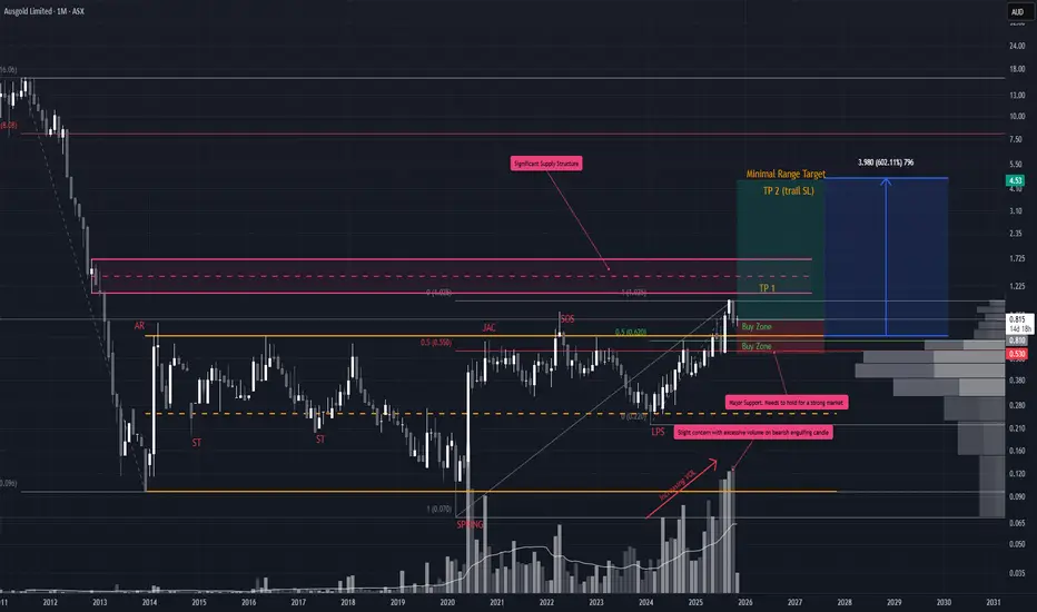
AUC Pulling Into Key AOI
AUC setup is shaping up well. After the initial breakout on expanding volume, price has pulled back ~30% and now retesting the top of the prior range. That’s a healthy retrace, and structurally, the chart still leans bullish.
Entry
You could begin scaling in here, but the more compelling support zone sits closer to ~$0.56. Notably, October closed with heavy volume and a bearish engulfing candle so ideally, we want to see this pullback continue on declining volume with overlapping candles. That would signal absorption rather than distribution.
Take Profit (TP)
• First TP sits around the EQ of the monthly supply structure (already marked).
• Beyond that, there’s minimal overhead resistance, so you can trail stops using higher swing lows as they form.
Stop Loss (SL)
• Since we haven’t seen a new swing low (LPS) yet, the $0.220 LPS remains the logical invalidation point.
• Once a monthly higher low confirms, you can tighten the stop accordingly.
• Until then, risk management is key especially for a small cap stock
ETHUSD Sell Pressure Current Price Goes up and hits the Sell Order Block for a Bearish and also have a Resistance Point, after these Done Price Come Back to Sell at Consolidation 2935.66 to 2917.91 point . When Price will Close the 2916.61 Price Then Price Should be Clear and Quickly Goes Down at 2773.21 Near About. Now Lets see what they Does.

GOLD Buy Near at POI Now at time gold have a selling pressure price is 4508.235 But its will be come Down at 4464.833 round about +-, and that point have a clear Order Block , Fixed Volume Range that mean Showing Clear BUY Pressure also we another conformation is 3rd Time Trend-Line Touch and Volume at time Time is Down. Now let's see what gold does.

GOLD Again Buy OpperunityGold excite Point of interest area (POI) , where have Major POI ,Valid order block and also FVG , trend-line 3rd touch , Liquated Area and Fixed Volume Range

EURUSD Buy After Few Conformation Now at This Time Price 1.1774 Area. at time point price goes up near 1.1780 its a Internal High Level then price come to down at 1.1756 (its a Order Block area, Golden zone and also fixed Volume range)as par technical analysis May be possible Price Liquated sweep 1.1747 Then Find Clear up side Buy Conformation be carefully take all entry as per yourself .that is our analysis

GBP/USD OVERVIEW H4 CHART I 12/22The chart is extremely Bullish. The price is sitting above both the POC and the supporting trendline. The most recent green candle demonstrates strong buyer aggression right at the 1.3400 threshold.

Nanocap Beast Poised for a Breakout?*Reuploaded - chart was recently deleted as I accidently used a paid indicator. However, this setup is looking really nice and still worth to follow. the analysis below is still relevant and now we wait to see how price reacts at the supply structure.
CZR is shaping up for a potential macro range breakout, and while the technicals are compelling, it's critical to acknowledge the elevated risk profile. As a nanocap, CZR demands disciplined risk management and precise position sizing.
Setup Options
Option 1: Aggressive Breakout Anticipation
Enter early if the current monthly candle closes above the yearly pivot ($0.26).
Stop Loss: $0.210 (tight and tactical).
Target: Initial TP at ~$0.70 (major supply zone), with full TP at the 100% macro range extension.
Option 2: Confirmation & Pullback Entry
Wait for a confirmed breakout and close above the range.
Enter on the first clean pullback.
Stop Loss: Based on structure formed during the pullback (can use the SL).
Target: Same as Option 1 — ~$0.70 and full range extension.
Option 3: Deeper Pullback & Reassessment
If price retraces deeper into the range, reassess the setup.
Look for signs of strength (e.g., volume spike, bullish divergence) before re-engaging particularly ~$0.135
This scenario may offer a better R:R if structure holds.
*please note arrows are not based on time analysis just market structure.
