SEP 24, 2025 | XAUUSD | 1st Signal (SELL NOW)Selling at the 3765–3768 resistance zone offers a good risk–reward ratio:
- Stop Loss: above 3775 (to filter false breakouts).
- Take Profit: support zone 3740 → 3721 (POC).
1️⃣ Technical Resistance
- The 3765–3768 zone is located exactly at the SWING VAH – the upper boundary of the profile.
- This is a strong resistance zone, as the price has touched it multiple times and left upper wicks → showing clear selling pressure.
2️⃣ H1 Trendline
- On the chart, there is a descending H1 trendline formed after the price dropped from the recent high.
- Currently, the 3765–3768 zone coincides with this trendline → becoming a dynamic resistance, increasing the probability of price rejection.
3️⃣ Price Action
- Candles near the 3765–3768 area have shown long upper wicks, reflecting strong selling force as the price was pushed down.
- This is a clear signal that buyers are struggling to maintain bullish momentum.
4️⃣ Volume Profile
- The 3765–3768 area is close to a thick volume distribution cluster → the market often reacts strongly when retesting this level.
- This makes the zone a potential supply area.
👉 If you find this analysis useful, don’t forget to hit like 👍 and drop a comment 💬 to support us in delivering even better insights! Or join my channel to get free signal.
Volume

MACTER LongMACTER was previously moving in channel drawn with blue lines.
It broke the channel on 18th July and now it is moving in another channel drawn with yellow lines.
Currently it is at the bottom of this new channel and chances are high that it will bounce back from here. It has almost retraced to Fib 0.786 of its previous high.
Once it bounces back, the first major resistance it will face will be the bottom of blue channel (~480). If it breaks in the channel, the first target will be ~700 (top of yellow channel and Fib extension level of 1.0) and in the longer run, if it also breaks the top of yellow channel, it may reach new highs of ~900 (Fib extension of 1.618).
Heavy volumes in last few days support the idea of heavy accumulation at current price zone.
This is my personal opinion and not a buy / sell call.

Gold Buyers Face ResistanceHi traders and investors!
This analysis is based on the Initiative Analysis concept (IA).
The last daily candle showed strong volume and a long upper wick — indicating that the buyer met resistance from the seller.
Looking at the 1-hour timeframe, the price has formed a sideways range.
It’s better to look for long setups after the buyer defends the lower boundary of this range - 3736.
However, it’s also possible that the price will drop lower — down to the 50% level of the daily buyer initiative, which is 3709.608.
This expectation is based on several factors:
the extended buyer trend on the daily timeframe (a pause might be needed),
signs of seller resistance (as shown by the long upper wick on the last daily candle),
and the fact that the sideways range on the 1H chart has expanded significantly to the upside — ideally, the price would move just as far below the range for balance.
By the way, the 50% level of the daily buyer initiative almost coincides with the level of the last breakout on the daily chart.
Wishing you profitable trades!

Sep 24, 2025 | XAUUSD | Gold Analysis & Trading Plan 1️⃣ Main Trend
- The main trend is still clearly upward (uptrend) as price has been creating higher highs and higher lows since September 20.
- However, at the moment, the price is experiencing a short-term pullback and is being blocked by the descending H1 trendline.
2️⃣ Potential Price Zones
Nearest resistance: around 3,765 – 3,766 (Swing VAH + trendline).
Key support levels:
- 3,721 (Swing POC) – the area with the highest traded volume, potentially a strong support.
- 3,687 – 3,685 (Swing VAL) – the final support of the previous bullish leg.
3️⃣ Price Action
- The current price is moving sideways and retesting the descending trendline.
- There are signs of consolidation right under resistance → indicating hesitation between buyers and sellers.
+ If price breaks through the trendline + VAH, the uptrend is likely to continue.
+ If it fails, price may pull back to test the POC 3,721 or even deeper to the VAL 3,687.
4️⃣ Candlestick Pattern
- Clusters of small candles (doji, short-bodied candles) are forming around the trendline → showing market indecision.
- There is no clear reversal candlestick pattern yet, but the presence of small candles right under resistance often signals the need for a breakout to confirm the direction.
5️⃣ Trading Plan
* Strategy 1 (Priority Buy in line with the main trend):
- Buy when price decisively breaks the trendline and holds above 3,766 with confirming volume.
- Short-term target: 3,800 – 3,820.
* Strategy 2 (Short-term Sell at resistance):
- Sell when price retests the trendline + VAH 3,766 but gets rejected (appearance of bearish pin bar/engulfing candle).
- Target: 3,721 (POC), further 3,687 (VAL).
🪙 Summary: The main trend is still up, but short-term price is moving sideways under the trendline. Only take action when there is a clear signal at 3,766 (breakout = Buy, rejection = Sell).
👉 If you find this analysis useful, don’t forget to hit like 👍 and drop a comment 💬 to support us in delivering even better insights! Or join my channel to get free signal.


XAUUSD – Gold Analysis & Trading Plan (Sep 23, 2025)1️⃣ Main Trend (H1)
- On H1: Price is maintaining a short-term uptrend, respecting the daily trendline (D trendline).
- After breaking out of the 3680–3700 zone, price has held its momentum and is now moving sideways, consolidating around 3750–3760.
- Overall: Both short-term and medium-term trends are bullish, with buyers in control.
2️⃣ Potential Price Zones
Nearby Resistance:
- 3759 (Swing VAH + current distribution zone high).
- 3780 (extended resistance, previous supply zone).
Key Support:
- 3740–3745 (confluence of trendline + short-term demand).
- 3720–3722 (Swing POC – balance zone before breakout).
- 3686 (Swing VAL – final support of this bullish swing).
3️⃣ Price Action
- After testing 3759 several times, price has not yet broken through → showing short-term supply pressure.
- Buyers still dominate, but price action indicates an accumulation phase – waiting for a breakout.
- If price holds above 3740–3745, the uptrend could extend towards 3780+.
- If 3740 breaks, there’s a high chance of a retest at 3720 (Swing POC).
4️⃣ Candlestick Patterns
- A strong bullish sequence earlier, then shifting to small-bodied candles with long upper wicks around 3759 → signal of selling pressure.
- The most recent candle held support at 3740, showing buyers are still defending well.
- Further observation: If a bullish engulfing candle forms at 3740–3745 → confirmation of trend continuation. If broken down with a long-bodied H1 bearish candle → signal of deeper correction.
5️⃣ Trading Plan
* Scenario 1 – BUY at support (highest priority)
- Entry: 3740–3745 (trendline + demand zone).
- Target: 3759 → 3780.
* Scenario 2 – BUY at deeper support
- Entry: 3720–3722 (Swing POC).
- Target: 3745 → 3759.
* Scenario 3 – Breakout BUY
- Entry: Buy when H1 candle closes above 3760 with strong volume.
- Target: 3780 → 3800.
* Scenario 4 – Short-term SELL (low priority, only if clear candle signal)
- Entry: 3759–3760.
- Target: 3745 → 3720.
🏅 Conclusion: The bullish trend remains dominant. Priority is to look for BUY opportunities at 3740–3745 or 3720. If a breakout above 3760 occurs, the bullish move may extend to 3780–3800. SELL setups should only be considered if a clear reversal candle forms at 3759.
👉 If you find this analysis useful, don’t forget to hit like 👍 and drop a comment 💬 to support us in delivering even better insights! Or join my channel to get free signal.

SEP 23, 2025 | XAUUSD |Gold Signal🎯 Trading Plan
- Entry BUY: 3760–3763
- Stop Loss: below 3750 (filtering noise)
- Take Profit: 3785 → 3795 (towards the next resistance zone)
1️⃣ Technical Support Zone
- This is exactly the SWING VAH (Value Area High) from the previous swing profile → which often acts as a dynamic support after price has broken out.
- When price breaks above VAH and consolidates above it, this area becomes a “breakout retest zone” – extremely important for the continuation of the uptrend.
2️⃣ Volume Profile
- At 3760–3763, the Volume Profile shows a cluster of dense volume distribution (high volume node).
- This indicates that previously the market had strong buy–sell balance around this level → providing a solid foundation for price to bounce back when retesting.
3️⃣ Main Trend (Trendline & Momentum)
- Current price is still moving above the H1 uptrend line → the short-term trend remains bullish.
- The pullback into 3760–3763 is considered a retracement within the uptrend, not a reversal.
4️⃣ Price Action
- In previous attempts, whenever price approached the 3760–3763 zone, the market bounced back upward.
- This area is a demand zone that has been tested multiple times but has not been broken → showing that buyers are still defending strongly.
👉 If you find this analysis useful, don’t forget to hit like 👍 and drop a comment 💬 to support us in delivering even better insights! Or join my channel to get free signal.

XAUUSD – Gold Trading Plan | Sep 23, 2025 (Update)1️⃣ Main Trend
- On H1: Price is maintaining a strong uptrend, closely following the daily trendline.
- After the breakout from 3680–3700, price surged sharply, touched 3780, and is now moving sideways around the top area.
- Overall: Both short-term and mid-term trends remain bullish, with buyers fully in control.
2️⃣ Key Price Zones
Nearest Resistances:
- 3780 (recent short-term top, potential supply zone).
- 3800 (extended resistance, psychological level).
Key Supports:
- 3760 (Swing VAH – nearest dynamic support).
- 3745–3750 (short-term demand zone + trendline confluence).
- 3721 (Swing POC – the main balance point of this rally).
- 3685 (Swing VAL – the deepest support of the swing).
3️⃣ Price Action
- Price has surged steeply and faced selling pressure around 3780 → long upper wick appeared.
- Buyers are still in control, but price action shows the market is currently accumulating to find the next direction.
- If 3760 holds, the uptrend may continue toward 3780 → 3800.
- If 3760 breaks, it is highly likely price will retest 3745 → 3721 (Swing POC).
4️⃣ Candlestick Patterns
- Prior to this, there was a series of long-bodied bullish candles → confirming buyers’ dominance.
- The latest candle around 3780 left a long upper shadow → a signal of selling pressure.
- Further observation: If a bullish pin bar or bullish engulfing forms at 3760 → it will confirm trend continuation. If an H1 long-bodied bearish candle breaks down → signal of deeper correction toward 3745–3721.
5️⃣ Trading Plan
📌 Scenario 1 – BUY at Support (highest priority)
Entry: 3760 (Swing VAH).
Target: 3780 → 3800.
📌 Scenario 2 – BUY at Deeper Support
Entry: 3745–3750 (demand zone + trendline).
Target: 3780.
📌 Scenario 3 – BUY at Swing POC
Entry: 3721 (balance POC).
Target: 3745 → 3760.
📌 Scenario 4 – Short-term SELL (low priority)
Entry: 3780 (strong resistance zone).
Target: 3760 → 3745.
✅ Conclusion: The uptrend remains dominant. Priority is given to BUY setups at supports 3760 or 3745–3750. If the trendline breaks, 3721 POC will be a key support level. SELL should only be considered when there is a clear reversal candlestick signal at 3780.
👉 If you find this analysis useful, don’t forget to hit like 👍 and drop a comment 💬 to support us in delivering even better insights! Or join my channel to get free signal.

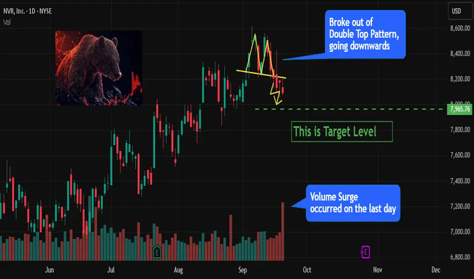
NVR Breaks Down from Double Top - Bearish Outlook Ahead1. Double Top Breakdown
NVR has recently broken down from a Double Top pattern .
This classic reversal structure indicates a shift from bullish to bearish sentiment.
2. Volume Confirmation
The breakdown was accompanied by a strong surge in volume on the last trading day .
High volume confirms strong selling interest and increases the reliability of the move.
3. Bearish Momentum Building
Sellers have taken control after the failed attempt to sustain recent highs.
Price action shows increasing downward momentum with little sign of reversal yet.
4. Downside Potential
With breakdown of the Double Top pattern and heavy volume, NVR shows strong downward potential .
Further weakness is likely if selling pressure continues in the next sessions.
5. Technical Confluence
Breakdown of a major reversal pattern (Double Top).
Strong volume confirming the bearish move.
All factors point toward extended downside.
EUR/USD H1 Analysis: Key Supply & Demand Zones to Watch I SEP/231) Overview
Timeframe: H1 (short to mid-term trades).
Short-term trend: bullish (trendline up from Sept 22 low).
Current price: around 1.1798, overlapping with POC zone ~1.1799 (from volume profile).
Key zones:
Supply zone: 1.1814 – 1.1820 (strong resistance).
POC zone / balance area: ~1.1799.
H1 Support: 1.17606 (near-term support).
Demand zone: ~1.17236 (stronger support below).
2) Price Action & Market Logic
Price has been making higher highs / higher lows → bullish structure.
Volume profile shows POC ~1.1799 as the most traded price → if price holds above → likely continuation. If rejected → pullback to support.
H1 trendline acts as dynamic support → confluence buy zone if combined with H1 support.
3) Main Scenario: Buy with the trend (priority setup)
Idea: wait for pullback to H1 support/trendline, buy upon confirmation.
Entry zone: 1.1760 – 1.1770 (support + trendline confluence).
SL: below 1.1740 (to avoid stop hunts).
TP1 (partial): 1.1814 (supply zone).
TP2 (full): 1.1820 – 1.1830 (if breakout/momentum continues).
Example Risk:Reward:
Entry ~1.1765.
Stop: 25 pips (1.1765 → 1.1740).
Target TP1: 49 pips (1.1765 → 1.1814).
R:R ~ 1:2 (solid setup).
4) Alternative Scenario: Sell from Supply zone (counter-trend scalp)
Idea: short at supply if bearish rejection forms.
Entry: 1.1814 – 1.1820.
SL: above 1.1835.
TP1: 1.1790 (POC zone).
TP2: 1.1760 (H1 support).
Note: This is a counter-trend trade → smaller size, only with clear rejection (pin bar/engulfing).
5) Entry Confirmation Signals
Only enter if one of these shows up at key levels:
Pin bar or engulfing candle on H1.
Break & retest of supply/resistance with strong volume.
Volume acceptance above POC = bullish continuation; rejection below = bearish move.
6) Risk & Position Sizing (example)
Rule: max 1% risk per trade (can go 2% if aggressive).
Formula:
Risk $ = Account × %risk.
Loss per lot = Stop (pips) × $10 (for EUR/USD, 1 standard lot ≈ $10/pip)
Lot size = Risk $ / Loss per lot.
Example: Account $10,000, 1% risk → $100 risk.
Stop = 25 pips.
Loss/lot = 25 × $10 = $250.
Lot size = $100 / $250 = 0.4 lots.
7) Trade Management
Partial close 50% at TP1, move SL to breakeven for the rest.
Or scale out gradually, trail stop under swing lows/EMA.
Exit early if price consolidates weakly without momentum.
8) Invalidations / No-trade conditions
If H1 closes below 1.1740 (support + trendline broken) → cancel buy setup, wait for demand zone ~1.1723.
If price struggles at POC (no acceptance above) → avoid buying until structure clears.
Avoid new entries right before high-impact news (FOMC, NFP, CPI).
9) Quick Checklist before entry
Price at confluence zone (support + trendline or supply).
H1 candle confirmation (pin/engulfing/retest).
R:R ≥ 1.5 (preferably ≥ 2).
Position size matches risk %.
Economic calendar checked for news events.
Disclaimer: This analysis is provided for educational and informational purposes only and does not constitute financial advice. Trading involves risk, and you should only trade with money you can afford to lose. Always do your own research before making any investment decisions.

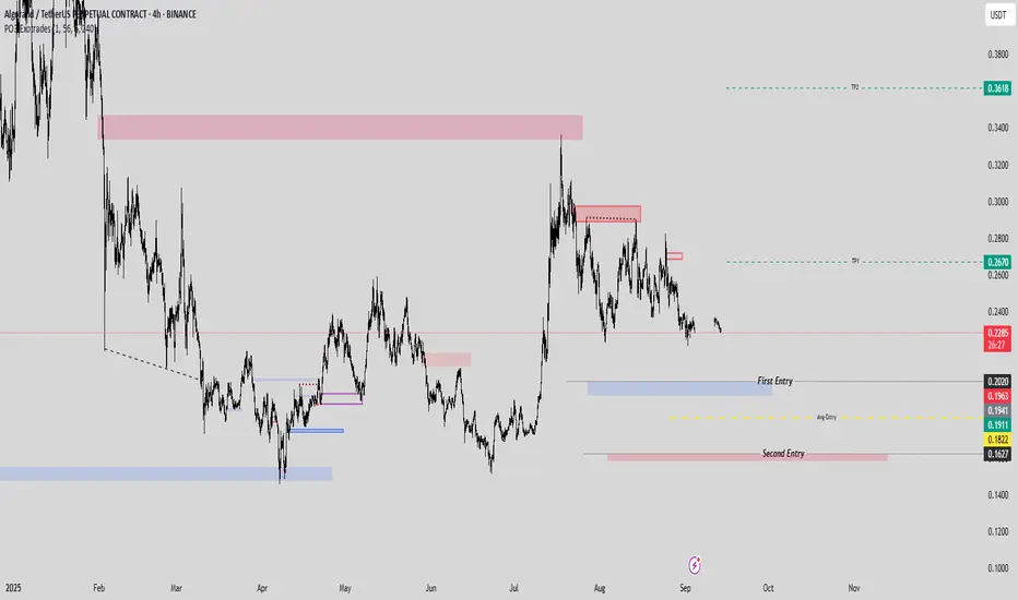
ALGO/USDT Double-Entry Precision Signal with 80% profitHere’s a strategic setup for #ALGOUSDT designed to lock in gains and eliminate downside risk through a two-tiered entry.
- Entry 1: 0.2020
- Entry 2: 0.1627 (purely to reduce overall trade risk; not a profit-seeking leg)
- TP1: 0.2670 (take 50% off the table)
- TP2: 0.1627
---
After TP1 is hit and you’ve secured half your position, shift your stop to breakeven on the remaining size. You can free-risk by moving your stop in the platform or setting a manual alert once 0.2670 is reached. This ensures the rest of the trade carries zero risk while letting profits run.
---
Note: the second entry point isn’t aimed at generating additional profit—it serves solely to widen your safety net and lower the average cost of your position. Trade smart, manage risk, and let the market work in your favor.
BINANCE:ALGOUSDT.P
AGI Infra is consolidating. Ready For BreakoutAGI Infra is consolidating for more than 5 weeks and outperforming Nifty500. Before consolidation, it move up strongly.
Volatility and volume both are low.
Fundamentals are also looks good.
I love the setup - Breakout Hunter Strategy

COOKIE/USDT – Accumulation before potential breakout This is truly an amazing chart. ✨ I haven’t seen anything like this in the altcoin world for a long time, and it even reminds me of Bitcoin’s structure.
On the weekly chart, COOKIE has been trading in a yellow accumulation zone, while forming a descending trendline (yellow). The price is approaching a decision point – either a breakdown or a potential breakout to the upside.
Support: around 0.10 – 0.13 USDT
Resistance: descending trendline
Volume profile: shows strong interest in this range
Upside target (if breakout): green zone $3 – $4.5 🟢
📌 Conclusion: The market is in accumulation. Watch closely how price reacts at the trendline. A breakout to the upside could open the door for a significant rally.

#USDCAD short stops 1.3815 tp 1.3752looking from the left there was a trap set for the buyers on the 60 minutes chart where it clearly shows now after the pullback back to the area buyers may have released because a trap on the 5 minutes has also been identified with some volumes
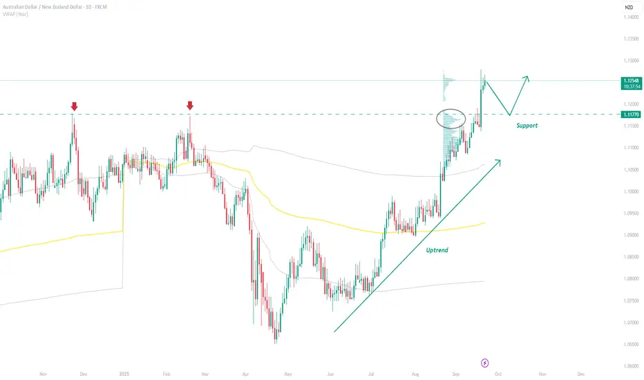
AUD/NZD Swing Trading Strategy: Volume Profile Support at 1.1177AUD/NZD has a newly formed swing support at 1.1177. A heavy volume cluster formed as buyers pushed through prior highs, showing strong commitment. If price pulls back, those buyers are likely to defend it—making this a solid long setup. This is a swing trade, so stops go below the cluster, with TP aiming for 1:1+ RRR.
USD/CAD Trade Idea: Short Setup at 1.3811 ExplainedUSD/CAD is forming a strong short setup at 1.3811. A heavy volume cluster + small FVG signal that sellers built shorts before driving price lower. This confluence makes the level strong, and we should wait for a pullback to short from it. There’s also a weak low below, which price often targets—ideal for partial trailing.

GBP/USD 1.3541 Resistance: FVG + Volume Profile BreakdownGBP/USD is forming a strong resistance at 1.3541. A Fair Value Gap (FVG) shows aggressive selling, backed by a heavy volume cluster where shorts were built.The level also flipped from support to resistance, adding confluence. We should wait for a pullback to short from this zone.

XAUUSD – Gold Analysis & Trading Plan (Sep 22, 2025)1️⃣ Main Trend (H1)
- On H1: The short-term downtrend has officially been broken as price surpassed the descending trendline and the 3680 resistance (PW VAH).
- Currently, price has rallied strongly, reaching the 3710–3715 zone, showing that buying pressure is dominant.
- Overall: The short-term trend has shifted to bullish, aligning with the broader uptrend.
2️⃣ Key Price Zones
Nearby Resistances:
- 3710–3715 (recent short-term high).
- 3730 (psychological resistance + previous supply zone).
Key Supports:
- 3680–3685 (PW VAH + breakout retest area).
- 3640–3643 (PW POC – previous balance & demand zone).
3️⃣ Price Behavior
- Price has broken out strongly from 3680, creating a steep bullish momentum.
- Current price action shows buyers in control, but after such a rapid move, the probability of a retest back to 3680–3685 is high.
- The 3710–3715 zone is showing signs of selling pressure (upper wick rejection on H1).
4️⃣ Candlestick Patterns
- Strong consecutive bullish H1 candles with long bodies → confirmation that buyers dominate the market.
- The latest candle around 3710–3715 left a longer upper wick → an early warning signal of short-term profit-taking pressure.
- Additional observation: If a bearish pin bar or bearish engulfing forms at 3710–3715 → high chance of a short-term pullback.
5️⃣ Trading Plan
* Scenario 1 – BUY at Support (Highest Priority)
- Entry: 3680–3685 (breakout retest area).
- Target: 3710 → 3725.
* Scenario 2 – Short-term SELL at Resistance (only if clear bearish candlestick signals appear)
- Entry: 3710–3715.
- Target: 3690 → 3685.
* Scenario 3 – Breakout BUY
- Entry: Buy if H1 closes above 3715–3720 with strong volume.
- Target: 3730 → 3745.
✅ Conclusion: The bullish trend has been confirmed. Priority goes to BUY strategies at 3680–3685 retest or successful breakout above 3720+. Short-term SELLs should only be considered if clear bearish candlestick signals form around the 3710–3715 resistance zone.
👉 If you find this analysis useful, don’t forget to hit like 👍 and drop a comment 💬 to support us in delivering even better insights!

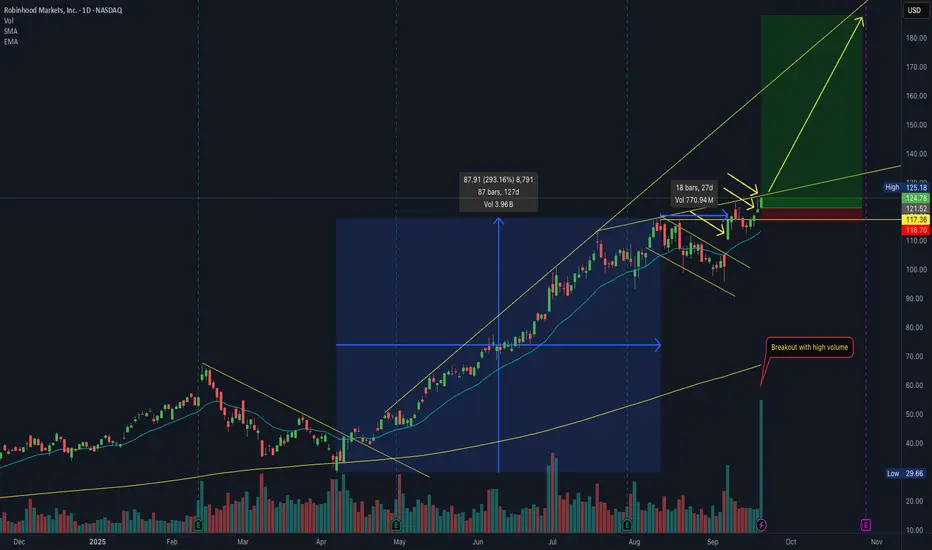
Potential Buy Setup – $HOOD Breakout on High VolumeKey points:
• Growth of 293% in the previous 4 months
• Consolidation phase of nearly 1 month after the growth, with low volume and respecting the EMA21
• Beginning of a flag breakout with average volume surging more than 50%
• Continuation breakout above the previous high with another volume surge
-------------
Dear friends,
I trade the markets using a structured, multi-stage strategy that combines technical analysis, price action, and market psychology. My approach includes key concepts such as candlestick patterns, trendlines, support & resistance, Elliott Wave theory, and price channels. I also integrate strategies from O’Neil’s CANSLIM, Minervini’s SEPA, Oliver Kell’s momentum trading, and Qullamaggie’s breakout setups.
Good luck!
Sellers in Control AfterEUR/USD hit a major resistance zone between 1.18500 – 1.19000, which aligns with the Monthly Volume Profile resistance area. Price has rejected this zone with lower highs and decreasing volume — a classic bearish signal.
This setup suggests that a Wave 4 correction may be underway, with potential to target 1.15500 and even 1.14500 if selling pressure accelerates.
Disclaimer: This analysis is for educational purposes only and does not constitute financial advice. Always conduct your own research and manage your risk appropriately.

Super Bear on NQ for week 22/10 - 03/11 2025This week will show if the bears are gonna step in! A lot of positivity in the markets due to rate cuts but I'm not buying it. Sell the news will be on. Predicting NQ back to 24000 till end of the month. Bearish setup only for the rest of the month.
Always remember, Caution, Patience and Risk!
GL!
If you like the content give me a follow on X!
Check Bio. Cheers!

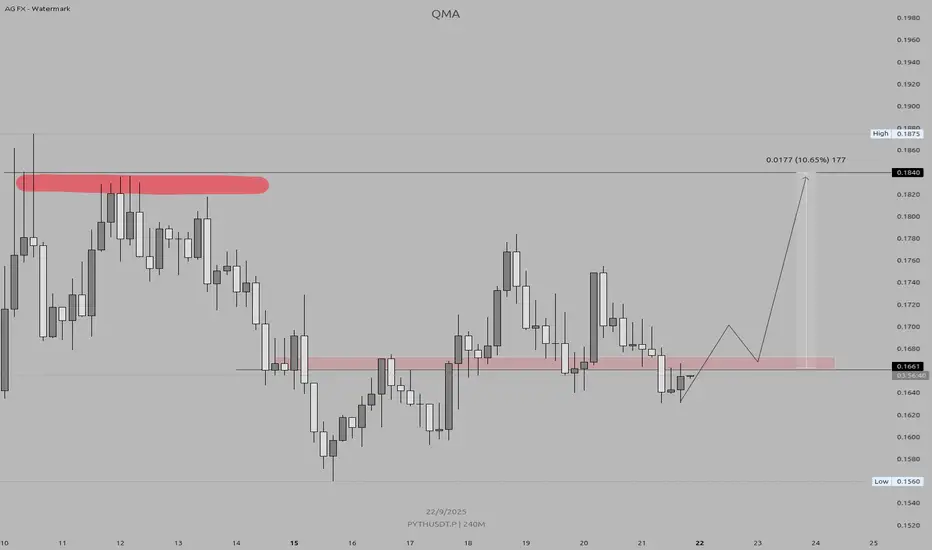
PYTH/USDT – Bullish Re-Test SetupKey Level: 0.167 (Previous Support → Now Resistance)
Target: 0.18 – 0.185
Timeframe: 4H (240M)
✅ Trade Conditions:
Price must reclaim and close above 0.167 on the 4-hour candle.
This confirms bullish strength and breaks the previous downtrend.
🎯 Action:
Enter on close above 0.167
Stop Loss: Below 0.160 (support breakdown)
Take Profit: 0.18 → 0.185
💡 Why?
The zone around 0.167 was strong support earlier. If bulls reclaim it with a strong close, it signals momentum shift. The path of least resistance is now toward 0.18, where prior resistance lies.
🔥 Watch for confirmation — no fakeouts. Only trade if the 4H candle closes cleanly above 0.167.
#PYTH #CryptoTrading #DayTrading #Breakout #TradingView
EURUSD: 1.19 Hit — Sellers Step In?Hi traders and investors!
This analysis is based on the Initiative Analysis concept (IA).
Buy patterns formed in the 1.1835–1.1830 zone, and then price reached 1.1900, as anticipated in the previous review. Got lucky on this one (see previous post).
Let’s take a closer look—this is an interesting setup.
Weekly chart
The last three buyer bars showed elevated volume but no result — the closes are inside the wicks.
Daily chart
The buyer broke above the initiative’s upper boundary at 1.18299 with a wide-spread, high-volume candle, but the seller pushed price back below 1.18299 and engulfed the buyer’s candle.
A sideways range is likely forming; a seller initiative is projected with a target at 1.15278.
There’s a sell signal on the chart — very interesting.
The Dollar Index, by the way, is turning in a mirror image.
Wishing you profitable trades!
