Sayed Official SniperSniper and Trading best swing of the year no body knows i get it premium to share with you guyz
Bands and Channels
Rectangle Breakout Patterns📊 Rectangle Breakout Pattern Detector (Support & Resistance)
This indicator is a dynamic tool designed to automatically identify and visualize Rectangle Continuation Patterns and Trading Ranges based on pure price action. It focuses on finding horizontal areas of long-term support and resistance where price is consolidating before an eventual breakout.
💡 What It Does
The core function of this indicator is to detect and plot the boundaries of significant consolidation areas on your chart. It follows a multi-step confirmation process:
Level Detection: It automatically identifies significant Pivot Highs and Lows.
Pattern Confirmation: It confirms Support and Resistance by counting the number of times price 'touches' a level (controlled by the Min Pivot Touches setting).
Visualization: Once confirmed, it draws a Box around the consolidation area. This box automatically extends to the right as long as the price remains contained, showing the active trading range.
This provides an objective, code-driven approach to a classic chart pattern often relied upon by technical analysts.

CHOP-O-METER - Multi-Factor Choppiness DetectorA composite indicator that quantifies market choppiness using four independent measurements, helping you identify when to trade trends vs. when to sit out or fade moves.
━━━━━━━━━━━━━━━━━━━━━━━━━━━━━━━━━━━━━━━━
HOW IT WORKS
The Chop-O-Meter combines four normalized components (each scaled 0-100) into a single weighted score:
1. Price Efficiency (Kaufman-style)
Measures how efficiently price moved from point A to B. If price travels far but nets little distance, efficiency is low = high chop.
2. Direction Change Frequency
Counts how often price direction flips within the lookback period. More flips = more chop.
3. Mean Reversion Intensity
Tracks how often price crosses its moving average. Frequent crosses indicate a ranging, choppy market.
4. ATR Expansion Ratio
Compares the sum of individual bar ranges to the total period range. High ratio means lots of movement within a tight overall range = chop.
━━━━━━━━━━━━━━━━━━━━━━━━━━━━━━━━━━━━━━━━
READING THE INDICATOR
Above 65 (Red Zone): High chop — avoid trend-following, consider mean-reversion or staying flat
Below 35 (Green Zone): Trending — momentum strategies more likely to succeed
35-65 (Orange): Transitional/uncertain regime
━━━━━━━━━━━━━━━━━━━━━━━━━━━━━━━━━━━━━━━━
SIGNALS
🔻 Green triangle (top): Chop breaking down — potential trend starting
🔺 Red triangle (bottom): Trend exhausting — chop may be returning
━━━━━━━━━━━━━━━━━━━━━━━━━━━━━━━━━━━━━━━━
SETTINGS
Lookback Period: Number of bars to analyze (default 20)
Component Weights: Adjust influence of each factor
Thresholds: Customize high/low chop boundaries
Show Components: Toggle individual factor plots for debugging
━━━━━━━━━━━━━━━━━━━━━━━━━━━━━━━━━━━━━━━━
USE CASES
Filter out trend trades when chop score is high
Reduce position size in choppy regimes
Switch between mean-reversion and momentum strategies
Identify regime transitions early
━━━━━━━━━━━━━━━━━━━━━━━━━━━━━━━━━━━━━━━━
ALERTS INCLUDED
Entering High Chop
Entering Trend
Chop Breaking Down

Quantum Darvas BoxesQuantum Darvas Boxes - The Modern Evolution
The original Darvas Box methodology, conceived by Nicolas Darvas in the 1950s, revolutionized breakout trading by identifying consolidation phases as "boxes." However, modern markets move with algorithmic speed and fractal volatility that often trigger false breakouts. Quantum Darvas Boxes were designed not as a nostalgic tribute, but as a computational upgrade. By anchoring boxes to volatility-adjusted boundaries rather than raw highs/lows, and introducing adaptive stability mechanisms, this indicator transforms a classic discretionary tool into a systematic, noise-filtered engine.
Description & Improvements
Quantum Darvas Boxes solve the three fatal flaws of the original: false breakouts, arbitrary box sizing, and lack of confirmation. Instead of drawing boxes at exact recent highs/lows, it creates volatility-buffered boundaries using ATR, ensuring breakouts require meaningful momentum. The boxes remain anchored until a confirmed close beyond the buffer occurs, preventing the constant redrawing that plagued traditional Darvas implementations. Built-in volume and RSI filters add discretionary-grade confirmation to pure price action. Visually, the system presents as a stable, semi-transparent blue zone between red (resistance) and lime (support) lines, with clear triangle signals appearing only on validated breakouts.
How It's Based on Darvas
The core philosophy remains true to Darvas' 1950s methodology:
Identify Consolidation: Finds price ranges where the market consolidates
Draw Box: Creates a "box" representing the accumulation zone
Breakout Trading: Enters when price breaks out of the box with momentum
Volatility-Adjusted Boundaries
Original: Boxes at exact highs/lows → prone to false breakouts
QDB: Boxes set at High - (ATR × Multiplier) and Low + (ATR × Multiplier)
→ Breakouts require meaningful momentum, not just price tags
→ Adapts to different volatility regimes
Signal Logic:
Long: Close above box top, previous close was inside box
Short: Close below box bottom, previous close was inside box
Ideal Settings:
For daily charts, use lookback=13 and mult=2.4.
For intraday (1H-4H), reduce to lookback=8 and mult=1.8. Enable volume filter in trending markets and RSI filter in ranging conditions.
Trade Execution: Enter long on the green triangle below the bar following a close above the red top line; enter short on the red triangle above the bar after a close below the lime bottom line. The background glow provides immediate visual confirmation.
Risk Management: Set stops at the opposite box boundary. The volatility multiplier inherently calculates a risk buffer—larger multipliers create wider, higher-conviction boxes; smaller multipliers produce more frequent, sensitive signals. This system excels in trending markets and provides clear exit/reversal points, transforming Darvas's original speculation into a quantified, repeatable edge.

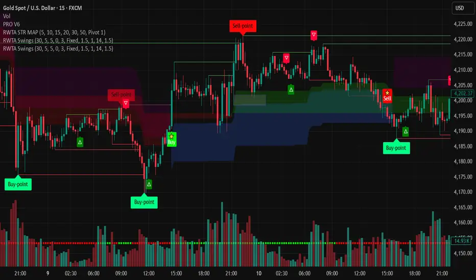
MAJOR PA Zones + Structure + Targets (Gray/Purple)This script highlights major price-action structure (HH/HL/LH/LL), marks BOS/CHOCH events, and draws key supply/demand zones to help visualize trend shifts and potential targets.

Round Strike Price, Levels Options Series➤ Strike Price Range Mode:
➤ Exact Strike Price Mode:
⭐ Overview and How It Works
Round Strike Price or Levels is a precision-focused visual tool designed for options and index traders.
It dynamically plots round strike levels around the current price and presents them either as:
⠀ — Exact strike prices, or
⠀ — Strike price ranges, where each zone represents the midpoint between two adjacent strikes.
The indicator continuously recalculates the base strike using the current price and aligns all surrounding levels using a fixed step size.
All lines and labels are updated only on the last bar for optimal performance and stability.
This makes StrikePrice ideal for:
🔹 Identifying key option strikes.
🔹 Visualizing price acceptance zones.
🔹 Understanding strike-to-strike movement during intraday trading.
⭐ Key Features and Functionality
Strike Price Range:
⠀ — Treats each pair of strike lines as a price zone.
⠀ — Labels are plotted at the midpoint between two lines.
⠀ — Last label is intentionally hidden (no upper range exists)
Exact Strike Price:
⠀ — Labels are plotted directly on each strike line.
⠀ — Useful for precise strike-based analysis.
Dynamic Base Calculation:
⠀ — Automatically snaps price to the nearest round strike.
⠀ — Re-centers the entire grid as price moves.
⠀ — No manual adjustment required.
Efficient Object Management:
⠀ — Uses persistent arrays for lines and labels.
⠀ — Objects are reused instead of recreated.
⠀ — Prevents flickering and avoids TradingView object limits.
🎨 Visualizations and User Experience
Clean horizontal strike grid with configurable:
⠀ — Line width, Line color, Line style (Solid / Dashed / Dotted), Extension direction (Left / Right / Both / None).
Labels are:
⠀ — Positioned to the right of price, Size-adjustable, Fully customizable in text color and background color.
Designed to stay visually clear even on:
⠀ — Fast-moving intraday charts, Options-focused layouts, Multi-indicator setups.
Tip: Increase Right Bars Margin in chart settings to give labels proper spacing.
⭐ Settings and Customization
🔹 Strike Settings:
⠀ — Step (points): Distance between adjacent strike levels (e.g., 50, 100)
⠀ — Levels per side: Number of strike levels plotted above and below the base.
⠀ — Strike Mode: Strike Price Range, Exact Strike Price.
🔹 Line Settings:
⠀ — Line width, Line color, Line style (Solid / Dashed / Dotted), Line extension direction.
🔹 Label Settings:
⠀ — Show / hide labels, Label distance (bars to the right), Label size, Label text color, Label background color.
All label properties are updated dynamically, allowing real-time UI tuning without reloading the script.
⭐ Uniqueness of the Concept:
Unlike generic round-number indicators, StrikePrice:
⠀ — Understands option-style strike structure.
⠀ — Separates range-based thinking from exact price levels.
⠀ — Uses midpoint logic to visualize strike-to-strike movement.
⠀ — Maintains strict performance discipline by updating only when necessary.
This makes it especially useful for:
⠀ • NIFTY / BANKNIFTY options.
⠀ • Index and futures traders.
⠀ • Intraday strike rotation analysis.
⠀ • Premium decay and range-bound setups.
🚀 Conclusion:
StrikePrice is a focused, professional-grade indicator for traders who think in strikes, ranges, and levels rather than arbitrary prices.
It offers:
⠀ • Clear structure
⠀ • Accurate strike alignment
⠀ • Clean visuals
⠀ • Zero repainting logic


Resampling Reverse Engineering Bands XRREB X: Visual Oscillator Projection Bands
Based on the innovative "Resampling Reverse Engineering" concept pioneered by Donovan Wall, this enhanced script fixes the core mathematical symmetry and provides anchored, non-repainting bands for reliable analysis.
This indicator transforms any RSI, Stochastic, or CCI calculation directly onto your price chart as dynamic support/resistance bands. Instead of watching an oscillator below your chart, you see its overbought/oversold levels projected as price levels the market must reach.
RREB X reverses standard oscillator formulas to answer one question: "What price must the market reach for my chosen oscillator to hit an extreme level like RSI=70, Stoch=80, or CCI=100?" It then plots these levels as actionable bands.
Key Improvements
Adjustable Oscillator Values - While the original was hard coded the reverse engineered oscillator length which limited its usefulness, this script finally allows you to visualize any length oscillator as dynamic OB/OS regions directly on the chart.
Dynamic OB/OS levels: This version also lets you dynamically adjust the OB/OS levels location, making bands tighter or wider as your strategy demands.
Mathematical Symmetry: Outer bands are perfect mirrors, providing reliable projected levels.
Fixed Anchoring: Bands don't repaint historically, offering stable reference lines.
Direct Price Translation: Oscillator overbought/oversold conditions are visualized as clear price levels.
The Band Calculation Type switch lets you project different oscillator logics, each with unique characteristics for different market conditions.
RRSI - General trend & momentum. Change RSI Period (e.g., 7 for fast, 21 for slow). Adjust OB/OS (e.g., 80/20 for strong trends). The bands show the price needed to push your custom RSI into overbought/oversold territory.
RStoch - Ranging markets & short-term reversals. Focus on the Stochastic Period. The projected bands are highly sensitive to recent highs/lows. Excellent for spotting reversals at the edges of a range.
RCCI - Strong trends & volatile markets. Use a higher Outer Bands Multiplier. CCI's lack of upper/lower bounds means bands reflect extreme momentum shifts. Great for identifying explosive breakout or breakdown levels in trends.
Use Middle Band as Filter: Price above the white middle band suggests a bullish bias for long setups; below suggests bearish for shorts. Same as the 50 midline on the RSI or Stochastic or 0 for CCI.
Customizing the Calculation:
The power lies in changing the oscillator lengths that the bands reflect. Adjust these in the settings:
Change from 14 to 7 for faster, more reactive bands, or to 21 for slower, smoother bands.
Overbought/Oversold: Change from 70/30 to 80/20 for stronger-trend filters, or to 60/40 for more frequent signals.
Trading the Bands:
Bands as Dynamic S/R: The solid cyan (Upper 100) and magenta (Lower 0) bands act as dynamic support and resistance. A touch and reversal can signal a trade.
Gradient as Momentum: The colored fills between bands visually represent the "pressure" needed to reach the next oscillator level.
Middle Band as Trend Filter: Price above the white middle band suggests a bullish bias for long setups; below suggests bearish for short setups.
Ultimate Squeeze & BreakoutTitle: Ultimate Squeeze & Breakout
Description: This indicator is a volatility analysis tool designed to identify periods of market compression ("The Squeeze") and validate subsequent breakouts using momentum logic. It builds upon the classic relation between Bollinger Bands and Keltner Channels but adds a directional filter to reduce false signals.
The Problem It Solves: Standard squeeze indicators often signal a breakout the moment price exits the bands, even if the underlying trend is weak or flat. This can lead to entering "wicks" or fakeouts. This script solves this by requiring the Basis Line Slope to align with the breakout direction before generating a signal.
How It Works:
1. Compression (The Setup) The script monitors the relationship between Bollinger Bands (Standard Deviation) and Keltner Channels (ATR).
Red Cloud: When the Bollinger Bands contract completely inside the Keltner Channels, it indicates a critical drop in volatility. The market is coiling and storing energy.
2. The Momentum Filter (The Validation) Unlike basic squeeze indicators, a breakout is not signaled solely by price closing outside the bands.
Logic: The script calculates the slope of the 20-period Basis Line (Simple Moving Average).
Bullish Validation: Price > Upper Band AND Basis Line is sloping UP.
Bearish Validation: Price < Lower Band AND Basis Line is sloping DOWN.
Visual Guide:
🟥 Red Cloud: Squeeze ON. Volatility is compressed. Do not trade; wait for expansion.
🟣 Fuchsia Cloud: Bullish Breakout (Price released upward + Positive Momentum).
🔵 Blue Cloud: Bearish Breakout (Price released downward + Negative Momentum).
⬜ Gray/Green Cloud: Standard Trending phase (Volatility is normal).
Features:
Precision Inputs: Multipliers for Standard Deviation and ATR can be adjusted in 0.01 increments for fine-tuning sensitivity.
Visual Toggles: Option to color the neutral trending cloud Green or Gray based on preference.
Alerts: Built-in alerts for "Squeeze Started" and validated "Bullish/Bearish Breakouts."
Credits: Core mechanics based on the TTM Squeeze concept popularized by John Carter. Momentum filtering logic added for enhanced signal reliability.

Adaptive 2-Pole Trend Bands [supfabio]Adaptive 2-Pole Trend Bands is a volatility-aware trend filtering indicator designed to identify the dominant market direction while providing dynamic reference zones around price.
Instead of relying on traditional moving averages, this indicator uses a two-pole digital filter to smooth price action while maintaining responsiveness. Around this central trend line, a multi-band structure based on ATR is applied to help traders evaluate pullbacks, extensions, and potential exhaustion areas within a trend.
Core Concept
The indicator is built around three key ideas:
Digital Trend Filtering
Volatility-Adjusted Bands
Trend Persistence Measurement
These components work together to separate meaningful price movement from noise and to provide context for how far price has moved relative to recent volatility.
Two-Pole Trend Filter
At its core, the indicator uses a two-pole smoothing filter, which produces a cleaner trend curve than common moving averages.
Compared to standard averages, this approach:
Reduces market noise
Produces smoother transitions
Responds faster to genuine trend changes
Avoids excessive lag in trending markets
The result is a trend line that represents the structural direction of price, rather than short-term fluctuations.
Adaptive Multi-Band System
Around the central trend filter, the indicator plots four independent volatility-based bands, each derived from the Average True Range (ATR).
Each band represents a different degree of price extension:
Band 1: Shallow pullbacks and minor reactions
Band 2: Moderate extensions within a trend
Band 3: Strong directional moves
Band 4: Extreme extensions relative to recent volatility
Because the bands are ATR-based, they automatically adapt to changing market conditions, expanding during high volatility and contracting during calmer periods.
This makes the indicator suitable for both slow and fast markets without manual recalibration.
Trend State Detection
The color of the central filter dynamically reflects trend persistence, not just direction:
Sustained upward movement highlights bullish conditions
Sustained downward movement highlights bearish conditions
Transitional phases are visually distinct, helping identify regime changes
This logic is based on how long price has maintained directional behavior, reducing sensitivity to isolated candles or short-lived spikes.
Practical Applications
This indicator can be used as:
A trend filter for discretionary or systematic strategies
A context tool to evaluate pullbacks versus overextension
A risk reference to avoid entries in extreme price zones
A confirmation layer when combined with price action or momentum tools
It performs consistently across different asset classes, including futures, cryptocurrencies, forex, indices, and equities.
Configuration
Key parameters such as filter length, damping factor, and band multipliers are fully configurable, allowing traders to adapt the indicator to different timeframes and trading styles.
Important Notes
This indicator does not predict future price movement
It does not generate guaranteed buy or sell signals
Best results are achieved when used in combination with sound risk management and additional confirmation tools
Past behavior does not imply future performance
Disclaimer
This indicator is provided for educational and analytical purposes only and should not be considered financial advice.
Se quiser, posso:
Criar uma versão resumida para a primeira linha da publicação
Ajustar o texto para um tom mais técnico ou mais comercial
Traduzir para português mantendo o inglês como idioma principal
Revisar o título para SEO dentro da Biblioteca Pública

Ultimate Reversion BandsURB – The Smart Reversion Tool
URB Final filters out false breakouts using a real retest mechanism that most indicators miss. Instead of chasing wicks that fail immediately, it waits for price to confirm rejection by retesting the inner band—proving sellers/buyers are truly exhausted.
Eliminates fakeouts – The retest filter catches only genuine reversions
Triple confirmation – Wick + retest + optional volume/RSI filters
Clear visuals – Outer bands show extremes, inner bands show retest zones
Works on any timeframe – From scalping to swing trading
Perfect for traders tired of getting stopped out by false breakouts.
Core Construction:
Smart Dynamic Bands:
Basis = Weighted hybrid EMA of HLC3, SMA, and WMA
Outer Bands = Basis ± (ATR × Multiplier)
Inner Bands = Basis ± (ATR × Multiplier × 0.5) → The "retest zone"
The Unique Filter: The Real Retest
Step 1: Identify an extreme wick touching the outer band
Step 2: Wait 1-3 bars for price to return and touch the inner band
Why it works: Most false breakouts never retest. A genuine reversal shows seller/buyer exhaustion by allowing price to come back to the "halfway" level.
Optional Confirmations:
Volume surge filter (default ON)
RSI extremes filter (optional)
Each can be toggled ON/OFF
How to Use:
Watch for extreme wicks touching the red/lime outer bands
Wait for the retest – price must return to touch the inner band (dotted line) within 3 bars
Enter on confirmation with built-in volume/RSI filters
Set stops beyond the extreme wick

Pro trade by Amit// This work is licensed under Creative Commons Attribution-NonCommercial-ShareAlike 4.0 International License (CC BY-NC-SA 4.0) creativecommons.org
//@version=5
import HeWhoMustNotBeNamed/utils/1 as ut
import Trendoscope/ohlc/1 as o
import Trendoscope/LineWrapper/1 as wr
import Trendoscope/ZigzagLite/2 as zg
import Trendoscope/abstractchartpatterns/5 as p
import Trendoscope/basechartpatterns/6 as bp
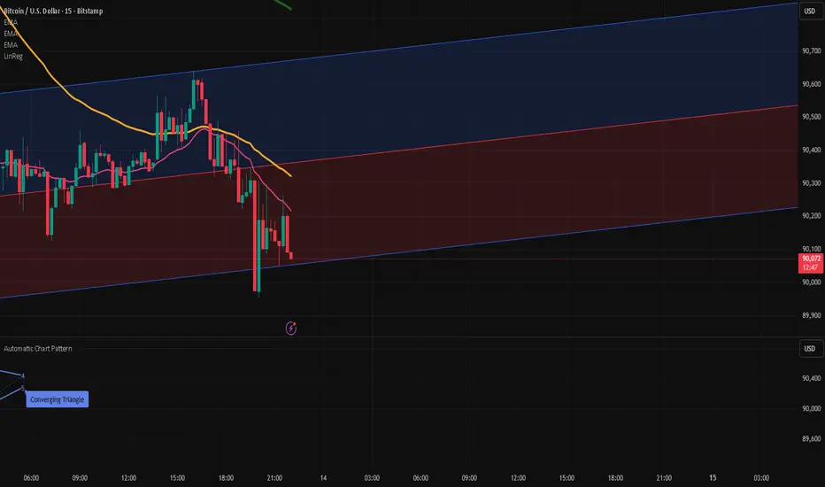
indicator("Installing Wait....", "Automatic Chart Pattern", overlay = true, max_lines_count=500, max_labels_count=500, max_polylines_count = 100)
openSource = input.source(open, '', inline='cs', group='Source', display = display.none)
highSource = input.source(high, '', inline='cs', group='Source', display = display.none)
lowSource = input.source(low, '', inline='cs', group='Source', display = display.none)
closeSource = input.source(close, '', inline='cs', group='Source', display = display.none, tooltip = 'Source on which the zigzag and pattern calculation is done')
useZigzag1 = input.bool(true, '', group = 'Zigzag', inline='z1', display = display.none)
zigzagLength1 = input.int(8, step=5, minval=1, title='', group='Zigzag', inline='z1', display=display.none)
depth1 = input.int(55, "", step=25, maxval=500, group='Zigzag', inline='z1', display=display.none, tooltip = 'Enable and set Length and Dept of Zigzag 1')
useZigzag2 = input.bool(false, '', group = 'Zigzag', inline='z2', display = display.none)
zigzagLength2 = input.int(13, step=5, minval=1, title='', group='Zigzag', inline='z2', display=display.none)
depth2 = input.int(34, "", step=25, maxval=500, group='Zigzag', inline='z2', display=display.none, tooltip = 'Enable and set Length and Dept of Zigzag 2')
useZigzag3 = input.bool(false, '', group = 'Zigzag', inline='z3', display = display.none)
zigzagLength3 = input.int(21, step=5, minval=1, title='', group='Zigzag', inline='z3', display=display.none)
depth3 = input.int(21, "", step=25, maxval=500, group='Zigzag', inline='z3', display=display.none, tooltip = 'Enable and set Length and Dept of Zigzag 3')
useZigzag4 = input.bool(false, '', group = 'Zigzag', inline='z4', display = display.none)
zigzagLength4 = input.int(34, step=5, minval=1, title='', group='Zigzag', inline='z4', display=display.none)
depth4 = input.int(13, "", step=25, maxval=500, group='Zigzag', inline='z4', display=display.none, tooltip = 'Enable and set Length and Dept of Zigzag 4')
numberOfPivots = input.int(5, "Number of Pivots", , 'Number of pivots used for pattern identification.', group='Scanning', display = display.none)
errorThresold = input.float(20.0, 'Error Threshold', 0.0, 100, 5, 'Error Threshold for trend line validation', group='Scanning', display = display.none)
flatThreshold = input.float(20.0, 'Flat Threshold', 0.0, 30, 5, 'Ratio threshold to identify the slope of trend lines', group='Scanning', display = display.none)
lastPivotDirection = input.string('both', 'Last Pivot Direction', , 'Filter pattern based on the last pivot direction. '+
'This option is useful while backtesting individual patterns. When custom is selected, then the individual pattern last pivot direction setting is used',
group='Scanning', display=display.none)
checkBarRatio = input.bool(true, 'Verify Bar Ratio ', 'Along with checking the price, also verify if the bars are proportionately placed.', group='Scanning', inline = 'br', display = display.none)
barRatioLimit = input.float(0.382, '', group='Scanning', display = display.none, inline='br')
avoidOverlap = input.bool(true, 'Avoid Overlap', group='Scanning', inline='a', display = display.none)
repaint = input.bool(false, 'Repaint', 'Avoid Overlap - Will not consider the pattern if it starts before the end of an existing pattern '+
'Repaint - Uses real time bars to search for patterns. If unselected, then only use confirmed bars.',
group='Scanning', inline='a', display = display.none)
allowChannels = input.bool(true, 'Channels', group='Pattern Groups - Geometric Shapes', display = display.none, inline='g')
allowWedges = input.bool(true, 'Wedge', group='Pattern Groups - Geometric Shapes', display = display.none, inline='g')
allowTriangles = input.bool(true, 'Triangle', group='Pattern Groups - Geometric Shapes', display = display.none, inline='g',
tooltip = 'Channels - Trend Lines are parralel to each other creating equidistance price channels'+
' \t- Ascending Channel \t- Descending Channel \t- Ranging Channel'+
' Wedges - Trend lines are either converging or diverging from each other and both the trend lines are moving in the same direction'+
' \t- Rising Wedge (Expanding) \t- Rising Wedge (Contracting) \t- Falling Wedge (Expanding) \t- Falling Wedge (Contracting)'+
' Triangles - Trend lines are either converging or diverging from each other and both trend lines are moving in different directions'+
' \t- Converging Triangle \t- Diverging Triangle \t- Ascending Triangle (Contracting) \t- Ascending Triangle (Expanding) \t- Descending Triangle(Contracting) \t- Descending Triangle(Expanding)')
allowRisingPatterns = input.bool(true, 'Rising', group='Pattern Groups - Direction', display = display.none, inline = 'd')
allowFallingPatterns = input.bool(true, 'Falling', group='Pattern Groups - Direction', display = display.none, inline = 'd')
allowNonDirectionalPatterns = input.bool(true, 'Flat/Bi-Directional', group='Pattern Groups - Direction', display = display.none, inline = 'd',
tooltip = 'Rising - Either both trend lines are moving up or one trend line is flat and the other one is moving up.'+
' \t- Ascending Channel \t- Rising Wedge (Expanding) \t- Rising Wedge (Contracting) \t- Ascending Triangle (Expanding) \t- Ascending Triangle (Contracting)'+
' Falling - Either both trend lines are moving down or one trend line is flat and the other one is moving down.'+
' \t- Descending Channel \t- Falling Wedge (Expanding) \t- Falling Wedge (Contracting) \t- Descending Triangle (Expanding) \t- Descending Triangle (Contracting)'+
' Flat/Bi-Directional - Trend Lines move in different directions or both flat.'+
' \t- Ranging Channel \t- Converging Triangle \t- Diverging Triangle')
allowExpandingPatterns = input.bool(true, 'Expanding', group='Pattern Groups - Formation Dynamics', display = display.none, inline = 'f')
allowContractingPatterns = input.bool(true, 'Contracting', group='Pattern Groups - Formation Dynamics', display = display.none, inline='f')
allowParallelChannels = input.bool(true, 'Parallel', group = 'Pattern Groups - Formation Dynamics', display = display.none, inline = 'f',
tooltip = 'Expanding - Trend Lines are diverging from each other.'+
' \t- Rising Wedge (Expanding) \t- Falling Wedge (Expanding) \t- Ascending Triangle (Expanding) \t- Descending Triangle (Expanding) \t- Diverging Triangle'+
' Contracting - Trend Lines are converging towards each other.'+
' \t- Rising Wedge (Contracting) \t- Falling Wedge (Contracting) \t- Ascending Triangle (Contracting) \t- Descending Triangle (Contracting) \t- Converging Triangle'+
' Parallel - Trend Lines are almost parallel to each other.'+
' \t- Ascending Channel \t- Descending Channel \t- Ranging Channel')
allowUptrendChannel = input.bool(true, 'Ascending ', group = 'Price Channels', inline='uc', display = display.none)
upTrendChannelLastPivotDirection = input.string('both', '', , inline='uc', group='Price Channels', display = display.none,
tooltip='Enable Ascending Channel and select the last pivot direction filter. Last pivot direction will only be used if the Generic Last Pivot Direction parameter is set to Custom')
allowDowntrendChannel = input.bool(true, 'Descending', group = 'Price Channels', inline='dc', display = display.none)
downTrendChannelLastPivotDirection = input.string('both', '', , inline='dc', group='Price Channels', display = display.none,
tooltip='Enable Descending Channel and select the last pivot direction filter. Last pivot direction will only be used if the Generic Last Pivot Direction parameter is set to Custom')
allowRangingChannel = input.bool(true, 'Ranging ', group = 'Price Channels', inline='rc', display = display.none)
rangingChannelLastPivotDirection = input.string('both', '', , inline='rc', group='Price Channels', display = display.none,
tooltip='Enable Ranging Channel and select the last pivot direction filter. Last pivot direction will only be used if the Generic Last Pivot Direction parameter is set to Custom')
allowRisingWedgeExpanding = input.bool(true, 'Rising ', inline='rwe', group = 'Expanding Wedges', display = display.none)
risingWedgeExpandingLastPivotDirection = input.string('down', '', , inline='rwe', group='Expanding Wedges', display = display.none,
tooltip='Enable Rising Wedge (Expanding) and select the last pivot direction filter. Last pivot direction will only be used if the Generic Last Pivot Direction parameter is set to Custom')
allowFallingWedgeExpanding = input.bool(true, 'Falling ', inline='fwe', group = 'Expanding Wedges', display = display.none)
fallingWedgeExpandingLastPivotDirection = input.string('up', '', , inline='fwe', group='Expanding Wedges', display = display.none,
tooltip='Enable Falling Wedge (Expanding) and select the last pivot direction filter. Last pivot direction will only be used if the Generic Last Pivot Direction parameter is set to Custom')
allowRisingWedgeContracting = input.bool(true, 'Rising ', inline='rwc', group = 'Contracting Wedges', display = display.none)
risingWedgeContractingLastPivotDirection = input.string('down', '', , inline='rwc', group='Contracting Wedges', display = display.none,
tooltip='Enable Rising Wedge (Contracting) and select the last pivot direction filter. Last pivot direction will only be used if the Generic Last Pivot Direction parameter is set to Custom')
allowFallingWedgeContracting = input.bool(true, 'Falling ', inline='fwc', group = 'Contracting Wedges', display = display.none)
fallingWedgeContractingLastPivotDirection = input.string('up', '', , inline='fwc', group='Contracting Wedges', display = display.none,
tooltip='Enable Falling Wedge (Contracting) and select the last pivot direction filter. Last pivot direction will only be used if the Generic Last Pivot Direction parameter is set to Custom')
allowRisingTriangleExpanding = input.bool(true, 'Ascending ', inline='rte', group = 'Expanding Triangles', display = display.none)
risingTriangleExpandingLastPivotDirection = input.string('up', '', , inline='rte', group='Expanding Triangles', display = display.none,
tooltip='Enable Ascending Triangle (Expanding) and select the last pivot direction filter. Last pivot direction will only be used if the Generic Last Pivot Direction parameter is set to Custom')
allowFallingTriangleExpanding = input.bool(true, 'Descending', inline='fte', group = 'Expanding Triangles', display = display.none)
fallingTriangleExpandingLastPivotDirection = input.string('down', '', , inline='fte', group='Expanding Triangles', display = display.none,
tooltip='Enable Descending Triangle (Expanding) and select the last pivot direction filter. Last pivot direction will only be used if the Generic Last Pivot Direction parameter is set to Custom')
allowExpandingTriangle = input.bool(true, 'Diverging ', inline='dt', group = 'Expanding Triangles', display = display.none)
divergineTriangleLastPivotDirection = input.string('both', '', , inline='dt', group='Expanding Triangles', display = display.none,
tooltip='Enable Diverging Triangle and select the last pivot direction filter. Last pivot direction will only be used if the Generic Last Pivot Direction parameter is set to Custom')
allowRisingTriangleConverging= input.bool(true, 'Ascending ', inline='rtc', group = 'Contracting Triangles', display = display.none)
risingTriangleContractingLastPivotDirection = input.string('up', '', , inline='rtc', group='Contracting Triangles', display = display.none,
tooltip='Enable Ascending Triangle (Contracting) and select the last pivot direction filter. Last pivot direction will only be used if the Generic Last Pivot Direction parameter is set to Custom')
allowFallingTriangleConverging = input.bool(true, 'Descending', inline='ftc', group = 'Contracting Triangles', display = display.none)
fallingTriangleContractingLastPivotDirection = input.string('down', '', , inline='ftc', group='Contracting Triangles', display = display.none,
tooltip='Enable Descending Triangle (Contracting) and select the last pivot direction filter. Last pivot direction will only be used if the Generic Last Pivot Direction parameter is set to Custom')
allowConvergingTriangle = input.bool(true, 'Converging ', inline='ct', group = 'Contracting Triangles', display = display.none)
convergingTriangleLastPivotDirection = input.string('both', '', , inline='ct', group='Contracting Triangles', display = display.none,
tooltip='Enable Converging Triangle and select the last pivot direction filter. Last pivot direction will only be used if the Generic Last Pivot Direction parameter is set to Custom')
allowedPatterns = array.from(
false,
allowUptrendChannel and allowRisingPatterns and allowParallelChannels and allowChannels,
allowDowntrendChannel and allowFallingPatterns and allowParallelChannels and allowChannels,
allowRangingChannel and allowNonDirectionalPatterns and allowParallelChannels and allowChannels,
allowRisingWedgeExpanding and allowRisingPatterns and allowExpandingPatterns and allowWedges,
allowFallingWedgeExpanding and allowFallingPatterns and allowExpandingPatterns and allowWedges,
allowExpandingTriangle and allowNonDirectionalPatterns and allowExpandingPatterns and allowTriangles,
allowRisingTriangleExpanding and allowRisingPatterns and allowExpandingPatterns and allowTriangles,
allowFallingTriangleExpanding and allowFallingPatterns and allowExpandingPatterns and allowTriangles,
allowRisingWedgeContracting and allowRisingPatterns and allowContractingPatterns and allowWedges,
allowFallingWedgeContracting and allowFallingPatterns and allowContractingPatterns and allowWedges,
allowConvergingTriangle and allowNonDirectionalPatterns and allowContractingPatterns and allowTriangles,
allowFallingTriangleConverging and allowFallingPatterns and allowContractingPatterns and allowTriangles,
allowRisingTriangleConverging and allowRisingPatterns and allowContractingPatterns and allowTriangles
)
getLastPivotDirectionInt(lastPivotDirection)=>lastPivotDirection == 'up'? 1 : lastPivotDirection == 'down'? -1 : 0
allowedLastPivotDirections = array.from(
0,
lastPivotDirection == 'custom'? getLastPivotDirectionInt(upTrendChannelLastPivotDirection) : getLastPivotDirectionInt(lastPivotDirection),
lastPivotDirection == 'custom'? getLastPivotDirectionInt(downTrendChannelLastPivotDirection) : getLastPivotDirectionInt(lastPivotDirection),
lastPivotDirection == 'custom'? getLastPivotDirectionInt(rangingChannelLastPivotDirection) : getLastPivotDirectionInt(lastPivotDirection),
lastPivotDirection == 'custom'? getLastPivotDirectionInt(risingWedgeExpandingLastPivotDirection) : getLastPivotDirectionInt(lastPivotDirection),
lastPivotDirection == 'custom'? getLastPivotDirectionInt(fallingWedgeExpandingLastPivotDirection) : getLastPivotDirectionInt(lastPivotDirection),
lastPivotDirection == 'custom'? getLastPivotDirectionInt(divergineTriangleLastPivotDirection) : getLastPivotDirectionInt(lastPivotDirection),
lastPivotDirection == 'custom'? getLastPivotDirectionInt(risingTriangleExpandingLastPivotDirection) : getLastPivotDirectionInt(lastPivotDirection),
lastPivotDirection == 'custom'? getLastPivotDirectionInt(fallingTriangleExpandingLastPivotDirection) : getLastPivotDirectionInt(lastPivotDirection),
lastPivotDirection == 'custom'? getLastPivotDirectionInt(risingWedgeContractingLastPivotDirection) : getLastPivotDirectionInt(lastPivotDirection),
lastPivotDirection == 'custom'? getLastPivotDirectionInt(fallingWedgeContractingLastPivotDirection) : getLastPivotDirectionInt(lastPivotDirection),
lastPivotDirection == 'custom'? getLastPivotDirectionInt(convergingTriangleLastPivotDirection) : getLastPivotDirectionInt(lastPivotDirection),
lastPivotDirection == 'custom'? getLastPivotDirectionInt(fallingTriangleContractingLastPivotDirection) : getLastPivotDirectionInt(lastPivotDirection),
lastPivotDirection == 'custom'? getLastPivotDirectionInt(risingTriangleContractingLastPivotDirection) : getLastPivotDirectionInt(lastPivotDirection)
)
theme = input.string('Dark', title='Theme', options= , group='Display', inline='pc',
tooltip='Chart theme settings. Line and label colors are generted based on the theme settings. If dark theme is selected, '+
'lighter colors are used and if light theme is selected, darker colors are used. '+
'Pattern Line width - to be used for drawing pattern lines', display=display.none)
patternLineWidth = input.int(2, '', minval=1, inline='pc', group = 'Display', display = display.none)
showPatternLabel = input.bool(true, 'Pattern Label', inline='pl1', group = 'Display', display = display.none)
patternLabelSize = input.string(size.normal, '', , inline='pl1', group = 'Display', display = display.none,
tooltip = 'Option to display Pattern Label and select the size')
showPivotLabels = input.bool(true, 'Pivot Labels ', inline='pl2', group = 'Display', display = display.none, tooltip = 'Option to display pivot labels and select the size')
pivotLabelSize = input.string(size.normal, '', , inline='pl2', group = 'Display', display = display.none)
showZigzag = input.bool(true, 'Zigzag', inline='z', group = 'Display', display = display.none)
zigzagColor = input.color(color.blue, '', inline='z', group = 'Display', display = display.none, tooltip = 'Option to display zigzag within pattern and the default zigzag line color')
deleteOldPatterns = input.bool(true, 'Max Patterns', inline='do', group = 'Display', display = display.none)
maxPatterns = input.int(20, '', minval=1, step=5, inline = 'do', group = 'Display', display = display.none, tooltip = 'If selected, only last N patterns will be preserved on the chart.')
errorRatio = errorThresold/100
flatRatio = flatThreshold/100
showLabel = true
offset = 0
type Scanner
bool enabled
string ticker
string timeframe
p.ScanProperties sProperties
p.DrawingProperties dProperties
array patterns
array zigzags
method getZigzagAndPattern(Scanner this, int length, int depth, array ohlcArray, int offset=0)=>
var zg.Zigzag zigzag = zg.Zigzag.new(length, depth, 0)
var map lastDBar = map.new()
zigzag.calculate(array.from(highSource, lowSource))
var validPatterns = 0
mlzigzag = zigzag
if(zigzag.flags.newPivot)
while(mlzigzag.zigzagPivots.size() >= 6+offset)
lastBar = mlzigzag.zigzagPivots.first().point.index
lastDir = int(math.sign(mlzigzag.zigzagPivots.first().dir))
if(lastDBar.contains(mlzigzag.level)? lastDBar.get(mlzigzag.level) < lastBar : true)
lastDBar.put(mlzigzag.level, lastBar)
= mlzigzag.find(this.sProperties, this.dProperties, this.patterns, ohlcArray)
if(valid)
validPatterns+=1
currentPattern.draw()
this.patterns.push(currentPattern, maxPatterns)
alert('New Pattern Alert')
else
break
mlzigzag := mlzigzag.nextlevel()
true
method scan(Scanner this)=>
var array ohlcArray = array.new()
var array patterns = array.new()
ohlcArray.push(o.OHLC.new(openSource, highSource, lowSource, closeSource))
if(useZigzag1)
this.getZigzagAndPattern(zigzagLength1, depth1, ohlcArray)
if(useZigzag2)
this.getZigzagAndPattern(zigzagLength2, depth2, ohlcArray)
if(useZigzag3)
this.getZigzagAndPattern(zigzagLength3, depth3, ohlcArray)
if(useZigzag4)
this.getZigzagAndPattern(zigzagLength4, depth4, ohlcArray)
var scanner = Scanner.new(true, "", "",
p.ScanProperties.new(offset, numberOfPivots, errorRatio, flatRatio, checkBarRatio, barRatioLimit, avoidOverlap, allowedPatterns=allowedPatterns, allowedLastPivotDirections= allowedLastPivotDirections, themeColors = ut.getColors(theme)),
p.DrawingProperties.new(patternLineWidth, showZigzag, 1, zigzagColor, showPatternLabel, patternLabelSize, showPivotLabels, pivotLabelSize, deleteOnPop = deleteOldPatterns),
array.new())
if(barstate.isconfirmed or repaint)
scanner.scan()

LSTM-Inspired BB Mean Reversion// ============================================================================
// BOLLINGER BANDS MEAN REVERSION STRATEGY
// Based on LSTM Model True Positive Signal Characteristics
// ============================================================================
// Model learned to identify:
// 1. Price at/below Lower Bollinger Band (100% of TP signals)
// 2. RSI < 30 (Oversold) (75% of TP signals)
// 3. High volatility (wide BB bands)
// 4. Below average volume (contrarian)
// ============================================================================

Ichimoku + VWAP + OBV + ATR Full System (NQ Daytrade)Extended Indicator Description
Ichimoku + VWAP + OBV + ATR Full System is a rule-based intraday trading indicator designed specifically for NQ day trading, focusing on trend alignment, participation confirmation, and volatility-aware execution.
This indicator does not rely on a single signal or crossover. Instead, it integrates multiple market dimensions into one structured framework to help traders identify high-probability trend continuation scenarios while avoiding low-quality, range-bound conditions.
System Philosophy
The core idea of this system is simple:
trade only when trend, price location, volume, and volatility are aligned.
Each component plays a specific role and is not meant to be used in isolation. The indicator works best when all conditions reinforce the same directional bias.
Component Breakdown
Ichimoku Cloud
Used to define the primary market structure and directional bias. The system favors trades only when price action aligns clearly above or below the cloud, helping filter out indecisive or transitional phases.
VWAP
Acts as a session-based equilibrium reference. Price position and distance relative to VWAP are used to confirm whether the market is trending with intent rather than reverting to the mean.
OBV (On-Balance Volume)
Provides participation and flow confirmation. OBV helps validate whether price movement is supported by volume, reducing the likelihood of false breakouts or weak trend signals.
ATR (Average True Range)
Used as a volatility filter and risk-awareness tool. ATR conditions help the system avoid low-volatility environments and support more realistic expectations for intraday movement.
Trade Logic Overview
The system is designed around trend-following pullbacks, not prediction or counter-trend trading.
When trend structure is established and confirmed by VWAP positioning and OBV behavior, pullback zones within the trend become areas of interest. ATR conditions ensure that trades are taken only when sufficient movement potential exists.
Rather than generating frequent signals, the system prioritizes selectivity and clarity, making it suitable for disciplined day traders who value context over quantity.
Intended Use
This indicator is built for:
NQ intraday and day trading
Trend continuation and pullback strategies
Traders who prefer structured, confirmation-based systems
Lower to mid intraday timeframes such as 3-minute, 5-minute, and 15-minute charts
Important Notes
This is not an automated trading system and does not provide guaranteed results. The indicator is designed as a decision-support tool to assist with market context, directional bias, and trade timing. Risk management, execution, and position sizing remain the responsibility of the user.
롱/숏 삼각형 시그널
동그라미 청산 시그널
VWAP 밴드 기반 방향성
OBV 보조지표
이름 (Name)
BTC Scalping Signal – VWAP + OBV
짧은 설명 (Short Description)
VWAP 밴드와 OBV를 기반으로 방향성, 진입·청산 시그널을 제공하는 스캘핑 지표입니다.
긴 설명 (Long Description)
이 지표는 BTC 단기 스캘핑을 위해 설계된 것으로, 특히 15분봉 환경에 최적화되어 있습니다.
VWAP 밴드의 위치와 추세 판별 로직을 기반으로 롱·숏 진입 신호를 제공합니다.
OBV 모멘텀을 보조 필터로 사용하여 돌파 및 되돌림 가능성을 판단합니다.
시장 변동성이 축소되거나 평균회귀 신호가 감지될 때 청산 시그널을 표시합니다.
삼각형(진입), 원형(청산) 등 직관적 시각 요소를 통해 빠른 의사결정을 지원합니다.

CODEX OB + BBMA V1CODEX OB + BBMA is a multi-purpose Smart Money Concepts (SMC) indicator that automatically detects and visualizes key institutional trading elements such as Order Blocks, Fair Value Gaps, Rejection Blocks, Break of Structure, Pivots, High Volume Bars, and several qualitative SMC signals.
In addition to SMC tools, this indicator also incorporates multi-timeframe BBMA logic, allowing traders to view higher-timeframe momentum, trend direction, and volatility envelopes directly from the current chart. This makes it easier to align SMC setups—like OB, FVG, and BOS—with BBMA structure such as MA touches, re-entry zones, extreme candles, and volatility expansions.
This combination helps traders identify institutional footprints, multi-timeframe confluence, and displacement-based setups with high clarity.


RCI4linesRCI4lines plots four Rank Correlation Index (RCI) lines in a single panel to help you read momentum and trend conditions at a glance.
It shows two short-term RCIs (default: 7 and 9), a middle-term RCI (26), and a long-term RCI (52).
The script also draws shaded threshold zones between +80 to +95 and -80 to -95, making it easier to spot potential overbought / oversold areas and compare short-term moves with the bigger trend.
Useful for scalping to day trading, and for checking whether short-term momentum is aligned with mid/long-term direction.

Regime EngineRegime Engine
Overview
Regime Engine is a market regime detection system that classifies price action into bullish, bearish, or neutral states using weighted exponential moving average analysis. Once the regime is identified, the indicator generates buy and sell signals based on Donchian channel breakouts, filtered by ADX trend strength and RSI momentum conditions.
The Money Line
The core of regime detection is the Money Line, a weighted combination of two exponential moving averages. By default, the short EMA (8 periods) receives 60% weight while the long EMA (24 periods) receives 40% weight. This weighting allows the Money Line to be more responsive than a simple long-period average while remaining smoother than a short-period average alone.
The Money Line changes color based on the current regime: green for bullish, red for bearish, and yellow for neutral. This provides immediate visual feedback about the market state.
Regime Classification
The indicator determines market regime by comparing the relative positions of the short and long EMAs while also considering RSI levels to avoid classifying overbought or oversold conditions as trend states.
Bullish regime is identified when the short EMA is above the long EMA and RSI is not in overbought territory. This combination suggests upward momentum that is not yet exhausted.
Bearish regime is identified when the short EMA is below the long EMA and RSI is not in oversold territory. This indicates downward momentum with room to continue.
Neutral regime applies when the EMAs are close together or RSI conditions prevent trend classification. The indicator provides two optional methods for enhanced neutral detection.
Neutral Zone Detection
Markets often transition through periods where trend direction is unclear. The indicator offers two complementary methods for detecting these neutral zones.
The slope method examines the rate of change of the Money Line relative to ATR. When the Money Line is moving slowly (slope below a tolerance threshold), the market is classified as neutral regardless of EMA positioning.
The EMA distance method calculates the percentage distance between the short and long EMAs. When they are within a specified percentage of each other, the EMAs are considered too close to reliably indicate direction.
Either or both methods can be enabled, and if either triggers, the regime is classified as neutral.
Donchian Channel Signals
Buy and sell signals are generated when price interacts with the Donchian channel boundaries. The Donchian channel plots the highest high and lowest low over a lookback period (default 20 bars), offset by one bar to prevent repainting.
Buy signals trigger when price touches or breaks below the lower Donchian band, indicating a potential support level. Sell signals trigger when price touches or breaks above the upper Donchian band, indicating potential resistance.
An optional setting requires the close to confirm the break rather than just the wick, providing more conservative signal generation.
ADX Trend Strength Filter
The Average Directional Index filters signals to ensure they occur during trending conditions. When enabled, signals only fire if ADX exceeds the threshold (default 24), confirming that the market has sufficient directional momentum for breakout trades to succeed.
The indicator uses Wilder's original smoothing method for ADX calculation, providing the traditional interpretation of trend strength values.
RSI Momentum Filter
RSI provides additional signal filtering to ensure entries occur at favorable momentum levels. Buy signals require RSI to be at or below the oversold threshold (default 30), indicating potential exhaustion of selling pressure. Sell signals require RSI to be at or above the overbought threshold (default 70), suggesting exhaustion of buying pressure.
These filters can be disabled for traders who prefer unfiltered Donchian breakout signals.
BBWP Volatility Monitoring
Bollinger Band Width Percentile measures current volatility relative to its historical range. The indicator calculates BB width and ranks it against the specified lookback period (default 252 bars, approximately one trading year).
BBWP above 70% indicates elevated volatility, which may signal trend acceleration or potential reversals. BBWP below 30% indicates compressed volatility, often preceding significant moves. The information panel displays the current BBWP reading with color coding to highlight these conditions.
Signal Cooldown
To prevent signal clustering during extended breakout periods, a configurable cooldown prevents new signals of the same type for a specified number of bars after each signal. This ensures each signal represents a distinct trading opportunity.
Visual Components
The Donchian channel can display shaded bands between the upper and lower boundaries. The shading color reflects the current regime: green for bullish, magenta for bearish, and blue for neutral. This provides at-a-glance context for where price is trading within its recent range.
An ADX strength bar at the bottom of the chart uses color coding: white for weak trend (ADX below 15), orange for ranging (ADX 15-24), and blue for trending (ADX above 24). This matches the trend strength display in the information panel.
Price labels appear at signal locations showing the signal type and entry price. Labels are automatically cleaned up after reaching a configurable history limit to maintain chart performance.
Signal candles are highlighted in blue, making it easy to identify exactly which bars generated signals when reviewing historical performance.
Information Panel
A compact table displays key metrics: current regime bias, trend strength classification, BBWP volatility reading, RSI level, and ADX value. Each metric is color-coded to highlight favorable or unfavorable conditions.
The panel can be positioned at any corner or middle edge of the chart. An alternative label-based display anchored to the chart is also available for those who prefer that format.
Trend Persistence Option
By default, the regime is recalculated on every bar. An optional persistence mode changes this behavior so that the regime only changes on EMA crossovers. This reduces regime flipping during choppy conditions but may delay regime recognition during gradual trend changes.
How to Use
Monitor the Money Line color and information panel for current regime. In bullish regimes, focus on buy signals at the lower Donchian band as potential pullback entries. In bearish regimes, focus on sell signals at the upper band as potential short entries or exit points.
Use the ADX strength indicator to gauge signal reliability. Signals during trending conditions (blue ADX bar) have historically higher success rates than signals during ranging conditions (orange bar) or weak trends (white bar).
Watch BBWP for volatility context. Low BBWP readings suggest a significant move may be developing, while high readings indicate the current move may be overextended.
The combination of regime awareness, Donchian breakout signals, and ADX/RSI filtering provides a structured approach to identifying trading opportunities across different market conditions.
Settings Guidance
The default settings work well for cryptocurrency and forex markets on intraday timeframes. For stocks or longer timeframes, consider increasing the EMA periods and Donchian lookback. The ADX threshold can be adjusted based on the typical ADX range for the traded instrument.
The RSI filter levels can be relaxed (higher oversold, lower overbought) for more signals or tightened for higher-quality but less frequent signals. The cooldown period should be adjusted based on timeframe, with shorter timeframes typically requiring longer cooldown periods.

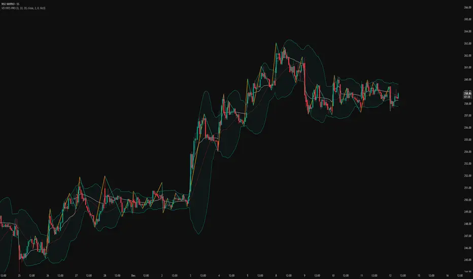
VD FRFS PRO
VD FRFS PRO
This trader centric, multi-functional indicator built on **Pine Script™ v6** that seamlessly integrates four of the most critical price and volatility tools into a single overlay. Designed for day traders, swing traders, and institutional analysts, this tool provides a comprehensive view of volatility, trend, volume-based pricing, and structure, all without chart clutter.
Overview & Concept
The VD FRFS PRO is engineered for efficiency and clarity. Instead of layering four separate indicators, which can lead to performance issues and confusion, this script combines the calculations into one, allowing traders to execute complex technical analysis rapidly.
It serves as a powerful foundation for strategies that require:
1. Volatility Assessment (Bollinger Bands)
2. Volume-Weighted Fair Value (VWAP)
3. Price Structure & Swings (Zig Zag)
4. Dynamic Trend Filtering (Configurable SMA)
Customization & Settings
All inputs are logically grouped for ease of use in the indicator's settings menu.
Bollinger Bands
BB Length: Period for the Basis SMA and StdDev calculation (default: 20).
BB Source: Price series for the calculation (default: `close`).
BB StdDev Multiplier: Multiplier for the Standard Deviation (default: 2.0).
BB Offset: Shifts the bands horizontally (default: 0).
VWAP Settings
VWAP Source: Price series for the VWAP calculation (default: `hlc3`).
Zig Zag Settings
Zig Zag High/Low Length: Lookback period for determining swing points (default: 3).
SMA Settings
SMA Period: Lookback period for the configurable SMA (default: 20).
Show SMA: Checkbox to toggle the visibility of this SMA (default: `true`).
Disclaimer
Feel free to reach out for suggestions and modification requests.
11-MA Institutional System (ATR+HTF Filters)11-MA Institutional Trading System Analysis.
This is a comprehensive Trading View Pine Script indicator that implements a sophisticated multi-timeframe moving average system with institutional-grade filters. Let me break down its key components and functionality:
🎯 Core Features
1. 11 Moving Average System. The indicator plots 11 customizable moving averages with different roles:
MA1-MA4 (5, 8, 10, 12): Fast-moving averages for short-term trends
MA5 (21 EMA): Short-term anchor - critical pivot point
MA6 (34 EMA): Intermediate support/resistance
MA7 (50 EMA): Medium-term bridge between short and long trends
MA8-MA9 (89, 100): Transition zone indicators
MA10-MA11 (150, 200): Long-term anchors for major trend identification
Each MA is fully customizable:
Type: SMA, EMA, WMA, TMA, RMA
Color, width, and enable/disable toggle
📊 Signal Generation System
Three Signal Tiers: Short-Term Signals (ST)
Trigger: MA8 (EMA 8) crossing MA21 (EMA 21)
Filters Applied:
✅ ATR-based post-cross confirmation (optional)
✅ Momentum confirmation (RSI > 50, MACD positive)
✅ Volume spike requirement
✅ HTF (Higher Timeframe) alignment
✅ Strong candle body ratio (>50%)
✅ Multi-MA confirmation (3+ MAs supporting direction)
✅ Price beyond MA21 with conviction
✅ Minimum bar spacing (prevents signal clustering)
✅ Consolidation filter
✅ Whipsaw protection (ATR-based price threshold)
Medium-Term Signals (MT)
Trigger: MA21 crossing MA50
Less strict filtering for swing trades
Major Signals
Golden Cross: MA50 crossing above MA200 (major bullish)
Death Cross: MA50 crossing below MA200 (major bearish)
🔍 Advanced Filtering System1. ATR-Based ConfirmationPrice must move > (ATR × 0.25) beyond the MA after crossover
This prevents false signals during low-volatility consolidation.2. Momentum Filters
RSI (14)
MACD Histogram
Rate of Change (ROC)
Composite momentum score (-3 to +3)
3. Volume Analysis
Volume spike detection (2x MA)
Volume classification: LOW, MED, HIGH, EXPL
Directional volume confirmation
4. Higher Timeframe Alignment
HTF1: 60-minute (default)
HTF2: 4-hour (optional)
HTF3: Daily (optional)
Signals only trigger when current TF aligns with HTF trend
5. Market Structure Detection
Break of Structure (BOS): Price breaking recent swing highs/lows
Order Blocks (OB): Institutional demand/supply zones
Fair Value Gaps (FVG): Imbalance areas for potential fills
📈 Comprehensive DashboardReal-Time Metrics Display: {scrollbar-width:none;-ms-overflow-style:none;-webkit-overflow-scrolling:touch;} ::-webkit-scrollbar{display:none}MetricDescriptionPriceCurrent close priceTimeframeCurrent chart timeframeSHORT/MEDIUM/MAJORTrend classification (🟢BULL/🔴BEAR/⚪NEUT)HTF TrendsHigher timeframe alignment indicatorsMomentumSTR↑/MOD↑/WK↑/WK↓/MOD↓/STR↓VolatilityLOW/MOD/HIGH/EXTR (based on ATR%)RSI(14)Color-coded: >70 red, <30 greenATR%Volatility as % of priceAdvanced Dashboard Features (Optional):
Price Distance from Key MAs
vs MA21, MA50, MA200 (percentage)
Color-coded: green (above), red (below)
MA Alignment Score
Calculates % of MAs in proper order
🟢 for bullish alignment, 🔴 for bearish
Trend Strength
Based on separation between MA21 and MA200
NONE/WEAK/MODERATE/STRONG/EXTREME
Consolidation Detection
Identifies low-volatility ranges
Prevents signals during sideways markets
⚙️ Customization OptionsFilter Toggles:
☑️ Require Momentum
☑️ Require Volume
☑️ Require HTF Alignment
☑️ Use ATR post-cross confirmation
☑️ Whipsaw filter
Min bars between signals (default: 5)
Dashboard Styling:
9 position options
6 text sizes
Custom colors for header, rows, and text
Toggle individual metrics on/off
🎨 Visual Elements
Signal Labels:
ST▲/ST▼ (green/red) - Short-term
MT▲/MT▼ (blue/orange) - Medium-term
GOLDEN CROSS / DEATH CROSS - Major signals
Volume Spikes:
Small labels showing volume class + direction
Example: "HIGH🟢" or "EXPL🔴"
Market Structure:
Dashed lines for Break of Structure levels
Automatic detection of swing highs/lows
🔔 Alert Conditions
Pre-configured alerts for:
Short-term bullish/bearish crosses
Medium-term bullish/bearish crosses
Golden Cross / Death Cross
Volume spikes
💡 Key Strengths
Institutional-Grade Filtering: Multiple confirmation layers reduce false signals
Multi-Timeframe Analysis: Ensures alignment across timeframes
Adaptive to Market Conditions: ATR-based thresholds adjust to volatility
Comprehensive Dashboard: All critical metrics in one view
Highly Customizable: 100+ input parameters
Signal Quality Over Quantity: Strict filters prioritize high-probability setups
⚠️ Usage Recommendations
Best for: Swing trading and position trading
Timeframes: Works on all TFs, optimized for 15m-Daily
Markets: Stocks, Forex, Crypto, Indices
Signal Frequency: Conservative (quality over quantity)
Combine with: Support/resistance, price action, risk management
🔧 Technical Implementation Notes
Uses Pine Script v6 syntax
Efficient calculation with minimal repainting
Maximum 500 labels for performance
Security function for HTF data (no lookahead bias)
Array-based MA alignment calculation
State variables to track signal spacing
This is a professional-grade trading system that combines classical technical analysis (moving averages) with modern institutional concepts (market structure, order blocks, multi-timeframe alignment).
The extensive filtering system is designed to eliminate noise and focus on high-probability trade setups.

MoneyLine CipherMoneyLine Cipher
Overview
MoneyLine Cipher is a trend-following indicator designed to identify high-probability entry and exit points by combining multiple technical analysis methods into a unified signal system. The indicator adapts its behavior based on current market conditions, becoming more aggressive in strong trends and more conservative in choppy or uncertain markets.
Core Concept: The Money Line
At the heart of this indicator is the Money Line, a linear regression line that acts as a dynamic center of price action. Unlike a simple moving average, linear regression fits a straight line through recent prices using least-squares methodology, providing a smoother representation of the underlying trend direction. The slope of this line determines whether the market is in a bullish, bearish, or neutral state.
Dynamic Envelope Bands
The indicator plots upper and lower bands around the Money Line using Average True Range (ATR) as the volatility measure. What makes these bands unique is their adaptive multiplier system. When the ADX (Average Directional Index) indicates a strong trend, the bands automatically widen to accommodate larger price swings and avoid premature exits. In ranging or weak trend conditions, the bands contract to provide tighter entry and exit zones. This dynamic adjustment helps the indicator perform consistently across different market environments.
Trend State Detection
The indicator classifies market conditions into five distinct states: Strong Uptrend, Uptrend, Neutral, Downtrend, and Strong Downtrend. This classification uses three complementary methods working together.
First, the Directional Movement Index (DMI) measures the spread between positive and negative directional indicators. A large positive spread suggests bullish momentum, while a large negative spread indicates bearish pressure.
Second, On-Balance Volume (OBV) confirms whether volume supports the indicated trend direction. For a Strong Uptrend classification, OBV must be rising above its moving average, confirming that buying pressure backs the price movement.
Third, ADX must exceed a minimum threshold for Strong trend classifications, ensuring that only genuinely trending markets receive the Strong designation.
Signal Generation
Buy and sell signals are generated using Fisher Transform and Aroon indicators, but with a crucial enhancement: the trigger thresholds adjust dynamically based on the current trend state.
The Fisher Transform converts price data into a Gaussian normal distribution, making turning points easier to identify. In a Strong Uptrend, the buy threshold relaxes (making buys easier to trigger) while the sell threshold tightens (making sells harder to trigger). This allows traders to stay in winning positions longer during favorable conditions. The opposite applies in downtrends, where the system becomes quick to exit and reluctant to enter long positions.
The Aroon indicator measures how recently price made a new high or low within the lookback period. Combined with Fisher Transform, this dual-confirmation approach reduces false signals that might occur when using either indicator alone.
Band touches also generate signals. When price reaches the lower band, a potential buy zone is identified. When price reaches the upper band, a potential sell zone is flagged.
Cascade Protection System
A key feature is the built-in protection against averaging down into a losing position. The system tracks consecutive buy signals and limits them to a configurable maximum (default: 3). After reaching this limit, no additional buy signals are generated until a sell signal resets the counter. This prevents the common mistake of repeatedly buying during a sustained decline.
Additionally, the indicator monitors Bollinger Band Width Percentile (BBWP), which measures current volatility relative to historical volatility. When BBWP exceeds a threshold (indicating a volatility spike often associated with sharp moves), buy signals are temporarily frozen. This protects against entering during panic selloffs or blow-off tops.
Extreme Move Detection
Sometimes price moves so aggressively that it penetrates the bands by an unusual amount. The indicator detects these extreme moves and can generate signals even during normal cooldown periods. The logic is that an extreme band penetration represents a significant overextension that warrants attention regardless of recent signal history. These extreme signals are visually distinguished from regular signals.
RSI Divergence
The indicator includes RSI divergence detection as an additional confirmation tool. When price makes a lower low but RSI makes a higher low (bullish divergence), it suggests weakening downside momentum and a potential reversal. Bearish divergence (price higher high, RSI lower high) warns of potential tops. Both regular and hidden divergences are detected and marked on the chart.
Signal Cooldown
To prevent overtrading and signal clustering, a configurable cooldown period prevents new signals for a set number of bars after each signal. This spacing ensures that each signal represents a distinct trading opportunity rather than repeated triggers on the same price movement.
Visual Display
The indicator provides a comprehensive information panel showing current trend state, BBWP status, consecutive buy count, ADX reading, Fisher and Aroon values, cooldown status, and current dynamic thresholds. An ADX bar at the bottom of the chart provides quick visual reference for trend strength and direction using color coding.
Signal labels display the entry or exit price along with the current buy count (for buy signals), helping traders track their position sizing.
How to Use
In uptrending markets, look for buy signals near the lower band, particularly when the trend state shows Uptrend or Strong Uptrend. These represent pullback opportunities within an established trend.
In downtrending markets, the indicator naturally reduces buy signals and increases sell sensitivity, helping traders avoid catching falling knives.
In neutral or ranging conditions, signals from both directions are generated with moderate thresholds, suitable for mean-reversion trading within the bands.
Monitor the BBWP and consecutive buy counter in the info panel. If BBWP shows "FROZEN" or the buy counter approaches the maximum, exercise additional caution with new long entries.
Settings Guidance
The default settings are optimized for 5-minute cryptocurrency charts but can be adjusted for other timeframes and assets. Key parameters to consider adjusting include the Money Line length (shorter for more responsive, longer for smoother), ATR multiplier range (wider bands reduce signals but improve accuracy), and the various threshold values for trend classification.

Neural Fusion ProNeural Fusion Pro
Overview
Neural Fusion Pro is a multi-factor scoring system that combines numerous technical analysis methods into a single unified score. Rather than requiring traders to monitor multiple indicators separately, this system synthesizes trend strength, momentum oscillators, volume confirmation, price structure, and price action quality into one composite reading that adapts to current market conditions.
The Scoring System
At the heart of this indicator is a weighted scoring algorithm that produces a value between -1.0 and +1.0. Positive scores indicate bullish conditions across the measured factors, while negative scores suggest bearish conditions. The magnitude of the score reflects the strength of conviction across indicators.
The score is calculated from five distinct components, each capturing a different aspect of market behavior. Users can adjust the weight given to each component based on their trading style and market preferences.
Component 1: Trend Strength and Direction
This component uses the Average Directional Index to measure trend strength and the Directional Movement indicators to determine trend direction. When ADX exceeds the trending threshold, indicating a directional market, the component contributes a positive score if the positive directional indicator leads, or a negative score if the negative directional indicator leads. In ranging markets where ADX is low, this component contributes minimally to avoid false trend signals.
Component 2: Multi-Factor Momentum
Rather than relying on a single oscillator, this component synthesizes readings from RSI, MACD histogram, Stochastic, CCI, and Rate of Change. Each oscillator is normalized to a common scale and weighted according to its reliability characteristics. RSI readings are compared against dynamic thresholds that adjust based on trend state, making the indicator more forgiving in uptrends and more demanding in downtrends.
The component also includes divergence detection. When price makes a higher high but RSI makes a lower high (bearish divergence), or when price makes a lower low but RSI makes a higher low (bullish divergence), the divergence score adjusts the momentum component accordingly.
Component 3: Volume Confirmation
Volume provides crucial confirmation of price movements. This component analyzes On-Balance Volume relative to its moving average and measures the slope of OBV to determine whether volume is supporting the price trend. Additionally, it monitors relative volume by comparing current volume to its recent average, adding confirmation when volume spikes accompany price movements.
Component 4: Price Structure and Volatility
This component evaluates where price sits within the dynamic bands and considers the current volatility regime. When price is near the lower band, the component contributes a bullish score, suggesting potential support. When price is near the upper band, it contributes a bearish score, suggesting potential resistance.
The volatility regime assessment uses ATR percentile ranking. Low volatility periods often precede significant moves, while extremely high volatility may indicate unsustainable conditions.
Component 5: Price Action Quality
This component examines the character of recent candles by tracking the ratio of bullish to bearish candles over a lookback period. Consistent bullish price action contributes a positive score, while consistent bearish action contributes negatively. This helps filter signals by confirming that price behavior aligns with other factors.
Dynamic Bands
The indicator plots adaptive bands around a central basis line. The basis can be configured as either a simple or exponential moving average. Band width is determined by ATR multiplied by a dynamic factor that incorporates both ADX (expanding bands in trending markets) and the Chaikin Oscillator (expanding bands during strong accumulation or distribution).
These bands serve multiple purposes: they provide visual context for price position, they define signal trigger zones, and they help identify overextended conditions.
Trend State Detection
The indicator classifies market conditions into three states that affect signal generation and threshold levels.
Strong Uptrend is identified when ADX is rising, ADX exceeds the strong trend threshold, and the positive directional indicator exceeds the negative. This state triggers the most aggressive buy settings, allowing entries on shallow pullbacks.
Downtrend is identified when the negative directional indicator exceeds positive DI and ADX confirms directional movement. This state applies the most conservative buy settings, requiring deep oversold conditions before generating buy signals.
Neutral applies when neither trend condition is met, using moderate threshold settings appropriate for range-bound or transitional markets.
Dynamic RSI Thresholds
A key innovation is the automatic adjustment of RSI thresholds based on trend state. In a strong uptrend, the buy RSI threshold might be set to 50, allowing entries when RSI merely pulls back to neutral rather than requiring oversold conditions. The sell threshold rises to 72, keeping traders in positions longer during favorable conditions.
In downtrends, the buy RSI threshold drops to 25, ensuring buys only trigger on genuine capitulation. The sell threshold drops to 64, making exits easier to trigger.
In neutral markets, traditional oversold and overbought levels apply, with buy triggers around RSI 30 and sell triggers around RSI 68.
This adaptive approach prevents the common problem of indicators that work well in one market environment but fail in others.
Dynamic Cooldown
The signal cooldown period adjusts based on trend strength. During normal conditions, a standard cooldown prevents signal clustering. When ADX exceeds the strong trend threshold and is rising, indicating a powerful trend, the cooldown period extends. This helps traders stay in winning positions longer by reducing the frequency of counter-trend signals.
Cascade Protection
The indicator includes protection mechanisms to prevent overtrading and averaging down into losing positions.
The BBWP (Bollinger Band Width Percentile) monitor tracks current volatility relative to historical levels. When BBWP exceeds a threshold, indicating a volatility spike often associated with sharp moves, all buy signals are frozen. This protects against entering during panic selloffs or blow-off tops.
The consecutive buy counter tracks how many buy signals have occurred without an intervening sell. After reaching the maximum (default 3), no additional buy signals are generated until a sell occurs. This prevents the destructive pattern of repeatedly buying a declining asset.
Both protection mechanisms are displayed in the information panel, allowing traders to understand why signals may or may not be firing.
Signal Generation
Buy signals require price to touch or penetrate the lower band, RSI to be below the dynamic threshold, and the market to be in a trending state (when that filter is enabled). Additionally, the cooldown period must have elapsed and cascade protection must not be blocking buys.
Sell signals require price to touch or penetrate the upper band, RSI to be above the dynamic threshold, and the cooldown to have elapsed.
Signal labels display the entry price, signal type (shallow dip, capitulation, extended, bounce sell, or neutral), and the current position in the consecutive buy count.
Visual Components
The indicator provides multiple layers of visual feedback.
Cloud shading between the bands changes based on whether the composite score is in a buy zone or sell zone. Green clouds indicate bullish score readings, while red clouds indicate bearish readings.
Background coloring reflects the overall market regime. Green background indicates a bullish regime (positive DI leadership with volume confirmation), red indicates bearish regime, and white indicates neutral conditions.
An ADX bar at the bottom of the chart uses color coding: white for ranging (very low ADX), orange for flat, and blue for trending conditions.
The information panel displays the composite score with color coding, current trend state, active RSI thresholds, divergence status, BBWP freeze status, buy counter, market regime, ADX value with trend indicator, current cooldown setting, and live RSI reading color-coded against the active thresholds.
A debug panel can be enabled to show the individual component scores, helping users understand what is driving the composite reading.
How to Use
Monitor the composite score in the information panel. Readings above the buy threshold combined with price near the lower band represent potential long entries. Readings below the sell threshold with price near the upper band suggest exit opportunities.
Pay attention to the trend state. In strong uptrends, be more willing to buy dips and more patient with holding positions. In downtrends, require stronger confirmation before entering and be quicker to take profits on bounces.
Watch the cascade protection status. If BBWP shows frozen or the buy counter is approaching maximum, exercise additional caution regardless of other signals.
Use the dynamic RSI thresholds as context. When the panel shows buy RSI threshold at 50 (strong uptrend), even a pullback to RSI 45 is a potential entry. When the threshold shows 25 (downtrend), wait for genuine capitulation conditions.
Component Weight Adjustment
The relative importance of each scoring component can be adjusted through the settings. The default weights emphasize trend strength (30%) and momentum (25%), with volume (20%), price structure (15%), and price action (10%) providing confirmation.
For trend-following strategies, consider increasing trend and momentum weights. For mean-reversion approaches, increase the price structure weight to emphasize band position. The weights should sum to approximately 1.0 for proper score scaling.
Settings Guidance
The default settings are calibrated for cryptocurrency markets on lower timeframes. For traditional markets or longer timeframes, consider adjusting the ADX trending threshold (lower values for less volatile assets), the dynamic RSI levels for each trend state, and the cascade protection parameters.
The Heikin Ashi option for band calculation can provide smoother bands but may introduce slight lag. The default setting uses standard price data for better real-time accuracy.
