KLemurs DeviationMarket: Stocks and ETF's
This overlay shows the deviation of the exponential moving average of the mid candle price of the currently loaded chart, away from the exponential moving average of the S&P and DOW combined and averaged mid candle price. The top and bottom lines also give a visual perspective of what a certain percentage (default 1%) looks like on the current charts window. This may help with making quick decisions for things like setting trailing stop trades with a percentage. This can be used for stocks, ETF's, and index's and It may be useful in finding potential stocks or ETF's if you are interested in these kinds of deviations. Defaults are set for a dark screen but can be edited to your taste. It's optimized to be an overlay on the current chart window as opposed to being a separate window.
Percentage Lines (editable)
This is three lines. The upper line (default green) plots the set percentage (default 1%) above the current chart’s ema. The middle line (default white) plots the current chart’s ema. The lower line (default red) plots the set percentage (default 1%) below the current chart’s ema.
Deviation Band (editable)
This is the colored band on the overlay between the upper and lower percentage lines. The band’s fill color indicates the deviation of the current charts ema from the ema of the combined S&P and DOW’s ema as follows:
- Red (default) = Current Chart’s ema is descending and the S&P/DOW ema is descending OR the Current Chart’s ema is below (underperforming) the S&P/DOW ema.
- Orange (default) = The Current Chart and S&P/DOW ema’s are both either ascending or descending together.
- Green (default) = The Current Chart’s ema is ascending but the S&P/DOW ema is descending.
To Set Line Colors
BY default, the upper line color uses the same colors as the ascending band color and the lower line uses the same color as the descending band color. To set the line colors, see "plotColor", "plotColorUp", or" plotColorDown" in variable settings within the script or use the “Central Plot Line”, “Upper Plot Line, or “Lower Plot Line” in the input dialogue to change this.
To Set Band Colors
To set the band colors, see "plotColor", "plotColorUp", or "plotColorDown" in variable settings within the script or use the “Color0”, “Color1", or “Color2” in the input dialogue to change this.
To Set EMA Lookback Period
The ema lookback period defaults to 5. This is the number of candles back that the script will use to determine the ema. See “CCemaN” in variable settings within the script or use the “EMA Period” in the input dialogue to change this.
To Set Percentage
To set the percentage that plots the upper and lower lines, see "CCP" in variable settings within the script or use “Upper/Lower Bands Percentage” in the input dialogue to change this. The default is .01 (or 1%).
Comparison
Any Security vs. Any Security Change Comparison [BigBitsIO]This script allows you to compare the percentage-based change in the price of any two securities on any given (and supported) timeframe on the chart. This can give you a very simple way to compare any two securities against one another.
Ex: If your base security gained 5%, and the other security gained 3% in a single day, the change comparison would show a green bar of 2% because your base security outgained your other security by 2%.
Features:
- 2 securities to compare. A base and other.
- Shortlist of default securities to choose from.
- Ability to override the default securities list and use any security supported by TradingView. You must use the correct security string to do so.
- Resolution is tied to whatever the current chart is using. This way the view of the indicator always reflects the correct resolution of the chart.
- If either market has a 0% change, it is considered likely closed during that period and will result in a change of 0%, as they shouldn't be compared at that time.

Current vs. Average price performance (daily and weekly)This indicator is to be used only by the values it gives back, don't use the lines .
In "current week days" choose number of days that already BEGAN this week (ex. on Wednesday type 3)
Green1 - Current Daily Range
Orange1 - Average Daily Range
Green2 - Current Weekly Range
Red1 - Average Weekly Range
Orange2 - Today's price movement compared to the average daily price movement (in percentage)
Red2 - This week price movement compared to the average weekly price movement (in percentage)
By these values you can check how price performed today and this week in comparison to the average daily and weekly values - you can check with some probability if the movement is already exhausted or price can do some more action.

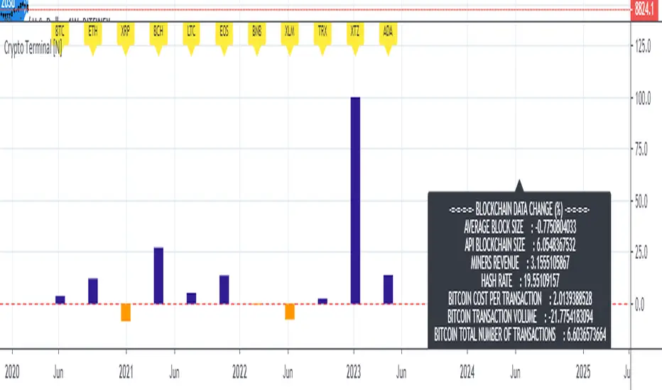
Live Mini Terminal 7 : Major Cryptocurrencies Change DataThis script displays relative data changes occurring in the adjustable period and/or adaptive automatic period in U.S Dollar based Major Cryptocurrencies.
This script was inspired by the data terminals used by commercial traders.
Period selection can be set in the menu.
This script uses the adaptive period algorithm used by Autonomous LSTM and Relativity scripts.
Or you can set the period manually from the menu.
For more information about adaptive period:
This script works only for 1 day (1D) and 1 week (1W) time frames.
Since usage of Blockchain Data, the most efficient time frame is 1 week (1W) .
Features
Value changes on a percentage basis (%)
The Info Panel contains percentage-based blockchain data changes.
CRYPTOCURRENCIES
BTC : Bitcoin
ETH : Ethereum
XRP : Ripple
BCH : Bitcoin Cash
LTC : Litecoin
EOS : EOS
BNB : Binance Coin
XLM : Stellar
TRX : Tron
XTZ : Tezos
ADA : Cardano
INFO PANEL
Average Blockchain Size change data
API Blockchain Size change data
Miners Revenue change data
Hash Rate change data
Bitcoin Cost Per Transaction change data
Bitcoin Transaction Volume change data
Bitcoin Total Number of Transactions change data
USAGE
The script can be used as an indicator by putting it under the chart as shown above.
It is necessary to enlarge to see clearly.
Since it is not often looked at,
such use is the best method for healthy interpretation.
Best regards.
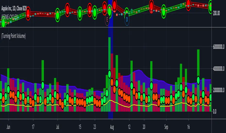
(14) Turning Point Volume VS-332Although dramatic increases in volume can accurately reflect the sentiment of changes in price, small changes do as well. Think of it this way. Every share sold or purchased is a vote for or against the current price action. If the price has gone up today and the volume also went up, compared to the previous days volume, the votes of the majority of the traders that produced this volume agreed with the sentiment that this price change represented. If the volume was suppressed on this price increase, that sentiment was not confirmed. This provides you with a very good window into the collective minds of traders allowing you to judge every candle, every indicator and every price action in a much more initiative and accurate way. The SDG Turning Point Volume indicator again utilizes a dot system to easily allow you to see in a glance if the volume is confirming the price action sentiment (green dot) or if it is discounting the price action (red dot.)
There are many situations where volume alone can indicate important inflection points in an equities direction. It may not even reverse direction, but an abrupt change in the rate of change, can be a very profitable entry point – if you can see it coming and act in advance of some or most of the traders making this market.
Access this Genie indicator for your Tradingview account, through our web site. (Links Below) This will provide you with additional educational information and reference articles, videos, input and setting options and trading strategies this indicator excels in.
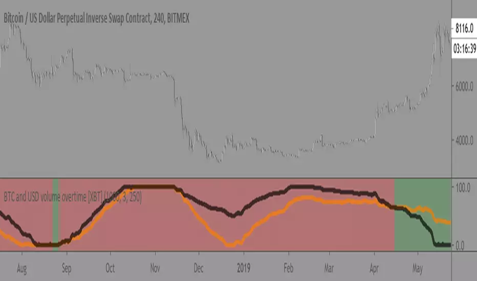
BTC and USD volume overtime [XBT]Compares BTC volume vs USD volume overtime
Best used on 4hr timeframe. Not really some crazy alpha but good overview/statistic to keep track of.
(make sure to use on XBTUSD pair since it isnt using security calls to call the data)
Enjoy!
Correlation Volitility Bars [BVCC]This chart will allow you to compare the volatility of correlation of any other instrument to your current chart. When the comparison coin is selected, it will overlay your current bars with additional information that shows up/down correlation to your master chart as well the volatility of that correlation.
This can be used to compare other coins to BTC for a quick visual reference of if a coin moves with or against BTC movements. If the comparison coin moves up on the given bar, it is represented by a green histogram ABOVE of your current candle. If the comparison coin moves down, it is represented as a red histogram BELOW your current candle.
The height of the correlation candle represents the percentage that the comparison coin moved up or down. The longer the candle, the farther that coin moved.
The blue band represents a 'volatility reference'
-If your comparison coin stays within this band, then it is moving at an absolute rate which is less than the absolute rate of the master coin.
-If your comparison coin moves outside of this band, then it is moving at an absolute rate which is more than the absolute rate of the master coin.
A couple of example of how to read this;
*******Master Candle = Up | Comparison Candle = Up | Equal to Volatility Band********
This means that when the master went up, so did the comparison coin and they both moved equal amounts
******Master Candle = Up | Comparison Candle = Down | Outside Volatility Band*******
This means that when the master went up, the comparison coin went down in response and it's downward response was greater than the corresponding master up movement
******Master Candle = Up | Comparison Candle = Up | Outside Volatility Band*******
This means that when the master went up, the comparison candle responded by going up as well but made more % gains than the corresponding master candle.
Uses for this indicator would be research into the historical performance of how a specific coin reacts to BTC and whether it is a more or less profitable vehicle than BTC during that time period. If the price is consistently outside of the Volatility band then you can infer that this coin is hypersensitive to BTC movements. If the price is consistently within the bands, then you could infer that your comparison coin is relatively correlated or unfazed by BTC.
Percentage Change Comparison [BVCC]This script allows you to input 2 different coins and plot % changes against each other.
Look Back is adjustable to account for different time frame windows. Default is 1, so each line will be graphed on a 1:1 ratio with the candle period selected on the chart. raising this number to 24 will plot the change across every 24 candles and so on. It's pretty interesting to move the input dialogue window out of the way and change this number, watching how the % gain comparisons change in real time.
Default coins to compare are set to BTCUSD and ETHUSD @ coinbase.

Stoch + Stoch RSI [R1984]Simple comparison of stochastic based on price versus stochastic based on RSI.
Plan to add more features later like divergence indications, light/dark mode toggle, etc.

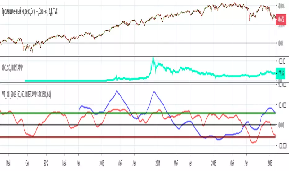
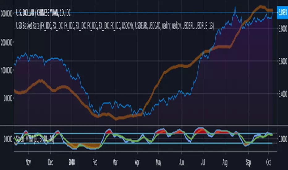
WT_BTC_Dow Jones_2019[wozdux]Comparison of two trading instruments using the indicator. Visual comparison often does not provide complete information. The scale and amplitude of the fluctuations of the two trading pairs are very different. Therefore, it is better to compare indicators from these pairs. I have used for this purpose, the speed indicator of price movement wt. The red line is the wt indicator from the trading instrument that is in the main window. The blue line is an indicator from the pair, which is written in the indicator settings. In addition, the calculation periods for each pair can be taken as the same or different. Often, trading pairs do not fluctuate synchronously, so it is necessary to select the periods of calculation of the wt indicator individually. In this example, Dow Jones and bitcoin were used.
-----------------------
Сравнение двух торговых инструментов с помощью индикатора. Визуальное сравнение часто не дает полной информации. Масштаб и амплитуда колебаний двух торговых пар бывают сильно различаются. Поэтому сравнивать лучше индикаторы от данных пар. Я использовала для этой цели индикатор скорости движения цены wt. Красная линия это индикатор wt от того торгового инструмента, который находится в главном окне. Синяя линия это индикатор от пары, которая прописывается в настройках индикатора. Кроме того, периоды вычислений для каждой пары можно брать как одинаковые, так и разные. Часто торговые пары колеблются не синхронно, поэтому стоит подбирать периоды вычислений индикатора WT индивидуально. В данном примере использовался Доу Джонс и биткоин.
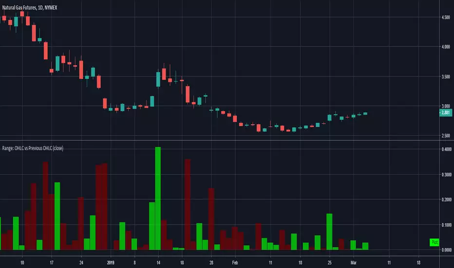
Range: OHLC vs Previous OHLCThis will plot your choice of OHLC (or any of the averaging choices) of the current candle compared to the previous candle.
For example if you choose "high" for the input and set the chart to daily, you'll see the currently daily high vs the previous daily high.
Green candle represent a higher high and the length of the candle represents how much higher.
Red candles represent a lower high than the previous day and the length is by how much lower.
This indicator is pretty straight forward, look for me to build on this with something a little more elaborate in the near future.
Bestest MA. Compare 2 x 7 MA's at different resolutionAdjust time, length, visibility, colour.
SMA and EMA can use different time resolution.
This is version 1 aka work in progress.


FM RSI Vs StochEasy to use RSI and Stoch
Setting Menu has an option to toggle the RSI and Stoch ON and OFF for your own preference.
Great for reducing clutter when comparing oscillators, while giving the ease of use to just click the toggle option instead of having to find and reset your indicator settings.
Colour schemes adjustable in Settings Menu for personal taste.
SeasonalityA multitool to find seasonal effects and components in your time series. Seasonality is one of most frequently used statistical patterns to improve the accuracy of demand forecasts.
To learn more about seasonality see:
en.wikipedia.org
www.investopedia.com
Features
Ability to see up to 16 period lines
33 metric types
Metrics customization
17 types of the price sources
31 types of the moving averages
Readable and optimized code
Free 7-day trial access
Supported Metrics
Price
Average Price
Price Momentum
Price ROC
True Range (by J. Welles Wilder)
Average True Range (by J. Welles Wilder)
Double True Range (by Cynthia Kase)
Average Double True Range
Accumulation/Distribution (by Marc Chaikin)
Volume
Average Volume
Volume Momentum
Volume ROC
Net Volume
On Balance Volume (by Joe Granville)
Trade Value
Tick Volume
Tick Range
Max Tick Movement
Min Tick Movement
Correlation
ADX (by J. Welles Wilder)
Coppock Curve (by Edwin S. Coppock)
Elder Force Index (by Dr. Alexander Elder)
Ease Of Movement (by Richard W. Arms)
Mass Index (by Donald Dorsey)
Price Volume Trend
TRIX (by Jack K. Hutson)
Ulcer Index (by Peter Martin and Byron McCann)
VHF, Vertical Horizontal Filter (by Adam White)
Swing Index (by J. Welles Wilder)
Accumulative Swing Index (by J. Welles Wilder)
Standard Deviation
Supported Price Sources
open
high
low
close
oo2 ( (open + previous open) / 2 )
oh2 ( (open + high) / 2 )
ol2 ( (open + low) / 2 )
oc2 ( (open + close) / 2 )
hh2 ( (high + previous high) / 2 )
hl2
hc2 ( (high + close) / 2 )
ll2 ( (low + previous low) / 2 )
lc2 ( (low + close) / 2 )
cc2 ( (close + previous close) / 2 )
hlc3
ohlc4
wc (weighted close, (2 * close + high + low) / 4 )
Supported Moving Averages
AHMA, Ahrens MA (by Richard D. Ahrens)
ALF, Adaptive Laguerre Filter (by John F. Ehlers)
DEMA, Double Exponential MA (by Patrick G. Mulloy)
EMA, Exponential MA
EVWMA, Elastic Volume Weighted MA (by Christian P. Fries)
FRAMA, Fractal Adaptive MA (by John F. Ehlers)
HMA, Hull MA (by Alan Hull)
IIRF, Infinite Impulse Response Filter (by John F. Ehlers)
LSMA, Least Squares MA
LWMA, Linear Weighted MA
Median
RMA, Running MA (by J. Welles Wilder)
RMF, Recursive Median Filter (by John F. Ehlers)
RMTA, Recursive Moving Trend Average (by Dennis Meyers)
SMA, Simple MA
SHMMA, Sharp Modified MA (by Joe Sharp)
SMMA, Smoothed MA
TEMA, Triple Exponential MA (by Patrick G. Mulloy)
TMA, Triangular MA (Modified by John F. Ehlers)
VIDYA, Variable Index Dynamic Average (by Tushar S. Chande)
VWMA, Volume Weighted MA
WMA, Weighted MA
ZLEMA, Zero Lag Exponential MA (by John F. Ehlers and Ric Way)
2-Pole BF, 2-Pole Butterworth Filter (by John F. Ehlers)
3-Pole BF, 2-Pole Butterworth Filter (by John F. Ehlers)
2-Pole SSF, 2-Pole Super Smoother Filter (by John F. Ehlers)
3-Pole SSF, 2-Pole Super Smoother Filter (by John F. Ehlers)
1-Pole GF, 1-Pole Gaussian Filter (by John F. Ehlers)
2-Pole GF, 2-Pole Gaussian Filter (by John F. Ehlers)
3-Pole GF, 3-Pole Gaussian Filter (by John F. Ehlers)
4-Pole GF, 4-Pole Gaussian Filter (by John F. Ehlers)

Kendall Rank Correlation CoefficientKendall Rank Correlation Coefficient script.
This way to measure the ordinal association between two measured quantities described by Maurice Kendall (1938, Biometrika, 30 (1–2): 81–89, "A New Measure of Rank Correlation").
In this script I compare Kendall Coefficient and Pearson Coefficient (using built-in "correlation" function).

ATR adjusted MACDWhen running MACD, it can be useful to compare the value of the MA difference to other values. In other words, is a particular stock or futures contract at a more extreme MACD value than another. This can be done by dividing by the price, however, that doesn't adjust for volatility differences. Using ATR, one can adjust for price and volatility at the same time, allowing comparisons between securities more easily.
[RESEARCH] Custom Median vs Built-in MedianI compared custom median (using the sorting solution by @apozdnyakov) with built-in median (using percentile_nearest_rank function)
If you see the zero line this means the solutions give the same results.
The best results was achieved on the odd lengths.
Conclusions:
1) Do not try to reinvent the wheel.
2) Always check the Pine Script docs to find already implemented solutions.
Compare currency against multiple (Basket of currencies)Early version of a script to compare one currency against multiple to get an index.
Default values loaded basically make something along the lines of, "USD global exchange rate"
I plan on making this less clunky/messy in future with respect to the coding and the user inputs. Works 100% right now though.
Responsive Comparison Line by SymbolThis script allows you to specify a security to overlay on your chart when viewing a certain symbol. The line will only show on that symbol, change symbols and it will disappear. I found that adding more than 4 lines will slow load time significantly, however if you can code it to be faster please let me know!
All credit to @gyromatical, a good samaritan.

Candle Range CompareThis one compares the total candle height (Low to High), body size, also top and bottom wick sizes. I really don't know when it would be best to use this, but it gives a 0 baseline to compare candles side-by-side also to compare body size to wick size.
*Notes*
- The tallest of course is high minus low
- whether or not the close is above the open, the body size is the column in front of the total size of course
- wicks are from 0 up for the top wick and 0 down for the bottom wick.

Volume ComparisonThis script allows for the comparison of current volume to the past 10 days of volume at the same time of day. Currently the only time frame options available are 15m and 30m. The bar coloring is related to if the volume is > the avg_vol and the close is > or < the previous close.
FYI because volume data trickles in over time and the bar coloring relies on close data this will operate on a 1 bar delay.
Still an interesting study that I will probably add more features to in the future.
Currently it only works on assets that are only traded during normal hours (stocks, futures , etc. NOT crypto, but if I get some interest I may add crypto in the future).
Thanks all for your support!
Much Love
xoxo
-Snoop

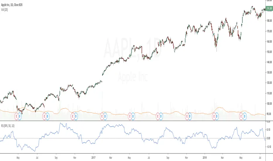
Relative StrengthRelative strength is a ratio between two assets, most often a stock and a market average (index). This implementation uses the method described here and the second method described here to calculate its value: "To calculate the relative strength of a particular stock, divide the percentage change over some time period by the percentage change of a particular index over the same time period". This indicator oscillates around zero. If the value is greater than zero, the investment has been relatively strong during the selected period; if the value is less than zero, the investment has been relatively weak. The period and the comparative symbol can be set in the settings for the indicator (the defaults are 50 and SPX), there you can also find an option to turn on a moving average.