Volumetric Tensegrity🧮 Volumetric Tensegrity unifies two of the Leading Indicator suite's critical engines — ZVOL ( volume anomaly detection ) and OBVX ( directional conviction ). Originally designed as a structural economizer for traders navigating strict indicator limits (e.g. < 10 slots per chart), it was forced to evolve beyond that constraint simply to fulfill it, albeit with a difference. The fatal flaw of traditional fusion, where two metrics are blended mathematically, is that they lose scale integrity (i.e. meaning). VTense encodes optical tensegrity to scale the amplitude of the ZVOL histogram and the slope of the OBVX spread independently, so that expansion and direction may coexist without either dominating the frame.
🧬 Tensegrity , by definition, is an intelligent design principle where elements in compression are suspended within a network of continuous tension, forming a stable, self-supporting structure . Originally conceived in esoteric biomorphology (c.f. Da Vinci, Snelson, Casteneda), tensegrity balances force through opposition, not rigidity. Applied to financial markets, Volumetric Tensegrity captures this same principle: price compresses, volume expands, conviction builds or fades — yet structure holds through the interplay. The result is not a prediction engine, but a pressure field — one that visualizes where structure might bend, break, or rebound based on how volume breathes.
🗜️ Rather than layering multiple indicators and consuming precious chart space, VTense frees up room for complementary overlays like momentum mapping, liquidity tiers, or volatility phase detection — making it ideal for modular traders operating in tight technical real estate.
🧠 Core Logic - VTense separates and preserves two essential structural forces:
• ZVOL Histogram : A Z-score-based expansion map that measures current volume deviation from its historical average. It reveals buildup zones, dormant stretches, and breakout pressure — regardless of price behavior.
• OBVX Spread : A directional conviction curve that tracks the difference between On-Balance Volume and its volume-weighted fast trend. It shows whether the crowd is leaning in (accumulation/distribution) or backing off.
🔊 ZVOL controls the amplitude of the histogram, while OBVX controls the curvature and slope of the spread. Without sacrificing breathing behavior or analytical depth, VTense provides a compact yet dynamic lens to track both expansion pressure and directional bias within a single footprint.
🌊 Volumetric Tensegrity forecasts breakout readiness, trend fatigue, and compression zones by measuring the volatility within volume . Unlike traditional tools that track volatility of price, this indicator reveals when effort becomes unstable — signaling inflection points before price reacts. Designed to decode rhythm shifts at the volume level, it operates as a pre-ignition scanner that thrives on low-timeframe charts (15m and under) while scaling effectively to 1H for validation.
🪖 From Generals to Scouts
👀 When used jointly, ZVOL + OBVX act as the general : deep-field analysts confirming stress, commitment, or exhaustion. VTense , by contrast, functions as a scout — capturing subtle buildup and alignment before structure fully reveals itself. The indicator aims to be a literal vanguard, establishing a position that can be confirmed or flexibly abandoned when the higher authority arrives to evaluate.
🥂 Use the ZVOL + OBVX pair when :
• You need independent axis control and manual dissection
• You’re building long-form confluence setups
• You have more indicator slots than you need
🔎 Use VTense when :
• You need compact clarity across multiple instruments
• You’re prioritizing confluence _detection_ over granular separation
• You’re building efficient multi-layered systems under slot constraints
🏗️ Structural Behavior and Interpretation
🫁 Z VOL Respiration Histogram : Structural Effort vs Baseline
🔵 Compression Coil – volume volatility is low and stable; the market is coiling
🟢 Steady Rhythm – volume is healthy but unremarkable; balanced participation
🟡 Passive/Absorbed Effort – expansion failing to manifest; watch for reversal
🟠 Clean Expansion – actionable volatility rise backed by structure
🔴 Volatile Blowout – chaos, climax; likely end-phase or fakeout
⚖️ ZVOL Respiration measures how hard the crowd is pressing — not just that volume is rising, but how statistically abnormal the surge is. Because it is rescaled proportionally to OBVX, the amplitude of the histogram reflects structural urgency without overwhelming the visual field.
🖐️ OBVX Spread : Real-Time Directional Conviction Behind Price Moves
🔑 The curvature of the spread reveals not just directional bias but crowd temp o: sharp slopes = urgent transitions; gradual slopes = building structural shifts. Curvature is key: sharp OBVX slope = urgency; gentle arcs = controlled drift or indecision.
• Green Rising : Accumulation — upward pressure from real buyers
• Red Falling : Distribution — sell pressure, downward slope
• Flat Curves : Transitional → uncertainty, microstructure digestion
🎭 Synchronized vs Divergent Behavior
⏱️ Synchronized (high-confluence) : often precedes structural breakouts, with internal conviction clearly visible before price resolves.
• ZVOL expands (yellow/orange/red) and OBVX climbs steeply green = strong bullish pressure
• ZVOL expands while OBVX steepens red = growing sell-side intent
🪤 Divergent (conflict tension) : flags potential traps, fakeouts, and liquidity sweeps.
• ZVOL expands sharply, but OBVX flattens or opposes → reactive expansion without crowd commitment
⛔️ Latent Drift + Structural Holding Patterns : tensegrity in action — the market holds tension without directional release.
• ZVOL compresses (blue) + OBVX meanders near zero → structure is resting, building up energy
• After prolonged drift, expect violent asymmetry when balance finally breaks
📚 Phase Interpretation: Dynamic Structural Read
• 1️⃣ Quiet Coil : Histogram flat, OBVX flat → no urgency
• 2️⃣ Initial Pulse : Yellow bars, OBVX slope builds → actionable tension
• 3️⃣ Structural Breath : Synchronized expansion and slope → directional commitment
• 4️⃣ Disagreement : Spike in ZVOL, flattening OBVX → exhaustion risk or false signal
💡 Suggested Use
• Run on 15m charts for breakout anticipation and 1H for validation
• Pair with ZVOL + OBVX to confirm crowd conviction behind the tension phase
• Use as a rhythm filter for the suite's trend indicators (e.g., RDI , SUPeR TReND 2.718 , et. al.)
• Ideal during low-volume regimes to detect pressure buildup before triggers
🧏🏻 Volumetric Tensegrity doesn’t signal. It breathes , and listens to pressure shifts before they speak in price. As a scout, it lets you see structural posture before signals align — helping you front-run resolution with clarity, not prediction.
Confluence
EMA 9/21/50 + VWAP + MACD + RSI Pro [v6]Overview:
A powerful multi-indicator tool combining Exponential Moving Averages (EMA 9, 21, 50), Volume-Weighted Average Price (VWAP), Moving Average Convergence Divergence (MACD), and Relative Strength Index (RSI) into a single, easy-to-read system. Designed for traders who want a clean, all-in-one dashboard for trend analysis, momentum confirmation, and overbought/oversold conditions.
Key Features:
1. Triple EMA System (9, 21, 50)
Identifies short-term and medium-term trends.
Bullish Signal: EMA 9 > EMA 21 > EMA 50 (Green Highlight)
Bearish Signal: EMA 9 < EMA 21 < EMA 50 (Red Highlight)
Helps confirm trend direction and potential reversals.
2. VWAP (Volume-Weighted Average Price)
Tracks intraday fair value price based on volume.
Bullish: Price above VWAP (Green)
Bearish: Price below VWAP (Red)
3. MACD (Standard 12, 26, 9 Settings)
Shows momentum shifts.
Bullish: MACD line > Signal line (Green)
Bearish: MACD line < Signal line (Red)
Histogram confirms strength of momentum.
4. RSI (14-Period Default)
Identifies overbought (>70) and oversold (<30) conditions.
Red: Overbought (Potential Reversal)
Green: Oversold (Potential Bounce)
5. Signal Dashboard (Top-Right Table)
Real-time summary of all indicators in one place.
Color-coded for quick interpretation (Green = Bullish, Red = Bearish).
How to Use This Indicator?
✅ Trend Confirmation:
Trade in the direction of EMA alignment (9 > 21 > 50 for uptrends).
Use VWAP as dynamic support/resistance.
✅ Momentum Entries:
Look for MACD crossovers while RSI is not extreme.
Avoid buying when RSI > 70 or selling when RSI < 30 (unless strong trend).
✅ Mean Reversion:
Fade extreme RSI readings (overbought/oversold) when price is at key levels.
Who Is This For?
✔ Swing Traders – EMA + MACD combo for trend-following.
✔ Day Traders – VWAP + EMA for intraday bias.
✔ RSI Traders – Clear overbought/oversold signals.
Settings Customization:
Adjust EMA lengths, RSI periods, and MACD settings as needed.
Toggle VWAP visibility on/off.
Why Use This Script?
📌 All-in-One: No need for multiple indicators cluttering your chart.
📌 Visual Clarity: Color-coded signals for quick decision-making.
📌 Flexible: Works on any timeframe (1M, 5M, 1H, Daily, etc.).
Install now and enhance your trading strategy with a professional-grade multi-indicator system!
Not a financial advice. Use at your own discretion and always apply risk management

[GrandAlgo] MTF Confluence Key LevelsMTF Confluence Key Levels
The MTF Confluence Key Levels indicator is a powerful tool designed to identify pivotal price levels by analyzing price action across three timeframes . By leveraging a proprietary algorithm, this indicator filters out noise and highlights only the most significant zones, providing traders with actionable insights into potential price reactions.
With daily level resets , the indicator ensures traders work with the most current data, enabling precision and confidence in their trading decisions. Whether you’re a day trader, swing trader, or long-term investor, this tool adapts seamlessly to your trading style across all markets.
Key Features:
Multi-Timeframe Analysis: Evaluates price data across three timeframes to identify areas of confluence with high accuracy.
Daily Level Reset: Automatically refreshes key levels each day to reflect the latest market dynamics.
Proprietary Algorithm: Filters out insignificant levels to focus on zones that matter most, reducing chart clutter.
Universal Application: Compatible with Forex, crypto, stocks, indices, and commodities.
Customizable Settings: Tailor the indicator to align with your preferred strategy and level of precision.
Benefits:
Identify high-probability zones for potential reversals, breakouts, or consolidations.
Align short-term trades with long-term trends for enhanced confluence.
Optimize entries and exits by using precise confluence levels.
Improve risk management by setting stop-loss and take-profit levels based on robust support and resistance zones.
Adaptable for all trading styles, including day trading, swing trading, and position trading.
Use Cases:
Confirm overarching market trends by analyzing key levels from higher timeframes.
Refine trade entries and exits by leveraging multi-timeframe confluence.
Combine key levels with other tools, such as volume and momentum indicators, for enhanced decision-making.
Adjust strategies daily with updated levels reflecting current price action.
The image showcases how the MTF Confluence Key Levels indicator dynamically highlights critical areas of market interest using three timeframes for actionable trading insights.
Disclaimer:
This indicator is a technical analysis tool designed to assist traders by providing insights into market conditions. It does not guarantee future price movements or trading outcomes and should not be relied upon as a sole decision-making tool. The effectiveness of this indicator depends on its application, which requires your trading knowledge, experience, and judgment.
Trading involves significant financial risk, including the potential loss of capital. Past performance of any tool or indicator does not guarantee future results. This script is intended for educational and informational purposes only and does not constitute financial or investment advice. Users are strongly encouraged to perform their own analysis and consult with a qualified financial professional before making trading decisions.
Money Flow Index Trend Zone Strength [UAlgo]The "Money Flow Index Trend Zone Strength " indicator is designed to analyze and visualize the strength of market trends and OB/OS zones using the Money Flow Index (MFI). The MFI is a momentum indicator that incorporates both price and volume data, providing insights into the buying and selling pressure in the market. This script enhances the traditional MFI by introducing trend and zone strength analysis, helping traders identify potential trend reversals and continuation points.
🔶 Customizable Settings
Amplitude: Defines the range for the MFI Zone Strength calculation.
Wavelength: Period used for the MFI calculation and Stochastic calculations.
Smoothing Factor: Smoothing period for the Stochastic calculations.
Show Zone Strength: Enables/disables visualization of the MFI Zone Strength line.
Show Trend Strength: Enables/disables visualization of the MFI Trend Strength area.
Trend Strength Signal Length: Period used for the final smoothing of the Trend Strength indicator.
Trend Anchor: Selects the anchor point (0 or 50) for the Trend Strength Stochastic calculation.
Trend Transform MA Length: Moving Average length for the Trend Transform calculation.
🔶 Calculations
Zone Strength (Stochastic MFI):
The highest and lowest MFI values over a specified amplitude are used to normalize the MFI value:
MFI Highest: Highest MFI value over the amplitude period.
MFI Lowest: Lowest MFI value over the amplitude period.
MFI Zone Strength: (MFI Value - MFI Lowest) / (MFI Highest - MFI Lowest)
By normalizing and smoothing the MFI values, we aim to highlight the relative strength of different market zones.
Trend Strength:
The smoothed MFI zone strength values are further processed to calculate the trend strength:
EMA of MFI Zone Strength: Exponential Moving Average of the MFI Zone Strength over the wavelength period.
Stochastic of EMA: Stochastic calculation of the EMA values, smoothed with the same smoothing factor.
Purpose: The trend strength calculation provides insights into the underlying market trends. By using EMA and stochastic functions, we can filter out noise and better understand the overall market direction. This helps traders stay aligned with the prevailing trend and make more informed trading decisions.
🔶 Usage
Interpreting Zone Strength: The zone strength plot helps identify overbought and oversold conditions. A higher zone strength indicates potential overbought conditions, while a lower zone strength suggests oversold conditions, can suggest areas for entry/exit decisions.
Interpreting Trend Strength: The trend strength plot visualizes the underlying market trend, can help signal potential trend continuation or reversal based on the chosen anchor point.
Using the Trend Transform: The trend transform plot provides an additional layer of trend analysis, helping traders identify potential trend reversals and continuation points.
Combine the insights from the zone strength and trend strength plots with other technical analysis tools to make informed trading decisions. Look for confluence between different indicators to increase the reliability of your trades.
🔶 Disclaimer:
Use with Caution: This indicator is provided for educational and informational purposes only and should not be considered as financial advice. Users should exercise caution and perform their own analysis before making trading decisions based on the indicator's signals.
Not Financial Advice: The information provided by this indicator does not constitute financial advice, and the creator (UAlgo) shall not be held responsible for any trading losses incurred as a result of using this indicator.
Backtesting Recommended: Traders are encouraged to backtest the indicator thoroughly on historical data before using it in live trading to assess its performance and suitability for their trading strategies.
Risk Management: Trading involves inherent risks, and users should implement proper risk management strategies, including but not limited to stop-loss orders and position sizing, to mitigate potential losses.
No Guarantees: The accuracy and reliability of the indicator's signals cannot be guaranteed, as they are based on historical price data and past performance may not be indicative of future results.
Six PillarsGeneral Overview
The "Six Pillars" indicator is a comprehensive trading tool that combines six different technical analysis methods to provide a holistic view of market conditions.
These six pillars are:
Trend
Momentum
Directional Movement (DM)
Stochastic
Fractal
On-Balance Volume (OBV)
The indicator calculates the state of each pillar and presents them in an easy-to-read table format. It also compares the current timeframe with a user-defined comparison timeframe to offer a multi-timeframe analysis.
A key feature of this indicator is the Confluence Strength meter. This unique metric quantifies the overall agreement between the six pillars across both timeframes, providing a score out of 100. A higher score indicates stronger agreement among the pillars, suggesting a more reliable trading signal.
I also included a visual cue in the form of candle coloring. When all six pillars agree on a bullish or bearish direction, the candle is colored green or red, respectively. This feature allows traders to quickly identify potential high-probability trade setups.
The Six Pillars indicator is designed to work across multiple timeframes, offering a comparison between the current timeframe and a user-defined comparison timeframe. This multi-timeframe analysis provides traders with a more comprehensive understanding of market dynamics.
Origin and Inspiration
The Six Pillars indicator was inspired by the work of Dr. Barry Burns, author of "Trend Trading for Dummies" and his concept of "5 energies." (Trend, Momentum, Cycle, Support/Resistance, Scale) I was intrigued by Dr. Burns' approach to analyzing market dynamics and decided to put my own twist upon his ideas.
Comparing the Six Pillars to Dr. Burns' 5 energies, you'll notice I kept Trend and Momentum, but I swapped out Cycle, Support/Resistance, and Scale for Directional Movement, Stochastic, Fractal, and On-Balance Volume. These changes give you a more dynamic view of market strength, potential reversals, and volume confirmation all in one package.
What Makes This Indicator Unique
The standout feature of the Six Pillars indicator is its Confluence Strength meter. This feature calculates the overall agreement between the six pillars, providing traders with a clear, numerical representation of signal strength.
The strength is calculated by considering the state of each pillar in both the current and comparison timeframes, resulting in a score out of 100.
Here's how it calculates the strength:
It considers the state of each pillar in both the current timeframe and the comparison timeframe.
For each pillar, the absolute value of its state is taken. This means that both strongly bullish (2) and strongly bearish (-2) states contribute equally to the strength.
The absolute values for all six pillars are summed up for both timeframes, resulting in two sums: current_sum and alternate_sum.
These sums are then added together to get a total_sum.
The total_sum is divided by 24 (the maximum possible sum if all pillars were at their strongest states in both timeframes) and multiplied by 100 to get a percentage.
The result is rounded to the nearest integer and capped at a minimum of 1.
This calculation method ensures that the Confluence Strength meter takes into account not only the current timeframe but also the comparison timeframe, providing a more robust measure of overall market sentiment. The resulting score, ranging from 1 to 100, gives traders a clear and intuitive measure of how strongly the pillars agree, with higher scores indicating stronger potential signals.
This approach to measuring signal strength is unique in that it doesn't just rely on a single aspect of price action or volume. Instead, it takes into account multiple factors, providing a more robust and reliable indication of potential market moves. The higher the Confluence Strength score, the more confident traders can be in the signal.
The Confluence Strength meter helps traders in several ways:
It provides a quick and easy way to gauge the overall market sentiment.
It helps prioritize potential trades by identifying the strongest signals.
It can be used as a filter to avoid weaker setups and focus on high-probability trades.
It offers an additional layer of confirmation for other trading strategies or indicators.
By combining the Six Pillars analysis with the Confluence Strength meter, I've created a powerful tool that not only identifies potential trading opportunities but also quantifies their strength, giving traders a significant edge in their decision-making process.
How the Pillars Work (What Determines Bullish or Bearish)
While developing this indicator, I selected and configured six key components that work together to provide a comprehensive view of market conditions. Each pillar is set up to complement the others, creating a synergistic effect that offers traders a more nuanced understanding of price action and volume.
Trend Pillar: Based on two Exponential Moving Averages (EMAs) - a fast EMA (8 period) and a slow EMA (21 period). It determines the trend by comparing these EMAs, with stronger trends indicated when the fast EMA is significantly above or below the slow EMA.
Directional Movement (DM) Pillar: Utilizes the Average Directional Index (ADX) with a default period of 14. It measures trend strength, with values above 25 indicating a strong trend. It also considers the Positive and Negative Directional Indicators (DI+ and DI-) to determine trend direction.
Momentum Pillar: Uses the Moving Average Convergence Divergence (MACD) with customizable fast (12), slow (26), and signal (9) lengths. It compares the MACD line to the signal line to determine momentum strength and direction.
Stochastic Pillar: Employs the Stochastic oscillator with a default period of 13. It identifies overbought conditions (above 80) and oversold conditions (below 20), with intermediate zones between 60-80 and 20-40.
Fractal Pillar: Uses Williams' Fractal indicator with a default period of 3. It identifies potential reversal points by looking for specific high and low patterns over the given period.
On-Balance Volume (OBV) Pillar: Incorporates On-Balance Volume with three EMAs - short (3), medium (13), and long (21) periods. It assesses volume trends by comparing these EMAs.
Each pillar outputs a state ranging from -2 (strongly bearish) to 2 (strongly bullish), with 0 indicating a neutral state. This standardized output allows for easy comparison and aggregation of signals across all pillars.
Users can customize various parameters for each pillar, allowing them to fine-tune the indicator to their specific trading style and market conditions. The multi-timeframe comparison feature also allows users to compare pillar states between the current timeframe and a user-defined comparison timeframe, providing additional context for decision-making.
Design
From a design standpoint, I've put considerable effort into making the Six Pillars indicator visually appealing and user-friendly. The clean and minimalistic design is a key feature that sets this indicator apart.
I've implemented a sleek table layout that displays all the essential information in a compact and organized manner. The use of a dark background (#030712) for the table creates a sleek look that's easy on the eyes, especially during extended trading sessions.
The overall design philosophy focuses on presenting complex information in a simple, intuitive format, allowing traders to make informed decisions quickly and efficiently.
The color scheme is carefully chosen to provide clear visual cues:
White text for headers ensures readability
Green (#22C55E) for bullish signals
Blue (#3B82F6) for neutral states
Red (#EF4444) for bearish signals
This color coding extends to the candle coloring, making it easy to spot when all pillars agree on a bullish or bearish outlook.
I've also incorporated intuitive symbols (↑↑, ↑, →, ↓, ↓↓) to represent the different states of each pillar, allowing for quick interpretation at a glance.
The table layout is thoughtfully organized, with clear sections for the current and comparison timeframes. The Confluence Strength meter is prominently displayed, providing traders with an immediate sense of signal strength.
To enhance usability, I've added tooltips to various elements, offering additional information and explanations when users hover over different parts of the indicator.
How to Use This Indicator
The Six Pillars indicator is a versatile tool that can be used for various trading strategies. Here are some general usage guidelines and specific scenarios:
General Usage Guidelines:
Pay attention to the Confluence Strength meter. Higher values indicate stronger agreement among the pillars and potentially more reliable signals.
Use the multi-timeframe comparison to confirm signals across different time horizons.
Look for alignment between the current timeframe and comparison timeframe pillars for stronger signals.
One of the strengths of this indicator is it can let you know when markets are sideways – so in general you can know to avoid entering when the Confluence Strength is low, indicating disagreement among the pillars.
Customization Options
The Six Pillars indicator offers a wide range of customization options, allowing traders to tailor the tool to their specific needs and trading style. Here are the key customizable elements:
Comparison Timeframe:
Users can select any timeframe for comparison with the current timeframe, providing flexibility in multi-timeframe analysis.
Trend Pillar:
Fast EMA Period: Adjustable for quicker or slower trend identification
Slow EMA Period: Can be modified to capture longer-term trends
Momentum Pillar:
MACD Fast Length
MACD Slow Length
MACD Signal Length These can be adjusted to fine-tune momentum sensitivity
DM Pillar:
ADX Period: Customizable to change the lookback period for trend strength measurement
ADX Threshold: Adjustable to define what constitutes a strong trend
Stochastic Pillar:
Stochastic Period: Can be modified to change the sensitivity of overbought/oversold readings
Fractal Pillar:
Fractal Period: Adjustable to identify potential reversal points over different timeframes
OBV Pillar:
Short OBV EMA
Medium OBV EMA
Long OBV EMA These periods can be customized to analyze volume trends over different timeframes
These customization options allow traders to experiment with different settings to find the optimal configuration for their trading strategy and market conditions. The flexibility of the Six Pillars indicator makes it adaptable to various trading styles and market environments.

[GYTS-Pro] Flux Composer🧬 Flux Composer (Professional Edition)
🌸 Confluence indicator in GoemonYae Trading System (GYTS) 🌸
The Flux Composer is a powerful tool in the GYTS suite that is designed to aggregate signals from multiple Signal Providers, apply advanced decaying functions, and offer customisable and advanced confluence mechanisms. This allows making informed decisions by considering the strength and agreement ("when all stars align") of various input signals.
🌸 --------- TABLE OF CONTENTS --------- 🌸
1️⃣ Main Highlights
2️⃣ Flux Composer’s Features
Multi Signal Provider support
Advanced decaying functions
Customisable Flux confluence mechanisms
Actionable trading experience
Filtering options
User-friendly experience
Upgrades compared to Community Edition
3️⃣ User Guide
Selecting Signal Providers
Connecting Signal Providers to the Flux Composer
Understanding the Flux
Tuning the decaying functions
Choosing Flux confluence mechanism
Choosing sensitivity
Utilising the filtering options
Interpreting the Flux for trading signals
4️⃣ Limitations
🌸 ------ 1️⃣ --- MAIN HIGHLIGHTS --- 1️⃣ ------ 🌸
- Signal aggregation : Combines signals from multiple different 📡 Signal Providers, each of which can be tuned and adjusted independently.
- Decaying function : Utilises advanced decaying functions to model the diminishing effect of signals over time, ensuring that recent signals have more weight. In addition to the decaying effect, the "quality" of the original signals (e.g. a "strong" GDM from WaveTrend 4D ) are accounted for as well.
- Flux confluence mechanism : The aggregation of all decaying functions form the "Flux", which is the core signal measurement of the Flux Composer. Multiple mechanisms are available for creating the Flux and effectively using it for actionable trading signals.
- Visualisation : Provides detailed visualisation options to help users understand and tune the contributions of individual Signal Providers and their decaying functions.
- Backtesting : The 🧬 Flux Composer is a core component of the TradingView suite of the 🌸 GoemonYae Trading System (GYTS) 🌸. It connects multiple 📡 Signal Providers, such as the WaveTrend 4D, and processes their signals to produce a unified "Flux". This Flux can then be used by the GYTS "🎼 Order Orchestrator" for backtesting and trade automation.
🌸 ------ 2️⃣ --- FLUX COMPOSER'S FEATURES --- 2️⃣ ------ 🌸
Let's delve into more details...
💮 1. Multi Signal Provider support
Using the name of the GYTS "🎼 Order Orchestrator" as an analogy: Imagine a symphony where each instrument plays its own unique part, contributing to the overall harmony. The Flux Composer operates similarly, integrating multiple Signal Providers to create a comprehensive and robust trading signal -- the "Flux". Currently, it supports up to four streams from the WaveTrend 4D's ’s Gradient Divergence Measure (GDM) and another four streams from the Quantile Median Cross (QMC). These can be either four "Professional Edition" Signal Providers or eight "Community Editions".
Note that the GDM includes 2 different continuous signals and the QMC 3 different continuous signals (from different frequencies). This means that the Community Edition can handle 2*2 + 2*3 = 10 different continuous signals and the Professional Edition as much as 20.
As GYTS evolves, more Signal Providers will be added; at the moment of releasing the Flux Composer, only WaveTrend 4D is publicly available.
💮 2. Advanced decaying functions
A trading signal can be relevant today, less relevant tomorrow, and irrelevant in a week's time. In other words, its relevance diminishes, or decays , over time. The Flux Composer utilises decaying functions that ensure that recent signals carry more weight, while older signals fade away. This is crucial for accurate signal processing. The intensity and decay settings allow for precise control, allowing emphasising certain signals based on their strength and relevance over time. On top of that, unlike binary signals ("buy now"), the Flux Composer utilises the actual values from the Signal Providers, differentiating between the exact quality of signals, and thus offering a detailed representation of the trading landscape. We will illustrate this in a further section.
💮 3. Customisable Flux confluence mechanisms
Another core component of the Flux Composer is the ability of intelligently combining the decaying functions. It offers four sophisticated confluence mechanisms: Amplitude Compression, Accentuated Amplitude Compression, Trigonometric, and GYTSynthesis. Each mechanism has its unique way of processing the Flux, tailored to different trading needs. For instance, the Amplitude Compression method scales the Flux based on recent values, much like the Stochastic Oscillator, while the Trigonometric method uses smooth functions to reduce outliers’ impact. The GYTSynthesis is a proprietary method, striking a balance between signal strength and discriminative power.
We'll discuss this in more detail in the User Guide section.
💮 4. Actionable trading experience
While the mathematical abilities might seem overwhelming, the goal of the Flux Composer is to transform complex signal data into actionable trading signals. When the Flux reaches certain thresholds, it generates clear bullish or bearish signals, making it easy for traders to interpret. The inclusion of upper and lower thresholds (UT and LT) helps in identifying strong signals visually and should be a familiar behaviour similar to how many other indicators operate. Furthermore, the Flux Composer can plot trading signals directly on the oscillator, showing triangle shapes for buy or sell signals. This visual aid is complemented by the possibility to setup TradingView alerts.
💮 5. Filtering options
The Professional Edition also offers filtering options to possibly further improve the quality of Flux signals. Signal streams can be divided into “Signal Flux” and “Filter Flux.” The Filter Flux acts as a gatekeeper, ensuring that only signals meeting the Filter's criteria (which consist of similar UT/LT thresholds) are considered for trading. This dual-layer approach enhances the reliability of trading signals, reducing the chances of false positives.
💮 6. User-friendly experience
GYTS is all about sophisticated, robust methods but also "elegance". One of the interpretations of the latter, is that the users' experience is very important. Despite the Flux Composer's mathematical underpinnings, it offers intuitive settings that with omprehensive tooltips to help with a smooth setup process. For those looking to fine-tune their signals, the Flux Composer allows the visualisation of individual decaying functions. This feature helps users understand the impact of each setting and make informed adjustments. Additionally, the background of the chart can be coloured to indicate the trading direction suggested by the Filter Flux, providing an at-a-glance overview of market conditions.
💮 7. Upgrades compared to Community Edition
Number of signal streams -- At the moment of writing, the Professional Edition works with 4x GDM and 4x QMC signal streams from WaveTrend 4D Signal Provider , while Community Edition (CE) Flux Composer (FC) only works with 2x GDM and 2x QMC signal streams.
Flux confluence mechanism -- CE includes the Amplitude Compression and Trigonometric confluence mechanisms, while the Pro Edition also includes the Accentuated Amplitude Compression and the GYTSynthesis mechanisms.
Signal streams as filters -- The Pro Edition can use Signal Providers as filters.
🌸 ------ 3️⃣ --- USER GUIDE --- 3️⃣ ------ 🌸
💮 1. Selecting Signal Providers
The Flux Composer’s foundation lies in its Signal Providers. When starting with the Flux Composer, using a single Signal Provider can already provide significant value due to the nature of decaying functions. For instance, the WaveTrend 4D signal provider includes up to 5 signal types (GDM and QMC in different frequencies) in a single direction (long/short). Moreover, the various confluence mechanisms that enhance the resulting Flux result in improved discrimination between weak and strong signals. This approach is akin to ensemble learning in machine learning, where multiple models are combined to improve predictive performance.
While using a single Signal Provider is beneficial, the true power of the Flux Composer is realised with multiple Signal Providers. Here are two general approaches to selecting Signal Providers:
Diverse Behaviours
Use Signal Providers with different behaviours, such as WaveTrend 4D on various assets/timeframes or entirely different Signal Providers. This approach leverages diversification to achieve robustness, rooted in the principle that varied sources enhance the overall signal quality. To explain this with an analogy, this strategy aligns with the theory of diversification in portfolio management, where combining uncorrelated assets reduces overall risk. Similarly, combining uncorrelated signals can mitigate the risk of signal failure. A practical example can be integrating a mean-reversion signal with a trend-following signal -- these can balance each other out, providing more stable outputs over different market conditions.
Enhancing a Single Provider
If you consider a particular Signal Provider highly effective, you could improve its robustness by using multiple instances with slight variations. These variations could include different sources (e.g., close, HL2, HLC3), data providers (same asset across different brokers/exchanges), or parameter adjustments. This method mirrors Monte Carlo simulations, often used in risk management and derivative pricing, which involve running many simulations with varied inputs to estimate the probability of different outcomes. By applying similar principles, the strategy becomes less susceptible to overfitting, ensuring the signals are not overly dependent on specific data conditions.
💮 2. Connecting Signal Providers to the Flux Composer
Moving on to practicalities: how do you connect Signal Providers with the Flux Composer? You may have noticed that when you open the drawdown of a data source in a TradingView indicator (with "open", "high", "low", etc.), you also see names from other indicators on your chart. We call these "streams", and the Signal Providers are designed such that they output this stream in a way that the Flux Composer can interpret it. Thus, to connect a Signal Provider with the Flux Composer, you should first have that Signal Provider on your chart. Obviously you should set it up an a way that it seems to provide good signals. After that, in the Data Stream dropdown in the Flux Composer, you can select the stream that is outputted by your Signal Provider. This will always be with a prefix of "🔗 STREAM" (after the Signal Provider's indicator name). See the chart below.
There is one important nuance: when you have multiple (similar) Signal Providers on your chart, it may be hard to select the correct data stream in the Flux Composer as the names of the streams keep repeating when you use identical indicators. So be sure to be attentive as you might end up using the same signals multiple times.
Also, the Signal Providers have an "Indicator name" parameter (and another parameter to repeat this name) that is handy to use when you have multiple Signal Providers on your screen. It is handy to give names that describe the unique settings of that Signal Provider so you can better differentiate what you are looking at on your screen.
💮 3. Understanding the Flux
Let's understand how the Signal Provider's signals are processed. In the chart below, you see we have one Signal Provider (WaveTrend 4D) connected to the Flux Composer and that it gives a bearish QMC signal. The Flux Composer converts this into a decaying function. You can show these functions per Signal Provider when the option "Show decaying function of Signal Provider" is enabled (as it is in the chart).
In our opinion, of crucial importance is the ability to process the quality of signals, rather than just any signal. In mathematical terms, we are interested in continuous signals as these provide a spectrum of values. These signals can reflect varying degrees of market sentiment or trend strength, offering richer information than binary signals, which offer only two states (e.g., buy/sell). Especially in the context of the Flux Composer, where you aggregate multiple signals, it makes a big difference whether you combine 10 weak signals or 10 strong signals. To illustrate this principle, look at the chart below where there are 4 signals of different strengths. As you can see, each of the signals affects the Flux with different intensities.
💮 4. Tuning the decaying functions
As previously mentioned, the decaying functions are a way to give more importance to recent signals while allowing older ones to fade away gradually. This mimics the natural way we assess information, giving more weight to recent events. The decaying functions in the Flux Composer are highly customisable while remaining easy to use. You can adjust the initial intensity , which sets the starting strength of a signal, and the decay rate, which determines how quickly this signal diminishes over time. Let's look at specific examples.
If we add 3 Flux Composers on the chart, connect the same Signal Provider, keep all settings the same with one exception, we get the chart below. Here we have changed the "intensity" parameter of the specific signal. As you can see, the decaying functions are different. The intensity determines the initial strength of the decayed function. Adjusting the intensity allows you to emphasise certain signal types based on their perceived reliability or importance.
Let's now keep the intensity the same ("normal"), but change the "decay" parameter. As you can see in the image below, the decay controls how quickly the signal’s strength diminishes over time. By adjusting the decay, you can model the longevity of the signal’s impact. A faster decay means the signal loses its influence quickly, while a slower decay means it remains relevant for a longer period.
So how do multiple signals interact? You can see this as a simple "stacking of decaying functions" (although there is more to it, see next section). In the chart below we different strenghts of signals and different decay rates to illustrate how the Flux is constructed.
Hopefully this helps with developing some intuition how signals are converted to decaying functions, how you can control them, and how the Flux is constructed. When tuning these parameters, use the visualisation options to see how individual decaying functions contribute to the overall Flux. This helps in understanding and refining the parameters to achieve the desired trading signal behaviour.
💮 5. Choosing Flux confluence mechanism
While we mentioned that the Flux is a "stacking of individual decaying functions", in the back-end, that is not exactly that simple. Like previously mentioned, for GYTS, "elegance" is very important. One of the interpretations is "user friendliness" and the Flux confluence mechanism is one of the essential developments for this characteristic. The Flux confluence mechanism is critical in synthesising the aggregated signals into the Flux. The choice of mechanism affects how the signals are combined and the resulting trading signals. The Professional Edition offers four distinct mechanisms, each with its strengths.
The Amplitude Compression mechanism is intuitive, scaling the Flux based on recent values, intuitively not unlike the method of the well-known Stochastic Oscillator. The Accentuated Amplitude Compression method takes this a step further, giving more weight to strong Flux values. The Trigonometric mechanism smooths the Flux and reduces the impact of outliers, providing a balanced approach. Finally, the GYTSynthesis mechanism, a proprietary approach, balances signal strength and discriminative power, making it easier to tune and generalise.
It's difficult to convey the workings of the Flux confluence mechanism in a chart, but let's take the opportunity to show how the Flux would look like when connecting both one WaveTrend 4D Signal Provider signals to four Flux Composers with default settings, except the Flux confluence mechanism:
You may notice subtle differences between the four methods. They react differently to different values and their overall shape is slightly be different. The Amplitude Compression is more "pointy" and GYTSynthesis doesn't react to low values. There are many nuances, especially in combination with tuning the sensitivity and upper/lower threshold (UT/LT) parameters.
💮 6. Choosing sensitivity
Speaking of the sensitivity , this parameters fine-tunes how responsive the Flux is to the input signals. Higher sensitivity results in more pronounced responses, leading to more frequent trading signals. Lower sensitivity makes the Flux less responsive, resulting in fewer but potentially more reliable signals.
You might think that changing the upper/lower threshold (UT/LT) parameters would be equivalent, but that's not the case. The sensitivity In case of the Amplitude Compression mechanisms, changing the sensitivity would change the relative Flux shape over time, and with the Trigonometric and GYTSynthesis mechanisms, the Flux shape itself (independent of time) would change. In other words, these are all good parameters for tuning.
💮 7. Utilising the filtering options
When choosing the signal stream of a Signal Provider, you can also change the default "Signal" category of that Signal Provider to a "Filter". In the example below, two Signal Providers are connected; the second is set as a filter. You can see that a second row of a Flux is shown in the Flux Composer (this visualisation can be disabled), corresponding with the signals of the second Signal Provider.
Logically, only when the Filter Flux gives a signal in a certain direction, signals from the regular Signal Flux are registered. Generally speaking, for this use case it is handy to set the thresholds for the Filter Flux low and possibly to decrease the decay rate so that the filtering is active for a long enough time.
💮 8. Interpreting the Flux for trading signals
Lastly, the Signal Flux gives buy and sell signals when it crosses the upper/lower thresholds (UT/LT), when the filter allows it (if enabled). This can be visualised with the triangles as you may have seen in the charts in the previous sections. For people using TradingView's alerts -- these would work too out of the box. And finally, for backtesting and possibly trade automation, we will have the GYTS "🎼 Order Orchestrator" that connects with the Flux Composer.
🌸 ------ 4️⃣ --- LIMITATIONS --- 4️⃣ ------ 🌸
Only 🌸 GYTS 📡 Signal Providers are supported, as there is a specific method to pass continuous (non-binary) data in the data stream
At the moment of release, only the WaveTrend 4D Signal Provider is available. Other Signal Providers will be gradually released.

[GYTS-CE] Flux Composer🧬 Flux Composer (Community Edition)
🌸 Confluence indicator in GoemonYae Trading System (GYTS) 🌸
The Flux Composer is a powerful tool in the GYTS suite that is designed to aggregate signals from multiple Signal Providers, apply customisable decaying functions, and offer customisable and advanced confluence mechanisms. This allows making informed decisions by considering the strength and agreement ("when all stars align") of various input signals.
🌸 --------- TABLE OF CONTENTS --------- 🌸
1️⃣ Main Highlights
2️⃣ Flux Composer’s Features
Multi Signal Provider support
Advanced decaying functions
Customisable Flux confluence mechanisms
Actionable trading experience
User-friendly experience
3️⃣ User Guide
Selecting Signal Providers
Connecting Signal Providers to the Flux Composer
Understanding the Flux
Tuning the decaying functions
Choosing Flux confluence mechanism
Choosing sensitivity
Interpreting the Flux for trading signals
4️⃣ Limitations
🌸 ------ 1️⃣ --- MAIN HIGHLIGHTS --- 1️⃣ ------ 🌸
- Signal aggregation : Combines signals from multiple different 📡 Signal Providers, each of which can be tuned and adjusted independently.
- Decaying function : Utilises advanced decaying functions to model the diminishing effect of signals over time, ensuring that recent signals have more weight. In addition to the decaying effect, the "quality" of the original signals (e.g. a "strong" GDM from WaveTrend 4D with GDM ) are accounted for as well.
- Flux confluence mechanism : The aggregation of all decaying functions form the "Flux", which is the core signal measurement of the Flux Composer. Multiple mechanisms are available for creating the Flux and effectively using it for actionable trading signals.
- Visualisation : Provides detailed visualisation options to help users understand and tune the contributions of individual Signal Providers and their decaying functions.
- Backtesting : The 🧬 Flux Composer is a core component of the TradingView suite of the 🌸 GoemonYae Trading System (GYTS) 🌸. It connects multiple 📡 Signal Providers, such as the WaveTrend 4D, and processes their signals to produce a unified "Flux". This Flux can then be used by the GYTS "🎼 Order Orchestrator" for backtesting and trade automation.
🌸 ------ 2️⃣ --- FLUX COMPOSER'S FEATURES --- 2️⃣ ------ 🌸
Let's delve into more details...
💮 1. Multi Signal Provider support
Using the name of the GYTS "🎼 Order Orchestrator" as an analogy: Imagine a symphony where each instrument plays its own unique part, contributing to the overall harmony. The Flux Composer operates similarly, integrating multiple Signal Providers to create a comprehensive and robust trading signal -- the "Flux". Currently, it supports up to two streams from the WaveTrend 4D’s Gradient Divergence Measure (GDM) and another two streams from the WaveTrend 4D's Quantile Median Cross (QMC) .
Note that the GDM includes 2 different continuous signals and the QMC 3 different continuous signals (from different frequencies). This means that the Community Edition can handle 2*2 + 2*3 = 10 different continuous signals.
As GYTS evolves, more Signal Providers will be added; at the moment of releasing the Flux Composer, only WaveTrend 4D with GDM and with QMC are publicly available.
💮 2. Advanced decaying functions
A trading signal can be relevant today, less relevant tomorrow, and irrelevant in a week's time. In other words, its relevance diminishes, or decays , over time. The Flux Composer utilises decaying functions that ensure that recent signals carry more weight, while older signals fade away. This is crucial for accurate signal processing. The intensity and decay settings allow for precise control, allowing emphasising certain signals based on their strength and relevance over time. On top of that, unlike binary signals ("buy now"), the Flux Composer utilises the actual values from the Signal Providers, differentiating between the exact quality of signals, and thus offering a detailed representation of the trading landscape. We will illustrate this in a further section.
💮 3. Customisable Flux confluence mechanisms
Another core component of the Flux Composer is the ability of intelligently combining the decaying functions. It offers two sophisticated confluence mechanisms: Amplitude Compression and Trigonometric. Each mechanism has its unique way of processing the Flux, tailored to different trading needs. The Amplitude Compression method scales the Flux based on recent values, much like the Stochastic Oscillator, while the Trigonometric method uses smooth functions to reduce outliers’ impact We'll discuss this in more detail in the User Guide section.
💮 4. Actionable trading experience
While the mathematical abilities might seem overwhelming, the goal of the Flux Composer is to transform complex signal data into actionable trading signals. When the Flux reaches certain thresholds, it generates clear bullish or bearish signals, making it easy for traders to interpret. The inclusion of upper and lower thresholds (UT and LT) helps in identifying strong signals visually and should be a familiar behaviour similar to how many other indicators operate. Furthermore, the Flux Composer can plot trading signals directly on the oscillator, showing triangle shapes for buy or sell signals. This visual aid is complemented by the possibility to setup TradingView alerts.
💮 5. User-friendly experience
GYTS is all about sophisticated, robust methods but also "elegance". One of the interpretations of the latter, is that the users' experience is very important. Despite the Flux Composer's mathematical underpinnings, it offers intuitive settings that with omprehensive tooltips to help with a smooth setup process. For those looking to fine-tune their signals, the Flux Composer allows the visualisation of individual decaying functions. This feature helps users understand the impact of each setting and make informed adjustments.
🌸 ------ 3️⃣ --- USER GUIDE --- 3️⃣ ------ 🌸
💮 1. Selecting Signal Providers
The Flux Composer’s foundation lies in its Signal Providers. When starting with the Flux Composer, using a single Signal Provider can already provide significant value due to the nature of decaying functions. For instance, the WaveTrend 4D signal provider includes up to two GDM and three QMC signals in a single direction (long/short). Moreover, the various confluence mechanisms that enhance the resulting Flux result in improved discrimination between weak and strong signals. This approach is akin to ensemble learning in machine learning, where multiple models are combined to improve predictive performance.
While using a single Signal Provider is beneficial, the true power of the Flux Composer is realised with multiple Signal Providers. Here are two general approaches to selecting Signal Providers:
Diverse Behaviours
Use Signal Providers with different behaviours, such as WaveTrend 4D on various assets/timeframes or entirely different Signal Providers. This approach leverages diversification to achieve robustness, rooted in the principle that varied sources enhance the overall signal quality. To explain this with an analogy, this strategy aligns with the theory of diversification in portfolio management, where combining uncorrelated assets reduces overall risk. Similarly, combining uncorrelated signals can mitigate the risk of signal failure. A practical example can be integrating a mean-reversion signal with a trend-following signal -- these can balance each other out, providing more stable outputs over different market conditions.
Enhancing a Single Provider
If you consider a particular Signal Provider highly effective, you could improve its robustness by using multiple instances with slight variations. These variations could include different sources (e.g., close, HL2, HLC3), data providers (same asset across different brokers/exchanges), or parameter adjustments. This method mirrors Monte Carlo simulations, often used in risk management and derivative pricing, which involve running many simulations with varied inputs to estimate the probability of different outcomes. By applying similar principles, the strategy becomes less susceptible to overfitting, ensuring the signals are not overly dependent on specific data conditions.
💮 2. Connecting Signal Providers to the Flux Composer
Moving on to practicalities: how do you connect Signal Providers with the Flux Composer? You may have noticed that when you open the drawdown of a data source in a TradingView indicator (with "open", "high", "low", etc.), you also see names from other indicators on your chart. We call these "streams", and the Signal Providers are designed such that they output this stream in a way that the Flux Composer can interpret it. Thus, to connect a Signal Provider with the Flux Composer, you should first have that Signal Provider on your chart. Obviously you should set it up an a way that it seems to provide good signals. After that, in the Data Stream dropdown in the Flux Composer, you can select the stream that is outputted by your Signal Provider. This will always be with a prefix of "🔗 STREAM" (after the Signal Provider's indicator name). See the chart below.
There is one important nuance: when you have multiple (similar) Signal Providers on your chart, it may be hard to select the correct data stream in the Flux Composer as the names of the streams keep repeating when you use identical indicators. So be sure to be attentive as you might end up using the same signals multiple times.
Also, the Signal Providers have an "Indicator name" parameter (and another parameter to repeat this name) that is handy to use when you have multiple Signal Providers on your screen. It is handy to give names that describe the unique settings of that Signal Provider so you can better differentiate what you are looking at on your screen.
💮 3. Understanding the Flux
Let's understand how the Signal Provider's signals are processed. In the chart below, you see we have one Signal Provider (WaveTrend 4D) connected to the Flux Composer and that it gives a bearish QMC signal. The Flux Composer converts this into a decaying function. You can show these functions per Signal Provider when the option "Show decaying function of Signal Provider" is enabled (as it is in the chart).
In our opinion, of crucial importance is the ability to process the quality of signals, rather than just any signal. In mathematical terms, we are interested in continuous signals as these provide a spectrum of values. These signals can reflect varying degrees of market sentiment or trend strength, offering richer information than binary signals, which offer only two states (e.g., buy/sell). Especially in the context of the Flux Composer, where you aggregate multiple signals, it makes a big difference whether you combine 10 weak signals or 10 strong signals. To illustrate this principle, look at the chart below where there are 4 signals of different strengths. As you can see, each of the signals affects the Flux with different intensities.
💮 4. Tuning the decaying functions
As previously mentioned, the decaying functions are a way to give more importance to recent signals while allowing older ones to fade away gradually. This mimics the natural way we assess information, giving more weight to recent events. The decaying functions in the Flux Composer are highly customisable while remaining easy to use. You can adjust the initial intensity , which sets the starting strength of a signal, and the decay rate, which determines how quickly this signal diminishes over time. Let's look at specific examples.
If we add 3 Flux Composers on the chart, connect the same Signal Provider, keep all settings the same with one exception, we get the chart below. Here we have changed the "intensity" parameter of the specific signal. As you can see, the decaying functions are different. The intensity determines the initial strength of the decayed function. Adjusting the intensity allows you to emphasise certain signal types based on their perceived reliability or importance.
Let's now keep the intensity the same ("normal"), but change the "decay" parameter. As you can see in the image below, the decay controls how quickly the signal’s strength diminishes over time. By adjusting the decay, you can model the longevity of the signal’s impact. A faster decay means the signal loses its influence quickly, while a slower decay means it remains relevant for a longer period.
So how do multiple signals interact? You can see this as a simple "stacking of decaying functions" (although there is more to it, see next section). In the chart below we use different "intensity" and "decay" parameters to discuss how the Flux is created.
Hopefully this helps with developing some intuition how signals are converted to decaying functions, how you can control them, and how the Flux is constructed. When tuning these parameters, use the visualisation options to see how individual decaying functions contribute to the overall Flux. This helps in understanding and refining the parameters to achieve the desired trading signal behaviour.
💮 5. Choosing Flux confluence mechanism
While we mentioned that the Flux is a "stacking of individual decaying functions", in the back-end, that is not exactly that simple. Like previously mentioned, for GYTS, "elegance" is very important. One of the interpretations is "user friendliness" and the Flux confluence mechanism is one of the essential developments for this characteristic. The Flux confluence mechanism is critical in synthesising the aggregated signals into the Flux. The choice of mechanism affects how the signals are combined and the resulting trading signals. The Community Edition offers two distinct mechanisms, each with its strengths.
The Amplitude Compression mechanism is intuitive, scaling the Flux based on recent values, intuitively not unlike the method of the well-known Stochastic Oscillator. On the other hand, the Trigonometric mechanism smooths the Flux and reduces the impact of outliers, providing a balanced approach. It's difficult to convey the workings of the Flux confluence mechanism in a chart, but let's take the opportunity to show how the Flux would look like when connecting both GDM and QMC signals to two Flux Composers with default settings, except the Flux confluence mechanism:
You can notice that the upper Flux Converter (FC) triggered two signals while the other FC triggered only one. There are more nuances, especially in combination with tuning the sensitivity and upper/lower threshold (UT/LT) parameters.
💮 6. Choosing sensitivity
Speaking of the sensitivity , this parameters fine-tunes how responsive the Flux is to the input signals. Higher sensitivity results in more pronounced responses, leading to more frequent trading signals. Lower sensitivity makes the Flux less responsive, resulting in fewer but potentially more reliable signals.
You might think that changing the upper/lower threshold (UT/LT) parameters would be equivalent, but that's not the case. The sensitivity In case of the Amplitude Compression mechanism, changing the sensitivity would change the relative Flux shape over time, and with the Trigonometric mechanism, the Flux shape itself (independent of time) would change. In other words, these are all good parameters for tuning.
💮 8. Interpreting the Flux for trading signals
Lastly, the Signal Flux gives buy and sell signals when it crosses the upper/lower thresholds (UT/LT) This can be visualised with the triangles as you may have seen in the charts in the previous sections. For people using TradingView's alerts -- these would work out of the box. And finally, for backtesting and possibly trade automation, we will have the GYTS "🎼 Order Orchestrator" that connects with the Flux Composer.
🌸 ------ 4️⃣ --- LIMITATIONS --- 4️⃣ ------ 🌸
Only 🌸 GYTS 📡 Signal Providers are supported, as there is a specific method to pass continuous (non-binary) data in the data stream
At the moment of release, only WaveTrend 4D with GDM and with QMC are available. Other Signal Providers will be gradually released.

U-Oscillator Pro [UAlgo]The U-Oscillator Pro is a comprehensive technical analysis tool designed to assist traders in making informed decisions in financial markets. This indicator integrates various features including oscillator, bands, trend clouds divergences, and confluence signals to provide a comprehensive view of market dynamics.
🔶 Oscillator :
U-Oscillator uses an amalgamation of price, momentum, and volatility elements to provide a comprehensive market view. It provides a common output about the market and is easy to use.
Oscillator Features :
Customizable Oscillator Length : This parameter sets the length of the oscillator.
Use Machine Learning On Oscillator Calculation : By evaluating the output of the oscillator, this data set calculates a weighted average of the data set by taking each point with a certain weight and using these weights. This is often used in situations where some data points are more important or need to have more impact than others. A weight for each point that the oscillator calculates may represent the importance or impact of that point. By including all these calculations in the oscillator, it provides a result.
Reversal Signals : Determines whether to display reversal signals on the chart. When set to true, it enables the plotting of reversal signals based on certain conditions for both long (buy) and short (sell) signals. These signals can be interpreted as "potential" turning points of the market. Signals are represented by small shapes on the chart, with green indicating short (sell) signals and red indicating long (buy) signals.
🔶 Extreme Bands:
These regions can be described as the possible reversal regions of the price and obtained by deviations of oscillator values.
Extreme Bands Features:
Band Length : Determines the length of the bands.
Show Extreme Bands : Option to display the extreme bands.
Show Middle Line : Option to show the middle line.
Transparency Mode : Adjust the transparency level of the bands.
It would not be wrong to consider it as potential overbought and oversold regions.
Example:
🔶 Divergences :
The divergence calculation in this script identifies potential reversals by analyzing pivot points in the oscillator. Here's how it works:
Divergence Features :
Pivot Length: The user specifies the length of the divergence calculation (pivotLength), which determines the number of bars to consider for pivot analysis.
Pivot Identification: The script searches for pivot highs and lows within the specified length. These pivots indicate potential turning points in the oscillator.
Divergence Conditions: Different conditions are evaluated based on the identified pivots to determine the presence of bullish or bearish divergences:
Regular Bullish Divergence: Occurs when the oscillator makes a lower low while the price makes a higher low.
Hidden Bullish Divergence: Occurs when the oscillator makes a higher low while the price makes a lower low.
Regular Bearish Divergence: Occurs when the oscillator makes a higher high while the price makes a lower high.
Hidden Bearish Divergence: Occurs when the oscillator makes a lower high while the price makes a higher high.
Visualization: Detected divergences are plotted on the chart using shapes and lines, indicating potential reversal points. Users can choose which types of divergences to display using input options.
🔶 Trend Cloud :
This section can provide information about the long-term direction of the price and the current status of the trend. The increase in the visibility of the cloud can provide information about the strength of the trend.
Trend Cloud Features :
Show Trend Cloud: This setting allows you to choose whether the trend cloud is displayed on the chart or not.
Fast Trend Cloud Mode: This feature can be used to provide information about the cloud's shorter-term trend and its strength.
Classic Mode of Trend Cloud :
Fast Mode of Trend Cloud :
🔶 Confluence :
This section of the script aims to identify potential reversal confluences based on the deviation between the price and a combination of oscillator values. The confluence signals are categorized into light and heavy, representing different levels of potential reversal strength.
Confluence Features :
Show Light/Heavy Reversal Confluences: This setting allows users to control the visibility of the confluence signals on the chart.
Confluence Term: Users can select the term for calculating the confluence, which in turn affects the sensitivity of the confluence signals. The available options are Short, Medium, and Long.
Confluence Signal Conditions:
Light Bearish Reversal Confluence: This type of confluence occurs when there is a moderate deviation between the price and the oscillator values, indicating a potential shift towards a bearish reversal in the market sentiment.
Heavy Bearish Reversal Confluence: In contrast, a heavy bearish reversal confluence signifies a significant deviation between the price and the oscillator values, suggesting a strong indication of a bearish reversal in the market sentiment.
Light Bullish Reversal Confluence: Similar to light bearish reversal confluence, light bullish reversal confluence occurs with a moderate deviation between the price andthe oscillator values, indicating a potential shift towards a bullish reversal in the market sentiment.
Heavy Bullish Reversal Confluence: On the other hand, heavy bullish reversal confluence indicates a substantial deviation between the price andthe oscillator values, suggesting a strong indication of a bullish reversal in the market sentiment.
Plotting Confluence Signals: Shapes (triangles) are plotted on the chart to indicate the presence of confluence signals. Red triangles denote bearish signals, while green triangles denote bullish signals.
This confluence analysis provides traders with additional insights into potential reversal points or helping them make more informed trading decisions.
Example For Confluence :
🔶 Disclaimer:
Use with Caution: This indicator is provided for educational and informational purposes only and should not be considered as financial advice. Users should exercise caution and perform their own analysis before making trading decisions based on the indicator's signals.
Not Financial Advice: The information provided by this indicator does not constitute financial advice, and the creator (UAlgo) shall not be held responsible for any trading losses incurred as a result of using this indicator.
Backtesting Recommended: Traders are encouraged to backtest the indicator thoroughly on historical data before using it in live trading to assess its performance and suitability for their trading strategies.
Risk Management: Trading involves inherent risks, and users should implement proper risk management strategies, including but not limited to stop-loss orders and position sizing, to mitigate potential losses.
No Guarantees: The accuracy and reliability of the indicator's signals cannot be guaranteed, as they are based on historical price data and past performance may not be indicative of future results.

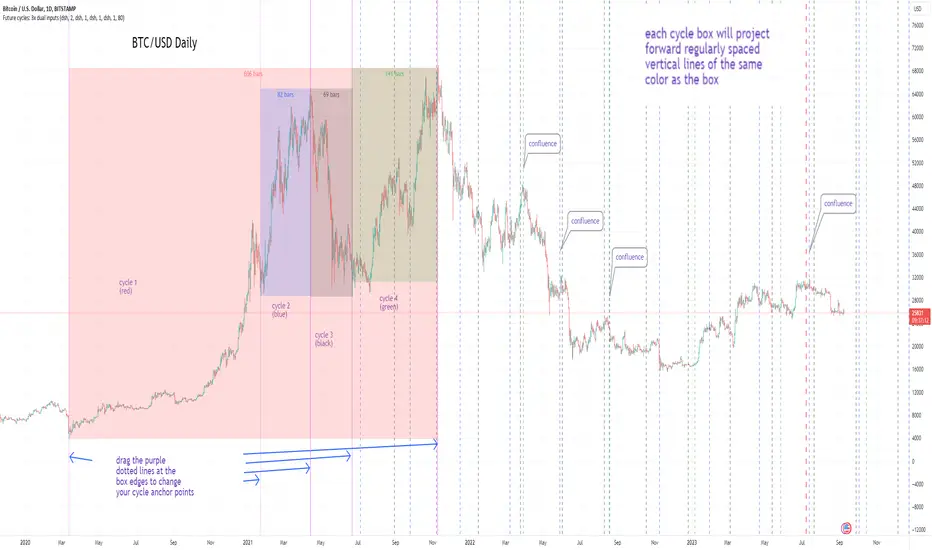
Cycles: 4x dual inputs: Swing / Time Cycles projected forward//Purpose/Premise:
To project forward vertical 'cycle' lines based on user-input anchor points, and to search for confluence.
The idea being that if several well-anchored cycles agree (i.e. we see multiple bunched vertical line confluence in the future), then this may add support to an already existing trade idea, or may indicate an increased likelihood of a shift in direction.
//Usage & notes:
~In the above chart I've anchored to obvious swing lows and swing highs in Btc/Usd from 2020-2022. You could also use fixed time-based cycles from a favored start anchor point. Bars per cycle are printed at the top of each cycle box if your're interested in time cycles. I.e. for 1, 2, 3 month cycles: for BTC you could use 30, 60, 90 bars on daily; for S&P you could use 20, 40, 60 bars on daily.
~On first loading the indicator you will be asked select 'start date', and 'end date' for each of 4 sessions (8x clicks on chart). After this you can easily reset points by clicking the indicator display line three dots>> reset points. Or you can simply drag the vertical box edges (purple lines) to change your cycle anchor points.
~Be sure the start anchor point is before the end anchor point or box/lines won't appear.
~When you drop down to low timeframes you might get bar_index error due to history available: you need then to click the three dots on indicator display line >> reset points >> 8x clicks on the chart.
~Vertical projected lines will match the color of the cycle box they origninate from.
~Lines will project into the future as far as is allowed by tradingview (500 bars max)
//Inputs:
~Time start and end dates for each cycle (change these as described above, or input manually)
~Show/hide each cycle (default is show all 4)
~Formatting options: color of forward projected lines, line width, line style, line / box / text color.
~Box transparancy: Set to 100 to make boxes invisible & declutter the chart. Set to 0 for maximum opacity. Default is 80.
thanks to @Sathyamurthie for his ideas on cycle confluence which caused me to write this.
Volatility-Based Mean Reversion BandsThe Volatility-Based Mean Reversion Bands indicator is a powerful tool designed to identify potential mean reversion trading opportunities based on market volatility. The indicator consists of three lines: the mean line, upper band, and lower band. These bands dynamically adjust based on the average true range (ATR) and act as reference levels for identifying overbought and oversold conditions.
The calculation of the indicator involves several steps. The average true range (ATR) is calculated using a specified lookback period. The ATR measures the market's volatility by considering the range between high and low prices over a given period. The mean line is calculated as a simple moving average (SMA) of the closing prices over the same lookback period. The upper band is derived by adding the product of the ATR and a multiplier to the mean line, while the lower band is derived by subtracting the product of the ATR and the same multiplier from the mean line.
Interpreting the indicator is relatively straightforward. When the price approaches or exceeds the upper band, it suggests that the market is overbought and may be due for a potential reversal to the downside. On the other hand, when the price approaches or falls below the lower band, it indicates that the market is oversold and may be poised for a potential reversal to the upside. Traders can look for opportunities to enter short positions near the upper band and long positions near the lower band, anticipating the price to revert back towards the mean line.
The bar color and background color play a crucial role in visualizing the indicator's signals and market conditions. Lime-colored bars are used when the price is above the upper band, indicating a potential bearish mean reversion signal. Conversely, fuchsia-colored bars are employed when the price is below the lower band, suggesting a potential bullish mean reversion signal. This color scheme helps traders quickly identify the prevailing market condition and potential reversal zones. The background color complements the bar color by providing further context. Lime-colored background indicates a potential bearish condition, while fuchsia-colored background suggests a potential bullish condition. The transparency level of the background color is set to 80% to avoid obscuring the price chart while still providing a visual reference.
To provide additional confirmation for mean reversion setups, the indicator incorporates the option to use the Relative Strength Index (RSI) as a confluence factor. The RSI is a popular momentum oscillator that measures the speed and change of price movements. When enabled, the indicator checks if the RSI is in overbought territory (above 70) or oversold territory (below 30), providing additional confirmation for potential mean reversion setups.
In addition to visual signals, the indicator includes entry arrows above or below the bars to highlight the occurrence of short or long entries. When the price is above the upper band and the confluence condition is met, a fuchsia-colored triangle-up arrow is displayed above the bar, indicating a potential short entry signal. Similarly, when the price is below the lower band and the confluence condition is met, a lime-colored triangle-down arrow is displayed below the bar, indicating a potential long entry signal.
Traders can customize the indicator's parameters according to their trading preferences. The "Lookback Period" determines the number of periods used in calculating the mean line and the average true range (ATR). Adjusting this parameter can affect the sensitivity and responsiveness of the indicator. Smaller values make the indicator more reactive to short-term price movements, while larger values smooth out the indicator and make it less responsive to short-term fluctuations. The "Multiplier" parameter determines the distance between the mean line and the upper/lower bands. Increasing the multiplier widens the bands, indicating a broader range for potential mean reversion opportunities, while decreasing the multiplier narrows the bands, indicating a tighter range for potential mean reversion opportunities.
It's important to note that the Volatility-Based Mean Reversion Bands indicator is not a standalone trading strategy but rather a tool to assist traders in identifying potential mean reversion setups. Traders should consider using additional analysis techniques and risk management strategies to make informed trading decisions. Additionally, the indicator's performance may vary across different market conditions and instruments, so it's advisable to conduct thorough testing and analysis before integrating it into a trading strategy.

Adaptive Mean Reversion IndicatorThe Adaptive Mean Reversion Indicator is a tool for identifying mean reversion trading opportunities in the market. The indicator employs a dynamic approach by adapting its parameters based on the detected market regime, ensuring optimal performance in different market conditions.
To determine the market regime, the indicator utilizes a volatility threshold. By comparing the average true range (ATR) over a 14-period to the specified threshold, it determines whether the market is trending or ranging. This information is crucial as it sets the foundation for parameter optimization.
The parameter optimization process is an essential step in the indicator's calculation. It dynamically adjusts the lookback period and threshold level based on the identified market regime. In trending markets, a longer lookback period and higher threshold level are chosen to capture extended trends. In ranging markets, a shorter lookback period and lower threshold level are used to identify mean reversion opportunities within a narrower price range.
The mean reversion calculation lies at the core of this indicator. It starts with computing the mean value using the simple moving average (SMA) over the selected lookback period. This represents the average price level. The deviation is then determined by calculating the standard deviation of the closing prices over the same lookback period. The upper and lower bands are derived by adding and subtracting the threshold level multiplied by the deviation from the mean, respectively. These bands serve as dynamic levels that define potential overbought and oversold areas.
In real-time, the indicator's adaptability shines through. If the market is trending, the adaptive mean is set to the calculated mean value. The adaptive upper and lower bands are adjusted by scaling the threshold level with a factor of 0.75. This adjustment allows the indicator to be less sensitive to minor price fluctuations during trending periods, providing more robust mean reversion signals. In ranging market conditions, the regular mean, upper band, and lower band are used as they are more suited to capture mean reversion within a confined price range.
The signal generation component of the indicator identifies potential trading opportunities based on the relationship between the current close price and the adaptive upper and lower bands. If the close price is above the adaptive upper band, it suggests a potential short entry opportunity (-1). Conversely, if the close price is below the adaptive lower band, it indicates a potential long entry opportunity (1). When the close price is within the range defined by the adaptive upper and lower bands, no clear trading signal is generated (0).
To further strengthen the quality of signals, the indicator introduces a confluence condition based on the RSI. When the RSI exceeds the threshold levels of 70 or falls below the threshold level of 30, it indicates a strong momentum condition. By incorporating this confluence condition, the indicator ensures that mean reversion signals align with the prevailing market momentum. It reduces the likelihood of false signals and provides traders with added confidence when entering trades.
The indicator offers alert conditions to notify traders of potential trading opportunities. Alert conditions are set to trigger when a potential long entry signal (1) or a potential short entry signal (-1) aligns with the confluence condition. These alerts allow traders to stay informed about favorable mean reversion setups, even when they are not actively monitoring the charts. By leveraging alerts, traders can efficiently manage their time and take advantage of market opportunities.
To enhance visual interpretation, the indicator incorporates background coloration that provides valuable insights into the prevailing market conditions. When the indicator generates a potential short entry signal (-1) that aligns with the confluence condition, the background color is set to lime. This color suggests a bullish trend that is potentially reaching an exhaustion point and about to revert downwards. Similarly, when the indicator generates a potential long entry signal (1) that aligns with the confluence condition, the background color is set to fuchsia. This color represents a bearish trend that is potentially reaching an exhaustion point and about to revert upwards. By employing background coloration, the indicator enables traders to quickly identify market conditions that may offer mean reversion opportunities with a directional bias.
The indicator further enhances visual clarity by incorporating bar coloring that aligns with the prevailing market conditions and signals. When the indicator generates a potential short entry signal (-1) that aligns with the confluence condition, the bar color is set to lime. This color signifies a bullish trend that is potentially reaching an exhaustion point, indicating a high probability of a downward reversion. Conversely, when the indicator generates a potential long entry signal (1) that aligns with the confluence condition, the bar color is set to fuchsia. This color represents a bearish trend that is potentially reaching an exhaustion point, indicating a high probability of an upward reversion. By using distinct bar colors, the indicator provides traders with a clear visual distinction between bullish and bearish trends, facilitating easier identification of mean reversion opportunities within the context of the broader trend.
While the "Adaptive Mean Reversion Indicator" offers a robust framework for identifying mean reversion opportunities, it's important to remember that no indicator is foolproof. Traders should exercise caution and employ risk management strategies. Additionally, it is recommended to use this indicator in conjunction with other technical analysis tools and fundamental factors to make well-informed trading decisions. Regular backtesting and refinement of the indicator's parameters are crucial to ensure its effectiveness in different market conditions.
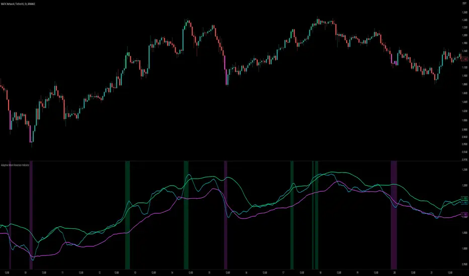
VWAP Xing D, Prv.D, W, Q, M, & Y + SD [UOI]Introducing the "VWAP Xing D, Prv.D, W, Q, M, & Y + SD" Indicator: A Comprehensive, Multi-Timeframe Trading Tool for the Modern Trader
In today's dynamic and fast-paced financial markets, traders require versatile and powerful tools that can help them navigate the complex world of trading. The "VWAP Xing D, Prv.D, W, Q, M, & Y + SD" indicator is designed to be the ultimate, all-in-one solution for traders seeking a comprehensive and robust trading indicator. This cutting-edge tool combines the power of an extensive VWAP library with the versatility of Bollinger Bands, Donchian Channels, standard deviation multi-timeframe analysis, and an auto boxed range identifier, all to provide traders with the crucial insights needed to identify reversals, breakdowns, and breakups.
Offering the magnetic daily, previous day, weekly, monthly, quarterly, and even yearly VWAP levels, this comprehensive library caters to traders with varying time horizons and strategies. Coupled with the precision of Bollinger Bands and Donchian Channels, the indicator allows for accurate tracking of price volatility, enabling traders to make more informed decisions in response to changing market conditions. The integration of multi-timeframe standard deviation analysis further bolsters the indicator's ability to identify potential trading opportunities, ensuring that users can stay ahead of the curve.
Finally, the auto boxed range identifier serves as the cherry on top, automatically detecting critical price levels where reversals, breakdowns, and breakups are most likely to occur. This powerful feature not only helps traders confirm potential entry and exit points but also allows for more effective risk management.
Overall, the "VWAP Xing D, Prv.D, W, Q, M, & Y + SD" indicator is a comprehensive, multi-timeframe trading tool that empowers traders with unparalleled insights, precision, and adaptability. Whether you're a seasoned professional or a novice trader, this powerful indicator is a must-have tool for anyone looking to excel in today's competitive financial markets.
Multi-timeframe Volume Weighted Average
First let's define Volume Weighted Average Price (VWAP):
Volume Weighted Average Price (VWAP) is a widely-used technical analysis indicator that calculates the average price of a security, taking into account both price and trading volume. In essence, it represents the average price at which a security has been traded throughout a specified time period, giving more weight to transactions with higher volume.
The VWAP is often used by traders and investors to assess the market's trend and gauge the relative value of a security. It serves as a benchmark for institutional investors, who often use it to evaluate their trading performance and determine whether they are buying or selling at favorable prices.
The formula for calculating VWAP is:
VWAP = (Sum of (Price * Volume)) / Total Volume
By incorporating volume into the calculation, the VWAP provides a more accurate representation of a security's true average price, as it takes into consideration the impact of larger trades on the price. This makes it a valuable tool for traders seeking to make more informed decisions in the market and avoid getting caught in unfavorable trading positions.
VWAP is a crucial indicator that provides insights into the average price at which a financial asset, such as a stock or cryptocurrency, has been traded throughout a specific period. It takes into consideration the volume of trades executed at each price level during that period. The VWAP lines included in the " VWAP Xing D, Prv. D, W, Q, M, & Y" indicator offer various timeframe perspectives, allowing traders to analyze different levels of market trends and behaviors.
Here's a detailed explanation of the VWAP lines and their significance:
1. Daily VWAP (D): The daily VWAP line represents the average price at which the asset has been traded throughout the current trading day. It resets at the beginning of each trading session. Traders often use the daily VWAP as a reference point to gauge the fairness of their trade executions relative to the prevailing market prices. Price deviations from the daily VWAP can indicate shifts in market sentiment and potential trading opportunities.
2. Previous Day VWAP (Prv.D): The previous day VWAP line reflects the average price at which the asset was traded during the preceding trading day. It helps traders assess the continuity or deviation of the current day's price action relative to the previous day's trading activity. Traders often observe the previous day VWAP for insights into potential support or resistance levels and to identify whether the current day's price is trading above or below the previous day's average price.
3. Weekly VWAP (W): The weekly VWAP line calculates the average price of the asset over the entire week, taking into account the volume traded at each price level. Traders use the weekly VWAP to gain a broader perspective on the asset's price movement and potential trend directions. It can act as a significant support or resistance level, especially when the price interacts with the weekly VWAP.
4. Monthly VWAP (M): The monthly VWAP line provides a longer-term perspective by averaging the asset's price and volume data over the entire month. It helps traders identify key price levels that are significant within the monthly timeframe. Traders often observe the monthly VWAP to assess the overall trend and to determine whether the current price is trading above or below the monthly average.
5. Quarterly VWAP (Q): The quarterly VWAP line calculates the average price and volume data over a three-month period, representing a longer-term view of market activity. Traders use the quarterly VWAP to identify significant price levels and to analyze the broader trend within the quarterly timeframe. Deviations from the quarterly VWAP can indicate potential shifts in market sentiment and trading opportunities.
6. Yearly VWAP (Y): The yearly VWAP line represents the average price and volume data over the course of a year. It offers a comprehensive long-term perspective on the asset's price behavior and trend. Traders often consider the yearly VWAP as a key reference point for assessing the asset's overall performance and identifying major support or resistance levels.
By observing the VWAP lines, traders can gain insights into the prevailing market sentiment, potential support or resistance levels, and deviations from average prices. These deviations can be useful for identifying potential trading opportunities, such as when the price significantly deviates from the VWAP lines, suggesting potential overbought or oversold conditions. Additionally, VWAP can serve as a benchmark for evaluating trade executions and assessing the fair value of an asset.
It's important to note that while VWAP is a valuable tool, it should be used in conjunction with other technical analysis indicators and strategies to make informed trading decisions. Traders should consider factors like market context, trend analysis, and risk management principles to validate signals and confirm potential trading opportunities.
Bollinger Bands and Donchian Channels
In addition to VWAP this indicator also has combined the power of Bollinger Bands and Donchian Channels to produce a solid framework. The time frame by default is set to 30 min which is good for intraday trading but you can also change that in the setting to always use chart time frame intervals which works better on longer time frames.
IMPORTANT: You can change the time frame to always use chart or keep the default on 30 min or change it to another timeframe manually. If you allow the chart to always provide the intervals then the default 30 min will be ineffective and it automatically adjust to chart timeframe. Personally I think a fixed timeframe work better so keep in that way if you trade on 30 min or lower time frame.
Bollinger Bands and Donchian Channels are two popular technical analysis tools that provide valuable insights into price volatility, potential breakout levels, and support/resistance areas. When used in combination, they offer a comprehensive framework for analyzing market conditions and identifying trading opportunities.
Bollinger Bands: Bollinger Bands consist of two lines plotted above and below a moving average, typically a simple moving average (SMA). The upper band is calculated by adding the standard deviation of price multiplied by a customizable standard deviation factor to the SMA. The lower band is calculated by subtracting the standard deviation multiplied by the same factor from the SMA. The key features of Bollinger Bands are as follows:
1. Volatility Measurement: Bollinger Bands expand and contract based on market volatility. When the bands widen, it indicates higher volatility, and when they narrow, it suggests lower volatility. Traders can observe the width of the bands to gauge the potential for price movements and volatility expansions.
2. Overbought/Oversold Levels: Bollinger Bands can help identify overbought and oversold conditions in the market. When the price reaches or exceeds the upper band, it may indicate that the asset is overbought and due for a potential reversal or pullback. Conversely, when the price reaches or falls below the lower band, it may suggest oversold conditions and a possible bounce or reversal.
Donchian Channels: Donchian Channels consist of two lines representing the highest high and lowest low within a specified period. The key characteristics of Donchian Channels are as follows:
1. Breakout Levels: The upper line of the Donchian Channel represents the highest high within the specified period, while the lower line represents the lowest low. Traders often use Donchian Channels to identify potential breakout levels. When the price breaks above the upper channel line, it may indicate a bullish breakout and the potential for further upward momentum. Conversely, a break below the lower channel line suggests a bearish breakout and the possibility of downward momentum.
2. Support/Resistance Areas: Donchian Channels also act as dynamic support and resistance levels. The upper channel line can act as a resistance level where the price may encounter selling pressure. The lower channel line can act as a support level where the price may find buying interest. Traders can monitor price interactions with these levels to make informed trading decisions.
Advantages of Using Bollinger Bands and Donchian Channels Together: By combining Bollinger Bands and Donchian Channels, traders can gain a more comprehensive view of market conditions and potential trading opportunities. Here are some advantages of using them together:
1. Volatility Confirmation: Bollinger Bands help identify periods of high or low volatility, while Donchian Channels confirm breakouts and potential trend changes. When the bands widen and a breakout occurs above or below the Donchian Channels, it can provide confirmation of increased volatility and the start of a new trend.
2. Price Extremes and Breakouts: Bollinger Bands assist in identifying overbought and oversold conditions, while Donchian Channels help pinpoint breakout levels. When price reaches an extreme level according to Bollinger Bands and coincides with a breakout from the Donchian Channels, it can signal a significant trading opportunity.
3. Support/Resistance Validation: Donchian Channels act as dynamic support and resistance levels, and Bollinger Bands can validate these levels. When price bounces off the upper or lower Bollinger Band near a Donchian Channel level, it provides additional confirmation of the support or resistance area.
4. Risk Management: The combination of Bollinger Bands and Donchian Channels enables traders to set more precise stop-loss levels and define risk. They can place stop-loss orders beyond the support or resistance levels identified.
Standard Deviation
Standard deviation bands by default are disabled but you can easily enable them in the setting. The 1 standard deviation bands are made invisible by default to avoid a crowded space. You can reduce the transparency to view them.
In intraday trading, the Daily VWAP (Volume Weighted Average Price) with 3 standard deviations is a powerful tool that helps traders gauge price movements and potential trading opportunities. Here's how it works and why it is useful:
1. Calculation of Daily VWAP: The Daily VWAP is the average price at which a security has traded throughout the trading day, weighted by the volume of each trade. It provides a measure of the average price that traders have paid for the asset during the day.
2. Standard Deviation: Standard deviation is a statistical measure that quantifies the dispersion or variability of prices around the Daily VWAP. It gives an indication of how much prices deviate from the average. A higher standard deviation suggests greater price volatility.
3. Three Standard Deviations: By adding and subtracting three times the standard deviation from the Daily VWAP, you create bands that represent the potential price range within which the majority of intraday trading activity is expected to occur. These bands act as potential support and resistance levels and help traders identify price extremes.
4. Price Reversals: When the intraday price extends beyond the upper or lower band (three standard deviations), it suggests an overextended move or potential price reversal. Traders interpret this as an opportunity to enter or exit trades. If the price moves beyond the upper band, it may indicate overbought conditions and a possible reversal to the downside. Conversely, if the price moves below the lower band, it may signal oversold conditions and a potential reversal to the upside.
5. Volatility and Breakouts: Intraday traders often look for volatility and breakout opportunities. The three standard deviation bands on the Daily VWAP provide valuable information about price volatility. When the price breaks out of the bands, it suggests a significant increase in volatility and potential opportunities for intraday traders to take advantage of strong momentum moves.
6. Risk Management: The three standard deviation bands help traders define their risk and set stop-loss orders. By placing stop-loss orders outside the bands, traders can protect their positions in case the price moves beyond the expected range. This risk management technique allows traders to limit their potential losses and preserve capital.
7. Confirmation with Other Indicators: Intraday traders often use the three standard deviation bands on the Daily VWAP in conjunction with other technical indicators or chart patterns to strengthen their trading decisions. The bands can validate other signals or provide additional confirmation before entering or exiting a trade.
Overall, the Daily VWAP with three standard deviations is a valuable tool for intraday traders as it helps identify price extremes, potential reversals, volatility, and breakout opportunities. By incorporating this indicator into their trading strategies, traders can make more informed decisions and enhance their intraday trading performance.
Auto Boxed Range Detector
The true innovation in the "VWAP Xing D, Prv.D, W, Q, M, & Y + SD" indicator lies in the integration of the sophisticated 'Auto Boxed Range Detector.' This feature serves as the cornerstone of the tool's enhanced functionality, shedding light on critical price ranges to give traders a distinct advantage when identifying potential breakouts or breakdowns.
Meticulously designed with the needs of traders in mind, the Auto Boxed Range Detector automates the process of pinpointing trading ranges, resulting in increased precision and swiftness in your decision-making. By automating this crucial aspect of technical analysis, traders can now focus on other essential factors, ultimately maximizing their trading efficiency.
Furthermore, the Auto Boxed Range Detector helps traders avoid falling prey to false breakouts. By identifying the top of the boxed range in relation to resistance levels, users can more accurately predict the likelihood of a breakout. For instance, if the top of the boxed range is situated near a resistance line, the chances of a breakout are diminished unless the market is experiencing a trend day.
In essence, the Auto Boxed Range Detector not only streamlines the identification of trading ranges but also provides invaluable insights into the validity of potential breakouts or breakdowns. This innovative feature makes the "VWAP Xing D, Prv.D, W, Q, M, & Y + SD" indicator an indispensable tool for traders seeking to capitalize on opportunities while minimizing risk in today's fast-paced financial markets.
Once you get used to this tool it will be an integral part of your trading.

SME Backtesting [TFO]This strategy script is an extension of my Smart Money Essentials (SME) indicator and aims to provide a simplified means of backtesting complex trade models that incorporate a variety of Smart Money Concepts.
Among other things, Smart Money Essentials contains logic for:
- Market structure
- Fair Value Gaps
- Order Blocks
- Breaker Blocks
- Optimal Trade Entries
- HTF Market Structure
The Confluence section can then be utilized to build and test trade models from any combination of the included factors. As a basic example, we could test a strategy that only utilizes market structure. With Manual Exit turned off, we would simply be flipping long on bullish market structure shifts, and reversing short on bearish market structure shifts for the duration of the user-defined session.
As one might expect, such a simple strategy isn't expected to produce very reliable results by itself. However, we could build on these ideas by adding extra layers of Confluence, like looking for entries where Market Structure aligns with Order Block interactions. We could also turn on Manual Exit with a 40 tick stop loss and 80 tick profit target (10 points and 20 points, respectively, for ES futures), for more defined exit criteria.
One could expand on these ideas by adding factors like Fair Value Gaps, HTF Market Structure, etc. Any of the core pieces of SME can be used to build and backtest strategies that would otherwise be extremely tedious to do by hand, and as the SME indicator grows, so too will this backtesting script. Ultimately, the purpose of this is to make Smart Money Concepts more objective and easily testable so that users may better understand where these concepts may perform best.

Price Legs & Fib Projections: Fibonacci Confluence-Plots price legs based on two user input lookback numbers. Smaller number for small legs, larger number for large legs.
-Plots Fib projections of these price legs, above and below; User can input four independent fib levels or standard deviation levels
## User Inputs ##
~Show visible chart only; Show price leg labels (time and price); show small legs (fibs and/or boxes); show large legs (fibs and/or boxes)
~Input 4 Fibonacci levels or measured move levels. Toggle each level on/off
~toggle on/off Fib levels ABOVE or fib levels BELOW
~extend Fib levels 'X' bars to the right, or toggle on/off 'Full Extend' to the right
## Tips & Notes ##
-use 'Full Extend' together with 'visible chart only' if searching for multiple confluence of Fib levels.
-can quickly get very cluttered, but the aim in writing this was to try to find area of confluence at a glance amongst a mess of levels, then hide the indicator and study/note that area.
-if lines don't print toward the left hand side of the chart you've likely reached the max line limit set by Tradingview.
-Fib level input of 1.0 represents zero % extension above the high or below the low of the leg; 2.0 represents 100% extension.
1hr S&P: Visible chart only; large legs only; 50%, 100%, 150%, 200% Fib extensions; Above only; lines extended fully to the right:
Usage notes; 15m S&P: Small & Large price legs; partial extend; all fib levels above/below:
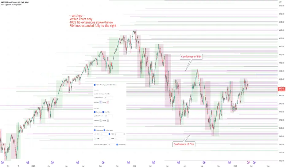
Smart Money Essentials [TFO]This indicator utilizes “Smart Money Concepts” like liquidity, order blocks, premium & discount, and more to analyze price action.
What’s included in the initial release:
Market Structure
Liquidity
Displacement
Order Blocks
Premium / Discount
Confluence Table
Alerts
Market structure logic objectively identifies whether the current trend is bullish or bearish, based on swing highs and lows. Liquidity levels offer insight into major pivots where we can assume many traders may place their stop loss, which can also serve as areas where “Smart Money” may be accumulating or distributing positions.
Displacement adds to this by spotting rapid price movement, often accompanied by imbalances where price may come back to before continuing in the direction of the displacement. These can be filtered based on whether the imbalance is accompanied by a Break of Structure (BOS) or Market Structure Shift (MSS), which may give additional insight into the draw on liquidity.
Order blocks (OB’s) are detected and treated as areas that may offer support for price in an uptrend or resistance in a downtrend. Premium and discount zones are essentially fitted by an “auto-fib” retracement that looks at recent liquidity levels, and optionally offers areas to look for an Optimal Trade Entry (OTE) where price retraces between 62-79% of the preceding displacement leg.
The confluence table provides an organized place to visualize and identify where any of the above concepts may be present at or around the same time. We can implement a threshold where, if the number of selected factors meets or exceeds this threshold, we can potentially identify bullish and bearish opportunities where multiple layers of confluence are overlapping.
And of course, alerts are built in for all significant events related to the above concepts, for example: runs on liquidity, BOS and MSS, rejections from OB and OTE, etc.
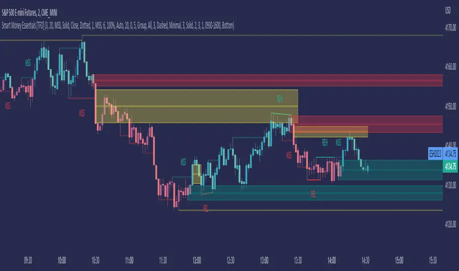
RSI + GDAX EMA ConfluencerHighly customizable RSI + GDAX EMA tool to help you quickly spot levels of confluence
- Displays current RSI levels as a plot
- Displays current 12 + 26 EMA as a plot
- 7 customizable time frames
- Each time frame marks RSI oversold, RSI overbought, 12 EMA, and 26 EMA as a line with label
- Each time frame RSI and EMA have options to toggle visibility and oversold/overbought only so you can choose exactly what you want to see
Planned for future release:
- Further customization for lines (color, size, direction, etc)
- Further customization for labels (location, offset, color, size, etc)
- Highlighting areas of confluence (if 2-3+ lines are within a certain % of each other)

Dynamic ADX - [The Pine Guru]Dynamic ADX by The Pine Guru
What is the Dynamic ADX?
The Dynamic ADX is an indicator created using the regular ADX, Line, and additional ADX Moving Average. This MA allows the script to calculate the ADX differently to the original ADX, providing greater input and accessibility to the user. As the ADX is a volatility indicator, it is communicates to trend strength in the markets. The Dynamic ADX displays these trending Periods through user controlled visualizers like Fills, Background Color, and Bar Color.
How do I use the Dynamic ADX?
This indicator has 4 different "versions" or "conditions" in which it displays trend strength. These are achieved by checking and unchecking ADX, ADX MA and Line. Different combinations of these 3 inputs will result in a change of true condition that the script outputs.
Dynamic ADX Achieved by checking the ADX and ADX MA, results in an ADX similar to an MA Crossover, with the ADX being over the MA indicating a true or strong trend condition.
Regular ADX Achieved by Checking the ADX and Line. Results in the regular calculation of the ADX.
Mixture Achieved by Checking all three sections, which results in the calculation a normal ADX as well as the MA. Provides and extra condition or confluence into the ADX.
MA and Line Achieved by checking the ADX MA and Line. Results in a similar calculation to an original ADX but with a smoother MA.
Recommendations
This indicator will work typically in all markets with high volume and volatility. It is recommended that it is used as a confluence in a trading system, and not as an outright indicator. As always do your own testing before live use with this indicator. Do your own Research and refinements.
Please Leave a like if you enjoy this Indicator

Triple ThreatThis indicator provides buy and sell signals for Bitcoin based on confluence from well-known momentum, volatility, and trend indicators. It has successfully captured the major directional trends on Bitcoin's daily chart since 2018, and the settings are currently optimized for this chart in particular. This indicator implements RSI to gauge momentum, BBWP to gauge volatility, and an EMA to gauge trend. Maximum confluence signals are represented by horizontal bars in the indicator's pane, where the tallest green bar is a confirmed buy signal, and the tallest red bar is a confirmed sell signal. The shortest bar represents a momentum-only signal, and the second-shortest bar represents a volatility signal in confluence with the previously given momentum signal.
To track momentum, the RSI is plotted to the indicator plane against a moving average of the RSI. A momentum signal is generated when the RSI crosses over its moving average, retests/approaches the moving average, and then continues in the crossover direction (i.e., it fails to cross the moving average to the opposite side, creating a successful retest). The settings that affect this trigger are the "Crossover Threshold," which specifies how much the RSI should exceed the moving average to be considered a crossover, and the "Retest threshold," which specifies how closely the RSI should approach the moving average to be considered a retest. A momentum signal is ALSO generated if the RSI or its moving average exceed their counterpart by a certain threshold. For example, if the threshold was set at 10, a BUY signal would be generated when the RSI exceeds the moving average by 10, or a SELL signal would be generated when the moving average exceeds the RSI by 10. This threshold can be set using the "Instant Signal Threshold" setting. Either type of momentum signal will be plotted on the pane as the shortest horizontal bar, with its color indicating the signal's direction.
Volatility is primarily measured using the Bollinger Band Width Percentile (BBWP) indicator, which was created by The_Caretaker. BBWP plots the volatility of the asset's price, given by Bollinger Band width, relative to past volatility by assigning the volatility readings into percentiles. The indicator also includes a moving average of the BBWP itself, where a crossover to the upside represents expanding volatility and a crossover to the downside represents contracting volatility. This indicator is used to confirm a signal given by the momentum indicators - a momentum signal that is given during a period of expanding volatility has a greater likelihood of success. Therefore, when the BBWP crosses above its moving average by a given threshold, a previously triggered momentum signal is considered to be "confirmed." The threshold for this crossover can be set using the "BBWP Confirmation Threshold" setting. However, it is also relevant that periods of extreme volatility often accompany an extremity in price action (a "top" or "bottom"), in which case the BBWP is likely to contract after price reaches such an extremity. This phenomenon is captured by also using "extreme reads" on the momentum indicator to signal that there has already been enough volatility to confirm a momentum signal. If the RSI gives an "extreme read" before triggering a signal, the momentum signal is also considered to be confirmed. For example, if the RSI is above 80, breaks below 80, and then gives a SELL signal, this sell signal is considered to be confirmed without requiring the BBWP to crossover its moving average to the upside. The threshold that would confirm a SELL signal can be set with the "Overbought" setting, and the threshold that would confirm a BUY signal can be set with the "Oversold" setting. Whenever a volatility signal confirms a momentum signal, a medium-sized horizontal bar will be plotted on the pane in the same directional color as the momentum signal. Note that a momentum signal may trigger at the exact same time as the volatility signal which confirms it; in this case, only the medium-sized bar will be visible on the pane, but its direction can still be identified by its color.
Lastly, to reduce the likelihood of "false signals," a trend indicator is used to confirm the direction of the signal. This is typically an exponential moving average. If a confirmed volatility SELL signal is given, and the closing price is below the moving average, then the SELL signal is also confirmed by the trend. Likewise, if a confirmed volatility BUY signal is given, and the closing price is above the moving average, then the BUY signal is confirmed by the trend. The type and length of the moving average used to verify the trend can be set using the "Moving Average Type" and "Moving Average Length" settings found below the momentum/volatility settings. A trend signal is plotted on the pane as a tall horizontal bar, and is more deeply colored than the momentum and volatility signals.
For maximum confluence, it is recommended that the trend signal, given by the tallest bar, is the one that forms the basis of trades executed while using the Triple Threat indicator. It is possible to enter more aggressive trades with better entries by using only the volatility signal, given by the medium-sized bar, however this entails greater risk and should only be done in confluence with an additional trading strategy of your own discretion. Backtesting has shown that using the volatility signal alone underperforms using the volatility signal in confluence with the trend signal.
Please also be advised that the default setting are optimized for Bitcoin's daily chart only. The indicator is still applicable to other timeframes and asset classes, but the settings may need to be modified. I have a list of settings for other Bitcoin timeframes, and I would be happy to share them upon request.
I hope you can find this indicator to be of some use to your trading strategies. I'd be happy to hear any feedback from the community, so please don't hesitate to reach out. Stay safe, and happy trading.
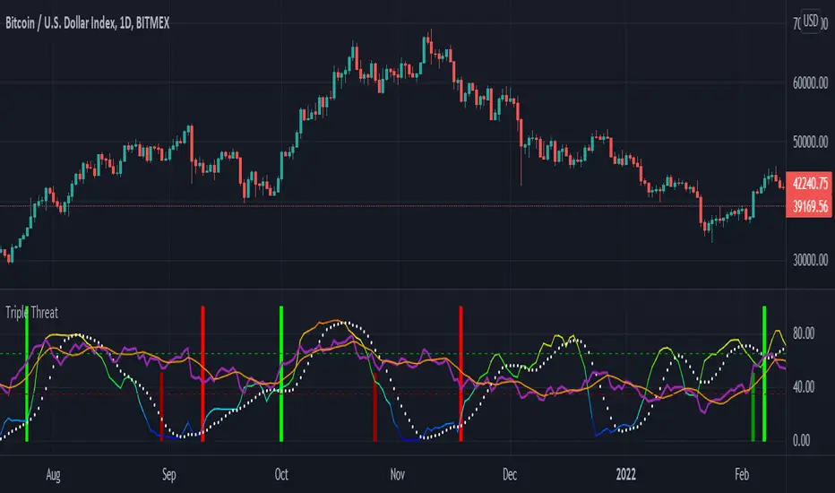
Logarithmic MACD ©KGRThis is a logarithmic MACD that comes with several advantages over the standard MACD.
Benefits: L MACD ©KGR vs Standard MACD
Normalized over longer time periods: LMACD: Yes - standard: No
Visual cues for tops: LMACD: Yes - standard: No
Visual cues for bottoms: LMACD: Yes - standard: No
Visual cues for crossing bull/bear LMACD: Yes - standard: No
Automatic divergence indicators LMACD: Yes - standard: No
Aligns with the total KGR suite highlighting confluence: LMACD: Yes - standard: No
KG Research focuses on developing crypto and general macro indicators.
Please like, follow and share to show your appreciation and support.
the KG Research team.
TWP Higher Timeframe Pivot Points█ OVERVIEW
This script displays the nearest support and resistance fibonacci pivot point levels from the higher reference timeframes -- weekly, monthly, and yearly levels. When trading it is always been helpful for me to be aware of significant price levels of the players participating on larger timeframes. HTF pivot points are a great tool for finding confluence and/or gaining extra conviction on your trades. This is a companion tool to be used in conjunction with the Standard Fibonacci Pivot Points .
█ CONCEPTS
Pivot points are a technical indicator / calculation that can be used to determine the overall trend of the market or determine the level that price may face support or resistance. At the same time it can lead to confirmation of the overall trend when price travels through support or resistance lines continuously.
The pivot point is the average of the high, low, and closing price of the previous time window - Day, Week, Month, Year.
The going belief is that if price is trading above the pivot point (P) then there is a bullish sentiment and trading below the pivot point (P) is a bearish sentiment.
Pivot points can be calculated a multitude of ways but the way I am using it here is using the fibonacci method. See the calculations below.
Note: Tooltips are added for each lines label that display the calculation used.
Default Ratios + Matching Labels:
pivot point = (high + low + close) / 3
support lines = pivot - (prevhigh - prevlow) * 0.236
resistance lines = pivot - (prevhigh - prevlow) * 0.236
38.2% - S1/R1
61.8% - S2/R2
100% - S3/R3
Additional (Mid) Ratios + Matching Labels:
23.6% - SA/RA
50% - SB /RB
76.4% - SC / RC
127.2% - S4/R4
141.4% - S5/R5
161.8% - S6/R6
200% - S7/R7
█ FEATURES
1 — Line Extension - Left, Right, Both, None
2 — Pivot Levels for Week, Month, and Year Pivot Points
• Show line
• Show label
• Line color
• Line style
█ HOW TO USE
• As mentioned earlier it best used along with the Standard Fibonacci Pivot Points to find levels of potential confluence where you believe may be key support, resistance, or a potential inflection point in price action.
█ LIMITATIONS
• Depending on the chart and the amount of data it naturally pulls back, the yearly fibonacci pivot point levels may not show
• Pivot points may be found useful for some and not for others
• There is no assurance that price will stop at, reverse, or reach a specific pivot level

Standard Fibonacci Pivot PointsPivot points are probably one of the greatest leading indicator for any and all asset classes, used since the advent of the public/private markets, granted it uses previous days data, it is an awesome leading indicator that produces guide rails for future trading periods. This project was born out of the necessity to have the additional fibonacci levels and to have pivot point for the current day to appear for pre and post market hours. The latter inspiration was later added by the TV team at my request and it was greatly appreciated.
This tool can be handy in any trading process from short-long term trades or timeframes, multiple timeframe analysis, trend trades, swing trades, position trades, and momentum trades.
The tool can also be a great addition to any part of your processes especially if you are looking for instances of confluences on higher or lower timeframes.
"Pivot points are a technical indicator that is used to determine the levels at which price may face support or resistance. The Pivot Points indicator consists of a pivot point (PP) level and several support (S) and resistance (R) levels." - TV Help Center
We have found the Fibonacci levels to be more respected/self-fulfilling than other versions of the pivot point indicator. (Find example in code notes below)
Note: (If you all love the flexibility of this code then we will be happy to replicate it using the other pivot point formulas. Just drop us a private message.)
TV has a great default version of the indicator but it lacks dynamism . (The compile time is relatively similar to the default indicator also)
Some of the features that we loved from the default we have been able to carry over after many many difficult iterations :
-- Showing historical pivots (probably the most difficult feature add up until some recent pine script features additions)
-- Automatic pivot timeframe creation...meaning for appropriate pivot lines populate for daily, weekly, monthly, and yearly timeframe periods
-- Labels that do not lay on top of the lines as labels normally do
By dynamism we are referring to the following abilities/features:
-- Ability for the next day's pivot to populate before the next market open (pivots populate when the market time changes over to the next day)
-- Ability to turn on/off every support and/or resistance line...sometime you just want to see the resistance levels if it is an up kind of day
-- Ability to have the support/resistance lines to be different colors
-- Ability to change what the pivot point itself if based on
-- The additional fibonacci ratios
Default Ratios + Matching Labels:
38.2% - S1/R1
61.8% - S2/R2
100% - S3/R3
Additional (Mid) Ratios + Matching Labels:
23.6% - SA/RA
50% - SB/RB
76.4% - SC/RC
127.2% - S4/R4
141.4% - S5/R5
161.8% - S6/R6
200% - S7/R7
Code Notes and Insight:
pivot point = (high + low + close) / 3
support lines = pivot - (prevhigh - prevlow) * 0.236
resistance lines = pivot - (prevhigh - prevlow) * 0.236
The high, low and close is based on the indicator resolution which by default is set too auto due to smaller timeframes not being able to pull back enough data at time when attempting to show multiple periods of pivots.
The increased resolution is determined by the following parameters (similar to the default TV indicator):
-- for intraday resolutions up to and including 15 min, DAY (1D) is used
-- for intraday resolutions 26m, 30m, and 1H then WEEK (1W) is used
-- for 3H, 4H and daily resolutions MONTH (1M) is used
-- for weekly and monthly resolutions, 12-MONTH (12M) is used
-- Tooltips have been added on the labels as subtle references in case you forget what a specific level's formula is
-- Remember to set your changes as default in the input menu after changing the colors of lines or default populated levels
-- Number of pivots back has been limited to 20 given that indicators are only able to populate 500 lines and labels but 20 historical periods should be more than enough for sufficient use
---------
Past performance is not indicative of future performance.
Please PM us to obtain access to any of our indicators.
Please PM or comment if you run into any bugs within your use or any questions about functionality.

Key Levels CustomTF + Backtest: SpacemanBTCKey Levels Backtest, same logic as the key levels script, provide levels based:
High, Low, Mid and Close.
This was requested, took a long time to post as I fell sick and was given a lot of Dev Work.
Hope this helps those who use it, very useful to see liquidity grabs in my opinion.
Input time in minutes!
Result of a user request.
(CoInS) Confluence of Indicators and Signals v2 skvConfluence of Indicators and Signals (CoInS) v2 skv
This time best of pivots and oscillators came to confluence to guide traders for better decision making to trade. Remember practice makes profit.
This script created for educational purpose for learners want to observe/study the indicators and its signals. Indicators HMA, SMA, Super Trend, MACD, BB, ADX/DMI/DMS, RSI, Elder Impulse and Pivots CPR, Camarilla, Floor, SQR are used in this script and the display of them controlled through the indicator settings. Values are tuned and can't be changed. Only the current day values will be displayed.
Observe the signals and reversal points at pivots or moving average lines. The bright green up triangles and bright orange down triangles indicates momentum, the faded triangles indicates the momentum is getting weak.
At start of the day, this script indicates whether today is trending or not trending for the scrip.
The SQR pivot points will move as per the trend and indicate the resistance and support level at that time. The color crosses informs that the change occurred throughout the day.
The signals generated by this study are not recommendation and use it on your own discretion after keenly observing each and every details.
Pivots
Pivot Boss CPR with width
Pivot Boss Camarilla
Pivot Boss Floor pivots
Simple and amazing SQR pivots
Displays signals from,
RSI signals
HMA signals
Super Trend
MACD (cross and histogram signals)
Elder Impulse
ADX/DMI/DMS and BB for Momentum
I'm thankful to trading view, various pine coders and authors contributing here and building wealth of knowledge.
*****Remember: Practice makes Profits*****
Disclaimer
1. Only for educational and learning purpose
2. For Intraday and scalping strategies and 5 and 15 min TF only
3. Do paper trade before using any information for actual trading
4. Not swing or positional trade
5. Use it on your own discretion and no one else responsible for the profit/loss except you
