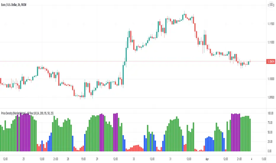
Regime Quadrant Map [XWiseTrade]Regime Quadrant Map
Part of the XWiseTrade Quant Suite. Follow so you don't miss the next one.
Most "regime" indicators sort the market into two boxes: trending or ranging. But that single axis hides the variable that actually decides whether a trend is tradeable — volatility. A market drifting up in dead-calm conditions and a market ripping up in violent conditions are both "trending," yet they demand opposite tactics. Collapsing them into one label is why so many trend filters fail exactly when you lean on them. This indicator separates the two questions that a one-dimensional filter fuses together, and maps the result onto four regimes instead of two.
Why volatility is measured as an ATR Z-score, not raw ATR
Raw ATR tells you nothing on its own — an ATR of 15 is enormous on one instrument and trivial on another, and huge in one era and small in the next. What matters is whether volatility is unusually high or low relative to this market's own recent behaviour. So ATR here is ranked against its own distribution over a lookback window and expressed as a Z-score: how many standard deviations above or below its own norm current volatility sits. That makes the reading self-referential and comparable across any symbol or timeframe, instead of an absolute number you'd have to re-learn for every chart.
Why trend is measured with Efficiency Ratio, not a moving-average slope
A rising moving average tells you price is higher than it was — it does not tell you how price got there. Efficiency Ratio does: it divides the net directional move by the total distance price actually travelled to make it. A value near 1 means a clean, purposeful move; near 0 means price thrashed back and forth to end up in nearly the same place. Two charts with an identical slope can have completely different efficiency, and that difference — not the slope — is what separates a trend you can ride from a trap. Slope measures result; Efficiency Ratio measures quality.
The four quadrants
Crossing the two axes gives four regimes, each with a distinct character:
GRIND (trending + low volatility) — a steady, efficient directional move; the kind you can lean into.
EXPANSION (trending + high volatility) — a violent directional move; momentum conditions, wider risk.
COIL (ranging + low volatility) — compression; energy building, often ahead of a breakout.
CHOP (ranging + high volatility) — whipsaw with no follow-through; the regime most accounts quietly bleed in.
How to use it
Watch the regime label and background tint for the current quadrant, or read the two plotted lines directly against their dashed thresholds — the ATR Z-score line for the volatility axis, the Efficiency Ratio line for the trend axis. Both thresholds and both lookbacks are adjustable, so you can set what counts as "high volatility" or "trending" for your own instrument and timeframe. An alert fires whenever the market crosses into a new quadrant, so you don't have to watch it to know the regime shifted.
What makes it different
Standard regime tools reduce the market to a single trend-versus-range line and treat volatility as an afterthought. This one builds regime from two independent axes, measures volatility as a self-referential Z-score rather than an absolute number, measures trend by path efficiency rather than slope, and resolves the market into four actionable states instead of two — because "trending" alone was never enough to decide how to trade it.
If this framework is useful, follow to get the rest of the Quant Suite as it drops — each script extends this model into entries, risk, and prop-firm workflows. More tools and write-ups: xwisetrade.com
These are descriptive regime classifications for discretionary use, not buy/sell signals. Indicator

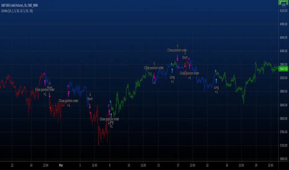
Median Cascade Trend [BackQuant]Median Cascade Trend
Overview
Median Cascade Trend is a noise-resistant trend-following indicator that combines multiple causal median filters , an Ehlers-style two-pole Super Smoother , and a configurable chop-gating system .
Its purpose is to identify meaningful directional structure while rejecting the types of price movement that frequently cause conventional moving averages to whipsaw:
Single-bar spikes
Short-lived price shocks
Irregular wicks
Low-efficiency sideways movement
Weak slopes that do not represent genuine directional progress
The indicator processes price in three distinct stages:
A median-filter cascade removes impulsive and short-duration noise.
A two-pole low-pass filter smooths the remaining structural signal.
A chop gate decides whether a change in direction is strong enough to update the active trend state.
This creates a trend line that is intentionally more selective than a standard moving average. The line itself can continue evolving, but trend-state changes are only accepted when the underlying movement passes the chosen quality tests.
The result is a system that separates:
The estimated trend line
The raw direction of that line
The confirmed trend regime
That distinction is important. The indicator does not assume that every small turn in a smoothed line represents a valid trend reversal.
Core idea
Most trend filters are built around linear averaging. They combine historical prices using fixed or exponentially decaying weights.
Examples include:
SMA
EMA
WMA
HMA
DEMA
These filters are effective for general smoothing, but they have a weakness: a single extreme observation can influence the output immediately.
If one bar produces a large wick or temporary price shock, a moving average will usually be pulled toward that value because it includes the magnitude of every observation.
A median filter behaves differently.
Instead of averaging the values inside a window, it sorts them and selects the middle observation. This makes it highly resistant to isolated extremes.
Median Cascade Trend uses this property repeatedly before applying traditional low-pass smoothing.
The central idea is:
Remove impulsive noise first.
Smooth the cleaned signal second.
Confirm direction only when the movement is efficient or sufficiently steep.
This ordering is deliberate. Smoothing a noisy series and filtering noise before smoothing are not the same thing.
Where median filtering comes from
Median filters are widely used in digital signal processing, image processing, and engineering.
One of their best-known applications is the removal of impulse noise , sometimes called salt-and-pepper noise in image processing.
Impulse noise consists of isolated extreme observations that are not representative of the surrounding signal.
In market data, comparable events include:
Temporary liquidity gaps
Single-bar stop runs
Erroneous prints
Sharp wick reversals
News spikes that immediately retrace
A linear smoother such as an SMA or EMA cannot distinguish between an important sustained move and an isolated outlier. Both are included according to their numerical magnitude.
A median filter is nonlinear. It selects the central-ranked value rather than calculating an arithmetic mean.
For example, consider five observations:
100
101
102
103
140
The average is:
109.2
The median is:
102
The isolated value at 140 significantly distorts the average but has almost no effect on the median.
This is why median filtering is especially useful when the objective is to preserve structural turns while rejecting isolated noise.
What makes a median filter nonlinear
A normal moving average can be represented as a weighted sum of its inputs.
A median filter cannot.
Its output depends on the ordering of observations, not their arithmetic combination. This makes it a nonlinear filter.
That has several important consequences:
Outliers have limited influence.
Edges and structural shifts can be preserved more cleanly.
The response is not equivalent to ordinary low-pass averaging.
The filter may hold a value until enough observations confirm a change.
In trading terms, the median filter often behaves more like a structural selector than a conventional average.
What “causal” means
The median stages in this indicator are causal.
A causal filter uses:
The current bar
Past bars
It does not use future observations.
This matters because many visually smooth filtering methods can only produce their best result by centering the calculation around the current point, which requires future data.
This script does not do that.
Every value is calculated from information available at that bar, making the filter suitable for live use.
Why use a cascade of median filters
A single median filter can remove isolated spikes, but noise does not always occur as one extreme bar.
It can appear as:
Two-bar shocks
Short bursts of alternating movement
Small clusters of irregular candles
Residual distortion left after the first filtering pass
A cascade applies multiple median stages sequentially:
Stage 1 processes the original source.
Stage 2 processes the output of Stage 1.
Stage 3 processes the output of Stage 2.
Each stage removes a different layer of short-duration instability.
The process is similar to progressively cleaning a signal:
The first stage removes obvious impulse noise.
The second stage removes remaining short-term irregularity.
The third stage produces a more stable structural series before low-pass smoothing.
Median Stage 1
The first median stage is intended to reject isolated one-bar disturbances.
With a short setting such as 3:
The filter remains responsive.
Single-bar spikes are strongly suppressed.
Most genuine multi-bar movement remains visible.
This is the most tactical stage.
Median Stage 2
The second stage receives an already-cleaned input.
Its role is to remove:
Short-duration residual noise
Small alternating movements
Irregularity that survived the first stage
A slightly longer setting such as 5 creates stronger structural consistency.
Median Stage 3
The third stage provides the final nonlinear cleaning pass.
With a longer setting such as 7:
The output becomes more stable.
Short-lived reversals are reduced.
Only more persistent changes are passed into the low-pass stage.
This is the most conservative median stage.
Cascade Stages input
The user can select how many median stages are active:
1 stage: fastest and most responsive
2 stages: balanced noise rejection
3 stages: strongest impulse-noise suppression
The unused stages are still calculated internally, but the selected stage determines which output is sent into the Super Smoother.
Why cascade instead of one very long median
Applying several shorter filters is not always equivalent to applying one very long median filter.
A long median window can:
Delay structural changes heavily
Flatten shorter trend legs
Become insensitive to local turns
A cascade allows the filtering process to be distributed across stages.
This provides greater control over:
How aggressively isolated noise is removed
How much short-duration movement survives
How smooth the final structural input becomes
It also lets users build a progression such as 3, 5, and 7 rather than applying one blunt window.
The low-pass stage
After the median cascade, the signal is passed into a two-pole Super Smoother .
The median cascade removes nonlinear impulse noise, but its output can still contain:
Small step changes
Residual high-frequency movement
Sharp transitions caused by median replacement
The Super Smoother converts that cleaned but potentially stepped series into a smoother trend line.
This creates a hybrid filtering system:
Nonlinear median filtering for outlier rejection
Recursive low-pass filtering for smooth trend extraction
These components solve different problems.
Where the Super Smoother comes from
The Super Smoother is associated with John F. Ehlers’ application of digital signal processing techniques to financial markets.
It is based on the behavior of a two-pole low-pass filter and is designed to suppress high-frequency components more effectively than many conventional moving averages.
Traditional moving averages are simple smoothers, but they are not necessarily optimized as frequency-selective filters.
The Super Smoother uses recursively calculated coefficients derived from:
Exponential decay
Trigonometric terms
A selected cutoff period
The objective is to reduce high-frequency market noise while retaining lower-frequency directional structure.
What a low-pass filter does
A low-pass filter allows slow-moving components of a signal to pass while reducing fast-moving components.
In market terms:
Slow components represent broader trend structure.
Fast components represent short-term noise, rapid oscillation, and microstructure disturbance.
The Low-Pass Length determines the separation.
Lower values:
Allow more short-term movement through.
React faster.
Produce more turns.
Higher values:
Reject more high-frequency movement.
Produce a smoother trend line.
Respond later to structural changes.
Why use a two-pole filter
The number of poles broadly describes the order and steepness of a filter.
A two-pole filter generally provides:
Stronger attenuation of high-frequency noise than a one-pole filter.
A smoother output.
A more defined frequency response.
It also uses prior filter outputs recursively, allowing substantial smoothing without requiring an extremely long direct averaging window.
The full signal-processing chain
The calculation can be understood as:
Raw price source
Median Stage 1
Optional Median Stage 2
Optional Median Stage 3
Two-pole Super Smoother
Direction measurement
Chop-quality validation
Persistent trend state
Each layer has a distinct purpose.
Median cascade
Rejects isolated and short-lived noise.
Super Smoother
Reduces the remaining high-frequency variation.
Direction logic
Determines whether the final line is rising or falling.
Chop gate
Determines whether that directional change is trustworthy enough to update the confirmed trend.
Trend direction calculation
The raw direction is determined by comparing the current trend line with its value several bars ago:
Bullish if trendLine > trendLine
Bearish if trendLine < trendLine
Neutral if equal
The Direction Lookback controls how much movement is required before the line is classified as rising or falling.
A one-bar comparison is extremely responsive but can detect tiny slope changes.
A longer comparison:
Measures movement across a wider interval.
Reduces sensitivity to one-bar flattening.
Produces more stable raw direction.
Raw trend versus confirmed trend
One of the most important design choices is that the script separates:
Raw trend
Confirmed trend
The raw trend reflects the current direction of the filtered line.
The confirmed trend is persistent and changes only when:
The raw trend points in a new direction.
The chop gate is open.
If the line turns but the gate is closed:
The active trend state remains unchanged.
The attempted flip can optionally be displayed as blocked.
This prevents every small line turn from immediately becoming a regime reversal.
Why a chop filter is needed
Even an advanced smoother can turn repeatedly during sideways markets.
Smoothing reduces noise, but it does not determine whether movement is:
Directional
Efficient
Large enough relative to volatility
A line can move upward and downward in a range while making almost no net progress.
The chop gate addresses this by evaluating two separate properties:
Directional efficiency
ATR-normalized slope
Efficiency Ratio
The first gate component measures how efficiently the trend line has moved over a selected window.
The calculation compares:
Net movement
Total movement
Net movement is:
|trendLine - trendLine |
Total movement is:
Sum of |bar-to-bar changes in trendLine|
The Efficiency Ratio is:
Efficiency = Net Movement / Total Movement
The result ranges approximately from 0 to 1.
Efficiency near 1
The line has moved mostly in one direction.
Example:
It advanced 10 units.
Its total path was approximately 11 units.
This indicates a clean directional move.
Efficiency near 0
The line has moved back and forth without achieving much net progress.
Example:
It travelled 20 units in total.
But ended only 1 unit from where it started.
This indicates chop.
Where the Efficiency Ratio comes from
The Efficiency Ratio is commonly associated with Perry Kaufman’s work on adaptive market analysis and the Kaufman Adaptive Moving Average.
Its purpose is to distinguish directional movement from noisy movement.
It does not measure the size of a move alone.
It measures the quality of the path.
This makes it highly suitable as a trend gate.
A market can be volatile but inefficient. It can move aggressively in both directions and still make little progress.
The Efficiency Ratio helps identify that distinction.
Minimum Efficiency
The Minimum Efficiency input determines the directional quality required for the efficiency condition to pass.
Lower values:
Allow more irregular movement.
Open the gate more frequently.
Produce earlier but noisier trend changes.
Higher values:
Require cleaner directional travel.
Block more sideways flips.
Produce fewer but more selective regime changes.
ATR-Normalized Slope
The second gate component measures how large the trend-line movement is relative to current market volatility.
It calculates:
|trendLine - trendLine | / ATR
This converts the line’s movement into ATR units.
Without normalization, a slope of 10 points could be:
Large for one instrument
Negligible for another
Large in a quiet regime
Small during extreme volatility
ATR normalization makes the slope more comparable across assets and regimes.
What normalized slope measures
The Efficiency Ratio asks:
Was the movement directionally clean?
ATR-normalized slope asks:
Was the movement large enough to matter?
These are different questions.
A move can be highly efficient but extremely small.
For example:
A perfectly smooth drift of only 0.02 ATR may not justify a new trend regime.
A move can also be large but inefficient:
A violent range may travel several ATRs while repeatedly reversing.
Using both filters gives a more complete view of trend quality.
Minimum ATR-Normalized Slope
The Minimum ATR-Normalized Slope defines the movement threshold.
Lower values:
Accept weaker slopes.
React sooner.
Allow more low-energy flips.
Higher values:
Require stronger displacement.
Reduce weak trend transitions.
Delay signals until movement becomes more meaningful.
Gate modes
The indicator provides four chop-gate modes.
Efficiency Ratio
Only directional efficiency is required.
Best suited for users who care primarily about whether movement is clean, regardless of its exact magnitude.
ATR-Normalized Slope
Only slope strength is required.
Best suited for users who want movement to exceed a volatility-adjusted threshold, even if the path is not perfectly efficient.
Both
Both conditions must pass:
Efficiency must be high enough.
Slope must be strong enough.
This is the strictest mode and generally provides the strongest chop rejection.
Either
Only one condition must pass.
This is more permissive:
A very clean slow trend may pass through efficiency.
A powerful but less orderly move may pass through slope.
It provides a balance between responsiveness and filtering.
Gate behavior
When the gate is open:
A new raw direction can update the trend state.
Bullish and bearish flips can be confirmed.
When the gate is closed:
The previous confirmed trend persists.
Attempted changes are blocked.
The display can dim, turn neutral, or hide.
This means the indicator behaves like a regime-holding system during chop.
It does not constantly reset to neutral. It retains the last confirmed direction until sufficient evidence supports a new one.
Blocked flips
A blocked flip occurs when:
The filtered line attempts to change direction.
The attempted direction differs from the confirmed trend.
The chop gate is closed.
The raw direction has just changed.
These can optionally be displayed as small X markers.
Blocked flips are useful because they show:
Where a basic slope indicator would have reversed.
Where the chop filter rejected that reversal.
How much signal noise the gate is removing.
They are not trade signals. They are diagnostic information.
Trend persistence
The trend variable is persistent.
Once bullish:
It remains bullish until a valid bearish change passes the gate.
Once bearish:
It remains bearish until a valid bullish change passes the gate.
This persistence is central to the design.
The indicator is not merely coloring every local slope. It is maintaining a confirmed market regime.
Display modes when the gate is closed
The indicator offers three ways to display gated conditions.
Dim
The current trend color remains visible but becomes transparent.
This communicates:
The last confirmed trend is still active.
Current conditions are not strong enough to confirm a new direction.
This is useful when you want regime continuity without overstating conviction.
Neutral
The trend line and candles switch to the selected gate color.
This communicates:
The directional regime is being withheld.
Current conditions are considered non-trending or uncertain.
Hide
The trend line disappears while the gate is closed.
This is the strictest visual mode.
It communicates:
No actionable trend state should be displayed during the gated condition.
Trend line coloring
The base color is determined by the confirmed trend:
Bullish trend uses the long color.
Bearish trend uses the short color.
Uninitialized state uses gray.
The gate display can then modify the final presentation.
This allows the chart to show:
Direction
Confirmation status
Chop-filter activity
without needing a separate panel.
Gradient fill
The indicator fills the area between price and the trend line.
When price is above the trend line:
A bullish gradient is displayed.
When price is below the trend line:
A bearish gradient is displayed.
The fill is stronger near the trend line and fades toward price.
This emphasizes the trend line as the structural reference.
The fill color follows the gate display state:
Full trend color when active
Dimmed during a closed gate in Dim mode
Neutral when configured
Hidden when the trend line is hidden
Trend glow
A soft glow is created around the filtered line using a small ATR-scaled distance.
The glow width is:
ATR(14) × 0.06
Using ATR ensures the glow remains visually proportional across assets and price scales.
The glow does not affect the calculation. It improves readability and reinforces the line as the central structural output.
Candle coloring
Candles can be colored using the confirmed trend state.
When the gate is open:
Bull trend produces bullish candles.
Bear trend produces bearish candles.
When the gate is closed:
Dim mode fades the existing trend color.
Neutral mode uses the gate color.
Hide mode removes the candle override.
This gives an immediate full-chart view of both trend and gate status.
Signal logic
Signals only occur when the confirmed trend changes.
Bullish flip
A bullish signal requires:
The active trend becomes bullish.
The previous trend was bearish.
The gate accepted the change.
Bearish flip
A bearish signal requires:
The active trend becomes bearish.
The previous trend was bullish.
The gate accepted the change.
This is more selective than simply detecting a change in line slope.
How to interpret the indicator
Bullish confirmed regime
A bullish regime means:
The median-filtered and low-pass-smoothed trend line is rising.
The move satisfied the selected chop-filter conditions when the regime changed.
The last accepted direction remains bullish.
Bearish confirmed regime
A bearish regime means:
The final trend line is falling.
The bearish change passed the selected quality gate.
The last accepted direction remains bearish.
Gate closed in an existing trend
This means:
The market is no longer moving with sufficient efficiency or slope.
A new reversal cannot currently be confirmed.
The previous regime remains stored.
This often occurs during:
Consolidation
Pullbacks
Low-volatility drift
Transition phases
Repeated blocked flips
Repeated blocked changes suggest:
The filtered line is oscillating.
Directional quality is weak.
A normal trend-following system would likely be whipsawing.
This is exactly the environment the gate is designed to avoid.
How to use it in practice
1. Directional regime filter
Use the confirmed trend to filter other setups:
Favor long trades during bullish regimes.
Favor short trades during bearish regimes.
Reduce activity when the gate is closed.
2. Trend-following entries
Bullish and bearish flips can be used as directional entry triggers, especially when confirmed by:
Price structure
Breakouts
Volume expansion
Higher-timeframe alignment
3. Pullback framework
During an established trend:
Price returning toward the trend line may represent a pullback.
If the gate remains closed but the trend does not flip, the move may be consolidation rather than reversal.
If the opposite direction eventually passes the gate, the regime has changed more meaningfully.
4. Chop avoidance
The most direct use is avoiding repeated entries during low-quality conditions.
When the display is dim, neutral, or hidden:
Reduce confidence in new trend signals.
Wait for efficiency or slope to recover.
5. Diagnostic comparison
Enable blocked flips to see how often the raw trend attempts to reverse without confirmation.
This helps tune:
Efficiency threshold
Slope threshold
Gate mode
Input guide
Source
Selects the price series used by the median cascade.
Close is the standard choice.
Alternatives such as hl2 or hlc3 may produce a slightly smoother structural input.
Cascade Stages
Controls how many median filters are used.
1: responsive
2: balanced
3: strongest noise rejection
Median Stage Lengths
Control the window used at each stage.
Shorter values:
Preserve responsiveness.
Remove only very short-duration noise.
Longer values:
Produce stronger structural filtering.
Delay shorter turns.
Low-Pass Length
Controls the two-pole Super Smoother.
Lower:
Faster
More reactive
Higher:
Smoother
More conservative
Direction Lookback
Controls how far back the current line is compared when determining raw direction.
Lower:
Faster slope changes
Higher:
More stable directional measurement
Efficiency Length
Controls the window used to measure net movement versus total path movement.
Shorter:
More responsive efficiency reading
More sensitive to recent chop
Longer:
More stable directional-quality assessment
Minimum Efficiency
Controls how clean the directional path must be.
Higher values make the gate stricter.
Slope Length
Controls the interval across which trend-line movement is measured.
Slope ATR Length
Controls the ATR baseline used to normalize slope.
Minimum ATR-Normalized Slope
Controls the minimum volatility-adjusted displacement required.
Higher values require stronger movement.
Tuning examples
Faster trend configuration
1 or 2 median stages
Short median windows
Lower Super Smoother length
Direction Lookback of 1 or 2
Either gate mode
Lower efficiency and slope thresholds
Balanced configuration
2 or 3 median stages
Progressive windows such as 3, 5, 7
Moderate Super Smoother length
Both gate mode
Moderate thresholds
Conservative configuration
3 stages
Longer median windows
Higher Super Smoother length
Longer Direction Lookback
Both gate mode
Higher minimum efficiency and slope
How this differs from a normal moving average
A standard moving average:
Uses linear averaging.
Responds directly to outlier magnitude.
Changes direction whenever its slope changes.
Median Cascade Trend:
Uses nonlinear outlier-resistant preprocessing.
Applies a proper recursive low-pass stage.
Separates raw direction from confirmed regime.
Blocks changes during inefficient or weak movement.
How this differs from a normal median filter
A basic median filter only removes impulse noise.
This indicator extends the idea by adding:
Multiple median stages
Low-pass smoothing
Direction measurement
Efficiency gating
Volatility-normalized slope gating
Persistent trend states
Signals and alerts
It is not simply a median-smoothed line. It is a complete trend-regime system built on median preprocessing.
How this differs from a Supertrend
A Supertrend uses ATR bands around price and changes state when price crosses the trailing boundary.
Median Cascade Trend does not use a volatility band to define direction.
Instead:
Direction comes from the slope of the filtered trend line.
ATR is used only to normalize slope and scale visuals.
Trend changes are controlled by movement quality rather than price crossing a stop band.
Strengths
Strong rejection of isolated price spikes
Preserves broader structural movement
Combines nonlinear and linear filtering
Separates raw turns from confirmed trend changes
Configurable chop rejection
Volatility-normalized slope testing
Persistent directional regimes
Blocked-flip diagnostics
Fully causal calculation
Limitations
Strong filtering can delay genuine reversals.
Long median windows may suppress shorter trend legs.
Strict gate settings can hold the previous regime too long.
Loose gate settings reduce the benefit of chop filtering.
Median filters can produce stepped transitions before low-pass smoothing.
The indicator remains reactive rather than predictive.
Best use cases
Median Cascade Trend is particularly suited for:
Trend filtering in noisy markets
Reducing false reversals caused by wicks
Swing-trading regime identification
Filtering entries from faster systems
Dynamic trend-structure visualization
Avoiding sideways-market whipsaws
It can be applied across:
Equities
Indices
Futures
Forex
Cryptocurrency
Commodities
Alerts
The indicator provides alerts for:
Confirmed bullish trend changes
Confirmed bearish trend changes
Trend changes blocked by the chop filter
The blocked-flip alert is especially useful for monitoring when the line attempts to reverse but market quality remains insufficient.
Summary
Median Cascade Trend is a multi-stage trend extraction system designed to reject impulsive market noise before determining direction. It first applies up to three causal median filters, progressively removing isolated spikes and short-duration disturbances. The cleaned series is then passed through a two-pole Super Smoother to extract a stable low-frequency trend line.
Rather than accepting every change in slope, the indicator evaluates the quality of the movement using directional efficiency and ATR-normalized slope. Depending on the selected gate mode, trend changes can require clean directional travel, sufficient volatility-adjusted displacement, or both.
This produces a persistent trend state that changes only when the filtered line turns and the surrounding movement is strong enough to justify the reversal. The final result is a robust trend-following framework that combines outlier rejection, low-pass smoothing, directional-quality measurement, and chop suppression into a single overlay.
Indicator

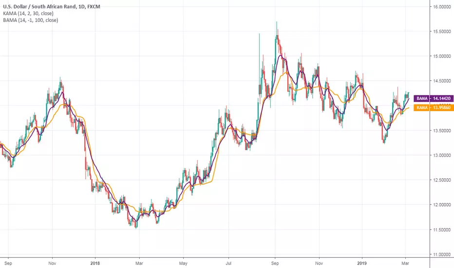
Trend Efficiency Exhaustion Regime-Gated & CalibratedTrend Efficiency Exhaustion — Regime-Gated & Calibrated
What it is
A single-pane oscillator that measures when a trend is losing efficiency and turns that into graded, forward-calibrated exhaustion and ignition signals. It is built around one question — "is this efficiency-exhaustion event actually worth acting on?" — and every component in the script exists to answer that one question rather than to add an independent signal.
It plots, in one pane: an efficiency-gap histogram, a fast efficiency line, event markers, a regime "weather-strip" ribbon, and an information table that states the read in plain language. It is symbol- and timeframe-agnostic; defaults are tuned for NIFTY / BANKNIFTY but a Source input and a VIX-symbol input let you use it on any instrument in any market.
The core idea — efficiency, not a magic multiplier
The Efficiency Ratio is the net move divided by the total path travelled over a window: ER = |close − close | / Σ|close − close |, bounded 0–1. A value near 1 means price moved in a straight, efficient line (trend); near 0 means it wandered (chop).
Reading efficiency at two horizons gives the central signal:
Efficiency Gap = ER_fast − ER_slow. When the fast read rolls over while the slow read is still elevated, the trend is losing efficiency under an otherwise intact trend — the classic exhaustion tell.
Displacement percentile ranks the current leg's travel against recent completed legs on this symbol and timeframe, so "stretched" is defined by the instrument's own recent behaviour rather than a fixed price > k·ATR multiplier.
Exhaustion = a stretched leg with fast efficiency rolling over, under a genuine trend. Ignition = fast efficiency surging from a young leg (continuation).
Why these components belong in ONE script (how the mashup works together)
This is a mashup by design, but it is not a stack of indicators each drawing its own signal. Every layer is a gate or a grade on the same event, feeding one decision pipeline:
Efficiency (dual-horizon Efficiency Ratio) — detects the candidate event (exhaustion / ignition).
Regime engine (Efficiency + ADX + a self-exciting volatility-cluster intensity) — decides when the event is even allowed to fire. Exhaustion is only meaningful inside a real trend; it is suppressed in chaotic, news-driven volatility. The regime is rendered as a continuous 5-state read (strong-trend / trend / neutral / reversion / chaos).
Variance ratio (Lo-MacKinlay) — a second, short-window-reliable lens that confirms a real trend existed to exhaust (VR > 1 = trending, < 1 = mean-reverting, ≈ 1 = random walk), with a significance z-statistic.
Ornstein-Uhlenbeck half-life — quality gate: if the estimated mean-reversion half-life is longer than the evaluation horizon, the expected reversion is too slow to pay off in time, so the exhaustion call is rejected.
Implied-volatility (VIX) state — quality gate: exhaustion is more reliable when implied volatility is elevated but stable (fear present, not spiking). The gate blocks exhaustion during a volatility spike.
Divergence quality — grades each exhaustion on the price↔efficiency divergence at the extreme: the slope of the efficiency drop between successive same-side pivots, how developed the swing is, and whether volume waned into the extreme. Weak-divergence setups are filtered out.
Forward calibration — the scorekeeper. Each fired event is logged as a hypothesis and resolved a fixed number of bars later against an ATR-scaled move, then summarised as a realised hit-rate versus an unconditional base rate.
Take any single layer away and the remaining pipeline still describes the same one event — they are complementary measurements of a single hypothesis (a trend running out of efficiency), which is precisely why they belong together rather than as separate scripts. The regime, variance-ratio, OU and VIX layers never plot their own buy/sell calls; they only decide whether the efficiency-exhaustion event is trustworthy.
The part most scripts skip — forward calibration
Most indicators emit a score and never check whether that score was right. Here, every event is queued and resolved N bars later against moveATR × ATR, in R-multiples. The information table reports, per class (Exhaustion / Ignition):
n — resolved sample size
Hit% with a Wilson 95% interval (so you see how stable the rate is)
Base% — the unconditional same-horizon move rate (the honest benchmark)
Edge = Hit% − Base%, marked * when a z-test clears 95%
MFE / MAE in R (how far it ran for you vs against you)
a recency-weighted hit-rate and a regime-conditional hit-rate for the current regime
If Edge is not positive, the signal is not adding information over chance on your chart — and the script tells you so instead of hiding it.
How to use it
Ribbon = context. Don't fade a strong trend; stand aside in chaos.
Histogram rolling over + a marker = the trigger.
Verdict line = the plain-language call (e.g. "TREND · watch for exhaustion", "EXHAUSTION ↓ · fade the up-move (edge +12%*)", "CHAOS · stand aside"), with the calibrated edge appended when the live class is calibrated.
Chart View: Clean (default) shows only the decision elements; Full adds the slow-ER line, displacement %, all reference levels and the divergence glow for analysis.
Information Table: Compact (default) is the key-info panel — verdict, efficiency/displacement/regime, variance-ratio/OU/VIX, best calibrated edge. Pro adds the full per-class calibration table with confidence intervals, recency and regime-conditional rows.
Treat it as a context-and-confirmation overlay on your own process, not an autotrading signal. Paper-trade first and confirm the Edge column is positive on your symbol and timeframe before relying on a class.
Originality
The novelty is not any single formula — those are credited below — but the closed loop: a self-referential displacement percentile (no fixed multiplier), a regime engine and four independent quality gates that all condition one event, and a forward-calibration layer that scores that event against its own base rate with confidence intervals, recency weighting and regime conditioning. Everything is original Pine; no third-party script code is reused.
Inputs, data & markets
Source (group 1) sets the raw series the whole engine reads — change it to use any instrument in any market.
Defaults are tuned for NIFTY / BANKNIFTY; the VIX Symbol defaults to NSE:INDIAVIX. For other markets, change the Source, the ER horizons and the VIX symbol (e.g. CBOE:VIX). A missing VIX symbol auto-disables that gate.
Inputs are organised institutionally: Source & Efficiency · Regime & Variance-Ratio · Displacement · Events · Quality Gates · Calibration · Display · Theme · Exports. The table colour scheme adapts automatically to a light or dark chart background.
Non-repaint
Efficiency is read on confirmed closes, legs are taken from confirmed pivots, events fire on barstate.isconfirmed, and there are no dynamic-length ta.* calls. Forward statistics are in-sample, close-to-close, with no costs, slippage or stops — a study aid, not a backtest.
Concept credits (original Pine re-derivations)
Efficiency Ratio — Perry Kaufman
Variance-ratio test — Andrew Lo & Craig MacKinlay (1988)
ADX / Directional Movement — J. Welles Wilder
Self-exciting (Hawkes) intensity — Alan G. Hawkes (1971)
Mean-reversion half-life — Ornstein & Uhlenbeck process
Score confidence interval — Edwin B. Wilson (1927)
Dominant-cycle homodyne discriminator — John F. Ehlers
Disclaimer
For education and information only. Not financial advice and not a recommendation to buy or sell anything. Past performance does not guarantee future results. The forward statistics are in-sample and idealised (close-to-close, no costs/slippage/stops). Always do your own analysis and manage your own risk; paper-trade before risking real money. Indicator

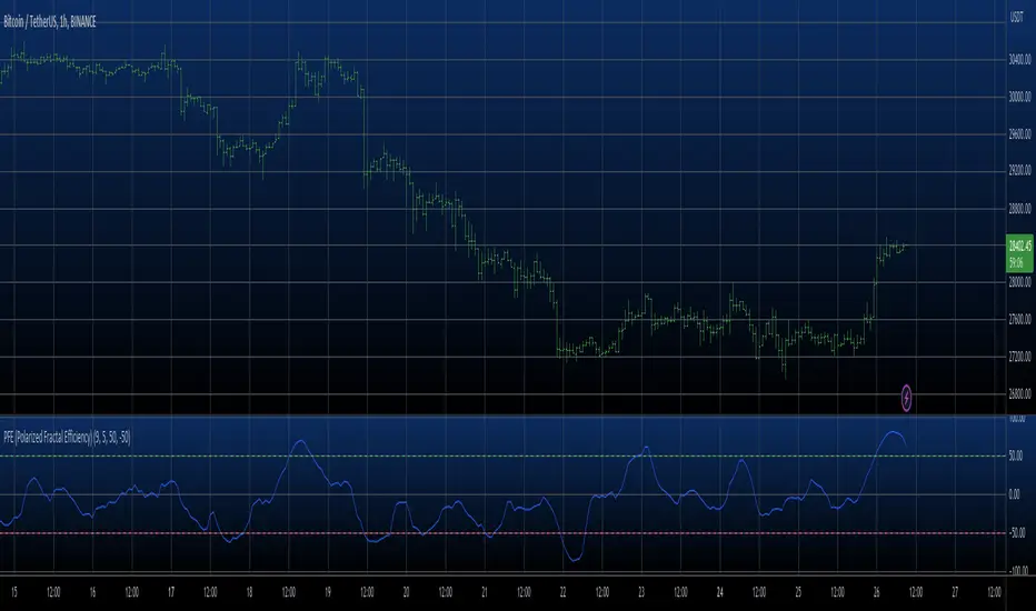
Efficiency Divergence OscillatorEfficiency Divergence Oscillator
## Overview
The Efficiency Divergence Oscillator turns the **signed efficiency ratio** - net price displacement divided by the total path price actually travelled - into a standardized, bounded oscillator, and then looks for **divergence between price and the efficiency of its travel**. The idea it tests: when price makes a new extreme but reaches it on an increasingly choppy, inefficient path, the move is losing conviction.
It is a single-pane oscillator. It needs no external data and no volume. Every data input is user-configurable, so it runs on any symbol, asset class or timeframe, in any market and on any timeframe. Defaults target NSE NIFTY index futures on intraday charts.
## What it plots
- A z-scored **efficiency oscillator** (clean advance = up, clean decline = down, choppy travel = near zero), with a glow line and sigma-based overbought/oversold levels.
- **Extreme-zone bands** (default +/-3 sigma) with a gradient fill that deepens toward the edge.
- **Divergence lines and labels** on the oscillator - regular (reversal) and hidden (continuation), in two colors.
- **In-band reversal dots** where the oscillator turns inside an extreme zone.
- Optional **price-pane marks** at the confirmation bar (all generated by this one indicator).
- A **background-adaptive status dashboard** (oscillator value in sigma, zone, last divergence, last reversal, signed efficiency in %).
## Why these components are combined (mashup rationale)
This script combines a **derived measure**, a **normalization stage**, a **divergence engine** and a **reversal read**, because each answers a question the others cannot and none is useful here alone:
1. **Signed efficiency ratio (path quality).** Momentum tells you how FAR price moved; it does not tell you how DIRECTLY it got there. The signed efficiency ratio = (price - price ) / sum(|price - price |, len), a value in +/-1 that is positive for efficient up-moves and negative for efficient down-moves. It isolates path quality - a dimension a magnitude-only momentum oscillator cannot show.
2. **Standardization (rolling z-score).** efficiency differs in scale across instruments. The z-score expresses it in standard-deviation units, so "overbought/oversold" and the extreme bands mean the same thing on NIFTY, on a commodity future, or on a crypto instrument. Without this step the divergence thresholds would not transfer between symbols.
3. **Divergence engine.** The original payload is reading **price-versus-efficiency disagreement at confirmed pivots**. The engine pairs each new price pivot with the oscillator value, then requires: a genuine new price extreme; the measure failing to confirm it; a minimum oscillator gap scaled to the oscillator own stdev; the two pivots within a maximum bar distance; and optionally an overbought/oversold reading at the pivot. These gates make the combination produce signal rather than noise.
4. **Reversal read.** Independently, the engine flags oscillator turns that occur inside the extreme bands - a complementary exhaustion cue.
Together the components form one pipeline: **build the signal -> make it comparable (z-score) -> surface where price and that signal disagree (divergence) and where it exhausts (reversal).** Each is incomplete alone.
## How it works (method)
efficiency = (price - price ) / sum(abs(price - price ), len) over the efficiency window, a value in +/-1; this is standardized with a rolling z-score to the oscillator.
Regular and hidden divergence are detected from confirmed pivothigh/pivotlow pivots and filtered by the gates above; reversals are oscillator pivots that print inside the extreme bands. Pivots confirm a few bars after they occur, so a printed signal does not repaint. The confirmation lag equals the pivot length.
## How to use it
1. Add the indicator on any chart; no special data is required.
2. Read divergence as **context, not a trigger**: a bearish divergence (price higher high, efficiency lower high) says the advance is getting choppier; a bullish divergence says the decline is. Confirm with your own structure, levels and risk process.
3. Tune the **pivot length**, **max gap** and **min oscillator gap** to your timeframe; raise them for fewer, cleaner signals.
## Originality
This is an original implementation - not a efficiency line and not a generic divergence script, but the specific combination of efficiency, sigma-standardization that makes the read portable across markets, a multi-gate divergence engine (magnitude + distance + extreme-zone), hidden-divergence and in-band reversal detection, and a background-adaptive dashboard. The code is written from scratch; helper functions use only their arguments and built-ins.
## Credits
The Efficiency Ratio was introduced by **Perry J. Kaufman**. **Price/oscillator divergence** is a long-established, publicly documented technical-analysis technique. This script is not affiliated with, nor endorsed by, any third party.
## Notes / limitations
- Efficiency is a path-quality read, not a direction call; in strong clean trends it stays elevated without diverging.
- Divergence is descriptive context, never a guarantee of reversal.
- Confirmation lags each pivot by the pivot length.
## Disclaimer
Research and educational tool only. NOT financial advice and no guarantee of profitability or accuracy. Indicators describe past behaviour; they do not predict the future. Trading carries risk of loss. Test out-of-sample and make your own decisions. The author accepts no liability for any use of this script.
Indicator

Entropic Regime Field [JOAT]Entropic Regime Field is an open-source market state classifier that uses three quantitative measures — Fractal Efficiency Ratio, a synthetic Hurst Exponent approximation, and a Garman-Klass volatility estimator — to classify each bar into one of three entropy states: LOW (predictable, directional structure present), TRANSITION (regime shift underway), and HIGH (chaotic, low-predictability environment). Directional signals from an Adaptive Momentum Oscillator are filtered to fire only during LOW entropy states, where momentum signals have historically more reliable edge than during random or chaotic market behavior.
The foundational premise is that markets alternate between periods of organized directional behavior and periods of disorganized random movement. Trading momentum signals indiscriminately across both environments degrades overall performance because the same signal that has edge in a trending market produces random outcomes in a chaotic one. By measuring the structural organization of price movement directly — rather than relying on ADX alone, which is a lagging momentum derivative — Entropic Regime Field attempts to identify when the market's behavior is organized enough for directional signals to have context.
Core Concepts
1. Fractal Efficiency Ratio (FER)
The FER measures how efficiently price has moved over a lookback period — the ratio of the net directional distance to the total path length of individual bar-to-bar changes. A value near 1.0 indicates straight-line directional movement; a value near 0.0 indicates constant reversals:
float ferNet = math.abs(close - close )
float ferPath = math.sum(math.abs(ta.change(close)), ferLen)
float ferVal = ferPath > 0.0 ? ferNet / ferPath : 0.0
2. Synthetic Hurst Exponent
The Hurst Exponent characterizes the memory of a time series. Values above 0.5 indicate persistence (trending), values near 0.5 indicate randomness, and values below 0.5 indicate anti-persistence (mean-reversion). A simplified Hurst estimate is computed using the variance ratio method:
float var1 = ta.variance(ta.change(close, 1), hurstWindow)
float var5 = ta.variance(ta.change(close, 5) / 5, hurstWindow)
float hurstEst= 0.5 * math.log(var1 / var5) / math.log(5) + 0.5
3. Garman-Klass Volatility Estimator
Standard ATR uses only the prior close and current high/low. The Garman-Klass estimator uses all four OHLC prices, producing a more statistically efficient estimate of true volatility:
gkBar = 0.5 * math.pow(math.log(high / math.max(low, syminfo.mintick)), 2.0)
- (2.0 * math.log(2.0) - 1.0) * math.pow(math.log(close / math.max(open, syminfo.mintick)), 2.0)
The GK estimate is averaged over a configurable period and normalized to a 0-100 percentile rank over the trailing 100 bars.
4. Three-Factor Entropy Classification
LOW entropy requires FER above a threshold AND ADX above a minimum AND Hurst estimate above 0.52. HIGH entropy is triggered when FER falls below a lower threshold OR ADX falls below a minimum. TRANSITION is the state between the two.
5. Adaptive Momentum Oscillator (AMO)
The AMO blends three momentum inputs with fixed weights: RSI(14) centered at 50 (40%), Stochastic(14) centered at 50 (35%), and Williams Percent Range(14) centered at -50 (25%). Directional signals fire only in LOW entropy when AMO crosses zero and KAMA confirms via crossover/under.
Features
Fractal Efficiency Ratio: Net directional move divided by total path length, configurable lookback
Synthetic Hurst Exponent: Variance ratio approximation identifying persistent vs. anti-persistent price behavior
Garman-Klass volatility: OHLC-based volatility estimator normalized to percentile rank over 100 bars
Three entropy states: LOW, TRANSITION, HIGH — each with distinct visual treatment
10-line entropy ribbon: EMA lines colored by entropy state for visual history of regime transitions
Adaptive Momentum Oscillator: RSI + Stochastic + WPR composite with fixed optimal weights
Entropy-gated signals: AMO + KAMA confirmation signals fire only in LOW entropy state
Regime background tint: Background tinted by entropy state, cleared after 10 bars
Trade block on signal: ATR-based TP and stop rendered as boxes on signal bars
12-row institutional dashboard: FER, Hurst estimate, GK volatility percentile, ADX, AMO, entropy state, signal, win rate, bars in current state
Non-repainting: All signals gated by barstate.isconfirmed; no future data referenced
Four color themes: Phantom, Neon, Classic, Solar
Input Parameters
Fractal Efficiency:
FER Lookback (default: 14)
LOW Entropy FER Minimum (default: 0.60)
HIGH Entropy FER Maximum (default: 0.35)
Hurst Exponent:
Hurst Window (default: 20)
LOW Entropy Hurst Minimum (default: 0.52)
Garman-Klass Volatility:
GK Averaging Length (default: 14)
ADX Gate:
Min ADX for LOW Entropy (default: 22)
Signal:
AMO Cross Threshold, KAMA Period, Cooldown Bars
TP ATR Multiple, SL ATR Multiple
How to Use This Indicator
Step 1: Read the Entropy State
Check the dashboard. LOW entropy means the market is behaving in an organized, directional way — this is when momentum signals carry more weight. HIGH entropy means the market is chaotic — avoid directional signals.
Step 2: Watch FER and Hurst Together
FER and Hurst are independent measures of market organization. When both agree (high FER AND Hurst > 0.52 simultaneously), the LOW entropy classification is more reliable.
Step 3: Enter on AMO + KAMA Confirmation
Signals fire only when the AMO crosses zero in the signal direction AND price crosses the KAMA level simultaneously. Both conditions must occur on the same confirmed bar in a LOW entropy environment.
Indicator Limitations
The Hurst approximation via variance ratio is a simplified estimate. It should be treated as a directional indicator of persistence, not a precise statistical measure
The FER computation on every bar may affect chart loading performance for very long lookback periods on large datasets
LOW entropy classifications can persist during slow grinding trends that produce high FER but low volatility. These environments may produce signals with narrower ATR-based targets
The GK estimator can return unreliable values when open equals close (as occurs on some synthetic instruments or during gaps)
This indicator classifies entropy state. It does not predict how long the state will persist or when it will change
Originality Statement
The combination of Fractal Efficiency Ratio, synthetic Hurst Exponent via variance ratio, and Garman-Klass volatility estimator as a three-factor entropy classification system gating AMO momentum signals is not replicated in any existing open-source Pine Script v6 publication as of this writing
The Garman-Klass estimator as a volatility input provides a more statistically efficient OHLC-based volatility measure that captures intraday range information not available in ATR
Gating a composite three-input momentum oscillator by an entropy state derived from completely different mathematical principles (efficiency, persistence, and OHLC volatility) rather than using a single lagging derivative like ADX as the sole filter is an original analytical architecture
Disclaimer
This indicator is provided for educational and informational purposes only. It is not financial advice. Trading involves substantial risk of loss. Entropy classifications are approximations based on historical price data and do not guarantee future market behavior will repeat. The Hurst approximation used is a simplified estimate, not a statistically rigorous computation. Past win rates do not predict future performance. The author accepts no responsibility for trading losses resulting from use of this indicator.
Made with passion by jackofalltrades
Indicator

Phase Exhaustion Reversal [BullByte]Phase Exhaustion Reversal (PXR) is an intraday reversal engine that measures one specific market phenomenon: the moment a short-horizon directional burst exhausts itself against a broader structural gradient. It is built on a single mathematical primitive - directional efficiency - applied at two horizons, and turns the gap between them into an exhaustion-detection framework.
This is not a mashup of existing indicators. The entire engine is derived from one calculation family: how cleanly price travels over a window. The regime classifier, the signal trigger, the risk engine, and the dashboard are all layers of that single concept rather than separate components.
---
Why This Indicator Exists
Most reversal tools fire on oscillator extremes or candlestick patterns. They answer the question "is price stretched?" but not "has the energy actually run out? " A market can stay stretched for a long time before reverting. PXR was built to answer a more precise question: when has a short-horizon momentum burst exhausted its energy against the prevailing structural direction? That moment - the exhaustion-and-recede - is what PXR isolates.
The phenomenon being studied can be observed on historical price data.
When price moves with high short-horizon efficiency in a direction that contradicts the medium-horizon efficiency gradient, that move is consuming energy faster than structure supports. Such bursts can appear to exhaust and then realign with the broader gradient on historical data. PXR visualizes that potential realignment as an observation worth studying.
---
Why a Trader Might Use It
Intraday traders on 5-minute and 15-minute charts frequently face counter-trend bursts that look like reversals but are actually just temporary dislocations. PXR offers a structured way to read those bursts: it waits for the burst to peak, confirms the peak has begun receding, and only then marks the realignment as armed. The next-bar open execution model means the entry price on the chart matches what a real-time observer could actually have achieved.
PXR is designed for traders who want a single coherent reading of market state - regime, bias, setup progression, and signal - rather than juggling multiple unrelated indicators.
---
The Concept
Imagine price as a hiker walking through terrain. Two things can be measured about that hiker over any window of time:
One - how far they ended up from where they started. This is transport.
Two - how much total ground they covered while getting there. This is agitation.
The ratio of transport to agitation is efficiency. If a hiker walked 100 meters in a straight line, transport equals agitation, and efficiency is 1.0 - perfectly directional. If a hiker zigzagged 500 meters total but ended up only 100 meters away, efficiency is 0.2 - most of the energy was wasted on the zigzag.
PXR computes this efficiency at two horizons simultaneously. The short horizon (around 35 minutes of bars, regardless of timeframe, by default) captures reactive bursts. The medium horizon (around 2 hours of bars by default) captures the structural gradient - the broader direction price is actually flowing in.
When the short-horizon efficiency spikes far from the medium-horizon efficiency, the two have dislocated. PXR normalizes this dislocation into a value called the Phase Gap. When the Phase Gap stretches to an extreme and then begins to recede, the short-horizon burst is exhausting. If the medium-horizon gradient points the opposite direction at that moment, PXR marks a realignment signal - the observed behavior is a possible realignment with the structural gradient.
---
What Makes This Different From a Standard Momentum Tool
Three architectural choices separate PXR from typical oscillator-based reversal tools.
First, the use of two-horizon efficiency phase-gap normalization. The raw difference between two efficiency readings is rescaled by its own rolling maximum so the threshold stays meaningful across all volatility regimes. A 0.6 reading means the same thing on a quiet day as on a volatile one.
Second, regime-conditional adaptive thresholds. The signal threshold is not a fixed constant. It adapts based on whether the market is currently classified as Extended (clean trend), Compressed (range), Transitioning (regime shifting), or Neutral. Each regime gets a different sensitivity, and each timeframe gets its own scaling on top of that.
Third, an exhaustion-and-recede state machine gated by structural gradient sign. The signal does not fire when the Phase Gap simply crosses a level. It fires only when the gap has first reached a qualified peak and then receded by a meaningful fraction of that peak - confirming exhaustion has begun - and only when that exhaustion direction opposes the sign of the medium-horizon efficiency. This is a directional fade of short-horizon energy against the prevailing structural gradient.
---
Mathematical Foundation
The script is built from three primitive calculations. All other logic flows from these.
Transport over n bars equals close minus close n bars ago. This measures net displacement.
Agitation over n bars equals the sum of absolute bar-to-bar price changes across that window. This measures total path length.
Efficiency over n bars equals transport divided by agitation. This produces a signed value bounded between -1 and +1. Positive values indicate net upward directional purity, negative values indicate net downward directional purity, and values near zero indicate chop.
The Phase Gap is the short-horizon efficiency minus the medium-horizon efficiency, divided by the rolling maximum of the absolute raw gap. This normalization keeps the Phase Gap roughly within plus or minus one regardless of market conditions.
A realignment signal fires when the Phase Gap has peaked beyond a regime-adjusted threshold and then receded by a meaningful fraction of that peak, AND the sign of the medium-horizon efficiency points in the direction opposite to the burst that just exhausted.
This calculation family is conceptually related to efficiency-ratio style measurements. PXR's originality lies in the multi-horizon phase-gap construction, the regime-adaptive thresholding, and the exhaustion-and-recede state machine.
---
Recommended Timeframes and Markets
PXR is built for intraday operation. The timeframe-adaptive logic is tuned for 1-minute through 15-minute charts. The default Auto-Scale setting recalibrates the horizons so the same physical time window of analysis is used regardless of timeframe.
The phenomenon PXR studies appears most cleanly on liquid intraday instruments. Crypto majors such as BTCUSDT and ETHUSDT on 5-minute and 15-minute charts work well because crypto exhibits meaningful path tortuosity - the agitation-to-transport ratio carries real information. Index futures such as NQ and ES on 5-minute and 15-minute charts also work, though session boundaries can affect the normalization window on overnight sessions.
PXR is built for intraday use. Higher timeframes such as 1H, 4H, or daily may behave differently because the regime thresholds and recede fractions are tuned for intraday energy cycles rather than multi-day structural shifts.
---
Chart Examples
The two examples below are illustrative historical signals chosen to show the engine's mechanics and visual elements. They are not representative of typical or expected outcomes. Many signals fail and reach the INVALIDATION level instead. These examples are educational only.
1. Example - Bull Realignment on BTCUSDT 15m
The annotated chart shows a complete PXR realignment cycle.
Price experienced a sharp short-horizon bearish burst from roughly 77,650 down to 76,150. During this drop, the medium-horizon efficiency gradient remained bullish - the slower 24-bar window still carried the structural upward bias from earlier hours. The yellow diagonal line traces this bullish medium-horizon gradient that the bearish burst was working against.
At the bottom of the move, the Phase Gap reached its negative peak . The bearish burst's energy was fully spent. The yellow rectangle marks the exhaustion zone where two indecision candles stalled the fall.
Beginning shortly after, the Phase Gap began receding from its negative peak. Once it had receded by the configured fraction, the exhaustion-and-recede condition was satisfied. The medium-horizon efficiency was still positive, so the structural gradient gate qualified the direction. The state machine flipped upward and the signal armed on the close of the trigger bar.
On the next bar, the entry executed at the open at 76,410. The four rails drew automatically - INVALIDATION at 75,982, TARGET 1 at 76,923, TARGET 2 at 77,351.
In this illustrative example, the price moved upward after the signal and later reached TARGET 1 and TARGET 2. This is one historical instance only. Outcomes vary, and many signals reach the INVALIDATION level instead.
2. Example - Bear Realignment and Engine
This chart illustrates three aspects of PXR that complement the phenomenon view.
First, the engine is bidirectional. The red downward callout marks a BEAR realignment signal. A short-horizon bullish burst pushed price upward over several hours. When that burst exhausted near 77,400, the Phase Gap reached its positive peak . As the gap began receding and the medium-horizon gradient pointed bearish, the exhaustion-and-recede condition triggered a BEAR signal . The four rails drew at INVALIDATION 77,465, ENTRY 76,765, TARGET 1 75,925, and TARGET 2 75,226.
Second, the regime ribbon is visible across the background. Subtle orange tints mark COMPRESSED periods where both efficiencies are low and the market is consolidating. Subtle cyan tints mark TRANSITIONING periods where the Phase Gap has stretched far and a regime shift is underway. These background colors give an at-a-glance read of market state without requiring a glance at the dashboard.
Third, the live dashboard in the top-right shows engine state in real time. State, Setup, Bias, Phase Gap, and Last all update on every bar. The five-line legend overlay explains what each field represents. At the moment of this screenshot, the BEAR signal was Triggered, the regime was COMPRESSED , and the Phase Gap reading was -0.07 - a sign the dislocation had largely normalized after the signal fired.
Together with the dashboard and regime ribbon, the engine provides a continuous reading of market state - not just point-in-time signals, but a live framework that contextualizes each signal as it forms.
---
How to Read the Chart
PXR draws several elements. Each one represents something specific.
The PHASE EXHAUSTION label, marked with an upward or downward arrow, appears at the bar where the signal arms. An upward arrow with the text " Realign Up " means a short-horizon bearish burst has exhausted against a bullish gradient , and the studied behavior is upward realignment. A downward arrow means the opposite. The label is anchored outside the bar's price extreme so it does not clash with other chart elements.
The ENTRY rail is a dashed line drawn at the open of the bar immediately after the signal armed. This is the reference entry level. The script does not place orders - it visualizes the reference level a real-time user could have acted on.
The INVALIDATION rail is a solid red line. If price reaches this level, the realignment thesis is rejected. This level is calculated as the worse of two values: a structural swing high or low with an ATR buffer, or a minimum ATR-floored distance from entry. Whichever is further from entry is used. This guarantees the invalidation level is never crammed inside short-term noise.
The TARGET 1 and TARGET 2 rails are teal solid lines placed at user-configurable R-multiples of the invalidation distance. These represent profit objectives. The defaults are 1.2R and 2.2R, which can be modified in the Risk Settings group.
All four rails extend forward bar by bar while the trade is conceptually active, and their labels trail slightly ahead of the live bar so they remain visible at the right edge of the chart.
The regime ribbon is a subtle background tint. Red indicates an Extended regime, orange indicates Compressed, cyan indicates Transitioning, and faint grey indicates Neutral. The ribbon helps users see at a glance which regime the engine currently classifies the market in.
The active tint colors bars green during an active long observation and red during an active short observation. This is purely visual and can be toggled off.
---
How to Read the Dashboard
The dashboard sits in the top-right of the chart and shows six live readings.
State shows the current regime classification. Extended means the medium-horizon efficiency is high - the market has a clean directional gradient. Compressed means both efficiencies are low - the market is ranging. Transitioning means the Phase Gap has stretched far - a regime change is in progress. Neutral means none of the above.
Setup shows the realignment setup progress. No Setup means nothing is forming. Forming means the Phase Gap has reached 60 percent of the threshold. Watching means the Phase Gap has reached 85 percent of the threshold - a setup is building but no signal has fired yet. Armed means a confirmed signal has fired and is awaiting next-bar execution. Triggered means a trade observation is currently active.
Bias shows the direction of the medium-horizon efficiency gradient. BULL means the structural gradient points up. BEAR means it points down. A dash means it is neutral.
Phase Gap shows the live normalized Phase Gap value, roughly bounded within plus or minus one. The color brightens when the absolute value exceeds the threshold.
Last shows the direction of the most recently triggered realignment.
---
Settings Explained
Core Settings.
Auto-Scale Horizons: when on, the Short and Medium horizons are automatically recomputed per timeframe so the analysis covers similar physical time on every chart. When off, the manually entered horizon lengths are used. Recommended on for users who switch between timeframes.
Short Horizon: bars used to measure short-horizon efficiency. Lower values are more reactive but noisier. Default 7. Ignored when Auto-Scale is on.
Medium Horizon: bars used to measure the structural efficiency gradient. Should span one meaningful intraday cycle. Default 24. Ignored when Auto-Scale is on.
Phase Gap Threshold: the normalized Phase Gap level required for a peak to qualify as exhaustion-grade. Higher values yield fewer but stronger signals. Default 0.58.
Cooldown Bars: minimum bars between two consecutive signals. Prevents clustering during noisy regimes. Default 3.
Risk Settings.
ATR Length: the ATR window used for the volatility-based stop floor. Default 14.
ATR Floor Multiplier: minimum stop distance expressed as a multiple of ATR. Ensures the stop is never inside short-term noise. Default 1.0.
TP1 R-Multiple: first profit target expressed as a multiple of the invalidation distance. Default 1.2.
TP2 R-Multiple: final profit target expressed as a multiple of the invalidation distance. Default 2.2.
Visuals.
Show Regime Ribbon: toggles the background regime tint.
Show Active Tint: toggles the green or red bar coloring during an active observation.
Show Dashboard: toggles the top-right state dashboard.
---
Execution Model - Why This Is Honest
PXR uses a strict two-bar workflow. The signal arms only on the close of a confirmed bar - this is enforced by a barstate-confirmed gate inside the engine. The entry then executes at the open of the next bar. This means the entry price shown on the chart matches what a real-time user could have achieved by placing a market order the moment the signal arms.
This workflow prevents the most common form of repaint illusion. The script does not use lookahead data. It does not use future bars. It does not modify past signal positions. Historical signals on the chart represent the same logic that fires in real time.
---
What the Indicator Does Not Do
PXR does not predict future price. It identifies a measurable energy state and labels the observation. It does not place trades. It does not guarantee outcomes. It does not work on all markets in all conditions. It is not a substitute for risk management, position sizing, or contextual judgment.
The realignment behavior is an observed tendency on historical data, not a certainty or guarantee.
The invalidation rail exists precisely because failure is expected and must be bounded.
---
Limitations You Should Know
Session boundaries on instruments such as NQ and ES can compress the rolling normalization window during overnight low-liquidity periods. This can make the Phase Gap appear weaker than it would on a continuous session.
The engine is intentionally reversal-focused. It does not generate continuation signals. In strong trending markets, reversal signals may underperform compared to a continuation tool because the structural gradient is not exhausting - it is reinforcing itself.
Auto-Scale produces horizon values that may differ substantially from the manual input defaults. If a user toggles Auto-Scale off after operating with it on, the manual values will be used immediately and behavior will shift.
On very long historical lookbacks at 1-minute resolution, the efficiency calculation may require additional processing time due to the bar-by-bar path-length computation. If performance is a concern, reducing the Medium Horizon input or enabling Auto-Scale on faster timeframes will reduce the load.
---
Disclaimer
This script is provided for educational and analytical use only. It does not provide financial, investment, or trading advice. It does not guarantee any specific outcome. Past behavior of the indicator on historical data does not imply future results. Markets carry risk. Use independent judgment, sound risk control, and full market context before acting on any signal or observation produced by this tool. The author is not responsible for any decisions made on the basis of this script.
Indicator

Efficiency Trailing Stop LossEfficiency TSL is an adaptive trailing stop framework designed to dynamically follow market movement while continuously adjusting stop behavior based on changing price efficiency and directional conditions.
Unlike traditional trailing stop systems that rely on static ATR values or fixed structure levels, Flip TSL evaluates how effectively price is moving and uses that information to expand, tighten, or aggressively reduce risk as market behavior evolves.
The objective is not simply to trail price, but to adapt risk management according to changing market conditions beneath the surface.
By combining market efficiency analysis, directional state detection, adaptive stop expansion logic, and automatic long/short transition behavior into a unified framework, the indicator is designed to provide additional context for trade management and evolving market structure.
Features
• Single adaptive trailing stop line
• Automatic Long ↔ Short transition system
• Dynamic stop expansion and tightening engine
• Market efficiency analysis
• Improvement / deterioration detection
• Automatic direction logic modes:
• Stop Cross
• SMA Direction
• Candle Direction
• Structure Step stop logic
• Swing High / Low fallback logic
• Multi-timeframe calculations
• Adjustable timeframe selection
• Wait-until-close confirmation option
• Dynamic ATR stop sizing
• Real-time dashboard
• Fully customizable colors and display settings
Dashboard Includes
• Current direction mode
• Auto direction method
• Efficiency score
• Market state
• Stop mode
• Active ATR multiplier
• Current trailing stop value
Alerts Included
• Flipped Long
• Flipped Short
• Efficiency crossed below threshold
• Long Mode Activated
• Short Mode Activated
Potential Use Cases
• Dynamically manage open positions
• Adapt stop placement to changing conditions
• Reduce risk during deteriorating environments
• Hold stronger trends longer
• Filter lower-quality market conditions
• Add confluence to existing systems
• Study changing market behavior
Interpretation
Expanded
Market efficiency is elevated and conditions remain supportive of directional continuation.
The trailing stop expands and provides additional room for price movement.
Tightening
Market conditions begin slowing or losing efficiency.
The trailing stop contracts and moves closer to price action.
Cut / Take Profit
Market efficiency falls beneath the defined threshold.
The stop may aggressively tighten or move toward current price to reduce exposure and protect gains.
Direction Modes
Stop Cross
Direction flips when price crosses the active trailing stop.
SMA Direction
Direction follows price relative to moving average positioning.
Candle Direction
Direction adapts based on bullish and bearish candle behavior.
About TrendGenY Indicators
TrendGenY indicators are built from market experience, creative concepts, and a constant pursuit of unique perspectives. Rather than following conventional ideas, the focus is on uncovering alternative insights and viewing market behavior through different angles to reveal information that traditional tools may overlook and help traders build a more meaningful edge in the market. Indicator

AlphaQuant Statistical Intelligence█ ALPHAQUANT STATISTICAL INTELLIGENCE (QSI)
Quantitative Market Quality Analysis
A quantitative market analysis tool that measures the statistical "quality" of market conditions using three core modules: Hurst Regime Engine , Shannon Entropy Flow , and Price Efficiency Ratio . These combine into a single QSI Composite Score (0-100) that rates whether current conditions are favorable for trading or not.
Free and Open Source.
█ THE CONCEPT: WHY STATISTICAL MARKET QUALITY MATTERS
Most indicators answer "which direction?" — QSI answers a different question: "Should I be trading right now?"
Markets alternate between regimes: trending, mean-reverting, chaotic, and efficient. QSI identifies these regimes in real-time so you can adapt your strategy accordingly. A trending Hurst regime favors breakout strategies. A mean-reverting regime favors fading. High entropy means the market is chaotic — reduce size. High efficiency means clean directional moves — increase conviction.
█ CORE MODULES
1. Hurst Regime Engine
Calculates the Hurst Exponent via Rescaled Range (R/S) analysis — a robust statistical method from hydrology adapted for financial markets.
H > 0.55 — Trending regime. Price has "memory" — breakout/trend-following strategies work well.
H = 0.50 — Random Walk. No statistical edge — the market is coin-flipping. Reduce size.
H < 0.45 — Mean-Reverting regime. Price has "anti-memory" — fade strategies work well.
2. Shannon Entropy Flow
Measures the information entropy of the return distribution using the Shannon Entropy formula from information theory.
High Entropy (>70) — Returns spread across many bins = chaotic, unpredictable. Reduce exposure.
Low Entropy (<30) — Returns cluster in few bins = ordered, predictable. Good for systematic strategies.
3. Price Efficiency Ratio
Measures directional efficiency by comparing net price movement to gross price movement over N bars.
High Efficiency (>30%) — Price moving cleanly in one direction. Trend-following conditions.
Low Efficiency (<10%) — Price chopping with no net progress. Avoid or use range strategies.
█ QSI COMPOSITE SCORE
The three modules combine into a single 0-100 score with fixed weights:
Hurst Edge: 40% — How strong is the regime signal?
Inverse Entropy: 35% — How ordered is the market?
Efficiency: 25% — How clean are the price moves?
Score interpretation:
> 70 — PRIME — Optimal conditions, full conviction
55-70 — FAVORABLE — Good conditions, normal sizing
40-55 — NEUTRAL — Mixed signals, proceed with caution
25-40 — CAUTION — Poor conditions, reduce size
< 25 — AVOID — Worst conditions, stay out
█ DASHBOARD
A compact, dark-themed info panel displaying:
QSI INDEX — Current composite value with regime label
HURST — Current Hurst exponent with regime classification
ENTROPY — Current entropy score with regime classification
EFFICIENCY — Current efficiency ratio with regime classification
WEIGHTS — Module weight distribution (H:40 E:35 F:25)
█ ALERTS (8 CONDITIONS)
QSI: PRIME Conditions — Composite entered prime zone (>70)
QSI: AVOID Conditions — Composite dropped to avoid zone (<25)
QSI: Conditions Improving — Composite crossed above 55
QSI: Conditions Deteriorating — Composite dropped below 40
QSI: Hurst → Trending — Hurst crossed above 0.55
QSI: Hurst → Mean-Reversion — Hurst crossed below 0.45
QSI: Entropy → Chaos — Entropy spiked above 70
QSI: Entropy → Order — Entropy dropped below 30
█ PRO VERSION
The PRO version adds:
Markov Transition Probabilities — Statistical prediction of next-bar direction
Correlation Intelligence — Auto-benchmark correlation with breakdown detection
Fractal Dimension — Higuchi fractal complexity analysis
Absorption Detection — High volume + low range = institutional activity
Trading Style Presets — Auto/Scalping/Daytrading/Swing/Position
Asset Auto-Optimization — Automatic parameter tuning per asset class
Profile-Adaptive Weighting — Dynamic composite weights based on style + asset
█ NON-REPAINTING
All calculations use confirmed bar data only. The Hurst Exponent is calculated from historical log-returns. Shannon Entropy uses a rolling window of past data. Price Efficiency uses closed bars only. No future data leakage. No repainting.
█ WORKS ON
Crypto, Forex, Stocks, Futures, Indices — any timeframe from 1 minute to Monthly.
█ DISCLAIMER
This indicator is for educational and informational purposes only. It does not constitute financial advice. Always do your own research and manage your risk. Past performance does not guarantee future results. Trading involves substantial risk of loss.
Indicator

Effort vs Result Reaction Map [AGPro Series]Effort vs Result Reaction Map
⚖️ OVERVIEW
Effort vs Result Reaction Map is a premium volume-price reaction indicator built around one of the most practical ideas from Wyckoff and Volume Spread Analysis: effort only matters when it is compared with result.
Many volume tools stop at identifying high volume, relative volume spikes, wide candles or bullish/bearish pressure. This script goes further by asking a more selective question:
Is the market actually getting progress for the effort being spent?
The indicator compares normalized participation effort, ATR-adjusted price progress, close-location quality, directional efficiency and wick behavior. The output is a clean reaction map that highlights two specific event families:
• High effort + poor result
• Low effort + strong result
That makes the script different from a simple volume spike detector, a generic pressure map, a support/resistance drawer or a full Wyckoff phase tool. It is focused on the moment where participation and progress become meaningfully disconnected.
🔬 CORE IDEA
Effort is built from two dimensions:
• Relative volume versus a rolling participation baseline
• Candle spread normalized by ATR
Result is built from:
• Price progress over a configurable number of bars
• Close-location quality in the direction of progress
• ATR-normalized movement quality
Efficiency measures the relationship between those two sides. A bar can show strong volume, but if price does not achieve directional progress, the script treats that as a potential failed-progress reaction. A bar can also move cleanly with surprisingly low effort, which can reveal ease of movement and directional acceptance.
🧭 WHAT MAKES IT DIFFERENT
Most public volume indicators answer one of these questions:
• Is volume high?
• Is relative volume expanding?
• Is price near a volume shelf?
• Is pressure bullish or bearish?
• Is a Wyckoff phase forming?
Effort vs Result Reaction Map answers a narrower and more actionable chart-reading question:
Did the market receive enough result for the effort it spent?
This keeps the tool focused and prevents it from overlapping with broader volume profile, relative volume, delta, session reaction or support/resistance scripts. It does not try to label accumulation, distribution, spring, upthrust or phase structure. Instead, it turns effort/result imbalance into a compact reaction framework that can sit cleanly on any chart.
🎯 SIGNAL TYPES
High Effort + Poor Result
This event appears when participation and spread are unusually active but price progress remains weak. The script studies wick behavior and candle direction to estimate which side attempted progress and failed. The label then expresses the opposite reaction bias:
• Failed Bull Progress
• Failed Bear Progress
Low Effort + Strong Result
This event appears when price makes strong directional progress while effort remains unusually light. This can suggest ease of movement, cleaner directional travel or a lack of opposing participation in that moment:
• Low Effort Rise
• Low Effort Drop
Each event must pass a confidence threshold and a visual cooldown before it appears on the chart. This keeps the output selective and suitable for publication-quality screenshots.
🟦 REACTION BOXES
The script can draw rectangular reaction boxes around qualified events. These boxes are not generic support and resistance zones. They are event-native reaction ranges created only when the effort/result engine finds a meaningful imbalance.
Reaction boxes help the user track whether the market later respects, revisits or ignores the area where effort and result became disconnected. The box length, padding, transparency and minimum confidence are configurable.
This gives the chart more structure without turning the indicator into another broad zone tool.
📊 PANEL
The compact panel reports:
• Effort
• Result
• Efficiency
• Reaction Bias
• Confidence
The first panel row follows the AGPro standard format: one merged blue header row containing only the script name. Panel location, panel theme and panel font size are all configurable from the settings.
⚙️ KEY SETTINGS
Engine
• Effort Baseline Length controls the volume normalization baseline.
• ATR Normalization Length controls spread, progress and object spacing.
• Result Progress Bars defines how far back the result comparison looks.
• Volume Weight In Effort balances relative volume versus candle spread.
Reaction Thresholds
• High Effort Threshold defines unusual participation.
• Low Effort Threshold defines unusually light participation.
• Poor Result Threshold filters failed-progress events.
• Strong Result Threshold filters low-effort strong-result events.
• Minimum Event Confidence controls final event selectivity.
• Visual Cooldown Bars keeps labels and boxes from clustering.
Reaction Boxes
• Box Minimum Confidence keeps boxes more selective than labels if desired.
• Box Extend Right Bars controls how long reaction ranges remain visible.
• Box ATR Padding gives boxes a clean margin around the event candle.
• Box Transparency controls chart softness.
Labels And Markers
• Event labels can be enabled or disabled.
• Label confidence can be shown or hidden; it is hidden by default for cleaner screenshots.
• Label font size defaults to Normal.
• Label offset uses ATR so labels stay away from candle bodies.
• Directional markers provide a minimal visual cue for qualified reactions.
🧠 HOW TO USE
Apply the script to a liquid market and start with the default settings.
Watch for high-effort poor-result labels when volume and spread expand but the market fails to make clean progress. These areas can be useful for studying absorption, failed pushes and short-term reaction shifts.
Watch for low-effort strong-result labels when price moves cleanly without requiring heavy participation. These events can help identify easier directional travel and cleaner movement conditions.
Use the reaction boxes as context zones created by the event itself. They are best read together with structure, trend context, liquidity areas, session behavior or your own discretionary framework.
✅ BEST USE CASES
• Spotting failed directional progress after heavy participation
• Comparing volume effort with actual price result
• Identifying clean movement when result expands on lighter effort
• Studying short-term absorption and efficiency shifts
• Adding Wyckoff/VSA-inspired logic without using a full phase detector
• Keeping a premium chart layout with selective labels and contextual boxes
🧩 LIMITATIONS AND TRANSPARENCY
Effort vs Result Reaction Map is an analytical indicator, not a strategy.
It does not classify full Wyckoff phases, does not draw generic support/resistance, and does not attempt to forecast future price. Its purpose is to organize observed effort/result behavior into a clean visual framework.
Event quality depends on symbol behavior, timeframe, volume reliability and selected thresholds. Markets with unreliable volume data may need more conservative settings.
The script is designed to be selective by default, but users can tune thresholds, confidence, cooldown, label size, panel theme and reaction box visibility to match their preferred chart style.
Indicator

Breakout Volume Quality [AGPro Series]Breakout Volume Quality
🔷 OVERVIEW
Breakout Volume Quality is a chart-overlay indicator built to answer one specific question:
When price breaks a defended level, did that break carry real participation quality, or was it only a low-conviction move beyond the line?
Many breakout tools detect the level break itself. This script goes one layer deeper. It evaluates the breakout candle through relative volume, body efficiency, close location, distance beyond the broken level, expansion versus ATR, and the quality of the underlying support-resistance range. The output is a clean 0-100 breakout volume quality score, a visual confirmation band, a compact event label, and a retest state panel.
The goal is not to mark every possible breakout. The goal is to separate a cleaner participation-backed break from a weak level poke that deserves less visual attention.
🔹 CORE IDEA
A breakout is more useful when price does more than cross a line.
Breakout Volume Quality looks for a sequence:
1. A support or resistance reference is built from repeated pivot interaction.
2. Price closes beyond that defended level by an ATR-adjusted buffer.
3. The breakout candle is graded for relative volume participation.
4. Candle structure is checked for efficient body control and directional close quality.
5. The move is measured against ATR to understand displacement and expansion.
6. Confirmed events project a forward confirmation band.
7. The script then tracks whether the broken level produces a clean retest hold, expires, or fades back inside.
This creates a more complete event map than a simple arrow above or below a candle.
💠 UNIQUE EDGE
The edge of this script is the "volume verdict" layer.
It does not simply ask whether price broke resistance or support. It asks whether the break showed enough participation quality to deserve confirmation.
That distinction matters because visually similar breakouts can behave very differently:
- A break with elevated relative volume, strong body efficiency, and a close near the directional extreme usually communicates cleaner participation.
- A break with low relative volume, wick-heavy structure, and a weak close beyond the level may be more fragile.
- A move that breaks, confirms, and later holds the band is visually different from a move that immediately fades back inside.
Breakout Volume Quality turns those differences into a readable score and a structured chart layer.
🔶 WHAT MAKES IT DIFFERENT FROM OTHER AGPRO BREAKOUT TOOLS
This script was intentionally designed to avoid overlapping with the existing AGPro breakout family.
It is not a Donchian breakout tool.
It does not revolve around a rolling channel high or low as the main concept. The level reference comes from defended pivot interaction, and the main evaluation is the volume quality of the break.
It is not an Inside Bar breakout tool.
It does not require a parent candle compression pattern. The script can evaluate broader defended levels rather than only inside-bar structures.
It is not an Opening Range breakout tool.
There is no session opening window, no locked opening range, and no session-specific model.
It is not an ATR Envelope breakout tool.
It does not treat a dynamic volatility envelope as the breakout boundary. ATR is used for normalization, buffers, bands, and score scaling.
It is not a Break-Retest quality tool.
The retest state is included for workflow context, but the core score is assigned to the breakout candle and its participation quality. The first retest is not the central scoring event.
It is not a Failed Break or trap-reclaim tool.
Weak breaks are faded as failed confirmations, but the script does not rebuild the event into a reversal or reclaim model.
It is not a general RVOL pressure map.
Relative volume is used specifically to validate level breaks, not to classify all candles into broad pressure states.
This gives Breakout Volume Quality its own clear lane: breakout participation quality around defended levels.
📌 VISUAL COMPONENTS
Breakout Line
The broken level is extended forward so the user can see the exact structural reference being tested.
Decision Rails
Eligible defended support and resistance references are displayed as subtle forward rails. These rails keep the chart active while price is building around a level, without turning the script into a generic support-resistance map.
Volume Build-Up Windows
Compact boxes labeled BULL SETUP or BEAR SETUP can frame areas where price is building volume pressure near an eligible breakout level before confirmation. These windows are concept-native: they show pre-breakout participation pressure, not generic support-resistance zones.
Optional Advanced Layers
RVOL approach marks, quality candle glow, and pressure trail points are available for users who want more activity on the chart, but they are disabled by default so the main public view remains easy to read.
Confirmation Band
A rectangular band is projected around the broken level. Confirmed events use stronger visual emphasis, while weak confirmations are faded so the chart keeps important context without becoming noisy.
Failed-Confirmation Fade
When price breaks a level but fails the volume, score, candle structure, or close-quality model, the event can still be shown as a softer failed confirmation band. Cleaner weak confirmations can also print WEAK UP or WEAK DOWN labels through a minimum-score filter, so the chart gains more context without labeling every low-quality break.
Retest Hold Label
After a confirmed breakout, the script watches the band for a clean hold. A retest hold is labeled only once so the chart remains controlled.
Summary Panel
The panel displays the current breakout side, volume confirmation, expansion, retest state, and score. It is designed for quick chart reading without covering the price action.
⚙️ SCORING MODEL
The score is built from six components:
Relative Volume
Measures whether current participation is meaningfully above its volume baseline.
Body Efficiency
Measures how much of the candle range is represented by the real body.
Directional Close Location
Checks whether the candle closes toward the breakout side of its own range.
Break Distance
Measures how far the close finishes beyond the broken level in ATR terms.
Expansion
Measures the breakout candle range relative to ATR.
Range Quality
Rewards levels that come from a more defined structure rather than a loose oversized range.
Together, these components produce a transparent 0-100 score and a grade-style readout.
🧭 HOW TO USE
Use the script to study whether a breakout has participation quality.
A stronger event usually has:
- A clean close beyond the level.
- Relative volume above the confirmation threshold.
- A body-dominant candle.
- A close near the breakout-side extreme.
- Meaningful ATR-normalized displacement.
- A confirmation band that later holds during a retest.
A weaker event may show:
- Low relative volume.
- A wick-heavy breakout candle.
- A close barely beyond the level.
- Fast return back inside the broken structure.
- A faded failed-confirmation label instead of a confirmed event.
The script is best used as a structured chart-reading layer. It helps organize breakout quality, but it is not a complete trading system by itself.
🔷 KEY INPUTS
Pivot Strength
Controls how support and resistance references are confirmed.
Minimum Level Touches
Requires repeated interaction before a level becomes eligible.
Level Match Tolerance ATR
Groups nearby pivots into one defended level.
Close Beyond Level ATR
Controls how decisive the break must be beyond the level.
RVOL Confirmation Threshold
Defines the participation level required for volume confirmation.
Minimum Body Efficiency
Filters weak, wick-heavy breakout bars.
Directional Close Location
Requires the candle to close toward the breakout side.
Minimum Score To Confirm
Controls how selective confirmed breakout labels should be.
Confirmation Band ATR
Sets the height of the projected band around the broken level.
Retest Watch Window
Defines how long the script watches for a clean retest hold.
Panel Location / Theme / Font Size
Allows the panel to be adapted to different chart layouts.
Label Font Size / Label Offset
Keeps labels readable and away from candle bodies.
🔶 BEST USE CASE
Breakout Volume Quality works best when the chart has visible defended levels and the user wants a cleaner way to judge whether the break had enough participation behind it.
It is especially useful for:
- Breakouts through repeated swing highs or swing lows.
- Range exits where volume quality matters.
- Comparing strong break candles against weak level pokes.
- Reviewing whether a breakout level later behaves as a confirmation band.
- Keeping weak break attempts visible without giving them the same visual weight as confirmed events.
The script is intentionally restrained: no oversized dashboard, no heavy channel system, no session dependency, and no unnecessary signal spam. The chart stays focused on the level, the break, the volume verdict, and the retest state.
🔹 ALERTS
The script includes alert conditions for:
- Bullish breakout volume confirmation.
- Bearish breakout volume confirmation.
- Breakout failed volume confirmation.
- Breakout retest hold.
- Breakout failed back inside.
These alerts are event prompts for chart review and workflow organization.
💎 DESIGN PHILOSOPHY
Breakout Volume Quality is built to feel clean, premium, and practical on a public TradingView chart.
The visual hierarchy is deliberate:
- Confirmed breaks are visible but not loud.
- Cleaner weak confirmations are faded and labeled through a score filter, while low-quality weak breaks stay visually softer.
- Decision rails keep active levels visible between major events.
- Labeled setup windows explain where pre-breakout volume pressure is forming.
- Optional activity layers are available, but the default chart does not rely on unlabeled dots.
- Bands are long enough to make the level meaningful.
- Retest labels appear only when the state actually changes.
- The panel stays compact and focused on the fields that matter.
The result is a breakout tool that is easy to understand at first glance, but still has enough structure underneath to support serious review.
Indicator

Trend Quality [AGPro Series]Trend Quality
Trend Quality fuses three independent regime dimensions — ADX directional strength, Kaufman Efficiency Ratio, and ATR-normalized EMA slope — into a single 0–100 composite Trend Quality Score. A hysteresis + confirmation + cooldown gate turns that score into a stable TREND / CHOP regime, enhanced with HTF confirmation, lifecycle phases, score velocity, breakout grading, directional dominance, and a full adaptive on-chart quality window. The goal is simple: replace noisy "is this a trend?" guessing with a transparent, multi-dimensional, low-lag quality reading you can read in one glance.
🎯 OVERVIEW
Most trend filters fail at the same thing — they tell you a trend exists, but not whether that trend is clean, accelerating, fading, or already exhausted. Trend Quality answers the harder question. Every bar is scored on three independent dimensions that each measure a different physical property of price movement:
• ADX — directional strength (how strongly one side dominates)
• Kaufman Efficiency Ratio (ER) — path efficiency (how little wasted motion)
• ATR-normalized EMA slope — normalized trend velocity (how fast, relative to volatility)
These three signals are combined into one 0–100 Trend Quality Score. A hysteresis band + confirmation bars + cooldown filter convert that score into a stable TREND / CHOP regime — no single-bar flipping, no false recovery wicks. On top of the core regime, the indicator layers Score Velocity, Lifecycle phases (Emerging → Confirmed → Exhausting), Breakout Quality grading (A / B / C), directional dominance, and a visual Quality Window that tracks the active trend zone and projects it forward.
💎 UNIQUE EDGE
What separates Trend Quality from a standard ADX filter, an EMA slope indicator, or a generic regime meter:
• Tri-factor fusion (not a single metric) — ADX alone misses path quality; ER alone misses direction; slope alone misses choppy-but-strong moves. Weighted fusion (45% ADX, 35% ER, 20% Slope) neutralizes each component's blind spot.
• Stable regime, not a flickering line — the TREND / CHOP state passes through a 3-layer filter: hysteresis band around the threshold, N confirmation bars, and a cooldown window after every transition. The result is a regime reading that holds through pullbacks without flipping.
• Score Velocity Engine — a second-derivative layer that watches how fast the score itself is changing. Surges flag momentum ignition; collapses flag quality breakdown before price confirms it. A bearish divergence detector fires when price makes new highs while quality is fading.
• Lifecycle phases — inside every TREND regime, the script distinguishes Emerging (young, fresh, accelerating), Confirmed (mature, stable, above buffer), and Exhausting (score rolling over from a peak). This lets you see whether you are entering early, running mid-trend, or catching the end.
• Breakout Quality Badge (A / B / C) — every CHOP → TREND transition receives a graded badge based on composite score plus velocity bonus. Grade A breakouts are rare and have an optional dedicated alert.
• HTF confirmation with Auto-HTF mapping — the same engine runs on a higher timeframe. When LTF is trending but HTF is not, the regime is marked BLOCKED (not forced to CHOP) so you retain full transparency about why the regime is gated.
• Adaptive Quality Window — a live rectangular zone that tracks the full trend's high/low from its start bar, projects forward, shows ceiling/floor projection labels, and preserves historical windows with directional color coding (green for up-trends, pink for down-trends, amber for HTF-blocked trends).
🧪 METHODOLOGY
Core composite score (every bar, LTF):
Score = 100 × (0.45 × ADX_norm + 0.35 × ER_norm + 0.20 × Slope_norm)
• ADX_norm = min(ADX / 50, 1)
• ER_norm = |close − close | / (SMA(|Δclose|, N) × N)
• Slope_norm = min(|EMA − EMA | / ATR × 10, 1)
Regime gating:
• Hysteresis: +3 above threshold to enter TREND, −3 below to enter CHOP
• Confirmation: N consecutive bars above/below the hysteresis band
• Cooldown: N bars after every regime flip where no new flip is allowed
MTF confirmation (optional, default ON):
The same core function is called via request.security on the HTF (Auto: 30m→4H, 4H→Daily, Daily→Weekly, Weekly→Monthly in Strict mode). When LTF=TREND but HTF=CHOP, the regime is tagged BLOCKED — a transparent third state that is neither forced-CHOP nor accepted-TREND.
Lifecycle logic:
• Emerging: TREND is young (bars since start ≤ Emerging Bars) OR score slope ≥ 0 and score below buffer
• Confirmed: score ≥ threshold + Confirmed Buffer AND HTF passes (optional)
• Exhausting: score slope < 0 AND pullback from peak ≥ Exhaustion Pullback
Score velocity:
velocity = score − score (default 5-bar look-back)
Breakout quality grading:
bqScore = score + velocity_bonus (bonus: +15 if vel>15, +7 if vel>5, else 0)
A ≥ 82, B ≥ 67, C < 67
🔔 SIGNALS & ALERTS
The script exposes 12 alert conditions — all moderator-safe, educational, non-solicitating:
• CHOP → TREND / TREND → CHOP regime flips with LTF+HTF context
• Strong Trend composite conviction threshold
• HTF Blocked / HTF Unblocked third-state transparency events
• Emerging / Confirmed / Exhausting Trend lifecycle phase changes
• Velocity Surge / Velocity Collapse second-derivative extremes
• Grade-A Breakout rare high-conviction breakouts
• Bearish Divergence price up, quality down warning
On-chart visual events (also filterable via inputs):
• Breakout Quality badge (A / B / C) at every CHOP → TREND
• Bearish divergence ⚠ marker at trend peaks where quality fades
• State tag near backbone: EMERGING / CONFIRMED / EXHAUSTING / HTF BLOCKED
• Quality Window label: ACTIVE + phase
• Projection labels on the right edge: QUALITY CEILING / TREND FLOOR
All badge and warning labels are gated with an 8-bar cooldown so the chart stays clean even on repeated intra-swing triggers.
⚙️ KEY INPUTS
Core engine:
• ADX Length (14) — directional strength look-back
• Efficiency Length (20) — ER path-efficiency window
• Slope EMA Length (50) — trend backbone reference
• ATR Length (14) — volatility normalization
• TREND Threshold (55) — composite score level to enter TREND
• Confirmation Bars (1) — bars of persistence before flipping
• Strong Trend Offset (15) — extra score above threshold for STRONG tag
MTF:
• HTF Confirmation (ON) — enable/disable HTF gate
• Auto HTF (ON, Strict) — smart HTF mapping per chart TF
• Manual HTF (240) — override timeframe
Stability:
• Change Cooldown Bars (2) — lock-out window after any regime flip
Lifecycle:
• Emerging Phase Bars (4) — max trend age to stay Emerging
• Confirmed Buffer (8.0) — score must clear threshold+buffer
• Exhaustion Pullback (4.0) — peak-to-current drop to flag Exhausting
Visual Overlay:
• Backbone + Glow + Zone + State Candles + Quality Window + Historical Windows + Projection Box + Guides + Midline (all toggleable)
Panel, Theme, Layout, Help rows, Alerts, Score Velocity Engine, Breakout Quality Badge, Divergence Detector — every layer has its own input group and can be shown/hidden independently.
📘 HOW TO USE
Read-in-one-glance panel (standard AGPro format):
• Blue header row: script title
• Line 2: REGIME / LIFECYCLE · Score N/100 · Velocity state
• Line 3: LTF regime · Direction · Directional Dominance
• Line 4: HTF regime · MTF PASS/BLOCKED · Active Window state · Streak
Quick playbook:
1. CHOP on LTF → wait. No setup, no commitment.
2. CHOP → TREND transition with Grade A badge + HTF PASS → highest-conviction regime start.
3. CONFIRMED phase with DOM HIGH and rising score → the middle of the trend, usually the cleanest section.
4. Velocity COLLAPSE or EXHAUSTING phase with bearish divergence ⚠ → quality is deteriorating; reduce exposure or tighten stops.
5. HTF BLOCKED amber window → LTF trend exists but higher timeframe disagrees; treat as lower-conviction and be aware of mean-reversion risk.
The indicator does NOT issue buy/sell signals, does NOT define entry/exit prices, and is NOT a strategy. It is a regime-quality reading — a context layer you pair with your own trade management.
⚠️ LIMITATIONS & TRANSPARENCY
• Trend-quality indicators are inherently trend-following. In low-volatility ranges the score can stay above threshold on minor moves; in very fast markets the score can lag by 1–3 bars while the filters stabilize.
• HTF confirmation introduces a natural HTF delay. This is intentional (it removes noise) but means the HTF gate may lift several LTF bars after price has already moved.
• All composite signals rely on look-backs (ADX 14, ER 20, Slope EMA 50, ATR 14). On very short intraday timeframes with low bar counts these need calibration.
• Lifecycle phases are structural readings, not predictions. EXHAUSTING means the score is rolling over — not that price must reverse.
• Past performance of any visual regime does not imply future performance. Charts showing clean historical windows are illustrative of the indicator's logic, not trading results.
• No repainting on historical bars. The HTF call uses lookahead_off and barmerge.gaps_off. Score and regime values on closed bars are final.
🛡️ RISK DISCLOSURE
This script is published as an educational and analytical tool. It does not provide financial advice, does not generate trade signals of any kind, and must not be used as a standalone decision system. Markets involve substantial risk of loss. Past behavior of any market regime, indicator output, or historical visual window is no guarantee of future results. Always combine any indicator with independent risk management, position sizing, a tested plan, and — where appropriate — the guidance of a licensed professional. You are solely responsible for any trading decisions you make. Indicator

Reaction Efficiency Meter [AGPro Series]Reaction Efficiency Meter
A pure observation lens that scores every pivot-based support and resistance reaction from 0 to 100 and classifies it as WEAK, LIMITED, FAIR, STRONG or EFFICIENT. Designed to answer one specific question on any chart: how well did price actually react when it touched that level? Not a strategy, not a signal generator — a quality meter for S/R reactions.
🔹 Overview
Reaction Efficiency Meter watches pivot-based support and resistance levels and, the moment price touches any of them, opens a fixed reaction window to observe what happens next. At the end of that window the reaction is scored from 0 to 100 using four weighted components — strength, speed, cleanliness, follow-through — and then classified into a five-tier hierarchy. The result is printed directly on the chart as a color-coded label (BULL or BEAR), while a side panel keeps a live summary of the last bullish reaction, last bearish reaction and the currently active event window. The indicator is built as a post-event quality lens for traders who already work with horizontal levels, pivot zones, or structural S/R and want an objective readout of reaction quality instead of a subjective eyeball assessment.
🔸 Unique Edge
Most support and resistance indicators stop at drawing lines or zones. Reaction Efficiency Meter goes one step further and evaluates the reaction itself on a fixed, reproducible scale. Four distinct quality dimensions are blended into a single 0-100 score, and a separate adverse-excursion penalty reduces the score when price violated the level before reacting. The result is a transparent number tied to a five-tier verbal classification (WEAK / LIMITED / FAIR / STRONG / EFFICIENT), which makes reactions directly comparable across symbols and timeframes. There are no repainting signals, no lagging smoothers and no hidden strategy logic — the scoring is purely descriptive and fires only after the reaction window closes on a confirmed bar.
🔹 Methodology
The engine has four clear stages:
1. Level detection. Classic pivot highs and lows are tracked as dynamic resistance and support. Only the most recent N levels per side stay active — older ones are retired, so the chart never clutters.
2. Touch detection. A touch is registered when the bar's range enters a tolerance band around any active level (expressed in ATR units so the logic auto-scales across volatility regimes). A cooldown of N bars between tests on the same level prevents noise from restarting an event too quickly.
3. Event tracking. Once a touch fires, a reaction window of N bars is opened. During that window the script tracks (a) the best favorable excursion in ATR units, (b) the worst adverse excursion in the wrong direction, (c) which bar produced the peak favorable move, (d) the net retained move at window close.
4. Scoring and classification. At window close the four components are combined with a penalty:
• Strength (0-35): best favorable excursion relative to 1.5 ATR reference.
• Speed (0-20): how early the peak favorable bar occurred inside the window.
• Cleanliness (0-20): reduced linearly by adverse excursion.
• Follow-through (0-15): how much of the peak move was retained at window close.
• Adverse penalty (up to -15): applied when price broke through the level.
Final score is clamped 0-100 and mapped to: WEAK (<25), LIMITED (25-44), FAIR (45-64), STRONG (65-79), EFFICIENT (80+).
🔸 Signals & Alerts
The indicator does not emit buy or sell alerts. Its outputs are purely descriptive:
• A color-coded reaction label (BULL or BEAR with score and tier) plotted after each completed window.
• Active zone rectangle and reaction corridor drawn around the touched level while the window is open.
• Touch markers on the bar where a new event begins.
• Live status tag showing BULL WINDOW x/N or BEAR WINDOW x/N during an active event.
• A stateful side panel with Status, Last Bull, Last Bear, Window progress and Mode rows.
All visuals render on confirmed bars only, so the score and tier of a completed reaction do not change afterwards.
🔹 Key Inputs
• Pivot Length — bar distance used to qualify pivot highs and lows.
• Max Active Levels / Side — how many recent resistance and support levels stay active.
• ATR Length — volatility reference for tolerance, corridor depth and scoring.
• Touch Tolerance (ATR) — how close to the level a bar must come to count as a touch.
• Reaction Window Bars — fixed observation length per event.
• Minimum Bars Between Tests — cooldown on the same level.
• Reaction Corridor Depth (ATR) — vertical span of the reaction corridor drawn during the window.
• Display group — toggles for levels, tags, markers, labels, active zone, corridor, panel.
• Theme & Layout — panel theme (Auto / Dark / Light), position, font size, line width and opacity controls.
🔸 How to Use
The indicator is intended as a companion lens, not a standalone system. Typical workflows include:
• Confluence study. Compare reaction scores at different levels on the same chart to see which zones historically produced stronger reactions.
• Bias assessment. Watching whether BULL and BEAR labels on a given timeframe skew toward higher or lower tiers can inform directional bias for discretionary decisions made elsewhere.
• Framework validation. Add it on top of an existing S/R, order block or pivot framework to quantify whether the levels those tools produce actually generate efficient reactions.
• Multi-timeframe scanning. Running the indicator on multiple timeframes shows where strong reactions cluster — often useful for context, not entry timing.
The tool is descriptive and retrospective. It is not designed to replace risk management, structural analysis or the user's own trading plan.
🔹 Limitations & Transparency
• The reaction window is fixed per event. Very fast V-reversals may still register as WEAK if most of the favorable move happens after the window closes; conversely, slow grind reactions may score lower on the Speed component even when the net outcome is good.
• Pivot-based levels are, by definition, confirmed with a lag equal to Pivot Length bars.
• Scores are descriptive — a STRONG tag on a past reaction does not imply that the next test of the same level will also react strongly.
• All scoring uses confirmed-bar logic, so the indicator is non-repainting by design.
🔸 Risk Disclosure
This indicator is provided for educational and analytical purposes only. It is not financial advice, not a trade signal generator, and not a recommendation to buy or sell any instrument. Trading involves substantial risk of loss. Past reactions do not guarantee future reactions. Users are solely responsible for their own trading decisions and risk management. Indicator

Trend Stability Ribbon [AGPro Series]Trend Stability Ribbon
🔹 OVERVIEW
Most trend tools tell you WHICH WAY price is going. Trend Stability Ribbon tells you HOW WELL it is getting there. By pairing an ATR-normalized slope engine with a Kaufman path-efficiency score, it projects every bar into one of four rules-based states — Stable Up, Noisy Up, Stable Down, Noisy Down — and paints them onto a clean, adaptive ribbon that stays out of the candles' way. The result is a context layer that separates decisive trending from directional-but-choppy travel, without adding a second indicator pane.
🧭 UNIQUE EDGE — WHY THIS IS NOT "JUST ANOTHER TREND INDICATOR"
Direction alone is cheap. Every moving-average cross, every supertrend, every slope color tells you "up" or "down" — and then leaves you holding the bag when the trend is technically up but structurally a mess.
Trend Stability Ribbon adds the missing second dimension: path quality. The same 34-bar window that defines direction also feeds a Kaufman efficiency calculation (net travel divided by total path travel). An ER near 1.00 means price walked a near-straight line; an ER near 0.00 means it zig-zagged its way to the same point. Mapping that score against a calibrated threshold band produces the four composite states — and a visual language that finally distinguishes "trend worth trusting" from "trend worth fading".
Additional design choices that set it apart:
• Dual-layer event engine — direction flips, stability upgrades, and stability downgrades are tracked as independent transitions, each with its own alert.
• Badge/alert separation — on-chart badges are throttled by a cooldown for visual hygiene, but alerts are always raw so automation pipelines never miss an event.
• Reset state — when the slope-confirmation filter rejects a direction, the ribbon goes neutral instead of flipping false. Chop gets ignored, not misreported.
🧪 METHODOLOGY
1. TREND DIRECTION ENGINE
• A slow EMA (default length 34) anchors the trend path and serves as the ribbon centerline.
• Slope is measured over a 3-bar lookback and normalized by a 14-period ATR, making it instrument-agnostic across crypto, FX, equities, and futures.
• With Slope Confirmation enabled (default), direction is only accepted when price position AND slope agree. Disagreement returns a Reset state.
2. PATH EFFICIENCY (STABILITY) ENGINE
• ER = |close − close | ÷ Σ|close − close | over the same trend window.
• Three classes: Stable (ER ≥ 0.45), Noisy (ER ≤ 0.25), Mixed (between). Thresholds scale with the Stability Sensitivity input.
• The Mixed zone is a deliberate dead-band — during uncertain phases the previous state persists rather than flickering.
3. COMPOSITE STATE MACHINE
• Direction × Stability yields five possible states: Stable Up, Noisy Up, Stable Down, Noisy Down, Reset.
• Bars-in-state is tracked live, giving a simple persistence read on each state.
4. RIBBON RENDERING
• Ribbon is anchored to the EMA centerline with height driven by ATR × a user-selected multiplier (Thin / ATR-Adaptive / Thick).
• Fill opacity and border weight shift by state — Stable states are saturated, Noisy states are faded, Reset is a soft amber.
🔔 SIGNALS & ALERTS
Three transition events are detected and exposed as separate, user-toggled alerts:
• Trend State Flipped — direction changed (Up ↔ Down). Raw, never throttled.
• Stability Improved — path upgraded from Noisy to Stable while direction held. Raw — delivered regardless of badge cooldown.
• Stability Degraded — path downgraded from Stable to Noisy while direction held. Raw — delivered regardless of badge cooldown.
Matching on-chart badges appear at the same moments, subject to the Stability Badge Cooldown for visual cleanliness. Direction-flip badges are never throttled.
⚙️ KEY INPUTS
Engine
• Trend Length (default 34) — lookback for both direction and path-efficiency windows.
• Stability Sensitivity (default 1.0) — scales the Stable / Noisy thresholds.
• Require Slope Confirmation (default on) — enforces price-and-slope agreement; rejects chop.
Ribbon & Badge
• Ribbon Height — Thin / ATR-Adaptive / Thick.
• Show State Badge — toggle on-chart transition labels.
• Label Font Size — tiny / small / normal / large (default normal).
• Minimal Mode — hides panel and badges for pairing with other overlays.
• Stability Badge Cooldown (default 5 bars) — visual throttle for stability transitions.
Info Panel
• Panel Position, Panel Font Size, Efficiency Ratio display, Active Thresholds display.
Alerts
• Independent toggles for each of the three transition events.
🧠 HOW TO USE
• CONTEXT FILTER — use Stable states as a "green light" for continuation setups on your primary system; treat Noisy states as a headwind.
• REGIME BREAKS — a Stability Degraded event mid-trend is often an early warning that the move is maturing, even before price has flipped.
• CLEAN ENTRIES — pair a direction flip (Trend Up / Trend Down) with an immediate Stable classification to filter out whipsaw-prone breakouts.
• CHOP AVOIDANCE — when the ribbon sits in a Reset or Mixed state, the script is telling you the underlying path is not tradeable as a trend. Stand aside or switch to range tactics.
• PAIRING — with Minimal Mode on, the ribbon layers cleanly under structure tools, VWAPs, or S/R zones without visual conflict.
⚠️ LIMITATIONS & TRANSPARENCY
• This is an indicator, NOT a strategy. It does not generate buy or sell orders, has no backtest, and makes no claim of performance.
• Efficiency Ratio is a lagging measure — it describes the path already travelled. The ribbon should be read as context, not as a leading signal.
• The Mixed zone is intentional persistence; expect the composite state to hold through brief chop rather than flipping on every bar.
• Lower timeframes (<5m on thin-liquidity markets) can push ER values into erratic ranges. Start with the defaults on 15m–4h and tune from there.
• All calculations are closed-bar. Intra-bar values may shift until the bar confirms.
🛡️ RISK DISCLOSURE
This script is published for educational and analytical purposes only. It is not financial advice, not a signal service, and not a solicitation to buy or sell any instrument. Past behavior of markets does not predict future results. Always do your own research, apply proper risk management, and consult a licensed professional before making trading decisions. The author assumes no responsibility for losses incurred through use of this indicator. Indicator

Liquidity Void Navigator [AGPro Series]Liquidity Void Navigator
🔹 OVERVIEW
Liquidity Void Navigator identifies impulsive price displacements that were produced with disproportionately low volume participation — the institutional footprint of a true liquidity void. Unlike geometric gap concepts that rely purely on wick-to-wick imbalance, this engine measures the efficiency of each impulsive bar: how much price moved relative to how much volume was transacted. When price travels faster than the order book justifies, a magnet zone is born. These zones frequently act as high-probability retest and mean-reversion targets for SMC and ICT traders.
🔹 UNIQUE EDGE
Most gap-based tools on TradingView detect Fair Value Gaps using a 3-bar geometric pattern. This indicator uses a fundamentally different signature:
- Volume Efficiency Ratio (core innovation): efficiency = (volume / avgVol) / (range / ATR). Values below the threshold reveal bars where price displacement outpaced volume effort — the statistical definition of a liquidity void.
- Body-based zones, not wick-to-wick: the void box spans the impulsive candle body, excluding wicks that represent liquidity sweeps.
- Dynamic lifecycle management: zones are tracked from birth through mid-line mitigation, with configurable trigger modes (close cross, wick touch, or full fill).
- Strongest-void emphasis: the lowest-efficiency active void automatically receives a bold neutral-colored border, giving traders an at-a-glance view of the most reliable magnet on the chart.
🔹 METHODOLOGY
Each completed bar is evaluated against four quality filters:
1. Range Expansion — bar range must exceed ATR × configurable multiplier (default 1.3).
2. Volume Efficiency — the efficiency ratio must fall below the configurable cap (default 0.85).
3. Minimum Height — void must be at least a fraction of ATR to filter micro-noise (default 0.5×).
4. Body Dominance — the candle body must represent at least 50% of the total range, confirming directional conviction rather than indecision.
Qualifying bars create a directional void zone spanning the body. An optional next-bar gap confirmation adds stricter FVG-style filtering. Active zones are continuously evaluated against the selected mitigation mode and updated in real time. Oldest active voids are pruned when the per-side cap is exceeded, keeping the chart focused on recent, actionable structure.
🔹 SIGNALS & ALERTS
Four alert conditions are available:
- New Bullish Liquidity Void — an upward impulsive void is detected.
- New Bearish Liquidity Void — a downward impulsive void is detected.
- Bull Void Mitigated — closing price crosses the mid-line of an active bullish void from above.
- Bear Void Mitigated — closing price crosses the mid-line of an active bearish void from below.
Each alert fires only on bar close to eliminate repainting concerns. Alert messages include the ticker and timeframe for multi-chart workflows.
🔹 KEY INPUTS
Void Detection
- Volume Baseline Lookback — window for average volume and range calculations.
- Min Range Expansion (×ATR) — minimum impulsive bar size.
- Max Volume Efficiency Ratio — core void qualification threshold.
- Min Void Height (×ATR) — filters micro-voids.
- Require Gap with Next Bar — optional strict confirmation.
- Mitigation Trigger — choose between Close Cross (institutional default), Wick Touch (strict), or Full Fill (swing).
Lifecycle
- Max Active Voids per Side — visual cap to prevent chart clutter.
- Zone Right Extension — how far zones project to the right.
- Show Mitigated Voids — optionally display filled zones in gray.
Visuals
- Bullish / Bearish / Mitigated colors, mid-line toggle, projection arrow toggle, label size.
Panel
- Show / position / font size.
🔹 HOW TO USE
Trend-aligned reversion entries: When price returns to an unmitigated void in the direction of the higher-timeframe trend, watch for rejection at the mid-line or far edge as a potential long (bull void) or short (bear void) trigger.
Breakout continuation context: Newly formed voids in the direction of a breakout often indicate institutional participation. Waiting for a retest of the void zone can provide improved risk-to-reward compared to chasing the breakout bar.
Strongest-void bias: The yellow-bordered void on the chart represents the lowest-efficiency (statistically strongest) active zone. Traders can treat it as the highest-probability magnet for price revisits.
Fill Rate context: A persistently high fill rate on a given symbol or timeframe indicates that voids fill rapidly — more suitable for scalping. A lower fill rate suggests that unfilled voids accumulate meaningfully, offering swing-style opportunities.
Multi-timeframe workflow: Identify voids on a higher timeframe (4H or 1D) as strategic bias zones, then use a lower timeframe (15m or 1H) for tactical execution when price approaches those higher-timeframe voids.
🔹 LIMITATIONS & TRANSPARENCY
- This indicator is built for liquid markets with reliable volume data. Thinly traded symbols or instruments without accurate volume feeds (some spot FX, certain indices) will produce unreliable results.
- Not every detected void will be retested or filled. Voids are statistical zones of interest, not guarantees.
- The indicator is a visualization and analytical tool, not a trading strategy. It does not generate buy or sell recommendations.
- Fill rate statistics are computed over the visible history of active and mitigated voids and are approximate; they are intended as a relative gauge of symbol behavior, not as a backtested performance metric.
- Mitigation triggers are bar-close based to avoid repainting. Intrabar signals may appear and disappear until the bar confirms.
- Zones have a fixed right extension from their birth bar; the indicator does not extend zones infinitely.
🔹 RISK DISCLOSURE
Trading financial markets involves substantial risk of loss and is not suitable for all investors. Past performance of any technical indicator, including this one, is not indicative of future results. This tool is provided for educational and analytical purposes only and does not constitute financial advice, investment recommendations, or solicitation to trade. Users are solely responsible for their own trading decisions, risk management, and outcomes. Always conduct independent analysis and consult with a qualified financial advisor before making investment decisions. Indicator

Kaufman Efficiency Ratio Gate [NovaLens]Kaufman Efficiency Ratio Gate is a regime classifier that separates trending markets from choppy ones. Instead of plotting a raw ratio and leaving you to interpret thresholds, it ranks the current Kaufman Efficiency Ratio within its own recent history and outputs a binary gate: trend-favorable or chop-dominant. Five timeframe-specific presets ship ready to use - pick the one matching your chart.
◉ HOW IT WORKS
The Efficiency Ratio measures how much of price's total movement was directional over N bars:
ER = |Close - Close(N)| / Σ|Close(i) - Close(i-1)|
A value near 1.0 means price moved in a straight line - maximum efficiency. A value near 0 means price covered distance but went nowhere net - noise. Perry Kaufman introduced this in "Trading Systems and Methods" (1995) as the foundation for his Adaptive Moving Average.
Raw ER values are hard to threshold because what counts as "efficient" varies by asset and timeframe. This gate solves that with a three-stage pipeline:
• Light EMA smoothing - removes single-bar noise from the raw ER without adding meaningful lag (Smoothing = 2 for most presets).
• Percentile rank - ranks the smoothed ER within its own rolling window. A reading at the 70th percentile means the current efficiency is higher than 70% of recent history. This is what makes the gate self-normalizing. A "trending" efficiency ratio for Gold might sit at 0.45, while for a volatile altcoin it might be 0.25 - the gate adjusts automatically to each asset's own baseline, so you never need to guess at fixed thresholds.
• Symmetric hysteresis - the gate opens when rank crosses above the median + Stability/2, and closes when rank drops below the median - Stability/2. This prevents flicker at the boundary. A small buffer (Stability = 2) is enough because KER is already a clean ratio.
Other regime tools approach this differently. ADX measures trend strength through smoothed directional movement - it tells you how strong a trend is, but its fixed scale means a reading of 25 carries different weight on different instruments. The Choppiness Index compresses ATR relative to the window's price range into a 0-100 scale - useful, but sensitive to window length and not inherently normalized. The Efficiency Ratio takes a more direct route: what fraction of total movement was net directional? And the percentile-rank layer on top makes that reading self-normalizing across any asset or timeframe - no manual threshold tuning required.
The result is a binary state: trend-favorable (gate open) or chop-dominant (gate closed).
◈ HOW TO READ IT
• Teal background / teal hero line - Gate open. The market's directional efficiency is above its recent median. Trend-following setups tend to perform better in this environment.
• Amber background / amber hero line - Gate closed. Efficiency is below the median - price is moving but not going anywhere. Trend-following setups historically tend to underperform in this environment.
• Bright teal (strong trend) - Smoothed KER is in the top 25% of its recent rank window. The trend is unusually clean - continuation setups tend to be cleaner in this state.
• Bright amber (strong chop) - Smoothed KER is in the bottom 25%. Noise is dominant - even range-bound strategies may find fewer clean entries. Generally a low-opportunity environment.
The info panel (top-right) shows the current gate state, smoothed KER value, percentile rank, and a momentum readout (strengthening / weakening / stable) based on how the rank has moved over the last few bars.
✦ HOW WE USE IT - REGIME FILTER
In systematic trading, the Efficiency Ratio often serves as one of the regime filters applied before a trend-following signal gets capital allocation. The idea is to confirm that the market is actually trending efficiently, not just moving.
When the gate is open (teal), directional efficiency is elevated. Pullback entries, breakout continuations, trend-following MA crosses - these setups tend to perform better because price is converting movement into net progress. When the gate closes (amber), the same setups historically tend to underperform. Price is volatile but going nowhere. In choppy regimes, trend-following systems generally struggle, and while mean reversion may be more favorable, it remains a harder environment to trade overall. Many systematic traders use this kind of regime awareness to reduce exposure or adjust position sizing rather than forcing directional bets.
The gate works well as a context overlay alongside other entry signals. It doesn't indicate which direction to trade, but it helps characterize whether the current environment is rewarding directional movement at all.
What the gate is NOT: a forward predictor. It classifies the recent past. A gate-open reading means efficiency has been high - it doesn't guarantee the next bar will trend. It's a filter, not a crystal ball.
◆ OTHER APPLICATIONS
• Entry filter - pair with any trend-following signal (MA cross, breakout, RSI) and add a gate-open condition. Filtering out chop regimes can help reduce whipsaw entries.
• Multi-timeframe confirmation - checking the gate on a higher timeframe before entering on a lower one can add confidence. For example, a Daily gate-open reading alongside a 4H trend entry.
• Regime-aware sizing - some traders scale position size with regime state, increasing exposure during gate-open periods and reducing it when the gate closes.
• Alert-driven workflow - set alerts on gate open/close transitions and check your trend setups only when the gate fires.
⚙ SETTINGS
Preset (default: Daily) - Timeframe-specific parameter bundles. Select the one matching your chart resolution:
• Weekly - KER 10, Smoothing 2, Rank Window 100, Stability 2. Long context window for position traders.
• Daily - KER 8, Smoothing 2, Rank Window 50, Stability 2. The default. Works well on most daily charts.
• 8H - KER 8, Smoothing 2, Rank Window 50, Stability 2. Starting point same as Daily - validate on your own 8H charts.
• 4H - KER 14, Smoothing 2, Rank Window 30, Stability 2. Wider KER period compensates for noisier intraday data.
• 30m - KER 5, Smoothing 5, Rank Window 30, Stability 2. Short KER period with heavier smoothing for fast charts.
• Custom - Drive the gate from the four inputs below.
KER Period - Lookback for the raw Efficiency Ratio. Shorter (5-8) reacts faster to regime changes. Longer (14-20) gives more stable readings but lags transitions.
Smoothing - EMA applied to the raw KER. Set to 1 for no smoothing. KER is self-normalizing by construction, so low values (1-5) are usually enough.
Rank Window - Rolling window for the percentile rank. Controls how much recent history defines "typical." Shorter windows adapt faster; longer windows give more stable context.
Stability - Hysteresis half-width around the 50th percentile. At 0, the gate flips the instant rank crosses the median. At higher values, the gate requires a stronger signal to switch state. Low values (2-5) work well since KER is already a clean signal.
Display toggles:
• Show Raw KER - thin white line showing the unsmoothed ratio
• Show Median - 50th-percentile reference line on the smoothed KER
• Show Background - teal/amber background wash (turn off if your workspace already signals the regime elsewhere)
• Show Info Panel - gate state, KER, rank, and momentum readout
• Light Theme - flips panel colours for light chart backgrounds
△ LIMITATIONS
• Backward-looking - the gate classifies recent efficiency, not future direction. Regimes can shift faster than the rank window catches, especially around news events.
• Directionless - both strong uptrends and strong downtrends produce gate-open readings. A separate directional indicator is needed to determine which side to trade.
• Noise on thin instruments - short KER periods on low-volume assets can produce noisy readings even with smoothing.
• History requirement - percentile rank needs sufficient data to be meaningful. The first ~50-100 bars on any chart (depending on preset) will have unstable rankings.
⌁ NOTES
• Based on Perry Kaufman's Efficiency Ratio from "Trading Systems and Methods" (1995)
• Cross-validated against our PyneCore Python reference implementation.
• Parameters were tuned on gold (XAUUSD) via the NovaLens research pipeline. The same presets generalize reasonably to other assets - though testing on your own instruments is always recommended.
• Regime palette: teal = trend-favorable, amber = chop-dominant. Not green/red - this is a state classifier, not a directional signal.
If you find a Custom parameter set that works well on a different instrument, the comments are a good place to share it. Indicator

AG Pro KAMA Efficiency Zones [AGPro Series]AG Pro KAMA Efficiency Zones
Overview
KAMA stands for Kaufman’s Adaptive Moving Average.
AG Pro KAMA Efficiency Zones is built around KAMA not as a simple trend-following line, but as an adaptive market reference for evaluating how efficiently price is moving. Instead of focusing only on direction, the script is designed to classify the quality of directional travel and separate cleaner movement from noisier, lower-clarity conditions.
The core idea is straightforward: markets do not move with the same quality all the time. Some phases show relatively efficient directional travel where price stays organized around an adaptive path. Other phases become mixed, unstable, or reversion-prone, where direction weakens and noise becomes more dominant. This script is designed to map those changes visually through adaptive KAMA-based zones, state labels, and a compact panel that summarizes the current condition.
This makes the tool structurally different from a basic moving average overlay. The objective is not to present KAMA as a one-line signal source. The objective is to use KAMA as the center of a state engine that helps users distinguish efficient trend phases from transitional or noisy environments.
What this script does
AG Pro KAMA Efficiency Zones evaluates price behavior around a Kaufman’s Adaptive Moving Average and organizes that behavior into visual market states. It does this by combining adaptive smoothing, slope behavior, distance from KAMA, and persistence around the KAMA path.
The result is a chart framework that can help answer questions such as:
• Is price moving in an efficient bullish or bearish path?
• Is the market entering a mixed transition phase?
• Has movement quality deteriorated into a noisier reversion-prone environment?
• Is the adaptive path becoming stronger, weaker, or less stable?
By turning those questions into zones and state-based chart feedback, the script aims to improve context rather than replace judgment.
Unique edge
The distinguishing feature of this script is that it does not treat KAMA as a standard moving average. Instead, it uses KAMA as the center of a layered efficiency model.
That model focuses on the quality of movement, not just the existence of movement.
Many tools emphasize momentum, volatility, volume pressure, or overbought/oversold conditions. This script is designed for a different purpose. It is a movement-quality map. It attempts to show whether price is traveling in a relatively efficient path or whether that path is degrading into a noisier condition where directional clarity may be weaker.
This means the script is less about predicting a move and more about classifying the environment in which a move is taking place.
How it works
The script begins with KAMA, or Kaufman’s Adaptive Moving Average. KAMA is useful because it adapts its responsiveness according to market behavior. In cleaner directional phases it can respond more quickly, while in noisier phases it can become more conservative. That makes it a practical centerline for an efficiency-based state model.
On top of KAMA, the script evaluates several components:
1. Efficiency behavior
The script measures how directly price is moving relative to its recent path. This helps estimate whether price action is acting efficiently or becoming more erratic.
2. KAMA slope behavior
The slope of KAMA is normalized so that directional angle can be evaluated in a more consistent way. Stronger and more persistent slope behavior supports higher-quality trend classifications.
3. Price-to-KAMA relationship
Price position around KAMA helps determine whether movement is aligned with the adaptive path or drifting around it without clear structure.
4. Persistence
The script also looks at how consistently price remains on one side of KAMA. That persistence can help distinguish a more stable move from a weaker and less durable one.
These components are blended into a composite efficiency model that drives the active state and the corresponding visual zone.
States and zones
The script classifies market behavior into four main states:
Efficient Bull Trend
This state reflects a comparatively organized bullish environment where price and adaptive slope are aligned in a cleaner upward path.
Efficient Bear Trend
This state reflects a comparatively organized bearish environment where price and adaptive slope are aligned in a cleaner downward path.
Transition
This is a mixed condition. Direction may be weakening, changing, or failing to achieve the quality required for an efficient trend classification.
Noise / Reversion
This state reflects lower movement quality, weaker slope behavior, or a more unstable relationship between price and the adaptive path.
The visual zone structure is designed to reinforce those classifications on the chart. Instead of using only one line, the script builds layered KAMA-centered bands so the user can read not only direction, but also how structured or fragile the current condition may be.
How to read the chart
The KAMA line is the adaptive spine of the script.
The outer and inner bands represent zone structure around that adaptive path. In stronger trend states, the script increases the visual emphasis of the KAMA path and its supporting zone layers. In weaker or more mixed conditions, the script softens those visuals and allows the chart to communicate reduced clarity.
State labels appear when the script confirms a meaningful shift in condition. These labels are intended to highlight a change in market state, not to promise a trade outcome.
The on-chart panel summarizes the active reading using fields such as State, Efficiency, Score Band, Adaptive Bias, Active Zone, and Stability. This gives the user a compact interpretation layer without requiring every decision to be made directly from raw chart inspection.
Key inputs
KAMA Efficiency Length
Controls the lookback used in the KAMA efficiency logic. Lower values react faster. Higher values smooth more noise.
KAMA Fast Response and KAMA Slow Response
Define the adaptive responsiveness range of the KAMA engine.
ATR Length
Used to normalize slope and distance so the tool behaves more consistently across different symbols and volatility conditions.
KAMA Slope Lookback
Controls how the script measures directional slope over time.
Persistence Length
Influences how much consistency price must show around KAMA before a move is treated as more structured.
Efficient Trend Threshold and Noise Threshold
These thresholds help determine when the model classifies a move as higher quality or lower quality.
Zone Band ATR Width
Adjusts the width of the adaptive visual zone.
State Hold Bars
Helps reduce rapid state flipping by requiring a condition to persist before the active state changes.
Panel Font Size and Label Size
Allow visual customization for different chart layouts and monitor sizes.
Alerts
The script includes state-oriented alerts intended to notify the user when market condition changes. These are designed around state transitions and movement-quality shifts rather than promotional “buy now” style messaging.
Examples include bullish and bearish efficiency shifts, transition detection, noise-zone detection, efficiency recovery, efficiency breakdown, and trend strengthening.
Alerts should be interpreted as contextual information. They are intended to support review and analysis, not to function as a standalone decision system.
What this script is not
This script is not a guarantee engine.
It does not predict future price with certainty.
It does not eliminate risk.
It is not a substitute for broader market structure analysis, execution planning, or risk management.
It should not be treated as a self-sufficient entry/exit system without additional confirmation and user judgment.
Limitations and transparency
All adaptive models are sensitive to parameter choices. Changing responsiveness, thresholds, smoothing, or persistence settings can materially affect the way states appear on the chart.
Because the script is state-based, some shifts will naturally occur after the earliest turning point in price. That is part of the tradeoff involved in using confirmation and persistence to reduce noise.
In highly erratic or news-driven conditions, classification can also become less stable. During those periods, transition or noise-oriented readings may occur more often, and users should interpret the visual output in that context.
The script is best viewed as an analytical framework for movement quality and adaptive context, not as a promise of directional success.
Practical use cases
Users may find the script useful for:
• separating cleaner trend phases from mixed or unstable phases
• filtering chart environments before applying another workflow
• evaluating whether direction is gaining or losing efficiency
• adding adaptive context to discretionary analysis
• comparing how different symbols behave around a KAMA-centered efficiency structure
Risk disclosure
This script is for analytical and educational use. It does not provide financial advice, investment advice, or guaranteed outcomes. Market conditions can change quickly, and any indicator can produce false, delayed, or incomplete signals. Users remain responsible for their own decisions, validation process, and risk management.
In short, AG Pro KAMA Efficiency Zones is designed to help read the quality of movement, not just the direction of movement. It uses KAMA as an adaptive reference point and converts that reference into a structured zone and state model so users can assess whether price behavior appears efficient, transitional, or noisy.
Indicator

Adaptive Velocity Oscillator [UAlgo]Adaptive Velocity Oscillator is a momentum and reversal framework built around the rate of change of an Adaptive Moving Average. Instead of using a fixed smoothing engine, the script first creates a Kaufman style adaptive average whose responsiveness changes according to market efficiency, then measures how fast that adaptive baseline is moving from one bar to the next. That velocity becomes the core oscillator.
The main idea is straightforward. When the adaptive average starts accelerating upward, the oscillator rises above zero. When the adaptive average starts decelerating or turning lower, the oscillator falls below zero. This gives the user a direct view of directional pressure, but in a way that remains sensitive to changing market conditions because the underlying average itself is adaptive rather than static.
To make the oscillator more practical, the script surrounds the velocity with dynamic filter bands derived from the standard deviation of the AMA series. These bands act like a contextual noise threshold. Small fluctuations inside the band are treated as less important, while stronger moves through the band can be interpreted as meaningful directional expansion or reversal activity.
The script also supports two signal styles. Standard mode reacts to velocity transitions through the regular filter band. Extreme Reversal mode requires a deeper stretch into an expanded threshold before signaling a reversal style response. Optional price confirmation can then require bullish candle structure for buy signals and bearish candle structure for sell signals. A cooldown filter is added on top so the same type of signal cannot repeat too rapidly.
The result is an oscillator that can be used for trend context, reversal spotting, and momentum transition analysis. It is especially useful for traders who want something more adaptive than a traditional moving average crossover or a simple rate of change calculation.
🔹 Features
🔸 Adaptive AMA Core
The script uses an adaptive moving average whose smoothing constant changes according to the Efficiency Ratio. When price is moving efficiently in one direction, the average becomes more responsive. When price is noisy and directionless, the average becomes slower and more stable.
🔸 Velocity Based Oscillator
The oscillator is not built from price directly. It is built from the bar to bar change of the adaptive average. This means the indicator measures how quickly the smoothed baseline itself is moving, which creates a cleaner momentum signal than raw price change alone.
🔸 Dynamic Filter Bands
A statistical filter band is calculated from the standard deviation of the AMA series and then scaled by the user selected gamma value. This creates a noise threshold that expands and contracts with market conditions.
🔸 Standard and Extreme Reversal Modes
In Standard mode, signals are generated when velocity crosses back through the regular filter threshold. In Extreme Reversal mode, the script requires a deeper stretch using an expanded band before a signal can trigger. This gives the user a choice between more responsive and more selective behavior.
🔸 Optional Price Confirmation
Signals can require candle confirmation. Bullish signals may be restricted to bars where close is above open, and bearish signals may be restricted to bars where close is below open. This can help reduce signals that appear without supportive candle structure.
🔸 Cooldown Protection
A built in cooldown logic prevents repeated same side signals from firing too close together. This helps reduce clustering during noisy or oscillatory phases.
🔸 Trend State From Zero Crosses
The script also tracks velocity crosses through zero. These zero transitions can be interpreted as broader positive or negative momentum regime shifts.
🔸 Visual Context Through Color and Bands
The histogram and line coloring change according to whether velocity is strongly positive, strongly negative, or neutral relative to the filter zone. This makes the oscillator easy to read at a glance.
🔸 Signal Labels and Alerts
The indicator places buy and sell labels around qualifying signal bars and includes alert conditions for bullish signals, bearish signals, positive trend shifts, and negative trend shifts.
🔹 Calculations
1) AMA State Container
type AMACalculator
float value = na
float value_prev = na
float velocity = 0.0
float filterBand = 0.0
This object stores the internal state of the adaptive average engine.
value holds the latest AMA value.
value_prev stores the previous AMA value.
velocity stores the bar to bar change of that AMA.
filterBand stores the active dynamic threshold used later for signal filtering.
So before any signal logic begins, the script already has a dedicated structure for the adaptive average, its momentum, and its statistical band.
2) Efficiency Ratio Calculation
float change = math.abs(src - src )
float volatility = math.sum(math.abs(src - src ), lengthER)
float ER = volatility == 0 ? 0 : change / volatility
This is the first major step inside the AMA calculation.
The script compares two quantities.
change measures the net directional move from the current price back to the price lengthER bars ago.
volatility measures the total path traveled during that same interval by summing all absolute bar to bar changes.
The Efficiency Ratio is then:
ER = change / volatility
If price moved smoothly in one direction, net change will be large relative to total movement, and ER will be high. If price moved in a noisy back and forth way, total movement will be large but net change will be smaller, so ER will be low.
This ratio tells the AMA how efficiently price has been moving, which directly controls how responsive the adaptive average should become.
3) Building the Adaptive Smoothing Constant
float fastest = 2.0 / (fastLen + 1)
float slowest = 2.0 / (slowLen + 1)
float sc = math.pow(ER * (fastest - slowest) + slowest, 2)
This block converts the Efficiency Ratio into a smoothing constant.
First, the script computes the EMA style constants for the chosen fast and slow lengths. Then it blends between them using ER. When ER is high, the result moves closer to the fast setting. When ER is low, the result stays closer to the slow setting.
Finally, the blended value is squared. This is a classic AMA technique that makes the adaptive response more sensitive to efficiency changes.
So the smoothing constant automatically shifts between fast and slow behavior depending on market structure.
4) Updating the Adaptive Moving Average
this.value_prev := this.value
float prevAma = na(this.value_prev) ? src : this.value_prev
this.value := prevAma + sc * (src - prevAma)
This is the actual AMA update formula.
The script first stores the previous AMA value. If no previous value exists yet, it uses the current source as the starting point.
Then it updates the average using:
new AMA = previous AMA + smoothing constant × (source minus previous AMA)
So the adaptive average moves toward price, but the speed of that movement depends entirely on the previously calculated smoothing constant.
When the market is efficient, the average reacts more quickly. When the market is noisy, it reacts more slowly.
5) Computing Velocity
this.velocity := this.value - prevAma
This single line is the core of the oscillator.
Velocity here is simply the difference between the current AMA value and the previous AMA value.
If the adaptive average is rising, velocity is positive.
If the adaptive average is falling, velocity is negative.
If the adaptive average is barely moving, velocity stays close to zero.
So the oscillator is not measuring price change directly. It is measuring the momentum of the adaptive baseline itself.
6) Creating the Dynamic Filter Band
float amaGlobalSeries = amaObj.value
float sigma = ta.stdev(amaGlobalSeries, n)
amaObj.filterBand := gamma * sigma
After the AMA is calculated, the script builds a dynamic filter threshold from its standard deviation.
sigma measures how much the AMA has been varying over the selected period.
That value is then scaled by gamma to create the final filter band.
So the band expands when the adaptive average becomes more variable and contracts when the average becomes quieter.
This creates a context aware threshold that helps separate meaningful momentum movement from smaller background fluctuations.
7) Regular Band and Extreme Band
float currentVelocity = amaObj.velocity
float currentFilter = amaObj.filterBand
float extremeBand = currentFilter * extMulti
This block prepares the two signal thresholds used later.
currentFilter is the normal band.
extremeBand is a larger band created by multiplying the normal band by the user selected extreme multiplier.
So the script supports two layers of selectivity:
a regular threshold for Standard mode,
and a deeper threshold for Extreme Reversal mode.
8) Raw Signal Logic
bool rawBullSignal = sigMode == "Standard" ? ta.crossover(currentVelocity, -currentFilter) : ta.crossover(currentVelocity, -extremeBand)
bool rawBearSignal = sigMode == "Standard" ? ta.crossunder(currentVelocity, currentFilter) : ta.crossunder(currentVelocity, extremeBand)
This is the primary signal engine.
In Standard mode:
a bullish signal appears when velocity crosses upward through the negative regular filter level.
a bearish signal appears when velocity crosses downward through the positive regular filter level.
In Extreme Reversal mode:
a bullish signal requires velocity to recover upward through the deeper negative extreme band.
a bearish signal requires velocity to fall downward through the deeper positive extreme band.
The important idea is that signals are not based on zero line crosses alone. They are based on velocity reentering from stretched territory. That makes the logic more reversal oriented than a simple trend flip model.
9) Optional Price Confirmation
if reqPriceConf
rawBullSignal := rawBullSignal and close > open
rawBearSignal := rawBearSignal and close < open
This block adds an extra candle structure filter.
If price confirmation is enabled:
bullish signals are only allowed when the bar closes above its open.
bearish signals are only allowed when the bar closes below its open.
This can help reduce signals that occur mathematically in the oscillator but do not have supportive price behavior on the actual candle.
So the oscillator can be used either in pure indicator form or with a stricter candle aligned confirmation layer.
10) Cooldown Filter Logic
method filterSignal(array arr, bool cond, int waitBars) =>
bool isValid = false
if cond
int lastSignalBar = arr.size() > 0 ? arr.get(0) : -waitBars - 1
if (bar_index - lastSignalBar) >= waitBars
isValid := true
arr.unshift(bar_index)
if arr.size() > 2
arr.pop()
isValid
This method prevents signals from firing too frequently.
When a new raw signal appears, the script looks at the most recent stored signal bar for that direction. If enough bars have passed since the previous signal, the new one is accepted. Otherwise it is ignored.
The accepted signal bar index is then stored at the front of the array. Only a small recent history is kept.
So this method acts as a timing gate that stops repetitive same side signals during choppy conditions.
11) Final Signal Construction
var array lastBull = array.new()
var array lastBear = array.new()
bool finalBullSignal = lastBull.filterSignal(rawBullSignal, cooldown)
bool finalBearSignal = lastBear.filterSignal(rawBearSignal, cooldown)
This is where raw signals become final trade style signals.
Bullish signals are passed through the bullish cooldown array.
Bearish signals are passed through the bearish cooldown array.
That means buy and sell signals are filtered independently. A recent bullish signal only blocks another bullish signal, and a recent bearish signal only blocks another bearish signal.
So the script maintains clean directional spacing for both sides.
12) Histogram Coloring Logic
color histColor = currentVelocity > currentFilter ? color.new(colorUp, 20) :
currentVelocity < -currentFilter ? color.new(colorDn, 20) :
currentVelocity > 0 ? color.new(colorUp, 70) :
color.new(colorDn, 70)
This block assigns visual meaning to oscillator strength.
If velocity is above the upper regular filter, the histogram uses a stronger bullish color.
If velocity is below the lower regular filter, it uses a stronger bearish color.
If velocity is still positive but inside the filter region, it uses a softer bullish color.
If velocity is negative but inside the filter region, it uses a softer bearish color.
So the color logic tells the user both direction and intensity at the same time.
13) Drawing the Filter Bands
plot(currentFilter, "Upper Filter Band", color=color.new(colorDn, 40), linewidth=1, style=plot.style_line)
plot(-currentFilter, "Lower Filter Band", color=color.new(colorUp, 40), linewidth=1, style=plot.style_line)
plot(extremeBand, "Upper Extreme Band", color=color.new(colorDn, 60), linewidth=1, style=plot.style_line, display=sigMode == "Extreme Reversal" ? display.all : display.none)
plot(-extremeBand, "Lower Extreme Band", color=color.new(colorUp, 60), linewidth=1, style=plot.style_line, display=sigMode == "Extreme Reversal" ? display.all : display.none)
These plots create the visual threshold system.
The regular upper and lower filter bands are always shown.
The wider extreme bands are shown only when Extreme Reversal mode is selected.
This makes it easy to see whether current velocity is operating inside the neutral zone, beyond the regular band, or at deeper stretch levels.
14) Filling the Neutral Filter Region
p_upper = plot(currentFilter, display=display.none)
p_lower = plot(-currentFilter, display=display.none)
fill(p_upper, p_lower, color=color.new(colorNeu, 95), title="Filter Band Fill")
This block shades the area between the upper and lower regular filter bands.
The filled zone visually represents the neutral or lower conviction region. When velocity remains inside this zone, momentum is more muted relative to recent adaptive average behavior.
So the fill acts as a quick background cue for whether velocity is still inside normal fluctuation territory.
15) Plotting Velocity as Histogram and Line
plot(currentVelocity, "AMA Velocity", color=histColor, style=plot.style_columns)
plot(currentVelocity, "Velocity Line", color=histColor, linewidth=2)
The same velocity value is drawn in two forms.
The column plot gives a strong histogram style momentum read.
The line plot overlays the same data as a smoother continuous path.
Using both together makes the oscillator easier to read because the columns highlight amplitude while the line emphasizes turning points and transitions.
16) Signal Label Placement
if finalBullSignal
label.new(x=bar_index, y=math.min(0, currentVelocity) - math.abs(sigMode == "Extreme Reversal" ? extremeBand : currentFilter) - (math.abs(currentFilter) * 1.5),
text="▲ BUY",
color=color.new(color.white, 100),
textcolor=colorUp,
style=label.style_none,
size=size.small)
if finalBearSignal
label.new(x=bar_index, y=math.max(0, currentVelocity) + math.abs(sigMode == "Extreme Reversal" ? extremeBand : currentFilter) + (math.abs(currentFilter) * 1.5),
text="SELL ▼",
color=color.new(color.white, 100),
textcolor=colorDn,
style=label.style_none,
size=size.small)
These blocks place the signal labels outside the oscillator body rather than directly on top of the bars.
For bullish signals, the label is positioned below the relevant lower threshold area.
For bearish signals, the label is positioned above the relevant upper threshold area.
This helps keep the chart readable and visually separates the signal from the oscillator itself.
17) Alert Conditions
alertcondition(finalBullSignal, "Buy Signal", "AMA Velocity Buy Signal")
alertcondition(finalBearSignal, "Sell Signal", "AMA Velocity Sell Signal")
bool posTrend = ta.crossover(currentVelocity, 0)
bool negTrend = ta.crossunder(currentVelocity, 0)
alertcondition(posTrend, "Positive Trend", "AMA Velocity crossed above zero")
alertcondition(negTrend, "Negative Trend", "AMA Velocity crossed below zero")
The script provides four alert types.
The first two alert on final buy and sell signals after all filters and cooldown checks are applied.
The second two alert when velocity crosses the zero line, which can be interpreted as broader momentum regime shifts.
So the indicator supports both reversal style event monitoring and general trend transition monitoring. Indicator

Price Efficiency Ratio (PER) [SharpStrat]Price Efficiency Ratio (PER)
The Price Efficiency Ratio (PER) is built around a simple question: how efficiently is the market moving from its starting point to its current point?
Price often moves in indirect ways. Sometimes it travels cleanly in one direction with very little noise, and sometimes it spends more energy moving up and down than actually progressing. PER quantifies this behavior and turns it into a clear, readable number that identifies whether the market is behaving like a trend or a range.
To make the idea intuitive, imagine walking from point A to point B. If you walk straight, you arrive efficiently. If you zigzag, backtrack, or wander before reaching the same point, your total travel distance becomes much larger than the straight line distance. PER applies this exact idea to price movement.
How the Indicator Computes Efficiency
The indicator measures two distances over the selected lookback period:
Net Distance: This is the absolute distance between the closing price now and the closing price at the start of the lookback period. It represents how far the market has actually progressed.
Total Distance: This is the sum of every bar to bar price change within that same period. Every small rise, drop, spike, reversal, and retrace is included.
These two distances are then compared: PER = (Net Distance / Total Distance) × 100
The result is a 0-100% reading where:
HIGH values (above threshold) = Price moved efficiently in one direction = Trending
LOW values (below threshold) = Price zigzagged without net progress = Ranging
Understanding High PER vs Low PER
The easiest way to see what PER measures is by observing how price travels between two points. The image below shows a clean directional movement compared to a choppy, back and forth one.
On the left, the market moves steadily from point A to point B with only small interruptions. Most of the movement contributes directly toward the final destination. Because the total distance is close to the straight line distance, PER is high. This represents a trending environment where trend following tools typically perform well.
On the right, the market still reaches point B, but the path is filled with reversals. Price spends more time oscillating than progressing. Total distance becomes much larger than net distance, which produces a low PER. This represents a ranging or mean-reversion environment, where fading extremes and playing inside the range tends to be more appropriate.
In simple terms:
High PER means price is moving with intention and direction.
Low PER means price is moving inefficiently and indecisively.
How to Use PER
PER is not a signal generator by itself. It is a market regime classifier, and its strength lies in selecting the right strategy for the right environment.
When PER is above the threshold (Trending Environment)
Price is moving efficiently. Most bars contribute to the same directional bias. This is when trend following strategies excel. Examples include:
Breakouts
Pullback entries into trend direction
Moving average crossovers
In these situations, using mean-reversion is generally less effective.
When PER is below the threshold (Ranging / Mean-Reversion Environment)
Price is inefficient and oscillatory. The market wastes movement and fails to make directional progress. Examples include:
RSI overbought/oversold reversals
Bollinger Band bounces
Liquidity sweeps and reversals
Breakouts tend to fail more frequently in these conditions.
Example:
Below is a section of the S&P 500 on the daily timeframe showing both trending and ranging conditions, along with how PER responded to each.
This chart shows how PER naturally separates trending phases from ranging phases using objective efficiency rather than subjective chart reading. It demonstrates exactly how the indicator identifies regime changes and helps you understand what kind of behavior the market is currently showing.
Features & Settings
Dynamic vs Fixed Threshold
Threshold- Different markets and timeframes produce different typical PER values.
Fixed Threshold:
You choose the efficiency level manually. Useful if you trade the same instrument and know the PER levels that define a trend for it.
Dynamic Threshold:
The threshold is calculated from historical PER distribution.
This adapts automatically to each timeframe and each asset, aligning the threshold with what is normal for that chart. It reduces manual tuning and produces more consistent regime classification.
Smoothing Option
Raw PER can fluctuate rapidly on lower timeframes. Smoothing helps reveal the underlying efficiency trend more clearly.
Volume Weighted PER
A volume weighted mode is also included. When enabled, price movement occurring during high volume bars has more influence, making PER more meaningful on assets where volume impacts trend quality.
Information Box
The information box provides quick context, including the current PER value, the current regime (trending or ranging), and whether the threshold mode is fixed or dynamic. It is designed to make interpretation instant without additional settings or visual clutter.
Summary
PER will not tell you when to buy or sell. PER doesn't predict the future or generate signals. It simply tells you what kind of market you're in right now.
The value is in knowing when to apply trend strategies versus mean reversion strategies. A lot of traders already have good tools they just use them in the wrong conditions. PER helps you avoid that mistake. Use it as part of your overall analysis, not as a standalone system.
This indicator is open source and free. If you find it useful, a like or comment helps others discover it.
Risk Disclaimer: For educational purposes only. Trading involves risk. No indicator guarantees profits. Use proper risk management.
Indicator

Indicator

Market Efficiency Ratio [Interakktive]The Market Efficiency Ratio decomposes price movement into two components: net progress vs wasted movement. This tool exposes the underlying math that most traders never see, helping you understand when price is moving efficiently versus chopping sideways.
Unlike simple trend indicators, this shows you WHY price movement matters — not just whether it's up or down, but how much of that movement was useful directional progress versus noisy oscillation.
█ WHAT IT DOES
• Calculates Efficiency Ratio (0–1 or 0–100) measuring directional progress
• Exposes Net Displacement (how far price actually moved)
• Exposes Path Length (total distance price traveled)
• Calculates Chop Cost (wasted movement)
• Visual zones for high/mid/low efficiency states
█ WHAT IT DOES NOT DO
• NO signals, NO entries/exits, NO buy/sell
• NO performance claims
• NO predictions — purely diagnostic
• This is a tool for understanding price behavior
█ HOW IT WORKS
The efficiency ratio answers one question: "Of all the movement price made, how much was useful progress?"
🔹 THE MATH
Over a lookback period of N bars:
Net Displacement = |Close - Close |
Path Length = Σ |Close - Close | for all bars
Efficiency Ratio = Net Displacement / Path Length
🔹 INTERPRETATION
• Efficiency = 1.0 (100%): Price moved in a straight line — every tick was progress
• Efficiency = 0.5 (50%): Half the movement was wasted in back-and-forth chop
• Efficiency = 0.0 (0%): Price ended exactly where it started — all movement was noise
🔹 CHOP COST
This is the "wasted movement" — how much price traveled without making progress:
Chop Cost = Path Length - Net Displacement
Chop % = Chop Cost / Path Length
High chop cost means lots of effort for little result — a warning sign for trend traders.
█ VISUAL GUIDE
Three efficiency zones:
• GREEN (≥70): High efficiency — strong directional movement
• YELLOW (30-70): Mixed efficiency — some progress, some chop
• RED (<30): Low efficiency — mostly noise, little progress
█ INPUTS
Lookback Length (default: 14)
Number of bars to calculate efficiency over. Higher values produce smoother readings but respond slower to changes.
Smoothing Length (default: 5)
EMA smoothing applied to the output. Reduces noise in the efficiency reading.
Apply Smoothing (default: true)
Toggle EMA smoothing on/off.
Scale Mode (default: 0–100)
Display as percentage (0-100) or decimal ratio (0-1).
Show Reference Bands (default: true)
Display the high/low efficiency threshold lines.
Low/High Efficiency Level (default: 30/70)
Thresholds for classifying efficiency zones.
Overlay Effect (default: None)
• None: No overlay
• Background Tint: Subtle chart background color in high/low zones
• Bar Highlight: Color bars during low efficiency periods
Show Data Window Values (default: true)
Export all raw values (Net Displacement, Path Length, Efficiency, Chop Cost, Chop %) to the data window for analysis.
█ USE CASES
This indicator helps traders understand:
• Why some trends are "clean" and others are "messy"
• When price is consolidating vs trending (without using volume)
• The relationship between movement and progress
• Why high-chop environments are difficult to trade
This is the foundational concept behind more advanced regime detection systems.
█ SUITABLE MARKETS
Works on: Stocks, Futures, Forex, Crypto
Timeframes: All timeframes
Note: This is a price-only indicator — no volume required
█ DISCLAIMER
This indicator is for informational and educational purposes only. It does not constitute financial advice. It does not generate trading signals. Past performance does not guarantee future results. Always conduct your own analysis.
Indicator

Quick scan for signal🙏🏻 Hey TV, this is QSFS, following:
^^ Quick scan for drift (QSFD)
^^ Quick scan for cycles (QSFC)
As mentioned before, ML trading is all about spotting any kind of non-randomness, and this metric (along with 2 previously posted) gonna help ya'll do it fast. This one will show you whether your time series possibly exhibits mean-reverting / consistent / noisy behavior, that can be later confirmed or denied by more sophisticated tools. This metric is O(n) in windowed mode and O(1) if calculated incrementally on each data update, so you can scan Ks of datasets w/o worrying about melting da ice.
^^ windowed mode
Now the post will be divided into several sections, and a couple of things I guess you’ve never seen or thought about in your life:
1) About Efficiency Ratios posted there on TV;
Some of you might say this is the Efficiency Ratio you’ve seen in Perry's book. Firstly, I can assure you that neither me nor Perry, just as X amount of quants all over the world and who knows who else, would say smth like, "I invented it," lol. This is just a thing you R&D when you need it. Secondly, I invite you (and mods & admin as well) to take a lil glimpse at the following screenshot:
^^ not cool...
So basically, all the Efficiency Ratios that were copypasted to our platform suffer the same bug: dudes don’t know how indexing works in Pine Script. I mean, it’s ok, I been doing the same mistakes as well, but loxx, cmon bro, you... If you guys ever read it, the lines 20 and 22 in da code are dedicated to you xD
2) About the metric;
This supports both moving window mode when Length > 0 and all-data expanding window mode when Length < 1, calculating incrementally from the very first data point in the series: O(n) on history, O(1) on live updates.
Now, why do I SQRT transform the result? This is a natural action since the metric (being a ratio in essence) is bounded between 0 and 1, so it can be modeled with a beta distribution. When you SQRT transform it, it still stays beta (think what happens when you apply a square root to 0.01 or 0.99), but it becomes symmetric around its typical value and starts to follow a bell-shaped curve. This can be easily checked with a normality test or by applying a set of percentiles and seeing the distances between them are almost equal.
Then I noticed that on different moving window sizes, the typical value of the metric seems to slide: higher window sizes lead to lower typical values across the moving windows. Turned out this can be modeled the same way confidence intervals are made. Lines 34 and 35 explain it all, I guess. You can see smth alike on an autocorrelogram. These two match the mean & mean + 1 stdev applied to the metric. This way, we’ve just magically received data to estimate alpha and beta parameters of the beta distribution using the method of moments. Having alpha and beta, we can now estimate everything further. Btw, there’s an alternative parameterization for beta distributions based on data length.
Now what you’ll see next is... u guys actually have no idea how deep and unrealistically minimalistic the underlying math principles are here.
I’m sure I’m not the only one in the universe who figured it out, but the thing is, it’s nowhere online or offline. By calculating higher-order moments & combining them, you can find natural adaptive thresholds that can later be used for anomaly detection/control applications for any data. No hardcoded thresholds, purely data-driven. Imma come back to this in one of the next drops, but the truest ones can already see it in this code. This way we get dem thresholds.
Your main thresholds are: basis, upper, and lower deviations. You can follow the common logic I’ve described in my previous scripts on how to use them. You just register an event when the metric goes higher/lower than a certain threshold based on what you’re looking for. Then you take the time series and confirm a certain behavior you were looking for by using an appropriate stat test. Or just run a certain strategy.
To avoid numerous triggers when the metric jitters around a threshold, you can follow this logic: forget about one threshold if touched, until another threshold is touched.
In general, when the metric gets higher than certain thresholds, like upper deviation, it means the signal is stronger than noise. You confirm it with a more sophisticated tool & run momentum strategies if drift is in place, or volatility strategies if there’s no drift in place. Otherwise, you confirm & run ~ mean-reverting strategies, regardless of whether there’s drift or not. Just don’t operate against the trend—hedge otherwise.
3) Flex;
Extension and limit thresholds based on distribution moments gonna be discussed properly later, but now you can see this:
^^ magic
Look at the thresholds—adaptive and dynamic. Do you see any optimizations? No ML, no DL, closed-form solution, but how? Just a formula based on a couple of variables? Maybe it’s just how the Universe works, but how can you know if you don’t understand how fundamentally numbers 3 and 15 are related to the normal distribution? Hm, why do they always say 3 sigmas but can’t say why? Maybe you can be different and say why?
This is the primordial power of statistical modeling.
4) Thanks;
I really wanna dedicate this to Charlotte de Witte & Marion Di Napoli, and their new track "Sanctum." It really gets you connected to the Source—I had it in my soul when I was doing all this ∞ Indicator

KERPD Noise Filter - Kaufman Efficiency Ratio and Price DensityThis indicator combines Kaufman Efficiency Ratio (KER) and Price Density theories to create a unique market noise filter that is 'right on time' compared to using KER or Price Density alone. All data is normalized and merged into a single output. Additionally, this indicator provides the ability to consider background noise and background noise buoyancy to allow dynamic observation of noise level and asset specific calibration of the indicator (if desired).
The basic theory surrounding usage is that: higher values = lower noise, while lower values = higher noise in market.
Notes: NON-DIRECTIONAL Kaufman Efficiency Ratio used. Threshold period of 30 to 40 applies to Kaufman Efficiency Ratio systems if standard length of 20 is applied; maintained despite incorporation of Price Density normalized data.
TRADING USES:
-Trend strategies, mean reversion/reversal/contrarian strategies, and identification/avoidance of ranging market conditions.
-Trend strategy where KERPD is above a certain value; generally a trend is forming/continuing as noise levels fall in the market.
-Mean reversion/reversal/contrarian strategies when KERPD exits a trending condition and falls below a certain value (additional signal confluence confirming for a strong reversal in price required); generally a reversal is forming as noise levels increase in the market.
-A filter to screen out ranging/choppy conditions where breakouts are frequently fake-outs and or price fails to move significantly; noise level is high, in addition to the background buoyancy level.
-In an adaptive trading systems to assist in determining whether to apply a trend following algorithm or a mean reversion algorithm.
THEORY / THOUGHT SPACE:
The market is a jungle. When apex predators are present it often goes quiet (institutions moving price), when absent the jungle is loud.
There is always background noise that scales with the anticipation of the silence, which has features of buoyancy that act to calibrate the beginning of the silence and return to background noise conditions.
Trend traders hunt in low noise conditions. Reversion traders hunt in the onset of low noise into static conditions. Ranges can be avoided during high noise and buoyant background noise conditions.
Distance between the noise line and background noise can help inform decision making.
CALIBRATION:
- Set the Noise Threshold % color change line so that the color cut off is where your trend/reversion should begin.
- Set the Background Noise Buoyancy Calibration Decimal % to match the beginning/end of the color change Noise Threshold % line. Match the Background Noise Baseline Decimal %' to the number set for buoyancy.
- Additionally, create your own custom settings; 33/34 and 50 length also provides interesting results.
- A color change tape option can be enabled by un-commenting the lines at the bottom of this script.
Market Usage:
Stock, Crypto, Forex, and Others
Excellent for: NDQ, J225, US30, SPX
Market Conditions:
Trend, Reversal, Ranging Indicator

Indicator