Valdes Trading Bots – 6H AutomationValdes Trading Bots – 6H Automation
This strategy is designed for 6-hour charts and applies structured logic to identify potential long and short entries. It operates with fixed internal rules and does not rely on user-adjusted inputs for decision-making.
Core Functionality:
Uses volatility-based entry conditions to trigger directional trades
Supports two entries per direction using pyramiding
Applies layered take profit levels to scale out of positions
Includes breakeven and trailing stop logic to reduce downside risk
Configurable comments for long and short entries to support alert workflows
Execution Notes:
Non-repainting and non-optimized design
No reliance on future data or external variables
Intended for backtesting and alert integration on 6H timeframes
Performance Characteristics:
Backtesting over a wide range of assets shows:
High win-rate behavior across multiple market types
Strong trade frequency and positive risk-to-reward balance
Consistent equity growth with defined drawdown limits
This script is meant for educational and development purposes and should be tested thoroughly in simulated environments before applying to any live scenario.
Fundamental Analysis

Sessions with Extended LinesClear Sessions with lines showing upper and lower.
This script can be used with multiple different stances.
The main ones being looking for ORB breakouts or liquidity sweeps

HTF TimeFrameAlignment - ROMEFX📊 HTF Timeframe Alignment — ROME
A powerful multi-functional indicator designed for higher timeframe confluence and market structure clarity.
🔧 Key Features:
HTF Candles Display
Visualize higher timeframe (HTF) candles on lower timeframe charts, including optional Heikin Ashi smoothing. Supports both manual and automatic timeframe selection with alignment logic.
Timeframe Alignment System
Automatically aligns the HTF based on your current chart timeframe using a smart hierarchical structure (e.g., 15m → 4H, 1H → 1D).
CISD Bias Logic
Implements Change-In-Structure Detection (CISD) to identify potential bullish and bearish structure shifts, visualized via labeled levels (+CISD / -CISD) and supported by optional alerts. Bias can be set to:
Neutral (detect both)
Bullish (focus on bearish shifts)
Bearish (focus on bullish shifts)
Customizable Period Separators
Add clean visual separators marking the start of new HTF candles to help with session awareness and structure boundaries.
HTF Highs and Lows
Tracks and updates high/low levels of each HTF candle, useful for identifying key support/resistance and structural turning points.
Information Table
A real-time info panel displaying:
Current symbol
Chart and HTF timeframes
Selected bias
Script status (Live vs Historical)
Optional structure state summary (Bullish/Bearish)
Optional Custom Open Time
Define non-standard candle anchor times (e.g., institutional sessions), especially useful for aligning with Forex or crypto rollovers.
🖌️ Fully Customizable:
Candlestick colors, styles, and sizes
Line widths, label visibility, and projection overlays
Table colors and positions
Alerts for CISD level breaks
Retention of old CISD levels if desired

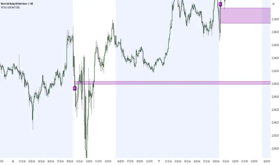
FVG 9:31–10:00 AM ETFVG 9:31–10:00 AM ET - Script Description
What This Script Does
This indicator finds **Fair Value Gaps (FVGs)** that form during the first 29 minutes of the U.S. stock market (9:31 AM to 10:00 AM Eastern Time). A Fair Value Gap is a price imbalance where there's a gap between candles that often becomes an important support or resistance level.
Key Features:
- **Time Window**: Only looks for FVGs between 9:31-10:00 AM ET (most important opening period)
- **One Per Day**: Finds only the first FVG that forms in this time window each day
- **Visual Display**: Draws a purple box around the gap with a clear "FVG" label
- **Price Tracking**: Monitors when price comes back to test the gap level
- **Alert System**: Sends notifications when price returns to the FVG zone
How FVGs Are Detected:
- **Bullish FVG**: When there's a gap up (low of middle candle is above high of 3rd candle back)
- **Bearish FVG**: When there's a gap down (high of middle candle is below low of 3rd candle back)
The 9:31-10:00 AM window is chosen because this is when institutions and algorithms create their biggest price moves right after market open, making these gaps very reliable.
Customization Options
User Settings
Extend FVG Box (Bars)
- **What it does**: Makes the purple box longer to the right
- **Default**: 0 (box ends right after the gap forms)
- **Options**: Any number from 0 to 100+
- **When to use**:
- Keep at 0 for clean historical view
- Set to 10-20 to track the gap during the current session
- Set higher for longer reference
Code Settings (Can Be Changed)
Time Window
- **Start**: 9:31 AM Eastern Time
- **End**: 10:00 AM Eastern Time
- **Can modify**: Change the hour/minute numbers in the code
Visual Style
- **Color**: Purple with see-through background
- **Label**: Shows "FVG" text in white
- **Can modify**: Change colors and transparency in the code
How to Use:
Setup
Chart Settings
1. Use 1-minute, 5-minute, or 15-minute charts (works best on these timeframes)
2. Apply to liquid markets like ES, NQ, major stocks, or forex pairs
3. Set the "Extend FVG Box" to your preference (start with 0 or 10)
What You'll See
- A purple box appears when an FVG forms during 9:31-10:00 AM
- Box shows the exact price levels of the gap
- "FVG" label appears on the box
- Only one FVG per day will be marked
Trading Strategies
Basic FVG Trading
1. **Wait for Formation**: Let the purple box appear during 9:31-10:00 AM
2. **Watch Price Movement**: See if price moves away from the gap
3. **Enter on Retest**: When price comes back to the purple box area, consider entering
4. **Trade Direction**:
- Bullish FVG = look for long opportunities when price retests
- Bearish FVG = look for short opportunities when price retests
Entry Methods
- **Bounce Play**: Enter when price touches the FVG box and bounces away
- **Break Play**: Enter if price strongly breaks through the FVG box
- **Rejection Play**: Enter opposite direction if price gets rejected at the FVG
Risk Management
Stop Losses
- Place stops just outside the FVG box (a few ticks beyond the gap)
- If trading a bounce, stop goes on opposite side of the gap
- If trading a break, stop goes back inside the gap
Position Sizing
- Start small until you understand how FVGs work in your market
- Bigger gaps = smaller position size (more risk)
- Smaller gaps = can use larger position size
Profit Targets
- Take profits at obvious levels like round numbers, previous highs/lows
- Consider taking half profits at 1:1 risk/reward ratio
- Let some position run if the move is strong
Best Practices
When It Works Best
- High-volume stocks and futures (ES, NQ work great)
- Normal market days without major news during the 9:31-10:00 window
- When there's clear institutional activity in the opening period
When to Be Careful
- Low-volume stocks or markets
- Major economic news releases during the time window
- Market holidays when volume is low
- Very choppy or sideways days
Alert Usage
- The script will alert you when price comes back to test the FVG
- Don't trade the alert blindly - always check the current market situation
- Use the alert as a heads-up to start watching the setup more closely
Tips for Success
- The earlier the FVG forms in the 9:31-10:00 window, often the more significant it is
- FVGs that form with high volume are usually more reliable
- Always consider the overall market direction - don't fight the main trend
- Practice on paper first to understand how FVGs behave in your chosen market
🔗 Works Best With:
✅ Liquidity Levels — Smart Swing Lows: Spot key structural lows that can fuel stop hunts and reversals.
✅ ICT Turtle Soup — Liquidity Reversal: Add a classic reversal pattern to your toolkit to catch fakeouts cleanly.
✅ ICT SMC Liquidity Grabs and OBs- Liquidity Grabs, Order Block Zones, and Fibonacci OTE Levels, allowing traders to identify institutional entry models with clean, rule-based visual signals.
This script is most valuable for day traders who want to catch institutional moves right after market open, but it can also help swing traders identify important intraday levels.
✅ ICT Macro Zones (Grey Box Version)- It tracks real-time highs and lows for each Silver Bullet session.
✅ Weekly Opening Gap (cryptonnnite)
Beta calculatorCalculates the market beta for the stock that is on your screen. You may change the parameters by changing the symbol you are using as benchmark to calculate market beta in the settings. This will affect the market beta you get. VTI is used since it has a theoretical market beta of 1.

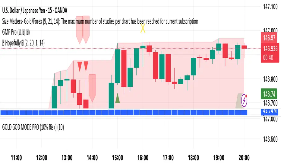
🚀 Hopefully 🤲🏻It’s a simple yet effective indicator. Its power level is high. Its secret lays in its dynamics. Simply “BUY’ when you see green triangle & "SELL" when you see red triangle 🔺. Do your own due diligence and remember to always be disciplined and focused 🧘
Happy trading to you all ☮️
Quarterly Earnings with NPMQuarterly Earnings with NPM can be used to compare earnings for Indian stocks QOQ or YOY, also shows the revenue or Mcap of any company.

RSI First Condition SignalsBuy signal with the exit of RSI from the bottom to the top of the number 30.
Sell signal with RSI exit from above 70 to below. The longer the RSI stays above the overbought zone, i.e above 70, and then breaks below 70,
the stronger the sell signal.
The longer the RSI stays below thw oversold zone, i.e. below 70, and then exits above 30,the stronger the buy signal.
And if the RSI exits below the 70 line with a steeper slope, the sell signal is valid.
And if the RSI exits with a steeper slope above 30, the buy signal is valid .

🇰🇷 Kim'in Kim'out — Korean Premium TrackerKim’in Kim’out is a premium-tracking TradingView indicator that reveals Korean market sentiment by comparing real-time asset prices on Upbit (KRW) and Binance (USDT).
It detects when Korean traders are spot accumulating (Kim’in) or spot distributing (Kim’out) — enhanced by volume confirmation and trend context.
Perfect for crypto scalpers, swing traders, and arbitrage hunters.
⚙️ How It Works
Kimchi Premium: Measures how much more (or less) Koreans are paying on Upbit compared to Binance.
Volume Confirmation: Filters signals by comparing Upbit volume vs its moving average.
Signal Logic:
🔼 Kim’in: Premium exceeds the buy threshold + high volume
🔽 Kim’out: Premium drops below the sell threshold + high volume
Trend Context: Premium trend line gives insight into sustained interest/disinterest.
🎛️ Settings Overview
Input Description
Select Cryptocurrency Choose from supported coins (BTC, ETH, SOL, etc.)
Buy Threshold (%) How high the premium must be to trigger a Kim’in signal
Sell Threshold (%) How low the premium must be to trigger a Kim’out signal
Volume MA Period The number of candles for volume average
Volume Multiplier Volume spike ratio needed to confirm a signal
Show Info Table Toggle detailed premium stats in a side panel
Show Premium Zones Visual background zones (green/red/yellow)
Debug Mode Shows extra signals that trigger without volume confirmation
✅ How to Use It
Add the indicator to any chart (e.g. BTC/USDT)
Choose a coin from the dropdown (BTC, ETH, etc.)
Watch for:
Green Triangle Up (Kim’in) = Korean spot buy pressure confirmed
Red Triangle Down (Kim’out) = Korean selloff or disinterest
Use the Info Table (top-right) to see:
Premium %
Volume confirmation
Real-time KRW-USD exchange rate
Upbit vs Binance price comparison
Set Alerts:
Right-click on a signal → Add Alert on "Kim’in" or "Kim’out"
Or use the prebuilt alertconditions
🔔 Alert Messages
🇰🇷 Korean Premium BUY signal detected → Kim’in
🇰🇷 Korean Premium SELL signal detected → Kim’out
🧪 Best Practices
Use on 1H or 4H timeframe for best results
Confirm with broader market structure or confluence tools
Spot divergences between Binance and Upbit to predict regional flow shifts
🚫 Limitations
Works only with coins that have both Binance USDT & Upbit KRW pairs
Premium may be delayed by low liquidity or FX rate fluctuations (USDKRW)
Not suitable for lowcaps not listed on Upbit
Created by UKMC Crypto

Multi ZigZag DR Advanced Elliott Wave - DR BASL📊 Multi ZigZag DR – Advanced Elliott Wave Detection by DR BASL 🧠
"ZigZag DR BASL - Elliott Wave" is a high-performance indicator designed to automatically detect Elliott Impulse Waves (0 → 1 → 2) using a multi-ZigZag approach with advanced ATR filtering.
🔍 Core Features:
✅ Detects impulse waves across 4 custom ZigZag lengths.
✅ Draws Entry, Stop Loss, and Take Profit (TP1–TP4) levels.
✅ Filters out market noise using ATR-based movement threshold.
✅ Fully customizable: colors, styles, wave structure, and display settings.
✅ Visual trend coloring (Bullish / Bearish) for directional clarity.
✅ Built-in alerts to notify when a new valid impulse wave is formed.
✅ Optional Pivot Statistics Table for wave validation and analysis.
🧠 Ideal For:
Elliott Wave traders looking for precise and automated detection.
Swing and structure-based traders using wave confluence.
Traders who prefer multi-layered ZigZag logic for confidence.
Users seeking visual clarity for entries, targets, and market context.
💡 Developed By:
📌 DR BASL – Designed with precision and flexibility in mind, coded in Pine Script v5, with modular logic and optimization for large-scale structures.

Quarterly Earnings
Easy to access fundamentals of a company on the chart.
EPS and Sales data of post quarters

Seasonal Forecaster ProSeasonal Forecaster Pro
This script is an advanced analytical tool designed to uncover and measure historical seasonal (or cyclical) tendencies in any market. It visualizes how an asset has performed on average during specific times of the year and provides a real-time score to gauge how closely the current price action is following these historical patterns.
The primary goal is to provide traders with a unique analytical layer, helping to identify periods of historical strength or weakness and to validate current trends against historical norms.
Key Features
📈 Multi-Period Seasonality Lines: The indicator plots multiple seasonal patterns simultaneously. Each colored line represents the average historical performance over a different lookback period (e.g., 3-year, 5-year, 10-year average). This allows you to compare short-term versus long-term seasonal trends.
🔮 Forward Projection: The seasonal lines are projected into the future, illustrating the average historical path for the upcoming days and weeks. This is not a price prediction, but a visual guide to an asset's typical behavior based on past data.
📊 Correlation Table: A powerful, real-time dashboard that measures how strongly the current price is correlated with each historical seasonality pattern.
High Correlation (> 75%): 🟢 Indicates that the current price is moving in strong alignment with its historical tendency.
Medium Correlation (50% to 75%): 🟠 Shows a moderate relationship.
Low Correlation (< 50%): 🔴 Signals that the price is currently deviating from its historical norm.
🛡️ Advanced Outlier Filtering: The core calculation uses a robust statistical method to filter out extreme, one-off market events like flash crashes or major news spikes. This ensures that the resulting seasonal patterns are more stable and representative of typical market behavior.
⚙️ Full Customization: You have complete control over the indicator's appearance. You can toggle any seasonality line on or off, and customize the colors, line width, and the on-screen table's position and colors to perfectly match your chart's theme.
How It Helps Your Trading
This indicator is a tool for analysis and confluence, not for generating buy/sell signals. Here’s how you can integrate it into your strategy:
Identify Seasonal Trends: Easily spot times of the year where an asset has historically shown bullish or bearish tendencies. For example, if the lines are consistently trending upwards from March to May, it highlights a period of historical strength.
Confirm Trend Strength: Use the correlation table to add confidence to your analysis. If you see an asset is in an uptrend and the correlation score for its dominant seasonal pattern is high and green, it provides powerful confirmation that the move is aligned with historical precedent.
Spot Divergences: Identify when the market is behaving abnormally. If the historical pattern suggests an uptrend, but the current price is falling and the correlation score is low and red, it signals a divergence. This can alert you that current market drivers are overriding seasonal tendencies and may warrant extra caution.
This script is an analysis tool and does not provide financial advice or trade signals. All trading involves risk, and past performance is not indicative of future results. Please use this indicator as part of a comprehensive trading plan. This script is invite-only and its source code is protected.

Gold vs DXYThe 30-day rolling correlation between Gold (XAU/USD) and the US Dollar Index (DXY) shows how closely the two move together — or more often, in opposite directions — over the last 30 trading days. In most market environments, the relationship is pretty straightforward: when the dollar goes up, gold tends to go down, and vice versa. That’s because gold is priced in dollars, so a stronger dollar makes it more expensive for international buyers, which usually softens demand.
But it’s not always that simple. There are times when this inverse correlation breaks down. For example, if real yields (like the US 10-year yield minus inflation expectations) are rising, that can pressure gold even if the dollar is falling — because higher real returns elsewhere make gold less attractive. Another case is when other currencies, like the euro or yen, rally strongly on their own central bank decisions. This can pull DXY lower without necessarily signaling weakness in the U.S. economy — meaning gold might not benefit much.
There are also “risk-on” moments where investors rotate into equities or crypto, selling off both gold and the dollar in favor of yield or momentum. And during periods of crisis or uncertainty, both gold and the dollar can rise together as safe-haven assets, breaking the usual pattern entirely.
That’s why tracking the rolling correlation is helpful. It shows whether the historical relationship between gold and the dollar is still holding — or if we’re entering a different market regime. It’s not about predicting exact price moves, but about understanding the current backdrop. When gold and DXY are moving out of sync as expected, it can support your trade thesis. But when the correlation flattens or flips, it’s often a sign to dig deeper — macro forces may be shifting.

Liquidity Sweep & Encroachment [Clean Labels]It basically tries to track when a liquidity sweep has been detected based off of volume and volatility of candles. This indicator is in beta and works well with mostly 1-2 minute chart I still have to work on higher time frames.

世界最强100倍杠杆ETF无敌完美交易系统 v3.0🔑 Core Features
Multi-Layer Technical Framework
EMA Cloud (8 Layers): ema_1 (Lightning) to ema_8 (Ultra-Long) for trend alignment.
Ichimoku Cloud: Tenkan/Kijun/Senkou spans with cloud-state detection (bull/bear/neutral).
Oscillators: RSI, Stochastic, Williams %R, CCI with adaptive thresholds.
Volatility Channels: Dual Bollinger Bands + Keltner Channel for "squeeze" detection.
Volume Analysis: VWAP, volume spikes/climax, and price-volume divergence.
AI-Powered Enhancements
Pattern Recognition: Detects 15+ candlestick patterns (e.g., Engulfing, Morning Star, Three Soldiers).
Adaptive Parameters: Adjusts RSI/MACD thresholds based on volatility.
Pattern Strength Scoring: Quantifies signal reliability (0–10 scale).
Risk Management System
Dynamic Position Sizing: Adjusts trade size using:
Win/loss streaks
Pattern strength
Volatility regimes
Smart Stops: Trailing stops with ATR-based distance + volatility scaling.
Drawdown/Heat Protection: Reduces exposure after consecutive losses.
Market Structure Tools
Support/Resistance: Dynamic pivots (5/10/20 periods).
Fibonacci Retracements: Auto-plots key levels (23.6%, 38.2%, 61.8%).
Trend Strength Meter: Scores trends from -1.0 (strong bear) to +1.0 (strong bull).
Time & Session Filters
Avoids news hours + sessions (Asian/European/US/Overlap).
📊 Visualization & Alerts
Plotting:
EMA cloud ribbons
Ichimoku cloud
Bollinger/Keltner bands
Fibonacci levels
Entry/exit markers (e.g., 🚀MEGA Long/💥MEGA Short)
Dashboard: Real-time table showing:
RSI/MACD/Volume grades
Position status (PnL %)
Risk score (A-F rating)
System total score (0-100%)
Alerts: Triggers for:
Mega entries/exits
Squeeze releases
Breakouts
"Perfect score" (90%+ conditions met)
⚙️ Key Innovations
20-Condition Confirmation: Requires confluence of EMA alignment, volatility expansion, volume spikes, pattern strength, and trend momentum for entries.
Self-Adjusting Logic: Parameters adapt to market regimes (e.g., high volatility tightens stops).
Institutional-Grade Risk Controls: Max risk/trade, min 5:1 risk-reward ratio, and max concurrent trades.
❗️ Critical Notes
Leverage Warning: Explicitly flagged for 100x leverage ETFs (high-risk).
Overkill?: Combines every major technical approach—may cause clutter. Best used on high-timeframe charts (1H+).
Pine Script Limits: max_boxes_count=500 avoids overcrowding; complex logic may slow performance.
💡 Ideal For: Experienced traders seeking a "all-in-one" system for volatile assets. Not recommended for beginners.
Let me know if you need help optimizing/modifying specific components! 🚀

NEO CLOUD + Kinetic Compass CombinedThis is a comprehensive technical analysis indicator combining three powerful trading systems:
📊 NEO CLOUD System:
- Trend identification system based on dual EMA range filters
- Provides dynamic cloud fill for intuitive trend direction and strength visualization
- Supports Fast/Normal/Slow trend length settings
- Fully customizable colors including cloud fill and signal arrows
🧭 KINETIC COMPASS System:
- Modified trend indicator based on EMA100 for high-precision trend tracking
- Dual-layer exit signal system to optimize exit timing
- Integrated EMA50/100/200 multi-timeframe confirmation
- Gradient fill effects for clear support/resistance visualization
- Independent control over buy/sell signals and exit signals display
📈 DUAL SUPERTREND System:
- Two independent Supertrend indicators with separate parameters
- Selective display control - show one, both, or neither
- Dynamic support/resistance lines that adapt to market volatility
- Adjustable transparency fill areas
🚀 Combined Features:
- MEGA Alerts: Super alerts triggered when multiple systems align
- Independent Switches: Each system can be enabled/disabled separately
- Color Customization: Full personalization of all visual elements
- Candle Coloring: Support for NEO or Kinetic candle coloring schemes
- Signal Filtering: Choose to show or hide various types of trading signals
💡 Usage Recommendations:
- Beginners: Start with single system, then combine after familiarization
- Trend Trading: Focus on NEO CLOUD direction and Kinetic trend lines
- Scalping: Use exit signals and Supertrend for precise entry/exit points
- Signal Confirmation: Wait for multiple system alignment for higher success rate
TPO Unsplit (Optimized v5)TPO Unsplit (Optimized v5) is a script that renders unsplit Market Profile (TPO) structures with precision and historical depth—ideal for traders who want a clean, collapsed TPO view across any timeframe. Unlike built-in TradingView Market Profile tools that rely on "expanded" (split) or "collapsed" profiles limited by chart scope, this tool provides full unsplit TPO shapes & HTN/LTN for prior completed sessions , rendered directly on your chart.
Key Features
Unsplit TPO Profiles : Displays the full shape of each prior TPO session without splitting by sub-period.
Historical Rendering : View TPOs across extensive historical data (up to 500 sessions), depending on row count and chart resolution.
Custom Timeframe Configuration :
Chart Interval determines the sub-period granularity (e.g. each "letter" equivalent is a 5m bar on a 5m chart).
Selected Session Timeframe (in the script settings) defines the full TPO session window (e.g. 30m, 1h, D, W, M, etc).
Value Area & POC Visuals :
Customisable drawing of Value Area High (VAH), Value Area Low (VAL), and Point of Control (POC).
Colour settings for value vs non-value regions.
Efficiency Controls :
The Row Count input controls TPO resolution. Higher row count = more detail but shorter lookback.
Lowering row count increases how far back profiles can be rendered (helpful on high-volume charts or low timeframes).
Optimised Structure Rendering : Efficient block rendering using scaled vertical lines rather than characters. No letter labeling, but full TPO shape is accurately depicted.
Alerts : Includes price-based alerts for interactions with the POC (in, above, or below).
Usage Notes
The script only displays completed TPO sessions (i.e. the most recent full session). The current session is not shown while it’s forming.
Because TPOs are based on time-at-price , this may resemble a volume profile visually—but it strictly counts time-based touches per price bin.
Use on intraday, daily, weekly, or custom intervals. Designed for adaptability across instruments and strategies.
Example Use Case:
Set your chart to 5-minute candles, then choose a TPO session length of 2 hours in the settings. You'll see each completed 2-hour period plotted as a single collapsed TPO shape—providing a clean view of price distribution without noise.
Performance Tips:
Default Row Count is 50 for balance between precision and depth.
Increase for finer profiles, decrease to load more history.
This is bounded by TradingView’s max_lines_count , so tuning is essential based on your asset/timeframe.
Disclaimer:
This tool is built purely on public Pine Script v5 , compliant with TradingView's open-source requirements. It’s not based on volume but strictly follows the Steidlmayer TPO methodology using time-based logic.
For private access, extended versions, or inquiries—feel free to contact me directly.

Trinity Multi Time Frame Trend Dashboard and SignalsUpdated the logic behind the buy and sell signals to them for more responsiveness and also included an ADX filter.

US Macro Indicators (CPI YoY, PPI YoY, Interest Rate)US Macro Indicators (CPI YoY, PPI YoY, Interest Rate)
This indicator overlays the most important US macroeconomic trends for professional traders and analysts:
CPI YoY (%): Tracks year-over-year change in the Consumer Price Index, the main measure of consumer inflation, and a core focus for Federal Reserve policy.
PPI YoY (%): Shows year-over-year change in the Producer Price Index, often a leading indicator for future consumer inflation and margin pressures.
Fed Funds Rate (%): Plots the US benchmark interest rate, reflecting the real-time stance of US monetary policy.
Additional Features:
Key policy thresholds highlighted:
2% (Fed’s formal inflation target)
1.5% (comfort floor)
3% and 4% (upper risk/watch zones for inflation)
Transparent background shading signals elevated inflation zones for quick visual risk assessment.
Works on all asset charts and timeframes (macro data is monthly).
Why use it?
This tool lets you instantly visualize inflation trends versus policy and spot key macro inflection points for equities, FX, and rates. Perfect for anyone applying macro fundamentals to tactical trading and investment decisions.

830 to 11am NY Raid [Plazo Sullivan Roche Capital]PSRC Dynamic Range Liquidity Sweep Strategy
Trade Like an Institution. Win Like a Shark.
What’s Inside This Strategy?
An elite killzone toolkit built for one job:
Exploit institutional moves during the most volatile part of the trading day — 8:30 AM to 11:00 AM NY.
This strategy fuses ICT killzone logic, Smart Money Concepts, and Dynamic Range Implied Reversion to give you ultra-high probability trades using:
Liquidity sweep detection
Displacement candle validation
Time-restricted sniper entries
Real-time Buy/Sell signals
Visual dashboard of market confluence
Automated alerts to never miss a trade again
Who Is This For?
Scalpers and intraday traders
Forex, Index, Crypto, and Gold players
Users on ICMarkets, OANDA, FXPro, Binance, TradingView
If you’re tired of lagging indicators and want to trade like the banks, this is your scalping bible.
⚙️ Feature Set Breakdown
Feature Description
✅ Killzone Filter Trades only between 8:30–11:00 AM New York (configurable)
✅ Liquidity Sweep Logic Detects manipulation above PDH / below PDL
✅ Displacement Candle Check Validates impulsive moves from Smart Money
✅ Entry Signal Auto-detects retrace entries after sweep/displacement
✅ Visual Buy/Sell Labels See signals right on your chart
✅ Alert Conditions Sends real-time alerts (mobile, webhook, popup)
✅ Dashboard Panel Real-time confluence insights in plain English
🚀 What’s In It For You?
Trade with institutional logic, not retail lag
Catch reversals where amateurs get trapped
Automate confluences so you stop second-guessing entries
Save screen time with killzone filtering and alerts
Dominate high-volatility hours when real money moves
🔌 How to Set It Up
Click “Add to Chart.”
Right-click chart > “Add Alert”
→ Choose Buy Signal Alert or Sell Signal Alert.
Adjust start/end time to match your broker feed if needed.
🧠 Best Practices
✅ Trade only in the killzone. The logic is tuned for 8:30–11:00 AM NY.
✅ Wait for the signal — don’t front-run it. Let the sweep + displacement + retrace combo hit.
✅ Add confluences like:
Fair Value Gaps (FVGs)
1H OBs or 4H Implied Range Levels
News catalysts from ForexFactory or FinancialJuice
✅ Use alert webhooks for semi-automated trading via platforms like 3Commas, Alertatron, or AutoView.
📈 Recommended Assets
Forex: EURUSD, GBPUSD, USDJPY
Indices: NAS100, US30, SPX500
Gold: XAUUSD
Crypto: BTC/ETH on Binance Futures
⚠️ Risk Reminder
This tool identifies high-probability setups. But risk management is still king.
Use fixed SLs based on structure
Go for 1:2+ RR minimum
Trade 1–2% max risk per position
PRO Version
Auto-drawn Fair Value Gaps
Dynamic Range projection zones
Multi-timeframe signal table
Institutional order block detection
Breaker block and BOS/CHoCH overlays
Contact. us to purchase the pro version: $297 lifetime updates

SMC Smart Money Concepts//@version=5
indicator("SMC Smart Money Concepts", overlay=true)
// === إعداد الهيكل السعري ===
// تحديد HH, HL, LL, LH
pivotHigh = ta.pivothigh(high, 5, 5)
pivotLow = ta.pivotlow(low, 5, 5)
plotshape(pivotHigh, location=location.abovebar, style=shape.triangleup, color=color.red, title="Lower High")
plotshape(pivotLow, location=location.belowbar, style=shape.triangledown, color=color.green, title="Higher Low")
// === Break of Structure & CHoCH ===
bos = pivotHigh and close > high
choch = pivotLow and close < low
plotshape(bos, location=location.abovebar, color=color.blue, style=shape.labelup, text="BOS")
plotshape(choch, location=location.belowbar, color=color.orange, style=shape.labeldown, text="CHOCH")
// === Order Blocks (OB) ===
// نأخذ آخر شمعة صاعدة قبل هبوط قوي كمثال على OB
bearishOB = high < high and close < open
bullishOB = low > low and close > open
plotshape(bearishOB, location=location.abovebar, color=color.maroon, style=shape.square, title="Bearish OB")
plotshape(bullishOB, location=location.belowbar, color=color.lime, style=shape.square, title="Bullish OB")
// === Fair Value Gap (FVG) ===
// إذا لم تلامس الشمعة التالية قاع أو قمة شمعتين قبليتين
fvgBull = low > high
fvgBear = high < low
plotshape(fvgBull, location=location.belowbar, color=color.teal, style=shape.circle, title="Bullish FVG")
plotshape(fvgBear, location=location.abovebar, color=color.fuchsia, style=shape.circle, title="Bearish FVG")
// === السيولة (Liquidity Pools) ===
// تعتبر السيولة موجودة عند قمم أو قيعان واضحة
liquidityHigh = high == ta.highest(high, 20)
liquidityLow = low == ta.lowest(low, 20)
plotshape(liquidityHigh, location=location.abovebar, color=color.purple, style=shape.cross, title="Liquidity High")
plotshape(liquidityLow, location=location.belowbar, color=color.purple, style=shape.cross, title="Liquidity Low")
FOMC Strategy XAU/USD (by Mestre dos Traders)🔰 XAUUSD - Advanced Strategy Indicator (by Mestre dos Traders 2025)
This exclusive indicator was designed for strategic trading on gold (XAU/USD), especially during high-impact economic events (like FOMC) and key support/resistance zones. It combines two powerful tools in a single script, offering traders a complete, visual, analytical, and actionable interface for precise decision-making.
🧠 Combined Functionalities:
📌 1. Smart Support and Resistance Breakout Strategy
Visual marking of manual support and resistance zones, with customizable extension.
Breakout signals (buy/sell) triggered by realistic technical criteria (e.g., 50% candle body crossing).
Smart cooldown system to avoid repeated signals in short sequences.
Highlighting of fake breakouts using background colours on the chart.
Dashboard displaying trend direction, success rate, and loss risk.
🎯 2. Strategic Trade Planning for Economic Events (e.g. FOMC)
Manual input for the date and time of economic events (e.g., FOMC, NFP, CPI).
Configurable Pre-News (entry), TP1, TP2, and SL zones for both buy and sell setups.
Fully customizable line extensions (candles before/after the event).
Automatic labels and lines appear only at the event candle, maintaining clarity.
Informative table showing the line extension settings for each zone.
⚙️ Additional Options & Controls
Option to use either manual entry, TP, SL or values based on trend direction.
Alerts for buy/sell entries and when price touches key zones.
Optional display of entry, TP, and SL labels directly on the chart.
High flexibility to suit various strategies and trader profiles.
🟡 Compatible Instrument:
✔️ XAU/USD (Gold) – especially effective on short- and medium-term charts.
🧭 Purpose of the Indicator:
To help traders position themselves with clarity, anticipation, and confidence during major economic releases and around critical technical zones. Perfect for both technical breakouts and scheduled news trading.
📣 Credits:
Developed by Mestre dos Traders – 2025
💬 Feedback, suggestions, and improvements are welcome!
Contacts:
TG.: @mestredostradersoficial
TG Support: @suportedomestretraders
Tiktok Channel: @Mestredostraders
Whatsapp Sales: +55 61 991371216

vivek kumar 045For education only it provide technical information about chart over the period over the period you will find out how to read a chart without any indicator it is indicator only for education purpose
