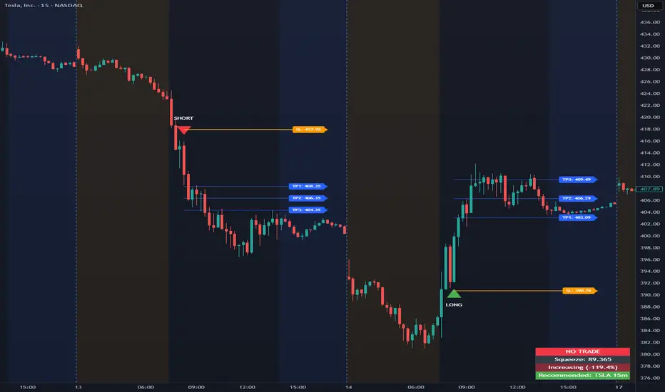
Opening Range Intraday IndicatorOpening Range Intraday Indicator
Summary
The Opening Range Intraday Indicator is a decision-support tool for intraday breakout entries. It combines an Opening Range Breakout (ORB) model with relative volume confirmation and a squeeze-style trend filter, then visualizes entries with clearly defined take-profit (TP) and stop-loss (SL) levels.
The indicator works on any ticker and any timeframe. However, its default parameters and internal logic are optimized for TSLA on the 15-minute chart, which is shown as a recommended context in the on-chart table for informational purposes only.
Core Logic
Opening Range Breakout
Establishes an opening range during the early session and monitors for confirmed breakouts above or below that range to generate potential intraday entries.
Relative Volume confirmation
Breakouts are validated using relative volume to help ensure participation and reduce low-quality signals during thin or inactive periods.
Squeeze / trend filter
A squeeze-style metric evaluates recent compression and directional behavior, helping to avoid entries during unfavorable or low-quality structural conditions.
Entry Visualization & Risk Levels
When a valid entry is confirmed, the indicator automatically:
Plots directional entry markers
Calculates and draws multiple take-profit levels
Draws a stop-loss level based on opening-range structure or ATR logic
Marks TP or SL hits directly on the chart for visual review
These visuals persist on the chart to allow traders to manually review trade structure and outcome over time.
On-Chart Table & Context Guidance
The indicator includes a compact on-chart table that displays:
Current squeeze value and short-term trend behavior
“No trade” conditions when structure is unfavorable
A recommended context message indicating whether the chart matches the optimized setup (TSLA on the 15-minute timeframe)
This message is informational only and does not restrict signals or functionality on other symbols or timeframes.
Flexibility & Controls
Users can customize:
Take-profit and stop-loss display behavior
Tight or standard stop-loss logic
Quiet windows near session close to suppress alerts
Visual settings and table positioning
This allows the indicator to be adapted to different instruments, volatility profiles, and execution styles.
Important Notes
This indicator does not execute trades and does not include automated backtesting or performance statistics.
TP/SL markers are visual aids only and are intended for manual review, not statistical validation.
Results will vary by symbol, timeframe, execution, and market conditions.
This indicator is intended as a research and decision-support tool for experienced intraday traders who understand execution risk, volatility, and position sizing. It should be used alongside proper risk management and independent analysis.
Optionstrading
0DTE Credit Spreads Indicator0DTE Credit Spreads Indicator
This indicator is designed to assist 0DTE credit spread traders by providing rule-based PCS (Put Credit Spread) and CCS (Call Credit Spread) signals, dynamic risk levels, and an integrated performance summary — all within a single, cohesive tool.
What the indicator does
The script implements a complete intraday framework tailored specifically to same-day expiration credit spreads, combining market structure, volatility context, and trade management logic into one workflow:
Opening Range logic (15-minute)
A defined opening range is used to establish directional bias. Signals are generated only after the range is confirmed, aligning entries with controlled intraday structure rather than momentum chasing.
Optional Early Entry logic
An optional early-entry mechanism evaluates 30-minute RSI extremes during the opening phase only. This is intentionally constrained to the opening window and designed for early premium capture scenarios common in 0DTE trading.
Volatility-aware credit estimation
Expected credit is derived from current volatility conditions to provide realistic assumptions for backtesting, trade visualization, and partial-profit modeling.
Dynamic risk visualization
Each signal automatically plots:
A horizontal stop-loss level
A take-profit level based on user-selected credit percentage
A dynamic diagonal stop line from entry to end-of-day, modeling time-based risk specific to 0DTE positions
Partial profit and contract modeling
The backtest logic supports closing a user-defined number of contracts at the take-profit level, while allowing remaining contracts to run to end-of-day or stop loss. This mirrors real-world 0DTE trade management practices.
Flexible evaluation modes
Trades can be evaluated using either:
Intraday stop-loss crosses, or
End-of-day outcome logic
allowing users to align results with their execution style.
Backtesting and transparency
The indicator includes a live, on-chart backtest table displaying:
PCS and CCS signal counts
Wins, losses, and win rate
Total P/L (points or dollar-based per contract)
Contract and partial-TP configuration
A non-blocking “Recommended context” note indicating whether the script is running on the preferred symbol and timeframe
Signals and visuals will display on any chart. The recommended context is informational only and does not restrict usage.
Chart presentation
Full visual mode with labels, TP/SL levels, and diagonal risk lines
Clean Chart mode with arrow-only signals and a compact summary table
Automatic object management to prevent chart clutter.
Intended use
This indicator is intended as a decision-support and research tool for experienced traders. It does not place trades, does not guarantee profitability, and should be used alongside proper risk management.

Round Strike Price, Levels Options Series➤ Strike Price Range Mode:
➤ Exact Strike Price Mode:
⭐ Overview and How It Works
Round Strike Price or Levels is a precision-focused visual tool designed for options and index traders.
It dynamically plots round strike levels around the current price and presents them either as:
⠀ — Exact strike prices, or
⠀ — Strike price ranges, where each zone represents the midpoint between two adjacent strikes.
The indicator continuously recalculates the base strike using the current price and aligns all surrounding levels using a fixed step size.
All lines and labels are updated only on the last bar for optimal performance and stability.
This makes StrikePrice ideal for:
🔹 Identifying key option strikes.
🔹 Visualizing price acceptance zones.
🔹 Understanding strike-to-strike movement during intraday trading.
⭐ Key Features and Functionality
Strike Price Range:
⠀ — Treats each pair of strike lines as a price zone.
⠀ — Labels are plotted at the midpoint between two lines.
⠀ — Last label is intentionally hidden (no upper range exists)
Exact Strike Price:
⠀ — Labels are plotted directly on each strike line.
⠀ — Useful for precise strike-based analysis.
Dynamic Base Calculation:
⠀ — Automatically snaps price to the nearest round strike.
⠀ — Re-centers the entire grid as price moves.
⠀ — No manual adjustment required.
Efficient Object Management:
⠀ — Uses persistent arrays for lines and labels.
⠀ — Objects are reused instead of recreated.
⠀ — Prevents flickering and avoids TradingView object limits.
🎨 Visualizations and User Experience
Clean horizontal strike grid with configurable:
⠀ — Line width, Line color, Line style (Solid / Dashed / Dotted), Extension direction (Left / Right / Both / None).
Labels are:
⠀ — Positioned to the right of price, Size-adjustable, Fully customizable in text color and background color.
Designed to stay visually clear even on:
⠀ — Fast-moving intraday charts, Options-focused layouts, Multi-indicator setups.
Tip: Increase Right Bars Margin in chart settings to give labels proper spacing.
⭐ Settings and Customization
🔹 Strike Settings:
⠀ — Step (points): Distance between adjacent strike levels (e.g., 50, 100)
⠀ — Levels per side: Number of strike levels plotted above and below the base.
⠀ — Strike Mode: Strike Price Range, Exact Strike Price.
🔹 Line Settings:
⠀ — Line width, Line color, Line style (Solid / Dashed / Dotted), Line extension direction.
🔹 Label Settings:
⠀ — Show / hide labels, Label distance (bars to the right), Label size, Label text color, Label background color.
All label properties are updated dynamically, allowing real-time UI tuning without reloading the script.
⭐ Uniqueness of the Concept:
Unlike generic round-number indicators, StrikePrice:
⠀ — Understands option-style strike structure.
⠀ — Separates range-based thinking from exact price levels.
⠀ — Uses midpoint logic to visualize strike-to-strike movement.
⠀ — Maintains strict performance discipline by updating only when necessary.
This makes it especially useful for:
⠀ • NIFTY / BANKNIFTY options.
⠀ • Index and futures traders.
⠀ • Intraday strike rotation analysis.
⠀ • Premium decay and range-bound setups.
🚀 Conclusion:
StrikePrice is a focused, professional-grade indicator for traders who think in strikes, ranges, and levels rather than arbitrary prices.
It offers:
⠀ • Clear structure
⠀ • Accurate strike alignment
⠀ • Clean visuals
⠀ • Zero repainting logic

IV vs Realised Volatility (VIX/HV Comparator)VIX / HV Comparator – Implied vs Realised Volatility
This indicator compares Implied Volatility (IV) from a volatility index (VIX, India VIX, etc.) with the Realised / Historical Volatility (HV) of the current chart symbol.
It helps you see whether options are pricing volatility as rich or cheap relative to what the underlying is actually doing.
What it does
Pulls IV from any user-selected vol index symbol (e.g. CBOE:VIX for SPX, NSEINDIA:INDIAVIX for Nifty).
Calculates realised volatility from the chart’s price data using returns over a user-defined lookback.
Annualises HV so IV and HV are displayed on the same percentage scale, on any timeframe (intraday or higher).
Optionally shows an IV/HV ratio in a separate pane to highlight when options are rich or cheap relative to realised volatility.
How to read it
Main panel:
Orange line – Implied Volatility (IV) from your chosen vol index.
Aqua line – Realised / Historical Volatility (HV) of the current chart symbol.
Fill between lines:
Green shading -> IV > HV -> options are priced richer than what the underlying is currently realising.
Red shading -> HV > IV -> realised vol is higher than the options market is implying.
Sub-panel (optional):
IV / HV ratio
- Above 1 -> IV > HV (vol rich).
- Below 1 -> IV < HV (vol cheap).
- Horizontal guides (for example 1.2 / 0.8) help frame “significantly rich/cheap” zones.
A small label on the latest bar displays the current IV, HV and their difference in vol points.
Inputs (key ones)
IV Index Symbol – choose the volatility index that corresponds to your underlying (VIX, India VIX, etc.).
Realised Vol Lookback – number of bars used to compute HV (for example 20).
Trading Days per Year and Active Hours per Day – used for annualising HV so it stays consistent across timeframes.
IV Scale Factor – adjust if your IV index is quoted in decimals (0.15) instead of points (15).
Practical uses
Context for options trades – Quickly see if current IV is high or low relative to realised volatility when deciding on strategies (premium selling vs buying, spreads, hedges).
Vol regime analysis – Track shifts where HV starts to rise above IV (real stress building) or IV spikes far above HV (fear premium / insurance bid).
Cross-timeframe checks – Use on intraday charts for short-term trading context, or on daily/weekly charts for bigger picture vol regimes.
This tool is not a stand-alone signal generator. It is meant to be a volatility dashboard you combine with your usual price action, trend, and options strategy rules to understand how the options market is pricing risk vs what the underlying is actually delivering.

GexView📈 OVERVIEW
GexView indicator plots the Historical Gamma Exposure (GEX) profile, directly on the chart. It enables traders and analysts to observe how GEX profile evolve across multiple days/sessions.
🧲 CONCEPT
Today everybody uses Gamma Exposure. Gamma is the ROC (Rate of Change) for an option’s delta. GEX is crucial for all traders, not just intraday traders, because it helps assess market stability and potential volatility shifts driven by options positioning.
High positive GEX generally implies a mean-reverting market, where big price swings are dampened, while negative GEX signals increased volatility and potential large moves.
Understanding GEX allows traders to anticipate liquidity-driven price action, identify key support and resistance levels, and adjust strategies accordingly. In today’s market, where options flow heavily influences underlying assets, ignoring GEX can mean missing critical market dynamics that impact both short-term and long-term positions.
💡 UNIQUENESS
This indicator is a unique tool and offers a groundbreaking way to visualize market dynamics by plotting Historical Gamma Exposure (GEX), like a Volume Profile across multiple days or sessions. For the first time, traders can clearly see how GEX levels evolve over time, revealing how certain price zones gain or lose importance as market conditions change. This multi-session GEX profile allows users to identify persistent areas of dealer positioning and potential support or resistance that develop and shift over days. Unlike traditional GEX tools designed primarily for intraday use, this indicator provides valuable insight for both short-term traders and medium-term investors seeking to understand how option market flows influence price behaviour over extended periods.
⚙️ FEATURES
• Historical Gamma Exposure
The GexView indicator by default plots the last 6 days of the GEX profile, providing a framework for understanding the bigger picture.
• GEX profile
Displays the 10 largest GEX levels across all expirations (thick lines), as well as the 10 largest GEX levels for the next expiration (thin lines, 0DTE or upcoming).
• Update
Daily, after market close, based on new open interest. No more manual level imports.
Just one-click update.
• Settings
Option to plot total sum GEX for all expirations, or only net GEX for next expiration.
• Watchlist
SPX, NDX, DIA, SPY, QQQ, VIX, VXX, IBIT
(Additional tickers coming soon)
• Mapping
The indicator automatically detects and maps the underlying ticker on your chart, or lets you plot any symbol from the available watchlist.
🔍 HOW TO USE
• Identify intraday support and resistance levels shaped by option market dynamics
• Quickly spot significant GEX levels and compare how they relate to other key levels.
• Compare current vs. past GEX distributions for contextual trend analysis
• Observe structural GEX shifts that may align with volatility or mean-reversion setups
• Easily understanding if an asset trading on positive gamma (around green lines), or negative gamma (around red lines)
Examples:
1. DIA ETF
2. QQQ and VIX
📚 NOTES
• Calculation
GEX for All Expirations: This is the total sum (Call+Put) of gamma exposure of all expirations.
GEX for Nearest Expirations: This is the net sum (Call-Put) of gamma exposure of next expirations (0DTE if available).
• Trading Session - RTH & ETH
The indicator can include the extended trading hours when activated on the chart.
✅ VISUALIZATION
• Vertical implementation of gamma exposure profile.
• Thick lines represent the total gamma exposure across all expiration contracts.
• Thin lines represent the gamma exposure of next expiration only.
• All Expirations: Green colour if Calls > Puts, Red colour if Calls < Puts
• Next Expiration: Lime colour if Calls > Puts, Maroon colour if Calls < Puts
⚠️ DISCLAIMER
This indicator is provided for informational and educational purposes only.
It does not constitute financial advice or a recommendation to buy or sell any financial instrument.
Historical Gamma patterns and analytical interpretations do not guarantee future performance.
All analysis should be combined with independent research and risk management.

TradeUniv.com Expected MovesTradeUniv.com Expected Moves
See where the market expects stocks to move based on options pricing data. This indicator shows you upper and lower price levels that help identify potential support, resistance, and overextended moves.
What Are Expected Moves?
Expected moves are calculated from option prices and show where the market thinks a stock is likely to trade by the end of the day or week. Think of them as probability zones - when price reaches or crosses these levels, it may signal an unusual
move or potential reversal opportunity.
What You'll See on Your Chart:
• Upper Level (Green) - Expected high for the period
• Lower Level (Red) - Expected low for the period• Midpoint (Gray) - Previous day's closing price (your reference point)
• Shaded Area - The expected trading range between levels
How to Use:
1. Visit www.tradeuniv.com
2. Select your favorite tickers
3. Click "Generate Script" and copy the TradingView input
4. Paste it into this indicator's settings
5. The indicator automatically shows the expected moves for whatever chart you're viewing
Perfect For:
• Day traders planning entry and exit zones
• Identifying when price has moved "too far too fast"
• Spotting potential reversal areas
• Understanding daily volatility expectations
• Planning option strategies around expected ranges
Features:
• Automatically detects daily vs weekly expirations (SPY, IWM, QQQ use daily; others use weekly)
• Customizable colors and line styles
• Price crossing alerts (get notified when price breaks above/below expected levels)
• Works on any timeframe
• Clean, minimal chart display
Important:
• Requires TradeUniv.com free account to generate data
• Refresh your data daily for accurate calculations
• Only shows levels for tickers you selected when generating

ATM Pulse (Arjo)ATM Pulse (Arjo) — Real-Time ATM Options Sentiment & Trend Strength Indicator
Overview
ATM Pulse (Arjo) is an options analytics and trend overlay tool that automatically detects the At-The-Money (ATM) strike for NIFTY, BANKNIFTY , or any selected stock.
It merges Call–Put Volume Ratio (CPVR) sentiment analysis with a Chandelier Exit trend overlay to help traders visualize both market bias and trend direction in a single chart.
Concepts & Logic
ATM Auto Detection
The script calculates the current ATM strike by rounding the underlying’s price to the nearest strike interval (e.g., 50 for NIFTY, 100 for BANKNIFTY). It then requests live option-chain data for that strike.
Call–Put Volume Ratio (CPVR)
The Call-Put Volume Ratio (CPVR) is calculated as the call volume divided by the put volume.
CPVR > 1.25 → Bullish dominance (Calls stronger)
CPVR < 0.75 → Bearish dominance (Puts stronger)
0.75–1.25 → Neutral sentiment
This ratio helps interpret real-time option-market positioning.
Chandelier Exit Trend Overlay
Using Average True Range (ATR) , the overlay plots dynamic trailing stops and visual trend zones:
🟢 Green: Uptrend continuation zone
🔴 Red: Downtrend continuation zone
A color change signals possible momentum reversal.
Combination of CPVR and Chandelier Exit
CPVR gauges option-market sentiment
Chandelier Exit confirms price-action direction
When both align (e.g., bullish CPVR + green Chandelier zone), it strengthens directional conviction. Divergent readings may signal indecision or early reversals.
How to Use
Open any NIFTY, BANKNIFTY , or stocks chart.
Add ATM Pulse (Arjo) to the chart.
Select your expiry date — the script auto-detects the ATM strike and displays:
C: Call LTP
P: Put LTP
CPVR: Call/Put Volume Ratio label
Watch the Chandelier Exit colors:
🟢 Green = Bullish trend
🔴 Red = Bearish trend
Combine CPVR bias + trend color for confirmation.
If CPVR is above 1.25 and trend color green → More bullish activity (Calls stronger).
If CPVR is below 0.75, and trend color red→ More bearish activity (Puts stronger).
If CPVR is between 0.75 and 1.25 and the trend color is gray/mixed → Neutral
Practical Use Case
The script continuously updates the ATM strike, CPVR , and trend overlay in real time.
It provides a clear visual snapshot of how option volumes align with price momentum , ideal for intraday or short-term directional traders.
Disclaimer
This tool is for educational and analytical purposes only.
It does not provide financial advice or guaranteed trading signals.
Happy Trading. ARJO

Option Chain-Based Call & Put Momentum VisualizerOption Chain-Based Call & Put Momentum Visualizer
invite-only by @JjpTradingAcademy
Overview
The Option Chain-Based CE/PE Momentum Visualizer is a powerful analytical tool designed to track real-time momentum and sentiment shifts between Call (CE) and Put (PE) options directly on the chart. It offers deep insight into option buyers’ and sellers’ behavior by analyzing multiple strikes, dynamically calculating cumulative CE/PE strength, and correlating it with underlying index price movements.
How to Use
The bottom pane of the indicator displays the decay data for both Call and Put options at every candle, green shows positive, red shows negative, and orange shows neutral. At the centre, it shows difference between Call and Put decay data, if the difference is less than 35 then it indicates with lime color otherwise it appears with purple color, When the trend changes between from lime and purple, the indicator plots a purple bar representing strong candles that often precede high momentum moves.
High/Low ranges are automatically plotted once the middle value drops below 10.
A breakout/breakdown of purple candle at the range indicates a strong directional movement on either side.
Reference images for visual guidance:
Inputs
To ensure proper functionality, fill in all fields correctly - Index/Stock Symbol Name, Pre-Market 's ATM Level, Options Type (OTM, ITM, OTM+ITM), Options Expiry Date, Options Symbol Prefix, Strike Interval If these are not set correctly, runtime errors may occur.
CE/PE Candle Strength – Displays CE/PE strength % for each candle
Highlight Prior Range – Marks previous High/Low zones for visual confirmation
Show Historical Entry Zone – Displays earlier High/Low ranges with color fills to highlight zone strength
Alerts
Purple Bar Signal
(Setup: Add Alert → Condition: "Option Chain-Based Call & Put Momentum Visualizer" → "Purple Bar Signal")
Security Call
All signals are calculated on bar close.
The script uses security () calls to fetch individual option OHLC data for accurate CE/PE momentum analysis.
Access
Invite-Only.
Request access via TradingView PM to @JjpTradingAcademy
Redistribution, reselling, or code extraction is strictly prohibited.
Disclaimer
This indicator is for educational purposes only.
It does not constitute financial advice or a guaranteed system of profitability.
Trading options involves significant risk - always conduct your own research and apply sound risk management.

PCP Arbitrage Monitor (Math by Thomas)Live monitor for Put–Call Parity (C + PV(K) = P + S) showing drift, arbitrage direction, and opportunity strength.
The PCP Arbitrage Monitor helps traders visualize and quantify deviations from the Put–Call Parity (PCP) relationship:
𝐶+𝐾𝑒−𝑟𝑇 = 𝑃+𝑆
When this equation drifts, it indicates a potential arbitrage opportunity between call, put, and underlying (spot or future).
This indicator plots the left-hand side (LHS) and right-hand side (RHS) of the PCP equation on your chart, computes the drift, and automatically highlights and displays actionable trade combinations when the deviation exceeds a set threshold.
⚙️ How It Works
Inputs
Call & Put Symbols – Select matching call and put options (same strike & expiry).
Strike (K) – The strike price for those options.
Expiry (UTC) – Option expiry date/time (used to calculate 𝑇 and PV(K)).
Risk-free Rate (r) – Annualized rate used for discounting the strike.
Lot Size / Tick Value – Used to calculate profit in INR.
Arbitrage Threshold – Minimum drift (in points) to trigger signals (default 200).
Displayed Data
LHS = C + PV(K) (Call + discounted Strike)
RHS = P + S (Put + Spot/Future)
Drift = LHS – RHS
Bookable Profit (INR)
Action Suggestion (only when |drift| ≥ threshold)
Background Highlight
🟩 Green – Call side expensive → Sell Call + Buy Put + Buy Fut
🟥 Red – Call side cheap → Buy Call + Sell Put + Sell Fut
Table
Displays all key values live in the top-right corner:
Option prices
LHS, RHS
Drift (points)
Time to expiry
Lot size
Bookable profit (INR)
Trade action (only if |drift| ≥ threshold)
📈 How to Use
Open a NIFTY Spot or Futures chart (works on both).
Enter the exact option symbols (e.g., NSE:NIFTY24DEC21900CE and NSE:NIFTY24DEC21900PE).
Adjust Strike (K) and Expiry to match those options.
Observe:
The green/red background highlights large deviations (≥ threshold).
The Action cell displays the arbitrage combination and expected profit.
A drift beyond the threshold suggests a potential risk-free arbitrage if executed simultaneously across all legs.
Hold positions till expiry if margin allows; the profit is theoretically locked in.
💡 Tips
Works on both Spot and Futures charts — the script auto-uses the chart’s close as 𝑆
Set smoothing to 0 to see raw parity values.
Adjust threshold based on costs and margin — e.g., 150–200 points for NIFTY is practical.
Only valid when options are European (no early exercise risk).
Ensure both option symbols are liquid and from the same expiry.
⚠️ Disclaimer
This tool is for educational and analytical purposes.
Real arbitrage execution depends on liquidity, bid-ask spread, slippage, and margin requirements.
Always validate prices with your broker before trading.

Institutional Zones: Opening & Closing Trend HighlightsDescription / Content:
Track key institutional trading periods on Nifty/Bank Nifty charts with dynamic session zones:
Opening Volatility Zone: 9:15 AM – 9:45 AM IST (Green)
Closing Institutional Zone: 1:30 PM – 3:30 PM IST (Orange)
Both zones are bounded by the day’s high and low to help visualize institutional activity and price behavior.
Key Observations:
Breakout in both closing trend and opening trends often occurs on uptrending days.
Breakdown in both closing range and opening range usually happens on downside trending days.
Price opening above the previous closing trend is often a sign of a strong opening.
This script helps traders identify trend strength, breakout/breakdown zones, and institutional participation during critical market hours.
Disclaimer:
This indicator is for educational and informational purposes only. It is not a financial advice or recommendation to buy or sell any instrument. Always confirm with your own analysis before taking any trade.
Pine Script Features:
Dynamic boxes for opening and closing sessions
Boxes adjust to the day’s high and low
Optional labels at session start
Works on intraday charts (1m, 5m, 15m, etc.)
Usage Tip:
Use this indicator in combination with trend analysis and volume data to spot strong breakout/breakdown opportunities in Nifty and Bank Nifty.

Gamma Exposure Levels by OMG (Oh My Gamma)OMG (Oh My Gamma) - Daily GEX Levels
An operational framework for Gamma analysis with daily data.
Indicator's Purpose & Demo Data
This indicator plots key strategic levels derived from Gamma Exposure (GEX) analysis. It showcases the operational logic of OhMyGamma analytical engine.
IMPORTANT: The levels plotted by this public script are based on a past date's snapshot for demonstration purposes. They are not valid for live trading and will not update automatically.
The real edge comes from using the fresh data structure provided daily.
How to Read the Levels
This indicator is designed to provide actionable intelligence, not just data. Here's how to read it:
The Levels: Each line represents a key strategic zone (Zero Gamma, Call/Put Walls, etc.) where a market reaction is statistically probable due to dealer hedging flows.
Line Thickness = Strategic Importance: The thickness of each line directly corresponds to its strategic rating. Thicker, solid lines represent higher-conviction zones.
Labels & Tooltips: Hover over a level's label on your chart to see its full description, confluences, and strategic rating.
Pro Tip: The Power of Confluence
This indicator is not a standalone "system". It's an institutional-grade intelligence layer. Its predictive power increases exponentially when used to find confluence with your own analysis.
The highest-probability trades occur when a key Gamma level aligns with:
Price Action: Key support/resistance zones, order blocks, or liquidity pools.
Volumetric Indicators: High/Low Volume Nodes (HVN/LVN) from Volume Profile, VWAP, and Anchored VWAP.
Use these levels to confirm your setups and gain the conviction to act.
How to Get the Daily Updated Script
This indicator requires a new Pine Script code each day to load the current session's data.
To get the daily updated code feel free to visit www.ohmygamma.com
Feedback & Suggestions
This tool is built for the community. Suggestions for improvements and new features are highly welcome and help the project evolve. Feel free to get in touch via the contact form on the website.
Disclaimer: This tool is for informational and educational purposes only. Trading involves significant risk. The authors assume no responsibility for any trading decisions.

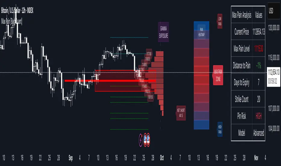
Options Max Pain Calculator [BackQuant]Options Max Pain Calculator
A visualization tool that models option expiry dynamics by calculating "max pain" levels, displaying synthetic open interest curves, gamma exposure profiles, and pin-risk zones to help identify where market makers have the least payout exposure.
What is Max Pain?
Max Pain is the theoretical expiration price where the total dollar value of outstanding options would be minimized. At this price level, option holders collectively experience maximum losses while option writers (typically market makers) have minimal payout obligations. This creates a natural gravitational pull as expiration approaches.
Core Features
Visual Analysis Components:
Max Pain Line: Horizontal line showing the calculated minimum pain level
Strike Level Grid: Major support and resistance levels at key option strikes
Pin Zone: Highlighted area around max pain where price may gravitate
Pain Heatmap: Color-coded visualization showing pain distribution across prices
Gamma Exposure Profile: Bar chart displaying net gamma at each strike level
Real-time Dashboard: Summary statistics and risk metrics
Synthetic Market Modeling**
Since Pine Script cannot access live options data, the indicator creates realistic synthetic open interest distributions based on configurable market parameters including volume patterns, put/call ratios, and market maker positioning.
How It Works
Strike Generation:
The tool creates a grid of option strikes centered around the current price. You can control the range, density, and whether strikes snap to realistic market increments.
Open Interest Modeling:
Using your inputs for average volume, put/call ratios, and market maker behavior, the indicator generates synthetic open interest that mirrors real market dynamics:
Higher volume at-the-money with decay as strikes move further out
Adjustable put/call bias to reflect current market sentiment
Market maker inventory effects and typical short-gamma positioning
Weekly options boost for near-term expirations
Pain Calculation:
For each potential expiry price, the tool calculates total option payouts:
Call options contribute pain when finishing in-the-money
Put options contribute pain when finishing in-the-money
The strike with minimum total pain becomes the Max Pain level
Gamma Analysis:
Net gamma exposure is calculated at each strike using standard option pricing models, showing where hedging flows may be most intense. Positive gamma creates price support while negative gamma can amplify moves.
Key Settings
Basic Configuration:
Number of Strikes: Controls grid density (recommended: 15-25)
Days to Expiration: Time until option expiry
Strike Range: Price range around current level (recommended: 8-15%)
Strike Increment: Spacing between strikes
Market Parameters:
Average Daily Volume: Baseline for synthetic open interest
Put/Call Volume Ratio: Market sentiment bias (>1.0 = bearish, <1.0 = bullish) It does not work if set to 1.0
Implied Volatility: Current option volatility estimate
Market Maker Factors: Dealer positioning and hedging intensity
Display Options:
Model Complexity: Simple (line only), Standard (+ zones), Advanced (+ heatmap/gamma)
Visual Elements: Toggle individual components on/off
Theme: Dark/Light mode
Update Frequency: Real-time or daily calculation
Reading the Display
Dashboard Table (Top Right):
Current Price vs Max Pain Level
Distance to Pain: Percentage gap (smaller = higher pin risk)
Pin Risk Assessment: HIGH/MEDIUM/LOW based on proximity and time
Days to Expiry and Strike Count
Model complexity level
Visual Elements:
Red Line: Max Pain level where payout is minimized
Colored Zone: Pin risk area around max pain
Dotted Lines: Major strike levels (green = support, orange = resistance)
Color Bar: Pain heatmap (blue = high pain, red = low pain/max pain zones)
Horizontal Bars: Gamma exposure (green = positive, red = negative)
Yellow Dotted Line: Gamma flip level where hedging behavior changes
Trading Applications
Expiration Pinning:
When price is near max pain with limited time remaining, there's increased probability of gravitating toward that level as market makers hedge their positions.
Support and Resistance:
High open interest strikes often act as magnets, with max pain representing the strongest gravitational pull.
Volatility Expectations:
Above gamma flip: Expect dampened volatility (long gamma environment)
Below gamma flip: Expect amplified moves (short gamma environment)
Risk Assessment:
The pin risk indicator helps gauge likelihood of price manipulation near expiry, with HIGH risk suggesting potential range-bound action.
Best Practices
Setup Recommendations
Start with Model Complexity set to "Standard"
Use realistic strike ranges (8-12% for most assets)
Set put/call ratio based on current market sentiment
Adjust implied volatility to match current levels
Interpretation Guidelines:
Small distance to pain + short time = high pin probability
Large gamma bars indicate key hedging levels to monitor
Heatmap intensity shows strength of pain concentration
Multiple nearby strikes can create wider pin zones
Update Strategy:
Use "Daily" updates for cleaner visuals during trading hours
Switch to "Every Bar" for real-time analysis near expiration
Monitor changes in max pain level as new options activity emerges
Important Disclaimers
This is a modeling tool using synthetic data, not live market information. While the calculations are mathematically sound and the modeling realistic, actual market dynamics involve numerous factors not captured in any single indicator.
Max pain represents theoretical minimum payout levels and suggests where natural market forces may create gravitational pull, but it does not guarantee price movement or predict exact expiration levels. Market gaps, news events, and changing volatility can override these dynamics.
Use this tool as additional context for your analysis, not as a standalone trading signal. The synthetic nature of the data makes it most valuable for understanding market structure and potential zones of interest rather than precise price prediction.
Technical Notes
The indicator uses established option pricing principles with simplified implementations optimized for Pine Script performance. Gamma calculations use standard financial models while pain calculations follow the industry-standard definition of minimized option payouts.
All visual elements use fixed positioning to prevent movement when scrolling charts, and the tool includes performance optimizations to handle real-time calculation without timeout errors.
Implied Volatility RangeThe Implied Volatility Range is a forward-looking tool that transforms option market data into probability ranges for future prices. Based on the lognormal distribution of asset prices assumed in modern option pricing models, it converts the implied volatility curve into a volatility cone with dynamic labels that show the market’s expectations for the price distribution at a specific point in time. At the selected future date, it displays projected price levels and their percentage change from today’s close across 1, 2, and 3 standard deviation (σ) ranges:
1σ range = ~68.2% probability the price will remain within this range.
2σ range = ~95.4% probability the price will remain within this range.
3σ range = ~99.7% probability the price will remain within this range.
What makes this indicator especially useful is its ability to incorporate implied volatility skew. When only ATM IV (%) is entered, the indicator displays the standard Black–Scholes lognormal distribution. By adding High IV (%) and Low IV (%) values tied to strikes above and below the current price, the indicator interpolates between these inputs to approximate the implied volatility skew. This adjustment produces a market-implied probability distribution that indicates whether the option market is leaning bullish or bearish, based on the data entered in the menu:
ATM IV (%) = Implied volatility at the current spot price (at-the-money).
High IV (%) = Implied volatility at a strike above the current spot price.
High Strike = Strike price corresponding to the High IV input (OTM call).
Low IV (%) = Implied volatility at a strike below the current spot price.
Low Strike = Strike price corresponding to the Low IV input (OTM put).
Expiration (Day, Month, Year) = Option expiration date for the projection.
Once these inputs are entered, the indicator calculates implied probability ranges and, if both High IV and Low IV values are provided, adjusts for skew to approximate the option market’s distribution. If no implied volatility data is supplied, the indicator defaults to a lognormal distribution based on historical volatility, using past realized volatility over the same forward horizon. This keeps the tool functional even without implied volatility inputs, though in that case the output represents only an approximation of ATM IV, not the actual market view.
In summary, the Implied Volatility Range is a powerful tool that translates implied volatility inputs into a clear and practical estimate of the market’s expectations for future prices. It allows traders to visualize the probability of price ranges while also highlighting directional bias, a dimension often difficult to interpret from traditional implied volatility charts. It should be emphasized, however, that this tool reflects only the market’s expectations at a specific point in time, which may change as new information and trading activity reshape implied volatility.

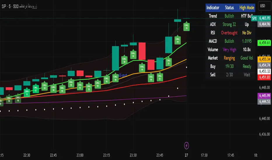
Multi-Timeframe Options Strategy with Dynamic Scoring System## Multi-Timeframe Options Strategy with Dynamic Scoring System
### Overview
This indicator combines 12 technical analysis tools using a proprietary 30-point scoring system to generate options trading signals (CALL/PUT). It's designed for traders seeking confluence-based entries with multiple confirmation layers.
### How the Scoring System Works
The indicator evaluates market conditions across three categories:
**Trend Analysis (9 points maximum):**
- EMA Alignment (9, 21, 50, 200): Checks if moving averages are properly stacked (3 points)
- ADX Trend Strength: Confirms trend momentum above 25 threshold (3 points)
- Higher Timeframe Confirmation: Validates signals against larger timeframe trend (3 points)
**Momentum Indicators (7 points maximum):**
- RSI Position & Direction: Optimal zones 40-65 for buys, 35-60 for sells (2 points)
- MACD Signal Line Cross: Momentum confirmation (2 points)
- Stochastic Oscillator: Overbought/oversold conditions (2 points)
- Bollinger Band Position: Price relative to middle band (1 point)
**Market Quality Filters (4 points maximum):**
- Volume Confirmation: 1.5x average volume requirement (2 points)
- VWAP Position: Trend alignment check (1 point)
- ATR Volatility: Ensures adequate price movement (1 point)
### Key Features
**1. Fair Value Gaps (FVG)**
- Identifies price inefficiencies between candles
- Bullish FVG: Current low > high (potential support)
- Bearish FVG: Current high < low (potential resistance)
- Visual representation with colored boxes on chart
**2. Three Operating Modes**
- Normal Mode: Minimum 10 points - balanced signal frequency
- High Mode: Minimum 15 points - fewer but stronger signals
- Ultra Mode: Minimum 20 points - only highest quality setups
**3. Protection Mechanisms**
- Bollinger Band squeeze detection avoids ranging markets
- Prevents conflicting signals (no simultaneous CALL/PUT)
- 5-bar minimum cooldown between signals
- Filters extreme RSI readings (>75 or <25)
**4. Risk Management**
- Three profit targets: 0.5%, 1%, 1.5%
- Stop loss: 0.5% or ATR-based
- Visual target lines with entry/exit levels
### How Components Work Together
The indicator creates a comprehensive market analysis by combining:
- **EMAs** provide the trend structure framework
- **Oscillators** (RSI, Stochastic) identify optimal entry timing
- **ADX** confirms trend strength to filter weak signals
- **Volume** validates institutional participation
- **Higher timeframe** acts as a directional filter
Each component contributes points to either bullish or bearish scoring. Signals only generate when one direction significantly outweighs the other and meets minimum thresholds.
### Usage Instructions
1. **Select Mode**: Choose Normal/High/Ultra based on your trading style
2. **Monitor Dashboard**: Check real-time scoring and market conditions
3. **Wait for Signals**: Main BUY/SELL labels appear when criteria met
4. **Follow Targets**: Use automated TP and SL levels for risk management
5. **Candle Labels**: Optional CALL/PUT labels show building momentum
### Dashboard Information
The dashboard displays:
- Current trend direction and HTF confirmation
- ADX strength and direction
- RSI status with divergence detection
- MACD momentum state
- Volume multiplier
- Market condition (trending/ranging)
- Live scoring for both directions
### Important Notes
- This is a technical analysis tool, not financial advice
- Past performance does not guarantee future results
- Always use proper risk management
- Test thoroughly on demo before live trading
### Originality
This indicator's unique value comes from:
1. The 30-point weighted scoring system that prioritizes different factors
2. Integration of Fair Value Gaps with traditional indicators
3. Multi-mode operation allowing traders to adjust signal frequency
4. Higher timeframe validation system
5. Comprehensive filtering to reduce false signals
The combination creates a systematic approach to options trading that goes beyond simple indicator mashups by providing clear, scored reasoning for each signal.
---
### Updates and Support
For questions or suggestions, please comment below. The indicator will be updated based on community feedback while maintaining compliance with all platform rules.
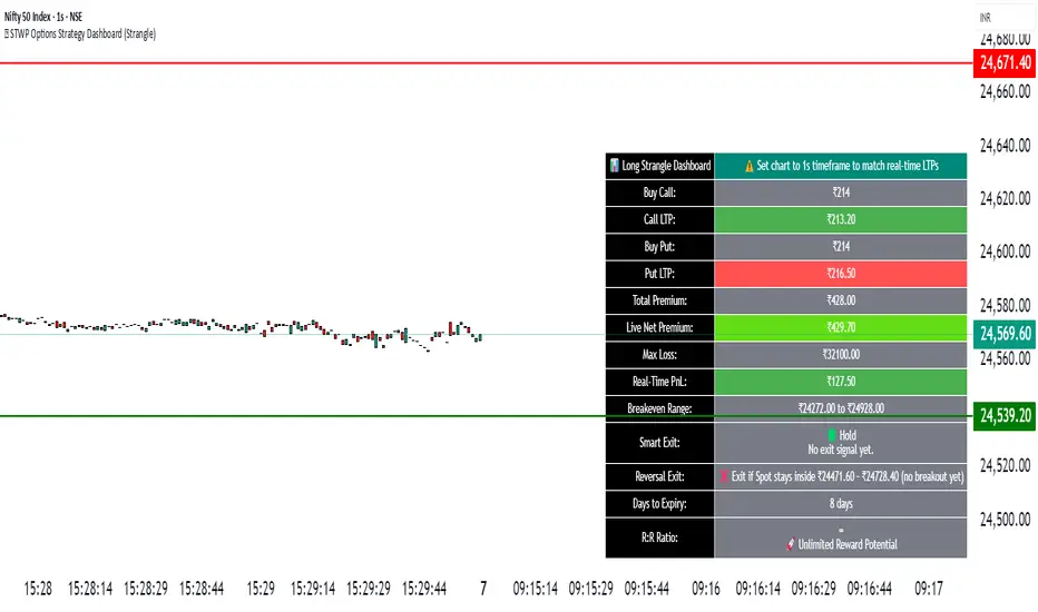
🧠 STWP Options Strategy Dashboard (Strangle)________________________________________
🧠 STWP Options Strategy Dashboard (Long/Short Strangle)
Author: simpletradewithpatience
Markets: NSE (India)
Best timeframe: 1-second chart
Built with: Pine Script v5
________________________________________
📌 Overview
A real-time options strategy dashboard tailored for NSE Strangles:
✅ Long Strangle → Buy OTM CE + Buy OTM PE
✅ Short Strangle → Sell OTM CE + Sell OTM PE
This tool offers a tick-by-tick visual dashboard to monitor:
Live premiums, PnL, breakeven levels, expiry decay, and Greeks.
It is designed **for manual use only** — no trade automation.
Ideal for strategy tracking, education, and decision support.
________________________________________
📌 Key Features
✅ Long & Short Strangle support
✅ Real-time tracking of CE & PE legs (LTPs, PnL, Premium)
✅ Max Loss / Profit calculator
✅ Breakeven range calculator
✅ Risk:Reward verdict (dynamic logic)
✅ Smart Exit logic with trade-specific warnings
✅ Reversal Exit logic based on spot compression
✅ Optional manual Greeks input (Delta, Gamma, Theta, IV)
✅ Greek-based bias: Bullish / Bearish / Neutral
✅ Days to Expiry (DTE) calculator
✅ Clean dashboard UI (emoji-labeled)
✅ Built for Indian NSE Options
✅ Designed to run on **1-second chart only**
________________________________________
📌 Option Symbol Inputs (LTP Tracking)
✅ Call Symbol: OTM CE (above spot)
✅ Put Symbol: OTM PE (below spot)
🎯 Symbol Tips: Use NSE format like `NSE:RELIANCE25JUL3050CE` and `PE`
⚠️ Valid option symbols are critical for accurate PnL tracking
________________________________________
📌 Strategy Parameters
- Call & Put Strike Prices
- Buy/Sell Premiums for both legs
- Lot Size & Number of Lots
- Loss Bearable Amount (₹)
- Expiry Date & Time (used for DTE tracking)
________________________________________
📌 Smart Exit Logic
🧠 A dynamic assistant that checks:
✅ Profit Target Hit
❌ Loss Threshold Breach
⏳ Expiry nearing with no breakout
🟡 Partial Profit Zone
📉 Guides the trader to avoid emotional decisions.
All messages are suggestive only — no trade recommendations.
________________________________________
📌 Reversal Exit Logic (Strangle Specific)
🔁 Detects if spot is trapped between the call/put strikes
➡️ If no breakout from the average strike zone, exit is suggested
⚠️ Helps prevent theta decay trap in Long Strangles
________________________________________
📌 Greeks (Optional Input)
🔹 Manual input for Delta, Gamma, Theta, and IV for both legs
🔍 Dashboard shows:
- Net Delta: Directional Bias
- Net Gamma: Volatility Risk
- Net Theta: Time Decay Risk
- Avg IV: Vol Crush or Low IV Warning
- Verdict: 🟢 Strong / 🟡 Moderate / ❌ Risky
________________________________________
📌 Dashboard Display
📈 Strategy Type: Long or Short Strangle
💹 Call & Put Premiums (Entry vs LTP)
📊 Total Net Premium
📉 Real-time PnL
📐 Breakeven Range (Lower & Upper)
🧠 Smart Exit verdict
🔁 Reversal Exit guidance
📆 Days to Expiry (DTE)
📊 R:R Ratio & Quality Verdict
📐 Greeks Summary + Risk Flags (if enabled)
________________________________________
⚠️ Important Notes
✅ Built for NSE Options only
✅ Designed for Long/Short Strangle strategies
✅ Use on 1-second chart only
❌ Will not function correctly on higher timeframes
✅ This is a manual dashboard — **no orders or automation**
✅ For educational, research, and tracking use only
❌ Not financial advice or a trading recommendation
________________________________________
💬 How to Use This Dashboard
1️⃣ Choose your strategy: Long or Short Strangle
2️⃣ Enter valid CE & PE symbols (OTM strikes)
3️⃣ Fill in strike prices and premiums (Buy/Sell)
4️⃣ Optionally enter Greeks (Delta, Gamma, etc.)
5️⃣ Set your expiry date
6️⃣ Monitor PnL, risk zones, exit suggestions
7️⃣ Use alerts (if enabled) for major thresholds
________________________________________
🤝 Final Note
This tool was built with patience and care by simpletradewithpatience to help fellow options traders trade more objectively, systematically, and confidently.
Feel free to share feedback on Tradingview.
Happy Trading! 📈
Stay disciplined. Stay smart.
________________________________________
🔠 Glossary
PnL – Profit & Loss
LTP – Last Traded Price
IV – Implied Volatility
DTE – Days to Expiry
ROI – Return on Investment
R:R – Risk to Reward Ratio
CE / PE – Call / Put Option
SEBI – Securities and Exchange Board of India
________________________________________
⚠️ Disclaimer
This script is for educational and research purposes only.
I am not a SEBI-registered advisor.
No buy or sell recommendations are made.
Trading options involves significant risk.
Use proper risk management and always consult a licensed advisor if in doubt.
The author is not responsible for any financial losses incurred.
By using this tool, you agree to these terms.
________________________________________
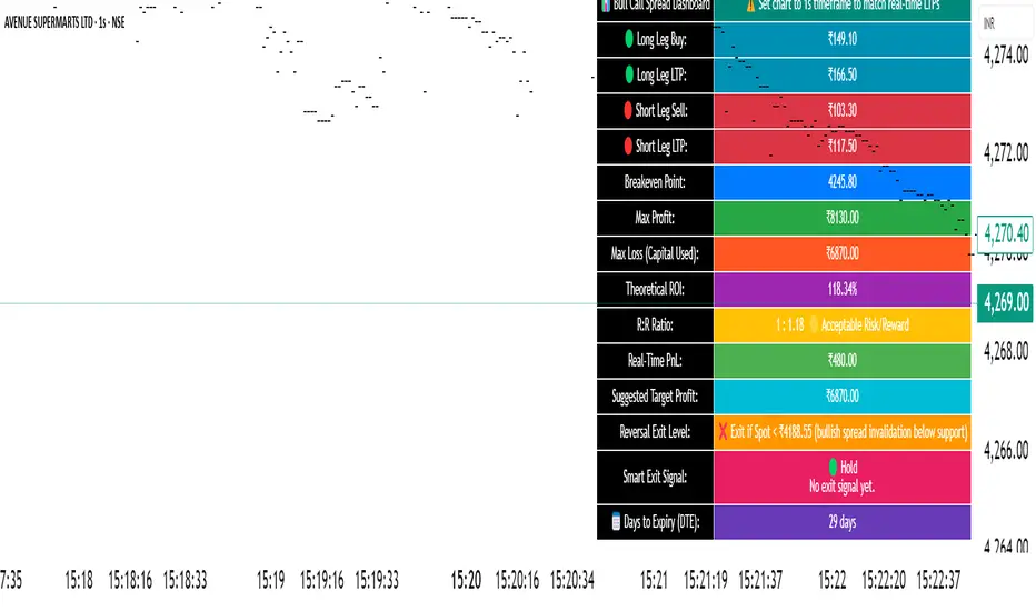
🧠 STWP Dashboard (Bull Call Spread / Bear Put Spread)________________________________________
🧠 STWP Options Strategy Dashboard (Bull Call Spread/ Bear Put Spread)
Author: @simpletradewithpatience
Markets: NSE (India)
Best timeframe: 1-second chart
Built with: Pine Script v5
________________________________________
📌 Overview
A real-time options strategy dashboard tailored for NSE traders, designed for two-leg spreads:
✅ Bull Call Spread → Buy Lower Strike CE, Sell Higher Strike CE
✅ Bear Put Spread → Buy Higher Strike PE, Sell Lower Strike PE
This tool gives you a real-time, color-coded visual interface with:
Entry premiums & breakeven levels
Live LTPs & PnL
ROI & Risk: Reward
Smart Exit logic
Alerts for expiry, Greeks, and PnL events
It’s fully manual, for educational and tracking use only — not for automated trading.
________________________________________
📌 Key Features
✅ Track Bull Call & Bear Put Spreads
✅ Live LTP tracking via symbol input
✅ Real-time PnL, breakeven, max profit/loss
✅ ROI & Risk:Reward calculation
✅ Smart Exit logic with trade verdicts
✅ Invalidation logic with Reversal Exit
✅ Manual input of Greeks (Delta, Gamma, Theta, IV%)
✅ Greek-based alerts for Gamma Risk, IV Crush, Theta Decay
✅ Days to Expiry (DTE) tracking
✅ Fully customizable alert system
✅ Clean, emoji-labelled dashboard UI
✅ Built for Indian NSE options only
✅ Requires 1-second chart for correct data
________________________________________
📌 Option Symbol Inputs (LTP Tracking)
✅ Long Leg Symbol (Buy): Lower strike CE (Bull Call) or higher strike PE (Bear Put)
✅ Short Leg Symbol (Sell): Higher strike CE (Bull Call) or lower strike PE (Bear Put)
✅ Symbol Tips: Use TradingView's dropdown to select NSE option symbols like NSE:RELIANCE25JUL3000CE
⚠️ Providing valid option symbols is crucial — it powers all live tracking and calculations.
________________________________________
📌 Trade Setup Parameters
Spot Price at Entry
Long & Short Strike Prices
Buy Price (Long Leg)
Sell Price (Short Leg)
Lot Size & Number of Lots
Loss Bearable Amount (₹) → Used by Smart Exit logic to issue early warnings
________________________________________
📌 Expiry Date Input
Expiry Year, Month, and Day
🎯 Used to calculate Days to Expiry (DTE) and enable:
⏱️ Expiry alerts like “Less than 2 Days”, “Theta Risk”, and more
📉 Smart Exit logic adjusts based on time decay
________________________________________
📌 Greeks (Optional)
🔹 Default Mode: Don’t Enter Greeks
🔹 Optional Mode: Enter Greeks for both legs (Delta, Gamma, Theta, IV%)
🔍 Enabling Greeks unlocks:
Net Delta, Gamma, Theta, IV
Greek-based warnings (e.g. Gamma Risk, Theta Risk)
A dashboard Greek Verdict:
🟢 Conservative 🟡 Moderate Risk 🔴 Aggressive Risk
________________________________________
📌 Dashboard Display
🎯 Strategy Type (Bull or Bear Spread)
📈 Entry Premiums & Live LTPs
💹 Breakeven, Max Profit/Loss, Net Premium
📊 ROI % & Risk:Reward (with verdict)
📉 Real-time PnL using tick-by-tick data
🚦 Smart Exit verdict: Hold, Exit Soon, or Book Profit
🔁 Reversal Exit Price (spread invalidation logic)
📆 Days to Expiry (DTE)
📐 Greek Data (if enabled) with Net & Average values
⚠️ Greek Risk Verdict for managing directional risk
________________________________________
📌 Alert System (Built-in Alerts)
🎯 Target Profit Hit
❌ Max Loss Reached
🛑 Loss Bearable Limit Breached
📍 Hold Signal
📉 Book Loss / Exit Soon
⏳ Expiry Nearing
⚠️ Spread Invalidation Alert (via Reversal Price breach)
💥 High Gamma Risk (if Gamma > ±0.05)
📉 High IV Alert (if IV > 35%)
🚨 Combined Master Alert – fires if any key condition is triggered
________________________________________
📌 Smart Exit System
⚙️ Context-aware, dynamic trade assistant
✅ Analyses real-time market, PnL, expiry risk, reversal risk
✅ Gives exit suggestions based on:
Time decay
Price invalidation
Breach of defined loss/profit thresholds
✅ Keeps you objective — no emotional exits
________________________________________
📌 Reversal Exit Logic
🔁 Detects directional failure in spread structure
Bull Call Spread: Invalidation = Spot falls 25% of net premium below long strike
Bear Put Spread: Invalidation = Spot rises 25% of net premium above short strike
📉 Alerts you to exit even before loss appears
🎯 Designed for directional traders using spread logic
💡 Acts as a breakdown or breakout filter
________________________________________
⚠️ Important Notes
✅ Built for NSE Options – not for global exchanges
✅ Only for Bull Call & Bear Put spreads
✅ Use on 1-second chart only
❌ Will not work properly on higher timeframes
✅ Manual tool only – doesn’t place trades
✅ For educational and research use only
________________________________________
💬 How to Use This Dashboard
Choose Your Strategy
Bull Call or Bear Put
Input Symbols & Strikes
Use Tradingview dropdown to select accurate NSE option symbols
Enter Buy/Sell Prices
Add premiums, lot size, no. of lots
(Optional) Enable Greeks
Add Delta, Gamma, Theta, IV for both legs
Set Expiry Date
Year, Month, Day — activates DTE & expiry alerts
Monitor Dashboard
Live PnL, Max P/L, ROI, R:R, Smart Exit, Reversal Levels
(Optional) Enable Alerts
Get notified for PnL events, expiry risk, Greek risk, spread failure
________________________________________
🤝 Final Note
This tool was built with patience and care by @simpletradewithpatience to help fellow options traders trade more objectively, systematically, and confidently.
Feel free to share feedback on Tradingview.
Happy Trading! 📈
Stay disciplined. Stay smart.
________________________________________
🔠 Glossary
PnL – Profit & Loss
LTP – Last Traded Price
IV – Implied Volatility
DTE – Days to Expiry
ROI – Return on Investment
R:R – Risk to Reward Ratio
CE / PE – Call / Put Option
SEBI – Securities and Exchange Board of India
________________________________________
⚠️ Disclaimer
This script is for educational and research purposes only.
I am not a SEBI-registered advisor.
No buy or sell recommendations are made.
Trading options involves significant risk.
Use proper risk management and always consult a licensed advisor if in doubt.
The author is not responsible for any financial losses incurred.
By using this tool, you agree to these terms.
________________________________________
Simulated OI Proxy with Trend Table1. In Simple Terms
This script mimics open interest analysis using price and volume changes.
It visually marks possible bullish and bearish setups directly on your price chart.
It’s especially useful for markets where real OI data is not available (like Indian stocks)
=======================================================================
2. Calculating Price and Volume Changes
close - close: Calculates the change in closing price from the previous bar to the current bar.
volume - volume: Calculates the change in trading volume from the previous bar to the current bar.
Purpose:
These calculations help determine if price and volume are increasing or decreasing, which is used as a proxy for open interest (OI) since real OI data may not be available.
===================================================================
3. Proxy Logic for OI Signals
long_buildup: Both price and volume are rising. This suggests new buying interest (bullish signal).
short_buildup: Price is falling but volume is rising. This suggests new short positions are being opened (bearish signal).
short_covering: Price is rising but volume is falling. This suggests shorts are closing their positions, causing a price rise (cautiously bullish).
long_unwinding: Both price and volume are falling. This suggests long positions are being closed (cautiously bearish).
====================================================================
4. Plotting the Signals
plotshape(condition, ...): Draws a shape on the chart when the condition is true.
Long Buildup: Green triangle below the bar (bullish).
Short Buildup: Red triangle above the bar (bearish).
Short Covering: Blue circle below the bar (cautiously bullish).
Long Unwinding: Orange circle above the bar (cautiously bearish).
======================================================================
5. Signal Detection:
The script checks price and volume changes to determine which signal is active.
Trend Assignment:
It assigns a text label and color for the detected trend.
Table Display:
A table appears at the top-right of your chart, showing the current trend based on the latest bar.

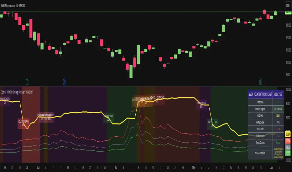
Options Volatility Strategy Analyzer [TradeDots]The Options Volatility Strategy Analyzer is a specialized tool designed to help traders assess market conditions through a detailed examination of historical volatility, market benchmarks, and percentile-based thresholds. By integrating multiple volatility metrics (including VIX and VIX9D) with color-coded regime detection, the script provides users with clear, actionable insights for selecting appropriate options strategies.
📝 HOW IT WORKS
1. Historical Volatility & Percentile Calculations
Annualized Historical Volatility (HV): The script automatically computes the asset’s historical volatility using log returns over a user-defined period. It then annualizes these values based on the chart’s timeframe, helping you understand the asset’s typical volatility profile.
Dynamic Percentile Ranks: To gauge where the current volatility level stands relative to past behavior, historical volatility values are compared against short, medium, and long lookback periods. Tracking these percentile ranks allows you to quickly see if volatility is high or low compared to historical norms.
2. Multi-Market Benchmark Comparison
VIX and VIX9D Integration: The script tracks market volatility through the VIX and VIX9D indices, comparing them to the asset’s historical volatility. This reveals whether the asset’s volatility is outpacing, lagging, or remaining in sync with broader market volatility conditions.
Market Context Analysis: A built-in term-structure check can detect market stress or relative calm by measuring how VIX compares to shorter-dated volatility (VIX9D). This helps you decide if the present environment is risk-prone or relatively stable.
3. Volatility Regime Detection
Color-Coded Background: The analyzer assigns a volatility regime (e.g., “High Asset Vol,” “Low Asset Vol,” “Outpacing Market,” etc.) based on current historical volatility percentile levels and asset vs. market ratios. A color-coded background highlights the regime, enabling traders to quickly interpret the market’s mood.
Alerts on Regime Changes & Spikes: Automated alerts warn you about any significant expansions or contractions in volatility, allowing you to react swiftly in changing conditions.
4. Strategy Forecast Table
Real-Time Strategy Suggestions: At the close of each bar, an on-chart table generates suggested options strategies (e.g., selling premium in high volatility or buying premium in low volatility). These suggestions provide a quick summary of potential tactics suited to the current regime.
Contextual Market Data: The table also displays key statistics, such as VIX levels, asset historical volatility percentile, or ratio comparisons, helping you confirm whether volatility conditions warrant more conservative or more aggressive strategies.
🛠️ HOW TO USE
1. Select Your Timeframe: The script supports multiple timeframes. For short-term trading, intraday charts often reveal faster shifts in volatility. For swing or position trading, daily or weekly charts may be more stable and produce fewer false signals.
2. Check the Volatility Regime: Observe the background color and on-chart labels to identify the current regime (e.g., “HIGH ASSET VOL,” “LOW VOL + LAGGING,” etc.).
3. Review the Forecast Table: The table suggests strategy ideas (e.g., iron condors, long straddles, ratio spreads) depending on whether volatility is elevated, subdued, or spiking. Use these as a starting point for designing trades that match your risk tolerance.
4. Combine with Additional Analysis: For optimal results, confirm signals with your broader trading plan, technical tools (moving averages, price action), and fundamental research. This script is most effective when viewed as one component in a comprehensive decision-making process.
❗️LIMITATIONS
Directional Neutrality: This indicator analyzes volatility environments but does not predict price direction (up/down). Traders must combine with directional analysis for complete strategy selection.
Late or Missed Signals: Since all calculations require a bar to close, sharp intrabar volatility moves may not appear in real-time.
False Positives in Choppy Markets: Rapid changes in percentile ranks or VIX movements can generate conflicting or premature regime shifts.
Data Sensitivity: Accuracy depends on the availability and stability of volatility data. Significant gaps or unusual market conditions may skew results.
Market Correlation Assumptions: The system assumes assets generally correlate with S&P 500 volatility patterns. May be less effective for:
Small-cap stocks with unique volatility drivers
International stocks with different market dynamics
Sector-specific events disconnected from broad market
Cryptocurrency-related assets with independent volatility patterns
RISK DISCLAIMER
Options trading involves substantial risk and is not suitable for all investors. Options strategies can result in significant losses, including the total loss of premium paid. The complexity of options strategies requires thorough understanding of the risks involved.
This indicator provides volatility analysis for educational and informational purposes only and should not be considered as investment advice. Past volatility patterns do not guarantee future performance. Market conditions can change rapidly, and volatility regimes may shift without warning.
No trading system can guarantee profits, and all trading involves the risk of loss. The indicator's regime classifications and strategy suggestions should be used as part of a comprehensive trading plan that includes proper risk management, directional analysis, and consideration of broader market conditions.
Options Chart Lite [Pt]█ Options Chart Lite
────────────────────────────
█ Introduction
Options Chart Lite is a simplified version of the full Options Chart+ tool — created for traders who want a clean and easy way to visualize option volume around price without extra complexity.
It displays live call and put volume and pricing directly on your TradingView chart, centered around the most relevant strikes for the selected expiry.
────────────────────────────
█ What Is Options Chart Lite ?
Options Chart Lite is a tool that shows real-time call and put activity in a clean, strike-by-strike table.
It provides:
- Side-by-side call/put volume and pricing
- Live table centered on current price
- Total call and put volume summary
- Quick insight into flow without overlays or clutter
────────────────────────────
█ Key Features
Visual Option Table
- Volume and price for calls and puts
- Table auto-centers around current price
- Up to 20 strikes shown
Total Volume Summary
- Call vs put volume shown at the bottom
Formatted Expiry + Timeframe
- Full expiry display (e.g. “Fri Apr 11, 2025”)
- Fixed to 1D timeframe
Reset & Warnings
- Button to reset strike range
- Optional delayed data notice
────────────────────────────
█ Inputs
Option Expiry Date (YYMMDD): Must match a valid expiry
Strike Increment: Strike spacing (e.g., 1, 2.5, 5)
Reference Strike Denominator: Rounds price to valid strike
Font Size Option: Choose Auto, Tiny, Small, or Normal
Reset Button: Re-centers if price moves
Delayed Data Warning: Toggle display of warning
────────────────────────────
█ Use Cases
Spot Key Strikes
See which strikes have the most activity.
Quick Flow Insights
Volume bias without opening an option chain.
Prep Levels
Align price action with strike flow.
Volume Skew Snapshot
Check if calls or puts dominate.
────────────────────────────
█ Known Limitations
- Invalid Expiry or Strike Inputs Will Error
Inputs must match real listed options for the symbol.
- Options Data Must Be Available
Volume will appear as 0 if TradingView data isn’t accessible.
- Strike Range is Limited
Script renders ~20 strikes. Use Reset Indicator if price moves too far.

Options Chart+ [Pt]█ Introduction
Since the launch of options data support on TradingView, the landscape for retail options traders has started to shift. But until now, no tool in the public TradingView library has offered a full-featured, visual-first interface for reading option strike activity directly from your chart.
www.tradingview.com
Options Chart+ changes that — bringing an institutional-style strike analysis interface to TradingView.
It reads the option chain for any symbol and expiry, dynamically builds a strike-by-strike volume and price table, highlights top areas of market activity, and helps you interpret directional sentiment through both total and skew-adjusted implied moves.
────────────────────────────
█ What Is Options Chart+ ?
Options Chart+ is a premium script for analyzing call and put option volumes and pricing for any option chain that's readily available on TradingView.
It provides a real-time, on-chart display of:
- Strike-Level Volume and Price Table
- Gradient Heatmaps for Volume Activity
- Overlayed Top Strikes on the Chart
- Implied Move and Directional Bias Metrics
By visualizing where options traders are concentrating their positioning, this tool helps uncover potential support/resistance zones, directional bets, and key gamma levels — all from the flow.
────────────────────────────
█ Key Features
Visual Option Chain Table
- Centers around the current price
- Real-time volume and price per strike
- Clean formatting with total summaries
Gradient Volume Coloring
- Highlights activity using customizable color gradients
- Makes volume spikes obvious at a glance
Top Strike Overlays
- Automatically highlights top volume call/put strikes
- Overlays labeled lines on the chart for price context
Implied Move and Directional Bias
- ATM straddle = Total Implied Move
- Volume-weighted extrinsics = Directional Implied Move (DIM)
- Shows skew-based bias: bullish or bearish
────────────────────────────
█ Inputs & Customization
Option Expiry Date (YYMMDD): Must match valid options for the symbol
Strike Increment: Matches strike spacing (e.g., 1, 2.5, 5)
Reference Strike Denominator: Rounds the center strike
Volume Timeframe: Any valid chart timeframe
Gradient Volume Coloring: Toggle on/off
Call/Put Volume Colors: Fully customizable
Draw Top Strike Lines: Enables chart overlays
Start / End Offset: Customize overlay length
Font Size: Auto, Tiny, Small, or Normal
Delayed Data Warning: Adds footnote in the table
Reset Button: Re-centers the tool if price moves too far
────────────────────────────
█ Use Cases
1. Spotting High-Interest Strikes
Use gradient heatmaps and overlays to see where volume is clustering.
Example: Heavy calls at 4200 may act as a magnet or gamma level — perfect for breakout or fade setups.
2. Interpreting Sentiment with DIM
Gauge where the flow is leaning directionally.
Example: Bullish DIM = call extrinsics outweigh puts → sentiment skewed bullish.
3. Sizing Risk Around Implied Movement
Use Total Implied Move to set range boundaries.
Example: Avoid selling premium inside the expected move unless risk is tight.
4. Combining Volume and Price Action
Overlay strikes with price structure for confluence trades.
Example: A heavy put strike with price holding = potential bounce zone.
5. Structuring Straddles or Strangles
Use volume skew to inform multi-leg positions.
Example: If call side is bid up, lean strangle wider to the upside.
────────────────────────────
█ Known Limitations
- Invalid Expiry or Strike Inputs Will Error
You are responsible for selecting a valid expiry and strike increment that matches the symbol’s listed options.
- Options Data Must Be Available
This tool depends on TradingView's options feed. If you do not have access (delayed or real-time), the script will fail to load.
- Strike Range is Limited
Renders ~20 strikes max to preserve clarity. If price moves beyond that, use the Reset Indicator input.
────────────────────────────
█ Final Thoughts
Options Chart+ is built for traders who operate on flow, structure, and sentiment. It lets you trade with confidence by showing where the real positioning is happening — visually, clearly, and in real-time.
If you:
- Think in terms of option flow
- Trade around volume levels or gamma exposure
- Want faster access to skew and sentiment
- Or just need clarity over chaos in an options chain...
This tool is for you.

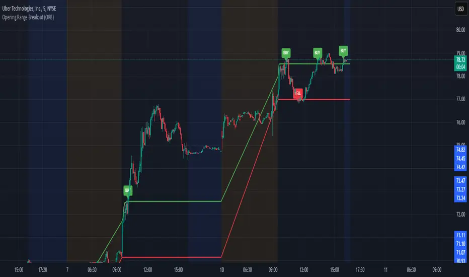
Opening Range Breakout (ORB)This is an Opening Range Break indicator. Best if used on a 5 minute chart. It plots the opening 30 minutes high and low of a ticker. (meaning mostly for stocks, options, etfs) and then it alerts a buy signal upon break of opening high and a sell signal upon break of opening low. This is a day trading type of indicator and there is a new opening range everyday.
Monthly Options Expiration 2025Monthly Options Expiration 2025
Plots the monthly options expiration dates in advance for the year 2025.
Happy trading and all the best.
Option Time ValueThis TradingView script calculates and visualizes the time value of an option (Call or Put) based on its market price and intrinsic value. The time value represents the premium paid for the option above its intrinsic value, and it is a key metric for analyzing the cost of holding an option.
This script is suitable for traders analyzing options on indices or stocks, such as the NIFTY 50, and supports both Call and Put options. By dynamically extracting the strike price and option type from the input symbol, it adapts seamlessly to the selected instrument.
Key Features:
Dynamic Instrument Selection:
Users can input the underlying asset (e.g., NSE:NIFTY) and the specific option instrument (e.g., NSE:NIFTY250327C24000 for a Call or NSE:NIFTY250327P24000 for a Put).
Automatic Option Type Detection:
The script detects whether the option is a Call or a Put by parsing the input symbol for the characters "C" (Call) or "P" (Put).
Dynamic Strike Price Extraction:
The strike price is dynamically extracted from the input option symbol, eliminating the need for hardcoding and reducing user errors.
Key Metrics Plotted:
Time Value: The premium paid above the intrinsic value, plotted in blue.
Intrinsic Value: The calculated intrinsic value of the option, plotted in green.
Seamless Integration:
Designed for ease of use and integration into existing TradingView setups.
Automatically adjusts to the timeframe and pricing data of the selected instruments.
