Six Meridian Divine Swords [theUltimator5]The Six Meridian Divine Sword is a legendary martial arts technique in the classic wuxia novel “Demi-Gods and Semi-Devils” (天龙八部) by Jin Yong (金庸). The technique uses powerful internal energy (qi) to shoot invisible sword-like energy beams from the six meridians of the hand. Each of the six fingers/meridians corresponds to a “sword,” giving six different sword energies.
The Six Meridian Divine Swords indicator is a compact “signal dashboard” that fuses six classic indicators (fingers)—MACD, KDJ, RSI, LWR (Williams %R), BBI, and MTM—into one pane. Each row is a traffic-light dot (green/bullish, red/bearish, gray/neutral). When all six align, the script draws a confirmation line (“All Bullish” or “All Bearish”). It’s designed for quick consensus reads across trend, momentum, and overbought/oversold conditions.
How to Read the Dashboard
The pane has 6 horizontal rows (explained in depth later):
MACD
KDJ
RSI
LWR (Larry Williams %R)
BBI (Bull & Bear Index)
MTM (Momentum)
Each tick in the row is a dot, with sentiment identified by a color.
Green = bullish condition met
Red = bearish condition met
Gray = inside a neutral band (filtering chop), shown when Use Neutral (Gray) Colors is ON
There are two lines that track the dots on the top or bottom of the pane.
All Bullish Signal Line: appears only if all 6 are strongly bullish (default color = white)
All Bearish Signal Line: appears only if all 6 are strongly bearish (default color = fuchsia)
The Six Meridians (Indicators) — What They Mean:
1) MACD — Trend & Momentum
What it is: A trend-following momentum indicator based on the relationship between two moving averages (typically 12-EMA and 26-EMA)
Logic used: Classic MACD line (EMA12−EMA26) vs its 9-EMA signal.
Bullish: MACD > Signal and |MACD−Signal| > Neutral Threshold
Bearish: MACD < Signal and |diff| > threshold
Neutral: |diff| ≤ threshold
Why: Small crosses can whipsaw. The neutral band ignores tiny separations to reduce noise.
Inputs: Fast/Slow/Signal lengths, Neutral Threshold.
2) KDJ — Stochastic with J-line boost
What it is: A variation of the stochastic oscillator popular in Chinese trading systems
Logic used: K = SMA(Stochastic, smooth), D = SMA(K, smooth), J = 3K − 2D.
Bullish: K > D and |K−D| > 2
Bearish: K < D and |K−D| > 2
Neutral: |K−D| ≤ 2
Why: K–D separation filters tiny wiggles; J offers an “extreme” early-warning context in the value label.
Inputs: Length, Smoothing.
3) RSI — Momentum balance (0–100)
What it is: A momentum oscillator measuring speed and magnitude of price changes (0–100)
Logic used: RSI(N).
Bullish: RSI > 50 + Neutral Zone
Bearish: RSI < 50 − Neutral Zone
Neutral: Between those bands
Why: Centerline/adaptive bands (around 50) give a directional bias without relying on fixed 70/30.
Inputs: Length, Neutral Zone (± around 50).
4) LWR (Williams %R) — Overbought/Oversold
What it is: An oscillator similar to stochastic, measuring how close the close is to the high-low range over N periods
Logic used: %R over N bars (0 to −100).
Bullish: %R > −50 + Neutral Zone
Bearish: %R < −50 − Neutral Zone
Neutral: Between those bands
Why: Uses a centered band around −50 instead of only −20/−80, making it act like a directional filter.
Inputs: Length, Neutral Zone (± around −50).
5) BBI (Bull & Bear Index) — Smoothed trend bias
What it is: A composite moving average, essentially the average of several different moving averages (often 3, 6, 12, 24 periods)
Logic used: Average of 4 SMAs (3/6/12/24 by default):
BBI = (MA3 + MA6 + MA12 + MA24) / 4
Bullish: Close > BBI and |Close−BBI| > 0.2% of BBI
Bearish: Close < BBI and |diff| > threshold
Neutral: |diff| ≤ threshold
Why: Multiple MAs blended together reduce single-MA whipsaw. A dynamic 0.2% band ignores tiny drift.
Inputs: 4 lengths (default 3/6/12/24). Threshold is auto-scaled at 0.2% of BBI.
6) MTM (Momentum) — Rate of change in price
What it is: A simple measure of rate of change
Logic used: MTM = Close − Close
Bullish: MTM > 0.5% of Close
Bearish: MTM < −0.5% of Close
Neutral: |MTM| ≤ threshold
Why: A percent-based gate adapts across prices (e.g., $5 vs $500) and mutes insignificant moves.
Inputs: Length. Threshold auto-scaled to 0.5% of current Close.
Display & Inputs You Can Tweak
🎨 Use Neutral (Gray) Colors
ON (default): 3-color mode with clear “no-trade”/“weak” states.
OFF: classic binary (green/red) without neutral filtering.
Indicators and strategies

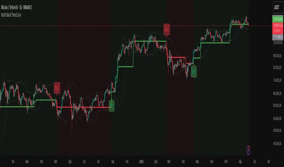
Multi-Band Trend LineThis Pine Script creates a versatile technical indicator called "Multi-Band Trend Line" that builds upon the concept of the popular "Follow Line Indicator" by Dreadblitz. While the original Follow Line Indicator uses simple trend detection to place a line at High or Low levels, this enhanced version combines multiple band-based trading strategies with dynamic trend line generation. The indicator supports five different band types and provides more sophisticated buy/sell signals based on price breakouts from various technical analysis bands.
Key Features
Multi-Band Support
The indicator supports five different band types:
- Bollinger Bands: Uses standard deviation to create bands around a moving average
- Keltner Channels: Uses ATR (Average True Range) to create bands around a moving average
- Donchian Channels: Uses the highest high and lowest low over a specified period
- Moving Average Envelopes: Creates bands as a percentage above and below a moving average
- ATR Bands: Uses ATR multiplier to create bands around a moving average
Dynamic Trend Line Generation (Enhanced Follow Line Concept)
- Similar to the Follow Line Indicator, the trend line is placed at High or Low levels based on trend direction
- Key Enhancement: Instead of simple trend detection, this version uses band breakouts to trigger trend changes
- When price breaks above the upper band (bullish signal), the trend line is set to the low (optionally adjusted with ATR) - similar to Follow Line's low placement
- When price breaks below the lower band (bearish signal), the trend line is set to the high (optionally adjusted with ATR) - similar to Follow Line's high placement
- The trend line acts as dynamic support/resistance, following the price action more precisely than the original Follow Line
ATR Filter (Follow Line Enhancement)
- Like the original Follow Line Indicator, an ATR filter can be selected to place the line at a more distance level than the normal mode settled at candles Highs/Lows
- When enabled, it adds/subtracts ATR value to provide more conservative trend line placement
- Helps reduce false signals in volatile markets
- This feature maintains the core philosophy of the Follow Line while adding more precision through band-based triggers
Signal Generation
- Buy Signal: Generated when trend changes from bearish to bullish (trend line starts rising)
- Sell Signal: Generated when trend changes from bullish to bearish (trend line starts falling)
- Signals are displayed as labels on the chart
Visual Elements
- Upper and lower bands are plotted in gray
- Trend line changes color based on direction (green for bullish, red for bearish)
- Background color changes based on trend direction
- Buy/sell signals are marked with labeled shapes
How It Works
Band Calculation: Based on the selected band type, upper and lower boundaries are calculated
Signal Detection: When price closes above the upper band or below the lower band, a breakout signal is generated
Trend Line Update: The trend line is updated based on the breakout direction and previous trend line value
Trend Direction: Determined by comparing current trend line with the previous value
Alert Generation: Buy/sell conditions trigger alerts and visual signals
Use Cases
Enhanced trend following strategies: More precise than basic Follow Line due to band-based triggers
Breakout trading: Multiple band types provide various breakout opportunities
Dynamic support/resistance identification: Combines Follow Line concept with band analysis
Multi-timeframe analysis with different band types: Choose the most suitable band for your timeframe
Reduced false signals: Band confirmation provides better entry/exit points compared to simple trend following
Trend Buy & Sell Signals [Kodeus]The Trend Buy & Sell Signals is designed to help traders identify market trend reversals, generate reliable buy/sell signals, and manage trades with automated risk-to-reward levels. It combines volatility filters, momentum analysis, RSI/CMO confirmation, and a dynamic trend-following cloud to provide clear trade setups. This tool is suitable for both beginner and advanced traders looking for an all-in-one trend trading system.
🔷 Key Features
Buy & Sell Signals: Automatic detection of bullish and bearish trend reversals.
TP & SL Visualization: Entry, SL, and TP levels plotted on the chart with labels for clarity.
Volatility Options: Choose between Enhanced or Classic ATR modes for trend filtering.
Trend Cloud: EMA-based cloud visualization with MACD-powered color dynamics.
Customizable Sensitivity: Adjust signal responsiveness to match different trading styles.
🔷 Disclaimer
Use with Caution: This indicator is provided for educational and informational purposes only and should not be considered as financial advice. Users should exercise caution and perform their own analysis before making trading decisions based on the indicator's signals.
Not Financial Advice: The information provided by this indicator does not constitute financial advice, and the creator shall not be held responsible for any trading losses incurred as a result of using this indicator.
Backtesting Recommended: Traders are encouraged to backtest the indicator thoroughly on historical data before using it in live trading to assess its performance and suitability for their trading strategies.
Risk Management: Trading involves inherent risks, and users should implement proper risk management strategies, including but not limited to stop-loss orders and position sizing, to mitigate potential losses.
No Guarantees: The accuracy and reliability of the indicator's signals cannot be guaranteed, as they are based on historical price data and past performance may not be indicative of future results.

🏛️ INSTITUTIONAL TRENDLINE v8 • Open Source🏛️ INSTITUTIONAL TRENDLINE v8 • Open Source
Adaptive S/R discovery with ML scoring, MTF confluence, and event-driven alerts
What it does (in one breath):
This indicator auto-discovers institutional-grade trendlines / dynamic support & resistance, scores them for quality using a dual-regime ML model (trend vs. range), validates them with multiple techniques (Theil–Sen, Huber, ATR/RSI/MACD/EMA, MTF confluence), then tracks breakouts, retests, failed breaks, proximity/touch events, and learns from outcomes to adapt over time. A visual panel summarizes stats, and optional heatmap/zones show where price is most “supported” or “capped”.
🚀 Quick Start (2 minutes)
Add to chart and leave defaults.
At the top of Inputs:
🎛️ Preset → choose your style: Scalper, Swing, Investor (or Custom).
🧬 Market Profile → pick Crypto/FX/Stocks + style or “Auto by Timeframe”.
Keep 🎯 Accuracy Mode = Quantum AI and ⚡ Performance = Maximum Quality if your device handles it.
Turn on 💥 Breakout Signals and 🚨 Alerts if you want notifications.
Read the right-side panel: Active Lines, Avg Q, Best Line, Market State, Nearest S/R, Top-3 lines, Pattern, Touch counts.
That’s it. You’ll see thinner, professional trendlines, small labels, optional zones, and tasteful break/retest markers.
🧠 How it works (plain English)
Discovery: It samples price pairs (with a swing-pivot bias) and fits many candidate lines.
Inlier-only R²: Instead of punishing outliers, it measures how tight touching bars are to a line.
ML Quality (0–100): Six signals (Touches, Volume @ touches, RSI, MACD, Volatility, Duration) are weighted differently for Trend vs Range regimes.
Validation: Rejects lines that disagree across Theil–Sen and Huber regressions (>15% slope deviation), fail slope/ATR filters, or lack MTF confluence.
Live tracking: Once a line is on the chart, the script watches for Breakouts → Retests → Failed breaks, and logs outcomes to continually re-weight the ML model (if enabled).
🎛️ Inputs (top section first)
1) Presets & Profiles (at the top)
🎛️ Preset
Scalper – lower lookbacks, faster, more signals.
Swing – balanced lookbacks, 2–4 lines per window.
Investor – longer lookbacks, fewer but stronger lines.
Custom – you control everything below.
🧬 Market Profile
Tailors thresholds for Crypto / FX / Stocks and your style (Scalper / Swing / Investor). Choose Auto by Timeframe to adapt from your chart resolution.
These two choices set “effective” requirements under the hood (min quality, R², proximity windows, cleanup cadence, etc.) so you don’t have to micromanage.
2) 🤖 Machine Learning Engine
Enable ML Enhancement – turns the adaptive scoring on/off.
ML Sensitivity – caps the maximum achievable score (lower = stricter).
Adaptive Learning – updates weights after each confirmed outcome.
Outcome Window (bars) & Target (ATR) – define when a breakout is counted as success or fail for learning.
Dual-Regime Models – separate weight sets for Trend and Range.
Tip: If results look “too picky,” raise ML Sensitivity slightly (e.g., 0.85→0.95).
3) 🎯 Accuracy & Filters
Minimum Touch Points / Quality / R² – base requirements for new lines.
Multi-Algorithm Validation – confirms slope across three regressions.
Volume / RSI / MACD / EMA / ATR filters – optional evidence checks.
No-Repaint Strict (HTF closed only) – for purists; fewer but cleaner MTF confirmations.
4) 🧠 Pro Logic / MTF
Swing-Anchored Sampling Bias – increases hits on meaningful swings.
HTF 1 / HTF 2 – reference frames for confluence (e.g., 4H & 1D).
HTF Bars to Scan / Touches Needed – how much agreement to demand.
Geometric Midline Agreement – proximity to HTF midlines (20-SMA).
Midline Distance Threshold (×ATR) – how strict that midline check is.
5) 💎 Visual System
Display Trendlines / Zones / Smart Labels / Breakout Signals / Heatmap – toggle pieces on/off.
Visual Theme & Color Intensity – pick a palette; v8 lines are thinner with subtle gradients.
Highlight Top-3 Lines – faint halo on the three highest-quality lines.
Limit Signal Markers / Bar – prevents clutter in fast moves.
Tip: For the cleanest chart: show Trendlines + Breakouts, keep Zones semi-transparent, and enable Heatmap only when you want confluence context.
6) 🚨 Alerts
Enable Smart Alerts – master switch.
Alert Quality Threshold – only alert for lines ≥ this Q%.
Base Proximity (ATR) & Slope-Adaptive Proximity – how close is “near”.
Retest / Failed-Break Windows – how long after a break to track.
Per-Line Cool-Off (bars) – spacing to avoid spam.
Consolidated JSON Alert/Bar – single JSON payload with all events per bar (great for bots).
Fire Inline Alerts (verbose) – pop real-time alerts the moment events occur.
Alert names (mapped to alertconditions):
🆕 New S/R Created
📍 Approaching Trendline
🎯 Touching Trendline
🟢 Bullish Breakout / 🔴 Bearish Breakdown
♻️ Bullish Retest / ♻️ Bearish Retest
⛔ Failed Break
7) ⚡ Performance
Performance Mode – quality vs speed.
Max New Lines per Lookback/Bar – caps how many fresh lines a bar can add.
Cleanup Interval (bars) & Max Lines to Keep – automatic memory & clutter control.
Theil–Sen Sampled Pairs – fewer = faster; more = robust.
📈 How to read the chart
Lines:
Color = Support (green) or Resistance (red) at current price.
Thickness/Style = relates to Quality and Touches (higher Q = slightly bolder).
Labels show a badge (💎 🏆 ⭐ ✅ 📊) with Q%. Tooltip lists touches, R², price@line, lookback, and which evidences are ON.
Zones: Soft confidence corridors around lines (ATR-scaled).
Heatmap: A faint background tint—dominant support, resistance, or neutral/confluence.
Break markers: tiny ▲ / ▼ (or 🚀/💀 when very strong). Retests and failed breaks are tagged separately.
Top-3 glow: subtle halo on the three best lines right now.
🧭 Trading workflow (example)
Scenario A – Trend continuation
Market panel shows TREND; Top-3 lines include two rising supports ≥90% Q.
Price approaches one of them → Touch → Bullish breakout above a local resistance line.
Wait for ♻️ Retest of that broken line from above; if RSI>50 & MACD>0 (shown in panel), open a long with stop just under the line or zone.
Exit partials at next resistance line; trail under the line.
Scenario B – Range fade
Panel says RANGE; heatmap is neutral/confluence.
Price tags a high-Q red line and prints Touch without breakout, while RSI>60 cools off.
Enter a mean-revert short with stop above the line; target midrange or next green line.
If a Bullish breakout fires during the trade → respect the Failed Break logic; exit quickly.
Scenario C – Breakout trader
Filter only lines with Q ≥ 90% and alerts ON.
When Breakout triggers with strength ≥ 4/7 (see panel), take a starter.
Add on Retest if it prints within your retest window and confluence still looks good.
Manage risk with ATR or zone width.
This is a levels & event indicator. It doesn’t replace your system; it gives objective lines and objective events around those lines.
✅ Best-practice setup
Presets/Profiles: Start with Swing + your Market Profile.
ML Sensitivity: 0.90–0.95 for most markets.
Alerts: Set Alert Quality ≥ 85–90, Cool-Off = 4–6 bars.
MTF: Use 4H + 1D on intraday; 1D + 1W on daily charts.
Clutter control: Max Lines ~200, Cleanup ~50 bars, Signal cap 6/bar (defaults are sensible).
No-repaint strict: Turn on for signal review; turn off if you want more frequent MTF confirmations in real time.
🔬 Research Mode (optional)
Enable 🧪 Research Mode to track win-rates by quality buckets. The panel shows Win% so you can calibrate your thresholds per market.
⚠️ Notes & limitations
This is open-source research software. Past performance ≠ future results.
Learning requires time: the ML engine adapts after outcomes; don’t expect instant magic.
Very low-liquidity symbols may produce fewer reliable lines; increase lookbacks or tighten filters.
MTF data uses request.security with no lookahead; turning No-Repaint Strict on can further reduce signals.
🧩 Troubleshooting
“Too many lines.” Raise Min Quality / R², lower Max Lines, or reduce cap per lookback.
“Too few lines.” Lower Min Quality a bit, raise ML Sensitivity, or choose an easier Preset/Market Profile.
“Alerts are spammy.” Raise Alert Quality, increase Cool-Off, increase Proximity threshold.
“Performance is slow.” Use Balanced / Fast, reduce Theil–Sen pairs, or extend Cleanup Interval.
📦 Included alertconditions (for one-click alert rules)
New S/R Created
Approaching Trendline
Touching Trendline
Bullish Breakout / Bearish Breakdown
Bullish Retest / Bearish Retest
Failed Break
Enjoy, share feedback, and feel free to fork.
If you publish ideas using it, please credit “INSTITUTIONAL TRENDLINE v8 • OS” so other traders can find the open-source original. Happy trading! 🫶

Hirochan miracle M1 RSI×RSI-MA Signals (Long/Short Alerts)Hirochan Miracle M1 RSI×RSI-MA Signals (Long/Short Alerts) is a 1-minute strategy built by layering two custom signal logics.

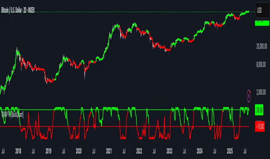
VWAP For Loop [BackQuant]VWAP For Loop
What this tool does—in one sentence
A volume-weighted trend gauge that anchors VWAP to a calendar period (day/week/month/quarter/year) and then scores the persistence of that VWAP trend with a simple for-loop “breadth” count; the result is a clean, threshold-driven oscillator plus an optional VWAP overlay and alerts.
Plain-English overview
Instead of judging raw price alone, this indicator focuses on anchored VWAP —the market’s average price paid during your chosen institutional period. It then asks a simple question across a configurable set of lookback steps: “Is the current anchored VWAP higher than it was i bars ago—or lower?” Each “yes” adds +1, each “no” adds −1. Summing those answers creates a score that reflects how consistently the volume-weighted trend has been rising or falling. Extreme positive scores imply persistent, broad strength; deeply negative scores imply persistent weakness. Crossing predefined thresholds produces objective long/short events and color-coded context.
Under the hood
• Anchoring — VWAP using hlc3 × volume resets exactly when the selected period rolls:
Day → session change, Week → new week, Month → new month, Quarter/Year → calendar quarter/year.
• For-loop scoring — For lag steps i = , compare today’s VWAP to VWAP .
– If VWAP > VWAP , add +1.
– Else, add −1.
The final score ∈ , where N = (end − start + 1). With defaults (1→45), N = 45.
• Signal logic (stateful)
– Long when score > upper (e.g., > 40 with N = 45 → VWAP higher than ~89% of checked lags).
– Short on crossunder of lower (e.g., dropping below −10).
– A compact state variable ( out ) holds the current regime: +1 (long), −1 (short), otherwise unchanged. This “stickiness” avoids constant flipping between bars without sufficient evidence.
Why VWAP + a breadth score?
• VWAP aggregates both price and volume—where participants actually traded.
• The breadth-style count rewards consistency of the anchored trend, not one-off spikes.
• Thresholds give you binary structure when you need it (alerts, automation), without complex math.
What you’ll see on the chart
• Sub-pane oscillator — The for-loop score line, colored by regime (long/short/neutral).
• Main-pane VWAP (optional) — Even though the indicator runs off-chart, the anchored VWAP can be overlaid on price (toggle visibility and whether it inherits trend colors).
• Threshold guides — Horizontal lines for the long/short bands (toggle).
• Cosmetics — Optional candle painting and background shading by regime; adjustable line width and colors.
Input map (quick reference)
• VWAP Anchor Period — Day, Week, Month, Quarter, Year.
• Calculation Start/End — The for-loop lag window . With 1→45, you evaluate 45 comparisons.
• Long/Short Thresholds — Default upper=40, lower=−10 (asymmetric by design; see below).
• UI/Style — Show thresholds, paint candles, background color, line width, VWAP visibility and coloring, custom long/short colors.
Interpreting the score
• Near +N — Current anchored VWAP is above most historical VWAP checkpoints in the window → entrenched strength.
• Near −N — Current anchored VWAP is below most checkpoints → entrenched weakness.
• Between — Mixed, choppy, or transitioning regimes; use thresholds to avoid reacting to noise.
Why the asymmetric default thresholds?
• Long = score > upper (40) — Demands unusually broad upside persistence before declaring “long regime.”
• Short = crossunder lower (−10) — Triggers only on downward momentum events (a fresh breach), not merely being below −10. This combination tends to:
– Capture sustained uptrends only when they’re very strong.
– Flag downside turns as they occur, rather than waiting for an extreme negative breadth.
Tuning guide
Choose an anchor that matches your horizon
– Intraday scalps : Day anchor on intraday charts.
– Swing/position : Month or Quarter anchor on 1h/4h/D charts to capture institutional cycles.
Pick the for-loop window
– Larger N (bigger end) = stronger evidence requirement, smoother oscillator.
– Smaller N = faster, more reactive score.
Set achievable thresholds
– Ensure upper ≤ N and lower ≥ −N ; if N=30, an upper of 40 can never trigger.
– Symmetric setups (e.g., +20/−20) are fine if you want balanced behavior.
Match visuals to intent
– Enabling VWAP coloring lets you see regime directly on price.
– Background shading is useful for discretionary reading; turn it off for cleaner automation displays.
Playbook examples
• Trend confirmation with disciplined entries — On Month anchor, N=45, upper=38–42: when the long regime engages, use pullbacks toward anchored VWAP on the main pane for entries, with stops just beyond VWAP or a recent swing.
• Downside transition detection — Keep lower around −8…−12 and watch for crossunders; combine with price losing anchored VWAP to validate risk-off.
• Intraday bias filter — Day anchor on a 5–15m chart, N=20–30, upper ~ 16–20, lower ~ −6…−10. Only take longs while score is positive and above a midline you define (e.g., 0), and shorts only after a genuine crossunder.
Behavior around resets (important)
Anchored VWAP is hard-reset each period. Immediately after a reset, the series can be young and comparisons to pre-reset values may span two periods. If you prefer within-period evaluation only, choose end small enough not to bridge typical period length on your timeframe, or accept that the breadth test intentionally spans regimes.
Alerts included
• VWAP FL Long — Fires when the long condition is true (score > upper and not in short).
• VWAP FL Short — Fires on crossunder of the lower threshold (event-driven).
Messages include {{ticker}} and {{interval}} placeholders for routing.
Strengths
• Simple, transparent math — Easy to reason about and validate.
• Volume-aware by construction — Decisions reference VWAP, not just price.
• Robust to single-bar noise — Needs many lags to agree before flipping state (by design, via thresholds and the stateful output).
Limitations & cautions
• Threshold feasibility — If N < upper or |lower| > N, signals will never trigger; always cross-check N.
• Path dependence — The state variable persists until a new event; if you want frequent re-evaluation, lower thresholds or reduce N.
• Regime changes — Calendar resets can produce early ambiguity; expect a few bars for the breadth to mature.
• VWAP sensitivity to volume spikes — Large prints can tilt VWAP abruptly; that behavior is intentional in VWAP-based logic.
Suggested starting profiles
• Intraday trend bias : Anchor=Day, N=25 (1→25), upper=18–20, lower=−8, paint candles ON.
• Swing bias : Anchor=Month, N=45 (1→45), upper=38–42, lower=−10, VWAP coloring ON, background OFF.
• Balanced reactivity : Anchor=Week, N=30 (1→30), upper=20–22, lower=−10…−12, symmetric if desired.
Implementation notes
• The indicator runs in a separate pane (oscillator), but VWAP itself is drawn on price using forced overlay so you can see interactions (touches, reclaim/loss).
• HLC3 is used for VWAP price; that’s a common choice to dampen wick noise while still reflecting intrabar range.
• For-loop cap is kept modest (≤50) for performance and clarity.
How to use this responsibly
Treat the oscillator as a bias and persistence meter . Combine it with your entry framework (structure breaks, liquidity zones, higher-timeframe context) and risk controls. The design emphasizes clarity over complexity—its edge is in how strictly it demands agreement before declaring a regime, not in predicting specific turns.
Summary
VWAP For Loop distills the question “How broadly is the anchored, volume-weighted trend advancing or retreating?” into a single, thresholded score you can read at a glance, alert on, and color through your chart. With careful anchoring and thresholds sized to your window length, it becomes a pragmatic bias filter for both systematic and discretionary workflows.

Golden Zone Signals with Zigzag [Kodeus]The Golden Zone Signals with ZigZag indicator combines ZigZag pivots with Fibonacci retracements to highlight key reversal zones and potential trading opportunities. It dynamically detects peaks and troughs, draws Fibonacci levels, and emphasizes the “Golden Zone” retracement areas where price often reacts. With customizable themes and optional trading signals, this tool is designed to support both discretionary and systematic trading approaches.
🔷 Key Features
ZigZag Detection: Automatically identifies swing highs and lows based on customizable periods.
Fibonacci Levels: Plots standard retracement levels (0.236, 0.382, 0.500, 0.618, 0.786) with clear visualization.
Golden Zone Highlighting: Shades the high-probability retracement zones where reversals or continuations often occur.
Trading Signals (Optional): Generates potential Buy/Sell signals based on price action in relation to Fibonacci zones.
Buy signal example:
Sell signal example:
Customizable Themes: Multiple color schemes (Neon, Ocean, Sunset, Monochrome) to fit different charting styles.
🔷 Disclaimer
Use with Caution: This indicator is provided for educational and informational purposes only and should not be considered as financial advice. Users should exercise caution and perform their own analysis before making trading decisions based on the indicator's signals.
Not Financial Advice: The information provided by this indicator does not constitute financial advice, and the creator shall not be held responsible for any trading losses incurred as a result of using this indicator.
Backtesting Recommended: Traders are encouraged to backtest the indicator thoroughly on historical data before using it in live trading to assess its performance and suitability for their trading strategies.
Risk Management: Trading involves inherent risks, and users should implement proper risk management strategies, including but not limited to stop-loss orders and position sizing, to mitigate potential losses.
No Guarantees: The accuracy and reliability of the indicator's signals cannot be guaranteed, as they are based on historical price data and past performance may not be indicative of future results.

MTF Oscillator Stack [BigBeluga]🔵 OVERVIEW
The MTF Oscillator Stack brings powerful multi-timeframe momentum analysis directly into your price chart. You can select one oscillator— RSI , MFI , or Stochastic RSI —and display it across up to 4 different timeframes. Each panel is neatly stacked horizontally above price , offering quick insight into cross-timeframe conditions like trend direction, exhaustion zones, and momentum shifts.
🔵 CONCEPTS
Single Oscillator Mode: Select one oscillator type (RSI, MFI, or Stoch RSI) to analyze across all selected timeframes.
Top-Chart Horizontal Panels: Oscillator plots are aligned horizontally at the top of the chart for seamless top-down reading.
Signal Comparison Arrows: Arrows (🢁 / 🢃) indicate oscillator position relative to its signal line.
Overbought/Oversold Zones: Transparent 30–70 fill zones highlight key reversal areas.
Dynamic Display Logic: Only enabled panels are shown; spacing adjusts based on active timeframes.
Timeframe Tagging: Each oscillator panel is labeled with its corresponding timeframe (e.g., 1H, 2H, 4H).
🔵 FEATURES
Choose one oscillator (RSI, MFI, or Stoch RSI) and apply it across up to 4 timeframes.
Each oscillator panel includes: price-synced plot, signal line, and zone shading.
Scale alignment allows users to place charts at the bottom or top.
Clear arrow signals show whether oscillator is bullish or bearish.
Individual length and signal settings per timeframe.
Toggle for alignment mode: evenly spaced or floating layout.
All panels use a consistent layout for faster decision-making.
🔵 HOW TO USE
Select your preferred oscillator and activate 2–4 key timeframes (e.g., 1H, 4H, D1, W1).
Use signal crossovers as a bullish (🢁) or bearish (🢃) trend cue.
Look for aligned extremes (e.g., all timeframes overbought) to spot momentum exhaustion.
Ideal for momentum confluence strategies and top-down confirmation.
Use horizontal layout to stay focused on price while assessing broader structure.
🔵 CONCLUSION
MTF Oscillator Stack simplifies complex multi-timeframe momentum analysis into one clean, actionable visual. Whether you're tracking RSI, MFI, or Stoch RSI, this tool helps you stay aligned with the broader trend—without ever leaving your main chart.

Smarter Money Concepts - Wyckoff Springs & Upthrusts [PhenLabs]📊Smarter Money Concepts - Wyckoff Springs & Upthrusts
Version: PineScript™v6
📌Description
Discover institutional manipulation in real-time with this advanced Wyckoff indicator that detects Springs (accumulation phases) and Upthrusts (distribution phases). It identifies when price tests support or resistance on high volume, followed by a strong recovery, signaling potential reversals where smart money accumulates or distributes positions. This tool solves the common problem of missing these subtle phase transitions, helping traders anticipate trend changes and avoid traps in volatile markets.
By combining volume spike detection, ATR-normalized recovery strength, and a sigmoid probability model, it filters out weak signals and highlights only high-confidence setups. Whether you’re swing trading or day trading, this indicator provides clear visual cues to align with institutional flows, improving entry timing and risk management.
🚀Points of Innovation
Sigmoid-based probability threshold for signal filtering, ensuring only statistically significant Wyckoff patterns trigger alerts
ATR-normalized recovery measurement that adapts to market volatility, unlike static recovery checks in traditional indicators
Customizable volume spike multiplier to distinguish institutional volume from retail noise
Integrated dashboard legend with position and size options for personalized chart visualization
Hidden probability plots for advanced users to analyze underlying math without chart clutter
🔧Core Components
Support/Resistance Calculator: Scans a user-defined lookback period to establish dynamic levels for Spring and Upthrust detection
Volume Spike Detector: Compares current volume to a 10-period SMA, multiplied by a configurable factor to identify significant surges
Recovery Strength Analyzer: Uses ATR to measure price recovery after breaks, normalizing for different market conditions
Probability Model: Applies sigmoid function to combine volume and recovery data, generating a confidence score for each potential signal
🔥Key Features
Spring Detection: Spots accumulation when price dips below support but recovers strongly, helping traders enter longs at potential bottoms
Upthrust Detection: Identifies distribution when price spikes above resistance but falls back, alerting to possible short opportunities at tops
Customizable Inputs: Adjust lookback, volume multiplier, ATR period, and probability threshold to match your trading style and market
Visual Signals: Clear + (green) and - (red) labels on charts for instant recognition of accumulation and distribution phases
Alert System: Triggers notifications for signals and probability thresholds, keeping you informed without constant monitoring
🎨Visualization
Spring Signal: Green upward label (+) below the bar, indicating strong recovery after support break for accumulation
Upthrust Signal: Red downward label (-) above the bar, showing failed breakout above resistance for distribution
Dashboard Legend: Customizable table explaining signals, positioned anywhere on the chart for quick reference
📖Usage Guidelines
Core Settings
Support/Resistance Lookback
Default: 20
Range: 5-50
Description: Sets bars back for S/R levels; lower for recent sensitivity, higher for stable long-term zones – ideal for spotting Wyckoff phases
Volume Spike Multiplier
Default: 1.5
Range: 1.0-3.0
Description: Multiplies 10-period volume SMA; higher values filter to significant spikes, confirming institutional involvement in patterns
ATR for Recovery Measurement
Default: 5
Range: 2-20
Description: ATR period for recovery strength; shorter for volatile markets, longer for smoother analysis of post-break recoveries
Phase Transition Probability Threshold
Default: 0.9
Range: 0.5-0.99
Description: Minimum sigmoid probability for signals; higher for strict filtering, ensuring only high-confidence Wyckoff setups
Display Settings
Dashboard Position
Default: Top Right
Range: Various positions
Description: Places legend table on chart; choose based on layout to avoid overlapping price action
Dashboard Text Size
Default: Normal
Range: Auto to Huge
Description: Adjusts legend text; larger for visibility, smaller for minimal space use
✅Best Use Cases
Swing Trading: Identify Springs for long entries in downtrends turning to accumulation
Day Trading: Catch Upthrusts for short scalps during intraday distribution at resistance
Trend Reversal Confirmation: Use in conjunction with other indicators to validate phase shifts in ranging markets
Volatility Plays: Spot signals in high-volume environments like news events for quick reversals
⚠️Limitations
May produce false signals in low-volume or sideways markets where volume spikes are unreliable
Depends on historical data, so performance varies in unprecedented market conditions or gaps
Probability model is statistical, not predictive, and cannot account for external factors like news
💡What Makes This Unique
Probability-Driven Filtering: Sigmoid model combines multiple factors for superior signal quality over basic Wyckoff detectors
Adaptive Recovery: ATR normalization ensures reliability across assets and timeframes, unlike fixed-threshold tools
User-Centric Design: Tooltips, customizable dashboard, and alerts make it accessible yet powerful for all trader levels
🔬How It Works
Calculate S/R Levels:
Uses the highest high and the lowest low over the lookback period to set dynamic zones
Establishes baseline for detecting breaks in Wyckoff patterns
Detect Breaks and Recovery:
Checks for price breaking support/resistance, then recovering on volume
Measures recovery strength via ATR for volatility adjustment
Apply Probability Model:
Combines volume spike and recovery into a sigmoid function for confidence score
Triggers signal only if above threshold, plotting visuals and alerts
💡Note:
For optimal results, combine with price action analysis and test settings on historical charts. Remember, Wyckoff patterns are most effective in trending markets – use lower probability thresholds for practice, then increase for live trading to focus on high-quality setups.

Gann Swing [Kodeus]Gann Swing neon-styled take on classic Gann swing logic. It detects swing peaks and valleys, draws confirmed legs with a soft glow, and projects a live (developing) leg in real time. An “Outside Bar Rule” lets you choose how to resolve bars that break both the prior swing high and low, so the swing state machine behaves exactly how you prefer across volatile candles. Optional labels, trend-tinted bars, and alert conditions round out a clean, informative visual.
🔷 Key Features
Configurable Outside Bar Rule : Choose how to handle bars that make both a higher high and lower low:
Magnitude→Close, Close direction, Always Up, Always Down, or Ignore Outside (Next Bar).
Real-time “Live Leg” : Dotted line with adjustable transparency updates every bar until the swing confirms and is drawn as a solid, glowing leg.
Peak/Valley Labels : One-tap toggles for labels at confirmed turning points (🔻 for peaks, 🔺 for valleys).
Color Themes : Pick from neon palettes for uptrends and downtrends.
Alerts : Built-in alert conditions for Trend Up (valley confirmed) and Trend Down (peak confirmed).
🔷 Calculations
Outside Bar Rule (how “both” is resolved)
When a bar breaks both the running high and low, the script determines a preferred direction based on your setting:
Magnitude→Close (default)
Compare overshoots on each side:
upMag = high - lastTrendHigh
dnMag = lastTrendLow - low
If upMag > dnMag → prefer Up
If dnMag > upMag → prefer Down
If equal → use the bar close vs open (close ≥ open → Up, else Down)
Why: favors the side that extended further beyond the previous extreme; ties fall back to candle body bias.
Close direction
Ignore magnitude, use bar body direction only:
close ≥ open → Up, else Down.
Why: simple, body-driven resolution for indecisive wicks.
Always Up
Always resolve outside bars Up.
Why: forces upward continuation on outside bars (useful for trend-following bias tests).
Always Down
Always resolve outside bars Down.
Why: forces downward continuation on outside bars.
Ignore Outside (Next Bar)
Treat outside bars as not trend bars for that candle (isTrendBar = false when both), deferring swing decisions to the next bar.
Why: avoids whipsaws from single, highly volatile candles.
🔷 Disclaimer
Use with Caution: This indicator is provided for educational and informational purposes only and should not be considered as financial advice. Users should exercise caution and perform their own analysis before making trading decisions based on the indicator's signals.
Not Financial Advice: The information provided by this indicator does not constitute financial advice, and the creator shall not be held responsible for any trading losses incurred as a result of using this indicator.
Backtesting Recommended: Traders are encouraged to backtest the indicator thoroughly on historical data before using it in live trading to assess its performance and suitability for their trading strategies.
Risk Management: Trading involves inherent risks, and users should implement proper risk management strategies, including but not limited to stop-loss orders and position sizing, to mitigate potential losses.
No Guarantees: The accuracy and reliability of the indicator's signals cannot be guaranteed, as they are based on historical price data and past performance may not be indicative of future results.

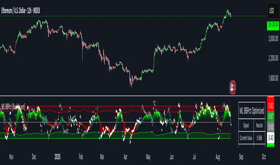
Machine Learning BBPct [BackQuant]Machine Learning BBPct
What this is (in one line)
A Bollinger Band %B oscillator enhanced with a simplified K-Nearest Neighbors (KNN) pattern matcher. The model compares today’s context (volatility, momentum, volume, and position inside the bands) to similar situations in recent history and blends that historical consensus back into the raw %B to reduce noise and improve context awareness. It is informational and diagnostic—designed to describe market state, not to sell a trading system.
Background: %B in plain terms
Bollinger %B measures where price sits inside its dynamic envelope: 0 at the lower band, 1 at the upper band, ~ 0.5 near the basis (the moving average). Readings toward 1 indicate pressure near the envelope’s upper edge (often strength or stretch), while readings toward 0 indicate pressure near the lower edge (often weakness or stretch). Because bands adapt to volatility, %B is naturally comparable across regimes.
Why add (simplified) KNN?
Classic %B is reactive and can be whippy in fast regimes. The simplified KNN layer builds a “nearest-neighbor memory” of recent market states and asks: “When the market looked like this before, where did %B tend to be next bar?” It then blends that estimate with the current %B. Key ideas:
• Feature vector . Each bar is summarized by up to five normalized features:
– %B itself (normalized)
– Band width (volatility proxy)
– Price momentum (ROC)
– Volume momentum (ROC of volume)
– Price position within the bands
• Distance metric . Euclidean distance ranks the most similar recent bars.
• Prediction . Average the neighbors’ prior %B (lagged to avoid lookahead), inverse-weighted by distance.
• Blend . Linearly combine raw %B and KNN-predicted %B with a configurable weight; optional filtering then adapts to confidence.
This remains “simplified” KNN: no training/validation split, no KD-trees, no scaling beyond windowed min-max, and no probabilistic calibration.
How the script is organized (by input groups)
1) BBPct Settings
• Price Source – Which price to evaluate (%B is computed from this).
• Calculation Period – Lookback for SMA basis and standard deviation.
• Multiplier – Standard deviation width (e.g., 2.0).
• Apply Smoothing / Type / Length – Optional smoothing of the %B stream before ML (EMA, RMA, DEMA, TEMA, LINREG, HMA, etc.). Turning this off gives you the raw %B.
2) Thresholds
• Overbought/Oversold – Default 0.8 / 0.2 (inside ).
• Extreme OB/OS – Stricter zones (e.g., 0.95 / 0.05) to flag stretch conditions.
3) KNN Machine Learning
• Enable KNN – Switch between pure %B and hybrid.
• K (neighbors) – How many historical analogs to blend (default 8).
• Historical Period – Size of the search window for neighbors.
• ML Weight – Blend between raw %B and KNN estimate.
• Number of Features – Use 2–5 features; higher counts add context but raise the risk of overfitting in short windows.
4) Filtering
• Method – None, Adaptive, Kalman-style (first-order),
or Hull smoothing.
• Strength – How aggressively to smooth. “Adaptive” uses model confidence to modulate its alpha: higher confidence → stronger reliance on the ML estimate.
5) Performance Tracking
• Win-rate Period – Simple running score of past signal outcomes based on target/stop/time-out logic (informational, not a robust backtest).
• Early Entry Lookback – Horizon for forecasting a potential threshold cross.
• Profit Target / Stop Loss – Used only by the internal win-rate heuristic.
6) Self-Optimization
• Enable Self-Optimization – Lightweight, rolling comparison of a few canned settings (K = 8/14/21 via simple rules on %B extremes).
• Optimization Window & Stability Threshold – Governs how quickly preferred K changes and how sensitive the overfitting alarm is.
• Adaptive Thresholds – Adjust the OB/OS lines with volatility regime (ATR ratio), widening in calm markets and tightening in turbulent ones (bounded 0.7–0.9 and 0.1–0.3).
7) UI Settings
• Show Table / Zones / ML Prediction / Early Signals – Toggle informational overlays.
• Signal Line Width, Candle Painting, Colors – Visual preferences.
Step-by-step logic
A) Compute %B
Basis = SMA(source, len); dev = stdev(source, len) × multiplier; Upper/Lower = Basis ± dev.
%B = (price − Lower) / (Upper − Lower). Optional smoothing yields standardBB .
B) Build the feature vector
All features are min-max normalized over the KNN window so distances are in comparable units. Features include normalized %B, normalized band width, normalized price ROC, normalized volume ROC, and normalized position within bands. You can limit to the first N features (2–5).
C) Find nearest neighbors
For each bar inside the lookback window, compute the Euclidean distance between current features and that bar’s features. Sort by distance, keep the top K .
D) Predict and blend
Use inverse-distance weights (with a strong cap for near-zero distances) to average neighbors’ prior %B (lagged by one bar). This becomes the KNN estimate. Blend it with raw %B via the ML weight. A variance of neighbor %B around the prediction becomes an uncertainty proxy ; combined with a stability score (how long parameters remain unchanged), it forms mlConfidence ∈ . The Adaptive filter optionally transforms that confidence into a smoothing coefficient.
E) Adaptive thresholds
Volatility regime (ATR(14) divided by its 50-bar SMA) nudges OB/OS thresholds wider or narrower within fixed bounds. The aim: comparable extremeness across regimes.
F) Early entry heuristic
A tiny two-step slope/acceleration probe extrapolates finalBB forward a few bars. If it is on track to cross OB/OS soon (and slope/acceleration agree), it flags an EARLY_BUY/SELL candidate with an internal confidence score. This is explicitly a heuristic—use as an attention cue, not a signal by itself.
G) Informational win-rate
The script keeps a rolling array of trade outcomes derived from signal transitions + rudimentary exits (target/stop/time). The percentage shown is a rough diagnostic , not a validated backtest.
Outputs and visual language
• ML Bollinger %B (finalBB) – The main line after KNN blending and optional filtering.
• Gradient fill – Greenish tones above 0.5, reddish below, with intensity following distance from the midline.
• Adaptive zones – Overbought/oversold and extreme bands; shaded backgrounds appear at extremes.
• ML Prediction (dots) – The KNN estimate plotted as faint circles; becomes bright white when confidence > 0.7.
• Early arrows – Optional small triangles for approaching OB/OS.
• Candle painting – Light green above the midline, light red below (optional).
• Info panel – Current value, signal classification, ML confidence, optimized K, stability, volatility regime, adaptive thresholds, overfitting flag, early-entry status, and total signals processed.
Signal classification (informational)
The indicator does not fire trade commands; it labels state:
• STRONG_BUY / STRONG_SELL – finalBB beyond extreme OS/OB thresholds.
• BUY / SELL – finalBB beyond adaptive OS/OB.
• EARLY_BUY / EARLY_SELL – forecast suggests a near-term cross with decent internal confidence.
• NEUTRAL – between adaptive bands.
Alerts (what you can automate)
• Entering adaptive OB/OS and extreme OB/OS.
• Midline cross (0.5).
• Overfitting detected (frequent parameter flipping).
• Early signals when early confidence > 0.7.
These are purely descriptive triggers around the indicator’s state.
Practical interpretation
• Mean-reversion context – In range markets, adaptive OS/OB with ML smoothing can reduce whipsaws relative to raw %B.
• Trend context – In persistent trends, the KNN blend can keep finalBB nearer the mid/upper region during healthy pullbacks if history supports similar contexts.
• Regime awareness – Watch the volatility regime and adaptive thresholds. If thresholds compress (high vol), “OB/OS” comes sooner; if thresholds widen (calm), it takes more stretch to flag.
• Confidence as a weight – High mlConfidence implies neighbors agree; you may rely more on the ML curve. Low confidence argues for de-emphasizing ML and leaning on raw %B or other tools.
• Stability score – Rising stability indicates consistent parameter selection and fewer flips; dropping stability hints at a shifting backdrop.
Methodological notes
• Normalization uses rolling min-max over the KNN window. This is simple and scale-agnostic but sensitive to outliers; the distance metric will reflect that.
• Distance is unweighted Euclidean. If you raise featureCount, you increase dimensionality; consider keeping K larger and lookback ample to avoid sparse-neighbor artifacts.
• Lag handling intentionally uses neighbors’ previous %B for prediction to avoid lookahead bias.
• Self-optimization is deliberately modest: it only compares a few canned K/threshold choices using simple “did an extreme anticipate movement?” scoring, then enforces a stability regime and an overfitting guard. It is not a grid search or GA.
• Kalman option is a first-order recursive filter (fixed gain), not a full state-space estimator.
• Hull option derives a dynamic length from 1/strength; it is a convenience smoothing alternative.
Limitations and cautions
• Non-stationarity – Nearest neighbors from the recent window may not represent the future under structural breaks (policy shifts, liquidity shocks).
• Curse of dimensionality – Adding features without sufficient lookback can make genuine neighbors rare.
• Overfitting risk – The script includes a crude overfitting detector (frequent parameter flips) and will fall back to defaults when triggered, but this is only a guardrail.
• Win-rate display – The internal score is illustrative; it does not constitute a tradable backtest.
• Latency vs. smoothness – Smoothing and ML blending reduce noise but add lag; tune to your timeframe and objectives.
Tuning guide
• Short-term scalping – Lower len (10–14), slightly lower multiplier (1.8–2.0), small K (5–8), featureCount 3–4, Adaptive filter ON, moderate strength.
• Swing trading – len (20–30), multiplier ~2.0, K (8–14), featureCount 4–5, Adaptive thresholds ON, filter modest.
• Strong trends – Consider higher adaptive_upper/lower bounds (or let volatility regime do it), keep ML weight moderate so raw %B still reflects surges.
• Chop – Higher ML weight and stronger Adaptive filtering; accept lag in exchange for fewer false extremes.
How to use it responsibly
Treat this as a state descriptor and context filter. Pair it with your execution signals (structure breaks, volume footprints, higher-timeframe bias) and risk management. If mlConfidence is low or stability is falling, lean less on the ML line and more on raw %B or external confirmation.
Summary
Machine Learning BBPct augments a familiar oscillator with a transparent, simplified KNN memory of recent conditions. By blending neighbors’ behavior into %B and adapting thresholds to volatility regime—while exposing confidence, stability, and a plain early-entry heuristic—it provides an informational, probability-minded view of stretch and reversion that you can interpret alongside your own process.
Liquidity Sweep Signals [Kodeus]This script is designed to identify and visualize potential liquidity sweeps in the market, helping traders spot areas where liquidity may be targeted around support and resistance levels. It automatically plots pivot-based support and resistance lines and dynamically manages them as price action evolves. When price wicks through a level but closes back in the opposite direction, the script highlights a potential liquidity sweep with visual annotations and color-coded signals, allowing traders to quickly recognize buy-side or sell-side liquidity grabs. With adjustable parameters such as pivot length, maximum zones, line width, and custom colors, users can easily adapt the tool to their trading style while keeping charts clean and informative.
🔷 Key Features
Pivot Length: Defines the number of bars used to calculate swing highs and lows for support and resistance.
Max Lines: Controls how many active support and resistance zones are kept on the chart at once.
Line Width & Colors: Allows customization of line thickness and colors for support, resistance, and sweep signals.
Buy-Side Liquidity Sweep: Detects when price wicks above a resistance level but closes back below, signaling a potential buy-side sweep.
Sell-Side Liquidity Sweep: Detects when price wicks below a support level but closes back above, signaling a potential sell-side sweep.
Dynamic Line Management: Old support and resistance levels are automatically removed once the maximum limit is reached, keeping charts clean.
Real-Time Annotations: Displays instant labels and sweep lines on the chart to mark detected liquidity sweeps.
Liquidity areas waiting to be swept are shown as "pivot high" in red and "pivot low" in green.
🔶 Disclaimer
Use with Caution: This indicator is provided for educational and informational purposes only and should not be considered as financial advice. Users should exercise caution and perform their own analysis before making trading decisions based on the indicator's signals.
Not Financial Advice: The information provided by this indicator does not constitute financial advice, and the creator (Kodeus) shall not be held responsible for any trading losses incurred as a result of using this indicator.
Backtesting Recommended: Traders are encouraged to backtest the indicator thoroughly on historical data before using it in live trading to assess its performance and suitability for their trading strategies.
Risk Management: Trading involves inherent risks, and users should implement proper risk management strategies, including but not limited to stop-loss orders and position sizing, to mitigate potential losses.
No Guarantees: The accuracy and reliability of the indicator's signals cannot be guaranteed, as they are based on historical price data and past performance may not be indicative of future results.

Volatility Flow Tracker [Kodeus]The Volatility Flow Tracker is an volatility-based indicator designed to detect trending and consolidating phases in price action. Utilizing a smoothed price flow mechanism and adaptive ATR-based sensitivity, this tool visually highlights momentum shifts and potential consolidation zones, enabling traders to anticipate market structure changes with greater precision.
Trend follower or range trader, this indicator offers dynamic insights into price flow behavior by adapting to current volatility conditions and identifying neutral zones where market indecision is highest.
🔷 Key Features
Flow Line Algorithm: Smooths price input to track directional movement with volatility-based sensitivity adjustment.
Adaptive Volatility Bands: Optional upper and lower bounds reflecting dynamic ATR-based ranges.
Trend State Detection: Automatically color-codes the flow line based on bullish, bearish, or neutral conditions.
Consolidation Zones: Visualizes periods of market indecision by plotting historical neutral zones, aiding range-based strategies.
Customizable Visuals: User-friendly options to personalize color themes and toggle visibility for zones and bands.
🔷 Disclaimer
Use with Caution: This indicator is provided for educational and informational purposes only and should not be considered as financial advice. Users should exercise caution and perform their own analysis before making trading decisions based on the indicator's signals.
Not Financial Advice: The information provided by this indicator does not constitute financial advice, and the creator shall not be held responsible for any trading losses incurred as a result of using this indicator.
Backtesting Recommended: Traders are encouraged to backtest the indicator thoroughly on historical data before using it in live trading to assess its performance and suitability for their trading strategies.
Risk Management: Trading involves inherent risks, and users should implement proper risk management strategies, including but not limited to stop-loss orders and position sizing, to mitigate potential losses.
No Guarantees: The accuracy and reliability of the indicator's signals cannot be guaranteed, as they are based on historical price data and past performance may not be indicative of future results.

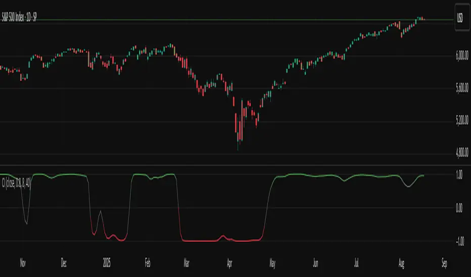
TASC 2025.09 The Continuation Index
█ OVERVIEW
This script implements the "Continuation Index" as described by John F. Ehlers in the September 2025 edition of TASC's Trader's Tips . The Continuation Index uses Laguerre filters (featured in the July 2025 edition) to provide an early indication of trend direction, continuation, and exhaustion.
█ CONCEPTS
The idea for the Continuation Index was formed from an observation about Laguerre filters. In his article, Ehlers notes that when price is in trend, it tends to stay to one side of the filter. When considering smoothing, the UltimateSmoother was an obvious choice to reduce lag. With that in mind, The Continuation Index normalizes the difference between UltimateSmoother and the Laguerre filter to produce a two-state oscillator.
To minimize lag, the UltimateSmoother length in this indicator is fixed to half the length of the Laguerre filter.
█ USAGE
The Continuation Index consists of two primary states.
+1 suggests that the trader should position on the long side.
-1 suggests that the user should position on the short side.
Other readings can imply other opportunities, such as:
High Value Fluctuation could be used as a "buy the dip" opportunity.
Low Value Fluctuation could be used as a "sell the pop" opportunity.
█ INPUTS
By understanding the inputs and adjusting them as needed, each trader can benefit more from this indicator:
Gamma : Controls the Laguerre filter's response. This can be set anywhere between 0 and 1. If set to 0, the filter’s value will be the same as the UltimateSmoother.
Order : Controls the lag of the Laguerre filter, which is important when considering the timing of the system for spotting reversals. This can be set from 1 to 10, with lower values typically producing faster timing.
Length : Affects the smoothing of the display. Ehlers recommends starting with this value set to the intended amount of time you plan to hold a position. Consider your chart timeframe when setting this input. For example, on a daily chart, if you intend to hold a position for one month, set a value of 20.
Regression Trend Channels [Kodeus]The Regression Trend Channels is a technical analysis indicator that automatically identifies and visualizes dynamic trend channels using regression analysis and pivot point detection algorithms. This indicator employs iterative optimization techniques to find the most statistically significant support and resistance channels across multiple timeframes simultaneously.
Unlike traditional channel indicators that rely on simple high/low connections, this tool uses linear regression analysis combined with standard deviation calculations to create adaptive channels that better represent market structure. The indicator continuously scans historical price data, identifies pivot points, and applies multiple regression iterations to filter out noise and highlight the most relevant trend channels.
The system evaluates channel quality using a logarithmic R-squared metric, ensuring that only statistically significant trends are displayed. Each channel consists of three components: a regression centerline and two parallel boundaries based on the standard deviation of price residuals, creating a comprehensive view of price behavior within trending markets.
🔷 Key Features
Automated Pivot Detection: Identifies high and low pivot points using configurable left/right bar sensitivity.
Multi-Length Channel Scanning: Analyzes multiple historical ranges to locate the most reliable trend channels.
Linear Regression Optimization: Filters pivot points iteratively to maximize trend quality (R²-based metric).
Trend Quality Scoring: Channels are drawn only when they meet user-defined thresholds for point count and statistical quality.
Dynamic Width Calculation: Channel width is based on the standard deviation of residuals, ensuring proportional boundaries.
🔷 Disclaimer
Use with Caution: This indicator is provided for educational and informational purposes only and should not be considered as financial advice. Users should exercise caution and perform their own analysis before making trading decisions based on the indicator's signals.
Not Financial Advice: The information provided by this indicator does not constitute financial advice, and the creator shall not be held responsible for any trading losses incurred as a result of using this indicator.
Backtesting Recommended: Traders are encouraged to backtest the indicator thoroughly on historical data before using it in live trading to assess its performance and suitability for their trading strategies.
Risk Management: Trading involves inherent risks, and users should implement proper risk management strategies, including but not limited to stop-loss orders and position sizing, to mitigate potential losses.
No Guarantees: The accuracy and reliability of the indicator's signals cannot be guaranteed, as they are based on historical price data and past performance may not be indicative of future results.

Buy Sell Volume with delta value📄 Script Description
This indicator decomposes total traded volume into buying and selling volume, and displays their relative ratios.
🔎 Key Features
Buying vs. Selling Volume Separation
Uses the candle’s high, low, and close to split total volume into buying volume and selling volume.
Formula:
Buy = volume * (close - low) / (high - low)
Sell = volume * (high - close) / (high - low)
Volume Histogram Visualization
Plots overall volume (upper/lower) and separated buy/sell volumes as color-coded columns.
UPPER V / LOWER V: total volume
BUY V: buying volume (teal)
SELL V: selling volume (red)
Buy/Sell Ratio Calculation
Computes the percentage of buy and sell volume relative to total volume.
Buy Ratio = buyVolume / totalVolume * 100
Sell Ratio = sellVolume / totalVolume * 100
Ratio Display
Shows the latest Buy Ratio in a table (top-right corner of the chart).
Adds a label above the most recent bar displaying:
"Buy XX% / Sell YY%"
Historical ratios can be inspected through the TradingView Data Window or tooltip.
🛠️ Usage
Quickly identify whether volume during each candle is dominated by buyers or sellers.
Helps to assess market pressure and confirm potential trend direction, entries, or exits.
⚠️ Notes
Labels are shown only on the most recent bar (Pine cannot track mouse cursor events).
To see historical values, use the TradingView Data Window or hover tooltips.
This method provides an approximate split of volume and does not perfectly capture all market order flows.

Fair Value Gaps [Kodeus]The Fair Value Gaps indicator automatically detects, visualizes, and manages bullish and bearish fair value gap (FVG) zones directly on your chart. It highlights potential imbalance areas using smart filtering and volume-based analysis, giving traders deeper insights into market inefficiencies and order flow dynamics.
The tool dynamically extends zones, tracks their validity, and removes them once price breaks through. With built-in volume split visualization, traders can quickly assess the dominance of buyers vs sellers within each zone.
🔷 Key Features
Fair Value Gap Identification
Bullish fair value gaps occur when the current market price exceeds the previous high. The indicator identifies bullish gaps by comparing the low of the current candle with the high of the candle two candles ago . If the low of the current candle is higher than the high two candles ago and the closing price of the previous candle is also higher than the high two candles ago, a bullish fair value gap is detected.
Bearish fair value gaps occur when the current market price falls below the previous low. The indicator identifies bearish gaps by comparing the high of the current candle with the low of the candle two candles ago. If the high of the current candle is lower than the low two periods ago and the closing price of the previous candle is also lower than the low two candles ago, a bearish fair value gap is detected.
Fair Value Gap Filter
ATR measures market volatility by analyzing the range of price movements over a specified period. It provides insights into the average price range that a security experiences within a given timeframe. After the ATR is calculated, a Simple Moving Average (SMA) is computed for the ATR values. This moving average smoothens out the ATR data, providing a clearer indication of the average volatility levels over time.
When the filter is active, fair value gaps are identified only if they occur during periods of relatively higher volatility, as indicated by the ATR being greater than the SMA. This helps in refining and obtaining the detection of stronger fair value gaps
Customizable Settings : Users have the flexibility to customize various parameters to suit their trading preferences. They can adjust settings such as the number of fair value gaps displayed, mitigation method (either based on closing prices or wicks), and apply filters based on Average True Range (ATR) to refine gap detection.
Volume Split Analysis : Breaks down recent volume into bullish and bearish contributions and overlays them visually inside each zone.
🔷 Disclaimer
Use with Caution: This indicator is provided for educational and informational purposes only and should not be considered as financial advice. Users should exercise caution and perform their own analysis before making trading decisions based on the indicator's signals.
Not Financial Advice: The information provided by this indicator does not constitute financial advice, and the creator shall not be held responsible for any trading losses incurred as a result of using this indicator.
Backtesting Recommended: Traders are encouraged to backtest the indicator thoroughly on historical data before using it in live trading to assess its performance and suitability for their trading strategies.
Risk Management: Trading involves inherent risks, and users should implement proper risk management strategies, including but not limited to stop-loss orders and position sizing, to mitigate potential losses.
No Guarantees: The accuracy and reliability of the indicator's signals cannot be guaranteed, as they are based on historical price data and past performance may not be indicative of future results.

Live Trading Metrics DashboardReal-Time Trading Data Table for Chart Analysis
This clean and professional dashboard displays essential trading metrics directly on your chart in an easy-to-read table format. Perfect for traders who need quick access to key volatility and momentum data without cluttering their chart with multiple indicators.
Key Metrics Displayed:
IBD Relative Strength (RS):
Professional Formula: Uses Investor's Business Daily methodology
Multi-Timeframe Analysis: Weighted calculation across 3, 6, 9, and 12-month periods
Performance Indicator: Shows how the instrument performs relative to its historical price action
Real-Time Updates: Values update with each bar for current market conditions
1.5 ATR (Average True Range):
Volatility Measurement: 14-period ATR multiplied by 1.5 for extended range analysis
Stop-Loss Placement: Ideal for setting dynamic stop-loss levels
Risk Management: Helps determine appropriate position sizing based on volatility
Breakout Targets: Useful for setting profit targets on breakout trades
1.5 ATR Percentage:
Relative Volatility: Shows 1.5 ATR as a percentage of current price
Cross-Asset Comparison: Enables volatility comparison across different instruments
Position Sizing: Helps calculate risk per trade as percentage of price
Market Context: Understand volatility relative to instrument value
How to Interpret:
Positive IBD RS: Instrument showing strength relative to historical performance
Negative IBD RS: Instrument showing weakness relative to historical performance
Higher ATR Values: Increased volatility, wider stops needed
Higher ATR %: Greater relative volatility for the instrument's price level
Perfect For:
Day traders needing quick volatility reference
Swing traders using IBD methodology
Position traders managing risk with ATR-based stops
Any trader wanting clean, organized data display

Long & Short Liquidations [Kodeus]The Long & Short Liquidations indicator is designed to highlight potential liquidation zones by tracking deviations between short-term and long-term moving averages. It visually emphasizes bullish and bearish extremes while also displaying live volume statistics to help traders gauge market dominance.
This tool aims to provide insights into liquidation pressure, trend signals, and volume dynamics all in one place, assisting traders in identifying possible reversal or continuation points.
🔷 Key Features
Customizable Price Source : Choose between Close, Open, High, or Low as the calculation basis.
Dual Moving Average Baseline : Uses a combination of SMA (fast) and EMA (slow) for deviation tracking.
Liquidation Peaks : Detects bullish and bearish extremes, plotting signals where strong deviations occur.
Real-Time Volume Stats: Displays bull and bear volume, ratio, and market dominance in a compact table.
🔷 Disclaimer
Use with Caution: This indicator is provided for educational and informational purposes only and should not be considered as financial advice. Users should exercise caution and perform their own analysis before making trading decisions based on the indicator's signals.
Not Financial Advice: The information provided by this indicator does not constitute financial advice, and the creator shall not be held responsible for any trading losses incurred as a result of using this indicator.
Backtesting Recommended: Traders are encouraged to backtest the indicator thoroughly on historical data before using it in live trading to assess its performance and suitability for their trading strategies.
Risk Management: Trading involves inherent risks, and users should implement proper risk management strategies, including but not limited to stop-loss orders and position sizing, to mitigate potential losses.
No Guarantees: The accuracy and reliability of the indicator's signals cannot be guaranteed, as they are based on historical price data and past performance may not be indicative of future results.

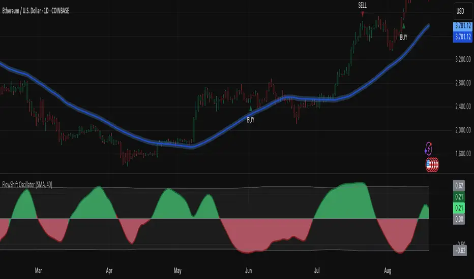
FlowShift OscillatorFlowShift Oscillator
Overview
The FlowShift Oscillator is a sophisticated momentum indicator designed to capture short-term shifts in market strength, identify trend acceleration, and highlight potential reversals. Combining baseline trend analysis with normalized momentum displacement and volatility-adjusted thresholds, FlowShift provides traders with a responsive, adaptive, and visually intuitive tool suitable for multiple timeframes and asset classes. Whether used for intraday scalping or longer-term trend following, FlowShift helps traders make informed decisions with precision and confidence.
Features
Customizable Baseline Moving Average : Select from SMA, EMA, SMMA (RMA), WMA, or VWMA to define the underlying trend. Adjustable length allows for tuning to specific market conditions.
Normalized Momentum Calculation : Measures price displacement relative to the baseline MA, removing minor fluctuations while preserving meaningful momentum shifts.
Volatility-Adjusted Thresholds : Dynamic upper and lower bounds adapt to market volatility, helping identify overextended bullish or bearish conditions.
Optional Signal Markers : Buy/Sell triangles indicate potential turning points when momentum reaches critical levels, aiding trade timing and decision-making.
Visual Enhancements : Customizable area fills, line colors, and optional candle tinting allow traders to quickly interpret momentum, bias, and trend direction.
Flexible Timeframe Compatibility : Effective across all timeframes, from 1-minute intraday charts to daily and weekly analysis.
How It Works
FlowShift calculates the displacement of price from a baseline moving average to identify deviations from the prevailing trend. This displacement is normalized and smoothed using exponential moving averages, producing a clean oscillator line that highlights genuine momentum changes. The oscillator’s dynamic thresholds are determined by a percentile of recent absolute values, providing an adaptive reference for extreme conditions in both bullish and bearish markets.
Signals
Buy Signal : Triggered when the oscillator crosses above prior lows in an oversold region, suggesting potential upward momentum.
Sell Signal : Triggered when the oscillator crosses below prior highs in an overbought region, indicating potential downward momentum.
Signals are optional and can be displayed as triangles on the chart to clearly mark potential entry and exit points.
Visual Interpretation
FlowShift Line & Area : The oscillator line and area highlight momentum direction and intensity. Upward momentum is shown in green tones, downward momentum in red.
Baseline MA & Glow : Displays the selected baseline moving average with optional glow for trend reference.
Candle Tinting : Optionally tints bars based on the baseline MA bias, providing an at-a-glance view of market sentiment.
Usage Notes
FlowShift is best used in conjunction with other trend confirmation tools or support/resistance analysis.
Dynamic thresholds help identify potential reversal points, but traders should consider overall market context and not rely solely on signals.
Customize the baseline MA type and length to fit your trading style; shorter lengths increase sensitivity, while longer lengths provide smoother trend representation.
Use the optional signal markers as guidance for trade timing, combining with risk management strategies for optimal results.
Conclusion
FlowShift Oscillator delivers a powerful, adaptive, and visually intuitive approach to momentum analysis. By combining baseline trend assessment, normalized momentum, and dynamic volatility scaling, it enables traders to anticipate market shifts, spot trend accelerations, and make timely trading decisions across a wide range of markets and timeframes.

super miracle 30s - hirochan binaryWhen this signal appears, enter a 30-second trade 10 seconds later.

Range Breakout Detector [Kodeus]The Range Breakout Detector is a technical tool designed to identify volatility-based price ranges and highlight breakout opportunities. It uses ATR-driven volatility spikes combined with flexible breakout detection methods to help traders visualize consolidations, potential breakouts, and trend continuations. The script automatically plots bullish and bearish zones and provides clear breakout signals when price action exceeds those ranges.
🔷 Key Features
Volatility-Triggered Zone Creation: Detects significant volatility spikes using ATR and SMA comparison to define key price ranges.
Customizable Breakout Detection: Allows traders to choose between Close or Wick levels for breakout confirmation.
Breakout Signals: Plots labels on the chart to indicate bullish or bearish breakouts.
Breakout Below Range :
Breakout Above Range :
Adjustable Zone Period: Offers a flexible period setting (5–50 bars) to suit different strategies and timeframes.
🔷 Disclaimer
Use with Caution: This indicator is provided for educational and informational purposes only and should not be considered as financial advice. Users should exercise caution and perform their own analysis before making trading decisions based on the indicator's signals.
Not Financial Advice: The information provided by this indicator does not constitute financial advice, and the creator shall not be held responsible for any trading losses incurred as a result of using this indicator.
Backtesting Recommended: Traders are encouraged to backtest the indicator thoroughly on historical data before using it in live trading to assess its performance and suitability for their trading strategies.
Risk Management: Trading involves inherent risks, and users should implement proper risk management strategies, including but not limited to stop-loss orders and position sizing, to mitigate potential losses.
No Guarantees: The accuracy and reliability of the indicator's signals cannot be guaranteed, as they are based on historical price data and past performance may not be indicative of future results.
