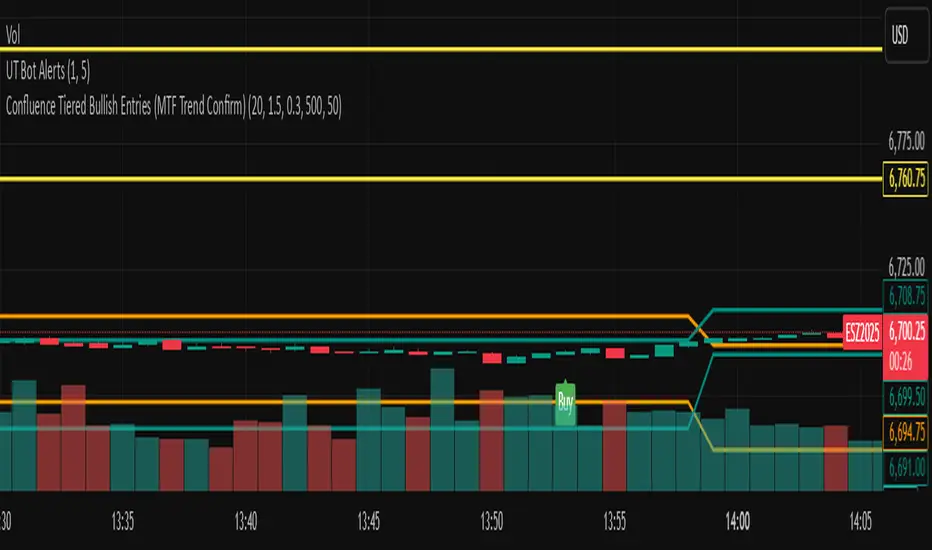
Confluence Tiered Bullish Entries (MTF Trend Confirm)Draws only the key trendlines: previous day’s high/low, last completed 4H high/low, and last completed 1H high/low.
Fires an alert the instant price touches any of those lines.
Detects bullish Fair Value Gaps (early, as they form), then marks a confluence only when price revisits that FVG.
Confirms with a volume spike + a green candle that closes near the bottom of its range (tunable).
Labels entries as Tier 3 (one confluence), Tier 2 (two), or Tier 1 BUY (all three).
Only shows those trendlines and bullish entry labels on chart.
Search in scripts for "trendline"
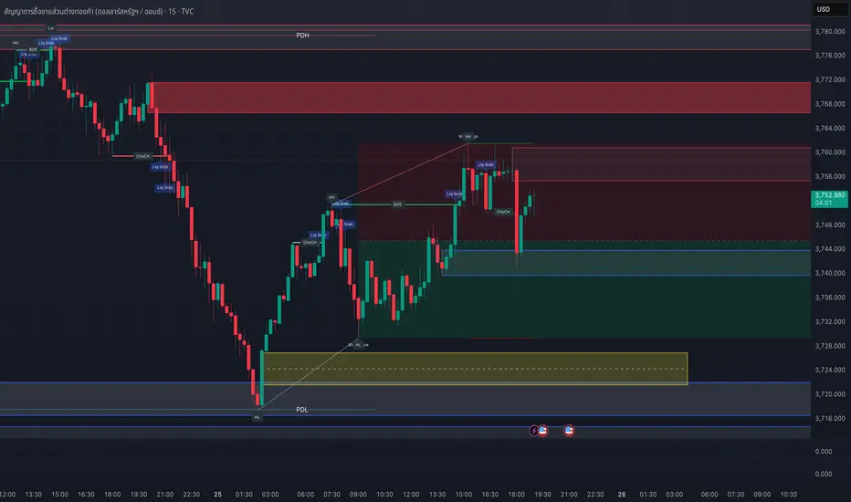
SMC style josh )SMC style josh — FVG, OB, BOS/CHoCH, EQH/EQL, PD, HTF, Trendlines
What it does
A clean-room Smart-Money–style study that visualizes market structure and liquidity concepts:
Structure: BOS & CHoCH for swing and internal legs (width/style controls, preview of last pivots)
Order Blocks: internal & swing OBs with midline (50%), mitigated/invalid handling, optional auto Breaker creation
Fair Value Gaps (FVG): auto boxes with optional 50% line, ATR filter, extend length, and “after-CHoCH only” window
Equal High/Low (EQH/EQL): ATR-based proximity threshold
Liquidity Grabs: wick-through/close-back tags
Premium/Discount (PD) zones: live boxes + equilibrium line from latest swing range
HTF levels: previous Daily/Weekly/Monthly highs/lows with labels (PDH/PDL, PWH/PWL, PMH/PML)
Trendlines: auto swing-to-swing lines (liquidity)
Confluence Score: column plot summarizing recent events (+/− weighting)
Key options
Safety switch to pause all drawings
Per-module visibility, label sizes/colors, line styles/widths
ATR-based filters for impulses and gaps
Limits for lines/labels/boxes to avoid runtime errors
How to read
BOS = continuation break of the current leg; CHoCH = potential regime shift
OB mitigated when price returns into the block; invalid when price closes beyond; mitigated-then-invalid can form a Breaker
FVG is considered “filled” when price closes through the gap boundary (optional hide/gray-out)
Strong/Weak High/Low tags reflect the active swing bias (potential liquidity/targets)
Good practice
Combine with risk management, multiple timeframes, and your own rules. All drawings are for study/visualization; signals are not trade instructions.
Compliance / Disclaimer
This script is for educational and research purposes only. It is not financial advice or a solicitation to buy/sell any asset. Past performance does not guarantee future results. Always test and manage risk responsibly.
License / Credits
Built with Pine Script® v5. “SMC style josh” is an original, clean-room implementation and does not reuse third-party code.
FibonacciRetracementHi all!
This library will help you draw Fibonacci retracement levels (zones). The code is from my indicator "Fibonacci retracement" (). You can see that description for more information about the behaviour and example of how to use this library. The code is almost the same with the addition of alerts. If the alert frequency is 'alert.freq_once_per_bar_close' alert messages will be concatenated and have a header saying how many messages it contains (if it's more than 1).
Hope this is of help!
Library "FibonacciRetracement"
ConcateAlerts(context)
Concatenates all alerts from the bar to one string (separated by new lines) and clears alert messages on the current bar.
Parameters:
context (Context)
AddAlert(context, message, unshiftInsteadOfPush)
Parameters:
context (Context)
message (string)
unshiftInsteadOfPush (bool)
Range(context, structure, settings)
Will return values if new levels/zones should be drawn.
Parameters:
context (Context) : The 'Context' for the Fibonacci retracement.
structure (Structure type from mickes/PriceAction/1) : The current 'Structure' from the 'MarketStructure' library.
settings (Settings) : The 'Settings' object for the 'Context'.
Returns: A tuple with the start and end pivot if new zones should be drawn, ' ' otherwise.
DrawAll(context, settings, start, end)
Draws lines and labels for the zone. It will also set the 'Price' value that will be used for absolute positions.
Parameters:
context (Context) : The 'Context' for the Fibonacci retracement.
settings (Settings) : The 'Settings' object for the 'Context'.
start (Pivot type from mickes/PriceAction/1)
end (Pivot type from mickes/PriceAction/1)
AlertActive(context, settings)
Will alert for all zones that are active. If multiple alert messages are added they will be concatenated (separated by a new line) with a header saying how many messages the alert contains.
Parameters:
context (Context) : The 'Context' for the Fibonacci retracement. This contains the zones that will be alerted if price (wick or close according to the settings) enters it.
settings (Settings) : The 'Settings' object for the 'Context'.
TrendlineSettings
Holds all the values for 'TrendlineSettings'.
Fields:
Enabled (series bool) : If the trendline should be visible or not.
Color (series color) : The color of the trendline.
Style (series string) : The style of the trendline (as a string).
GenericZonesSettings
Holds all the values for 'GenericZonesSettings', that will be applicable to all drawn objects.
Fields:
ExtendRight (series bool) : If all lines should extend to the right or not.
Style (series string) : The style of all drawn lines
Reverse (series bool) : If true, all lines will be reversed.
Prices (series bool) : If price levels should be shown or not.
Levels (series bool) : If levels should be shown or not.
LevelsValue (series string) : Either 'Value' or 'Percent'. Defined if value or percentage should be shown.
FontSize (series int) : The for size of the text in labels drawn.
LabelsPosition (series string) : Coul be 'Left', 'Rigth' or 'Adapt'. 'Adapt' will try to adapt the labels position to the prices.
ZoneSettings
Holds all the values for 'ZoneSettings'.
Fields:
Enabled (series bool) : If this zone is enabled or not.
Level (series float) : The level of the zone.
Color (series color) : The color that will be displayed.
Price (series float) : The price of the level. Will be set internally.
Settings
Holds all the values for 'Settings'.
Fields:
PivotLeftLength (series int) : The left length used to find pivots through the 'MarketStructure' library.
PivotRightLength (series int) : The right length used to find pivots through the 'MarketStructure' library.
Trendline (TrendlineSettings) : The settings for the 'Trendline' object.
GenericZonesSettings (GenericZonesSettings) : The setting applicable to all zones.
AlertFrequency (series string) : The frequency for the alerts. If 'alert.freq_once_per_bar_close', alert messages will be concatenated and have a header saying how many messages it contains (if it's more than 1).
AlertPrice (series string) : The price that has to enter a zone. Can be 'Close' (the closing price) or 'Wick' (the whole candle needs to be in the zone).
Zone1 (ZoneSettings) : The 'ZoneSettings' that represents this zone.
Zone2 (ZoneSettings) : The 'ZoneSettings' that represents this zone.
Zone3 (ZoneSettings) : The 'ZoneSettings' that represents this zone.
Zone4 (ZoneSettings) : The 'ZoneSettings' that represents this zone.
Zone5 (ZoneSettings) : The 'ZoneSettings' that represents this zone.
Zone6 (ZoneSettings) : The 'ZoneSettings' that represents this zone.
Zone7 (ZoneSettings) : The 'ZoneSettings' that represents this zone.
Zone8 (ZoneSettings) : The 'ZoneSettings' that represents this zone.
Zone9 (ZoneSettings) : The 'ZoneSettings' that represents this zone.
Zone10 (ZoneSettings) : The 'ZoneSettings' that represents this zone.
Zone11 (ZoneSettings) : The 'ZoneSettings' that represents this zone.
Zone12 (ZoneSettings) : The 'ZoneSettings' that represents this zone.
Zone13 (ZoneSettings) : The 'ZoneSettings' that represents this zone.
Zone14 (ZoneSettings) : The 'ZoneSettings' that represents this zone.
Zone15 (ZoneSettings) : The 'ZoneSettings' that represents this zone.
Zone16 (ZoneSettings) : The 'ZoneSettings' that represents this zone.
Zone17 (ZoneSettings) : The 'ZoneSettings' that represents this zone.
Zone18 (ZoneSettings) : The 'ZoneSettings' that represents this zone.
Zone19 (ZoneSettings) : The 'ZoneSettings' that represents this zone.
Zone20 (ZoneSettings) : The 'ZoneSettings' that represents this zone.
Zone21 (ZoneSettings) : The 'ZoneSettings' that represents this zone.
Zone22 (ZoneSettings) : The 'ZoneSettings' that represents this zone.
Zone23 (ZoneSettings) : The 'ZoneSettings' that represents this zone.
Zone24 (ZoneSettings) : The 'ZoneSettings' that represents this zone.
Context
Holds all the values for 'Context'.
Fields:
Lines (array) : All the drawn lines for the current 'Context'.
Labels (array) : All the drawn labels for the current 'Context'.
Boxes (array) : All the drawn boxes for the current 'Context'.
Alerts (array) : All the alert messages on the current tick.
Start (series int) : The start bar index of the current 'Context'.

Geometric Momentum Breakout with Monte CarloOverview
This experimental indicator uses geometric trendline analysis combined with momentum and Monte Carlo simulation techniques to help visualize potential breakout areas. It calculates support, resistance, and an aggregated trendline using a custom Geo library (by kaigouthro). The indicator also tracks breakout signals in a way that a new buy signal is triggered only after a sell signal (and vice versa), ensuring no repeated signals in the same direction.
Important:
This script is provided for educational purposes only. It is experimental and should not be used for live trading without proper testing and validation.
Key Features
Trendline Calculation:
Uses the Geo library to compute support and resistance trendlines based on historical high and low prices. The midpoint of these trendlines forms an aggregated trendline.
Momentum Analysis:
Computes the Rate of Change (ROC) to determine momentum. Breakout conditions are met only if the price and momentum exceed a user-defined threshold.
Monte Carlo Simulation:
Simulates future price movements to estimate the probability of bullish or bearish breakouts over a specified horizon.
Signal Tracking:
A persistent variable ensures that once a buy (or sell) signal is triggered, it won’t repeat until the opposite signal occurs.
Geometric Enhancements:
Calculates an aggregated trend angle and channel width (distance between support and resistance), and draws a perpendicular “breakout zone” line.
Table Display:
A built-in table displays key metrics including:
Bullish probability
Bearish probability
Aggregated trend angle (in degrees)
Channel width
Alerts:
Configurable alerts notify when a new buy or sell breakout signal occurs.
Inputs
Resistance Lookback & Support Lookback:
Number of bars to look back for determining resistance and support points.
Momentum Length & Threshold:
Period for ROC calculation and the minimum percentage change required for a breakout confirmation.
Monte Carlo Simulation Parameters:
Simulation Horizon: Number of future bars to simulate.
Simulation Iterations: Number of simulation runs.
Table Position & Text Size:
Customize where the table is displayed on the chart and the size of the text.
How to Use
Add the Script to Your Chart:
Copy the code into the Pine Script editor on TradingView and add it to your chart.
Adjust Settings:
Customize the inputs (e.g., lookback periods, momentum threshold, simulation parameters) to fit your analysis or educational requirements.
Interpret Signals:
A buy signal is plotted as a green triangle below the bar when conditions are met and the state transitions from neutral or sell.
A sell signal is plotted as a red triangle above the bar when conditions are met and the state transitions from neutral or buy.
Alerts are triggered only on the bar where a new signal is generated.
Examine the Table:
The table displays key metrics (breakout probabilities, aggregated trend angle, and channel width) to help evaluate current market conditions.
Disclaimer
This indicator is experimental and provided for educational purposes only. It is not intended as a trading signal or financial advice. Use this script at your own risk, and always perform your own research and testing before using any experimental tools in live trading.
Credit
This indicator uses the Geo library by kaigouthro. Special thanks to Cryptonerds and @Hazzantazzan for their contributions and insights.

Dow waveform analyzerDow Waveform Analyzer
1. Overview and Features of the Indicator
This indicator is a tool designed to analyze chart waveforms based on Dow Theory, identifying swing lows (support) and swing highs (resistance). It allows users to quickly and consistently determine trend direction. Compared to manual analysis, it provides more efficient and accurate results.
By using swing lows and swing highs, the indicator offers a more detailed understanding of trends than simple updates to highs and lows, aiding in the creation of effective trading strategies.
2. Identifying Wave Lows and Highs
Stock prices do not move in straight lines; instead, they rise and fall in waves. This indicator starts by identifying the wave lows and wave highs.
- Wave Low: The lowest point during a temporary price decline.
- Wave High: The highest point during a temporary price increase.
These are automatically identified using Pine Script’s built-in functions `pivotlow` and `pivothigh`.
3. Drawing the Waveform
The identified wave lows and highs are alternately connected to draw the waveform. However, there are cases where wave lows or highs occur consecutively:
- Consecutive Wave Lows: The lower low is used for drawing the waveform.
- Consecutive Wave Highs: The higher high is used for drawing the waveform.
4. Tracking Swing Lows/Highs and Trend Determination
Swing lows and swing highs are crucial markers that indicate the state of wave progression:
- Swing Low: The starting point of a wave (wave low) when the closing price exceeds the previous wave high.
- Swing High: The starting point of a wave (wave high) when the closing price falls below the previous wave low.
The changes in swing lows and swing highs as the waves progress allow for trend state determination.
5. Examples of Trend States
During an Uptrend:
- When the price surpasses a wave high, the swing low is updated, confirming the continuation of the uptrend.
End of an Uptrend:
- When the price falls below the swing low, the swing low disappears, and a swing high appears, signaling the end of the uptrend.
Sideways Movement:
- Swing lows and swing highs alternately appear, indicating a sideways trend.
Start of a Downtrend:
- When the price breaks below a wave low for the first time, the swing high is updated, confirming the start of the downtrend.
During a Downtrend:
- When the price breaks below a wave low, the swing high is updated, confirming the continuation of the downtrend.
End of a Downtrend:
- When the price surpasses a wave high, the swing high disappears, and a swing low reappears, signaling the end of the downtrend.
Restart of an Uptrend:
- When the swing low is updated, the uptrend resumes. The uptrend begins when the price surpasses a wave high, and the swing low is updated for the first time.
6. Applications
Trade Entries and Exits:
- Set stop orders for entry at the price level where a trend starts.
- Set stop orders for exit at the price level where a trend ends.
Trend Filtering:
- Use the indicator to confirm whether market conditions are suitable for entry based on the trend state. Analyze waveforms to aid trading strategies.
Guide for Drawing Trendlines:
- Utilize wave lows and highs as starting and ending points when drawing trendlines with drawing tools.
7. Parameters and Display Items
Pivot Points:
- Wave lows are marked with circles below the candlestick’s low, and wave highs are marked with circles above the candlestick’s high.
Number of Bars for Pivot Calculation:
- Specify the number of bars on either side used to identify highs (default: 2).
Waveform:
- Specify the color (default: blue) or toggle its visibility (default: visible).
Swing Lows/Highs:
- Displayed as large circles. The rightmost large circle on the chart indicates the current swing low or swing high. Historical swing points are also displayed to show the progression of state changes. Specify the color (default: green) or toggle visibility (default: visible).
1. インジケーターの概要と特徴
このインジケーターは、ダウ理論を基にチャートの波形を分析し、押し安値や戻り高値を特定するツールです。これにより、トレンドの方向を迅速かつ一貫して判断できます。手動での分析と比較して、効率的かつ精度の高い結果が得られる点が特徴です。
押し安値や戻り高値を利用することで、単純な高値・安値の更新よりも詳細にトレンドの状況を把握し、効果的な取引戦略の構築に役立ちます。
2. 波の谷と波の頂の特定
株価は直線的に動くのではなく、波を描きながら上昇や下落を繰り返します。このインジケーターは、まず波の谷と波の頂を特定するところから始まります。
波の谷: 一時的な下落の最安値
波の頂: 一時的な上昇の最高値
これらを Pine Script の内蔵関数(ピボットローとピボットハイ)を用いて自動的に特定しています。
3. 波形の描画方法
特定した波の谷と波の頂を交互に結んで波形を描画します。ただし、波の谷や頂が連続する場合があります。
波の谷が連続する場合: より低い谷を採用して波形を描く
波の頂が連続する場合: より高い頂を採用して波形を描く
4. 押し安値・戻り高値の追跡とトレンド判断
押し安値と戻り高値は、波の進行状況を示す重要な指標です。
押し安値: 終値が前回の高値を超えた際の波の谷
戻り高値: 終値が前回の安値を割り込んだ際の波の頂
波の進行に伴う押し安値・戻り高値の変化から、トレンドの状態を判断します。
5. トレンド状態の具体例
上昇トレンド中:
波の頂を株価が上抜け押し安値が更新され続けることで上昇トレンドを継続。
上昇トレンドの終了:
株価が押し安値を割ると、押し安値が消え、戻り高値が新たに出現して、上昇トレンドを終了。
横ばい状態:
押し安値と戻り高値が交互に切り替わる。
下降トレンドの開始:
波の谷を株価が下抜け戻り高値がはじめて更新されることで下降トレンド開始を確認。
下降トレンド中:
波の谷を株価が下抜け戻り高値が更新され続けることで下降トレンドを継続。
下降トレンドの終了:
株価が波の頂を超えると、戻り高値が消え、押し安値が再び出現して、下降トレンドを終了。
横ばい状態:
押し安値と戻り高値が交互に切り替わる。
上昇トレンドの再開:
押し安値が更新されることで上昇トレンドを確認。
波の頂を株価が上抜け押し安値がはじめて更新されることで上昇トレンド開始を確認。
6. 応用例
トレードのエントリーとエグジット:
トレンド発生の価格に逆指値を設定してエントリー。
トレンド終了の価格に逆指値を設定してエグジット。
トレンドフィルターとして活用:
エントリーに適したトレンド状況かを確認。波形を分析してトレード戦略の参考に。
トレンドラインを描く時の参考として活用:
波の谷と頂を描画ツールを使ってトレンドラインを描く時の起点や終点として活用。
7. パラメーターと表示項目
ピボット: 波の谷はローソク足の安値にサークルを表示、波の頂はローソク足の高値にサークルを表示。
ピボット計算用のバーの数: 高値を特定するために左右何本のローソク足を使用するかを設定(初期値: 2)。
波形: 色(初期値: 青)や表示(初期値: 表示)の指定。
押し安値・戻り高値: 大きなサークルで表示。チャートの一番右の大きなサークルが現在のもの。過去のものも状態変化の経緯を示すために表示。色(初期値: 緑)や表示(初期値: 表示)の指定。

No Wick Setup Indicator
**No Wick Setup Indicator**
This is a custom trading indicator designed to identify and signal potential buy and sell opportunities based on candlestick patterns with no wicks. Specifically, it looks for candles with no wicks at the bottom (bullish setup) or no wicks at the top (bearish setup). Here's how it works:
**Key Features:**
- **Bullish Setup**: A green candlestick with no bottom wick (i.e., the open price is equal to the low price of the candle) is considered a potential bullish signal. A trendline is drawn at the bottom of this candle. When the market price returns to this trendline, a buy signal is generated.
- **Bearish Setup**: A red candlestick with no top wick (i.e., the open price is equal to the high price of the candle) is considered a potential bearish signal. A trendline is drawn at the top of this candle. When the market price returns to this trendline, a sell signal is generated.
- **Timeframe**: This indicator works exclusively on the **30-minute timeframe**.
**How It Works:**
1. When a candlestick pattern with no bottom wick (bullish setup) is identified, a trendline is drawn at the low of the candlestick.
2. When a candlestick pattern with no top wick (bearish setup) is identified, a trendline is drawn at the high of the candlestick.
3. The indicator then tracks the market price and waits for it to return to the respective trendline level.
4. **Buy Signal**: When the market price touches or goes below the bullish trendline, a **Buy** signal is displayed on the chart with an upward arrow.
5. **Sell Signal**: When the market price touches or goes above the bearish trendline, a **Sell** signal is displayed on the chart with a downward arrow.
**Visual Elements:**
- **Trendlines**: Horizontal lines drawn at the bottom (bullish) or top (bearish) of the candlesticks with no wick.
- **Buy/Sell Labels**: Labels indicating "Buy" or "Sell" appear when the market price returns to the trendline.
**Why Use This Indicator?**
- This indicator helps identify specific price levels where the market might reverse or consolidate based on candlestick structure, offering potential entry points for trades.
- It allows traders to focus on price action and market behavior without relying on more complex indicators.

RR SummaThis is my favourite Indicator
Support and resistance are fundamental concepts in technical analysis used by traders to predict potential price movements in financial markets such as stocks, forex, and cryptocurrencies.
### 1. **Support**
Support refers to a price level at which an asset tends to find buying interest, preventing the price from falling further. It acts as a "floor" where demand is strong enough to halt the downward movement and potentially reverse it. When the price approaches support, buyers may step in, believing the asset is undervalued.
- **Characteristics of Support:**
- **Previous lows:** Historical price points where the price has repeatedly bounced upward.
- **Increased buying pressure:** When prices approach the support level, traders tend to buy, believing it's a good entry point.
- **Psychological factor:** Traders view support levels as a point where the price is unlikely to fall below for a while.
- **Example:** A stock may be trading at $50, and whenever it drops near that price, buyers step in and push it back up. In this case, $50 is the support level.
### 2. **Resistance**
Resistance is the opposite of support. It is a price level at which an asset faces selling pressure, preventing the price from rising further. It acts as a "ceiling," where supply exceeds demand, often leading to a reversal or consolidation.
- **Characteristics of Resistance:**
- **Previous highs:** Historical price points where the price has struggled to break through or where it has reversed downward.
- **Increased selling pressure:** Sellers are more likely to take profits or short the asset near resistance levels.
- **Psychological factor:** Traders may perceive resistance levels as a point where the asset is overvalued or where the trend will reverse.
- **Example:** A stock may approach a price of $100, but every time it gets close, sellers appear and push the price back down. In this case, $100 is the resistance level.
### **Key Points about Support and Resistance**
- **Breakout and Breakdown:** If a price moves beyond a support or resistance level, it is considered a breakout (above resistance) or breakdown (below support). This may signal a new trend in the market.
- **Role Reversal:** Once a resistance level is broken, it can turn into a support level, and vice versa. Traders often look for such shifts in market behavior.
- **Trend Continuation or Reversal:** Support and resistance can indicate whether the market is in a trend or preparing for a reversal. A test of support or resistance can lead to a continuation if the level holds, or a reversal if the level is breached.
### **Identifying Support and Resistance**
- **Historical Price Action:** Look for points where the price has reversed or consolidated multiple times.
- **Trendlines:** Draw trendlines that connect swing highs (resistance) and swing lows (support) to identify these levels.
- **Moving Averages:** Key moving averages (e.g., 50-day, 200-day) can act as dynamic support and resistance levels.
### **Why Support and Resistance Matter**
- **Risk Management:** Traders use these levels to place stop-loss orders to manage risk.
- **Entry and Exit Points:** These levels can help traders decide when to enter or exit trades, aiming to buy near support and sell near resistance.
- **Market Sentiment:** Support and resistance levels reflect the collective psychology of market participants, indicating areas where sentiment may shift.
In summary, support and resistance are essential tools for traders to identify potential price points where assets may reverse or consolidate. Understanding these levels allows traders to make more informed decisions about when to buy, sell, or stay on the sidelines.

YinYang MomentumOverview:
YinYang Momentum is a Price, Volume and Momentum Oscillator. Its job is to help you see swings in momentum and the strength of it. It also creates signals (Blood Diamond (Bear) and Support Cross (Bull)) where these momentum swings may occur. YinYang Momentum features 3 Price and 3 Volume 'Mountains with Ice'. There are Predictive, Regular and Confirming Mountains. You have the ability to overlay them on top of each other which helps to decipher momentum swings. The Volume Mountains are very important for showing the strength behind the Price Mountains and their Signals. If you look, you'll notice, as the 'Ice' starts to curve into the 'Mountains' it signals a potential shift in Momentum. The green Mountain is the Predictive, the Blue is the Regular and the Purple is the Confirming. You'll also notice that the Predictive Mountains movements happen first and move much more drastically. When you notice the regular starts to follow suit, there is a potential for a momentum shift. Shortly after, a signal will occur if this shift is actually happening. You can also check the Confirming Mountain for more confirmation (however, leaving the Confirming Mountain active can be a little confusing and make it harder to read signals). YinYang Momentum also features Information Tables. These tables display how the Blood Diamonds and Support Cross' are fairing on different Timeframes. This way, you'll be able to see if it's in a Bullish or Bearish state on critical Time Frames no matter what Timeframe you're trading on.
Before we move onto the tutorial, let's discuss what each of these Mountains and Ice are and how they work. All of our Mountains and Ice are calculated using the same algorithm but with varying sources, lengths and multipliers. We are essentially calculating differences in movement and then sending those differences into an EMA for the Mountain Base and SMA for the mountain Ice. The values we use for the Predictive are much lower and therefore occur much quicker as they aren’t averaged out on longer lengths/time frames; this helps to make it more of a leading Indicator which may predict momentum changes. Our Regular is over a medium length and multipliers that result in a smooth but generally also gradual movement that helps reliability; this helps it act as more of an ‘in the now’ Indication of momentum changes. Our Confirming uses lengths and multipliers that are of a higher value and longer span; this makes it more difficult to use for determining entry / exit locations as it's more of a lagging indicator, but it helps to add confirmation as to whether the momentum change has occurred and wasn't a false signal.
Tutorial:
YinYang Momentum may look like a lot is going on.. And well that’s cause there is.. But that doesn’t mean it's confusing or hard to read once you know what you’re looking for!
To make this tutorial a little easier to understand, let's turn off a few settings and dissect this indicator one thing at a time. YinYang Momentum features Price and Volume mountains. Currently in the photo above we have 2 Price Mountains and 1 Volume Mountain turned on (this is how it's set by default and how we recommend using it), however there are 3 Mountains available for both Price and Volume:
Predictive
Regular
Confirming
We are going to deactivate everything so it's the Regular Price Mountain + Ice enabled.
Now that it is just the Regular Price Mountain and Ice it is much easier to teach and understand. As you can see there are two different colors on the mountain. The dark blue is the Mountain and the light blue is the Ice.
The Ice moves before the mountain does and when the momentum happens it is larger than it (below or above). When the momentum starts to change however, the Ice curves inside of the mountain. As you can see here, where the BUY signal (red cross) is, the Ice curves into the mountain; also where the SELL signal (red circle) is, the Ice curves into the mountain. The Ice curving into the mountain is a very important leading indication that momentum is changing and the Signals (crosses and diamonds) help solidify this momentum change.
The Index levels for YinYang Momentum is a little different than most oscillators that range from 0-100. Instead YinYang Momentum’s neutral level is 0 and it ranges from -100 to 100. For these reasons, the Viable Range for Buying is -40 to -70 and the Optimal Range for Buying is -70 to -100. For Selling, the Viable Range is 40 to 70 and the Optimal Range is 70 to 100.
If you look at the example above, you can see whenever it has been in the optimal range and the signal occurred, it may potentially be an amazing time to buy or sell. However, when it is within the Viable Range it can be hit or miss. The reason for this is because we are only looking at the Regular Price Mountain and Ice. Once we turn on the Predictive Price and Regular Volume we will have a much clearer idea as to what is noise and what is a true purchase signal. Why don’t we turn on Predictive Price Mountains and Ice so you can see what we’re talking about:
So there are 2 big things that changed when we added the predictive price mountains + ice.
We can see that where the orange circle is, is just noise, it isn’t a viable buy signal.
We can see that where the red circle is, is actually a better spot to sell than the previous marked white circle slightly to the right of it.
We will explain why both above are true, but first let's explain how we were able to deduce this information.
There are 5 rules when deciphering if the signal is a true signal or just noise.
You want the predictive mountain to be decently spaced out from the regular mountain. Refer to the example above how that should look. Remember it's predictive so with parabolic movements it will get quite spaced out. If the price went up but slowly, it generally won’t be as spaced and isn’t as strong of a signal predictor.
You want the Ice to be of a decent size and to curve in on both the Predictive and Regular Mountains. Both arrows (red and white circle arrows) are pointing to Ice that does just that. The Predictive mountain is of decent size and spaced out and the Ice curves in sharply on the Predictive, before curving in sharply on the Regular and then we get both Predictive and Regular Support Cross on the Same Bar.
When you get the Signals (Predictive and Regular) the amount of bars between them matters a lot! On the same Bar is ideal, however 1-2, max 3 bars between them is acceptable. Any more than 3 bars spacing and it's too risky of a signal because that means momentum change was happening but then stopped before picking back up. This doesn’t mean it can’t be a good signal, it just means it is much more risky and we don’t recommend it.
You don’t want Signal Clustering. You can see an example of this from the picture above. Signal Clustering is where signals are back to back over and over. During this time the momentum is in a consolidation phase and easily swaps back and forth between signals. These signals are not reliable and should not be traded on. We only want to act on clear momentum based signals.
Last but certainly not least, actually, the most important! Ensure that the Mountain + Ice for both the Predictive and Regular is at the bare minimum touching (preferably inside) the Viable Range. The Optimal range is best, but most mountains don’t make it that far. Viable Range is where you will make most of your trades from. Sometimes a great signal happens with all 5 of these rules but it is only touching the Viable Range right at 40 or -40. This CAN be okay, but is also much more risky than if it was at 50 to 60 or -50 to -60.
Based on the 5 rules mentioned, take a second and look back at the photo where we initially added the Predictive Price mountains and Ice, can you decipher why the orange circle is just noise, and can you see why the red circle is a better sell location than the white circle slightly to the right of it?
Let’s bring that photo back up now and let’s discuss this:
Let's start with the orange circle:
This orange circle, without the predictive, was hard to tell if it was a good location to buy or not, but the second we turned it on we could clearly see it was just noise.
The spacing between the Predictive mountains and the Regular is almost non-existent.
There was signal clustering shortly before this signal.
Remember, there doesn’t have to be many rules broken for a signal to be either too risky or not valid at all. The safest trades are ones where it meets the requirements of all 5 rules (6 once we talk about volume, but 5 price rules).
Now, let's discuss the red circle:
This red circle, although it could have been chosen with just the regular, was much more noticeable with the predictive added on top.
It has a perfect spacing between the Predictive and the Regular all the way to the peak.
The Ice is large and both curve in very nicely towards the mountains.
The signals are within 2 bars apart from each other.
There is no signal clustering.
The Predictive is within the Viable Range and the Regular is just touching it.
For these reasons, the red circle actually would have been where you sold and not the white circle beside it.
This pretty much covers the Price Mountains, but wait! The most important Cherry on Top to your decision making process is coming next!
We have just enabled our Regular Volume Mountains and Ice (which are the black mountains + ice). As you can see, we have circled what we call the ‘Perfect Combo’. This Perfect combo is when you have all 5 Price rules met COMBINED with a high volume mountain. The Volume Mountain and Ice act as strength. They aren’t biased towards bulls or bears, they simply show strength to whatever signal is present with it.
For example, if all 5 rules are met with Price on a Blood Diamond (Bear) Signal and there is a High Volume Mountain then this is also a ‘Perfect Combo’. That Blood Diamond signal will potentially have great strength behind it. The Viable and Optimal Ranges don’t apply to volume mountains. Any volume mountain, even close to the Viable Range, is considered to be a very high mountain. High volume is when the mountain is above 0 and low volume is when it's below 0. Any signal with low volume has less of a chance of being correct, regardless of whether it abides by all 5 price rules.
You can see here that the 5 Price rules are achieved but the volume mountain is low. It is at -25. Since the 5 Price rules are right, there is still a decent amount of accuracy to this signal and the price did plummet after, but not nearly as much as it would have if the volume mountain was high with it.
We have turned our Confirming Price Mountain on here so you can get an idea of what it looks like and how it’s used. If you refer to the Support Crosses and Blood Diamonds circled in white, you’ll see that although they both received their signals on the Predictive and Regular, neither of them received it on the Confirming. This shows that these signals lost momentum shortly after. However if you look at both the red and green circles, you’ll see that they both received their confirming signals and that it helped give those signals momentum. The Confirming Price Mountain is meant to help confirm if the momentum change is still on track and the max 3 bars from the regular signal rule still applies to it. However its height within the viable and optimal range is important, just not as relevant
Before we move on to our Information Tables we want to take a second just to discuss our Volume Mountains and Ice. We haven’t had a chance yet to discuss the Predictive or Confirming Volume. When it comes to our Volume Mountains + Ice, we don’t recommend having more than 1 on at a time. The reason we have included the Predictive and Confirming is in case you find they suit your Trading Style best, not necessarily to be used the same way the Price Mountains and Ice are. The main reason for this is due to the fact that the Volume Mountains are much smaller and when overlaid on top of each other can make a confusing blur that is hard to decipher.
In this example above we have enabled both Predictive and Regular Volume just so you can understand what we are talking about. The two together can be rather confusing and actually interfere with your decision making process. For this reason, we highly recommend finding the Volume Mountain that suits your trading style best and solely sticking to that.
Our Predictive Volume Mountains and Ice may help sense volume changes before they’ve even happened. This can be very useful if your Trading Style revolves around heavy volume changes.
Our Confirming Volume Mountains and Ice are much slower and smaller, but they help show the movement of volume that has occurred already. This can be used to help see the movement of volume without fearing it may or may not happen.
Our Information Tables are there to show you valuable information on whether it is in a state of Support Cross or Blood Diamond on 6 different Time Frames at the same time. The % it shows you displays how much of a price change has occurred since that signal has happened. It is important to note, if for instance you see it is in a state of Support Cross but the % is negative, this generally means it is going to switch to Blood Diamond soon and vice versa. Therefore if you are in a trade, especially on a lower Time Frame and you are watching the 1 Day or a higher Time Frame and notice that the % is getting less and less, it may be a good time to get out.
We will conclude our Tutorial here. If you have any Questions, Concerns, Suggestions or Comments please don’t hesitate to contact us.
Settings:
1. Show Predictive to Confirmed Trendline:
The Predictive to Confirmed Trendline is very useful for seeing when the predictive (Support Cross or Blood Diamond) has hit the confirmed (It’s a strong confirmation that the trend may be shifting). This trendline also features a Moving Average which helps give you a solid marker for when the Regular / Predictive mountains cross under or over it that a momentum swing may occur. Somewhat like when the RSI crosses above/below its Moving Average it dictates momentum change, that is likewise how to interpret when it happens with the mountains and this trendline.
2. Show Price Ice and Mountains based on:
The Price Ice and Mountains are very important when it comes to deciphering signal strength. For example, When the mountains are very low (regular and predictive) and are between the 2 red line (undervalued) or even possibly below the bottom red line, and the Ice on the mountains starts to curve into the mountains and then the Predictive and Regular Support Cross occur; this is a very strong Bullish Signal. But wait, that's not all, the cherry on top is when the volume mountain (black) is ALSO high while this occurs; the Volume Mountain adds Strength to the signal. When the volume mountain is high too during this ‘Perfect Combo’ this may potentially lead to very bullish price movement occurring soon. Here is an overview of each mountain:
2.1. Predictive: Are the least reliable, but they move first and nothing will move without the predictive moving first, and getting you ready.
2.2. Regular: Are the most accurate, they don't signify strength on its own, but they sure show some momentum.
2.3. Confirming: Are slightly behind when it comes to displaying data, and therefore shouldn't be used for entry / exit, but rather to show if the trend movement has truly been confirmed or not.
When the Ice starts to curve into the Mountain, (either upward or below) it signifies possible momentum change. There are Crosses (Bull), and Diamonds (Bear) to show when they've crossed. Cross' and Diamonds balance each other out and therefore there can never be more than 1 in a row (of the same type). When the Ice and Mountain size is very large (between 40 and 70), and the predictive Ice starts to curve into its mountain, and then the predictive curves into the Regular, and the Regular Ice is curving into its Mountain, then it may have some strong weight behind that signal.\nIMPORTANT: refer to Volume tooltip below for how to increase the signal strength even more.
3. Show Volume Ice and Mountains based on:
The Volume Ice and Mountains are for giving strength to the Price's signals and Size. When there is the perfect combo (described above) AND the Volume Ice + Mountain is high, then there may be a lot of strength to that Price signals (whether it is Cross (Bull), or Diamond (Bear)).
IMPORTANT: High volume mountains, unlike Price, don't mean good or bad. Volume shows strength to the Price, and therefore if there are high Volume mountains during a Diamond (Bearish), then there may be a lot of strength to that signal and vice versa.
4. Show Information Tables:
Information tables are used to display 6 different Time Frames and whether or not each time frame is in a state of Blood Diamond (red) or Support Cross (green). They also show how much % in price has changed since the current signal happened. These are very useful for seeing how the price is fairing on different Time Frames without having to constantly change your timeframe. For instance, maybe you base your entry off the 1 day time frame but then you swing trade on the 15 minute. Well, after you’ve confirmed your entry position and are sitting on the 15 minute, you can stay on the 15 minute and see how it is fairing on the 1 day, 5 minute or whatever time frame you choose. This way you aren’t distracted from the trade at hand. All of these Time Frames can be adjusted in the Settings (GUI) to whatever resolution you wish.
5. Res1 / Res2/ Res3 / Res4 / Res5 / Res6:
These represent the different resolutions (Time Frames) being used in your information tables and can be modified to display whatever resolution works best for your trading style. By default they are:
Res1: Current Timeframe
Res2: 15 Minute
Res3: 1 Hour
Res4: 4 Hour
Res5: 1 Day
Res6: 1 Week
Backup Res (not changeable): 5 Minute (this is only used if your Current Timeframe in Res1 is a duplicate of one of the other resolutions)
HAPPY TRADING!

Support & Resistance AI (K means/median) [ThinkLogicAI]█ OVERVIEW
K-means is a clustering algorithm commonly used in machine learning to group data points into distinct clusters based on their similarities. While K-means is not typically used directly for identifying support and resistance levels in financial markets, it can serve as a tool in a broader analysis approach.
Support and resistance levels are price levels in financial markets where the price tends to react or reverse. Support is a level where the price tends to stop falling and might start to rise, while resistance is a level where the price tends to stop rising and might start to fall. Traders and analysts often look for these levels as they can provide insights into potential price movements and trading opportunities.
█ BACKGROUND
The K-means algorithm has been around since the late 1950s, making it more than six decades old. The algorithm was introduced by Stuart Lloyd in his 1957 research paper "Least squares quantization in PCM" for telecommunications applications. However, it wasn't widely known or recognized until James MacQueen's 1967 paper "Some Methods for Classification and Analysis of Multivariate Observations," where he formalized the algorithm and referred to it as the "K-means" clustering method.
So, while K-means has been around for a considerable amount of time, it continues to be a widely used and influential algorithm in the fields of machine learning, data analysis, and pattern recognition due to its simplicity and effectiveness in clustering tasks.
█ COMPARE AND CONTRAST SUPPORT AND RESISTANCE METHODS
1) K-means Approach:
Cluster Formation: After applying the K-means algorithm to historical price change data and visualizing the resulting clusters, traders can identify distinct regions on the price chart where clusters are formed. Each cluster represents a group of similar price change patterns.
Cluster Analysis: Analyze the clusters to identify areas where clusters tend to form. These areas might correspond to regions of price behavior that repeat over time and could be indicative of support and resistance levels.
Potential Support and Resistance Levels: Based on the identified areas of cluster formation, traders can consider these regions as potential support and resistance levels. A cluster forming at a specific price level could suggest that this level has been historically significant, causing similar price behavior in the past.
Cluster Standard Deviation: In addition to looking at the means (centroids) of the clusters, traders can also calculate the standard deviation of price changes within each cluster. Standard deviation is a measure of the dispersion or volatility of data points around the mean. A higher standard deviation indicates greater price volatility within a cluster.
Low Standard Deviation: If a cluster has a low standard deviation, it suggests that prices within that cluster are relatively stable and less likely to exhibit sudden and large price movements. Traders might consider placing tighter stop-loss orders for trades within these clusters.
High Standard Deviation: Conversely, if a cluster has a high standard deviation, it indicates greater price volatility within that cluster. Traders might opt for wider stop-loss orders to allow for potential price fluctuations without getting stopped out prematurely.
Cluster Density: Each data point is assigned to a cluster so a cluster that is more dense will act more like gravity and
2) Traditional Approach:
Trendlines: Draw trendlines connecting significant highs or lows on a price chart to identify potential support and resistance levels.
Chart Patterns: Identify chart patterns like double tops, double bottoms, head and shoulders, and triangles that often indicate potential reversal points.
Moving Averages: Use moving averages to identify levels where the price might find support or resistance based on the average price over a specific period.
Psychological Levels: Identify round numbers or levels that traders often pay attention to, which can act as support and resistance.
Previous Highs and Lows: Identify significant previous price highs and lows that might act as support or resistance.
The key difference lies in the approach and the foundation of these methods. Traditional methods are based on well-established principles of technical analysis and market psychology, while the K-means approach involves clustering price behavior without necessarily incorporating market sentiment or specific price patterns.
It's important to note that while the K-means approach might provide an interesting way to analyze price data, it should be used cautiously and in conjunction with other traditional methods. Financial markets are influenced by a wide range of factors beyond just price behavior, and the effectiveness of any method for identifying support and resistance levels should be thoroughly tested and validated. Additionally, developments in trading strategies and analysis techniques could have occurred since my last update.
█ K MEANS ALGORITHM
The algorithm for K means is as follows:
Initialize cluster centers
assign data to clusters based on minimum distance
calculate cluster center by taking the average or median of the clusters
repeat steps 1-3 until cluster centers stop moving
█ LIMITATIONS OF K MEANS
There are 3 main limitations of this algorithm:
Sensitive to Initializations: K-means is sensitive to the initial placement of centroids. Different initializations can lead to different cluster assignments and final results.
Assumption of Equal Sizes and Variances: K-means assumes that clusters have roughly equal sizes and spherical shapes. This may not hold true for all types of data. It can struggle with identifying clusters with uneven densities, sizes, or shapes.
Impact of Outliers: K-means is sensitive to outliers, as a single outlier can significantly affect the position of cluster centroids. Outliers can lead to the creation of spurious clusters or distortion of the true cluster structure.
█ LIMITATIONS IN APPLICATION OF K MEANS IN TRADING
Trading data often exhibits characteristics that can pose challenges when applying indicators and analysis techniques. Here's how the limitations of outliers, varying scales, and unequal variance can impact the use of indicators in trading:
Outliers are data points that significantly deviate from the rest of the dataset. In trading, outliers can represent extreme price movements caused by rare events, news, or market anomalies. Outliers can have a significant impact on trading indicators and analyses:
Indicator Distortion: Outliers can skew the calculations of indicators, leading to misleading signals. For instance, a single extreme price spike could cause indicators like moving averages or RSI (Relative Strength Index) to give false signals.
Risk Management: Outliers can lead to overly aggressive trading decisions if not properly accounted for. Ignoring outliers might result in unexpected losses or missed opportunities to adjust trading strategies.
Different Scales: Trading data often includes multiple indicators with varying units and scales. For example, prices are typically in dollars, volume in units traded, and oscillators have their own scale. Mixing indicators with different scales can complicate analysis:
Normalization: Indicators on different scales need to be normalized or standardized to ensure they contribute equally to the analysis. Failure to do so can lead to one indicator dominating the analysis due to its larger magnitude.
Comparability: Without normalization, it's challenging to directly compare the significance of indicators. Some indicators might have a larger numerical range and could overshadow others.
Unequal Variance: Unequal variance in trading data refers to the fact that some indicators might exhibit higher volatility than others. This can impact the interpretation of signals and the performance of trading strategies:
Volatility Adjustment: When combining indicators with varying volatility, it's essential to adjust for their relative volatilities. Failure to do so might lead to overemphasizing or underestimating the importance of certain indicators in the trading strategy.
Risk Assessment: Unequal variance can impact risk assessment. Indicators with higher volatility might lead to riskier trading decisions if not properly taken into account.
█ APPLICATION OF THIS INDICATOR
This indicator can be used in 2 ways:
1) Make a directional trade:
If a trader thinks price will go higher or lower and price is within a cluster zone, The trader can take a position and place a stop on the 1 sd band around the cluster. As one can see below, the trader can go long the green arrow and place a stop on the one standard deviation mark for that cluster below it at the red arrow. using this we can calculate a risk to reward ratio.
Calculating risk to reward: targeting a risk reward ratio of 2:1, the trader could clearly make that given that the next resistance area above that in the orange cluster exceeds this risk reward ratio.
2) Take a reversal Trade:
We can use cluster centers (support and resistance levels) to go in the opposite direction that price is currently moving in hopes of price forming a pivot and reversing off this level.
Similar to the directional trade, we can use the standard deviation of the cluster to place a stop just in case we are wrong.
In this example below we can see that shorting on the red arrow and placing a stop at the one standard deviation above this cluster would give us a profitable trade with minimal risk.
Using the cluster density table in the upper right informs the trader just how dense the cluster is. Higher density clusters will give a higher likelihood of a pivot forming at these levels and price being rejected and switching direction with a larger move.
█ FEATURES & SETTINGS
General Settings:
Number of clusters: The user can select from 3 to five clusters. A good rule of thumb is that if you are trading intraday, less is more (Think 3 rather than 5). For daily 4 to 5 clusters is good.
Cluster Method: To get around the outlier limitation of k means clustering, The median was added. This gives the user the ability to choose either k means or k median clustering. K means is the preferred method if the user things there are no large outliers, and if there appears to be large outliers or it is assumed there are then K medians is preferred.
Bars back To train on: This will be the amount of bars to include in the clustering. This number is important so that the user includes bars that are recent but not so far back that they are out of the scope of where price can be. For example the last 2 years we have been in a range on the sp500 so 505 days in this setting would be more relevant than say looking back 5 years ago because price would have to move far to get there.
Show SD Bands: Select this to show the 1 standard deviation bands around the support and resistance level or unselect this to just show the support and resistance level by itself.
Features:
Besides the support and resistance levels and standard deviation bands, this indicator gives a table in the upper right hand corner to show the density of each cluster (support and resistance level) and is color coded to the cluster line on the chart. Higher density clusters mean price has been there previously more than lower density clusters and could mean a higher likelihood of a reversal when price reaches these areas.
█ WORKS CITED
Victor Sim, "Using K-means Clustering to Create Support and Resistance", 2020, towardsdatascience.com
Chris Piech, "K means", stanford.edu
█ ACKNOLWEDGMENTS
@jdehorty- Thanks for the publish template. It made organizing my thoughts and work alot easier.

Parallel Projections [theEccentricTrader]█ OVERVIEW
This indicator automatically projects parallel trendlines or channels, from a single point of origin. In the example above I have applied the indicator twice to the 1D SPXUSD. The five upper lines (green) are projected at an angle of -5 from the 1-month swing high anchor point with a projection ratio of -72. And the seven lower lines (blue) are projected at an angle of 10 with a projection ratio of 36 from the 1-week swing low anchor point.
█ CONCEPTS
Green and Red Candles
• A green candle is one that closes with a high price equal to or above the price it opened.
• A red candle is one that closes with a low price that is lower than the price it opened.
Swing Highs and Swing Lows
• A swing high is a green candle or series of consecutive green candles followed by a single red candle to complete the swing and form the peak.
• A swing low is a red candle or series of consecutive red candles followed by a single green candle to complete the swing and form the trough.
Peak and Trough Prices (Basic)
• The peak price of a complete swing high is the high price of either the red candle that completes the swing high or the high price of the preceding green candle, depending on which is higher.
• The trough price of a complete swing low is the low price of either the green candle that completes the swing low or the low price of the preceding red candle, depending on which is lower.
Historic Peaks and Troughs
The current, or most recent, peak and trough occurrences are referred to as occurrence zero. Previous peak and trough occurrences are referred to as historic and ordered numerically from right to left, with the most recent historic peak and trough occurrences being occurrence one.
Support and Resistance
• Support refers to a price level where the demand for an asset is strong enough to prevent the price from falling further.
• Resistance refers to a price level where the supply of an asset is strong enough to prevent the price from rising further.
Support and resistance levels are important because they can help traders identify where the price of an asset might pause or reverse its direction, offering potential entry and exit points. For example, a trader might look to buy an asset when it approaches a support level , with the expectation that the price will bounce back up. Alternatively, a trader might look to sell an asset when it approaches a resistance level , with the expectation that the price will drop back down.
It's important to note that support and resistance levels are not always relevant, and the price of an asset can also break through these levels and continue moving in the same direction.
Trendlines
Trendlines are straight lines that are drawn between two or more points on a price chart. These lines are used as dynamic support and resistance levels for making strategic decisions and predictions about future price movements. For example traders will look for price movements along, and reactions to, trendlines in the form of rejections or breakouts/downs.
█ FEATURES
Inputs
• Anchor Point Type
• Swing High/Low Occurrence
• HTF Resolution
• Highest High/Lowest Low Lookback
• Angle Degree
• Projection Ratio
• Number Lines
• Line Color
Anchor Point Types
• Swing High
• Swing Low
• Swing High (HTF)
• Swing Low (HTF)
• Highest High
• Lowest Low
• Intraday Highest High (intraday charts only)
• Intraday Lowest Low (intraday charts only)
Swing High/Swing Low Occurrence
This input is used to determine which historic peak or trough to reference for swing high or swing low anchor point types.
HTF Resolution
This input is used to determine which higher timeframe to reference for swing high (HTF) or swing low (HTF) anchor point types.
Highest High/Lowest Low Lookback
This input is used to determine the lookback length for highest high or lowest low anchor point types.
Intraday Highest High/Lowest Low Lookback
When using intraday highest high or lowest low anchor point types, the lookback length is calculated automatically based on number of bars since the daily candle opened.
Angle Degree
This input is used to determine the angle of the trendlines. The output is expressed in terms of point or pips, depending on the symbol type, which is then passed through the built in math.todegrees() function. Positive numbers will project the lines upwards while negative numbers will project the lines downwards. Depending on the market and timeframe, the impact input values will have on the visible gaps between the lines will vary greatly. For example, an input of 10 will have a far greater impact on the gaps between the lines when viewed from the 1-minute timeframe than it would on the 1-day timeframe. The input is a float and as such the value passed through can go into as many decimal places as the user requires.
It is also worth mentioning that as more lines are added the gaps between the lines, that are closest to the anchor point, will get tighter as they make their way up the y-axis. Although the gaps between the lines will stay constant at the x2 plot, i.e. a distance of 10 points between them, they will gradually get tighter and tighter at the point of origin as the slope of the lines get steeper.
Projection Ratio
This input is used to determine the distance between the parallels, expressed in terms of point or pips. Positive numbers will project the lines upwards while negative numbers will project the lines downwards. Depending on the market and timeframe, the impact input values will have on the visible gaps between the lines will vary greatly. For example, an input of 10 will have a far greater impact on the gaps between the lines when viewed from the 1-minute timeframe than it would on the 1-day timeframe. The input is a float and as such the value passed through can go into as many decimal places as the user requires.
Number Lines
This input is used to determine the number of lines to be drawn on the chart, maximum is 500.
█ LIMITATIONS
All green and red candle calculations are based on differences between open and close prices, as such I have made no attempt to account for green candles that gap lower and close below the close price of the preceding candle, or red candles that gap higher and close above the close price of the preceding candle. This may cause some unexpected behaviour on some markets and timeframes. I can only recommend using 24-hour markets, if and where possible, as there are far fewer gaps and, generally, more data to work with.
If the lines do not draw or you see a study error saying that the script references too many candles in history, this is most likely because the higher timeframe anchor point is not present on the current timeframe. This problem usually occurs when referencing a higher timeframe, such as the 1-month, from a much lower timeframe, such as the 1-minute. How far you can lookback for higher timeframe anchor points on the current timeframe will also be limited by your Trading View subscription plan. Premium users get 20,000 candles worth of data, pro+ and pro users get 10,000, and basic users get 5,000.
█ RAMBLINGS
It is my current thesis that the indicator will work best when used in conjunction with my Wavemeter indicator, which can be used to set the angle and projection ratio. For example, the average wave height or amplitude could be used as the value for the angle and projection ratio inputs. Or some factor or multiple of such an average. I think this makes sense as it allows for objectivity when applying the indicator across different markets and timeframes with different energies and vibrations.
“If you want to find the secrets of the universe, think in terms of energy, frequency and vibration.”
― Nikola Tesla

Fan Projections [theEccentricTrader]█ OVERVIEW
This indicator automatically projects trendlines in the shape of a fan, from a single point of origin. In the example above I have applied the indicator twice to the 1D SPXUSD. The seven upper lines (green) are projected at an angle of -5 from the 1-month swing high anchor point. And the five lower lines (blue) are projected at an angle of 10 from the 1-week swing low anchor point.
█ CONCEPTS
Green and Red Candles
• A green candle is one that closes with a high price equal to or above the price it opened.
• A red candle is one that closes with a low price that is lower than the price it opened.
Swing Highs and Swing Lows
• A swing high is a green candle or series of consecutive green candles followed by a single red candle to complete the swing and form the peak.
• A swing low is a red candle or series of consecutive red candles followed by a single green candle to complete the swing and form the trough.
Peak and Trough Prices (Basic)
• The peak price of a complete swing high is the high price of either the red candle that completes the swing high or the high price of the preceding green candle, depending on which is higher.
• The trough price of a complete swing low is the low price of either the green candle that completes the swing low or the low price of the preceding red candle, depending on which is lower.
Historic Peaks and Troughs
The current, or most recent, peak and trough occurrences are referred to as occurrence zero. Previous peak and trough occurrences are referred to as historic and ordered numerically from right to left, with the most recent historic peak and trough occurrences being occurrence one.
Support and Resistance
• Support refers to a price level where the demand for an asset is strong enough to prevent the price from falling further.
• Resistance refers to a price level where the supply of an asset is strong enough to prevent the price from rising further.
Support and resistance levels are important because they can help traders identify where the price of an asset might pause or reverse its direction, offering potential entry and exit points. For example, a trader might look to buy an asset when it approaches a support level , with the expectation that the price will bounce back up. Alternatively, a trader might look to sell an asset when it approaches a resistance level , with the expectation that the price will drop back down.
It's important to note that support and resistance levels are not always relevant, and the price of an asset can also break through these levels and continue moving in the same direction.
Trendlines
Trendlines are straight lines that are drawn between two or more points on a price chart. These lines are used as dynamic support and resistance levels for making strategic decisions and predictions about future price movements. For example traders will look for price movements along, and reactions to, trendlines in the form of rejections or breakouts/downs.
█ FEATURES
Inputs
• Anchor Point Type
• Swing High/Low Occurrence
• HTF Resolution
• Highest High/Lowest Low Lookback
• Angle Degree
• Number Lines
• Line Color
Anchor Point Types
• Swing High
• Swing Low
• Swing High (HTF)
• Swing Low (HTF)
• Highest High
• Lowest Low
• Intraday Highest High (intraday charts only)
• Intraday Lowest Low (intraday charts only)
Swing High/Swing Low Occurrence
This input is used to determine which historic peak or trough to reference for swing high or swing low anchor point types.
HTF Resolution
This input is used to determine which higher timeframe to reference for swing high (HTF) or swing low (HTF) anchor point types.
Highest High/Lowest Low Lookback
This input is used to determine the lookback length for highest high or lowest low anchor point types.
Intraday Highest High/Lowest Low Lookback
When using intraday highest high or lowest low anchor point types, the lookback length is calculated automatically based on number of bars since the daily candle opened.
Angle Degree
This input is used to determine the angle of the trendlines. The output is expressed in terms of point or pips, depending on the symbol type, which is then passed through the built in math.todegrees() function. Positive numbers will project the lines upwards while negative numbers will project the lines downwards. Depending on the market and timeframe, the impact input values will have on the visible gaps between the lines will vary greatly. For example, an input of 10 will have a far greater impact on the gaps between the lines when viewed from the 1-minute timeframe than it would on the 1-day timeframe. The input is a float and as such the value passed through can go into as many decimal places as the user requires.
It is also worth mentioning that as more lines are added the gaps between the lines, that are closest to the anchor point, will get tighter as they make their way up the y-axis. Although the gaps between the lines will stay constant at the x2 plot, i.e. a distance of 10 points between them, they will gradually get tighter and tighter at the point of origin as the slope of the lines get steeper.
Number Lines
This input is used to determine the number of lines to be drawn on the chart, maximum is 500.
█ LIMITATIONS
All green and red candle calculations are based on differences between open and close prices, as such I have made no attempt to account for green candles that gap lower and close below the close price of the preceding candle, or red candles that gap higher and close above the close price of the preceding candle. This may cause some unexpected behaviour on some markets and timeframes. I can only recommend using 24-hour markets, if and where possible, as there are far fewer gaps and, generally, more data to work with.
If the lines do not draw or you see a study error saying that the script references too many candles in history, this is most likely because the higher timeframe anchor point is not present on the current timeframe. This problem usually occurs when referencing a higher timeframe, such as the 1-month, from a much lower timeframe, such as the 1-minute. How far you can lookback for higher timeframe anchor points on the current timeframe will also be limited by your Trading View subscription plan. Premium users get 20,000 candles worth of data, pro+ and pro users get 10,000, and basic users get 5,000.
█ RAMBLINGS
It is my current thesis that the indicator will work best when used in conjunction with my Wavemeter indicator, which can be used to set the angle. For example, the average wave height or amplitude could be used as the value for the angle input. Or some factor or multiple of such an average. I think this makes sense as it allows for objectivity when applying the indicator across different markets and timeframes with different energies and vibrations.
“If you want to find the secrets of the universe, think in terms of energy, frequency and vibration.”
― Nikola Tesla

Sessions [LuxAlgo]This indicator shows when user set sessions are active and returns various tools + metrics using the closing price within active sessions as an input. Users have the option to change up to 4 session times.
The indicator will increasingly lack accuracy when the chart timeframe is higher than 1 hour.
Settings
Sessions
Enable Session: Allows to enable or disable all associated elements with a specific user set session.
Session Time: Opening and closing times of the user set session in the hh:mm format.
Range: Highlights the associated session range on the chart.
Trendline: Returns the associated session trendline on the chart.
Mean: Returns the associated session mean average on the chart.
VWAP: Returns the associated session volume weighted average price on the chart.
Ranges Settings
Range Area Transparency: Transparency of the area highlighting sessions ranges.
Range Outline: Highlights the borders of the session range area.
Range Label: Shows the session label at the mid-point of the session interval.
Dashboard
Show Dashboard: Enables sessions dashboard on the chart.
Advanced Dashboard: Returns more information regarding user set sessions on the dashboard.
Dividers
Show Session Divider: Highlights active sessions using intervals on the bottom of the chart (this can lead to less responsive charts)
Show Daily Divider: Highlights days on the chart.
Usage
This tool is versatile and allows the user to perform a wide variety of tasks all focusing on highlighting and analyzing price movements within a specific user set session in a periodic fashion.
Significant forex trading sessions are used by default, but the users are free to choose the opening and closing time of their choices.
Using ranges can indicate which sessions returned the most volatile price movements.
Trendlines can be useful to estimate the underlying trend of a specific session, but they can also offer a quick way to see which session started a trend reversal.
The session Mean highlights the equilibrium level within a session, extrapolating these levels can provide potential support and resistances levels of interest.
Finally, users can use the sessions VWAP's for real time applications, using them as trailing supports and resistances.
Using The Advanced Dashboard
The advanced dashboard returns useful information regarding the user set sessions. Each dashboard elements are described below:
Status: Highlights whether the user set session is active (open) of inactive (closed).
Trend: Shows correlation coefficient between the session prices and a linear sequence of values. Values above 0 indicates an up-trending session, while values under 0 indicates a down-trending session. Values closer to (1, -1) indicates a more trending session.
Volume: Shows accumulated volume within the session
σ (Standard Deviation): Shows standard deviation of the session, while this value is not bounded it can be useful to compare it with the other ones to see which session was the most volatile.
Note that when a session becomes inactive the value on the dashboard will hold until the specific session becomes active again.
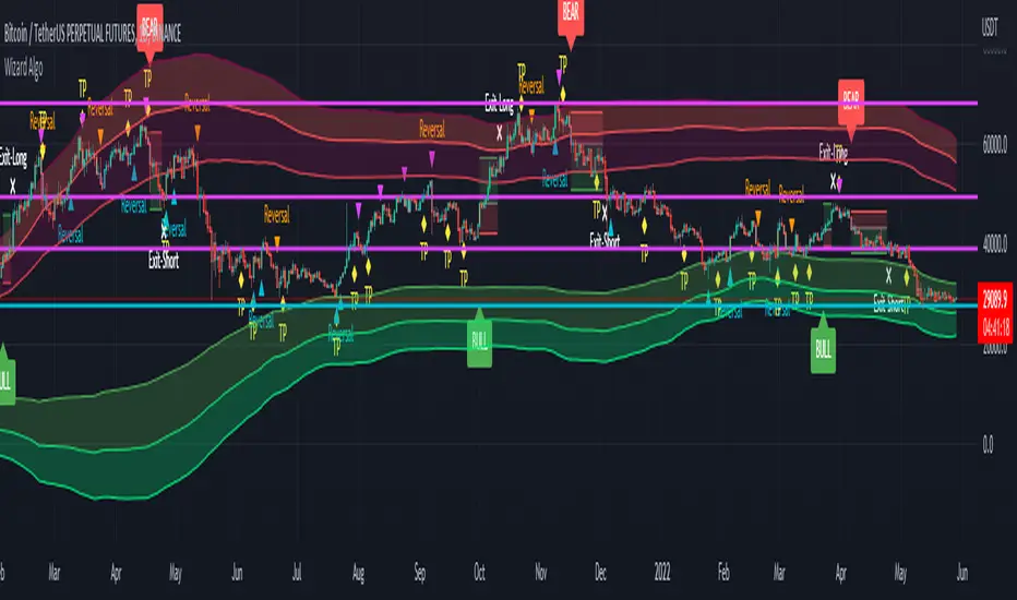
Wizard AlgoWizard Algo:
==============================
Features of the indicator:
- BULL/BEAR Signals
- TP (Take-Profit) and Exit System
- Possible Reversal Signals
- Reversal Scalper
- Reversal Bands
- Trend Bar Colors
- Auto Support/Resistance Levels
- Auto Trend-Lines
================================
Description:
1. Signals: The signals consists of 2 different approaches and the users can choose which signal type they want to use. The indicator gives bull/bear signals based on certain condition, such as trend and momentum. The "TP" signals stands for "Take Profit." These signals help users to decide when to take profits or liquidate all position. The Indicator includes an exit system that can used as another means of closing a position. The exit system uses a 1.5x risk to reward ratio to determine where to keep the take profit and stop loss target.
2.Reversal Scalper: Reversal scalpers are the tiny up(aqua) and down(fuchsia) triangles on the chart. These signals a possible reversal in the price and they can be used to enter a scalping trade. The signals uses mainly momentum and candle price action to determine when there could be a possible reversal in price.
3. Reversal Bands: The reversal band is the green/red cloud like indicator. This can help determine when a price is oversold and therefore, it could reverse. Same goes for the short side, if price is in the overbought territory, then it could reverse to the downside. The reversal bands uses mainly volatility. This is not the same thing as Bollinger bands.
4. Bar Colors: The candle bar colors helps to determine the current trend. The colors are given based on the current trend. The colors lime/red shows strong trend, and orange/cyan/blue shows weak trend.
5. Auto S/R and Auto trendlines: These indicators can be used for determining price actions. Both of these work in similar manner. They mainly look at the previous pivots and draws a line connecting the pivots. S/R are the horizontal lines and the trendline have angles to them.
Trend Lines for RSI, CCI, Momentum, OBVHello Traders!
After publishing Trend Lines for RSI yesterday, I realized that Trend Lines for more indicators needed by the traders. so I decided to make it for four different indicators: RSI, CCI, OBV, Momentum
In the indicator options you can choose the indicator from pull-down menu.
How it works?
- On each bar it finds last 10 higher and lower Pivot Points (PP) for the indicator.
- from first bar to 10. Pivot Point it searchs if a trend line is possible
- for each PP it starts searching from the last PP .
- it checks if drawing a trend line possible or not and also it's broken or not
- if it's broken then optionally it shows broken trend lines as dotted (or you can option not to see broken lines)
- if it finds a continues trend line then it stops searhing more and draw trend line, this is done by checking angles (I did this to make the script faster, otherwise you may get error because of it needs time more than .2sec)
- the script makes this process for each PP
- then shows the trend lines
P.S. it may need 3-10 seconds when you added the script to the chart at first (because of calculations)
Trend lines for CCI:
Trend Lines for OBV
Trend Lines for Momentum:
You may want to watch how Trend Lines script works (that was made for RSI)
s3.tradingview.com
If you still didn't see Trend Lines v2 then visit:
All Comments are welcome..
Enjoy!
Trend Lines v2Hello Everyone. After working on new and better trend lines script for couple of weeks, finally I am proud to publish Trend Lines v2.
How it works?
- On each bar it finds last 10 higher and lower Pivot Points (PP).
- from first bar to 10. PP it search if a trend line is possible
- for each it starts searching from the last PP.
- it check if drawing a trend line possible or not and also it's broken or not
- if it's broken then optionally it shows broken trend lines as dotted
- if it finds a continues trend line and stop searhing more and draw trend line (I did this to make the script faster, otherwise you may get error because of it needs time more than .2sec)
- the script makes this process for each PP
optionally trend lines may be Solid or Dashed
optionally you may get rid of broken trend lines if you think it's crowded
and sometimes you may not see any trend line on the chart. this means you need to adjust the period for Pivot Points accordingly
also I made a video. if you watch this video you can see how the script works.
Important! after you add this tool to the chart you may need zoom-in and zoom-out to see all lines!
I thought a lot to make it free or not then I decided make it free and open source. you should know there is a lot of effort for this script, so if you think this is usefull please consider a donation ;)
Enjoy!

P6●智能资金概念交易系统//@version=5
indicator("P6●智能资金概念交易系统", overlay=true, max_boxes_count = 500, max_labels_count = 500)
// === 参数分类标题 ===
// --------------------------
// 1. 基础指标设置
// --------------------------
// 2. 范围过滤器 设置
// --------------------------
// 3. ADX 趋势过滤器 设置
// --------------------------
// 4. 趋势线 设置
// --------------------------
// 5. 支撑与阻力 设置
// --------------------------
// 6. PMA 设置
// --------------------------
// 7. 交易信息表格 设置
// --------------------------
// 8. 顶部规避 设置
// --------------------------
// 9. 底部规避 设置
// --------------------------
// 10. RSI 动量指标 设置
// --------------------------
// 11. 多时间框架 设置
// --------------------------
// === 显示/隐藏选项 ===
showRangeFilter = input.bool(true, title="显示 范围过滤器", group="1. 基础指标设置")
showADXFilter = input.bool(true, title="启用 ADX 趋势过滤器", group="1. 基础指标设置")
showTrendLines = input.bool(false, title="显示 趋势线", group="1. 基础指标设置")
showSupRes = input.bool(true, title="显示 支撑与阻力", group="1. 基础指标设置")
showPMA = input.bool(true, title="显示 多周期移动平均线", group="1. 基础指标设置")
showTable = input.bool(true, title="显示 交易信息表格", group="1. 基础指标设置")
showTopAvoidance = input.bool(false, title="启用 顶部规避系统", group="1. 基础指标设置")
showBottomAvoidance = input.bool(false, title="启用 底部规避系统", group="1. 基础指标设置")
showRSI = input.bool(false, title="启用 RSI 动量指标", group="1. 基础指标设置")
showMTF = input.bool(true, title="启用 多时间框架分析", group="1. 基础指标设置")
// === RSI 动量指标 设置 ===
rsiLength = input.int(14, title="RSI 周期", minval=1, group="10. RSI 动量指标 设置")
rsiOverbought = input.float(70.0, title="超买阈值", minval=50, maxval=90, step=1, group="10. RSI 动量指标 设置")
rsiOversold = input.float(30.0, title="超卖阈值", minval=10, maxval=50, step=1, group="10. RSI 动量指标 设置")
rsiNeutralUpper = input.float(60.0, title="中性区间上沿", minval=50, maxval=70, step=1, group="10. RSI 动量指标 设置")
rsiNeutralLower = input.float(40.0, title="中性区间下沿", minval=30, maxval=50, step=1, group="10. RSI 动量指标 设置")
// === 多时间框架设置 ===
mtfEnable1m = input.bool(true, title="启用 1分钟", group="11. 多时间框架 设置")
mtfEnable5m = input.bool(true, title="启用 5分钟", group="11. 多时间框架 设置")
mtfEnable15m = input.bool(true, title="启用 15分钟", group="11. 多时间框架 设置")
mtfEnable1h = input.bool(true, title="启用 1小时", group="11. 多时间框架 设置")
mtfEnable4h = input.bool(true, title="启用 4小时", group="11. 多时间框架 设置")
// === RSI 计算与状态判断 ===
rsiValue = ta.rsi(close, rsiLength)
rsiPrevious = ta.rsi(close , rsiLength)
// RSI 动量状态判断
getRSIStatus() =>
status = "动量中性"
// 动量回落条件:RSI从高位下降或处于下降趋势
fallCondition1 = rsiValue < rsiPrevious and rsiValue > rsiNeutralUpper
fallCondition2 = rsiValue >= rsiOverbought and rsiValue < rsiPrevious
fallCondition3 = rsiPrevious >= rsiOverbought and rsiValue < rsiOverbought and rsiValue < rsiPrevious
if fallCondition1 or fallCondition2 or fallCondition3
status := "动量回落"
// 动量回升条件:RSI从低位上升或处于上升趋势
riseCondition1 = rsiValue > rsiPrevious and rsiValue < rsiNeutralLower
riseCondition2 = rsiValue <= rsiOversold and rsiValue > rsiPrevious
riseCondition3 = rsiPrevious <= rsiOversold and rsiValue > rsiOversold and rsiValue > rsiPrevious
if riseCondition1 or riseCondition2 or riseCondition3
status := "动量回升"
// 动量中性条件:RSI在中性区间或无明确趋势
if rsiValue >= rsiNeutralLower and rsiValue <= rsiNeutralUpper
status := "动量中性"
status
rsiStatus = getRSIStatus()
// RSI 信号与其他指标结合
rsiSupportsBuy = rsiStatus == "动量回升" or (rsiValue <= rsiOversold and rsiValue > rsiPrevious)
rsiSupportssell = rsiStatus == "动量回落" or (rsiValue >= rsiOverbought and rsiValue < rsiPrevious)
// === 多时间框架数据获取 ===
// 简化的多时间框架趋势计算
calcSimpleTrend(src) =>
ema21 = ta.ema(src, 21)
ema50 = ta.ema(src, 50)
trend = src > ema21 and ema21 > ema50 ? 1 : src < ema21 and ema21 < ema50 ? -1 : 0
trend
// 获取各时间框架的趋势数据
trend1m = showMTF and mtfEnable1m ? request.security(syminfo.tickerid, "1", calcSimpleTrend(close)) : 0
trend5m = showMTF and mtfEnable5m ? request.security(syminfo.tickerid, "5", calcSimpleTrend(close)) : 0
trend15m = showMTF and mtfEnable15m ? request.security(syminfo.tickerid, "15", calcSimpleTrend(close)) : 0
trend1h = showMTF and mtfEnable1h ? request.security(syminfo.tickerid, "60", calcSimpleTrend(close)) : 0
trend4h = showMTF and mtfEnable4h ? request.security(syminfo.tickerid, "240", calcSimpleTrend(close)) : 0
// === 多时间框架趋势判断函数 ===
getTrendDirection(trend) =>
if trend > 0
"多头倾向"
else if trend < 0
"空头倾向"
else
"震荡"
// 获取各时间框架趋势方向
trend1mDir = getTrendDirection(trend1m)
trend5mDir = getTrendDirection(trend5m)
trend15mDir = getTrendDirection(trend15m)
trend1hDir = getTrendDirection(trend1h)
trend4hDir = getTrendDirection(trend4h)
// === 顶部规避系统 ===
ma_period_top = input.int(10, 'MA Period (Length)', group='8. 顶部规避 设置')
topThreshold = input.int(85, 'VAR顶部阈值', minval=70, maxval=95, step=1, group='8. 顶部规避 设置')
// 计算VAR指标 - 顶部(检测上涨动能)
pre_price_top = close
VAR_top = ta.sma(math.max(close-pre_price_top,0), ma_period_top) / ta.sma(math.abs(close-pre_price_top), ma_period_top) * 100
// 顶部信号 - 当上涨动能达到高位时
isTop = VAR_top > topThreshold and VAR_top <= topThreshold
// 图表显示顶部标记
plotshape(series=showTopAvoidance and isTop, title="顶", style=shape.labeldown, location=location.abovebar,
color=color.new(color.purple, 0), textcolor=color.white, size=size.normal, text="顶")
// === 底部规避系统 ===
ma_period_bottom = input.int(14, 'MA Period (Length)', group='9. 底部规避 设置')
bottomThreshold = input.int(15, 'VAR底部阈值', minval=5, maxval=30, step=1, group='9. 底部规避 设置')
// 计算VAR指标 - 底部(检测下跌动能)
pre_price_bottom = close
VAR_bottom = ta.sma(math.max(pre_price_bottom-close,0), ma_period_bottom) / ta.sma(math.abs(close-pre_price_bottom), ma_period_bottom) * 100
// 底部信号 - 当下跌动能达到高位时
isBottom = VAR_bottom > bottomThreshold and VAR_bottom <= bottomThreshold
// 图表显示底部标记
plotshape(series=showBottomAvoidance and isBottom, title="底", style=shape.labelup, location=location.belowbar,
color=color.new(color.orange, 0), textcolor=color.white, size=size.normal, text="底")
// === 范围过滤器 部分 ===
upColor = color.white
midColor = #90bff9
downColor = color.blue
src = input(defval=close, title="数据源", group="2. 范围过滤器 设置")
per = input.int(defval=100, minval=1, title="采样周期", group="2. 范围过滤器 设置")
mult = input.float(defval=3.0, minval=0.1, title="区间倍数", group="2. 范围过滤器 设置")
smoothrng(x, t, m) =>
wper = t * 2 - 1
avrng = ta.ema(math.abs(x - x ), t)
smoothrng = ta.ema(avrng, wper) * m
smoothrng
smrng = smoothrng(src, per, mult)
rngfilt(x, r) =>
rngfilt = x
rngfilt := x > nz(rngfilt ) ? x - r < nz(rngfilt ) ? nz(rngfilt ) : x - r :
x + r > nz(rngfilt ) ? nz(rngfilt ) : x + r
rngfilt
filt = rngfilt(src, smrng)
upward = 0.0
upward := filt > filt ? nz(upward ) + 1 : filt < filt ? 0 : nz(upward )
downward = 0.0
downward := filt < filt ? nz(downward ) + 1 : filt > filt ? 0 : nz(downward )
hband = filt + smrng
lband = filt - smrng
filtcolor = upward > 0 ? upColor : downward > 0 ? downColor : midColor
barcolor_ = src > filt and src > src and upward > 0 ? upColor :
src > filt and src < src and upward > 0 ? upColor :
src < filt and src < src and downward > 0 ? downColor :
src < filt and src > src and downward > 0 ? downColor : midColor
longCond = bool(na)
shortCond = bool(na)
longCond := src > filt and src > src and upward > 0 or
src > filt and src < src and upward > 0
shortCond := src < filt and src < src and downward > 0 or
src < filt and src > src and downward > 0
CondIni = 0
CondIni := longCond ? 1 : shortCond ? -1 : CondIni
// === ADX 趋势过滤器 部分 ===
adxLength = input.int(defval=14, minval=1, title="ADX 周期", group="3. ADX 趋势过滤器 设置")
adxThreshold = input.float(defval=25.0, minval=0, maxval=100, step=0.5, title="ADX 阈值", tooltip="ADX大于此值才允许交易信号", group="3. ADX 趋势过滤器 设置")
// 简化的ADX计算 - 更准确的方法
calcADX(len) =>
up = ta.change(high)
down = -ta.change(low)
plusDM = na(up) ? na : (up > down and up > 0 ? up : 0)
minusDM = na(down) ? na : (down > up and down > 0 ? down : 0)
truerange = ta.rma(ta.tr, len)
plus = fixnan(100 * ta.rma(plusDM, len) / truerange)
minus = fixnan(100 * ta.rma(minusDM, len) / truerange)
sum = plus + minus
adx = 100 * ta.rma(math.abs(plus - minus) / (sum == 0 ? 1 : sum), len)
= calcADX(adxLength)
// ADX状态判断
adxStrong = adxValue >= adxThreshold
adxTrendUp = diPlus > diMinus
adxTrendDown = diMinus > diPlus
// 修改信号生成逻辑,加入顶部和底部规避以及RSI确认
longCondition = longCond and CondIni == -1 and (not showADXFilter or adxStrong) and (not showTopAvoidance or not isTop) and (not showRSI or rsiSupportsBuy)
shortCondition = shortCond and CondIni == 1 and (not showADXFilter or adxStrong) and (not showBottomAvoidance or not isBottom) and (not showRSI or rsiSupportssell)
// === 记录买卖信号价格 ===
var float entryPrice = na
var string entryType = na
var float entryTime = na
// 当出现买入信号时记录
if longCondition
entryPrice := close
entryType := "多单"
entryTime := time
// 当出现卖出信号时记录
if shortCondition
entryPrice := close
entryType := "空单"
entryTime := time
// === 趋势颜色逻辑 ===
var trendColor = color.gray
if longCondition
trendColor := color.green
else if shortCondition
trendColor := color.red
// ADX线绘制(可选)- 已隐藏显示
adxColor = adxStrong ? (adxTrendUp ? color.green : color.red) : color.gray
// plot(showADXLine and showADXFilter ? adxValue : na, title="平均方向指数", color=adxColor, linewidth=1)
// hline(showADXLine and showADXFilter ? adxThreshold : na, title="ADX阈值线", color=color.yellow, linestyle=hline.style_dashed)
// 绘图部分 - 已隐藏线条显示,保留功能
// filtplot = plot(showRangeFilter ? filt : na, color=trendColor, linewidth=2, title="区间过滤器")
// hbandplot = plot(showRangeFilter ? hband : na, color=color.new(trendColor, 30), title="上轨线", linewidth=1)
// lbandplot = plot(showRangeFilter ? lband : na, color=color.new(trendColor, 30), title="下轨线", linewidth=1)
// barcolor(na) - 已隐藏K线颜色
plotshape(showRangeFilter and longCondition, title="买入信号", text="买", textcolor=color.white, style=shape.labelup, size=size.small, location=location.belowbar, color=color.new(color.green, 20))
plotshape(showRangeFilter and shortCondition, title="卖出信号", text="卖", textcolor=color.white, style=shape.labeldown, size=size.small, location=location.abovebar, color=color.new(color.red, 20))
// === 趋势线 部分 ===
length_tl = input.int(14, '分型回溯长度', group="4. 趋势线 设置")
mult_tl = input.float(1., '斜率系数', minval = 0, step = .1, group="4. 趋势线 设置")
calcMethod = input.string('平均真实波幅', '斜率计算方法', options = , group="4. 趋势线 设置")
backpaint = input(true, tooltip = '回溯显示:将可视元素向历史偏移,禁用后可查看实时信号。', group="4. 趋势线 设置")
upCss = input.color(color.teal, '上升趋势线颜色', group = "4. 趋势线 设置")
dnCss = input.color(color.red, '下降趋势线颜色', group = "4. 趋势线 设置")
showExt = input(true, '显示延长线', group="4. 趋势线 设置")
var upper_tl = 0.
var lower_tl = 0.
var slope_ph_tl = 0.
var slope_pl_tl = 0.
var offset_tl = backpaint ? length_tl : 0
n = bar_index
src_tl = close
ph = ta.pivothigh(length_tl, length_tl)
pl = ta.pivotlow(length_tl, length_tl)
slope = switch calcMethod
'平均真实波幅' => ta.atr(length_tl) / length_tl * mult_tl
'标准差' => ta.stdev(src_tl, length_tl) / length_tl * mult_tl
'线性回归' => math.abs(ta.sma(src_tl * n, length_tl) - ta.sma(src_tl, length_tl) * ta.sma(n, length_tl)) / ta.variance(n, length_tl) / 2 * mult_tl
slope_ph_tl := ph ? slope : slope_ph_tl
slope_pl_tl := pl ? slope : slope_pl_tl
upper_tl := ph ? ph : upper_tl - slope_ph_tl
lower_tl := pl ? pl : lower_tl + slope_pl_tl
var upos = 0
var dnos = 0
upos := ph ? 0 : close > upper_tl - slope_ph_tl * length_tl ? 1 : upos
dnos := pl ? 0 : close < lower_tl + slope_pl_tl * length_tl ? 1 : dnos
var uptl = line.new(na,na,na,na, color = upCss, style = line.style_dashed, extend = extend.right)
var dntl = line.new(na,na,na,na, color = dnCss, style = line.style_dashed, extend = extend.right)
if ph and showExt and showTrendLines
line.set_xy1(uptl, n-offset_tl, backpaint ? ph : upper_tl - slope_ph_tl * length_tl)
line.set_xy2(uptl, n-offset_tl+1, backpaint ? ph - slope : upper_tl - slope_ph_tl * (length_tl+1))
if pl and showExt and showTrendLines
line.set_xy1(dntl, n-offset_tl, backpaint ? pl : lower_tl + slope_pl_tl * length_tl)
line.set_xy2(dntl, n-offset_tl+1, backpaint ? pl + slope : lower_tl + slope_pl_tl * (length_tl+1))
plot(showTrendLines ? (backpaint ? upper_tl : upper_tl - slope_ph_tl * length_tl) : na, '上升趋势线', color = ph ? na : upCss, offset = -offset_tl)
plot(showTrendLines ? (backpaint ? lower_tl : lower_tl + slope_pl_tl * length_tl) : na, '下降趋势线', color = pl ? na : dnCss, offset = -offset_tl)
// 趋势线突破也需要ADX确认,并加入顶部和底部规避以及RSI确认
trendLineBuySignal = showTrendLines and upos > upos and (not showADXFilter or adxStrong) and (not showTopAvoidance or not isTop) and (not showRSI or rsiSupportsBuy)
trendLineSellSignal = showTrendLines and dnos > dnos and (not showADXFilter or adxStrong) and (not showBottomAvoidance or not isBottom) and (not showRSI or rsiSupportssell)
plotshape(trendLineBuySignal ? low : na, "上轨突破"
, shape.labelup
, location.absolute
, upCss
, text = "突"
, textcolor = color.white
, size = size.tiny)
plotshape(trendLineSellSignal ? high : na, "下轨突破"
, shape.labeldown
, location.absolute
, dnCss
, text = "突"
, textcolor = color.white
, size = size.tiny)
alertcondition(trendLineBuySignal, '上轨突破', '价格向上突破下趋势线')
alertcondition(trendLineSellSignal, '下轨突破', '价格向下突破上趋势线')
// === 支撑与阻力 部分 ===
g_sr = '5. 支撑与阻力'
g_c = '条件'
g_st = '样式'
t_r = 'K线确认:仅在K线收盘时生成警报(延后1根K线)。\n\n高点与低点:默认情况下,突破/回踩系统使用当前收盘价判断,选择高点与低点后将使用高低点判断条件,不再重绘,结果会不同。'
t_rv = '每当检测到潜在回踩时,指标会判断回踩事件即将发生。此输入用于设置在潜在回踩激活时,最大允许检测多少根K线。\n\n例如,出现潜在回踩标签时,该标签允许存在多少根K线以确认回踩?此功能防止回踩警报在10根K线后才触发导致不准确。'
input_lookback = input.int(defval = 20, title = '回溯区间', minval = 1, tooltip = '检测分型事件的K线数量。', group = g_sr)
input_retSince = input.int(defval = 2, title = '突破后K线数', minval = 1, tooltip = '突破后多少根K线内检测回踩。', group = g_sr)
input_retValid = input.int(defval = 2, title = '回踩检测限制', minval = 1, tooltip = t_rv, group = g_sr)
input_breakout = input.bool(defval = true, title = '显示突破', group = g_c)
input_retest = input.bool(defval = true, title = '显示回踩', group = g_c)
input_repType = input.string(defval = '开启', title = '重绘模式', options = , tooltip = t_r, group = g_c)
input_outL = input.string(defval = line.style_dotted, title = '边框样式', group = g_st, options = )
input_extend = input.string(defval = extend.none, title = '延长方向', group = g_st, options = )
input_labelType = input.string(defval = '详细', title = '标签类型', options = , group = g_st)
input_labelSize = input.string(defval = size.small, title = '标签大小', options = , group = g_st)
st_break_lb_co1 = input.color(defval = color.lime , title = '空头突破标签颜色' ,inline = 'st_break_lb_co', group = g_st)
st_break_lb_co2 = input.color(defval = color.new(color.lime,40) , title = '' ,inline = 'st_break_lb_co', group = g_st)
lg_break_lb_co1 = input.color(defval = color.red , title = '多头突破标签颜色' ,inline = 'lg_break_lb_co', group = g_st)
lg_break_lb_co2 = input.color(defval = color.new(color.red,40) , title = '' ,inline = 'lg_break_lb_co', group = g_st)
st_retest_lb_co1 = input.color(defval = color.lime , title = '空头回踩标签颜色' ,inline = 'st_retest_lb_col', group = g_st)
st_retest_lb_co2 = input.color(defval = color.new(color.lime,40) , title = '' ,inline = 'st_retest_lb_col', group = g_st)
lg_retest_lb_co1 = input.color(defval = color.red , title = '多头回踩标签颜色' ,inline = 'lg_retest_lb_co', group = g_st)
lg_retest_lb_co2 = input.color(defval = color.new(color.red,40) , title = '' ,inline = 'lg_retest_lb_co', group = g_st)
input_plColor1 = input.color(defval = color.lime, title = '支撑方框颜色', inline = 'pl_Color', group = g_st)
input_plColor2 = input.color(defval = color.new(color.lime,85), title = '', inline = 'pl_Color', group = g_st)
input_phColor1 = input.color(defval = color.red, title = '阻力方框颜色', inline = 'ph_Color', group = g_st)
input_phColor2 = input.color(defval = color.new(color.red,85), title = '', inline = 'ph_Color', group = g_st)
input_override = input.bool(defval = false, title = '自定义文字颜色', inline = '覆盖', group = g_st)
input_textColor = input.color(defval = color.white, title = '', inline = '覆盖', group = g_st)
bb = input_lookback
// 兼容label与英文选项
rTon = input_repType == '开启'
rTcc = input_repType == '关闭:K线确认'
rThv = input_repType == '关闭:高低点'
breakText = input_labelType == '简洁' ? '突' : '突破'
// 分型
rs_pl = fixnan(ta.pivotlow(low, bb, bb))
rs_ph = fixnan(ta.pivothigh(high, bb, bb))
// Box 高度
s_yLoc = low > low ? low : low
r_yLoc = high > high ? high : high
//-----------------------------------------------------------------------------
// 函数
//-----------------------------------------------------------------------------
drawBox(condition, y1, y2, color,bgcolor) =>
var box drawBox = na
if condition and showSupRes // 仅在显示开关打开时绘制
box.set_right(drawBox, bar_index - bb)
drawBox.set_extend(extend.none)
drawBox := box.new(bar_index - bb, y1, bar_index, y2, color, bgcolor = bgcolor, border_style = input_outL, extend = input_extend)
updateBox(box) =>
if barstate.isconfirmed and showSupRes
box.set_right(box, bar_index + 5)
breakLabel(y, txt_col,lb_col, style, textform) =>
if showSupRes
label.new(bar_index, y, textform, textcolor = input_override ? input_textColor : txt_col, style = style, color = lb_col, size = input_labelSize)
retestCondition(breakout, condition) =>
ta.barssince(na(breakout)) > input_retSince and condition
repaint(c1, c2, c3) => rTon ? c1 : rThv ? c2 : rTcc ? c3 : na
//-----------------------------------------------------------------------------
// 绘制与更新区间
//-----------------------------------------------------------------------------
= drawBox(ta.change(rs_pl), s_yLoc, rs_pl, input_plColor1,input_plColor2)
= drawBox(ta.change(rs_ph), rs_ph, r_yLoc, input_phColor1,input_phColor2)
sTop = box.get_top(sBox), rTop = box.get_top(rBox)
sBot = box.get_bottom(sBox), rBot = box.get_bottom(rBox)
if showSupRes
updateBox(sBox), updateBox(rBox)
//-----------------------------------------------------------------------------
// 突破事件 - 加入顶部和底部规避以及RSI确认
//-----------------------------------------------------------------------------
var bool sBreak = na
var bool rBreak = na
cu = repaint(ta.crossunder(close, box.get_bottom(sBox)), ta.crossunder(low, box.get_bottom(sBox)), ta.crossunder(close, box.get_bottom(sBox)) and barstate.isconfirmed)
co = repaint(ta.crossover(close, box.get_top(rBox)), ta.crossover(high, box.get_top(rBox)), ta.crossover(close, box.get_top(rBox)) and barstate.isconfirmed)
switch
cu and na(sBreak) and showSupRes and (not showADXFilter or adxStrong) and (not showBottomAvoidance or not isBottom) and (not showRSI or rsiSupportssell) =>
sBreak := true
if input_breakout
breakLabel(sBot, st_break_lb_co1,st_break_lb_co2, label.style_label_upper_right, breakText)
co and na(rBreak) and showSupRes and (not showADXFilter or adxStrong) and (not showTopAvoidance or not isTop) and (not showRSI or rsiSupportsBuy) =>
rBreak := true
if input_breakout
breakLabel(rTop, lg_break_lb_co1,lg_break_lb_co2, label.style_label_lower_right, breakText)
if ta.change(rs_pl) and showSupRes
if na(sBreak)
box.delete(sBox )
sBreak := na
if ta.change(rs_ph) and showSupRes
if na(rBreak)
box.delete(rBox )
rBreak := na
//-----------------------------------------------------------------------------
// 回踩事件
//-----------------------------------------------------------------------------
s1 = retestCondition(sBreak, high >= sTop and close <= sBot)
s2 = retestCondition(sBreak, high >= sTop and close >= sBot and close <= sTop)
s3 = retestCondition(sBreak, high >= sBot and high <= sTop)
s4 = retestCondition(sBreak, high >= sBot and high <= sTop and close < sBot)
r1 = retestCondition(rBreak, low <= rBot and close >= rTop)
r2 = retestCondition(rBreak, low <= rBot and close <= rTop and close >= rBot)
r3 = retestCondition(rBreak, low <= rTop and low >= rBot)
r4 = retestCondition(rBreak, low <= rTop and low >= rBot and close > rTop)
retestEvent(c1, c2, c3, c4, y1, y2, txt_col,lb_col, style, pType) =>
if input_retest and showSupRes
var bool retOccurred = na
retActive = c1 or c2 or c3 or c4
retEvent = retActive and not retActive
retValue = ta.valuewhen(retEvent, y1, 0)
if pType == 'ph' ? y2 < ta.valuewhen(retEvent, y2, 0) : y2 > ta.valuewhen(retEvent, y2, 0)
retEvent := retActive
retValue := ta.valuewhen(retEvent, y1, 0)
retSince = ta.barssince(retEvent)
var retLabel = array.new()
if retEvent
retOccurred := na
array.push(retLabel, label.new(bar_index - retSince, y2 , text = input_labelType == '简洁' ? '潜回' : '潜在回踩', color = lb_col, style = style, textcolor = input_override ? input_textColor : txt_col, size = input_labelSize))
if array.size(retLabel) == 2
label.delete(array.first(retLabel))
array.shift(retLabel)
retConditions = pType == 'ph' ? repaint(close >= retValue, high >= retValue, close >= retValue and barstate.isconfirmed) : repaint(close <= retValue, low <= retValue, close <= retValue and barstate.isconfirmed)
retValid = ta.barssince(retEvent) > 0 and ta.barssince(retEvent) <= input_retValid and retConditions and not retOccurred and (not showADXFilter or adxStrong) and (not showRSI or (pType == 'ph' ? rsiSupportsBuy : rsiSupportssell))
if retValid
label.new(bar_index - retSince, y2 , text = input_labelType == '简洁' ? '回' : '回踩', color = lb_col, style = style, textcolor = input_override ? input_textColor : txt_col, size = input_labelSize)
retOccurred := true
if retValid or ta.barssince(retEvent) > input_retValid
label.delete(array.first(retLabel))
if pType == 'ph' and ta.change(rs_ph) and retOccurred
box.set_right(rBox , bar_index - retSince)
retOccurred := na
if pType == 'pl' and ta.change(rs_pl) and retOccurred
box.set_right(sBox , bar_index - retSince)
retOccurred := na
else
= retestEvent(r1, r2, r3, r4, high, low, lg_retest_lb_co1,lg_retest_lb_co2, label.style_label_upper_left, 'ph')
= retestEvent(s1, s2, s3, s4, low, high, st_retest_lb_co1,st_retest_lb_co2, label.style_label_lower_left, 'pl')
//-----------------------------------------------------------------------------
// 警报
//-----------------------------------------------------------------------------
// 买卖信号警报条件
buySignal = showTrendLines and trendLineBuySignal
sellSignal = showTrendLines and trendLineSellSignal
// 添加买卖信号的警报条件
alertcondition(buySignal, title='买入信号', message='范围过滤器买入信号:上轨突破')
alertcondition(sellSignal, title='卖出信号', message='范围过滤器卖出信号:下轨突破')
alertcondition((showSupRes and ta.change(rs_pl)), '新支撑位')
alertcondition((showSupRes and ta.change(rs_ph)), '新阻力位')
alertcondition((showSupRes and ta.barssince(na(sBreak)) == 1), '支撑位突破')
alertcondition((showSupRes and ta.barssince(na(rBreak)) == 1), '阻力位突破')
alertcondition((showSupRes and sRetValid), '支撑位回踩')
alertcondition((showSupRes and sRetEvent), '潜在支撑回踩')
alertcondition((showSupRes and rRetValid), '阻力位回踩')
alertcondition((showSupRes and rRetEvent), '潜在阻力回踩')
AllAlerts(condition, message) =>
if condition and showSupRes
alert(message)
AllAlerts(ta.change(rs_pl), '新支撑位')
AllAlerts(ta.change(rs_ph), '新阻力位')
AllAlerts(ta.barssince(na(sBreak)) == 1, '支撑位突破')
AllAlerts(ta.barssince(na(rBreak)) == 1, '阻力位突破')
AllAlerts(sRetValid, '支撑位回踩')
AllAlerts(sRetEvent, '潜在支撑回踩')
AllAlerts(rRetValid, '阻力位回踩')
AllAlerts(rRetEvent, '潜在阻力回踩')
AllAlerts(buySignal, '买入信号:上轨突破')
AllAlerts(sellSignal, '卖出信号:下轨突破')
// === 多周期移动平均线 部分 ===
// === 公共函数 ===
strRoundValue(num) =>
strv = ''
if num >= 100000
strv := str.tostring(num/1000, '#千')
else if (num < 100000) and (num >= 100)
strv := str.tostring(num, '#')
else if (num < 100) and (num >= 1)
strv := str.tostring(num, '#.##')
else if (num < 1) and (num >= 0.01)
strv := str.tostring(num, '#.####')
else if (num < 0.01) and (num >= 0.0001)
strv := str.tostring(num, '#.######')
else if (num < 0.0001) and (num >= 0.000001)
strv := str.tostring(num, '#.########')
(strv)
defaultFunction(func, src, len, alma_offst, alma_sigma) =>
has_len = false
ma = ta.swma(close)
if func == '自适应移动平均'
ma := ta.alma(src, len, alma_offst, alma_sigma)
has_len := true
else if func == '指数移动平均'
ma := ta.ema(src, len)
has_len := true
else if func == '修正移动平均'
ma := ta.rma(src, len)
has_len := true
else if func == '简单移动平均'
ma := ta.sma(src, len)
has_len := true
else if func == '对称加权移动平均'
ma := ta.swma(src)
has_len := false
else if func == '成交量加权平均价'
ma := ta.vwap(src)
has_len := false
else if func == '成交量加权移动平均'
ma := ta.vwma(src, len)
has_len := true
else if func == '加权移动平均'
ma := ta.wma(src, len)
has_len := true
def_fn = input.string(title='默认移动平均线', defval='指数移动平均', options= , group="6. PMA 设置")
ma1_on = input.bool(inline='均线1', title='启用移动平均线1', defval=false, group="6. PMA 设置")
ma2_on = input.bool(inline='均线2', title='启用移动平均线2', defval=true, group="6. PMA 设置")
ma3_on = input.bool(inline='均线3', title='启用移动平均线3', defval=true, group="6. PMA 设置")
ma4_on = input.bool(inline='均线4', title='启用移动平均线4', defval=true, group="6. PMA 设置")
ma5_on = input.bool(inline='均线5', title='启用移动平均线5', defval=true, group="6. PMA 设置")
ma6_on = input.bool(inline='均线6', title='启用移动平均线6', defval=true, group="6. PMA 设置")
ma7_on = input.bool(inline='均线7', title='启用移动平均线7', defval=true, group="6. PMA 设置")
ma1_fn = input.string(inline='均线1', title='', defval='默认', options= , group="6. PMA 设置")
ma2_fn = input.string(inline='均线2', title='', defval='默认', options= , group="6. PMA 设置")
ma3_fn = input.string(inline='均线3', title='', defval='默认', options= , group="6. PMA 设置")
ma4_fn = input.string(inline='均线4', title='', defval='默认', options= , group="6. PMA 设置")
ma5_fn = input.string(inline='均线5', title='', defval='默认', options= , group="6. PMA 设置")
ma6_fn = input.string(inline='均线6', title='', defval='默认', options= , group="6. PMA 设置")
ma7_fn = input.string(inline='均线7', title='', defval='默认', options= , group="6. PMA 设置")
ma1_len = input.int(inline='均线1', title='', defval=12, minval=1, group="6. PMA 设置")
ma2_len = input.int(inline='均线2', title='', defval=144, minval=1, group="6. PMA 设置")
ma3_len = input.int(inline='均线3', title='', defval=169, minval=1, group="6. PMA 设置")
ma4_len = input.int(inline='均线4', title='', defval=288, minval=1, group="6. PMA 设置")
ma5_len = input.int(inline='均线5', title='', defval=338, minval=1, group="6. PMA 设置")
ma6_len = input.int(inline='均线6', title='', defval=576, minval=1, group="6. PMA 设置")
ma7_len = input.int(inline='均线7', title='', defval=676, minval=1, group="6. PMA 设置")
alma1_offst = input.float(group='均线1其他设置', inline='均线11', title='自适应偏移', defval=0.85, minval=-1, maxval=1, step=0.01)
alma1_sigma = input.float(group='均线1其他设置', inline='均线11', title=', 西格玛', defval=6, minval=0, maxval=100, step=0.01)
ma1_src = input.source(group='均线1其他设置', inline='均线12', title='数据源', defval=close)
ma1_plt_offst = input.int(group='均线1其他设置', inline='均线12', title=', 绘图偏移', defval=0, minval=-500, maxval=500)
alma2_offst = input.float(group='均线2其他设置', inline='均线21', title='自适应偏移', defval=0.85, minval=-1, maxval=1, step=0.01)
alma2_sigma = input.float(group='均线2其他设置', inline='均线21', title='西格玛', defval=6, minval=0, maxval=100, step=0.01)
ma2_src = input.source(group='均线2其他设置', inline='均线22', title='数据源', defval=close)
ma2_plt_offst = input.int(group='均线2其他设置', inline='均线22', title='绘图偏移', defval=0, minval=-500, maxval=500)
alma3_offst = input.float(group='均线3其他设置', inline='均线31', title='自适应偏移', defval=0.85, minval=-1, maxval=1, step=0.01)
alma3_sigma = input.float(group='均线3其他设置', inline='均线31', title='西格玛', defval=6, minval=0, maxval=100, step=0.01)
ma3_src = input.source(group='均线3其他设置', inline='均线32', title='数据源', defval=close)
ma3_plt_offst = input.int(group='均线3其他设置', inline='均线32', title='绘图偏移', defval=0, minval=-500, maxval=500)
alma4_offst = input.float(group='均线4其他设置', inline='均线41', title='自适应偏移', defval=0.85, minval=-1, maxval=1, step=0.01)
alma4_sigma = input.float(group='均线4其他设置', inline='均线41', title='西格玛', defval=6, minval=0, maxval=100, step=0.01)
ma4_src = input.source(group='均线4其他设置', inline='均线42', title='数据源', defval=close)
ma4_plt_offst = input.int(group='均线4其他设置', inline='均线42', title='绘图偏移', defval=0, minval=-500, maxval=500)
alma5_offst = input.float(group='均线5其他设置', inline='均线51', title='自适应偏移', defval=0.85, minval=-1, maxval=1, step=0.01)
alma5_sigma = input.float(group='均线5其他设置', inline='均线51', title='西格玛', defval=6, minval=0, maxval=100, step=0.01)
ma5_src = input.source(group='均线5其他设置', inline='均线52', title='数据源', defval=close)
ma5_plt_offst = input.int(group='均线5其他设置', inline='均线52', title='绘图偏移', defval=0, minval=-500, maxval=500)
alma6_offst = input.float(group='均线6其他设置', inline='均线61', title='自适应偏移', defval=0.85, minval=-1, maxval=1, step=0.01)
alma6_sigma = input.float(group='均线6其他设置', inline='均线61', title='西格玛', defval=6, minval=0, maxval=100, step=0.01)
ma6_src = input.source(group='均线6其他设置', inline='均线62', title='数据源', defval=close)
ma6_plt_offst = input.int(group='均线6其他设置', inline='均线62', title='绘图偏移', defval=0, minval=-500, maxval=500)
alma7_offst = input.float(group='均线7其他设置', inline='均线71', title='自适应偏移', defval=0.85, minval=-1, maxval=1, step=0.01)
alma7_sigma = input.float(group='均线7其他设置', inline='均线71', title='西格玛', defval=6, minval=0, maxval=100, step=0.01)
ma7_src = input.source(group='均线7其他设置', inline='均线72', title='数据源', defval=close)
ma7_plt_offst = input.int(group='均线7其他设置', inline='均线72', title='绘图偏移', defval=0, minval=-500, maxval=500)
fill_12_on = input.bool(title='启用均线1-2填充', defval=false, group="6. PMA 设置")
fill_23_on = input.bool(title='启用均线2-3填充', defval=true, group="6. PMA 设置")
fill_34_on = input.bool(title='启用均线3-4填充', defval=false, group="6. PMA 设置")
fill_45_on = input.bool(title='启用均线4-5填充', defval=true, group="6. PMA 设置")
fill_56_on = input.bool(title='启用均线5-6填充', defval=false, group="6. PMA 设置")
fill_67_on = input.bool(title='启用均线6-7填充', defval=true, group="6. PMA 设置")
// === 计算移动平均线 ===
= defaultFunction(def_fn, ma1_src, ma1_len, alma1_offst, alma1_sigma)
= defaultFunction(def_fn, ma2_src, ma2_len, alma2_offst, alma2_sigma)
= defaultFunction(def_fn, ma3_src, ma3_len, alma3_offst, alma3_sigma)
= defaultFunction(def_fn, ma4_src, ma4_len, alma4_offst, alma4_sigma)
= defaultFunction(def_fn, ma5_src, ma5_len, alma5_offst, alma5_sigma)
= defaultFunction(def_fn, ma6_src, ma6_len, alma6_offst, alma6_sigma)
= defaultFunction(def_fn, ma7_src, ma7_len, alma7_offst, alma7_sigma)
// === 均线类型切换 ===
if ma1_fn != '默认'
if ma1_fn == '自适应移动平均'
ma1 := ta.alma(ma1_src, ma1_len, alma1_offst, alma1_sigma)
ma1_has_len := true
else if ma1_fn == '指数移动平均'
ma1 := ta.ema(ma1_src, ma1_len)
ma1_has_len := true
else if ma1_fn == '修正移动平均'
ma1 := ta.rma(ma1_src, ma1_len)
ma1_has_len := true
else if ma1_fn == '简单移动平均'
ma1 := ta.sma(ma1_src, ma1_len)
ma1_has_len := true
else if ma1_fn == '对称加权移动平均'
ma1 := ta.swma(ma1_src)
ma1_has_len := false
else if ma1_fn == '成交量加权平均价'
ma1 := ta.vwap(ma1_src)
ma1_has_len := false
else if ma1_fn == '成交量加权移动平均'
ma1 := ta.vwma(ma1_src, ma1_len)
ma1_has_len := true
else if ma1_fn == '加权移动平均'
ma1 := ta.wma(ma1_src, ma1_len)
ma1_has_len := true
if ma2_fn != '默认'
if ma2_fn == '自适应移动平均'
ma2 := ta.alma(ma2_src, ma2_len, alma2_offst, alma2_sigma)
ma2_has_len := true
else if ma2_fn == '指数移动平均'
ma2 := ta.ema(ma2_src, ma2_len)
ma2_has_len := true
else if ma2_fn == '修正移动平均'
ma2 := ta.rma(ma2_src, ma2_len)
ma2_has_len := true
else if ma2_fn == '简单移动平均'
ma2 := ta.sma(ma2_src, ma2_len)
ma2_has_len := true
else if ma2_fn == '对称加权移动平均'
ma2 := ta.swma(ma2_src)
ma2_has_len := false
else if ma2_fn == '成交量加权平均价'
ma2 := ta.vwap(ma2_src)
ma2_has_len := false
else if ma2_fn == '成交量加权移动平均'
ma2 := ta.vwma(ma2_src, ma2_len)
ma2_has_len := true
else if ma2_fn == '加权移动平均'
ma2 := ta.wma(ma2_src, ma2_len)
ma2_has_len := true
if ma3_fn != '默认'
if ma3_fn == '自适应移动平均'
ma3 := ta.alma(ma3_src, ma3_len, alma3_offst, alma3_sigma)
ma3_has_len := true
else if ma3_fn == '指数移动平均'
ma3 := ta.ema(ma3_src, ma3_len)
ma3_has_len := true
else if ma3_fn == '修正移动平均'
ma3 := ta.rma(ma3_src, ma3_len)
ma3_has_len := true
else if ma3_fn == '简单移动平均'
ma3 := ta.sma(ma3_src, ma3_len)
ma3_has_len := true
else if ma3_fn == '对称加权移动平均'
ma3 := ta.swma(ma3_src)
ma3_has_len := false
else if ma3_fn == '成交量加权平均价'
ma3 := ta.vwap(ma3_src)
ma3_has_len := false
else if ma3_fn == '成交量加权移动平均'
ma3 := ta.vwma(ma3_src, ma3_len)
ma3_has_len := true
else if ma3_fn == '加权移动平均'
ma3 := ta.wma(ma3_src, ma3_len)
ma3_has_len := true
if ma4_fn != '默认'
if ma4_fn == '自适应移动平均'
ma4 := ta.alma(ma4_src, ma4_len, alma4_offst, alma4_sigma)
ma4_has_len := true
else if ma4_fn == '指数移动平均'
ma4 := ta.ema(ma4_src, ma4_len)
ma4_has_len := true
else if ma4_fn == '修正移动平均'
ma4 := ta.rma(ma4_src, ma4_len)
ma4_has_len := true
else if ma4_fn == '简单移动平均'
ma4 := ta.sma(ma4_src, ma4_len)
ma4_has_len := true
else if ma4_fn == '对称加权移动平均'
ma4 := ta.swma(ma4_src)
ma4_has_len := false
else if ma4_fn == '成交量加权平均价'
ma4 := ta.vwap(ma4_src)
ma4_has_len := false
else if ma4_fn == '成交量加权移动平均'
ma4 := ta.vwma(ma4_src, ma4_len)
ma4_has_len := true
else if ma4_fn == '加权移动平均'
ma4 := ta.wma(ma4_src, ma4_len)
ma4_has_len := true
if ma5_fn != '默认'
if ma5_fn == '自适应移动平均'
ma5 := ta.alma(ma5_src, ma5_len, alma5_offst, alma5_sigma)
ma5_has_len := true
else if ma5_fn == '指数移动平均'
ma5 := ta.ema(ma5_src, ma5_len)
ma5_has_len := true
else if ma5_fn == '修正移动平均'
ma5 := ta.rma(ma5_src, ma5_len)
ma5_has_len := true
else if ma5_fn == '简单移动平均'
ma5 := ta.sma(ma5_src, ma5_len)
ma5_has_len := true
else if ma5_fn == '对称加权移动平均'
ma5 := ta.swma(ma5_src)
ma5_has_len := false
else if ma5_fn == '成交量加权平均价'
ma5 := ta.vwap(ma5_src)
ma5_has_len := false
else if ma5_fn == '成交量加权移动平均'
ma5 := ta.vwma(ma5_src, ma5_len)
ma5_has_len := true
else if ma5_fn == '加权移动平均'
ma5 := ta.wma(ma5_src, ma5_len)
ma5_has_len := true
if ma6_fn != '默认'
if ma6_fn == '自适应移动平均'
ma6 := ta.alma(ma6_src, ma6_len, alma6_offst, alma6_sigma)
ma6_has_len := true
else if ma6_fn == '指数移动平均'
ma6 := ta.ema(ma6_src, ma6_len)
ma6_has_len := true
else if ma6_fn == '修正移动平均'
ma6 := ta.rma(ma6_src, ma6_len)
ma6_has_len := true
else if ma6_fn == '简单移动平均'
ma6 := ta.sma(ma6_src, ma6_len)
ma6_has_len := true
else if ma6_fn == '对称加权移动平均'
ma6 := ta.swma(ma6_src)
ma6_has_len := false
else if ma6_fn == '成交量加权平均价'
ma6 := ta.vwap(ma6_src)
ma6_has_len := false
else if ma6_fn == '成交量加权移动平均'
ma6 := ta.vwma(ma6_src, ma6_len)
ma6_has_len := true
else if ma6_fn == '加权移动平均'
ma6 := ta.wma(ma6_src, ma6_len)
ma6_has_len := true
if ma7_fn != '默认'
if ma7_fn == '自适应移动平均'
ma7 := ta.alma(ma7_src, ma7_len, alma7_offst, alma7_sigma)
ma7_has_len := true
else if ma7_fn == '指数移动平均'
ma7 := ta.ema(ma7_src, ma7_len)
ma7_has_len := true
else if ma7_fn == '修正移动平均'
ma7 := ta.rma(ma7_src, ma7_len)
ma7_has_len := true
else if ma7_fn == '简单移动平均'
ma7 := ta.sma(ma7_src, ma7_len)
ma7_has_len := true
else if ma7_fn == '对称加权移动平均'
ma7 := ta.swma(ma7_src)
ma7_has_len := false
else if ma7_fn == '成交量加权平均价'
ma7 := ta.vwap(ma7_src)
ma7_has_len := false
else if ma7_fn == '成交量加权移动平均'
ma7 := ta.vwma(ma7_src, ma7_len)
ma7_has_len := true
else if ma7_fn == '加权移动平均'
ma7 := ta.wma(ma7_src, ma7_len)
ma7_has_len := true
// === 均线颜色 ===
ma1_clr = color.new(color.fuchsia, 0)
ma2_clr = color.new(color.aqua, 0)
ma3_clr = color.new(color.yellow, 0)
ma4_clr = color.new(color.blue, 0)
ma5_clr = color.new(color.orange, 0)
ma6_clr = color.new(color.green, 0)
ma7_clr = color.new(color.red, 0)
// === 均线全局绘图 ===
p1 = plot(series=showPMA and ma1_on ? ma1 : na, title="均线1", color=ma1_clr, trackprice=false, offset=ma1_plt_offst, linewidth=2)
p2 = plot(series=showPMA and ma2_on ? ma2 : na, title="均线2", color=ma2_clr, trackprice=false, offset=ma2_plt_offst, linewidth=2)
p3 = plot(series=showPMA and ma3_on ? ma3 : na, title="均线3", color=ma3_clr, trackprice=false, offset=ma3_plt_offst, linewidth=2)
p4 = plot(series=showPMA and ma4_on ? ma4 : na, title="均线4", color=ma4_clr, trackprice=false, offset=ma4_plt_offst, linewidth=2)
p5 = plot(series=showPMA and ma5_on ? ma5 : na, title="均线5", color=ma5_clr, trackprice=false, offset=ma5_plt_offst, linewidth=2)
p6 = plot(series=showPMA and ma6_on ? ma6 : na, title="均线6", color=ma6_clr, trackprice=false, offset=ma6_plt_offst, linewidth=2)
p7 = plot(series=showPMA and ma7_on ? ma7 : na, title="均线7", color=ma7_clr, trackprice=false, offset=ma7_plt_offst, linewidth=2)
// === 多周期移动平均线 填充渲染 ===
fill(p1, p2, color=showPMA and ma1_on and ma2_on and fill_12_on ? color.new(color.purple, 70) : na, title="均线1-2填充")
fill(p2, p3, color=showPMA and ma2_on and ma3_on and fill_23_on ? color.new(color.blue, 70) : na, title="均线2-3填充")
fill(p3, p4, color=showPMA and ma3_on and ma4_on and fill_34_on ? color.new(color.teal, 70) : na, title="均线3-4填充")
fill(p4, p5, color=showPMA and ma4_on and ma5_on and fill_45_on ? color.new(color.green, 70) : na, title="均线4-5填充")
fill(p5, p6, color=showPMA and ma5_on and ma6_on and fill_56_on ? color.new(color.yellow, 70) : na, title="均线5-6填充")
fill(p6, p7, color=showPMA and ma6_on and ma7_on and fill_67_on ? color.new(color.orange, 70) : na, title="均线6-7填充")
// === 交易信息表格 部分 ===
// 表格参数设置 - 修改默认大小为中等
tablePos = input.string("右上角", title="表格位置", options= , group="7. 交易信息表格 设置")
tableSize = input.string("中等", title="表格大小", options= , group="7. 交易信息表格 设置")
showTargets = input.bool(true, title="显示止盈目标", group="7. 交易信息表格 设置")
showRatio = input.bool(true, title="显示盈亏比", group="7. 交易信息表格 设置")
// 辅助函数
getTablePosition() =>
switch tablePos
"右上角" => position.top_right
"右下角" => position.bottom_right
"左上角" => position.top_left
"左下角" => position.bottom_left
getTableSize() =>
switch tableSize
"小" => size.small
"中等" => size.normal
"大" => size.large
formatPrice(price) =>
if na(price)
"N/A"
else
str.tostring(price, "#.####")
calcStopLossPercentage(entryPrice, stopLoss, entryType) =>
if na(entryPrice) or na(stopLoss) or na(entryType)
""
else
pct = 0.0
if entryType == "多单"
pct := (stopLoss - entryPrice) / entryPrice * 100
else if entryType == "空单"
pct := (entryPrice - stopLoss) / entryPrice * 100
" (" + str.tostring(pct, "#.##") + "%)"
calcTakeProfitPercentage(entryPrice, takeProfit, entryType) =>
if na(entryPrice) or na(takeProfit) or na(entryType)
""
else
pct = 0.0
if entryType == "多单"
pct := (takeProfit - entryPrice) / entryPrice * 100
else if entryType == "空单"
pct := (entryPrice - takeProfit) / entryPrice * 100
" (+" + str.tostring(pct, "#.##") + "%)"
calcUnrealizedPnL(entryPrice, currentPrice, entryType) =>
if na(entryPrice) or na(currentPrice) or na(entryType)
""
else
priceDiff = currentPrice - entryPrice
pct = (currentPrice - entryPrice) / entryPrice * 100
if entryType == "多单"
if pct > 0
" (" + formatPrice(priceDiff) + ", +" + str.tostring(pct, "#.##") + "%)"
else
" (" + formatPrice(priceDiff) + ", " + str.tostring(pct, "#.##") + "%)"
else if entryType == "空单"
// 对于空单,价差符号相反
if pct < 0
" (" + formatPrice(-priceDiff) + ", +" + str.tostring(-pct, "#.##") + "%)"
else
" (" + formatPrice(-priceDiff) + ", " + str.tostring(-pct, "#.##") + "%)"
else
""
// RSI状态颜色函数
getRSIStatusColor() =>
switch rsiStatus
"动量回升" => // 绿色
"动量回落" => // 红色
"动量中性" => // 黄色
=> // 默认灰色
// 多时间框架趋势颜色函数
getTrendColor(trendDirection) =>
switch trendDirection
"多头倾向" => // 绿色
"空头倾向" => // 红色
"震荡" => // 黄色
=> // 默认灰色
// === 蓝紫科幻风格表格 ===
// 创建蓝紫色主题的表格
var infoTable = table.new(getTablePosition(), columns=2, rows=26,
bgcolor=color.new(#0f0a1a, 5),
border_width=3,
border_color=color.new(#6633ff, 40),
frame_width=2,
frame_color=color.new(#9966ff, 30))
if showTable and barstate.islast
// 确定止盈止损位
var float stopLoss = na
var float takeProfit1 = na
var float takeProfit2 = na
if not na(entryType)
if entryType == "多单"
stopLoss := na(sBot) ? entryPrice * 0.98 : sBot
takeProfit1 := na(rTop) ? entryPrice * 1.02 : rTop
takeProfit2 := entryPrice * 1.05
else if entryType == "空单"
stopLoss := na(rTop) ? entryPrice * 1.02 : rTop
takeProfit1 := na(sBot) ? entryPrice * 0.98 : sBot
takeProfit2 := entryPrice * 0.95
// 计算盈亏比
riskRewardRatio = na(entryPrice) or na(stopLoss) or na(takeProfit1) ? na :
math.abs(takeProfit1 - entryPrice) / math.abs(entryPrice - stopLoss)
riskRewardStr = na(riskRewardRatio) ? "N/A" : "1:" + str.tostring(riskRewardRatio, "#.##")
rowIndex = 0
// === 作者联系信息行 - 最顶部,大字体 ===
table.cell(infoTable, 0, rowIndex, "合作联系作者", text_color=color.new(#ffcc99, 0),
text_size=size.normal, bgcolor=color.new(#1a1a0d, 0))
table.cell(infoTable, 1, rowIndex, "qq2390107445", text_color=color.new(#66ff99, 0),
text_size=size.normal, bgcolor=color.new(#0d2619, 0))
rowIndex += 1
// === 表格标题行 - 蓝紫主题 ===
table.cell(infoTable, 0, rowIndex, "⚡ P6●智能资金概念交易系统", text_color=color.new(#ccccff, 0),
text_size=getTableSize(), bgcolor=color.new(#1a0d33, 0))
table.cell(infoTable, 1, rowIndex, "『" + syminfo.ticker + "』", text_color=color.new(#9966ff, 0),
text_size=size.normal, bgcolor=color.new(#1a0d33, 0))
rowIndex += 1
// === 当前价格与浮盈浮亏行 - 蓝紫主题 ===
unrealizedPnL = calcUnrealizedPnL(entryPrice, close, entryType)
// 浮盈浮亏颜色逻辑
pnlColor = color.new(#ccccff, 0)
pnlBgColor = color.new(#0d0d1a, 0)
if not na(entryPrice)
if entryType == "多单"
if close > entryPrice
pnlColor := color.new(#66ff99, 0)
pnlBgColor := color.new(#0d2619, 0)
else
pnlColor := color.new(#ff6699, 0)
pnlBgColor := color.new(#260d19, 0)
else if entryType == "空单"
if close < entryPrice
pnlColor := color.new(#66ff99, 0)
pnlBgColor := color.new(#0d2619, 0)
else
pnlColor := color.new(#ff6699, 0)
pnlBgColor := color.new(#260d19, 0)
table.cell(infoTable, 0, rowIndex, "当前价格", text_color=color.new(#b3b3ff, 0),
text_size=getTableSize(), bgcolor=color.new(#0d0d1a, 0))
table.cell(infoTable, 1, rowIndex, formatPrice(close) + unrealizedPnL,
text_color=pnlColor,
text_size=getTableSize(), bgcolor=pnlBgColor)
rowIndex += 1
// === 趋势状态与进场价格行 - 蓝紫主题 ===
trendStatus = na(entryType) ? "待机中" : entryType == "多单" ? "多头执行" : "空头执行"
trendIcon = entryType == "多单" ? " ▲" : entryType == "空单" ? " ▼" : " ●"
trendBgColor = entryType == "多单" ? color.new(#1a4d1a, 0) :
entryType == "空单" ? color.new(#4d1a1a, 0) :
color.new(#1a1a4d, 0)
trendTextColor = entryType == "多单" ? color.new(#66ff99, 0) :
entryType == "空单" ? color.new(#ff6699, 0) :
color.new(#9999ff, 0)
table.cell(infoTable, 0, rowIndex, "交易状态", text_color=color.new(#b3b3ff, 0),
text_size=getTableSize(), bgcolor=color.new(#0d0d1a, 0))
table.cell(infoTable, 1, rowIndex, trendStatus + trendIcon, text_color=trendTextColor,
text_size=getTableSize(), bgcolor=trendBgColor)
rowIndex += 1
// === 进场价格行 - 蓝紫主题 ===
table.cell(infoTable, 0, rowIndex, "进场价位", text_color=color.new(#b3b3ff, 0),
text_size=getTableSize(), bgcolor=color.new(#0d0d1a, 0))
table.cell(infoTable, 1, rowIndex, formatPrice(entryPrice),
text_color=color.new(#ffcc99, 0),
text_size=getTableSize(), bgcolor=color.new(#1a1a0d, 0))
rowIndex += 1
// === 多时间框架分析 - 独立行显示 ===
if showMTF
// 多时间框架标题行
table.cell(infoTable, 0, rowIndex, "━━ 多时间框架趋势 ━━", text_color=color.new(#ccccff, 0),
text_size=getTableSize(), bgcolor=color.new(#1a0d33, 0))
table.cell(infoTable, 1, rowIndex, "━━━━━━━━━━━━━━━━━━━━", text_color=color.new(#6633ff, 0),
text_size=getTableSize(), bgcolor=color.new(#1a0d33, 0))
rowIndex += 1
// 1分钟趋势
if mtfEnable1m
= getTrendColor(trend1mDir)
trend1mIcon = trend1mDir == "多头倾向" ? " ▲" : trend1mDir == "空头倾向" ? " ▼" : " ●"
table.cell(infoTable, 0, rowIndex, "1分钟", text_color=color.new(#b3b3ff, 0),
text_size=getTableSize(), bgcolor=color.new(#0d0d1a, 0))
table.cell(infoTable, 1, rowIndex, trend1mDir + trend1mIcon, text_color=trend1mTextColor,
text_size=getTableSize(), bgcolor=trend1mBgColor)
rowIndex += 1
// 5分钟趋势
if mtfEnable5m
= getTrendColor(trend5mDir)
trend5mIcon = trend5mDir == "多头倾向" ? " ▲" : trend5mDir == "空头倾向" ? " ▼" : " ●"
table.cell(infoTable, 0, rowIndex, "5分钟", text_color=color.new(#b3b3ff, 0),
text_size=getTableSize(), bgcolor=color.new(#0d0d1a, 0))
table.cell(infoTable, 1, rowIndex, trend5mDir + trend5mIcon, text_color=trend5mTextColor,
text_size=getTableSize(), bgcolor=trend5mBgColor)
rowIndex += 1
// 15分钟趋势
if mtfEnable15m
= getTrendColor(trend15mDir)
trend15mIcon = trend15mDir == "多头倾向" ? " ▲" : trend15mDir == "空头倾向" ? " ▼" : " ●"
table.cell(infoTable, 0, rowIndex, "15分钟", text_color=color.new(#b3b3ff, 0),
text_size=getTableSize(), bgcolor=color.new(#0d0d1a, 0))
table.cell(infoTable, 1, rowIndex, trend15mDir + trend15mIcon, text_color=trend15mTextColor,
text_size=getTableSize(), bgcolor=trend15mBgColor)
rowIndex += 1
// 1小时趋势
if mtfEnable1h
= getTrendColor(trend1hDir)
trend1hIcon = trend1hDir == "多头倾向" ? " ▲" : trend1hDir == "空头倾向" ? " ▼" : " ●"
table.cell(infoTable, 0, rowIndex, "1小时", text_color=color.new(#b3b3ff, 0),
text_size=getTableSize(), bgcolor=color.new(#0d0d1a, 0))
table.cell(infoTable, 1, rowIndex, trend1hDir + trend1hIcon, text_color=trend1hTextColor,
text_size=getTableSize(), bgcolor=trend1hBgColor)
rowIndex += 1
// 4小时趋势
if mtfEnable4h
= getTrendColor(trend4hDir)
trend4hIcon = trend4hDir == "多头倾向" ? " ▲" : trend4hDir == "空头倾向" ? " ▼" : " ●"
table.cell(infoTable, 0, rowIndex, "4小时", text_color=color.new(#b3b3ff, 0),
text_size=getTableSize(), bgcolor=color.new(#0d0d1a, 0))
table.cell(infoTable, 1, rowIndex, trend4hDir + trend4hIcon, text_color=trend4hTextColor,
text_size=getTableSize(), bgcolor=trend4hBgColor)
rowIndex += 1
// === RSI 动量状态行 - 蓝紫主题 ===
rsiTextColor = color.new(#ccccff, 0)
rsiBgColor = color.new(#0d0d1a, 0)
if rsiStatus == "动量回升"
rsiTextColor := color.new(#66ff99, 0)
rsiBgColor := color.new(#0d2619, 0)
else if rsiStatus == "动量回落"
rsiTextColor := color.new(#ff6699, 0)
rsiBgColor := color.new(#260d19, 0)
else
rsiTextColor := color.new(#ffcc99, 0)
rsiBgColor := color.new(#1a1a0d, 0)
rsiIcon = rsiStatus == "动量回升" ? " ▲" : rsiStatus == "动量回落" ? " ▼" : " ●"
rsiDisplayText = rsiStatus + rsiIcon + " (" + str.tostring(rsiValue, "#.#") + ")"
table.cell(infoTable, 0, rowIndex, "RSI动量", text_color=color.new(#b3b3ff, 0),
text_size=getTableSize(), bgcolor=color.new(#0d0d1a, 0))
table.cell(infoTable, 1, rowIndex, rsiDisplayText, text_color=rsiTextColor,
text_size=getTableSize(), bgcolor=rsiBgColor)
rowIndex += 1
// === 风险管理分割线 ===
table.cell(infoTable, 0, rowIndex, "━━ 风险管理 ━━", text_color=color.new(#ccccff, 0),
text_size=getTableSize(), bgcolor=color.new(#1a0d33, 0))
table.cell(infoTable, 1, rowIndex, "━━━━━━━━━━━━━━━━━━━━", text_color=color.new(#6633ff, 0),
text_size=getTableSize(), bgcolor=color.new(#1a0d33, 0))
rowIndex += 1
// === 止损行 - 蓝紫主题 ===
slPct = calcStopLossPercentage(entryPrice, stopLoss, entryType)
table.cell(infoTable, 0, rowIndex, "止损价位", text_color=color.new(#b3b3ff, 0),
text_size=getTableSize(), bgcolor=color.new(#0d0d1a, 0))
table.cell(infoTable, 1, rowIndex, formatPrice(stopLoss) + slPct,
text_color=color.new(#ff6699, 0),
text_size=getTableSize(), bgcolor=color.new(#330d1a, 0))
rowIndex += 1
// 止盈目标行
if showTargets
// === 目标位1 - 蓝紫主题 ===
tp1Pct = calcTakeProfitPercentage(entryPrice, takeProfit1, entryType)
tp1Reached = na(takeProfit1) ? false :
(entryType == "多单" ? high >= takeProfit1 : low <= takeProfit1)
tp1Icon = tp1Reached ? " ✓" : ""
tp1Color = tp1Reached ? color.new(#66ff99, 0) : color.new(#99ccff, 0)
tp1BgColor = tp1Reached ? color.new(#0d2619, 0) : color.new(#0d1a26, 0)
table.cell(infoTable, 0, rowIndex, "止盈目标1", text_color=color.new(#b3b3ff, 0),
text_size=getTableSize(), bgcolor=color.new(#0d0d1a, 0))
table.cell(infoTable, 1, rowIndex, formatPrice(takeProfit1) + tp1Pct + tp1Icon,
text_color=tp1Color,
text_size=getTableSize(), bgcolor=tp1BgColor)
rowIndex += 1
// === 目标2 - 蓝紫主题 ===
tp2Pct = calcTakeProfitPercentage(entryPrice, takeProfit2, entryType)
tp2Reached = na(takeProfit2) ? false :
(entryType == "多单" ? high >= takeProfit2 : low <= takeProfit2)
tp2Icon = tp2Reached ? " ✓" : ""
tp2Color = tp2Reached ? color.new(#66ff99, 0) : color.new(#cc99ff, 0)
tp2BgColor = tp2Reached ? color.new(#0d2619, 0) : color.new(#1a0d26, 0)
table.cell(infoTable, 0, rowIndex, "止盈目标2", text_color=color.new(#b3b3ff, 0),
text_size=getTableSize(), bgcolor=color.new(#0d0d1a, 0))
table.cell(infoTable, 1, rowIndex, formatPrice(takeProfit2) + tp2Pct + tp2Icon,
text_color=tp2Color,
text_size=getTableSize(), bgcolor=tp2BgColor)
rowIndex += 1
// === 盈亏比行 - 蓝紫主题 ===
if showRatio
rrColor = color.new(#9999ff, 0)
rrBgColor = color.new(#0d0d1a, 0)
if not na(riskRewardRatio)
if riskRewardRatio >= 2
rrColor := color.new(#66ff99, 0)
rrBgColor := color.new(#0d2619, 0)
else if riskRewardRatio >= 1
rrColor := color.new(#ffcc99, 0)
rrBgColor := color.new(#1a1a0d, 0)
else
rrColor := color.new(#ff9966, 0)
rrBgColor := color.new(#1a1a0d, 0)
table.cell(infoTable, 0, rowIndex, "盈亏比例", text_color=color.new(#b3b3ff, 0),
text_size=getTableSize(), bgcolor=color.new(#0d0d1a, 0))
table.cell(infoTable, 1, rowIndex, riskRewardStr,
text_color=rrColor,
text_size=getTableSize(), bgcolor=rrBgColor)
rowIndex += 1
// === 免责声明行 - 蓝紫主题 ===
table.cell(infoTable, 0, rowIndex, "⚠ 风险提示", text_color=color.new(#9999ff, 0),
text_size=size.small, bgcolor=color.new(#0d0d1a, 0))
table.cell(infoTable, 1, rowIndex, "仅供参考,不构成投资建议,盈亏自负",
text_color=color.new(#9999ff, 0),
text_size=size.small, bgcolor=color.new(#1a1a4d, 0))

Total Returns indicator by PtahXPtahX Total Returns – True Total-Return View for Any Symbol
Most charts only show price. This script shows what your position actually did once you include dividends and, optionally, inflation.
What this indicator does
1. Builds a Total Return series
You choose how dividends are treated:
* Reinvest (default): All gross dividends are automatically reinvested into more shares on the ex-dividend bar.
* Cash: Dividends are kept as cash added on top of your initial position.
* Ignore: Price only, like a regular chart.
This answers: “If I bought once at the start and held, how much would that position be worth now, given this dividend policy?”
2. Optional inflation-adjusted (real) returns
You can also plot a real total-return line, which adjusts for inflation using a CPI series.
This answers: “How did my purchasing power change after inflation?”
3. Stats window and exponential trendline
You can pick the time window:
* Since inception (full available history)
* YTD
* Last 1 Year
* Last 5 Years
* Custom start date
For that window, the script:
* Normalizes Total Return to 1.0 at the window start.
* Fits an exponential trendline (pink) to the normalized series.
* Displays a stats table in the bottom-right showing:
• Overall Return (%) over the selected range
• CAGR (compound annual growth rate, % per year)
• Trendline growth (% per year)
• R² of the trendline (fit quality)
• A separate “Since inception” block (overall return and CAGR from the first bar on the chart)
How to use it
1. Add the indicator to your chart.
2. Open the settings:
Total Return & Dividends
* Dividend mode
• Reinvest: closest to a true total-return curve (default).
• Cash: price plus cash dividends.
• Ignore: price only.
* Plot inflation-adjusted TR line
• Turn this on if you want to see a real (CPI-adjusted) total-return line.
Inflation / Real Returns
* Inflation country code and field code
• Leave defaults if you just want a standard CPI series.
* Use real TR for stats & trendline
• On: stats and trendline use the inflation-adjusted curve.
• Off: stats use the nominal (non-adjusted) total return.
Stats Range & Trendline
* Stats range: Since inception, YTD, 1 Year, 5 Years, or Custom date.
* Custom date: set year, month, and day if you choose “Custom date”.
* Plot TR exponential trendline: show or hide the pink curve.
* Show stats table / Show Overall Return / Show Trendline stats: toggle what appears in the table.
3. Zoom and change timeframe as usual. The stats range is based on calendar time (YTD, 1Y, 5Y, etc.), not bar count, so the numbers stay meaningful as you change resolutions.
How to read the outputs
* Teal line: Nominal Total Return (using your chosen dividend mode).
* Orange line (if enabled): Real (inflation-adjusted) Total Return.
* Pink line (if enabled): Exponential trendline for the selected stats window.
On the right edge, small labels show the latest value of each active line.
In the bottom-right stats table:
* Overall Return: total percentage gain or loss over the chosen stats range.
* CAGR: the smoothed annual rate that would turn 1.0 into the current value over that range.
* Exponential Trendline: the average trendline growth per year and the R².
• R² near 1 means prices follow a clean exponential path.
• Lower R² means more noise or sideways movement around the trend.
* Range: which window those stats apply to (YTD, 1Y, 5Y, etc.).
* Since inception: overall return and CAGR from the first bar on the chart up to the latest bar, independent of the current stats range.
Use this when you want to compare true performance, not just price – especially for dividend-heavy ETFs, funds, and income strategies.

IMS 4H Structural Framework (MA / Pivot / MTF Levels)IMS 4H Structural Framework (MA / Pivot / MTF Levels)
✅ SHORT, COMPLIANT DESCRIPTION (Invite-Only Safe)
Description:
This tool visualizes a 4H Institutional Market Structure (IMS) framework by combining three workflow components into a single structural map—MA-based bias shifts, pivot-derived 4H trendlines, and multi-timeframe (1H/45m) structural levels.
It does not generate signals or performance claims.
The framework is designed purely for visual, discretionary analysis of structural flow, risk context, and higher-timeframe alignment.
Core Components:
• 4H Bias Shift (MA): Highlights directional bias transitions.
• 4H Trendlines (Pivot-Based): Shows structural slopes and reaction zones.
• MTF Levels (1H & 45m): Adds micro-structure inside the 4H box for refinement.
• Caution Zones: Marks potential reaction areas near support/resistance or trendlines.
• Dashboard: Displays bias context and educational guidance only.
Intended Use:
For traders who analyze 4H structural flow and wish to visualize bias, context, and multi-timeframe alignment—not for automation or signals.
________________________________________
✅ SHORT, SAFE DISCLAIMER (Invite-Only Approved)
Disclaimer:
This tool is for educational and informational purposes only.
It does not provide trading signals, financial advice, or performance guarantees.
All decisions remain solely with the user.

HIT Trend & CrossoverThis indicator displays the trend of a declining stock using two yellow trendlines, and when a trend reversal occurs, it marks the buy price with a green trendline and the stop-loss price with a red trendline.
Investors can use these four trendlines as a reference to generate their own profits.

Mohammad - Micro-Segments 2Mohammad - Auto Trendlines - Dynamic Support & Resistance
This indicator automatically identifies and draws trendlines by connecting pivot highs and pivot lows, similar to how a professional trader would manually draw them on a chart. Each pivot point is used only once to maintain clean, non-overlapping lines.
Key Features:
Automatically detects and connects pivot points to form trendlines
Distinguishes between resistance lines (connecting highs, drawn from top) and support lines (connecting lows, drawn from bottom)
Each pivot/wick is used for maximum one trendline, preventing messy overlapping
Color-coded: Black for resistance lines (bearish), Blue for support lines (bullish)
Support lines can be toggled on/off (hidden by default for cleaner charts)
Parameters:
Minimum/Maximum Length: Controls the range of bars to search for trendline connections (5-40 bars default)
Pivot Strength: Determines how prominent a high/low must be to qualify as a pivot point
Line Extension: Projects trendlines forward into the future
Tolerance: Flexibility for validating price touches on the trendline
Maximum Lines: Limits the number of visible trendlines to prevent chart clutter
How It Works:
The indicator scans historical price data to identify significant pivot points (local highs and lows). It then connects these pivots with trendlines following these rules:
Resistance lines connect pivot highs where the recent high is lower than the older high (descending)
Support lines connect pivot lows where the recent low is higher than the older low (ascending)
Lines must have intermediate price touches to be considered valid
Each pivot can only be used once, ensuring clean, logical trendline placement
Use Cases:
Identify key support and resistance levels automatically
Spot trend continuations and potential reversal points
Save time by eliminating manual trendline drawing
Maintain consistency in technical analysis
The indicator updates every 5 bars and on the last bar to ensure current relevance while maintaining performance.
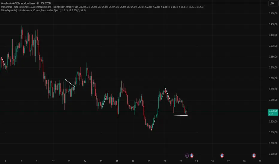
Superdupermegadeduper signals by BrenFX🚀 Superdupermegadeduper Signals by BrenFX
Overview
The Superdupermegadeduper Signals indicator is a comprehensive trading system that combines multiple advanced technical analysis concepts to identify high-probability trading opportunities. This indicator integrates supply/demand zone analysis, dynamic trendline detection, and multi-confirmation signal generation to provide traders with precise entry, stop-loss, and take-profit levels.
🎯 Key Features
Supply & Demand Zone Detection
Intelligent Zone Identification: Automatically detects high-probability supply and demand zones based on price action and touch frequency
Customizable Zone Strength: Set minimum touches required for zone validation (2-10 touches)
Visual Zone Display: Clear visual representation with customizable colors and transparency
Zone Extension: Projects zones forward for future reference
Dynamic Trendline Analysis
Multi-Touch Trendline Detection: Identifies significant support and resistance trendlines with configurable minimum touch requirements
Automatic Trendline Drawing: Draws and extends trendlines automatically with custom colors
Deviation Tolerance: Configurable deviation percentage for trendline validation
Breakout & Retest Signals: Detects trendline breakouts and subsequent pullback retests
Advanced Signal Generation
Dual Signal Types:
Zone Reversal Signals: Based on supply/demand zone interactions
Trendline Breakout Signals: Based on trendline breaks with pullback confirmation
Multi-Confirmation System:
Volume confirmation (optional)
RSI filter integration
Candlestick pattern confirmation
Pullback verification
Professional Trade Management
Multiple Stop Loss Methods:
ATR-based dynamic stops
Zone-based stops
Fixed point stops
Automatic Level Calculation: Entry, stop-loss, and take-profit levels calculated automatically
Real-Time Trade Table: Live display of current trade levels and parameters
Customizable Table Position: Place trade information anywhere on your chart
Alert System
Comprehensive Alerts: Get notified instantly when signals are generated
Detailed Alert Messages: Include entry price, stop-loss, and take-profit levels
Frequency Control: Once-per-bar alert frequency to avoid spam
📊 How It Works
Signal Logic
Zone Analysis: The indicator scans for areas where price has repeatedly found support or resistance
Trendline Detection: Identifies significant trend lines by connecting pivot points with multiple touches
Confirmation Process: Multiple filters ensure signal quality:
Price action confirmation (multiple bullish/bearish candles)
Volume above average (optional)
RSI oversold/overbought conditions (optional)
Entry Timing: Signals are generated when all confirmations align
Buy Signals Generated When:
Price reaches a demand zone with bullish reversal confirmation, OR
Price breaks above resistance trendline and retests successfully
Sell Signals Generated When:
Price reaches a supply zone with bearish reversal confirmation, OR
Price breaks below support trendline and retests successfully
⚙️ Configuration Options
Supply/Demand Settings
Zone Strength: Minimum touches required (2-10)
Lookback Period: Historical bars to analyze (10-100)
Zone Extension: Forward projection length (1-20 bars)
Trendline Settings
Lookback Period: Historical analysis range (20-200 bars)
Minimum Touches: Required pivot connections (2-5)
Deviation Tolerance: Allowable price variance (0.01-1.0%)
Signal Filters
Reversal Confirmation: Required confirmation candles (1-5)
Pullback Confirmation: Retest validation period (1-5)
Volume Filter: Above-average volume requirement
RSI Filter: Overbought/oversold confirmation
Trade Management
Stop Loss Methods: ATR, Zone-based, or Fixed points
ATR Multiplier: Risk adjustment (0.5-5.0x)
Take Profit: Fixed point target (1.0-50.0 points)
📈 Best Practices
Recommended Settings
For Scalping: Lower zone strength (2-3), shorter lookback periods
For Swing Trading: Higher zone strength (4-6), longer lookback periods
For Trend Following: Enable trendline signals, use ATR-based stops
Risk Management
Always use the provided stop-loss levels
Consider position sizing based on stop-loss distance
Monitor the trade table for real-time level updates
Use alerts to avoid missing opportunities
🎨 Visual Elements
Supply Zones: Red semi-transparent rectangles
Demand Zones: Green semi-transparent rectangles
Resistance Lines: Red trendlines
Support Lines: Green trendlines
Buy Signals: Green "BUY" labels below bars
Sell Signals: Red "SELL" labels above bars
Trade Table: Comprehensive trade information display
💡 Tips for Success
Combine with Market Structure: Use on clean trends and at key support/resistance levels
Multiple Timeframe Analysis: Confirm signals on higher timeframes
Volume Confirmation: Enable volume filter for higher quality signals
Risk Management: Never risk more than 1-2% per trade
Backtesting: Test settings on historical data before live trading
⚠️ Important Notes
This indicator works best in trending markets
Signals are more reliable when multiple confirmations align
Always consider fundamental analysis and market conditions
Past performance does not guarantee future results
Practice proper risk management at all times
🔧 Technical Specifications
Pine Script Version: 6
Overlay: Yes
Max Objects: 500 boxes, 500 lines
Performance: Optimized for real-time analysis
Compatibility: Works on all timeframes and instruments
Developed by BrenFX | Advanced Trading Signals for Professional Traders
Remember: Trading involves risk. This indicator is a tool to assist in analysis and should not be the sole basis for trading decisions. Always use proper risk management and consider your financial situation before trading.
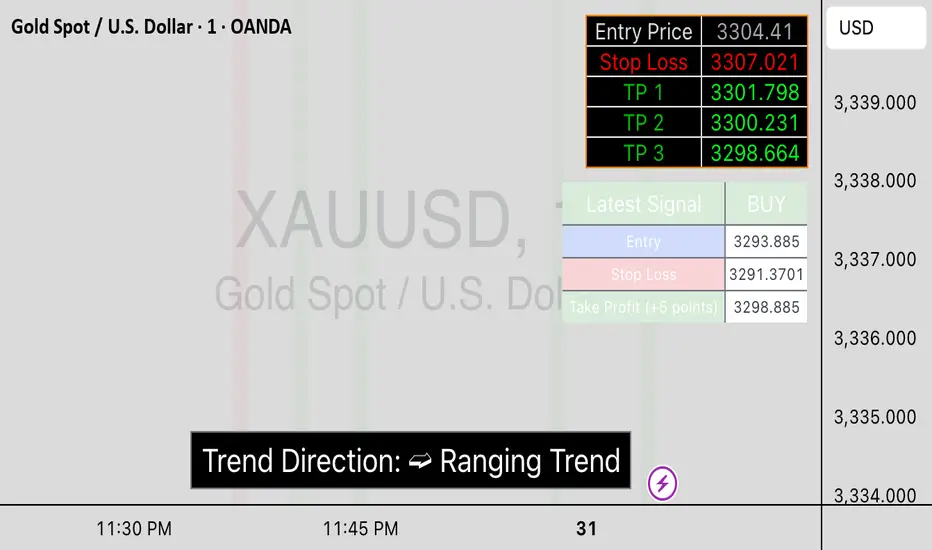
Momentum Regression [BackQuant]Momentum Regression
The Momentum Regression is an advanced statistical indicator built to empower quants, strategists, and technically inclined traders with a robust visual and quantitative framework for analyzing momentum effects in financial markets. Unlike traditional momentum indicators that rely on raw price movements or moving averages, this tool leverages a volatility-adjusted linear regression model (y ~ x) to uncover and validate momentum behavior over a user-defined lookback window.
Purpose & Design Philosophy
Momentum is a core anomaly in quantitative finance — an effect where assets that have performed well (or poorly) continue to do so over short to medium-term horizons. However, this effect can be noisy, regime-dependent, and sometimes spurious.
The Momentum Regression is designed as a pre-strategy analytical tool to help you filter and verify whether statistically meaningful and tradable momentum exists in a given asset. Its architecture includes:
Volatility normalization to account for differences in scale and distribution.
Regression analysis to model the relationship between past and present standardized returns.
Deviation bands to highlight overbought/oversold zones around the predicted trendline.
Statistical summary tables to assess the reliability of the detected momentum.
Core Concepts and Calculations
The model uses the following:
Independent variable (x): The volatility-adjusted return over the chosen momentum period.
Dependent variable (y): The 1-bar lagged log return, also adjusted for volatility.
A simple linear regression is performed over a large lookback window (default: 1000 bars), which reveals the slope and intercept of the momentum line. These values are then used to construct:
A predicted momentum trendline across time.
Upper and lower deviation bands , representing ±n standard deviations of the regression residuals (errors).
These visual elements help traders judge how far current returns deviate from the modeled momentum trend, similar to Bollinger Bands but derived from a regression model rather than a moving average.
Key Metrics Provided
On each update, the indicator dynamically displays:
Momentum Slope (β₁): Indicates trend direction and strength. A higher absolute value implies a stronger effect.
Intercept (β₀): The predicted return when x = 0.
Pearson’s R: Correlation coefficient between x and y.
R² (Coefficient of Determination): Indicates how well the regression line explains the variance in y.
Standard Error of Residuals: Measures dispersion around the trendline.
t-Statistic of β₁: Used to evaluate statistical significance of the momentum slope.
These statistics are presented in a top-right summary table for immediate interpretation. A bottom-right signal table also summarizes key takeaways with visual indicators.
Features and Inputs
✅ Volatility-Adjusted Momentum : Reduces distortions from noisy price spikes.
✅ Custom Lookback Control : Set the number of bars to analyze regression.
✅ Extendable Trendlines : For continuous visualization into the future.
✅ Deviation Bands : Optional ±σ multipliers to detect abnormal price action.
✅ Contextual Tables : Help determine strength, direction, and significance of momentum.
✅ Separate Pane Design : Cleanly isolates statistical momentum from price chart.
How It Helps Traders
📉 Quantitative Strategy Validation:
Use the regression results to confirm whether a momentum-based strategy is worth pursuing on a specific asset or timeframe.
🔍 Regime Detection:
Track when momentum breaks down or reverses. Slope changes, drops in R², or weak t-stats can signal regime shifts.
📊 Trade Filtering:
Avoid false positives by entering trades only when momentum is both statistically significant and directionally favorable.
📈 Backtest Preparation:
Before running costly simulations, use this tool to pre-screen assets for exploitable return structures.
When to Use It
Before building or deploying a momentum strategy : Test if momentum exists and is statistically reliable.
During market transitions : Detect early signs of fading strength or reversal.
As part of an edge-stacking framework : Combine with other filters such as volatility compression, volume surges, or macro filters.
Conclusion
The Momentum Regression indicator offers a powerful fusion of statistical analysis and visual interpretation. By combining volatility-adjusted returns with real-time linear regression modeling, it helps quantify and qualify one of the most studied and traded anomalies in finance: momentum.

PnF ChartPoint and Figure (P&F) charts are a time-independent technical analysis tool that focuses purely on price movements, filtering out noise like minor price fluctuations and time. Unlike candlestick or bar charts, P&F charts ignore time and only record significant price changes based on predefined rules.
Key Characteristics of P&F Charts
No Time Axis
Only price movements matter; time is irrelevant.
Columns form based on reversals, not fixed time periods.
Uses X's and O's
X = Rising prices (demand in control)
O = Falling prices (supply in control)
Box Size (Price Increment)
Defines the minimum price change required to plot a new X or O.
Example: If the box size is **1∗∗,astockmustmoveatleast1∗∗,astockmustmoveatleast1 to record a new X or O.
Reversal Amount
Determines how much the price must reverse to switch from X's to O's (or vice versa).
Common reversal settings: 3-box reversal (price must reverse by 3x the box size).
How P&F Charts Work
1. Rising Prices (X-Columns)
A new X is added if the price rises by the box size.
If the price reverses down by the reversal amount, a new O-column starts.
2. Falling Prices (O-Columns)
A new O is added if the price falls by the box size.
If the price reverses up by the reversal amount, a new X-column starts.
Example of a P&F Chart
Suppose:
Box Size = $1
Reversal Amount = 3-box (i.e., $3)
Price Movement Chart Update
Stock rises from 10→10→11 X at $11
Rises to $12 X at $12
Drops to 9(9(12 → 9=9=3 drop) New O-column starts at 11,11,10, $9
Rises again to 12(12(9 → 12=12=3 rise) New X-column at 10,10,11, $12
About the Script:This Script uses columns instead of traditional X and O boxes.Column Printing (Red vs Green)
This Point and Figure chart alternates between two states:
X columns (green): Represent upward price movements
O columns (red): Represent downward price movements
When Green Columns (X) Are Printed:
A green column is printed when:
The script is in "X mode" (is_x is true)
A new column is created (new_column_created is true)
This happens after the price has reversed upward by at least the "reversal boxes" threshold from a previous O column
When Red Columns (O) Are Printed:
A red column is printed when:
The script is in "O mode" (is_x is false)
A new column is created (new_column_created is true)
This happens after the price has reversed downward by at least the "reversal boxes" threshold from a previous X column
How Trendlines Are Created
The script can draw two types of trendlines when the show_trendlines option is enabled:
Green Trendlines (Uptrend):
A green trendline is created when:
There's a transition from O to X columns (cond2 is true but wasn't true on the previous bar)
This represents the beginning of a potential uptrend
The trendline is solid and extends to the right
Red Trendlines (Downtrend):
A red trendline is created when:
There's a transition from X to O columns (cond1 is true but wasn't true on the previous bar)
This represents the beginning of a potential downtrend
The trendline is dashed and extends to the right
The script maintains two trendline objects - current_trendline and previous_trendline - and deletes the oldest one when a new trendline is created to prevent cluttering the chart.
In summary, this Point and Figure chart tracks price movements in discrete boxes and changes column types (and creates trendlines) when price reverses by a significant amount (defined by the reversal_boxes parameter). The chart also generates alerts when these trend changes occur, helping traders identify potential trend reversals.