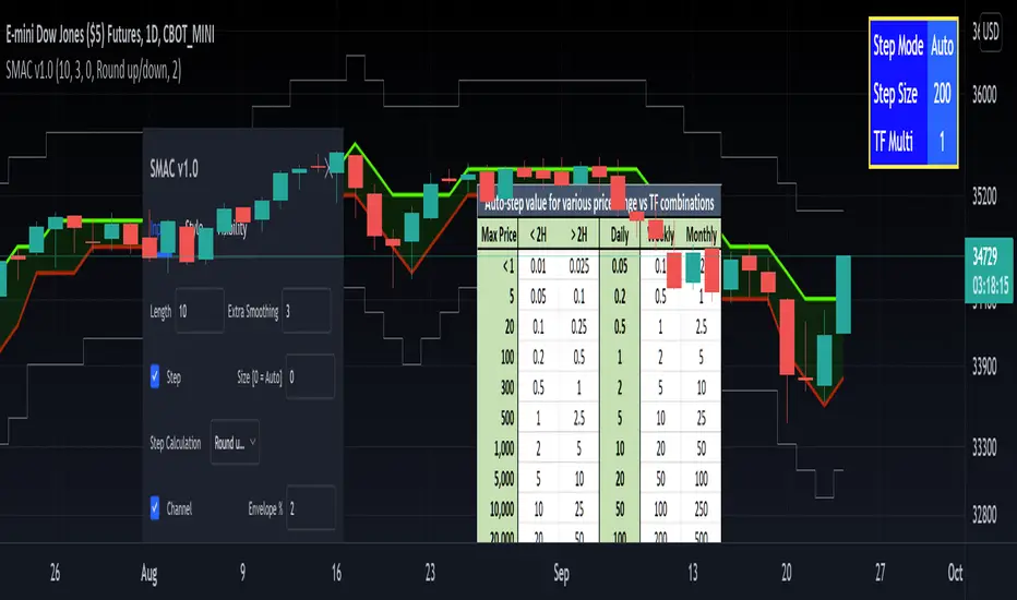
[RedK] Stepped Moving Average Channel (SMAC)The Stepping Moving Average Channel (SMAC) is not an indicator - It is more of a trading tool that was put together to enable a trader to take advantage of relatively fast price moves with quick incremental gain - maybe by exploiting opportunities to trade basic options (Calls, Puts) or to help with in/out-type swing trades. This is more a price-level visualization tool so please use it with this in mind, and not as a trading tool by itself.
While it looks very similar to a Donchian channel, SMAC plots a stepping channel of the moving average of the high & low prices (channel borders) - with an envelope that is at a user-specified % distance from the channel borders.
This setup, when combined with other Moving Averages and lower indicators, may make it easier for a trader to prepare for a trade with clear entry and exit price levels being planned upfront.
For example, a trader wants to capture 2% of the next move, will set the envelope to 2% and have clearer view of entry/exit price levels for such a scenario. once the trader receives confirmation (from other indicators or charts) that the price is heading in the way expected, the SMAC may make it simpler and quicker to estimate (and visualize) the entry/exit price levels and track the movement.
* The stepping feature helps remove price noise and the auto-stepping feature is designed to "snap to" those mental price levels that trader gravitate towards.
* The moving average type I used here is the Compound Ratio MA (CoRA_Wave) .
* This MA type was selected because it has a very high responsiveness and good smoothness, and tracks the price values very closely.
* The MA type can be replaced within the code with any other MA as preferred.
The auto-stepping feature:
----------------------------------
User can override the auto-stepping by entering a manual step value
when the auto-stepping is active, it will attempt to pick the best step size based on the underlying price range and the timeframe selected.
The step selection may not be ideal in some combination of value / TF - i will continue to improve these combinations
Stepping can also be completely disabled - this bring SMAC back to a regular (though highly responsive) Hi/Lo MA channel with envelope
The Excel table snippet in the chart above shows the various step value / TF combinations.
Also the stepping values can be further customized by changing the appropriate part in the script.
Other features:
--------------------
* Rounding Options: The stepping calculations uses one of 2 selectable methods:
1 -- regular rounding (uses the round() function): which rounds the price up & down depending on where it is compared to the half-step value
example: a value of 17 with a step of 10 will be rounded to 20. a value of 13 in that case will be rounded to 10
2 -- Whole Step (uses the int() function): this will only consider whole/fully completed steps - if the average (hi or low) does not explicitly exceed the next step level, we will not get that next value.
example: both values of 17 and 13 with a step of 10 will be rounded to 10.
* The "Quick Table":
The Quick Table shows on the top-left - and can be disabled in the script settings - It shows the currently selected stepping mode and value - since the auto-step changes dynamically with the selected chart timeframe, this makes it easier for the trader to view the active "configuration"
overall, i hope some traders find this quick utility useful - if not to use, maybe to inspire other ideas
- please feel free to use or customize in any way you need. Feel free to share feedback and observations.
Search in scripts for "wave"
[pp] Signal GeneratorResearch and Development Tool.
For anyone who is familiar with working with digital signals (audio/electrical engineers) you might appreciate this Signal Generator.
You can select and vary 4 different types of signals.
Logistic Map
If you're not familiar with the logistic map, then go watch a youtube video. By default the equation is meant to represent chaos and is a good alternative for random number generation.
Random
This uses the built-in random number generator. I'm not sure if it's better to use this or the logmap default settings. Either way, you have a choice.
Unit Impulse
Good for creating a transient impulse.
Step Impulse
Similar to the unit impulse. Except constant and not a transient.
Synthesizer
It comes with 4 wave functions (Sine, Triangle, Square, Saw) that can be combined for additive synthesis. Each wave function contains its own respective phase and amplitude control.
Credits
Many of these functions were taken from www.pinecoders.com with the exception of the logistic map. I simply aggregated them all into this toolkit for ease of use.
How to use
This is not a trading indicator. This is meant to be used for research and development. You could use it to test strategies, by generating white noise with the logmap and creating trading signals. Or you could use it for teaching and learning. Using the constant data as a dependable, repeatable resource.

RedK Magic RibbonRedK Magic Ribbon is simple script that combines a fast and a slow moving averages to create a 2-Moving Average Cross-over / trend visualization tool.
We utilize the Compound Ratio Weighted Average (CoRa Wave) as the fast MA line and the RedK Slow Smooth Weighted Moving Average (RSS_WMA) aka LazyLine as the slow MA line.
i put this script together when i found that i started using these 2 moving average lines in my trading charts most of the time. thought others may find it useful.
The simple idea is that when the 2 lines "agree" on direction, then this is possibly a confirmed trend in that direction.
Visually, when the 2 lines agree on a trend direction, Magic Ribbon gives either a green (up) or red (down) fill, when they disagree, it gives a gray fill - Gray areas are considered "no trade" or "get ready" zones depending on the situation.
This ribbon can be used to support trend-following trades, swing trading, or as a visual trend tracking tool
Suggested Usage Tips:
----------------------------
* Position entry should be made as close to the RSS_WMA/LazyLine as possible to maximize gain.
* The RSS_WMA can act as a guide for Stop Loss
* An aggressive (or swing) trader may consider entries as soon as the CoRa Wave line changes color, but in context of the prevailing trend.
* if you intend to use this tool for trading, please test it using the PaperTrading or Rewind features of TV to get used to how it behaves and adjust accordingly.
* The Magic Ribbon should work on any timeframe.
* The basic settings are available - they enable adjusting the length and smoothness of the CoRa Wave and the Smoothness of the RSS_WMA - as well as the source price for each. Style settings enable to adjust color, line width, or hide/show various elements as needed.
* The most important tip for using the Magic Ribbon: when you first add it to your chart, is to fine-tune the length settings to your preference. start by adjusting the LazyLine (RSS_WMA) Smoothness value, so it tracks and barely touches the highs / lows of price bars - with the least amount of lag possible - then adjust the CoRa Wave length to make it as responsive as you need. Keep smoothness to the lowest you can use (i like 3 or 4 max) - the default settings are generic usable values based on my testing.
* as usual, please use this tool only as a guide - make your own detailed chart analysis and support your trading decision with signals and confirmations from other indicators .
*** This script does not repaint.

Trading ABCHello Traders,
For a few months I have been getting requests from my followers about ABC pattern and finally I decided to make this indicator.
How it works?
- It creates Trend Cloud using Simple and Exponential moving averages with the lenghts 50, 100, 150, 200, 20, 40 by default and checks the trend. you can change the lengths as you wish
- It also creates ZigZag using the ZigZag Period in the options.
- Using last 2 zigzag waves it checks if there is suitable ABC pattern according the Trend, the Min/Max Fibonacci levels and Error Rate
- Then it check if the price bounces after this ABC pattern
- And if all these conditions met then it plot triangle
- If there are multiple bouncing then you can see multiple triangles
You can change/set;
- Zigzag Period
- Fibonacci Max level
- Fibonacci Min Level
- Error Rate
- The Lengths that are used for Moving Averages
- Keeping old ABC lines/labels
- Show Zigzag and min/max Fibonacci levels
- Show Trend Cloud
- and colors
if you don't want to see old ABC lines/labels you can disable it:
if you don't want to see Trend Cloud you can disable it:
Zigzag and Fibonacci levels:
P.S. if you have new ideas to improve this indicator then let me know please. We together can do this life easier!
Enjoy!

Zigzag SARThis is another ZigZag script. But the difference between this and other ZigZag indicators on TV is that here we find highs and lows based on Parabolic SAR.
It repaints?
YES.
On last line of ZigZag you get repainting, because the highs and lows get confirmation only if direction (SAR dots) changes.
This shouldn't be used to forecast highs and lows directly anyway, it's just a visual guide for past highs and lows.
I'm using it to spot harmonic patterns and Wolfe waves more easily. The plan is to draw these automatically in the future, but my skills at Pinescript are limited at the moment.
PS. Ideas for my scripts are coming from @Jegejig1 on Stocktwits, if you want to know who to blame lol

Trend Strength Directional IndicatorThis study was inspired by two famous Trading View contributors. Shout out to Lazy Bear and Crypto Face!
In this study you have a live view of the strength of direction the market is heading. The indicator that looks like a black wave is showing us the momentum of price action. When a green dot appears under the lower level it is a indication that we should consider buying, and if the red dot appears over the upper level we should sell. The custom MFI indicator determines how much money is flowing into the market. If it is green that means money is flowing into the market and if it shows red it means that money is flowing out of the market.

Crypto Squeeze StrategyThis strategy was inspired by two famous Trading View contributors. Shout out to Lazy Bear and Crypto Face!
The strategy includes a similar replication of the blue wave, and MFI indicator. The point of the strategy is to buy when the blue wave crosses up the zero value, and the MFI is greater than zero value. This indicates that there is strong bullish momentum and money flowing into the market.
Weis BB StrategyThis is a strategy based on Weis Wave & EMA. Weis Wave Volume is used to determine the overall trend and Bollinger Band to determine the Price breaking out from resistance zones.
[bjb] tEMAs - Triple Exponential Moving Averages, by BlueJayBirdIs it not a pain in the butt not to find a simple script like this one in TV? I didn't find one, so I made it.
Features:
- Simple script with 3 simple Exponential Moving Averages.
Special features:
- Settable time resolution.
- Colored fill between EMA20/50 pair, and between EMA50/200 pair.
More useful than you think:
- I've found it specially useful for detecting Elliot Wave patterns. The fill colors make them stand out. Use EMA20/50 pair for this.
- The resolution change makes EMAs studies from higher timeframes, at lower time frames, more accurate. Try from 1m timeframe, setting the tEMAs resolution to 1h.
Like, follow and comment. 💯

Bollinger Bands Touch MapThis simple script based on Bollinger Bands to collect Touch Point at bandsand display them on the map. Detail of rule as below:
1.Define Touch Point
1.1.Touch Point at Lower Band
+ Key bar:
- Open Price lower than BB lower band, Close Price higher than BB lower band
+ Touch Point:
- Median Price (HL2) of Key bar
1.2.Touch Point at Upper Band
+ Key bar:
- Open Price higher than BB upper band, Close Price lower than BB upper band
+ Touch Point:
- Median Price (HL2) of Key bar
1.3.Zero Point
- Close Price of Current bar
===================================
2.Touch Map
+ Last 5 Touch Point will be show on the map
+ Newest Touch point is numbered as (1) and show at the left of Zero Point
+ Each Point has a label show point's value
===================================
3.Fibonacci
+ Enable: Apply to number of Touch Points indicated
+ Style Up: 0 Level at the bottom
+ Style Down: 0 Level at the top
===================================
4.123 Pattern
+ Pattern: dot 2 and dot 3 at the Top and the Bottom of group 1234
+ M Pattern: dot 3 at the Top of group 135 and at the Bottom of group 234
+ W Pattern: dot 3 at the Bottom of group 135 and at the Top of group 234
===================================
5.Supply Demand Zone
5.1.Supply Zone
+ Supply Zone is area map structure change from upward to downward
+ Supply Zone is limited by 2 dots highest before upward structure broken
5.2.Demand Zone
+ Demand Zone is area map structure change from downward to upward
+ Demand Zone is limited by 2 dots lowest before downward structure broken
============================================================================
6.6.Over Block
6.1.Overbought Block
+ Overbought Block is location Long position covering
+ Ovb Block is limited by higest high and upper band at top of map
6.2.Oversold Block
+ Oversold Block is location Short position covering
+ Ovs Block is limited by lowest low and lower band at bottom of map
===================================
7.RSI Column
+ RSI Overbought is marked by Overbought color
+ RSI Oversold is marked by Oversold color
+ RSI Normal is marked by Normal color
+ Symbol ▲: RSI growing
+ Symbol ▼: RSI falling
===================================
8.Volume Direction
+ Volume growing is marked by Up Color
+ Volume falling is marked by Down Color
+ New Highest Volume on the map is marked by High Color and H Label
+ New Lowest Volume on the map is marked by Low Color and L Label
+ Volume higher than Median level is marked by Up Color and M Label
===================================
9.Useful features
+ Quickly find chart patter: 123, M, W...
+ Quickly find wave patter: I, V, N...
+ Quickly find Key level when moving between different Time Frame
+ Quickly recognize chart is trending or trendless
+ Quickly recognize divergence of Price and Volume
+ Quickly calculate Entry, Stoploss, Takeprofit by using Fibonacci

MESA Stochastic Multi LengthJohn Ehler's MESA Stochastic uses super smoothing to give solid signals. This indicator uses the same rules as every other Stochastic indicator so it would be worth looking into if you are not already familiar with reading a Stochastic. There are 4 different lengths displayed to give traders an edge on reading the market. This is a great tool to analyze waves and find tops and bottoms. It gives great pump and dump signals and even helps filter out bad trades when used with other indicators such as Boom Hunter.
Below are some examples of signals to look out for:
oo

Financial Astrology Vesta LongitudeVesta is one of the largest objects in the asteroid belt between Mars and Jupiter, the orbit duration is 3.63 years and seems to be very relevant celestial object in financial astrology. The experienced financial astrologer "Bill Meridian" indicates that this asteroid rules the security business, and paper securities such as bonds and stocks. We have confirmed through statistical research that adding this asteroid to astrology machine learning models provides an increase in daily trend predictions accuracy for crypto-currencies sector.
Our statistical analysis of Vesta zodiac sign location concluded that when is transiting the signs of Aries, Gemini, Cancer, Leo and Libra the daily trend is 59% or more of the days bullish. When Vesta is located at Capricorn is very bearish with 60% of the daily trend going in downward direction. In the other zodiac signs the daily trend was neutral showing most of the time a sideways pattern.
Is very interesting to note that the exact date July 21, 2021, when Vesta entered in Libra BTCUSD started the last bullish wave that finally broke the congestion zone of the 30K-35K and started a new bullish optimism. Pay attention on what happened in the previous cycle when Vesta was located in Libra and do your conclusions.
Note: Vesta longitude indicator is based on an ephemeris array that covers years 2010 to 2030, prior or after this years the data is not available, this daily ephemeris are based on UTC time so in order to align properly with the price bars times you should set UTC as your chart timezone.

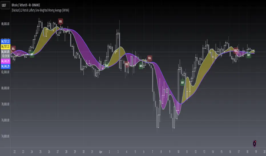
[blackcat] L2 Sine-Weighted Moving Average (SWMA)Level: 2
Background
Invented by Patrick Lafferty in 1999, a Sine Weighted Moving Average (SWMA) takes its weighting from the first half of a Sine wave cycle and accordingly, the most weighting is given to the data in the middle of the data set. It is therefore very similar to the Triangular Moving Average.
Function
A sine weighted moving average (Sine-MA) applies weights to each bar in the shape of the bulge in a sine curve from 0 to pi. For an N-bar average the weightings are
/ 1 \ / 2 \ / N \
sin | --- * pi |, sin | --- * pi |, ..., sin | --- * pi |
\ N+1 / \ N+1 / \ N+1 /
The effect is that middle prices have the greatest weight (much like the TMA, Triangular Moving Average). A Sine Weighted Moving Average ( Sine WMA ) takes its weighting from the first half of a Sine wave cycle and accordingly, the most weighting is given to the data in the middle of the data set.
Key Signal
SWMA(FastLength) --> SWMA Fast Line.
SWMA(SlowLength) --> SWMA Slow Line.
Remarks
This is a Level 2 free and open source indicator.
Feedbacks are appreciated.
Trend From Volume And Price (TFVAP)Indicator that indicates buying and selling times based on price and volume and who is imposed of the two (VAP).
It uses the trends of the Dow theory (primary: 365 days/1 year, secondary: 90 days/3 months and tertiary: 21 days/3 weeks) and the identification of Elliot waves, both impulse and correction, based on the Fibonacci retracements (23.61% , 38.2%, etc.).
- Purple line is the evolution in percentage of the price in the primary trend
- Blue line is the evolution in percentage of the volume in the primary trend
- White line is the evolution in percentage of the (volume % - price %) in the primary trend, if white line > 0
- Green triangleup is time of start to buy
- Green square is time of stop to buy
- Red triangledown is time of sell
To understand it better:
If the purple line goes up it indicates that the price is rising, if it goes down, that the price is down.
If the blue line is greater than 0 it indicates that there are more purchases than sales, if the blue line is less than 0 it indicates that there are more sales than purchases.
If the white line is greater than 0 there is a high volume of purchases or low sales for the price that there is, it is likely that the price will rise.
If the white line is less than 0 there is a low volume of purchases or high sales for the price that there is, it is likely that the price will go down.
PD: Ignore the chart drawings, the indicator script is only represented at the bottom

Tesla CoilThis indicator reads the charts as frequency because the charts are just waves after all. This is an excellent tool for finding "Booms" and detecting dumps. Booms are found when all the frequencies pull under the red 20 line. Dumps are detected when all the lines drag themselves along the 20 line as seen is screenshots below.
Below is another 2 examples of a "boom". Everything sucks in before exploding out.
Below is an example of a dump:
