Simple LevelsSImple levels is a clean way to automatically plot important daily levels including:
Yesterday's High
Yesterday's Low
50% level between Prior High/Low
Today's Open
Premarket Low
Premarket High
This Daily Levels indicator is unique in its ability to:
-Plot all of the daily level PLUS premarket high/low levels (extended hours must be turned ON)
-Can hide past days levels, only plotting levels on the current day, to keep chart cleaner
-Can extend line levels right or fullscreen
-Plots the level price at each level on the chart
-Can show/hide price levels labels
-Can add supplemental premarket levels plot to show levels being formed during the premarket time period
-Coded with line.new vs plot so dashed lines are available as a style
-Automatically hides the indicator if the timeframe selected is Daily or greater
Search in scripts for "神户胜利+VS+磐田喜悦"

UDI barCandle has been divide into 3 types up bar, down bar and inside bar,
These bar classified comparing previous candle high low to current candle close.
This method used to ride the trend without exiting position.
We can use this candle color as a stop loss and take profit.
Previous candle H&L Vs Cur. Candle Close
I
U
D
------------------------
I - Inside Candle
U - Up Candle
D - Down Candle

Intraday Accumulator [close-open]This script plots close-open cumulative from the beginning of the chart. It is made for use on equities with overnight sessions to view the intraday performance vs the candlestick chart.

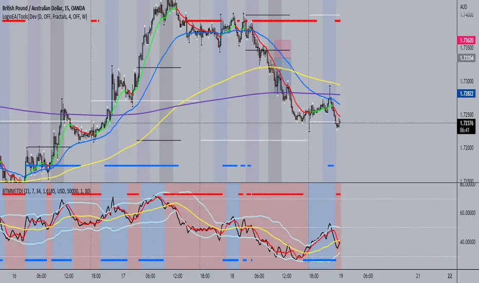
BTMM|TDIThis is the trader's dynamic index inspired by Steve Mauro's BTMM strategy.
In addition to the RSI, Trendline, Baseline, Volatility Bands I have also included additional trend biases that are painted in the background to provide more confluence when the markets break out in either direction.
For convenience, a position size calculator is included for all users to quickly calculate lot sizes on forex pairs with difference account balance currencies. The calculator works accurately on forex pairs. DO NOT USE for crypto or indices as some brokers have unique contract sizes that could not be fully incorporated into the tool.
There is also data table that displays historical values of the RSI, Trendline, Baseline, and an EMA vs Price scoring procedure that covers the current candle (t0) and up to 3 candles back. The table is meant to provide a snapshot view of either bullish or bearish dominance that can be deciphered with a quick glance.
Helme-Nikias Weighted Burg AR-SE Extra. of Price [Loxx]Helme-Nikias Weighted Burg AR-SE Extra. of Price is an indicator that uses an autoregressive spectral estimation called the Weighted Burg Algorithm, but unlike the usual WB algo, this one uses Helme-Nikias weighting. This method is commonly used in speech modeling and speech prediction engines. This is a linear method of forecasting data. You'll notice that this method uses a different weighting calculation vs Weighted Burg method. This new weighting is the following:
w = math.pow(array.get(x, i - 1), 2), the squared lag of the source parameter
and
w += math.pow(array.get(x, i), 2), the sum of the squared source parameter
This take place of the rectangular, hamming and parabolic weighting used in the Weighted Burg method
Also, this method includes Levinson–Durbin algorithm. as was already discussed previously in the following indicator:
Levinson-Durbin Autocorrelation Extrapolation of Price
What is Helme-Nikias Weighted Burg Autoregressive Spectral Estimate Extrapolation of price?
In this paper a new stable modification of the weighted Burg technique for autoregressive (AR) spectral estimation is introduced based on data-adaptive weights that are proportional to the common power of the forward and backward AR process realizations. It is shown that AR spectra of short length sinusoidal signals generated by the new approach do not exhibit phase dependence or line-splitting. Further, it is demonstrated that improvements in resolution may be so obtained relative to other weighted Burg algorithms. The method suggested here is shown to resolve two closely-spaced peaks of dynamic range 24 dB whereas the modified Burg schemes employing rectangular, Hamming or "optimum" parabolic windows fail.
Data inputs
Source Settings: -Loxx's Expanded Source Types. You typically use "open" since open has already closed on the current active bar
LastBar - bar where to start the prediction
PastBars - how many bars back to model
LPOrder - order of linear prediction model; 0 to 1
FutBars - how many bars you want to forward predict
Things to know
Normally, a simple moving average is calculated on source data. I've expanded this to 38 different averaging methods using Loxx's Moving Avreages.
This indicator repaints
Further reading
A high-resolution modified Burg algorithm for spectral estimation
Related Indicators
Levinson-Durbin Autocorrelation Extrapolation of Price
Weighted Burg AR Spectral Estimate Extrapolation of Price
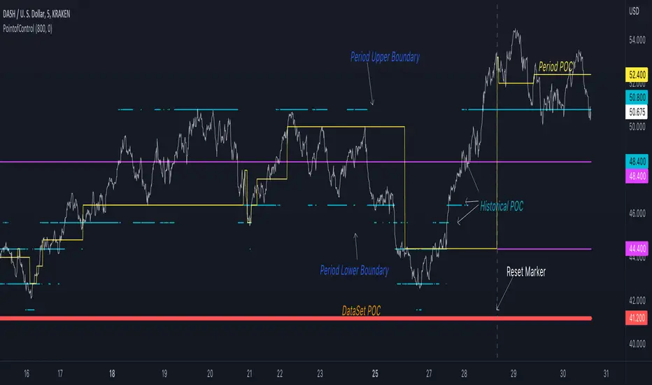
Point of Control V2 The genesis of this project was to create a POC library that would be available to deliver volume profile information via pine to other scripts of indicators and strategies.
This is a republish of an invite only script to open access
This is the indicator version of the library function.
A few points of significance:
- Allows the choice of reset of the study period, day/week or bars. This is simple enough to expand to other conditions
- Bar count resets starting from the beginning of the data set (bar index =0) vs bars back from the end of the data set
- A 'period' in this context is the time between resets - the start of the POC (eg. start of Day or Week) until it resets (for example at the beginning of a next day or week)
- Automates the determination of the increment level rather than the user specifying ticks or price brackets
- Does not allow for setting the # of rows and then calculating the implied price increment levels
- When a period is complete it is often useful to look back at the POCs of historical periods, or extend them forward.
- This script will find the historical POCs around the current price and display them rather than extend all the historical POC lines to the right
- This script also looks across all the period POCs and identifies the master POC or what I call the Grand POC, and also the next 3 runner up POCs
This indicator is also available as a library.
BINANCE:BTCUSDT NSE:NIFTY OANDA:XAUUSD NASDAQ:AAPL TVC:USOIL

PointofControlLibrary "PointofControl"
POC_f()
The genesis of this project was to create a POC library that would be available to deliver volume profile information via pine to other scripts of indicators and strategies.
This is the indicator version of the library function.
A few things that would be unique with the built in
- it allows you to choose the kind of reset of the period, day/week or bars. This is simple enough to expand to other conditions
- it resets on bar count starting from the beginning of the data set (bar index =0) vs bars back from the end of the data set
- A 'period' in this context is the time between resets - the start of the POC until it resets (for example at the beginning of a new day or week)
- it will calculate an increment level rather than the user specifying ticks or price brackets
- it does not allow for setting the # of rows and then calculating the implied price levels
- When a period is complete it is often useful to look back at the POCs of historical periods, or extend them forward.
- This script will find the historical POCs around the current price and display them rather than extend all the historical POC lines to the right
- This script also looks across all the period POCs and identifies the master POC or what I call the Grand POC, and also the next 3 runner up POCs
There is a matching indicator to this library
EPS & SalesHi everyone,
I just adapted a little utility script to visualise EPS % increase (quarters vs Year -1) and sales.
I used the code from @ARUN_SAXENA and modified it to fix what I saw as issues.
(Using base 3M instead of 1M +
request.earnings(syminfo.tickerid, earnings.actual, ignore_invalid_symbol=true)
instead of
request.financial(syminfo.tickerid, "EARNINGS_PER_SHARE", "FQ")
Data will differ from MarketSmith because they use sometimes actual EPS sometimes standard, but think we can at least trust what we see in term of %
The tool is far from being perfect !

Trigonometric compare close vs obvTrigonometric compare
This is copy and mod of a script from alexgrower which did this great trigonometric math.
As there was this idea floating around from some unicorn doing it instead of close also with the ta.obv, why not compare them.
from a first idea:
green=bullish trend
red=baserish trend
blue=deciding and acceleration zone
or maybe SL hunting of whales
Plot1: trigonometrics for obv
Plot2: trigonometrics for close
Plot3: trigonometrics for obv-close
what to trade or how to trade no idea, just hat do post the basic idea of this compare.
have fun

Candle Strength IndicatorThe candle strength indicator depicts the average strength of the price action by evaluating bullish vs bearish candles.
The scale is relative to price fluctuation and the size of the candles for the particular ticker / market, so there are no significant levels.
A cross on the zero line would generally indicate a change in trend / sentiment.
This indicator may be useful as a filter for entries and use in confluence with other indicators.

Gold Silver SpreadGold silver Spread
Different Between Gold & Silver Price
Find Spread Opportunity
Gold Vs Silver Strength Strategy

Percentage Up/Down vs lowest/highestPercentage difference at current price (close) to lowest and highest certain number of bars ago (14, 36, 96).

Historical US Bond Yield CurvePreface: I'm just the bartender serving today's freshly blended concoction; I'd like to send a massive THANK YOU to all the coders and PineWizards for the locally-sourced ingredients. I am simply a code editor, not a code author. Many thanks to these original authors!
Source 1 (Aug 8, 2019):
Source 2 (Aug 11, 2019):
About the Indicator: The term yield curve refers to the yields of U.S. treasury bills, notes, and bonds in order from shortest to longest maturity date. The yield curve describes the shapes of the term structures of interest rates and their respective terms to maturity in years. The slope of the yield curve tells us how the bond market expects short-term interest rates to move in the future based on bond traders' expectations about economic activity and inflation. The best use of the yield curve is to get a sense of the economy's direction rather than to try to make an exact prediction. This indicator plots the U.S. yield curve as maturity (x-axis/time) vs yield (y-axis/price) in addition to historical yield curves and advanced data tickers . The visual array of historical yield curves helps investors visualize shifts in the yield curve that are useful when identifying & forecasting economic conditions. The bond market can help predict the direction of the economy which can be useful in crafting your investment strategy. An inverted 10y/2y yield curve for durations longer than 5 consecutive trading days signals an almost certain recession on the horizon. An inversion happens when short-term bonds pay better than longer-term bonds. There is Federal Reserve Board data that suggests the 10y3m may be a better predictor of recessions.
Features: Advanced dual data ticker that performs curve & important spread analysis, plus additional hover info. Advanced yield curve data labels with additional hover info. Customizable historical curves and color theme.
‼ IMPORTANT: Hover over labels/tables for advanced information. Chart asset and timeframe may affect the yield curve results; I have found consistently accurate results using BINANCE:BTCUSDT on 1d timeframe. Historical curve lookbacks will have an effect on whether the curve analysis says the curve is bull/bear steepening/flattening, so please use appropriate lookbacks.
⚠ DISCLAIMER: Not financial advice. Not a trading system. DYOR. I am not affiliated with the original authors, TradingView, Binance, or the Federal Reserve Board.
About the Editor: I am a former FINRA Registered Representative, inventor/patent holder, futures trader, and hobby PineScripter.

Goertzel Cycle Period [Loxx]Goertzel Cycle Period is an indicator that uses Goertzel algorithm to extract the cycle period of ticker's price input to then be injected into advanced, adaptive indicators and technical analysis algorithms.
The following information is extracted from: "MESA vs Goertzel-DFT, 2003 by Dennis Meyers"
Background
MESA which stands for Maximum Entropy Spectral Analysis is a widely used mathematical technique designed to find the frequencies present in data. MESA was developed by J.P Burg for his Ph.D dissertation at Stanford University in 1975. The use of the MESA technique for stocks has been written about in many articles and has been popularized as a trading technique by John Ehlers.
The Fourier Transform is a mathematical technique named after the famed French mathematician Jean Baptiste Joseph Fourier 1768-1830. In its digital form, namely the discrete-time Fourier Transform (DFT) series, is a widely used mathematical technique to find the frequencies of discrete time sampled data. The use of the DFT has been written about in many articles in this magazine (see references section).
Today, both MESA and DFT are widely used in science and engineering in digital signal processing. The application of MESA and Fourier mathematical techniques are prevalent in our everyday life from everything from television to cell phones to wireless internet to satellite communications.
MESA Advantages & Disadvantage
MESA is a mathematical technique that calculates the frequencies of a time series from the autoregressive coefficients of the time series. We have all heard of regression. The simplest regression is the straight line regression of price against time where price(t) = a+b*t and where a and b are calculated such that the square of the distance between price and the best fit straight line is minimized (also called least squares fitting). With autoregression we attempt to predict tomorrows price by a linear combination of M past prices.
One of the major advantages of MESA is that the frequency examined is not constrained to multiples of 1/N (1/N is equal to the DFT frequency spacing and N is equal to the number of sample points). For instance with the DFT and N data points we can only look a frequencies of 1/N, 2/N, Ö.., 0.5. With MESA we can examine any frequency band within that range and any frequency spacing between i/N and (i+1)/N . For example, if we had 100 bars of price data, we might be interested in looking for all cycles between 3 bars per cycle and 30 bars/ cycle only and with a frequency spacing of 0.5 bars/cycle. DFT would examine all bars per cycle of between 2 and 50 with a frequency spacing constrained to 1/100.
Another of the major advantages of MESA is that the dominant spectral (frequency) peaks of the price series, if they exist, can be identified with fewer samples than the DFT technique. For instance if we had a 10 bar price period and a high signal to noise ratio we could accurately identify this period with 40 data samples using the MESA technique. This same resolution might take 128 samples for the DFT. One major disadvantage of the MESA technique is that with low signal to noise ratios, that is below 6db (signal amplitude/noise amplitude < 2), the ability of MESA to find the dominant frequency peaks is severely diminished.(see Kay, Ref 10, p 437). With noisy price series this disadvantage can become a real problem. Another disadvantage of MESA is that when the dominant frequencies are found another procedure has to be used to get the amplitude and phases of these found frequencies. This two stage process can make MESA much slower than the DFT and FFT . The FFT stands for Fast Fourier Transform. The Fast Fourier Transform(FFT) is a computationally efficient algorithm which is a designed to rapidly evaluate the DFT. We will show in examples below the comparisons between the DFT & MESA using constructed signals with various noise levels.
DFT Advantages and Disadvantages.
The mathematical technique called the DFT takes a discrete time series(price) of N equally spaced samples and transforms or converts this time series through a mathematical operation into set of N complex numbers defined in what is called the frequency domain. Why would we what to do that? Well it turns out that we can do all kinds of neat analysis tricks in the frequency domain which are just to hard to do, computationally wise, with the original price series in the time domain. If we make the assumption that the price series we are examining is made up of signals of various frequencies plus noise, than in the frequency domain we can easily filter out the frequencies we have no interest in and minimize the noise in the data. We could then transform the resultant back into the time domain and produce a filtered price series that hopefully would be easier to trade. The advantages of the DFT and itís fast computation algorithm the FFT, are that it is extremely fast in calculating the frequencies of the input price series. In addition it can determine frequency peaks for very noisy price series even when the signal amplitude is less than the noise amplitude. One of the disadvantages of the FFT is that straight line, parabolic trends and edge effects in the price series can distort the frequency spectrum. In addition, end effects in the price series can distort the frequency spectrum. Another disadvantage of the FFT is that it needs a lot more data than MESA for spectral resolution. However this disadvantage has largely been nullified by the speed of today's computers.
Goertzel algorithm attempts to resolve these problems...
What is the Goertzel algorithm?
The Goertzel algorithm is a technique in digital signal processing (DSP) for efficient evaluation of the individual terms of the discrete Fourier transform (DFT). It is useful in certain practical applications, such as recognition of dual-tone multi-frequency signaling (DTMF) tones produced by the push buttons of the keypad of a traditional analog telephone. The algorithm was first described by Gerald Goertzel in 1958.
Like the DFT, the Goertzel algorithm analyses one selectable frequency component from a discrete signal. Unlike direct DFT calculations, the Goertzel algorithm applies a single real-valued coefficient at each iteration, using real-valued arithmetic for real-valued input sequences. For covering a full spectrum, the Goertzel algorithm has a higher order of complexity than fast Fourier transform (FFT) algorithms, but for computing a small number of selected frequency components, it is more numerically efficient. The simple structure of the Goertzel algorithm makes it well suited to small processors and embedded applications.
The main calculation in the Goertzel algorithm has the form of a digital filter, and for this reason the algorithm is often called a Goertzel filter
Where is Goertzel algorithm used?
This package contains the advanced mathematical technique called the Goertzel algorithm for discrete Fourier transforms. This mathematical technique is currently used in today's space-age satellite and communication applications and is applied here to stock and futures trading.
While the mathematical technique called the Goertzel algorithm is unknown to many, this algorithm is used everyday without even knowing it. When you press a cell phone button have you ever wondered how the telephone company knows what button tone you pushed? The answer is the Goertzel algorithm. This algorithm is built into tiny integrated circuits and immediately detects which of the 12 button tones(frequencies) you pushed.
Future Additions:
Bartels test for cycle significance, testing output cycles for utility
Hodrick Prescott Detrending, smoothing
Zero-Lag Regression Detrending, smoothing
High-pass or Double WMA filtering of source input price data
References:
1. Burg, J. P., ëMaximum Entropy Spectral Analysisî, Ph.D. dissertation, Stanford University, Stanford, CA. May 1975.
2. Kay, Steven M., ìModern Spectral Estimationî, Prentice Hall, 1988
3. Marple, Lawrence S. Jr., ìDigital Spectral Analysis With Applicationsî, Prentice Hall, 1987
4. Press, William H., et al, ìNumerical Receipts in C++: the Art of Scientific Computingî,
Cambridge Press, 2002.
5. Oppenheim, A, Schafer, R. and Buck, J., ìDiscrete Time Signal Processingî, Prentice Hall,
1996, pp663-634
6. Proakis, J. and Manolakis, D. ìDigital Signal Processing-Principles, Algorithms and
Applicationsî, Prentice Hall, 1996., pp480-481
7. Goertzel, G., ìAn Algorithm for he evaluation of finite trigonometric seriesî American Math
Month, Vol 65, 1958 pp34-35.
Metals:Backwardation/ContangoMETALS: Gold , Silver , Copper ( GC , SI, HG)
Quickly visualize carrying charge market vs backwardized market by comparing the price of the next 2 years of futures contracts.
Carrying charge (contract prices increasing into the future) = normal, representing the costs of carrying/storage of a commodity. When this is flipped to Backwardation (contract prices decreasing into the future): its a bullish sign: Buyers want this commodity, and they want it NOW.
Note: indicator does not map to time axis in the same way as price; it simply plots the progression of contract months out into the future; left to right; so timeframe DOESN'T MATTER for this plot
There's likely some more efficient way to write this; e.g. when plotting for Gold ( GC ); 21 of the security requests are redundant; but they are still made; and can make this slower to load
TO UPDATE(once a year will do): in REQUEST CONTRACTS section, delete old contracts (top) and add new ones (bottom). Then in PLOTTING section, Delete old contract labels (bottom); add new contract labels (top); adjust the X in 'bar_index-(X+_historical)' numbers accordingly
This is one of three similar indicators: Meats | Metals | Grains
-If you want to build from this; to work on other commodities ; be aware that Tradingview limits the number of contract calls to 40 (hence the 3 seperate indicators)
Tips:
-Right click and reset chart if you can't see the plot; or if you have trouble with the scaling.
-Right click and add to new scale if you prefer this not to overlay directly on price. Or move to new pane below.
--Added historical input: input days back in time; to see the historical shape of the Futures curve via selecting 'days back' snapshot
updated 15th June 2022
© twingall

Grains:Backwardation/ContangoGRAINS: Wheat , Soybeans , Corn (ZW, ZS, ZC )
Quickly visualize carrying charge market vs backwardized market by comparing the price of the next 2 years of futures contracts.
Carrying charge (contract prices increasing into the future) = normal, representing the costs of carrying/storage of a commodity. When this is flipped to Backwardation (contract prices decreasing into the future): its a bullish sign: Buyers want this commodity, and they want it NOW.
The above chart shows a nice example of backwardation.
Note: indicator does not map to time axis in the same way as price; it simply plots the progression of contract months out into the future; left to right; so timeframe DOESN'T MATTER for this plot
There's likely some more efficient way to write this; e.g. when plotting for Wheat (ZW); 15 of the security requests are redundant; but they are still made; and can make this slower to load
TO UPDATE(once a year will do): in REQUEST CONTRACTS section, delete old contracts (top) and add new ones (bottom). Then in PLOTTING section, Delete old contract labels (bottom); add new contract labels (top); adjust the X in 'bar_index-(X+_historical)' numbers accordingly
This is one of three similar indicators: Meats | Metals | Grains
-If you want to build from this; to work on other commodities ; be aware that Tradingview limits the number of contract calls to 40 (hence the 3 seperate indicators)
Tips:
-Right click and reset chart if you can't see the plot; or if you have trouble with the scaling.
-Right click and add to new scale if you prefer this not to overlay directly on price. Or move to new pane below.
--Added historical input: input days back in time; to see the historical shape of the Futures curve via selecting 'days back' snapshot
updated 15th June 2022
© twingall
