[VC] Box Chart Histogram V1.0V.C Box Chart Histogram draws the cumulative delta that correlates to another indicator named ''V.C Box Chart Index'' .
(In other words, ''V.C Box Chart Histogram'' & ''V.C Box Chart Index'' are correlated.)
V.C Box Chart Histogram draws the cumulative delta as histogram based on ''V.C Box Chart Index''. Combining these two indicators empowers you to see the cumulative demand & supply / cumulative buying & selling quantity of each box.
You can also switch from cumulative delta mode to cumulative delta % from input settings. See the difference between simple delta & delta % mode from these examples.
Simple Delta Mode (Cumulative Demand & Supply)
In the above example, green & red boxes on the histogram show the cumulative delta of each box from the main chart. In simple words, these boxes show the cumulative net demand & supply of the corresponding box from the main chart. In this example, Big green boxes indicate demand is increasing, whereas small red boxes indicate that supply is decreasing.
Delta % Mode (Cumulative Volume-Weighted Demand & Supply)
Similar to the simple delta mode, in the above example, blue & red boxes on the histogram show the cumulative delta % of each box from the main chart. In simple words, these boxes show the cumulative & volume-weighted demand & supply of the corresponding box from the main chart.
In this example, Big blue boxes indicate that demand is increasing, whereas small red boxes indicate that supply is decreasing.
V.C Box Chart Histogram Properties & Settings
Inputs
Choose Your Source:
Allow you to switch from simple delta to delta %
Choose color of the box on simple delta:
Allow you to change the color of the box
Choose color of the box on delta %:
Allow you to change the color of the box
Style
Positive & Negative Simple Delta:
Allow you to see the simple delta in the column format.
Positive & Negative Delta %:
Allow you to see the delta % in the column format.
Boxes:
Allow you to show/hide the boxes
NOTE: You can also see both delta formats in dual view mode. (in column & box at the same time to have a more precise & detailed look)
See Below Example
Disclaimer Note:
V.C Box Chart Histogram is not a Buy/Sell signal based indicator or a holy grail trading system. It is purely a leading indicator that can help you to analyse demand & supply and buying & selling forces of the market in a smart & effortless way. Before applying this indicator to your analysis, you should have some basic knowledge about volume, delta, & supply & demand. Some basic understanding of Sir Richerd Wyckoff's Theory can also be helpful.
VSA

[VC] Wave Chart Index V1.0V.C Wave Chart Index
Richard D. Wyckoff created the first wave chart, and he instructed students to think in waves. He was an early 20th-century pioneer in the technical approach to studying the stock market and is considered one of the five "titans" of technical analysis, along with Dow, Gann, Elliott and Merrill.
V.C Wave Chart Index is the most comprehensive version of Wyckoff's theory. It is used to measure the strength & weakness of each market move by comparative data analysis. It draws waves on the chart based on Gann Swing theory. At the end of each wave, a label shows all the cumulative data & information of the wave.
With the help of this indicator, You can measure each swing or high/low movement of the market by comparing it with previous high/low price movements. The comparison can be made by using the following data of each wave.
Price Change
Volume Change
Delta Change
Delta % Change
Buy Volume
Sell Volume
Time Spent (Bar Counter)
V.C Wave Chart Index is not only an indicator but itself a unique & comprehensive tool kit to measure & compare each move of the market. This tool enables you to see deep inside each movement of the market. It allows you to observe the nitty-gritty data of each wave at the micro-level with your nacked eyes. With the help of Delta & (C.C) Close to Close Price Change, it is now easy to apply effort & result and cause & effect theory to your analysis. (total volume, buy volume, sell volume & delta % can also be used for comparative analysis)
V.C Wave Chart Index Properties
Price Change or (P.C): Shows the price Change of the Wave
Buy Volume (B.V): Shows the Cumulative Buy Volume of the Wave
Sell Volume (S.V): Shows the Cumulative Sell Volume of the Wave
Delta Volume (∆): Shows the Cumulative Buy - Sell Volume of the Wave
Delta % ∆ : Shows the Cumulative Delta % of the wave
Total Volume (T.V): Shows the Cumulative Total Volume of the Wave
Bar Count (B.C): Shows how much time it took to Complete the Wave
Swing Price: Shows the Reversal Price of the Wave
V.C Wave Chart Index Settings & Inputs Explained
Sensitivity (%): This input helps you adjust to the wave's steepness. 0.001 is my recommended value for all time frames.
Cumulation: This input helps you to control the length & formation of the wave: ( the fewer values = more wave formations & vice versa)
Wave Color: Allow you to change the color of the wave
Draw to Latest Candle: Allow you to show/hide the latest or real-time wave & data.
Divisor: Allow you to divide extensive numeric data into small numbers to read it easily.
Align Text: Allow you to align the text.
Size Text: Allow you to change the size of the text.
Display Toal Delta: Allow you to show or hide total Delta (∆).
Display Percentage Delta (%): Allow you to show or hide Delta (∆) %.
Color Wave Buy: Allow you to change the color.
Color Wave Sell: Allow you to change the color.
Display Total Volume (T.V): Allow you to show/hide total volume
Display Buy Volume (B.V): Allow you to show/hide buy volume
Display Sell Volume (S.V): Allow you to show/hide sell volume
Display Swing Price: Allow you to show/hide swing price
Display Swing Price Change (P.C): Allow you to show/hide price change
Display Close to Close Price Change (C.C): Allow you to show/hide close to close price changes. (previous wave close to current wave close) (recommended for comparative analysis)
P.C Format: Allow you to select the price formate
C.C Format: Allow you to select the price formate
Display Bar Counter (B.C): Allow you to show/hide the bar counter
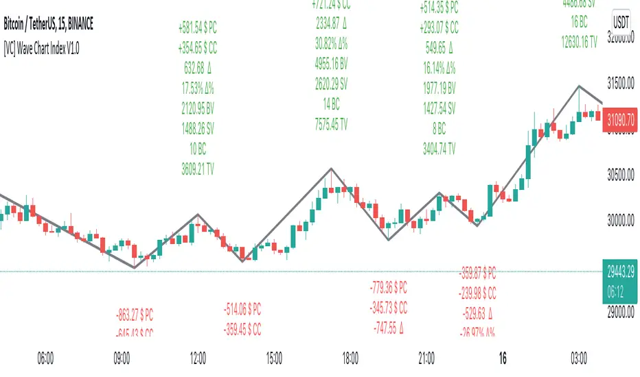
Comparative Data Analysis Example in the light of Effort & Result Theory
A short explanation of the above analysis
On Wave A , the close to close price change (C.C) is $354 . (its the distance of price that price travelled from the low of the previous wave)
and price travelled this distance with 632 Delta (Delta is an effort which is used to travel the price)
On Wave B , close to close price change (C.C) is -$359 , almost the same distance as the previous wave. But for this distance price used 47% more Delta than the last wave. ( previous Delta is 632 , but current Delta is 931 that is 47% extra)
It indicates that sellers have put more effort in Wave B than Wave A . However, they got similar results as the previous wave. In other words
More Effort & Less Result = Reversal Sign
(that's why in the above example price reversed from a support level)
* Notice that Wave B is also on a key support area/level. And on key support or resistance area, this kind of comparative analysis can give an extra edge in your analysis.
Disclaimer Note:
V.C Wave Chart Index is not a BUY/SELL signal based indicator or a holy grail trading system.
It is purely Volume, Delta and comparative analysis based indicator. Before applying this indicator to your analysis, you should know about V.S.A, Volume, Delta & Spread.
Some basic understanding of Sir Richerd Wyckoff's Theory can also be helpful.
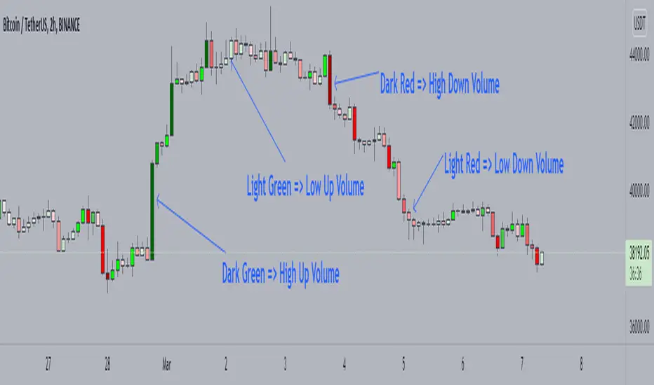
Candle Color by VolumeA simple but effective indicator that paints candles with different shades of colors based on the volume transacted.
-> Supports 6 levels of sensitivity at present. Might enhance the granularity later.
-> Darkest indicates the most volume transacted. Lightest, the least. Change it around however you see fit and based on your theme.
-> Use it for your Volume Spread Analysis and/or in conjunction with any other strategies that you employ.
-> Note that the volume ratio is calculated relative to the average volume of the last n candles ( EMA 20 by default).
Total VolumeThis simple indicator unifies the volumes of multiple exchanges/brokers. The idea of this indicator stems from the need to monitor the movements made by whales on other markets that can actually influence the price (manipulations, arbitrage, etc.).
Basically, we can:
* choose the number and symbols
* choose with which algorithm to merge the volumes (sum, average, weighted average, maximum)
* color the histogram (based on the dominant exchange, classic green/red color, no color)
Furthermore, there is a summary table which, in addition to indicating the volume for each exchange, also indicates the color attributed.
you can see the volume of the current exchange behind the volume obtained by the algorithm.
If you have any questions, doubts or suggestions please write to me.

[MattLet] Relative Volume for VSAThe Volume Spread Analysis (VSA) methodology focus at the relationship between price, spread, and volume, trying to identify the variations that the price of an asset may have bar by bar, candle by candle.
This indicator is based on calculates on the average volume of the bars in a close environment, that indicates when the volume is Ultrahigh, Very high , High , Normal and low.
The configuration setted is based on personal study. You can configurate the volume ratios per level, and try different results.
The indicator colors the volume bars and candles according to the volume traded.
Base colors configuration is a kind of heat map (don't forget to check the option to paint candles), but you can customize it as you wish.
Good Luck!

Better Trader Super PredictThis is a free trading assistant that combines 4 types of trading signals and useful tools.
Four types of trading signals:
1. Trending signals. KAMA and Awesome oscillator(5,34) and (3,25) are used to confirm trend.
2. Knifes. This is a SOT detector with volume and spread filtering. The algorythm takes into account the volatility.
3. Predict. The distance from VWAP and BB stdev 2 and 3 is used. Signals usually appear when RSI/MACD/AO divergence is detected.
4. High risk signals. These are SOT and high volume signals without hard filtering.
All signals use distance from SMMA and volatility.
Filters use LL and HH events.
Each signals has entry zone, recommended stop-loss and a number of take-profits.
Recommended entry points and usually located in the body of higher timeframe candles.
Recommended stop-loss zones are using ATR(10) with multiplier that depends on the timeframe.
Take-profit points and arranged within daily and week levels using pivots and VWAP.
The useful tools are:
- Autofibo
- Ichimoku clouds
- VWAP
Disclaimer:
Your trading is fully your responsibility.
Sell and Buy markers are not a financial advice.
Do not take too much risk.
Almost all signals are NOT repainted. There some rare trend signals that can be repainted.

Auto Price Action - Multi Time Frame [Mehrok]Auto Price Action - Volume Price and Spread - Multi Time Frame
Volume Price and Spread script generates important support and resistance levels basis activity happening in price, volume and candle spread. The basic idea has been taken from concepts of VSA which underlies that weakness appears in uptrend and strength in downtrend. Script will try to find candles which have volume higher then average and candle spread.
Underlying logic:
Script generates significant high's as resistance and lows as support basis activity happened on volume , price and candle spread. Multi Time Frame gives ability to find strong support and resistance levels on higher time frames and display on lower time frame chart.
Usage:
As it records and maintain important high and lows happening on candles till the time new levels are generated therefore generated price levels act as significant support or resistance. Higher the activity in volume , price and spread stronger that price level would act as support or resistance in future.
Script work on all time frame where volume information is available. In absence of volume information script would only generate optional levels and that too if activated.

Volume Heatmap v7FTJR20This indicator is a heatmap of the financial volume used in the asset, I use three different means to define the heatmap separating it into 3 phases
Phase A: Low volume
Phase B: Medium volume
Phase C: High volume
don't worry about these data, the indicator is configured to auto-interpret the information.
The heatmap uses the following colors and specifications
Red = Ultra High Volume
Orange = High Volume
Yellow = Average Volume (balance)
Blue = Low volume
White = Volume below average
The heatmap compares the phases to identify if it finds a standard deviation over time, that is, you can see a smaller volume with the same red bar as a previous larger red bar, this is because the attacks are updated in real time.
Tutorial:
1 - In point 1 we have an aggression with yellow and orange bars, that is, a balance with aggressions. As we are coming from an uptrend, the probability is a reversal and the answer came in sequence with a red drop bar with ultra volume, so we have a seller in control.
2- after point 1, we see that we only have several blue and white bars, that is, possibly the red bar absorbed the seller and the seller flow was decreasing, notice that the prices held for 3x so the buyer attacks the seller with an orange bar.
3- at point 3, we have two yellow bars, a balance, notice that it is an aggression, any yellow, orange or red bar is an aggression, that is, there was a passive seller selling at higher values, taking advantage of the stops in a region where there was buying demand (people buying wrong!)
4- Before reaching point 4, notice that in general the price is moving practically sideways and the volume is decreasing (white and blue bars), exhaustion of the buyer volume (no demand) and the answer in point 4 came in aggression with yellow bars and oranges.
* the seller lets the market go up to make sure he is in control and when he tests the pivot zone he attacks with a red bar (notice that this red bar is smaller than the previous ones, this is the magic of the indicator divided into 3 phases).
5- After the market goes through the natural distribution phases, we see a red bar with a high spread, whenever you see a red bar with a 2 to 3x spreed, it is a region with potential for reversal.
6- Note that after the characteristics of point 5 the asset works in zig zag, volume decreasing and the reversal comes with little volume, it is natural to engulf without volume this is the reversal signal, notice that it touches the bottom several times and not loses the region after a red bar with very high spread.
*notice that the buyer let it form a giant (shoulder head shoulder) to make a trap and the price always respected the volume of the first red bar at point 1.
7- see that the asset entered an uptrend and the phase is repeating itself, asset rising in a wave A, made a corrective B wave in smaller ABC and is making a C wave, at this moment it is a probability to enter a red bar after test the resistance and have a significant increase in volume.
- I like your feedback and leave your settings and experiences in the comments.

Volume Profile HeatmapA variation of a Volume Profile based on code originally by LuxAlgo. () The traditional bar chart is replaced with full-width bars that are brighter for high volume price levels.
Like a traditional VP, its purpose is to visualize how volume corresponds to specific price levels, allowing you to get a quick idea of where the most activity is occurring, and where it hasn't been. This information may provide clues as to where price action may return, areas of support and resistance , and regions where price may move quickly. The basic concepts behind any Volume Profile (or Price by Volume Chart) should apply here as well. (investopedia article)
Inputs are set up such that you can customize the lookback period, number of rows, and width of rows for most major timeframes individually. Timeframes between those available will use the next lower timeframe settings (e.g., 2m chart will use the 1m settings.)
This indicator is experimental and is likely to receive further updates.

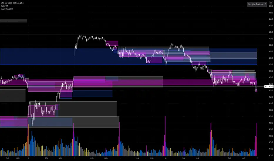
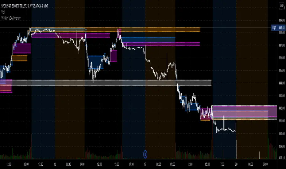
Volume Zones Multi-Timeframe OverlayAt its core, this indicator is a variation of my other indicator, Welkin Advanced Volume Overlay (for VSA )
This version is based on the power of multi-timeframe analysis. The basic functionality is simple: Plot lines from the high and low of candles formed during periods of high volume and fill the space between them. The volume levels for deciding what counts as "high volume" are based on standard deviations of the volume's SMA , and the higher the volume , the brighter the zone. i.e., a volume zone set by a volume level that is 4 standard deviations higher than average will be more "filled in" and less transparent than a volume zone from a 2 standard deviation candle.
These zones tend to act as areas of congestion, and the "ceilings" and "floors" of the zones as support and resistance . Overlapping zones tend to indicate strength and are likely to require more effort to get through. The more timeframes that agree with each other, the stronger the zone, ceiling, or floor.
By default, these zones are drawn based on the chart's timeframe and 1 timeframe higher, automatically set based on some "standard" values:
1m -> 5m
5m -> 15m
10m -> 30m
15m -> 60m
30m -> 60m
60m -> 1d
1d -> 1w
Finally, both the base timeframe and the higher timeframe are customizable; this is intended to make it easy to "double" up copies of the indicator to fit even more timeframes on the chart, creating a sort of heatmap for volume price analysis.
An example of three copies of the indicator, showing volume zones from 6 different timeframes.
Auto Price Action - Volume Price and Spread [Mehrok]Auto Price Action - Volume Price and Spread script generates important support and resistance levels basis activity happening in price, volume and candle spread. The basic idea has been taken from concepts of VSA which underlies that weakness appears in uptrend and strength in downtrend. Script will try to find candles which have volume higher then average and candle spread.
Underlying logic:
Script generates significant high's as resistance and lows as support basis activity happened on volume, price and candle spread. Once criteria set in script is met it would then mark that candle with resistance or support line which would act as important price action level later in time.
Usage:
As it records and maintain important high and lows happening on candles till the time new levels are generated therefore generated price levels act as significant support or resistance. Higher the activity in volume, price and spread stronger that price level would act as support or resistance in future.
Settings:
AvgLen- It would allow you to set the SMA settings for volume bars. By default set at 20 means that SMA of 20D volume would be considered in script.
Volume Start Threshold - Default 1.3 - You can change this setting basis stock volatility. This would set the starting point in script to trigger support or resistance levels if volume is equal or higher then the multiplier you have chosen.
Bearish Volume Mult 1, 2 and 3: Set the the levels which can be adjusted to generate x1, x2 or x3 resistance levels which would appear on top of candles.
Bullish Volume Mult 1, 2 and 3: Set the levels which can be adjusted to generate x1, x2, or x3 support levels which would appear at bottom of candles.
Use of bearish and bullish volume mult is to let user define the multiplier value against which current volume bar would be checked. Higher the value means rare it would be.
x1 - Starting level of resistance/support. It would be considered as level 1 of support or resistance which can be broken easily. Happen too often.
x2 - Medium level of resistance/support. It would be considered as level 2 of support or resistance which can give tough fight as price would reach this level. If set as more then 50% of stock volatility of instrument then price would react for sure.
x3 - Strongest level of resistance/support. If set 3 or higher it would be rare to be generated and price may not visit level too often.
Bullish Candle Matrix %: Keep it above 50 to let script check how strong bullish candle is. Strength of candle increase as value increase from 50 towards 100. Keep it at 52 to track maximum bullish candles.
Bearish Candle Matrix %: Keep it below 50 to let script check how strong bearish candle is. Strength of candle increase as value increase from 50 towards 0. Keep it at 47to track maximum bearish candles.
Optional Lines
Optional lines usage no volume activity therefore can generate important price levels basis volume and price only.
Script work on all time frame where volume information is available. In absence of volume information script would only generate optional levels and that too if activated.

TradeGuider VSA Relative VolumeThe TradeGuider VSA Lite package is designed for those traders who want to trade in harmony with the professionals (‘smart money’) and is based on Tom Williams’ Volume Spread Analysis methodology ( VSA ). It works in any market and any time frame. The trader can use it as a standalone toolkit to support their trading decisions, or in conjunction with other trading tools to obtain additional confirmations.
The package consists of two parts:
TradeGuider VSA Lite indicator
TradeGuider Relative Volume indicator
Together with the TradeGuider VSA Lite indicator, the TradeGuider VSA Relative Volume indicator helps to determine the interaction between supply and demand as well as assisting traders in their trading decisions. In the VSA methodology all analysis is based on Relative Volume . This means that the exact values of the volume on the price bars are not nearly as important as their volume in relation to the previous volume bars. The following classifications of Relative Volume are used in VSA:
Ultra High Volume
Very High Volume
High Volume
Average Volume
Low Volume
Very Low Volume
Users can easily see how any volume bar is classified by observing which color band in the volume indicator is reached by the top of any given volume bar.
Price bars where the volume is Ultra High very often begin the VSA Setup, while price bars on Low or Very Low Volume can be the confirmation and end the VSA Setup.
Using this indicator, users may also observe bullish (when price falls and volume decreases) and bearish (when price rises and volume decreases) behavior.
See the Author's instructions below to get access to this package and the accompanying documentation.

TradeGuider VSA LiteThe TradeGuider VSA Lite package is designed for those traders who want to trade in harmony with the professionals (‘smart money’) and is based on Tom Williams’ Volume Spread Analysis methodology (VSA). It works in any market and any time frame. The trader can use it as a standalone toolkit to support their trading decisions, or in conjunction with other trading tools to obtain additional confirmations.
The package consists of two parts:
TradeGuider VSA Lite indicator
TradeGuider Relative Volume indicator
The TradeGuider VSA Lite indicator provides information about the imbalance between supply and demand on the price charts via VSA principles. The VSA principles introduced in this indicator can be divided into two groups: Signs of Strength (SOS) and Signs of Weakness (SOW). The following six VSA principles are implemented:
SOSs: Potential Professional Buying (PB), Shakeout (SO), Test (TE)
SOWs: Potential Professional Selling (PS), Upthrust (UT), No Demand (ND)
VSA principles ARE NOT BUY and SELL SIGNALS on their own, but in combination may create VSA Setups to the long and short sides which are used in the VSA methodology to identify low-risk entries into, and optimal exits from, a trade.
A potential VSA Setup to the long side means that strength is presented on that particular chart at the current moment and the following conditions are present:
Potential Professional Buying (PB) is found in the background.
The price has risen above the high of the Potential Professional Buying (PB).
The price behavior has changed to the upside (the Short Term Trending Tool is changing color from red to gray or green).
The confirmation (a Test) is identified.
With a VSA Setup to the long side and strength on higher time frames, the price very often moves higher and the user may trade it.
A potential VSA Setup to the short side means that weakness is presented on that particular chart at the current moment and the following conditions are present:
Potential Professional Selling (PS) is found in the background.
The price has moved below the low of the Potential Professional Selling (PS).
The price behavior has changed to the downside (the Short Term Trending Tool is changing color from green to gray or red).
The confirmation (a No Demand) is identified.
With a VSA Setup to the short side and weakness on higher time frames, the price very often moves lower and the user may trade it.
The TradeGuider VSA Lite indicator is equipped with alerts which, when set, inform users of VSA Setups as they appear.
See the Author's instructions below to get access to this package and the accompanying documentation.
DISCLAIMER: The TradeGuider VSA Lite package is developed for educational purposes only. None of the content including the alerts should be considered as financial or investment advice. Investments are always made at your own risk and are based on your personal evaluations. We cannot be held responsible for any losses you may have. Please trade sensibly and carefully and only when you have a clear understanding of what is happening in the markets.

VPA - 5.0 This is a upgraded version of the vpa analysis script which basically implements Volume Spread Analysis (aka Volume Price analysis). It has been rechristened as VPA 5.0 to be inline with version released for Amiboker package so that all future upgrades will go hand in hand. All most all featured of the Amibroker version has been incorporated in this version. Some important additions are as follows
1. A status window for the bar and Trend Description added. No need to plot the trend bands or additional trend Indicator any more.
2. The most important upgrade would be the addition of a Alert window which provides description of the VSA signals. It is also a log window which provides up to 10 last signals
(Credits to Quantnomad for this wonderful piece of code. This feature is an adaptation of his public code)
3. Added facility to plot EMAs / PEMAs with changable parameters
4. Added facility to plot VWAP
5. Facility to switch on and Off the VSA signals. Also tool tip provides description of the signals
6. Facility to plot Resistance and Volume Lines (Credits to @margepadu)
Hope this script will be helpful to everyone. Please do provide your feedback and suggestions for improvements

Williams Accumulation/DistributionThis is an indicator described by Larry Williams in one of his books. Larry won the 1987 World Cup Championship of Futures Trading, where he turned $10,000 to over $1,100,000 in a 12-month competition with real money.
Larry used this indicator to track divergences between price action and volume, which he called patterns of accumulation (bullish divergence) and distribution(bearish divergence). Its logic is similar to On Balance Volume(OBV), where it accumulates up and down volume in a single line, but also takes into account the size of the candle in its calculation, by taking the difference between the open and close, and the high and the low.
Enjoy!
Volume Ranges (VSA)The script is intended for volume analysis
It shows if the volume is low, average, high or ultra-high.
Can be applied to any timeframe and any asset.
There're two calculation methods user can choose from:
1. Ranges - it allows to set a lookback period and moving average type to calculate averages
2. Deviations. In this case only one setting is applied - lookback period. Average type is not involved in this calculation method
Play around to figure out which one is better for you
Colors are:
Red - low volume
Green - avg volume
Yellow - high volume
Blue - ultra high volume

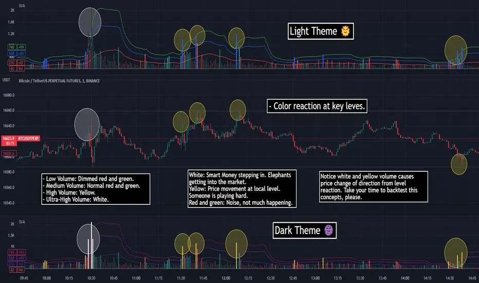
SVA - Simple Volume Analyzer, by BlueJayBird [bjb] ENGLISH & SPANISH
------------------------------------- ENSLIGH
The idea was initially inspired in the concepts shared by @LazyBear on his indicator "Better Volume Indicator" (). But I found it somewhat complicated and dull. So I came up with this.
Concept:
It changes the color of volume bars based on surrounding volume changes.
Volume changes are plotted as volume MAs lines in the volume pane.
Whenever the volume is higher than these MAs, the bar changes color.
For this reason, the bar color change is RELATIVE TO the surroundings, because the color change depends on how far the MA has been extended due to sudden (or not) changes in the volume.
BAR COLORS:
Weak Green and Red: Low volume. The calm before or after the storm.
Normal Green and Red: Mid volume. Still low volume, you may get bored.
Yellow: High volume. Players are playing hard and harder.
White: Ultra-High Volume. The elephants stepped in.
NOTES:
SVA works better at lower timeframes. Though as far as I can tell, it works pretty well as far as 1D timeframe.
------------------------------------- SPANISH
La idea estuvo inicialmente inspirada en los conceptos expuestos por @LazyBear en su indicador "Better Volume Indicator" (). Pero lo encontré un poco complicado y falto de claridad. Así que me inventé este.
Conceptp:
Cambia el color de las barras basándose en los últimos cambios de volumen.
Los cambios de volumen son ploteados como lineas de medias móviles (MAs, es decir "Moving Averages") en la sección del volumen (chart pane).
En cualquier momento que el volumen es mayor que estos MAs, el color de las barras cambia.
Por esta razon, el cambio de color de las barras es RELATIVO a lo que está sucediendo alrededor, ya que el cambio de color depende de qué tan lejos el MA se haya extendido por causa de los últimos cambios (o no) de volumen.
BAR COLORS:
Verde y rojo apagados: Volumen bajo (Low Volume). La calma antes de la tormenta.
Verde y rojo normales: Volumen medio (Mid volume). Volumen todavía bajo. Es posible que te aburras.
Amarillo: Volumen alto (High Volume). Los jugadores están jugando duro.
Blanco: Volumen ultra-alto (Ultra-High Volume). Los elefantes entran a la cancha.
NOTAS:
SVA funciona mejor en temporalidades menores. Pero por lo que he visto, funciona bien hasta la temporalidad de 1D.
Welkin Advanced Volume Study (for VSA)This is a translation of Welkin's Advanced Volume Study Indicator originally written for ThinkOrSwim. This version is simpler than Welkin's and attempts to streamline that basic functionality for beginners to Volume Spread Analysis.
This can be used to replace the built-in volume bar with a more advanced version that is designed to facilitate Volume Spread Analysis. The basic idea is to clearly call out areas of high and low volume that help a trader determine where to "Smart Money" may be attempting to move the market. Volume is an incredible powerful tool for the retail trader; learn how to use it.
Grey bar are Below Average volume .
Blue bars are Average Volume , from a 20sma of volume .
Orange bars are 2-sigma (or 2 standard deviations) above average.
Magenta bars are 3-sigma (3 standard deviations) above average.
The plotted lines represent these levels.
Yellow bars have relatively higher volume compared to the previous bar.
The study can also apply these same colors to the price candles themselves, as well as showing buying and selling pressure of the volume bars.

Welkin Advanced Volume Overlay (for VSA)This is a PineScript translation of Welkin's Advanced Volume Indicator Overlay, originally written for ThinkOrSwim. This tool is designed to facilitate Volume Spread Analysis (VSA) by highlighting areas of above average volume alongside price movement.
This indicator does two things:
1. Plots lines that extend from candles of above average, high, and very high volume.
2. Colors in candles with colors indicating volume levels (when "Paint Candles With Volume Colors" is enabled).
Blue lines mark candles with Average volume, based on a 20 SMA.
Orange lines mark 2-sigma (2 times standard deviations higher) volume.
Magenta lines mark 3-sigma (3 times standard deviations higher) volume.
When enabled, gray colored candles indicate below average volume.
Yellow candles indicate volume that is relatively higher than the previous candle, default is 1.25x.
Comparison Chart with Relative Volume Gradient CandlesThis indicator provides a way to use Relative Volume Gradient Paintbars on an alternate/comparison symbol while still looking at your main charted symbol. For instance, this allows you to plot the ES1! or SPY or QQQ above/below your charted symbol, and see its current Relative Volume signal, and compare that to the your currently-charted individual stock symbol, etc., and while keeping the candles from both symbols all lined up perfectly. It also provides 4 different custom MAs which can be applied to the comparison symbol.
The idea here is that you can potentially use my other indicator, Relative Volume Gradient Paintbars, on the primary symbol to evaluate that chart, while using this particular indicator to quickly analyze the same Relative Volume data on a comparison market symbol such as the SPY or QQQ without having to switch charted symbols. You can also quickly compare price action and location relative to familiar moving averages to quickly gauge relative strength of the stock vs. the market symbol.

Buy/Sell Volume confirmation for BO_Entry_ExitThis script helps to identify the volume strength basis EMA and various EMA multipliers, There are provisions provided to enable and disable when the volume is gaining momentum and the volume for a particular candle touches the Break Out criteria. Users will be able to modify the criteria for Volume strength and Volume break out Indication. It will also show the buyers & sellers strength of a volume bar which the uses will be able to enable and disable.

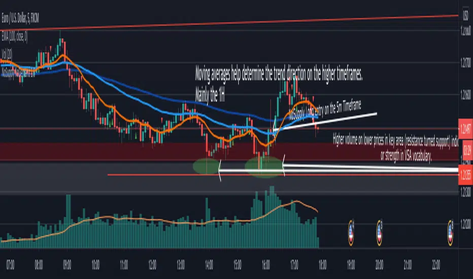
NoSupply NoDemand 1.01 - Description
This indicator is mainly used in a VSA (Volume Spread Analysis) based strategy, it shows NoSupply and NoDemand confirmations (and sends alerts if needed), which are triggers to enter a trade in some VSA based strategies.
2 - Definitions
NoSupply Candle
It's a down candle with its volume lower than the previous 2 candles.
The candle has to close bearish and there has to be some sort of rejection (pin or wick) at its low.
If the low is equal to the close it would not be a NoSupply candle.
NoDemand Candle
It's an up candle with its volume lower than the previous 2 candles.
The candle has to close bullish and there has to be some sort of rejection (pin or wick) at its high.
If the high is equal to the close it would not be a NoDemand candle.
3 - How this indicator works
There are 2 entry triggers possible with this indicator.
NoSupply Confirmation - Long
When there is a NoSupply Candle, a confirmation candle is needed to give an entry.
The conditions below has to be satisfied
A confirmation candle is a candle that closes above the high of the NoSupply candle.
There has to be no close below the low of the NoSupply candle before the confirmation candle.
This indicator looks for a confirmation within the next 7 candles
A green up triangle is plotted below the confirmation candle.
NoDemand Confirmation - Short
When there is a NoCandle Candle, a confirmation candle is needed to give an entry.
The conditions below has to be satisfied
A confirmation candle is a candle that closes below the low of the NoDemand candle.
There has to be no close above the high of the NoDemand candle before the confirmation candle.
This indicator looks for a confirmation within the next 7 candles
A red down triangle is plotted above the confirmation candle.
4 - How to add an Alert
1. On the chart, choose the timeframe of the Alert
2. Right Click on the Chart
3. Add Alert
4. In the "Condition" field, choose "NoSupply NoDemand 1.0"
5. Another field then shows just below the "Condition" field, choose the Alert Type needed (NoSupply or NoDemand)
6. Edit the alert name and message (if needed)
5 - How to use Alerts in the strategy
I personally use it this way for my VSA (Volume Spread Analysis) based strategy.
1. Define the background (Strength or Weakness)
2. Define key areas to look for a trade
3. Set Price Alerts in key areas defined in step 2
4. Look for High Volume (or Stopping Volume) in the pre-defined key area
5. If the volume confirms the background (High Volume and rejection in the right place), and if I'm busy and can't watch the charts, I use this indicator to set a NoSupply or a NoDemand alert. An alert is sent on the close of the confirmation candle.
6. If I can watch the charts, no need for alerts, and the indicator show the NS and ND confirmations as explained in section 3.