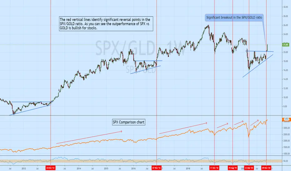
I like to use ratio charts to compare one instrument/sector/index to another as it can give you better a perspective on the market. One ratio I track is SPX to GOLD.
Gold is seen by many as a risk off asset so a strengthening SPX to GOLD ratio suggests traders are willing to take on more risk which is typically bullish for stocks. One can also
compare the SPX to ETFs like XLU, XLP or use ratio charts like XLK/XLP to gauge the market's appetite for risk.
Gold is seen by many as a risk off asset so a strengthening SPX to GOLD ratio suggests traders are willing to take on more risk which is typically bullish for stocks. One can also
compare the SPX to ETFs like XLU, XLP or use ratio charts like XLK/XLP to gauge the market's appetite for risk.
Disclaimer
The information and publications are not meant to be, and do not constitute, financial, investment, trading, or other types of advice or recommendations supplied or endorsed by TradingView. Read more in the Terms of Use.
Disclaimer
The information and publications are not meant to be, and do not constitute, financial, investment, trading, or other types of advice or recommendations supplied or endorsed by TradingView. Read more in the Terms of Use.