Market Structure 101: Navigating Price ActionMost traders jump directly into indicators, oscillators, or patterns. Yet every chart has a deeper foundation that determines direction long before any tool is applied. Market structure is that foundation. When you understand how price forms highs, lows, and transitions between them, you stop reacting to noise and start reading the market’s intent. It is the base layer that allows you to build a clear, consistent bias.
Price moves because buyers and sellers interact around key levels. Structure highlights where momentum strengthens, weakens, or reverses. By tracking how highs and lows evolve, you can identify trend, consolidation, and shifts in direction with far more clarity than any indicator can offer. Market structure is objective. It gives you a rule-based lens to interpret movement across all timeframes.
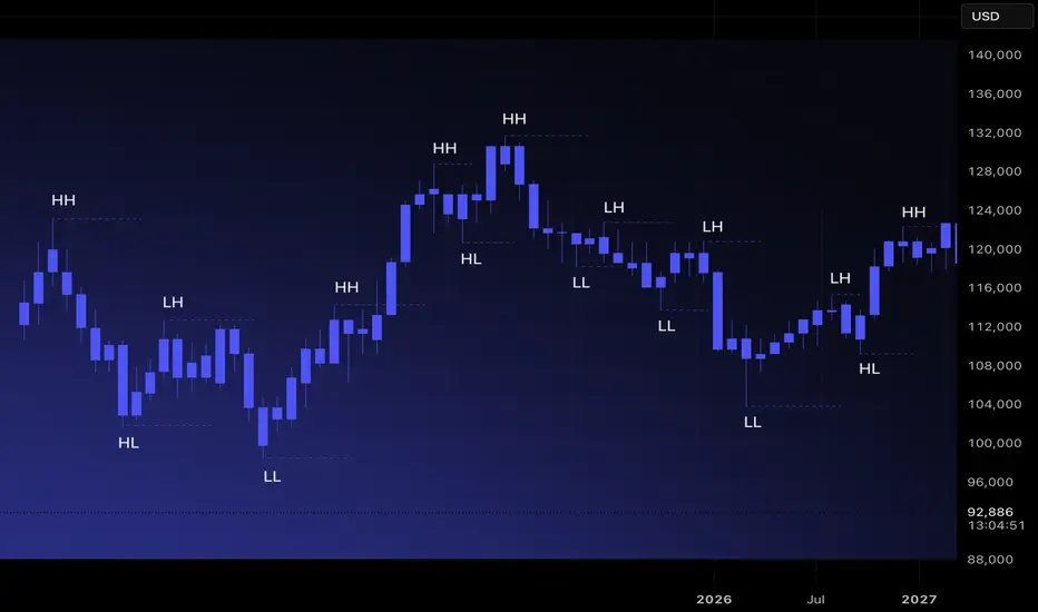
Understanding Highs and Lows
There are four structural components every trader must recognize.
Higher High (HH): Price breaks above a previous high, showing buyers in control.
Higher Low (HL): Price pulls back but stays above the prior low, confirming trend continuation.
Lower High (LH): Price rallies but fails to reach previous highs, indicating weakening demand.
Lower Low (LL): Price breaks below the previous low, signaling sellers taking control.
These sequences are the building blocks of trend identification. When mapped correctly, they remove guesswork and reveal underlying momentum.
Identifying Uptrends and Downtrends
Uptrend: A sequence of HHs and HLs. Buyers consistently push price higher and defend higher floors.
Downtrend: A sequence of LHs and LLs. Sellers control direction, rejecting higher prices and driving the market downward.
A trend remains intact until structure breaks. This is why experienced traders avoid predicting reversals and instead follow structural evidence. When the market prints new HHs and HLs, the bias remains long. When LLs and LHs appear, the bias rotates short.
Ranges and Consolidation
Markets do not trend all day. Much of the time, they move sideways. A range occurs when highs and lows stay relatively equal, creating a horizontal zone with equal highs and equal lows. This is where compression happens. Liquidity builds above the range highs and below the range lows, and trend often resumes only after one side of the range is taken.
In ranges, structure becomes neutral. Bias is formed only when price breaks out and retests with confirmation.
Break of Structure(BOS) and Trend Shift
A break of structure occurs when the market violates the pattern of the existing trend. In an uptrend, a break occurs when price prints an LL. In a downtrend, a break occurs when price forms an HH. This signals a potential shift in momentum.
Breaks of structure matter because they identify turning points without relying on subjective signals. They show where one side loses control and the other gains traction. They also create clear invalidation points for risk management.
How to Read Structure Across Timeframes
Market structure becomes even stronger when used across multiple timeframes. The higher timeframe sets the primary bias. The lower timeframe provides entry precision.
Weekly or Daily: Structural trend and major zones.
4H or 1H: Execution windows and key shifts.
15m and 5m: Entry confirmation.
When all levels of structure align, the probability of a clean move increases significantly.
Avoiding Common Mistakes
Many traders misread structure by focusing on every small fluctuation. Structure is defined by meaningful swings, not micro noise. Another common error is assuming a single HH or LL immediately reverses a trend. Context matters. Breaks followed by continuation and retests confirm the shift. A disciplined trader waits for structure to become clear instead of acting on isolated candles.
Turning Structure Into a Bias
Structure simplifies decision-making.
If the market is printing HH and HL formations, you prioritize longs.
If it is printing LH and LL formations, you seek shorts.
If highs and lows are equal, you wait for a breakout.
Multitimeframeanalysis
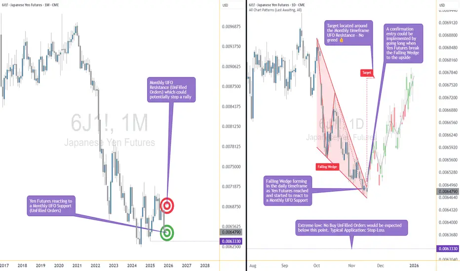
The Support Zone That Refused To Be IgnoredSome chart zones whisper. This one practically waved its arms.
Price slid right into a hefty support area on the higher timeframe… and suddenly started behaving like it had forgotten how to move lower. Classic clue.
Zoom in, and the daily chart shows price squeezing itself into a falling wedge — the market’s equivalent of someone pacing in a hallway, unsure whether to sit down or sprint. Sellers kept trying to push prices lower, but each attempt had less conviction than the last.
When you stack those two pieces together — a big support zone from the monthly chart and a daily pattern running out of room — things start to get interesting. Not predictive, just… interesting.
A breakout above the wedge (around 0.0065030) would basically say, “Alright, I’m done compressing.”
A stop tucked below the lower support range (roughly 0.0063330) keeps the scenario clean.
And a structural projection toward 0.0067695 gives the idea a tidy endpoint if momentum decides to stretch its legs.
Of course, leverage cuts both ways, and traders working with the standard or micro contracts often choose size based on how much room they want between entry and invalidation. When traders choose between the standard and micro versions of this market, it usually comes down to scale. The bigger contract represents 12,500,000 units of the underlying with a $6.25 tick, while the micro mirrors the behavior at 1,250,000 units with a $1.25 tick. Estimated margins also differ — roughly $2,800 for the larger contract and about $280 for the micro. Same chart logic, just two very different footprints on the account.
The real takeaway? When a major zone teams up with a compression pattern, it’s usually worth paying attention. Maybe it leads to a beautiful breakout. Maybe it fizzles. But structurally, this is one of those “save the screenshot” moments.
And whatever the outcome, risk management keeps the whole thing sensible — size smartly, define failure points, and let the chart prove itself instead of assuming it will.
Want More Depth?
If you’d like to go deeper into the building blocks of trading, check out our From Mystery to Mastery trilogy, three cornerstone articles that complement this one:
🔗 From Mystery to Mastery: Trading Essentials
🔗 From Mystery to Mastery: Futures Explained
🔗 From Mystery to Mastery: Options Explained
When charting futures, the data provided could be delayed. Traders working with the ticker symbols discussed in this idea may prefer to use CME Group real-time data plan on TradingView: www.tradingview.com - This consideration is particularly important for shorter-term traders, whereas it may be less critical for those focused on longer-term trading strategies.
General Disclaimer:
The trade ideas presented herein are solely for illustrative purposes forming a part of a case study intended to demonstrate key principles in risk management within the context of the specific market scenarios discussed. These ideas are not to be interpreted as investment recommendations or financial advice. They do not endorse or promote any specific trading strategies, financial products, or services. The information provided is based on data believed to be reliable; however, its accuracy or completeness cannot be guaranteed. Trading in financial markets involves risks, including the potential loss of principal. Each individual should conduct their own research and consult with professional financial advisors before making any investment decisions. The author or publisher of this content bears no responsibility for any actions taken based on the information provided or for any resultant financial or other losses.

A High-Impact Support Zone Meets a Breakout StructureIntroduction
Markets occasionally compress into areas where structure, momentum, and historical buying pressure align with surprising precision. When that compression occurs at a major higher-timeframe floor, traders often pay closer attention—not because the future is predictable, but because the chart reveals a location where price behavior typically becomes informative.
The current case study centers on a market pressing into a high-impact support zone visible on the monthly chart, while the daily chart displays a falling wedge pattern that has gradually narrowed the range of movement. This combination often highlights moments where the auction process is nearing a decision point. The purpose here is to dissect that confluence using multi-timeframe structure, pattern logic, and broad order-flow principles—strictly for educational exploration.
Higher-Timeframe Structure (Monthly)
The monthly chart shows price approaching a well-defined support area between 0.0065425 and 0.0063330, a region that has acted in the past as a base for significant reactions. These areas often develop because markets rarely absorb all buy interest in a single pass; pockets of unfilled orders may remain, leading to renewed reactions when price returns.
This type of zone does not guarantee a reversal. However, historically, when price reaches such levels, traders tend to monitor whether selling pressure slows or becomes less efficient. In this case, the structure suggests a recurring willingness from buyers to engage at these prices, forming a foundation that has held multiple swings.
The presence of a clear, higher-frame resistance at 0.0067530 anchors the broader range. When price rotates between such boundaries, the monthly context often acts as a roadmap: major support below, major resistance above, and room in between for tactical case-study exploration.
Lower-Timeframe Structure (Daily)
Shifting to the daily chart, price action has carved a falling wedge, a pattern often associated with decelerating downside movement. In wedges, sellers continue to push price lower, but with diminishing strength, as each successive low becomes less effective.
This type of compression structure can provide early evidence that the auction is maturing. Traders studying such patterns often watch for:
tightening of the range,
shorter waves into new lows,
initial signs that buyers are defending intraday attempts to drive price lower.
The daily wedge in this case sits directly on top of the monthly support zone—an alignment that strengthens its analytical relevance. The upper boundary of the wedge sits near 0.0065030, and a break above that line is often interpreted as price escaping the compression phase.
Multi-Timeframe Confluence
Multi-timeframe confluence arises when higher-frame structure provides the background bias and lower-frame patterns offer the tactical trigger. In this case:
The monthly chart signals a historically responsive support zone.
The daily chart shows structural compression and slowing downside momentum.
The interaction between them creates a scenario where educational case studies tend to focus on breakout behavior, as the daily timeframe may provide the first evidence that higher-frame buyers are engaging.
This confluence does not imply certainty. It simply highlights a location where structure tends to become more informative, and where traders often study the transition from absorption to response.
Order-Flow Logic (Non-Tool-Specific)
From an order-flow perspective, strong support zones typically develop where prior buying activity left behind unfilled interest. When price returns to that region, two things often happen:
Sellers begin to encounter difficulty driving price lower, as remaining buy orders absorb their activity.
Compression patterns form, as the market oscillates in a tightening range while participants test whether enough liquidity remains to cause a directional shift.
A breakout of the daily wedge represents a potential change in the auction dynamic. While sellers are still active inside the wedge, a breakout suggests their pressure may have become insufficient to continue the sequence of lower highs and lower lows. Traders studying market transitions often use such moments as part of hypothetical scenarios to understand how imbalances evolve.
Forward-Looking Trade Idea (Illustrative Only)
For educational purposes, here is how a structured case study could frame a potential opportunity using the discussed charts:
Entry: A hypothetical entry could be placed above the falling wedge, around 0.0065030, once buyers demonstrate the ability to break outside the compression structure.
Stop-Loss: A logical invalidation area in this case study would be at or below the monthly support, around 0.0063330, where failure would indicate the higher-timeframe zone did not hold.
Target: A purely structural wedge projection would suggest a target near 0.0067695, aligning closely with the broader resistance region on the monthly chart.
These price points yield a reward-to-risk profile that is measurable and logically linked to structure, though not guaranteed. This case study exists solely to illustrate how support-resistance relationships and pattern logic can be combined into a coherent, rules-based plan, not as an actionable idea for trading.
Yen Futures Contract Context
The larger (6J) and micro-sized (MJY) versions of this futures market follow the same underlying price but differ in exposure and margin scale. The standard contract generally carries a greater notional value and therefore translates each price movement into a larger monetary change. The micro contract mirrors the same structure at a reduced size, allowing traders to adjust position scaling more precisely when navigating major zones or breakout structures such as the one discussed in this case study:
6J equals 12,500,000 Japanese Yen per contract, making it suitable for larger, institutional players. (1 Tick = 0.0000005 per JPY increment = $6.25. Required Margin = $2,800)
MJY equals 1,250,000 Japanese Yen per contract, making it suitable for larger, institutional players. (1 Tick = 0.000001 per JPY increment = $1.25. Required Margin = $280)
Understanding margin requirements is essential—these products are leveraged instruments, and small price changes can result in large percentage gains or losses.
Risk Management Considerations
Strong support zones can attract interest, but risk management remains the foundation of any structured approach. Traders studying these transitions typically:
size positions relative to the distance between entry and invalidation,
maintain clear exit criteria when structure fails,
avoid adjusting stops unless the market has invalidated the original reasons for the plan,
adapt to new information without anchoring to prior expectations.
These principles emphasize the importance of accepting uncertainty. Even at major support zones, markets can remain volatile, and scenarios may unfold differently than anticipated.
When charting futures, the data provided could be delayed. Traders working with the ticker symbols discussed in this idea may prefer to use CME Group real-time data plan on TradingView: www.tradingview.com - This consideration is particularly important for shorter-term traders, whereas it may be less critical for those focused on longer-term trading strategies.
General Disclaimer:
The trade ideas presented herein are solely for illustrative purposes forming a part of a case study intended to demonstrate key principles in risk management within the context of the specific market scenarios discussed. These ideas are not to be interpreted as investment recommendations or financial advice. They do not endorse or promote any specific trading strategies, financial products, or services. The information provided is based on data believed to be reliable; however, its accuracy or completeness cannot be guaranteed. Trading in financial markets involves risks, including the potential loss of principal. Each individual should conduct their own research and consult with professional financial advisors before making any investment decisions. The author or publisher of this content bears no responsibility for any actions taken based on the information provided or for any resultant financial or other losses.
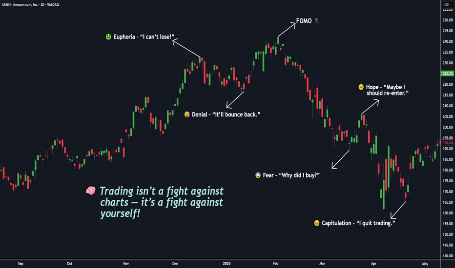
You’re Not Competing With the Market, You’re Competing With Self🧠 Trading isn’t a fight against charts — it’s a fight against yourself.
If you’ve ever told yourself “I’ll just take one more trade”, you already know this battle.
But in truth — the real battle happens inside your mind.
You start your day with discipline: BITSTAMP:BTCUSD , NASDAQ:AMZN , OANDA:XAUUSD , NASDAQ:META
📋 “ Two setups max. 1% risk. No emotions. ”
But then the market shows you something that looks perfect.
Price moves fast. Your pulse jumps. You click “BUY BUY BUY.”
Seconds later , the candle reverses — and suddenly, you chase a candle, break a rule, or move your stop just to “ give it a little more space ,” you’re not losing to the market my friend, You’re losing to your own impulses. ⚔️
You’re not trading the chart anymore — you’re trading your hope. And that’s what makes trading beautiful — it’s not a test of intelligence, it’s a mirror of your self-awareness.
That’s when the market does what it always does: it punishes emotional decisions and rewards patient ones.
💭 Emotionally! You start bargaining with yourself:
“It’ll come back.” ( When you’re greedy → it exposes it. )
“I’ll just move my stop a little.” ( When you’re fearful → it magnifies it. )
“Let me add to average out.” ( When you’re calm → it rewards it. )
The market doesn’t care if you win or lose. It simply amplifies your inner state.
You Digest it or not!, the truth most don’t want to accept:
You can’t control the market.
You can’t control news, indicators, or price spikes.
But you can control your reactions.
The moment you stop reacting and start observing — your trading transforms.
Clarity comes only when emotion leaves. 💎
⚡ Trading isn’t about predicting moves — it’s about managing yourself during those moves.
🎯 Real-Life Example:
Think back to the last time you made money on a random FOMO entry. It felt good, right?
That “instant win” wired your brain to believe impulsiveness works.
But the next time, that same instinct cost you twice as much.
That’s recency bias — one of trading’s silent killers.
Your brain craves the last emotion it felt, not the right decision.
💎 True mastery begins when you stop asking:
“Why did the market do that?”
and start asking:
“Why did I react like that?” ( 👉 “ Am I reacting, or am I responding ?” )
The market has no emotions . It’s just reflecting yours back at you — amplified, delayed, and multiplied by leverage. ⚔️
🧩 Here’s the mindset shift, that changes everything:
You don’t need to win every trade. You need to trade as if you already know yourself.
You don’t need a better indicator. You need a clearer mirror.
The edge isn’t on the screen — it’s inside your head.
When you realize that, trading becomes peaceful and You stop chasing, You start choosing.
Master that single question, and you’ll outperform 90% of traders who never will.
💬 What’s one emotion you think costs you the most trades —
👉 Fear 😨
👉 Greed 🤑
👉 Impatience ⚡
🧩 Drop it below 👇 and let’s talk about how to overcome it — build awareness together as traders, not competitors.
If this Idea gave you a value information then please, Boost it, share your thoughts in comments, and follow for more practical trading!
Happy Trading & Investing!
Team @TradeWithKeshhav
Multi-Time Frame Analysis (MTF) — Explained SimplyWant to level up your trading decisions? Mastering Multi-Time Frame Analysis helps you see the market more clearly and align your trades with the bigger picture.
Here’s how to break it down:
🔹 What is MTF Analysis?
It’s the process of analyzing a chart using different time frames to understand market direction and behavior more clearly.
👉 Example: You spot a trade setup on the 15m chart, but you confirm trend and structure using the 1H and Daily charts.
🔹 Why Use It?
✅ Avoids tunnel vision
✅ Aligns your trades with the larger trend
✅ Confirms or filters out weak setups
✅ Helps you find strong support/resistance zones across time frames
🔹 The 3-Level MTF Framework
Use this to structure your chart analysis effectively:
Higher Time Frame (HTF) → Trend Direction & Key Levels
📅 (e.g., Daily or Weekly)
Mid Time Frame (MTF) → Structure & Confirmation
🕐 (e.g., 4H or 1H)
Lower Time Frame (LTF) → Entry Timing
⏱ (e.g., 15m or 5m)
🚀 If you’re not using MTF analysis, you might be missing critical market signals. Start implementing it into your strategy and notice the clarity it brings.
💬 Drop a comment if you want to see live trade examples using this method!

How To Customize The 1 Minute Scalping IndicatorThis tutorial explains each setting of the 1 Minute Scalping Indicator in detail so you understand exactly how to adjust your settings to get the results you would like from the indicator.
Here is a list of the details we discuss:
How to fix loading errors
Tooltips that explain each setting for your reference
Trade modes and how they are affected by other settings
Average candle size rejection parameters
Higher timeframe candle filters, settings and levels
External indicator trend filtering capabilities and how to set them up correctly
Stoploss and take profit calculations and settings you can adjust
Signal arrow customization options
Candle coloring adjustments
Visual/styling options
Make sure to watch the whole video so you fully understand how each setting affects the indicator for best results.

How To Filter Signals On The 1 Minute Scalping IndicatorThis tutorial shows you how to use external indicators to filter out signals on the 1 Minute Scalping Indicator so that you only get signals that are in the direction of the trend.
Step By Step Process:
1. Pick an external indicator that provides an output value of 1 for bullish, -1 for bearish or 0 for neutral and add it to your chart. We have multiple indicators that can do this, but you can also customize your own indicators to provide this value and use that to filter out signals.
2. Set your desired trend parameters on your external indicator and make sure that indicator is on the same chart as the 1 Minute Scalping Indicator.
3. Go to the indicator settings for the 1 Minute Scalping Indicator and turn on one of the 3 available External Indicator Filters. Then from the dropdown menu, select the external indicator you want to use and make sure to choose the output value that gives the 1, -1 or 0 output for trends. Our indicators will have an output titled "Trend Direction To Send To External Indicators" to make that value easy to find in the dropdown menus.
That's it! Let the 1 Minute Scalping Indicator reload with the external indicator trend values and it will only show buy signals during bullish trends, only show sell signals during bearish trends or no signals during neutral markets. Make sure to back test your setup until you find the best external indicators and settings to use that work best for your trading style and then apply that setup to any chart you would like.
Here is the code you can use to add a trend value to your own custom indicators and send it to the 1 Minute Scalping Indicator:
trendDirection = 0
if close > ema1
trendDirection := 1
else if close < ema1
trendDirection := -1
else
trendDirection := 0
plot(trendDirection, title="Trend Direction To Send To External Indicators", color=#00000000, display=display.data_window)
Change the (close > ema1) and (close < ema1) to use your own variables from within your script.

Trading with multiple VAMAsI want to show you how to analyse multiple timeframe VAMAs for trading opportunities. This is an interesting approach that can reveal valuable market structure information.
For this example I am using a 15m, 1h and. 4h VAMA, but you can use this on lower or higher timeframes as well. First, let's understand what each timeframe VAMA represent in this case:
The 15-minute VAMA indicates short-term trends and momentum
The 1-hour VAMA reveals intermediate trend direction
The 4-hour VAMA represents the broader market structure
When these VAMAs overlap on your lower timeframe chart (15m in this case), they create what we might call "zones of interest." Think of it like layers of support and resistance that have different degrees of significance based on their timeframe. Here's how we can interpret and use this information:
Convergence Zones
When multiple VAMAs cluster in a tight price range, this creates a significant zone of interest. For example, if your 15-minute, 1-hour, and 4-hour VAMAs are all within a narrow price band, this often indicates a strong support or resistance level. These zones typically exhibit one of two behaviors:
Price Bounces:
When price approaches a convergence zone from above or below, it often respects these levels. The more timeframes that have converged, the stronger the zone becomes. A bounce from such a zone with corresponding volume can present a high-probability trade opportunity.
Zone Breaks:
If price successfully breaks through a convergence zone, especially with increased volume, this often signals a strong trend continuation or reversal, depending on the direction of the break.
Hierarchical Trending
You can identify the strength and maturity of trends by examining how the different timeframe VAMAs are arranged:
Strong Uptrend Structure:
4H VAMA lowest
1H VAMA above 4H
15min VAMA above 1H
This "stacking" of VAMAs shows a healthy trend structure. The higher timeframe VAMAs act as dynamic support levels in an uptrend (or resistance in a downtrend).
Trade Entry Opportunities
Alignment Trades:
Look for moments when all VAMAs are pointing in the same direction and properly stacked. These situations often present high probability setups. For example: In an uptrend Price pulls back to test the 15-minute VAMA while the 1H and 4H VAMAs continue trending up.This creates a "buy the dip" opportunity with multiple timeframe confirmation.
Divergent Zone Trades:
When the faster VAMAs (1min, 15min) show divergence from the slower ones (1H, 4H), this can indicate potential reversal points: If the 1min and 15min VAMAs start curling up while price is testing the 1H VAMA as support. This divergence in shorter timeframes while respecting longer timeframe support can signal a reversal opportunity.
Breakout Confirmation:
Use the multiple timeframes to confirm breakout trades:
When price breaks above a convergence zone
Look for the faster VAMAs (1min, 15min) to cross above the slower ones
Volume should increase during the break
The previous resistance zone (marked by the VAMAs) should become support

Trading My Robin Trap Strategy Me Going Over How I Use Everything Together For My Robin Trap Strategy In Great Detail

Understanding ICT Bullish Mitigation BlockA Bullish ICT Mitigation Block is a concept from Inner Circle Trader (ICT) methodology.
It forms at the end of a bearish trend when the price reaches a strong bullish institutional reference point, such as a bullish order block or breaker block.
Formation: It occurs when the price fails to create a lower low in a bearish trend and instead reverses to shift the market structure to the bullish side.
Identification: Look for a price level where the market attempted to break lower but was halted by significant buying pressure.
Trading Implications: This area can serve as a strong demand level, from which the price can rally further stronger because of short traders exit and long traders enter at the same area.
Multi Time Frame Analysis:
Higher Time Frame - H4
Lower Time Frame - M15
Institutional Framework:
Price Expansion (MMXM Buy Model)
Institutional Reference Points:
Bullish Mitigation
Sell Side Liquidity (SSL)

How To Use Multi-Timeframe AnalysisHey,
In this video, I dive into the methods of multi-timeframe analysis, exploring how to use daily, weekly, and monthly charts alongside intraday charts like the 4-hour to gain a clearer picture of price movement.
Multi-timeframe analysis helps you view the same data through different lenses, allowing you to make predictions across various time horizons.
For example, a weekly trend or a monthly move can appear as a complete trend on lower timeframes.
By integrating these perspectives, you can better understand what price action is indicating and make informed decisions.
Kind regards,
Max

How To Setup Your TradingView RightHey,
In this video I show you how my charting setup looks like.
I use the monthly, weekly, daily time-frames in one layout.
I use the 4hour and 1hour time-frame in my other layout.
Then I show you everything I trade for FX in my watch list.
Then I show you my crypto and stock market watch list.
Kind regards,
Max

How I Use Multi Timeframe Analysis to Capture LARGE Price SwingsDISCLAIMER: This is not trade advice. Trading involves real risk. Do your own due diligence.
TUTORIAL:
Today, I demonstrate the thought process and mechanical steps I take when trading my Multi-Timeframe strategy. We take a look at US Treasuries, which have offers a classic lesson in how to apply this approach.
As you will see, throughout the year, this approach took some losses prior to getting involved in the "real" move which we anticipated. No strategy is perfect, and I do not purport this to be perfect. It is a rules based and effective way to read price. This strategy is great for people who don't have a lot of time to spend at the charts. I would classify this more as an "investing" strategy when utilizing the 12M-2W-12H timeframe.
If you have questions about anything in this video, feel free to shoot me a message.
I hope you have all had a great week so far.
Good Luck & Good Trading.

Why WAITING on XAU Will pay BIG TIME The charts cover different timeframes of the XAU/USD (Gold/US Dollar) pair, and they reveal several key technical structures and patterns that are useful for trading analysis.
1. Flag Pattern and Breakout (5-Minute and 15-Minute Charts)
- On the 5-minute and 15-minute charts, there is a visible **flag pattern** following a strong upward move (bullish flag). This pattern typically indicates a continuation of the prevailing trend after a consolidation phase.
- The flag's lower trendline (support) and upper trendline (resistance) are marked in yellow. The price consolidated between these lines, and the breakout occurred upwards, confirming the bullish continuation. This breakout could be a potential entry point for a long position, with the stop loss below the flag's lower trendline and a target based on the flagpole's length (the initial strong upward move preceding the flag).
2. Descending Channel and Potential Reversal (1-Hour and 4-Hour Charts)
- The 1-hour and 4-hour charts display a **descending channel** (marked with yellow trendlines). The price recently touched the lower trendline and bounced back, showing signs of a potential reversal.
- If the price continues to break above the upper trendline of the descending channel, it could signal a bullish reversal, providing a possible entry for a long trade. The risk management strategy should include placing a stop loss below the recent low (or the channel's lower trendline) and targeting previous resistance levels or the channel's upper boundary.
3. Broadening Wedge Formation (4-Hour Chart)
- The broader view on the 4-hour chart shows a **broadening wedge pattern**, where the price has been making higher highs and lower lows. This pattern is generally considered a sign of increasing volatility and potential trend reversal.
- If the price breaks above the broadening wedge's upper trendline, this could further confirm a bullish reversal. Conversely, a break below the lower trendline would suggest further downside potential.
4. Support and Resistance Zones (Highlighted on All Charts)
- Several horizontal lines mark significant **support and resistance levels** around $2,507 and $2,532.144, respectively. These levels could serve as potential entry or exit points based on how the price reacts when approaching them.
- Observing how the price interacts with these levels can provide clues for future price action. For example, a sustained move above $2,507 could confirm a bullish sentiment, whereas a rejection or false breakout might suggest the continuation of the bearish trend.
Trading Strategy Recommendations:
1. Flag Pattern (Short-Term Bullish) If looking for short-term trades, consider entering a long position on a confirmed breakout of the flag pattern, with a stop loss below the flag's lower trendline. Target a move equal to the height of the flagpole added to the breakout point.
2. Descending Channel (Potential Reversal):If trading based on the descending channel, a break above the upper trendline could signal a reversal and a potential buying opportunity. In contrast, if the price rejects the upper trendline, consider shorting with a stop above the recent highs and target the lower boundary.
3. Broadening Wedge (Cautious Approach): For traders cautious about volatility, wait for a confirmed breakout from the broadening wedge to determine the trend direction. Enter long if it breaks upwards and short if it breaks downwards, setting stop losses just beyond the breakout points.
4. Support and Resistance Levels (Decision Zones): Use the marked support and resistance zones as decision points. Enter trades based on confirmation signals near these levels, and manage risk by adjusting stop-loss orders accordingly.
By combining these observations with confluence factors such as higher time frame trends, candlestick patterns, and multi-touch confirmations, you can refine your entry and exit points and enhance your trading strategy.

Chart Patterns Within Patterns: A Guide to Nested Setups Daily Chart Analysis:
Pattern Overview:
The daily chart shows an Ascending Channel formation, which generally indicates a bullish trend but can also signal a potential reversal if the upper trendline acts as strong resistance.
Within the ascending channel, there are continuation patterns such as smaller bull flags, which suggest bullish momentum continuation.
Key Resistance and Liquidity Zone (LQZ):
The upper trendline of the ascending channel aligns closely with the recent highs around the $2,530 - $2,540 region, creating a significant resistance area.
The 1-Hour Liquidity Zone (LQZ) at $2,486.793 is marked below the current price, indicating potential areas where price might retest before any significant upward or downward move.
Potential Reversal Signal:
The upper boundary of the ascending channel has recently been tested multiple times, and each time, there has been a slight pullback, indicating selling pressure. This could be a precursor to a possible reversal if this level is not broken with conviction.
4-Hour Chart Analysis:
Nesting Patterns:
The 4-hour chart also reveals several nested patterns within the broader ascending channel, including smaller bull flags and a potential double-top pattern forming at the resistance zone.
The price action is consolidating below the resistance line at $2,530.750, creating a possible Double Top scenario, which could indicate a bearish reversal if confirmed by a breakdown below the neckline support.
Impulse and Correction Phases:
The recent impulsive moves upwards have been followed by corrective pullbacks, which have been forming higher lows, reinforcing the bullish bias in the medium term.
However, the proximity to the resistance and the potential double-top formation might signal caution for long positions.
1-Hour and 15-Minute Chart Analysis:
Short-Term Structure:
The 1-hour chart shows a more detailed view of the recent consolidation phase near the key resistance level. There are signs of weakening momentum as prices approach the upper trendline.
The 15-minute chart further shows a tightening range and potential bear flag or a descending channel, which could indicate a short-term bearish continuation if the lower trendline of this smaller pattern breaks.
Critical Levels:
The support level around $2,486.793 (1HR LQZ) is critical for intraday trading. A break below this could lead to a sharper correction towards the lower boundary of the ascending channel on the daily chart.
For bullish continuation, a clear break above the $2,530 - $2,540 resistance with strong volume would be needed to confirm further upside potential.
Trading Strategy and Recommendations:
Bullish Scenario:
Look for a strong breakout above the $2,530 - $2,540 resistance on the daily chart, accompanied by increased volume and a break above the smaller continuation patterns (flags) on the lower timeframes.
Enter on a reduced risk entry after a pullback to the breakout level, with stops placed below the recent consolidation range or the 1-Hour LQZ.
Bearish Scenario:
Watch for a confirmed Double Top breakdown on the 4-hour chart, with a clear break below the neckline support around $2,486.793.
Consider short positions on the break of the neckline or after a retest of the breakdown level, with stops placed above the recent highs or the upper boundary of the descending channel on the 15-minute chart.
Risk Management:
Given the proximity to a key resistance level and the potential for a reversal, it is crucial to manage risk carefully. Use tight stops and consider reducing position size until a clear directional move is confirmed.

Market Overview Part 33!Me Going over My Full Robin Trap Strategy In Deep Detail! And How Many Trades Im In Right NOW!

Unlock the Secrets of Gold Trading: Pericles' Ancient WisdomIn this video, we explore the profound perspectives on fear from historical figures like Pericles and modern thinkers like Ryan Holiday. Pericles, the esteemed Athenian statesman, saw fear as a natural emotion that should not paralyze us. He believed in confronting fear with courage, rational thought, and strategic planning, using it as a tool for effective decision-making.
Ryan Holiday, drawing on Stoic philosophy in his works, echoes these sentiments with stories of historical figures who turned fear into fuel for success. He recounts how John D. Rockefeller faced market crashes with calm calculation and how Theodore Roosevelt overcame health challenges by embracing adversity.
Both Pericles and Holiday teach us that fear, when managed correctly, can become a powerful ally. By acknowledging fear, confronting it with rationality and courage, and using it to sharpen our focus and strategy, we can transform challenges into opportunities for growth and success. This approach is especially relevant in the realm of trading, where mastering fear can lead to better decision-making and greater resilience.
Key Levels and Patterns:
Higher Highs (HH) and Higher Lows (HL):
The chart shows a series of higher highs (HH) and higher lows (HL), indicating an overall uptrend. This pattern suggests that the bullish momentum is still in play.
Ascending Channel:
There is a well-defined ascending channel where the price has been moving upwards within parallel trendlines. This channel can act as a guide for potential support and resistance levels.
Reversal Points (LQZ):
1-Hour LQZ / Reversal Point: Located at 2,429.190. This level is a potential area where price may reverse or find support.
4-Hour LQZ / Reversal Point: Located at 2,391.394. This level also serves as a significant support zone.
Take Profit (TP) Levels:
TP 1: 2,319.385
TP 2: 2,288.085
TP 3: 2,265.369
Recent Price Action:
The price recently reached a higher high at around 2,458.755 and then pulled back slightly, indicating a potential short-term correction within the overall uptrend.
The ascending channel suggests that if the price remains above the lower boundary of the channel, the uptrend is likely to continue.
If the price breaks below the 1-hour LQZ / Reversal Point at 2,429.190, it could test the 4-hour LQZ / Reversal Point at 2,391.394. A further breakdown below this level might lead to the next support at TP 1.
Analysis Summary:
Bullish Scenario: The price could bounce from the current levels or the lower boundary of the ascending channel, aiming for new highs. Traders might look for buying opportunities near the support levels of the channel and reversal points.
Bearish Scenario: If the price breaks below the identified reversal points and the ascending channel, it might signal a deeper correction, potentially heading towards the TP levels for possible buying opportunities at lower prices.
By applying Pericles' wisdom of confronting fear with rationality and Ryan Holiday's insights on turning fear into strategic advantage, traders can approach these levels with a clear, disciplined mindset, making informed decisions even in volatile market conditions.

Revealing My Top Gold Trading Secrets for Huge Profits!In this video, I reveal my top trading secrets for making huge profits in gold trading (XAU/USD). This educational content will cover key technical analysis techniques and strategies that I frequently use in my charts, as well as valuable insights into trading mindset and proper risk management. Let's unlock the potential of your trading skills together!
Technical Approach:
In this educational segment, we'll focus on the core technical analysis principles that I use to make informed trading decisions. Here's a detailed breakdown of my approach:
Identifying the Trend:
Uptrends and Downtrends: Learn how to recognize market trends using higher highs and higher lows for uptrends, and lower highs and lower lows for downtrends.
Trendlines: Use trendlines to connect the highs and lows of price movements, helping to identify the direction of the trend and potential reversal points.
Support and Resistance Levels:
Support Levels: Identify areas where the price tends to find support as it falls, acting as a floor preventing further decline.
Resistance Levels: Identify areas where the price tends to find resistance as it rises, acting as a ceiling preventing further ascent.
Historical Price Action: Use past price movements to pinpoint key support and resistance levels that the market respects.
Liquidity Zones (LQZ):
Definition: Liquidity zones are areas on the chart where there is a high concentration of trading activity, often leading to significant price movements.
Identification: Learn how to spot these zones using volume profiles, order flow analysis, and historical price action.
Trading Strategy: Use liquidity zones to identify potential entry and exit points, as they often precede major price moves.
Volume Analysis:
Volume Spikes: Understand how volume spikes can indicate strong buying or selling interest, confirming the validity of price movements.
Volume Trends: Analyze volume trends to gauge the strength of a price trend and anticipate potential reversals.
Entry and Stop Loss Strategies:
Breakouts and Pullbacks: Enter trades on confirmed breakouts above resistance or below support, or on pullbacks to key levels within a trend.
Trailing Stop Loss: Implement a trailing stop loss to lock in profits as the trade moves in your favor, adjusting the stop loss level as the price progresses.
Mini Lessons: Mindset:
Patience and Discipline:
Patience: Wait for the right trading setups that meet your criteria, avoiding impulsive decisions.
Discipline: Stick to your trading plan and rules, even when the market becomes volatile or unpredictable.
Emotional Control:
Stay Calm: Keep your emotions in check to avoid making irrational decisions based on fear or greed.
Mindfulness: Practice mindfulness techniques to remain focused and calm, especially during stressful trading situations.
Proper Risk Management:
Position Sizing:
Risk Per Trade: Limit the amount of capital you risk on any single trade, typically 1-2% of your trading account.
Position Size Calculation: Calculate your position size based on the distance to your stop loss and your risk tolerance.
Risk-Reward Ratio:
Target Ratio: Aim for a risk-reward ratio of at least 2:1, meaning your potential profit should be at least twice your potential loss.
Trade Evaluation: Evaluate each trade based on its risk-reward ratio before entering, ensuring it aligns with your trading strategy.
By incorporating these technical strategies and mindset principles, you can enhance your trading performance and increase your chances of success in the gold market. Stay tuned for more educational content and trading insights!


Market Overview Part 16!Me Going Over My Full Robin Trap Strategy In Deep Detail. And How I Killed This Week 5-0!!

Market Overview Part 12 Me Going Over My Full Strategy In Deep Detail Just like The Other 11 Videos LOL

Using Multi-Timeframe analysis for a major WinnerMulti-timeframe analysis is a key techniques for prepping a market prior to a trading session.
The first thing to do before trading is to understand the major moves and longer term price action. This enables us to get on the right side of a sessions move and avoid a lot of the chop.
We take a look at the DOW from the previous trading session and talk through the 30 min timeframe and why it was so important for the 500 pt rally into the close.
I talk through the key price action, the trap of shorts before the big move up and why we needed to be on the long side of the action.
ANY QUESTIONS, JUST LEAVE IN THE COMMENTS !!
** If you like the content then take a look at the profile to get more ideas and learning material **
** Any Comments and likes are greatly appreciated **

Trade in a sideways marketMain price pattern of financial instruments
So, when we talk about the price of financial stuff, like stocks or crypto, it often moves in specific ranges over different timeframes, right? Whether it's weekly, daily, hourly, or even minute charts, prices tend to hang out in these ranges for a while. Traders call this kind of price movement "consolidation," "range-bound," or simply a "sideways market."
In this article, we'll just call it a sideways market or range. When prices are stuck in this sideways action, they can break out with a sudden burst of momentum, kickstarting a trend, or they might just keep bouncing around, forming a new sideways pattern.
Let's check out the daily chart of BTCUSDT starting from October 2021. On the chart (see above), we've marked those periods where the price was moving sideways with blue markers. Since October 2021, we've spotted 7 of these sideways patterns. We label the first point of each sideways move as "1". Out of 884 trading days, the price was stuck in this sideways action for 758 days (884 - 72 - 39 - 15), which makes up about 85%. This means that throughout this whole period, you could've been looking at trades from one edge of the sideways range to the other.
Based on my estimates, most financial instruments spend more than 75% of their time in this sideways market mode.
So, knowing how to trade in sideways markets is a super important skill for traders. And for investors, understanding these sideways moves can really amp up the profitability of their investments by pinpointing better entry and exit points.
For example, right now, considering buying BABA stocks might be a good idea because the price is chilling at the bottom of a sideways range on the weekly chart.
Example1
Mastering the Skills for Successful Trading in Sideways Market
Being able to effectively trade within trading ranges, between their boundaries, requires not only a certain amount of knowledge but also the development of specific skills. Initially, one must grasp the theoretical foundations and then apply them in practice, gradually honing their skills. Let's look at the necessary skills:
Skill 1: Understanding and applying the Concept of Time Frame (TF) Interconnection: higher TF, lower TF. Grasping the context of the higher TF in relation to the sideways market TF.
Skill 2: Identifying sideways market: determining the absolute and current boundaries of the range, as well as the current direction (vector) of price movement.
Skill 3: Recognizing zones of interest for buyers and sellers.
Skill 4: Determining the presence of buyers at the lower boundary (bottom protection by buyers) and sellers at the upper boundary (top protection by sellers).
Skill 5: Adhering to risk management principles when entering trades (especially crucial for traders).
Each of these skills is based on a vast amount of knowledge that needs to be absorbed first and then applied in practice. The journey can be long and sometimes tedious. Is there a way to hack this system and shorten the time it takes to acquire knowledge, develop skills, and start trading? Well, there are options. For example, you can use technical indicators (such as RSI, Bollinger Bands, ATR, etc.) to make buying or selling decisions. Or you could completely bypass the process of acquiring knowledge and skills and rely on signals from Telegram channels or expert opinions. But what will you find there about trading in sideways market (ranges), where the market spends more than 75% of its time?
This series of articles is written for those who are ready to take control of their financial destiny, who strive to understand how financial markets work, and who want to master the skills of independent trading and making more informed investment decisions. Here you will find the knowledge and tools to start understanding what is happening in the financial markets and how to profit from it. I don't promise any magic pills or "money" buttons:).
So, let's get started.
Skill 1: Applying the Concept of Time Frame Interconnection
The higher time frame (TF) always takes precedence over the lower one. For instance, if we observe on the daily chart that the market is in a seller's zone (which is determined by Skill 3), then on the hourly chart, we need to analyze the seller's actions (Skill 4) and primarily look for selling opportunities. However, there might be a situation where the seller is inactive, and the price starts to rise due to buyer pressure (in this case, Skill 4 comes into play again).
Example2
On the provided chart, areas of seller interest are marked in red, while buyer interest areas are marked in blue. Let's examine the period from March 25th to March 27th, highlighted in yellow on the chart.
On the daily TF, we observe sideways movement since December 22, 2023, with the bearish vector (11-12) being relevant. The first target of the bearish vector, 3.119, was reached on March 19, 2024. The second target (2.822) and the third (2.611) remain valid. On March 25th, the price returned to the seller's zone on the daily chart (the red zone with the lower boundary at 3.680).
On the hourly chart, on March 25th, the price trend reached the daily seller's zone and formed a range with 7 points. The breakout from this range occurred downwards on March 27th. Therefore, in this range, it was advisable to look for selling opportunities from the upper boundary and riskily consider buying from the lower one.
Similarly, you can make investment decisions by analyzing, for example, the weekly and daily TFs.
To be continued...
P.S. This is indeed an interesting point! Despite the fact that the market spends more than 75% of its time in sideways movement, indicators and strategies specifically designed for trading in this mode have not gained as much popularity as other trading approaches. Even on the internet, including TV and trading Telegram channels, signals or analyses based on identifying sideways movement are very rarely encountered. If you have experience or knowledge about trading methods in sideways markets (including indicators), please share them in the comments!
