Forget the Textbook: A 30-Year Reality CheckA Big Policy Moment
A central bank (BOJ) just pushed interest rates to levels not seen in 30 years.
That’s not a routine tweak — that’s a regime shift.
Textbooks might suggest a clean, logical market response.
Reality? Markets got emotional. Fast.
Selling Got Loud
Instead of an orderly adjustment, selling pressure exploded.
Not just “price going down,” but effort going through the roof.
That’s where Volume Delta comes in — the net difference between buying and selling volume. It tells us who is pressing the gas pedal.
And in this case, sellers floored it.
When an Indicator Starts Yelling
Now here’s the interesting part.
Bollinger Bands weren’t applied to price…
They were applied to Volume Delta itself.
Result?
Volume Delta plunged far below its lower Bollinger Band.
That’s not normal selling.
That’s everyone trying to get out at the same time.
Does that mean price must reverse?
Nope. But it does suggest selling is becoming inefficient.
No Safety Net Below
Here’s the catch.
There are no meaningful UFO supports (UnFilled Orders) below current price.
No obvious institutional “safety net.”
Instead, only two old technical floors remain:
0.0063330
0.0062415
Think of them as floors, not trampolines. Price may react… or punch straight through.
Reaction Beats Guessing
This is where patience matters.
Extreme selling doesn’t mean “buy now.”
It means watch closely.
At those levels, traders are looking for:
Selling pressure slowing down
Price stabilizing
Daily closes showing acceptance or rejection
No assumptions. Only reactions.
Don’t Forget the Ceiling
Even if price bounces, there’s a ceiling waiting above.
A clear sell-side UFO resistance sits near 0.0065640.
That’s leftover supply — the kind that often stops rallies in their tracks.
So any upside move?
Treat it as corrective until structure says otherwise.
Contract Specs
This analysis uses both standard and micro futures to illustrate scalable risk. Japanese Yen Futures (6J) have a tick size of 0.0000005 with a $6.25 tick value and currently require roughly ~$2,800 in margin per contract, while Micro JPY/USD Futures (MJY) use a 0.000001 tick size with a $1.25 tick value and margin closer to ~$280. Margin requirements vary by market conditions and broker policies, and micro contracts can be especially useful when volatility expands following major macro events.
The Big Takeaway
Historic policy decisions don’t end stories — they start messy chapters.
Extreme Volume Delta shows stress, not certainty.
Structure decides what comes next.
When markets digest big shocks, the edge doesn’t come from predicting —
It comes from staying disciplined while everyone else reacts.
Want More Depth?
If you’d like to go deeper into the building blocks of trading, check out our From Mystery to Mastery trilogy, three cornerstone articles that complement this one:
🔗 From Mystery to Mastery: Trading Essentials
🔗 From Mystery to Mastery: Futures Explained
🔗 From Mystery to Mastery: Options Explained
When charting futures, the data provided could be delayed. Traders working with the ticker symbols discussed in this idea may prefer to use CME Group real-time data plan on TradingView: www.tradingview.com - This consideration is particularly important for shorter-term traders, whereas it may be less critical for those focused on longer-term trading strategies.
General Disclaimer:
The trade ideas presented herein are solely for illustrative purposes forming a part of a case study intended to demonstrate key principles in risk management within the context of the specific market scenarios discussed. These ideas are not to be interpreted as investment recommendations or financial advice. They do not endorse or promote any specific trading strategies, financial products, or services. The information provided is based on data believed to be reliable; however, its accuracy or completeness cannot be guaranteed. Trading in financial markets involves risks, including the potential loss of principal. Each individual should conduct their own research and consult with professional financial advisors before making any investment decisions. The author or publisher of this content bears no responsibility for any actions taken based on the information provided or for any resultant financial or other losses.
Orderflow

Whale Watching: What Institutional Flow Actually Tells Us
In the Ocean of Markets, the Biggest Players Leave the Deepest Wakes
Most retail traders stare at price.
Serious traders watch who is behind the move.
In the era of AI and real‑time data, you don't have to guess what the "smart money" might be doing. You can read their footprints in volume, order flow, and on‑chain behavior — then decide whether to swim with them or stay out of the way.
Who Are the Whales, Really?
"Whales" aren't mythical creatures. They're large players whose orders are big enough to move the market:
Hedge funds and prop firms
Pension and mutual funds
Investment banks and market‑making desks
In crypto: early adopters, exchange wallets, protocol treasuries and large funds
They don't trade like retail because they can't . Size forces them to:
Enter and exit over time
Hide intent with execution algorithms
Use levels where liquidity is deep enough to absorb flow
That's why their activity leaves patterns you can study.
Why Following Flow Matters More in the AI Era
AI and automation haven't made whales less important — they've made them more efficient:
Execution algos slice large orders into small pieces
Smart routing hunts for the best liquidity across venues
Portfolio models rebalance at increasingly precise trigger points
That means big decisions (accumulation, distribution, hedging, de‑risking) still show up in:
Unusual volume where price barely moves
Levels that absorb wave after wave of orders
On‑chain flows into and out of exchanges (for crypto)
You don't need to know who the whale is. You just need to recognize when "someone big" is quietly changing their exposure.
Three Practical Ways to Spot Whale Footprints
Volume That Doesn't Match the Candle
High volume but small candle body can signal accumulation or distribution.
Repeated volume spikes at the same level hint at a large resting order being filled.
Order Flow and Liquidity Behavior
Blocks and icebergs: large orders sliced into many smaller prints at the same price.
Support that "refuses" to break despite aggressive selling.
Resistance that repeatedly rejects pushes higher.
On‑Chain Flows (Crypto)
Big transfers to exchanges often precede potential selling pressure.
Big transfers from exchanges into cold wallets often align with accumulation.
Concentration in a few wallets can increase systemic risk.
AI tools can monitor all this in the background, pinging you only when something unusual happens.
Thinking in Terms of the Accumulation/Distribution Cycle
Zoom out and you see the same story play out over and over:
Accumulation – Big players quietly build positions while sentiment is bearish.
Markup – Price trends higher as demand overwhelms supply.
Distribution – Whales offload to latecomers near highs.
Markdown – Price grinds or flushes lower as supply dominates.
You can't know every motive behind every print. But you can ask:
"Does the current behavior look more like quiet accumulation or organised distribution?"
"Is volume confirming or contradicting the move?"
"Am I buying from strong hands or selling to them?"
How AI Can Help You Track Whales Smarter
Instead of manually staring at raw volume all day, AI‑driven tools can:
Tag and classify large prints and block trades
Detect recurring absorption at key levels
Aggregate on‑chain flows into simple dashboards (net inflows/outflows)
Alert you when "unusual" activity appears relative to normal behavior
Your edge isn't memorizing every tick — it's designing the rules for what counts as meaningful whale activity, and letting systems watch for you.
Staying Grounded: What Whale Watching Can't Do
It can't guarantee direction — whales hedge, scale, and reposition.
It can't replace risk management — big players can be early or wrong.
It can't turn a bad strategy into a good one — it can only improve timing and context.
Treat whale analysis as an extra lens, not a green‑light signal by itself.
Your Turn
How much weight do you give to institutional flow in your trading decisions?
Do you focus more on volume, order flow tools, or on‑chain metrics if you trade crypto?
Share what has (and hasn't) worked for you — your process might help someone else stop swimming blind.

The Anatomy of an Overextended Market MoveMarket Context: When Momentum Accelerates
Markets periodically enter phases where price accelerates rapidly, often driven by a combination of macro catalysts, positioning imbalances, and behavioral feedback loops. In such environments, momentum can appear self-reinforcing: higher prices attract more participation, which in turn pushes prices even higher. While these phases can feel decisive and convincing, they also introduce an important analytical question — is the move being accepted by the market, or is it simply expanding faster than structure can support?
This distinction matters because strong momentum does not automatically imply durability. In fact, the most aggressive moves often carry the seeds of their own instability, particularly when price begins to disconnect from commonly observed reference points such as volatility envelopes, prior value zones, and resting order clusters.
The recent advance examined in this case study provides a clear example of this dynamic: a structurally bullish resolution followed by a sharp acceleration that raises legitimate questions about sustainability.
Pattern Resolution Versus Move Sustainability
Classical chart patterns are useful because they describe how markets transition from balance to imbalance. A double bottom, for example, reflects a failed attempt by sellers to extend lower prices, followed by renewed demand. Once the neckline is cleared, the pattern is considered resolved.
However, pattern resolution only explains directional bias — it does not guarantee how price will behave after the breakout.
In practice, many pattern completions coincide with:
Early participants reducing exposure
Profit-taking activity near projected objectives
New positioning that is more sensitive to short-term adverse movement
As a result, the completion of a pattern can sometimes mark the end of a clean directional phase rather than the beginning of an extended one. This is especially relevant when the breakout is followed by aggressive price expansion rather than gradual acceptance.
Volatility Expansion and the Bollinger Band Framework
Bollinger Bands® are commonly misunderstood as directional indicators. In reality, they function as volatility envelopes, providing context for how far price has deviated from its recent mean.
When price trades:
Outside the upper band
After a gap higher
And remains extended for multiple sessions
it signals volatility expansion, not necessarily trend continuation.
From a statistical perspective, such conditions indicate that price has moved beyond its recent distribution range. From a behavioral perspective, they often reflect:
Late participation
Emotional decision-making
Reduced liquidity on one side of the market
None of these imply that price must reverse immediately. What they do imply is that the informational risk of continuation increases, while the probability of mean reversion back toward equilibrium also rises.
Mean Reversion as a Structural Tendency
Mean reversion is not a prediction tool. It is a structural tendency observed across liquid markets, driven by the constant interaction between:
Value discovery
Liquidity provision
Inventory management by participants
When price moves “too far, too fast,” it stretches these mechanisms. Liquidity providers become more selective, directional participants begin to manage exposure, and resting orders closer to the mean regain relevance.
Importantly, mean reversion does not require a bearish narrative. It simply reflects the market’s natural inclination to revisit areas where participation was previously deeper and more balanced.
In this context, mean reversion should be viewed as a risk consideration, not a directional conviction.
Order-Flow Structure
A key element of this case study is the alignment between classical technical projections and observable order-flow structure, described here through the lens of UnFilled Orders (UFOs).
UFOs represent areas where prior activity suggests the presence of resting interest that has not yet been fully executed. These zones often coincide with:
Prior consolidations
Structural inflection points
Pattern-derived objectives
In the current structure:
o An upper zone near 1.18350 aligns with:
The projected objective of the resolved pattern
UFO resistance
Likely areas of trade closure and sell on-field activity
o A lower zone near 1.16875 aligns with:
UFO support
Areas where price previously attracted participation
A logical mean reversion destination
The importance of these zones lies not in their precision, but in their confluence. When multiple frameworks point to the same areas, they tend to attract attention from a broader range of participants.
Why Overextended Moves Become Fragile
Overextended markets often appear strongest right before they become most sensitive. This is because:
Positioning becomes one-sided
Liquidity thins as fewer participants are willing to transact at extremes
Small shifts in order flow can have outsized impact
In such conditions, price does not need a major catalyst to retrace. It often only needs:
A pause in aggressive buying
Routine profit-taking
A minor shift in expectations
This fragility is what makes mean reversion a relevant consideration after sharp extensions, even within broader bullish structures.
Illustrative Trade Framework (Case Study Only)
To translate these concepts into a practical framework, consider the following illustrative structure, presented strictly as a case study.
o Context
Price has resolved a bullish pattern
Volatility has expanded sharply
Price is trading outside the upper Bollinger Band
o Area of Interest - Upper reference zone near 1.18350, where:
Pattern objectives converge
UFO resistance is present
Trade closure activity is likely
o Mean Reversion Reference - Lower zone near 1.16875, aligned with:
Buy UFO support
Prior participation
The statistical mean
o Risk Definition
Invalidation occurs if price demonstrates acceptance above the resistance zone rather than rejection
This framework highlights an important principle: mean reversion trades are defined by risk first, not by direction. They require patience, flexibility, and a clear understanding of when the underlying premise no longer applies.
Standard and Micro Contracts
This case study can be examined using both standard and micro futures contracts, which offer different exposure profiles while referencing the same underlying market. Understanding their basic specifications is essential, particularly when volatility expands and mean reversion risk increases.
o Standard Futures Contract (6E)
Minimum price fluctuation (tick): 0.000050 per Euro increment = $6.25
Typical margin characteristics: ~$2,700 per contract
o Micro Futures Contract (M6E)
Minimum price fluctuation (tick): 0.0001 per euro = $1.25
Typical margin characteristics: ~$270 per contract
Margin requirements are dynamic, not fixed. They are influenced by market volatility, exchange risk controls, and clearing firm policies.
From a risk-management perspective, the availability of both standard and micro contracts enables traders to align position size with conviction and uncertainty, rather than forcing binary exposure decisions.
Risk Management Considerations
Mean reversion setups carry unique risks. Unlike momentum trades, they often involve entering against recent price direction, which requires:
Smaller position sizing
Wider tolerance for initial adverse movement
Strict invalidation criteria
It is also important to distinguish between being early and being wrong. Overextended markets can remain extended longer than expected. Risk management exists to ensure that such scenarios do not result in disproportionate losses.
Ultimately, the objective is not to capture every retracement, but to participate selectively when structure, volatility, and order-flow context align.
Data Consideration
When charting futures, the data provided could be delayed. Traders working with the ticker symbols discussed in this idea may prefer to use CME Group real-time data plan on TradingView: www.tradingview.com - This consideration is particularly important for shorter-term traders, whereas it may be less critical for those focused on longer-term trading strategies.
General Disclaimer
The trade ideas presented herein are solely for illustrative purposes forming a part of a case study intended to demonstrate key principles in risk management within the context of the specific market scenarios discussed. These ideas are not to be interpreted as investment recommendations or financial advice. They do not endorse or promote any specific trading strategies, financial products, or services. The information provided is based on data believed to be reliable; however, its accuracy or completeness cannot be guaranteed. Trading in financial markets involves risks, including the potential loss of principal. Each individual should conduct their own research and consult with professional financial advisors before making any investment decisions. The author or publisher of this content bears no responsibility for any actions taken based on the information provided or for any resultant financial or other losses.

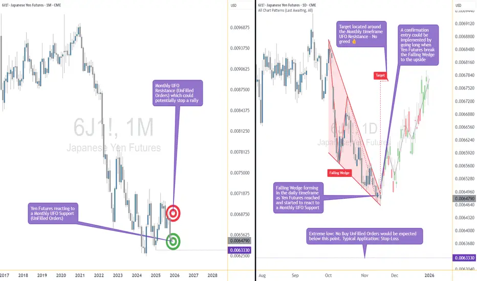
A High-Impact Support Zone Meets a Breakout StructureIntroduction
Markets occasionally compress into areas where structure, momentum, and historical buying pressure align with surprising precision. When that compression occurs at a major higher-timeframe floor, traders often pay closer attention—not because the future is predictable, but because the chart reveals a location where price behavior typically becomes informative.
The current case study centers on a market pressing into a high-impact support zone visible on the monthly chart, while the daily chart displays a falling wedge pattern that has gradually narrowed the range of movement. This combination often highlights moments where the auction process is nearing a decision point. The purpose here is to dissect that confluence using multi-timeframe structure, pattern logic, and broad order-flow principles—strictly for educational exploration.
Higher-Timeframe Structure (Monthly)
The monthly chart shows price approaching a well-defined support area between 0.0065425 and 0.0063330, a region that has acted in the past as a base for significant reactions. These areas often develop because markets rarely absorb all buy interest in a single pass; pockets of unfilled orders may remain, leading to renewed reactions when price returns.
This type of zone does not guarantee a reversal. However, historically, when price reaches such levels, traders tend to monitor whether selling pressure slows or becomes less efficient. In this case, the structure suggests a recurring willingness from buyers to engage at these prices, forming a foundation that has held multiple swings.
The presence of a clear, higher-frame resistance at 0.0067530 anchors the broader range. When price rotates between such boundaries, the monthly context often acts as a roadmap: major support below, major resistance above, and room in between for tactical case-study exploration.
Lower-Timeframe Structure (Daily)
Shifting to the daily chart, price action has carved a falling wedge, a pattern often associated with decelerating downside movement. In wedges, sellers continue to push price lower, but with diminishing strength, as each successive low becomes less effective.
This type of compression structure can provide early evidence that the auction is maturing. Traders studying such patterns often watch for:
tightening of the range,
shorter waves into new lows,
initial signs that buyers are defending intraday attempts to drive price lower.
The daily wedge in this case sits directly on top of the monthly support zone—an alignment that strengthens its analytical relevance. The upper boundary of the wedge sits near 0.0065030, and a break above that line is often interpreted as price escaping the compression phase.
Multi-Timeframe Confluence
Multi-timeframe confluence arises when higher-frame structure provides the background bias and lower-frame patterns offer the tactical trigger. In this case:
The monthly chart signals a historically responsive support zone.
The daily chart shows structural compression and slowing downside momentum.
The interaction between them creates a scenario where educational case studies tend to focus on breakout behavior, as the daily timeframe may provide the first evidence that higher-frame buyers are engaging.
This confluence does not imply certainty. It simply highlights a location where structure tends to become more informative, and where traders often study the transition from absorption to response.
Order-Flow Logic (Non-Tool-Specific)
From an order-flow perspective, strong support zones typically develop where prior buying activity left behind unfilled interest. When price returns to that region, two things often happen:
Sellers begin to encounter difficulty driving price lower, as remaining buy orders absorb their activity.
Compression patterns form, as the market oscillates in a tightening range while participants test whether enough liquidity remains to cause a directional shift.
A breakout of the daily wedge represents a potential change in the auction dynamic. While sellers are still active inside the wedge, a breakout suggests their pressure may have become insufficient to continue the sequence of lower highs and lower lows. Traders studying market transitions often use such moments as part of hypothetical scenarios to understand how imbalances evolve.
Forward-Looking Trade Idea (Illustrative Only)
For educational purposes, here is how a structured case study could frame a potential opportunity using the discussed charts:
Entry: A hypothetical entry could be placed above the falling wedge, around 0.0065030, once buyers demonstrate the ability to break outside the compression structure.
Stop-Loss: A logical invalidation area in this case study would be at or below the monthly support, around 0.0063330, where failure would indicate the higher-timeframe zone did not hold.
Target: A purely structural wedge projection would suggest a target near 0.0067695, aligning closely with the broader resistance region on the monthly chart.
These price points yield a reward-to-risk profile that is measurable and logically linked to structure, though not guaranteed. This case study exists solely to illustrate how support-resistance relationships and pattern logic can be combined into a coherent, rules-based plan, not as an actionable idea for trading.
Yen Futures Contract Context
The larger (6J) and micro-sized (MJY) versions of this futures market follow the same underlying price but differ in exposure and margin scale. The standard contract generally carries a greater notional value and therefore translates each price movement into a larger monetary change. The micro contract mirrors the same structure at a reduced size, allowing traders to adjust position scaling more precisely when navigating major zones or breakout structures such as the one discussed in this case study:
6J equals 12,500,000 Japanese Yen per contract, making it suitable for larger, institutional players. (1 Tick = 0.0000005 per JPY increment = $6.25. Required Margin = $2,800)
MJY equals 1,250,000 Japanese Yen per contract, making it suitable for larger, institutional players. (1 Tick = 0.000001 per JPY increment = $1.25. Required Margin = $280)
Understanding margin requirements is essential—these products are leveraged instruments, and small price changes can result in large percentage gains or losses.
Risk Management Considerations
Strong support zones can attract interest, but risk management remains the foundation of any structured approach. Traders studying these transitions typically:
size positions relative to the distance between entry and invalidation,
maintain clear exit criteria when structure fails,
avoid adjusting stops unless the market has invalidated the original reasons for the plan,
adapt to new information without anchoring to prior expectations.
These principles emphasize the importance of accepting uncertainty. Even at major support zones, markets can remain volatile, and scenarios may unfold differently than anticipated.
When charting futures, the data provided could be delayed. Traders working with the ticker symbols discussed in this idea may prefer to use CME Group real-time data plan on TradingView: www.tradingview.com - This consideration is particularly important for shorter-term traders, whereas it may be less critical for those focused on longer-term trading strategies.
General Disclaimer:
The trade ideas presented herein are solely for illustrative purposes forming a part of a case study intended to demonstrate key principles in risk management within the context of the specific market scenarios discussed. These ideas are not to be interpreted as investment recommendations or financial advice. They do not endorse or promote any specific trading strategies, financial products, or services. The information provided is based on data believed to be reliable; however, its accuracy or completeness cannot be guaranteed. Trading in financial markets involves risks, including the potential loss of principal. Each individual should conduct their own research and consult with professional financial advisors before making any investment decisions. The author or publisher of this content bears no responsibility for any actions taken based on the information provided or for any resultant financial or other losses.
The Pattern That Looked Bullish… Until It Didn’t1. The “Too Good to Be True” Setup
You’ve seen it a hundred times — that shiny W-shaped pattern that screams reversal.
Traders spot it, celebrate it, and rush in before it even completes.
But not every double bottom deserves a standing ovation. Sometimes, what looks like a powerful comeback is actually the calm before another dip.
2. Meet the Real Players: FO vs. UFO
Behind every pattern hides a tug-of-war between two invisible forces:
FO (Filled Orders): Where buyers already did their job. The gas tank’s empty.
UFO (UnFilled Orders): Where fresh buyers are still waiting. That’s where the real fuel sits.
In our current setup, price bounced from an FO zone that already spent its energy.
The next UFO zone — the untouched demand — sits lower.
Translation? The market might need one more leg down to refuel before any real rally begins.
3. The Bear Hiding Inside the Bull
Chart shapes can lie.
Order flow doesn’t tend to.
When price sits on an FO support and the next UFO level is far below, odds tilt toward a break, not a bounce.
It’s like jumping on a trampoline that’s already been stretched too far — it might not spring you up again this time.
4. Rethink “Confirmation”
Pattern traders often buy the moment they spot symmetry. Smart traders wait for liquidity confirmation — the moment unfilled demand actually engages.
If that doesn’t happen, all you’ve got is a good-looking shape on a tired level.
5. The Real Lesson
Patterns attract attention.
Order flow reveals intent.
Patience separates analysis from impulse.
The next time a chart whispers “reversal,” ask yourself: Is it running on new energy or recycled hope?
Want More Depth?
If you’d like to go deeper into the building blocks of trading, check out our From Mystery to Mastery trilogy, three cornerstone articles that complement this one:
🔗 From Mystery to Mastery: Trading Essentials
🔗 From Mystery to Mastery: Futures Explained
🔗 From Mystery to Mastery: Options Explained
When charting futures, the data provided could be delayed. Traders working with the ticker symbols discussed in this idea may prefer to use CME Group real-time data plan on TradingView: www.tradingview.com - This consideration is particularly important for shorter-term traders, whereas it may be less critical for those focused on longer-term trading strategies.
General Disclaimer:
The trade ideas presented herein are solely for illustrative purposes forming a part of a case study intended to demonstrate key principles in risk management within the context of the specific market scenarios discussed. These ideas are not to be interpreted as investment recommendations or financial advice. They do not endorse or promote any specific trading strategies, financial products, or services. The information provided is based on data believed to be reliable; however, its accuracy or completeness cannot be guaranteed. Trading in financial markets involves risks, including the potential loss of principal. Each individual should conduct their own research and consult with professional financial advisors before making any investment decisions. The author or publisher of this content bears no responsibility for any actions taken based on the information provided or for any resultant financial or other losses.
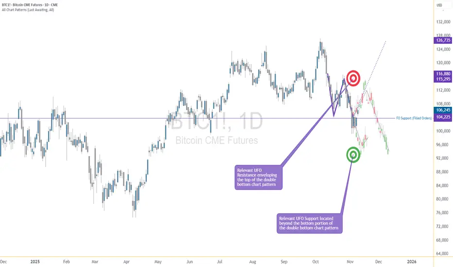
The Double Bottom Trap That Traders Might Miss1. The Comfort Zone of Classic Patterns
Few formations attract traders’ attention like a double bottom. It’s one of those timeless chart patterns that promise hope after a long decline—a visual story of selling exhaustion followed by a bullish reversal.
But markets rarely reward what’s obvious. In futures trading, especially when examining instruments like Bitcoin Futures (BTC) and Micro Bitcoin Futures (MBT), patterns are only half the story. What truly moves price isn’t just the shape on the chart—it’s the order flow behind it.
That’s where understanding FO (Filled Orders) and UFO (UnFilled Orders) becomes essential. Both represent past and potential liquidity imbalances, and reading their relationship can transform how traders interpret “classic” setups.
2. The Bitcoin Setup: A Tale of Two Bottoms
The current BTC daily chart paints what seems like a textbook double bottom. Two price troughs form near the same horizontal area around $104,000, setting up the typical “W” shape many traders see as a bullish reversal pattern.
However, when we dig deeper into the order flow structure, the illusion begins to fade.
A FO Support level exists near $103,860, meaning that this area previously attracted enough buyers to halt a decline—but those orders have already been filled and we know this given the fact that price turned at that price level before.
The next UFO Support zone sits much lower, around $95,640. That’s where unfilled buy orders are expected to remain waiting, untouched.
This distinction matters. While FO zones mark previous turning points, UFO zones highlight potential turning points that still contain resting liquidity. In simple terms, FO areas represent “used energy,” while UFO areas represent “stored energy.”
3. FO vs. UFO – The Order Flow Reality Check
Let’s define these two concepts with precision:
FO (Filled Orders): Price zones where significant buying or selling already occurred. These levels once reversed price, but because those orders were executed, fewer remain to defend the level again.
UFO (UnFilled Orders): Price zones containing pending buy or sell orders not yet triggered. They represent areas of fresh imbalance and therefore carry a higher probability of influencing future price moves.
In our Bitcoin case, the FO Support around $103,860 has done its job already—it stopped price before. But now, the unfilled buying interest lies lower, implying that the market may need to travel down to reach fresh demand at $95,640.
On the other side, UFO Resistance hovers near $112,410, enveloping the top of the double bottom structure. Should the price rebound toward that level, sellers waiting there could re-enter the scene, potentially capping any bullish recovery.
The conclusion? This pattern isn’t as bullish as it looks.
4. When Bullish Shapes Hide Bearish Probabilities
Most traders spot the double bottom and immediately think “trend reversal.” Yet, the distance between FO and UFO levels tells a more subtle story.
Since FO Support levels carry reduced strength after being tested, they’re more likely to break than hold. In this context, the probability favors a downside continuation rather than an immediate bounce.
If price breaches $103,860, the next probable destination becomes the UFO Support at $95,640. Only then, after reaching that pocket of unfilled demand, might a significant rebound have higher odds.
It’s a reminder that technical patterns, while valuable, must always be filtered through liquidity context. A pattern without order flow validation is like reading the market’s outline without its story.
5. Quantitative Insight: A Probabilistic Lens
Think of this in probabilistic terms:
When FO zones sit above UFO zones, the market often continues toward the unfilled liquidity.
When UFO zones lie closer to current price, reversals occur faster because demand (or supply) is still waiting to be executed.
In our example, BTC shows a larger gap between FO and UFO support levels, signaling lower immediate reversal odds. The chart may appear bullish, but the underlying order flow distribution points to weakness first, strength later.
This is not a prediction—it’s an observation of potential. It allows traders to structure their expectations based on where fresh participation is more likely to emerge.
6. Risk Management: Navigating the Trap
For traders considering setups around this structure, risk management is crucial.
Entry awareness: Avoid entering long positions purely because a double bottom “looks bullish.” Consider waiting for evidence of unfilled demand being triggered (confirmation at or near UFO Support).
Stop-loss placement: Stops below FO Support can easily be hunted in liquidity sweeps; better to align risk control with genuine unfilled demand areas.
Reward-to-risk thinking: A test of the UFO Support near $95,640 could later offer a more favorable upside-to-downside ratio than buying prematurely at $104,000.
Remember, pattern-based entries without liquidity confirmation often carry poor asymmetry—small upside with large downside risk.
7. Futures Structure and Margin Awareness
Both BTC and MBT represent Bitcoin exposure via futures contracts, but their sizing differs dramatically.
BTC equals 5 Bitcoin per contract, making it suitable for larger, institutional players. (1 Tick = 5 = $25. Required Margin = $132,500)
MBT, the Micro Bitcoin Futures, equals 0.1 Bitcoin per contract, offering flexibility for smaller accounts and finer position scaling. (1 Tick = 5 = $0.50. Required Margin = $2,600)
Understanding margin requirements is essential—these products are leveraged instruments, and small price changes can result in large percentage gains or losses.
8. Key Takeaway: The Hidden Lesson
This entire setup illustrates a powerful educational point:
Chart patterns may draw the eye, but order flow tells the truth.
The double bottom may invite buyers, but the imbalance between FO and UFO zones exposes an underlying weakness. Traders who rely solely on visual patterns may walk straight into a trap. Those who align patterns with liquidity insights, however, read the market at a deeper level.
In the current context, BTC and MBT might need to visit lower support levels before finding true stability. Watching how price behaves around these unfilled order zones will reveal whether this double bottom turns into a lasting floor—or just another false start.
When charting futures, the data provided could be delayed. Traders working with the ticker symbols discussed in this idea may prefer to use CME Group real-time data plan on TradingView: www.tradingview.com - This consideration is particularly important for shorter-term traders, whereas it may be less critical for those focused on longer-term trading strategies.
General Disclaimer:
The trade ideas presented herein are solely for illustrative purposes forming a part of a case study intended to demonstrate key principles in risk management within the context of the specific market scenarios discussed. These ideas are not to be interpreted as investment recommendations or financial advice. They do not endorse or promote any specific trading strategies, financial products, or services. The information provided is based on data believed to be reliable; however, its accuracy or completeness cannot be guaranteed. Trading in financial markets involves risks, including the potential loss of principal. Each individual should conduct their own research and consult with professional financial advisors before making any investment decisions. The author or publisher of this content bears no responsibility for any actions taken based on the information provided or for any resultant financial or other losses.

Why Prices Move Up or Down: Order Flow and Liquidity█ Why Prices Move Up or Down: Understanding Order Flow and Liquidity
Most traders are told that prices rise because “there are more buyers than sellers,” and that prices fall because “there are more sellers than buyers.” But that’s not how markets actually work. In every transaction, there’s always one buyer and one seller; what really matters is which side is more aggressive and how liquidity responds to that aggression.
Price movement is the result of order flow interacting with liquidity. When buyers use market orders and aggressively lift the available sell orders (the ask), the price moves up. When sellers hit the bid with market orders, the price moves down.
In short, price moves in the direction of the side that consumes liquidity.
█ The Engine Behind Price Movement
When buyers and sellers agree on price, the market ranges, there’s a balance. When one side becomes more aggressive, an imbalance occurs, and the price must adjust until new liquidity appears.
Imagine the market like a ladder made of buy and sell orders. Each rung shows where traders are waiting, buyers below the current price, and sellers above it. These waiting orders are what we call liquidity.
When a trader sends a market buy order, they’re not waiting; they want to buy immediately. That order takes the best available sell price (the ask). If more traders keep doing this — buying aggressively — those sell orders get used up faster than new ones appear. As a result, the next available sell price is higher, and the price moves up until new sellers fill the gap.
The same logic applies in reverse: when aggressive market sell orders hit the bids, they consume the buy-side liquidity. Once those bids are gone, the next available buyer is lower, and the price moves down.
This continuous back-and-forth, liquidity being consumed, replaced, or withdrawn, is the real engine of every price movement.
█ Why Prices Move Up
1. Aggressive Buying (New Longs)
When new participants enter with market buys, they lift the offers, consuming sell-side liquidity. If this continues, the price climbs until enough new sellers appear to absorb demand. This is the cleanest form of demand-driven uptrend, with new buyers initiating positions.
2. Short Covering
The price moves higher as short sellers buy back positions. This can happen when stops are triggered after a price rise or when shorts take profits after a decline. In both cases, their buying adds upward pressure. When many cover at once, the move can accelerate into a short squeeze — higher prices trigger stops, which trigger even more buy orders, creating a self-reinforcing rally.
Profit Taking Phase
Short Squeeze Phase
3. Stop-Loss Triggers
Clusters of stop-loss orders above previous highs act as “fuel.” When price breaks those levels, automatic buy orders fire off. These aren’t new investors; they’re forced buyers closing shorts. The result is a fast, often exaggerated upward burst.
4. Thin Liquidity and Pulled Offers
Sometimes, price surges not because of huge buying, but because there’s nobody selling. If the sell side of the order book is thin, or if large resting orders get canceled, even small buys can sweep multiple levels. This creates those “air pockets” where price jumps several ticks in seconds.
5. Algorithmic and Institutional Flows
Institutions use automated execution algorithms like VWAP or TWAP to buy steadily throughout the day. These constant flows absorb liquidity over time, creating a slow upward bias. Similarly, option dealers who are short gamma must buy as prices rise to stay hedged, adding even more mechanical buying pressure.
█ Why Prices Move Down
1. Aggressive Selling (New Shorts)
When traders use market sells, they consume buy-side liquidity. If this persists, the price naturally ticks lower as bids disappear, and the next buyer will be willing only at a cheaper level.
2. Long Profit-Taking
At some point, long traders sell to realize profits. These sales add supply, which can cap or reverse an uptrend. It’s not bearish conviction; it’s simply existing longs exiting their positions.
3. Long Stop-Loss Cascades
If prices fall to where many long traders placed stops, those automatic sell orders trigger, creating a chain reaction of forced selling. This is the mirror image of a short squeeze — a long liquidation cascade.
4. Thin Bid Liquidity or Pulled Bids
When buy orders disappear, the market has no floor. Even modest selling pressure can make the price fall through several levels until new bids emerge. This is how “flash drops” occur during low-liquidity periods.
5. Algorithmic and Mechanical Selling
Negative news or risk events can activate automated sell programs, from funds rebalancing to dealers hedging short options exposure. These trades can intensify selling, even without new bearish sentiment.
█ New Positions vs. Exits — The Hidden Difference
Not every up-move means new buyers are coming in, and not every down-move means new shorts.
Some moves happen because existing positions are being closed, not opened. and that distinction matters.
New Positions (Initiative Flow): Create real trends, since they bring new demand or supply.
Position Exits (Reactive Flow): Often short-lived, they relieve pressure rather than add it.
One way to tell the difference is through open interest (in futures or options):
Price up + Open Interest up → new longs entering (sustainable).
Price up + Open Interest down → short covering (temporary).
Price down + Open Interest down → long liquidation (often near exhaustion).
Price down + Open Interest up → new shorts entering (trend formation).
█ The Real Takeaway
Price doesn’t rise because “buyers beat sellers.” It rises because buyers were more aggressive, consuming available sell orders faster than they were replaced. It falls when sellers become more aggressive, taking out the bids.
Both entries and exits can push the price the same way:
New longs and shorts covering both create buy pressure.
New shorts and longs taking profit both create sell pressure.
To truly understand a move, traders must ask:
Who initiated it, new positions or forced exits?
Was liquidity added or withdrawn?
Did open interest confirm new participation or show a squeeze?
Once you start thinking in these terms, price becomes more than a random chart line; it becomes a story of liquidity and intent unfolding in real time.
█ Multiple Forces in Motion
While each example above highlights a single mechanism in isolation, the market rarely moves for one reason alone. In real trading, several of these forces often act simultaneously, new longs entering, shorts covering, stops triggering, algorithms executing, and liquidity thinning.
When multiple flows align in the same direction, the result is acceleration, price moves rapidly as liquidity vanishes, and reactions compound. When opposing forces meet, price can stall, consolidate, or violently whip as both sides compete for control.
In essence, market movement is the sum of overlapping liquidity events, not isolated causes. Understanding how these factors interact in real time is key to reading true intent behind every move.
█ In summary:
Markets move not because of “more buyers” or “more sellers,” but because one side becomes impatient, consumes liquidity, and forces repricing until balance returns.
Understanding who’s moving the market and why — new positioning, forced exits, or vanished liquidity — is the foundation of reading true market intent.
-----------------
Disclaimer
The content provided in my scripts, indicators, ideas, algorithms, and systems is for educational and informational purposes only. It does not constitute financial advice, investment recommendations, or a solicitation to buy or sell any financial instruments. I will not accept liability for any loss or damage, including without limitation any loss of profit, which may arise directly or indirectly from the use of or reliance on such information.
All investments involve risk, and the past performance of a security, industry, sector, market, financial product, trading strategy, backtest, or individual's trading does not guarantee future results or returns. Investors are fully responsible for any investment decisions they make. Such decisions should be based solely on an evaluation of their financial circumstances, investment objectives, risk tolerance, and liquidity needs.
BITCOIN – THE REAL REASON BEHIND THE FALLWhen I started trading someone told me something I’ll never forget: “If you can predict tomorrow’s newspaper headline, you understand the market.”
He didn’t mean I should chase news. He meant I should read structure so well that I know what kind of headline the market is already writing, before the mass even see it.
And now, looking around online, I see the complete opposite. Everywhere you look, there’s another “confluencer” talking about crypto with big words and zero understanding.
People selling dreams, memberships, and indicators, while they don’t even know what open interest or CVD means.
I’m not here to sell anything. I’m here to help people actually learn how to read data and see through the noise. Because what most of these so-called experts call “analysis” is just emotional guessing wrapped in confidence.
What I called and what happened
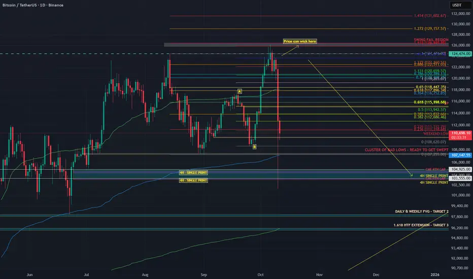
Last week I posted my “Big Dump” thesis.
I said Bitcoin would swing fail above the highs, then drop into the 104K region. That is exactly what happened.
Price ran the sweep into 126K, trapped the late buyers, and dumped straight into 104K.
People blamed tariffs. The tariff headline was the spark. The fuel was crypto’s own positioning.
Why the structure was ready to snap
Before the crash, the data told the story clearly.
Stablecoin OI went from 257K to 285K contracts (+10.9%). That is new leveraged exposure.
Coin-margined OI dropped during the breakout, then rose again near the highs. Shorts were fading strength.
Spot CVD stayed flat to slightly negative. Real buyers were missing.
The long/short ratio fell from 2.05 to 1.02 even while price kept climbing.
That’s what distribution looks like. Buyers on leverage pushing price up while stronger hands sell into them. No real spot demand, just futures exposure.
You don’t need a macro event to fall. You only need a reason for those leveraged buyers to stop bidding. Think of it like a crowded elevator. Everyone keeps piling in as it moves up, feeling safe because it hasn’t stopped yet. But the moment one person hesitates, the weight shifts. When the next person panics, the whole thing drops.
That’s what happens when a market is driven by leverage instead of conviction. You don’t need bad news, you just need hesitation.
Look back at similar events.
In May 2021, funding rates were insane, perps overloaded, and spot volume thin. Elon Musk tweeted about Bitcoin’s energy use. That tweet didn’t cause the dump. It just made leveraged longs pause. The bids disappeared and the cascade started.
In August 2023, Evergrande headlines hit. Bitcoin was sitting at resistance with flat spot CVD and rising OI. Equities wobbled, crypto longs hesitated, and the structure collapsed within hours.
In March 2020, when COVID panic hit, Bitcoin had already been stretched thin. Funding was high, leverage was heavy, and liquidity was weak. The virus didn’t break the market, leverage did.
Leverage creates confidence until it doesn’t. Price doesn’t fall because people start selling. It falls because nobody steps in to buy. Headlines decide when the drop starts. Structure decides how far it goes.
Why 104K was my first target
I didn’t pick 104K out of thin air. That level was built on confluence.
1) AVWAP from the April 7 auction
That swing low kicked off with massive volume. When a move starts with that kind of participation, the anchored VWAP becomes a key reference for institutional flow. It represents the average cost of that whole auction, and when extended forward, it acts as a dynamic area where liquidity and algorithms interact.
That blue AVWAP line from April has been running right through the 104K region.
It’s not that price revisited that auction, it’s that the anchored VWAP from that event still marks the fair value area for that entire move.When price traded back down into that region, it met that same volume-weighted anchor, creating a major confluence zone that algos and larger players watch closely.
2) The June 22 breakout left an LVN
A new auction started on June 22 and pushed higher, leaving a Low Volume Node behind.
An LVN is a thin zone on the volume profile where the market moved quickly with little trade.
Markets often revisit these thin areas later to find balance or test unfinished business.
3) HTF Fibonacci cluster
Multiple higher timeframe Fibonacci retracements and extensions overlapped near the same 104K area. When several fib levels align with structure, that’s a strong confluence zone watched by both human traders and algorithms.
The 104K region was where the AVWAP line, LVN, and fib cluster all met. That’s not a random target. It’s a structurally defined area where liquidity concentrates and where markets tend to react sharply. And that’s exactly what happened.
The spark versus the structure
The tariff headline didn’t cause the drop. It triggered it.
The structure was already unstable. Leverage was maxed. Spot demand was flat. Funding was positive and rising. When the tariff news hit, traditional markets pulled back and crypto followed instantly. It wasn’t correlation, it was liquidity contagion.
Traders managing multiple books de-risk across assets when volatility spikes. That creates a gap in liquidity. When the bids vanish, the market falls into the first real pool of resting orders — in this case, the 104K zone.
You saw the same mechanics during the March 2020 crash and the 2021 deleverage. External shocks trigger internal liquidation cascades. That’s why saying “this had nothing to do with crypto is completely wrong.
This had everything to do with crypto. It’s like blaming the thunder for breaking a window when the glass was already cracked. Or saying the iceberg sank the Titanic when the captain was already steering through a sea of warnings.
Crypto was structurally weak. Leverage was stretched, spot demand was gone, and funding was positive. When the headline hit, it didn’t cause the collapse. It just gave the market permission to do what it was already set up to do — unwind.
Crypto is built on leverage.
Perpetual futures dominate volume.
Stablecoin collateral drives exposure.
When external risk events change funding conditions or risk appetite, the crypto market reacts instantly because its structure is fragile by design.
Example:
When yields spike, the dollar strengthens and funding costs rise. Leveraged longs become more expensive to hold, so traders unwind positions.
When equities dump, cross-asset desks reduce risk globally, which pulls liquidity out of crypto perps too.
Intermarket correlation always matters. Macro sets the mood. But the speed and violence of crypto moves always come from leverage inside the system.
How you can spot it next time
Compare Spot CVD vs Stablecoin CVD. If stablecoin CVD rises while spot stays flat or negative, the rally is leverage-driven.
Track Open Interest vs Price. Both rising together usually means exposure is building. Confirm with spot flow.
Watch the Long/Short ratio. If it drops while price rises, shorts are entering and the move may be getting absorbed.
Anchor VWAPs to real pivots like swing lows, breakouts, or liquidation spikes. Those levels attract institutional flow.
Study Volume Profiles. LVNs are thin and often retested. HVNs are balance zones that attract price.
Map HTF fib clusters for confluence. Reactions are stronger when multiple timeframes agree.
Note single prints and thin brackets on TPO or volume profiles. These often act as magnets.
When these factors line up, you don’t need to predict headlines.
You’ll already most likely know which headline will break the market.
TLDR
The rally was leverage-driven: Stablecoin OI up 10.9%, Spot CVD flat, Long/Short ratio down from 2.05 to 1.02
The swing fail at 126K was the final liquidity grab
104K was the target due to AVWAP + LVN + HTF fib cluster
The tariff headline was the spark, not the cause
The crash was caused by leverage and missing spot demand
Crypto didn’t fall because of politics. It fell because the market was already begging for an excuse to reset.
The data showed it clearly weeks before the drop.
If this helped you see the market a little clearer or made you think differently about how price really moves, please leave a like and drop a reaction. It keeps me motivated to keep posting real analysis, not the copy-paste bullshit hype that floods your feed every day.
Check the Order Flow Data from 6 October here: ibb.co
A simple Introduction to Footprint charts
Welcome to this educational video on footprint charts .
I decided to do this introduction because I feel it would benefit so many traders who are unfamiliar with this chart type and once understood it can serve as a very powerful additional confluence in your day to day trading .
I hope I have delivered this lesson in a simple and understandable format for you too
understand the following .
The problem with just watching the price
What is order flow
Delta explained
What is open interest
How to tie it all together to produce better entries , exists and oversight into knowing when to take your trades.
I welcome any feedback or questions and I really hope that this serves you well.
*The link to the Tradingview guide is in the designated box on the right hand side I encourage everybody to use this resource .

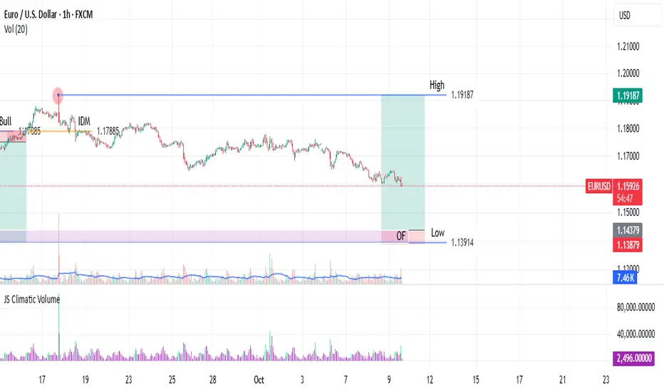
Testing a POI (Point of Interest) & Inducement FrameworkThis script is a visual aid for my personal testing of a systematic trading plan. It is designed to help me manually identify and mark key structural components on the chart. The core concepts I am testing are Trading Ranges, Inducement Levels, and Points of Interest (POI), specifically Order Flows and Order Blocks. (On this chart, an Order Flow)
This is a work in progress and represents my personal learning process. It is not intended as financial advice or a complete trading system.
Key Features I am Testing:
Trading Range Identification: The script helps mark the high and low of a defined trading range, which I identify based on a confirmed break of structure or change of character. In this case what is depicted is a change of character from Bearish to Bullish Sentiment on the EURUSD One-Hour Frame.
Inducement Visualization: It allows for the marking of key inducement levels. In my testing, an inducement is the pullback high (in a bearish move) or low (in a bullish move) immediately preceding the most recent significant low or high. A range is considered valid once its corresponding inducement is traded through.
Order Flow/Block Marking: The tool assists in highlighting potential OFs or OBs. These ranges or candles, located near range extremes, are the Points of Interest I test for potential entries.
My Testing Notes & Disclaimer:
This visual tool is part of my journaling process to build discipline and consistency. I use it to document my hypothesis for each trade setup. The market does not always respect these levels, and a key part of my testing is learning to distinguish between valid and invalid POIs.
My risk management rules are separate and non-negotiable. I always define my stop loss and position size before entering any test trade.
I am sharing this as a documentation of my own testing framework, not as a recommendation.
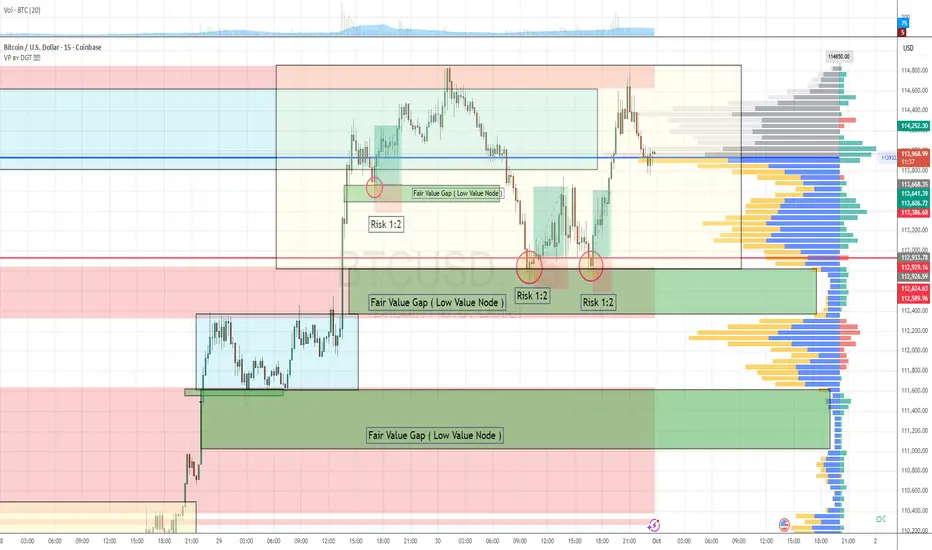
Order Flow & Fair Value Gap Approach 3 Setups in the last 48hourThis strategy leverages order flow analysis and the concept of fair value gaps, operating on the principle that the market behaves as an auction—constantly seeking areas of balance and imbalance.
Over the past 48 hours, BTCUSD has presented three high-probability scalping setups aligned with this methodology.
Market Context
Trend: Bullish
The market has shown clear bullish momentum over the last 48 hours.
Breakout Event:
Price broke out of a consolidation zone with strong, aggressive buying activity, indicating a shift in market sentiment and the initiation of a new leg in the trend.
Imbalance Creation:
During this breakout, two fair value gaps (FVGs)—also referred to as low value nodes (LVNs)—were formed as a result of inefficient price movement.
Trade Setup Criteria & Checklist
To validate each setup, we apply the following checklist:
Criteria Status
1. Trend is bullish ✅ Confirmed
2. Breakout from a consolidation zone with aggressive buy orders ✅ Confirmed
3. Fair value gap created by impulsive buying ✅ Confirmed
4. Retracement into the fair value gap ✅ Confirmed
5. Confirmation of strong buyers defending the FVG zone ✅ Confirmed
6. Defined risk with favorable R:R (1:2 or better) ✅ Confirmed
Risk Management
Each trade setup followed a 1:2 risk-to-reward ratio, maintaining consistency with our strategy's risk parameters.
This sequence illustrates how combining order flow with structural imbalances like fair value gaps can produce high-quality scalping opportunities. Always remember: context, confirmation, and confluence are key.
What Is Stock Tape Reading, and How Do Traders Use It?What Is Stock Tape Reading, and How Do Traders Use It?
Tape reading is a real-time market analysis method used to track buying and selling pressure. Unlike technical indicators, which rely on historical data, tape reading focuses on executed trades, order flow, and liquidity shifts. Traders use it to assess momentum, identify institutional activity, and refine trade timing. This article explores how tape reading works, its role in modern markets, and how traders apply it to short-term decision-making.
The Origins and Evolution of Tape Reading
Tape reading began in the late 19th century when stock prices were transmitted via ticker tape machines, printing a continuous stream of price updates on paper strips. Traders would gather around these machines, scanning for large trades and unusual activity to anticipate market moves. One of the earliest and most well-known tape readers, Jesse Livermore, built his fortune by studying these price changes and spotting institutional buying and selling patterns.
By the mid-20th century, as markets became faster and more complex, ticker tape machines were replaced by electronic order books. Instead of scanning printed numbers, traders began using Level 2 market data and time & sales windows to track order flow in real time. This transition allowed for more precise liquidity analysis, making it easier to see how large orders impacted price movement.
The rise of algorithmic and high-frequency trading (HFT) in the 2000s further changed the landscape. Today, market depth tools, order flow software, and footprint charts have replaced traditional tape reading, but the core principle remains the same: analysing how buyers and sellers interact in real time. While charts and indicators offer historical insight, tape reading provides a direct window into current market behaviour, giving traders an edge in fast-moving conditions.
How to Read the Tape
Nowadays, tape reading is all about real-time market data—watching when and how orders are placed and filled to gauge momentum and liquidity. Unlike technical indicators, reflecting past price action, tape reading focuses on what’s happening right now. Stock, forex, and commodity traders use it to assess buying and selling pressure, spot large orders, and understand market sentiment as it unfolds. Here is the key information provided by tape reading:
Time & Sales
The time & sales window (the tape) displays every completed trade. Each entry shows time, price, trade size, and whether it hit the bid or ask.
- Trades at the ask suggest aggressive buying, as buyers are willing to pay the market price.
- Trades at the bid indicate selling pressure, as sellers accept lower prices.
- Large block trades often signal institutional activity—tracking these can reveal where big players are positioning.
Bid-Ask Activity
Nowadays, an order book is a part of tape reading. The order book (Level 2 or DOM) shows the number of buy and sell orders at different price levels. While not all orders get filled, traders watch for:
- Stacked bids (a high concentration of buy orders) near a price level, which may indicate strong buying interest.
- Stacked offers (large sell orders) acting as resistance.
- Orders rapidly appearing or disappearing, suggesting hidden liquidity or fake orders meant to mislead traders.
Volume and Trade Size
Changes in trade size and volume help traders judge the conviction behind a move:
- Consistent large trades in one direction can suggest institutions accumulating or distributing a position.
- A surge in small trades may indicate retail participation rather than institutional moves.
- A sudden drop in trade activity after a sharp move may hint at exhaustion or a potential reversal.
Trade Speed
The pace of executions matters.
- Fast, continuous transactions suggest urgency—buyers or sellers are aggressively taking liquidity.
- A slowdown in transactions near a key level can indicate hesitation or a shift in sentiment.
Tape Reading vs Technical & Fundamental Analysis
Tape reading differs from technical and fundamental analysis in both approach and timeframe. While technical traders study historical price patterns and fundamental analysts focus on company performance and economic data, tape readers focus on real-time order flow to assess market direction as it develops.
Technical Analysis
Technical traders rely on chart patterns, moving averages, and oscillators to identify trends and potential turning points. These tools are built on past price data, meaning they lag behind actual market activity. For example, a trader using a moving average crossover strategy waits for confirmation before acting, whereas a tape reader sees momentum shifting as it happens by watching the flow of orders.
Fundamental Analysis
Fundamental analysis is longer-term, based on financial statements, earnings reports, and macroeconomic indicators. Investors using this approach focus on factors like revenue growth, interest rates, and industry trends to decide whether a stock is undervalued or overvalued. Tape reading, by contrast, ignores these metrics entirely—it’s used by short-term traders reacting to immediate buying and selling pressure.
Where Tape Reading Fits In
Many traders combine approaches. A day trader might use technical analysis to find key price levels and then apply tape reading to fine-tune entries and exits. Similarly, a swing trader tracking earnings reports may use tape reading to see how large players are reacting. Each method provides different insights, but tape reading offers a unique advantage: it reveals market sentiment in real time, helping traders assess momentum before price movements become obvious.
Advantages and Disadvantages of Tape Reading
Tape reading gives traders an inside look at real-time market activity, but it also comes with challenges, especially in modern electronic markets.
Advantages
- Immediate Market Insight: Unlike lagging indicators, tape reading reflects live buying and selling pressure, helping traders react before price changes become obvious.
- Identifying Large Buyers & Sellers: Institutions often execute orders in patterns, leaving clues in the stock market tape. Recognising these can help traders gauge potential price direction.
- Fine-Tuning Entries & Exits: By tracking order flow near key price levels, traders can time their trades more precisely rather than relying on static chart signals.
- Useful in Fast-Moving Markets: Tape reading can be particularly valuable in scalping and day trading, where short-term momentum plays a key role.
Disadvantages
- Algorithmic Trading Distortion: High-frequency trading firms place and cancel orders rapidly, making it harder to interpret true supply and demand.
- Steep Learning Curve: Unlike technical analysis, which provides visual patterns, tape reading requires experience in spotting meaningful order flow changes.
- Mentally Demanding: Constantly watching the tape can be exhausting, requiring a high level of focus and quick decision-making.
- Less Effective in Low-Volume Markets: When liquidity is thin, tape reading becomes unreliable, as fewer trades mean less actionable data.
Modern Footprint Charts and Order Flow Software
While some stock tape readers rely on raw order flow data, many use footprint charts and order flow software to visualise buying and selling pressure more effectively.
Footprint charts display executed trades within each price bar, showing volume distribution, bid-ask imbalances, and point of control (POC)—the price level with the highest traded volume. This helps traders see where liquidity is concentrated and whether buyers or sellers are in control.
Order flow software offers heatmaps, cumulative delta, and volume profile tools. Heatmaps highlight resting liquidity in the order book, revealing where large players may be positioned. Cumulative delta tracks the difference between market buys and sells, helping traders assess momentum shifts.
These tools provide a more structured approach to tape reading, filtering out noise and making it easier to spot large orders, absorption, and potential reversals. While experience is still essential, modern software gives traders a clearer view of market behaviour beyond just raw time & sales data.
The Bottom Line
Reading the tape remains a valuable tool for traders looking to analyse real-time order flow and market liquidity. While there are numerous algorithms that place trades, understanding executed trades and bid-ask dynamics can provide an edge in fast-moving conditions.
FAQ
Is Tape Reading Still Useful in Trading?
Yes, but the application of tape reading in trading has changed. While traditional tape reading focuses on printed ticker tape, modern traders use time & sales data, Level 2 order books, and footprint charts to analyse order flow. High-frequency trading and algorithmic activity have made tape reading more complex, but it remains valuable for scalpers, day traders, and those tracking institutional activity.
What Are the Principles of Tape Reading?
Tape trading is based on real-time order flow analysis. Traders focus on executed trades (time & sales), bid-ask activity (order book), volume shifts, and trade speed to gauge buying and selling pressure. The goal is to understand how liquidity moves in the market and spot signs of institutional accumulation or distribution.
What Is the Difference Between Order Book and Tape?
The order book (Level 2 or DOM) shows pending orders at different price levels, representing liquidity that may or may not get filled. The tape (time & sales) displays completed transactions, showing actual buying and selling activity in real time.
What Is the Difference Between Technical Analysis and Tape Reading?
Technical analysis relies on historical price patterns and indicators, while tape reading focuses on real-time executed trades and market depth. Technical traders look at charts, whereas tape readers analyse live order flow to assess momentum and liquidity shifts.
How to Read Ticker Tape?
Modern ticker tape is displayed in time & sales windows on trading platforms. Traders monitor price, trade size, and whether transactions occur at the bid or ask. Rapid buying at the ask suggests demand, while consistent selling at the bid indicates selling pressure.
This article represents the opinion of the Companies operating under the FXOpen brand only. It is not to be construed as an offer, solicitation, or recommendation with respect to products and services provided by the Companies operating under the FXOpen brand, nor is it to be considered financial advice.

Hidden Forces: Decoding Buyer & Seller Activity on ChartsTotal Volume vs. Volume Delta: The total volume on the chart includes both buys and sells, making it less useful for analysis. Volume Delta, however, shows whether buyers or sellers dominated within a candle.
A green Delta candle means more aggressive retail buying; a red one means more retail selling. This helps analyze market sentiment beyond price movement.
Price & Delta Relationships:
1. Price and Delta move together → Organic movement, likely driven by retail.
2. Delta moves, but price doesn’t → Retail is heavily biased in one direction, absorbing limit orders. Possible smart money trap.
3. Price moves, but Delta doesn’t → Retail didn’t participate in the move. Lack of belief or failed market-making attempt.
4. Price moves against Delta → Strong indication of market manipulation. Large players using aggressive strategies against retail.
Market Manipulation & Smart Money:
* Whales leverage retail psychology and order flow to position themselves.
* Retail often gets caught in fake moves, unknowingly providing liquidity to big players.
Final Thought: By analyzing Delta and price movement together, we can spot hidden large buyers and sellers and understand market dynamics beyond surface-level price action.

Is Liquidity Zones The Hidden Battleground of Smart Money In every market move, liquidity zones are the battlefields between buyers and sellers. Understanding these zones is crucial for spotting reversals and breakouts before they happen.
What Are Liquidity Zones?
High Liquidity Areas, Where large orders are placed, typically around key support/resistance or round numbers.
Low Liquidity Areas. Where price moves quickly due to fewer orders, often creating price imbalances.
Why Liquidity Matters
Smart money (institutions) seeks liquidity to execute large orders without massive slippage. Their footprints appear as wicks, sudden volume spikes, or rapid price reversals.
Spotting Liquidity Traps
False Breakouts, Price pierces a key level, triggers stop losses, and reverses quickly.
Stop Hunts, Sudden price spikes beyond a key level, only to return inside the range.
rading Strategy Example
1. Use volume profile or heat maps to spot high-interest price areas.
2. Wait for Reaction, Enter only after confirmation (e.g., a sharp wick or order flow shift).
3.Risk Management, Place stops beyond liquidity zones to avoid getting trapped.
Master liquidity zones, and you'll start seeing the market through the eyes of institutional players.

What Is ICT Turtle Soup, and How Can You Use It in Trading?What Is ICT Turtle Soup, and How Can You Use It in Trading?
The ICT Turtle Soup pattern is a strategic trading approach designed to exploit false breakouts in financial markets. By understanding and leveraging liquidity grabs, traders can identify potential reversals and enter trades with relative precision. This article delves into the components of the ICT Turtle Soup pattern, how to identify and use it, and its potential advantages and limitations, providing traders with valuable insights to potentially enhance their trading strategies.
The ICT Turtle Soup Pattern Explained
ICT Turtle Soup is a trading pattern developed by the Inner Circle Trader (ICT) that focuses on exploiting false breakouts in the market. This ICT price action strategy aims to identify and take advantage of situations where the price briefly moves beyond a key support or resistance level, only to reverse direction shortly after. This movement is often seen in ranging markets where prices oscillate between established highs and lows.
The concept behind ICT Turtle Soup trading is rooted in the idea of liquidity hunts and market imbalances. When the price breaks out, it often triggers stop-loss orders set by other traders, creating a temporary imbalance. The ICT Turtle Soup strategy seeks to capitalise on this by entering trades in the opposite direction once the breakout fails and the price returns to its previous range.
The pattern is named humorously after the original Turtle Traders' strategy, which focuses on genuine breakouts. In contrast, ICT Turtle Soup takes advantage of these failed attempts, thus "making soup out of turtles" by transforming unproductive breakout attempts into potentially effective trades.
Typically, traders look for specific signs of a false breakout, such as a price briefly moving above a recent high or below a recent low but failing to sustain the move. This strategy is particularly effective when used in conjunction with other ICT concepts, such as higher timeframe analysis and understanding of market structure.
Components of the ICT Turtle Soup Pattern
To effectively utilise the ICT Turtle Soup setup, it’s essential to understand its core components: order flow and market structure, liquidity, and internal versus external liquidity.
Order Flow and Market Structure
Order flow and market structure are critical in analysing the ICT Turtle Soup pattern. This involves observing price movements and traders' behaviour in different timeframes. Traders can analyse higher and lower timeframe price movements in FXOpen’s free TickTrader platform.
Higher Timeframe Structure
This refers to the broader trend governing the lower timeframe trend. For traders using the 15m-1h charts to trade, this might mean structure visible on 4-hour, daily, or weekly charts.
Higher timeframe structures help traders identify the major support and resistance levels. These levels are essential as they mark the boundaries within which the market generally oscillates. Traders use these to determine the prevailing market direction and potential areas where false breakouts (stop hunts) are likely to occur.
Lower Timeframe Structure
Lower timeframe structures are examined on hourly or minute charts. These provide a more detailed view of price action within the higher timeframe’s range and account for the bullish and bearish legs that dictate a broader higher timeframe trend.
Liquidity and Stop Hunts
In general trading terms, liquidity represents how easy it is to enter or exit a market. However, in the context of the ICT Turtle Soup pattern, areas of liquidity can be identified beyond key swing points.
Stop Hunts
Stop hunts, also known as a liquidity sweep, occur when the price temporarily moves above a resistance level or below a support level to trigger stop-loss orders. This movement creates a liquidity spike as traders' stops are hit, providing a favourable condition for the price to reverse direction. ICT Turtle Soup traders seek to exploit these moments by entering trades opposite to the initial breakout direction once the liquidity is absorbed.
Internal and External Liquidity
Understanding internal and external liquidity is vital for applying the ICT Turtle Soup pattern effectively.
Internal Liquidity
This refers to the liquidity available within the range of the higher timeframe structure. It involves identifying smaller support and resistance levels within the larger range. For example, in a bullish leg, there will be a series of higher highs and higher lows; beneath these higher lows is where internal liquidity rests. This internal liquidity will be targeted to form a bearish leg as part of a higher timeframe bullish trend.
External Liquidity
This involves liquidity that exists outside the key highs and lows of the higher timeframe trend. To use the example of the bullish leg in a higher timeframe bullish trend, the low it originated from and the high it creates as the bearish retracement begins count as areas of external liquidity.
Order Blocks and Imbalances
While not directly involved in the ICT Turtle Soup setup, understanding order blocks and imbalances can provide insight into where the price might head and the general market context.
Order blocks are areas where significant buying or selling activity has previously occurred, often due to institutional orders. These blocks represent zones of support and resistance where the price is likely to react.
Bullish Order Blocks
These are typically found at the base of a significant upward move and indicate zones where buying interest is strong. When the price revisits these areas, it often finds support, making them potential entry points for long trades.
Bearish Order Blocks
Conversely, these are located at the top of significant downward moves and signal strong selling interest. These zones often act as resistance when revisited, making them strategic points for short trades.
Imbalances
Imbalances, or fair value gaps (FVGs), are price regions where the market has moved too quickly, creating a significant disparity between the number of long and short trades. These gaps often occur due to high volatility and indicate areas where the market might revisit to "fill" the gap, thereby achieving fair value.
In other words, when a price rapidly moves in one direction, it leaves behind an area with little to no trading activity. The market often returns to these imbalanced zones to facilitate proper price discovery and liquidity.
How to Use the ICT Turtle Soup Strategy
Here's a detailed breakdown of how traders use the ICT Turtle Soup pattern.
Establishing a Bias
Traders begin by analysing the higher timeframe trend, such as the daily or weekly charts, to establish a market bias. This analysis helps determine whether the market is predominantly bullish or bearish. Identifying this trend is crucial as it guides where to look for potential Turtle Soup setups.
For instance, the example above shows AUDUSD initially moving down after a bullish movement off-screen. It eventually breaks above the lower high, indicating that the higher timeframe trend may now be bullish. Similarly, the shorter-term downtrend beginning from mid-May also saw a new high, meaning a trader may want to look for long positions.
Identifying Internal Liquidity
Once the higher timeframe trend is established, traders look for a move counter to that higher timeframe trend. In the example shown, this would be a downtrend counter to the bullish structure break. They mark levels of internal liquidity; in a bullish leg, these would be below swing lows and vice versa. These areas are likely to attract stop-loss orders.
Looking for Liquidity Taps
The next step involves waiting for these internal liquidity areas to be tapped. This typically happens when the price briefly breaks through a support or resistance level, triggering stop-loss orders before quickly reversing direction.
Ideally, the price should tap into the same area or order block where the internal liquidity formed and then exhibit a quick reversal, often leaving just a small wick. This movement indicates a liquidity grab, where large players have taken out stops to facilitate their own orders.
Lower Timeframe Confirmation
After identifying a liquidity grab beyond this internal liquidity level, traders look for an entry. On a lower timeframe, they look for a similar pattern: internal liquidity being run and a subsequent break of structure in the direction of the higher timeframe trend. This involves price retracing back inside the range to fill an imbalance and meet an order block, which provides a precise entry point.
Executing the Trade
Once these conditions are met, traders typically enter the market. Specifically, they’ll often leave a limit order at an order block to trade in the direction of the higher timeframe trend. They place a stop loss just beyond the liquidity grab, either above the recent high for a short trade or below the recent low for a long trade. Profit targets are often set at key liquidity levels, such as previous highs or lows, where the market is likely to encounter significant activity.
Potential Advantages and Limitations
The ICT Turtle Soup pattern is a trading strategy with several potential benefits and drawbacks.
Advantages
- Precision: Allows for precise entry points by identifying false breakouts and liquidity grabs.
- Adaptability: Effective across different timeframes and market conditions, including ranging and trending markets.
- Risk Management: Built-in risk management by placing stop losses just beyond the liquidity grab points.
Limitations
- Complexity: Requires a deep understanding of market structure, liquidity, and order flow, making it challenging for less experienced traders.
- Market Conditions: Less effective in highly volatile or illiquid markets where false signals are more common.
- Time-Consuming: Demands continuous monitoring of multiple timeframes to identify valid setups, which can be time-intensive.
The Bottom Line
The ICT Turtle Soup pattern offers traders a powerful tool to identify and exploit false breakouts in the market. By understanding its components and applying the strategy effectively, traders can potentially enhance their trading performance. To put this strategy into practice, consider opening an FXOpen account, a reliable broker that provides the necessary tools and resources for trading.
FAQs
What Is ICT Turtle Soup in Trading?
ICT Turtle Soup is a trading pattern that exploits false breakouts. It identifies potential reversals when the price briefly moves beyond a key support or resistance level, triggering stop-loss orders before reversing direction. This strategy aims to take advantage of these liquidity grabs by entering trades opposite to the initial breakout direction.
How to Identify ICT Turtle Soup Conditions?
To identify the ICT Turtle Soup pattern, traders analyse higher timeframe trends to establish market bias. They then look for counter-trend moves and mark internal liquidity areas. The pattern is identified when the price taps these liquidity zones and reverses quickly, often leaving a small wick. This signals a liquidity grab and potential trade setup in the direction of the higher timeframe trend.
How to Use the ICT Turtle Soup Pattern?
Using the ICT Turtle Soup pattern involves several steps. First, traders establish a market bias based on higher timeframe analysis. Then, they look for liquidity grabs at marked internal liquidity areas, indicating false breakouts. The next step is to confirm the setup on a lower timeframe by observing a similar liquidity grab and structure break. Lastly, they enter trades in the direction of the higher timeframe trend, placing stop losses just beyond the liquidity grab and targeting key liquidity levels for profit-taking.
This article represents the opinion of the Companies operating under the FXOpen brand only. It is not to be construed as an offer, solicitation, or recommendation with respect to products and services provided by the Companies operating under the FXOpen brand, nor is it to be considered financial advice.

How Can You Trade Using Order Flow? 3 Trading StrategiesHow Can You Trade Using Order Flow? 3 Trading Strategies
Understanding the intricacies of order flow trading unlocks the door to deeper market insights, revealing not just the movements of prices but the forces driving them. In this FXOpen article, we’ll explore how order flow works, its components, and how it can be used within three comprehensive trading strategies.
Understanding Order Flow Trading
Understanding order flow in trading involves examining where buy and sell orders might rest in the market. Essentially, it's about understanding the action behind price movements rather than just the movements themselves. At its core, order flow reveals where traders are placing their orders and at what price, offering a glimpse into the potential future direction of the market based on the current levels of buy and sell orders.
When traders talk about order flow, they're looking at the accumulation of these orders at various price levels, which can indicate areas of strong buying or selling pressure.
For instance, a significant number of buy orders at a certain price level might suggest a strong demand at that level, potentially leading to a price increase if sell orders cannot match this buying pressure. Conversely, an abundance of sell orders could indicate a supply level that, if not met with equal buying interest, might drive prices down.
Components of Order Flow Chart Trading
In the realm of trading, dissecting the order flow is akin to peering into the heart of the market, revealing the intentions of traders through the movement of buy and sell orders. Here's a closer examination of the core order flow indicators.
Understanding these components allows traders to interpret order flow directly from the chart, providing insights into where the market might head next based on past and present trader actions.
Order Blocks (Supply and Demand Zones)
In analysing order flow on a chart, order blocks, or supply and demand zones, appear as areas where price action has shown significant movement away from a particular level, indicating a concentration of buy (demand) or sell (supply) orders.
These zones are typically highlighted by a sudden surge or drop in price, leaving behind a footprint where future price often reacts. For example, a demand zone might be identified by a rapid price increase from a specific area, suggesting buyers overpowered sellers significantly.
Most importantly, when the price returns to one of these areas, it’ll typically reverse.
Market Structure/Trends
The market structure, or trend, is visible through the series of highs and lows on a chart. An uptrend is recognised by ascending peaks and troughs, while a downtrend is marked by descending peaks and troughs. These structures show order flow traders the prevailing direction of market sentiment.
Imbalances
Imbalances manifest as large, directional candles that break away from a consolidation area, signifying a sudden imbalance between buyers and sellers, usually with little to no pullbacks. These are often accompanied by increased volume, which may suggests a strong commitment from traders to move the price in a specific direction.
Volume
Volume is directly observable on a chart, usually depicted as bars beneath the price action. High volume bars accompanying significant price moves validate the strength of that move, implying a robust interest from the market in that price level. Conversely, low volume may indicate a lack of conviction, suggesting that the price move may not be sustainable.
Interested readers can learn more about these components and how they interact with each other in our comprehensive article on order flow analysis.
Order Flow Trading Strategy: Three Examples
Let’s now take a look at how these components can be used in three order flow trading strategies. Consider applying them to real-time charts in FXOpen’s free TickTrader platform to gain the deepest understanding.
Liquidity Sweep at Order Block/Supply or Demand Zone
The concept of a liquidity sweep within an order block stands out for its nuanced approach to capitalising on market reversals. This strategy hinges on the premise that price movements in these critical zones often preclude a significant direction change, making them ripe for reversal entries.
However, while leaving a simple limit order at these areas may be tempting, unforeseen news or a strong trend can cause the price to trade beyond it. Therefore, the theory states that looking for confirmation is often best. Using the idea of a liquidity sweep or a bull/bear trap, traders can identify higher probability setups in these areas.
Entry
Traders typically identify an order block, marking zones that prompted a significant imbalance and strong directional price move.
Watching for the price to approach these zones is key, with a keen eye on the price action within the zone for signals of a potential reversal.
The formation of new highs in a supply zone or lows in a demand zone accompanied by a liquidity sweep (a brief breach of these highs/lows followed by a quick return) may serve as a trigger for entry.
The appearance of reversal patterns, like a shooting star, hammer, or engulfing candlestick, may indicate the market's rejection of prices beyond the zone.
Stop Loss
Placing a stop loss just beyond the boundary of the supply or demand zone potentially safeguards against the risk of a genuine breakout.
Take Profit
Profit targets may be set at the nearest opposing supply or demand zone, usually where another significant imbalance lies, offering a strategic exit point.
Moving Average Crossover at Order Block/Supply or Demand Zone
Integrating moving averages into the analysis of order blocks or supply/demand zones offers traders a quantitative lens through which market sentiment can be gauged more precisely. This strategy particularly revolves around the utilisation of two moving averages.
We’ve used Exponential Moving Averages (EMAs) with periods of 9 and 20, leveraging their sensitivity to price movements to identify potential reversal points within these critical market zones. However, traders can use whichever type or length they prefer, though a balance should be struck between responsiveness and mitigating false signals.
Entry
The trader identifies an order block where a substantial move has previously occurred, leaving behind a noticeable imbalance in the price chart.
As the price revisits this zone, attention is directed towards the EMAs' behaviour. For instance, a crossover of the 9-period EMA above the 20-period EMA signals bullish momentum, whereas its crossover below the 20-period EMA reflects bearish momentum.
Entry may be considered once the moving average crossover aligns with the anticipated direction of the reversal, indicating a strengthening trend.
This signal may be further validated if accompanied by a liquidity sweep or specific candlestick patterns within the zone, potentially enhancing the conviction of the trade.
Stop Loss
A stop loss could be placed beyond the zone’s extremes.
Given the added confidence from the moving average crossover, the stop loss could also be positioned just beyond the most extreme high or low when the price entered the zone.
Take Profit
The take-profit target may be set at an opposing supply or demand zone. Such zones are anticipated to act as natural barriers where the next significant price reaction could occur.
Impulse and Correction Stop Order
The Impulse and Correction Stop Order strategy leverages the dynamic reaction of prices at supply or demand zones, focusing on the price action that follows these pivotal areas.
Recognising that initial reactions from these zones can be sharp, signalling strong market rejection, this approach waits for a pullback or correction as a secondary entry point. This method suits traders looking to capitalise on the momentum shift or those who may have missed the primary reversal opportunity within the zone.
Entry
Traders monitor for a pronounced impulse move away from a supply or demand zone, indicating strong market rejection of these levels.
A subsequent pullback or correction phase is observed, ideally filling the imbalance left by the initial impulse. This correction signals the market's natural attempt to retest the zone before a potential markup or markdown begins.
A stop order may be set at the low (for bearish setups) or high (for bullish setups) that initiated the correction. This positioning aims to capture the breakout moment that confirms the market's commitment to the new direction.
Stop Loss
The stop loss may be placed beyond the correction. This placement is strategic, potentially minimising loss if the anticipated breakout does not materialise and the correction reverses direction.
Take Profit
The take-profit point may be chosen within a suitable opposing zone, considering the optimal risk/reward ratio or strong support/resistance levels.
The Bottom Line
In essence, the realm of order flow trading offers a rich tapestry of insights, enabling traders to navigate the market with a more informed perspective. Through the application of these strategies, traders can potentially align themselves with the underlying momentum of the market.
For those looking to dive deeper into these strategies and apply them in real-time market conditions, opening an FXOpen account provides access to a platform where such sophisticated analyses can be executed, bridging the gap between theory and practical trading.
FAQs
What Is Order Flow in Trading?
Order flow represents the myriad of buy and sell orders executed in the market. It acts as a snapshot of market sentiment, showing where and how traders are placing their orders, which in turn influences price movements.
How to Read Order Flow?
Reading order flow involves analysing the data on the volume of trades, the price levels at which they are executed, and the type of orders (buy or sell). Traders often use specialised software that visualises these data points, though they can be identified on charts through the use of order blocks and imbalances.
How to Trade Order Flow?
Trading order flow typically involves looking for signs of imbalance between buy and sell orders and trading from order blocks. Traders often enter positions based on the anticipation that price will fill these imbalances and reverse from order blocks.
Why Is Order Flow Important in Trading?
Order flow is important because it provides insights into the immediate direction of the market, revealing the underlying demand and supply dynamics, which can be key for making informed trading decisions.
What Is the Difference Between Order Flow and Volume?
While closely related, order flow technically refers to the detailed list of transactions (buy and sell), whereas volume measures the quantity of an asset traded over a period. Order flow gives insight into the specifics of market transactions, while volume indicates the level of activity.
What Is the Difference Between Order Flow and Price Action Trading?
Order flow trading focuses on the underlying transactions that drive market movements, whereas price action trading relies on analysing the price movements themselves. Price action traders study charts for patterns and trends without necessarily considering the specific buy and sell orders that cause those movements.
This article represents the opinion of the Companies operating under the FXOpen brand only. It is not to be construed as an offer, solicitation, or recommendation with respect to products and services provided by the Companies operating under the FXOpen brand, nor is it to be considered financial advice.

"The Bodies Tell The Story.. The Wicks Do The Damage" - ICTIn this video I'm going to go through one of ICT's most famous sayings, which is "The bodies tell the story, and the wicks do the damage". If haven't taken the time to understand what he means, then you are seriously putting yourself at a disadvantage if you are using his concepts. This is one of the most crucial and useful pieces of the ICT puzzle. You often hear him say that the wicks are painting outside of the lines, which he sees as permissable when he is trading his PD Arrays. So without further ado, I'll try my best to provide some insight.
For illustrative purposes I'll use his Market Maker Sell Model. Just to note that this is not a video teaching about his market maker models, so the focus will not be on that or his other concepts. If you don't understand a certain term or concept, please check out ICT's YouTube Channel or the countless other resources online. This video will be predominantly shedding some light on candle bodies and wicks.
I urge you to go into your own charts and do your own study. This will truly be something eye opening if it is the first time you've actually decided to take notice.
- R2F

FOREX ORDER EXECUTION AND STOP LOSS Stop losses are a risk management tool that traders use to mitigate potential losses in volatile markets. However, understanding how stop losses work can be complex, especially when considering the different business models of brokers.
The broker's business model can significantly impact the execution of a stop loss. Typically, brokers operate under one of two models: the A-Book mode l or the B-Book mode l. This might also be referred to as a non-dealing desk or dealing desk brokers. Under the A-Book model (Non dealing desk), a broker routes orders directly to liquidity providers who source counterparties to take the opposite side of the trade. In contrast, the B-Book (Dealing desk/Market Makers) model involves executing orders in-house, making the broker the counterparty to all trades.
While the A-Book model provides a neutral intermediary between traders and liquidity providers, the B-Book model can lead to a conflict of interest, as the broker profits from traders' losses. Furthermore, the A-Book model may not guarantee stop-loss execution since it relies on liquidity providers to fill orders. On the other hand, the B-Book model can lead to faster order execution, but at the expense of the broker's credibility.
It's essential to understand the order execution process when placing a stop loss order. For example, when a trader inputs an order to buy or sell, the broker processes the order and returns execution information to the trader's terminal. However, the execution of stop losses is not always guaranteed since orders can experience slippage due to price movements or liquidity issues.
It's worth noting that some brokers offer guaranteed stop losses, but at an additional cost. This guarantee ensures that traders are not responsible for any losses beyond their requested exit price. However, traders should weigh the costs and benefits of this option before utilizing it.
In conclusion, stop losses are a critical tool for managing trading risk, but they are not foolproof. A trader's ability to exit a position at a specific price is subject to various factors, including the broker's business model and liquidity issues. To make informed decisions when placing stop loss orders, traders should research and understand the broker's order execution process beyond the liquidity provider.
In a future post, we will dive deeper into order execution from the A-Book broker broker's perspective and explore how it impacts traders. We will also speak on STP and ECN processing. Stay tuned for more insights and information on trading practices and strategies.

True SMC entry module to pass Funded Accounts!!!Hello traders. In this module we aim to explain how to enter the trades along with market makers for high RR entries. Entering like this will protect your Stoploss since your orders are along with the Market makers and market makers defend their positions. As a result your position in also defended in this case. Please pay attention to the annotations made on the chart.
Happy Trading
Team Lamda!!!

Looking back at old tradesI apologise for the sniffles and stuff I am quite ill. Anyways here's my "result" for December 2022

Higher resolutionHigher resolutions aka lower timeframes have several uses:
HIgh res levels
1) For more precise entries past the positioned levels. You have a level on your current resolution, a level you want to use, let's call it "X". You turn in higher resolutions, and scale in around the levels there, past the X;
2) For precise entries during positioning. You have a level that you expect to be positioned 'that way', let's call it "Y". You turn in higher resolutions, and scale in around the levels there, past the Y. An example on the chart is exactly about that. Suppose we expected a 1M level (red line) to be positioned as support. We've opened 1W chart and scaled in at 1W levels below the level;
3) Overridden levels. Forgot to mention, just as overridden waves, overridden levels do exist. It really concerns an imaginary level called value aka fair price. Usually, when you have an overridden wave -> value level in the middle of this wave, the real levels around value exist only deep in higher resolutions, and are already cleared, long time ago. So, they kinda "reactivate" again inside an overridden wave, near the value;
4) For scaling out. When offloading risk, you don't want to do it at the levels that You, yourself, expect to be cleared xD. And that includes the levels from the high ress.
HIgh res waves
1) To fine tune the location of back levels. Positioning of a level on a given resolution is a so called pattern seen on higher resolutions. I can't say much about the predictive power of dem patterns, but can say for sure that fine tuning the back levels by finding boundaries of these patterns is a good idea;
2) Simply monitoring the action on higher resolutions gives information about what's happening around your levels of interest. Everything explained in "Current resolution" can be applied there.
You may come up with more uses. The main part is to understand what higher resolutions are: less data in greater detail. Now how would you leverage this info?

Lower resolutionMore data on lower resolutions, smth that others call higher timeframes.
Low res waves
While being on a given resolution, the lower resolutions are mostly used to understand the trends within the overall fractal. In general, you want to trade along with the strong low res wave, and don't trade against an exhausted low res wave. While being on given resolution, you're interested in all the lower resolutions, not only in the first adjacent one. So if you operate on 1H charts, you also need to consider 6H, 1D, 1W etc, not only 6H.
For example, imagine being in a strong up trend on 1W chart. It won't go 4 ever. There's no exhaustion in 1M wave. But here we go, and exhaustion on 1Q chart. And "suddenly", the levels on 1W chart start to position as resistances! Before that, the overall trend on 1Q surely showed some weaknesses, but there was no evident evidence. This kind of info could've been only gained from more data.
Low res levels
Now that's really interesting. As I mentioned somewhere before, while being on any resolution, ALL the levels from ALL the lower resolutions should be monitored. That's why people say that it's harder to trade on lower timeframes (higher resolutions), simply because they don't know that simple fact I just mentioned. They see a reversal "in the air", but, as you already know, there's always a level. So, a level from 1Y chart does matter on 1 minute chart. Yes, it does. How?
The action around low res levels are somewhat common with the action around option strikes. In a sense, it's a microstructural phenomena as well. Without further analysis, what you know 4 sure is that low res levels might produce reactions, even if a level is from 1Y chart and you are on 1 sec chart. In general, they allow rapid price moves to come through, and produce reactions when prices approach these levels in normal way.
Why? As you know, it becomes cheap/expensive PAST the level, never before. Now imagine price comes to a level in a usual manner, or even slower. Chances for a deep dive past the levels are low. What you do? You scale in closer to the level. And now imagine price flying fast. It'll make sense to scale in deeper with a bigger size, to get better prices, to reduce risks. Why not if the market activity allows it?
It's a 1H chart on the screen there, and the yellow level is a support from 1W chart. Take a look how the 1H action unfolds around that level.

Real wavesFrom all the dudes tryna solve it Wyckoff was the closest. He even figured out how levels get positioned as supports/resistances (he called it accumulations, re-accumulations, distributions and re-distributions). The only thing he was missing are the actual levels hehe (all these 4 volume absorption processes never happen "in the air", ain't no Phil Collins in this particular case, there's always a level). Levels & waves, one doesn't exist without another one .
It's all simple: every formation of a new level and every test of existing non-cleared level starts a new wave, either in the opposite or in the same direction.
Check the chart, I've marked some waves and made 2 schemes. Every distinct wave has a different color.
Why? How?
Wave sounds cool, "uninterrupted continuous order flow in the same direction" sounds lame and boring af.
Interrupted? Each level interrupts the order flow, even for a lil sec, there's always a volume absorption process happening when levels get formed and when levels get positioned, also when levels get cleared (consumption of liquidity at the level). So, checking the level-to-level buying and selling waves is a perfect way to measure order flow aka incoming volume.
Remember about fractal nature of the market => propagation of principles? It works on tick charts => it works on 1 minute charts, and on 1Q charts, and on every other possible resolutions.
