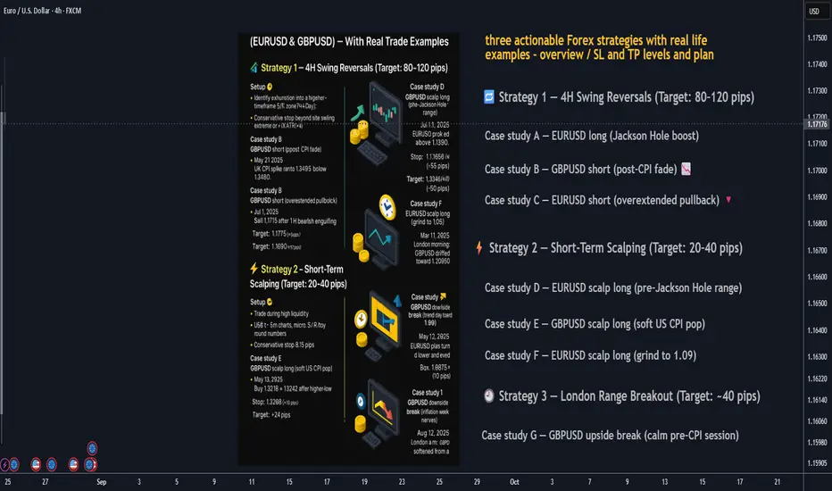
3 Actionable FX Strategies — With Real Trade Examples👋 Below are three practical strategies you can plug into your playbook today:
1. swing reversals (80+ pips), 2) short-term scalps (20–40 pips), and 3) the London range breakout (≈40 pips). Each section includes rules of engagement, risk management, and three real-market case studies on EURUSD and GBPUSD with conservative stops.
________________________________________
🔁 Strategy 1 — 4H Swing Reversals (Target: 80–120 pips)
Setup 🧩
• Identify exhaustion into a higher-timeframe S/R zone (4H/Day).
• Look for a reversal signal (engulfing/pin bar, momentum shift, or divergence) and a confirmation close.
• Conservative stop: beyond the swing extreme or ~1× ATR(14) on the entry timeframe.
• Take-profit: next HTF level or ≥ 1.8R, aiming for 80+ pips.
Case study A — EURUSD long (Jackson Hole boost) 📈
• When: Aug 22, 2025, NY session after Powell; EURUSD pushed above 1.1700 on broad USD weakness.
• Plan: After a 4H close back above 1.1700, buy a retest ~1.1705.
• Stop: 1.1650 (≈55 pips).
• Target: 1.1790 (≈85 pips).
Case study B — GBPUSD short (post-CPI fade) 📉
• When: May 21, 2025, UK CPI spike ran to 1.34695 then faded.
• Plan: After a 15–30m lower high below 1.3460, sell break of 1.3435.
• Stop: 1.3490 (≈55 pips).
• Target: 1.3345 (≈90 pips).
Case study C — EURUSD short (overextended pullback) 🔻
• When: Jul 1, 2025, EURUSD briefly poked above 1.1800 then eased.
• Plan: Sell 1.1775 after a 1H bearish engulfing.
• Stop: 1.1825 (≈50 pips).
• Target: 1.1690 (≈85 pips).
________________________________________
⚡ Strategy 2 — Short-Term Scalping (Target: 20–40 pips)
Setup 🧩
• Trade during high liquidity (London open or London/NY overlap).
• Use 1–5m charts: micro S/R + round numbers, quick momentum bursts.
• Conservative stop: 8–15 pips (just beyond the micro structure).
• Take-profit: 20–40 pips or to next intraday level.
Case study D — EURUSD scalp long (pre-Jackson Hole range) ⏱️
• When: Aug 21, 2025, Europe a.m.; EURUSD near 1.1650.
• Plan: Buy break-and-retest 1.1665.
• Stop: 1.1652 (≈13 pips).
• Target: 1.1687 (≈22 pips).
Case study E — GBPUSD scalp long (soft US CPI pop) 💥
• When: May 13, 2025, post-US CPI tone lifted risk; GBPUSD ~1.3226.
• Plan: Buy 1.3218 → 1.3242 after higher-low.
• Stop: 1.3208 (≈10 pips).
• Target: +24 pips.
Case study F — EURUSD scalp long (grind to 1.09) 🚀
• When: Mar 11, 2025, London morning; EURUSD nudged to 1.0890 / kissed 1.0900.
• Plan: Buy 1.0885 on retest.
• Stop: 1.0875 (≈10 pips).
• Target: 1.0905 (≈20 pips).
________________________________________
🕘 Strategy 3 — London Range Breakout (Target: ~40 pips)
Setup 🧩
• Mark the Asian/Late-Asia range before 08:00 London.
• Trade the first clean break/close outside the box.
• Entry: stop order beyond the box high/low.
• Conservative stop: opposite side of the box or box size + buffer (≤40–50 pips).
• Take-profit: ~40 pips (scale at 20 pips).
Case study G — GBPUSD upside break (calm pre-CPI session) 📦➡️📈
• When: Mar 25, 2025, London a.m.; GBPUSD drifted toward 1.2950.
• Box: 05:00–08:00 London ~22 pips.
• Plan: Buy box high +3 pips (≈1.2953).
• Stop: 1.2930 (≈23 pips).
• Target: 1.2993 (≈40 pips).
Case study H — EURUSD downside break (trend day toward 1.09) 📦➡️📉
• When: May 12, 2025, EURUSD bias turned lower and eyed the 1.09 handle.
• Box: 05:00–08:00 London ~28 pips.
• Plan: Sell box low −3 pips (≈1.0978).
• Stop: 1.1008 (≈30 pips).
• Target: 1.0938 (≈40 pips).
Case study I — GBPUSD downside break (inflation-week nerves) 📦➡️🔻
• When: Aug 12, 2025, London a.m.; GBPUSD softened from a two-week high.
• Box: 05:00–08:00 London ~24 pips.
• Plan: Sell box low −2 pips (≈1.3446).
• Stop: 1.3472 (≈26 pips).
• Target: 1.3406 (≈40 pips).
________________________________________
🛡️ Risk Management (applies to all three)
• Risk small per trade (e.g., 0.5–1%).
• Stops beyond structure: previous swing/box edge or ATR-based to avoid noise.
• News filter: avoid fresh entries seconds before major economic data.
________________________________________
🧰 Quick Checklists
Swing reversal (4H) ✅
🎯 Level picked • 📉 Reversal signal • 🛑 Stop beyond swing/ATR • 📐 ≥1.8R • 📰 No imminent shock
Scalp (1–5m) ✅
⏱️ Active session • 🔍 Micro S/R & round numbers • 🛑 8–15 pip stop • 🎯 20–40 pips • ✂️ Partial at +10–15
London breakout ✅
🕗 Box 05:00–08:00 • 📦 Reasonable width • 🚀 First break/close • 🛑 Stop other side • 🎯 ≈40 pips
________________________________________
⚠️ Final word
These examples show how setups map onto real market context. Adapt entries/levels to your feed and spreads. Nothing here is financial advice—test and size appropriately.
________________________________________
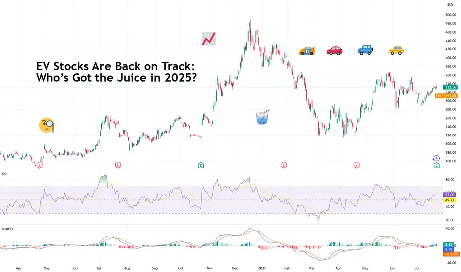
Tesla Motors (TSLA)
EV Stocks Are Back on Track: Who’s Got the Juice in 2025?This year is big for the EV sector so we figured let’s do a piece on it and bring you up to speed on who’s making moves and getting traction — both in the charts and on the road.
What we’ve got here is a lean, mean lineup of real contenders. Let’s go for a ride.
🚗 Tesla: Still King of the Road (for Now)
Tesla NASDAQ:TSLA isn’t just an EV company. It’s a tech firm, an AI shop, a robotaxi rollout machine, and an Elon-flavored media event every quarter. Even so, when it comes to margins, global volume, and name recognition, Tesla is still the benchmark everyone else is chasing.
In 2025, Tesla’s bounceback is fueled not just by EV hype but by its push into autonomous driving and different plays into the AI space.
The stock is down about 13% year-to-date. But investors love a narrative turnaround. Apparently, the earnings update didn't help the situation as shares slipped roughly 5%. Well, there's always another quarter — make sure to keep an eye on the Earnings Calendar .
🐉 BYD: The Dragon in the Fast Lane
BYD 1211 is calmly racking up sales, expanding across continents, and stealing global market share without breaking a sweat. The Chinese behemoth is outselling Tesla globally and doing it with less drama and more charge… literally .
Vertical integration is BYD’s secret weapon — they make their own batteries, chips, and even semiconductors. The West might not be in love with BYD’s designs, but fleet operators and emerging-market governments are. And that’s where the real growth is.
⛰️ Rivian: Built for Trails, Not Earnings (Yet)
Rivian NASDAQ:RIVN still feels like the Patagonia of EV makers — rugged, outdoorsy, aspirational. Its R1T pickup truck has cult status, but the company had to tone down its ambitions and revised its guidance for 2025 deliveries to between 40,000 and 46,000. Early 2025 projections floated around 50,000 .
The good news? Rivian is improving on cost control, production pace, and market fit. The bad news? It’s still burning cash faster than it builds trucks. But for investors betting on a post-rate-cut growth stock rally, Rivian may be the comeback kid to watch. It just needs a few solid quarters.
🛋️ Lucid: Luxury Dreams, Reality Checks
Lucid NASDAQ:LCID , the one that’ll either go under or make it big. The luxury carmaker, worth about $8 billion, came into the EV game promising to out-Tesla Tesla — with longer range, more appeal, and a price tag to match.
But here’s the rub: rich people aren’t lining up for boutique sedans, especially when Mercedes and BMW now offer their own electric gliders with badge power and a dealer network.
Lucid’s challenge in 2025 is existential. The cars are sleek, the tech is strong, but the cash runway is shrinking and demand isn’t scaling like the pitch deck promised.
Unless it nails a strategic partnership (Saudi backing only goes so far), Lucid could end up as a cautionary tale — a beautifully engineered one, but a cautionary tale nonetheless. Thankfully, Uber NYSE:UBER showed up to the rescue ?
💪 NIO : Battling to Stay in the Race
Remember when NIO NYSE:NIO was dubbed the “Tesla of China”? Fast forward, and it’s still swinging — but now the narrative is more about survival than supremacy. NIO's battery-swap stations remain a unique selling point, but delivery volumes and profitability are still trailing.
The company’s leaning into smart-tech partnerships and next-gen vehicle platforms. The stock, meanwhile, needs more than just optimism to get moving again — it’s virtually flat on the year.
✈️ XPeng: Flying Cars, Literally
XPeng’s NYSE:XPEV claim to fame used to be its semi-autonomous driving suite. Now? It's working on literal flying vehicles with its Land Aircraft Carrier. Innovation isn’t the problem — it's execution and scale.
XPeng is beloved by futurists and punished by spreadsheets. It’s still getting government love, but without a clear margin path, the stock might stay grounded.
🏁 Li Auto: The Surprise Front-Runner
Li Auto NASDAQ:LI doesn’t get the headlines, but it’s quietly killing it with its range-extended EVs — hybrids that let you plug in or gas up. A smart move in a country still building out its charging infrastructure.
Li is delivering big numbers, posting improving margins, and seems laser-focused on practicality over hype. Of all the Chinese EV stocks, this one might be the most mature.
🧠 Nvidia: The Brains of the Operation
Okay, not an EV stock per se, but Nvidia NASDAQ:NVDA deserves a spot on any EV watchlist. Its AI chips are running the show inside Tesla’s Full Self-Driving computers, powering sensor fusion in dozens of autonomous pilot programs, and quietly taking over the brains of modern mobility.
As self-driving becomes less sci-fi and more of a supply-chain item, Nvidia's value-add grows with every mile driven by data-hungry EVs.
🔋 ChargePoint & EVgo: Picks and Shovels
If you can’t sell the cars, sell the cables.
EV charging companies were once seen as the “safe bet” on electrification. Now they’re just seen as massively underperforming.
ChargePoint BOATS:CHPT : Still the leader in US charging stations but struggling with profitability and adoption pacing. Stock’s down bad from its peak in 2021 (like, 98% bad).
EVgo NASDAQ:EVGO : Focused on fast-charging and partnerships (hello, GM), but scale and margin pressures remain.
Both stocks are beaten down hard. But with billions in infrastructure funding still flowing, who knows, maybe there’s potential for a second act.
👉 Off to you : are you plugged into any of these EV plays? Share your EV investment picks in the comments!
Vanguard Mega Cap Growth ETF (MGK): FAQ guide before investing🚀 Vanguard Mega Cap Growth ETF (MGK): A Deep Dive into Holdings and Hypothetical Returns
🌟 The Vanguard Mega Cap Growth ETF (MGK) is a popular exchange-traded fund offering investors access to some of the largest and most dynamic growth-oriented companies in the U.S. market. MGK closely tracks the CRSP US Mega Cap Growth Index, emphasizing mega-cap stocks.
🎯 Key Features of MGK
💰 Expense Ratio: 0.07%, a cost-effective choice for investors.
📊 Assets Under Management: Around $25.42 billion.
💵 Dividend Yield: 0.44%, distributed quarterly.
🏆 Top Holdings:
🍎 Apple Inc. (AAPL): 14.34%
🖥️ Microsoft Corp. (MSFT): 11.93%
🎮 NVIDIA Corp. (NVDA): 10.70%
📦 Amazon.com Inc. (AMZN): 7.63%
📱 Meta Platforms Inc. (META): 4.33%
🔌 Broadcom Inc. (AVGO): 3.54%
🚗 Tesla Inc. (TSLA): 3.22%
💊 Eli Lilly and Co. (LLY): 3.20%
💳 Visa Inc. (V): 2.76%
🔍 Alphabet Inc. (GOOGL): 2.31%
📌 Sector Allocation:
💻 Technology: ~52.8%
🛒 Consumer Discretionary: 15.9%
📡 Communication Services: 11.0%
📈 Performance Overview
MGK has consistently demonstrated strong returns:
🗓️ Year-to-Date (YTD): 0.96%
📅 1-Year Return: ~21.09%
📆 3-Year Return: ~23.26%
📊 5-Year Return: ~19.26%
💸 Hypothetical Investment Scenarios
Assuming an average annual return of 19.26%, here's how various investments might grow over five years:
💲 $10,000 Investment:
Year 1: $11,926
Year 2: $14,219
Year 3: $16,951
Year 4: $20,207
Year 5: $24,070
💲 $100,000 Investment:
Year 1: $119,260
Year 2: $142,190
Year 3: $169,510
Year 4: $202,070
Year 5: $240,700
💲 $1,000,000 Investment:
Year 1: $1,192,600
Year 2: $1,421,900
Year 3: $1,695,100
Year 4: $2,020,700
Year 5: $2,407,000
⚠️ Note: These returns are hypothetical and assume consistent annual performance, which may not reflect actual market volatility.
🔑 Considerations for Investors
🎯 Concentration Risk: MGK heavily invests in technology and a few major stocks, tying its success closely to these specific companies.
📉 Market Volatility: Although historically strong, MGK can be highly volatile, particularly during tech-sector downturns.
📈 Long-Term Growth: Ideal for investors seeking significant long-term capital appreciation through prominent U.S. growth firms.
📌 In Summary: MGK provides focused exposure to U.S. mega-cap growth stocks with a strong track record. Investors should consider portfolio diversification carefully due to its sector concentration.

TESLA Always Pay YOURSELF! Tsla Stock were you PAID? GOLD Lesson
⭐️I want to go into depth regarding the this topic but it is a long one with PROS & CONS for doing and not doing it.
Every trader must choose what's best for them but you will SEE when I finally get to the write up that MANY OF THE PROS are NOT FINANCIAL but PSYCHOLOGICAL❗️
Another of 🟢SeekingPips🟢 KEY RULES!
⚠️ Always Pay YOURSELF.⚠️
I know some of you chose to HOLD ONTO EVERYTHING and place your STOP at the base of the WEEKLY CANDLE we entered on or the week priors base.
If you did that and it was in your plan GREAT but... if it was NOT that is a TRADING MISTAKE and You need to UPDATE YOUR JOURNAL NOW.
You need to note EVERYTHING. What you wanted to see before your exit, explain why not taking anything was justified to you, were there EARLY exit signals that you did not act on. EVERYTHING.
🟢SeekingPips🟢 ALWAYS SAYS THE BEST TRADING BOOK YOU WILL EVER READ WILL BE YOUR COMPLETE & HONEST TRADING JOURNAL ⚠️
📉When you read it in black amd white you will have YOUR OWN RECORD of your BEST trades and TRADING TRIUMPHS and your WORST TRADES and TRADING ERRORS.📈
✅️ KEEPING an UPTO DATE JOURNAL is STEP ONE.
STUDYING IT IS JUST AS IMPORTANT👍
⭐️🌟⭐️🌟⭐️A sneak peek of the LESSON after will be HOW & WHEN TO ENTER WHEN THE OPEN BAR IS GOING THE OPPOSITE WAY OF YOUR IDEA.👌
🚥Looking at the TESLA CHART ABOVE you will see that we were interested in being a BUYER when the weekly bar was BEARISH (GREEN ARROW) and we started to consider TAKE PROFITS and EXITS when the (RED ARROW) Weekly bar was still BULLISH.🚥

6 Things to Do before you start Investing and Trading1. Build an Emergency Fund
▪️Why it's important: Having an emergency fund ensures you have a financial cushion for unexpected expenses (e.g., medical bills, car repairs, job loss). Without this safety net, you may be forced to sell investments or go into debt if something unforeseen happens.
▪️How to do it: Aim for 3-6 months' worth of living expenses in a liquid, easily accessible account like a savings account. Focus on saving first before putting money into investments.
2. Pay Down High-Interest Debt
▪️Why it's important: High-interest debt, especially from credit cards, can severely hinder your financial progress. The interest on these debts is often higher than the returns you could earn from investments in the short term.
▪️How to do it: Prioritize paying off high-interest debts first (e.g., credit cards), then move on to other debts like student loans or car loans. Consider strategies like the debt snowball or debt avalanche method.
3. Define Your Financial Goals and Priorities
▪️Why it's important: Knowing what you're investing for (e.g., retirement, a down payment on a house, education, or travel) will help you choose the right investment vehicles and timeframes. It also provides motivation and direction.
▪️How to do it: Set SMART (Specific, Measurable, Achievable, Relevant, Time-bound) financial goals. Break them down into short-term, medium-term, and long-term goals. This helps you align your investments with your needs.
4. Know Your Cash Flow
▪️Why it's important: Understanding your income and expenses is essential for managing your finances and determining how much money you can consistently allocate to investing. If you don't have a clear picture of your cash flow, you might overextend yourself or miss opportunities.
▪️How to do it: Create a monthly budget to track your income, fixed expenses, and discretionary spending. Consider using a budgeting tool or app to make this process easier. Be honest about where you can cut back to free up funds for investing.
5. Track Your Net Worth
▪️Why it's important: Tracking your net worth gives you a clear picture of your overall financial health. It's a snapshot of what you own (assets) minus what you owe (liabilities). This helps you measure your progress over time and adjust as needed.
▪️How to do it: List all your assets (e.g., savings, investments, real estate) and liabilities (e.g., mortgages, student loans, credit card debt). Update this regularly to see how your financial situation is evolving. You can use free online tools or apps to make this process easier.
6. Understand the Basics of Investing and Trading
▪️Why it's important: If you're going to invest or trade, you need to understand the fundamental principles behind both activities. This includes knowledge of risk, returns, diversification, asset classes (stocks, bonds, real estate), and how markets operate.
▪️How to do it: Read books, take online courses, or follow credible financial blogs and YouTube channels. It’s important to grasp concepts like risk tolerance, time horizon, and the different types of investments (stocks, mutual funds, ETFs, etc.). Understanding these principles will help you avoid common mistakes and make informed decisions.

BIG POST! | How To Beat SP500?
S&P 500 Performance: +35% since 2022.
My Selected Portfolio Performance: +62%, with an 82% hit rate.
Top Performing Stocks: NVDA (+735%), ANET (+343%), META (+209%), and more.
Technical Analysis Tools Used: Price action, trendlines, Fibonacci levels, round numbers, and more.
It’s been nearly three years since I posted my analysis of S&P 500 stocks on February 23, 2022. Back then, I reviewed all 500 stocks, applied some quick technical analysis, and identified 75 stocks that stood out for me. Importantly, I relied solely on technical analysis to make my picks. Fast forward to today, and the results speak for themselves. Most of these selections have significantly outperformed the broader market, proving the power and importance of technical analysis.
While many investors rely solely on fundamentals, technical analysis brings a dynamic edge that’s often underestimated. By focusing on price action and market behavior, technical analysis allows us to spot opportunities that others might miss, especially it gives a massive psychological edge while the markets are making corrections. The market doesn't care what you know, the market cares what you do!
Here’s what I used for my analysis:
It's kind of pure price action - previous yearly highs, trendlines, a 50% retracement from the top, round numbers, Fibonacci levels, equal waves, and channel projections. For breakout trades, determined strong and waited for confirmation before pulling the trigger.
The Results
While the S&P 500 has gained around 35% over this period , my selected stocks from the same list have made +62%! Out of the 75 stocks I picked, 67 have hit my target zones and 54 are currently in the green. That’s an 82% hit rate, and for me, that’s a good number!
Now, for those who favor fundamental analysis, don’t get me wrong, it has its place. But remember, fundamentals tell you what to buy, while technicals tell you when to buy - to be a perfect investor, you need them both. You could hold a fundamentally strong stock for years, waiting for it to catch up to its "true value," while a technical analyst might ride multiple trends and capture far superior returns during that same time. Also, the opposite can happen – you may see a great technical setup, but if the fundamental factors are against it, you could end up with your money stuck in a bad trade.
To put these ideas in perspective, starting with a simulated portfolio of $76,000, where each stock had an equal investment of around $1,000–$1,100, the portfolio is now worth around $124,000. The results are based on buying at marked zones and holding until today. I calculated entries from the middle of the target zone, as it’s a more realistic and optimal approach compared to aiming for perfect lows (which, frankly, feels a bit scammy) to get much(!) higher returns. This method reflects real-world trading.
Before we dive in, here are the current Top 5 stocks from My Picks:
NVDA: +735%
ANET: +343%
TT: +227%
META: +209%
LEN: +164%
These numbers demonstrate the effectiveness of a solid technical strategy. Many say it's tough to beat the market with individual stock picks, but these results show it’s not just possible, it’s absolutely achievable with the right tools and approach.
Now, let's dive into the charts!
1. Apple (AAPL) - a load-it-up type of setup has worked out nicely. Used previously worked resistance levels. If the stocks performing well and the market cap is big enough then these levels can help you to get on board.
Current profit 65%
Before:
After:
---------------------------
2. Adobe (ADBE) - came down sharply, but the price reached the optimal area and reversed.
Current profi 38%.
Before:
After:
---------------------------
3. Advanced Micro Devices (AMD) - round number, strong resistance level becomes support and the climb can continue.
Current profit 101%
Before:
After:
---------------------------
4. Amazon (AMZN) - came down from high prices to the marked levels and those who were patient enough got rewarded nicely.
Current profit 66%
Before:
After:
---------------------------
5. Arista Networks (ANET) - retest of the round nr. worked perfectly, as a momentum price level, after the strong breakout.
Current profit 343%
Before:
After:
---------------------------
6. Aptiv PLC (APTV): Came down quite sharply and it will take some time to start growing from here, if at all. The setup was quite solid but probably fundamentals got weaker after the all-time high.
Current loss -24%
Before:
After:
---------------------------
7. American Express (AXP) - firstly the round nr. 200 worked as a strong resistance level. Another example is to avoid buying if the stock price approaches bigger round numbers the first time. Came to a previous resistance level and rejection from there…
Current profit 104%
Before:
After:
---------------------------
8. Bio-Rad Laboratories (BIO) - in general I like the price action, kind of smoothly to the optimal zone. It might take some time to start growing from here but also fundamentals need to look over.
Current loss 6%
Before:
After:
---------------------------
9. BlackRock (BLK) - kind of flawless. All criteria are in place and worked perfectly.
Current profit 81%
Before:
After:
---------------------------
10. Ball Corporation (BALL) - a perfect example of why you should wait for a breakout to get a confirmed move. No trade.
Before:
After:
---------------------------
11) Berkshire Hathaway (BRK.B) - Buy the dip. Again, as Apple, a big and well-known company - all you need to do is to determine the round numbers, and small previous resistances that act as support levels, and you should be good.
Current avg. profit from two purchases 64%
Before:
After:
---------------------------
12) Cardinal Health (CAH) - the retest isn't as deep as wanted but still a confirmed breakout and rally afterward. Still, the bias was correct!
Before:
After:https://www.tradingview.com/x/83OmlWuv/
---------------------------
13) Ceridian HCM Holding (DAY) - found support from the shown area but not much momentum.
Current profit 20%
Before:
After:
---------------------------
14) Charter Communications (CHTR) - technically speaking it is a quite good price action but kind of slow momentum from the shown area. Probably came too sharply and did not have enough previous yearly highs to support the fall.
Current loss -10%
Before:
After:
---------------------------
15) Comcast Corp. (CMCSA) - got liquidity from new lows, pumped up quickly, and is currently fairly solid.
Current profit 10%
Before:
After:
---------------------------
16) Cummins (CMI) - got rejected from 2028 and 2019 clear highs, fairly hot stock, and off it goes.
Current profit 80%
Before:
After:
---------------------------
17) Salesforce.com (CRM) - perfect. 50% drop, strong horizontal area, and mid-round nr did the work.
Current profit 83%
Before:
After:
---------------------------
18) Cisco Systems (CSCO) - worked and slow grind upwards can continue.
Current profit 30%
Before:
After:
---------------------------
19) Caesars Entertainment (CZR) - not in good shape imo. It has taken too much time and the majority of that is sideways movement. Again, came too sharply to the optimal entry area.
Current loss -16%
Before:
After:
---------------------------
20) Devon Energy (DVN) - inside the area and actually active atm. Still, now I’m seeing a bit deeper correction than shown.
Before:
After:
---------------------------
21) Electric Arts (EA) - 6 years of failed attempts to get a monthly close above $150 have ended here. It got it and we are ready to ride with it to the higher levels.
Current profit: kind of BE
Before:
After:
---------------------------
22) eBay (EBAY) - it took some time but again, worked nicely.
Before:
After:
---------------------------
23) Enphase Energy (ENPH) - got a breakout, got a retest, and did a ~76% rally after that! If you still hold it, as I do statistics, then…
Current loss -59%
Before:
After:
---------------------------
24) Expeditors International of Washington (EXPD) - kind of worked but didn't reach. No trade.
Before:
After:
---------------------------
25) Meta Platforms (META) - the bottom rejection from the round number $100 is like a goddamn textbook :D At that time 160 and 200 were also a good area to enter. Here are several examples of the sharp falls/drops/declines - watch out for that, everything should come fairly smoothly. Still, it ended up nicely and we have a massive winner here...
Current profit 209%
Before:
After:
---------------------------
26) FedEx (FDX) - I love the outcome of this. Very solid price action and multiple criteria worked as they should. Perfect.
Current profit 60%
Before:
After:
---------------------------
27) First Republic Bank (FRC) - firstly got a solid 30 to 35% gain from the shown area but...we cannot fight with the fundamentals.
Current loss 99%
Before:
After:
---------------------------
28) General Motors (GM) - finally found some liquidity between strong areas and we are moving up.
Current profit 47%
Before:
After:
---------------------------
29) Alphabet (GOOG) - load it up 3.0, a good and strong company, and use every previous historical resistance level to jump in.
Current avg. profit after three different price level purchases 63%
Before:
After:
---------------------------
30) Genuine Parts (GPC) - coming and it looks solid.
Before:
After:
---------------------------
31) Goldman Sachs (GS) - really close one.
Current profit 86%
Before:
After:
---------------------------
32) Hormel Foods (HRL) - quite bad performance here. Two trades, two losses.
The current loss combined these two together is 35%
Before:
After:
---------------------------
33) Intel (INTC) - at first perfect area from where it found liquidity, peaked at 65%. Still, I make statistics if you still holding it then…
Current loss -21%
Before:
After:
---------------------------
34) Ingersoll Rand (IR) - beautiful!
Current profit 144%
Before:
After:
---------------------------
35) Intuitive Surgical (ISRG) - the trendline, 50% drop, strong horizontal area. Ready, set, go!
Current profit 157%
Before:
After:
---------------------------
36) Johnson Controls International (JCI) - second rest of the area and then it started to move finally..
Current profit 55%
Before:
After:
---------------------------
37) Johnson & Johnson (JNJ) - Buy the dip and we had only one dip :)
Current profit 13%
Before:
After:
---------------------------
38) CarMax (KMX) - the area is strong but not enough momentum in it so I take it as a weakness.
Current profit kind of BE
Before:
After:
---------------------------
39) Kroger Company (KR) - without that peak it is like walking on my lines
Current profit 15%
Before:
After:
---------------------------
40) Lennar Corp. (LEN) - strong resistance level becomes strong support. Beautiful!
Current profit 164%
Before:
After:
---------------------------
41) LKQ Corp. (LKQ) - just reached and it should be solid. Probably takes some time, not the strongest setup but still valid I would say.
Before:
After:
---------------------------
42) Southwest Airlines (LUV) - no breakout = no trade! Don’t cheat! Your money can be stuck forever but in the meantime, other stocks are flying as you also see in this post. If there is a solid resistance, wait for the breakout and possibly retest afterward! Currently only lower lows and lower highs.
Before:
After:
---------------------------
43) Las Vegas Sands (LVS) - channel inside a channel projection ;) TA its own goodness!
Current profit 70%
Before:
After:
---------------------------
44) Microchip Technology Incorporated (MCHP) - worked!
Current profit 37%
Before:
After:
---------------------------
45) Altria Group (MO) - got a bit deeper retest, liquidity from lower areas, and probably a second try..
Currently kind of BE
Before:
After:
---------------------------
46) Moderna (MRNA) - "seasonal stocks", again too sharp and we are at a loss…
Current loss -37%
Before:
After:
---------------------------
47) Morgan Stanley (MS) - the first stop has worked, and got some nice movements.
Current profit 62%
Before:
After:
---------------------------
48) Microsoft (MSFT) - Load it up 4.0, buy the dip has worked again with well-known stock.
Three purchases and avg. return from these are amazing 70%
Before:
After:
---------------------------
49) Match Group (MTCH) - it happens..
Current loss -53%
Before:
After:
---------------------------
50) Netflix (NFLX) - almost the same as Meta. Came quite sharply but the recovery has been also quick. Another proof is that technical analysis should give you a psychological advantage to buy these big stocks on deep corrections.
Current profit 153%
Before:
After:
---------------------------
51) NRG Energy (NRG) - Perfect weekly close, perfect retest…
Current profit 90%
Before:
After:
---------------------------
52) NVIDIA (NVDA) lol - let this speak for itself!
Current profit 735%
Before:
After:
---------------------------
53) NXP Semiconductors (NXPI) - usually the sweet spot stays in the middle of the box, and also as I look over these ideas quite a few have started to climb from the first half of the box. Touched the previous highs.
Current profit 74%
Before:
After:
---------------------------
54) Pfizer (PFE) - actually quite ugly, TA is not the strongest. Probably results-oriented but yeah..
Current loss -25%
Before:
After:
---------------------------
55) PerkinElmer - “after” is EUR chart but you get the point.
Current profit 25%
Before:
After:
---------------------------
56) Pentair (PNR) - worked correctly, 50% drop combined with the horizontal area, easily recognizable, and the results speak for themselves.
Current profit 124%
Before:
After:
---------------------------
57) Public Storage (PSA) - again, previous yearly highs and the trendline did the job.
Current profit 36%
Before:
After:
---------------------------
58) PayPal (PYPL) - the area just lowers the speed of dropping, but slowly has started to recover.
Current loss -14%
Before:
After:
---------------------------
59) Qorvo (QRVO) - slow, no momentum.
Current profit 10%
Before:
After:
---------------------------
60) Rockwell Automation (ROK) - previous yearly high again, plus some confluence factors.
Current profit 32%
Before:
After:
---------------------------
61) Rollins (ROL) - after posting it didn’t come to retest the shown area. Being late for a couple of weeks. Worked but cannot count it in, the only thing I can count is that my bias was correct ;)
Before:
After:
---------------------------
62) Snap-On Incorporated (SNA) - same story!
Before:
After:
---------------------------
63) Seagate Technology (STX) - firstly it came there! Look how far it was, the technical levels are like magnets, the price needs to find some liquidity for further growth and these areas can offer it. I like this a lot, almost all the criteria are in place there.
Current profit 73%
Before:
After:
---------------------------
64) Skyworks Solutions (SWKS) - one of the textbook examples of how trendline, 50% drop, round nr. and strong horizontal price zone should match. Still a bit slow and it will decrease the changes a bit.
Kind of BE
Before:
After:
---------------------------
65) TE Connectivity (TEL) - came down, and got a rejection. “Simple” as that.
Current profit 37%
Before:
After:
---------------------------
66) Thermo Fisher Scientific (TMO) - mister Ranging Market.
Current profit 19%
Before:
After:
---------------------------
67) Trimble (TRMB) - finally has started to move a bit. Got liquidity from previous highs again and..
Current profit 45%
Before:
After:
---------------------------
68) Tesla (TSLA) - made a split. Have been successfully recommended many times after that here and there but two years ago we traded in these price levels and..
Current profit 19%
Before:
After:
---------------------------
69) Train Technologies (TT) - dipped the box and off it goes! Epic!
Current profit 227%
Before:
After:
---------------------------
70) Take-Two Interactive Software (TTWO) - I like this analysis a lot. Worked as a clockwork.
Current profit 60%
Before:
After:
---------------------------
71) United Rentals (URI) - WHYY you didn’t reach there :D Cannot count it.
Before:
After:
---------------------------
72) Waters Corp. (WAT) - came to the box as it should be slow and steady. As the plane came to the runway.
Current profit 41%
Before:
After:
---------------------------
73) Exxon Mobil Corp. (XOM) - another escaped winner. Didn’t come down to retest my retest area so, missed it.
Before:
After:
---------------------------
74) Xylem (XYL) - perfect trendline, good previous highs, 50% drop from the peak and..
Current profit 76%
Before:
After:
---------------------------
75) Autodesk (ADSK) - took a bit of time to start climbing but everything looks perfect. Nice trendline, 50% drop from ATH, previous yearly highs - quite clean!
Current profit 66%
Before:
After:
The strategies above show how useful price action, key levels, and psychology can be for investing. By spotting breakouts, and pullbacks, or focusing on round numbers and past highs, technical analysis helps give traders an edge in understanding the market.
Regards,
Vaido

Ultimate Winrate KDJ Strategy by reset parameter!(best tutorial)You've ever had this happen?
Bought a stock at rock bottom, and it starts to rise a bit, and then the J line turns down on the KDJ indicator, telling you to sell. So, you sell, but then it quickly shoots up, leaving you pretty blue. like you missed out on a fortune. Was the KDJ indicator down?
Nope
Hold tight, cause we're about to see a miracle. By just tweaking a bit the KDJ indicator's parameters, you can nail those short-term highs and be on your way to the success.
So, how do you find the right KDJ indicator parameters?
Stick around, and I'll spill the beans!
First off, why do we need to optimize this lil' parameter?
Well, every stock moves differently cause the folks trading it are different. So, a one-size-fits-all KDJ indicator won’t always work well on every stock at every stage. To up our chances, we gotta tweak those parameters to find the best fit for our stock.
Now, onto the second question: how do you find the right ones?
Let’s go back to the Tesla stock chart.
After changing the KDJ indicator parameters to 74, the sell point lines up perfectly with the peak.
Why 74?
Well, from point A to point B, there’s exactly 74 candles. Why use the number of candles between those two points as the KDJ parameter?
Here’s the crux of it.
The KDJ indicator is a momentum oscillator, calculating the close price at latest candle with the highest and lowest prices of the previous nine candles since the default KDJ parameter is 9.
so If the price breaks above the highest price of those nine candles, it will be constantly giving false sell signals.
So, we need to set the KDJ parameter to the number of candles from the previous high to the low. This way, the highest price and lowest price are not broken.
Then, the KDJ works accurately.
Still lost? Let’s look at another example. Here’s an Apple stock chart.
With the default parameter of 9, we bought after the golden cross, but few days later, it prompt to sell signal, and then the price soared. Feeling furious yet?
But if we set the KDJ parameter to 95, we’d have sold right near the top, securing a nice profit!
Why 95?
Same method: from the highest point A to the lowest point B, there’s 95 candles.
Got it? Ain’t it something?
Check your stocks with this method. Got questions? Leave a comment, and I’ll get back to ya ASAP! Today we focused on using KDJ to find sell points. It’s just as magical for buy points, which I’ll cover in future videos.
So, please follow me and hit that boost bell so you don’t miss out!

HERE ARE 10 COMMON TRADING INDICATORS MADE SIMPLE Chart has all 10.
Hope this helps.
Hope it's simple to understand if you still struggle with indicators.
Remember, no one indicator is good on its own.
Think of an indicator as a sign that you should pay attention to a possibility. For example, if I go to the ocean, maybe I have an indicator that says you're closer to sharks than in the great lakes, will I be eaten? Probably not, but also, there are more sharks and my indicator confirms that. I can't use this one indicator to say, I'm probably about to be eaten. BUT.. Let's say I have multiple indicators that I use to give me a better idea if I'll be eaten. Maybe an indicator tells me there is an oddly higher than avg number of a sharks number 1 food source within the area. Can I say I'll be eaten? No, but I could say, maybe due to the increased food supply, there may be more sharks. What if I have a few more indicators, one of which says there are 30 great whites within 10 miles, and another that says, usually at this time of the year, there are only ever between 2 to 7 great whites. Can I say, Yes, I'll be eaten? NOPE, not yet.
What if I have another indicator that says, across the globe, shark attacks are increasing by a certain percentage, and another that says, there is blood detected within the water you're swimming in, which is lower than the threshold for human's to detect, but higher than the threshold needed for sharks to smell. What if I combine that with an indicator that says, on avg there are 1000 swimmers here, but now, there are under 30. Can I say I'll be eaten? Nope, BUT, I can say, hmm. Something is up and if one of us were to get eaten, I'm more likely to be picked out of 30 people than 1000.
When can I say I'll be eaten? Probably if you build an indicator that can detect bite force and compare to known bit forces of sharks that could sense you're actively being eaten, but at that point, the stock moved already... err I mean, the shark ate already, and you're late to the show..
My point being, use them, but don't always assume when it comes to indicators. Take in all the data and then make a decision. Some indicators fit your style, some won't. Do I need 30 stacked indicators for sharks if I'm swimming in Lake Michigan? Probably not, it would make everything a mess.
So, here there are.
Relative Strength Index (RSI): Ah, the RSI, the “I’ve had too much” indicator of the stock market. When it hits above 70, it’s like your stock had too much to drink at the party and is likely to come crashing down. Below 30? It’s been left out in the cold and might be due for a warm-up (a.k.a. price increase). Remember, it’s not foolproof, but then again, neither is your weather app.
On-Balance Volume (OBV): This one’s all about following the crowd. If the volume is increasing, it’s like everyone’s rushing to get the latest iPhone. But remember, even if everyone jumps off a bridge, it doesn’t mean you should too. Always double-check before you follow the herd.
Simple Moving Average (SMA): The SMA is like that reliable friend who’s always a bit behind on the latest trends. It gives you the average closing price over a certain period. It’s simple, it’s moving, it’s average. It’s the SMA.
Exponential Moving Average (EMA): The EMA is the SMA’s hip younger sibling. It cares more about what happened recently than what happened way back when. It’s great for short-term trading, but remember, even the coolest kids can get things wrong.
Moving Average Convergence Divergence (MACD): This one sounds complicated, but it’s not. It’s like watching two rabbits on a race track. If the fast rabbit (the 12-day EMA) overtakes the slow rabbit (the 26-day EMA), it’s a bullish signal. If the slow rabbit overtakes the fast one, it’s a bearish signal. Just remember, rabbits are unpredictable!
Fibonacci retracements: Ah, Fibonacci, the Da Vinci of math. These horizontal lines indicate where support and resistance levels might be. It’s like trying to predict where you’ll meet your ex at a party. It could be useful, but don’t rely on it too much.
Stochastic oscillator: This one’s a bit like a pendulum. When it swings one way, it’s likely to swing back the other way soon. It’s great for spotting potential reversals, but remember, even a broken clock is right twice a day.
Bollinger bands: These are like the elastic waistband of your favorite sweatpants. If the price hits the upper band, it might be time to sell (or stop eating pizza). If it hits the lower band, it might be time to buy (or hit the gym).
Average Directional Index (ADX): This one tells you whether the price is trending strongly or just wandering around like a lost puppy. Above 25 is a strong trend, below 20 is weak. But remember, even lost puppies find their way home eventually.
Accumulation/Distribution (A/D) line: This one’s all about supply and demand. If the line is going up, the stock is being accumulated. If it’s going down, it’s being distributed. It’s like tracking whether more people are buying or selling fidget spinners.
Remember, these indicators are like tools in a toolbox. Don’t try to build a house with just a hammer. Use them in combination, understand their limitations, and always do your own research. Happy trading! 📈

VOLUME INDICATORS, PART 2. SEVEN COMMON VOLUME INDICATORS.Understanding Volume Indicators:
Volume indicators are essential tools for traders and analysts, providing insights into market activity and sentiment. In this guide, we'll explore seven common volume indicators and how you can use them to enhance your trading strategies.
1. Volume
Volume is the simplest volume indicator, representing the total number of shares or contracts traded over a specific period. It's like the crowd size at a Super Bowl game—when the stadium is packed and roaring, it indicates a lot of interest and activity. Similarly, high trading volume suggests significant buying or selling activity in the market. Traders often use volume to confirm the strength of price movements and identify potential trends.
Volume, the bedrock of volume analysis, represents the total number of shares or contracts traded over a specific period. Common parameter values range from 20 to 50 periods for short-term analysis and 100 to 200 periods for long-term trends. Remember, volume precedes price movements, so significant changes can hint at impending shifts in direction.
2. On-Balance Volume (OBV)
On-Balance Volume (OBV) adds a cumulative total of volume when the price closes up and subtracts it when the price closes down. It's akin to keeping score of how loud each team's fans are cheering during the Super Bowl game. If one team's supporters get louder as the game progresses, it suggests growing momentum for that team. Likewise, OBV helps traders gauge buying and selling pressure, providing insights into potential price movements. A rising OBV indicates bullish momentum, while a falling OBV suggests bearish sentiment.
On-Balance Volume (OBV) tracks cumulative volume based on price movements. Set your period length typically between 14 to 20 periods for optimal results. A rising OBV confirms bullish trends, while a falling OBV suggests bearish sentiment. Divergences between OBV and price often foreshadow reversals.
3. Accumulation/Distribution Line (A/D Line)
The Accumulation/Distribution Line (A/D Line) combines price and volume to show how much of a security is being accumulated or distributed. It's like a tug-of-war between the two teams during halftime at the Super Bowl. The team with more supporters pulling harder gains ground. Similarly, the A/D Line measures the battle between buyers and sellers. If it's trending upwards, it suggests that accumulation (buying) is outweighing distribution (selling), indicating potential upward price movement.
The Accumulation/Distribution Line (A/D Line) gauges the flow of funds into or out of a security. Optimal period lengths range from 14 to 30 periods. Rising A/D Line values signal accumulation and potential price appreciation, while declining values indicate distribution and possible downturns.
4. Chaikin Money Flow (CMF)
Chaikin Money Flow (CMF) measures the flow of money into or out of a security based on both price and volume. It's akin to checking the enthusiasm of the fans after each touchdown at the Super Bowl. If the fans are still hyped and buying team merchandise, it suggests sustained enthusiasm and support. CMF helps traders assess the strength of buying or selling pressure. A positive CMF suggests buying pressure, while a negative CMF indicates selling pressure.
Chaikin Money Flow (CMF) measures buying and selling pressure relative to price movements. Common period lengths vary from 10 to 30 periods. Positive CMF values indicate buying pressure, while negative values suggest selling pressure. Look for divergences between CMF and price for early reversal signals.
5. Volume Weighted Average Price (VWAP)
Volume Weighted Average Price (VWAP) calculates the average price a security has traded at throughout the day, weighted by volume. It's like a buffet at a Super Bowl party where each dish is labeled with the average popularity rating from all the guests. The more popular dishes have a higher average rating. Similarly, VWAP gives traders a sense of the average price level where most trading activity has occurred. Traders use VWAP to assess whether their trades were executed at favorable prices relative to the day's average.
Volume Weighted Average Price (VWAP) calculates the average price weighted by volume. Period lengths typically range from 20 to 50 periods. VWAP acts as a dynamic support or resistance level, guiding traders on optimal entry and exit points. Monitor deviations from VWAP to identify potential trend shifts.
6. Money Flow Index (MFI)
The Money Flow Index (MFI) measures the rate at which money is flowing into or out of a security based on both price and volume. It's akin to fans at the Super Bowl game exchanging team merchandise and tickets. The more transactions happening, the more money is flowing between fans. MFI helps traders gauge market sentiment. A high MFI suggests strong buying pressure, while a low MFI indicates selling pressure. Traders often look for divergences between MFI and price movements to anticipate potential reversals.
The Money Flow Index (MFI) evaluates the rate of money flow into or out of a security. Optimal period lengths usually range from 10 to 20 periods. High MFI values indicate overbought conditions, while low values suggest oversold conditions. Watch for divergences between MFI and price for reversal signals.
7. Volume Rate of Change (VROC)
Volume Rate of Change (VROC) measures the rate of change in volume over a specific period, showing whether volume is increasing or decreasing rapidly. It's like measuring the acceleration or deceleration of the crowd's excitement level during different parts of the Super Bowl game. If the crowd gets louder and louder as the game progresses, it indicates increasing excitement and momentum. Similarly, a rising VROC suggests increasing buying or selling activity, while a falling VROC suggests waning activity.
Volume Rate of Change (VROC) measures the rate of change in volume over a specific period. Common period lengths vary from 10 to 20 periods. Rising VROC values signify increasing volume momentum, indicating potential price continuation. Falling values may precede price reversals.
GME and VOLUME? Let's go back and see GME on the Weekly
In conclusion, volume indicators provide valuable insights into market sentiment and potential price movements. By understanding and incorporating these indicators into your trading strategy, you can make more informed decisions and improve your overall trading performance.
REMEMBER, no one indicator on it's own tells you much, but a lot of different indicators all telling you the same thing at the same area... pay attention to that kind of confirmation.
Hope this helps!!
I've linked PART 1, 10 COMMON INDICATORS.
This post is all Volume related.
You can go in depth with all of these, I don't find it necessary for most traders, but the option is there, however, you'll need someone more advanced than myself to help you through that.

How to Trade with the Inside Bar PatternHow to Trade with the Inside Bar Pattern
The inside bar pattern is characterised by two consecutive candlesticks that often suggest a period of consolidation or indecision in the market. Traders and analysts can find value in identifying the setup as it can provide insights into potential future price movements. In this article, we will explore different examples of this formation on price charts and discuss how to interpret their signals for trading purposes.
What Is an Inside Bar Candle Pattern?
An inside bar is a two-candlestick formation that occurs when a candlestick's high and low range is contained within the high and low range of the preceding candle. In other words, the entire price action of one candle is confined within the previous candlestick's price range.
The setup signifies a period of consolidation or indecision in the market; however, it doesn’t identify a trend reversal. The price may continue moving in the prevailing trend or turn around. Also, the pattern may appear both in an uptrend and in a downtrend. It indicates that the trading range of the current candle is narrower than the range of the previous candlestick. This contraction in price volatility suggests a temporary equilibrium between buyers and sellers.
The inside bar can be observed across different financial instruments such as stocks, cryptocurrencies*, ETFs, indices, and forex currency pairs and can be traded using contracts for difference (CFDs) provided by FXOpen.
Identifying the Inside Bar on Trading Charts
To identify this formation on trading charts, traders follow these steps:
Look for two candlesticks: Start by identifying a candlestick with a defined high and low range and check a subsequent candlestick.
Compare the high and low range: Check if the high and low range of the subsequent candle is entirely contained within the high and low range of the preceding candlestick. The entire price action of the following candles should be within the boundaries of the last candlestick.
Confirmation: Once identifying that the subsequent candle meets the criteria, traders can confirm it as an inside bar.
Inside Bar vs Outside Bar
The inside candle pattern occurs when the high and low of a candle are contained within the range of the preceding candlestick, indicating consolidation or indecision in the market. It suggests a potential reversal or continuation of the current trend. On the other hand, an outside bar, or engulfing pattern, happens when the high and low of a candlestick completely engulf the previous candle, signalling a potential reversal. A bearish engulfing indicates a bearish reversal, while a bullish engulfing suggests a bullish reversal. Both are widely used by traders for technical analysis and identifying potential trading opportunities.
Traders can analyse outside and inside bars on forex, stocks, and other markets for free using the FXOpen TickTrader platform.
How to Trade Inside Bar Pattern
Trading with the inside bar candlestick pattern involves using it as a signal for potential breakouts or continuation of the prevailing trend. Here are the steps traders usually follow when trading with the pattern:
Determine the direction of the preceding trend: Traders assess the overall trend leading up to the formation. If it's an uptrend, the preceding candles should be mostly bullish. If it's a downtrend, the prior candles should be mostly bearish.
Wait for a breakout: The formation indicates consolidation and potential price compression. Traders often wait for a breakout from the setup's range to initiate a trade. A breakout above the high of the formation suggests a bullish signal, while a breakout below the low indicates a bearish signal.
Set your entry: Once the breakout occurs, traders may set the entry order slightly above the high of the bullish breakout or slightly below the low of the bearish breakout.
Consider additional confirmation: To increase the probability of a successful trade, traders may look for additional confirmation indicators such as volume analysis, trendlines, or other technical indicators to support your trade decision. An increasing volume at the breakout or the breakout from a trendline may provide additional confluence.
Manage your trade: As the trade progresses, traders monitor price movements and may want to adjust your stop-loss level to protect profits or limit losses.
Take profits: Traders may decide on your profit-taking strategy, whether it's a predetermined target, a trailing stop, or monitoring key levels of support and resistance.
Live Market Example
Below we present an inside bar stock pattern on Tesla. It contains a bullish inside bar. Following the inside bar trading strategy, the trader waits for the breakout above the setup marked by a horizontal line. The stop loss is set below the low of the formation, and the take profit is at the next resistance.
Final Thoughts
While the setup can be a useful tool for identifying potential breakout or continuation opportunities, it's important for traders not to rely solely on this pattern for their trading decisions. To enhance their analysis, traders combine the formation with other technical indicators and utilise effective risk management strategies to manage potential losses.
It's crucial to exercise caution and be mindful of false signals that can occur. Traders try to adapt their trading strategies accordingly to improve their chances of success. To develop your own trading strategy with this pattern, you can open an FXOpen account.
FAQ
Is an inside bar bullish or bearish?
It does not inherently indicate a bullish or bearish bias. It simply represents a period of consolidation or indecision in the market. So, the formation occurring within an uptrend can be bullish and signal a trend continuation or bearish and signal a trend reversal.
What does an inside bar bullish mean?
The meaning of an inside candle that is bullish refers to an inside bar, after which the price moves upwards. When this pattern forms during an uptrend, it suggests a temporary pause or consolidation in price before the uptrend potentially resumes. When it is formed in a downtrend, it signals a trend reversal.
How do you use the inside bar strategy?
To use the strategy, traders wait for the inside bar to form and then look for a breakout above the high of the formation to enter a long position or below the low to enter a short trade. A stop-loss order is typically placed below the low of the pattern in a long trade and above the high of the pattern in a short trade. Profit targets can be determined based on the trader's trading plan, technical indicators, or key support and resistance levels.
* At FXOpen UK and FXOpen AU, Cryptocurrency CFDs are only available for trading by those clients categorised as Professional clients under FCA Rules and Professional clients under ASIC Rules, respectively. They are not available for trading by Retail clients.
This article represents the opinion of the Companies operating under the FXOpen brand only. It is not to be construed as an offer, solicitation, or recommendation with respect to products and services provided by the Companies operating under the FXOpen brand, nor is it to be considered financial advice.

Advanced Candlestick Pattern AnalysisAdvanced Candlestick Pattern Analysis
Welcome to the intricate world of advanced candlestick patterns, a realm where subtle shifts in market sentiment are captured in the form and structure of candles on a chart. This article delves into some of the more sophisticated patterns that, while less common, offer insightful signals to those who can identify them. For readers eager to try spotting these patterns themselves, FXOpen's free TickTrader platform provides an ideal canvas to practise and observe these formations in real-time markets.
Island Reversal Pattern
The Island Reversal pattern is a distinct formation in advanced candlestick patterns, marked by a gap on both sides of a cluster of candles. This pattern signifies a possible reversal of the current trend. It appears as a small 'island' of trading activity separated by gaps from the larger price movement, indicating a sudden shift in market sentiment.
Traders often view the Island Reversal as a strong signal. They typically wait for confirmation in the form of a price moving away from the 'island' before executing trades. For instance, traders might buy once the price moves above the pattern in a bullish island reversal. Conversely, in a bearish reversal, selling occurs when prices drop below the island. Stop-loss orders are generally placed on the opposite side of the gap, limiting potential losses if the expected trend reversal does not materialise.
Hook Reversal Pattern
The Hook Reversal pattern forms part of advanced candlestick analysis and is characterised by two candlesticks, where the first one aligns with the trend and the second is the opposite. Also, the second candlestick opens and closes within the first one. It can indicate a potential reversal in the current trend, particularly in a highly traded market.
In response, traders often seek additional confirmation before acting, such as a continued movement toward the reversal. For instance, in a Bullish Hook Reversal, they might enter a long position when subsequent candles continue to rise. Stop-losses are commonly set just below the low of the second candle in a bullish reversal or above the high in a bearish reversal to manage risk effectively.
Triple Gap (San-ku) Candlestick Pattern
The Triple Gap (San-ku) candlestick pattern is a notable formation in candlestick chart pattern analysis, often signalling an impending trend reversal. It emerges through three consecutive candlesticks, each marked by gaps between them, reflecting a buildup of momentum. Typically, at least two of these sessions feature notably large candles.
In recognising the San-ku, traders view it as a caution against the prevailing trend's sustainability, acknowledging that such accelerated momentum cannot persist indefinitely. This pattern does not pinpoint the exact reversal moment but indicates its likelihood shortly. Prudent traders often wait for further confirmation, such as a change in direction, before adjusting their positions. Stop-loss orders are strategically placed above a swing high/low to minimise potential losses if the anticipated trend reversal does not materialise promptly.
Kicker Candlestick Pattern
In stock analysis, candlestick patterns like the Kicker play a crucial role. This pattern is characterised by a drastic change in market sentiment, reflected by two candles moving in opposite directions. The first candle follows the current trend, while the second moves sharply in the opposite direction with a price gap, which strengthens the reversal signal.
The Kicker is considered one of the most powerful reversal indicators. For a bullish kicker, traders might initiate a buy when the second candle's upward trend is confirmed, while in a bearish kicker, a sell is considered when the market continues trading downwards after the second candle. Stop-losses are often placed just beyond the start of the second candle to manage risk.
Three Line Strike Pattern
The Three Line Strike pattern, in the realm of trading candlestick analysis, is a unique trend continuation signal. It consists of three consecutive candles following the current trend (either bullish or bearish), followed by a fourth candle that strikes through the range of the first three.
A bullish Three Line Strike starts with three rising green candles, followed by a long red candle that closes below the first candle's open price. This reflects a temporary pullback before the uptrend resumes. Conversely, in a bearish pattern, three falling red candles are followed by a green candle that closes above the first candle's open price, indicating a brief upward correction before the downtrend continues.
Traders typically use this pattern to reinforce their confidence in the prevailing trend. Stop-loss orders are placed just beyond the fourth candle's extreme to protect against unexpected reversals.
Belt Hold Pattern
In the candlestick chart technical analysis, the Belt Hold stands out as a key reversal indicator. It’s characterised by a single, long candlestick that signals a shift in market momentum. In a downtrend, a bullish Belt Hold is represented by a long green candle, opening at its low and closing near its high. This reflects a possible shift to an upward trend. Conversely, during an uptrend, a bearish Belt Hold is identified by a long red candle, opening at its high and closing near its low, indicating a potential reversal to a downward trend.
Traders typically look for additional market confirmation after a Belt Hold emerges before executing trades. For risk management, stop-loss orders are commonly placed just past the extreme end of the Belt Hold candle.
Concealing Baby Swallow
In candle technical analysis, the Concealing Baby Swallow is a rare but noteworthy bearish continuation formation. It consists of four candles in a downtrend, where the first two are black Marubozu candles (candles without shadows), indicating strong selling pressure. The third candle, also black, opens with a gap down. The fourth candle completely engulfs the third and closes within the first candle's body.
This pattern may reflect a strong continuation of the bearish trend, with the fourth candle's engulfing nature indicating the concealment of any bullish attempt to reverse the trend. Traders often interpret this as a signal to maintain or initiate short positions, with stop-loss orders set above the high of the fourth candle.
On-Neck
The On-Neck is a bearish continuation formation in candlestick charting. It typically emerges in a downtrend and is composed of two candles: the first is a red candle, followed by a green candle. The second candle opens lower than the first candle's close and closes near the low or close of the first candle but not below it, creating a pattern that resembles a neck.
This pattern indicates that selling pressure remains dominant despite a brief bullish interlude. Traders often view the On-Neck as a confirmation to continue or initiate short positions, expecting the downtrend to persist. For risk management, a stop-loss is usually placed just above the high of the second candle to protect against potential trend reversals.
The Bottom Line
In conclusion, mastering these advanced candlestick patterns may potentially enhance trading strategies. Each pattern provides unique insights into market dynamics, offering traders valuable tools for decision-making. To apply these concepts in real-world trading, consider opening an FXOpen account, a broker that provides robust platforms and resources to support your trading journey.
This article represents the opinion of the Companies operating under the FXOpen brand only. It is not to be construed as an offer, solicitation, or recommendation with respect to products and services provided by the Companies operating under the FXOpen brand, nor is it to be considered financial advice.

Box Trading MasteryBox Trading Mastery. Simply utilize the average movement over a specific period to establish a trading range. Focus on the most recent range. Every time this range is breached, anticipate an equivalent movement in the next range. This is the essence of the 'Box Breakout Strategy,' enabling seamless trading without reliance on external indicators.

How to Trade with the Hockey Stick Chart PatternTraders strive to identify structures and indicators that can assist their decisions. One such pattern that has garnered attention is the hockey stick. Whether you are an experienced trader or just starting your journey in the world of trading, understanding this hockey stick effect can be a valuable addition. In this FXOpen article, we will explore what this pattern is, how to spot it, and, most importantly, how to trade it effectively by identifying the hockey stick growth curve.
What Is the Hockey Stick Pattern?
The term hockey stick pattern is used to highlight a significant change or inflection point in a trend or data series. The name comes from the shape of a hockey stick, with its long handle and curved blade. This pattern can refer to a few different concepts depending on the context in which it is used. Here are two common interpretations:
In Finance and Economics: A hockey stick pattern can describe a financial or economic trend that resembles the shape of a hockey stick. In this context, it typically refers to a situation where there is a relatively flat or stable period followed by a sudden and significant upward (or sometimes downward) movement. This formation can be seen in various economic indicators, such as a sudden surge in stock prices.
In Data Visualisation and Business: The pattern is also used to describe a particular shape in data graphs or charts. It's often seen in business presentations, especially related to sales or revenue. In this context, the hockey stick represents a slow or steady start followed by a sharp increase in numbers.
In this article, we will consider the hockey stick trading pattern.
How to Spot the Hockey Stick in the Chart?
Here are some key characteristics:
Gradual Build-Up: The pattern begins with a period of stability or slow development, often represented by a nearly horizontal or slightly inclined line resembling the blade of a hockey stick. Given its shape, it is also known as the “blade phase” of the hockey stick pattern.
Inflection: The most defining feature of the formation is the sudden and steep upward curve that follows the initial flat phase.
Rapid Growth: The final phase of this formation is the hockey stick growth, meaning a continuous upward trajectory and signalling a rapid exponential increase. Usually, there is a surge in trading volume during the sharp uptrend phase, which validates the strength of the formation. This curve signifies an increase in the asset's value, akin to the shaft of a hockey stick.
Duration: This can occur over varying time frames, from days to months, so traders stay vigilant across different intervals.
How to Trade the Hockey Stick Pattern
Trading this formation involves a strategic approach that traders employ to potentially capitalise on the formation's characteristics.
Entry
Traders typically consider entering a position in the “inflection phase,” as it represents an opportunity to enter a trade while the asset's price is still relatively low, but the market signals growth potential.
Take Profit
In trading the hockey stick setup, establishing a take-profit level is vital, but the pattern doesn’t provide specific levels. Market players set this target above the inflection point, considering market conditions and their risk tolerance, as a strategy to secure gains.
Stop Loss
Risk management is pivotal in trading. For the hockey stick formation, the stop-loss placement depends on the entry point. Traders entering during the “inflection phase” often set it below the “blade phase”, typically beneath initial support. If entering during the third phase, they might position the stop loss near the inflection point.
Live Market Example
To better understand how to trade this formation, let's look at a live market example using FXOpen's TickTrader platform.
Suppose you open an FXOpen account and access the TickTrader platform to analyse the daily chart of TSLA stock.
During 2017-2020, the stock had shown flat movement resembling the blade phase of a hockey stick formation. The traders had a notable opportunity to open trades in this phase to receive potential gains. The stock price was $20 at this stage. Had market players believed in the company, they might have considered entering a long position at this stage.
After “blade” years, the growth began in the initial months of 2020. The sudden rise in this stock was witnessed, with stock prices hitting $60 in the early months of 2020. A huge increase of 200% in the stock price was very convincing for traders.
Over time, the stock experienced a slight downtrend followed by the expected sharp upward curve, resembling the shaft of a hockey stick. At this stage of surging growth, the stock price reached $420. Traders that decided to open a buy position at the ‘inflection point’ near $60 must have experienced a 700% gain if they closed the position at ATH of $420.
Limitations of the Hockey Stick Pattern
While the hockey stick formation offers market players valuable insights, it's crucial to understand its limitations. Like all chart formations, the hockey stick can occasionally produce false signals. It's recommended that traders use this pattern in combination with other analytical tools to confirm signals and enhance trading accuracy.
Conclusion
The hockey stick growth chart pattern is a valuable tool for traders seeking to identify opportunities in the global financial markets. By understanding the characteristics of this formation and following a disciplined trading strategy, they can potentially capitalise on significant price increases. However, it's important to remember that no pattern or strategy is foolproof, and risk management is essential to protect capital.
This article represents the opinion of the Companies operating under the FXOpen brand only. It is not to be construed as an offer, solicitation, or recommendation with respect to products and services provided by the Companies operating under the FXOpen brand, nor is it to be considered financial advice.

How to Choose Stocks for TradingWhat stocks do day traders trade? What stock types are more appropriate for swing traders? Selecting suitable stocks for trading requires an amalgamation of keen market understanding and thorough research. This process, while complex, is fundamental for traders aiming to navigate the ever-evolving financial markets with precision. Platforms like FXOpen provide traders with the tools and resources necessary to facilitate this selection, with instruments like TickTrader aiding in a more refined analysis. This article offers a structured approach to stock selection, encompassing various analytical techniques and considerations.
Understanding Your Trading Goals
Every trader has unique objectives shaping their strategies. While a young trader might aim for aggressive growth, those nearing retirement might focus on capital safety.
Consequently:
Growth-oriented traders are drawn to emerging companies with promising revenue growth, even if earnings vary, as they provide a high level of volatility.
Those emphasising capital preservation opt for long-standing firms known for steady profits.
Defining Your Trading Approach
Your trading approach will determine the stocks you can trade:
Short-Term: This is where understanding how to research stocks for day trading becomes essential. This period, which can last anywhere from a few moments to a few days, is ideal for traders who are looking for rapid market movements. Emerging equities and penny stocks may be an ideal option.
Medium-Term: Traders who choose medium-term trading lasting anywhere from weeks to months pay attention to securities whose value highly depends on sector trends or company-specific developments that could affect their value in the near future.
Long-Term: This investment timeframe extends over years. Although it’s not common for traders to keep trades open for such long periods, they may choose stocks with promising growth potential supported by solid company fundamentals.
Are you scouting for the best day trading stocks today, or are you more intrigued by swing trading? With platforms like FXOpen, traders can optimally navigate the markets on chosen timeframes.
Risk Tolerance Assessment
If you are looking for the best stocks for trading, it's crucial to assess the level of risk you're comfortable with in relation to your entire trading capital. Risk tolerance can be categorised into different profiles, such as conservative, moderate, or aggressive:
Conservative approach: priority for capital preservation and lower-risk investments.
Moderate approach: a trader may take some risk but still prefer a balanced approach.
Aggressive approach: higher levels of risk for potentially higher returns.
Understand Stock Types
Stocks can be categorised into various types based on their risk profiles, such as:
Blue-chips: Generally considered less risky and associated with established financially stable companies.
Growth: Offers the potential for higher returns but comes with higher volatility and risk.
Value: Tend to be less volatile and may appeal to more conservative traders.
Fundamental Analysis
Fundamental analysis provides the map for a stock trading journey, using financial statements and key ratios to decode a company's performance and potential.
Evaluating Financial Statements
Income Statement: This vital document illuminates the revenue, expenses, and profits, acting as a window into a company's profitability over a specific period. By examining it, traders discern how the company generates profits and manages its operating expenses.
Balance Sheet: Acting as a financial snapshot, the balance sheet reveals a company's assets and liabilities at a particular point in time. It provides insights into the company's net worth and financial resilience.
Cash Flow Statement: A crucial tool for traders, it traces the journey of cash as it enters and exits the company. More than just profitability, this statement underscores the company's liquidity, showing how well it manages its cash resources.
Analysing Key Financial Ratios: Ratios like P/E, Debt-to-Equity, and ROE offer profound insights into a company's valuation, leverage, and profitability, respectively.
Assessing the Company's Industry and Market Position: Understanding the industry trends and the company's standing within its sector provides context. Does the company lead its peers, or does it follow?
Identifying Potential Catalysts: A product launch, merger, or even macroeconomic factors can serve as catalysts, inducing stock price movements.
Technical Analysis
Technical analysis deciphers stock price movements through historical trends and patterns, enabling traders to base decisions on past data over speculation.
Reading Stock Charts
By analysing chart patterns and technical indicators, you can identify the best stocks with precise entry and exit points, increasing the likelihood of effective trades. For example, if you're looking to learn how to find stocks to day trade, understanding and utilising candlestick patterns can be an incredibly useful tool.
Using Technical Indicators
Technical indicators allow traders to determine the assets with the most promising price movements. Whether you are a day trader or keep trades open for weeks, technical analysis tools will help build a strong trading strategy.
Volume Analysis
Every stock movement is driven by the forces of supply and demand. Volume analysis helps to understand this by shedding light on a stock's trading activity. A surge in volume could indicate a growing interest in a stock, while dwindling volumes could suggest fading enthusiasm. This metric is essential, especially when identifying the best stocks to day trade.
Market Sentiment Analysis
Market sentiment analysis offers a deep dive into traders' collective perceptions, providing insight into their outlook on particular stocks or the market as a whole. Such insights often serve as the vital link between analytical data and the real-world trading environment.
Understanding Market Sentiment: Recognising the market's overall sentiment can be invaluable. For instance, a predominantly bullish sentiment on a blue-chip stock after a strong earnings report might indicate a potential upward trend.
Monitoring News and Events: External events, such as an unexpected CEO resignation or geopolitical tensions, can drastically impact stock prices. Staying updated can prepare traders for sudden market shifts.
Social Media Sentiment Analysis: Platforms like Twitter can be goldmines of trader sentiment. A sudden spike in tweets about a tech company following a product launch, for example, might hint at market excitement.
Sentiment Indicators and Tools: Several tools, such as those on platforms like TickTrader, offer sentiment metrics. Tracking market volume is a logical way to measure market sentiment. Large market volumes are a good indicator of how the market feels about a particular security.
Screening for Trading Candidates
Traders need a systematic approach to identify the most suitable stocks for their strategy in order to navigate the vast sea of options available. Effective screening can be the difference between capitalising on an opportunity and missing it entirely.
Liquidity ensures traders can promptly enter or exit trades. Typically, blue-chip stocks have higher liquidity than small-cap stocks.
Volatility represents price fluctuations. High volatility can provide more short-term trading chances, but it comes with risks. For instance, emerging industry stocks tend to be more volatile.
Price Trends track stocks with steady trajectories. A stock frequently hitting its 52-week high may suggest a sustained bullish trend.
Stock Screeners and Tools: With modern tech, traders use stock screeners to filter stocks that match their criteria, streamlining the selection process.
Conclusion
Choosing stocks requires a careful mix of insight, study, and instinct. As markets change, being informed and adaptable remains crucial. Platforms such as TickTrader support traders, providing essential tools for their trading journey. If you are keen to further harness these approaches, consider opening an FXOpen account.
This article represents the opinion of the Companies operating under the FXOpen brand only. It is not to be construed as an offer, solicitation, or recommendation with respect to products and services provided by the Companies operating under the FXOpen brand, nor is it to be considered financial advice.

The Power of Dollar-Cost AveragingThe Power of Dollar-Cost Averaging: Building Wealth Gradually
Introduction
In the world of investing, there's a powerful strategy that enables individuals to build wealth over time without the need for market-timing skills or significant capital: dollar-cost averaging (DCA). This method involves investing a fixed amount of money at regular intervals, regardless of market conditions. In this blog post, we will explore the concept of dollar-cost averaging and how it can be a valuable tool for building wealth gradually and with discipline.
Understanding Dollar-Cost Averaging
Dollar-cost averaging is a disciplined investment approach that involves investing a fixed dollar amount in a particular asset or investment vehicle on a scheduled basis, such as weekly, monthly, or quarterly. The key feature of DCA is that the same amount is invested consistently, regardless of whether the asset's price is high or low.
The Power of Consistency
Reducing Market Timing Risk: Dollar-cost averaging eliminates the need to time the market, which is notoriously difficult even for seasoned investors. By investing regularly, you spread your purchases over different market conditions, reducing the risk of making ill-timed investments.
Taking Advantage of Market Volatility: DCA allows you to purchase more shares when prices are lower and fewer shares when prices are higher. Over time, this strategy can lead to a lower average cost per share.
Embracing Disciplined Investing: Dollar-cost averaging promotes disciplined investing habits. It encourages you to stay committed to your investment plan regardless of short-term market fluctuations.
Building Wealth Gradually
Regular Contributions: Set a consistent schedule for investing, such as monthly or quarterly contributions. This habit ensures that you continually add to your investments over time.
Automate Your Investments: Automate the investment process by setting up automatic transfers from your bank account to your investment account. This reduces the temptation to deviate from your plan.
Stay the Course: Remain patient and steadfast during market ups and downs. Stick to your dollar-cost averaging plan, as its true power lies in its long-term impact.
The Magic of Compounding
Dollar-cost averaging harnesses the magic of compounding, where reinvested returns generate additional returns over time. The longer you maintain your dollar-cost averaging plan, the more significant the compounding effect on your wealth.
Conclusion
Dollar-cost averaging is a time-tested and straightforward strategy for building wealth gradually and with consistency. By investing regularly and without the need to time the market, you can overcome the pitfalls of emotional decision-making and take advantage of market volatility.
Embrace the power of dollar-cost averaging as your ally in wealth-building, and watch your investments grow steadily over the years. Remember, the key to success is to start early, stay committed, and let the power of compounding work its magic on your journey toward financial prosperity.
Happy investing, and may your disciplined efforts lead to a brighter financial future!

How to Trade with a Bearish Harami PatternThe bearish harami is a two-candlestick pattern that highlights that the market is in for a possible reversal from an uptrend to a downtrend. It may benefit traders and technical analysts seeking to spot selling opportunities. This article will outline how to recognise this formation with various bearish harami examples on a price chart and then interpret its signals.
What Is a Bearish Harami Candle Pattern?
A bearish harami candlestick pattern is a technical analysis setup that consists of two candlesticks and predicts a potential reversal from an upward trend to a downward trend. The setup is formed when a large green bar is followed by a smaller bearish bar that is completely engulfed within its body. It signifies a potential shift in market sentiment, indicating that selling pressure may outweigh buying pressure in the near future.
The bearish harami candlestick formation is applicable to various financial instruments, including stocks, cryptocurrencies*, ETFs, indices, and forex, without any restriction on the timeframe. FXOpen enables market participants to trade these instruments through contracts for difference (CFDs).
Bullish Harami vs Bearish Harami
The bullish and bearish harami are two candlestick patterns used in technical analysis to identify potential trend reversals. The bullish harami consists of a large bearish candlestick followed by a smaller green candlestick, signalling a possible reversal from a downtrend to an uptrend. On the other hand, the bearish harami comprises a large green bar followed by a smaller bearish bar, indicating a potential reversal from an uptrend to a downtrend. Traders and analysts use these patterns to identify buying or selling opportunities based on the anticipated shift in market sentiment.
Traders can analyse bearish and bullish harami formations on charts of different assets and in different timeframes for free using the FXOpen TickTrader platform.
Identifying a Bearish Harami on Trading Charts
To identify the bearish harami on trading charts, traders follow these steps:
Look for an existing uptrend: Before spotting a bearish harami on forex, stocks, commodities, and other financial instruments, it's important to identify a prevailing uptrend. The stronger the uptrend, the more reliable the signal.
Look for bearish and bullish candles: The harami consists of two candlesticks. The first candle should be large and bullish, indicating buying pressure; the second one should be smaller and bearish, with its body fully contained within the body of the preceding candle.
Analyse the formation: The setup signifies a potential reversal of the uptrend. It suggests that selling pressure may be gaining strength and that it could lead to a downtrend. Traders pay attention to the size and shape of the candlesticks, focusing on the contrast between the bearish and bullish candles.
Trading the Bearish Harami Candlestick Pattern
When trading the formation, traders typically implement their strategies based on the following general rules:
Entry: Traders may initiate a short position once they identify a setup on a chart. However, it is crucial to wait for bearish harami confirmation before entering the trade. Validation can be in the form of the next bearish candle after the pattern or a break below a support level. An early entry can increase the risk of false signals.
Take Profit: To determine a take-profit level, traders often look for potential support levels. They analyse previous price action or employ technical analysis tools like trendlines or moving averages to identify them.
Stop Loss: Implementing a stop-loss order is vital for risk management. Traders may place their stop-loss orders above the high of the green candle in the setup. This helps mitigate potential losses if the trade goes against expectations.
Live Market Example
The bearish harami chart shows the setup on the chart of Tesla’s stocks. After it was formed, the trader could have waited for another red candle to break below the initial bullish bar. The take-profit target could have been set at the closest support level. However, trading the bearish harami following the guidelines could have led to an early exit as the price rose significantly before the downtrend formed. If a trader calculated the stop-loss level based on the risk/reward ratio, they would have placed the stop loss much higher above the recent swing high.
Final Thoughts
While the bearish harami formation can provide valuable insights into potential trend reversals, traders don’t rely solely on it as the basis for their trading decisions. Complementing the bearish harami image with technical indicators and implementing effective risk management strategies to mitigate potential losses is important.
Traders also exercise caution and remain aware of the possibility of false signals, adapting their trading strategies accordingly to improve their chances of achieving successful outcomes. Once you feel confident in your trading approach, you can open an FXOpen account to apply your method to live trading.
FAQ
What is a bearish harami candle pattern?
It is a two-candlestick formation on a price chart that indicates a potential reversal from an uptrend to a downtrend. It consists of a large green candle followed by a smaller red candlestick completely contained within the range of the preceding bullish candle. It suggests a weakening of buying pressure and a possible shift in market sentiment towards selling.
Is the bearish harami reliable?
The reliability of the setup, like any other technical analysis tool, is not absolute and can vary. While the formation indicates a potential trend reversal, it is important to consider other factors and confirmatory signals for validation. Traders often incorporate additional technical indicators, price patterns, and fundamental analysis to increase the reliability of their trading decisions. It is crucial to exercise caution, manage risk effectively, and combine the formation with other forms of analysis to make informed trading decisions.
Is harami bearish or bullish?
Depending on its specific formation, the harami formation can be either bearish or bullish. The meaning of bearish harami is buried in its name. The setup occurs during an uptrend before a trend reversal and consists of a large bullish candlestick followed by a smaller red one that is completely engulfed within the body of the preceding green candle. On the other hand, a bullish harami pattern occurs during a downtrend and signals a trend change. It consists of a large red bar followed by a smaller green bar that is fully contained within its body.
What does a harami candle indicate?
The harami candle pattern, which can be either bearish or bullish, provides information about potential trend reversals. It suggests a possible shift in market sentiment and can indicate either a momentary pause or consolidation in the price movement or a trend reversal.
This article represents the opinion of the Companies operating under the FXOpen brand only. It is not to be construed as an offer, solicitation, or recommendation with respect to products and services provided by the Companies operating under the FXOpen brand, nor is it to be considered financial advice.
*At FXOpen UK and FXOpen AU, Cryptocurrency CFDs are only available for trading by those clients categorised as Professional clients under FCA Rules and Professional clients under ASIC Rules, respectively. They are not available for trading by Retail clients.

Ninja Talks EP 23: Useless ToolsWhen it comes to analyzing price charts, simplicity is often the key to success. Overloading your trading chart with numerous tools and indicators can lead to confusion and hinder your decision-making process. In this post, we will explore the benefits of removing unnecessary and useless tools from your chart, enabling you to focus on the most crucial aspects of your trading analysis.
The Power of Minimalism:
In trading, less is often more. By decluttering your chart and removing unnecessary tools, you create a clean and focused environment that allows you to concentrate on key price action and market trends. A minimalist approach helps you identify patterns and signals more effectively, reducing distractions and improving your overall trading performance.
Eliminating Redundant Indicators:
Take a critical look at the indicators on your chart and ask yourself: Do I really need all of them? Many traders tend to overload their charts with multiple indicators that often convey similar information. By removing redundant indicators, you simplify your analysis and avoid conflicting signals. Stick to a few key indicators that align with your trading strategy and provide meaningful insights.
Prioritize Price Action:
Price action is the foundation of technical analysis. Removing unnecessary tools allows you to focus primarily on price movements, support and resistance levels, and chart patterns. By honing your skills in interpreting price action, you gain a deeper understanding of market dynamics and can make more informed trading decisions.
Clean Up Chart Overlays:
Chart overlays, such as moving averages, Bollinger Bands, or Ichimoku clouds, can be helpful in certain situations. However, having too many overlays can obscure the underlying price action. Consider removing overlays that you rarely use or those that add little value to your trading analysis. Stick to the ones that truly contribute to your strategy and trading style.
Simplify Trendlines and Support/Resistance Levels:
Trendlines and support/resistance levels are powerful tools for identifying key price areas. However, an overcrowded chart can make it challenging to distinguish significant levels from minor ones. Remove unnecessary trendlines and cluttered support/resistance areas to focus on the most critical levels. This allows for clearer visualization and enhances your ability to identify high-probability trading opportunities.
Conclusion:
Streamlining your trading chart by removing unnecessary and useless tools is a crucial step towards improving your trading performance. Embrace minimalism and prioritize price action analysis to develop a deeper understanding of the market. By simplifying your chart, you can gain clarity, reduce distractions, and make more informed trading decisions. Remember, the goal is not to completely eliminate all tools but to remove those that don't contribute significantly to your trading strategy. Start decluttering your chart today and unlock the power of simplicity in your trading journey.

#TradingViewPAY HOW TO EARN 💲💲 BY BECOME THE BEST AUTHOR ON TVGet rewarded for your ideas and scripts!
A month earlier, on the 20th of May, Tradingview introduced its new Rewards Program .
Sharing is powerful, right!? The TradingView community thrives on fantastic members who share their knowledge, experience, successes and sometimes even their failures. Interaction, open discussion and self-expression are the keys to understanding.
In the spirit of sharing, the TradingView team, believing it is fair that outstanding contributions are rewarded, has decided to thank their dedicated contributors. The TradingView Wizards program was recently launched to bring out the real wizards.
Inspired by this, TradingView has also launched a new pilot program that rewards authors whose ideas and scripts appear in the Editors' Choice section.
In the event that your idea or scenario becomes an Editors' Choice, your work will not only be featured to the entire TradingView community, but you will also receive a cool $100! If several of your publications are selected during the month, you will be charged for each. Learn more about the program and its terms and conditions in this Help Center article .
This pilot program is just the first step towards content monetization. TradingView promises to keep adding new ways to motivate great creators to enrich the community.
At the first stage, authors are rewarded for those ideas and scenarios that have become "Editor's Choice" in the international part of the TradingView community (only in English).
TradingView promises to tweak the features of the program and aspects of the program are subject to change as improvements are made to benefit our community!
I must confess on my own behalf that the TradingView Editors Team has A REALLY VERY GOOD TASTE. For all the time I spent on the TradingView website (that is almost eight years), I have become the author of more than 300 publications, and the best of them have rightfully become to an "Editors' Choice" column.
And so, just literally two months earlier, in April 2023, two of my publications became "Editor's Choice" again, in the international part of the TradingView community (in English).
The first one is 😀 SVB Crisis Is Over?! What S&P500 and VIX Are Talking About was dedicated to the US S&P500 index SP:SPX , while the market began to show the first signs that the Silicon Valley banking crisis was over. More details can be found on the publication page .
In the second publication - Occidental Petroleum Corp.: Bullish Bias. Continuation I've considered with technical aspects and opportunities of Value Investment Assets. Incl. NYSE:OXY - one of the legendary 92-year-old American investor Warren Buffett favorites, Occidental Petroleum corp.
More details can be found on the publication page .
While expressing many words of gratitude to the TradingView team, I must admit that the EP selection of mentioned above publications in April to the "Editor's Choice" was a pleasant surprise for me. As well as the launch of the #TradingViewPAY motivational Program a month later, the effect of which is extended to all the ideas and scenarios that have become "Editor's Choice" starting from the second quarter of 2023!
Proves and Screenshots!? - Yes, please! Everything is 100 DOLLARS working! ✨💖
Dare you too! Post your best ideas and scripts! And may the reward find the best of you!
--
Watch first, then share!
TradingView FEAT Pandorra 💖

Ninja Talks EP 9: Despair and HopeDespair and Hope, two sides of the same coin and the two emotions that rule your decision making.
In my 10+ years of trading experience, I'm not sure it's even possible to not feel or be aware of them in some way - what I'm saying is, I don't know if you can get rid of them entirely from your trading.
It may just be a constant (and natural) part of being a trader.
These days I use the intuition, awareness and knowledge about these two emotions to make the bulk of my money.
Techniques are autopilot at this point, same goes for money management, but psychology - hope - despair? They seem to be a daily "battle".
I put "battle" in quotes because, yes it's back and fourth but it doesn't need to be adversarial, do'ya know what I mean?
Too many Bambi traders run from despair and seek hope, but I use them differently - I use them as sensors of when to time an entry and exit perfectly - kinda like parking sensors on modern day cars, they're there to warn you - it's not good or bad, it's just warning you.
Hope this helps, follow for more Ninja Talks.
Nick

Creating Your Trading Strategy: Simple Steps and Common PitfallsWhen it comes to using technical analysis for making trading decisions, a solid, simple, yet robust trading strategy is an essential foundation for traders to achieve consistent profits. However, constructing that strategy can be a challenge, especially for those new to trading, as there is an overwhelming amount of information out there. There are nearly countless books written on the subject of trading strategies. We want to simplify the process so that you can develop your own approach and get started.
Step 1: Determine your market, timeframe, and trading methodology
The overall first step in constructing a trading strategy is to determine: the market, trading methodology, and time frames you wish to take on. This will help you choose the appropriate indicators and approach to your trades.
There are several markets to choose from, but it is highly recommended that you pick one when you first start trading. It is easy to look at all of the opportunities present in the market and potentially overplay your hand by trading too many, which can lead to devastating losses. As an example, if you wanted to scalp the forex market, it would be best to pick one or two currency pairs to trade rather than trying to monitor all major currency pairs for opportunities.
Defining your trading methodology is another aspect of this step. Are you intending to hold stock or ETFs long-term? Do you want to swing trade or day trade cryptocurrencies? Maybe you believe you want to scalp the forex market. Doing your own research into these varying methodologies is a paramount step in formulating your strategy. Research all of them to better understand what they are and how they may fit your overall goals and risk tolerance.
Your trading style can help determine what overall time frames you are looking at. A long-term holder will typically rely on higher time frames such as the daily or weekly timeframe. While a trader who predominantly scalps may rely more heavily on the 1-minute or 5-minute timeframes. Choosing the appropriate time frames and sticking with them for your trading decisions will help you achieve discipline and consistency.
Step 2: Choose your indicators
When choosing indicators for your trading strategy, it is important to know that there are several broad indicator categories to choose from. Included in these categories are: trend-following indicators, momentum indicators, volatility indicators, and volume indicators. Trend-following indicators help traders identify the direction of the trend, while momentum indicators measure the overall strength of a trend. Volatility indicators help traders identify the level of price volatility in the market, and volume indicators measure the amount of trading activity taking place. Traders commonly pick a combination of these to be included in their strategy to help give a clearer overall picture of the potential market direction.
It is crucial to keep your strategy simple, so we recommend using 2-4 indicators at most. Choosing the right indicator combinations can be difficult, but is crucial to the success of your trading strategy.
While it may be tempting to use multiple indicators in the hope of finding the perfect combination, having too many indicators can do more harm than good. When you have too many indicators, it becomes difficult to make clear decisions. You may end up with conflicting signals that can cause confusion and lead to losses or missed opportunities.
It's important to choose only a few indicators that complement each other and provide valuable information about the market conditions. This will allow you to make more informed decisions and stick to your trading plan with greater confidence.
Step 3: Define your entry and exit rules
Once you have chosen your indicators, the next step is to define your entry and exit rules. This will help you determine when to open and close trades. For entries, you are taking the signals generated by the indicators you have chosen in step two and making a clear and definable set of rules for entering a trade. There can be other factors, such as market structure that play a role, but from an indicator standpoint, it is good to make these rules easy to follow.
Your chosen technical indicators can also be used to exit trades. For example, traders may incorporate moving averages into their strategies, and moving averages can be used for both entries and exits. Other exit conditions include having hard set take profit or stop losses. We covered this topic in our stop loss article a few weeks back (and we highly recommend you check it out). No matter how you decide to make your entry and exit rules, please ensure you implement proper risk mitigation techniques to protect your account, and in turn, help you grow.
Step 4: Backtest your strategy and practice, practice, practice
Before putting your strategy into action it is essential to backtest it using historical data. This will help you determine if your strategy is profitable and identify any areas that need improvement. Note that while backtesting is an important part of determining if your strategy is successful, past results are not indicative of future success.
Another aspect of this step is putting your strategy into practice. We never recommend diving straight into the deep end with your money before practicing. There are many free demo account options out there to get started. It is recommended that you find one that fits your needs based on the market you will be trading. The key part of this step is patience and carrying over that patience for when you are ready to go live with your strategy.
Common pitfalls to avoid:
When constructing a trading strategy, it is important to avoid common pitfalls that can lead to losses or missed trading opportunities. Some common pitfalls include:
Overcomplicating your strategy: Using too many indicators or rules can make your strategy overly complex and difficult to follow.
Failing to backtest and practice: Backtesting is essential to ensure your strategy is profitable and identify areas that need improvement.
Ignoring risk management: Proper risk management is essential to minimize losses and maximize profits.
Losing patience and jumping right in: It is easy for anyone to find a hot new indicator they believe is their edge in the market and to subsequently jump right into trading. Don’t fall into this trap as the outcome is seldom good! Take your time and become a student of the market you are trading, and a student of your strategy
In conclusion, constructing a robust yet simple trading strategy using indicators requires careful consideration of your market and timeframe, choosing the appropriate indicators defining your entry and exit rules, and backtesting your strategy. There are other aspects of technical analysis that could be tied in between the steps listed above such as market structure and patterns. However, the goal of this article was to make the process as simple as possible to help traders get on the right path. By avoiding common pitfalls such as overcomplicating your strategy, failing to backtest, ignoring risk management, and chasing after losses, traders can increase their chances of success in the markets.

How to Understand Short-term TradingTo begin with, let's dampen the spirits of short-term enthusiasts who are new to the market. The success rate of purely candlestick chart technical analysis or chasing the leading stocks based on a simple "follow the trend" strategy is around 45%. This is akin to gambling at a casino in Macau and is likely to erode your capital.
Short-term trading is a comprehensive skill. Many people have spent a lot of time studying technical analysis, policy aspects, and fundamentals, but have failed to achieve success. Success comes with diligence, but it is also essential to know how to use a combination of approaches.
Those who are skilled at short-term trading should understand their own characteristics and find methods that suit them best.
When the timing is not ripe or the market is unfavorable, it is essential to face the risk rationally. When opportunities arise, go all out to seize them. Although this sentence is easy to understand, it is not easy to achieve. Many people tend to be eager to recover their losses when they lose money, repeatedly resisting risks and becoming numb to the stocks they are deeply trapped in when opportunities arise.
When the market's development and one's own judgment are inconsistent, it is necessary to re-examine the situation. The more critical the moment, the more crucial it is to handle it calmly. A stable mentality is the basis of short-term trading.
Short-term trading requires strong comprehensive qualities, including a calm and rational mentality, a good overall perspective, a sound trading system, and belief.
The position size of a skilled short-term trader is usually positively correlated with the overall trading volume of the market. When opportunities abound, trade frequently, and when opportunities are scarce, trade less.
Technical chart patterns are relatively secondary. The key is to grasp market sentiment, which is difficult to quantify without charts but can be deduced by intuition.
Apart from transaction volume, almost no other indicators are considered. Transaction volume is mainly used to observe changes in trading volume and combine them with price changes to deduce the changes in the sentiments of insiders and outsiders.
Specific technical details are not particularly important to individuals. Once you understand the general direction, there is no need to belabor the point. To put it in my own words, although short-term trading is being done, we are looking at a bigger picture.

12 Car Companies LISTED on Stock Exchanges It’s the era of the electric vehicles. It’s their time to shine and it looks like many car companies are becoming a favourite investment out there for many investors…
In this short article, I’m going to highlight some of the many car brands that are listed on the stock exchange.
Toyota Motor Corporation (NYSE: TM)
Toyota is a Japanese car manufacturer that is listed on the Tokyo Stock Exchange. It is one of the largest and most successful car companies in the world, with a strong reputation for innovation and quality.
General Motors Company (NYSE: GM)
General Motors (GM) is an American car manufacturer that is listed on the New York Stock Exchange. It is one of the largest car companies in the world, with a portfolio of well-known brands including Chevrolet, Buick, and Cadillac.
Volkswagen AG (OTC: VOW3)
Volkswagen Group is a German car manufacturer that is listed on the Frankfurt Stock Exchange. It is one of the largest car companies in the world and owns a number of well-known brands including Volkswagen, Audi, Lamborghini and Porsche.
Tesla, Inc. (NASDAQ: TSLA)
Tesla is an American electric car manufacturer that is listed on the NASDAQ stock exchange. It has disrupted the traditional automotive industry with its focus on electric vehicles and has become one of the most valuable car companies in the world.
Ford Motor Company (NYSE: F)
Ford is an American car manufacturer that is listed on the New York Stock Exchange. It is one of the oldest and most iconic car companies in the world, with a long history of innovation and a strong portfolio of brands including Ford, Lincoln, and Mercury.
Some other companies include:
Daimler AG (OTC: DDAIF)
BMW AG (OTC: BMWYY)
Honda Motor Co., Ltd. (NYSE: HMC)
Nissan Motor Co., Ltd. (OTC: NSANY)
Subaru Corporation (OTC: FUJHY)
Mazda Motor Corporation (OTC: MZDAF)
Tata Motors Limited (NYSE: TTM)
Can you think of anymore car companies listed on the stock exchange? Let me so I can include them in my watch list…
Trade well, live free.
Timon
MATI Trader

IBM - Harmonics (theory)The first thing to look for when identifying the Bat pattern is the impulsive leg or the XA leg. We’re looking for a strong move up or down depending if we either have a bullish or a bearish Bat structure.
The next thing that needs to be satisfied for a valid Bat pattern structure is a minimum 0.382 Fibonacci retracement of the XA leg and it can go as deep as 0.50 Fibonacci retracement of the XA leg, but it can’t break below the 0.618. This will create the B leg of our Bat pattern.
How to trade the bat pattern
The next thing we’re going to look for is a retracement of the AB leg up to at least 0.382 Fibonacci ratios, but it can’t go above 0.886, and this will create our third point C of the harmonic Bat pattern strategy.
The last thing we want to establish is the D point and in order to get to the D point, all we do is to find the 0.886 Fibonacci ratios of the impulsive XA leg, which will result in a deep CD leg and finally it will complete the whole Bat pattern structure.
In the current scenario, I presented also a surprising correlation between the time cycles, where the X and A leg time frame could indicate potential CD range. As described above - if this scenario turns true and price action will indeed form a bullish harmonic bat here, the initial retracement could potentially reach levels of the previous low of this cycle (X).
This is just a tutorial and an idea for a potential Long, at the bottom of the formation and end of the current time cycle - nevertheless, I mark this idea as Neutral and place IBM in my 'watched' list.
