Why Modern Markets Demand Multi-Dimensional Data Visualization?Dashboard-Driven Analysis: Beyond Traditional Line-Based Indicators
Why Modern Markets Demand Multi-Dimensional Data Visualization
━━━━━━━━━━━━━━━━━━━━━━━━━━━━━━━━━━━━━━━━━━━
📌 THE PROBLEM WITH TRADITIONAL ANALYSIS
For decades, technical analysis has relied primarily on drawing lines on charts — trend lines, moving averages, support/resistance levels. While these tools remain valuable, modern markets present a fundamental challenge:
- Hundreds of interacting variables
- Multiple timeframe correlations
- Volume-price-momentum relationships
- Institutional vs. retail flow dynamics
- Real-time regime changes
Trying to capture this complexity with "two lines crossing" is like trying to understand weather patterns by looking at a single thermometer.
━━━━━━━━━━━━━━━━━━━━━━━━━━━━━━━━━━━━━━━━━━━
🎯 THE SHIFT: FROM LINES TO MATRICES
A new analytical approach is emerging: Dashboard-Driven Analysis — using structured data tables, matrices, and multi-panel information displays to synthesize complex market data into actionable context.
Instead of asking: "Did the line cross?"
We ask: "What does the entire system state tell us?"
Key Principles:
1️⃣ Multi-Factor Synthesis
Rather than isolated signals, dashboards combine:
- Price location (spatial context)
- Volume profile (participation quality)
- Flow dynamics (buyer vs. seller dominance)
- Momentum regime (acceleration/deceleration)
- Statistical deviation (Z-scores, percentiles)
2️⃣ State Classification
Markets exist in distinct "states" or "regimes":
- Trending vs. ranging
- Accumulation vs. distribution
- Climactic vs. exhausted
- High-conviction vs. low-liquidity
Dashboards classify these states explicitly rather than leaving interpretation to guesswork.
3️⃣ Real-Time Context Awareness
Traditional indicators tell you WHAT happened.
Smart dashboards tell you WHERE you are and WHAT it means.
━━━━━━━━━━━━━━━━━━━━━━━━━━━━━━━━━━━━━━━━━━━
📊 PRACTICAL DASHBOARD COMPONENTS
A well-designed analytical dashboard typically includes:
Section 1: Current State Vector
- Direction bias with confidence level
- Price position relative to key levels
- Volume quality assessment
Section 2: Structure Analysis
- Support/resistance matrix
- Level proximity detection
- Breakout/rejection probability
Section 3: Flow Dynamics
- Buy vs. sell volume decomposition
- Delta (net flow) measurement
- Pressure imbalance detection
Section 4: Signal Quality Scoring
- Multi-layer validation system
- Grade-based confidence rating
- Risk/reward context
━━━━━━━━━━━━━━━━━━━━━━━━━━━━━━━━━━━━━━━━━━━
💡 WHY THIS MATTERS
The evolution from line-based to dashboard-based analysis reflects a broader truth:
Markets are systems, not simple patterns.
A dashboard approach helps traders:
✓ Avoid false signals by requiring multi-factor confirmation
✓ Understand context before acting
✓ Recognize regime changes earlier
✓ Make decisions based on synthesis, not isolated triggers
This doesn't mean traditional tools are obsolete — it means they work better when integrated into a comprehensive information framework.
━━━━━━━━━━━━━━━━━━━━━━━━━━━━━━━━━━━━━━━━━━━
⚠️ IMPORTANT NOTES
- No indicator or dashboard can predict the future
- All analytical tools require proper risk management
- Dashboard complexity should serve clarity, not create confusion
- The goal is better decisions, not more information
This educational content presents a conceptual framework for thinking about market analysis in a more systematic way.
━━━━━━━━━━━━━━━━━━━━━━━━━━━━━━━━━━━━━━━━━━━
📚 CONCLUSION
As markets evolve, so must our analytical tools. The shift toward dashboard-driven, multi-dimensional analysis represents not a rejection of traditional methods, but an evolution — synthesizing multiple data streams into coherent, actionable market context.
The question is no longer just "What does the chart show?"
It's "What does the entire market structure tell us?"
Accumulationzone

MBMA 2026Q1 target to above 800 watch MACD Divergen closelyIDX:MBMA MBMA 2026Q1 target to above 800 watch MACD divergent closely. Cut Loss level at 530
www.tradingview.com

Analysis of RIVNSPRS takes time to develop, but the ability to READ a stock chart and all the dynamics of each individual stock chart as quickly and easily as you read a book is important for consistently successful trading. Charts are the LANGUAGE of trading transactions and you must develop this skill to have a high income trading stocks.
Professional traders swing trade. The will nudge price or create setups that triggers HFT AI with their huge quantities of orders flooding the queues before the market opens.
When reading a stock chart, use several time frames for the most accurate and reliable method of understanding what has occurred in the past that may impact the current price action.
Do not use percentage stop losses because Floor traders will take you out.
All retail-side orders are required by SEC rules and regulations to be "LIT" before being executed by the Payment for Order Flow Market Makers to whom your broker sends most, if not all, of their retail orders.
The professionals of the market can see everything you do. You can ONLY see their activity via the stock charts. You need to learn how to read a stock chart accurately and quickly.
Avoid using "recommended stocks" as these are also identified by HFT AI and you will be front ran all the time.
Professionals trade on the millisecond. That's 60,000 transactions per SECOND.
You trade on the 1 minute scale. Even though it seems like your order is filled quickly, it actually is filled VERY SLOWLY in relation to the professionals' millisecond execution time.
Use indicators that reveal Dark Pool Activity so that you can create a watchlist of stocks and identify early the professional traders' footprints that will create a sudden momentum run.

Archer (ACHR) Bullish Pennant Breakout?I love this chart setup so wanted to share. It has a little bit of everything from market structure, fib levels, pattern recognition, falling wedges.. a bullish backdrop for tech, speculative plays, and the air transportation sector in particular.
Archer's top competitor is $JOBY. They have been performing amazing as of late, experiencing all time highs, even. During the last few months though I have watched NYSE:ACHR closely looking for an opportunity to diversify and buy up some real estate. Now is looking like a decent time to start accumulating for a swing trade in my humble opinion.

SUDARSHANCHEMSUDARSHANCHEM showing very good strength and consolidating since a month near ATH. Result is expected tomorrow on 25-Aug. If it declares bumper result then we may see next leg of steep rally. In recent time accumulation has been observed. Provided that if it closes above 1380 level then one may get very good risk-reward trade from hereon. Keep a stock in watch list. Just a small volume may push it above resistance line.

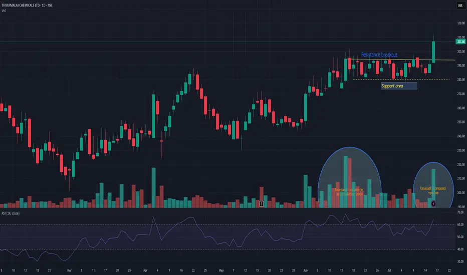
TIRUMALCHMTIRUMALCHM has given resistance breakout with decent volume. Another good thing is unusual volume increased in accumulation zone. Support can be seen near 280 levels. There is high probability that this time it may push the stock in to trend change and may take momentum to the next level. Keep it on radar.
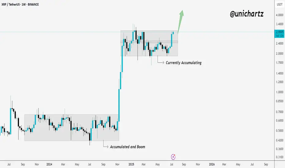
Accumulation Ending? XRP Showing Signs of BreakoutXRP is in the process of breaking out of its weekly accumulation range.
The last time we saw this kind of structure — it led to a massive move.
Now, price is pushing toward the top of the zone again… and momentum is picking up.
If it closes strong above this level, it could trigger the next big leg higher.
Stay alert — this could be the start of something big!
DUCKCHAIN LONGDUCKCHAIN is currently primed to move out of its accumulation zone. In fact, it is lagging behind alt coins who has already made there way out of their accumulation channel. Duckchain is in a prime location to see massive moves from this zone. First major target area is .00448 region. We are currently lookinng at using 4x leverage in the futures market. This will also give us a 1:4 risk reward from these levels.

Stay liquid my friend $HYPEI am going to enjoy GETTEX:HYPE , it is very liquid, a great mover. Price discovery will be amazing when it comes. But right now we are in the accumulation phase
With a nice WXY #elliotwavepattern

Gold Xau (tf1M) Last Phase AccumulationGold Xau Last Phase Accumulation incoming 👇
"Way from 1500 to 4100" (+175%)
OANDA:XAUUSD
⏰ TimeFrame 1 Month
👉 Go to last phase accumulation
👉 White Trace
👉 Green Trace
👉 EMA 200 1M (White)
👉 Fib Measure as pattern "ExPanding Triangle" ( blue stick )
👉 Potential +175%
✔️Logarithmic (Log) Chart & Fib

$TTD to go below $60- Investors were paying too much for growth in NASDAQ:TTD
- It operates in a very competitive space.
- Leadership is solid however eps growth and gaap eps tells a different story. EPS growth is impressive but gaap eps is terrible. Stock based comp remain consistent but somehow gaap eps isn't growing as fast as non-gaap eps.
- Nonetheless, here's fair value for NASDAQ:TTD
Year | 2025 | 2026 | 2027 | 2028
EPS | 1.79 | 2.21 | 2.85 | 3.89
EPS growth | 9.54% | 23.13% | 28.92% | 36.66%
For eps growth of 20%+ and company with a moat. Fair forward EPS is 30
Year | 2025 | 2026 | 2027 | 2028
Bear Case ( p/e 20 ) | $35 | $44 | $57 | $77
Base Case (p/e 30 ) | $53.7 | $66.3 | 85.5 | $116
Bull Case (p/e 35 ) | $62 | $77 | $99 | $136
Idea is to buy close to fair value and hold it for period when there is optimism in the market or euphoria and/or valuation expansion where stock is assigned higher forward p/e multiple.
For me, NASDAQ:TTD is a buy under $65. However, I have started with a starter position at 80s because you many times good stocks bottom above its fair value.
I plan to build a position in increments because you never know how much stock will undercut on pessimism. However, the above intrinsic value based on EPS should help to identify the ranges

BILI | China's Gaming Industry will RiseBilibili, Inc. is a holding company, which engages in the provision of online entertainment content. The firm enables broad video-based content consumption scenarios centered around professional user generated videos supplemented with live broadcasting, occupationally generated videos, or occupationally generated videos. The company was founded by Xu Yi in June 2009 and is headquartered Shanghai, China.

Google is Taking a Break and accumulating for the 2nd run !Google returns to the inflection zone we had previously studied. This is good news because, after pulling back, we got a bounce in the same inflection zone.
What does this mean?
It means that the price is more than ready to continue its upward trend; however, it is just forming an accumulation pattern, where it could resume its upward movement at any moment.
Key points to follow:
Markets, in general, are bullish, and we are in a week of high market euphoria, which could support the price to continue rising.
Google continues to report positive news within the company.
Google’s prices have increased, indicating that higher figures may be reported in their next earnings report.
In my opinion, Google will remain in an accumulation range this week—it's a pattern where the price will hold steady this week before its next bullish run.
Thank you for supporting my analysis. TRADE SAFE! Best regards."

Nvidia So close to earnings report ! here is my analysis... In this chart, I haven't moved anything at all since my previous analysis of Nvidia. The price is making its natural movement just as we’ve been predicting.
As you can see, the last candle closed by bouncing off my order block and following the pattern of my forecast arrow.(yellow dotted arrow) Based on the price behavior, we can predict that as it gets closer to November 20 — the earnings report date — it will simply be accumulating.
Nvidia's last earnings reports have been phenomenal, and I don’t doubt that this report will be a trigger for the price to make a decision.
But for now, we’ll only see the price in a range until a few days before the report, when we’ll see those high-volume candles that will drive the price in a single direction.
Which direction? The one the report indicates.
Best regards!

Hooking the BigTime: Reeling in Profits Before the Tide Turns!💡 Overview :
This trade setup focuses on accumulation and distribution zones of BITGET:BIGTIMEUSDT.P identified through technical analysis, inflow/outflow metrics, open interest, and funding rates. Based on the data provided, we're targeting a strategic entry point during accumulation, a clear stop-loss level, and a take-profit level based on historical resistance. Let’s dive into the why , what , when , how , and where of this trade.
🐝 Why This Trade?
Accumulation Phase 🟢:
The accumulation zone between $0.10 and $0.12 is based on increased inflows (green bars) combined with strong support levels where buying pressure was historically dominant.
Long/Short Sentiment 📊:
A favorable long-short ratio around these levels signals traders expecting upward momentum, supporting the accumulation narrative.
Price Bounce Potential 🚀:
The charts indicate significant price rebounds after reaching this zone, supported by previous spikes in Open Interest and inflows, signaling that buyers are active here.
🐝 What’s the Plan?
We aim to enter the market within the accumulation zone between $0.10 and $0.12 and exit at a key distribution level of $0.15 for a calculated risk/reward trade.
🐝 When?
Entry Point 📈:
Enter the trade when the price touches or consolidates between $0.10 and $0.12 , confirming that accumulation is happening (evident by inflows outweighing outflows).
Exit Point 💰:
Exit when the price hits $0.15 , which aligns with a previous resistance level where heavy distribution and outflows were seen, suggesting a potential reversal.
🐝 How?
Risk Management Strategy 🔒:
Stop-Loss :
Place your stop-loss just below $0.10 to protect against downside risk in case the market fails to hold the accumulation zone.
Take Profit :
Set your take-profit level at $0.15 , which is the projected distribution zone , as prices have historically struggled to break past this level without major outflows.
🐝 Where are the Key Levels?
Accumulation Zone 🟢:
$0.10 - $0.12
Look for inflows > outflows and rising open interest to confirm accumulation.
Take Profit Level 🏆:
$0.15
Previous resistance and outflow spikes suggest this is a key distribution zone.
Stop-Loss 🛑:
Below $0.10
To protect against losses, use a tight stop-loss just below this level where strong support is expected.
🐝 Trade Summary 📝:
Entry : $0.10 - $0.12 (Accumulation Zone)
Take Profit : $0.15 (Distribution Level)
Stop-Loss : Below $0.10
📊 Indicators to Watch :
Long/Short Ratio : Favorable for longs near accumulation.
Net Inflows/Outflows : Inflows must exceed outflows in the accumulation phase.
Open Interest : Look for peaks to signal strong market activity before a potential breakout.
🚨 Final Thoughts :
This trade idea relies on well-established support at $0.10 - $0.12 and anticipates a rebound towards $0.15 , where distribution pressure might cause a reversal. Risk is managed with a stop-loss just below the accumulation zone, and profits are locked in at the $0.15 level.
Good luck! 🍀📈

Ethereum just entered an accumulation phase after the breakoutEthereum just broke out of the months-long channel, and in this case, we didn’t see a breakout with strength and volume. However, ETH is entering an accumulation phase and will consequently need to make a decision to break out and rise back to last month's levels.
Just remember that the backbone of all cryptocurrencies is Bitcoin, and if Bitcoin decides to go up, the entire crypto market will rise as a result. So, I invite you to check out my Bitcoin analysis.
Thanks for supporting my analysis.
Good luck!

Dark Pool Support of the Market PatternNASDAQ:AVGO had a Push reversal followed by a moderately sized white candle = Dark Pool Support of the Market followed by pro traders buying and then some investors buying as well.
Can you see the systematic, aka controlled, buy zone?

Ethereum still in accumulation zone, what's next?After Ethereum has been in a downward channel, it breaks the sequence at point #4, which remains in the accumulation range from previous days. This zone is extremely important because, as you can see, it has been moving within this area for several days, which means that the price could gain strength at any moment and start a bullish run. But NOTE: as long as the price remains within the channel, there will be no bullish run. We need to wait for the price to break out of the downward channel to confirm that it is heading back to the supply zone.
Thank you for supporting the analysis. ETH is at a point where adding a position might be considered; let’s hope the price makes a decision soon.
Thankyou for supporting my analysis i invite you to visit my analysis on Bitcoin
Use bitcoin price movement as a base of all the crypto market trend.
Best Regards

ETH Accumulating possible breakout (Very Bullish) Ethereum is still in the liquidity zone, but there is good news, first of all is that it has stayed in that zone for several days accumulating. Second, ETH has shown a lot of strength over the last 3 days, reaching up to $3,700. And the best part, as you may have seen in my Bitcoin analysis, is that the price is close to making a strong bullish move. This suggests that ETH and other coins will also gain strength and move in a bullish direction.
The key for Ethereum is to wait for it to break out of this downward channel. I believe it has been following a bearish sequence for a long time, but these last few days have been very positive as Bitcoin starts to gain momentum, and we are also seeing ETH begin to gather volume and buying pressure.
We will be keeping a close eye on the market in the coming days.
Thank you for following and supporting my analysis; we have been predicting every price movement according to a positive forecast.
Best regards.

UMA - Three D(r)ives Down PATTERNUMA is approaching an ideal buy-back zone whilst forming an important chart pattern - the Three Dives Down Pattern.
This pattern goes by many names including Three Drivers, Three Drives Down and Three Dives Down (which is the one I prefer to use). This pattern is bearish for the SHORT term, but bullish for the NEAR and LONGER term.
It's important to note that this analysis is from a macro timeframe, with the aim on identifying the key buy-back or re-accumulation zone. From the daily and lower timeframes, the price could easily increase by large amounts however, keep in mind we're looking for an accumulation zone not for swing trades in this post.
________________________________
BINANCE:UMAUSDT

Rapid Accumulation Pattern: COHRNYSE:COHR rebounded upward from a strong support level due to Rapid Accumulation by Derivative Developers. The company had a good earnings report on August 15th. This is NOT an all-time high. A shift to a platform or sideways trend would be ideal to reset for the next swing-style run. Chaikin Osc is overextended and floating as oscillators tend to do. Sideways trends pattern that out rather quickly most of the time.

$IBM Support Levels HoldingNYSE:IBM did not have a great earnings report for the 1st Quarter 2024, but 2nd quarter improved. The stock has one of the better charts in the Dow 30 components. It has held up better than most of the Dow components, except for those stocks that are in buyback mode. It has been tapering off its buybacks for 2 quarters. So the gains holding above the support lows are not from buybacks. There are accumulation patterns and pro trader activity in the mix. One to watch for swing trading potential.

NOCIL | SWING | LONG | ACCUMULATION PHASEPrice in an uptrend structure.
Price is creating a nice contraction over 20 EMA.
Price has been accumulating in a range from past few years and now it is ready to breakout of it.
It seems ready to break out of the previous ATH.
Volume is also drying up.
