ARTRADE has a lot to prove. ARTRADE remains in a clear downtrend, with price continuing to respect lower highs and lower lows. Structure hasn’t shifted yet, and price is still trading below all major moving averages, keeping the broader bias bearish.
The key focus is the highlighted reclaim zone overhead. This area has acted as heavy resistance and lines up with high volume on the profile. A clean reclaim and acceptance above this level would be the first signal that downside momentum is fading and a relief move could develop.
Until that happens, ARTRADE is still in a prove-it zone. Any upside move into resistance is counter-trend, while failure to reclaim keeps price compressed near the lows and vulnerable to further downside or extended consolidation.
Bias remains cautious until reclaim is confirmed.
ATR

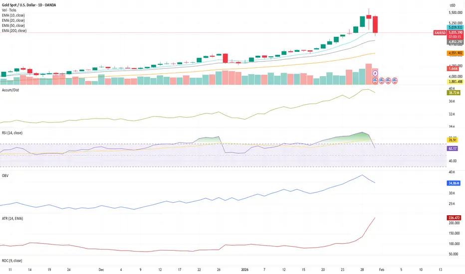
How ATR reveals volatility regime shifts (and why it matters)This chart is a great example of how volatility regimes shift, and how ATR (Average True Range) can help visualize those changes in real time.
For most of this advance, price moved in a low-volatility trend environment — clean structure, steady EMA alignment, and controlled daily ranges. This type of environment often supports sustained directional movement as long as volatility remains contained.
Recently, however, we can observe a sharp expansion in ATR, signaling a transition from volatility compression to volatility expansion.
This matters because:
• Rising ATR reflects increasing daily price range
• Expanding volatility often appears near structural inflection points
• Market behavior typically shifts from trend efficiency → structural normalization
In other words, when ATR expands rapidly after a prolonged advance, it often indicates that market conditions are changing, even if price remains elevated.
From a structural perspective, this creates an environment where:
• Trend continuation becomes less stable
• Mean reversion probability increases
• Market participants reassess positioning
• Price discovery becomes more volatile
Rather than implying direction, ATR expansion helps identify regime transitions — moments where markets move from order → disorder → rebalancing.
This is why volatility is just as important as price.
Understanding how volatility behaves provides critical context for interpreting trend quality, sustainability, and structural risk — especially after extended moves.
This does not imply directional certainty.
It simply highlights how markets evolve through phases of compression and expansion, and how ATR helps visualize those transitions in real time.
BTC market regime change
BTC daily market regime changed.
Market environment looks different from last week.
I track market environment using:
- Trend vs Range
- High vs Low Volatility
Trend + High Vol -> Range + High Vol

How to Use ATR in TradingViewMaster ATR using TradingView's powerful charting tools in this step-by-step tutorial from Optimus Futures.
ATR, or Average True Range, is a volatility indicator that helps traders measure market movement, set appropriate stop losses, and adjust position sizing based on current market conditions.
What You'll Learn:
Understanding ATR as a volatility measurement tool that tracks price movement regardless of direction
How ATR calculates the average range between highs and lows over a specified period — typically 14
Why rising ATR signals increasing volatility and larger price swings
Why falling ATR indicates decreasing volatility and quieter market conditions
Using ATR to set dynamic stop losses that adjust to current volatility rather than arbitrary dollar amounts
How to calculate stop distances by multiplying ATR by factors like 2x or 3x
Applying ATR for position sizing to maintain consistent risk across different volatility environments
Setting profit targets based on ATR multiples to align with actual market movement
Filtering trade setups using ATR levels to avoid low-volatility periods or confirm breakout momentum
How to add ATR on TradingView via the Indicators menu
Understanding the default 14-period setting and how shorter or longer periods affect responsiveness
Practical examples using the E-mini S&P 500 futures chart
Applying ATR across daily, weekly, and intraday timeframes for risk management and trade planning
This tutorial is designed for futures traders, swing traders, and risk-focused analysts who want to integrate volatility-based risk management into their trading approach.
The methods discussed may help you set smarter stops, size positions appropriately, and adapt your trading strategy to changing market conditions across multiple markets and timeframes.
Learn more about futures trading with TradingView: optimusfutures.com
Disclaimer
There is a substantial risk of loss in futures trading. Past performance is not indicative of future results. Please trade only with risk capital.
We are not responsible for any third-party links, comments, or content shared on TradingView. Any opinions, links, or messages posted by users on TradingView do not represent our views or recommendations.
Please exercise your own judgment and due diligence when engaging with any external content or user commentary.
This video represents the opinion of Optimus Futures and is intended for educational purposes only. Chart interpretations are presented solely to illustrate objective technical concepts and should not be viewed as predictive of future market behavior.
In our opinion, charts are analytical tools, not forecasting instruments.

BTC Daily Swing Lab: 50/200 EMA + ATR Stop (Open-Source StrategyThis is a simple daily swing framework for BTC and other major crypto pairs.
Rule 1: Only trade long when the 50 EMA is above the 200 EMA.
Rule 2: Use an ATR-based trailing stop.
Rule 3: Exit when volatility catches up or the trend breaks.
I built this as a lab tool to study daily swings on BTC, ETH, SOL and other majors without over-complicating the rules.
CORE IDEA
1. Define a bullish regime: 50 EMA above 200 EMA.
2. Only look for long trades inside that bull regime.
3. Use an ATR stop to trail exits instead of guessing tops.
4. Close if the 50/200 EMAs lose their bullish structure.
The goal is not to catch every wiggle. The goal is to ride the middle of big daily moves with clear, testable rules.
HOW I USE IT ON BTC 1D
Timeframe: 1D
Direction: Long-only
I use it to:
* Stay out of chop when the 50 is under the 200.
* Study how ATR stops behave in different BTC cycles.
* Compare mechanical exits to my discretionary levels.
Try it on ETH, SOL or your favorite majors and see how the behavior changes.
HOW TO ADD IT
1. Open BTCUSD and switch to the 1D timeframe.
2. Add “Lab: Daily 50/200 EMA + ATR Stop (Long Only) – by FlyingOceanTiger” from the Indicators & Strategies tab.
3. Open Strategy Tester and scroll through past bull and bear cycles to see how it handled them.
Feel free to fork the code and experiment with your own rules (different EMAs, ATR settings, extra filters). If you build a variation you like, drop it in the comments so I can check it out.
DISCLAIMER
This is a research tool and not financial advice. Always do your own testing and manage your risk.

How to use EMA+ATR scalping - Performance Breakdown📌 EMA + ATR Scalping Indicator – Performance Breakdown (Based on Chart)
This was my first indicator ever (built last year), and seeing its performance on the chart today again reminds me why it worked so well for both scalping and swing-style trend capture.
🔹 What the Indicator Is Doing on This Chart
1. Capturing Trend Direction Early
The combination of the EMA (trend filter) and ATR-based trailing stop (volatility filter) helps the indicator catch directional moves very cleanly.
• During strong directional phases (uptrends or downtrends), the signals appear right as momentum shifts.
• In the first half of the chart, every bearish impulse is detected quickly, and the EMA+ATR cross confirms continuation.
You can clearly see how:
✔ The SELL signals appear early on sustained drops
✔ The BUY signals appear early when bullish momentum kicks in
✔ There are hardly any “late” entries due to ATR’s responsiveness
⸻
2. Reversal Detection Is Smooth & Immediate
One of the strongest parts of this indicator is how it flips direction without delay.
Whenever price breaks the ATR trailing stop from the opposite side:
➡ A reversal signal is generated
➡ The previous directional bias is cancelled
This prevents holding a wrong-bias trade for too long.
Even in sideways phases, reversals are caught fast—helping scalpers avoid getting stuck.
⸻
3. Handles False Breakouts Surprisingly Well
This chart shows multiple places where price tries to break in one direction but gets rejected immediately.
The indicator reacts quickly because:
• EMA confirms the micro-trend
• ATR trailing stop invalidates fake moves
• The system flips signal as soon as true momentum appears
This “two-layer confirmation” makes the signals tighter and reduces whipsaws.
So yes—capturing false breakouts and flipping instantly is one of the biggest USPs of this script.
⸻
4. Consecutive Candle Momentum Logic
The script includes a 5-bar consecutive breakout filter, which increases the probability that a breakout is real.
This further improves:
✔ Trend continuation entries
✔ Avoidance of weak or random breakouts
✔ Early detection of strong impulses
You can see how this filter helps catch those clean legs in the chart’s mid-section.
⸻
🔹 The Grey “No-Trading Zone” — A Very Useful Filter
The grey highlighted vertical bands represent periods when the ATR stays too flat.
Flat ATR = low volatility = trap zone.
The indicator marks these with:
• Grey background shading
• “No Trading Zone” label on the candle
These filtered areas clearly show:
❌ Avoid entering — market is undecisive
❌ Signals here are often fake
✔ Wait until volatility expands again
This simple visual filter improves discipline and prevents unnecessary losses.
⸻
🔹 Overall Performance on the Chart
✔ Strong Trends → Clean Signals
The indicator rides the trend well (both up and down), capturing the majority of each move.
✔ Reversals → Early Detection
Quick flips keep you aligned with the new direction without holding drawdowns.
✔ Sideways Market → Controlled Exposure
ATR-flat grey zones protect you from chop.
✔ False Breakouts → Immediate Recovery
When the initial direction fails, the indicator immediately prints the opposite signal.
✔ Scalping & Swing Both Supported
The fast ATR logic supports scalpers,
the EMA confirmation supports swing traders.
⸻
🔹 Why This Indicator Still Feels Powerful (Even Today)
Because it is built on three timeless trading foundations:
1. Trend logic (EMA)
2. Volatility logic (ATR)
3. Breakout momentum (5-bar filter)
These three combine in a very natural way—hence the clean signals you see on the chart.

Trading Psychology Bias Lesson: BTCUSD 1D ATR Position SizeSummary
Bias shifts judgment under stress and often decides outcomes before the order ticket. This idea converts trading psychology into rules you can apply on BTCUSD now. It uses fixed ATR stops, pre defined entries and exits, a written disconfirming note before any order, and decision grades based on rule adherence. The goal is tighter drawdowns and consistent execution across regimes.
Live context
Price 123,102
SMA 50 114,314
EMA 200 106,289
ATR 14 daily 2,882.52 which is 2.34% of price
Distance to SMA 50 is 8,788 which is 7.14%
Distance to EMA 200 is 16,813 which is 13.66%
2 x ATR equals 5,765.04 which is 4.68%
Why psychology decides the trade before entry
Real trading includes noise, limited attention, and emotion. The result is bias, a stable tendency that pulls choices away from the written rule. Bias creeps into 4 moments: setup definition, entry trigger, position size, exit and review. The fix is structure. Use 5 blocks: a 1 sentence setup, entry and stop and trail defined with ATR, a written disconfirming note, a higher timeframe check, and a post trade grade by rule adherence rather than outcome.
Theory. Core biases you must neutralize
Loss aversion . Loss pain exceeds gain pleasure and leads to widening stops or cutting winners early. Fix . Initial stop equals 2 x ATR. Trail equals 1 x ATR or a close through a moving reference. Never widen stops.
Confirmation bias . You search for evidence that agrees with your idea. Fix . Write 1 disconfirming fact before any order. Check the next higher timeframe. If it disagrees, cut size by 50% or skip.
Anchoring . You fixate on entry or a round level. Fix . Define exits on structure with ATR or a moving average close. Name the anchor in notes to reduce its pull.
Recency and availability . You overweight the last 1 to 3 candles. Fix . Use a 20 bar context rule and a weekly system review.
Overconfidence . After a win trade count and size increase without any change in edge. Fix . Cool down 2 minutes after every exit and halve next size after a large winner.
Herd and gambler’s fallacy . Late entries on wide candles and belief that streaks must continue or must reverse. Fix . Only take trades with projected reward to risk at least 2 to 1 at the planned stop and avoid high impact events.
Hindsight and outcome bias . You judge by result and rewrite rules after 1 loss. Fix . Save entry and exit screenshots and grade by rule adherence.
Status quo and endowment . You sit in positions you already own while better setups exist. Fix . Monthly retest of every holding against current rules.
Three guardrail rules for BTCUSD
Stop discipline. Initial stop equals 2 x ATR. Trail winners by 1 x ATR or by a daily close through SMA 50. Do not widen stops.
Decision hygiene. Before every order write 1 disconfirming fact and check the next higher timeframe. If the higher timeframe disagrees, cut size by 50% or skip.
Quality floor. Projected reward to risk is at least 2 to 1 at the initial stop distance.
BTCUSD 1D continuation plan with exact math
This plan assumes a breakout continuation and uses your live ATR 14. All digits are based on ATR 2,882.52 and a price above SMA 50 and EMA 200.
Setup in 1 sentence . Trend continuation long on a daily close above the recent swing with SMA 50 rising and 20 bar context bullish.
Entry trigger . Close above 124,200 confirms continuation.
Initial risk . 2 x ATR equals 5,765.04. Stop equals entry minus 5,765.04. For 124,200 the stop is 118,434.96.
Targets . 1R target equals entry plus 5,765.04 which is 129,965.04. 2R target equals entry plus 11,530.08 which is 135,730.08.
Sizing example . Equity 20,000. Risk per trade 1% equals 200. Position size equals risk divided by stop distance which is 200 ÷ 5,765.04 equals 0.0347 BTC. Notional at 124,200 is about 4,308.
Management . Trail by 1 x ATR which is 2,882.52. Move the stop only with the trail. Ignore the first single red candle to reduce recency effects.
Exit logic . Exit on a daily close below the 1 x ATR trail or use a time stop after 12 bars if 2R is not reached.
Journal cue . Before entry write 1 disconfirming fact. After exit save 2 screenshots and grade by rule adherence.
Why each step neutralizes bias in real time
Loss aversion is capped because the stop distance is fixed by ATR and never widened. The trail is mechanical.
Confirmation is checked by the written disconfirming fact and the higher timeframe review that can force a skip or a 50% position cut.
Anchoring is reduced because exits reference ATR and structure instead of entry or round numbers.
Recency is filtered by the 20 bar rule and by a weekly system review that ignores single outcomes.
Overconfidence is constrained by a 2 minute cool down and 50% next size after a large winner.
Mean reversion companion inside an uptrend
Use this only while SMA 50 and EMA 200 slope up and price trades above both averages.
Context . Pullback forms inside the 20 bar range toward short term support while SMA 50 rises above EMA 200.
Entry . Bullish rejection from a prior swing zone or a daily close back above the intraday pivot after a 2 to 3 day pause.
Risk . Initial stop equals 1.5 x ATR which is 4,323.78.
Sizing . Risk per trade 1%. Position size equals risk divided by 4,323.78. With equity 20,000 and risk 200 the size equals 0.0463 BTC.
Exit . First scale at 1.5 R. Stop to break even only after a daily close above SMA 50. Final exit at 2 R or on a daily close back into the pullback range.
Bias note . Write 1 anchor you feel and 1 disconfirming fact that would cancel the setup.
Decision checklist to paste into chart notes
Setup in 1 sentence written before entry
Entry level, initial stop, trail method defined
1 disconfirming fact written and verified
Higher timeframe checked and size adjusted if needed
Projected reward to risk is at least 2 to 1
Screenshots saved at entry and exit
Decision grade recorded by rule adherence
Position size rule you can audit weekly
Account equity E. Risk per trade equals 1% of E by default.
Stop distance equals the ATR multiple from the plan.
Position size equals risk divided by stop distance. If required size is not tradable, skip the trade.
Bias symptoms you will see on the BTCUSD chart and the fix
Loss aversion . Stops drift lower while price falls. Winners are cut early. Fix . 2 x ATR hard stop and 1 x ATR trail.
Confirmation . Indicators are added until they agree with your view. Fix . 1 written disconfirming note and a higher timeframe check.
Anchoring . Waiting to exit when price returns to entry or to a round level. Fix . Structure based exits and naming the anchor in notes.
Recency . Judgment based on the last 2 candles. Fix . 20 bar context rule and a weekly system review.
Overconfidence . Trade count jumps after a win. Fix . 2 minute cool down and 50% next size after a large winner.
Herd and gambler’s fallacy . Late entries on wide candles and streak thinking. Fix . 2 to 1 minimum reward to risk and a news ban during known high impact windows.
Hindsight and outcome bias . Rewriting rules after 1 result. Fix . Grade by rule adherence and keep entry plus exit screenshots.
Status quo and endowment . Sitting in flat positions you already own. Fix . Monthly retest of every holding against current rules.
Worked example with our numbers
Assuming a daily close above 124,200 triggers the continuation. Initial stop equals 2 x ATR which is 5,765.04. Stop equals 118,434.96. 1R target equals 129,965.04. 2R target equals 135,730.08. Equity equals 20,000. Risk equals 200. Position size equals 0.0347 BTC. As price advances you trail by 1 x ATR which is 2,882.52 and you move the stop only when the trail shifts. If the trail is hit you exit. If 12 bars pass without the 2R target you exit on time and log the decision. You do not widen the stop. You do not add size after a win. You grade the decision by rule adherence.
If momentum stalls
If a daily close rotates down toward 121,000 to 121,500 and momentum weakens, shift to neutral. Wait for a fresh setup that passes the 2 to 1 test at the planned stop.
Do not react to a single candle. The plan lives on the daily chart.
Comparator and scorecard
Use simple Buy and Hold on BTCUSD as the baseline. Score the plan by Return divided by Drawdown, Max Drawdown, and percent of trades executed exactly as written. A smaller drawdown with steady execution beats a higher raw return with poor adherence. Your best forward indicator is the discipline metric you log each week.
Education and analytics only. Not investment advice. Test any rule with historical data before risking capital.

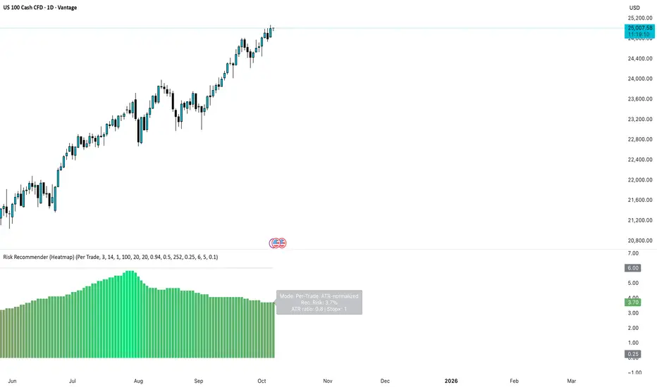
Stop Guessing Risk — Start Measuring It Like a QuantStop deciding risk based on emotion or setup. Do what quants do. Measure volatility and let it define your risk.
Most traders size positions emotionally:
• "This setup looks strong, I’ll double size."
• "I’m not sure, so I’ll go small."
→ Both are inconsistent and lead to unstable performance.
Professionals and systematic traders use a simple principle:
Risk is not a feeling, it’s a function of volatility.
⚙️ The concept
Markets breathe in volatility cycles. When volatility expands, risk should contract.
When volatility contracts, risk can expand.
Your position size should adapt automatically to those cycles.
This Idea demonstrates the logic behind the new 📊 Risk Recommender — (Heatmap) indicator, a tool that quantifies how much of your equity to risk at any time.
🧮 How it works
The indicator offers two complementary modes:
1️⃣ Per-Trade (ATR-based)
• Compares current volatility (ATR) to a long-term baseline.
• When market noise increases, it suggests smaller risk per trade.
• When conditions are quiet, it recommends scaling up—within your own floor and ceiling limits.
2️⃣ Annualized (Volatility Targeting)
• Computes realized and forecast volatility (EWMA-style).
• Adjusts your base risk so your overall exposure stays near a target annualized volatility (e.g., 20%).
• The same math used in institutional risk models and CTA frameworks.
🎨 Visual interpretation
The heatmap column acts as a “risk thermometer”:
• 🟥 Red = High volatility → scale down
• 🟩 Green = Low volatility → scale up
• Smoothed and bounded between your chosen floor and ceiling risk levels.
• The label shows current mode, recommended risk %, and volatility context.
💡 Why this matters
Risk should *never* depend on how confident you feel about a trade.
It should depend on how loud or quiet the market is.
Volatility is the market’s volume knob and this indicator helps you tune your exposure to the same frequency.
📈 Example use case
• NASDAQ volatility spikes → recommended risk drops from 3.0% → 1.2%
• SPX volatility compresses → risk rises gradually → 4.5%
You stay consistent while others overreact.
🚀 Automating it
My invite-only strategy applies this logic automatically to manage exposure in real time.
Combine it with the Risk Recommender indicator for full transparency and adaptive position sizing.
🎯 Summary
✅ Stop guessing risk size.
✅ Let volatility guide you.
✅ Keep risk constant, results consistent.
That’s how quants survive. That’s how traders evolve.
#RiskManagement #Volatility #ATR #PositionSizing #Quant #TradingStrategy #AlgorithmicTrading #SystematicTrading #Portfolio #EWMA #RiskControl
Follow-Up: Non-Farm Moves from FridayHi All,
Following up on the range (size of the move) after non-farm on Friday to see how close our range expectation estimates were (see the earlier video post linked here for that).
The actual number came in pretty poor and worse than expected at 22k (vs 75k expected).
The move on the Non-farm release itself was actually quite muted with roughly a 20pt move on both sides of our VWAP starting point. But the real move came around 30 minutes into the US open where we saw a quick decline down to our lower boundary (50pts lower at 6470) and then briefly over-ran to 6450. But we settled and that 6470 became support for most of the session before reverting back to that declining VWAP to finish the day around 6490.
So, what's the lesson here: a bit of time pre-framing the possibilities for moves in either direction using a combination of stats (ATR, standard deviation of range), other technical analysis tools (support/resistance, VWAP, vol profile) along with experience can help frame the day and the important levels. Use this to start to decide what tools to pull out of the toolbox (trading strategies) and where to initiate trades.
If you find this helpful and would like to see more please let me know.
Happy Trading!

Its Non-Farm: How much will ES Move?Hi all - Happy Non-Farm Friday!
I haven't done this in a while and thought it might be helpful to share my process for estimating the size of the move that we may get on ES after the Non-Farm Payrolls data is released.
I'm not trying to make a prediction on direction here - but more understand where the boundaries could be so I can determine how to trade this (what trading tool I can pull out of my box) once the announcement comes out.
Hope it helps and please let me know if you find it useful and I'll create more posts .
Cheers,
Jeff

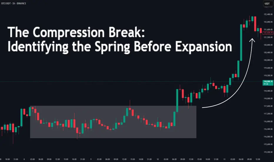
The Compression Break: Identifying the Spring Before ExpansionDifficulty: 🐳🐳🐳🐋 (Intermediate)
This article is for traders who want to recognize and trade explosive moves that form after periods of tight price compression. Perfect for those familiar with structure, volume, and volatility concepts.
🔵 INTRODUCTION
Price doesn’t move in a straight line — it breathes. It expands when there’s imbalance, and it compresses when the market is building energy. The most powerful moves often start with a compression phase — a tight, controlled price range — before a sudden breakout.
Learning to spot these “springs” before they snap can give you trades with excellent risk/reward ratios and clear invalidation points.
🔵 WHAT IS COMPRESSION?
Compression occurs when price volatility shrinks, and each swing becomes smaller than the last. It looks like price is being “squeezed” between converging support and resistance levels.
Common causes of compression:
Liquidity build-up before a major session open
Market waiting for a news release or key event
Institutional positioning before a drive
The tighter the range, the bigger the potential release.
🔵 WHY IT MATTERS
Compression is important because:
It reveals where the market is balanced and undecided
It creates a high-energy environment — a small push can trigger big moves
It offers tight stop-loss placement and clear breakout targets
Think of it like a coiled spring: the more it’s compressed, the more explosive the release.
🔵 HOW TO IDENTIFY COMPRESSION
1️⃣ Price Action Clues
Consecutive smaller candles with overlapping ranges
Lower highs + higher lows (triangle formation)
Reduced wick size in the final stages before breakout
2️⃣ Volume Clues
Declining volume during the squeeze
Sudden volume spike as breakout begins
3️⃣ Volatility Clues
ATR (Average True Range) dropping to local lows
Bollinger Bands narrowing (optional)
🔵 TRADING THE COMPRESSION BREAK
Step 1: Define the Box
Mark the high and low of the compression range. This will be your breakout reference.
Step 2: Wait for Volume Confirmation
Avoid jumping in on the first tick outside the box. Wait for a volume surge or strong close beyond the boundary.
Step 3: Trade in the Breakout Direction
Entry: After confirmed breakout close
Stop Loss: Inside the compression range
Target: Equal to the height of the compression box or previous swing high/low
🔵 EXAMPLE SCENARIO
Price compresses for more then 10 bars into a tight range
Volume steadily declines → ATR hits a local low
A big body bullish candle breaks above range high with 2× average volume
Entry at breakout close, stop inside range, target = box height projected upward or 1:2 RR
🔵 ADVANCED TIPS
Align with higher timeframe trend for higher probability
Watch for false breakouts (liquidity sweeps) before real move
Combine with order blocks or VWAP to refine entries
Use session timing — many compression breaks happen at market opens
🔵 CONCLUSION
Compression is the market’s way of loading a trade with potential energy. When you spot it, you’re seeing the buildup before the burst. Trade it with patience, volume confirmation, and proper structure, and it can become one of your highest-probability setups.
Have you traded compression breaks before? Share your best example in the comments!
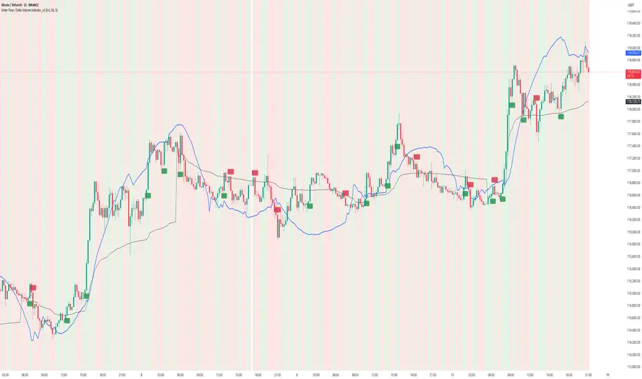
How to use Order Flow / Delta Volume Indicator for IntradayWhat you’re seeing
This idea visualizes an intraday session with my Order Flow / Delta Volume study applied. The chart overlays three things that matter for short-term context:
• Cumulative delta (blue line) : running sum of delta, rescaled so it’s easy to compare to price swings.
• VWAP (grey line) : session anchor for bias and mean-reversion context.
Signal logic (kept simple & rule-based)
A bar is considered imbalanced when one side’s volume dominates the bar’s total volume.
• Imbalance: upVol / totalVol > 0.60 → buy-side imbalance; downVol / totalVol > 0.60 → sell-side imbalance.
• Trend/strength filters (optional but enabled here):
• VWAP filter → longs only when price > VWAP; shorts only when price < VWAP.
• RSI(14) filter → longs only if RSI > 50; shorts only if RSI < 50.
• Noise throttle: minimum 5 bars between signals + price must exceed the prior close by ±ATR(14) to avoid tiny wiggles.
These rules try to capture moments when flow (delta) and context (VWAP/RSI) line up, while the ATR and cooldown help skip low-quality, back-to-back prints.
How to read the chart
• Rising blue cumulative-delta with price above VWAP → constructive backdrop for longs; fading/ranging delta warns to de-risk or wait.
• Green “ BUY ” labels plot when a buy-side imbalance clears the filters; red “ SELL ” labels mark sell-side imbalances with bearish context.
• Background tints briefly highlight where the raw imbalance occurred (light green/red), even when a trade filter blocks a signal.
Walk-through of the attached example
• Trend leg after a base: cumulative delta turns up first and price reclaims VWAP → several filtered BUY signals print into the push; ATR gate avoids chasing the very first small upticks.
• Mid-session chop: delta flips around the zero line and price hovers near VWAP → far fewer signals; most imbalances are filtered out by RSI/VWAP or fail the ATR move requirement.
• Late expansion: a swift VWAP reclaim with strong positive delta → clustered BUY signals that track the follow-through, while opposing sell imbalances near VWAP are rejected by filters.
Inputs used on this chart
• Imbalance threshold: 0.60
• VWAP filter: On
• RSI filter: On, threshold 50
• Cooldown: 5 bars
• ATR length: 14
Notes
• This is not a trade recommendation. Signals highlight where participation leans, not certainty of direction.
• Best paired with your execution plan (risk unit, stop location, partials near prior S/R or VWAP).
• In fast spikes, delta can be extreme—ATR and the cooldown help, but slippage and whipsaws are always possible.
• For instruments with very low volume or during illiquid hours, consider raising the imbalance threshold or disabling signals altogether.
Takeaway
Order-flow imbalance by itself fires often; layering VWAP, RSI, and an ATR-based movement check concentrates signals to moments when both flow and context align. The attached session shows that behavior clearly: fewer prints in chop, more conviction when cumulative delta trends and price holds its side of VWAP.
Educational post for discussion only. No financial advice.
ATR/USDT Facing the ResistanceHello everyone, I’m Cryptorphic.
I’ve been sharing insightful charts and analysis for the past seven years.
Follow me for:
~ Unbiased analyses on trending altcoins.
~ Identifying altcoins with 10x-50x potential.
~ Futures trade setups.
~ Daily updates on Bitcoin and Ethereum.
~ High time frame (HTF) market bottom and top calls.
~ Short-term market movements.
~ Charts supported by critical fundamentals.
Now, let’s dive into this chart analysis:
ATR is currently facing resistance between $0.0165 and $0.0211. If ATR fails to break above this resistance level, a downtrend is likely, with a potential drop to the $0.0047-$0.0064 range.
On the upside, a breakout above this resistance will confirm a bullish rally for ATR, with potential gains of over 740% from the support level.
The RSI is trending below the middle line and is likely to reach the oversold zone, indicating a possible bearish move.
Key Levels:
- Primary Resistance: $0.0165-$0.0211.
- Primary Support: $0.01193.
- Lower Support/Accumulation: $0.0047-$0.0064.
- All-Time Low: $0.0025.
- All-Time High: $0.105.
- Scenario: Possible rejection, followed by a rebound.
DYOR. NFA.
Please hit the like button to support my content and share your thoughts in the comment section. Feel free to request any chart analysis you’d like to see!
Thank you!
#PEACE

ChopFlow ATR Scalp Strategy (OBV EMA) on MNQThe ChopFlow ATR Scalp Strategy combines a low choppiness regime filter, on-balance volume with EMA confirmation, and ATR-based exits to capture quick micro-trends on the NASDAQ-100 E-mini (MNQ).
Strategy Logic
1. Choppiness Filter:
-Calculate the Choppiness Index over 14 bars.
- Trade only when chop < 60 (trending or mildly trending market).
2. Order-Flow Confirmation:
- Compute OBV and its 10-period EMA.
- Long when OBV > OBV EMA and chop < threshold.
- Short when OBV < OBV EMA and chop < threshold.
3. ATR-Based Exit:
- Exit at a fixed multiple of ATR (stop and profit target both = 1.5 × ATR).
How to Trade It
1. Confirm time chart with MNQ , preferably1-min chart.
2. Enable only the 17:00–16:00 CME session.
3. Look for low choppiness (< 60), then wait for OBV cross.
4. Enter with one-contract size, tight 1.5× ATR stops/profits.
5. Monitor DOM for liquidity shifts around entry levels.

My NQ Long Idea 5/5/2025Been a while but I haven't been posting ideas because I have been scalping and doing smaller time frame trades. I think we have NQ at a nice price level where we might see a bull run soon with the market sentiment slowly "thawing" on the idea of "risk-off" sentiment to "risk-on" sentiment and environment with more uncertainties clearing out of the market scenes.
We have US trying to negotiate deals with many countries including China which is very challenging and we can never know if it will be achieved or not. However, from an economic point of view we can agree that the US economy is in the Neutral-bullish. We have a very bullish price action in the past week or so. We also have healthy economic numbers but it is still unclear until Wednesday.
On Wednesday the FED will speak on this matter and give us some clarity on whether it is a Risk-on or Risk-off environment. Anything will happen but I can see the "Gap" getting filled on FED day due to the SPIKE that will be delivered to us.
Currently Edgefinder tool is giving us 8 for NQ with only the GDP and sPMI scores in the negative. However the net score is bullish and on the positive.
I think 1 of those two ideas will be played out sooner or later anything can happen but from a technical view I would like to see the price reaching the 50% FIB and then take off from there.
It is subjective though and everything in trading is subjective including what I do and say.

Gold Technical Expert Review - 3 May 2025 XAUUSD 1H Forecast
✅ Structure Summary:
The market is in a clear bearish trend, forming lower highs and lower lows.
Price has tapped into a validated 1H LQ Close zone, showing early signs of a bullish reaction.
A large untouched supply zone remains above, possibly acting as a future trap.
🔮 Price Forecast:
📈 Short-Term Bullish Scenario:
Price could bounce from the current LQ Close zone and rally toward the descending trendline.
It may interact with local liquidity pools or minor supply zones on the way — Phase 1 inducement in progress.
📉 Main Bearish Scenario:
Upon reaching the descending trendline or supply area, price could reverse again following the Phase 2 inducement, aligning with the broader bearish structure.
Downside targets include the 3180 region, and potentially lower toward 3150 if momentum increases

USDCAD Technical Expert Review - 3 May 2025✅ Market Structure Summary:
The market entered a distribution phase, clearly forming equal highs and a head & shoulders–like pattern.
After breaking out of the descending wedge, price surged upward to tap the upper supply zone (gray), sweeping liquidity before dropping sharply.
We now see price reacting to a mid-demand zone, with another deeper demand zone resting below.
📍 Key Technical Zones:
🔹 Upper Gray Supply Zone:
This zone was tapped after liquidity was grabbed from the equal highs.
Strong bearish rejection with impulse candles confirms it as a valid shorting zone.
It remains active and could act as a trap if retested without proper bullish structure.
🔹 Mid-Demand Zone (current reaction point):
Price is currently reacting from this area.
Initial bullish reaction is visible, but the reaction isn't strong enough yet to confirm reversal.
Weak buyer pressure (wicky candles) suggests vulnerability.
🔹 Lower Demand Zone (main target if breakdown occurs):
If the current zone fails, price will likely drop toward this deeper demand block, which hasn't been mitigated yet.
This area could offer a more solid foundation for a bullish reversal.
🔮 Forecast Scenarios:
📉 Primary Bearish Scenario:
If price fails to create higher highs from the current mid-demand zone:
Expect a continuation down toward the lower gray demand zone.
If that breaks, price could target the green higher-timeframe demand around 1.37200.
📈 Alternative Bullish Scenario:
If price builds structure and forms a higher high from this zone:
A short-term rally back toward the upper supply zone is possible.
However, without a strong breakout, that area still holds risk for another sell-off.

USDJPY Technical Expert Review - 3 May 2025🔮 USDJPY Price Forecast – 1H Timeframe
📈 Bullish Scenario:
Price may bounce from the LPP Inducement + HL (Higher Low) area and push upward.
The first target would be the upper blue LQ Close zone, which is still untouched.
If we observe weakness or an “M-shaped” reaction within that blue zone, a sell setup could be valid (inducement trap).
However, if price breaks and closes above the blue zone, further bullish continuation is expected — possibly toward the higher green liquidity zone around 147+.
📉 Bearish Scenario:
If the HL (blue zone) fails and breaks down, forming a new Lower Low (LL),
Then we can expect price to retrace toward the lower green demand zone, around 141.000, which aligns with higher timeframe liquidity and unmitigated demand.

GBPUSD Technical Expert Review - 3 May 2025🔮 Price Forecast (Main Scenarios)
📈 Bullish Scenario (if price reacts from current level):
Price may bounce from the current 1H LQ Close zone (gray).
It could rally toward the upper 1H LQ Close zone (purple) to retest it and potentially trigger Phase 2 Inducement.
🎯 First target: 1.33150
🎯 Second target: 1.33450 (just below the 4H LQ Close)
📉 Bearish Scenario (if the current zone breaks):
A clean close below 1.32500 could open the path toward the 4H LQ Close zone.
🧲 Expect potential reversal around 1.31600–1.31800 (major buy zone).

DXY Technical Expert Review - 3 May 2025Weekly Price Reaction Expectations:
Overall, for this week, we expect a price reaction around the ATI candle zone, followed by another potential reaction near the upper LQCLOSE BOX area.
DXY Bullish Momentum Justification:
Additionally, since the LPP or investment liquidity has been consumed, the bullish momentum in DXY appears more justified.

Nifty - moderation of +ve momentum seen on short period charts.Nifty closed with over 1% 21 VWMA was rising, Nifty respected SD+2 resistance today.
23298, 23395 resistance levels for tomorrow.
SD+1 or 23057 acted as major support today, any breach below this and sustaining lower will signal some weakness.
23730 major pivot, as long as this is help, uptrend is intact, and Nifty is in buy on dips.
24060, 23930, 23875, 23790, 23760 major support levels.

what is the most effective indicator?There isn’t a single "most effective" trading indicator that works for everyone, as effectiveness depends on your trading style, strategy, and the market conditions. However, some indicators are considered more versatile or reliable when used correctly. Here's a breakdown to help you choose:
Most Effective for Trends:
Moving Averages (EMA or SMA):
Simple and effective for identifying trends.
Works well in trending markets but less reliable in sideways or choppy markets.
Pro Tip: Combine short-term and long-term moving averages for crossovers.
Ichimoku Cloud:
A comprehensive indicator that provides trend direction, support/resistance, and momentum.
Effective but requires practice to interpret correctly.
Most Effective for Overbought/Oversold Levels:
Relative Strength Index (RSI):
One of the most popular and effective indicators for spotting overbought or oversold conditions.
Works well in both trending and range-bound markets when combined with other tools.
Stochastic Oscillator:
Similar to RSI but includes %K and %D lines for crossovers.
Effective for momentum confirmation.
Most Effective for Volatility:
Bollinger Bands:
Great for identifying periods of high or low volatility and potential breakout zones.
Useful for sideways (range-bound) markets and trend reversals.
Average True Range (ATR):
Excellent for setting stop-loss levels and identifying market volatility trends.
Works well in conjunction with trend indicators.
Most Effective for Momentum:
Moving Average Convergence Divergence (MACD):
Ideal for spotting trend reversals and momentum shifts.
Effective when used with a confirmation indicator like RSI.
Parabolic SAR:
Simple for identifying trend direction and potential exit points.
Works best in trending markets.
Combination for Higher Effectiveness:
Trend + Momentum: Combine EMA with MACD to identify trends and entry/exit points.
Overbought/Oversold + Volume: Use RSI with Volume Indicators (e.g., OBV) to confirm breakouts or reversals.
Volatility + Trend: Use Bollinger Bands with Ichimoku Cloud to spot breakout opportunities with clear trend guidance.

Understanding Average True Range (ATR): A Measure of Market VolaThe Average True Range (ATR) is a technical analysis indicator that measures market volatility. Developed by J. Welles Wilder Jr., the ATR provides traders with insights into price fluctuations, helping them set stop-loss levels, identify breakout opportunities, and assess market conditions.
What is ATR?
ATR represents the average range of price movement over a specified period, capturing the level of volatility rather than the direction of price movement. A higher ATR indicates greater volatility, while a lower ATR suggests a calmer market.
How is ATR Calculated?
The ATR calculation involves three steps:
1. Determine the True Range (TR):
The True Range is the greatest of:
- The current high minus the current low.
- The absolute value of the current high minus the previous close.
- The absolute value of the current low minus the previous close.
2. Calculate the Average True Range:
- ATR is the moving average of the True Range over a specified period (typically 14 periods).
How to Use ATR in Trading
1.Set Stop-Loss Levels:
- Use ATR to place stop-loss orders at a distance that accounts for market volatility. For instance, set a stop-loss at 1.5x the ATR below the entry price in an uptrend.
2.Identify Breakouts:
- Compare current ATR values to historical ATR levels. A sudden spike in ATR often signals a breakout, indicating increased volatility and potential price movement.
3. Determine Market Conditions:
- High ATR values suggest volatile markets, often seen during major news events or market openings.
- Low ATR values indicate a period of consolidation or range-bound conditions.
4. Position Sizing:
- ATR can help calculate position sizes based on volatility, allowing traders to adjust their risk exposure accordingly.
Strengths of ATR
-Versatility:Can be applied to any asset class or timeframe.
- Adaptability:Works in trending and range-bound markets to measure volatility.
- Enhances Risk Management:Helps traders set realistic stop-loss levels based on market conditions.
Limitations of ATR
-Lagging Indicator:ATR is based on historical data and doesn’t predict future price movements.
-No Directional Bias:ATR measures volatility, not the direction of the trend.
-Context Needed:ATR values alone don’t provide actionable signals without additional analysis.
Best Practices for Using ATR
1. Combine with Other Indicators:
- Pair ATR with trend-following tools like moving averages or MACD to validate signals.
2.Adjust Periods:
- The default 14-period setting works well for most markets, but traders can adjust it based on their strategy and timeframe.
3.Use with Breakout Strategies:
- Monitor ATR spikes to identify potential breakout opportunities.
Example of ATR in Action
Imagine Ethereum (ETH) has an ATR value of $50 on a daily chart. A trader planning to enter a long position at $1,800 might set a stop-loss at $1,725 ($1,800 - 1.5x ATR) to account for typical price fluctuations. As the ATR increases to $75 during a volatile period, the trader adjusts their stop-loss level to $1,687.50 ($1,800 - 1.5x ATR), ensuring it reflects the heightened volatility.
Conclusion
The Average True Range is an invaluable tool for traders seeking to understand market volatility and manage risk effectively. While it doesn’t predict price direction, its ability to quantify volatility makes it a key component of any robust trading strategy. Practice incorporating ATR into your analysis to refine your approach and improve decision-making.
