Aave (AAVE): Sellers Taking Over | Looking For Bearish CME FillAave caught our attention with current sell-side dominance, which might lead to a breakdown from the local neckline zone, which then again will lead the price towards the bearish CME gap (to fill it).
What we are looking here is a proper breakdown; after that, we want to see steep movement to lower zones and then a proper MSB to form (which would give us a buy entry)
Swallow Academy
Chart Patterns

$25500 Bitcoin loading in 2026For those looking to invest long term.. This is the year of sitting on your hands. Gather all your funds and get ready to change your life with a $25500 bitcoin. Of course it will not be immediate however this gives you an opportunity to pool your funds for the next pump. Let's go!

GBPJPY next MoveGBPJPY on the 4H timeframe has delivered a clean bearish market structure shift after failing to hold above the prior demand zone, with strong impulsive selling breaking support and confirming sellers in control. The sharp rejection from the upper range followed by continuation candles signals distribution and bearish momentum, while the current consolidation below broken support suggests a classic pullback before potential continuation lower, keeping downside liquidity and previous lows in focus. Fundamentally as of 15 Feb 2026, the pair is pressured by risk-off sentiment, steady Japanese yen demand as a safe haven, and ongoing uncertainty around UK economic growth, inflation trajectory, and Bank of England policy expectations, while yen strength is supported by shifting yield dynamics and cautious global outlook. As long as price remains below the broken support zone, bearish continuation setups, pullback sells, and trend-following strategies remain favored, aligning technical breakdown with macro-driven momentum for high-probability downside opportunities.

Pepe (PEPE): Just Had Market Structure Break, Be Careful!We just had an MSB (market structure break) on PEPE coin, which might result in a bigger movement to lower zones here.
What we are going to look for here is a possible BOS (break of structure). on smaller timeframes, which would be an ideal entry for a short position here (up until our buy entry area).
Swallow Academy

Aptos (APT): Are We Ready To Bounce? | BullishAptos has a good chance for a reversal soon, where the price has had a proper correction currently, leading the price back closer to EMAs, which could be considered a good buying area.
Now we set 2 areas or 2 trades (call it however you want), where one is opening from the current market price, which would mean a lower leverage position with multiple entries.
And the second trade option is on upper zones, where we will be looking for a BOS, so choose for yourself which way you want to go, either a safer trade and more day trading or scalping on upper zones. Both trades are with a good R:R ratio.
Swallow Academy

Litecoin (LTC): Still Bullish And Still Good For Long!Well, this video came out a little laggy, as markets were very volatile and had in the background the order book open, but overall we managed to make one TA for you.
We are bullish; it is still good for long as we are about to explode towards the local resistance line most likely—the $150 area.
More in-depth info is in the video—enjoy!
Swallow Academy

USOIL: Bearish Rejection at $66 Resistance & The Path to $60The Resistance Sweep: The title highlights the "Red Zone" at $66.00, where the price recently failed to sustain a breakout, creating a classic liquidity grab.
Fundamental Confluence: Today’s news confirms this bearish technical bias, as WTI futures fell to ~$62.50 following the IEA's report projecting a massive global oil surplus for 2026.
The $60 Magnet: Technical "Sell-side Liquidity" (DLiq) and psychological support align at the $60.00 mark, making it the logical end-point for the projected move.

Bitcoin Drop to $50,000 and Ether to $1,400 Market RecoveryStandard Chartered Predicts Bitcoin Drop to $50,000 and Ether to $1,400 Before Market Recovery
In a significant revision to its digital asset outlook, global investment bank Standard Chartered has lowered its near-term and full-year price forecasts for major cryptocurrencies. The bank cites persistent downward pressure on the market, driven by substantial outflows from cryptocurrency exchange-traded funds (ETFs) and a difficult macroeconomic environment that continues to dampen investor appetite for risk.
The revised analysis, spearheaded by Geoff Kendrick, the bank's Head of Digital Assets Research, suggests that the recent selloff may have further to go. He warns that ETF investors, many of whom are currently sitting on substantial unrealized losses, are more inclined to reduce their holdings to stem losses rather than view the price decline as a buying opportunity. This capitulation, he argues, is a necessary step before the market can establish a sustainable bottom.
According to the report, bitcoin, the world's largest cryptocurrency by market capitalization, could slide to around $50,000 in the coming months. As of the latest data, bitcoin was trading near $67,900. Similarly, ether, the second-largest digital asset, is projected to potentially fall to $1,400, a drop from its current trading price of approximately $1,980.
This anticipated short-term weakness has prompted Standard Chartered to slash its year-end 2026 price targets. The bank now expects bitcoin to reach $100,000 by the end of the year, a significant reduction from its previous forecast of $150,000. The outlook for ether is even more tempered, with the new year-end target set at $4,000, down sharply from an earlier projection of $7,500.
The crypto market has experienced a brutal start to 2026, characterized by heightened volatility and a broad risk-off sentiment among investors. Major assets like bitcoin have fallen considerably from the peaks they achieved in late 2025, contributing to a steep decline in the overall market capitalization over recent weeks. Bitcoin alone has lost nearly 23% of its value since the beginning of the year. This downturn has been punctuated by large-scale liquidations of leveraged positions, as falling prices triggered automated selling.
The current weakness is not occurring in a vacuum but is closely tied to broader financial market pressures. Concerns over global economic growth and the trajectory of interest rates have prompted a flight to safety, with investors gravitating toward traditional havens such as gold. The crypto market, which has shown an increasing correlation with weakening equity markets, has not been spared. Furthermore, a lack of decisive regulatory clarity, particularly in the United States, combined with liquidity concerns at some crypto-related institutions, has further eroded investor confidence. These converging forces have resulted in diminished trading revenues for crypto-exposed firms and a pervasive bearish sentiment across a wide range of tokens.
Data on ETF flows underscores the scale of the retreat. Kendrick notes that holdings in bitcoin ETFs have dwindled by nearly 100,000 BTC from their peak in October 2025. The average purchase price for these ETF investors sits around $90,000, meaning many are now facing unrealized losses of approximately 25%, a psychological hurdle that discourages "buying the dip."
The macro outlook offers little immediate relief. While U.S. economic data is beginning to show signs of softening, markets do not anticipate any interest rate cuts until at least the first Federal Open Market Committee meeting chaired by the new Fed Chair, Kevin Warsh, in mid-June. This prolonged period of tight monetary policy is expected to continue limiting support for risk-sensitive assets like cryptocurrencies in the near term.
Despite the grim short-term forecast, Standard Chartered emphasizes that the current drawdown is less severe than in previous market cycles. At its lowest point in early February, bitcoin was down approximately 50% from its all-time high reached in October 2025, and roughly half of the circulating supply remained in profit. While sharp, these declines have not reached the extreme levels witnessed in prior downturns.
A critical difference this cycle, according to Kendrick, is the absence of a systemic collapse of a major crypto platform, unlike the high-profile failures of Terra/Luna and FTX in 2022. This resilience suggests that the asset class is maturing and is better equipped to withstand significant market shocks.
Looking beyond the immediate turbulence, the bank has left its long-term projections untouched. It maintains its bullish end-2030 targets of $500,000 for bitcoin and $40,000 for ether, grounded in the belief that fundamental adoption trends and structural drivers for the technology remain robust and intact. The current forecast, therefore, paints a picture of a near-term capitulation that paves the way for a recovery later in 2026 and substantial growth over the longer term.

Ethereum Rejected at VWAP as $2,140 Resistance Caps PriceEthereum price action is currently trading at a critical technical zone, with price reacting around the VWAP after a clear rejection from daily resistance near $2,140. This area has acted as a strong supply zone, and the inability to reclaim it suggests that bullish momentum remains limited in the short term.
From a structural perspective, as long as Ethereum continues to trade below the $2,140 resistance, downside risk remains elevated. The rejection at this level reinforces the broader range-bound environment, where price oscillates between established support and resistance rather than trending decisively.
The VWAP now acts as a pivot point. Acceptance below this level would indicate that sellers remain in control, increasing the probability of a rotational move lower within the range. In this scenario, the next major downside target sits near the $1,800 region, which represents the lower boundary of the current trading range and a key area of historical demand.
Until Ethereum can reclaim $2,140 with strong volume and acceptance above VWAP, rallies are likely to be treated as corrective. From a technical and price action perspective, this setup favors continued range rotation rather than trend continuation. Traders should remain cautious at current levels, as rejection from resistance keeps the risk skewed toward a move back into lower support zones.

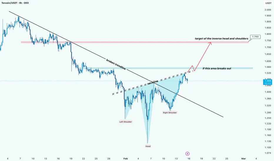
Ton: Neckline Break Could Open Path to 1.74Hi!
Market Structure:
Price has broken the main descending trendline and is now forming an inverse head and shoulders pattern. The right shoulder is developing while price is testing the neckline resistance zone.
Key Level to Watch:
The neckline area around the mid 1.50s is the decision point. A confirmed breakout and hold above this zone would signal strength from buyers.
Trade Scenario:
If the neckline breaks and holds → Long momentum likely accelerates.
Target Price:
🎯 1.74 (measured move from the inverse H&S structure and prior resistance zone)
Risk Note:
Failure to break the neckline could lead to a short-term pullback or consolidation before another attempt.
Main Idea:
Neckline breakout = Long opportunity toward 1.74.
SOLUSDT | Resistance Area & Another RejectionHello traders,
The price range between $88-$90 has been a major resistance area for SOL. It has rejected the breakout previously, and in the light of a bearish BTC breaking this zone is becoming so difficult. We can expect another rejection from this zone.
🎯 Targets: Previous swing lows
❌Invalidation: 4H candle close above $92.50
Good Luck!

Wheat Preparing for a New Trend CycleHello and welcome to all TradingView followers 👋📊
In this analysis, we review the WHEAT chart on the Daily timeframe.
The overall structure shows that after a long-term downtrend, the market has gradually lost bearish momentum and transitioned into a consolidation (range) phase. This behavior usually indicates selling pressure exhaustion and preparation for a new directional move. ⚖️
🧭 Trend Structure
Previously, the market had a clear downtrend with lower highs and lower lows. However, in recent months:
Lows are no longer breaking aggressively
The slope of the long-term decline has weakened
Price is stabilizing on a major long-term support
This suggests the market has entered an Accumulation phase 🟢
📦 Range Phase & Key Resistance
Currently, price is moving inside a sideways range and a clear resistance zone sits above the market.
Price behavior indicates buyers are gathering liquidity for a breakout.
📌 Main Scenario:
If a valid breakout with a Daily close above resistance occurs, the probability of a mid- to long-term bullish trend increases significantly 🚀
🎯 Potential Targets
After the breakout:
First move toward mid-range highs
Then continuation toward higher long-term targets
However, this will not be a straight move — the market may experience medium-term pullbacks during the bullish path 📉📈
⚠️ Alternative Scenario
If the breakout fails:
Price may return to the range lows
Continued consolidation before the final direction
Therefore, daily candle confirmation is crucial 🔍
🧠 Conclusion
The market has shifted from a downtrend into neutrality and is near a decision point.
A breakout could initiate a new bullish phase, but this setup is more suitable for long-term positioning, not short-term quick trades.
📊 What do you think?
🔘 Bullish after breakout
🔘 Continued range
🔘 Fake breakout and drop
Vote in the comments 👇
❗ Disclaimer
This analysis is for educational purposes only and is not financial advice. Always do your own research and apply proper risk management before trading.
🏷️ Tags
#WHEAT #Commodities #TechnicalAnalysis #PriceAction #Trading #SupportAndResistance #SwingTrading #LongTerm #Forex #MarketStructure

BTC/USDT Liquidity Map & Order Block Analysis🚀 BTC/USDT Bullish Setup | Bitcoin vs Tether Technical Roadmap
📊 Asset: BTC/USDT — Bitcoin vs Tether
Market: Cryptocurrency
Style: Day Trade / Swing Trade
Bias: Bullish Continuation Structure
🔎 Market Structure Overview
BTC/USDT is holding above key higher-timeframe support, maintaining a bullish market structure with:
✅ Higher Highs & Higher Lows (4H / Daily)
✅ Price respecting dynamic Moving Average support
✅ Liquidity sweep completed below recent swing low
✅ RSI recovering from mid-zone (bullish momentum rebuild)
✅ Volume expansion on upside impulse
The broader crypto market sentiment remains constructive as long as BTC defends key structural demand zones.
🎯 Trade Plan
Entry:
Flexible execution — look for pullbacks into intraday demand zones, previous breakout levels, or dynamic MA support for refined risk positioning.
Target: 75,000 USDT
Major psychological resistance
Previous liquidity pool
Potential distribution zone
Overbought condition likely near that level
If price approaches this region with weakening momentum or bearish divergence, profit protection is recommended.
Stop Loss: 67,000 USDT
Below key structural swing low
Below liquidity cluster
Invalidates bullish continuation structure
⚠️ Always adjust risk based on your account size and strategy. Risk management defines survival.
📈 Technical Confluence
🔵 50 & 200 Moving Averages acting as dynamic support
🔵 Bullish order block respected on 4H
🔵 MACD momentum building
🔵 Market structure intact above previous breakout zone
🔵 Liquidity imbalance partially filled
As long as BTC trades above the 67K structural support, upside continuation toward 75K remains technically valid.
🔗 Related Pairs to Watch (Correlation Insight)
Monitoring correlated assets strengthens conviction:
ETH/USDT → Ethereum strength confirms broader crypto risk appetite. If ETH outperforms BTC, bullish continuation probability increases.
BTC/USD → Spot USD pricing gives additional macro perspective vs stablecoin pricing.
TOTAL (Crypto Total Market Cap) → Expansion confirms risk-on environment.
DXY (U.S. Dollar Index) → Inverse correlation. Strong USD = pressure on BTC. Weak USD = supportive for crypto.
NASDAQ (US100) → Positive correlation with risk assets. Equity rally often supports BTC upside.
If DXY weakens while NASDAQ and ETH push higher → bullish confluence strengthens.
🌍 Fundamental & Macro Drivers
Key economic and crypto-specific catalysts influencing BTC:
🏦 U.S. Macro Factors
Federal Reserve interest rate expectations
CPI (Inflation Data)
Core PCE
NFP (Non-Farm Payrolls)
Treasury yields movement
🔎 Lower inflation + dovish Fed tone = supportive for BTC
🔎 Strong USD + rising yields = short-term pressure
💰 Crypto-Specific Catalysts
Spot Bitcoin ETF inflows/outflows
Institutional accumulation data
On-chain exchange reserve changes
Mining hash rate trends
Stablecoin liquidity expansion (USDT supply growth)
Growing ETF inflows + declining exchange reserves = bullish supply dynamics.
🧠 Trading Psychology Reminder
Markets reward discipline, not emotion.
Secure profits when momentum weakens.
Protect capital before chasing targets.
This plan outlines structure — execution and risk control remain personal responsibility.
If this setup aligns with your analysis:
👍 Drop a like
💬 Share your target in comments
🔔 Follow for structured crypto breakdowns
Precision. Patience. Profit.

Current game plan...So this is just basic fractal pattern/price action following for me, and then using the news to work out what will be the trigger.
I've drawn in 2 fractal structures on the left side that track well so far with the current structure.
The big trigger to the downside coming up this week looks like Wednesday 7am inflation rate YoY for GB.
Failing that, Friday's PMI's or PCE price index could do it, but inflation is where my heads at for now.
A break above the orange line before the EOW, and this idea is out the window!
Will add notes as we go along if anything worthy comes up.
Let me know your thoughts :)

Bitcoin Faces Key Inflection at 0.618 Fibonacci Bitcoin price action on the intraday timeframe has staged a rebound after putting in a local low near the value area low of the current trading range. This bounce reflects a technical reaction from support rather than a clear shift in trend, as price has now rotated higher into a key Fibonacci region. BTC is currently trading just below the 0.618 Fibonacci retracement, slightly front-running this level as momentum begins to stall.
This area represents a major inflection point. In the short term, holding around the 0.618 Fibonacci could allow for a final push higher into high-timeframe resistance near the $72,000 level. Such a move would likely act as a liquidity-driven spike rather than a sustained breakout, especially given the broader context of the market.
Importantly, the current rally has occurred on declining volume. The lack of strong bullish participation suggests the move higher may be corrective in nature rather than the start of a new impulsive leg. In bearish or corrective environments, low-volume rallies into resistance often precede continuation to the downside.
From a technical and price action perspective, Bitcoin remains vulnerable at current levels. Unless the rally is backed by a clear expansion in volume and acceptance above resistance, the probability favors a rejection and a continuation of the broader downtrend after any short-term upside attempt.

BTCUSD : Bullish Expansion After Short SqueezeThe arrows reflect strong upside continuation following aggressive short liquidations, with price reclaiming momentum and holding gains above recent consolidation. The move is impulsive rather than corrective, suggesting buyers are driving this leg higher rather than just covering. As long as momentum remains firm, continuation pressure stays favored in the near term.
Disclosure: We are part of Trade Nation's Influencer program and receive a monthly fee for using their TradingView charts in our analysis.

BTCUSD- BUY NOWBased on Clear Bullish divergence on 1 Hours time Frame. Expecting Bullish Momentum . Accordinly TP and SL has been marked. and insant Order is Placed. Choose your risk wisely. not more than 1%.
Love to hear your thoughts. cheers.

SHORT – PIPPIN - A severe RSI bearish divergence on the 4H timef🐻 SHORT – PIPPIN
Primary warning signal: A severe RSI bearish divergence on the 4H timeframe.
Price has formed a higher high, while RSI has printed a lower high, confirming a classic negative divergence. This momentum discrepancy is a high-impact signal in technical analysis, indicating buying pressure is weakening despite rising price. Such setups frequently precede sharp reversals or deep corrective phases, especially when occurring on higher timeframes like H4.
This aligns with established momentum theory: when price expansion is not supported by oscillator strength (e.g., RSI divergence), the move is typically unsustainable. Probability favors downside rotation as liquidity above recent highs gets absorbed.
🎯 TP: 0.24971
🛡️ SL: 0.77833
📊 RR: 1 : 7.94
Trade thesis: 4H RSI bearish divergence + momentum exhaustion → elevated probability of strong downside reversal with asymmetric reward.

They take YEARS to morph into existence.Next time you see EPIC SETUPS like these for GOLD... you will KNOW what to do.
So yeah... you WILL NOT find setups like these ANY TIME soon.
They take YEARS to morph into existence.
Have a GREAT weekend!

Gold Trading Strategy for Next Monday✅ The gold market is currently showing signs of short-term bullish momentum recovery. On the 4-hour chart, price has rebounded to the 5050 area, breaking above MA10 and MA20, which confirms the restoration of the short-term bullish structure. The Bollinger Bands’ middle and upper bands are turning upward, providing dynamic support. The 5060–5070 zone is a key resistance area; if price breaks above this region, it may accelerate higher, with the next target at 5100. On the downside, support is located at 5000–5020. If these levels are broken, a pullback toward 4950 may occur.
✅ On the 1-hour chart, price has stabilized above the short-term moving averages MA5 and MA10 since rebounding from the 4878 low, indicating strengthening short-term bullish momentum. Price is currently testing the 5050 resistance zone. A confirmed breakout could open the path toward 5070. The widening Bollinger Bands also suggest the potential for increased volatility. Therefore, a breakout above 5050 would confirm continued short-term bullish strength.
🔴 Resistance
● 5050–5070 (short-term resistance zone)
● 5100–5130 (stronger resistance zone)
🟢 Support
● 5000–5020 (short-term support)
● 4950–4930 (pullback defense zone)
✅ Trading Strategy Reference
🔰 Long Strategy
👉 Entry: 4995–5020
🎯 Target: 5050 / 5070 / 5100 / 5150
🔰 Short Strategy (Sell on pullback)
👉 Entry: 5050–5070 (light short position)
🎯 Target: 5020 / 5000 / 4950
✅ Overall Conclusion:
Gold is currently in a bullish-dominated trend. If price successfully breaks above the 5050 resistance zone, further upside toward and beyond 5070 is likely. Therefore, it is recommended to closely monitor the breakout at 5050 and follow the bullish momentum upon confirmation. Alternatively, if price pulls back to the 5000–5020 support zone, long positions may be considered. However, if price breaks decisively below 5000, caution is advised, and traders should wait for a deeper pullback before reassessing the strategy.

Conquer Market Psychology: Beat FOMO, Fear & Greed to Market psychology is the study of human emotions driving price movements – fear , greed , hope , and regret . Traders aren't battling the market; they're battling themselves. Mastering this turns losing streaks into consistent wins in Forex, Crypto, and Stocks.
Common Psychological Traps :
1- FOMO (Fear of Missing Out):
Jumping into trades because "everyone's winning" – leads to buying tops.
2- Fear & Panic Selling :
Dumping positions at lows due to short-term dips, missing recoveries.
3- Greed & Overstaying :
Holding winners too long, turning profits into losses.
4- Revenge Trading :
Chasing losses with bigger, riskier bets – recipe for account blowups.
Winning Strategies :
1- Build Discipline :
Stick to a trading plan: Pre-defined entries/exits, no exceptions.
2- Keep a Journal :
Log every trade: Why entered? Emotions? Lessons? Review weekly.
3- Use Mental Tools :
Set daily loss limits, take breaks, meditate to stay calm.
4- Focus on Process Over Profits :
Trade the setup, not the outcome – consistency beats one big win.
Real Examples Right Now (Feb 15, 2026)
Bitcoin BINANCE:BTCUSDT : Hovering around $70,000 – Recent rally sparked FOMO buys at peaks, but pullbacks test fear; smart traders waited for dips.
Pro Tips:
Visualize success daily to build confidence.
In volatile Crypto, shorten timeframes to avoid emotional swings.
Combine with tech analysis (e.g., RSI) to override gut feelings.
Remember : 90% of trading is mental – train your brain like a muscle!
Master your mind today and watch your trades transform!
What's your biggest psych challenge in trading? Share below! 👇
Ethereum Classic will start a new bull market in Q1 2026—Now!Ethereum Classic has been in a long downtrend, years of bearish action. December 2024 was a double-top compared to March 2024. Lower and lower. March 2024 was a lower high compared to August 2022. The August 2022 peak price was part of a descending trend that started with the 2021 bull market all-time high.
So the sequence goes like this: May 2021 through February 2026, sustained long-term bearish action.
February 2026 produced the lowest price since January 2021, in more than five years. And this completes the cycle.
Ethereum Classic's weekly RSI just hit the lowest reading ever, it entered oversold territory. The lowest reading in more than 7 years. A reversal tends to happen around these levels and we have some early signals based on the double-bottom (higher low/lower low) that happened between October 2025 and February 2026.
I mention three distinct events because it is different depending on the exchange we use. On some exchanges, ETCUSDT produced a double-bottom, others a higher low as shown here while still others produced a lower low. That is, October 2025 vs February 2026. In all cases, the chart shows an overextended bearish move.
We will have a change of trend.
There will be strong growth now, Q1 2026 and this growth period will work as the base to support any future bearish action.
The market is oversold and overextended on the bearish side so fully ready for a rising trend. Buyers have been taking advantage of this situation buying like never before. There is always a correction after a bullish period and this time around this correction will end in a higher low thus supporting a new uptrend.
This uptrend starts in 2026, contrary to what most people believe.
Think of this; the reason why people expect a brutal bear market in 2026 is not just because, but because a crazy bull market precedes it. A crazy bull market in 2025 is easily followed by a brutal bear market in 2026. It is easy to predict a major bearish cycle at the end of a strong bullish cycle. Ethereum Classic did not produce such "awesome" or "amazing" bullish cycle in 2025. So there is no need for a brutal bear market in 2026, even though market conditions are already extremely bearish.
Ethereum Classic produced zero growth in 2025. There is nothing to correct. No correction is needed yet the market continued lower, but lower it can go no more.
The bearish trend lost all of its momentum more than four months ago. It is already old. It is already over, we are going up. Ethereum Classic is preparing to produce a strong reversal followed by sustained growth. Years of bullish action.
Namaste.

GoldXAUUSD
- Ascending Triangle as an corrective pattern in Long Time Frame
- Fibonacci Level - 50.00%
- Completed " 12345 " Impulsive Waves and " ABC " Corrective Waves
- Double Top in Short Time Frame
- Sell Side Liquidity
