BTCUSD – Very Simple Market Idea (4H)BTCUSD – Very Simple Market Idea (4H)
This is the Bitcoin 4-hour chart.
The market is moving down. Price is making lower highs and lower lows. This means the trend is bearish.
Price fell strong before. Now price moved up a little. This move is only a small pullback.
The grey zone above is resistance. Sellers can enter from this area. Price may go down again.
The blue zone below is support. Price can bounce for a short time. If support breaks, price can fall more.
Chartpatterntrading

Gold Bullish Comeback Smart Money Buy AreaMarket Structure
Overall structure was bearish (clear lower highs & lower lows).
Price has now reacted strongly from a demand zone near the recent low.
This bounce suggests selling pressure is weakening.
Key Zones
Buy Zone (Demand): 4,600 – 4,640
→ Strong reaction area, buyers already defended this level.
First Resistance / Target 1: 4,780 – 4,820
→ Previous consolidation + mid-channel resistance.
Major Resistance / Target 2: 5,000 – 5,050
→ Strong supply zone & trend continuation confirmation.
Indicator View (Cloud / Trend)
Price is below the cloud, so trend is still bearish short-term.
However, price is pulling back toward the cloud, which often gives a corrective bullish move.
If price breaks and holds above 4,800, trend shift becomes more reliable.
Trade Idea
📌 BUY on pullback
Entry: 4,620 – 4,650
Stop Loss: Below 4,550
TP1: 4,800
TP2: 5,000+
Confirmation Needed
✅ Bullish candle close above 4,700
✅ Higher low on M15/M30
❌ Breakdown below 4,550 = setup invalid

ETHUSD | This is ALARMING in a bad wayHello traders,
ETH is starting to look uncomfortably similar .
The higher timeframe structure resemblance to 2021 is actually hard to ignore.
- A sharp selloff
- A relief rally into the golden fib zone, that convinced everyone the bull market was resuming
And then… reality hit.
Fast forward to 2025:
- ETH has already put in a major high @$3500.
- Then a sell off
- Now price action is grinding higher into the same 0.5–0.618 retracement zone.
If the market continues to rhyme with the 2021 fractal, ETH could still push enough to reignite confidence in the market. Before starting a deeper corrective leg.
No doom posting. No moon talking.
Just a reminder that not every bounce is a reversal, and history has a habit of repeating itself when sentiment resets too slowly.
I think swing exposure here carries much risk. You can scalp LTF trades.
Short-term bullish. Long-term bearish.
Good Luck!
All our analysis is shared with honesty, care, and real effort. If you find value in it, a like or comment means a lot to show your support🙏📊

BTCUSD BUY ZONE – BULLISH REVERSAL FROM DISCOUNT AREA📉 Market Structure
BTC was in a range/accumulation before a strong bearish breakdown.
The sharp drop created a sell climax, followed by base formation → classic sell-off → accumulation behavior.
Recent price action shows higher lows, signaling short-term trend shift from bearish to bullish correction.
☁️ Ichimoku Cloud Insight
Price was deeply below the cloud → strong bearish momentum earlier.
Now BTC is testing the lower edge of the cloud, which acts as dynamic resistance.
A clean break & close above the cloud will confirm bullish continuation.
If rejected → expect consolidation or a minor pullback.
📊 Supply & Resistance Zones
85,800 – 86,200 → First key resistance (previous structure + cloud)
87,800 – 88,200 → Major supply zone
These levels are marked on your chart and align well with smart money resistance.
🟢 Demand & Buy Zone Strength
82,800 – 83,300 is a strong demand zone
Multiple rejections from this area show institutional buying interest
As long as price holds above this zone, buyers remain in control
📈 Bullish Scenario
✔ Hold above 83K
✔ Break & close above 86K
✔ Cloud flip (price above cloud)
➡ Targets: 88K → 90K
🔴 Bearish Risk Scenario
❌ Rejection from cloud + resistance
❌ Break below 82,500
➡ Possible retest of 81K liquidity

XAUUSD Ready for Explosive MoveMarket Structure
Overall structure is bullish.
Price is making higher highs and higher lows, showing strong buyer control.
Recent pullback looks corrective, not a trend reversal.
Smart Money Perspective
Price previously moved impulsively upward → indicates institutional buying.
Current zone is a demand / accumulation area where smart money typically re-enters.
No strong bearish displacement seen yet → bullish bias remains valid.
Key Zone Insight
The marked area is a premium demand zone.
Price reacted cleanly from this level before, increasing its reliability.
Liquidity below has already been partially taken, reducing downside risk.
Expectation / Projection
After consolidation, price is likely to:
Sweep minor liquidity
Then continue upward toward the marked targets
Upside continuation is favored unless the demand zone is clearly broken.
Invalidation
A strong candle close below the demand zone would invalidate this setup.
Until then, buyers remain in control.
🔥 Trade Bias

#UKOIL - Double bottom, aiming $95Hi guys! 👋
🔔Brent crude has been in a prolonged corrective phase since the 2022 highs, but price action now suggests a potential trend reversal from a well-defined long-term support zone.
🔔 The market has twice defended the $58.7 level, forming a clear double bottom structure and signaling seller exhaustion after an extended downtrend.
🔔 The first rebound occurred near the 0.5 Fibonacci retracement, strengthening the validity of the base and increasing the probability of a sustained upside move.
🔔 Key resistance levels to watch are $72.5, $77, and $86.5, each acting as a structural barrier that must be cleared to maintain bullish momentum.
🔔 A confirmed breakout above these zones opens the path toward the $95–$95.7 target, which represents the measured move of the double bottom pattern.
🔔 From a macro perspective, steady global oil demand growth and persistent geopolitical risk in major producing regions may support higher prices by sustaining a risk premium.
Bias : Bullish above $58.7
Invalidation : Sustained breakdown below the double-bottom base
✊ Good luck with your trades! ✊
• If you like the idea, hit the 🚀 button
• Please ✍️ your thoughts in the Comments section
• And follow me for more updates.

HDFC Bank | Short-Term Trade SetupHDFC Bank – Short-Term Technical View
On the 1-hour timeframe, HDFC Bank is showing a positive EMA crossover, indicating improving short-term momentum. The crossover has formed near the ₹922 level, which is a crucial price zone.
This level gains further importance as the price is trading above both the daily and weekly pivot levels, suggesting bullish strength emerging from this area.
On the upside, if momentum sustains, the stock has the potential to move towards ₹950–₹960 in the short term.
On the downside, the last reversal point around ₹900 may act as immediate support. Additionally, the stock has a strong support zone between ₹890–₹900.
As long as this support zone holds, higher price levels can be expected in HDFC Bank.
Thank You !!

BTCUSD Market Structure Explained. Liquidity Above, Demand BelowHello traders,
I will keep this simple and structural because structure matters the most, right?
On the 6H timeframe, BTC is trading inside an ascending channel. As we see higher lows and consistent demand.
At the same time, price has been rejected multiple times from the channel upper trendline to sweep sell side liquidity.
This creates compression
As long as BTC holds this demand and maintains this bullish structure, this sets the stage for bullish continuation.
I previously stated multiple times that BTC could push toward the 100K+ region. This very chart could be the start of this move.
You should know that price reacts to structure, liquidity, and range expansion.
TL;DR: Overall bearish market 2026 | Short-term: Bullish relief rally
Good Luck!
If you find value in this content, a like supports more than anything🙏📊
Also, leave your comments and thoughts below.

GBPUSD Supply Zone Reaction – Expect Further DropGBPUSD – 30M Analysis (Bearish Bias)
Strong bullish move exhausted: Price rallied aggressively and is now showing signs of weakness near the top.
Clear rejection from supply zone: Multiple candles failed to hold above the marked resistance → seller dominance confirmed.
Lower high formation: Momentum is shifting from bullish to bearish continuation.
Key support broken / being tested: The marked horizontal zone around 1.3480 is acting as the first breakdown level.
Ichimoku cloud support below: Price moving toward the cloud increases the probability of a deeper pullback.
Sell Scenario
Sell below: 1.3480 (confirmed breakdown)
Target 1: 1.3440
Target 2: 1.3410
Invalidation: Strong candle close back above 1.3520
Market Structure Bias
➡️ Short-term trend: Bearish correction
➡️ Overall structure: Bullish → Pullback phase

BTCUSD BUY ZONE ACTIVATED | Cloud Support Holding Upside TargetBitcoin is showing signs of a short-term recovery after a strong sell-off. Price is currently holding near a key demand zone around 89K, while trading below the Ichimoku cloud — indicating the broader trend is still bearish, but a technical bounce is possible.Market Structure: Overall structure remains bearish with clear lower highs and lower lows. The recent sharp drop shows strong selling momentum.
Current Price Zone: Price is reacting from a demand/support area around 88.8K–89.2K, where buyers stepped in after the sell-off.
Ichimoku Cloud: Price is still below the cloud, and the cloud is acting as dynamic resistance. This means trend bias is bearish, but pullbacks are possible.
Support Levels:
Immediate support: 88.8K – 89.0K
If this breaks, next support near 87.5K
Resistance / Targets:
First resistance: 91,000
Major resistance: 93,000 (previous structure + cloud area)
Price Expectation: A relief bounce toward 91K–93K is possible if support holds. Rejection from these levels may lead to another bearish continuation.
Confirmation Needed: Bullish momentum and strong candles are required to sustain upside. Without confirmation, this move remains a counter-trend bounce.

XAUUSD Breakout Rally Buyers in Full ControlXAUUSD – Technical Analysis (Based on Chart)
Market Structure: Clear bullish structure with higher highs and higher lows. Breakout from consolidation confirms trend continuation.
Key Demand Zone: The highlighted area acted as strong support; price reacted sharply, showing institutional buying interest.
Momentum: Strong bullish impulse leg followed by controlled pullbacks → healthy trend, not exhaustion.
Trendline: Price respected the ascending trendline, confirming buyers are in control.
Support Levels: Previous breakout zone and demand area below can be used as buy-on-dip entries.
Resistance / Targets: Price is approaching a supply zone; partial profit booking is reasonable, with continuation possible if volume sustains.
Bias: Bullish until demand zone or trendline is broken with strong bearish close.

BANK OF MAHARASHTRA - DAILY CHART MY VIEW The Structure looks good to us, waiting for this instrument to correct and then give us these opportunities as shown on this instrument (Price Chart).
Note: Its my view only and its for educational purpose only. Only who has got knowledge about this strategy, will understand what to be done on this setup. its purely based on my technical analysis only (strategies). we don't focus on the short term moves, we look for only for Bullish or Bearish Impulsive moves on the setups after a good price action is formed as per the strategy. we never get into corrective moves. because it will test our patience and also it will be a bullish or a bearish trap. and try trade the big moves.
We do not get into bullish or bearish traps. We anticipate and get into only big bullish or bearish moves (Impulsive Moves). Just ride the Bullish or Bearish Impulsive Move. Learn & Know the Complete Market Cycle.
Buy Low and Sell High Concept. Buy at Cheaper Price and Sell at Expensive Price.
Please keep your comments useful & respectful.
Keep it simple, keep it Unique.
Thanks for your support
Tradelikemee Academy
Saanjayy K G

GBPCAD LONG CONTINUATIONGBPCAD has seemed to found support above 1.8600 .
The recent swing low at 1.85646 i am anticipating this to be the end of the downside retrace and now buyers resume to continue the pair higher.
On the daily we can see the strength in buyers with the formation of a bullish hammer of the support zone at 1.8600
TP1: 1.87000
TP2: 1.87595

Daily Analysis: Nifty & Hindunilvr 20/01/26Covering the levels for Nifty and Hindunilvr setup.
Nifty has breached support and testing it as resistance, hence a sell setup is on the radar.
In Hindunilvr, an inverted H&S is completed for bullish bias.

The Wyckoff Trading MethodThe Wyckoff Trading Method
The Wyckoff Method is a classical approach to market analysis designed to help traders understand trend development, market cycles, and potential reversals. Despite being developed over a century ago, it remains highly relevant in modern financial markets and is widely used across stocks, forex, and cryptocurrencies.
What Is the Wyckoff Method?
The Wyckoff Method is a form of technical analysis created in the early 20th century by Richard D. Wyckoff, a pioneering trader and market analyst. The core idea behind this method is that price movements are governed by supply and demand, and that large institutional participants (often referred to as “composite operators”) leave identifiable footprints on the chart.
Wyckoff believed that by studying price, volume, and time, traders could anticipate future price behavior rather than react to it.
Core Principles of the Wyckoff Method
The Wyckoff methodology is built around several foundational concepts:
1. Supply and Demand
Price rises when demand exceeds supply and falls when supply exceeds demand. Observing how price responds to changes in volume helps traders identify who is in control of the market.
2. Market Structure and Phases
Markets move in recurring cycles, typically broken down into:
- Accumulation
- Markup
- Distribution
- Markdown
Recognizing these phases allows traders to align with institutional activity rather than trade against it.
3. Price and Volume Relationship
Volume acts as a confirmation tool. Strong price movement with weak volume often signals exhaustion, while strong volume supports trend continuation.
4. Liquidity and Institutional Behavior
The method emphasizes how large players accumulate or distribute positions over time, often through range-bound price action designed to absorb liquidity.
The Market Cycle
The Wyckoff Market Cycle
The Wyckoff methodology describes market behavior as a repeating four-phase cycle driven by supply and demand. These phases help traders understand where the market is in its process, rather than simply reacting to price movements.
Accumulation Phase
Accumulation typically appears as a range-bound market after a decline. During this phase, large institutional participants quietly build long positions while price remains relatively stable. To most traders, the market appears directionless, but in reality, buying is taking place without pushing price higher. The true intent of the market is concealed until accumulation is complete.
Markup Phase
Once sufficient long positions have been accumulated, institutions begin to drive price higher. This phase is characterized by a clear uptrend as increased demand attracts additional buyers. Breakouts from accumulation ranges often trigger momentum traders and breakout strategies, reinforcing the trend. Markups may include re-accumulation phases, where price pauses and consolidates before continuing higher.
Distribution Phase
Distribution occurs after an extended advance, when upward momentum begins to slow. During this phase, large players gradually offload long positions and build short exposure. Price often moves sideways in a range, giving the illusion of stability, while smart money exits positions. This phase prepares the market for the next directional move lower.
Markdown Phase
The markdown is the declining phase that follows distribution. Selling pressure overwhelms demand, leading to a sustained downtrend. As price falls, traders are encouraged to enter short positions, further accelerating the move. Similar to markups, markdowns may include redistribution phases, where price consolidates before continuing lower.
Why the Wyckoff Model Works
Large financial institutions must execute trades of significant size, which requires liquidity. Liquidity is often found around stop losses, breakout levels, equal highs and lows, and key support or resistance zones. By intentionally pushing price into these areas, institutions can fill large orders efficiently without excessive slippage. This interaction between liquidity and market psychology forms the foundation of the Wyckoff model across all asset classes.
Core Principles of the Wyckoff Method
A key concept in Wyckoff theory is the Composite Man, a symbolic representation of institutional or “smart money” participants. Traders are encouraged to analyze price action as if a single, highly informed entity is controlling the market. The Composite Man accumulates or distributes positions strategically before allowing price to trend.
The Law of Supply and Demand explains that price rises when demand exceeds supply and falls when supply exceeds demand. The Law of Cause and Effect states that the size and duration of accumulation or distribution determine the magnitude of the subsequent price move, with higher-timeframe structures producing larger effects. The Law of Effort versus Result compares volume (effort) with price movement (result), highlighting potential trend continuation or exhaustion when these two factors diverge.
Wyckoff Schematics
Wyckoff schematics visually represent accumulation and distribution structures. Although these patterns may appear complex at first, they are mirror images of each other, with accumulation and distribution sharing identical phases and logic—only inverted. Studying these schematics helps traders recognize institutional behavior and align their trades with the dominant market process.
Type 1 Schematics
Accumulations
Phase A: Stopping the Downtrend
Phase A marks the transition from a markdown to the beginning of accumulation, where selling pressure starts to weaken.
- Preliminary Support (PS): After a prolonged decline, initial buying emerges and temporarily halts the downtrend. Volume increases as early demand appears, signaling that selling pressure is no longer dominant.
- Selling Climax (SC): Panic selling accelerates as long positions are stopped out and breakout traders enter short positions. At this point, the Composite Man absorbs this excess supply. The SC often leaves long lower wicks, reflecting strong buying interest.
- Automatic Rally (AR): Once selling pressure is exhausted, price rebounds quickly as shorts cover and new buyers step in. The high of the AR establishes the first resistance boundary of the accumulation range.
- Secondary Test (ST): Price revisits the SC area to test remaining supply. This test may form equal or slightly higher/lower lows, usually with reduced volume, confirming that selling pressure has diminished.
Phase B: Building the Cause
Phase B is where accumulation develops over time. The Composite Man continues to build long positions while price fluctuates within a range.
- Sign of Strength in Phase B (SOS(b)): In some cases, price rallies above the AR, creating a higher high within the range. This move suggests improving demand but still remains below preliminary resistance.
- Secondary Test in Phase B (ST(b)): A sharp decline follows, designed to trigger stop losses below prior lows and attract breakout sellers. This “liquidation” move provides the liquidity institutions need to continue accumulating, forming the underlying cause for the next trend.
Phase C: The Final Shakeout
Phase C is the critical phase that distinguishes accumulation from continuation lower.
- Spring: Price makes a final push below established support, sweeping remaining stop losses and trapping late sellers. This move briefly violates the range before quickly reversing.
- Test: After the Spring, price retests the area to confirm that supply has been fully absorbed. These tests typically form higher lows and occur on lower volume, signaling reduced selling interest.
Phase D: Transition to Markup
Phase D confirms that accumulation is complete and the market is ready to trend higher.
- Last Point of Support (LPS): Following the test and a rally, price pulls back shallowly, forming a higher low. This pullback reflects strong demand and is often the final opportunity before markup.
- Sign of Strength (SOS): Price breaks above the accumulation range with expanding volume, confirming bullish control. After this breakout, the market enters the markup phase, where the effect of prior accumulation is realized through sustained upward movement.
Distributions
Phase A: Stopping the Uptrend
Phase A marks the transition from an uptrend into distribution, where demand begins to weaken and supply quietly enters the market.
- Preliminary Supply (PSY): After a sustained advance, large operators start unloading positions, causing the first noticeable pause or pullback in price.
- Buying Climax (BC): Buying pressure reaches an extreme as late buyers enter aggressively, often accompanied by very high volume. This is where smart money sells into strength.
- Automatic Rally (AR): Once buying is exhausted, price pulls back sharply as demand fades. The AR typically forms below the BC and defines the first support boundary of the distribution range.
- Secondary Test (ST): Price revisits the BC area to test remaining demand, usually failing to make a new high. Volume is generally lower, indicating reduced buying interest and building liquidity for later phases.
Phase B: Building the Distribution
Phase B is where the Composite Man continues distributing positions while price fluctuates within a range.
- Sign of Weakness in Phase B (SOW(b)): A decline below the AR signals that supply is beginning to dominate. This move does not always appear, but when it does, it establishes a second support boundary.
- Upthrust (UT): Price briefly breaks above resistance to trigger buy stops and attract breakout buyers. This false breakout allows institutions to sell into increased demand and build short exposure.
Phase C: The Final Liquidity Grab
Phase C completes the distribution process by targeting remaining demand.
- Upthrust After Distribution (UTAD): Similar to a Spring in accumulation, UTAD is the final false breakout above resistance. It is designed to capture the last wave of liquidity before the true bearish move begins.
- Test: Price often revisits the UTAD area to confirm that demand has been fully absorbed. These tests typically occur on lower volume, signaling weakening bullish participation.
Phase D: Transition to Markdown
Phase D confirms that distribution is complete and bearish control is established.
- Last Point of Supply (LPSY): After price begins to decline, weak rallies attempt to test demand. These rallies are shallow and usually represent the final bullish reactions before the markdown.
- Sign of Weakness (SOW): Price breaks decisively below the range, confirming a bearish structure. Additional LPSYs may form, but this phase marks the final transition into the markdown.
Type 2 Schematics
Type 2 Wyckoff schematics contain the same structural components as Type 1, but without a Spring (in accumulation) or a UTAD (in distribution). In these cases, the market does not perform a final liquidity sweep before trending.
A Type 2 schematic can be identified by observing a direct transition into trend confirmation:
- In accumulation, price forms a Secondary Test (ST) and possibly an ST(b), then proceeds directly into a Sign of Strength (SOS) followed by markup.
- In distribution, price forms an ST or Upthrust (UT), then transitions directly into a Sign of Weakness (SOW) followed by markdown.
If markup or markdown begins without a Spring or UTAD, the structure should be classified as Type 2. Importantly, Type 2 schematics are traded using the same principles and execution logic as Type 1 structures.
The Five-Step Wyckoff Trading Strategy
Richard D. Wyckoff proposed a structured five-step approach to applying his methodology in real market conditions. This framework helps traders align with market structure and institutional intent.
1. Determine the Market Trend
Identify whether the broader market environment is bullish or bearish. Trading in alignment with the dominant trend increases probability.
2. Select a Suitable Market
Choose an asset or trading pair that clearly reflects the identified market trend and shows strong structural clarity.
3. Identify Accumulation or Distribution
Focus on assets that are currently forming a Wyckoff accumulation or distribution structure rather than those already trending.
4. Assess Readiness for a Move
Analyze the current Wyckoff phase and volume behavior. Events such as a Spring, UTAD, SOS, or SOW help confirm whether the market is prepared for markup or markdown.
5. Execute the Entry
Entries are commonly taken on Tests, Last Points of Support (LPS), or Last Points of Supply (LPSY), where risk can be controlled and structure is clear.
Does the Wyckoff Method Still Work?
- Despite being developed nearly a century ago, the Wyckoff Method remains highly relevant in modern markets. Its core principles supply and demand, market structure, volume analysis, and liquidity behavior are universal and apply across forex, stocks, commodities, and cryptocurrencies.
- When combined with complementary tools such as support and resistance, indicators, or pattern analysis, Wyckoff can form the foundation of a robust and disciplined trading approach. Its enduring value lies in teaching traders how markets move, not just where price is going.
Educational Disclaimer
This material is provided for educational purposes only. It reflects a general interpretation of the Wyckoff methodology and should not be considered financial advice, investment recommendations, or an offer to trade. Traders should always conduct their own analysis and manage risk responsibly.

EURGBP SHORTS NEXT LEG DOWNExpecting a continuation of the overall downtrend on EURGBP - You can see on the daily time frame higher lows and lower highs are being made.
If we manage to sweep last lows and support around 0.86403 we should see the pair hit 0.8600

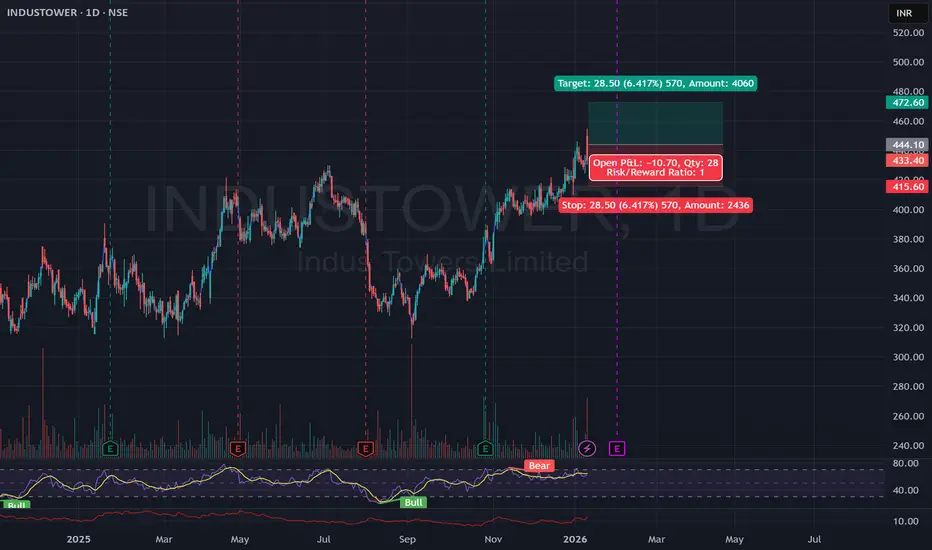
Technical Analysis: > "INDUSTOWER Technical Setup: Bullish BreakThe chart for Indus Towers (INDUSTOWER) shows a strong bullish setup. Here are the technical reasons why it is currently positioned to move higher:
Bullish Breakout: The price has recently broken above a significant resistance zone near 420–430. This "breakout" suggests that buyers have regained control after a period of consolidation.
Higher Highs & Lows: On the daily (1D) timeframe, the stock is in a clear uptrend. It consistently forms higher lows (support moving up) and higher highs, which is a classic signal of sustained demand.
Support Flip: Previous resistance around 415 is now acting as a "floor" (support). The trade setup in your image uses this level as a safety net (Stop Loss), indicating a high-conviction area where buyers are expected to step in.
Momentum & Volume: The recent price surge is accompanied by healthy volume (shown at the bottom), confirming that the move up is backed by institutional or large-scale buying rather than random fluctuation.
Target Level: The chart identifies a clear technical target at 472.60, which aligns with the next major historical resistance level.
Summary: The stock has transitioned from a sideways range into a confirmed uptrend by breaking key resistance with momentum.
BTC Technical Breakdown – Smart Money Sell Opportunity📉 Market Structure
Price is moving inside a descending channel, which confirms a bearish overall trend.
Each rally is making lower highs, showing sellers are in control.
The recent push up is corrective, not impulsive → typical of a downtrend.
---
📐 Key Technical Zones
🔴 Resistance (Sell Zone)
Price is currently testing the upper trendline of the descending channel.
There is a horizontal resistance aligning with this trendline → strong confluence.
Multiple rejections from this area in the past = high-probability sell zone.
🟢 Support / Liquidity Zones
First downside target: previous range low (local support).
Main liquidity zone marked below → sell-side liquidity resting there.
Strong impulse move previously left imbalance, likely to be filled.
---
🔻 Pattern Insight
Price formed a rising wedge / corrective structure inside a bearish channel.
This is a classic bearish continuation pattern.
The arrow and SELL marking indicate rejection confirmation, not anticipation.
---
🧠 Smart Money Concept (SMC View)
Break in minor bullish structure → Change of Character (ChoCH).
Price tapped premium zone of the range.
Institutions likely distributing before pushing price lower.
---
✅ Trade Idea (Example – Not Financial Advice)
Bias: SELL
Entry: Rejection / bearish candle at resistance
Stop Loss: Above channel high
Targets:
TP1: Range low
TP2: Liquidity zone
TP3: Extended imbalance fill

GBP/USD ANALYSIS IN ASIA SESSION I 01/081. Market Structure & Trend
Primary Trend: The price is currently in a clear downward trend. The descending trendline is acting as dynamic resistance, capping any recovery attempts.
Highs/Lows: The market is forming Lower Highs and Lower Lows. Currently, the price has broken below a short-term consolidation phase, signaling further weakness.
2. Key Volume Profile Zones
The Volume Profile on your chart highlights three critical areas:
VAH Zone (Value Area High - ~1.3560): This is the top of the value area. The price tested this level and was rejected sharply, confirming it as a "heavy" resistance zone.
POC Zone (Point of Control - ~1.3505): This is the price level with the highest trading volume. The price spent a significant amount of time churning here before breaking down. It will now act as a major overhead resistance.
VAL Zone (Value Area Low - ~1.3465): The price has just breached this level to the downside. In Volume Profile theory, when price exits the Value Area, it often indicates a "breakout" search for a new equilibrium at lower levels.
3. Current Situation & Future Scenarios
The most recent candle is sitting near 1.3460, just below the VAL line.
Scenario 1: Continued Bearish Momentum (High Probability) If the price fails to reclaim the 1.3470 level (the VAL zone) on a closing basis, the selling pressure is likely to persist. The next targets could be the support levels around 1.3420 – 1.3400.
Scenario 2: Technical Pullback (Retest) The price might experience a minor bounce to retest the VAL zone (1.3465 - 1.3470) or the descending trendline. If bearish reversal candles (like a pin bar or engulfing pattern) appear at this retest, it would offer a high-probability entry for short sellers.
4. Important Observations
Volume Nodes: The horizontal bars on the left show that the area below 1.3460 has relatively "thin" volume (Low Volume Nodes). This suggests that if selling continues, the price could drop quickly as there are fewer historical orders to provide support.
Economic Events: Note the US/UK flag icons at the bottom of the chart. Upcoming news events could trigger high volatility, potentially overriding technical levels.
Summary: Given the current trend, focusing on Sell opportunities when the price retraces to resistance (VAL or Trendline) is generally safer than attempting to "catch a falling knife" (buying at the bottom).

XAUUSD H1 CHART IN LONDON SESSION I 07/01
1. Overall Trend
Dominant Bullish Trend: Since the beginning of 2026 (as shown on the chart), Gold has established a strong upward momentum, climbing from the bottom area around 4,320 to a peak near 4,500.
Current Phase: The price is currently in a bearish retracement (correction) after hitting the psychological resistance level of 4,500.
2. Volume Profile Analysis
The chart displays key levels from the Fixed Range Volume Profile:
VAH (Value Area High) - 4,491: This is the upper boundary of the value area. The price attempted to break above this level but was strongly rejected (indicated by long upper wicks), signaling significant selling pressure.
POC (Point of Control) - 4,465: Represented by the bold black line. This is the price level with the highest traded volume. Currently, the price is trading just below this zone (4,463). The POC acts as a "magnet" or a critical short-term pivot point.
VAL (Value Area Low) - 4,429: The lower boundary of the value area. If the price continues to drop and loses the POC support, this will be the next target.
3. Candlestick & Price Action
Reversal Pattern: At the recent peak (~4,500), small-bodied candles with long upper wicks appeared, followed by a strong bearish engulfing candle. This confirms that Sellers have temporarily taken control.
Immediate Support: The price is currently hovering at a minor support level around 4,460. However, the downward pressure remains evident.
4. Forecast Scenarios
Based on the current market structure, there are two likely scenarios:
Scenario 1 (Recovery): If the price holds the 4,460 - 4,465 zone (POC) and a bullish confirmation candle appears, Gold could retest the VAH (4,491) area.
Scenario 2 (Continued Correction): If the 1-hour candle closes decisively below 4,460, the short-term downtrend will continue toward the VAL (4,429) or further down to the old accumulation zone near 4,356.
💡 Trading Observations:
Watch the POC (4,465): This is the "battleground" level that decides which side wins in the short term.
Economic Calendar: Note the US flags at the bottom of the chart. These indicate upcoming news events that could trigger high volatility.

GBP/USD M30 CHART ANALYSIS IN ASIA SESSION I 01/06
1. Key Price Zones (Volume Profile)
The chart highlights three critical zones based on volume distribution:
VAH Zone (Value Area High): Located around 1.3510. This is the upper boundary of the Value Area (where 70% of the volume was traded). Since the price has broken clean above this, it now acts as a major potential support level on any pullbacks.
POC Zone (Point of Control): Located around 1.3440 – 1.3450. This represents the price level with the highest traded volume. It acts as a "gravity well" or equilibrium point; if the current bullish momentum fades, the price is likely to be drawn back here.
VAL Zone (Value Area Low): Located around 1.3415. This is the lower boundary of the Value Area.
2. Price Action and Trend
Strong Bullish Momentum: The pair is in a steep uptrend. After consolidating within the Value Area, the price staged a breakout and is currently trading near 1.3558.
Trendline: The vertical-sloping trendline you've drawn shows an aggressive move. As long as the price stays above this line, the immediate bias remains strongly bullish.
Low Volume Nodes: The area between 1.3510 and 1.3550 shows very thin volume bars. This indicates price moved through this zone rapidly (an "imbalance"), meaning there is little structural support until the price hits the VAH.
3. Trading Scenarios (Actionable Insights)
Chasing the Move: Entering a "Buy" at current levels is high-risk because the price is "overextended" (far from its value).
The Re-test Strategy (Recommended):
Scenario 1: Wait for a correction back to the VAH (1.3510). If you see price rejection or bullish candlestick patterns there, it offers a high-probability entry with a clear stop-loss below the zone.
Scenario 2: If the steep trendline breaks, expect a deeper retracement toward the POC (1.3453) to find new buyers.
Targets: The next major psychological resistance is 1.3600. Watch for signs of exhaustion (like long upper wicks) as the price nears this level.
Summary: The trend is clearly Bullish, but the price is currently in an "excess" phase outside of value. Patience for a pullback to the 1.3510 area usually yields a better risk-to-reward ratio.

Gold Prices Fall Due to Profit TakingGold XAUUSD's movement was quite weak during the New York session, likely triggered by weekend profit-taking.
Liquidity was also limited at the end of the week.

Big Breakout Alert | IDBI BankIDBI Bank has formed a long-term Cup & Handle pattern since 2024 and has now confirmed a breakout with strong volume, indicating renewed bullish momentum.
Pattern: Cup & Handle (Long-term)
Breakout: Confirmed with heavy volume
Trend: Bullish structure intact
Key Support Zones:
Primary structure support near 90
Secondary support / breakout zone near 100
The breakout level may see a healthy retest if price shows short-term pullback.
Upside potential as per chart structure:
130
140–145 range
170 (extended target)
Weekly RSI has also given a breakout.
RSI is currently around 68, reflecting strong bullish strength and trend confirmation.
