EUR/USD Under PressureEUR/USD Under Pressure
Today, the EUR/USD pair is trading around 1.1560, close to autumn lows. From this week’s high, the pair has fallen by roughly 0.85%, reflecting bearish pressure.
The main factors driving the decline are traders’ reactions to central bank signals:
→ Hawkish Fed rhetoric: On Wednesday, Jerome Powell indicated that further rate cuts are “by no means predetermined.” The Fed continues to see mixed signals from the labour market and inflation data, suggesting it will not rush into easing policy.
→ ECB keeps rates unchanged: Yesterday, the European Central Bank left rates steady. However, markets remain concerned about the slowing economic growth across the eurozone, meaning the ECB cannot afford to tighten policy amid weak activity.
Technical Analysis of EUR/USD
Since mid-September, price movements have formed a descending channel (shown in red). Today, the pair fell below a key support level at 1.1580 (highlighted by arrows).
An earlier attempt to break this support in early October failed — as the pair entered oversold territory below the channel, it formed a double bottom (A–B) before sharply rebounding.
In this context, the 1.15435 level, where the double bottom formed, is significant. The orange-shaded area shows that bulls step in near this level, producing candles with long lower wicks. On shorter timeframes, this behaviour displays signs of a bullish engulfing pattern.
If bears succeed in breaking support, the pair could test the lower boundary of the red channel. Positive news from Donald Trump on progress in trade talks with China could improve the U.S. trade balance, supporting this bearish scenario.
Conversely, if bulls continue defending the 1.1560–1.15435 zone, EUR/USD may rebound, potentially moving towards the QH line.
This article represents the opinion of the Companies operating under the FXOpen brand only. It is not to be construed as an offer, solicitation, or recommendation with respect to products and services provided by the Companies operating under the FXOpen brand, nor is it to be considered financial advice.
Community ideas

NVIDIA – A New World First, Where Next?A mere 24 hours after Apple become the third company in history to reach a $4 trillion valuation, NVIDIA set a new benchmark by becoming the first company ever to register a market capitalisation of $5 trillion.
Despite concerns about over extended valuations, the news flow for NVIDIA was initially positive to start this new week as the company attempts to solidify its future at the centre of the potential AI revolution.
CEO Jensen Huang revealed the company had received $500 billion of AI chip orders, including contracts to build supercomputers for the US government and then President Trump commented on Wednesday that NVIDIA’s latest Blackwell chips could be a discussion point when he meets with President Xi at Thursday’s summit in South Korea.
Putting this into numbers, after opening on Monday at 189.25, the stock soared 12% across the first 3 trading days to a high of 212.19 on Wednesday. That move brought its year-to-date rally to 54%, very impressive indeed! Although, it must be said that prices did slip back to close the day at 207.04.
However, overnight the positive sentiment may have stalled slightly, the Federal Reserve cut interest rates 25bps as expected but Chairman Powell provided a more cautious outlook on future cuts than had been anticipated. Also, earnings from Alphabet, Microsoft and Meta released late on Wednesday were mixed, with strong profits offset by rising costs.
Looking forward, the initial updates from the President Trump and President Xi meeting has started to arrive on newswires and traders will be keen to assess the actual details of what was discussed about NVIDIA chip sales between the two countries. A crucial aspect could be whether sales of NVIDIA’s latest Blackwell chip was discussed and if not, what were the reasons why.
Then it’s eyes down for the release of Amazon and Apple earnings after the close tonight which could either confirm the recent bullish moves or throw a sentiment curve ball which could negatively impact in positioning into the weekend.
Technical Update: Acceleration Higher Shifts Focus to Extension Resistance
In just six trading sessions, NVIDIA's share price has rallied over 20%, reaching fresh all-time highs. Such a rapid acceleration can often signal strong momentum but also raises the risk of short-term upside exhaustion, although it's difficult to pinpoint where such moves might slow or even see risks of possible reversal.
In this environment, traders might monitor support and resistance levels, with resistance zones signalling potential for profit-taking, while breaks below support could lead to further price weakness.
[b Potential Resistance Levels:
As price action pushes into uncharted territory with new all-time highs, identifying resistance becomes a challenge. However, traders often turn to Fibonacci extension levels, derived from the most recent correction, to highlight potential areas where upside momentum may slow or even reverse.
As the chart above shows, for NVIDIA, this last correction developed between October 10th and October 22nd and the latest strength appears to be stalling in the short term ahead of 213.23, a level equal to the 100% Fibonacci extension.
There is no guarantee such extension levels will be successful in capping price strength and closing breaks above the 213.23 resistance may shift focus to 220.14, which is the higher 138.2% extension level.
Potential Support Levels:
To maintain NVIDIA’s current price strength, traders may now be focused on Wednesday’s low at 204.78 as near-term support; if price weakness tests this level, its defense will be watched, as a closing break below 204.78 could trigger further downside pressure.
A close below 204.78 could lead to tests of 198.59, the 38.2% Fibonacci retracement of the October 22nd to 29th rally, but if that support gives way, risks may extend toward 194.39, the deeper 50% retracement level.
The material provided here has not been prepared accordance with legal requirements designed to promote the independence of investment research and as such is considered to be a marketing communication. Whilst it is not subject to any prohibition on dealing ahead of the dissemination of investment research, we will not seek to take any advantage before providing it to our clients.
Pepperstone doesn’t represent that the material provided here is accurate, current or complete, and therefore shouldn’t be relied upon as such. The information, whether from a third party or not, isn’t to be considered as a recommendation; or an offer to buy or sell; or the solicitation of an offer to buy or sell any security, financial product or instrument; or to participate in any particular trading strategy. It does not take into account readers’ financial situation or investment objectives. We advise any readers of this content to seek their own advice. Without the approval of Pepperstone, reproduction or redistribution of this information isn’t permitted.

Building Rock-Solid Confidence: The Trader’s Unshakable EdgeConfidence is the foundation of every great trader — not because it guarantees wins, but because it guarantees consistency. In this session, we break down the psychology of self-belief and how to build confidence that doesn’t crumble when the market tests you.
Learn why confidence isn’t built from profits but from disciplined execution. We’ll cover how to stop second-guessing your trades, rebuild trust in your system, and detach your self-worth from your results. This episode shows you how professional traders use repetition, reflection, and recovery to stay calm, clear, and confident — even in drawdowns.
You’ll learn:
The difference between ego and true confidence
How to rebuild trust in your trading plan
Why the market manipulates your confidence and how to protect it
The 3-step framework for building self-trust in trading
If you’ve ever felt anxious before pressing “Buy” or “Sell,” or you constantly question your setups, this discussion will help you develop the rock-solid mindset needed to execute with precision and confidence.
Tags: trading psychology, trading confidence, self-belief for traders, trading mindset, forex psychology, discipline in trading, consistency in trading, emotional control, trader development, performance mindset

HOW TO TRADE THE LONG TERM TREND BY DRAWING TRENDLINES!Hey Traders so today wanted to make a quick video that explains how to trade the long term trend early. Also when to move your trendline to stay with the market for as long as possible in long term trends.
Hope This Helps Your Trading 😃
Clifford

META: Next Long Term Buy Following a disappointing earnings report, Meta (META) dropped more than 10% in post-market trading, decisively breaking through several key support levels. My primary support zones are typically derived from anchored VWAPs (Volume-Weighted Average Prices), which help identify where institutional buyers may step in to defend trend continuation. However, what’s becoming increasingly concerning is the decisive break below both major VWAPs — one anchored to the previous all-time high and another from the “tariff crash” lows.
This type of price action reflects broad-based weakness and a shift in market structure, suggesting that META may be entering a deeper corrective phase. The loss of both VWAPs indicates that long-term buyers are no longer in control of the trend, and that liquidity pockets beneath recent price levels could become magnets for further downside.
From a technical perspective, the current setup points toward a potential cascading move lower into the 0.618 Fibonacci retracement zone, which also aligns with multiple unfilled gaps on the chart. These confluence zones often act as high-probability areas for price stabilization or reversal, particularly when accompanied by a sentiment washout or capitulation event.
Moving forward, I’ll be closely monitoring the sub-$600 area as a potential longer-term accumulation zone. This region not only coincides with that Fibonacci retracement but could also mark the completion of a higher-degree corrective structure within the broader uptrend. Once price stabilizes, I plan to develop a detailed Elliott Wave projection to map out the next impulsive leg higher — ideally one that reestablishes META’s leadership role among the large-cap tech names.
In summary, while short-term weakness appears dominant, the upcoming retracement could offer an attractive buying opportunity for patient investors, provided the broader market context and technical structure begin to realign in favor of the bulls.

Fair Value Gaps: The Market Secret You Shouldn’t IgnoreEver scrolled through a chart and spotted a weird empty space in the candles — like the market just skipped a beat? That’s a Fair Value Gap (FVG). It’s one of those subtle price imbalances smart traders love to hunt for. Understanding how these gaps form and how price reacts around them can seriously level up your chart-reading game.
What Is a Fair Value Gap in Trading?
A Fair Value Gap happens when there’s a sudden surge in buying or selling pressure that causes price to move so fast, it doesn’t fully balance out between buyers and sellers. In simple terms, it’s an imbalance — a zone where the market skipped over potential orders.
When you hear traders talking about FVG in trading, they’re referring to those little pockets of unfilled liquidity left behind during strong moves.
So, what is FVG in trading, and why does it matter? Because price often comes back to those areas later to “rebalance” — filling the gap before continuing in the original direction. That’s the core logic behind Fair Value Gap trading.
Bullish and Bearish FVGs
There are two main types of Fair Value Gaps — bullish and bearish:
Bullish Fair Value Gap (bullish FVG): Forms during a strong upward move, when aggressive buyers push price higher, leaving a void below. Price might later dip back into that zone before continuing upward.
Bearish Fair Value Gap (bearish FVG): Forms in a sell-off, when sellers dominate and the market drops quickly, skipping over potential buy orders. Later, price often retraces upward to “fill” that gap.
Both can act as magnets for liquidity — areas where smart money likes to re-enter the market.
Fair Value Gap Example
Let’s say Bitcoin jumps from $110,000 to $120,000 in a single bullish candle, with almost no trading in between. That sudden move leaves a Fair Value Gap — the zone between the candle’s high and low where little to no trading took place.
If the market later pulls back to that range and finds support before bouncing, you’ve just witnessed a textbook Fair Value Gap example in action.
Using a Fair Value Gap Indicator
You can spot these zones manually by looking for three-candle structures — one candle that “leaves the gap” and two surrounding it that don’t overlap. But if you prefer automation, you can use a Fair Value Gap indicators:
Fair Value Gap Trading Strategies
Fair Value Gap trading isn’t about chasing price — it’s about waiting for the market to come back to you. Within Smart Money Concepts, traders often combine FVGs with CHoCH (Change of Character) to confirm a potential shift in structure before entering.
A common approach is to mark recent FVGs, identify the broader trend, and wait for price to revisit a gap in line with that trend.
In a bullish trend , traders look for bullish FVGs below current price as potential demand zones — ideally after a CHoCH confirms that buyers are stepping back in.
In a bearish trend , they watch for bearish FVGs above current price as potential supply zones, again validated by a CHoCH showing a shift in control.
Still, it’s important to remember — these setups are not guarantees. The market doesn’t owe you a fill. Use FVGs and CHoCH as part of the Smart Money framework, not as standalone signals. Always manage risk and make your own trading decisions based on your personal strategy and comfort level.
Final Thoughts
So, what is a Fair Value Gap really? It’s not magic — just the market showing where it moved too fast. Learning to read Fair Value Gaps gives you insight into liquidity, momentum, and potential reversals. Whether you use a Fair Value Gap indicator or mark them by hand, mastering FVG in trading can give you a serious edge in spotting high-probability zones.
Just keep in mind — no indicator or setup replaces good judgment.
Observe, adapt, and let the charts speak for themselves.

XAUUSD Long: Demand Zone Holding, Eyes on $4,080Hello traders! Gold (XAUUSD) is currently showing a corrective phase within its broader bullish trend. After a strong rally from the $3,850 Demand Zone, price climbed steadily along the ascending Trend Line, forming higher highs and higher lows until reaching the $4,150–$4,180 Resistance Area. This zone acted as a key pivot point, where buyers lost momentum and sellers initiated a retracement.
Following this, the market broke below the Trend Line, signaling the start of a short-term correction. The correction found temporary support near the $3,950 Demand Zone, where buyers have recently stepped in again. This level coincides with a previous pivot and a key structural support area, suggesting a potential rebound setup. At the moment, price is consolidating between the $3,950 Demand Zone and the $4,080–$4,150 Resistance Area, indicating indecision before the next move.
From my perspective, Gold is likely to attempt a bullish correction toward the $4,080–$4,150 Resistance Zone, which aligns with both the previous Trend Line and recent pivot structure. A successful break and close above $4,150 would confirm a trend continuation toward higher levels. However, if the price fails to break above this resistance area and gets rejected, sellers could regain control, pushing the market back down toward $3,950 or even lower. For now, I’ll be watching for confirmation of a bullish reaction from the $3,950 Demand Zone to validate a short-term long setup targeting $4,080. Manage your risk!

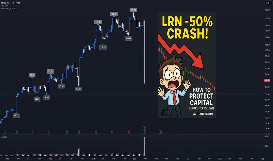
Capital Protection Guide: Learning from Catastrophic DrawdownCapital Protection Guide: Learning from Catastrophic Drawdowns - LRN Case Study
Overview
Catastrophic drawdowns—sudden, severe price declines of 30% or more in a single session—can devastate trading accounts, especially for beginners. This tutorial examines the real-world case of NYSE:LRN (Stride Inc.), which lost over 50% in a single day on October 29, 2025 , and provides practical strategies to protect your capital from similar disasters.
Understanding how to identify warning signs and implement proper risk management is essential for long-term trading success. While no strategy can guarantee complete protection, recognizing red flags and following disciplined capital preservation rules can significantly reduce the risk of catastrophic losses.
Understanding Catastrophic Drawdowns
What is a Catastrophic Drawdown?
A catastrophic drawdown occurs when a stock experiences an extreme price decline in a very short period—typically 10% or more in a single trading day . These events can be triggered by:
Earnings surprises: Missed expectations or guidance cuts
Regulatory news: Government actions or policy changes
Sector rotation: Money rapidly exiting entire sectors
High-frequency trading: Algorithmic selling creating cascading effects
Margin calls: Forced selling accelerating declines
Black swan events: Unexpected crises affecting specific stocks or sectors
Why Beginners Are Most Vulnerable
Beginners face unique challenges when catastrophic drawdowns occur:
Position Sizing Mistakes : Often risk too much capital on single trades
Lack of Stop-Loss Discipline : Emotional attachment prevents cutting losses
Overconfidence : Good runs create false confidence in risky positions
Ignoring Red Flags : Missing early warning signs of trouble
Averaging Down : Doubling down on losing positions instead of exiting
Case Study: NYSE:LRN -50% Crash on October 29, 2025
The Event
On October 29, 2025 , Stride Inc. ( NYSE:LRN ) experienced a catastrophic one-day decline. The stock closed at $68.04 on October 29, down from $153.53 the previous day—a drop of approximately 55.7% (close-to-close). According to multiple sources, the stock experienced between 41-49% premarket/intraday declines , with some sources reporting up to 51.5% decline over a 4-week period following the earnings announcement. The close-to-close decline represents one of the most severe single-day drops in recent market history.
Key Event Details:
• Crash Date: October 29, 2025
• Previous Close (Oct 28): $153.53
• Crash Day Close (Oct 29): $68.04
• Drop Magnitude: ~56% close-to-close (reported 41-49% intraday/premarket)
• Primary Causes: Weak FY26 outlook, failed platform upgrade, legal allegations
• Enrollment Impact: 10,000-15,000 student shortfall
• Growth Forecast: Slashed from 19% historical to 5% projected
• Earnings Report: Q1 FY26 reported October 28, 2025 (beat estimates but weak guidance)
What Happened - Timeline of Events
Summer 2025 : Stride attempted to implement an upgraded platform that failed to proceed as planned, resulting in poor customer experience and higher withdrawal rates.
September 14, 2025 : Gallup-McKinley County Schools Board of Education filed a lawsuit against Stride, alleging fraud, deceptive practices, and inflated enrollment figures. This was a major red flag that appeared 6 weeks before the crash.
October 28, 2025 : Q1 FY26 earnings reported after market close—beat estimates ($1.52 vs $1.23 expected) BUT guidance for FY26 was weak (only 5% growth vs 19% historical).
October 29, 2025 : Market opened and stock crashed:
• Premarket: Down ~41%
• Intraday: Declined further to ~49% intraday
• Close: Stock closed at $68.04 (down ~56% from previous close of $153.53)
• Weak financial forecast for FY26 confirmed fears
• Platform upgrade issues causing enrollment shortfall confirmed
The Math of Recovery
Critical lesson for beginners: If stock drops 50% , you need 100% gain just to break even. If stock drops 75% , you need 300% gain to recover. Prevention is infinitely easier than recovery.
Red Flags That Appeared Before the Crash
Red Flag #1: Legal Allegations (September 14, 2025)
What Happened:
• Lawsuit filed by Gallup-McKinley alleging fraud and deceptive practices
• Claims of artificially inflated enrollment figures
• Allegations of insufficiently licensed teachers
Why It Mattered:
• Legal issues are often a precursor to financial problems
• Governance and ethical concerns can destroy investor confidence
• This appeared 6 weeks BEFORE the crash - ample warning time
How to Monitor:
• Set up Google Alerts for " lawsuit" or " legal"
• Check SEC filings regularly
• Monitor news sources like Globe Newswire, MarketWatch
Red Flag #2: Operational Challenges (Summer 2025)
What Happened:
• Failed platform upgrade causing poor customer experience
• Higher withdrawal rates than anticipated
• Lower conversion rates
• Estimated 10,000-15,000 enrollment shortfall
Why It Mattered:
• Operational failures directly impact revenue
• Customer dissatisfaction leads to lost business
• Enrollment declines = revenue declines
How to Monitor:
• Read company earnings call transcripts
• Monitor customer reviews and complaints
• Watch for guidance reductions or warnings
Red Flag #3: Guidance Cut (October 29, 2025)
What Happened:
• FY26 growth forecast slashed from 19% historical average to only 5%
• This represents a 74% reduction in expected growth
• Investors immediately understood the implications
Why It Mattered:
• Growth rate cuts signal fundamental problems
• 5% growth vs 19% historical = massive disappointment
• Forward-looking statements are often more important than past results
How to Monitor:
• Compare new guidance to historical performance
• Watch for percentage reductions in growth forecasts
• Compare to analyst expectations
Red Flag #4: Volume Expansion (Days Before Crash)
What to Look For:
• Volume spikes of 2.5x+ average volume
• Unusually high volume on down days
• Declining volume on rallies (bearish divergence)
Why It Matters:
• High volume + falling price = Institutional selling
• Volume often leads price action
• Large players exiting before the crash
How to Monitor in TradingView:
Add Volume Moving Average indicators (20 and 50 period)
Compare current volume to averages
Set alert when volume > 2.5x average
Red Flag #5: Support Level Breakdowns
What to Look For:
• Price breaking below key support levels
• Support levels tested 3+ times before breaking
• Volume increase on support breaks
Why It Matters:
• Support breaks often trigger further selling
• Each failed support test weakens the level
• Break below major support = potential cascade
How to Identify in TradingView:
Use pivot low function to find support levels
Draw horizontal lines at key support using drawing tools
Track number of touches (3+ = strong support)
Exit immediately when support breaks
Red Flag #6: Volatility Expansion
What to Look For:
• Average True Range (ATR) exceeding 2x normal levels
• Increased daily price ranges (high-low spreads)
• Unusual intraday swings
Why It Matters:
• High volatility often precedes major moves
• Sudden volatility expansion can signal institutional activity
• Increased uncertainty = increased risk
How to Monitor in TradingView:
Add ATR (Average True Range) indicator
Compare current ATR to 20-period average
Calculate ratio: Current ATR / Average ATR
Alert when ratio exceeds 2.0 (volatility spike)
Capital Protection Strategies
Strategy 1: Position Sizing Rules
The Golden Rule: Never risk more than 1-2% of total capital per trade
How to Calculate Position Size:
Position Size = (Account × Risk %) / Stop-Loss %
Example: If you have $10,000 and want to risk 2% ($200) with a 5% stop-loss, your maximum position would be $4,000. This ensures that if your stop is hit, you only lose 2% of your account, not more.
Why It Works:
Limits maximum loss on any single trade
Allows you to survive multiple losses
Preserves capital for better opportunities
Strategy 2: Stop-Loss Discipline
Always Use Stop-Losses - No Exceptions
Types of Stop-Losses:
Fixed Percentage Stop :
• Example: 5% below entry
• Pros: Simple, consistent
• Cons: May not account for volatility
Support-Based Stop :
• Place below nearest support level
• Pros: Respects technical structure
• Cons: Requires chart analysis
ATR-Based Stop :
• Stop = Entry - (2 × ATR)
• Pros: Adapts to volatility
• Cons: May be too wide in volatile markets
Trailing Stop :
• Moves up as price increases
• Pros: Protects profits automatically
• Cons: Can exit during normal pullbacks
Critical Rules:
✅ Set stops immediately after entry
✅ Never move stops away from price
✅ Only move stops closer (trailing up)
✅ Never remove stops "temporarily"
✅ If stopped out, stay out (don't revenge trade)
Strategy 3: Early Exit Discipline
Why This Matters: If a stock drops 50%, you need it to gain 100% just to break even. That's why early exits are crucial—better to exit at -10% than wait for catastrophic losses. Accept small losses as the cost of doing business.
Strategy 4: Diversification Rules
Never Put All Eggs in One Basket
Diversification Guidelines:
Maximum 5-10% of capital in single stock
Diversify across sectors (not just stocks)
Keep 20-30% cash for opportunities
Don't over-concentrate in similar stocks
Example: Instead of putting 50% in one stock, spread it across multiple sectors: 5-10% in Tech, 5-10% in Healthcare, 5-10% in Energy, etc. This way, a single catastrophic drawdown can't destroy your entire account.
Why It Works:
Single catastrophic drawdown can't destroy account
Other positions can offset losses
Cash available for opportunities
Strategy 5: Risk Monitoring System
Create Your Own Risk Score:
Monitor these factors daily:
Volatility (0-25 points)
• ATR > 2x average = +25 points
Volume (0-20 points)
• Volume spike = +20 points
Support Breaks (0-25 points)
• Major support break = +25 points
Momentum (0-15 points)
• RSI overbought = +10 points
• Bearish divergence = +15 points
Gap-Downs (0-15 points)
• 3%+ gap down = +15 points
Legal/Operational Issues (0-25 points)
• Lawsuit filed = +25 points
• Guidance cuts = +20 points
Risk Score Interpretation:
0-29 : LOW risk - Normal trading
30-49 : MODERATE - Increase caution, tighten stops
50-69 : HIGH - Reduce position size by 50%
70-100 : CRITICAL - Exit immediately
Example: If a stock has a lawsuit filed (+25), operational issues (+20), volatility spike (+25), and volume anomaly (+20), the risk score would be 90—triggering an immediate exit signal.
How Early Detection Could Have Helped
In the LRN case, red flags appeared weeks before the crash:
September 14, 2025 (6 weeks before): Lawsuit filed → Risk score +25 → Monitor closely
Summer 2025 : Platform upgrade failure → Risk score +20 → Total 45 = MODERATE → Reduce position size
October 29, 2025 : Guidance cut → Risk score +20 → Total 65+ = CRITICAL → Exit immediately
By monitoring these red flags and following the risk scoring system, traders could have exited before the catastrophic crash, preserving capital for better opportunities.
Why Protection Matters:
Without Protection:
• Lost ~56% in one day
• Account severely damaged
• Needs 127% gain just to break even
With Protection:
• Exited at -5% to -10% (after red flags appeared)
• Small, manageable loss
• Capital preserved for better opportunities
• Can trade another day
Daily Protection Routine
✅ Morning: Review positions, check news/lawsuits, verify stop-losses
✅ During Trading: Monitor for red flags, watch volume/volatility spikes
✅ End of Day: Review alerts, adjust stops (only closer, never further)
Key Takeaways
Capital preservation is #1 - You can always find another trade, but lost capital is hard to recover
Always use stop-losses - Set immediately after entry, never move away from price
Watch for red flags - Multiple warnings = exit signal. Better to exit early than late.
Position sizing matters - Risk only 1-2% per trade, maximum 5-10% in single stock
Monitor news daily - Legal issues and guidance cuts often precede crashes
Use the risk scoring system - Combine technical indicators with fundamental news for better protection
Conclusion
Catastrophic drawdowns like NYSE:LRN 's ~56% crash can devastate trading accounts, especially for beginners. However, by understanding red flags (like the lawsuit that appeared 6 weeks before), implementing proper risk management, and maintaining discipline, traders can significantly reduce the risk of catastrophic losses.
While no strategy can guarantee complete protection, combining technical analysis, fundamental monitoring, risk management, and discipline can help protect your capital and ensure you can trade another day.
Remember: The goal isn't to avoid all losses—it's to avoid catastrophic losses that can destroy your trading account.
Stay disciplined. Protect your capital. Trade another day. 🛡️
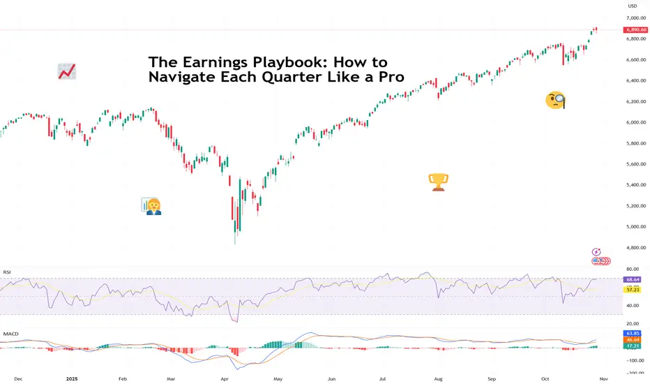
The Earnings Playbook: How to Navigate Each Quarter Like a ProTraders are in the heat of the earnings season and euphoria is sweeping every corner of the market.
The charts twitch, traders stop talking about the Fed for five minutes ( not this week, though ), and online forums turn into a parade of watch-me-trade sessions.
It’s that glorious stretch when companies pop open the books and reveal what’s really been happening behind the scenes.
For professional investors, it’s data heaven. For retail traders, it’s emotional cardio. Stocks can rise 20% on a single upbeat forecast — or plummet before your coffee cools. The trick isn’t just to survive it. It’s to navigate it like a pro.
💼 Know the Seasons (and the Mood Swings)
Earnings season comes four times a year — January, April, July, and October — and each has its own flavor.
Q1 (April): That’s the hangover quarter. Holiday sales meet new-year cost cuts. Traders recalibrate expectations and reality collides with ambition.
Q2 (July): The mid-year checkup. CEOs brag about “momentum,” analysts start sharpening their red pencils. Markets get twitchy.
Q3 (October): The credibility test. Guidance revisions and cautious tones dominate. If the year’s been good, this is where the victory laps start.
Q4 (January): The scoreboard reveal. Everyone tallies their annual wins and losses, and traders begin to bet on who carries the next year’s momentum.
Each cycle has a similar rhythm: hype, reaction, digestion, and speculation. Think of it like a four-act play.
📊 Mind the Gap
One thing to keep in mind whenever you find yourself in the earnings bonanza: the actual numbers matter less than the narrative. ( Looking at you, Oracle NYSE:ORCL )
A company can beat on revenue, miss on profit, and still rally — if the CEO sells a compelling story about the next quarter. Conversely, it can post record earnings and tank because analysts wanted even more.
The pros know to look beyond the headline EPS. They dig into guidance, margins, and segment performance. Is revenue growing because of genuine demand, or just creative accounting? Are margins improving, or did the company quietly cut R&D?
Markets don’t price what’s happened — they price what’s next. That’s especially true for growth stocks like t echnology companies .
🎯 Don’t Chase the Knee-Jerk
Every earnings season has its share of instant overreactions — the “up 10% at open, down 8% by lunch” kind of chaos. That’s when seasoned traders sit back and let volatility do the heavy lifting.
Smart money avoids buying into the frenzy or shorting into despair. Instead, they wait for the second move — when dust settles, algorithms calm down, and humans return to their desks.
🧠 Build Your Own Playbook
To trade earnings season like a pro, you need a plan. Here’s how the veterans prep:
Start early. Check the earnings calendar and mark high-impact names in your portfolio or watchlist.
Study the setup. Look at how the stock’s performed heading into earnings. A big pre-report rally can mean expectations are too high.
Focus on guidance. Earnings beats are old news — future commentary moves markets.
Use position sizing. Never bet the farm on one report. Even the best setups can go sideways.
Don’t forget the macro. Rate cuts, inflation prints, or a stray tweet from the US President can overshadow the best earnings beat.
🕹️ The Big Picture: Earnings as Market GPS
Earnings season is the market’s health check because it tells you which sectors are thriving, which are limping, and how CEOs feel about the future (watch the language: “headwinds” and “volatility” are polite ways of saying buckle up).
Taken together, earnings trends shape the broader narrative — from interest rate expectations to sector rotations. In other words, earnings season is where short-term trading meets long-term investing.
Now go and prepare for the next batch of earnings — Big Tech is on deck this week with Apple NASDAQ:AAPL and Amazon NASDAQ:AMZN reporting today.
Off to you : What’s your strategy this earnings season? Buying the hype or waiting to buy the dip? Share your thoughts in the comments!
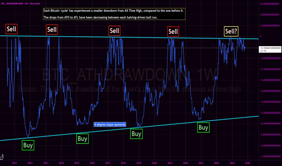
Bitcoin All Time High Drawdown - Bottom nowhere in sight?We revisit the Bitcoin All Time High Drawdown chart originally published in March 2023.
The core thesis of the BTC_ATHDRAWDOWN chart remains intact: each subsequent market cycle has exhibited a diminishing drawdown from its prior All-Time High, with generational cycle bottoms resting squarely on a discernible upward-sloping diagonal support (the 'Buy' line). The 2022-2023 bear market bottomed perfectly on this structural trendline, confirming the '4 degree slope upwards' trend.
Current Cycle Progress: The Sawtooth Fractal
Following the decisive breakthrough of the 2021 All-Time High, price action has entered an unprecedented and structurally complex phase. We are currently witnessing a prolonged high-frequency sawtooth waveform of continuous All-Time Highs.
This action represents the longest sawtooth fractal near ATH of any cycle prior.
This is a stark deviation from the swift, parabolic ascents that characterized previous blow-off tops:
Contrasting the 2017 Pattern: The 2017 bull run culminated in a sharp, almost vertical run-up to $20,000, immediately followed by a steep and rapid crash. That was a classic V-top.
The 2024/2025 Pattern: Instead of a quick V-top, the market is engaged in an extended, messy distribution/consolidation phase right at the very peak. The continuous setting of new, marginal ATHs followed by sharp, shallow pullbacks creates a dense, high-frequency signal in the ATH Drawdown chart.
This structural evolution—a prolonged struggle to hold and marginally exceed previous peaks—suggests that the market is either building a much larger, more resilient base for an extended super-cycle, or undergoing a slow, drawn-out distribution that fundamentally alters the historical BTC cycle cadence.
This is not financial advice, and presented merely as conjectural musing.
Wall Street Weekly Outlook - Week 44 2025 [27.10.- 31.10.2025]Wall Street Weekly Outlook – Week 44, 2025 📊💥
Let’s dive into another exciting trading week! 🚀
Rate decisions, month-end flows, and fresh quarterly earnings are setting the stage for strong market moves.
Sit back, enjoy the overview, and dive into the world of banks, hedge funds, and institutional flows — with exclusive insights into how the pros are positioning right now. 🧠💼📈
Extra Lessons: Strategies, setups, and market psychology — everything you need to know for the week ahead. ⚡️
**S&P500 Performance after FED rate cuts**
**Overview: The most important events of the week**
Have a great start to the trading week!
Meikel

QQQ: Preparation for FOMC... and Halloween Okay, so here is my annual Halloween themed post! Have to stick to tradition I guess.
Here I am sharing intra-day predictions in anticipation for FOMC release tomorrow.
The FEDS are between a rock and a hard place. As the Federal reserve depends on the federal government to release statistics, it is missing quite a bit of the data it would use to make decisions. While CPI was released last week which was high but showed inflation still "cooling", this is only part of the picture the FEDS consider.
In determining the appropriateness of rate cuts or hikes, these fundamental metrics are what the federal reserve considers:
Economic Growth (GDP): If GDP contracts or grows sluggishly, the Fed may cut rates to stimulate investment and consumer spending. For example, a negative Q1 followed by weak Q2 growth raises recession concerns.
Unemployment Trends: Rising unemployment signals labor market weakness. If job losses mount or hiring slows, the Fed may lower rates to encourage business expansion and hiring.
Inflation Levels: The Fed targets 2% inflation. If inflation falls below this, rate cuts can help reflate the economy. But if inflation is still high (e.g., 3% in September 2025), they must tread carefully
Financial System Stress: Signs of instability—like high volatility (VIX index), credit tightening, or banking stress—can prompt cuts to stabilize markets. Remember, JP directly mentioned how over-extended the market was! These are real considerations that the Fed is not blind to.
Global Economic Conditions: Weakness abroad (e.g., low global PMI) can spill into U.S. exports and investment, prompting accommodative policy.
Yield Curve and Policy Tightness: An inverted or steep yield curve suggests overly tight monetary policy. The Fed may cut rates to normalize the curve and avoid recession.
Here are the data the FEDS are missing going into the release tomorrow:
September Employment Report:
Job Openings and Labor Turnover Survey (JOLTS)
Retail Sales Data
Gross Domestic Product (or GDP)
Trade Balance and Import / Export Data
Let's take a look at the 20-Year Bond Market:
This chart shows a large descending wedge pattern that has recently broken to the upside, generally a bullish indication. The wedge, defined by lower highs and lower lows since early 2024, reflects a long period of declining momentum that appears to have been exhausted. The breakout above the upper trendline suggests that sellers are losing control and a potential trend reversal may be underway. As long as price remains above the broken resistance (~$44.50), the next technical targets could lie in the $46.50–$47.50 zone, while a close back below $44 would negate the breakout and reintroduce downside risk.
This is generally a sign of bearishness for the larger market, but a bullish indication for government bonds.
Why is this? For some reasons, namely:
UTWY rising means long-term Treasury prices are going up — and since bond prices move opposite to yields, this implies yields are falling.
Falling yields typically signal that investors expect slower economic growth, cooling inflation, or increased demand for safety.
In the early stages, declining yields can support equities (lower borrowing costs, valuation boost). But if yields are dropping because the market anticipates economic weakness or Fed easing due to slowdown, it can become bearish for risk assets like stocks and bullish for defensive assets like bonds and gold.
Be that as it may, the CME group estimates a > 95% probability that the feds will cut rates by at least 25 basis points. And this would be bullish, if and only if, the market hasn't already priced in a 25 basis point cut. If we notice the rallying into FOMC, it tells you something.. the market has expectations that they are already betting on.
I know, this is all boring. What about QQQ from a technical/math and momentum perspective?
On the hourly, QQQ has incredibly bullish momentum, which we can visualize using the momentum probability oscillator:
We can see that, on the hourly, QQQ is holding well above the momentum mean, indicating persistent trendiness backed but a ton of momentum.
That is not to say that this can't fail at any point, but it is completely momentum fueled right now.
But what about the math? If we look at QQQ on the weekly perspective:
We can see that QQQ is pushing the 99% confidence level. Historically, QQQ has closed above this range only 2.02% of the time, putting the odds that we hold here or above at 2.02% probability.
Not great odds if you ask me and definitely a terrible R:R to long here if you are not already long.
The last thing I can share with you is my fundamental forecast model. I haven't shared this publicly before but I have trained a model to forecast fundamental catalysts, including FOMC.
Obviously it forecasts a ton of volatility tomorrow, but here it is:
As per usual, we can expect dramatic movement in both directions.
Verdict
If you watched my most recent idea on SPY, you know I remain bullish for at least another 4% upside into EOY.
However, here is not the place to buy, in my honest opinion. I do anticipate we should see some retracement to the downside before and further moves to the upside. Not because the market is super "over-extended", because that never really matters with momentum. But because the math predicts as such ;-).
These are my thoughts. I have shared the intra-day levels in the main chart to guide you through the day tomorrow!
I wish you all safe trades and best of luck tomorrow!
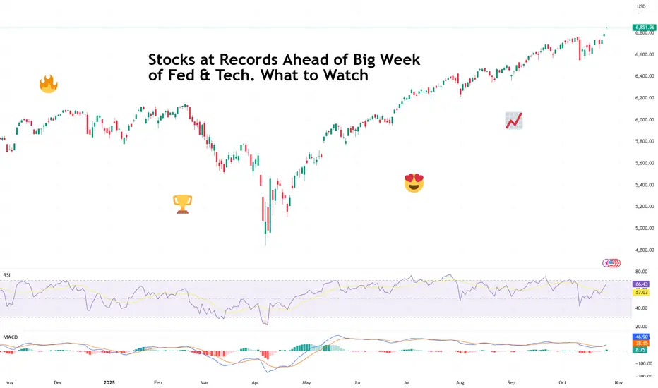
Stocks at Records Ahead of Big Week of Fed & Tech. What to WatchRecord highs, rate-cut optimism, five tech giants on deck — what a time to be a market participant!
It’s Monday, and Wall Street is back doing what it does best — setting new records and pretending not to worry about what comes next.
After a cooler-than-expected inflation print and some diplomatic smiles from Washington and Beijing, all three major indexes are kicking off the week in full throttle.
Last Friday, the Dow Jones Industrial Average TVC:DJI finally closed north of 47,000 for the first time ever, rising 472 points, or 1%.
You know that feeling when you hit every green light on the way to work? That’s what Friday felt like. The S&P 500 SP:SPX climbed 0.8%, and the Nasdaq Composite NASDAQ:IXIC gained 1.2%. Together, the trio ended the week at record highs.
The spark? September’s Consumer Price Index ECONOMICS:USCPI rose 3.0%, slightly below the 3.1% expected. Traders took that as a nod from the economy that the Federal Reserve can keep easing off the monetary brakes.
Odds of at least a half-point in rate cuts by year-end jumped to nearly 97%, according to the CME FedWatch Tool.
Soft inflation, strong sentiment, and new highs — *insert feelsgoodman meme.*
🤝 A Trade Truce (For Now)
Adding to optimism, US and Chinese negotiators sounded unusually positive over the weekend. The two sides reportedly hammered out a trade framework, setting the stage for President Donald Trump and Chinese leader Xi Jinping to meet in South Korea later this week.
Treasury Secretary Scott Bessent said the talks “ought to pave the way” for a broader discussion on tariffs, tech transfers, and everything in between — the kind of vague optimism that markets eat up like comfort food.
For now, investors are choosing to focus on the handshake rather than the fine print. After all, in the markets, hope is often more powerful than details.
🏦 The Fed’s Big Moment
The main event, however, comes midweek. The Federal Reserve is widely expected to cut interest rates ECONOMICS:USINTR by a quarter point on Wednesday. But the real show starts after the decision, when Jerome Powell takes the mic.
Traders will be parsing every word of his press conference for hints on how much further the Fed is willing to go. The tone of his remarks could determine whether markets keep coasting at record highs — or finally take a breather.
So far, Powell has managed to thread the needle: easing just enough to keep growth alive without letting inflation flare back up. But with stocks at all-time highs and job data still missing due to the government shutdown, he’s got a tough balancing act.
💻 Big Tech Takes the Stage
Anyway, peak earnings season is here and if macro policy is the first act this week, Big Tech earnings are the broader narrative.
Five members of the Magnificent Seven — Microsoft NASDAQ:MSFT , Alphabet NASDAQ:GOOGL , Meta NASDAQ:META , Apple NASDAQ:AAPL , and Amazon NASDAQ:AMZN — will all report their latest results.
That’s roughly $12 trillion in combined market cap stepping into the spotlight.
After a few solid years of sky-high expectations around AI, cloud, and advertising recovery, investors are craving proof that the hype is translating into actual earnings.
The question isn’t whether these companies are still dominant — it’s whether they can keep growing fast enough to justify valuations that have already priced in perfection.
Microsoft, Meta and Alphabet kick things off Wednesday, Apple and Amazon step up Thursday. Somewhere between all that, expect social media feeds to explode with charts, hot takes, and the occasional meme about “buying the dip” before it even happens.
🌍 Markets in a Mood
It’s one of those rare weeks when every major force — central banks, geopolitics, and tech earnings — converge into a single market narrative. And, by the looks of it, that narrative is leaning bullish.
Still, keep an eye out for surprises.
Off to you : Where do you think markets are heading this week? Are you excited to snap up some tech shares ahead of the updates or looking to play defense? Share your thoughts in the comments!
BTCUSDT – When the Bullish Wave ReturnsBitcoin is showing a notable recovery phase after a series of previous corrections. On the daily timeframe, price continues to move within an ascending channel that has been forming since the beginning of Q3.
Currently, BTC is approaching the midline of the channel around 115,000–116,000 USD , with key support at 106,700 USD and upper resistance near 127,700 USD.
If the price retests the 112,000–113,000 USD zone and holds, this could become a perfect “launchpad” for the next bullish move.
From a fundamental perspective, expectations of a Fed rate cut and South Korea’s more open stance toward crypto are providing positive momentum for risk assets like Bitcoin. However, signals from the options market and investor sentiment still show some caution, meaning the upward move may be gradual and range-bound rather than explosive.
Overall, BTC remains under bullish control , and as long as the price holds above the 106,000–107,000 USD zone, the gradual climb toward 127,000 USD remains the most likely scenario.

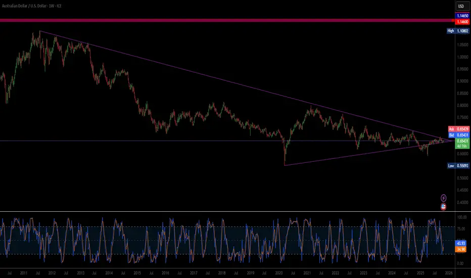
Is Geopolitical Re-Alignment the New AUD Catalyst?The Australian Dollar's (AUD) sharp surge against the US Dollar (USD) is driven by a powerful synergy of geopolitical de-escalation and structural economic realignment. Near-term momentum stems from optimism surrounding an imminent US-China trade deal. As a primary commodity exporter and a financial 'China proxy', Australia's currency benefits directly from reduced Sino-American trade tensions, prompting a global "risk-on" rally that lifted commodity prices and commodity-linked currencies. Simultaneously, softer-than-expected US inflation data has amplified expectations for a Federal Reserve rate cut in December, weakening the USD by narrowing the interest rate differential in favor of the Aussie.
Structurally, the AUD gains foundational strength from a landmark $8.5 billion US-Australia Critical Minerals Agreement. This strategic pact, targeting vital rare-earth elements, aims to secure a Western supply chain for high-tech and defense industries, directly countering China's resource dominance. The joint commitment of over $1 billion in near-term investment into Australian mining and processing facilities introduces significant foreign capital and long-term economic diversification. This geostrategic pivot transforms Australia into a key node in the non-Chinese supply of materials essential for the global clean energy transition and advanced cyber systems, moving the AUD beyond purely cyclical commodity flows.
In essence, the $AUD/USD rally is a dual narrative: a cyclical uplift from cooling trade wars and a structural upgrade from a new science and technology alliance with the US. While markets await specific details from the upcoming high-level trade talks and the Federal Reserve's next move, this combination of favorable macroeconomic divergence and a foundational critical minerals investment provides a robust, multi-domain argument for sustained Australian Dollar strength.
Can WTI’s 8% Rally Hold After Trump-Putin Summit Collapse?WTI just staged its biggest two-day rally since June, as hopes for a Trump-Putin summit were dashed, leading to new US sanctions on Russian oil exports.
Here’s what’s fuelling the move and what traders should watch next:
- US sanctions on Russia’s top oil producers after failed Budapest summit trigger supply fears and spike prices
- Trump escalates rhetoric to maintain leverage as Zelensky signs military deals with Sweden, raising geopolitical stakes
- WTI reclaims key $61 resistance, with daily RSI momentum signalling room to run and a possible cup & handle breakout toward $68
- Supply glitch fears (India, OPEC’s slow reaction) and technicals all support continued upside if the current environment holds
Watch for buy the dip signals, respect $61 support, and target the $65–68 channel top if current drivers persist.
Stay tuned!
This content is not directed to residents of the EU or UK. Any opinions, news, research, analyses, prices or other information contained on this website is provided as general market commentary and does not constitute investment advice. ThinkMarkets will not accept liability for any loss or damage including, without limitation, to any loss of profit which may arise directly or indirectly from use of or reliance on such information.

BTCUSDT: Bounce from Support Could Ignite Rally Toward $114KHello everyone, here is my breakdown of the current Bitcoin setup.
Market Analysis
Bitcoin (BTCUSDT) has recently transitioned from a bearish phase to a bullish structure after breaking out of a prolonged downward channel. The market had been forming a sequence of lower highs and lower lows until it found strong demand in the support zone around 110,000. From there, price began consolidating, indicating that sellers were losing control.A decisive breakout from the channel marked the end of bearish pressure, and since then, BTC has been moving inside a new upward channel, forming higher highs and higher lows — a clear sign of bullish momentum returning.
Currently, the price is approaching the resistance zone near 113,600–114,000, which previously acted as a key supply area. The ongoing structure suggests that buyers are attempting to push through this level and confirm a breakout continuation.
My Scenario & Strategy
In my view, BTC may attempt to retest the local support area near 111,000 before resuming its move higher. A successful bounce from this level would confirm that the new upward channel remains intact and provide a favorable long opportunity targeting the 114,000–115,000 zone.
If price breaks and holds above this resistance zone, it will likely open the door for a stronger bullish continuation toward 118,000 and beyond.
However, if BTC fails to maintain the channel support, a temporary correction back to the 110,000 area could occur before the next upward impulse.
That's the setup I'm tracking. Thank you for your attention, and always manage your risk.

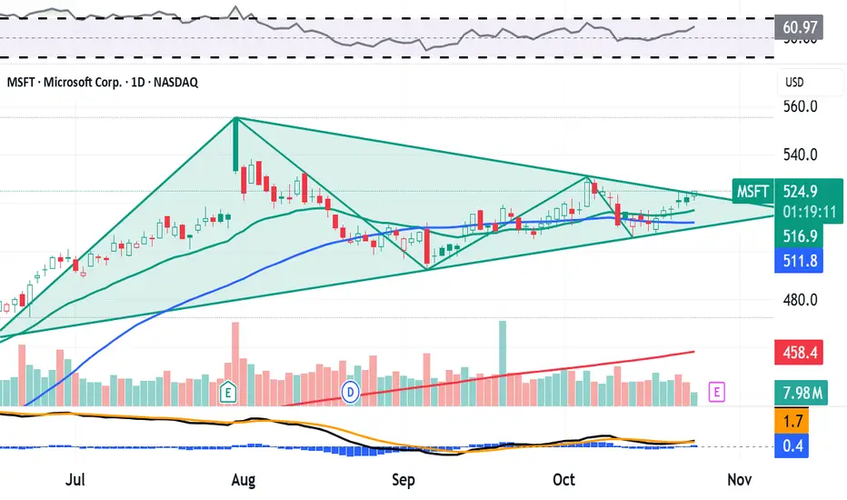
Here's What Microsoft's Chart Says Heading Into EarningsMicrosoft NASDAQ:MSFT , which will release earnings next week, is beating the S&P 500 SP:SPX year to date -- up 24.4% vs. about 15.7% for the SPX. MSFT has also gained roughly 112% over the past three years, while the S&P 500 has added just 78.9%. What does the company's chart show us ahead of earnings?
Let's check things out:
Microsoft's Fundamental Analysis
Earnings season is about to heat up. With Netflix NASDAQ:NFLX and Tesla NASDAQ:TSLA having reported results this week, the rest of the Mag-7/FAANGs -- Microsoft, Apple (AAPL), Amazon NASDAQ:AMZN , Meta NASDAQ:META , and Alphabet NASDAQ:GOOG NASDAQ:GOOGL -- will release numbers next week.
MSFT is set to release Q3 results after the closing bell on Wednesday, with the Street looking for the software giant to report about $3.66 in GAAP earnings per share. (Analyst estimates range from $3.50 to $3.78.)
A result like that would compare nicely to the year-ago print of $3.30.
Meanwhile, analysts' consensus estimate projects that MSFT will report $75.4 billion in revenue for the period, with individual forecasts ranging from $70.1 billion to $76.6 billion.
The consensus projection would be good enough for almost 15% in year-over-year revenue growth, in line with the pace of sales gains that Microsoft has regularly produced over the past few years.
All in, 26 of the 32 sell-side analysts I know of that cover Microsoft have revised their earnings estimates higher since the quarter began, while just three have lowered their forecasts. (Three have made no changes.)
Beyond just the quarterly numbers, Microsoft CEO Satya Nadella will have a lot to talk about on the earnings call -- from deals Microsoft has signed to power data centers to contracts with chip designers and LLM providers.
There's just a lot going on right now at Microsoft, from expansion of the firm's AI universe to plans to move a majority of its manufacturing out of Mainland China. A lot of what Nadella says about these things could cause a reaction in MSFT's share price.
Microsoft's Technical Analysis
Next, let's check out MSFT's chart going back some four months and running through Tuesday afternoon:
The first thing you'll see is a cup-with-handle pattern with a $531 pivot, slightly above the $524.65 that Microsoft was trading at Friday afternoon. That's a bullish signal as long MSFT can make a run at the pivot.
That's not all I see, though. Check this other four-month chart out:
This view shows a closing-pennant pattern for the stock.
Now, closing pennants historically tell you that a storm is coming, although as an indicator, they're non-directional. They signal that a violent move is on the way, but can't tell you if it's bullish or bearish.
The first chart suggests that such a move will, in fact, be bullish. But these two charts don't work together, so do we trust one or the other? That's the big question.
In the meantime, Microsoft has been using both its 21-day Exponential Moving Average (or "EMA," marked with a green line in the first chart) and the stock's 50-day Simple Moving Average (or "SMA," denoted with a blue line) for guidance lately.
This suggests that swing traders have not exited the trade, while portfolio managers have not reduced exposure. That's typically a positive unless the stock loses those lines after next week's earnings report. If that happens, you might have a crowded move to the door.
Separately, Microsoft's secondary technical indicators don't offer investors much help at this time.
The stock's Relative Strength Index (the gray line at both charts' tops) is almost perfectly neutral.
However, Microsoft's daily Moving Average Convergence Divergence indicator (or "MACD," marked with black and gold lines and blue bars at both charts' bottoms) is leaning bearish.
The histogram of the 9-day EMA (marked with blue bars) is negative and has been for almost two weeks. That's usually a short-term bearish sign.
Similarly, the 12-day EMA (the black line) is running below the 26-day EMA (the gold line). That's also usually bearish technically.
In fact, the only bullish thing I see in this indicator is that both the 12- and 26-day lines are still in positive territory.
An Options Option
Options investors who want to go long on Microsoft while purchasing downside protection might employ a "buy-write" strategy in this scenario.
This involves purchasing the stock, then selling a covered call against that equity position.
This can reduce net basis (cost), but limits the potential profitability of the investor's Microsoft purchase until the call expires. And the shares could get called away if the short call is assigned.
Here's an example of a buy-write on MSFT:
-- Purchase 100 shares of MSFT at or close to the $522 the stock was trading at when I wrote this.
-- Sell (write) one Oct. 31 call with a $532.50 strike price (the above chart's pivot) for about $9.10.
Investors who want some potential downside protection might also buy a put, which can limit losses until the options trade expires. Example:
-- Buy one Oct. 31 $512.50 put for roughly $8.40.
Investors in this example will have reduced their net basis to $521.30, but will have limited their MSFT stake's potential profitability to 2.2% through the options' Oct. 31 expiration. The trade-off is that these investors will have also capped any losses at 1.7% through expiration as well.
(Moomoo Technologies Inc. Markets Commentator Stephen "Sarge" Guilfoyle was long MSFT and TSLA at the time of writing this column.)
This article discusses technical analysis, other approaches, including fundamental analysis, may offer very different views. The examples provided are for illustrative purposes only and are not intended to be reflective of the results you can expect to achieve. Specific security charts used are for illustrative purposes only and are not a recommendation, offer to sell, or a solicitation of an offer to buy any security. Past investment performance does not indicate or guarantee future success. Returns will vary, and all investments carry risks, including loss of principal. This content is also not a research report and is not intended to serve as the basis for any investment decision. The information contained in this article does not purport to be a complete description of the securities, markets, or developments referred to in this material. Moomoo and its affiliates make no representation or warranty as to the article's adequacy, completeness, accuracy or timeliness for any particular purpose of the above content. Furthermore, there is no guarantee that any statements, estimates, price targets, opinions or forecasts provided herein will prove to be correct.
Options trading is risky and not appropriate for everyone. Read the Options Disclosure Document ( j.moomoo.com ) before trading. Options are complex and you may quickly lose the entire investment. Supporting docs for any claims will be furnished upon request.
Options trading subject to eligibility requirements. Strategies available will depend on options level approved.
Maximum potential loss and profit for options are calculated based on the single leg or an entire multi-leg trade remaining intact until expiration with no option contracts being exercised or assigned. These figures do not account for a portion of a multi-leg strategy being changed or removed or the trader assuming a short or long position in the underlying stock at or before expiration. Therefore, it is possible to lose more than the theoretical max loss of a strategy.
Moomoo is a financial information and trading app offered by Moomoo Technologies Inc. In the U.S., investment products and services on Moomoo are offered by Moomoo Financial Inc., Member FINRA/SIPC.
TradingView is an independent third party not affiliated with Moomoo Financial Inc., Moomoo Technologies Inc., or its affiliates. Moomoo Financial Inc. and its affiliates do not endorse, represent or warrant the completeness and accuracy of the data and information available on the TradingView platform and are not responsible for any services provided by the third-party platform.
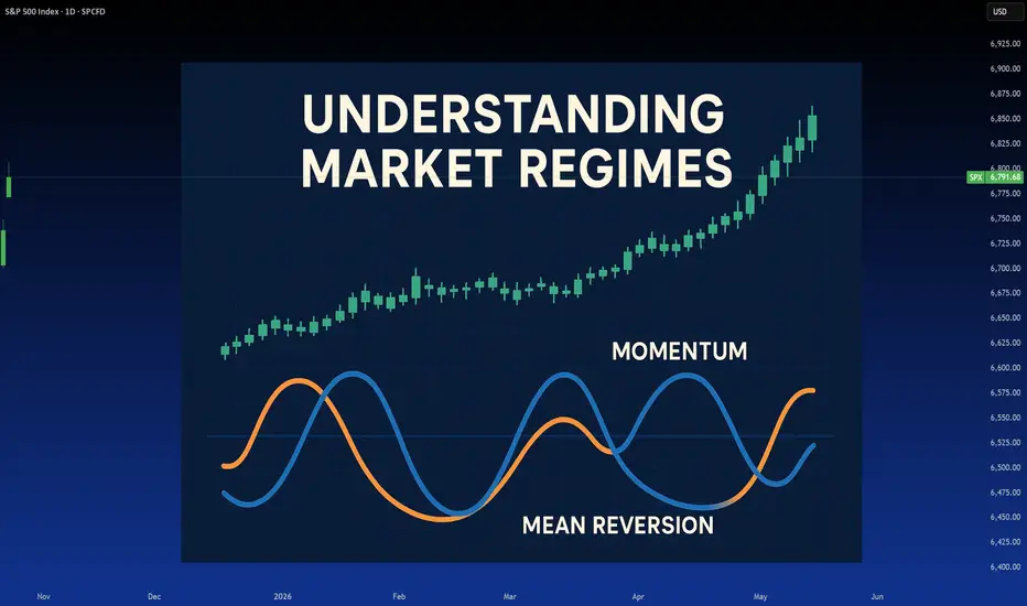
Market Regimes: What they are and why they matterRegimens, what are they and why they matter?
Most traders, especially new ones, don’t understand trading regimens. This is actually normal. Even as a quant based trader with higher education in stats/sciences, I learned of Regimen trading later in my trading career, having successfully navigated trading without it; but insurmountably improving things when I discovered it.
What is a regimen you may ask? Is it what’s going on in North Korea? Or even the USA?
Chances are, most people may think regime is synonymous with something like fascism or some ultra political significance, but the truth is regime can mean a few things, and I think its important, before getting into the real details, to first understand the meaning of regime.
The Meriam-Webster dictionary defines regime as:
regular pattern of occurrence or action (as of seasonal rainfall)
the characteristic behavior or orderly procedure of a natural phenomenon or process
mode of rule or management a government in power
a form of government
a government in power
a period of rule
If you were to do a grad school ‘ concept analysis’ on regime, you would get some interesting findings of regime. Essentially, all of these definitions have a significance/underlying overlap in meaning. The simplified meaning? I would say (without having done an actual concept analysis), a regime is a “pattern of behaviour / rules / government that forms repeating characteristics that can be measured and predicted against its previous characteristics”.
Still too complex? Let’s simplify with both political and scientific examples.
Political
In the current presidency in the U.S., the Republican party was swift to implement sweeping tariffs against international trade partners, blanketing entire continents in a matter of days with tariffs. These were then paused, resumed, paused, resumed, lowered, raised, lowered, raised, paused, resumed, revoked, resumed, lowered, raised, etc.
Under the current political regime, we can identify the behaviour of “tariff implementation”. From previous tariff implementation and revocation and adjustment, we have the characteristics of this regime. We can then use these characteristics to predict future outcomes under this regime, i.e. we would hypothesize “Tariffs will be paused within the coming 2 months”. We can say this because this is a characteristic of the current regime. In fact, the term TACO is a perfect example of repeating regime characteristics!
What about a scientific example?
Well we can draw on Meriam-Webster making reference to seasonal rainfall. In climatology, a " rainfall regime " refers to the characteristic pattern of precipitation over a region during the year—especially its timing, intensity, and variability across seasons. Identifying these regimes are pivotal to forecasting future meteorological and climatological events!
What about my field? Epidemiology and Biostatistics?
In Epi, we have multiple different regimes, such as:
Treatment Regime: A prescribed course of medical therapy, such as a drug regimen for tuberculosis or chemotherapy for cancer. It includes dosage, timing, and duration.
Vaccination Regime: A schedule of immunizations designed to prevent disease outbreaks—e.g., two-dose mRNA COVID-19 vaccine regime followed by boosters.
Control Regime: A set of public health policies or containment strategies—like quarantine protocols, mask mandates, or vector control in malaria-endemic areas.
Surveillance Regime: The systematic collection and analysis of health data to monitor disease trends—e.g., wastewater surveillance for poliovirus or syndromic surveillance for flu-like illness.
These all matter because these regimes dictate future characteristics/outcomes.
Great! Now that you have an idea of what a regime means, let’s talk about regimes in trading.
If you haven’t already guessed, there obviously exists “ market regime s”. These are, more or less, defined as “a distinct period characterized by specific patterns in market behavior—such as trends, volatility, and macroeconomic conditions—that influence investment strategies and risk management. ”
If you look back to our examples, you can begin to imagine why regimes matter. Remember, TACO! Previous behaviour dictates future characteristics. Once you understand the way or median in which some phenomena operates, you can use these characteristics to predict future characteristics.
If you wanted to dissect market regimes, it could get relatively involved and complex. For example, things such as:
Seasonality,
Momentum,
Mean Reversion,
Financial / economic stability
Geopolitical stability
These can all influence market regimes in their own way and can, in fact, be standalone market regimes. If you trade seasonality, you are trading “ seasonal regimes ”.
Momentum and Mean reversion are independent regimes of themselves (more on that shortly).
If you trade fundamentals, you will be trading economic and geopolitical regimes.
But which is correct? Not all regimes can exist at the same time, correct?
Yes and no! Regimes can momentarily shift and flip into a different one. Take, for example, the U.S. implementation of Tariff’s at the beginning of 2025. The initial blanket tariffs caused a mean reversion regime fueled by financial/economic and geopolitical stability. We had 3 regimes working together for the result, which was ultimately a mean reversion. This quickly shifted from a mean reversion regime to a momentum based regime (more on this shortly).
So, yes, we can, theoretically, have more than one regime simultaneously. However, when it comes to markets, and this is where you are in luck, its actually pretty easy! Markets tend to be either:
Mean reverting; or
Momentum based.
And that’s really that. Those are the only 2 regimes you will ever truly need to pay attention to, which will give you a better edge at trading. Seasonality, financial and geopolitical stability will either augment mean reversion or momentum, but generally are not independent regimes in and of themselves.
In the end, markets either go up, down or sideways. It can be driven by broader contexts, but in the end the up/down/sideways is driven by a predominate regimen;
Down markets: usually mean reverting.
Up markets: usually momentum.
Sideways markets: usually mean reverting with occasional momentum deviations.
If you want to learn more about the evolution of the market, you can check out my post about how the market has evolved into its current regime here:
Now, let the real fun begin and let’s talk about how to correctly trade based on the current regime!
There are some steps, first one must:
Identify the current regime concretely.
Apply the correct strategies that are compatible with the current regime.
Understand the momentum, mean reversion paradox
I will walk you through how to do this step by step.
Identifying the Current Regime Concretely
The easiest way to identify the current regime is by using Hurst Exponent.
The Hurst exponent is a number between 0 and 1 that tells you how predictable a time series is—like stock prices or rainfall.
If it's close to 0, the data is very random and tends to switch directions often.
If it's around 0.5, the data behaves like a random walk—no clear trend.
If it's close to 1, the data shows strong trends and tends to keep moving in the same direction.
So, it helps you measure persistence vs. randomness in patterns over time. The closer to 1 the more “persistent” the market is said to be. Persistence is basically the math equivalent of momentum. If a market is persistent, it will tend to trend with momentum.
The closer to 0 the more random the market is said to be . Randomness usually favours “mean reversion”
For simplicity, if you get a Hurst Exponent > 0.5, you are likely in a momentum regime. If < 0.5, you are likely in a mean reversion regime.
Let’s take a look at some examples using QuantNomad’s Hurt Exponent indicator ( available here ):
This is just before the crash in February 2025. We can see that up here, the Hurst Exponent was < 0.5, indicating a mean reversion preference. And indeed, the market ended up mean
reverting back to its quadratic mean (481) with the crash.
Then let’s see what happened:
After the crash, we can see that the Hurst Exponent was consistently > 0.5, indicating persistence in the market, i.e. trendy and momentum based.
Remember, as a rule of thumb, momentum markets generally faour upside and mean reverting tend to be downside favouring. If we narrow the regime to smaller timeframe regimes, you can see this phenomenon quite easily. Let’s look at SPY on a bearish day and bullish day against the Hurst Exponent:
We can see that on this bull trend day, Momentum and persistence reigned dominate. Hurst did not drop below 0.5, at least not for long, which indicated a persistent trend that was momentum driven.
Now a bearish day:
You can see on this bear trend day that Hurst stayed below 0.5 persistently, indicating mean reverting behaviour.
This also highlights how lower timeframes can have independent and day to day regimes, but its always important and critical to pay attention to the major regime a market is in on the larger timeframe.
Applying Correct Strategies
Depending on the regime, you MUST tailor your strategy to match the regime. If you are trading a mean reverting regime, oscillators like RSI and Stochastics aren’t going to work well. If you are trading a momentum regime with high persistence, mean reverting strategies like Bollinger Bands and Z-Score are not going to work.
As a rule of thumb, when Hurst is > 0.5, you want oscillator based strategies such as RSI, Stochastics, etc.
One indicator that I would recommend in momentum based regimes is my own, Momentum Probability Oscillator indicator ( available here ). This indicator operationalizes probability/sentiment through momentum metrics instead of mean reversion metrics. Let’s take a look at some examples:
In this example on the hourly timeframe for SPY, you can see that momentum is lost (signified by the oscillator falling below the yellow line) indicating that the likely outcome will be selling, this is shown by the pink arrows.
In this next example, we can see where momentum is reclaimed and the bias shifts to upside.
Because this indicator quantifies momentum probabilistically, it does well in momentum based, persistent regimes to identify strong trends and pullback of trends.
In reality, you can use any oscillator in a momentum based, persistent regime, but obviously I am biased to my own creations.
What about a mean reverting regimen?
If we are in a mean reverting regime, your best indicators to use are Bollinger Bands or, my favourite, the Z-Score probability indicator (by yours truly) available here .
Let’s use $NYSE:IRDM as our mean reverting example
In this image, the red arrow marks the transition to a mean reverting regime. So what do we use here? Well let’s take a look at the Z-Score probability indicator:
The red lines mark the transition to a mean reversion based regime. At the time of this transition, IRDM was oversold based on the Z-Score probability. We can see it in fact rallied back up to a z-score of 0 (mean reversion) before rejecting back down from the 0.
This is incredibly powerful, as the Hurst Exponent tells you that you can trust a reversion back to a mean!
Let’s try a smaller, intraday example, going back to SPY:
This day, SPY looked pretty bullish; however, the Hurst Exponent was consistently below 0.5 indicating mean reversion.
If we applied the Z-Score probability indicator:
I flipped the indicator to use Candles so you can more easily see the mean reversion behaviour. SPY goes to either extremes and always mean reverts back to 0, at times even consolidating in the mean reversion range.
And Bollinger bands:
If we look at a momentum driven day:
We can see that there is a skew or bias to one side of the average. The z-score is all over the map with no real expansion within the average range and infrequent and sporadic reversions that come more from extensive consolidation rather than actual mean reversion.
The indicator isn’t unusable in momentum based trading, but its not ideal. If we flip this same chart to the momentum probability oscillator we can see a stark difference in utility:
You can see the trend is using the full range of the oscillator and there is clear bounces at lower range and rejections at higher range with frequent “mean reversion” of the oscillator momentum based mean.
Now finally, the last section:
The Momentum Mean Reversion Paradox
This is, obviously, a self made up term. However, this is a phenomenon that will happen in corrective environments, where a mean reversion is so substantial, it becomes augmented by momentum itself.
What does this mean? It means that, despite the market actually mean reverting, the Hurst exponent flips to > 0.5, as the market is “persistently bearish”.
We can see this if we flip back to our $NYSE:IRDM example:
Here, we can see despite IRDM selling, the Hurst Exponent is incredibly trendy, with a really high value of > 0.55. Yet, despite this, the ticker continues down. This is the hallmark of a correction.
This is incredibly important and I really would advise you to mark this down and remember this. You can actually tell that something is “correcting” using this exact approach. When Hurst > 0.5 and the trend is down, this is the hallmark of a TRUE correction. No speculation needed!
Statistics is the best, I’m telling you.
Let’s look at the SPY crash of 2025:
During the SPY crash of 2025, the Hurst flipped to > 0.5, with a max of 0.57 indicating a hugely persistent trend. This means that this was a strong correction for SPY, flipping from a Hurst of < 0.5 to a Hurst of > 0.5 with a strong downtrend.
Crashes tend to happen abruptly without such transitions. For example, if we look at the COVID crash:
Theoretically Hurst warned us in advance that SPY was entering mean reversion territory, but when it actually happened, it happened so fast, Hurst never truly converted from mean reversion to trending. It was just a jumbled mess. This is the hallmark of a crash.
Concluding Remarks
And now, my friends, you know all there is to know about how to identify market regimes! Understanding these concepts will put your eons ahead of the average trader and allow you to select the correct tools and actually understand what the market is doing and when its gearing up for some corrections/mean reversions.
This is a long post, I will leave it there, but I really hope you learned something from this and will take some of the key points away!
Thanks for reading and as always, safe trades!
Tesla Stock Wobbles as Profit Dives 37%, Revenue Pops. Now What?Tesla NASDAQ:TSLA posted a 12% jump in revenue on Wednesday, reaching $28.1 billion, well above Wall Street’s $26.37 billion estimate. And yet, the stock slipped nearly 1% on the day before paring back that loss with a 2.3% Thursday gain.
Why? Because profits fell faster than Cybertruck’s reputation — a 37% plunge year over year, with adjusted earnings per share at 50 cents versus the expected 54 cents.
It’s a classic Tesla paradox: sales are booming, but margins are thinning, and Wall Street can’t decide whether to cheer the top line or cry over the bottom one.
🏎️ The Cost of Staying in the Fast Lane
Tesla’s secret sauce has always been scale — crank out more cars, dominate market share, and let profits follow. But this quarter, the recipe’s a bit off. Automotive revenue rose 6% to $21.2 billion, yet net income plunged to $1.37 billion from $2.17 billion a year earlier .
What happened? Price cuts. Lots of them. Musk has been slashing sticker prices across markets to stay ahead in the EV race — great for consumers, painful for margins. Add a 50% spike in operating expenses (thanks, humanoid robots and AI labs), and suddenly that sleek electric machine looks a lot less money-making.
Still, Tesla’s revenue growth means one thing: demand isn’t dead. The EV slowdown hasn’t reached Palo Alto yet.
💰 Bitcoin Bounces
In a crypto-centric subplot, the company made $62 million from its Bitcoin BITSTAMP:BTCUSD stash last quarter.
The crypto’s 5% rise — ending the quarter around $114,000 — gave Tesla’s treasury a nice digital cushion. The company held roughly 11,000 Bitcoins during the three months through September.
🧠 The $1 Trillion Question
And then there’s the other storyline — the Elon Musk Show. Musk wrapped up the earnings call by pivoting from profits to power. Specifically, his proposed $1 trillion pay package , which he insists isn’t “compensation” at all but a question of “control.”
“I just don’t feel comfortable building a robot army here and then being ousted because of some asinine recommendations from ISS and Glass Lewis,” Musk quipped, slamming the proxy firms as “corporate terrorists.”
His plan is to secure roughly mid-20s voting power to keep Tesla’s destiny firmly in his hands while still, as he puts it, being “fireable if I go insane.”
If approved, Musk’s stake could surge from 13% to nearly 29%, giving him the leverage he says he needs to push Tesla toward an $8.5 trillion valuation — complete with robotaxis, humanoid bots, and up to 12 million cars sold annually.
🧾 The Takeaway
The stock is up roughly 16% in 2025, clawing back some early-year losses, but it still lags the Nasdaq Composite NASDAQ:IXIC and other mega-cap peers like Nvidia NASDAQ:NVDA and Meta $META.
The near-term question is simple: can Tesla tighten costs without killing growth? The long-term one is bigger: can Elon Musk lead the company into its next chapter without turning every quarter into a cliffhanger?
That said, the earnings season continues and the next batch of big tech heavyweights is right around the corner.
Off to you : What’s your take on Tesla and Musk’s lofty vision north of $1 trillion? Share your thoughts in the comments!

Gold 1979 vs 2025 — When History Whispers and Markets Listen
🌕 1. The Echo of 1979
In 1979, the world watched Gold do the impossible. The metal surged from $226 to over $850 per ounce in less than a year, a 275% explosion that turned fear into fortune.
The triggers were seismic.
🇮🇷 The Iranian Revolution disrupted global oil flows.
🏛️ The U.S. Embassy hostage crisis fueled geopolitical panic.
⚔️ The Soviet invasion of Afghanistan reignited Cold War fears.
💸 And double-digit inflation in the U.S. shredded faith in the dollar.
By early 1980, panic replaced logic. Every newspaper screamed, “Buy Gold before it’s too late!” Then came Paul Volcker’s shock therapy as interest rates jumped above 15% and COMEX doubled margin requirements. Within eight weeks, Gold fell more than 40%, marking the end of one of the most dramatic speculative manias in modern history.
🔁 2. Fast-Forward to 2025: The Parallels Are Uncanny
The world of 2025 looks hauntingly similar.
🕰️ 1979 🔮 2025
Iranian Revolution and Cold War tensions Gaza war, U.S.–China decoupling, and regional instability
Oil shock and inflation Energy disruptions and persistent post-pandemic inflation
Dollar under pressure Record U.S. debt and fiscal erosion
Panic buying of Gold Central bank accumulation and retail FOMO
Fed under Volcker turns hawkish Fed under Powell trapped between cuts and control
By late August 2025, gold sat quietly near $3,415, then erupted into a seven-week vertical rally above $4,300, a mirror image of 1979’s euphoric climb. But just like back then, euphoria was the prelude to exhaustion.
⚠️ 3. The Anatomy of the Current Crash
On October 17, 2025, Gold plunged $250 in one day, a shocking 5–6% drop that broke its parabolic structure and sent fear rippling across markets.
What triggered it?
🏦 A hawkish shift in the Federal Reserve’s language as officials hinted rate cuts might be delayed.
💰 Real yields surged, breaking the inverse correlation that had fueled gold’s climb.
🏛️ Institutional profit-taking hit record levels, confirmed by rising COMEX open interest and volume.
🗞️ Sentiment flipped overnight as headlines shifted from “Gold to $5000” to “Gold crashes $250.”
The move marked the first true break of structure (CHoCH) since the rally began, historically the signal that smart money is quietly exiting.
🔍 4. Lessons from 1980 — The Signs of a Top
Before gold crashed in 1980, five clear warning signs appeared.
⚙️ 1979–1980 Signal 💡 2025 Equivalent 🧭 Status
Fed turns hawkish Powell signals “pause / higher for longer” ⚠️ Emerging
Rising bond yields vs. flat Gold Real yield divergence ✅ Confirmed
Parabolic candles Daily range above $100 ✅ Seen
Media frenzy “Gold to $5000” hype ✅ Seen
Margin hikes and record OI Record COMEX participation ⚠️ Rising
Four out of five signals are already flashing. History teaches that when everyone believes Gold can only rise, it’s often about to fall.
🧭 5. What Smart Traders Should Do Now
🟡 Phase 1 – Immediate Protection (Next 24 Hours)
If you’re long, secure 50–75% of gains and protect above $3,950.
If you’re short, trail stops to $4,200 and look for targets at $3,950 → $3,800 → $3,600.
If you’re flat, stay patient and wait for at least two daily candles of stabilization before acting.
🟠 Phase 2 – Stabilization (Next 3–5 Days)
Watch for:
🕯️ Long lower wicks on daily candles show buyer absorption.
📉 Shrinking COMEX volume indicates exhaustion of sellers.
📊 Flat or falling real yields confirming support.
🔵 Phase 3 – Re-evaluation (Next 1–2 Weeks)
If gold reclaims $4,000+ with strength and Fed tone softens, a controlled re-rally may begin. If Gold stays below $3,800, the correction likely extends toward $3,500, the same 30–40% retracement seen in 1980.
🧘♀️ 6. Beyond the Chart — Discipline Over Drama
When a $250 candle appears, instincts scream, “Do something!” But professionals know the truth: reaction destroys capital, observation preserves it. The coming days are not about prediction but about posture. Stay liquid, track sentiment, watch real yields, and remember that even in 1980, Gold’s crash didn’t end its story — it simply reset the cycle for the next era of accumulation.
✨ History doesn’t repeat, but it rhymes. In 1979, Gold taught us that fear creates bubbles. In 2025, it’s reminding us that even truth needs a pullback before it shines again.
If this article helped you today and brought you more clarity:
Drop a 🚀 and follow us✅ for more trading ideas and trading psychology. Thank you.

Beyond Meat Posts Best Day Ever, Up 147%: Return of the Meme?🔥 A Sizzling Comeback or Just Froth?
Beyond Meat NASDAQ:BYND , once the darling of the plant-based revolution and later the focus of every “overcooked IPO” joke, just got on everyone’s radar: a 147% single-day surge, its best performance ever.
For a company that was trading at just 65 cents last week — and a 50-cent all-time low — Tuesday’s rally was a surprise to many, especially those that were short the shares.
The stock is now sizzling around $3.60, and retail traders everywhere are asking the same question: Is the meme trade back on the menu?
📈 The Rally Nobody Ordered
This all started when Roundhill Investments — the folks who run the Roundhill Meme ETF AMEX:MEME — decided to toss Beyond Meat into their thematic mix. Within hours, a retail stampede was underway. Monday saw a 127% jump, and Tuesday piled on another 146%.
Over the past three trading days, the stock is up a whopping 600%. It’s not about earnings reports or something that popped out of the economic calendar .
It’s about a short squeeze. With more than 63% of Beyond’s float sold short, bearish investors were caught in a panicked scramble to buy back shares before the fire spread.
In meme stock lingo, this was déjà vu — the same cocktail of FOMO, leverage, and chaos that made GameStop NYSE:GME and AMC NYSE:AMC household names.
What’s more, a Walmart deal announced on Monday expanded Beyond Meat’s distribution across US stores.
🔍 The Irony of the “Beyond” Narrative
The irony here is almost poetic. Beyond Meat went public in 2019 as a symbol of disruption — the future of food, sustainability, and innovation. It hit $230 per share, a valuation that made traditional meat producers look like legacy players.
Then came reality. Demand cooled, competition heated up, and costs chewed through margins. By 2024, the stock was less “Beyond” and more behind. Losses piled up for five straight years.
Now, it’s back in the spotlight, not for reinventing dinner, but for rekindling nostalgia — the 2021 meme stock era, where logic left the room and retail traders partied all day and night.
🚨 Caution: Hot Grease Ahead
The stock was up another 50% in pre-market deals Wednesday, but before you mortgage your house to “ape in,” keep in mind this could end badly, fast.
The fundamentals haven’t changed. Beyond still faces declining revenue, debt issues, and a shrinking market for plant-based meat substitutes.
If you’re trading this, understand you’re surfing a wave built on emotion and short covering — not sustainable growth. When the wave breaks, it’ll break fast.
🪙 The Meme Lives On (But So Does Gravity)
So, is this the second coming of the meme stock era? Maybe. Or maybe it’s just a nostalgic encore — the kind where everyone sings along even though they know how it ends.
Off to you : What do you think? Are we back in the meme stock craze or is this about to fizzle out as quickly as it popped up? Share your thoughts in the comments!
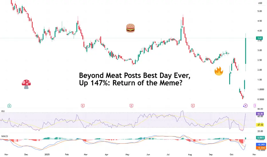
My Plan To Improve My Win/Loss Ratio In Forex TradingThe trading plan that I have been designing based on SMC was amazingly beautful in terms of its mechanics. Yet, it had a terrible Win/Loss ratio.
Because I loved its mechanics, I didn't want to drop it all together, and was looking for ways to enhance it. I tried to merge it with the classical school and with some Volume indicator, but things still went south.
Finally, I came by some educational material that showed me a couple of things on using Stochastic. I loved it, and this will be my addition, and what I will test in the coming week.
My plan will include the same SMC rules, and the Stochastic. I will draw the support and resistance zones and maybe trendlines.
I will be using the daily timeframe on two different sets of settings for the stochastic, one is long term and another is shorter term.
I will be coming back with my test results next week.
