XAUUSDXAUUSD remains in a strong uptrend and is expected to test the $4653-$4661 level. If the price fails to break through $4661, I anticipate a short-term downtrend. Consider selling in the red zone.
🔥Trading futures, forex, CFDs and stocks carries a risk of loss.
Please consider carefully whether such trading is suitable for you.
This content is not financial advice. Always conduct your own financial due diligence.
>>GooD Luck 😊
❤️ Like and subscribe to never miss a new idea!
Forextrading

Global Recession and Its Impact on the Stock MarketUnderstanding the Nature of a Global Recession
A global recession typically arises from a combination of factors such as financial crises, sharp interest rate hikes, geopolitical conflicts, pandemics, commodity shocks, or systemic banking failures. Unlike regional recessions, a global recession spreads across borders through trade links, capital flows, currency markets, and investor sentiment. When major economies like the United States, Europe, or China slow down simultaneously, the ripple effects are felt across emerging and developed markets alike.
Stock markets act as economic barometers. As expectations of lower growth emerge, equity prices begin to factor in weaker corporate earnings, declining demand, and tighter financial conditions. This makes stock markets one of the first and most visible casualties of a global recession.
Immediate Stock Market Reactions
One of the most prominent impacts of a global recession on stock markets is heightened volatility. As recession fears intensify, investors often rush to reduce risk exposure, triggering sharp sell-offs. Equity indices may experience rapid declines as panic-driven selling dominates rational valuation. During such phases, even fundamentally strong companies can see steep price corrections due to broad-based market fear.
Liquidity also becomes a concern. In times of recession, institutional investors may face redemption pressures, forcing them to sell holdings. This can amplify market declines, widen bid-ask spreads, and reduce market depth. Sudden drops in stock prices can erode investor confidence, creating a self-reinforcing cycle of fear and selling.
Decline in Corporate Earnings
At the core of stock valuation lies corporate profitability. A global recession directly impacts company earnings through reduced consumer spending, weaker demand, supply chain disruptions, and rising costs of financing. As revenues fall and margins compress, companies often issue earnings downgrades. These revisions play a major role in pushing stock prices lower.
Cyclical sectors such as automobiles, metals, construction, real estate, and discretionary consumption tend to suffer the most. Businesses dependent on exports are particularly vulnerable during a global downturn, as international trade slows and currency volatility increases. Lower earnings expectations reduce price-to-earnings multiples, further dragging stock market valuations down.
Sectoral Impact and Market Rotation
A global recession does not affect all sectors equally. Defensive sectors such as healthcare, utilities, consumer staples, and pharmaceuticals usually outperform the broader market during recessionary periods. These sectors provide essential goods and services, which remain in demand even when economic conditions deteriorate.
On the other hand, high-growth and capital-intensive sectors like technology, infrastructure, banking, and luxury goods often experience sharper corrections. Financial stocks are especially sensitive to recessions due to rising loan defaults, lower credit growth, and tighter regulatory oversight. Investors typically rotate their portfolios away from riskier assets and into defensive or dividend-paying stocks, reshaping overall market dynamics.
Impact on Investor Sentiment and Behavior
Investor psychology plays a crucial role during a global recession. Fear, uncertainty, and pessimism dominate market sentiment, leading to risk aversion. Retail investors may exit equities altogether, preferring cash or fixed-income instruments perceived as safer. Foreign institutional investors often withdraw capital from emerging markets, causing additional pressure on local stock indices and currencies.
Long-term investors, however, may view recession-driven market corrections as opportunities to accumulate quality stocks at discounted valuations. This divergence in behavior creates sharp short-term fluctuations while laying the groundwork for eventual recovery.
Role of Central Banks and Governments
Policy responses significantly influence how stock markets react to a global recession. Central banks usually respond by cutting interest rates, injecting liquidity, and implementing accommodative monetary policies. Lower interest rates reduce borrowing costs, support corporate balance sheets, and make equities more attractive compared to bonds.
Governments often introduce fiscal stimulus measures such as tax cuts, infrastructure spending, and direct financial support to households and businesses. These interventions can stabilize markets and restore investor confidence. Stock markets often stage relief rallies when large stimulus packages are announced, even if economic conditions remain weak.
Long-Term Structural Changes
Global recessions can lead to long-lasting structural shifts in stock markets. Certain industries may permanently lose relevance, while others emerge stronger. For example, past recessions have accelerated digital transformation, automation, and shifts in consumer behavior. Companies that adapt quickly to new economic realities tend to outperform in the post-recession phase.
Valuation frameworks may also change. Investors become more cautious, emphasizing balance sheet strength, cash flows, and sustainable business models over aggressive growth projections. This can lead to a re-rating of markets and a more disciplined investment environment.
Recovery Phase and Market Rebound
Historically, stock markets begin to recover before the broader economy shows visible improvement. As soon as recessionary conditions start stabilizing and future growth expectations improve, equities often rally sharply. This recovery is usually led by sectors that were hit hardest during the downturn, followed by broader market participation.
However, the pace and sustainability of recovery depend on factors such as policy effectiveness, inflation trends, employment growth, and global economic coordination. Markets that fell the most during the recession often deliver strong returns during the rebound, rewarding patient and disciplined investors.
Conclusion
A global recession has a profound and multifaceted impact on stock markets. From sharp declines and heightened volatility to earnings compression and shifts in investor behavior, recessions reshape financial markets in significant ways. While the short-term effects are often painful, they also serve as periods of correction, revaluation, and transformation.
For investors, understanding the dynamics of a global recession is crucial for risk management and long-term wealth creation. Diversification, focus on fundamentals, and a disciplined investment approach can help navigate turbulent markets. Ultimately, while global recessions test the resilience of stock markets, history shows that markets adapt, recover, and often emerge stronger over time.

Global Market Time Zone ArbitrageLeveraging the Clock for Trading Advantage
Global financial markets operate around the clock, moving seamlessly from one time zone to another as trading shifts from Asia to Europe and then to the Americas. This continuous cycle creates unique opportunities known as time zone arbitrage, where traders exploit price discrepancies, information gaps, and sentiment shifts that arise because markets in different regions open and close at different times. Global market time zone arbitrage is not about illegal exploitation; rather, it is a strategic approach that takes advantage of how information, liquidity, and trader behavior flow across time zones.
Understanding Time Zone Arbitrage
Time zone arbitrage refers to the practice of using the staggered opening and closing hours of global markets to anticipate price movements or capture temporary inefficiencies. For example, developments in the US market after Indian market hours can significantly impact Asian markets the next day. Similarly, movements in Asian markets during their trading session often influence European markets when they open. Traders who monitor and interpret these transitions can position themselves ahead of the crowd.
Unlike classical arbitrage, which focuses on simultaneous price differences of the same asset in different markets, time zone arbitrage is more anticipatory and strategic. It relies on understanding how price discovery unfolds over time rather than at a single moment.
Global Market Structure and Time Zones
The global trading day typically follows this sequence:
Asian Session (Tokyo, Shanghai, Hong Kong, Singapore, India)
European Session (London, Frankfurt, Paris)
US Session (New York, Chicago)
Each session has distinct characteristics. Asian markets are often influenced by regional economic data and overnight US market cues. European markets tend to react to both Asian performance and early macroeconomic announcements. US markets, being the most liquid, often set the global tone, especially after major economic data releases or Federal Reserve announcements.
This handoff from one region to another is where time zone arbitrage opportunities arise.
Information Flow and Overnight Gaps
One of the most important drivers of time zone arbitrage is information asymmetry. Economic data, corporate earnings, geopolitical news, and central bank statements often occur when certain markets are closed. When those markets reopen, prices may gap up or down to reflect the new information.
Traders who analyze overnight developments can anticipate these gaps. For instance, if US indices rally strongly due to positive economic data, Asian equity markets often open higher. A trader positioned in index futures or ETFs before the Asian open can benefit from this expected move.
Similarly, negative global news released during Asian hours can affect European and US markets later in the day, creating opportunities for short positions or hedging strategies.
Cross-Market Influence and Lead–Lag Relationships
Time zone arbitrage also relies heavily on lead–lag relationships between markets. Certain markets tend to lead others due to their size, liquidity, or economic influence. The US equity market often leads global equities, while US bond yields and the dollar influence currencies and emerging markets worldwide.
For example:
A sharp rise in US bond yields during the US session may pressure emerging market equities and currencies in the following Asian session.
Strong performance in Asian technology stocks can influence European tech indices at the open.
Movements in crude oil during US trading hours can affect energy stocks in Asian and European markets the next day.
Understanding these relationships allows traders to forecast probable reactions rather than reacting after the move has already occurred.
Instruments Used in Time Zone Arbitrage
Time zone arbitrage is applied across multiple asset classes:
Equity Index Futures: Such as S&P 500, Nikkei, DAX, and Nifty futures, which trade nearly 24 hours.
Currencies (Forex): The forex market operates 24/5, making it ideal for time zone-based strategies.
Commodities: Crude oil, gold, and base metals often react to global news across sessions.
ETFs and ADRs: Used to gain exposure to foreign markets during domestic trading hours.
These instruments allow traders to act even when the underlying cash market is closed.
Role of Volatility and Liquidity
Volatility and liquidity vary by session, which is crucial for time zone arbitrage. Asian sessions may show lower volatility compared to US sessions, while European sessions often experience sharp moves during overlapping hours with the US.
Professional traders adjust position size and execution strategies based on session liquidity. Lower liquidity can exaggerate price movements, creating both opportunity and risk. Time zone arbitrage traders must balance the potential for outsized gains against slippage and execution costs.
Risk Management in Time Zone Arbitrage
While time zone arbitrage offers opportunities, it also carries risks:
Unexpected News: Sudden geopolitical events or policy announcements can invalidate expectations.
False Correlations: Lead–lag relationships can break down during unusual market conditions.
Gap Risk: Overnight gaps can move sharply against positions with limited exit options.
Effective risk management includes predefined stop-loss levels, diversification across markets, and awareness of economic calendars across regions.
Technology and Data in Modern Arbitrage
Advances in technology have enhanced time zone arbitrage strategies. Real-time global news feeds, economic calendars, algorithmic trading systems, and quantitative models help traders analyze cross-market relationships faster and more accurately. Institutional players often use automated systems to exploit these opportunities, but informed retail traders can still benefit through disciplined analysis and timing.
Relevance for Emerging Market Traders
For traders in emerging markets like India, time zone arbitrage is especially relevant. Global cues from US and European markets strongly influence domestic indices, currencies, and commodities. Monitoring global market closures, futures movement, and overnight news can significantly improve decision-making at the local market open.
Conclusion
Global market time zone arbitrage is a powerful trading approach that transforms the world’s trading clock into a strategic asset. By understanding how markets interact across time zones, how information travels, and how different sessions influence one another, traders can anticipate movements rather than chase them. While not risk-free, time zone arbitrage rewards preparation, global awareness, and disciplined execution. In an interconnected financial world, mastering time-based market dynamics is no longer optional—it is a key component of modern global trading success.

XAUUSD – The uptrend is still intactXAUUSD – The uptrend is still intact, we just need that decisive break.
Gold is maintaining a strong bullish momentum within the rising channel, consistently printing higher lows. However, price is now approaching a psychological resistance cluster, so the next move could easily include a sharp shakeout to sweep liquidity before the market commits to direction.
Macro context
In periods where markets are sensitive to news flow and interest-rate expectations, gold often finds support from safe-haven demand. But when price is trading at elevated levels, the optimal approach remains the same: don’t chase candles — only act when price reaches key technical zones.
Technical view (H1)
The primary trend remains bullish, with price respecting the rising trendline.
The current area sits in a “premium” zone (prone to profit-taking / sharp pullbacks).
Two key clusters stand out on the chart:
Near psychological resistance: 4630–4640
Next psychological resistance: 4765 (expanded upside target)
Key levels
Near resistance: 4630–4640
Major resistance: 4760–4765
Support / pivot level: 4540 (previous resistance, now potential support)
Deeper support: 4400 (base zone, only relevant if a strong reversal develops)
Trading scenarios
Scenario 1: Trend BUY (priority)
Condition: Price holds above 4630–4640 and continues forming bullish structure.
Entry: Buy the pullback at 4605–4615
SL: 4595
TP1: 4685–4700
TP2: 4760–4765
This is the cleanest setup: a mild retracement, then continuation with the trend.
Scenario 2: Safer BUY on support retest
If price spikes down to sweep liquidity:
Entry: Buy 4540–4545
SL: 4528
TP: 4630 → 4685 → 4765
4540 is a key line in the sand — as long as it holds, the uptrend stays strong.
Scenario 3: Reaction SELL (short-term only)
Only consider sells if there’s clear rejection at resistance:
Sell: 4760–4765
SL: 4778
TP: 4685 → 4635 → 4540
Or, if price fails to hold 4630–4640 and closes weak:
Sell: 4625–4635
SL: 4650
TP: 4545
Conclusion
The dominant trend remains bullish, but price is pressing into psychological resistance — so execution must be “right level, right reaction”. The priority remains buying with the trend, and only selling if there’s a clean rejection at 4765 or a confirmed failure to hold 4630–4640.
👉 If this plan helps, follow LiamTradingFX for daily XAUUSD updates as early as possible.

XAUUSD – H2 Technical Outlook | Lana XAUUSD – H2 Technical Outlook | Lana ✨
Gold continues to trade within a strong bullish structure, and price action is confirming that the market is still respecting the ascending trend channel on the H2 timeframe.
📈 Market Structure & Trend Context
The overall trend remains bullish, with higher highs and higher lows clearly intact.
Price has successfully flipped the 4445–4450 zone from resistance into support, confirming strong buyer commitment.
The impulsive leg toward the current highs suggests we are still in a continuation phase, not a distribution phase.
🔍 Key Technical Zones & Liquidity
Buy resistance flip: 4445–4450
This zone has already shown clean reactions and acts as a structural base for further upside.
POC Buy zone: 4595–4600
This is a high-volume node where price is likely to rebalance liquidity before the next expansion.
Sellside liquidity sits just below current price, making a shallow pullback into value very possible before continuation.
🎯 Bullish Scenarios
Primary plan: Look for BUY setups on pullbacks into 4595–4600 (POC) with bullish confirmation.
Continuation target: If price accepts above current highs, the next upside objective sits around 4747, where higher-timeframe liquidity is resting.
A clean hold above the trendline keeps the bullish thesis valid.
🧠 Notes
Avoid chasing price at highs; wait for pullbacks into value and liquidity zones.
Trade in alignment with trend + structure, not short-term noise.
Patience is key while the market builds liquidity before the next expansion.
✨ Stay disciplined, trade the structure, and let price come to your zone.

Buy Side Liquidity Sweep & Bearish ContinuationGBPUSD H1
Consolidation Bullish BOS Order Block push Week High (Buy-Side Liquidity sweep).
After premium rejection, price shows distribution and a bearish shift (CHoCH).
Expectation: Sell-Side Liquidity (SSL) hunt, followed by HTF SLL toward 1.33000.

XAUUSD – H2 Technical OutlookXAUUSD – H2 Technical Outlook | Lana ✨
Gold is still holding a strong bullish structure, and what we’re seeing right now is a healthy technical pullback after the ATH breakout — not a reversal signal.
📈 Market Structure & Trendline
Price has broken the previous ATH and held above it, reinforcing the medium-term uptrend.
The current leg looks like a classic impulse → correction → continuation sequence.
The rising trendline remains respected, so the main bias stays bullish (BUY the dip).
🔢 Fibonacci Confluence & Key Zones
Applying Fibonacci to the most recent impulsive move:
✅ High-probability BUY areas
Buy GAP: 4515 – 4518
This is an imbalance zone where price often returns to rebalance before continuing higher.
Fibo 0.618: around 4545
A strong retracement level aligning with liquidity and bullish structure support.
These two zones are the best “value areas” to focus on for long entries.
🟢 Preferred BUY Scenarios
Plan A: Buy from 4515–4518 after bullish confirmation on H1–H2
Plan B: If price tags ~4545 (0.618), wait for confirmation and look for continuation longs
➡️ Upside targets: retest ATH first, then continuation can extend toward the 46xx–47xx area if resistance breaks and price accepts above.
🔴 Resistance & Breakout Confirmation
The zone around 4597 – 4630 is the near-term resistance area.
A clean break and acceptance above this zone would be a strong confirmation for a push toward 47xx.
🧠 Notes
Avoid FOMO and chasing price when the market is trading at elevated levels.
Be patient and wait for price to pull back into value zones.
Prioritize BUY setups aligned with the main trend and market structure, not emotional trades.

XAUUSD – H2 Technical Outlook | Lana XAUUSD – H2 Technical Outlook | Lana ✨
Gold is still holding a strong bullish structure, and what we’re seeing right now is a healthy technical pullback after the ATH breakout — not a reversal signal.
📈 Market Structure & Trendline
Price has broken the previous ATH and held above it, reinforcing the medium-term uptrend.
The current leg looks like a classic impulse → correction → continuation sequence.
The rising trendline remains respected, so the main bias stays bullish (BUY the dip).
🔢 Fibonacci Confluence & Key Zones
Applying Fibonacci to the most recent impulsive move:
✅ High-probability BUY areas
Buy GAP: 4515 – 4518
This is an imbalance zone where price often returns to rebalance before continuing higher.
Fibo 0.618: around 4545
A strong retracement level aligning with liquidity and bullish structure support.
These two zones are the best “value areas” to focus on for long entries.
🟢 Preferred BUY Scenarios
Plan A: Buy from 4515–4518 after bullish confirmation on H1–H2
Plan B: If price tags ~4545 (0.618), wait for confirmation and look for continuation longs
➡️ Upside targets: retest ATH first, then continuation can extend toward the 46xx–47xx area if resistance breaks and price accepts above.
🔴 Resistance & Breakout Confirmation
The zone around 4597 – 4630 is the near-term resistance area.
A clean break and acceptance above this zone would be a strong confirmation for a push toward 47xx.
🧠 Notes
Avoid FOMO and chasing price when the market is trading at elevated levels.
Be patient and wait for price to pull back into value zones.
Prioritise BUY setups aligned with the main trend and market structure, not emotional trades.

DXY, USDXDXY is currently approaching the support zone at $98. If this support holds strong and the price fails to break through $98, a rebound is possible. Consider buying in the red zone.
🔥Trading futures, forex, CFDs and stocks carries a risk of loss.
Please consider carefully whether such trading is suitable for you.
This content is not financial advice. Always conduct your own financial due diligence.
>>GooD Luck 😊
❤️ Like and subscribe to never miss a new idea!

USDCHFUSDCHF is in a sideways trading range. If the price can hold above 0.79248, I expect a potential rebound. Consider buying in the red zone.
🔥Trading futures, forex, CFDs and stocks carries a risk of loss.
Please consider carefully whether such trading is suitable for you.
This content is not financial advice. Always conduct your own financial due diligence.
>>GooD Luck 😊
❤️ Like and subscribe to never miss a new idea!

XAUUSD – H1 Technical Analysis | Lana XAUUSD – H1 Technical Analysis | Lana ✨
Gold remains in a strong bullish structure, and the current price action is best understood as a healthy pullback within an uptrend, not a reversal.
📈 Market Structure & Trendline
Price continues to respect the ascending trendline, confirming higher highs and higher lows.
The impulsive leg at the start of the week created a clear liquidity imbalance, which is now acting as a key demand zone.
As long as price holds above this structure, the bullish bias stays intact.
🔢 Fibonacci Confluence
Using Fibonacci on the latest impulsive move:
0.618 – 0.5 retracement zone aligns perfectly with the current consolidation.
This confluence strengthens the idea that the market is rebalancing before continuation, rather than distributing.
🟢 Key Buy Zones (Preferred)
4510 – 4520
Liquidity imbalance + trendline support
→ Ideal zone to wait for bullish confirmation
This zone represents value, where smart money typically looks to re-enter the trend.
🔴 Resistance & Reaction Zone
4635 – 4637 (Fibonacci extension 2.618)
→ Strong resistance and profit-taking area
→ Possible short-term sell reaction, not a confirmed reversal
Avoid chasing buys near this zone without a clear breakout and acceptance.
🧠 Trading Scenario
Base case: Price pulls back into the buy zone (4510–4520), reacts, and continues higher following the trendline.
Alternative: Deeper pullback but structure remains bullish as long as trendline holds.
Invalidation: A clean break and acceptance below the trendline would signal a deeper correction.
✨ Lana’s Notes
Trend is your friend — but entries matter more than bias.
Buy value, sell reactions.
Let Fibonacci, structure, and trendline do the heavy lifting.
No FOMO, no chasing.
Trade the structure. Respect the trend. React, don’t predict. 💛

XAUUSD – Strong Breakout, Focus on Buy PullbacksMarket Context (H1)
Gold has delivered a clean breakout above the previous consolidation zone, confirming a return of active buying pressure. This impulsive move signals that buyers are regaining short-term control, while any subsequent pullbacks are likely corrective rather than reversal-driven.
From a fundamental perspective, a cautious Fed stance and ongoing safe-haven demand continue to provide a supportive backdrop for gold, keeping downside moves limited and corrective in nature.
Structure & Price Action
H1 structure has shifted into a bullish continuation phase after breaking above key resistance.
Price remains above major demand zones, with no bearish CHoCH confirmed so far.
Lower zones act as retest and liquidity absorption areas, favoring trend-following BUY setups.
Trading Plan – MMF Style
Primary Scenario – Trend-Following BUY
Preferred BUY zones:
BUY zone 1: 4,538 – 4,510
BUY zone 2: 4,509 – 4,481
Only execute BUYs after clear bullish reactions and structure confirmation. Avoid FOMO at extended levels.
Upside Targets
TP1: 4,580
TP2: 4,602 (upper extension target)
Alternative Scenario
If price fails to pull back and holds firmly above 4,580, wait for a break & retest before looking for continuation BUYs.
Invalidation
If an H1 candle closes below 4,481, invalidate the BUY bias and reassess market structure.
Summary
Short-term bias remains bullish. The optimal strategy is to stay patient and BUY on pullbacks at discounted zones, aligning with higher-timeframe flow rather than chasing price.

XAUUSDXAUUSD is still in an uptrend. If the price can remain above $4420, further price growth is expected.
🔥Trading futures, forex, CFDs and stocks carries a risk of loss.
Please consider carefully whether such trading is suitable for you.
This content is not financial advice. Always conduct your own financial due diligence.
>>GooD Luck 😊
❤️ Like and subscribe to never miss a new idea!

Weekly Trade Planning Session: High Probability Pairs Analysis"When you fail to plan in trading, you are planning to fail." Welcome to this week's trade planning session where we identify high-probability setups using currency strength analysis + technical structure.
📊 Portfolio Selection - Currency Strength Index (CSI):STRONG Currencies (Buy Bias):
🟢 AUD
🟢 USD
🟢 GBP
🟢 CHF
🟢 EURWEAK Currencies (Sell Bias):
🔴 JPY
🔴 NZD
🔴 CAD
Why This Matters:
High-probability trades occur when technical structure aligns with fundamental strength. When a strong currency pairs against a weak one AND the chart shows clear technical setup = highest probability. Strategy: Look for strong vs weak currency pairs with confirming technical patterns.
💹 USDJPY Analysis (1HR Chart):Structure: Completed bullish wave structure ✓Current Position: Trading at the high
Expected Move: Bearish reversal
Entry Strategy (Advanced):
Rather than selling immediately at the high, I'm waiting for a failure pattern:
First: Expect break above Friday's high (158.18)
Then: Watch for failure to hold above 158.18
Entry: Sell on the rejection/failure
Why This Works:
This "break and fail" pattern traps late buyers and creates a higher-probability reversal entry with tighter risk.
Status: Watch for setup to develop
💶 EURUSD Analysis (1HR Chart):
Structure: Bearish wave structure in progress
Completed: Wave 0-1-2 ✓
Wave 2 extended nicely forming Wave 3 ✓
Expected This Week: Wave 4 formation (pullback)
Key Requirement for Downtrend Continuation:
We NEED to see Wave 4 form. This means a Lower High (LH) must develop before downside continuation to Wave 5.
Immediate Outlook:
Based on current price formation, a break above 1.1742 is possible before the sell setup activates.
Strategy: Watch for rally to 1.1742+
Then look for LH formation (Wave 4)
Sell the Wave 4 completion for Wave 5 downside.
💷 GBPUSD Analysis (1HR Chart):
Last Week's Action: Price failed below the last bullish wave structure, creating a complete breakdown.
Current Status: Price definition unclear
Issue: Structure is ambiguous after the breakdown
Recommendation: Wait for clarity. Allow price to create Wave 2 structure, which will provide a clear selling framework.
Strategy: Patience required. Let structure develop before committing.
🍁 USDCAD Analysis (1HR Chart):
Recent Action: Strong short covering rally without structural pullback = extended and vulnerable.
Opportunity: This uninterrupted rally creates potential for strong bearish reversal.
Entry Approach: Drop to lower timeframe (15min or 5min)
Wait for break of momentum low on lower TF
Look for selling opportunity after 1HR buyer stop-losses trigger
Logic: Extended moves without pullbacks eventually exhaust. When 1HR buyers' stops get hit, momentum can reverse sharply.
Strategy: Monitor for momentum low break on smaller timeframes, then execute short.
💡 Trading Principle:
"Fail to plan = Plan to fail"
This weekly planning session ensures we:
✅ Know currency strength/weakness going into the week
✅ Identify high-probability pairs (strong vs weak)
✅ Have clear technical levels to watch
✅ Understand what price needs to do before we act
✅ Trade in harmony with the market, not against it
Preparation = Confidence = Better Execution
Updates This Week:
I'll post individual trade setups as they develop throughout the week. Follow for updates!
👍 Boost if you found this weekly planning helpful
👤 Follow for trade updates throughout the week
💬 Which pair are you watching? Comment below
Wishing you a successful trading week! 📈

EURUSD: Support & Resistance Analysis for Next Week 🇪🇺🇺🇸
Here is my latest structure analysis
and important supports & resistances for EURUSD for next week.
Consider these structures for pullback/breakout trading.
❤️Please, support my work with like, thank you!❤️
I am part of Trade Nation's Influencer program and receive a monthly fee for using their TradingView charts in my analysis.

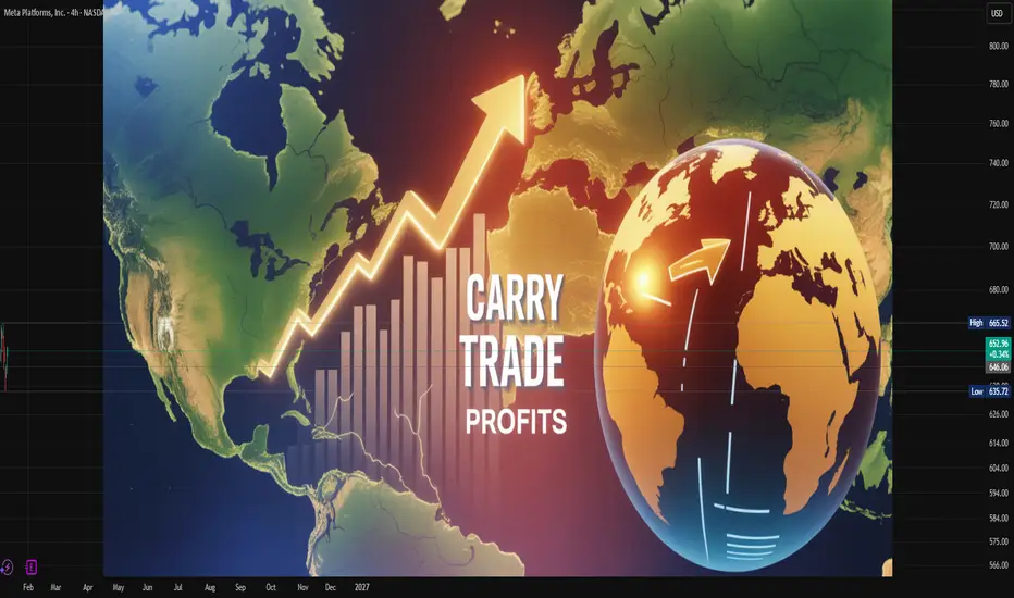
How Investors Earn from Interest Rate Differentials in MarketCarry Trade Profits:
Carry trade profits arise from one of the oldest and most widely used strategies in global financial markets: borrowing money in a low-interest-rate currency and investing it in a higher-interest-rate currency or asset. The core idea is simple, but the execution, risks, and macroeconomic implications are complex. Over decades, carry trades have shaped capital flows, influenced exchange rates, and occasionally amplified financial crises. Understanding how carry trade profits are generated, sustained, and lost is essential for traders, investors, policymakers, and students of international finance.
Concept and Basic Mechanics of Carry Trade
At its foundation, a carry trade exploits interest rate differentials between two countries. An investor borrows funds in a country where interest rates are low—historically currencies like the Japanese yen or Swiss franc—and converts those funds into a currency where interest rates are higher, such as the Australian dollar, New Zealand dollar, or emerging market currencies. The borrowed funds are then invested in higher-yielding assets such as government bonds, money market instruments, or even equities.
Carry trade profits come from two main sources. The first is the interest rate spread, which is the difference between the low borrowing cost and the higher investment yield. The second potential source is exchange rate movement. If the high-yielding currency appreciates or remains stable against the funding currency, profits increase. Even if the exchange rate remains unchanged, investors can still earn steady income purely from the interest differential.
Why Carry Trades Become Attractive
Carry trades tend to flourish in periods of global economic stability, low volatility, and predictable monetary policy. When central banks signal prolonged low interest rates, investors gain confidence that funding costs will remain cheap. At the same time, higher-yielding economies attract capital, reinforcing the attractiveness of the trade.
Low global inflation, ample liquidity, and accommodative central bank policies also support carry trade profits. When risk appetite is strong, investors are more willing to take exposure to currencies and markets perceived as riskier but rewarding. In such environments, carry trades can generate consistent returns that outperform traditional low-yield investments.
Role of Monetary Policy and Interest Rate Cycles
Central bank policies are the backbone of carry trade profitability. Interest rate decisions by major central banks like the US Federal Reserve, European Central Bank, Bank of Japan, and Reserve Bank of Australia directly shape funding costs and yield opportunities. A prolonged low-rate policy in one economy effectively turns its currency into a funding currency.
When interest rate cycles diverge—some economies tightening while others remain accommodative—carry trade opportunities expand. However, when central banks shift unexpectedly or signal rapid tightening, carry trade positions can unwind abruptly. Thus, carry trade profits are highly sensitive to changes in forward guidance, inflation expectations, and economic data.
Exchange Rate Risk and Its Impact on Profits
While interest differentials generate steady income, exchange rate movements can magnify or erase carry trade profits. A sudden depreciation of the high-yielding currency against the funding currency can wipe out months or even years of interest gains in a short period. This is why carry trades are often described as strategies that deliver small, consistent profits punctuated by occasional large losses.
Currency volatility increases during periods of geopolitical stress, financial crises, or global risk aversion. In such moments, investors rush to unwind carry trades, buying back funding currencies and selling high-yield currencies. This mass exit leads to sharp exchange rate reversals, intensifying losses.
Carry Trade Profits Across Asset Classes
Although traditionally associated with currency markets, carry trade principles apply across asset classes. In bond markets, investors borrow at short-term rates and invest in longer-term or higher-yield bonds. In equity markets, leveraged investments funded by low-cost borrowing can resemble carry trades. Even in commodity and crypto markets, investors use similar logic by borrowing cheaply to invest in assets with higher expected returns.
In emerging markets, carry trade profits often come from investing in high-yield government bonds. These trades can provide attractive returns but expose investors to political risk, inflation shocks, and capital control measures. As a result, carry trade profits in emerging markets tend to be higher but far more volatile.
Systemic Effects and Global Capital Flows
Carry trades influence global capital flows and exchange rate dynamics. Large inflows into high-yielding economies can lead to currency appreciation, asset price inflation, and credit expansion. While this can support growth, it may also create vulnerabilities, such as asset bubbles and excessive foreign debt.
When carry trades unwind, the reverse happens. Capital flows out rapidly, currencies depreciate, and financial conditions tighten. This pro-cyclical behavior has been observed during major global events, where carry trade reversals intensified market stress and volatility.
Risk Management and Hedging Strategies
To protect carry trade profits, investors often use risk management tools such as stop-loss orders, currency options, and diversification across multiple currency pairs. Some investors partially hedge exchange rate risk, sacrificing a portion of yield to reduce downside exposure.
Successful carry traders closely monitor macroeconomic indicators, central bank communications, inflation trends, and geopolitical developments. They understand that carry trade profits depend not only on yield but also on stability. Timing exits is as important as entering the trade.
Carry Trade Profits in the Long Term
Historically, carry trades have delivered positive average returns over long periods, particularly during stable economic phases. However, returns are unevenly distributed. Most profits accumulate gradually, while losses occur suddenly during crises. This asymmetric payoff profile requires discipline, patience, and robust risk controls.
Institutional investors such as hedge funds, banks, and asset managers are better positioned to manage these risks due to access to leverage, hedging instruments, and real-time data. Retail investors can participate but must be cautious, as leverage amplifies both gains and losses.
Conclusion
Carry trade profits represent a powerful but double-edged strategy in global finance. By exploiting interest rate differentials, investors can generate steady income and enhance portfolio returns during periods of stability. However, these profits come with significant exposure to exchange rate risk, monetary policy shifts, and sudden changes in market sentiment.
Understanding the macroeconomic environment, managing risk carefully, and respecting the cyclical nature of global markets are essential for sustaining carry trade profits. When used wisely, carry trades can be a valuable component of a diversified investment strategy, but when ignored or over-leveraged, they can become a source of severe financial loss.
Global Banking and Finance StabilityFoundations, Challenges, and the Road Ahead
Global banking and financial stability are central pillars of the modern world economy. They ensure that money flows smoothly between savers and borrowers, businesses and consumers, nations and markets. When banking and financial systems are stable, economies can grow sustainably, trade can flourish, and societies can plan confidently for the future. Conversely, when instability arises—as seen during the 2008 global financial crisis or periods of sovereign debt stress—the consequences can be severe, long-lasting, and global in scale. Understanding global banking and finance stability therefore requires examining its foundations, key institutions, major risks, regulatory frameworks, and emerging challenges shaping the future.
Foundations of Global Financial Stability
At its core, global financial stability refers to a condition in which the financial system—comprising banks, financial markets, payment systems, and non-bank institutions—functions efficiently and is resilient to shocks. Stability does not mean the absence of risk or volatility; rather, it implies the ability of the system to absorb shocks without collapsing or disrupting real economic activity.
Banks play a central role in this ecosystem. They mobilize savings, allocate capital, manage risks, and provide liquidity. A stable banking system maintains adequate capital, manages credit risk prudently, and sustains public confidence. Trust is critical: depositors must believe their money is safe, and investors must trust that financial institutions are solvent and transparent. Once trust erodes, even healthy institutions can face sudden crises due to bank runs or market panic.
Role of Global Financial Institutions
Global banking and finance stability is supported by a network of international institutions. The International Monetary Fund (IMF) monitors global economic conditions, provides financial assistance to countries facing balance-of-payments crises, and offers policy advice. The World Bank focuses on long-term development and financial resilience in emerging and developing economies. The Bank for International Settlements (BIS), often described as the “central bank for central banks,” promotes international monetary and financial cooperation and develops global banking standards.
Central banks themselves play a crucial stabilizing role. Through monetary policy, liquidity provision, and regulatory oversight, they influence credit conditions and financial market behavior. During crises, central banks act as lenders of last resort, providing emergency liquidity to prevent systemic collapse. Coordinated actions by major central banks have repeatedly proven essential in containing global financial stress.
Regulation and Risk Management
Strong regulation is fundamental to financial stability. After the global financial crisis of 2008, regulators worldwide recognized that weak oversight, excessive leverage, and complex financial products had amplified systemic risk. In response, international regulatory standards such as Basel III were introduced to strengthen bank capital requirements, improve liquidity management, and limit excessive risk-taking.
Macroprudential regulation has also gained prominence. Unlike traditional regulation focused on individual institutions, macroprudential policies aim to safeguard the financial system as a whole. Tools such as countercyclical capital buffers, stress testing, and limits on loan-to-value ratios help reduce the buildup of systemic vulnerabilities during economic booms and enhance resilience during downturns.
Risk management within financial institutions is equally critical. Banks must effectively manage credit risk, market risk, liquidity risk, and operational risk. Advances in data analytics and risk modeling have improved capabilities, but they also introduce new complexities. Poorly understood models or overreliance on historical data can create blind spots, especially during unprecedented events.
Globalization and Interconnectedness
Global banking and finance are deeply interconnected. Cross-border capital flows, multinational banks, and integrated financial markets mean that shocks in one region can quickly spread worldwide. While globalization enhances efficiency and access to capital, it also increases systemic risk. A crisis in a major financial center can trigger contagion effects, affecting currencies, stock markets, and banking systems across continents.
This interconnectedness makes international cooperation essential. Regulatory arbitrage—where financial activities shift to jurisdictions with weaker rules—can undermine stability. Harmonizing standards, sharing information, and coordinating crisis responses help reduce these risks. Global forums such as the G20 play an important role in fostering cooperation and aligning policy priorities among major economies.
Emerging Risks and Challenges
Despite progress since past crises, new risks continue to emerge. High levels of public and private debt in many countries raise concerns about long-term sustainability. Rising interest rates can strain borrowers, increase defaults, and weaken banks’ balance sheets. Asset price bubbles in real estate or equity markets pose additional threats if they burst abruptly.
Technological change presents both opportunities and risks. Digital banking, fintech innovations, and cryptocurrencies have transformed financial services, improving efficiency and inclusion. However, they also introduce cybersecurity risks, regulatory challenges, and potential threats to financial stability if poorly managed. A major cyberattack on a global bank or payment system could have systemic consequences.
Climate change is another growing concern. Physical risks from extreme weather events and transition risks from shifts toward low-carbon economies can affect asset values, insurance markets, and banking stability. Financial institutions and regulators are increasingly integrating climate risk into stress testing and disclosure frameworks to enhance resilience.
Stability in Emerging and Developing Economies
Global financial stability is inseparable from stability in emerging and developing economies. These countries often face greater vulnerability to external shocks, volatile capital flows, and currency fluctuations. Sudden stops or reversals of foreign investment can destabilize banking systems and economies.
Strengthening domestic financial institutions, developing local capital markets, and maintaining adequate foreign exchange reserves are key strategies for resilience. International support, through multilateral development banks and global safety nets, plays a crucial role in helping these economies withstand shocks and maintain stability.
The Road Ahead
The future of global banking and finance stability depends on adaptability, cooperation, and prudent governance. Financial systems must continue to evolve to support innovation and growth while managing new forms of risk. Regulators must strike a careful balance between oversight and flexibility, ensuring stability without stifling progress.
Transparency, strong institutions, and sound policy frameworks will remain essential. As global challenges—from geopolitical tensions to technological disruption—intensify, the importance of resilient banking and financial systems will only grow. Ultimately, global banking and finance stability is not just a technical objective; it is a foundation for economic prosperity, social well-being, and global confidence in the future.

XAUUSD – Weekly Outlook (D1) | Lana...XAUUSD – Weekly Outlook (D1) | Lana 💛
Gold has just confirmed a new All-Time High (ATH) on the daily chart, reinforcing the dominant bullish trend. However, after such an impulsive expansion, the market is now entering a critical decision zone where reactions and rotations are very likely next week.
Market structure – Big picture
The daily bullish structure remains intact with higher highs and higher lows.
ATH has been broken and accepted, which keeps the long-term bias bullish.
That said, price is now trading far from value, so short-term pullbacks are healthy and expected.
This is a classic environment where trend continuation and corrective moves can coexist.
Key zones for next week
🔴 Upper resistance / reaction zone
4610 – 4620
Major supply + psychological round number
Ideal area for profit-taking or short-term sell reactions
Not a reversal signal by itself, but a high-risk area to chase longs
🟢 Buy-on-dip scenarios (preferred)
Primary buy zone:
4377 – 4386
Strong daily structure support
Previous breakout & acceptance area
Good zone to look for bullish confirmation
Deeper value buy:
Around 4250
FVG + former resistance turned support
Strong value area if market corrects deeper
Best risk/reward zone for swing continuation setups
Scenarios to expect
Base case: Price consolidates or pulls back toward 4380 before continuing higher.
Alternative: Shallow pullback, then another push toward 4610–4620 to test liquidity.
Invalidation: Only a clean daily close below 4250 would weaken the current bullish structure.
Lana’s trading mindset ✨
No chasing price at ATH.
Let the market come back into value zones.
Trade reactions, confirmations, and structure — not headlines.
Big trend is bullish, but entries matter more than bias.
Next week is about patience and precision, not prediction.

XAUUSD H3 – Liquidity in Control Near ATH
Gold is trading in a sensitive zone just below all-time highs, where liquidity, Fibonacci extensions, and trend structure are converging. Price action suggests a controlled rotation rather than a clean breakout, with clear reaction levels on both sides.
TECHNICAL STRUCTURE (H3)
Gold remains in a broader bullish structure, with higher lows supported by an ascending trendline.
The recent impulse confirmed bullish intent, but price is now stalling near premium liquidity, signalling potential short-term distribution.
Market behaviour shows buy-the-dip dynamics, while upside extensions are being tested selectively.
KEY LEVELS FROM THE CHART
Upper liquidity / extension zone:
Fibonacci 2.618 extension near the top band
This area represents profit-taking and sell-side liquidity, especially if price reaches it with weak momentum.
Sell reaction zone:
4412 – 4415 (Fibonacci 1.618 + prior ATH reaction)
A classic area for short-term rejection if price fails to break and hold above.
Buy-side focus:
4480
This level acts as a buy-on-pullback zone, aligned with trendline support and prior bullish structure.
Expected flow:
Price holds above 4480 → attempts to push toward ATH → potential extension into the 2.618 zone.
Failure to hold 4480 → rotation back toward lower structure for liquidity rebalance.
MARKET BEHAVIOUR & LIQUIDITY LOGIC
Current structure favours reaction-based trading, not chasing breakouts.
Liquidity above ATH is attractive, but the market may need multiple attempts or a deeper pullback before a sustained breakout.
As long as higher lows are respected, pullbacks remain corrective.
MACRO CONTEXT – DXY BACK ABOVE 99
The US Dollar Index (DXY) has climbed above 99 for the first time since December 10, gaining 0.14% on the day.
A firmer USD can slow gold’s upside momentum in the short term.
However, gold’s ability to hold structure despite a stronger dollar highlights underlying demand and strong positioning.
This divergence suggests gold is not purely trading off USD weakness, but also off liquidity, positioning, and risk hedging flows.
SUMMARY VIEW
Gold remains structurally bullish on H3
Short-term price action is driven by liquidity near ATH
4480 is the key level defining bullish continuation
Upside extensions may require consolidation or pullbacks before a clean break
In this environment, patience and level-based execution matter more than directional bias.

Gold Price Analysis: Why XAUUSD Holds Firm Above $4,400PEPPERSTONE:XAUUSD Why Gold Is Holding Firm Above $4,400 (9 January 2026)
🔍📈 Welcome back to Trade with DECRYPTERS
📊 MARKET OVERVIEW
On January 8, 2026, gold prices were volatile as commodity index rebalancing created early selling pressure, but the market later stabilized.
Spot gold dipped near $4,407 before recovering and closing around $4,477, posting a modest daily gain.
US gold futures settled slightly lower, reflecting cautious positioning ahead of key US economic data.
Investor focus remained on upcoming nonfarm payrolls for clues on Fed rate cuts.
🧩 KEY FUNDAMENTALS
🏦 Fed Policy
Rates at 3.50–3.75%
Expectations of 1–2 cuts in 2026 support gold via lower real yields.
💵 US Dollar & Yields
Firmer USD and stable to higher Treasury yields create short-term pressure.
Longer-term trend remains supportive for gold.
📉 Inflation
Cooling but still above target.
Sticky inflation keeps gold attractive as a hedge.
🏦 Central Bank Buying
Strong and ongoing buying from China, Poland, Brazil.
Provides a solid long-term price floor.
📈 Investor & ETF Flows
Expected to remain strong in 2026.
Reinforces upside momentum.
🌍 Geopolitical Risks
Elevated global tensions:
US–Venezuela
Middle East
Trade and debt risks
Driving sustained safe-haven demand.
🌐 GEO POLITICS
🇺🇸 US Venezuela Crisis
Maduro’s capture, oil control plans, and tanker seizures triggered strong safe-haven flows.
Highly bullish for gold.
🧊 Greenland Tensions
US threats and Denmark–NATO concerns raise transatlantic and Arctic risks.
Supportive for gold.
🔥 Middle East & Iran
Protests, Iran tensions, and Israel–Iran risks sustain regional instability.
🌍 Broader Global Risks
Russia–Ukraine
Gaza
US–China rivalry
Arctic competition
Add structural uncertainty.
⚖️ RISK ON / RISK OFF ANALYSIS
🔄 Risk On vs Risk Off
🟢 Risk On
Higher stocks
Firmer USD
Stable or higher yields
→ Pressure gold
🔴 Risk Off
Lower stocks and yields
Weaker USD
Higher volatility
→ Support gold
📊 US 10Y Yields
Around 4.17–4.18%
Stable near highs limits upside, but not bearish.
💵 USD DXY
Around 98.9
Mild short-term headwind.
📈 Equities (S&P 500)
Near record highs.
Risk-on bias diverts flows from gold.
📉 Volatility (VIX)
Around 15
Low volatility caps gold rallies.
🟡 Gold Price
Around $4,460–$4,465
Holding $4,400–$4,500 range after ~66% 2025 surge.
🧠 Key Dynamic
Mixed risk-on / risk-off signals pressure gold.
Geopolitics keep a risk-off premium intact.
🛡️ Structural Support
Expected Fed cuts + central bank buying reduce downside risk.
📰 KEY INSIGHTS FROM CREDIBLE SOURCES
🛢️ Venezuela Oil Control:
US actions and long-term involvement plans increase geopolitical and energy uncertainty, supportive for gold.
💡 Oil Extraction Claims:
Statements about extracting massive oil value raise inflation and supply risk concerns.
🏦 Mortgage Bond Purchases:
Large-scale bond buying resembles QE, fueling inflation and debasement fears.
🧊 Greenland Focus:
Arctic control proposals heighten global tensions and policy unpredictability.
🔥 Middle East & Iran Tensions:
Warnings and unrest elevate regional risk.
🏛️ Fed Influence:
Political involvement in Fed leadership adds uncertainty around rates and inflation.
📊 Market Reaction:
Bullion and oil bids during equity and bond weakness highlight gold’s defensive role.
✅ CONCLUSION
Gold remains structurally supported despite short-term volatility driven by a risk-on market backdrop and firmer yields.
Expected Fed rate cuts, cooling but sticky inflation, and sustained central bank buying continue to limit downside risks.
Elevated geopolitical tensions — from Venezuela and the Middle East to Greenland and broader global rivalries — preserve a strong safe-haven premium.
While stronger equities and a firmer dollar cap immediate upside, gold’s ability to hold the $4,400–$4,500 range signals underlying strength.
🙌 SUPPORT THE ANALYSIS
👍 Like
💬 Comment your key levels
📈 Share your charts
🚀 Let’s grow together
Best Regards,
M. Moiz Khattak
Founder
🟡 TRADE WITH DECRYPTERS 📊

XAUUSD – Pullback Only, Trend Not Broken YetGold is not reversing — this is a controlled pullback inside a broader bullish structure.
Price has rejected the upper zone and is now retracing to rebalance liquidity. As long as the key demand below holds, the bullish bias remains intact.
Key Technical View
Market is still respecting the rising structure.
Current drop is corrective, not a confirmed bearish CHoCH.
Strong demand cluster below aligns with trendline + prior imbalance → high reaction area.
Primary Plan – Trend BUY
Focus on BUY opportunities at discounted zones.
Wait for price reaction and structure confirmation — no chasing candles.
Upside Targets
TP1: 4,449
TP2: 4,477
TP3: 4,494
Risk Note
If price fails to hold the demand zone, step aside and reassess — patience > prediction.
➡️ Bias stays bullish until structure says otherwise.

NZDJPY: Bullish After Trap 🇳🇿🇯🇵
NZDJPY will likely bounce after a false violation
of the underlined intraday horizontal support.
Expect a pullback to 90.33 level.
❤️Please, support my work with like, thank you!❤️
I am part of Trade Nation's Influencer program and receive a monthly fee for using their TradingView charts in my analysis.

Shaping the Future of Responsible FinanceSustainable and ESG Investing:
Sustainable investing, often referred to as ESG (Environmental, Social, and Governance) investing, represents a transformative shift in how capital is allocated in global financial markets. Unlike traditional investment approaches that focus primarily on financial returns, ESG investing integrates non-financial factors—such as environmental impact, social responsibility, and corporate governance—into investment decision-making. This approach recognizes that long-term value creation depends not only on profits but also on how companies interact with the environment, society, and their stakeholders.
Understanding ESG Investing
ESG investing is built on three core pillars. The Environmental component examines how a company impacts the natural world. This includes factors such as carbon emissions, energy efficiency, waste management, water usage, and commitment to renewable energy. Companies that actively manage environmental risks and contribute to climate solutions are often viewed as better positioned for long-term sustainability.
The Social dimension focuses on how a company manages relationships with employees, customers, suppliers, and communities. Issues such as labor practices, workplace diversity and inclusion, human rights, product safety, and community engagement fall under this category. Strong social performance can enhance brand reputation, employee productivity, and customer loyalty.
The Governance pillar evaluates the quality of a company’s leadership and decision-making structures. This includes board independence, executive compensation, shareholder rights, transparency, and ethical business practices. Good governance reduces the risk of fraud, mismanagement, and regulatory penalties, thereby protecting investor interests.
Evolution of Sustainable Investing
Sustainable investing is not a new concept, but its scope and influence have expanded significantly in recent decades. Initially, it began with ethical or socially responsible investing (SRI), where investors excluded certain industries such as tobacco, alcohol, or weapons based on moral considerations. Over time, the approach evolved from exclusionary screening to a more comprehensive integration of ESG factors into financial analysis.
Today, ESG investing is increasingly data-driven and systematic. Institutional investors, asset managers, pension funds, and even retail investors now consider ESG metrics alongside traditional financial indicators. Global initiatives, such as the United Nations Principles for Responsible Investment (UN PRI), have further accelerated adoption by encouraging investors to incorporate ESG considerations into their investment processes.
Why ESG Investing Matters
One of the key drivers of ESG investing is the growing recognition that ESG risks are financial risks. Climate change, for example, poses significant threats to businesses through extreme weather events, regulatory changes, and shifting consumer preferences. Companies that fail to adapt to these challenges may face higher costs, disrupted operations, and declining valuations.
Similarly, poor social practices—such as unsafe working conditions or discriminatory policies—can lead to legal liabilities, reputational damage, and employee unrest. Weak governance structures can result in corporate scandals, financial misreporting, and loss of investor confidence. By identifying and managing these risks early, ESG investing aims to enhance long-term risk-adjusted returns.
Moreover, ESG investing aligns capital with broader societal goals. It supports the transition to a low-carbon economy, promotes social equity, and encourages responsible corporate behavior. In this sense, ESG investing serves as a bridge between financial markets and sustainable development.
ESG and Financial Performance
A common misconception is that sustainable investing requires sacrificing returns. However, numerous studies suggest that companies with strong ESG performance often demonstrate competitive or even superior financial outcomes over the long term. Effective ESG practices can lead to operational efficiencies, innovation, better risk management, and stronger stakeholder relationships.
For instance, companies investing in energy efficiency and renewable resources may reduce operating costs and regulatory risks. Firms with inclusive workplace cultures may benefit from higher employee engagement and innovation. Strong governance can improve strategic decision-making and capital allocation. While short-term market fluctuations may still occur, ESG-focused companies are often better equipped to navigate long-term challenges.
ESG Investing Strategies
Investors can adopt ESG investing through various strategies. Negative or exclusionary screening involves avoiding companies or sectors that do not meet certain ESG criteria. Positive screening focuses on selecting companies with strong ESG performance relative to their peers. ESG integration incorporates ESG factors directly into financial analysis and valuation models.
Another approach is thematic investing, which targets specific sustainability themes such as clean energy, water conservation, healthcare access, or gender diversity. Impact investing goes a step further by aiming to generate measurable social or environmental impact alongside financial returns, often in areas such as education, affordable housing, or renewable infrastructure.
Challenges and Criticisms
Despite its rapid growth, ESG investing faces several challenges. One major issue is the lack of standardized ESG reporting. Different rating agencies may assign varying ESG scores to the same company due to differences in methodologies and data sources. This inconsistency can make it difficult for investors to compare companies accurately.
Another concern is greenwashing, where companies exaggerate or misrepresent their sustainability efforts to attract ESG-focused capital. Without robust disclosure and verification, investors may struggle to distinguish genuine ESG leaders from those making superficial claims.
Additionally, ESG factors can be complex and subjective. Balancing financial performance with ethical considerations may involve trade-offs, and not all investors share the same values or priorities. These challenges highlight the need for better regulation, transparency, and investor education.
The Future of ESG Investing
The future of sustainable and ESG investing appears increasingly influential and mainstream. Governments and regulators worldwide are introducing stricter disclosure requirements related to climate risks and sustainability reporting. Advances in data analytics, artificial intelligence, and satellite monitoring are improving the quality and availability of ESG data.
Investor demand is also expected to grow, particularly among younger generations who prioritize sustainability and purpose-driven investing. As awareness of global challenges such as climate change, inequality, and resource scarcity increases, ESG considerations are likely to become an integral part of investment decision-making rather than a niche strategy.
Conclusion
Sustainable and ESG investing represents a fundamental shift in the philosophy of finance—from short-term profit maximization to long-term value creation that accounts for environmental stewardship, social responsibility, and strong governance. By integrating ESG factors into investment decisions, investors can better manage risks, identify opportunities, and contribute to a more sustainable and equitable global economy. As financial markets continue to evolve, ESG investing is poised to play a central role in shaping the future of responsible and resilient capitalism.
