BTC 80% Chance of Another Low, BUT First...On 11/22/25 , Bitcoin experienced a relatively rare event: the Daily RSI dropped below 26 . On the Coinbase COINBASE:BTCUSD chart, this has occurred only 20 times historically since December 2014. By analyzing the price action following each occurrence, we can estimate the probability of future behavior when RSI reaches these extreme levels.
The results of each occurrence are summarized in the table shown on the chart.
The table includes:
Dates when RSI fell below 26
Whether price eventually made a lower low ( 16 out of 20 times, or 80% )
Maximum bullish move from the Daily swing low close to the highest wick before correcting (average +16% )
Time to reach that swing high (average 8 days )
Time to reach a new lower low (average 22 days )
The 16 times price eventually made lower low are marked with red or purple vertical lines . The 4 times it did not make a lower low are marked with green vertical lines .
Key Observations
When RSI drops below 26, it typically signals strong bearish momentum , but it is also often followed by a bullish RSI divergence as price forms a higher low in momentum. Historically, a lower low formed 80% of the time , suggesting a high probability of another downside move for BTC in the weeks ahead.
At present:
RSI bottomed at 22.93 on 11/22/25
BTC has already rallied ~11% from the swing low
We are currently at day 21 without a new lower low
All of these metrics remain well within historical norms .
However, there is an interesting nuance. Of the 16 cases where a lower low eventually formed , only 4 took more than 20 days to do so . In all 4 cases (marked with purple vertical lines) , BTC tested the Weekly 12 EMA before making the next leg lower (with a minor exception on the11/24/19 case, where a marginal lower low formed before a strong push above the Weekly 12 EMA).
The Weekly 12 EMA currently sits around $100,000 , suggesting BTC may test this level before any further meaningful correction.
ACTIONALBLE SCENARIOS
If this is a bear market:
Passive investors: Continue dollar-cost averaging at your preferred interval.
Active investors: Consider taking partial or full profits if BTC trades above $100,000 . Set calendar alerts for October 2026 and/or below $50,000 to resume heavier accumulation when BTC may bottom this bear cycle.
Swing traders: Consider Long setups below $86,800 with a stop-loss at $83,500, targeting the Weekly 12 EMA (~$100,000) , with an extended target around $101,000 .
If this is still a bull market:
Price will likely make a lower low to below $80,000 before a bullish move.
Passive investors: Continue dollar-cost averaging.
Active investors / swing traders: Continue accumulating below $86,800 , with heavier accumulation around $78,370 .
Hope this study helps add context to current price action. Trade safe everyone, PEACE.
Historicalanalysis

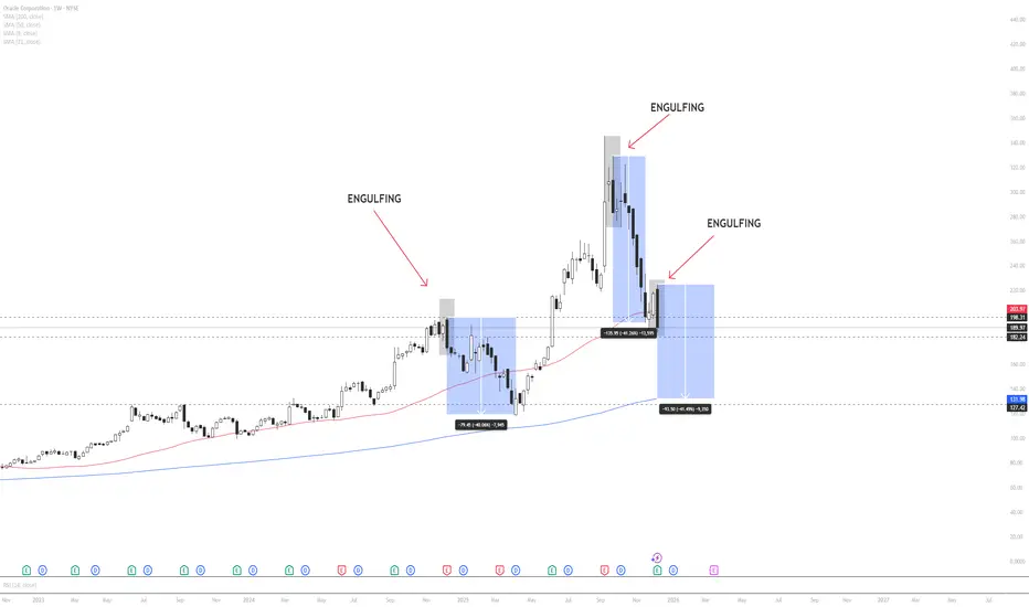
ORCL – Weekly Technical & Historical AnalysisOracle is currently trading in a weekly consolidation (flat) zone, indicating a neutral market structure. However, price has closed below the 50-period moving average , which often signals a shift in medium-term momentum.
A key technical development is the appearance of a weekly bearish engulfing candle, a pattern that historically precedes sharp downside moves in ORCL.
When analyzing previous occurrences of similar engulfing patterns, price declined by approximately 40% in the first instance and showed a nearly identical drawdown in the second instance. If historical behavior repeats , price may continue lower toward the 200-period moving average and the major support zone marked on the chart, which aligns closely with a projected ~40% correction.
Markets often exhibit recurring behavioral patterns, especially in higher timeframes. For this reason, downside risk remains elevated unless price reclaims the 50 MA and invalidates the engulfing structure.
This analysis is based on historical probability and technical structure and is not financial advice. Traders should manage risk accordingly.
Gold-Silver Ratio: Silver’s Lag and Historical DivergencesThe gold-silver ratio - the number of silver ounces equals in value to one ounce of gold – has surged recently as gold prices rally while silver underperforms. Gold, a traditional safe-haven, has climbed to record highs amid economic uncertainty, whereas silver, which is partly an industrial commodity, has struggled to break past $35/oz. As a result, the ratio is around 100 – meaning gold is ~100 times the price of silver despite the correction in the ratio from its peak around 125.
For context, the ratio averaged 57 from 1975-2000, and between 2000-2025 the ratio has ranged from 32 and 125 (with the max level reached this month with an average of 68. The ratio has observed extreme spikes in unusual crises).
Today’s elevated ratio highlights the divergence between gold’s sharp rally and silver’s lagging performance. The 25-year mean of the ratio is at 68, suggesting the present levels (100) represent an extreme deviation in favour of gold.
Historical Parallels in Gold-Silver Divergences
Similar wide divergences between gold and silver have occurred in the past. Key historical episodes illustrate how silver eventually played “catch-up” after lagging gold – albeit with varying lag times:
1970s – Silver’s Late Surge: After the U.S. abandoned the gold standard, gold prices soared while silver lagged. However, silver eventually staged a sharp rally later in the decade, quickly closing the gap and driving the gold-silver ratio sharply lower.
1980s – Prolonged Underperformance: Following the 1980 peak, precious metals collapsed, with silver suffering far more than gold. The gold-silver ratio surged and remained elevated through the 1980s and 1990s, as silver failed to catch up and largely moved sideways until the 2000s.
Early 2000s – Post-Recession Catch-Up: After the 2001 recession, gold began a
new bull market while silver initially lagged. Eventually, silver outpaced gold’s gains over the next several years, significantly narrowing the gold-silver ratio.
2008 Financial Crisis – Sharp Divergence and Recovery: The 2008 crisis caused gold to outperform sharply as silver collapsed. However, as the economy recovered, silver staged a dramatic rebound, quickly closing the gap and normalizing the ratio by 2011.
Why Is Silver Lagging Now? Industrial Demand Uncertainty
Roughly half of silver demand is industrial (electronics, photovoltaics, chemicals). Persistent worries about a global manufacturing slowdown and elevated inventories have capped silver’s upside just as investors have chased gold for geopolitical protection.
Source: Silver Institute
Worries about industrial demand have been exacerbated by the recent trade uncertainties which impact industrial sectors in an outsized manner.
By contrast, gold’s appeal as a safe haven has been boosted by geopolitical and inflation fears, driving it to record highs in 2025.
Despite cyclical swings, the underlying secular trend has crept higher for decades. Gold’s monetisation (central-bank reserves, ETF holdings surge) versus silver’s demonetisation, higher real production costs for gold, and silver’s growing industrial elasticity are all factors that represent a risk to normalization of the GSR.
Even a forceful mean-reversion might therefore stall nearer 60–70 than the sub-40 extremes of earlier cycles.
Hypothetical Trade Setups
History shows that once macroeconomic uncertainty clears, silver often recovers lost ground quickly. In previous periods of extreme gold-silver divergence, from the 1970s through 2008, silver staged strong rallies that pushed the gold-silver ratio (GSR) back toward normal levels.
Today, however, silver’s outlook remains clouded by uncertainty, particularly amid the ongoing trade war. Prices risk stalling below resistance around $35/oz. Consequently, the normalization in the GSR may instead result from a correction in gold prices. Gold has consistently broken record highs, and its long-term outlook remains firmly bullish. Nevertheless, concerns about the sustainability of the recent rally are valid - last week, gold fell sharply after setting a new high above $3,500/oz.
In summary, a normalization in the GSR could result from either a silver rally or a gold correction. While each path remains uncertain, a position focused on the ratio itself is relatively insulated from further divergence.
Given this environment, we could express our view in GSR through a long position in silver and a short position in gold. Investors can implement this using CME Micro Silver and Micro Gold futures. This setup benefits from 72% margin offsets. The Micro contracts balance the notional value between both legs by using one contract each.
A hypothetical trade setup consisting of a short position in CME Micro Gold futures expiring in June (MGCM2025) and a short position in CME Micro Silver futures expiring in June (SILM2025), offering a reward to risk ratio of 1.6x, is described below.
MARKET DATA
CME Real-time Market Data helps identify trading set-ups and express market views better. If you have futures in your trading portfolio, you can check out on CME Group data plans available that suit your trading needs tradingview.com/cme .
DISCLAIMER
This case study is for educational purposes only and does not constitute investment recommendations or advice. Nor are they used to promote any specific products, or services.
Trading or investment ideas cited here are for illustration only, as an integral part of a case study to demonstrate the fundamental concepts in risk management or trading under the market scenarios being discussed. Please read the FULL DISCLAIMER the link to which is provided in our profile description.

PAH3 - Opportunity to Buy a cheap Porsche? Stock - not a car :(GETTEX:PAH3
Quick Description of this stock:
PAH3 is the ticker symbol for Porsche Automobil Holding SE (Porsche SE). Holding company that primarily owns a significant portion of Volkswagen Group's shares and exercises 53,3% of voting rights in Volkswagen.
When you invest in PAH3 you are more exposed to Volkswagen's than Porsche AG's direct operations. These shares provide exposure to the broader automotive industry via VW's portfolio including Audi, Bentley, Lamborghini and others.
_____________________________________________________________________________
Same as Porsche AG (P911) stock, we can see significant drop in price.. The highest point that price reached in 2024 was around 52.28 per share, with today's drop in price this marks 35.79% drop in 2024!
As we can see on the chart ( I am using Monthly chart as this is a longterm investment and analysis) price is currently in the historic Demand Zone from where it bounced back up. Depending on how this monthly candle closes we may witness history repeat itself or we are going lower to the All-in Zone even better zone to invest.
I called it All-in Zone as I think this stock is a great investment opportunity for those who wish to enter this market. You now have a chance to buy at price that we havent seen in 4 years! If we reach to the All-in Zone you will have a chance to buy this stock at a price that we havent seen since 2010 or even 2003 if we reach bottom of the zone.
Nobody really knows what will happen with VW group and I am not here to make predictions or wild guesses. I just look at the chart and price history and look at where we might go next, I love technical analysis.
So I started buying these stocks same as P911 each month... There is no guarantee for anything and this may be a really good opportunity. As there is big profit potential ! And if we go lower? You will just get a better average buy-in price.
For those who are willing to take the risk and have some connection to the car industry - like me.. This may be a good investment in the long run.
Also do not forget that owning this stocks Porsche will be paying you dividends once a year!
Patience is the key! Play it smart!

USD/CAD Hit A Bouncing Support Lets Buythe area around 1.36000 - 1.36300 is an absolute strong support and a very resilient block that the price touched over 8 time and failed completely to break.
now tha price came back again to it after being pushed by a historical resistance.
the 4h price action was very promising showing a really good bullish price action. based on all these reasons u can enter a buy trade now with me and the chart shows all the trade details

BTC & ETH bottom priceI have an idea for ETH & BTC.
Simple look back to 2020-02-24. ETH down 70% before jumping.
Same with BTC, it divided 2.5 times from local top 10K to 3K8 (around 63%)
From CoinGlass check the liquidation heat map for ETH and BTC.
With current situation, if BTC and ETH price turn down 63% for BTC and 70% for ETH then bottom price will be around 25K for BTC, and 1300 for ETH.
And go up crazy after that.

Bitcoin: Long-term analysis & major levels to watch - PART 1Okay - I've been wanting to shed some light on BTC price action for a long time so here we go:
This is a monthly chart of the last 7 years of BTC and I've started with this chart because it should look interesting to all crypto investors/traders.
Very few people talk about these purple Fibs and yet they explain much of BTC's historical price action. They are what you may want to call: the "Primeval Fibs" (or for you, milennials: the "OG Fibs"). They are the extension fibs of the first run of BTC from a fraction of a cent in 2009 to almost US$32 in 2011 (first chart below - quarterly chart - shows three key sets of fibs, including the purple primeval fibs). They start with the 1; 1.618, 2.618 levels but run all the way to the 2207 level and beyond.
((Note that if you think my extension Fibonacci sequence is a bit off above the 18 level, then know that MY set is the logical expansion of the Fibonacci multiplication factors (connecting the numbers in the Fib sequence) that start with 1.618; 2.618; 4.236 etc, and that the more familiar set (the one that awkwardly morphs from the multiplication factors into the Fibonacci sequence itself) is the weird version. Just sayin'...))
Anyhow, what I'd like to note is the recent ATH perfectly stopped at the 2207 level of the Primeval Fibs set. Freaky, right? To think that extensions from the first run to $32 still have some influence on BTC price action today... But as you can see above, the price action from the last 7 years acknowledges these Primeval Fibs quite nicely.
That is: with the notable exception of the period leading up and immediately following the 2021 ATH. Not sure why this nice patterns broke down there. But of course we should understand that price action in the real world is governed by quite a bit of chaos. Sometimes bouncing of a 100 day average, sometimes a Primeval Fib and sometimes just for no apparent reason at all.
You can really apply these extension fibs to any nice move in the chart. In the second chart below (weekly chart) I've used two other old fib sets that I think have also helped shape the BTC chart and both appear to have influenced price action during the 2021 ATH period... So it's never as easy as you think, but really getting into a chart and back-testing Fibs does help you trade smarter.
So what's next for BTC? I'll get into that and my hypothesis for why I think ALT coins will outperform over the next three months in Part II. Happy trading!

Bitcoin Post 4th Halving Price Prediction for 2024Hello my friends!
I am back after a long break. Bitcoin has just experienced it's 4th halving event.
I took it upon myself to look into past Bitcoin price movement patterns, looking into how Bitcoin's price reacted immediately after Bitcoin experienced a halving event. I'm primarily using a historical time-based analysis approach.
Here are my findings:
- Bitcoin's prices seem to hold for about 60 days, and then either pump or dump.
- Bitcoin appears to experience its constant bullish price movements (bull run) 60 days immediately after each halving event.
- Bitcoin appears to reach its final top 133 to 525 days after each halving event (average is 329 days).
- Bitcoin appears to reach its top every 1162 to 1449 days each time it touches the upper trend line.
- Bitcoin is currently in a major Cup and Handle pattern spanning from 8th of November 2021. We are currently in the 'Handle' phase.
My Predictions:
- I predict that Bitcoin will go down to 52000, and hover around 53K and 54K for the next 2 months (29th of April 2024, until the 4th of July 2024).
- I believe we will promptly head back to 70K at around the 11th of July 2024 (± 5 days).
- I predict that there will be a FOMO event once we break all-time-high (73K), and a major psychological FOMO event once we reach 100K as everyone tries to get their hands on some Bitcoin before it's price gains another significant figure for the first time since November 29th 2017 (9999 -> 10000).
Entry and Exit Strategies:
- I believe we will reach tops of anywhere between 160K to 185K sometime in December 2024, which will be the most ideal time to exit one's Bitcoin position.
- Possible entry options are 52-58K , and 78K-88K (once we exist the Cup and Handle).
- The least riskiest entry option is approximately 62 days from the 4th halving event, just as it's breaking upward past 57500.
Don't forget, Patience is Paramount.
Happy trading :)

Paramount (PARA) Flirting with Historical Support, Time to Buy?Hi Guys. As usual always on the lookout for Macro trend setups, signs and opportunities. PARA seems to be in a position of low risk trade setup.
We have made it to a Historical Support level, where interactions here normally leads to bounces upward.
Please note however that previous history does not mean it is 100% probable that it will repeat.
HOwever, being in a downtrend for some time now. It is likely that there maybe DEMAND in this area. Its important to watch for signs of confirmation of Support.
This weeks candle may show signs. It is a Hammer candle printing at the bottom of a downtrend since January. Lower wick indicates buy pressure or demand.
Notice ABOVE we have a resistance trendline. Note if we bounce from here, that will be our area to watch. This resistance trendline has been dragging us down since April 2022.
We could also be attempting to form a double bottom.
Recently there is also an uptick in VOLUME, which can indicate support of the demand currently seen at this support lvl.
Ive added 2 indicators.
MACD shows that we have not reached ABOVE the 0 lvl in quite sometime. Hinting to the idea that eventually we will.
Notice also the presence of Bullish Divergence with MACD and price action.
Watch for the change in color of the histobars to light red. This will suppport the idea of waning bearish momentum. The presence of a bullish cross is also vital to watch for.
Now notice RSI. Our current RSI as indicated by orange circle, shows flattening of the RSI. This shows buying is stalling the sell off.
However, notice the rectangles highlighting previous flattening of RSI. There is a possibility of RSI continuing downward. An important sign for the RSI in my opinion would be if RSI can move above the resistance trendline. This thinking ahead, can coincide with breaking the Major resistance in price action.
Regardless of what happens, right now we are in a critical area and pushes for observation.
__________________________________________________________________________________
Thank you for taking the time to read my analysis. Hope it helped keep you informed. Please do support my ideas by boosting, following me and commenting. Thanks again.
Stay tuned for more updates on PARA in the near future.
If you have any questions, do reach out. Thank you again.
DISCLAIMER: This is not financial advice, i am not a financial advisor. The thoughts expressed in the posts are my opinion and for educational purposes. Do not use my ideas for the basis of your trading strategy, make sure to work out your own strategy and when trading always spend majority of your time on risk management strategy.

TSLA - $580 by 2027This is a TSLA forecast model based off of historic price action and a mix of confluence.
*Still in the workings.

Echoes of the Past: Analyzing E-mini S&P Futures 2008 vs. 2024Introduction to E-mini S&P Futures
E-mini S&P Futures stand as a testament to the intricate dynamics of financial markets, capturing the essence of broader economic trends and investor sentiment. As we navigate through 2024, these futures face a situation reminiscent of the prelude to the 2008 global financial crisis. This article embarks on a journey to analyze the current market position of E-mini S&P Futures against the backdrop of October 2007, unraveling the echoes of the past through which we could have a glimpse into the potential trajectory for 2024.
Historical Parallels: 2007 vs. Today
In October 2007, E-mini S&P Futures approached the precipice of a significant market downturn, attempting to break the all-time high set in March 2000 in vain, marking the peak before the devastating 2008 crash. Fast forward to today, we find ourselves in a similar position, with the market challenging the all-time high set in January 2022. However, the context now is markedly different, with indicators and market fundamentals suggesting a more robust potential for upside than downside.
Technical Analysis of Current Market Position
A detailed technical analysis paints a vivid picture of the current market. Key resistance and support levels are scrutinized, with a particular focus on how they compare to those of 2007. Indicators such as RSI, and MACD are employed to dissect the market's momentum and volatility, offering insights into potential future movements.
Additionally, to ensure the analysis remains impartial, we're utilizing a 42-day regression channel on both prices and indicators. This sophisticated tool will discern whether there's a convergence of trends or, conversely, a divergence between price movements and indicator signals.
2007/2008 Presented a Strong Divergence
Prices and Indicator are Not Diverging in 2024
The October 2007 Echo
The situation in October 2007 serves as a stark reminder of the market's capacity for sudden and profound shifts. By analyzing the market patterns, investor behavior, and economic indicators from that period, we draw parallels and contrasts to the present day, providing a multi-dimensional view of the potential market trajectory.
Breakout Teaser in 07/08
In October 2007, the E-mini S&P Futures made a daring attempt to surge beyond the previous all-time high price levels. However, this potential breakout turned out to be a deceptive "fake-out," setting the stage for a significant downtrend that persisted until March 2009.
Consequently, as the potential breakout faltered and the E-mini S&P Futures prices began their descent, they encountered minimal resistance to the downward movement. This was primarily because there were no significant support levels in close proximity, leaving a considerable gap until the next substantial support zone was encountered at markedly lower price points.
Potential Opportunities Amidst the Bad News
Despite the ominous shadow of 2007, the current market scenario reveals opportunities. The bad news dominating headlines may indeed present favorable conditions for trading E-mini S&P Futures at more attractive prices. An objective analysis, free from the emotional weight of the past, reveals a market teeming with potential for informed traders.
Break-Out or Fake-Out this Time?
The above chart bears a striking resemblance to the scenario observed in October 2007. However, it's crucial to acknowledge the distinct differences in our current market conditions. In 2024, the convergence of the RSI and MACD with the price, as opposed to divergence, paints a notably different picture. Furthermore, as depicted in the chart below, the proximity of significant support price levels forms a robust barrier, challenging the development of a downtrend and underscoring the unique nature of the current market landscape.
Forward-Looking Insights
The analysis leads us to a series of forward-looking insights. A comparative historical approach, coupled with current technical analysis, suggests that while the market is at a critical juncture reminiscent of 2007, the outcome may not necessarily follow the same path. The article discusses potential market scenarios for E-mini S&P Futures, considering the interplay of economic reports, investor sentiment, and global events.
With this delicate balance, influenced by both past events and current market conditions, we present a comprehensive detailed trade plan which would benefit from such potential new all-time high prices being formed.
Trade plan elements for a Risk-Defined E-mini S&P Futures Opportunity:
Understanding the Instrument : E-mini S&P Futures is a futures contract with a point Value of $50 per point. Traders willing to reduce the risk of the trade can use MES (Micro ES) which would reduce the exposure by a factor of 10 times less.
Risk Management : Experienced traders prioritize risk management. Using stop-loss orders or hedging techniques is imperative to avoid undefined risk exposure.
Precision in Entries and Exits : Aligning entries and exits with relevant market price levels can help manage risk. When a price point generates a bounce, the trader stays in the trade; if a price level is violated, the disciplined action is to exit the trade promptly for a predetermined loss.
Relevant Price Levels for E-mini S&P Futures : Currently, ES1! shows relevant support levels starting 4662.50.
Proposed Trade Plan:
ENTRY: At a significant support level identified by the analysis: 4662.50.
STOP-LOSS: Set at a calculated risk level below the entry: 4481.25.
TAKE PROFIT TARGET: Aimed at an identified resistance level which in this case does not exist and therefore we are taking a Fibonacci projection: 5300.50.
This plan offers a structured approach with a clear Reward-To-Risk ratio, aiming to capitalize on potential market movements while ensuring disciplined risk management.
Navigating 2024 with Lessons from 2008
As traders look to navigate the uncertain waters of 2024, the lessons from 2008 become invaluable. The article provides a nuanced strategy framework that incorporates risk management, market timing, and scenario planning. It emphasizes the importance of vigilance, adaptability, and informed decision-making in capitalizing on potential market movements.
Conclusion
The echoes of 2008 reverberate through today's market, presenting a unique blend of challenges and opportunities for traders of E-mini S&P Futures. By analyzing the past and present, this article provides a comprehensive view of the potential market dynamics for 2024. It concludes with strategic insights and a potential opportunity for traders to leverage the lessons from the past while remaining agile and informed in the face of future uncertainties.
When charting futures, the data provided could be delayed. Traders working with the ticker symbols discussed in this idea may prefer to use CME Group real-time data plan on TradingView: www.tradingview.com This consideration is particularly important for shorter-term traders, whereas it may be less critical for those focused on longer-term trading strategies.
General Disclaimer:
The trade ideas presented herein are solely for illustrative purposes, forming a part of a case study intended to demonstrate key principles in risk management within the context of the specific market scenarios discussed. These ideas are not to be interpreted as investment recommendations or financial advice. They do not endorse or promote any specific trading strategies, financial products, or services. The information provided is based on data believed to be reliable; however, its accuracy or completeness cannot be guaranteed. Trading in financial markets involves risks, including the potential loss of principal. Each individual should conduct their own research and consult with professional financial advisors before making any investment decisions. The author or publisher of this content bears no responsibility for any actions taken based on the information provided or for any resultant financial or other losses.

A Merry Bitcoin Xmas 12 statistics for 12 historical Decembers:
December Marks pretty pivotable points in Bitcoin history. Typically the 19th-31st of December marks some decent moves, with either a slight pause for continuation or a major reversal.
12 statistics for 12 historical Decembers:
- AVG. Overall Returns +15.26%
- AVG. Positive Returns +52.73%
- AVG. Negative Returns -28.45%
- 7/12 saw Red candle closes, 5/12 saw Green. (2023 will likely be 6/12)
- 6/12 saw January close lower than Dec, whilst 6/12 did not.
- 4/12 we never saw Dec low prices again.
- 4/12 proceeded with a Jan-Feb monthly retraces (didn't close < Dec), whilst 4/12 continued higher.
- 4/12 saw lower prices proceeding more than 6 months.
- 3/12 were in mid bull markets (wave 3)
- 2/12 marked ATH's and to date 2/12 marked ATL's.
- 1/12 saw sideways action for 4 consecutive months
- 1/12 marked false low reversal signal (COVID)
In summary, for the 13th December close given the timing of cycles, this does mark a midterm turning point between cycles. Generally, at this point, it is more probable for a slight -25% retrace before continuation. Statistics on lower Dec ratios (<4/12) would suggest that in Q1 2024 we may just get the dip, but for how long will the Santa Rally continue? $48-50k high seems very likely but a close < FWB:31K in the coming months on the retrace would prove something else is at play.
Sorry for rez, here is a better screenshot

BTC Price History repeated itself pretty accuratelyI updated an idea I posted at the beginning of the year, but I wanted to make a separate posting to make it clear.
I looked back at the candlestick pattern from 2018 to the beginning of 2021 and replicated it on September 2022 to June 2023 (the BLUE pattern)
The price prediction played out pretty well in the following months up until right now, November 4, 2023. It's not dead perfect, but it's surprisingly very similar so there is a lot to learn from it and you could've made many short-term trades based on that.
The price target of 38k was preshot too early, but we see that it's coming pretty close to it right now.

S&P500: Reaccumulation and Outlook for End of 2023Following the significant downturn of the S&P500 yesterday, the forecasts I set out on October 23rd are taking shape. I had hinted at the potential outlook of a market correction in the last week of October, and now, we find ourselves in a critical zone that could signal a reaccumulation period for institutional investors. Below, I illustrate the technical and fundamental reasons that strengthen this theory:
COT Report Analysis: A look at the Commitment of Traders (COT) report highlights that Asset Managers added approximately 500,000 long positions in the week of May 2, 2023. Conversely, Dealers, operating as market makers, accumulated about 300,000 short positions. This indicates potential reaccumulation in this price area, especially considering the POC (Point of Control) of the volume profile, which currently marks 4143.00.
Historical Trends: Historically, September has been a tumultuous month for stock markets, with October often following a similar trajectory, albeit less accentuated. However, the months of November and December tend to reverse this trend, often bringing optimism and rallies to the markets. This tendency could be further amplified by the upcoming quarterly results from Nvidia and the expected data on the Core CPI, which could indicate a reduction in inflation, given the persistence of high interest rates.
10-Year Treasury Movement: The curve of the 10-year US Treasury bond is showing signs of exhausting its bullish trend, having recently touched 5%. While it could reach higher levels, I see this escalation as increasingly improbable.
CBOE Skew Analysis: The CBOE skew index, a market asymmetry indicator, has shown a marked decrease, currently standing at 132. This suggests a possible reduction in the perceived market risk, hinting at the idea of an impending rally.
In conclusion, based on my market analysis and knowledge, I am inclined to maintain a positive outlook for November and December. It's interesting to note that, from my perspective, the current price of the S&P500 is balanced compared to the lows of October 2022, suggesting that the idea of an imminent rally is not out of the question. However, as always, it's essential to operate with caution and information, as market forecasts inherently carry risks and uncertainties.

The #BTC Cyclical Turn Around Is Here!Bitcoin has dropped around 80% each bear market since conception, As we can see looking at the historical data I showed above. Each Bull cycle rhymes if you measure the days the bull/bear cycle ran for. Overall, I think we are on the edge of something special!
***nothing here is financial advice, always do your own research.

HOW-TO: Historical Pattern Matcher [Trendoscope]Hello everyone, here is a short video on how to use the indicator Historical Pattern Matcher . In this video, we went through the indicator components and settings in detail. All the information are also available on the script page. Please go through and let me know if you have further questions.

Welcome bears? Technical analysis
From the SPX day chart and 5min chart, it is obvious that the interruption of the bull trend, now we are facing selling pressure from both bears and bulls. big techs were starting to sell from the last two hours on Friday, and the pre-mkt looks like we will have a lower open on Monday.
Watch closely on SPX 4381, IF 4381 BREAKS, the market will retest the previous low around 4325-4330. From the day chart, the pattern seems very similar to M top pattern. what is that mean? It means once SPX breaks 4325-4330 "shoulder" support, it will have an equivalent drop as the "head" to "shoulder", where is likely to see SPX around 4195 area.
Retest from the history
What is the performance of QQQ in the second half of the year after the huge increase in the first half of the history? What is the most similar current background for Treasury yields?
In 1987, it rose 33.8 percent in the first half and fell 17.4 percent in the second.
In 1995, it rose 33.1% in the first half of the year and 7.1% in the second half of the year.
In 1998, it rose 35% in the first half and 37.3% in the second half. Treasury yields fell sharply in 1995 and the second half of 1998.
Treasury yields soared in the summer of 1987.
Treasury yields have surged over the past week, most notably, with the benchmark 10-year Treasury yield breaking through the 4% mark on Thursday, breaking out of an apparent downtrend line and surpassing its early March high. And it has also formed a technical cup-and-handle breakout, a theoretical increase, which will rise to around 4.5%, meaning that the market believes that the Fed will keep interest rates higher for longer, and cut rates less aggressively in the next few years than before. Meanwhile, the two-year Treasury note - the best indicator of where the Fed expects interest rates to go - broke above 5%, just below its March high before the bank failure highlighted by Silicon Valley Bank, as well as its previous peak. (In 1987's summer, the Dow Jones Index DIA suddenly fell 22% in a single day, and this is where the circuit breaker came from)

CADCHF Update I Potential bounce from pandemic lowWelcome back! Let me know your thoughts in the comments!
** CADCHF Analysis - Listen to video!
We recommend that you keep this pair on your watchlist and enter when the entry criteria of your strategy is met.
Please support this idea with a LIKE and COMMENT if you find it useful and Click "Follow" on our profile if you'd like these trade ideas delivered straight to your email in the future.
Thanks for your continued support!

CADCHF Update I It will explode to the upside but be patientWelcome back! Let me know your thoughts in the comments!
**CADCHF Analysis - Listen to video!
We recommend that you keep this pair on your watchlist and enter when the entry criteria of your strategy is met.
Please support this idea with a LIKE and COMMENT if you find it useful and Click "Follow" on our profile if you'd like these trade ideas delivered straight to your email in the future.
Thanks for your continued support!

CADCHF I It will rise to the upside Welcome back! Let me know your thoughts in the comments!
**CADCHF Analysis - Listen to video!
We recommend that you keep this pair on your watchlist and enter when the entry criteria of your strategy is met.
Please support this idea with a LIKE and COMMENT if you find it useful and Click "Follow" on our profile if you'd like these trade ideas delivered straight to your email in the future.
Thanks for your continued support!Welcome back! Let me know your thoughts in the comments!

CADCHF I Impulse correction and continuationWelcome back! Let me know your thoughts in the comments!
**CADCHF Analysis - Listen to video!
We recommend that you keep this pair on your watchlist and enter when the entry criteria of your strategy is met.
Please support this idea with a LIKE and COMMENT if you find it useful and Click "Follow" on our profile if you'd like these trade ideas delivered straight to your email in the future.
Thanks for your continued support!

CADCHF I Keep buying from historic lowsWelcome back! Let me know your thoughts in the comments!
**CADCHF Analysis - Listen to video!
We recommend that you keep this pair on your watchlist and enter when the entry criteria of your strategy is met.
Please support this idea with a LIKE and COMMENT if you find it useful and Click "Follow" on our profile if you'd like these trade ideas delivered straight to your email in the future.
Thanks for your continued support!

VIX with Historic Spikes AnnotatedLarge spikes in VIX since 1990 highlighted with notes showing the events that caused them. Helps put into perspective where we are now in the markets. The yellow line shows the approximate low of VIX since the pandemic started and the red line shows an approximate line of best fit of when the VIX was low, and markets were calm since 1990.
