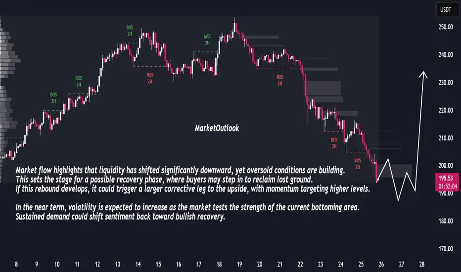
Bullish Reversal Ahead: Market Prepares for Sharp RecoveryThe market has been under consistent selling pressure, with a clear sequence of bearish breaks in structure confirming downside control. Price has now entered a zone where momentum shows signs of slowing, suggesting potential exhaustion in the recent decline. The sharp extension lower indicates that sellers may be reaching a short-term limit, creating conditions for a corrective rebound.
Market flow highlights that liquidity has shifted significantly downward, yet oversold conditions are building. This sets the stage for a possible recovery phase, where buyers may step in to reclaim lost ground. If this rebound develops, it could trigger a larger corrective leg to the upside, with momentum targeting higher levels.
In the near term, volatility is expected to increase as the market tests the strength of the current bottoming area. Sustained demand could shift sentiment back toward bullish recovery.
Liquidityzone
What Is an Iceberg Order, and How May It Be Used in Trading?What Is an Iceberg Order, and How May It Be Used in Trading?
An iceberg order is a type of execution strategy that hides the full size of a trade by revealing only small portions at a time. Used by institutions and large traders, it helps reduce market impact. Understanding how iceberg orders work, where they’re used, and their risks can help traders more accurately analyse market activity. This article breaks down everything you need to know about iceberg orders and their role in trading.
What Is an Iceberg Order?
An iceberg order is a type of order designed to execute large trades without revealing the full size to the market. Instead of placing one massive position that could disrupt prices, traders split it into smaller portions, with the rest hidden. As each portion gets filled, the next one is placed automatically until the full order is executed.
The key feature of this type of entry is that only a fraction—known as the display quantity—is visible in the order book at any given time. The rest remains hidden until it’s gradually revealed. This prevents other traders from immediately recognising the true size of the position, which helps avoid unnecessary market movements.
For example, if a trader wants to buy 50,000 shares of a stock, placing the full position in the market at once could cause prices to rise before execution is complete. Instead, they might set an iceberg order with a display size of 5,000 shares. Once the first 5,000 are bought, another 5,000 are automatically placed, repeating until the full 50,000 are executed.
They’re particularly useful for institutional traders, hedge funds, and high-net-worth individuals who want to build or reduce positions without attracting attention. However, some retail traders also use them when executing relatively large trades in markets that support this execution type. Many major exchanges, including those for equities, forex, and futures, allow icebergs, but their availability depends on the broker and trading platform being used.
How Iceberg Orders Work
The main idea of iceberg orders is clear but let’s consider how they work in detail.
Order Execution Process
When a trader places an iceberg order, they specify two key parameters:
Total size – The full amount they want to buy or sell.
Display size – The portion that will be visible at any given time.
For example, if a trader wants to buy 20,000 shares but only wants 500 to be visible at a time, the order book will show just 500 shares. Once those are bought, another 500 will appear at the same price (if still available), and the cycle continues until the entire 20,000 shares are filled.
Dynamic Execution
Some trading platforms and institutional brokers use smart order execution algorithms to optimise how these orders are placed. These algorithms might adjust the display size dynamically based on market conditions, ensuring the order gets executed efficiently without drawing too much attention.
Hidden Portions and Order Book Activity
Although most of the order remains hidden, experienced traders and high-frequency algorithms can sometimes detect iceberg levels. If they notice an order constantly refreshing at the same price level without an obvious large sell or buy position, they may infer that an iceberg is in play.
Where Iceberg Orders Are Most Popular
They are most popular in liquid markets where frequent trading activity allows the hidden portions to be executed smoothly. In less liquid markets, there’s a higher risk that the order will be only partially filled or take longer to execute, making alternative execution strategies more practical.
Why Traders Use Iceberg Orders
Iceberg orders help traders hide their full intentions from the market. Here’s why they’re commonly used:
Reducing Market Impact
When a large position enters the market, it can shift prices before the full trade is completed. This is particularly an issue in less liquid markets, where even moderate positions can cause price swings. By splitting a large trade into smaller, hidden chunks, iceberg orders prevent sudden moves that could work against the trader.
Avoiding Slippage
Slippage occurs when an order is executed at a worse price than expected due to market movement. Large trades placed all at once can exhaust available liquidity at the best price levels, forcing later portions to be filled at less favourable prices. Iceberg orders help mitigate this by allowing the trade to be executed gradually without consuming too much liquidity at once.
Maintaining Discretion
Institutions and high-net-worth traders often prefer to keep their trading activity under the radar. If other market participants see a massive buy or sell entry, they may react by adjusting their own strategies, making it harder for the original trader to get a good price. Icebergs keep most of the position hidden, preventing this from happening.
Reducing the Risk of Front-Running
High-frequency trading firms and aggressive traders actively monitor the order book for large transactions. When they spot them, they may enter positions ahead of the large trade, pushing prices in an unfavourable direction. By keeping most of the trade hidden, iceberg entries make it harder for others to exploit this information.
Identifying Iceberg Orders in the Market
Iceberg orders are designed to be discreet, but experienced traders and algorithmic systems can sometimes detect them by analysing order book activity and price movements. Since only a small portion of the total order is visible at any given time, certain patterns can reveal the presence of an iceberg in action.
Order Book Clues
One of the most obvious signs is a persistent order at the same price level. If a bid or ask keeps refreshing with the same quantity after being partially filled, it may indicate that a much larger hidden position is sitting at an iceberg level. This is particularly noticeable in less liquid markets where large trades are more disruptive.
Another telltale sign is a large trade volume without corresponding large visible orders. If significant buying or selling occurs but the order book only displays small entries, there’s a chance that a hidden order is gradually being executed.
Time and Sales Analysis
Traders can also look at time and sales data, which records every transaction. If the same price level repeatedly absorbs multiple trades without depleting, it suggests a hidden order replenishing itself after each execution.
Algorithmic Detection
Some trading algorithms are specifically designed to identify icebergs. These tools scan for patterns in order execution and attempt to infer hidden liquidity. While not always accurate, they can give traders an idea of when institutional activity is taking place.
Risks and Limitations of Iceberg Orders
While iceberg orders can help traders execute large trades discreetly, they are not without drawbacks. Market conditions, execution risks, and the rise of advanced trading algorithms can all impact their effectiveness.
- Incomplete Execution: If market conditions change or liquidity dries up, part of the position may remain unfilled. This is especially problematic in volatile or low-volume markets where price movements can accelerate unexpectedly.
- Detection by Algorithms: Sophisticated trading algorithms actively scan for hidden orders. High-frequency traders (HFTs) may detect it and adjust their strategies, making it harder to execute at a favourable price.
- Increased Trading Costs: Splitting a large entry into multiple smaller ones can lead to higher transaction costs. Exchanges and brokers may charge fees per executed trade, meaning an iceberg entry could end up costing more than a single bulk position.
- Slower Execution in Fast Markets: When markets move quickly, the visible portions of an iceberg might not fill fast enough before the price changes. This can lead to slippage, where later parts of the order get executed at worse prices than intended.
- Limited Availability: Not all brokers or exchanges support icebergs, particularly in smaller or less liquid markets. Some platforms also impose minimum position size requirements, restricting their use for smaller traders.
The Bottom Line
Iceberg orders enable traders to execute large trades discreetly, minimising market impact and enhancing execution quality. While they offer advantages in managing liquidity, they also carry risks such as detection by advanced algorithms and potential slippage. Traders should exercise caution and conduct thorough market analysis.
FAQ
What Is an Iceberg Order?
An iceberg order is a type of order that splits a large trade into smaller visible portions, with the remaining size hidden from the order book. As each visible portion is filled, the next one is automatically placed until the full order is executed. This helps traders avoid moving the market or revealing their full position size.
How Do You Identify an Iceberg Order?
Traders can spot icebergs by looking for repeated small trades at the same price level. If an order keeps refreshing after partial fills without a visible large order in the book, it may indicate hidden liquidity. Time and sales data, as well as algorithmic tools, can help detect these patterns.
What Is the Difference Between an Iceberg Order and a Basket Order?
An iceberg order breaks a single large entry into smaller, hidden parts, while a basket order consists of multiple different trades executed together, often across various assets or instruments. Basket orders are used for portfolio adjustments, whereas iceberg entries focus on reducing market impact.
What Is an Iceberg Order in Crypto*?
In crypto* markets, iceberg entries function the same way as in traditional markets—hiding large trades to prevent price fluctuations. Many exchanges offer this feature, particularly for institutional traders handling large positions.
How Do I Place an Iceberg Order?
Availability depends on the broker or exchange. Traders typically set the total position size and the visible portion, allowing the system to execute the trade in smaller segments.
What Is the Iceberg Order Strategy?
The strategy involves using iceberg orders to accumulate or distribute large positions without drawing attention. It helps reduce slippage, maintain discretion, and avoid triggering unnecessary price movement.
*Important: At FXOpen UK, Cryptocurrency trading via CFDs is only available to our Professional clients. They are not available for trading by Retail clients. To find out more information about how this may affect you, please get in touch with our team.
This article represents the opinion of the Companies operating under the FXOpen brand only. It is not to be construed as an offer, solicitation, or recommendation with respect to products and services provided by the Companies operating under the FXOpen brand, nor is it to be considered financial advice.

BTCUSD Technical Analysis – Bearish Momentum Towards Fair Value BTCUSD Technical Analysis – Bearish Momentum Towards Fair Value Gap
Bitcoin is showing clear bearish pressure after rejecting from the previous resistance zone around 118,800 – 120,000. The market structure and smart money concepts indicate potential for further downside.
🔍 Key Observations:
Previous Resistance Respected: Price failed to break through the strong resistance zone marked near the 119,200–120,000 level, showing strong institutional selling interest.
Market Structure Breaks:
BOS (Break of Structure) and CHoCH (Change of Character) confirmed bearish shift.
Price has maintained lower highs and lower lows, signaling a bearish trend.
Liquidity/Fair Value Gap Zone: The market is currently targeting the liquidity/FVG zone between 116,400 – 116,100, which aligns with price inefficiency and unfilled orders.
Support Zone Ahead: A strong support zone is visible near 115,600 – 115,200. Expect a potential reaction or consolidation here.
📌 Strategy & Bias:
Short Bias Active until price reaches 116,116 (target).
Watch for possible bullish reversal signs in the support/FVG zone.
Ideal for scalp-to-swing short trades, with tight SL above recent EQH.
📚 Educational Notes:
Fair Value Gaps (FVG) indicate institutional imbalances and are often revisited by price.
CHoCH and BOS are early signals of smart money moves – always monitor them in confluence with volume and zones.

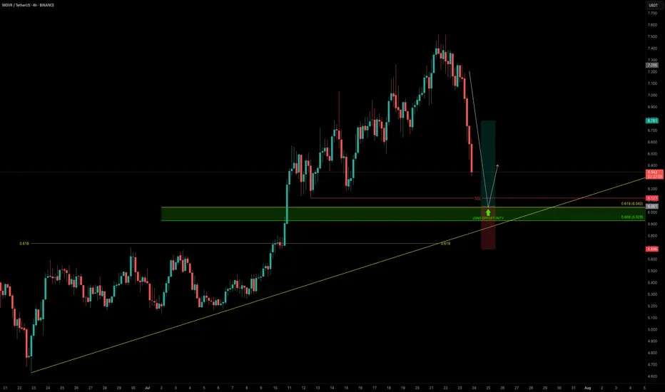
MOVR — Buying the Dip Into Confluence SupportAs the broader market pulls back, it’s the perfect time to scan for high-conviction long setups — and MOVR stands out.
Price is approaching a strong confluence support zone, offering a solid long opportunity.
🧩 Key Technicals
➡️ Liquidity Pool Below the Low:
There’s a visible liquidity pocket just beneath the swing low at $6.121 — an area where stop hunts and reversals are likely.
➡️ Fib & Speed Fan Confluence:
0.618 Fib retracement from the recent move aligns at $6.042
0.618 Speed Fan level also intersects the zone
Together, they form a technical floor right at the $6 psychological level
🟢 Long Trade Setup
Entry: $6.042
Stop-loss: $5.685 (below structure & liquidity sweep)
Target (TP): $6.78
R:R: ≈ 1:2+
Plan: Wait for price to fill into the zone and monitor for a bullish reaction (e.g., SFP, bullish structure reclaim)
💡 Why It Matters: Confluence Builds Confidence
When multiple tools — fib retracement, speed fan, liquidity pools, and psychological round numbers — all line up, it increases the probability of a strong reaction.
This is how smart money builds positions — not by chasing pumps, but by entering where others panic.
Final Thoughts
MOVR is approaching a clean, high-probability buy zone just below $6.00.
If the level holds and confirms with price action, this setup offers a solid R:R and a clear invalidation point.
📌 Mark the zone, set your alert, and let price come to you.
_________________________________
💬 If you found this helpful, drop a like and comment!
Want breakdowns of other charts? Leave your requests below.
XRP/USD – Bearish Shift After Momentum Exhaustion🧠 Summary:
XRP/USD has shown clear signs of exhaustion after sweeping the previous high. Following a breakout from a daily bull flag, price struggled to hold momentum near the key level of 3.4194, forming an ascending channel that eventually broke down. Liquidity zones below current price are now in focus.
🔍 Technical Breakdown:
✅ Daily Bull Flag → Broke out with strength
⚠️ Rejection near Previous High (3.4194) → No follow-through
🔼 Ascending Channel → Formed post-impulse, now broken
📉 Momentum Shift → Structure flipped bearish
💧 Liquidity Zones (LQZ) below price acting as magnets
📌 Key Levels:
🔹 Last High: 3.4194 (Rejection Point)
🔹 Broken LQZ: 3.2868
🔹 Current Support: 3.1689 (LQZ - being tested)
🔹 Target 1: 2.9849 (4HR Liquidity Zone)
🔹 Target 2: 2.7667 (Daily Liquidity Zone)
🧩 Confluences:
Liquidity sweep of prior high
Momentum loss near key resistance
Break of ascending structure
Retesting broken zones with room below
⚠️ Final Thoughts:
This trade is playing out just as we described in the post before this on XRP. We discussed watching how price would react to this area before making any type of "Late Entries". XRP is still a huge and vital part of the Crypto Eco System so long term i am holding my Long position. The areas on the chart are still great areas to buy in at "Dollar Cost Average". This will be one of those positions that though it may be bearish on the lower time frame you need to zoom out and always keep an eye on the weekly and daily chart before making any drastic moves.

1INCHUSDT - fear zone, return to the channel, growth potential1inch - is a decentralized exchange (DEX) aggregator that combines multiple DEXs into a single platform, aiming to provide users with the most efficient routes for swaps across all platforms.
📍 CoinMarketCap : #160
📍 Twitter(X) : 1.3M
The coin has already been listed on exchanges during the distribution phase of the cycle and was partially sold off in waves. Then, in line with the overall market, it declined to more reasonable accumulation prices, shaking out small investors and those who entered positions on positive news.
The price has been moving within a horizontal channel for a couple of years, and the channel’s percentage range reflects the coin’s liquidity. Currently, the coin is in a fear zone, at its lowest price levels. In moments like this, very few people have funds left to accumulate positions, as they’ve already been trapped by optimistic bloggers and a positive news background earlier.
Many were wiped out recently due to a breakdown and consolidation below the previous support of the inner channel, and now there's emptiness and fear below. What’s happening now is an attempt to return back into the inner channel. If this zone holds, the channel targets may be realized.
Resistance zones where the price may react are marked on the chart. Potential final downside wicks are also indicated. It’s important to allocate funds wisely for position building and use proper percentage distribution, according to your own experience!
______
📌 Not financial advice. Observing structure and recurring phases.
Operate within your strategy and with an awareness of risks.

Silver (XAGUSD) Structural Analysis : Curve break & TargetSilver is exhibiting a textbook bullish continuation pattern, guided by a parabolic curve structure that reflects intensifying buyer momentum. This unique setup provides a high-probability trading roadmap as we approach a major reversal zone—one where smart money may look to offload long positions or enter fresh shorts.
This analysis aims to help traders anticipate the likely path of XAGUSD based on structure, liquidity behavior, and trend psychology.
🔍 Key Structural Observations:
1. Black Mind Curve Support (Dynamic Bullish Structure)
This parabolic arc acts as dynamic support. Every bounce from the curve shows growing strength in buyer conviction.
The price is riding the curve upward with higher lows, signaling accumulation with momentum.
This is not a standard trendline but rather a curve reflecting the accelerated nature of this uptrend.
2. Aggressive Bullish Momentum
The recent price behavior has shown strong impulsive candles to the upside followed by shallow corrections, confirming bullish dominance.
Volume and candle size increase near the curve, suggesting institutional interest.
3. Reversal Zone: 37.20 – 37.45
Marked as the Next Reversal Zone, this green box represents a key supply area where previous swing highs exist.
Historically, price struggled to break this region cleanly, making it a high-probability reaction zone.
Expect either:
a bearish rejection (short-term correction), or
a consolidation before a breakout continuation.
4. Liquidity Pool & Needed Volume Zone (~35.20 – 35.50)
The market often revisits zones of untapped liquidity. This area likely holds:
Buy-side stop losses
Unfilled institutional orders
If the market needs a deeper retracement, this is the zone to watch for re-accumulation.
🧠 Market Psychology Behind This Setup:
This structure suggests a classic case of smart money accumulation, with price moving upward in a controlled yet aggressive fashion. The parabolic nature of the move points to:
Increasing retail buy-ins
FOMO-driven entries
Possible engineered sweep before the next impulse
The reversal zone could become a profit-taking area for institutions. If large players want to continue higher, they may first induce a pullback to absorb more volume at lower prices (near the curve or liquidity zone).
🔧 Tactical Playbook for Traders:
For Bulls (Long Bias):
Watch for pullbacks toward the curve or liquidity zone.
Enter long positions on bullish confirmation (e.g., engulfing candles, pin bars) off those zones.
Targets: 37.20 – 37.45, possibly higher if broken with strength.
For Bears (Countertrend Traders):
Wait for clear rejection patterns in the reversal zone.
Use confirmation like RSI divergence, momentum slowdown, or distribution volume.
Target: Curve support or deeper liquidity zone for reentry.
📌 Key Technical Levels:
Zone Price Range Description
Reversal Zone 37.20 – 37.45 Resistance / Take-Profit Area
Curve Support Dynamic (rising) Support based on parabolic arc
Liquidity Pool 35.20 – 35.50 High-volume demand zone
🧭 Conclusion
Silver is currently in a momentum-driven phase supported by smart money activity. The parabolic structure and clean liquidity map give traders a clear plan to engage both long and short setups with timing and precision. Patience around the reversal zone will be key, as the next major move may depend on how price behaves in this critical area.

Mastering Liquidity Dynamics: Understand the Dynamic True ValueDear Reader,
Thank you for reading—your time is valuable.
Use the chart's zoom-in/out (-/+) function for better visibility. This chart captures a large sample for your evaluation.
Below is the manual detailing the Smart Farmer System —a Dynamic True Value framework derived from real-time data to anticipate market intent and liquidity behavior .
If this resonates with you, drop a comment below— constructive insights are always welcome .
The Dynamic True Value - a Smart Farmer System: Terminology and Mechanics
: For now, I have firmed up POC - Price of Control, VAP - Value Average Pricing, SULB - Sell Upper Limit Bound, BLLB - Buy Lower Limit Bound.
Mechanic:
POC - Where fair value price dynamic is read.
VAP - Trading above indicates bullish sentiment of the cycle, and the opposite for bearish sentiment.
A crossed over of:
Grey POC above Green VAP - Signaling distribution, accumulation, consolidation, build-ups, correction, retracement .
Green VAP above Grey POC - Bullish strength and momentum consistency .
Pink VAP above Black POC - Bearish strength and momentum consistency .
Flip of Pink VAP to Green VAP - Sentiment flips from bear to bull, and the same goes for green flip to pink showing bull to bear.
Validation of entry signals requires:
Signal's candle must close past the opposite side of POC – flip sentiment .
The confirmation candle (is the closed next candle immediately after entry signal candle) must continue closed past the POC – maintain sentiment .
The progress candle (is the next candle closed right after the Confirmation Candle) shows traction, momentum build-up, and volume consistency .
Hint of invalidation:
Signal's candle is considered void if the next candle prints a new entry signal in the opposite direction. This often signals accumulation, sideways movement, build-up, uncertainty, or swings in range .
The immediate next candle closed past POC to the opposite side.
What to understand about Liquidity Trap, SULB, and BLLB:
Liquidity traps
Often occur at the recent/previous flatlines of Dynamic True Value (POC, VAP, SULB, BLLB) .
It is worth paying attention to the market’s intent and institutional positioning.
Signs of exhaustion, absorption, inducement, offloading, and accumulation are visible in the M1 (one-minute) TF, with significant confluence near the previous/recent flatlines of Dynamic True Value in the higher/macro-TFs.
An Anchored VWAP tool can be helpful for filtering noise in the market. This tool can be found in the drawing tab in the TradingView platform.
SULB
Details the dynamic of upper resistance where Bears remain in control below the dynamic level.
Below this limit bound (LB) , bears show strength – bear sentiment .
A converging price toward this LB indicates bulls are present.
Moving past this LB (a candle closed above) and successfully RETESTING newly formed support indicates a confirmed directional shift . Followed by printing a new BLLB in the next following candles with price continuing to rise above this failed SULB.
A rejection below LB (a rejection/exhausted candle closed below LB) and successful RETEST reaffirms the resistance holds , indicating downside continuation .
BLLB
Details the dynamic of lower support where Bulls remain in control above the dynamic level.
Above this LB, bulls show strength – bull sentiment .
A converging price toward this LB signifies bears are present.
Moving past this LB (a candle closed below) and successfully RETESTING newly formed resistance indicates a confirmed directional shift . Followed by printing a new SULB in the next following candles with price continuing to push lower below this failed BLLB.
A rejection above LB (a rejection/exhausted candle closed above LB) and successful RETEST reaffirms the support holds , indicating upward continuation .
Important Notes:
Select preferred Entry’s Signal TF (ex. M3 TF, M5 TF for scalping strategy, M15 for intraday/daily strategy, 4H TF for day-to-weekly strategy, etc.).
Always refer to the selected Entry’s TF for trading progress. Anticipate TP and SL by watching the range in this TF.
Non-entry TFs are not for entry purposes. These multi-TFs are used for measuring strength, momentum, liquidity, positioning, structure – The market intends . The Non-entry TF is used to anticipate institutional executions and liquidity pools.
These criteria MUST BE MET. A failed criterion suggests vague execution. Be patient and wait for clear validations.
Institutions excel in creating illusions.
SFS is designed to stand ready, calm, and execute with Clarity.
SFS cuts through noise, distraction, and stays independent of NEWS, GEOPOLITIC, RUMORS, and herd mentality because all these are designed to mislead retail traders into institutional traps.
When we see such ambiguity against the criteria, we know not to fall into the TRAP and become the liquidity FUEL.
Stay sharp, only respond when signals are firmed. SFS is designed to counter Smart Money capitalism. It is about time to level the playing field.

JPY/USD – Clean Rejection from Mini Resistance | Bearish Move🔻 1. Major & Mini Resistance Zones
Mini Resistance Zone: This is a key supply area that aligns with previous highs and recent structure points. As the price approaches this level, it tends to react due to unfilled sell orders and trapped buyers.
The chart shows a rejection from this mini resistance zone — visible through strong bearish candles. This suggests institutional selling pressure has entered the market.
Major Resistance is still untouched above, which becomes a clear invalidation level for any short bias. If price breaks and sustains above it, the bearish idea would be invalidated.
🔄 2. MMC (Mirror Market Concepts) at Work
The MMC idea is clearly illustrated. The price movement after the last major drop is mirrored on the right side:
Strong rally > Formation of lower highs > Resistance retest > Sharp decline
These mirrored behaviors often hint at psychological repetition in the market, driven by trader memory and order placement.
The bearish movement after retesting the mini resistance looks nearly identical to the previous leg on the left — reinforcing the idea that we may see a similar downside structure repeat.
🌀 3. Central Zone Area – Liquidity Trap and Reaction Point
The Central Zone Area is labeled where a previous sharp bounce occurred. This zone is critical for several reasons:
It acted as support multiple times.
It’s also where a liquidity grab occurred — shown with a long wick — before a reversal rally.
In current price action, this zone may again act as a magnet for price, as institutions seek liquidity to fuel further moves. Once price reaches it, expect a temporary bounce or reaction.
📐 4. 50% Fibonacci Retracement Confluence
The projected target sits right on the 50% retracement level of the previous bullish leg.
Institutions frequently target the 50%–61.8% Fibonacci zones to rebalance orders and create continuation moves.
This target zone is marked in purple and is aligned with historical support, adding confluence.
📉 5. Sharp Bearish Reversal from Structure
You can observe a very clear shift in momentum:
The uptrend was broken with a strong bearish engulfing candle.
That move wiped out several minor bullish structures — a sign of structure collapse.
This breakdown, combined with the resistance rejection and MMC mirroring, strongly supports a bearish continuation bias.
📊 6. Previous Targets and Structure Memory
The previous targets and historical swing points are not just annotations — they represent real zones of order flow memory.
When price revisits these levels, you often see reactions (reversals, consolidations, or continuation).
🎯 Trade Plan (Based on Chart):
Bias: Bearish
Entry Zone: After rejection confirmation at mini resistance
Target Zone: 0.00675 area (50% retracement)
Invalidation: Close above 0.00715 (Major Resistance)
✅ Conclusion:
This JPY/USD 4H chart beautifully showcases the power of technical structure, Mirror Market Concepts, and liquidity-focused trading. With a clean rejection from mini resistance, a history of mirrored bearish setups, and a confluence target at the 50% zone, this chart suggests a high-probability short opportunity for disciplined traders.

FILUSDT — the formation is repeating, the structure is familiar.Filecoin(FIL) - is a decentralized storage system with the goal of "storing humanity's most important information." During its initial coin offering (ICO) in 2017, the project raised $205 million. The launch was initially planned for mid-2019, but the mainnet launch date was postponed until block 148,888, which occurred on October 15, 2020.
📍 CoinMarketCap : #50
📍 Twitter(X) : 667.3K
🔍 What I observe:
I’ve added the full trading history to the chart for better understanding (the chart on exchanges is cut off). The coin is liquid. I also added the prices for the public and private offerings.
There’s a large horizontal channel, or more specifically, a channel within a channel, which has been active for about 1111 days.
After another drop, a descending wedge formed, and now we are witnessing a breakout of its resistance (a retest is possible).
These patterns are ones I regularly track and trade, based on personal experience accumulated over the years and my strategy.
📊 I’ve plotted the nearest resistances and target prices with movement percentage calculations.
💭 It’s quite possible that this formation in the lower part of the wedge, coinciding with the area of lows on the support of the outer channel, was used to gather liquidity and shake out weak hands.
I also want to point out the large wicks in this zone - a characteristic pattern for accumulation points and subsequent reversals.
______
📌 Not financial advice. Observing structure and recurring phases.
Operate within your strategy and with an awareness of risks.

EURUSD Just Landed in the Killzone — Bounce or Breakdown?🔥 EURUSD 15-Min SMC Precision Play — May 14, 2025
Here’s a sweet Smart Money sniper entry on EURUSD, caught right as price tagged a powerful triple confluence zone:
📊 1. Structure & Momentum
Recent bullish momentum created a weak high around 1.12660
Retracement follows with strong bearish pressure
Price lands exactly at a previous OB, Fair Value Gap, and the 61.8% fib retracement
🧱 2. Confluence Breakdown
🔴 Fair Value Gap (FVG): Unfilled imbalance tapped
🟣 Order Block (OB): The last down candle before bullish rally
🟡 61.8% Fibonacci Level: Price kissed the golden pocket
This stacking creates a high-probability reversal zone
🎯 3. Trade Plan
Entry: Around 1.12160
SL: Below 1.12090 (under 70.5% fib)
TP: At 1.12660 targeting previous weak high
RRR ≈ 1:6 — optimal asymmetric reward play
🔄 4. Management & Outlook
Watch for reaction on the 50% level at 1.12300
Break of market structure above 1.12400 = confirmation
Scaling out advised at midline levels with stop-loss trailed manually
🧠 Smart Money knows this is where the liquidity pools live. You're not late — you're patiently positioned where the institutions hunt.
🎯 Drop a “📍” in the comments if you're watching EURUSD
🎥 Follow for more sniper setups like this one — @ChartNinjas88

EURUSD 30min Smart Money Long | Order Block + Discount Entry⚡ EURUSD 30m Smart Money Long | May 9, 2025
We're spotting a strong potential reversal after price melts into a clearly defined Order Block deep in the discount zone. Momentum slows, wicks reject the lows, and we’re stacked for a bullish bounce.
🔍 KEY CONFLUENCES:
📉 Sharp selloff into 1.12204 support
🧱 Bullish Order Block holding with rejection wicks
🧠 Smart Money Entry Zone marked just above 1.1219
📐 Price below 50% Fib = Discounted premium RR
🚀 TP targeting imbalance fill near 1.13204
📊 Setup Specs:
Pair: EURUSD
Timeframe: 30 min
Entry: 1.12204
SL: ~1.12078
TP: ~1.13204
RR: Approx. 1:6+
💡 Smart Money Logic:
Big players often load longs in these deep discount zones, right before the crowd notices the shift. This zone is layered with protection: OB, liquidity sweep, and slowed momentum — textbook for a reversal.
📈 Chart Ninja Note:
"Don’t chase — wait for price to come to you… in the discount, at the OB."

"EURUSD | FVG + Discount Zone Confluence | Long Setup Brewing"⚡ EURUSD Analysis – 1H Timeframe | April 30, 2025
📊 Price Action Recap:
After a sharp decline, EURUSD has stabilized in a classic accumulation range, and now it’s dipping into a juicy confluence zone that screams Smart Money re-entry.
🎯 Key Zones Identified:
Fair Value Gap (FVG)
Price is currently balancing a recent inefficiency — Smart Money loves to reload here.
Discount Zone 50–100%
We’re deep in the BUY SIDE real estate. Institutions shop here. Do you?
Strong Demand Candles have printed around this zone — with wicks showing absorption of sell pressure.
🧠 Smart Money Logic:
Retail: "It’s breaking support… SHORT!"
Smart Money: "Perfect discount — let’s BUY what they’re selling." 💸📈
This is how liquidity gets transferred — one trapped seller at a time.
🧩 High-Probability Entry Checklist:
✅ Price inside Discount
✅ FVG touched
✅ Accumulation range forming
✅ Bearish momentum slowing down
✅ Entries aligning with Fibonacci golden pocket
🚀 Trade Idea Setup:
Entry: Inside Discount Zone (1.13980 to 1.13750)
SL: Just below 1.13750 (the low of the block)
TP Zones:
TP1: 1.14400 (Recent High)
TP2: 1.15000+ (Premium Area near -161.8%)
TP3: 1.15740 (Final Exhaustion Point at -400%)
📚 Smart Money Quote:
“You don’t buy at value, you buy at imbalance — where retail hesitates, Smart Money executes.” 🔥
📌 Final Take:
This is not a guessing game. It’s a blueprint.
EURUSD is setting up a possible Low-Risk, High RRR long — IF we follow structure, not emotion.
Wait for bullish reaction from the FVG zone and trail up using internal structure shifts. 📈
📸 Save this chart — this is how sniper setups are built.
💬 Comment "BUY THE DIP" if you’re watching this zone too.
📲 Tag your trading buddy who always hesitates at entries. 😂

#IPUSDT is gaining strength—expecting further upside!📈 LONG BYBIT:IPUSDT.P from $2.0510
🛡 Stop Loss: $2.0235
⏱ 15M Timeframe
✅ Overview:
➡️ BYBIT:IPUSDT.P is showing strong bullish momentum, trading near $2.0510, which could serve as a breakout entry point.
➡️ POC (Point of Control) at $1.8626 confirms the highest liquidity area below the current price, indicating strong buyer support.
➡️ The price is holding local support levels and is approaching $2.0510, a breakout of which could trigger further upside movement.
➡️ If the price holds above $2.0510, an upward push toward $2.0795 and $2.1155 is expected.
⚡ Plan:
➡️ Enter long on a confirmed breakout above $2.0510.
➡️ Risk management via Stop-Loss at $2.0235, limiting potential downside.
🎯 TP Targets:
💎 TP1: $2.0795
🔥 TP2: $2.1155
🚀 BYBIT:IPUSDT.P is gaining strength—expecting further upside!
📢 BYBIT:IPUSDT.P maintains bullish momentum. If the price holds above $2.0510, we expect further gains toward $2.0795 and $2.1155. However, a drop below $2.0235 may trigger a short-term pullback.

#BERAUSDT Expecting a reversal and price drop📉 SHORT BYBIT:BERAUSDT.P from $5.635
🛡 Stop Loss: $6.380
⏱ 1H Timeframe
✅ Overview:
➡️ BYBIT:BERAUSDT.P is facing strong resistance around $5.635, signaling a potential price reversal.
➡️ The $5.635 - $6.000 area has acted as a liquidity zone before, and if buyers start taking profits, a correction downward is likely.
➡️ The primary target for the decline is $4.145, a level where previous buy activity was observed.
➡️ Volume is starting to decline, indicating a potential shift from buyers to sellers.
⚡ Plan:
📉 Bearish Scenario:
➡️ Enter SHORT from $5.635 if the price fails to hold above resistance.
➡️ Risk management with Stop-Loss at $6.380, above key resistance.
🎯 TP Target:
💎 TP1: $4.145 — strong support and profit-taking zone.
🚀 BYBIT:BERAUSDT.P Expecting a reversal and price drop!
📢 After a strong upward move, BYBIT:BERAUSDT.P is approaching a potential reversal zone. If the price fails to hold above $5.635, a decline towards $4.145 is likely.
📢 However, if buyers manage to push the price above $6.000, the short scenario may be invalidated, leading to further bullish momentum.

#APTUSDT expecting further decline📉 SHORT BYBIT:APTUSDT.P from $5.5950
🛡 Stop Loss: $5.7250
⏱ 1H Timeframe
✅ Overview:
➡️ BYBIT:APTUSDT.P remains in a downtrend, forming lower lows. The price broke key support at $5.6600 and continues downward.
➡️ POC (Point of Control) at $5.94 indicates the highest liquidity zone, confirming a bearish market sentiment.
➡️ A breakdown of $5.5950 strengthens the downtrend, opening the way toward $5.2950, where buyers previously showed interest.
➡️ Holding below $5.5950 will likely accelerate selling pressure.
⚡ Plan:
➡️ Enter SHORT after confirming a breakdown below $5.5950, signaling further downside.
➡️ Risk management through Stop-Loss at $5.7250, placed above resistance.
➡️ Primary downside target – $5.2950, where buyers may step in.
🎯 TP Targets:
💎 TP1: $5.2950 – key support level.
📢 BYBIT:APTUSDT.P remains in a strong downtrend with no clear signs of reversal. If the $5.5950 level breaks with increasing volume, the decline may accelerate.
📢 It is crucial to watch the reaction at $5.2950—if significant buying interest appears, a short-term bounce is possible. However, if selling pressure persists, the price may continue to fall toward $4.3450.
🚀 BYBIT:APTUSDT.P remains weak - expecting further decline!

Textbook Reversal Setup: Liquidity Zone + Channel BreakReversal Setup Analysis: HTF Liquidity Zone + Ascending Channel Breakdown
This chart highlights a high-probability bearish reversal setup based on key technical confluences. Here’s a step-by-step breakdown of the analysis:
1. High-Timeframe (HTF) Liquidity Zone (LQZ):
- The red zone marks a major HTF supply area where price previously rejected with a strong impulsive move downward. This liquidity zone is critical as it represents an area where institutional players have shown activity, creating a high-probability region for a potential reversal.
- As price approached this zone again, it did so in a corrective manner (via an ascending channel), which indicates weakening bullish momentum.
2. Impulsive vs. Corrective Structures:
- Impulsive Move: The strong move away from the HTF LQZ (highlighted earlier in the chart) confirms bearish intent, serving as a key reference point for this trade idea.
Corrective Structure: The price forms an ascending channel on the way back to retest the HTF LQZ, signaling exhaustion of buyers.
- The third touch of the channel’s trendline coincides with the HTF LQZ, adding confluence for a potential bearish reversal.
3. Liquidity Zones in Play:
- HTF Liquidity Zone (Supply): Serves as the key resistance level and primary rejection zone.
- 15-Minute Liquidity Zone (Demand): Acts as a potential target for bearish momentum post-breakdown.
- This multi-timeframe liquidity alignment strengthens the trade idea by providing clear areas of interest for entry, stop-loss, and take-profit placement.
4. Breakdown Entry and Structure:
- Entry Trigger: The trade is triggered on the break of structure, where price falls through the lower boundary of the ascending channel. This breakdown confirms bearish momentum resuming after the corrective phase.
- Stop-Loss Placement: Ideally placed above the HTF liquidity zone and beyond the third touch of the channel to account for potential fake-outs.
- Take-Profit Levels: Targets can be set near the 15M liquidity zone or prior swing lows for a solid risk-to-reward ratio.
5. Key Takeaways:
- This setup offers an excellent example of combining HTF liquidity zones, structural patterns, and market context to develop a high-probability trade idea. The rejection from the HTF LQZ aligns with the broader bearish narrative, while the ascending channel acts as a corrective structure leading to a continuation of the downward move.
- By focusing on confluence factors like liquidity zones, impulsive vs. corrective moves, and structural breaks, this trade idea demonstrates a disciplined and strategic approach to trading reversals.
Educational Insights:
- Always zoom out to identify HTF zones of significance to ensure alignment with the larger market context.
- Differentiate between impulsive and corrective structures to gauge the strength and intent of price movements.
- Use pattern confluences (e.g., ascending channels) in combination with key zones to identify high-probability entries.
- Prioritize patience and discipline by waiting for clear structural breaks to confirm your setup.

Gold's Next Big Move: Will XAUUSD Break Resistance or Crash? Chart 1: 4-Hour Timeframe
Trend Analysis:
The chart shows a clear upward trend, forming higher highs and higher lows.
A wedge pattern is visible with converging trend lines indicating a potential breakout scenario.
Key Levels:
Support: Around 2348.248 (4hr LQZ).
Resistance: Approximately 2412.240.
Major Resistance: The upper trendline around 2480.
Recent Price Action:
The price has recently tested the lower trendline support and is currently retracing upwards.
A lower high (LH) has formed around 2480, suggesting a potential reversal or consolidation phase.
Potential Scenarios:
Bullish: If the price breaks above the 2412 resistance, it may retest the upper trendline around 2480.
Bearish: A break below the 4hr LQZ at 2348.248 could signal further downside towards the daily LQZ at 2267.320.
Chart 2: 1-Hour Timeframe
Trend Analysis:
A shorter-term view confirming the upward trend with higher highs and higher lows.
The formation of a wedge pattern indicates consolidation within a narrowing price range.
Key Levels:
Support: Around 2348.248 (4hr LQZ).
Resistance: Approximately 2412.240, coinciding with the previous chart.
Recent Price Action:
Price recently bounced off the 4hr LQZ support level and is now hovering near the 2412 resistance.
The lower high (LH) indicates sellers are stepping in around the 2412 level.
Potential Scenarios:
Bullish: Breaking and closing above 2412 could lead to further upside towards 2480.
Bearish: Rejection at 2412 and a break below recent lows could target the 4hr LQZ support at 2348.248.
Chart 3: 15-Minute Timeframe
Trend Analysis:
Short-term consolidation observed within a wedge pattern.
Recent price action indicates potential for a breakout or breakdown from this pattern.
Key Levels:
Support: Around 2348.248 (4hr LQZ).
Resistance: Approximately 2412.240.
Recent Price Action:
Price is consolidating just below the 2412 resistance level, forming a wedge pattern.
The 15-minute timeframe shows the price struggling to break above 2412.
Potential Scenarios:
Bullish: A breakout above the wedge and 2412 resistance could lead to a quick move towards 2480.
Bearish: A breakdown from the wedge could revisit the 4hr LQZ support at 2348.248.
Conclusion
The overall trend across multiple timeframes remains bullish with key resistance at 2412 and significant support at 2348.248. A break above 2412 could signal further upside towards 2480, while a failure to break and sustain above this level may lead to consolidation or a pullback to the 4hr LQZ support. Monitoring price action around these key levels will provide insights into the next directional move.

How to Use Liquidity Zones and Liquidity Voids in TradingHow to Use Liquidity Zones and Liquidity Voids in Trading
Navigating the forex market demands a keen understanding of liquidity dynamics. This article delves into the critical concepts of liquidity zones and voids, offering traders insights into identifying areas of high trading activity and potential price gaps.
Understanding Liquidity in Trading
In trading, liquidity refers to the potential ease with which an asset can be bought or sold in the market without causing significant price changes. High liquidity means that there are enough buyers and sellers at any given price level, facilitating potentially smoother and more consistent transactions. This concept is critical because it affects how quickly and at what price a trader can enter or exit positions.
Assets with high liquidity tend to have tighter spreads between the buy and sell prices, potentially reducing the cost of trading. Conversely, assets with low liquidity can experience abrupt price movements due to the lack of a steady flow of orders. Understanding the liquidity of an asset is essential for traders, as it impacts decision-making, potential returns, and risk management.
These dynamics give rise to two important phenomena in trading: liquidity zones and voids. Liquidity zones are areas with a high concentration of trading activity, while liquidity voids represent gaps in the market where trading activity is sparse, each presenting unique opportunities and challenges in trading strategies.
Liquidity Zones Explained
Liquidity zones, sometimes known as liquidity levels, are specific areas on a price chart characterised by a significant concentration of trading activity, leading to elevated volumes of buy and sell orders. These zones are crucial for traders as they indicate areas where the asset's liquidity is higher, making it potentially easier to execute large orders with minimal impact on price.
In the context of currency trading, forex liquidity zones are particularly important because they can highlight areas where currency pairs are more likely to experience favourable trading conditions, potentially offering clearer entry and exit points for traders. They may also be useful areas to watch for reversals or breakouts.
The formation of these zones is often tied to historical price levels where the asset has previously seen considerable trading activity. They often serve as magnets for future trading, attracting more buy and sell orders due to traders' anticipation of potential price movements around these areas.
Liquidity levels are commonly associated with support and resistance levels in technical analysis. When a price approaches a level, traders can expect increased order flow, leading to smoother price movements and potentially clearer signals for trading decisions.
Identifying Liquidity Zones
Liquidity zone trading hinges on the accurate identification of areas on the chart where trading activity is significantly concentrated. These levels not only highlight regions of high volume but also reflect potential pivot points for price action. Here's a closer look at three key techniques for identifying liquidity zones.
Volume Profile
This approach leverages the volume profile to map out where the bulk of trading activity has taken place. Unlike traditional volume indicators that display volume over time, the volume profile presents it across different price levels. This helps in identifying levels where the volume peaks, pointing towards areas of significant liquidity.
To use the volume profile tool as we have in the picture above, head over to FXOpen’s free TickTrader platform and search for “Volume Profile Fixed Range” under the Indicators tab.
Price Consolidation Areas
Recognising zones where the price has consolidated for a notable period is another effective method. These areas represent a tug-of-war between buyers and sellers, resulting in a high volume of trades. Such levels often act as magnets for future price action, making them critical for liquidity area trading.
Previous Support and Resistance Levels
Historical support and resistance levels are invaluable for spotting zones. These are levels at which significant reversals or pauses in trend have occurred, indicating areas where large volumes of orders may accumulate. When price approaches these levels again, it often does so with increased trading activity, making them prime candidates for liquidity areas.
Liquidity Voids and Their Impact
Liquidity voids, sometimes known as an imbalance, represent significant moments in the forex market, marked by rapid price movements between two levels without the typical intermediary trading activity. These gaps in liquidity can lead to abrupt changes in price, often visualised as large jumps on a chart, which can have profound impacts on trading strategies and market analysis.
A liquidity void in forex signals a temporary absence of balance between buyers and sellers, resulting in a sharp move as the market seeks to find equilibrium at a new price level. This phenomenon often occurs after major news releases, during off-market hours, or as a result of large institutional trades that can move the market significantly with a single order.
The impact of voids extends beyond their immediate appearance on a chart; they represent areas where the market has not established a consensus on price, potentially leading to increased volatility as the market later attempts to "fill" these voids. The concept of moving back to fill an imbalance is rooted in the idea that prices eventually return to levels where previously unmet trade orders exist, seeking to balance the earlier absence of trading activity.
For traders, these voids offer both challenges and opportunities. They must navigate the increased volatility and unpredictability associated with these gaps but can also strategise to take advantage of the potential return to equilibrium.
Types of Liquidity Voids
Liquidity voids in the forex market manifest in various forms, each with distinct characteristics and implications for traders. Understanding the different types of voids may aid traders in navigating these challenging areas more effectively. Here are some notable types:
Common Liquidity Voids
These are the most frequently encountered liquidity voids, appearing randomly across the forex chart without any apparent trigger from market news or events. They appear typically due to the natural market ebb and flow. Common voids may not always carry significant insights but must be navigated carefully to manage risk effectively.
Exhaustion Liquidity Voids
These imbalances appear at the end of a trend and signal a potential reversal. They occur when the momentum starts to wane, and the price makes a final push before reversing direction. Exhaustion voids are particularly noteworthy because they often indicate the end of a market move, providing strategic entry or exit points for traders who can identify them early.
Breakout Liquidity Voids
Characterised by a sudden price movement out of a range or through a significant level of support or resistance, breakout voids can signal the beginning of a new trend. They are formed when the price action breaks through a key level with enough force to leave behind an imbalance. This type of void may offer favourable opportunities for traders who catch the breakout early.
Runaway Liquidity Voids
These occur within an existing trend and signify its continuation. Runaway voids appear as the market makes a significant move in the direction of the trend, bypassing levels where liquidity might have been expected. Identifying these voids can help traders to confirm the strength and sustainability of a trend.
How to Use Liquidity Zones and Voids for Trading
Utilising zones and voids can significantly refine a trader's approach, offering insights into potential future market movements and reversal points.
Liquidity zones, rich with trading activity, act as magnets attracting the price towards them. Traders closely watch these areas not only for placing orders but also for setting a bias over time. The inherent magnet-like properties of these levels reflect areas where the price is likely to move, providing a strategic advantage in anticipating market direction.
On the other hand, liquidity voids present opportunities rooted in the market's tendency to 'fill' these gaps. The knowledge that prices are likely to return to these imbalances enables traders to anticipate and capitalise on potential price movements as these voids are addressed. When combined, the concepts of zones and voids offer a lens through which price action can be analysed.
For instance, when the price reaches a liquidity area, it may signal the market's attempt to fill a nearby imbalance that remains untraded. This interaction between the zone's magnetic pull and the void's filling potential can inform strategic trade placements and expectations about trend reversals or continuations.
While it may not be feasible to base an entire trading strategy on these concepts alone, integrating the analysis of liquidity zones and voids into a broader trading plan can offer valuable insights. This integration helps identify where the market might head next and pinpoint probable reversal areas, potentially enhancing the trader's ability to make informed decisions.
Limitations of Liquidity Zones and Voids
Understanding liquidity zones and voids provides traders with valuable insights into market dynamics, yet relying solely on these concepts comes with limitations. Here are some specific challenges to consider:
Market Volatility: High market volatility can disrupt the usual patterns of zones and voids, making it difficult to rely on historical data for future analysis.
Influence of External Events: Major economic announcements or geopolitical events can override the expected behaviour within these areas, leading to unpredictable market movements.
Timeframe Sensitivity: The relevance of zones and voids can vary significantly across different timeframes, potentially misleading traders who do not adjust their analysis accordingly.
False Signals: Both patterns can occasionally produce false signals, prompting traders to enter or exit positions prematurely.
The Bottom Line
Understanding liquidity zones and voids can be a critical skill for navigating the forex market effectively. These concepts reveal notable areas of market activity, offering insights into potential price movements. However, incorporating them into a broader trading strategy is crucial due to their inherent limitations.
For traders seeking to apply these insights in real-time, opening an FXOpen account could provide a practical platform to explore and leverage the dynamics of liquidity in their trading endeavours across hundreds of tradable assets.
FAQs
What Are Liquidity Zones?
Liquidity zones are specific areas on a trading chart characterised by a high concentration of trading activity, making them critical points for market entry and exit. These areas indicate where significant buying and selling have occurred, reflecting areas of strong support or resistance. They play a pivotal role in determining market direction and are essential for traders looking to capitalise on areas of high liquidity.
How Do We Identify Liquidity Zones in Trading?
Liquidity zones can be identified using several methods, including volume profile analysis, observing areas of price consolidation, and examining historical support and resistance levels. These techniques help traders spot areas where trading activity is concentrated, offering insights into potential entry and exit points.
How Are Trade Liquidity Zones Traded?
Trading liquidity zones involves monitoring these areas for signs of price potential stability or movement. Traders can use liquidity levels to set strategic entry and exit points, leveraging the high volume of trades to minimise slippage. Additionally, understanding the relationship between liquidity zones and voids can help traders anticipate market movements and adjust their strategies accordingly.
What Are Liquidity Voids?
Liquidity voids are areas in the market where trading activity is sparse or absent, leading to abrupt price movements between two levels. They occur due to an imbalance in buy and sell orders, often following significant news events or during off-market hours, creating opportunities for the price to rapidly adjust to new levels.
This article represents the opinion of the Companies operating under the FXOpen brand only. It is not to be construed as an offer, solicitation, or recommendation with respect to products and services provided by the Companies operating under the FXOpen brand, nor is it to be considered financial advice.

BTC: Anticipating Breakout from Sideways RangeWe're expecting a breakout from the current sideways trading range after a local correction, with the price likely to surge past the liquidity zone at 43,500. Stay tuned for more details on this potential move.

How to find Key Price Action zones for Daytrading successPrepping a market for daytrading is an important part of my process and understanding and identifying the KEY LEVELS is the major part of that process.
We have to build a Price Action picture of what may happen and what levels may be targeted so we will be ready for a trade. Understanding who (buyers or sellers) is getting caught off side and levels the market is targeting, will set us up for the higher probability trades.
I discuss a few key concepts for Intraday trading and how I identify the important zones. I show some trade examples and high probability trade zones.
** If you like the content then take a look at the profile to get more daily ideas and learning material **
** Comments and likes are greatly appreciated **

ATOM is Recharging the Fuel for its flight to CosmosHey there!
So I've just seen an amazing analysis of BINANCE:ATOMUSDT by the "Swallow Crypto" trading team named SwallowPremium on TradingView (I'd give you the link but my rating doesn't give me a chance yet, so just look at the linked Idea) . Shout out to you guys!
And I've found some more nuances to it I'd like to share.
The guys suppose we might be right at the Liquidity grab zone right now, and go up from here, as we've got to the same zone where we've been in June within a quick spike down and I totally agree with them. However, looking on a bigger picture, June 22' zone seems a lot more interesting for the big guys to enter, having in consideration this green indicator that shows Big Buys. We're currently facing Medium buys already, so the Fuel is slowly recharging, but it's still hard to name this zone as the Gas Station.
I will update you when the Big Guys will come in, so you can just follow me to be updated.
My guess is that we've Just been welcomed in the Entrance zone that started on 7,1 but may go deeper all the way to ˜5,8 or even ˜5,5 and will be formed within the next month or two within the tip of almost 1 year old Descending Wedge and from there we'll make a good old breakout.
However, i don't consider ATOM to be a short speculation project, so getting in by now and DCA-ing within the dips sounds cool to me.
P.S. Zooming out to the on-cycle view and considering 2023 not to be a final bottom, theoretically we currently are in the wedge inside of the wedge. If so, we will break out to ˜14,5 and go down to the Nadir... To the zones where "crypto is dead" will return back. To sub $2 ATOM.. Oh man I wonder if it's just the fantasy of the trippy mind or is it Groening mode on full send mode.
What do You think?
👁️ A.I.Vision

Is MANA heading to $2.30 or $1.00MANA broke two crucial supports: the first at $1.68 & the second at $1.50.
Between $1.50 and $1.07 there is not some significant support to stop the price from a possible fall.
The next important supports is at $1.08 and the liquidity zone between $1.07 – 0.92.
Resistance at $1.68 has tested a few days ago…so the likelihood of a return to this level is low, not impossible. In the short-term, of course.
Be careful with your high leveraged shorts.
1) Market is in extreme fear
2) We are nearer the bottom than the top
3) In 4H LTF formed a local demand zone
These are not good signs for (long-term) shorts.
On the other hand, today’s candle closes below $1.34.
• If you are looking for short entries wait for a return to $1.50 or near $1.68 and a bearish confirmation candle.
Stop loss or alert above $1.50
Take profit at the liquidity zone
• If you are looking for long entries, near $1.00 or below is a good price.
