Bitcoin Short This is overbought on M15, M30, and H1 showing strong divergence on RSI
There is a bat pattern on H1 displaying a potential reversal zone
Bitcoin is currently in a downtrend after the crash, making this a continuation
Stoploss above 112250
There is strong resistance from the previous weeks low
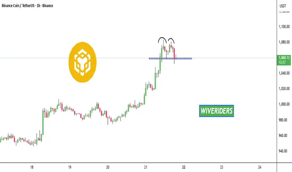
M-pattern

Got The GUTS For Stocks? Fractyl Health, Inc. Prints A Bull FlagNASDAQ:GUTS has printed a Bull Flag and with Price making a Retracement to the 50% Fibonacci Level @ $1.28, the Consolidation Phase of Price should be coming to and end!
This could mean its time to Buy Stock in Fractyl Health, Inc!
Once able to Breakout of the Descending Channel of the Flag, Price on Fractyl could keep pushing up!!
Currently the Analyst 1 Yr Price Target is set for $6.76, almost a 400% gain!
The company is also making great strides in weight loss study's and obesity gene therapy!

Triple Bottom At Rising Support Could Spell High Hopes For EJ!Here on OANDA:EURJPY we can see that Price was able to make a Breakout of the Rising Support to start the week last week and since, has made a Pullback to test the Breakout!
Price on Tuesday was able to make contact with the Rising Support in the 175.5 area and has formed a Triple Bottom Pattern suggesting this strong reversal pattern is aiming for higher prices!
Confirmation on the Triple Bottom Reversal Pattern will come when Price is able to Breakout of the current level holding Price @ 176.3.
Once the Breakout of the Triple Bottom is confirmed, this could generate a great Long opportunity from the 176.3 level to the next Resistance Zone @ 177.7 - 177.9

Bearish Gartley Potential on BTCTarget is around ~120,800 for the 0.786 retrace.
- 4hr RSI showing extreme levels
- Currently meets all criteria for a Bearish Gartley pattern

#GOLD price record I think #gold pullbacked and continu to ATH and upper resistance zone 3930
- 3950
support area 3871-3855

BNB is forming a bearish double top pattern📊 CRYPTOCAP:BNB Market Update
CRYPTOCAP:BNB is forming a bearish double top pattern 🔻 and is now testing the blue support zone 🔵. Watch closely — if support breaks, further downside could follow.
USDJPY Ultimate Price Action Analysis:📊 USDJPY Forecast 🔮💹 (147.961) Closing 20th Sept 2025 | 12:50 AM UTC+4
🕵️♂️ Market Snapshot
USDJPY closed at 147.961, showing mixed signals as bulls attempt to hold ground near critical levels while sellers eye a potential reversal. ⚖️
🏦 Technical Framework
🔹 Chart Patterns
📈 Possible Elliott Wave 5th leg exhaustion near 148.5–149.2.
🌀 Harmonic PRZ forming around 149.0.
🏯 Ichimoku Cloud shows resistance overhead, baseline support at 147.3.
⚠️ Watch for bull trap if price fails 148.2.
🔹 Indicators
RSI 📊: 62 → mild overbought.
BB 🔔: Price hugging upper band = volatility spike.
MA Cross 🔀: Golden cross intact, but momentum flattening.
VWAP ⚡: Anchored VWAP = 147.6 → strong pivot.
🕐 Intraday Outlook
Buy Zone 💵: 147.40 – 147.60 (support + VWAP confluence).
Sell Zone 💸: 148.50 – 148.80 (resistance + harmonic).
Take Profit 🎯:
Longs → 148.20 / 148.50
Shorts → 147.10 / 146.80
Stop Loss 🛑:
Longs < 147.20
Shorts > 149.00
⏳ Swing Trading Outlook
Bullish Scenario 🐂: Break & close above 149.20 → next target 150.50 – 151.20.
Bearish Scenario 🐻: Close below 146.80 → correction toward 145.40 – 144.70.
📌 Key Levels
Resistance: 148.20 / 148.80 / 149.20
Support: 147.40 / 146.80 / 145.40
🎯 Strategy Summary
✅ Intraday: Buy dips near support, sell rallies near resistance.
✅ Swing: Watch 149.20 breakout or 146.80 breakdown for larger moves.
⚡ Volatility expected → trade with strict risk control.
🌍 Market Context
Fed & BoJ policy divergence remains key.
Geopolitical jitters in Asia could trigger safe-haven flows → boosting JPY demand.
🔥 Trade Smart | Manage Risk | Respect Levels 🔥
For individuals seeking to enhance their trading abilities based on the analyses provided, I recommend exploring the mentoring program offered by Shunya Trade. (Website: shunya dot trade)
I would appreciate your feedback on this analysis, as it will serve as a valuable resource for future endeavors.
Sincerely,
Shunya.Trade
Website: shunya dot trade
⚠️Disclaimer: This post is intended solely for educational purposes and does not constitute investment advice, financial advice, or trading recommendations. The views expressed herein are derived from technical analysis and are shared for informational purposes only. The stock market inherently carries risks, including the potential for capital loss. Therefore, readers are strongly advised to exercise prudent judgment before making any investment decisions. We assume no liability for any actions taken based on this content. For personalized guidance, it is recommended to consult a certified financial advisor.

Noise or pattern?Since february 2024 silver shows like gold a four phase pattern but with a higher frequency leading to a phase shift. What do you think. What are the causes for this cycles? Why is there a difference in the frequency and what will happen when both phases are congruent again?
Disclaimer
This content is for informational and educational purposes only and should not be construed as financial or investment advice. The author is not a registered financial advisor. Trading and investing in financial markets involve substantial risk of loss and is not suitable for every investor. Past performance is not indicative of future results. Always conduct your own research and consult with a qualified professional before making any investment decisions.

What will happen next?Gold has been following a pattern since February 2024. Let's see how long it lasts and what will break it.
Disclaimer
This content is for informational and educational purposes only and should not be construed as financial or investment advice. The author is not a registered financial advisor. Trading and investing in financial markets involve substantial risk of loss and is not suitable for every investor. Past performance is not indicative of future results. Always conduct your own research and consult with a qualified professional before making any investment decisions.

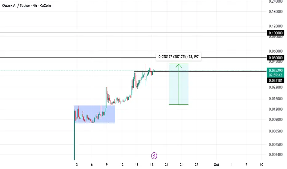
Q Pumped 207% Shared insights on Q trade a while ago. Been holding the trade for a while now and made easy 2x till now.
Hodling for 0.05 and 0.1 targets
Stop loss trailed!
Head and Shoulders Pattern on U.S. Dollar Index (DXY) – Bearish Overview of the Idea (as shown in the chart)
The chart illustrates a Head and Shoulders (H&S) reversal pattern forming on the U.S. Dollar Index (DXY). This classical technical pattern signals a potential trend reversal from bullish to bearish.
Left Shoulder: The first peak followed by a pullback.
Head: A higher peak, forming the top of the pattern.
Right Shoulder: A lower peak compared to the head, roughly equal to the left shoulder.
Neckline: A support line connecting the lows between the shoulders. Once broken, it indicates potential bearish continuation.
The chart highlights:
A breakout below the neckline.
A retest of the neckline (common in H&S setups, where old support becomes resistance).
A projected downside target aligned with the height of the head-to-neckline move.
Detailed Analysis
1. Pattern Identification
The H&S is clear: higher high (Head) flanked by two lower highs (Shoulders).
The neckline is slightly ascending, but once broken, it signals sellers stepping in.
2. Breakout Confirmation
Price broke below the neckline, confirming the bearish pattern.
The retest at ~97.62 shows rejection, strengthening the bearish outlook.
3. Bearish Projection
Technical rule: the expected downside target is approximately equal to the distance from the head to the neckline, projected downwards from the breakout point.
The chart projects a move toward 97.25, which aligns with the marked support zone.
Timing
The projection points to Monday, 15/09/25, suggesting this bearish move may unfold in the upcoming trading sessions.
Walkthrough Thought Process
Think of the market like a battle between buyers and sellers:
The buyers pushed price higher (Head), but then failed to sustain strength at the right shoulder.
When price breaks the neckline, it shows sellers are gaining control.
The retest confirms that what was once support (neckline) has now become resistance.
This setup gives traders confidence to enter a short (sell) trade, targeting the projected downside.
Trade Idea
Entry : After retest rejection around 97.62.
Target (TP) : 97.25 (support zone based on H&S projection).
Stop Loss (SL) : Above the right shoulder at 97.80 (to protect if pattern fails).

AIN PREPARING FOR BREAK OUTS One of the best charts in the current market.
Perfect accumulation tells about smart market maker.
Watching out closely , it can blast anytime

Euro will rebound from seller zone and then start to fallHello traders, I want share with you my opinion about Euro. The price action for the Euro has been methodically developing within the confines of a large upward channel for several weeks, creating a clear structure of higher highs and higher lows. This pattern has been anchored by the major buyer zone near the 1.1580 support level and capped by a dynamic resistance line. The market has just completed a full upward rotation within this structure and is now at a critical inflection point. Currently, the price of EUR is directly testing the upper boundary of the channel, which forms a powerful confluence of resistance with the horizontal seller zone located at the 1.1720 - 1.1740 area. The primary working hypothesis is a short, rotational scenario, based on the expectation that sellers will successfully defend this significant resistance confluence. A confirmed rejection from this seller zone would validate the integrity of the upward channel and likely initiate a new corrective swing to the downside. This move would first need to break the current support Level at 1.1720. Therefore, the TP for this scenario is logically placed at 1.16150, a target that aligns perfectly with the ascending support line of the channel and represents the most probable objective for this bearish rotation. Please share this idea with your friends and click Boost 🚀

DOT Daily After a strong downtrend, the price has stabilized around the 3.23 – 3.27 support zone, showing several bullish reactions from this area.
Recently, the price action has formed a Symmetrical Triangle structure, meaning volatility is tightening and energy is building up for a breakout.
The key resistance lies in the 4.40 – 4.65 zone (pink box), which could be the first target if the triangle breaks to the upside.
A breakout above the descending trendline (upper side of the triangle) with rising volume may signal the start of a strong bullish move.
On the other hand, if the triangle support and the 3.23 level are lost, the price may continue lower toward 3.00 and possibly 2.75.
The current Symmetrical Triangle can act as either a continuation or a reversal pattern, depending on the breakout direction. Given the recent bullish reactions at support and the market’s defense of the 3.2 zone, the probability of an upward breakout seems slightly higher.
❓ Do you think this triangle pattern could be a signal for a new bullish rally in DOT?

NMDCNSE:NMDC
Note :
1. One should go long with a Stop Loss, below the Trendline or the Previous Swing Low.
2. Risk :Reward ratio should be minimum 1:2.
3. Plan your trade as per the Money Management and Risk Appetite.
Disclaimer :
>You are responsible for your profits and loss.
>The idea shared here is purely for Educational purpose.
>Follow back, for more ideas and their notifications on your email.
>Support and Like incase the idea works for you.

KROSSNSE:KROSS
Note :
1. One should go long with a Stop Loss, below the Trendline or the Previous Swing Low.
2. Risk :Reward ratio should be minimum 1:2.
3. Plan your trade as per the Money Management and Risk Appetite.
Disclaimer :
>You are responsible for your profits and loss.
>The idea shared here is purely for Educational purpose.
>Follow back, for more ideas and their notifications on your email.
>Support and Like incase the idea works for you.

GBPUSD – Supply Zone Bears on Watch!GBPUSD continues to trade within a broad descending channel on the 4H timeframe. Price is approaching a well-defined supply zone that aligns with the upper red trendline resistance.
📉As long as this area holds, sellers are expected to step in, making it a high-probability zone to look for short setups.
A rejection from this level could push price back toward the lower boundary of the channel, keeping the bearish structure intact. Traders should stay cautious and watch for confirmation signals before engaging.
⚠️ Always remember: patience pays. Let the market come to you.
📚 Always follow your trading plan regarding entry, risk management, and trade management.
Good luck!
All Strategies Are Good; If Managed Properly!
~Richard Nasr

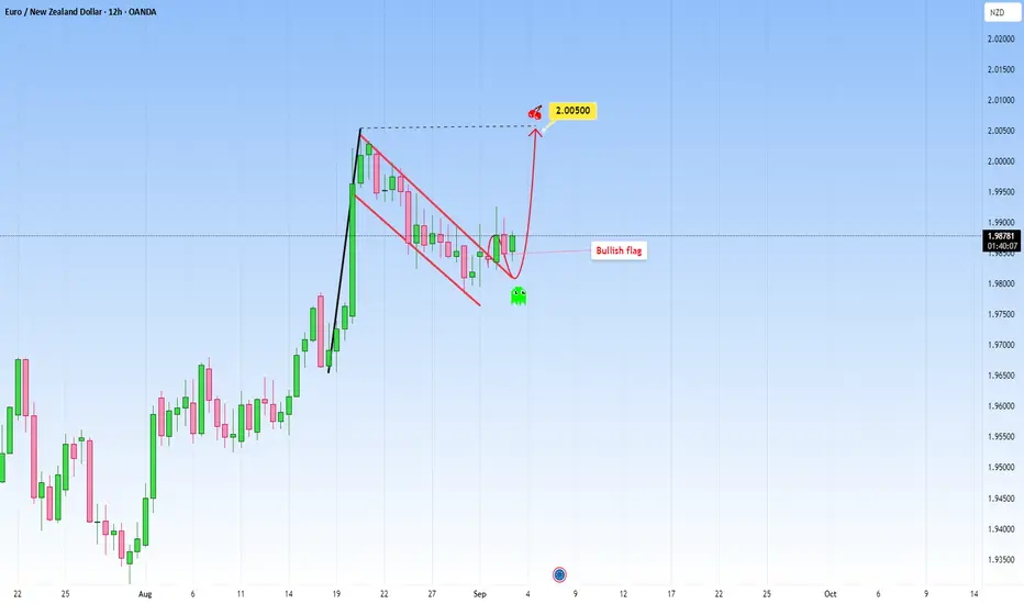
EURNZD: Rose steadily and created a Bullish FlagEURNZD looks quite interesting at the moment. Price rose to the upside steadily and now seems to have created a well known pattern: a bullish flag.
My expectation is for the price to continue, but first I would wait for a full strong candle to confirm the signal. I would target 2.00500.
If, on the other hand, price will decline below the flag, that would invalidate the continuation, and we can expect a short-term pullback incoming.
What do you think?
NAS100 LongThis is now oversold on all timeframes, showing sellers exhaustion
There is a deep crab pattern on H4 and H1 displaying a potential reversal zone
There is great support at this level as daily trend is also pointing up
Double bottom on M15 showing divergence
Stoploss of 150 pips

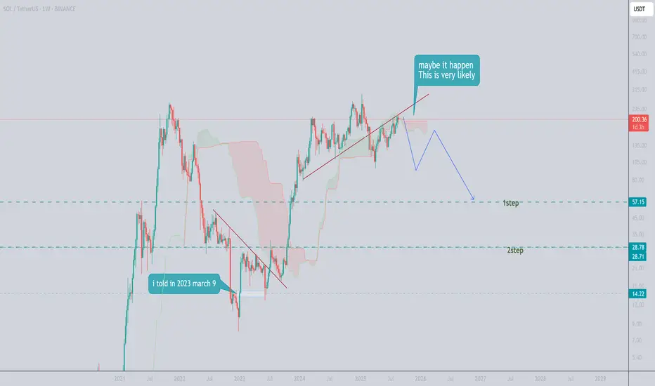
maybe dropThe market may fluctuate greatly in the short term but
the pattern is so bad and show me strong drop . save your money and good luck
SNP500 ShortThis is against the H4 trend; however there is very good resistance at this level, as it is the all-time high and contesting the previous week's high.
There is a pattern on M15 to show a potential reversal zone.
Multiple tops on M15 to H1 with divergence and showing the trends flattening out.
This is against the trend so look to get out at M15 oversold

CAMLINFINENSE:CAMLINFINE
Note :
1. One should go long with a Stop Loss, below the Trendline or the Previous Swing Low.
2. Risk :Reward ratio should be minimum 1:2.
3. Plan your trade as per the Money Management and Risk Appetite.
Disclaimer :
>You are responsible for your profits and loss.
>The idea shared here is purely for Educational purpose.
>Follow back, for more ideas and their notifications on your email.
>Support and Like incase the idea works for you.
