USDT DOMINANCE Is Still Bullish (4H)This analysis is an update to the previous one, which you can find in the related publications section.
First of all you should know that "USDT Dominance" is always moving inverse of BTCUSDT .
This index provides a good roadmap for Bitcoin and high volume altcoins.
For the next phase, the demand zone has been updated. Once price reaches this demand area, another upside move in USDT dominance is expected, which would likely put further downside pressure on the overall crypto market.
If you have a coin or altcoin you want analyzed, first hit the like button and then comment its name so I can review it for you.
This is not a trade setup, as it has no precise stop-loss, stop, or target. I do not publish my trade setups here.
Neo Wave

BTC: The Chart Designed to Wreck You (102k Incoming?)This current correction is extremely deceptive. I have re-labeled this chart more than 8 times, and this is arguably one of the trickiest price actions I’ve seen in my trading experience.
I am sharing this strictly for educational purposes only.
Honestly, trading a complex correction like this is reckless. I see people calling "longs" just because the correction is technically an uptrend or because of some EMA signal— Trading the direction of a correction drastically lowers your win rate compared to trading the main trend. This price action is designed to liquidate reckless and inexperienced people—you won't see it coming.
The structure might be shaping up as a Expanding Triangle to complete a W-X-Y correction.
* **W:** Zigzag
* **X:**
* **Y:** Expanding Triangle (Current)
Unlike standard triangles that contract, this structure shows increasing volatility. In these specific "Expanding" setups, the final Wave E often exhibits a blow-off top expanding significantly in price.
Potential Target:
If the "blow-off" play out, we could see a thrust toward **98,000 – 102,000**
Critical Levels & Invalidation:
- Watch **87,777**. If this level breaks, assume Wave D is extending.
* **Invalidation:** If **84,398** is broken, then this entire triangle idea is invalid.
* **C-5 Confirmation:** If the **80,604** is lost, it confirms C-5 is underway.

What does GOLD know?
The last analysis on gold was correct in that the rise did happen and I had talked about it, but this rise went far beyond my expectations. As a result, in my view, the last analysis is now invalid.
When I zoom out on the chart, I really see that the rise has been extraordinarily strong. However, in the most recent correction that started from 4381 (the red box), there is clear price similarity with the b-d-f-h waves.
From my perspective, there are three possible scenarios:
1- Either a new pattern is unfolding that is quite rare and we can’t always expect to see such a pattern.
2- The recent correction starting from 4381 (red box) should be considered an X wave, in which case gold’s rise could still continue.
3- We might still be inside wave-(i) of (E), which is extending — one of those exceptions I mentioned earlier regarding Diametrics and Symmetricals that you’re aware of. In this case, the maximum price gold could reach would be around $6900.
One interesting point that comes to mind:
From experience, whenever we have more than 2 scenarios on the table, it usually means we are in the middle of a strong rise and the move is likely to continue!!!! These are extremely confusing conditions, and if you’re feeling the same way, know that you’re not alone. What does gold know that it’s rising at such speed?? The most probable trigger these days, with all the news around, could be the potential conflict/war between Iran and the US!!
Honestly, at these price levels, I have no recommendation to buy or even sell because the rise has been huge, fast, and violent. In my opinion, if you want to enter, do it with small capital only, and never forget to set a stop-loss.
Good luck
NEoWave Chart

Bitcoin is still under the control of the bears (4H)This analysis is an updated follow-up to the previous analysis, which you can find in the Related Ideas section.
This Bitcoin move is still valid and intact.
Although price has experienced a drop, it has not yet reached the main supply zone, where large sellers and institutional orders are expected to be positioned.
At this stage, price is expected to enter a corrective and neutral pullback phase, slowly moving toward our planned entry areas. This type of behavior is typical market conditioning it creates uncertainty, draws in late buyers, and weakens conviction before the next directional move.
Once price reaches the zone between the two red lines, which represent our primary entry levels, a rejection to the downside is expected.
The upper green box represents our first target (TP1)
The lower green box represents our second target (TP2)
A daily candle close above the invalidation level will completely invalidate this analysis.
As always, let price come to you, respect your levels, and avoid emotional decision-making. The market rewards patience far more than prediction.
If you have a coin or altcoin you want analyzed, first hit the like button and then comment its name so I can review it for you.
This is not a trade setup, as it has no precise stop-loss, stop, or target. I do not publish my trade setups here.

USDT Dominance Turning Bullish | Risk-Off Mode Is Back (4H)Contrary to our previous analysis the market experienced a pump and reclaimed the flip zone Because of this the current wave count for USDT Dominance appears to be more accurate and reliable
The flip zone is a critical area in trading where the behavior of buyers and sellers often changes It can either be a point where buyers give up and start selling alongside sellers or a level where sellers capitulate and buy alongside the buyers Essentially it represents a shift in market sentiment and understanding it can give us a clearer picture of potential price action
In the case of USDT Dominance the flip zone we are observing acted as a resistance level As a result sellers are likely to capitulate and join the buying side reinforcing support at this level This suggests that the price could find a solid footing here before moving higher
Our expectation is that USDT Dominance will hold support at the green flip zone and gradually move toward the target levels marked on the chart If this scenario unfolds it could increase selling pressure in the broader crypto market especially on Bitcoin and some altcoins as traders react to rising stablecoin dominance
It will be interesting to see how this plays out but for now this flip zone represents a key battleground between buyers and sellers and could dictate the near term market dynamics.

HYPE Ready to Surge! Wave C Done (4H)Starting from the area marked with the red arrow on the chart, price action on HYPE appears to have completed a clear ABC corrective structure. This correction fits well within the context of a larger bullish cycle.
At this stage, wave C looks complete, and market structure suggests that price is attempting to transition from correction to expansion. If this interpretation is correct, we should expect the beginning of a new impulsive bullish wave, which has the potential to generate strong upside momentum and aggressive price acceleration.
The green zones highlighted on the chart represent our key demand and accumulation areas. These levels are considered high-probability regions for buyers to step in. Rather than entering with a single position, the preferred approach is to scale into the trade using DCA (Dollar-Cost Averaging) to manage risk and reduce exposure to short-term volatility.
As long as price holds above these key levels, the bullish scenario remains valid. The upside targets are clearly marked on the chart, aligned with previous structure, Fibonacci extensions, and logical resistance zones where partial or full profit-taking can be considered.
⚠️ Risk Management Note:
This analysis will be invalidated if a daily candle closes below the invalidation level marked on the chart. Such a close would indicate weakness in structure and negate the bullish setup, signaling the need to exit long positions and reassess market conditions.
Overall, this setup favors patience, disciplined entries, and proper position sizing, as the potential reward justifies a structured and risk-aware trading plan.
If you have a coin or altcoin you want analyzed, first hit the like button and then comment its name so I can review it for you.
This is not a trade setup, as it has no precise stop-loss, stop, or target. I do not publish my trade setups here.

ASTER New Update (12H)Based on the current candlestick data for ASTER, it appears to be forming an expanding pattern.
This pattern formed from the point where we placed the red arrow on the chart.
Wave C of this expanding pattern is expected to complete within the green zone. The green zone is an optimal higher-timeframe support area, such as the daily timeframe.
If the price reaches the green zone, we will look for buy or long positions.
The targets for this position are marked on the chart.
Let’s see what happens.
For risk management, please don't forget stop loss and capital management
When we reach the first target, save some profit and then change the stop to entry
Comment if you have any questions
Thank You

ZEC has started a bearish wave (12H)From the point where we placed the red arrow on the chart, it appears that ZEC is forming an ABC correction or potentially a more complex corrective structure. Based on the current price action, wave B seems to have completed, and we are now in the early stages of a bearish wave C.
All the upward recovery we’ve seen over the past period, where price retraced and moved higher, appears to have been part of wave B. The recent drop confirms that wave C has officially started.
If price respects the red box area we’ve highlighted on the chart, there is potential for it to move towards the green box zone, which represents our target area. All target levels are clearly marked on the chart for reference.
It’s important to note that a daily candle close below the invalidation level would invalidate this analysis and suggest that the current wave count may need to be reassessed.
This setup is suitable for traders looking for short-term bearish opportunities while keeping proper risk management in place.
If you have a coin or altcoin you want analyzed, first hit the like button and then comment its name so I can review it for you.
This is not a trade setup, as it has no precise stop-loss, stop, or target. I do not publish my trade setups here.

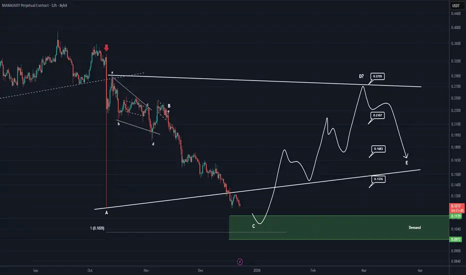
MANA Analysis (12H)The area marked with the red arrow was where the entire market crashed.
Now, in the futures market, this area has been filled with a shadow. The price can potentially rebound from below the shadow, i.e., the green box, and make a strong recovery because the scenario we’re watching is a triangle. Currently, wave C, which is a corrective wave, is coming to an end, and wave D, a bullish wave, will start soon.
The market is low-volume and weak, and market makers are easily manipulating it, so plan your entries using DCA.
Targets are marked on the chart.
For risk management, please don't forget stop loss and capital management
When we reach the first target, save some profit and then change the stop to entry
Comment if you have any questions
Thank You
XRP RoadMap (1D)Let's take a look at Ripple to see what fluctuations it may experience over the next month or two.
We considered the upward move in 2024 as Wave A, the following correction as Wave B, and the third rise as a terminal 5-wave structure.
The sharp downward move is considered a post-pattern terminal, and now the waves we are in are regarded as a bearish cycle, forming an expanding/diametric/symmetrical triangle.
Whatever the larger pattern is, in aggregation it seems that the price will move downward from the red zone to the short-term targets marked on the chart.
The targets are marked on the chart.
A daily candle closing above the invalidation level will invalidate this analysis
For risk management, please don't forget stop loss and capital management
When we reach the first target, save some profit and then change the stop to entry
Comment if you have any questions
Thank You

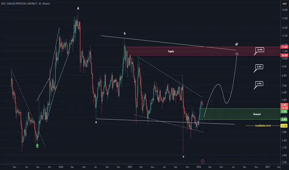
XVS Looks Bullish (3D)Before anything else, pay close attention to the timeframe.
This analysis is based on the 3D (3-Day) timeframe, which means it is time consuming by nature and absolutely not suitable for impatient trading. If you’re looking for fast moves or instant gratification, this setup is not for you. This is a position style analysis, where patience becomes an edge.
⚠️ Important Notice
This analysis is only suitable for spot positions, and strict risk and capital management is mandatory. Leveraged trading on this setup significantly increases risk and is not recommended.
Also keep in mind that XVS is a highly volatile and risky asset. Price movements can be sharp, emotional, and deceptive. This coin is known for shaking out weak hands before making its real move a classic playground for market psychology.
📐 Technical Structure & Market Psychology
From a structural perspective, XVS appears to be forming a triangle pattern, and we are currently approaching the end of Wave C.
This is a critical zone where fear is usually dominant. Late sellers often capitulate here, believing the market will continue lower, while smart money quietly prepares for accumulation.
This is where psychological games intensify:
Retail traders lose patience
Stops are hunted
Confidence disappears
Sentiment turns extremely bearish
Ironically, these conditions often create the best opportunities.
🟢 Green Zone – Where Psychology Shifts
The green highlighted area represents a high probability demand zone.
This is where strong buyers can step in, absorb sell pressure, and potentially launch price upward aggressively.
Markets don’t move up when everyone is confident
they move up when fear is high and selling pressure is exhausted.
That’s why DCA (Dollar Cost Averaging) inside the green zone is the preferred strategy. Instead of trying to catch the exact bottom (which is mostly ego driven), we let the market play its psychological games while we enter systematically and calmly.
📌 First target:
Partial profit should be secured at the first target. This is crucial not just financially, but psychologically. Locking in profit reduces emotional pressure and prevents impulsive decisions.
❌ Invalidation Rule (Non Negotiable)
If a weekly candle closes below the invalidation level,
this entire analysis becomes completely invalid.
No hope.
No bias.
No emotional attachment.
Professional traders don’t argue with the market
they respect invalidation and move on.
🧠 Final Thought
This setup is not about prediction
it’s about preparation.
Those who survive the psychological traps, manage risk properly, and remain patient are the ones who benefit when the crowd realizes they were wrong.
Trade smart.
Manage risk.
And never underestimate the psychological warfare of the market.
If you have a coin or altcoin you want analyzed, first hit the like button and then comment its name so I can review it for you.
This is not a trade setup, as it has no precise stop loss, stop, or target. I do not publish my trade setups here.
SUI🚀 SUI Expansion Pattern Analysis – High-Probability Bullish Setup
Based on the current market structure, SUI appears to be developing an Expansion pattern, with Wave D nearing completion. This setup is a classic structure often used by market makers to accumulate liquidity from both buyers and sellers before a strong directional move.
The market is currently in the final stages of Wave D, which typically serves as a corrective phase within this pattern. Understanding this phase is crucial for traders who want to enter high-probability trades without chasing the market.
🟢 Key Support Zone & Wave E Outlook
The green highlighted zone on the chart represents the area where the bearish momentum of SUI is expected to exhaust. Once price reaches this zone, the market is likely to transition into Wave E, which in this pattern is inherently bullish.
From a trading perspective:
The green zone is ideal for DCA (Dollar-Cost Averaging) entries
Enter positions gradually rather than all at once to maximize risk-reward efficiency
Let the market confirm support before scaling in
🎯 Targets & Risk Management
All bullish targets are clearly marked on the chart for easy reference and trade planning
⚠️ Invalidation Level: A daily candle close below the invalidation level will negate this analysis and signal a structural failure
💡 Why This Pattern Matters
Expansion patterns like this are highly favored in trading because they:
Allow traders to enter near liquidity zones with a better risk-to-reward ratio
Highlight where market makers are likely to trap retail positions before a breakout
Provide a clear roadmap of expected wave progression, which is invaluable for planning entries and exits
By following this structure, traders can align with the market’s bullish momentum while minimizing unnecessary exposure to risk.
If you have a coin or altcoin you want analyzed, first hit the like button and then comment its name so I can review it for you.
This is not a trade setup, as it has no precise stop-loss, stop, or target. I do not publish my trade setups here.

Structure Still Bullish On XMR (3D)📈 Bullish Market Structure
From the point where the green arrow is marked on the chart, price has clearly entered a strong bullish phase. Based on the current price behavior, market structure, and wave development, this movement strongly resembles a Bullish Diametric pattern, which typically appears during complex corrective structures before continuation.
At the moment, price is moving inside Wave F, which is the current active leg of this pattern. Importantly, Wave F has already delivered a healthy and controlled correction, both in price and structure. This correction is constructive and aligns well with the characteristics expected in a valid Diametric formation.
🟢 Key Support Zone & Market Expectation
The green highlighted zone on the chart represents a high-probability support area. From this region, we expect price to:
Hold above support
Spend some time building a base (accumulation)
Complete a time correction rather than a deep price correction
After this consolidation phase, the market is expected to transition into Wave G.
🚀 Wave G Outlook – Bullish Continuation
In a Bullish Diametric pattern, Wave G is inherently bullish and often leads to a strong continuation move in the direction of the main trend. If the structure plays out as expected, Wave G could deliver a powerful impulsive move, pushing price toward the predefined upside targets.
🎯targets : Targets : 668$ _ 1100$
💡 Trading Strategy – Smart Risk Management
The green zone is considered an optimal DCA (Dollar-Cost Averaging) entry area
Avoid chasing price; let the market come to your levels
Scale into positions gradually to manage risk effectively
This approach allows traders to stay flexible while positioning themselves early for the anticipated bullish expansion.
❌ Invalidation Level – Risk Control Is Key
This analysis will be invalidated if:
A weekly candle closes below the invalidation level marked on the chart
A weekly close below this level would signal a structural failure of the pattern and require a full reassessment.
If you have a coin or altcoin you want analyzed, first hit the like button and then comment its name so I can review it for you.
This is not a trade setup, as it has no precise stop-loss, stop, or target. I do not publish my trade setups here.

XRP Breaking Up, Could Go to ATHsXRP is breaking out of this descending wedge it has traded in for the last couple months. October 10th was probably a big leverage flush, and the last few months have effectively washed out any remaining weak hands.
Since Oct 10th was the biggest candle down that XRP has had in a very long time, there's a decent chance it is ending a larger pattern now and going to head to new ATHs from here. This is also true for many other cryptos.
In an even relatively mild bull market, XRP could run to at least $10 next year as the rest of the market also sees significant gains.
Momentum indicators are showing bullish divergences here, and with daily and potentially weekly wisemen signals, as long as XRP holds above $1.77 then we've likely bottom and are about to begin a nice rally from here.

Be careful! BITCOIN is showing bearish signals (4H)Looking at the sharp and aggressive reaction to the sellers’ order zones, we can anticipate further downside pressure as more sellers are likely to enter the market. What we’re seeing here is a classic move by market makers: they are creating FOMO in the market by forming bullish momentum candles, which psychologically convinces many traders that this is just a minor correction or a temporary pullback. However, despite these bullish signals on the lower timeframes, there is a strong possibility that the price could experience deeper drops.
On higher timeframes, Bitcoin still exhibits a bearish structure. The most recent upward leg was quickly rejected, indicating that the bullish momentum is weak and unsustainable for a long-term uptrend. This is a crucial observation because it suggests that continuing the bullish narrative here could be misleading. Our goal is not to work for the market makers or to fill their orders; instead, we want to maintain our analysis in alignment with the true market direction, avoiding traps and false signals.
We have identified two specific entry points for initiating a short position. To manage risk effectively, it’s recommended to enter these positions using a DCA (Dollar-Cost Averaging) approach, rather than committing a full position at a single level. This allows us to scale in and reduce exposure in case of temporary pullbacks.
Our target area is highlighted as the green box on the chart. It represents a logical support zone where profit-taking could occur. Importantly, this bearish scenario will be invalidated if a daily candle closes above the invalidation level, as this would negate the short-term bearish structure and suggest renewed bullish momentum.
In summary, while short-term bullish-looking candles may create the illusion of a correction, the overall structure on higher timeframes still favors the downside. Patience and proper position sizing are key traders should avoid chasing the market and instead stick to the plan of scaling into short positions at the identified entry points while keeping an eye on the invalidation level for risk management.
If you have a coin or altcoin you want analyzed, first hit the like button and then comment its name so I can review it for you.
This is not a trade setup, as it has no precise stop-loss, stop, or target. I do not publish my trade setups here.

Market Makers in Action on TOTAL 3 (1D)This index is one of the most important tools for predicting whether altcoins are about to turn bullish or not. Based on the structure it has formed we believe we are currently looking at a symmetrical pattern and it appears we are at the end of wave H.
On the chart we have highlighted two key demand zones that could potentially mark the completion of wave H. These zones are critical because they show where buying pressure is likely to step in potentially setting the stage for the next bullish wave.
Looking ahead wave I could provide a strong bullish move over the next few months offering significant opportunities for traders who are paying attention to the right levels.
It is crucial to monitor the two green levels closely they are not just arbitrary lines but a roadmap to decoding market maker activity. Market makers often manipulate price by pushing it up and down within certain ranges to accumulate liquidity shake out weak hands and set the stage for the next major move. By keeping a close eye on these levels you can better anticipate where the market may turn and position yourself strategically.
We have also identified two targets for wave I clearly marked on the chart which can serve as realistic goals for traders planning their entries and exits.
Now it is a matter of patience and observation lets watch and see how this unfolds. Traders who understand these patterns and market maker behavior will have a significant edge in navigating the altcoin market during this phase.
If you have a coin or altcoin you want analyzed, first hit the like button and then comment its name so I can review it for you.
This is not a trade setup, as it has no precise stop-loss, stop, or target. I do not publish my trade setups here.

DUSK ANALYSIS (1W)It seems that after forming the 3D structure, the price has entered a corrective ABC pattern or a more complex one.
It appears that wave B has now ended, and the price has entered wave C.
Wave C has a long correction ahead in terms of time, and in terms of price, the best area for the end of wave C is the green zone.
Let’s wait and see what happens.
For risk management, please don't forget stop loss and capital management
When we reach the first target, save some profit and then change the stop to entry
Comment if you have any questions
Thank You

CHZ will go to the moon (4H)First of all, you should know that we analyzed Chiliz in the most desperate market situation in this post and had a bullish view on it.
From the point where the green arrow is placed on the chart, the bearish phase of CHZ has officially ended, and the market has entered a new bullish phase.
This bullish structure appears to be forming a Diametric pattern, and at the moment, price action seems to be located near the end of wave E. Based on the current structure and market behavior, it is highly likely that wave E will complete soon, after which the price will move into wave F.
Wave F is expected to be a corrective / bearish wave, but it should be considered a pullback within a larger bullish trend, not a trend reversal. Therefore, the completion of wave F is where we will be actively looking for long (buy) opportunities, as it aligns with the newly established bullish phase.
Entry Strategy
We have identified two potential entry zones, and the recommended approach is to enter the position using DCA (Dollar-Cost Averaging). This allows for better risk management and improved average entry price during the corrective move.
Targets & Risk Management
Price targets are clearly marked on the chart
At Target 1, it is recommended to secure partial profits
After taking partial profit, move the stop-loss to breakeven to eliminate risk on the remaining position
Invalidation
This analysis will be invalidated if a daily candle closes below the invalidation level marked on the chart. A confirmed daily close below this level would indicate that the structure has failed and the bullish scenario is no longer valid.
As always, proper risk management is essential, and this analysis should be used as part of a broader trading plan, not as financial advice.
If you have a coin or altcoin you want analyzed, first hit the like button and then comment its name so I can review it for you.
This is not a trade setup, as it has no precise stop-loss, stop, or target. I do not publish my trade setups here.

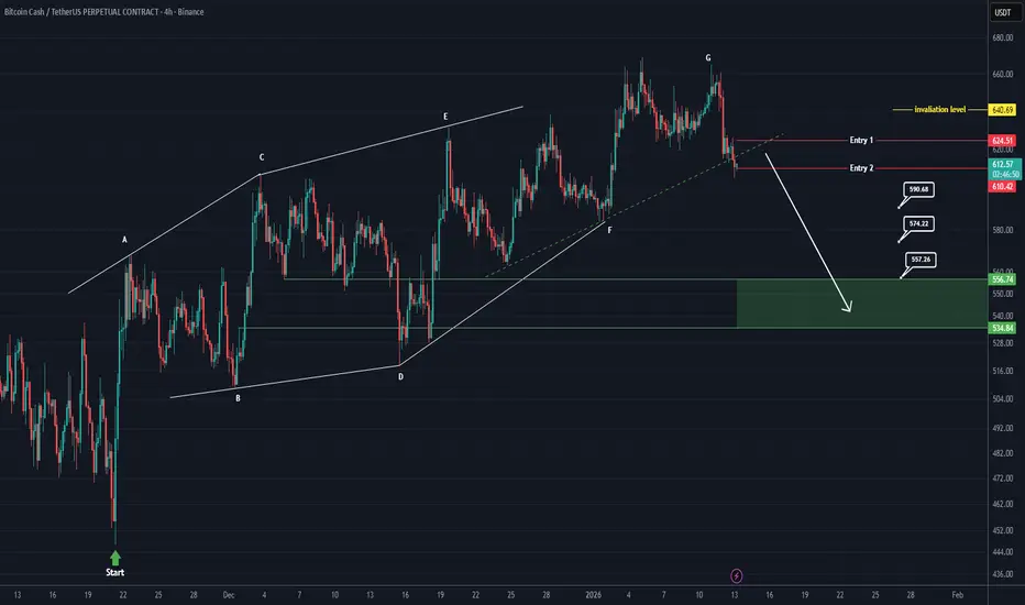
Bitcoin Cash distribution underway (4H)As discussed in our previous analysis, we identified a bullish diametric structure on Bitcoin Cash. That structure has now fully matured, with the final leg — wave G — reaching completion. According to Elliott Wave and complex corrective behavior, the completion of wave G in a diametric often signals trend exhaustion, and at this stage the market typically transitions into a corrective or impulsive move in the opposite direction.
At the current price location, market structure suggests that BCH is preparing to form a bearish wave, rather than continuing higher. This expectation is not based on a single signal, but on confluence.
Trendline Break & Shift in Control
A short-term ascending trendline, marked clearly with a dashed line on the chart, has now been broken to the downside. This breakdown is important because it represents a loss of bullish momentum and confirms a shift in market control.
When price fails to respect a short-term trendline after completing a higher-degree structure (like a diametric), it often means that buyers are no longer willing to defend higher prices, while sellers are becoming increasingly aggressive. In simple terms:
➡️ Sellers are now stronger than buyers.
Market Maker Perspective – Why Price Moves Like This
From a market maker perspective, this behavior makes perfect sense. After completing wave G, price typically enters a zone where liquidity above the highs is harvested. Market makers often push price slightly higher or keep it ranging to:
Trigger late long entries
Run stop-losses above resistance
Create the illusion of continuation
Once sufficient liquidity is collected, price is then distributed and pushed lower. This is why we often see:
Fake breakouts
Slow grinding price action near highs
Sharp bearish moves after structure completion
In this case, the diametric completion combined with the trendline break strongly suggests that distribution has already occurred, and the market is now transitioning into the markdown phase.
Trade Execution – DCA Entries
We have identified two clear entry zones for this setup. Rather than entering with full size immediately, the plan is to scale into a sell/short position using DCA (Dollar Cost Averaging).
This approach:
Reduces emotional decision-making
Protects against short-term market maker wicks
Aligns with how smart money builds positions
Patience is key here. Market makers often attempt one last push to shake out early shorts before the real move begins.
Targets & Expectations
All targets are clearly marked on the chart for transparency and planning purposes. While intermediate targets exist, the primary target is the green zone, which represents:
A high-probability liquidity area
Structural support
A logical termination zone for the bearish leg
This area is where we expect profit-taking and potential reaction.
Invalidation Level – Risk Management First
No analysis is complete without a clear invalidation point.
If a daily candle closes above the invalidation level, this entire bearish scenario will be invalidated.
A daily close above that level would indicate:
The diametric structure is no longer respected
Market makers are targeting higher liquidity zones
Bias must be reassessed objectively
Until that happens, the bearish bias remains valid.
Final Notes for Traders
This setup is not about prediction — it’s about structure, liquidity, and behavior.
When structure completes, trendlines break, and liquidity aligns, the probabilities favor a directional move.
Trade with discipline, respect your invalidation, and remember:
Market makers move price to where the most pain exists — not where the crowd expects it.
USDT DOINANCE is still under the control of bears (4H)USDT Dominance (USDT.D) – ABC Correction Completed? Bearish Wave C in Play 🚨
Altcoins & Bitcoin Recovery Scenario Explained | Smart Money Levels Ahead
If you remember our previous analysis, we were tracking a classic ABC corrective structure on USDT Dominance (USDT.D). In that scenario, Wave B was developing as a Triangle / Diametric pattern, which typically represents a complex correction before the final move.
📌 Now, the structure is becoming clearer.
Based on current price action and market behavior, it appears that Wave B has officially completed, and USDT Dominance has entered Wave C.
🔻 Why Wave C Is Important for the Crypto Market
Wave C in this structure is bearish for USDT Dominance, which is bullish for risk assets:
📈 Bitcoin (BTC) has room for further recovery
🚀 Altcoins may outperform and print greener candles
💧 Capital is likely rotating out of stablecoins and into crypto
Historically, a declining USDT.D often aligns with market relief rallies, increased risk appetite, and stronger momentum across altcoin pairs.
🎯 Key Targets & Market Maker Zones
On the chart, we have identified two major downside targets that act as high-importance reaction levels:
These levels are liquidity-rich zones
Market makers may slow price, create fake breakouts, or engineer reactions
Expect volatility and potential short-term bounces around these areas
⚠️ These are not random levels — they align with structure, Fibonacci confluence, and prior demand zones.
🔴 Critical Rejection Zone (Red Area)
The red-highlighted zone represents a strong resistance / rejection area where USDT Dominance is expected to fail and reverse lower.
If price reacts as expected from this zone:
It would confirm Wave C continuation
Strengthens the bullish case for BTC & Altcoins
Adds confidence to risk-on strategies
🧠 Smart Money Perspective
From a market maker & smart money point of view:
Liquidity above has likely been collected
Distribution appears complete
The path of least resistance is downward for USDT.D
This aligns perfectly with the current recovery narrative across the crypto market.
📊 What Should Traders Watch Next?
Reaction at the red rejection zone
Momentum toward the two marked targets
Confirmation via BTC.D and Total Market Cap
Volume expansion on altcoins
Final Thoughts
Nothing is guaranteed in the market, but structure + sentiment + liquidity are pointing in the same direction for now.
Let’s see how the market reacts.
Stay patient, trade the levels, and manage risk properly.
💬 If you’re tracking USDT.D, BTC, or Altcoins, share your bias in the comments.
📌 Follow for more Elliott Wave, Smart Money, and Crypto Market Structure analysis.

Why BTC Won't Crash to $50k (The 138.2% Rule)I want to share my full-view analysis of BTC today. Usually, I try to simplify my charts or translate them into standard Elliott Wave terms, but I feel like we might be at a 'moment of truth' here, so I’m going to stick to pure NeoWave and Ichimoku for this one, This idea tries to connect most of my previous ideas
It’s likely going to be a long read, and honestly, if you aren't interested in wave theory, this might not be for you. But for those who want to see what the deeper structure could be suggesting, let’s take a look.
The Big Picture: Supercycles
First, let's zoom all the way out. Based on the structure, it looks like Bitcoin has likely completed two major "Supercycles."
• Supercycle 1: Started way back in Nov 2011 and topped out around April 12, 2021.
• Supercycle 2: This was the corrective phase that followed which ended in November 2022
From my perspective, Supercycle 2 was a bit tricky. It actually failed the Time Similarity rule (it was too fast, lasting less than 1/3 of the time of the first wave). However, it passed on Price Similarity comfortably. The retracement was around 78%, which is well above the minimum needed. Because the price ratio is strong, I view this wave as acceptable despite the short duration.
The confirmation is seen November 2022. That’s when we broke the 2-4 trendline, which officially signaled that the Supercycle 1 correction (an Expanded Flat) was finished.
So, what does this mean for today? It suggests the rally we've seen since late 2022 is likely the start of Supercycle 3—specifically, we are looking at internal waves 1 and 2 of this new giant cycle.
Before we jump into the current setup, we need to quickly look at the popular Elliott Wave count that most people are following. I want to briefly explain why I think it might be flawed. We'll keep this part fast and short, just to clear the way for the actual analysis.
Let’s briefly test the common scenario most people are charting right now. The common view marks the move from Nov 2022 to Mar 2024 as a massive Extended Wave 1, followed later by Wave 3.
But when we look closer, the market physics tell a different story.
• Wave 1: Climbed roughly $58k, but it took a long 69 candles to do it.
• Wave 3: Climbed around $56k, but did it in just 25 candles.
Do you see the contradiction? Wave 3 covered almost the same ground but was nearly 3x more powerful in terms of speed and intensity. If Wave 1 was truly the "extended" leader, it shouldn't be outperformed so drastically by Wave 3.
The "Litmus Test" for a wave to be considered extended, it typically needs to dwarf the others—usually by at least 161.8%. Here, Wave 1 and Wave 3 are essentially the same size. When your motive waves are equal like this, it strongly suggests we aren't looking at a standard impulse pattern. The math simply doesn't support it.
Does that massive "Wave 1" actually subdivide into a clean 5-wave impulse? I checked the daily chart, and it fails the Degree Test.
• Wave 2: Lasted 23 candles.
• Wave 4: Lasted 153 candles.
Wave 4 took nearly 7x longer to correct the same amount of price. You cannot connect two waves with such a massive time imbalance and call them partners. The "impulse" theory simply breaks down when you zoom in.
Sticking to My Previous Analysis
I’m not trying to reinvent the wheel here. This is the exact same count I proposed in my previous analysis, and I haven't seen anything yet that changes my mind.
While the popular view has its merits, I’m sticking with this count simply because it passes the strict internal structure tests without having to force the rules.
• Wave 1: Nov 21, 2022 → Apr 10, 2023
• Wave 2: Apr 10, 2023 → Sep 11, 2023
• Wave 3: Sep 11, 2023 → Mar 11, 2024
• Wave 4: Mar 11, 2024 → Sep 02, 2024
• Wave 5: Sep 02, 2024 → Jan 20, 2025
• Major Correction: Jan 20, 2025 → Ongoing (Flat correction)
Unlike the other scenario, this count passes the Internal Structure Test. The waves are balanced, and the subdivisions are clean.
Why Jan 20, 2025 Was the Top ,The confirmation here is the 2-4 Trendline. We broke this line decisively around March 2025, once that line breaks, it confirms the entire 5-wave pattern is finished. This proves the subsequent rally to $126k wasn't a new impulse—it was just a corrective B-Wave in a flat pattern, also I reviewed the rally to 126k on 1D chart, from my view it’s a corrective pattern and not an impulse.
Ichimoku Evidence If you doubt the wave theory, look at the Ichimoku Base Line (Kijun-sen) on the weekly chart. It tells the real story of that rally to $126k.
From April to October 2025, the Base Line went completely flat.
• The Stat: It remained horizontal for 22 out of 27 weeks (81% of the time).
• The Reason: The calculation was "anchored" to the A-wave low ($74,434).
What This Means: In Ichimoku, a flat Kijun means the market is stuck in a range or equilibrium. Even though the price was rallying up to $126k, the math showed that the median equilibrium wasn't rising—it was pinned to the lows.
My view, that’s Flat behavior (specially B-wave). In a real trend, the equilibrium lifts with the price. Here, the price went up, but the structure stayed flat.
Combined with the fact that the upward speed (Velocity) was much slower than the drop in Wave A, this a major red flag, this was a corrective rally, not a new bull run.
This is where we have to look at the physics of the move.
• The Drop (Wave A): Fast, sharp, and velocity higher.
• The Rally (Wave B): Slower, grinding, and taking more time with a slower velocity.
Why This is a Major Red Flag In market theory, the "real" trend is usually the direction with the most speed. Impulse waves (the true trend) tend to move fast because everyone is rushing to the same side. Corrections (the counter-trend) tend to be slower and choppier because they are fighting the dominant flow.
While it is not a "god-given rule" that B-waves must be slower, when you see a rally that is significantly more lethargic than the drop that preceded it, it is a massive warning sign. It tells you that despite the green candles, the sellers are still stronger than the buyers. The "true" direction is likely still down.
The Million Dollar Question: How Deep?
Everyone seems worried that we are going to crash back down to $50k or $55k. But if we stick to the rules, I don't think that's happening.
I admitted before that was possible. But I need to make a correction.
What changed my mind? TIME. This drop moved too fast. Deep crashes usually drag out with a heavy feeling. This felt rushed. That intuition forced me to re-check.
The "138.2%" Rule The difference between a crash and a shallow bottom is the strength of the rally (Wave B).
• If Wave B is massive (> 138.2% of A), the pattern upgrades to an "Irregular Failure flat"
The Result: Our rally smashed that limit. This means the market is technically too strong to break the old lows. So, the $74,434 floor should hold. I am dropping the $50k target for now. Instead, I’m looking for a shallow bottom right here between $79k – $76.2k.
The Psychology of the pattern:
"Irregular Failure flat" sounds like a bad thing, but in reality, it is a sign of extreme strength.
Think of it like a Black Friday sale for a wildly popular product. You are standing in line waiting for the price to drop 50% so you can buy in cheap. But the demand is so crazy that people start buying the moment the price drops just 5%.
The crowd is so "hungry" that they don't let the price hit the clearance rack. They step in early.
That is exactly what a "Running Flat in elliott terms" is. It’s not just a chart pattern; it’s a map of impatience. It tells us the buyers are so aggressive that they aren't willing to wait for the deep discount everyone else is expecting.
A Final Word of Caution
However, let’s be real: These are not God's rules.
Markets are living things. Patterns break and structures shift all the time. If a major black swan event happens tomorrow—like a global conflict—and we smash through that $74k floor, the analysis changes. The whole rally from 2022 might turn into a complex correction (like a W-X-Y), and that is okay.
As traders, we don't predict the future with 100% certainty; we manage risk based on the structure we have right now. And right now, the structure says the bottom is close.
Summary & The Game Plan
So, to wrap this all up, here is what we are watching:
• The Target: We are waiting for C-5 for a bottom between $79k – $76.2k (Also there is a scenerio that C-5 might get truncated)
• The Invalidations: The absolute floor is $74,434 (Wave A low). If we break that or even wick near it, this specific "irregular failure flat" theory is dead, and we are likely dealing with a much larger, messier structure.
Where are we now?
We are currently forming a Running Triangle (Wave C-4). This typically signals the end is near—just one last leg down to go.
It looks like it's going to finish soon, unless it develops into something darker.
What Comes Next? The signal I am waiting for is a break of the 2-4 trendline (That’s when C-4 is confirmed finshed).
That might be the finish line. Once we smash through that line, it might confirm downtrend is over, But remember the break must be impulsive. It needs to be fast, strong, and convincing.
I will update you guys as soon as that breakout happens. If it doesn't... well, pretend you never saw this and just forget I exist.
A Note on Volatility (The BBWP Warning)
I also want to address the massive Weekly BBWP contractions I’ve flagged in most of my previous ideas.
I am sticking with the Supercycle theory. To me, this BBWP contractions is simply the "calm before the storm" right before Supercycle 3 kicks off. I fully agree with this outlook. it's coiling up for the next major move.
Also Technically, extreme contractions can signal a dangerous, higher-degree triangle or diagonal. That is the "darker" possibility, but I don't want to overcomplicate things today—that is a story for another time and I am not even considering it at the moment.

Bitcoin is completing a bullish triangle (12H)Since we marked the red arrow on the chart the price has entered a bearish phase
This phase appears to be a complex correction likely a double structure as we can observe an ABC plus X wave followed by a triangle formation
We are currently at the end of the second corrective wave with only one wave Wave E of this triangle remaining Once Wave E completes within the green zone the price may enter a bullish phase
In this scenario the recovery will only begin after the completion of Wave E This means that all movements from the current low until now have been part of corrective action and the bearish phase Therefore we can anticipate Bitcoins recovery target to reach around 106000 dollars
It is expected that the price will find support moving from the red zone toward the green zone after which stronger bullish movements could follow
Targets have been clearly marked on the chart for reference
Important A daily candle close below the invalidation level will negate this analysis and suggest a different market scenario
If you have a coin or altcoin you want analyzed, first hit the like button and then comment its name so I can review it for you.
This is not a trade setup, as it has no precise stop-loss, stop, or target. I do not publish my trade setups here.

APT is about to make a bullish move soon (4H)Since we marked the green arrow on the chart, a clear bullish phase has started on APT. Based on the current price structure, it appears that this phase is forming a bullish symmetrical pattern, and at the moment, we are navigating through wave F of this structure.
From a market dynamics perspective, market makers have pushed the price away from the lows with strong momentum. This move is carefully designed to create FOMO among retail buyers. Once retail participants jump in, the price is allowed to correct downward, shaking out those who entered at higher levels. This is a common tactic where market makers consolidate positions and remove weak hands before driving the price upward in the next bullish leg. Understanding this behavior is crucial for traders looking to avoid being trapped in premature entries.
Looking more closely at wave F, it is currently a bearish corrective wave within the larger bullish context. After the anticipated drop and reaching our predefined entry zones, APTOS may complete wave F and begin transitioning into wave G, which is expected to be a strong bullish wave. Wave G could offer the next opportunity for upward momentum and potential profit if entered carefully.
We have identified two key entry points on the chart. Traders should consider entering gradually using DCA (Dollar-Cost Averaging) to minimize risk and avoid overexposure, especially during periods of high volatility. Proper position sizing is critical here, as the market may continue to test lower levels before confirming the bullish wave.
The targets for this bullish move are clearly marked on the chart. Monitoring price action near these levels will help determine whether the wave structure is unfolding as expected. Additionally, it’s important to note that a daily candle close below the invalidation level would invalidate this analysis, signaling that the current wave count or bullish setup may no longer hold. Risk management and adherence to stop levels are essential to protect capital in case the market moves against the expected direction.
From a technical and psychological standpoint, this pattern illustrates how market makers manipulate momentum, retail behavior, and FOMO to their advantage. Recognizing these patterns allows traders to time their entries more effectively, avoid emotional decisions, and follow a disciplined plan that aligns with the market structure.
In conclusion, the current setup on APTOS presents a well-defined bullish opportunity, but it requires patience, discipline, and careful monitoring of the chart and price action. Entering at the designated DCA points, respecting invalidation levels, and aiming for the marked targets creates a structured trading approach that aligns with the ongoing market dynamics.
If you have a coin or altcoin you want analyzed, first hit the like button and then comment its name so I can review it for you.
This is not a trade setup, as it has no precise stop-loss, stop, or target. I do not publish my trade setups here.
