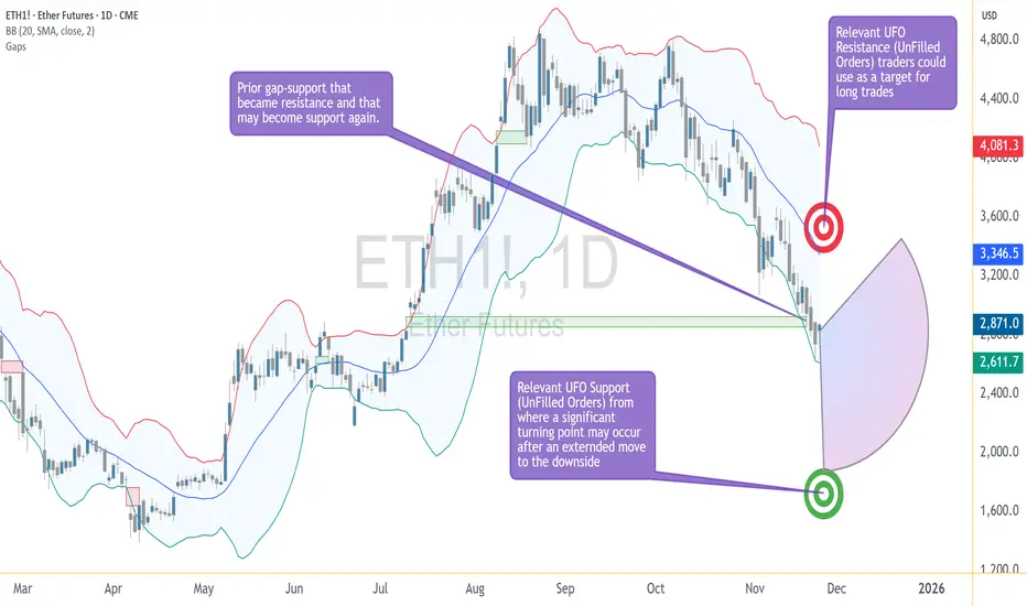
Crypto Walking the Edge: Will the Band Snap or Stretch Lower?Ether Futures (ETH) continue to tell a story of controlled pressure — one that traders have seen before across many markets, but rarely with this level of composure. The selling has been persistent, yet measured, and despite the depth of the decline, Ether has remained remarkably disciplined within its volatility structure. In short, price is walking the lower Bollinger Band — and doing it with intent.
The Market’s Controlled Descent
When an asset walks the lower Bollinger Band, it signals a market under steady directional momentum. The band represents volatility boundaries built around a moving average; hugging its lower edge reflects consistent downside force without capitulation. In Ether’s case, the message is clear — bears are in charge, but not panicking.
This pattern of orderly decline can be deceptive. It often convinces traders that “it can’t go lower” simply because volatility seems contained. Yet, in technical behavior, containment isn’t comfort — it’s momentum management. Until the market detaches from the band and closes above the midline, downside potential remains valid.
The Downside Magnet — UFO Support at 1883.0
Beneath the current price structure lies a level of particular interest: 1883.0. This is not just another number on the chart; it marks a UFO (UnFilled Orders) zone — an area where unexecuted buy orders from prior trading sessions may still be sitting.
Such levels often act as demand magnets. Price gravitates toward them as liquidity seeks to rebalance. If ETH continues its gradual descent, 1883.0 could act as a “final test” of demand strength. Traders currently short may view this area as a logical place to take profits or reduce exposure, while contrarian participants might monitor it for early signs of stabilization.
Walking the Edge — Bollinger Band Dynamics
The Bollinger Band is more than a volatility envelope; it’s a behavioral tool. Price hugging the lower band isn’t a reversal signal on its own. It shows persistent imbalance — sellers are comfortable pressing until they meet true counterflow demand.
The key observation isn’t where Ether trades, but how it interacts with the band:
If the band widens while Ether stays glued to its edge, volatility expansion favors continuation.
If the band narrows and Ether starts oscillating away from it, compression signals the potential for reversal.
At present, Ether remains on the outer lane — still walking the edge, with no confirmed volatility squeeze yet in play.
The Reversal Trigger — The Gap Between 2853.5–2769.0
Ether’s chart carries memory — and that memory is marked by the closure of a previously open gap between 2853.5 and 2769.0. Gaps represent unbalanced zones where the market skipped transactions, often leaving behind psychological resistance.
As long as ETH remains below 2769.0, bearish pressure dominates. A decisive close through the 2853.5 boundary would, however, suggest sellers have lost control. That event could flip the zone from resistance to support — the technical definition of a reversal confirmation.
Until that happens, Ether continues to operate in a bearish environment within its Bollinger framework, respecting lower boundaries and testing demand without capitulation.
The Upside Magnet — UFO Resistance at 3376.5
If the market does achieve a confirmed reversal through the gap zone, the next structural target stands near 3376.5. This region contains a UFO resistance cluster, where unfilled sell orders may wait to re-engage.
This becomes the “upside magnet” in the event of a bullish shift. Not as a forecast, but as a conditional marker — if price proves it can break through 2853.5, the 3376.5 zone becomes the next logical test for momentum sustainability.
Case Study: Risk Structure and Trade Framing
The beauty of futures markets lies in flexibility. Traders can define clear structural zones, build conditional scenarios, and design reward-to-risk ratios before any entry occurs. Ether’s chart currently offers two educational case studies:
Scenario 1 — Continuation Setup
If ETH continues trading below 2769.0, the bearish structure remains intact. Traders could study how price behaves as it approaches 1883.0 to understand profit-taking dynamics or potential trend exhaustion.
Scenario 2 — Reversal Setup
If ETH breaks and closes above 2853.5, the tone changes. It implies the market has absorbed overhead supply, opening the path toward 3376.5. In this case, risk would typically be defined below the reclaimed gap zone, maintaining a controlled risk ratio.
Whichever scenario unfolds, the discipline lies not in prediction but in preparation — in defining “if this, then that” logic.
Contract Specifications
To understand how traders express these views, it helps to revisit how Ether Futures work on CME.
Ether Futures (ETH)
Contract size: 50 Ether with a minimum tick: 0.25 per Ether = $25 per contract
Trading hours: Nearly 24 hours a day, Sunday to Friday, on CME Globex
Margin requirement: approximately $44,000 per contract (subject to changes)
For traders seeking smaller capital exposure, CME also lists Micro Ether Futures (MET) — 1/500th the size of the standard contract. This smaller format offers precision for testing setups, scaling positions, or managing margin during high volatility periods. Importantly, both ETH and MET track the same underlying price behavior, allowing consistent technical interpretation across sizes.
Managing Risk — Beyond Price Targets
Regardless of contract size, effective futures trading is a balance between conviction and constraint. Every trade requires three coordinates before execution:
Entry — based on objective price structure or confirmation.
Exit — determined by invalidation, not emotion.
Size — calibrated to volatility and margin.
A well-structured plan incorporates all three. For instance, a trader eyeing ETH’s move toward 1883.0 should define exit conditions before entry — not after volatility spikes. The same logic applies if Ether were to reclaim 2853.5 and aim higher; stop placement must be systematic, not spontaneous.
Ether Futures in Market Context
Ether’s futures market has become one of the clearest barometers of institutional sentiment in crypto. It reflects not retail enthusiasm but structured positioning, hedging, and liquidity management. The current price behavior — a slow, calculated descent — signals strategic repositioning rather than panic liquidation.
This distinction matters. Markets driven by liquidation collapse violently and rebound sharply. Markets driven by reallocation, like the current Ether environment, tend to evolve gradually — a series of tests, pauses, and measured reactions. Recognizing this tempo helps traders align their strategies with the rhythm of institutional order flow.
Summary — The Market Still Walking the Edge
Ether’s structure can be summarized in three key technical zones:
1883.0: Demand magnet and potential exhaustion level.
2853.5–2769.0: The gap resistance band — critical reversal gate.
3376.5: Major resistance cluster and next test if reversal unfolds.
As long as Ether remains below the gap zone, momentum remains under bearish control. If it trades through and holds above, a structural shift may begin. Until then, the market keeps “walking the edge” — respecting volatility, testing support, and waiting for conviction.
When charting futures, the data provided could be delayed. Traders working with the ticker symbols discussed in this idea may prefer to use CME Group real-time data plan on TradingView: www.tradingview.com - This consideration is particularly important for shorter-term traders, whereas it may be less critical for those focused on longer-term trading strategies.
General Disclaimer:
The trade ideas presented herein are solely for illustrative purposes forming a part of a case study intended to demonstrate key principles in risk management within the context of the specific market scenarios discussed. These ideas are not to be interpreted as investment recommendations or financial advice. They do not endorse or promote any specific trading strategies, financial products, or services. The information provided is based on data believed to be reliable; however, its accuracy or completeness cannot be guaranteed. Trading in financial markets involves risks, including the potential loss of principal. Each individual should conduct their own research and consult with professional financial advisors before making any investment decisions. The author or publisher of this content bears no responsibility for any actions taken based on the information provided or for any resultant financial or other losses.
Reversal
Mastering Trend Reversals: Morning & Evening Star PatternsSo, you're trying to nail those trend reversals? The Morning and Evening Star patterns are perfect for that. They show up right when the market’s about to shift, giving you a chance to get in before the move really takes off. Let’s break down how these setups work and why they’re such solid tools for traders like you.
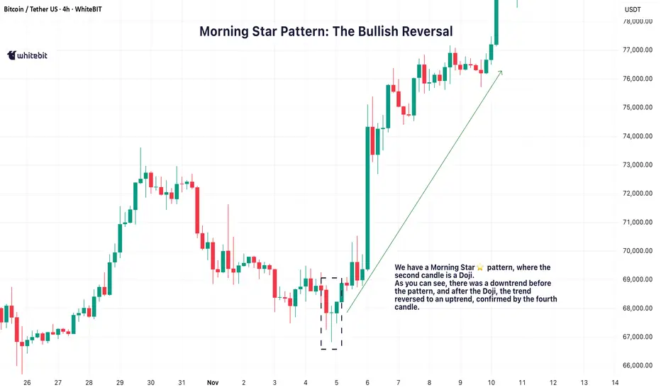
🌅 Morning Star Pattern: The Bullish Reversal
The Morning Star pattern is one of the best ways to catch a trend reversal from bearish to bullish. It usually pops up after a downtrend, signaling that the market is about to make a move to the upside. It’s made up of three candles:
A long red candle that shows the market’s been selling off.
A small candle, often a Doji, that indicates indecision or a pause in the downtrend.
A big green candle that confirms the shift, showing buyers are taking control.
When you spot a Morning Star candlestick pattern, it’s a strong indication that the downtrend might be over and the bulls could be taking over. The third candle plays a crucial role here, confirming that the trend is likely reversing.
🌇 Evening Star Pattern: The Bearish Reversal
On the flip side, the Evening Star pattern is the bearish cousin of the Morning Star. It shows up after an uptrend and signals that the market is ready to start heading down. It also consists of three candles:
A long green candle that continues the uptrend.
A small candle, again often a Doji, that suggests the market’s losing momentum.
A big red candle that confirms the reversal, showing sellers are stepping in.
When you see the Evening Star candlestick pattern, it tells you that the market could be shifting from bullish to bearish. The third candle confirms that the reversal might be taking place.
💡 Trading the Star Patterns
Both the Morning Star trading pattern and Evening Star patterns are great for spotting potential trend reversals, but they shouldn't be relied on as the only signal. To increase the reliability of these patterns, consider confirming them with other indicators like RSI (Relative Strength Index) , MACD (Moving Average Convergence Divergence) , or volume analysis.
For example, if a Morning Star pattern candlestick appears and is followed by increasing volume, it adds strength to the reversal signal. Similarly, if the Evening Star shows up with an overbought RSI, it could provide further confirmation that the market is due for a pullback.
By using these additional tools, you can have more confidence in your analysis and make better-informed decisions.
📈 Why These Patterns Matter
The Morning Star and Evening Star patterns are powerful tools for identifying potential trend reversals. They give traders a visual cue that a market shift could be on the horizon, helping to spot potential turning points.
However, it’s crucial to make your trading decisions based on a combination of factors and not rely solely on these patterns. Always make sure to consider the broader market context and other technical indicators before acting on any pattern.
Mastering the Hanging Man PatternAlright, traders, let’s talk about the Hanging Man candlestick pattern.
This one’s a classic, and if you know what you’re looking at, it can be a game changer when you’re spotting potential reversals. So, what exactly is the Hanging Man pattern, and how can you use it to your advantage? Let’s break it down.
What Is the Hanging Man Pattern?
The Hanging Man pattern appears when the market has been pushing higher, and then—bam—a sign that it could be running out of steam. It’s called the Hanging Man chart pattern because the candlestick looks like a little figure hanging by its feet, with a long lower wick. The body is small, and the lower shadow is long—typically at least twice the size of the body. This shows that while buyers were in control, sellers came in strong towards the end of the session, pushing prices lower.
Hanging Man candles can be red or green. Even though the candle is green, it still suggests the same potential reversal because the rejection of higher prices by the sellers shows weakening bullish pressure. The key point to remember is that the Hanging Man candle pattern signals potential exhaustion in an uptrend. It doesn’t guarantee that the trend is reversing, but it highlights that the bullish momentum is waning, which could be a sign that a reversal is near.
Where to Look for the Hanging Man Pattern?
Context is everything. The Hanging Man pattern is much more significant when it appears at the top of an uptrend. In this case, it suggests that buyers are losing control, and the market could soon turn bearish. If it appears after a downtrend, it’s known as an Inverted Hammer, and its interpretation is different—it could signal a potential reversal to the upside.
So, while the Hanging Man is typically seen as a bearish reversal indicator after a sustained uptrend, it is crucial to recognize that the context matters. A Hanging Man at the peak of a strong bullish trend often attracts attention from traders as a potential signal for a shift in momentum.
How to Confirm the Reversal?
The key to using the Hanging Man pattern effectively is the confirmation candle. After spotting the Hanging Man candlestick pattern, you’ll want to wait for a bearish candlestick in the next session that closes below the low of the Hanging Man candle. This confirms that sellers have taken control and that the market is likely heading lower.
It’s also important to consider the volume during the confirmation. A strong bearish Hanging Man pattern with higher-than-usual volume adds strength to the reversal signal. If the confirmation candle has low volume, it might not carry as much weight, so always consider the volume when confirming the pattern.
However, the Hanging Man candlestick pattern is not foolproof. A Hanging Man trading pattern without confirmation can sometimes lead to a false reversal, especially in markets with high volatility or when the overall trend is still strong.
False Signals and Pitfalls
One of the biggest challenges when trading the Hanging Man pattern candlestick is false signals. In choppy or sideways markets, the pattern may form but fail to lead to a true reversal. To avoid these traps, consider waiting for the confirmation candle and also use other tools to verify the signal, like:
Trendlines: Ensure the market is actually in an uptrend before considering the Hanging Man pattern.
Support/Resistance Levels: Wait for a breakdown below a significant support level to increase confidence in the reversal.
Momentum Indicators (e.g., RSI or MACD): Use momentum indicators to confirm that buying pressure is truly weakening, as suggested by the Hanging Man pattern.
These additional tools can help you filter out false signals and increase the reliability of your trades.
The Hanging Man pattern can be a valuable tool when used correctly, but it’s not a standalone signal. It works best when combined with other forms of technical analysis, such as momentum indicators, trendlines, and volume analysis. Be patient, wait for confirmation, and always manage your risk. The Hanging Man trading pattern is a great addition to your candlestick pattern toolbox, but it should be used as part of a broader strategy that includes multiple indicators and sound risk management.

Follow the Flow: Trading with Liquidity ZonesLiquidity is where the market breathes. The Liquidity Zones indicator by BigBeluga helps traders visualize where large players may be hiding orders—revealing the zones where price is most likely to react, reverse, or accelerate.
Let’s break down how this tool works, how we use it at Xuantify, and how you can integrate it into your own strategy.
🔍 What Is the Liquidity Zones Indicator?
This open-source tool identifies pivot highs and lows filtered by volume strength and plots them as liquidity zones —highlighting areas where buy/sell orders are likely to accumulate.
Key Features:
Volume-filtered pivot detection (Low, Mid, High)
Dynamic or static liquidity zone boxes
Color intensity based on volume strength
Liquidity grab detection with visual cues
These zones act as magnets for price , helping traders anticipate where reactions, reversals, or stop hunts may occur.
🧠 How We Use It at Xuantify
We use Liquidity Zones as a contextual map for structure and execution.
1. Entry & Exit Planning
We align entries near untested liquidity zones and use them as targets for exits—especially when confirmed by structure or momentum.
2. Liquidity Grab Detection
When price pierces a zone and reverses, it often signals a liquidity sweep . We use this as a trigger for reversal setups.
3. Volume Context
Zones with higher volume intensity are prioritized. These are more likely to attract institutional activity and generate stronger reactions.
🧭 Dynamic vs. Static Zones
The indicator offers both dynamic and static zone modes:
Dynamic : Box height adjusts based on normalized volume, showing how much liquidity is likely present.
Static : Consistent box size for cleaner visuals and easier backtesting.
Why this matters:
Dynamic zones reflect real-time volume strength
Static zones offer simplicity and clarity
Both modes help visualize where price is likely to “grab” liquidity
⚙️ Settings That Matter
To get the most out of this tool, we recommend:
Volume Strength = Mid or High for cleaner zones
Enable Dynamic Mode when trading volatile assets
Use Color Intensity to quickly spot high-liquidity areas
🔗 Best Combinations with This Indicator
We pair Liquidity Zones with:
Market Structure Tools – BOS/CHOCH for context
Momentum Indicators – Like RSI or MACD for confirmation
Fair Value Gaps (FVGs) – For precision entries near liquidity
This layered approach helps us trade into liquidity , not against it.
⚠️ What to Watch Out For
Liquidity zones are not signals —they’re context . In fast-moving or low-volume markets, price may ignore zones or overshoot them. Always combine with structure and confirmation.
🔁 Repainting Behavior
The Liquidity Zones indicator is designed to be non-repainting . However, due to waiting for pivot confirmation, the zones are plotted in hindsight. This makes it suitable for real-time execution .
⏳ Lagging or Leading?
This tool is partially lagging —it waits for pivot confirmation and volume validation before plotting a zone. However, once plotted, these zones often act as leading levels , helping traders anticipate where price may react next.
🚀 Final Thoughts
The Liquidity Zones indicator by BigBeluga is a powerful visual tool for traders who want to understand where the market is likely to move—not just where it’s been. Whether you’re trading reversals, breakouts, or mean reversion, this tool helps you stay aligned with the market’s hidden intent.
Add it to your chart, test it, and see how it sharpens your edge.

Mastering chart patterns - How to use them in trading!Chart patterns are visual formations created by the price movements of a financial asset—like a stock, currency, or cryptocurrency, on a price chart. Traders use these patterns in technical analysis to predict future market direction based on historical behavior. The main chart patterns are the reversal and continuation patterns.
-------------------------------
What will we discuss?
- Bullish reversal patterns
- Bearish reversal patterns
- Bullish continuation patterns
- Bearish continuation patterns
-------------------------------
Bullish reversal patterns:
Double bottom
A double bottom in trading is a bullish reversal pattern that signals the potential end of a downtrend and the beginning of an uptrend. It forms when the price of an asset falls to a low, bounces back up, then drops again to roughly the same low before rising once more. This creates a "W" shape on the chart.
How to trade it:
Before entering a trade, wait for the price to break back above the neckline with strong volume, as this indicates a potential bullish reversal. Once the breakout is confirmed, look for an entry on the pullback to the neckline.
Inverted head and shoulders
An inverted head and shoulders is a bullish reversal pattern that typically forms after a downtrend and signals a possible shift to an uptrend.
It consists of three parts:
* The left shoulder, where the price makes a low and then bounces.
* The head, which is a deeper low followed by another bounce.
* The right shoulder, a higher low similar in level to the left shoulder.
How to trade it:
Before entering a trade, wait for the price to break above the neckline with strong volume, as this confirms the pattern and signals a potential upward move. After the breakout, it's important to wait for a retest of the neckline to look for an entry. Traders typically place a stop-loss just below the right shoulder to manage risk.
Falling wedge
A falling wedge is a bullish chart pattern that often signals a potential reversal or continuation of an uptrend, depending on where it forms in a price trend.
It appears when the price is moving lower but within a narrowing range, creating two downward-sloping, converging trendlines. Both the highs and lows are falling, but the lower highs are coming down faster than the lower lows, which shows that selling pressure is losing strength over time.
How to trade it:
Wait for the falling wedge to break above the downward trendline and for the price to reclaim the most recent lower high. A breakout alone isn’t always reliable, sometimes the price moves briefly above the trendline without making a higher high, resulting in a fake-out. To confirm the move, wait for a clear higher high and then look to enter on the retracement that follows.
-------------------------------
Bearish reversal patterns
Double top
A double top is a bearish reversal pattern that signals a potential shift from an uptrend to a downtrend.
It forms when the price reaches a high, pulls back, then rallies again to the same or similar high but fails to break above it. This creates an "M" shape on the chart. The neckline is the support level at the low point between the two peaks. When the price breaks below this neckline with strong volume, it confirms the pattern and suggests that selling pressure is taking over.
How to trade it:
Before entering a trade, wait for the price to break below the neckline with strong volume, as this indicates a potential bearish reversal. Once the breakout is confirmed, look for an entry on the pullback to the neckline.
Head and shoulders
A head and shoulders is a bearish reversal pattern that typically forms after an uptrend and signals a potential shift to a downtrend.
It consists of three peaks:
* The left shoulder, where the price rises and then falls.
* The head, which is a higher peak followed by another decline.
* The right shoulder, a lower high that is roughly equal in height to the left shoulder.
How to trade it:
Before entering a trade, wait for the price to break below the neckline with strong volume, as this confirms the pattern and signals a potential downside move, After the breakout, it’s important to wait for a retest of the neckline to look for an entry. Traders typically place a stop-loss just above the right shoulder to manage risk
Rising wedge
A rising wedge is a bearish chart pattern that often signals a potential reversal or continuation of an downtrend, depending on where it forms in a price trend.
It appears when the price is moving higher but within a narrowing range, creating two upward-sloping, converging trendlines. Both the highs and lows are rising, but the highs are increasing at a faster rate than the lows. This suggests that buying pressure is weakening over time, and the market may be preparing for a downturn.
How to trade it:
Wait for the rising wedge to break below the upsloping trendline and for the price to reclaim the most recent high low. A breakout alone isn’t always reliable, sometimes the price moves briefly below the trendline without making a lower low, resulting in a fake-out. To confirm the move, wait for a clear lower low and then look to enter on the retracement that follows.
-------------------------------
Bullish continuation patterns
Bullflag
A bull flag is a continuation pattern that signals the potential for a price to continue moving upward after a brief consolidation or pullback.
It forms when the price experiences a strong upward move (the flagpole), followed by a period of consolidation or a slight downward movement (the flag). The flag typically slopes downward or moves sideways, and the consolidation phase usually occurs within two parallel trendlines, creating a rectangle or slight downward channel.
How to trade it?
Before entering a position, wait for the price to break above the downsloping trendline and establish a higher high. If the price doesn’t make a higher high, it could be a fake-out. Once a higher high is confirmed, look for an entry on the retracement. The target is typically the length of the flagpole projected upward from the breakout point.
Bullish pennant
A bullish pennant is a continuation pattern that indicates the potential for a price to continue its upward trend after a brief consolidation. It forms when a strong upward move (the flagpole) is followed by a period of consolidation, where the price moves within converging trendlines, creating a small symmetrical triangle or pennant shape. The consolidation typically shows lower highs and higher lows, and the pattern suggests that the market is taking a "breather" before continuing its upward momentum.
How to trade it?
Before entering a position, wait for the price to break above the downsloping trendline and establish a higher high. If the price doesn’t make a higher high, it could be a fake-out. Once a higher high is confirmed, look for an entry on the retracement. The target is typically the length of the flagpole projected upward form the breakout point.
Ascending triangle
An ascending triangle is a bullish continuation pattern that typically forms during an uptrend, signaling that the price is likely to continue moving higher.
It is characterized by a horizontal resistance line at the top, formed by a series of peaks at roughly the same price level, and an ascending support line at the bottom, formed by higher lows. This creates a triangle shape, where the price is gradually compressing between the horizontal resistance and the rising support.
How to trade it?
Before entering a position, wait for the price to break above the horizontal resistance level with strong volume. Once the breakout occurs, look for an entry on the retracement back to this area.
-------------------------------
Bearish continuation patterns
Bearflag
A bear flag is a bearish continuation pattern that suggests the price is likely to continue moving downward after a brief consolidation or upward pullback.
It forms when there is a strong downward move (the flagpole), followed by a period of consolidation or slight upward movement (the flag). The flag typically slopes upward or moves sideways, and the consolidation occurs within two parallel trendlines, creating a rectangular or upward-sloping channel. This pattern shows that, despite the short-term pullback, the overall downtrend remains intact.
How to trade it?
Before entering a position, wait for the price to break below the upsloping trendline and establish a lower low. If the price doesn’t make a lower low, it could be a fake-out. Once a lower low is confirmed, look for an entry on the retracement. The target is typically the length of the flagpole projected downward for the breakout point.
Bearish pennant
A bearish pennant is a bearish continuation pattern that signals a potential continuation of a downtrend after a brief consolidation.
It forms when there is a strong downward move (the flagpole), followed by a period of consolidation where the price moves within converging trendlines, creating a small symmetrical triangle or pennant shape. The consolidation typically shows lower highs and higher lows, indicating that the price is taking a pause before continuing its downward movement.
How to trade it?
Before entering a position, wait for the price to break below the upsloping trendline and establish a lower low. If the price doesn’t make a lower low, it could be a fake-out. Once a lower low is confirmed, look for an entry on the retracement. The target is typically the length of the flagpole projected downward for the breakout point.
Descending triangle
A descending triangle is a bearish continuation pattern that typically forms during a downtrend, indicating that the price is likely to continue moving lower after a period of consolidation.
The pattern is characterized by a horizontal support line at the bottom, formed by a series of lows at approximately the same price level, and a descending resistance line at the top, formed by a series of lower highs. The price contracts between these two trendlines, creating a triangle shape with a downward-sloping upper boundary and a flat lower boundary.
How to trade it?
Before entering a position, wait for the price to break below the horizontal support level with strong volume. Once the breakout occurs, look for an entry on the retracement back to this area.
-------------------------------
Thanks for your support.
- Make sure to follow me so you don't miss out on the next analysis!
- Drop a like and leave a comment!

The Two-Faced Market: The Truth Behind Trend Reversals!🎭 The Two-Faced Market: The Truth Behind Trend Reversals! 📊🚀
📢 Ever entered a trade thinking you caught the perfect trend , only to get stopped out as the market reversed?
You're not alone. The market has a way of fooling traders—but if you understand its “two-faced” nature, you can stay one step ahead.
🔥 Why Trends Reverse (and How to Catch It Early!)
Most traders believe trends reverse due to "news" or "randomness." But in reality, the market gives signals long before the turn happens. Here’s what to watch for:
🔹 Momentum Divergence: The price makes a new high, but indicators like RSI/MACD don’t.
🔹 Volume Anomaly: The trend continues, but volume dries up—a sign of weakness.
🔹 Failed Breakouts: Price breaks a key level, only to fall back inside—trapping traders.
🔹 Candlestick Clues: Reversal patterns like engulfing candles or wicks rejecting key levels appear.
🚀 Mastering these signals can put you ahead of 90% of traders.
📊 Real Example: XAU/ USD Trend Reversal in Action
🔎 Breakdown of the setup:
✅ Step 1: Identify a trend (through market structure, trendline or moving average).
✅ Step 2: Look for failed breakouts against the trend
✅ Step 3: Look for trend-following setups
🎯 The Market’s Game: Recognizing The Shift
Trends don’t die suddenly—they fade before reversing. The best traders spot the early signs and position before the crowd.
💡 Have you spotted these reversal signs before? Drop a comment with your experience! 👇🔥
📚 Always follow your trading plan regarding entry, risk management, and trade management.
Good luck!
All Strategies Are Good; If Managed Properly!
~Rich
Disclosure: I am part of Trade Nation's Influencer program and receive a monthly fee for using their TradingView charts in my analysis.

How to Spot a Reversal Before It Happens (Before Your SL Hits)You know the feeling. You’re confidently riding a winning trend, high on the euphoria of green candles, when—BAM—the market flips faster than a politician in an election year. Your once-perfect trade is now a humiliating red mess, and your stop loss is the only thing standing between you and financial pain.
But what if you could see that reversal coming before it smacks you in the face? What if, instead of watching your profits evaporate, you could exit like a pro—or better yet, flip your position and ride the reversal in the other direction?
Reversals don’t happen out of thin air. The signs are always there—you just have to know where to look. In this idea, we break down how to spot reversals before they happen.
😉 Price Action: The Market’s Way of Dropping Hints
Markets don’t just change direction because they feel like it. Reversals happen when sentiment shifts—when buyers and sellers agree, sometimes all at once, that the current trend has run its course.
The first clue? Price action itself.
Look for hesitation. A strong uptrend should be making higher highs and higher lows. A downtrend should be carving out lower lows and lower highs. But what happens when that rhythm starts breaking?
A higher high forms, but the next low dips below the previous one? Warning sign.
Price approaches a key resistance level, but momentum stalls, and candles start looking indecisive? Caution flag.
A massive engulfing candle wipes out the last three sessions? Somebody just hit the eject button.
Before markets reverse, they throw up some red flags first—and depending on your time frame, these red flags can give you a heads up so you can prepare for what’s coming.
🔑 Divergence: When Your Indicators Are Screaming "Lies!"
Indicators might be lagging, but they’re not useless—especially when they start disagreeing with price.
This is where divergence comes in. If the price is making new highs, but your favorite momentum indicator (RSI, MACD, Stochastic—you name it) isn’t? That’s a major warning sign.
Bearish Divergence: Price makes a higher high, but RSI or MACD makes a lower high. Translation? The momentum behind the move is fizzling out.
Bullish Divergence: Price makes a lower low, but RSI or MACD makes a higher low. Translation? Sellers are losing their grip, and a bounce might be coming.
Divergences don’t mean immediate reversals, but they do suggest that something’s off. And when the market starts whispering, it’s best to listen before it starts shouting.
📍 Volume: Who’s Actually Driving the Move?
A trend without volume is like a car running on fumes—it’s only a matter of time before it stalls.
One of the clearest signs of a potential reversal is a divergence between price and volume.
If price is pushing higher, but volume is drying up? Buyers are getting exhausted.
If price is tanking, but selling volume isn’t increasing? The bears might be running out of steam.
If a major support or resistance level gets tested with huge volume and a violent rejection? That’s not a coincidence—it’s a battle, and one side is losing.
Reversals tend to be violent because traders are caught off guard. Watching the volume can help you avoid being one of them.
📊 Key Levels: Where the Market Loves to Reverse
Price doesn’t move in a vacuum. There are levels where reversals love to happen.
Support and Resistance: The most obvious, yet most ignored. When price approaches a level that’s been historically respected, pay attention.
Fibonacci Retracements: Markets are weirdly obsessed with 38.2%, 50%, and 61.8% retracement levels. If a trend starts stalling near these zones, don’t ignore it.
Psychological Numbers: Round numbers (like 1.2000 in Forex , $500 in stocks , or $120,000 in Bitcoin BITSTAMP:BTCUSD act like magnets. The more traders fixate on them, the more likely they become reversal points.
Smart money isn’t chasing prices randomly. They’re watching these levels—and if you’re not, you might consider doing it.
🚨 Candlestick Warnings: When the Market Paints a Picture
Candlesticks aren’t just pretty chart elements that give you a sense of thrill—they tell stories. Some of them hint at “reversal.”
Doji: The ultimate indecision candle. If one pops up after a strong trend, the market is questioning itself.
Engulfing Candles: A single candle that completely erases the previous one? That’s power shifting sides.
Pin Bars (Hammer/Inverted Hammer, Shooting Star): Long wicks show rejection. When they appear at key levels, reversals often follow.
Candlestick patterns alone aren’t enough, but when they show up alongside other reversal signals, they’re hard to ignore.
📰 The News Factor: When Fundamentals Crash the Party
Technical traders like to pretend breaking news doesn’t matter—until it does.
Earnings reports , economic data , interest rate decisions ECONOMICS:USINTR —these events can turn a strong trend into a dumpster fire instantly.
A stock making all-time highs right before earnings? Tread carefully.
A currency pair trending up before an inflation report? One bad number, and it’s lights out.
A crypto rally before a major regulation announcement? That could end badly.
Reversals don’t always come from charts alone. Sometimes, they come from the real world. And the market rarely gives second chances.
✨ The Reversal Cheat Sheet: When Everything Aligns
A single signal doesn’t guarantee a reversal. But when multiple factors line up? That’s when you need to take action.
If you see:
✅ Divergence on indicators
✅ Volume drying up or spiking at a key level
✅ A major support/resistance level getting tested
✅ Reversal candlestick patterns forming
✅ News lurking in the background
Then congratulations—you’ve likely spotted a reversal before your stop loss takes the hit.
✍ Conclusion: Stay Ahead, Not Behind
Catching reversals before they happen isn’t magic—it’s just about knowing where to look. Price action, volume, key levels, indicators, and even the news all leave clues. The problem? Most traders only see them after their account takes the hit.
Don’t be most traders. Pay attention, recognize the signs, and act before the market flips the script on you.
Because the best time to spot a reversal? Before it happens.
Do you use any of these strategies to spot reversals in your trading? What’s the last time you did it and what were you trading—forex, crypto, stocks or something else? Let us know in the comments!

The reaction to the Supply Zone is the keyOn this chart, you can see that the topping signal and the formation of a fresh Supply Zone (highlighted in red) initially resulted in only a temporary shallow pullback. However, this pullback did not indicate a reversal of the uptrend. Instead, the market quickly resumed its upward momentum, as evidenced by the appearance of another "Buy re-test" signal shortly after.
This is a great example of how a topping signal—which might typically indicate potential exhaustion—can sometimes act as merely a pause in a strong uptrending market, rather than leading to a significant reversal. The trend continued higher as buyers re-established control, with subsequent key supports holding firmly to reinforce bullish strength.
Key takeaway: Topping signals and Supply Zones should be evaluated within the broader context of the market's trend. In this case, the bulls demonstrated sustained dominance despite the brief pause, confirming the uptrend's resilience.

Parabolic Reversals, A+ setup explained with todays NAS R5 shortRecap of todays NY Session with my shorts on NAS and Gold. I am explaining the parabolic reversal setup in detail since it happens quite often currently and is one of my favourite setups.

Divergence: RSI vs. PriceHey everyone!
In my years of trading, I've really come to love Reversal Strategies and my favorite is in the form of a DIVERGENCE!
Today, I took some time to put together an Educational Video on:
1) What a Divergence Is?
2) How to Spot them!
&
3) How to Trade them!
I hope you find this helpful!
**Tips
- Divergence is never good enough to trade alone, YOU NEED CONFIRMATION!
- The longer the Divergence takes, the more reliable it is
- Change in Momentum is KEY!

4 Stages of Price Delivery (ICT Concepts)In this video I go through the 4 stages of price delivery as it pertains to ICT Concepts.
Generally, the market is going through either of the following:
Consolidation
Expansion
Retracement
Reversal
Price starts from a consolidation, where Smart Money accumulates their position, and then an expansion, where price is trending in a direction for the purpose of seeking liquidity and/or manipulating sentiment. From an expansionary phase, price will either retrace to re-accumulate orders and expand again, or have a complete reversal.
Now, it is important to note that price is fractal, meaning the signatures you see on a lower timeframe perspective could also be seen on a higher timeframe perspective. In a singular candlestick, there can be multiple phases of price delivery happening.
Once one can fit all these pieces together in regard to how market makers book price, one can have a clear insight into where price is likely going and where it likely won't go again, all with a high degree of accuracy.
Thanks for watching and reading!
- R2F

Weekly Analysis Part 2 - Daily Sessions/ Reversals- Forex
- Gold Analysis Session Reversals
- Zone and Volatility indications
- RSI14
- Consolidation and Patterns

Key Levels and what you need to know about themThere are Key Levels on every timeframe. But the ones that are relevant are the ones that agree in between timeframes. There are Swing Key Levels, Intraday Keylevels /agree on H4 + H1) and Scalpers Key Levels (I use those that agree on H1 and M30).
Key Levels are zones where the market has not decided yet which direction it will choose, but as a trader you have to be one step ahead and speculate on it.
Key Levels of higher time frames are always dominant. So when you scalp make sure you are not landing in between the buyers and sellers fight of swing or intraday traders.
How to apply on low risk:
- Have a D1 ceiling and floor, have an H1 ceiling and floor. Generally don't sell on floors and don't buy at ceilings.
- Look for reversals around those areas (3 peak patterns or longer consolidations rejecting an important zone)
- Be careful at Key Levels (that is everything in between the floor and the ceiling)
- Generally buy at floors and sell at ceilings when you have:
a. indication of reversal
b. break of structure indication with candle close (not few pip around the zone, it should clearly break with close)
c. momentum pushing like "engulfing patterns", long candles (towards your direction), long wigs (towards the opposite direction), Dojis (indicates end of wave and short term change of direction)
How to apply on middle risk:
- buy when it breaks the ceiling with volatility specific stop loss of asset
- sell when it breaks the floor with volatility specific stop loss of asset
Also take a look at my post about specific volatility of assets. Linked below.

Mastering Trading with Support and Resistance LevelsTrading with support and resistance levels is a fundamental strategy that offers insights into market psychology and potential trade entry and exit points. This guide will explore how to effectively trade using these levels, highlighting the importance of confirmation, rejection patterns, candlestick patterns, and confluence with other indicators.
Understanding Support and Resistance
- Support : A price level where a downtrend may pause due to a concentration of demand.
- Resistance : A price level where an uptrend can pause or reverse because of a concentration of selling interest.
The Significance of Confirmation
Confirmation is crucial when trading with support and resistance, as it ensures that the price respects these levels before making a trade. Waiting for confirmation reduces the risk of false signals.
Candlestick Patterns: The Language of the Markets
Understanding candlestick patterns is essential for interpreting market sentiment at support and resistance levels. Patterns like bullish engulfing or bearish engulfing suggest strong reversals.
Finding Confluence with Other Indicators
Confluence enhances the reliability of trading signals. Combining support and resistance analysis with other indicators like moving averages or the stochastic RSI can provide stronger entry or exit signals.
Integrating Support and Resistance into Your Trading
Identify key levels : Mark clear support and resistance levels on your chart.
Wait for confirmation : Confirm the level is holding through candlestick patterns or price action before trading.
Look for rejection patterns : Observe candlestick formations for reversal signals.
Seek confluence : Use other indicators to validate your trading signals.
Manage your risk : Always set a clear stop-loss order to manage potential losses.
By employing these strategies, traders can enhance their market navigation skills, focusing on managing risk and seizing the right opportunities. With patience and practice, trading with support and resistance levels can be a vital part of a successful trading approach.

Bollinger Bands Part II: Reversal PatternsBollinger Bands Part II: Reversal Patterns
Analzying Two Key Patterns Called M-Tops and W-Bottoms
This post will go into greater depth than the basic introduction to Bollinger Bands published last week. In particular, it will discuss two key reversal patterns. Both the M-top reversal pattern and W-bottom reversal pattern are price patterns that form in conjunction with the Bollinger Bands.
M-Top Pattern
The classic M-top reversal pattern forms when two consecutive price highs form an M-shaped price pattern with the first high tagging the upper band and the second high exhausting before tagging the upper band. An example is shown on Supplemental Chart A involving a topping pattern in BTCUSD from early 2021. This weekly chart shows the M-top in red. The second high meets the traditional (strict) criteria of a second peak near—but not touching—the upper band. This is soon evident as a price failure.
Supplemental Chart A
But an M-top reversal pattern may arise even when two actual tags or pierces of the upper band occur, i.e., the second high may tag the band without invalidating the pattern. This is based on the email discussion this author had with the creator of the Bollinger Bands a while back in 2022, recounted at the end of this post.
In short, the most important feature of the pattern is price exhaustion and reversal at the second high . In other words, look for failure of the price move at or near band resistance (e.g., a failed breakout). The following technical signals may provide additional confirmation: weakening momentum indicators, including negative divergences in momentum indicators or a lower high on %B indicator which may present as a %B line divergence.
W-Bottom Pattern
The classic W-bottom reversal pattern forms when two consecutive price lows form a W-shaped price pattern with the first low tagging the lower band and the second low exhausting before tagging the lower band.
Supplemental Chart B
But note that a W-bottom reversal pattern may arise even when two actual tags or pierces of the lower band occur, i.e., the second low may tag the band without invalidating the pattern. This is based on the email discussion this author had with the creator of the Bollinger Bands a while back in 2022, recounted at the end of this post. In short, the most important feature of the pattern is price exhaustion and reversal at the second low. In other words, look for failure of the price move at band support (e.g., a failed breakdown). The following technical signals may provide additional confirmation: Strengthening momentum indicators, including positive divergences in momentum indicators or a higher low on % B indicator which may present as a %B line divergence.
Understanding the Nuances
In June 2022, John Bollinger, the creator of the Bollinger Bands, posted a monthly chart of BTC/USD on Twitter. He described the chart as a “picture perfect double (M-type) top in BTCUSD on the monthly chart complete with confirmation” from %B and bandwidth indicators. He noted also that the signal led to a tag of the lower band. Supplemental Chart C is my own attempt to recreate the monthly chart Bollinger had shown to reflect the same two major monthly highs in BTCUSD in early 2021 and then again in late 2021. Please note that Supplemental Chart C shows a different M-top than the one shown on the weekly time frame above on Supplemental Chart A, which only focuses on one of the two peaks analyzed in this monthly chart.
Supplemental Chart C
This chart that Bollinger originally posted in 2022 showed two actual tags of the upper band. This was not quite technically within the definition of an M-top in much of the technical literature. My previous reading on M-tops and W-bottoms found that all the definitions and examples showed that the second high or low must not touch or tag the relevant band. But this is incorrect to assume that M-tops and W-bottoms are invalid when this technical definition has not been strictly met, i.e., when two (or more) tags of the bands occurred at both price extremes.
Responding to Bollinger’s chart of a “perfect M-top pattern,” I messaged John Bollinger, the creator of the bands, directly, hoping for clarification about the strict definition of M-tops and W-bottoms. My question was whether they can be valid while having two actual tags of the bands at both price extremes—two tags at both highs of an M-top and two tags at both lows of a W-bottom. Or were the technical books correct to say that the second peak or low must approach the bands but fail to touch them.
In response to my questions, Bollinger clarified that whether a tag occurs at the second peak / high of an M-top is not important as price failure at upper band resistance. This reasoning can be applied in the inverse to W-bottoms as well. In other words, completing the second half of each formation requires a price failure, rather than a band-tag failure, upper band resistance (M-top) or lower band support (W-bottom).
So this broadens the scope of what constitutes a valid M-top or W-bottom pattern. But it does not exclude patterns that meet the conventional technical definition. This means that valid M-top and W-bottom patterns include cases where the secondary high / low fails to tag the upper / lower band. Stated differently, failures to tag the bands at a secondary price high / low can also form valid topping and bottoming patterns.
Finally, beware of seeking reversals too soon when price is trending strongly, or walking the bands —pullbacks in that specific scenario are not at all "price failures," and it's important to recognize the difference.
Conclusion
In short, the key is to apply substance over form, to follow the core concept rather than strictly adhering to the technical rules / definitions. Broaden the scope of the technical requirements to include price failures—on the secondary test—at band resistance or support. This will help traders recognize the patterns arising from this technical indicator more effectively.
Further, Bollinger himself recommended using other indicators for confirmation, such as RSI or another indicator that isn't overlapping in its operation too much. Lastly, it may be important to realize that the final failure at or near the bands may not be the second peak or low but the fourth, fifth or sixth. Just draw the M at the end where it fits if there has been strength followed by a failure at or near the bands. And remember trading time frame (M-tops and W-bottoms that are valid have much less significance on shorter time frames and much more and lasting significance on longer time frames. And keep risk management on as always.
________________________________________
Author's Comment: Thank you for reviewing this post and considering its charts and analysis. The author welcomes comments, discussion and debate (respectfully presented) in the comment section. Shared charts are especially helpful to support any opposing or alternative view. This article is intended to present an unbiased, technical view of the security or tradable risk asset discussed.
Please note further that this technical-analysis viewpoint is short-term in nature. This is not a trade recommendation but a technical-analysis overview and commentary with levels to watch for the near term. This technical-analysis viewpoint could change at a moment's notice should price move beyond a level of invalidation. Further, proper risk-management techniques are vital to trading success. And countertrend or mean-reversion trading, e.g., trading a rally in a bear market, is lower probability and is tricky and challenging even for the most experienced traders.
DISCLAIMER: This post contains commentary published solely for educational and informational purposes. This post's content (and any content available through links in this post) and its views do not constitute financial advice or an investment or trading recommendation, and they do not account for readers' personal financial circumstances, or their investing or trading objectives, time frame, and risk tolerance. Readers should perform their own due diligence, and consult a qualified financial adviser or other investment / financial professional before entering any trade, investment or other transaction.

How to Island Reversal PatternGreetings, fellow traders! Today, we dive into the Island Reversal patterns, a fascinating subset of price gap structures. Understanding their intricacies can empower us to make informed and strategic trading decisions.
Unraveling Island Reversals:
Island Reversals materialize when prices find themselves marooned amidst gaps, isolated from preceding trends.
Picture this: in a bullish rally, prices surge above the prior session's close, forming an upside gap. After a few sessions, a downside gap emerges, bringing prices below the prior close. This secluded price-range creates the Island Reversal setup, often heralding significant technical declines in bullish trends or robust rallies in bearish trends.
The Influence of News and Volume:
Island Reversals, intriguingly, are often the offspring of news-driven events. To validate these patterns, observe the volume – it should surge significantly on both sides of the gaps. Their rarity in the midst of a rally or descent underscores their potency as trend reversers post the second gap.
Strategic Trading Approach:
Post the reversal, enter a "short" trade below the low of the second downward gap in an uptrend. Conversely, in a downtrend, initiate a "long" trade above the high of the second upward gap. This tactical entry ensures you ride the wave of the emerging trend with precision.
Strategically Placed Stops and Targets:
Prudence dictates placing a "stop" order if the market closes above the high of the Island Reversal pattern for short trades or below the low for long trades. This precautionary measure safeguards your positions, preventing potential losses. As for targets, Island Reversals, being formidable trend indicators, often lead to substantial profits. Set your sights on key event-driven support or resistance levels, guiding your exit strategy.
Island Reversal patterns hinting at impending shifts in market dynamics. By mastering these patterns and integrating them into our trading arsenal, we elevate our ability to navigate the market. Remember, fellow traders, every pattern tells a story; it's our job to listen, decode, and act. Happy trading!

E9 ERASER PATTERN
Naming this the E9 Eraser Pattern as it literally erases traders out the game...
Impulse leg creates a peak with liquidity pool above the peak, this area (usually the wick area) is eaten into signalling to go short, as price moves in that direction price is sharply reversed after an internal structure break, trapping said short traders. As price breaks/pushes out of the prior Initial high, triggering buy stops / stop losses, once again we can expect price to sharply reverse.
Ideally we will see an OVERWATCH candle signal print, signalling potential reversal pattern in play.

MACD-Divergences: Assessing Present Varying Exemplifications!_____
Hello Traders Investors And Community,
_____
Welcome to this tutorial in which I will analyze the MACD-Divergence and its various types that can come up in the market movements. The MACD is an indicator developed in 1986 and since then established as a primary indicator in the oscillator types besides the RSI or stochastic. The indicator mainly has the function of spotting reversals and potential entry points into the market to catch the appropriate values and upcoming reversal developments. Although the indicator can be used as a single signal for market action only it is best combined with other technical analysis aspects such as candlesticks or volume. The main timeframe to apply the indicator should be the daily timeframe, it can be also applied to higher timeframes such as the weekly to assess broader trends. The indicator can also be applied on lower timeframes such as the 4-hour or hourly however in this case the fake signals getting higher.
The MACD consists of 3 main elements, the first is the MACD-Line marked in my chart in orange which is calculated by the 12-day EMA (Exponential-Moving-Average) minus the 26-day EMA. The second element is the signal-line which is a 9-day EMA. Further comes the histogram which measures the distance from the MACD-Line to the signal line and the histogram is positive when the MACD-Line is above the signal-line as well as negative when it is below. The main signal happens when the MACD-Line crosses the signal-line when it crosses from the downside to the upside this is typically seen before a bullish reversal takes place and the same in reverse with the MACD-Line crossing the signal-line down when a bearish reversal takes place, in both cases also the histogram changes from positive to negative or negative to positive.
In any case, it is always necessary to combine the MACD with the current price-action happening as in this case comes the interesting part with the divergences happening that can lead to dedicated signals. These divergences happen when there is a discrepancy between MACD and the actual price-action happening indicating a potential change in direction of actual price-action as the MACD shows up with these signs. In any case, it is unavoidable to consider the price-action together with the MACD as otherwise, it can lead to catching a fake-out and getting stopped out of the position what should be avoided in trading. The MACD also does not typically spot overbought or oversold conditions as it is an indicator consisting of EMAs it represents the previously developed price-actions in relation to the ongoing and upcoming price-actions.
_____
Regular MACD Divergences:
__
Classical MACD Crossover
- The Classical MACD Crossover comes up when the MACD-line crosses the signal-line either from the upside to the downside or from the downside to the upside. Both versions can indicate a reversal into the direction the MACD-line crossed the signal-line however the timeframe and structure is important here. When this crossover happens on the lower timeframes below 6-hours it can happen that there are many fake signals with several crossovers behind each other while the price-action is actually trending into one direction. The higher timeframes such as the daily are therefore the best to apply this regular classical MACD crossover.
Classical MACD Histogram Divergence
- This divergence occurs when the histogram has formed a new high together with the price-action, for example, the histogram forms the new high at 0.3 in the MACD-histogram then the price-action moves further and forms a higher high exceeding the previous one however the MACD-histogram does not do a higher high also while staying below the 0.3 level. This indicates that the market is likely to reverse into the other direction because the histogram does not correspond with the actual price-action and therefore forms a divergence. This can be applied in the reverse direction as well and a good combination would be to look also at the volume or overbought and oversold conditions.
Histogram Divergence Fakeout
- In this case, it is the crucial part of the histogram divergence. The price-action and MACD fulfilled the initial requirements for a classical MACD histogram divergence and the price-action should markdown after forming the final high and the divergence, however in this case it does not happen instead the price-action moves lower a little bit signaling the possible normal development after this signal and then moves up again exceeding the previous high and stopping out traders who may have entered the market because of the divergence, after that the price-action can markdown finally and move lower, therefore it is necessary to look at the price-action also and see if the market is really ready to markdown after the signal.
__
Bearish Regular Divergence Ⅰ
- The Bearish Regular Divergence Ⅰ is a divergence in the price-action that marks two important confirmations including this a technical confirmation in the MACD normally seen in price-action. In this divergence, the price-action marks consecutive higher highs while the MACD forms a double-top with the rejection at the upper baseline confirming the double-top. This divergence is likely to reverse the previously established bullish trend to the downside and continue with bearish determinations. It is important to watch out for fakeouts before potentially entering and when this possibility is low it can be a good entry.
Bullish Regular Divergence Ⅰ
- This is the counterpart to the Bearish Regular Divergence Ⅰ. In this case the price-action marks lower lows in the structure in the best case also with falling volume and momentum while the MACD makes a double-bottom which is a good sign when both form that the price will likely reverse into the bullish direction. A trendline breakout of the previous established lower highs in the downtrend can also add additional confirmation to the final bullish reversal.
__
Bearish Regular Divergence Ⅱ
- This is a very interesting divergence as it combines the classical price-action formation double-top with the lower highs forming in the MACD. A confirmed double top alone can also be a strong signal for a reversal nevertheless with the additional MACD making lower lows this can add to the main bearish reversal coming in and accelerating it. A valid confirmation will take place when the price-action regularly confirms the double-top with the neckline breakout to the downside.
Bullish Regular Divergence Ⅱ
- Here is another divergence in which the price-action forms a reliable reversal-formation, in this case, a double-bottom which also can alone be the decisive factor for the final reversal, together then with the higher lows forming in the MACD it is a strong signal to reversing the trend into the bullish direction and similarly to the Bearish Regular Divergence Ⅱ it finally confirms with the neckline breakout by the established double-bottom with proper volume to the upside.
__
Bearish Regular Divergence Ⅲ
- This divergence has a good and appropriate application in the market formations to form. In this divergence, the price-actions form higher highs while the MACD forms lower lows signaling a bearish reversal to take place. A good confirmation occurs when the price-action closes below the lastly established lows and after that continues also further to form further bearish continuations, it can be a good point to spot the final reversal when the MACD looks like it develops the next lower high.
Bullish Regular Divergence Ⅲ
- This is the exact counterpart of the Bearish Regular Divergence Ⅲ while the price-action forms lower lows in the structure the MACD develops higher highs showing this given divergence and likely to indicate the bullish reversal to take place sooner or later. Additionally, a falling volume and momentum in the actual price-action will lead to more increased validations followed by an upcoming rise in volatility above previously lower highs, these structures and developments are always also important.
_____
Hidden MACD Divergences:
__
Bearish Hidden Divergence Ⅰ
- This divergence is actually the counterpart to the Bearish Regular Divergence Ⅰ and in this case, the MACD also forms a double top in the structure however unlikely as in the Bearish Regular Divergence Ⅰ in this case the price-action forms lower highs in the structure showing the exceptional weakness of the bulls as the price-action does not manages to maintain further higher highs, this is why the formation is finally likely to confirm bearishly to the downside and the reversal took place.
Bearish Hidden Divergence Ⅰ
- In this divergence the MACD forms a double-bottom with both lows forming a lower baseline in the MACD-histogram structure while the price-action forms higher lows which is very important here as such a constellation is normally defined as bullish with the possibility to reverse, the double-bottom in the MACD then confirms the further bullishness to establish and likely bullish volatility to show up in the structure, the requirement is that the established uptrend-line does not invalidate to the downside.
__
Bearish Hidden Divergence Ⅱ
- The next divergence is forming a classical reversal-development with the formation of a double-top in the price-action as the two highs form a horizontal baseline where the price-action rejects while the MACD is developing higher highs in the structure. In this case, the final confirmation sets place when the price-action breaks out below the neckline of the double-top in the structure which is the set-up for the further continuations bearishly to the downside, the best is to wait on the final confirmation before considering moving into.
Bullish Hidden Divergence Ⅱ
- This classical bullish reversal-formation marks out the potential stopping of the downtrend with two lows building the baseline of a potential double-bottom while the MACD is establishing this lower low structure it is the proper further confirmational part to develop a sufficient bullish reversal which will finally take place when the price-action breaks out above the upper neckline of the double-bottom to complete it and show up with further continuations to the upside.
__
Bearish Hidden Divergence Ⅲ
- When the price-action forms lower highs that do not maintain new higher highs in an uptrend it is always a sign that the uptrend is struggling and that it is likely to reverse together then with the higher highs divergence in the MACD to form the final bearish reversal has a high possibility to emerge which will validate when price-action moves below the previous lows in the uptrend and continues to the south.
Bullish Hidden Divergence Ⅲ
- With this form the uptrend and the higher highs structure that developed in the price-action have a tendency to reverse as the MACD forms the lower lows in the structure signaling that the MACD is already doing the markdown that follows also in the price-action. In this case the final confirmation will take place with a breakout below the established ascending trend-line after which a bearish continuation will likely follow up.
_____
Therefore moving through all these important different forms the MACD can be a substantial indicator for spotting reversals in the structure when done right. It is always necessary to maintain the objection to the current situation and further technical factors to apply the MACD-divergences rightly.
In this manner, thank you everybody for watching, support the idea with a like and follow or comment, have a good day as well as weekend, and all the best to you!
Information provided is only educational and should not be used to take action in the markets.
_____

Candlestick Mastery: Reading Price Action for Winning TradesIn the ever-evolving world of trading, mastering candlestick patterns and effectively interpreting price action can significantly enhance your ability to make winning trades. This trading idea aims to delve into the art of candlestick mastery, equipping traders with the knowledge and skills necessary to identify profitable opportunities in the market.
Objective:
The objective of this trading idea is to empower traders with a comprehensive understanding of candlestick patterns and their significance in analyzing price action. By leveraging these insights, traders can make informed decisions, enhance their risk management strategies, and improve their overall trading performance.
Key Components:
Candlestick Basics:
To build a strong foundation in candlestick trading, it is essential to understand the fundamentals of candlestick charts. Dive into the various types of candlestick patterns and their characteristics. Explore patterns such as doji, hammer, shooting star, engulfing patterns, and more. Learn how to interpret the different components of a candlestick, including the body, wicks, and their sizes. Understand the significance of bullish and bearish candlestick formations in identifying market sentiment and potential trend reversals.
Pattern Recognition:
Mastering pattern recognition is a crucial aspect of candlestick trading. Gain in-depth knowledge of bullish and bearish reversal patterns that can provide valuable entry or exit signals. Study patterns such as the hammer, engulfing patterns, harami, and more. These patterns indicate potential trend reversals and offer opportunities for profitable trades. Additionally, explore continuation patterns like the flag, pennant, and symmetrical triangle, which suggest the continuation of existing trends. Real-life examples and case studies can help reinforce your understanding and sharpen your ability to spot these patterns in real-time.
Price Action Analysis:
Integrating candlestick patterns with price action analysis is a powerful approach to trading. Learn how to incorporate other technical indicators and tools into your analysis to validate and enhance the accuracy of your candlestick signals. Understand the importance of support and resistance levels, trendlines, and moving averages as they relate to candlestick patterns. By analyzing price action in conjunction with candlestick formations, you can gain deeper insights into market dynamics and improve your decision-making process.
Risk Management Strategies:
Effective risk management is paramount to successful trading. Develop robust risk management strategies specifically tailored to candlestick trading. Learn how to set appropriate stop-loss levels based on the structure of candlestick patterns and the surrounding market conditions. Explore position sizing methods to optimize risk-reward ratios and protect your trading capital. By implementing disciplined risk management techniques, you can safeguard against potential losses and preserve your long-term profitability.
Backtesting and Paper Trading:
Put your knowledge into practice by conducting backtesting using historical market data. Use candlestick patterns and price action analysis to identify potential trade setups and simulate trade entries and exits. Evaluate the performance of your strategies over different market conditions and timeframes. Additionally, utilize paper trading or demo accounts to execute trades based on your analysis without risking real capital. This hands-on experience will help you refine your trading approach, gain confidence, and validate the effectiveness of your strategies.
Trade Execution and Management:
Develop a systematic approach to trade execution and management. Learn practical methods for entering trades based on candlestick patterns and price action analysis. Define clear entry and exit criteria, set profit targets, and employ trailing stops to maximize potential gains. Additionally, explore techniques such as scaling in or out of positions to adapt to changing market conditions. Effective trade management strategies will enable you to stay disciplined and minimize emotional decision-making, leading to improved trading outcomes.
Mastering candlestick patterns and effectively reading price action can significantly improve your trading outcomes. By honing your skills in these key components, you can gain a competitive edge and increase your chances of making winning trades in the financial markets.
Thank you for reading and feel free to share your progress, ask questions, and discuss your experiences in the comments section. Let's learn from each other and continue refining this strategy together. Best of luck on your trading journey!
Disclaimer: Trading carries a level of risk, and past performance is not indicative of future results. It is important to conduct thorough research, practice proper risk management, and consider personal circumstances before making any trading decisions.

Introducing the Chop and Trend Index (CTI)Get ready to revolutionize your trading strategy with our latest tutorial on the Chop and Trend Index (CTI)! This unique indicator, unlike traditional oscillators, provides a fresh perspective on market conditions by identifying periods of market chop and strong trends. Whether you're trading stocks, forex, or commodities, on any timeframe, the CTI is a game-changer. In this video, we'll break down how it works, how to use it, and how it can enhance your trading strategy. Don't miss out on this opportunity to stay ahead of the market curve with the CTI!

Introducing the Bars Since EMA Touch IndicatorHey there traders, Stock Justice here! Are you ready to elevate your trading game? Today, we're going to delve into an exciting indicator I call 'Bars since EMA touch', or 'BSET' for short. Buckle up, because we're about to kick your technical analysis up a notch!
The BSET, at its heart, revolves around the Exponential Moving Average, or EMA. When setting up BSET, you'll be prompted for the length of the EMA, with the default being 9. This number represents the number of bars that will be averaged to create your EMA line. A higher value smooths out the line, reducing noise but potentially delaying important signals. A lower value makes the EMA more responsive, but at the risk of responding to market noise.
BSET calculates how many bars it's been since the price last touched the EMA. A positive number indicates the number of bars since the price was last above the EMA, and a negative number shows how long it's been since the price was below the EMA.
BSET also uses the MACD and signal line to color-code these bars. Blue and red bars indicate price is above the EMA, with blue signaling an upward trend and red signaling a possible downturn if the bar number is above 3. White and green bars indicate price is below the EMA, with white signaling a downward trend and green indicating a possible upturn if the bar number is above 3.
This color-coding can be a useful tool to quickly determine whether a potential reversal is in the making or if the current trend is likely to continue. But that's not all! BSET takes it a step further by keeping track of how often price trends extend beyond certain thresholds, updating these thresholds if necessary.
These thresholds, shown as red and green lines on the histogram, indicate the 15% percentile for bull and bear trends, respectively. If more than 20% of trends exceed the current threshold, it's adjusted upwards. This gives you a historical context for how long trends usually last and can help you spot when a trend is overextended and might be due for a reversal.
BSET is an innovative tool that combines trend tracking with volatility in a unique way, helping you better understand market dynamics and make informed trading decisions. Just remember, every indicator, BSET included, is just a tool. Always use them in conjunction with other analysis methods and never risk more than you're willing to lose.
That's it for now, traders. Keep your eyes on the charts and remember: Trade safe, trade smart! This is Stock Justice, signing off!

Introducing the Dual Dynamic Fibonacci Retracement IndicatorHey there, Stock Justice here. Today, I walked you through using the Dual Dynamic Fibonacci Retracement Levels Indicator on TradingView. This powerful tool calculates pivot points and determines Fibonacci retracement levels based on your position in the market. I explored every input, from lookback periods to toggling extra levels, to shifting and extending lines. We also delved into the use of two sets of Fibonacci levels to identify areas of confluence for more robust trading decisions. With vivid colors marking each retracement level and the flexibility to modify the lookback period, this indicator is a game-changer for pinpointing support, resistance, potential reversals, and continuations. Remember, the magic is in the details. Happy trading!

Introducing the Trendicator (by Stock Justice)In this comprehensive tutorial, we dive deep into the world of the Trendicator, a powerful and innovative trading tool made by @StockJustice that enables traders to identify trends, spot reversals, detect bullish and bearish divergences, and perform multi-timeframe analysis. We delve into the inner workings of this never-before-seen indicator, demystifying its complex algorithms and showing you how to harness its full potential. From understanding the unique features of the Trendicator such as its compression stages, divergences, and MACD crossovers, to learning how to pair it with a Displaced Aggregated Moving Average (DACD) for enhanced precision, we cover it all in a fun and engaging manner.
The tutorial is not just about explaining the Trendicator's functionalities, but it also provides practical tips and strategies for using it in real-world trading scenarios. We discuss how the Trendicator can help traders spot the onset of a trend, gauge its strength, and pinpoint potential reversal points. Additionally, we explain how traders can utilize the bullish and bearish divergences identified by the Trendicator to anticipate market turns and make informed trading decisions.
Lastly, we emphasize the importance of multi-timeframe analysis in trading and demonstrate how the Trendicator can facilitate this process. By interpreting the Trendicator's signals across different timeframes, traders can gain a more comprehensive view of the market and make more accurate predictions. This tutorial is a must-watch for any trader aspiring to level up their technical analysis skills and trade more confidently and effectively. So, get ready to embark on an exciting journey of learning and discovery with the Trendicator!
