How to identify a trend reversal using market structureThere are multiple ways to identify a trend reversal .
You can look at the price and see if it was going up and is now going down and BOOM congratulations! You just spotted a reversal.
However, I always like to analyse the market a little bit more and try to quantify what I see. This helps me to trade unemotionally and make fewer mistakes in analysing the markets. So how do we do this? Let's get into it.
Determine the important price points at the initial trend . Which are in this example (bearish trend) the lower highs and the lower lows the downtrend trend keeps forming. Always look for the lower lows/highs and higher lows/highs in a trend.
As long as a downtrend keeps making lower lows and lower highs, the downtrend is continuing. As always, the price starts consolidating eventually which means that no new set of lower lows and lower highs are made.
When the price breaks the level of the last lower high (to the upside). We have a potential break of the market structure (BOS). Which indicates to us the potential trend reversal.
When after this BOS a higher low is formed and after the higher low is a new higher high formed then you just spotted a successful BOS and trend reversal.
All these higher and lower lows and highs may sound confusing. The best way to learn is by practise and not by reading. So please practise this on your favourite pairs and you will notice that it gives you more confidence in the market but also a clear vision of the structure of the pair or market you are analysing.
This is not a trading strategy to find good entries but more something you can always use alongside your strategy to give you a clear vision of the market you are trading.
Let me know what you think!
Reversal

📉Bearish Reversal Patterns & Showcase📉What are Reversal Patterns?
In trading, candlestick patterns are used to analyze the behavior of the market and identify potential opportunities to enter or exit a trade. Reversal patterns and continuation patterns are two types of candlestick patterns that traders look for.
Reversal patterns are characterized by a change in the direction of the trend. These patterns indicate that the market is likely to reverse its direction and move in the opposite direction. In contrast, continuation patterns signal that the trend is likely to continue in the same direction after a temporary pause or consolidation.
Reversal patterns usually take longer to form than continuation patterns because it's easier for the market to continue moving in the same direction than to change course. For example, if sellers are pushing the market lower, it takes more effort for buyers to turn the market around and initiate an uptrend.
A reversal pattern may occur after a period of strong selling or buying pressure, as traders become exhausted or the market reaches a key support or resistance level. Once this happens, traders who missed the initial move may see an opportunity to enter a new trade in the opposite direction of the previous trend.
However, for a reversal pattern to be considered valid, there must have been a previous trend in place. A sideways market cannot be classified as a reversal because it doesn't reflect a change in trend direction. Traders typically look for confirmation of a reversal pattern, such as a breakout from a trendline or a significant price movement in the opposite direction of the previous trend.
👤 @AlgoBuddy
📅 Daily Ideas about market update, psychology & indicators
❤️ If you appreciate our work, please like, comment and follow ❤️

📊 Chart Pattern CheatsheetChart patterns are visual representations of a stock's price movement over time. These patterns can provide traders with information about the stock's trend, momentum, and potential future direction. Continuation and reversal patterns are two types of chart patterns that traders use to identify potential entry points. When considering entry points for both continuation and reversal patterns, traders often use a combination of technical indicators and price action analysis. They may use tools such as moving averages, oscillators, and trendlines to confirm a pattern's validity and identify potential entry points. Additionally, traders may set stop-loss orders to manage risk and limit potential losses.
🔹 Continuation patterns
Continuation patterns are chart patterns that suggest that the current trend will continue. They occur when the stock price consolidates in a certain range, showing a temporary pause in the trend. Some common continuation patterns include triangles, flags, and pennants. Traders may look to enter a long position when the stock price breaks out of the pattern, typically on higher than average trading volume.
🔹 Reversal patterns
Reversal patterns, on the other hand, suggest that the current trend is likely to reverse. These patterns occur when the stock price has reached a high or low point and is likely to move in the opposite direction. Some common reversal patterns include head and shoulders, double tops and bottoms, and the "V" pattern. Traders may look to enter a short position when the stock price breaks below a support level or the neckline of a pattern.
👤 @AlgoBuddy
📅 Daily Ideas about market update, psychology & indicators
❤️ If you appreciate our work, please like, comment and follow ❤️

Most Misguided PatternsHello Traders!
Welcome back to another trade with Analyst Aadil1000x.
Today I am posting some education posts which I found necessary to post and share with the public.
Have you ever wondered if you figured out a pattern perfectly and try to trade it and you lost and then you wait for the same pattern to reappear and try to trade that pattern in a more perfect manner and you still lose? The reason is you have been taught wrong. Nearly 100% of the patterns that are roaming on the internet are wrong and it will lead to a loss.
I have posted some patterns to make money easily. Trading is a game of probability and if you trade my way then the win probability will be higher than 70% and if you follow the traditional way then I am sure your probability will not be more than 30%.
Don't forget to hit the like button and follow to stay connected

📚 The Difference Between a Reversal and a Continuation!Hello TradingView Family / Fellow Traders. This is Richard, as known as theSignalyst.
Today I want to share an interesting pattern that I always use to speculate (to an extent) the next move of an asset after an impulse movement.
First , locate an impulse movement, bullish or bearish.
Second , wait for the correction movement to start.
📌In case of a bullish impulse:
1- if the correction movement is bearish , then expect a continuation bullish impulse to follow.
2- if the correction movement is bullish , then expect a reversal bearish movement to follow.
And vice versa...
📌In case of a bearish impulse:
3- if the correction movement is bullish , then expect a continuation bearish impulse to follow.
4- if the correction movement is bearish , then expect a reversal bullish movement to follow.
📉 We can clearly see this pattern is playing out nicely on BTC weekly chart . I have highlighted many example with its pattern number respectively. And you can always refer to the cheat sheet on the left inside the two circles.
If we apply the same logic to the current price action. Is BTC currently in a bearish correction as per our case #4?
🗒What do you think?
Always follow your trading plan regarding entry, risk management, and trade management.
Good luck!
And always remember:
All Strategies Are Good; If Managed Properly!
~Rich

Educational Series: Trading with Bollinger Bands (Part 2)The Bollinger Reversal is my absolute favorite and most valuable perspective of the Bollinger Bands.
Have you ever
- seen the price move strongly in a direction, but the moment you get into a trade, the price reverses almost immediately?
or
- held on to a profitable trade, hoping to hit a take-profit level, only to see your profits whittle away as the price reverses.
The Bollinger Band can help prevent
1) FOMO leading to Late Entry and
2) Greed leading to Late Exit
Look at the yellow spots on the charts
- The spots indicate when the price had traded outside of the 2std deviation of the Bollinger Band (either the lower or the upper bound).
- When the price trades outside of the Bollinger Band, two things are highly likely to happen :
1) the price reverses back before the current candle loses , leading to possibly the development of a pin bar (which usually signals a strong reversal candlestick pattern).
2) the price closes outside of the Bollinger Band and the subsequent candle is a strong retracement , back toward the Moving Average and possibly a stronger reversal.
The Bollinger Reversal can be applied to ANY timeframe (M1 through to D1)
When the price is outside of the Bollinger Band, you should choose to avoid entering a trade , as the price is likely to reverse. And if you are currently in a trade, and the price has broken out of the Bollinger Band, you might want to consider securing the profit .
However, some more aggressive traders could even choose to trade the short-term reversal.
Remember....
- This is a technical indicator. You shouldn't use technical indicators solely.
- Combine it with other forms of analysis, Price Action, Fundamental Analysis, Sentiment, and Other types of indicators.
The more confluences you can have, the more confidence you will have

ADA example of MTF Wave Stochastic reversal patternExplaining what the MTF Wave Stoch is all about, does not get any easier with this #Cardano chart $ADA / USDT pair. Feel free to ask if you don't understand!

Signs of trend strength and weaknessThe signs that I taught you in this lesson can be very useful
If they are recognized in the right place
One of the best situations to use these signs is near support or resistance

HEAD & SHOULDER AND INVERSE HEAD & SHOULDER In this tutorial, we go in-depth explaining the head and shoulder & the inverse head and shoulder patterns.
Comment your thoughts, like and share 🙂

How to Trade Bullish DivergenceAt some point in your trading career, you will hear the term "Divergence Trading". Divergence simply means when the price and indicator are telling the trader two different things. It can be an effective addition to your trading strategy, especially if already using indicators like RSI or MACD to find overbought and oversold levels but should not be replied on by itself and requires practice to get it right.
There are two types of Divergence you want to be familiar with: Regular bullish and bearish divergence and Hidden bullish and bearish divergence. In this educational tutorial, I will cover Bullish Divergence. You should note that the appearance of divergence doesn't happen 100% of the time, but when it does, you can use it for additional confluence (extra confirmation) for entering trades.
Bullish Divergence Overview:
A bullish divergence occurs when prices fall to a new low while an oscillator fails to reach a new low. This situation demonstrates that bears are losing power, and that bulls are ready to control the market again—often a bullish divergence marks the end of a downtrend. Notice in this example of GBPCAD, the price was in a downtrend and eventually came to a low at 5494 and rejected the area. The price shows a decline, while the RSI shows the oscillator moving higher. This is an example of regular bullish divergence, as it signaled a potential trend reversal.
How to Draw Bullish Divergence
You want to draw lines on successive tops and bottoms. Connect the tops and bottoms only, and keep your eyes on the price. If you draw a line connecting two lows on price, you MUST draw a line connecting two lows on the indicator. They have to match! Divergence only exists if the SLOPE of the line connecting the indicator tops/bottoms DIFFERS from the SLOPE of the line connecting the price tops/bottoms.
Popular Indicators to Use When Identifying Divergence
You can use indicators such as RSI, MACD, CCI, or Stochastic to trade divergence. Your selection in one of these indicators will depend on personal preference. I personally prefer the RSI at a 7 period.
If you spot divergence but the price has already reversed and moved in one direction for some time, the divergence should be considered played out.
You missed the boat this time. All you can do now is wait for another swing high/low to form and start your divergence search over.
What is your favorite way to trade Divergence? Let me know in the comments!
Happy Trading! :) - Brian & Kenya, BK FOREX ACADEMY

Horn Tops & Bottoms Pattern - How To Find and Trade ThemHorn patterns are reversal patterns introduced by Bulkowski in his book "Encyclopedia of Chart Patterns". These reversal patterns are not the most commonly used by traders but have very interesting characteristics.
In this post, we will cover details about these interesting patterns, such as identification rules and measure rules.
1. Origin
Bulkowski discovered horn patterns by studying double tops/bottoms patterns. In his study, he noticed that narrower double bottoms performed better than widely spaced ones, and as such wondered how would perform double bottoms spaced by a single week on a weekly chart.
The usage of the weekly timeframe is based on ease of selection and performance considerations, but horn patterns are also visible on the daily timeframe.
2. Identification
Horn patterns are relatively easy to identify. The identification of both horns' tops/bottoms should be done on the weekly timeframe.
2.1 Horn Tops
The horn tops pattern is characterized by two price highs situated at a similar level, both separated by a candle whose price high is lower than the two adjacent. These can occur in an uptrend but also on the top of downtrend retracements.
In an uptrend, this pattern should be clearly visible with prior highest highs inferior to the pattern high.
2.2 Horn Bottoms
The horn bottoms, also referred to as "inverted horns" pattern is characterized by two price lows situated at a similar level, both separated by a candle whose price low is higher than the two adjacent. These can occur in a downtrend but also on the bottom of uptrend retracements.
In a downtrend this pattern should be clearly visible with prior lowest lows superior to the pattern low.
3. Trading
Because of the usage of the weekly timeframe, we can see that trading horn patterns can be more suited to longer term investors.
Two approaches can be used when trading horn patterns, trading on identification, that is when the pattern is clearly identified, or trading on confirmation, the latter is the one covered by Bulkowski.
A horn top pattern is confirmed when the price breaks below the minimum of the pattern formation, while a horn bottom pattern is confirmed when the price breaks above the maximum of the pattern formation.
3.1 Measure Rule
The measure rule for horn patterns allows traders to set stop losses and take profit according to the pattern.
For horn bottoms patterns the target price is found by adding the formation height (maximum - minimum) to the formation maximum.
For horn top patterns the target price is found by subtracting the formation height (maximum - minimum) to the formation minimum.

Reversal VS retracement *BACKTEST*Simply * Back Testing *
in the image I tried to put into simplest terms how to differentiate a Reversal Patter vs retracement patterns and Tried to add some context to the topic. This is not financial advise.
Another EX:

Wanna identify reversals? This video shows how I do it :)The time is going to be coming soon when the market is going to go back to a bull market. But what if you could identify how to find those reversals yourself? In this video I go over how I use TA to find VERY important reversal and breakout zones. Enjoy

Reversal candlestick patterns in crypto you only needHello, everyone!
While Bitcoin is playing out our long signal it’s time for educational content. Today I wanna show you the candlestick formations which predict the reversals in crypto. I know that in the books we can find more formations with different names, but in practice only these patterns does matter in reversals. All these formations play out with the best performance on the 4h+ timeframes.
Bullish Formations
1. This is the strongest bullish formation. When we observe the downtrend and the bullish hammer candle with the increased volume appears at the end, it is almost 100% sign of reversal, the huge bounce or the new uptrend is anticipated when you see this pattern.
2. This formation does not mean that the downtrend is finished, but the big bounce can be anticipated.
3. This formation is the weakest. If it appeared we can wait just for the local bounce.
Bearish Formations
4. The strongest bearish formation which appears at the uptrend end with the increased volume at the bearish hammer candle.
5. The big correction can be anticipated if you see this formation but not the new downtrend.
6. Local correction can play out in case of this bearish formation.
Please, remember that the candlestick formation without conformation can’t be the long or short signal. Exception are 1 and 4 formations. For other patterns we have to see the divergence to confirm the trend reverse.
DISCLAMER: Information is provided only for educational purposes. Do your own study before taking any actions or decisions at the real market.

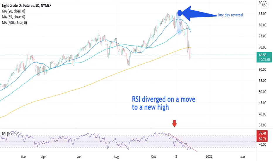
WTI Crude Daily Chart: Thoughts on trading and a setup...WTI Crude Daily Chart: Thoughts on trading and a trade set up illustration:
This post was written on January 18-19th but in order to avoid anyone viewing it as a trade recommendation I have withheld publication until today (1-21). It is only meant to illustrate how I think about trades and setups. The placing of entry and stop orders is complex. You need to develop your own plan, consistent with your risk management.
Most price change is noise. As an analyst your job is to identify those junctures where signal content is greater than noise content. Once those points are identified, you need a plan. TA is easy. Trading is way harder, particularly if you haven't systemized your plan.
Importantly, to be successful you need to do your own work. You need to understand how supply and demand shapes a market pattern and then find and isolate trading setups based on that knowledge. You do this by looking at, and more importantly thinking about, thousands of charts. Simple right? The point I'm trying to make is that you shouldn't expect to be successful by mimicking trades offered by some internet jackass like me. You have to do work. Hard work. Put in your time. Become a chart dog. Otherwise it’s a hobby, not a career. Hopefully these commentaries help you find a starting place.
WTI may be setting up one of my favorite technical trading setups, the failed breakout. I thought it might offer a good opportunity to walk through how I think about my trades. After all, what is the point of doing chart analysis if you don't have a plan to trade the analysis.
1. Today (1-19-2022) crude oil (CL) set a modest new high above $85.41 bb pivot that first appeared as resistance in October 2021.
2. Analysts making the fundamental case for $100.00bbl oil seem to be everywhere in the media today.
3. They may be right, sometimes the fundamental guys can be very good. But even in the cases where they get it right, their timing can be off dramatically.
4. In many cases the analyst or portfolio manager also makes the case for an energy overweight or a position in XLE. I would note that since breaking out above its October pivot, XLE has diverged significantly from the price of oil. XLE is up over 10% from its October high and nearly 30% from its December low. I have to ask myself why is XLE so much stronger than oil and how is this divergence most likely to be solved.
5. As a market moves into the zone around a prior high or low, there are really only two possible outcomes. The market either breaks out or it doesn't.
a. While there are only two possible outcomes, there are many variations in how the outcomes evolve.
b. To my mind, professional trading isn't about guessing the future so much as having a trading plan to take advantage of the setups.
The setup: Support and resistance confluences represent junctures where the signaling content is high.
1. CL is testing an important overhead pivot/resistance, in this case the $85.41 bbl high from late October.
2. Price is pressed against the top of the channel/rising triangle that defined the rally from late December.
3. Price is also pressing against the top of the moving average channel.
4. The triple resistance confluence should be difficult for the market to overcome.
5. The Relative Strength Index (momentum) is overbought. Note that this is the same degree of overbought that produced the June and October 2021 highs and has reliably produced important highs in the past.
6. Volume has been somewhat lighter on this move compared to the initial rally to $85.14 (suggesting less demand).
How do I think about set ups and trading?
1. The setup points above suggest that the market is more likely to fail/correct than to break out. In a case like this I am far more interested in finding a way to be short once a confirmed sign of failure materializes.
2. My favorite pattern in this situation is the upthrust or failed breakout.
a. Price moves above the resistance, triggering stop loss orders and attracting breakout traders.
b. After taking stops and attracting new weak handed longs, the market falls back below the prior pivot, forcing weak handed longs to exit.
c. This pattern is always better if it occurs within a few hours of the breakout (which CL has failed to do so far 01-20-2022).
3. If the market fails I like to have a sell order waiting back inside the range. If that sell order is triggered, I immediately place a stop loss order back above the first physical barrier. Trades should only be taken if the upside risk to the protective stop is reasonable.
a. I usually keep it simple. For instance I will often use a trade back below the low of the hour, day or week (depending upon the perspective I'm trading) leading to the failed breakout. Triggers can be set up using bars, volatility, TL breaks and dozens of other tactics.
b. This is the part where doing your homework and finding a tactic that is consistent with your temperament and risk management context becomes important.
4. Conversely if the market does the unexpected and breaks out, I begin looking for a consolidation pattern, for instance a bull flag or pennant pattern above which I can add a buy stop.
I believe that successful trading entails waiting for the high percentage and then having a trading plan to take advantage of it. A platform like TradingView makes it possible to look through hundreds or even thousands of charts to find precisely the trading setups you like the most.
Good Trading:
Stewart Taylor, CMT
Chartered Market Technician
Shared content and posted charts are intended to be used for informational and educational purposes only. The CMT Association does not offer, and this information shall not be understood or construed as, financial advice or investment recommendations. The information provided is not a substitute for advice from an investment professional. The CMT Association does not accept liability for any financial loss or damage our audience may incur.

What are Supply and Demand Zones and How to Trade with Them?What are Supply and Demand Zones?
▷ Demand Zone (Accumulation Area):
Accumulation comes from a Latin word meaning to increase something over time.
A strong uptrend can only exist if buyers outnumber sellers. During a trend, price moves up until enough sellers enter the market to absorb the buy orders. The origin of strong bullish trends is called an accumulation or a demand zone. Demand Zone is where traders are willing to buy aggressively because the balance has shifted to the demand side. Here, buyers are dominant and sellers weak.
The demand zone represents a period of implicit buying, typically by institutional buyers, while the price remains fairly stable. This area is characterized by mostly sideways price movement. Before a trend starts, price stays in an demand zone until the “big players” have accumulated their positions and then drive price higher.
This can be contrasted with the Supply Zone, where institutional investors start to sell.
▷ Supply Zone (Distribution Area):
Bearish trends are created when sellers outnumber buy orders. Then, price falls until a new balance is created and buyers become interested again. The origin of a bearish trend wave is called a distribution or a supply zone. At Supply Zone traders are willing to sell aggressively because the balance has shifted to the distribution side. Here, sellers are dominant and buyers are weak.
Support and Resistance Levels vs. Zones
If you have an idea of how to trade with support and resistance zones, you might find supply and demand zones very similar.
You won’t be mistaken; Supply and demand zones are natural support and resistance levels. You’ll often find supply and demand zones just below/above support and resistance levels.
Types of Supply And Demand Patterns
There are two types of patterns: “Reversal” and “Continuation” patterns.
While a pattern is forming, there is no way to tell whether the trend will continue or reverse. As such, careful attention should be paid to whether the price breaks above or below the zone.
▷ Continuation Patterns
If price continues on its trend, the pattern is known as a continuation pattern.
We have two continuation patterns: “Rally-Base_Rally” and “Drop-Base-Drop”
▷ Reversal Patterns
When price reverses after a pause, the pattern is known as a reversal pattern. The established trend will pause and then head in a new direction as new energy emerges from the other side (bull or bear).
Reversals that occur at market tops are known as distribution patterns. Conversely, reversals that occur at market bottoms are known as accumulation patterns.
We have two reversal patterns: “Rally-Base_Drop” and “Drop-Base-Rally”
How to Find Supply and Demand Zones?
On a price chart, the demand zone is characterized by sideways price movement on above-average volume. When a stock price doesn't fall below a certain price level, and moves in a sideways range for an extended period, this can be an indication to investors that the stock is being accumulated by investors and as a result, will be moving up soon.
The demand and supply zones are encompassing the base on the beginning of the move. The most important thing is to first finding a sharp move in either direction, after which you can identify its starting point and roughly define the supply or demand zone:
• Look at the chart and try to spot successive large candles.
• Find the base from which price started the quick move. Usually, before that you have a small sideways move, that is where your supply / demand zone is.
• Draw the zone
It is very hard to be precise with those levels and here it is more of an art than science. To make it easier to identify these levels, you can use another tool for confirmation.
How to Trade with Them?
One way to trade with supply and demand areas is reversal trading. After identifying a previous strong market reversal, wait for the price to return to that area. If a false breakout occurs, the chance of seeing a successful reversal is extremely high.
Some candlestick patterns such as "Engulfing", "Pin Bar" and "Tweezer Blades" can help you identify trend reversals.
Be careful, trading in the opposite direction of the trend is very risky. Technical analysts typically recommend assuming a trend will continue until it is confirmed that it has reversed. Trend reversal trading can be a profitable way to trade the markets. However, like any other trading strategy, there is a correct and a wrong way to do it.
Pros and Cons
Being able to recognize whether an asset is in the demand zone or the supply zone is helpful to investing success. Demand Zone is the origin of a big rally in price. Identifying this area could help investors spot good entry points into an investment before its price begins to rise.
Once the price leaves an demand zone, not all buyers got a fill and open interest still exists at that level. Supply and demand traders can use this knowledge to identify high probability price reaction zones.
As with anything else, supply and demand zones have their cons, as well. Understanding chart movements such as those seen in the accumulation area can work well during times of relative stability. Still, prudent investors know to pay attention to larger economic events that can quickly reconfigure charts (like the covid-19 epidemic)
Key Points
• Accumulation / Re-accumulation zones can becomes distribution/Re-distribution zones over a period in the Stock Market
• The narrower a supply/demand zone before a strong breakout is, the better the chances for a good reaction the next time typically.
• Good supply and demand zones are quite narrow and do not hold too long, which shows strong imbalance between buyers and sellers.
• The stronger the breakout, the better the demand zone and the more open interest will usually still exist.
• Always look for extremely strong turning points. They are often high probability price levels.
• Each time the price re-tests a supply/demand zone, more and more previously unfilled orders are filled and the level is continually weakened.
Conclusions
Supply and Demand Zones are a great way to identify areas of buying and selling as well as support and resistance, but they work best when combined with other kinds of technical analysis.

My rules for Reversal Watch CriteriaA couple of weeks ago I noticed the front page of the Economist publication, which had a front-page title – ‘The energy shock’ and it reminded me that market psychology plays a huge part as one of my reversal watch criteria. After all once a market starts moving a lot and grabbing more headlines, more and more people jump on that trend and once it gets to the front page of newspapers or publications, like The Economist, it is generally a good indication that a move is either at or very near the end of its move.
I have for many years worked on the trading floor of several large banks and have always found this to be a good indication of market in general. A few years ago I had a strong view on the fixed income markets as I had noted that the US 10Y yield had reached my long term downside target. I duly went off to tell the traders that the market had got to its target and they might like to think about covering their long positions on Fixed Income futures and not only was NO-ONE interested in hearing my view they simply told me to get lost – they had made money all year being long fixed income futures.
So, I went and sat back down and thought hang on if all these guys are already long, who is left to buy? Within a couple of days the market had turned lower very quickly with absolutely no new news or any fundamental reason that I could determine.
This is something I have observed over the many years in the business. But it does kind of makes sense as well, for a market to go up aggressively it takes a lot of buying and if most people have already bought who is there left to buy? For a market to go down, it does not have to be a change in fundamentals, it can just be a lack of buying….
So, if one of my reversal watch criteria is market psychology what are the other criteria?
1. The market is approaching a significant target area
2. The market is over-stretched or runaway ahead of target
3. We have heightened intraday volatility
4. We have Newspaper articles
5. All dealers/articles/people you speak to have the same view
We saw these conditions met recently on the Oil market. It is always extremely hard to cut a position that you are making money in and it helps when you have a list of criteria that you can watch. Once these criteria start to be met, it is a good idea to tighten up stops and think about lightening a position.
Disclaimer:
The information posted on Trading View is for informative purposes and is not intended to constitute advice in any form, including but not limited to investment, accounting, tax, legal or regulatory advice. The information therefore has no regard to the specific investment objectives, financial situation or particular needs of any specific recipient. Opinions expressed are our current opinions as of the date appearing on Trading View only. All illustrations, forecasts or hypothetical data are for illustrative purposes only. The Society of Technical Analysts Ltd does not make representation that the information provided is appropriate for use in all jurisdictions or by all Investors or other potential Investors. Parties are therefore responsible for compliance with applicable local laws and regulations. The Society of Technical Analysts will not be held liable for any loss or damage resulting directly or indirectly from the use of any information on this site.
BASIC MONEY MANAGEMENT - LOT SIZE VS REVERSAL AND ACCOUNT SIZEWe see too many new traders trade with random lot sizes with no understanding on the impact it has on account sizes, which result in not only losses but BLOWN accounts. This post is by no means a risk or money management strategy but more so just basics on the movement of reversals and how the lot sizes impact the value of your account during this reversal.
Trading with the right lot sizes allows a trader to manage their account/money when the trade goes against them. The right size allows a trader to move a range without blowing their account and without seeing their account reverse to the point of no equity. This type of trading gives traders anxiety and in return this anxiety impacts trading psychology. This then has a ripple effect and impacts your trading decisions and analysis.
The example we show on the chart is an entry of SELL that reverses by 380 PIPs. This movement happened in literally 2 candles (1hour candles) , so in two hours the price from entry reversed by 380 pips. This example then shows what this equates to in monetary value dependent on lot sizes.
The example shows that anyone with a £500 account trading this movement with a lot size of 0.20 would have blown their account.
Lot size usage should be based on the size of your account for example;
£500 size account - we will only use 0.01 size lot sizes with maximum deployed total no more than 0.05. This will allow an account to survive volatile movements. Also using stop losses ontop of this setup further strengthens the risk management.
£1000 size account - we will use 0.02 lot sizes with maximum deployed total no more then 0.10 any given time.
£2000 size account - we will use 0.03 lot sizes with maximum deployed total no more then 0.30 any given time.
£5000 size account - we will use 0.06 sizes with maximum deployed total no more then 0.50 any given time.
Basically 0.10 for every £!000, as the total deployed usage allows us enough flexibility of movement on the chart and then using stop losses ontop of this, gives us further control of our money management.
We hope this quick basic insight helps some of the newbies better manage their lot size usage.
Please like, comment and follow us to support our work, we really appreciate it!
GoldView

Using Volume Weighted Directional Bias As a Divergence IndicatorHere we see an excellent example of how divergence on the volume weighted directional bias (VWDB) indicator warns of a shift in market direction. If you're not familiar with natural gas futures, this market has been making some BIG moves lately. Here we are looking at the 30 MIN chart on the Henry hub natural gas futures front-month contract.
Notice on the chart that while the market continues marking new highs on 10/27/21, the VWDB has already peaked and is now marking lower highs. If you are long, this is a warning to take profits.
As far as using this signal for a short entry, it's important to understand that this divergence can sometimes build for considerable time before price finally rolls over and trends in the same direction as the VWDB indicator. Therefore, it is advisable to wait for additional market structure to lean on before entry: such as a previous level of resistance, or a fib extension perhaps if price action has rallied into uncharted territory.
Even if you had waited for the market to mark a lower high before entering a short trade (notice the lower high also completes a head and shoulders pattern), you still could have made $2-3k shorting a single NG contract on 10/28/21.
The longer a trend goes on, the more particapants have piled into positions in the direction of that trend. When the buying momentum runs out and the auction process reverts downward, all the late buyers begin bailing from their losing positions while those in profit take profits. Because everyone was long, they all become sellers. This is why so much countless time and effort has been put into all sorts of indicators and strategies to spot potential reversals before they happen.
This is just one more tool you can put in your toolbox to allow you to trade with conviction.
Trade well everyone.

Market Structure Simplified It is easy to get confused with overflowing information about market structure in the trading world.
To simplify things we have come up with a way of analysing market structure simply by marking each high or low.
In this particular example, you can see that higher lows were being created all the way down the bearish trend, so we knew that it was a seller's market UNTIL we got our break of structure .
When the BOS became apparent, we began to shift our attention to the possibility of reversals and used our magic tool, the Fibonacci.
This technique can be used in any trend, try it for yourselves!
Please, support this post with a like and comment!

Pullbacks Versus Reversals — Points To NoteIn this video, I talked about the misconception that Traders have on Pullbacks and Reversals. How to spot and identify them and What they signify.
If you loved this, be sure to follow up for more on Trading related content.
Cheers!
Luchi.

Candlestick Chart Part 2 : ReversalsHello everyone, as we all know the market action discounts everything :)
_________________________________Make sure to Like and Follow if you like the idea_________________________________
Today's video will be about the Candlestick Chart : Reversal Patterns.
So lets start by talking about the different types of Patterns :
Bullish Reversal Patterns
Bearish Reversal Patterns
And they are divided into 3 groups :
Weak Patterns
Reliable Patterns
Strong Patterns
We Start with the Weak Reversals :
1) Dragonfly Pattern :
A dragonfly doji candlestick is a candlestick pattern with the open, close, and high prices of an asset at the same level. A dragonfly doji pattern does not appear constantly. It is used as a technical indicator that signals a potential reversal of the asset’s price.
2) Hammer & Hanging Man Patterns :
The Hammer is a bullish reversal pattern that forms during a downtrend. It is named because the market is hammering out a bottom.
When the price is falling, hammers signal that the bottom is near and the price will start rising again.
The long lower shadow indicates that sellers pushed prices lower, but buyers were able to overcome this selling pressure and closed near the open.
The Hanging Man is a bearish reversal pattern that can also mark a top or strong resistance level.
When the price is rising, the formation of a Hanging Man indicates that sellers are beginning to outnumber buyers.
The long lower shadow shows that sellers pushed prices lower during the session.
Buyers were able to push the price back up some but only near the open.
3) Inverted Hammer & Shooting Star Patterns :
The Inverted Hammer occurs when the price has been falling suggests the possibility of a reversal. Its long upper shadow shows that buyers tried to bid the price higher.
However, sellers saw what the buyers were doing, said "No!" and attempted to push the price back down.
The Shooting Star is a bearish reversal pattern that looks identical to the inverted hammer but occurs when the price has been rising.
Its shape indicates that the price opened at its low, rallied, but pulled back to the bottom.
4) Dark Cloud Pattern :
A 2-candle pattern. The first candle is bullish and has a long body. The second candlestick should open significantly above the first one’s closing level and close below 50% of the first candlestick’s body. The sell signal is moderately strong.
5) Piercing Pattern :
A 2-candle pattern. The first candlestick is long and bearish. The second candlestick opens with a gap down, below the closing level of the first one. It’s a big bullish candlestick, which closes above the 50% of the first candle’s body. Both bodies should be long enough.
6) Upside Gap Three Method :
The upside gap three methods candlestick pattern is a bearish continuation pattern that only occurs during an uptrend. It consists of three candles. The first two candles are long and white in the direction of the prevailing trend. The second black candle creates an upside gap. The third candle fills the gap between the first and the second candle.
7) Downside Gap Three Method :
The downside gap three methods candlestick pattern appears during a downtrend and consists of three candles. The first two candles have a gap down between them while the third candle covers the gap between the first two. The gap between the first two candles simply gets filled.
8) Bearish Harami Pattern :
A 2-candle pattern. The body of the second candle is completely contained within the body of the first one and has the opposite color.
9) Bullish Herami Pattern :
A 2-candle pattern. The body of the second candle is completely contained within the body of the first one and has the opposite color.
Now Lets Talk about the Reliable Reversals :
1) Bullish Engulfing Pattern :
A 2-candle pattern appears at the end of the downtrend. The first candlestick is bearish. The second candle should open below the low of the first candlestick low and close above its high.
2) Bearish Engulfing Pattern :
A 2-candle pattern. The first candlestick is bullish. The second candlestick is bearish and should open above the first candlestick’s high and close below its low.
3) Tower Top Pattern :
The tower top is a reversal pattern that occurs at high price levels. Typically one or more long bullish candlesticks are followed by a few smaller real body candlesticks and then the pattern is completed with one or more large bearish candlesticks.
4) Tower Bottom Pattern :
The tower bottom is a reversal pattern that occurs at low price levels. There is one or more long bearish candlesticks followed by a few smaller body candlesticks and then concluded with one or more large bullish candlesticks.
5) Bullish Abandoned Baby Pattern :
The bullish abandoned baby is a pattern that appears at the end of a downtrend and signals reversal to an uptrend. Simply put, it signals an end of the selling pressure of the bears and return of the bulls in the market.
This pattern consists of three candlesticks: the first candle has a black (or red) big body, the second is a small and bearish candle – or a Doji, and the third is white (or green) candle.
6) Bearish Abandoned Baby Pattern :
The bearish abandoned baby is a reversal pattern that forms during an uptrend. It is characterized by three candles, where the first candle is long bodied and white/green.
The second candle is a Doji that gaps above the close of the first bar in the series. The third candle opens below the close of the second bar and is long bodied and black/red.
7) Dumpling Top Pattern :
A dumpling top occurs when small real body candlesticks slowly rise and then move in a neutral to downward direction. The dumpling top pattern is complete when there is a bearish candlestick that gaps down from the other candlesticks.
8) Fry Pan Bottom Pattern :
The opposite of the dumpling top is the fry pan bottom pattern. The fry pan bottom occurs when small real body candlesticks slowly move downward and then move in a neutral to upward direction. The fry pan bottom pattern is complete when a bullish candlestick gaps up from the rest of the candlesticks.
9) Bullish Belt Hold Pattern :
A bullish belt hold shows up in downtrends. The pattern can be recognized by one long, full-bodied candlestick that is bullish and opens at a new recent low. The bullish belt hold candle is expected to have a flat or nearly flat bottom. The top has a small shadow, relative to the length of the body.
10) Bearish Belt Hold Pattern :
The bearish belt hold is the complete opposite and it comes up in uptrends. To detect it, look for a long full-bodied, bearish candlestick that stands out at the top of an uptrend because it will get to a new recent high and it should be noticeably longer than the other candles.
11) Tweezer Top Pattern :
The Tweezer Top pattern is a bearish reversal candlestick pattern that is formed at the end of an uptrend.
It consists of two candlesticks, the first one being bullish and the second one being bearish candlestick.
Both the tweezer candlestick make almost or the same high.
12) Tweezers Bottom Pattern :
The Tweezer Bottom candlestick pattern is a bullish reversal candlestick pattern that is formed at the end of the downtrend.
It consists of two candlesticks, the first one being bearish and the second one being bullish candlestick.
Both the candlesticks make almost or the same low.
And Last but not least The Strong Reversal Patterns :
1) Three White Soldiers Pattern :
A 3-candle pattern. There’s a series of 3 bullish candles with long bodies. Each candle should open within the previous body, better above its middle. Each candle closes at a new high, near its maximum. The reliability of this pattern is very high, but still, a confirmation in the form of a white candlestick with a higher close or a gap-up is suggested.
2) Three Black Crows Pattern :
A 3-candlestick pattern. There’s a series of 3 bearish candles with long bodies. Each candle opens within the body of the previous one, better below its middle. Each candle closes at a new low, near its minimum. The reliability of this pattern is very high, but still, a confirmation in the form of a bearish candlestick with a lower close or a gap-down is suggested.
3) Morning Star Pattern :
A 3-candle pattern. After a long bearish candle, there’s a bearish gap down. The bears are in control, but they don’t achieve much. The second candle is quite small and its color is not important, although it’s better if it’s bullish. The third bullish candle opens with a gap up and fills the previous bearish gap. This candle is often longer than the first one.
4) Evening Star Pattern :
A 3-candle pattern. After a long bullish candlestick, there’s a bullish gap up. The bulls are in control, but they don’t achieve much. The second candlestick is quite small and its color is not important. The third bearish candle opens with a gap down and fills the previous bullish gap. This candle is often longer than the first one.
5) Bullish Three Line Strike Pattern :
A bullish three-line strike is made up of four candles. Of these, the first three are bullish, while the last is bearish. It is made up of three strong bullish candles that progressively end higher followed by a final strike candle. The strike candlestick is bearish and begins at or higher than the third candle but closes at least lower than the open of the first candle.
6) Bearish Three Line Strike Pattern :
A bearish three-line strike is a four candle continuation pattern that comes up in a bearish trend. The first three candles are bearish, while the last candle is positive and ends above the highest close of the previous three candles.
I Do wanna mention General Reversal Patterns :
Three Mountains is the same as Triple Top Pattern
Three Rivers is the same as Inverted Triple Top Pattern
Buddha Top is the same as Head and Shoulders Pattern
Inverted Buddha is the Same as Inverted Head and Shoulders Pattern
I hope that I was able to help you understand Reversal Patterns in Candlestick Charts better and if you have any more questions don't hesitate to ask.
Hit that like if you found this helpful and check out my other video about the Moving Average, Stochastic oscillator, The Dow Jones Theory, How To Trade Breakouts, The RSI , The MACD , The Bollinger Bands , The Different Types Of Trading Strategies, Candlestick Charts Part 1 links will be bellow

Reversal Zone Indicator / bitcoin litcoinIn this video, I show my most recent indicator that I have created which spots reversal zones based on stochastic RSI indicator combined with MACD indicator.
Potential buy zones are indicated with green columns printed on the chart, and sell zones are in red. a signal is more powerful and accurate whenever its surrounded by black bars before or after.
