MANAUSD - Plotting Future MovesA down channel can be drawn on MANA like this
The Middle line shows a nice bullish touch however on this middle line which is a sign for bulls, I expect alts to be very volatile hence the price action plotted in green.
Its kind of a head and shoulders pattern on the side if you look at it closer, linking a comparison to the H&S below
Search in ideas for "PLOT"

Blackhole Cursor and FOMC Minutes Plots I asked about the Blackhole cursor and apparently it's an Easter Egg they added for a short time. It's kinda fun, so check if you have it.
I plotted FOMC minutes and it seems to be more of a pivot than I thought. I figured the speeches and rate decisions would've been cleaner, but these seem closer to the actual pivots. I guess we could break out of the bear trend once and for all, but I'll be skeptical until it does. Tomorrow's flood of econ data will set the mood.

SBLK - Plotted Channel BreakoutUsing bars patterns to plot a breakout of the underlying green up channel
These bars patterns all three show a strong breakout for the bulls
Circles indicate an inverted H&S structure that is tilted, some would argue that it isn't a H&S structure but I included it anyway
Weekly timeframe

OTHERS MCAP - Plotting for the Future OTHERS MCAP is forming a large channel flag formation
While it is in its current bear state a lot of small alt coins will suffer
This bear state is accompanied by its partner bullish wedge
Plotted price action is just assumptions being made

Quarter point plottingTRhis a one hour time frame. I plotted the quarter points using different colors for each quarter

Bullish PlotNot entirely sure where we are here in terms of waves, I will go with the assumption that either wave (3) has ended and we're starting wave (5) or we're in wave 5 of (3), In both cases we should see substantial price increase and I have plotted a high confluence target area if either play out.

NQ PlotRSI is headed up while MFI is dropping, and it;s already oversold. Rates headed up.... lots of tech stocks look weak.
No idea which way this is going, indicators are all goofy today.
(Plotted by request, I normally don't post mixed indicators)

QQQ drunk plotjust a guess plotting by date and a long road to recovery, with international tensions
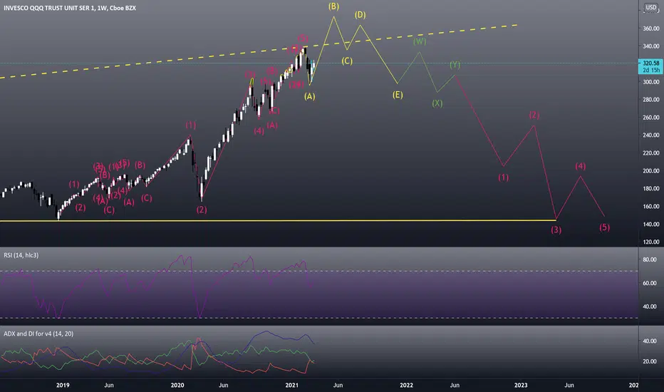
learning how to plot Elliot Waveshello I'm still learning and would some input on how I plotted these EWs. Thanks

$SPOT New Lazy Elliott Fibonacci PlotIt has been months since I last plotted this and it exceeded expectations.
Initial assumption on the left retracement is that the subwave impulse is complete and is doing a long correction.
Good base so far.
Take note of the following:
>It can rally until the 100% of the right retracement if the overall market sentiment is positive.
>Otherwise, expect the stock to do another leg down at least near the 38.2% level.
>Probably an ongoing major Wave 2.
Good luck!

Ascending Channels Plot GBP/AUD’s Both Minor and Major Trends GBPAUD’s both minor and major trends are spiking through ascending channels (refer both daily and weekly charts).
The interim bulls have resumed at around 21-DMA level, bullish engulfing pattern at 1.8979 level has taken off the rallies above DMAs and EMAs (refer daily & weekly plotting).
In this upside travel, the pair has broken-out previous channel resistance which is observed as the key obstacles for more rallies.
Both RSI and Stochastic curves show upward convergence to the prevailing rallies to indicate the buying momentum.
On a broader perspective, the intermediate trend also spikes through the rising channel (refer weekly chart), where bulls hold firm at the strong support at 1.8680 level and bounced back this week about 1.88%. Thereby, we could expect most likely bullish engulfing on this timeframe as well.
The current price spikes above EMAs as both leading oscillators signal bullish momentum & lagging indicators are indecisive on this timeframe as well.
Trade tips: One trading grounds, at spot reference: 1.8972 levels, we advocate executing one touch call option strategy with upper strikes at 1.9026 levels, the strategy is likely to fetch leveraged yields as long as the underlying price keeps spiking towards upper strikes on the expiration.
Alternatively, on hedging grounds, contemplating above technical rationale, we advocated directional setup in our earlier post, initiating shorts in GBPAUD futures contracts of October’19 delivery and simultaneously, longs in futures of December’19 delivery.
We wish to uphold long leg of December delivery for now.
Thereby, the foreign traders, who are exposed GBPAUD upside risks swings, can arrest their FX exposures.

Attempting to Plot BTC through Sunday - Upward Seems More LikelyI have mostly been charting on the 5-minute. After predicting a bullish breakout I am looking for new trends and see few on the 5 minute chart. So I zoomed out to take a look at a bigger picture and am sharing that here. Overall BTC looks like it's heading into the corner. In totality, it appear to me to be more likely it will rise out of the corner than fall. Projected support lines are plotted in red.
$BTC

If BTC plot similar scenario from 2017While past performance is not an good indicator of future, BTC is plotting similar behaviour from 2017. In addition to going short or long within the accumulation channel, it might be also profitable to buy ALTS at the top of the channel and sell at the bottom.

ETHBTC have a Bullish shark plotted on H4, What's your move?HI, I hope everyone is doing well.
as the start of this week is really depressing for cryptos as every major coin is suffering at the moment and it's quit hard to just
rely on the Technical side of these assets so just keep in mind that the risk is a little high while we try to go long on them,
but it's really interesting to know what our technicals has to say about ETHBTC where we can get a short bullish swing
First analyzing 240M Chart and we got,
1. HARMONIC PATTERN - BULLISH SHARK Identified on 240M Chart
2. 0.070000 consist of Demand Zone
3. Dynamic Support at 0.070455
4. OVERSOLD Indication by RSI and CMO
5. Fibonacci Gird Level 1.618 plotting near our Buying area
also on daily chart, Price is been Hold by 200Day WMA.
and hence everything looks great
Technical - Strong Bullish
Fundamentals - NILL
Market Condition - Bearish for Asset Type -III
Conclusion - Bullish for Short Term!
If you find my trading Ideas helpful then leave a LIKE
and Feel free to comment your thoughts,
- Lewis (CryptoLover)

If the Dot Plots point to the first rate cut being after June?Despite the FED intensifying its hawkish rhetoric at every meeting since December, the dovish market pricing in the SP500 continues. If the FED escalates its hawkish stance at tomorrow's FOMC meeting, we may see corrective declines in US stock markets, including the SP500, which are currently in a dovish pricing rally. The US inflation data coming in throughout the year shows a sticky outlook, not aligning with the dovish stance priced in by the market. The FED could intensify its rhetoric to cool down the market further. Especially if the dot weights in the Dot Plot concentrate after June for the first rate cut, the market could experience a significant correction.
FOREX PLOT PATTERNS.Trend patterns with Forex plots included. You all know what comes next. I’ve seen liquidity downtrend sweep. One of this moments all the bulls will come into 1.
Forex contraction. All we have seen is a wavy market because it’s a contraction. ATR in play says N_ xt!

spy like a robot (monthly and weekly standard deviation plots)looking for the .5 weekly standard dev plot prior support to hold. im looking for a general spy call or selling a couple bull put spreads. main driver of volatility is the german 10 year as described on previous posts
Custom Indicator: Ability To Plot Recurring Time Lines On Chart!CM Time Based Lines
Requested by codetrader to Visually Show Day Change on Intra-Day Charts.
Custom Indicator: Ability To Plot Recurring Time Lines On Chart!
Example of Uses:
Plot Lines at Midnight to Show Daily Change.
Plot Lines at Opening of Different Sessions.
Plot Lines at Opening and Closing of Sessions.
Plot Lines Every 4 Hours (Forex) To See 4-Hour Price Action!
Ability to Change Times!
Ability to Plot Up To 6 Recurring Time Based Lines!
Plus Many Other Uses!
Ability To Turn On/Off Any of the 6 Customizable Lines in Inputs Tab!
Ability To Change Thickness of Lines to Cover Multiple Bars!

Dot Plot Divide: Dollar Gains, Gold Stalls The USDJPY spiked lower following the Fed’s 25 basis point cut yesterday but quickly reversed trajectory as the dot plot projections from the FOMC came in softer than markets had expected.
The updated dot plot showed a narrow majority of FOMC members anticipating two more small rate cuts in 2025, while others leaned toward just one or even none.
This potentially suggests that the Fed is not simply aligning with Trump sycophant and newly appointed FOMC board member Stephen Miran’s aggressive call for repeated 50-basis-point cuts and instead signals an element of independence.
USDJPY (left chart, 1H): The pair has carved out a sharp V-shaped reversal after its Fed-driven dip, showing strong bullish momentum. This suggests buyers remain in control unless a reversal candle (such as a bearish engulfing) forms.
XAUUSD (right chart, 4H): Gold’s rally topped out near 3,707 before pulling back more than 600 pips to 3,646. The most recent candles show shorter bodies with upper wicks — a potential sign of fading momentum and supply pressure. If this develops into a bearish continuation pattern, the channel’s border becomes the next area of focus.

Can you Imagine?? Berkshire Hathaway low ? $185 plot Zero Band15Can you Imagine?? Berkshire Hathaway low ? $185 plot Zero Band15
NYSE:BRK.A
Plot zero for xd-Band15 = $185
and Today's low of Berkshire Hathaway Class A BRK.A was nothing but $185

ATR TURTLE WHITE PLOT Pivot has been marked on one of my ideas at $37,500 as a barrier. Barrier pinpoints to below white wave. ATR TURTLE WHITE PLOT moving up but slowly. ATR stop loss at $37,500 which is where the white wave is.
I’m sticking with the white turtle plot and white wave, I’m following its course. This is long term without noise of all the drama that’s happening.
We are all in this together! NEVER FORGET THAT:)

SPY DOT PLOT You might have heard me talk about the dot plot before or the SEP it is where all the members take a blue dot and place it on a chart where they believe rates should be in the future. They have been putting it off the last 2 meetings and a few meetings ago it effected the market in a good way which sparked the July rally, today they published the chart and raised the plot to 5.1 so that’s where the majority of members feel the rate should top out at. 7 members believe it should be over 5.25, 10 members believe 5.10 and 2 voted 4.80. So that is why the market reacted the way it did you can see when Powell started talking we almost made it back but there’s blood in the water so people are risk off for now. The market wants a rally but who knows when it will start I’m still sticking to the monthly box. I’m upset I totally didn’t think about the SEP I bring it every FOMC topic I right I’m blaming my in-laws that came in town and are staying for the week lol. I hope you had a good FOMC day or learned a thing or 2 remember take care of your mental health dial 988 if you need someone to talk to, people do count on you good or bad so stay strong. On another note
ATLAS boys they are some scumbags but there families have to deal with there decisions and that’s pretty messed up all the way around. People who pump and dump are just the greediest lowest forms because they can’t make it on there own so they prey on the vulnerable and unknowing who are trying to make a buck to put food on the table they will get what’s coming to them so please trust in yourself study and learn it takes time but you will get there
As always trade what’s in front of you good luck

Homework for Quarter point plottingIn the quarter point plotting I am learning how to move the horizontal line to quarter points on the chart. It shows how the market moves .
