[VC] Cumulative Delta PLUS It is a Merged Version of our following two indicators.
V.C Box Chart Histogram
&
V.C Cumulative Delta Histogram.
We merged them at the user's request & convenience. This merged version also helps to save space for other indicators.
Description & Usage
Description & Usage will remain the same as described in individual descriptions of the above-mentioned parent indicators. Only one additional input is added to adjust the scale, named "Scale_Setting''.
Because now it's a merged version of 2 different indicators & both indicators have their different scale levels. To bring both indicators on an equal scale so that they can be visualised better, we have added scale adjustment settings that are easy to understand. Let's elaborate it.
Scale adjustment settings belong to the Cumulative length of the ' 'Cumulative Delta Indicator'' . Keep in mind that the best scale setting is keeping the scale setting values near or equal to cumulative length.
For example:
If you set cumulative length 20, the scale setting value should also be 20 or near 20 (like 17, 18, 19 etc.). (It depends on you, how large cumulative columns you want to see relative to Box chart Histogram)
Note: Any scale setting value can be used, it only affects visuals, not the actual calculations.
Disclaimer Note:
V.C Cumulative Delta Histogram It is purely Volume, Delta, Demand & Supply imbalance and comparative analysis-based tool. Before applying this Indicator to your study, you should clear your concepts about Volume, Delta & Spread, Demand & Supply, and Aggressive & Passive behaviour of buyers/sellers.
Some basic understanding of Sir Richerd Wyckoff's Theory can also be helpful.
Accumulation / Distribution Line (ADL)

Treat Sideways👉 What is this indicator ?
Understanding the Sideways Trend is the best trading method, and we have written this script intending to make you a better sideways filter indicator. Treat Sideways helps you understand the sideways trend and trade in a risk free manner.
👉 On which coins can this indicator be used ?
This indicator is best used on all cryptocurrencies, stocks , forex markets
👉 How work this indicator ?
We understand the trend using our secret logic and price action, and After that, we mark the sideways movement in a box. The moving average line helps us to construct this indicator.
👉 Default Coin and Time Frame ?
XRPUSDT
Time Frame : 1 min
MA Line Color Details 👇
The Blue color of the MA line indicates the Sideways Trend
The Red color of the MA line indicates the Down Trend
The Green color of the MA line indicates the Up Trend
Indicator Settings 👇
Box Height : This setting can be used to set the size of the Sideways trend
Time Gap : This option is used to control unexpected down trend and up trend
Up Down Threshold : This option should be adjusted according to the time frame and voltality
Color :
Option to change the color of the box that appears in the sideways trend
Border Color : Option to change the color of the box border that appears in the sideways trend
Opacity : Option to change the opacity of the box border that appears in the sideways trend
Line Width : You can adjust the width of the MA line with this option

Breakout Accumulation/DistributionBasic modification of my SFP Momentum Indicator showing accumulation/distribution patterns based on breakouts above previous anchor points.
Candles are colored based on whether accumulation or distribution was last.
Best if used at HTF then confirmed at LTF.
Accumulation Distribution Volume Oscillator (ADVO) [JoseMetal]============
ENGLISH
============
- Description:
This indicator has 2 features (currently):
It shows the net volume in a histogram (buy volume in the upper part, sell volume in the bottom part).
Also calculates the difference between accumulation / distribution in a fast vs slow period to plot 2 moving averages and trigger crossovers.
It has an option to ignore the wicks, which sometimes makes it more accurate.
- Visual:
So first of all is the net volume, in the upper part of the histogram the buy volume is printed in green, if the volume keeps going up the histogram bars gets lighter, darker if the volume goes down.
Similarly, we have the sell volume in the bottom part, in red, it also gets lighter if the sell volume increases, and otherwise it gets darker.
And then we have 2 lines, one for the fast and other for the slow period, both shows the DIFFERENCE of the accumulation vs distribution, which can gives us clues about how the market is heading.
The background color changes depending on the status and crossovers:
Fast moving average crossovers the slow = GREEN, if the opposite happens = RED.
The rest of the time it depends on the position of the moving averages and if the fast is above or below the 0 line:
GREEN: FAST > SLOW and FAST > 0
OLIVE: FAST > SLOW but FAST < 0
RED: FAST < SLOW and FAST < 0
ORANGE: FAST < SLOW but FAST > 0
- Usage and recommendations:
Depending on the timeframe, the default 12 and 26 periods (fast / slow) are good, but i noticed that checking lower timeframes with higher settings it gives a better direction of the higher timeframe, example: you want to trade in 1h, but you check the 5 min timeframe with 25 / 100 periods.
That's because the smaller timeframe gives you a more "realistic" volume, more "detailed" volume I'd say.
In fact, in the real testings, I took a wonderful short by checking the 1 minute timeframe with 50 and 200 periods to decide if the 4h was making an accumulation or distribution.
Finally, there's an option to ignore wicks for the moving averages, sometimes it shows better results because ignoring volume within the wicks gives faster results, but I recommend checking both with and without.
- Customization:
So almost everything is customizable, colors, periods... there's an option for the histogram color scheme, but you can change every single color if you want.
You can also pick the moving average type, sometimes WMA is better, but I got better results with the EMA (which is the default).
============
ESPAÑOL
============
- Descripción:
Este indicador tiene 2 características (actualmente):
Muestra el volumen neto en un histograma (volumen de compra en la parte superior, volumen de venta en la parte inferior).
También calcula la diferencia entre acumulación/distribución en un periodo rápido vs lento para trazar 2 medias móviles y generar cruces.
Tiene una opción para ignorar las mechas, lo que a veces lo hace más preciso.
- Visual:
En primer lugar está el volumen neto, en la parte superior del histograma se muestra en verde el volumen de compra, si el volumen sigue subiendo las barras del histograma se hacen más claras, más oscuras si el volumen baja.
Del mismo modo, tenemos el volumen de venta en la parte inferior, en rojo, también se aclara si el volumen de venta aumenta, y de lo contrario se oscurece.
Y luego tenemos 2 líneas, una para el periodo rápido y otro para el lento, ambos muestran la DIFERENCIA entre la acumulación y distribución en su período, que nos puede dar pistas sobre la dirección del mercado.
El color del fondo cambia según el estado y los cruces:
La media móvil rápida cruza la lenta = VERDE, si ocurre lo contrario = ROJO.
El resto del tiempo depende de la posición de las medias móviles y de si la rápida está por encima o por debajo del punto 0:
VERDE: RÁPIDO > LENTO y RÁPIDO > 0
OLIVA: RÁPIDO > LENTO pero RÁPIDO < 0
ROJO: RÁPIDO < LENTO y RÁPIDO < 0
NARANJA: RÁPIDO < LENTO pero RÁPIDO > 0
- Uso y recomendaciones:
Dependiendo del marco de tiempo, los 12 y 26 períodos por defecto (rápido / lento) van bien, pero me di cuenta de que vigilar temporalidades más bajas con períodos más largos da una mejor dirección de la temporalidad superior, ejemplo: queremos operar en 1h, pero miramos el de 5 min con 25 / 100 períodos.
Eso es porque el marco de tiempo más pequeño le da un volumen más "realista", más "detallado" en mi opinión.
De hecho, en las pruebas reales, operé un estupendo short comprobando el marco de tiempo de 1 minuto con 50 y 200 períodos para decidir si el 4h estaba haciendo una acumulación o distribución.
Por último, hay una opción para ignorar las mechas para las medias móviles, a veces muestra mejores resultados ya que ignorar el volumen dentro de las mismas da resultados más rápidos, pero recomiendo comprobar el indicador de ambas formas para hacernos una idea general.
- Personalización:
Casi todo es personalizable, los colores, los periodos... hay una opción para el esquema de colores del histograma, pero puedes cambiar todos los colores si quieres.
También puedes elegir el tipo de media móvil, a veces es mejor la WMA, pero yo obtuve mejores resultados con la EMA (que es la que viene por defecto).
Accumulation_&_Distribution_Aka_ConsolidationZone - BasicDear Traders,
It so happens to the traders that once in their lifetime journey they be sure to here the below statement.
1. I got struck in the consolidation zone
2. Signals from technical indicators failed because prices were consolidating.
3. Its pretty tuff to detect consolidation zone. (programmatically)
I don't know about other but I have heard this throughout my trading journey. Hence I started to debug the above 3 statements and came up with this indicator which detects consolidation zones in the chart.
there are 3 inputs settings
1. ATR multiplier = can be used to filter the consolidation box height. higher the value bigger the box (vertical view) and smaller the value smaller the box height.
2. Show Last No of Zones = set the No of previous zones you would like to see.
3. Consolidation Size = If set to small. all kind of sizes will be plotted ( majorly works for day trading) if set to wide, script looks for major consolidation zones (majorly works for higher timeframes). if set to medium, script looks medium size to wide size zones majorly for timeframe with more than 30 min.
What's this indicator is taking into account?
1. Moving Averages
2. Linear Regression curves
3. ATR
4. BB
5. BBW
6. Couple of Math calculation to support the zone identification.
Note: Plz do suggest for any kind of improvements or feedbacks.
Regards

SFP MomentumCustom swing fail detector with levels and breakouts both major and minor plus colored candles based on SFP momentum.
Volume Weighted Accumulation DistributionVWAD : Volume Weighted Accumulation Distribution
VWAD, is a "Sentiment analysis" indicator that measures a moving average of volume being bought versus volume being sold.
====================
SETTINGS:
Acc/Dist Immediacy : is a lookback length from which buying and selling volume data is collected.
Signal Smoothing : removes the whiplash effect of the raw Immediacy buy and sell data (higher numbers slows the averaging effect)
Short Term Sentiment : measures a period of candles to obtain a "reading" of accumulation or distribution sentiment.
Long Term Sentiment : measures a longer period of candles to obtain a "reading" of accumulation or distribution sentiment.
Volatility Threshold : affects the colouring of an optional Histogram display. When the signal line exceeds this negative or positive level, the histogram will colour depending on which accumulation/distribution state its in and whether it is accelerating or decelerating. This helps to remove false "Signals".
Show Histogram : allows you to "hide" the histogram and just view the two plot lines (the 'VWAD', which displays as red or green and the 'Signal' line which is a smoothed version of the VWAD line)
====================
BASIC USAGE:
Looking at just the yellow 'Signal' line, one can determine the sentiment of Accumulation or Distribution, depending on whether it is above the dashed zero horizontal line (accumulation) or below (distribution).
It can be helpful to see when the balance of buying or selling volume shifts toward the top or bottom of price movements. As such, this indicator is not intended to give "Buy" or "Sell" signals, but instead is used to 'start finding opportunities' to enter and exit.
I have found that with the default settings, the 4 - 8 hour chart offers a good balance of "signal to noise", however, feel free to adjust the settings to your liking.
-----------------------------
Notes:
This is intended to suit a dark background, if the VWAD becomes popular enough, there may be an update to allow re-colouring to suit those freaks that prefer light backgrounds.
====================\\

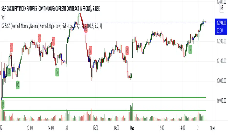
Demand and Supply zone Master Indicator without AlertThe Demand and Supply Zone indicator helps to identify the valid demand and supply zones by removing the played out zones. This indicator looks for all patterns , Rally-Base-Rally and Drop-Base-Rally mark the zone as "DZ". Same way with pattern Drop-Base-Drop and Rally-Base-Drop it will mark "SZ".
The indicator is fully customizable as per your trading style.
What does the Indicator do ?
Normal = Aggressive Trader
Strong = Conservative Trader
V Strong = V Conservative Trader
Based on Trading style one can choose the option available. Default gives the best result.
1. Explosive candle Range : One can choose explosive candle range.
2. Basing Candle Range : One Can Choose Basing candle range.
3. Normal Candle Range : One can choose the normal candle range.
4. Legout Strength : One can customize the Legout Strength.
5. Demand and Supply zone version :
High - Low = Most traders use the high and low of the basing for calculating their zone.
Body - Low = Body (Base candle body high for demand zone and Body low for supply zone ). Normally beginner ( Conservative trader ) uses this option.
Continuous base = 1 to 10 : Based on the requirement one can use the number of basing candle.
max normal = 2 to 10 : Based on the requirement one can use the number of normal candle.
min normal = 1 to 10 : Min one to form the zone.
Line width = 1 to 5
MaxTouches = One can set the number of times the price visits the zone. 1 for Conservative trader and 3 for aggressive trader. Once the price touches the zone more than the given input, lines get deleted. Also if the price is grater that the zone value, line deletes.
Bar Lookback = How many bars to look back to check the strength of the candle. Default gives the best result.
Max Demand and Supply zones and Show all active Demand and Supply zones = One can visually see played out ( violated ) zones by unticking the Active zones option.
MaxActiveDemand and Sell Zone : One can have max number of active Demand and Supply Zones on Chart. This option looks chart clean.
Avocado by KyAVOcado - rolls better off the tongue than "Awesome Volume Oscillator"
Awesome Oscillator on steroids. Volume analysis combined with the well known Awesome Oscillator to create Avocado.
Usage:
- Same way as you would use AO, look for divergences
- Could smoothen it by changing "Fast" to 10 but then the divergence might come at a different time.

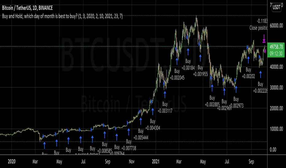
Buy and Hold, which day of month is best to buy?I wanted to invest a certain fiat amount each month and was wondering which day would be best to do this.
So, with this script, you can set your entry day. On the last day of the date range, it will close all positions. You can then see what amount of the asset you have accumulated to date. If you try all the days of the month and see when you can sell the most amount of the asset, you've found the best buy date of the month for that asset.
A second option is to set an exit day. This is good for a strategy where you would go long (buy) on the entry date and short (sell) on the exit day.
This was inspired by people running out of money by the end of the month and selling their asset, which could make the price fall. Then when they receive the wages by the 5th or so, they would rebuy, causing the price to go up.
Accumulation/Distribution %This script takes the signal from the Accumulation Distribution indicator invented by Larry Williams and normalizes it such that it becomes an oscillator about a zero line as described by John Bollinger in his book Bollinger on Bollinger Bands . The purpose of the indicator is to serve as a volume-based confirmation of signals given by other indicators, typically Bollinger Bands paired with a momentum indicator . In the example shown, Bollinger Bands are paired with Bollinger Bands %B and the Bollinger Bands %B indicator is interpreted similar to the Relative Strength Index ( RSI ) which is a momentum indicator .
The AD% indicator is colorized such that positive readings are green and negative readings are red. The readings become darker when approaching the zero line. The colorization is also displayed on the price chart. The chart type needs to be set to "bars" for price colorization to work properly.
The formula for this indicator is presented in the John Bollinger book as follows:
10-day sum of /10-sum of volume
How to use (my take on a strategy from the book):
1. Look for %B readings that are oversold or overbought (less than 0.00 or greater than 1.00)
2. Check for bearish divergence or bullish convergence of price and %B as shown on the chart
3. Verify divergence or convergence with AD%
4. Note previous trending/crossover behavior of AD% and %B and compare to situation being analyzed
5. A conservative trader may consider buying/selling on a close beyond the 20-day moving average and an AD% zero line crossover (color change)
6. An aggressive trader may consider buying/selling on a color change alone, on a breakdown of %B, or some other signal(s).
Securities behave differently from one another and this strategy doesn't work for all of them. As with any strategy, check past performance to make sure this approach is a good fit. Bandwidth ( volatility ) squeeze is another strategy which seems to work well for this security. For that reason, it was used to demonstrate buy signals, but squeezes aren't always so predictable. AD% may be useful for determining which direction a squeeze will resolve itself, as was the case here. Further information on volatility squeeze trading can be found in the John Bollinger book Bollinger on Bollinger Bands or online.
The default TradingView Accumulation Distribution indicator does not incorporate opening price. The formula used for this indicator does, so there are multiple versions of the A/D formula.
Despite the buy signal indicated, I'm not going long Hecla Mining here and I don't recommend it. I'd need to do further DD before doing so.
Please feel free to ask questions.

+ Accumulation/DistributionThis is an updated version (with lots of extras added) of the Accumulation/Distribution indicator coded by @Cl8DH.
You can read about what he says about his indicator, and how to use it, here:
So, from that, what have I done?
I added a moving average (of which there are many types to choose from) so that you can use this as a "two lines cross" indicator, as well as a "mid-line cross" indicator.
I added Bollinger Bands (primarily for when "range" is turned off, but if you want to use the Bands with it in fixed range mode too, that's fine. You do you.).
I added candle coloring for both ways of using this indicator:
In rangebound mode there is overbought and oversold coloring, as well as bullish (ADP above the MA and median) and bearish (ADP below the MA and median), and neutral (ADP is above the MA but below the median, or below the MA and above the median). With range turned off there is no overbought or oversold of course. Above the MA and median is bullish, below both is bearish, and neutral covers that grey area where it's neither one nor the other.
The indicator itself is also colored in the same way the candles are. The MA and BBands are biased colored as well (green/red).
Alerts for pretty much every condition imaginable.
Please note in the image above the indicator is pretty gaudy. I don't use it like that, and you can turn a lot of that stuff off (lines, shading, etc.). That is just the default settings.
Like I said, I think Bollinger Bands make most sense if you have it set to range off, but they could be useful either way. Depends on you, the trader.
The candle color is 100% based on the moving average, so if you are using the BBands, set your MA to the default 20 SMA because that's what BBands use for the basis. If you just turn off the MA, whatever it is set to the indicator will still see that and use it (unless you turn off candle colors) to color the candles.
Above is the same image, but just with range turned off, and the Bollinger Bands turned off.
That's all. Hope you like this! It's becoming a favorite of mine, and a lot of what I've implemented here will be added to my previously released indicators, as well as any new ones.
Quantum Dynamic Accumulation and DistributionIf you’ve been trading for any time, you will almost certainly have come across the concept of support and resistance. This powerful and simple concept lies at the heart of technical analysis. It forms the cornerstone of price action trading.
However, you can also think of support and resistance in another way. After all, these are also price areas where a market has paused, reversed, or moved into a congestion phase before moving on. As a result, these price regions are associated with sustained buying and selling, or what Wyckoff called Accumulation and Distribution. These two concepts go hand in hand, and you can think of these in simple terms as follows:
- Accumulation relates to how an area of support performs
- Distribution relates to how an area of resistance performs
It is these two powerful concepts which come together in the Quantum Accumulation and Distribution indicator. It is the act of accumulation (buying) over a sustained period which creates the support region, whilst the act of distribution (selling) over a sustained period creates the resistance region. Having the power to see both, gives you unparalleled insights into price behaviour at these key levels, and the confidence to forecast future market behaviour as a result.
Most traders still draw their lines manually, leading to a crude interpretation of these key levels. Even those companies who have developed a trading indicator, have developed an equally imprecise tool. No doubt you’ve seen them. Generally, these appear as wide bands on the chart, indicating vague areas of congestion, with associated support and resistance bands. These are virtually useless. They lack precision, or definition.
So, why has no one ever considered accumulation and distribution and the associated support and resistance as dynamic? After all, wouldn’t a dynamic indicator deliver high quality information where you need it most – at the live edge of the market?
Well perhaps no one has ever thought about it in this way before. After all, price action is dynamic.
Well, that’s what we thought too, and here it is at last – the Quantum Dynamic Accumulation and Distribution indicator. The first, and only dynamic indicator in the world which displays two things simultaneously. The regions of accumulation and distribution, and from that, the associated price levels of support and resistance. Even more so, it also displays the strength of these regions, the number of times they have been tested, and from which direction. This translates into a visual picture of the accumulation and distribution zones.
Finally, on your TradingView platform, you will have an indicator that truly defines, with pinpoint accuracy, those areas of price support and resistance associated with accumulation and distribution which are so important to you as a trader.
It’s an immensely powerful indicator which maps out the direction of price at any given moment. For most traders, the profit that springs from trading, comes from determining these levels precisely. This indicator will give you the confidence to forecast where the market is likely to move next, giving you the ability to gauge:
- Optimum entry levels
- Safe exit levels
- Proper stop loss levels
- Excellent take profit levels
But as with all Quantum Trading indicators, there’s more, a great deal more!
The indicator shows you both graphically and numerically, how many times the price region has been tested. Levels which have been tested several times, will appear as deeper lines, whilst those levels tested only once or twice will appear as narrower lines. This instantly reveals the depth of any accumulation or distribution regions, and hence the likelihood of the level holding or being breached. Each level is painted blue or red to show you whether that level has seen accumulation or distribution in the past. If the level is painted red, then this has been an area of price distribution, and if painted blue then this is accumulation. An area of price accumulation is likely to act as support if approached from above, and if breached from below, to then provide bullish support to a further move higher. Conversely, an area of price distribution is likely to act as resistance if approached from below, and if breached from above, to then provide bearish resistance to a further move lower. The indicator is dynamic, which means the support and resistance lines generated coincide with the current price action.
Every market behaves slightly differently. They each have their own price characteristics which are then reflected in the price action, which in turn is reflected in the dynamic accumulation and distribution levels. So, once again, we have included your own fine control. Using the custom option, you can increase or decrease the number of zones that appear on each chart, to suit your own trading style and approach. Some traders prefer more detail, others prefer less. The indicator caters for everyone. It’s a personal choice. It simply means you have full control to customise the indicator the way you want it. Matching the tool to the job means greater consistency and greater profitability.

Volume using Candle RangeAnother way of finding out a rough estimate of the volume or how much bulls or bears were in control using only the range of the candlesticks in relation to the closing price. If the close is in the higher range zone then the volume is said to have been positive, if the close is in the lower range zone then the volume is said to have been negative. The close is compared to the midpoint of the candle to see how far from the midpoint the close was.
The columns bars show how far each candlestick's close price is to the midpoint of its high and low. It's possible for the column bar to be a different color than the candlestick itself if the close was above or below the midpoint. An average line is shown that takes the average of a given length amount of column bars. There is an option to show the absolute value only of the columns and the average line.
This is based on an idea I found about candlestick range bars implying volume. This is an attempt to put that theory into practice and to see if there's any truth to it. It's not exactly volume and may not always look like it, and it does not show how many trades took place but instead tries to use price in relation to the high and low range.

OBV Accumulation / Distribution Strategy CryptoThis version its made for 8-12h and works amazingly on the ETH pairs. Can be adapted to others as well
For this example, I used an initial 1$ account, using always full capital on each trade(without using any leverage), together with a 0.1% commission/fees for each deal, on Coinbase broker.
This is a long only strategy
The components for the inside of the strategy are the next one :
1. OBV Accumulation/Distribution
3. EMA
The rules here are simple : we check for cross up or above on OBV and EMAmoving average and after that we check for the trend direction based on ascending/descending OBV. Based on this we enter long or exit long.
RISK WARNING
Trading on any financial market involves a risk of loss. Please consider carefully if such trading is appropriate for you. Past performance is not indicative of future results.
If you have any questions or you are interested in trying it, private message me and I will give you as soon as I see the message a trial for it.

Divergence TemplateDivergence Template!
This public indicator helps you to find as many divergences with as many indicators you like, without the long hassle of knowing and coding the divergence yourself.
Just replace the "Divergence Condition" with your formula and give it a title in the second step, everything simply illustrated to someone without any coding experience!
This example is calculating A/D Divergences.
Let's make 2021 great!
With help of @madoqa.

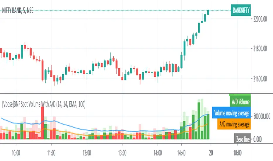
[VBose] Bank Nifty Volume With Accumulation/Distribution Bank Nifty Volume With Accumulation/Distribution Indicator shows Weighted Spot volume bars and the accumulated/distributed (A/D) portion of them. It calculates candle body to candle height ratio and multiplies it by Spot volume: Spot volume*(close-open)/(high-low)
The Spot Volume is calculated by the weighted sum (Composite method) of deriving stock volume from underlying 12 stocks in the Bank Nifty Index.
This Indicator has ability to multiply The Volume With Price and Take the Output of Volume or A/D to be fed as source in other indicators.
Light Green Color Shows Total Bull Volume > With Dark Green Color as Accumulation
Light Red Color Shows Total Bear Volume < With Dark Red Color as Distribution
Moving Average for Volume and A/D Line can be added with custom Moving Average Settings
Note:Trading view still does not provide Volume in Bank Nifty Index and this indicator calculates Spot Volume which is different than Futures Volume of Bank Nifty.
On Balance Volume Flow (Expo)On Balance Volume Flow (Expo) identifies buying and selling pressure at extreme points. On Balance Volume Flow (Expo) is primarily used to identify potential turning points and areas of congestion.
Vwap can be enabled as an input source instead of using Volume.
The indicator can be used standalone or as a part of your current trading strategy.
HOW TO USE
1. Use the indicator to identify potential turning points and areas of congestion.
2. Use the indicator to get a feel of how price movements and volume are related.
INDICATOR IN ACTION
1-hour chart
Works on any market
I hope you find this indicator useful , and please comment or contact me if you like the script or have any questions/suggestions for future improvements. Thanks!
I will continually work on this indicator, so please share your experience and feedback as it will enable me to make even better improvements. Thanks to everyone that has already contacted me regarding my scripts. Your feedback is valuable for future developments!
ACCESS THE INDICATOR
• Contact me on TradingView or use the links below
-----------------
Disclaimer
Copyright by Zeiierman.
The information contained in my scripts/indicators/ideas does not constitute financial advice or a solicitation to buy or sell any securities of any type. I will not accept liability for any loss or damage, including without limitation any loss of profit, which may arise directly or indirectly from the use of or reliance on such information.
All investments involve risk, and the past performance of a security, industry, sector, market, financial product, trading strategy, or individual’s trading does not guarantee future results or returns. Investors are fully responsible for any investment decisions they make. Such decisions should be based solely on an evaluation of their financial circumstances, investment objectives, risk tolerance, and liquidity needs.
My scripts/indicators/ideas are only for educational purposes!

A/D + 21/200EMASimple Accumulation & Distribution indicator with the 21 and 200EMA plotted on it. Might be a useful tool in your arsenal.

Volume AccumulationA simple tool that accumulates the trading volume of an instrument for a specified period of time.
Available modes:
Minutely
Hourly
Session
Daily
Monthly
Quarterly
Yearly

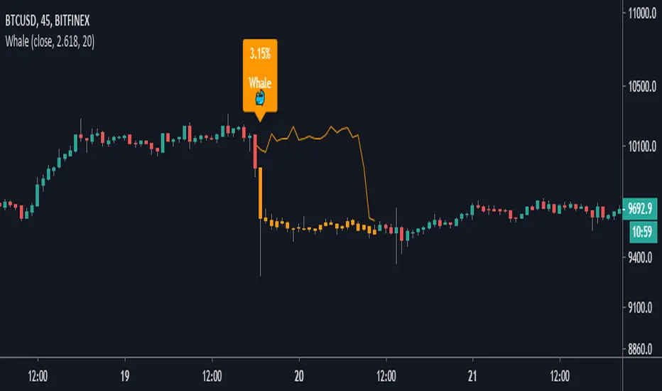
Whale Hunter [Gu5]Indicator to show a big change (Whale) in the same candle
The candles change color, until the Momentum returns to zero
After the movement of a whale, the market is usually on range, and there may be false entries
The default values (2.618% and 20 lenght), are optimized for BTCUSD 15m
---
Spanish
Este indicador muestrar un gran cambio porcentual (ballena) en la misma vela
Las velas cambian de color, hasta que el Momentum vuelve a cero
Luego de el movimiento de una ballena, el mercado suele quedar en lateral, y puede haber falsas entradas
Los valores por defecto (2.618% y 20 lenght), están optimizados para BTCUSD 15m
(D7R) ACC/DIST+D7R Custom version of Accumulation / Distribution indicator enhanced with Moving Average.
ACC/DIST model look at Volume and Open, High, Low and Close to draw cumulative picture of how volume is hypothetically distributed across time according to price.

OBV A / D with MA + SignalsThis script focuses on On Balance Volume and detection of varying Accumulation and Distribution phases.
It also incorporates Moving Average Cross-Over/Cross-Under alert/shapes, to provide plots and alerts for these events, which correspond as Buy / Sell warning signals.
The default length of the Moving Average is 21 periods, and the default MA type is SMA. You can customize the length, as well as switch it to an EMA or HMA.
