BTC Gravity OscillatorThis indicator is a deviation of a Center of Gravity Oscillator corrected for the diminishing returns of Bitcoin.
I've set up this indicator for it to be used on the weekly timeframe. The indicator oscillates between 0 and 10, where 0 indicates oversold conditions and 10 indicates overbought conditions.
The indicator plots in any BTCUSD spot, futures , BLX index and BTCEUR .
It paints in all time frames, but Weekly time frame is the correct one to interpret the 'official' read of it.
Bitcoin (Cryptocurrency)

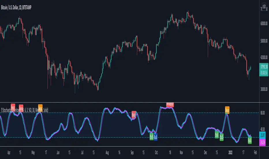
[Joy] AladdinDirectly used for entertainment purposes in figuring out the market trend:
Sell/bearish sign: I open a short position on the candle's close. I am bearish on the instrument.
Buy/bullish sign: I open a long position on the candle's close. I am bullish on the instrument.
Red circle: If I run a long position, I take at least 50% unrealized profit into a realized profit on the close candle. I might even convert some portion of the underlying spot into stable coins. I am essentially taking profit along the way as the trend is developing.
Green circle: If I am running a bearish short position, I take at least 50% unrealized profit into a realized profit on the candle's close. I am essentially taking profit along the way as the trend is developing.
Below are used for indications only:
Down Arrows: It is not directly used in opening/closing positions. When the down arrow finishes and the candle close, it sometimes indicates a local top. It does not mean the macro trend has changed.
Up Arrows: It is not directly used in opening/closing positions. When the up arrow finishes and the candle close, it sometimes indicates a local bottom. It does not mean the macro trend has changed.
Red Crosses: It indicates a squeeze may be incoming. When the red crosses finish, the price may move significantly in any one direction. It does not say which direction. It only gives me caution.
Experimental - Below Work in Progress may be from the config only:
>> Jasmine - Tweak of Aladdin
>> Candle color - Logic is different from Aladdin
>> Background color - Logic is different from Aladdin
FAQs
Q: Does it use some EMA /MA/Ichimoku/Parabolic SAR, etc? Does it use any indicator with tweaked settings?
Answer: No.
Q: What does it mostly use?
Answer: Volume and gradual flow of non-interrupted data. The logic depends on the correlation between volume , price bars and the wicks.
Q: Can you make it free or make it open source?
Answer: There is no free lunch in this world. I will never reveal or share the source code or make it free for all!
Q: Do you provide ongoing support for the indicator?
Answer: Yes, I will continue updating the indicator as long as I can. However it depends entirely on me. I may stop updating as well.
Q: Are the bullish /buy & the bearish /sell markers automatic?
Answer: Yes. I do not control it!
Q: Is this financial advice?
Answer: Any views expressed by the indicator are personal entertainment views & shouldn't form a basis for making investment decisions, nor be construed as a recommendation or advice to engage in investment transactions. It is not financial advice. I highly recommend not even think of using this for actual real-life trading with real money. Neither I nor the indicator is responsible for any misuses, including any profit/loss. There is no warranty on this entertainment product

AnyChartI changed few lines of code from TradingView's original Open Interest indicator to make this one. I wanted to compare other charts to while entering my trade like looking at BTC when trading in alts. It has option to view any chart. Add other things to improve your analysis.

Combo Ichimoku + CDC Action Zone by fukuizThis indicator combines the famous indicators Ichimoku and CDC ActionZone.
#A brief introduction to Ichimoku #
The Ichimoku Cloud is a collection of technical indicators that show support and resistance levels, as well as momentum and trend direction. It does this by taking multiple averages and plotting them on a chart. It also uses these figures to compute a “cloud” that attempts to forecast where the price may find support or resistance in the future.
#A brief introduction to CDC ActionZone #
CDC ActionZone is a very simple system, utilizing just two exponential moving averages. The 'zones' in which different 'actions' should be taken are highlighted in different colors. Calculations for the zones
They are based on the relative position of price to the two EMA lines and the relationship between the two EMAs.
The CDC ActionZone was developed by Piriya333, a Thai technical analyst.
#How to use #
The basic method for using Ichimoku+CDC ActionZone is to follow the green/red color and the cloud.
Buy condition
-Buy when the bar closes in green and closes above the cloud
Sell condition
-sell when the bar closes in red.

Cowen CorridorI'm reposting the Cowen Corridor that was originally developed by Benjamin Cowen of "Into the Cryptoverse"
This indicator was originally developed by Ben publicly on stream. It may be used to predict upper and lower bound limits for the price of Bitcoin .
I've set up this indicator for it to be used on the weekly timeframe as was intended.
The indicator plots in any BTCUSD spot, futures , BLX index and BTCEUR .
It paints in all time frames, but Weekly time frame is the correct one to interpret the 'official' read of it.
For that reason, I've enabled by default an option that forces the indicator to display on the Weekly value even though the time frame could be higher or lower.
Credit for this idea goes to Benjamin Cowen: @intocryptoverse

CDOI ProfileCumulative Delta of Open Interest Profile
This script lets you visualize where there were Open Interest build-ups and discharges on a price basis.
It only supports pairs where TradingView added the appropriate Open Interest data (at the time of posting that is only Binance and Kraken perpetual contracts)
The script uses my own functions to poll lower timeframe data and compile it into a higher timeframe profile. And as such, it needs some tweaking to adjust it to your timeframe until Tradingview lets me do it codewise (hopefully one day)
The instructions for using the Indicators are as follows:
Condition: How often a new profile should be generated
Sampling Rate and 1/Nth of the TF: These have to be calculated together to have a product that should correspond to the current timeframe in minutes. A few examples below
----------- Sampling - 1Nth of the TF
5 min ------- 5 --------------- 1
10 min ------ 10 ------------- 1
15 min ------ 5 --------------- 3
20 min ------ 10 ------------- 2
30 min ------ 10 -------------- 3
45 min ------- 9 -------------- 5
1 hour ------- 10 ------------- 6
4 hours ----- 10 -------------- 24
1 day -------- 10 ------------- 144
Transparency: This one is pretty self-explanatory but only applies to the Profile bars
% change for a bar: This one indicates how precise each bar will be, but if you go too low the script becomes too heavy and stop running
Bar limit: Limits the amounts of bars the script is run for (ae for the last 1000 bars). Lower = faster loading, too high will stop running
UI color: Color and transparency of the center line and the box surrounding the whole profile

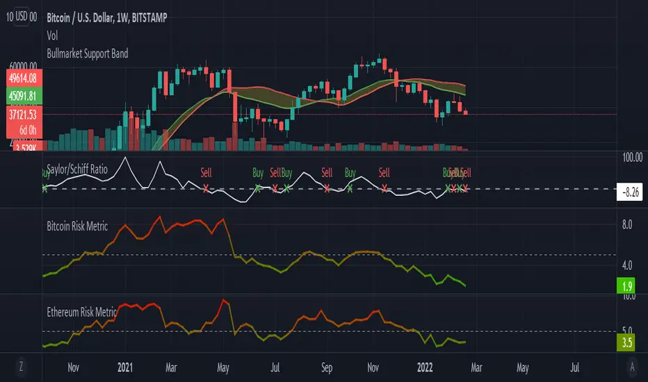
Saylor to Schiff RatioI'm reposting the Saylor to Schiff Ratio indicator that was originally developed by Michael Silva
This indicator may be used to predict key momentum shifts in the price of Bitcoin
I've set up this indicator for it to be used on the weekly timeframe as was intended.
The indicator plots in any BTCUSD spot, futures , BLX index and BTCEUR .
It paints in all time frames, but Weekly time frame is the correct one to interpret the 'official' read of it.
For that reason, I've enabled by default an option that forces the indicator to display on the Weekly value even though the time frame could be higher or lower.
Credit for this idea goes to Michael Silva: @mikepsilva
BTC Cap Dominance RSIBTC Cap Dominance RSI indicator is a combination of the RSI of Bitcoin Market Cap and the RSI of Bitcoin Dominance. The concept of this indicator is to get a good grasp of the bitcoin market flow by combining bitcoin dominance as well as bitcoin market cap.
BTC Cap Dominance (BCD) RSI is defined as:
BCD RSI = (BTC Cap RSI + BTC Dominance RSI) / 2
Case 1 (Bull market):
Both Cap RSI and Dominance RSI values are high
Case 2 (Neutral market):
Cap RSI is high but Dominance RSI is low
Cap RSI is low but Dominance RSI is high
Case 3 (Bear market):
Both Cap RSI and Dominance RSI values are low
(Note) Please note that the market capitalization symbols (CRYPTOCAP:TOTAL and CRYPTOCAP:TOTAL2) of TradingView started in January 2020, so you can check the indicator value from this point on.

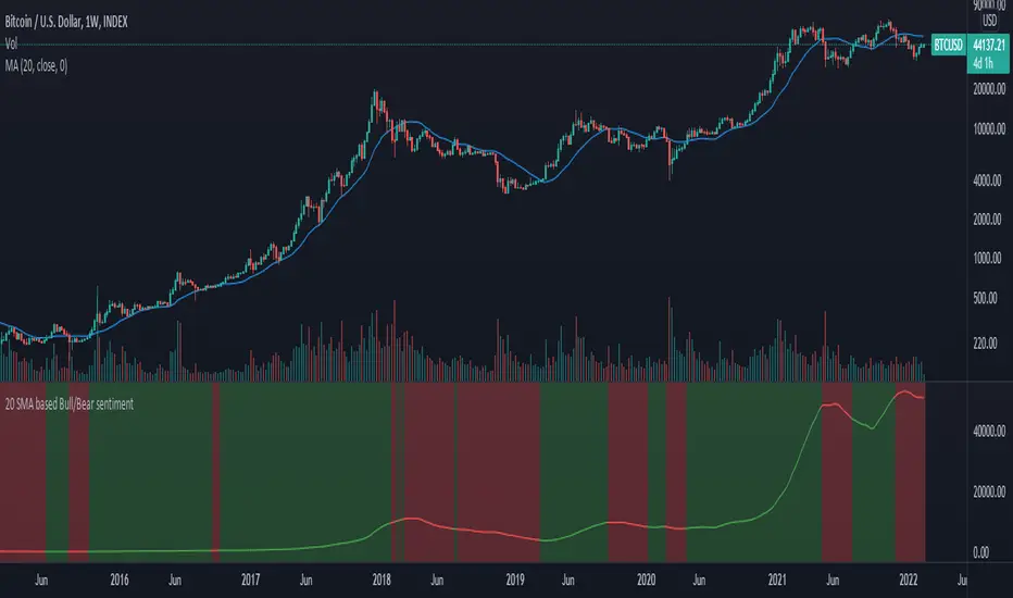
20 SMA based Bull/Bear sentiment indicatorThis script is only doing one thing, plots the 20 SMA and based on whether the asset's price is above or below of the SMA it changes the color of the SMA and the background's color.
Helping it to visualize whether from the 20 SMA's point of view we are in a Bull or a Bear trend.
I created this because I myself use this SMA with Bitcoin on the weekly time frame to identify the macro trend on the weekly.
IMO this is a good crypto market sentiment indicator.
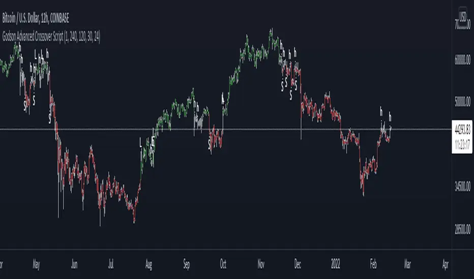
Godson Advanced Crossover ScriptThe Godson Advanced Crossover Script is advanced because it does two things
1: as a trend following indicator the script uses 2 VWAP ema's offset by 1 day(this is adjustable) and an ATR upper and lower band to find entries into larger trends.
2: it also allows you to setup alerts on a lower timeframe that follow a higher timeframe for example, if the 12hr is bearish(candles are red), you can trade shorts only in the 15min timeframe.
The script produces 3 signals
L: this is a long signal, this is signaled when the ema's crossover and the candle breakouts of the ATR bands, if the signal agrees with the upper trend
S: this is a short signal, it signals when the ema's crossunder and the candle breaks down of the ATR bands, if the signal agrees with the upper trend
H: this is for anything in-between, A is for apple, H is for Hedge.
you can set the upper trend timeframe to the same as the lower trend if you want all signals to alert
you can also turn the lines on or off if you need to visualize things
i will update this script as we progress
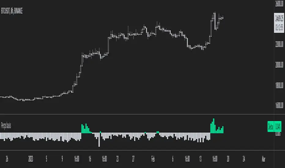
Bitcoin Perpetual Swaps BasisThis is a simplified version of my Aggregated Perpetual Swaps Basis script.
Click the image to see more details on that indicator.
This version works only for bitcoin (the older script works for BTC and ETH) and a bunch of code has been trimmed down.
The purpose of this is to make the indicator a lot faster .
When I published the old one I noticed that it always took a long time to load which is incredibly frustrating to me.
I guess I propped too much stuff in one indicator.
So that's why I'm basically cutting it up into two, more code efficient pieces, but it does the same thing.
People who have access to the old indicator will also get access to this one.
Here's a list of contracts that I used to make the perps and spot indices.
These will be updated if needed (in case an exchange loses relevancy for example).
Perps:
Binance USDT margin
Binance coin margin
Bybit USDT margin
Bybit coin margin
FTX perp
Spot:
Coinbase USD
Bitfinex USD
FTX USD
Binance USDT
Ultimate HODL WaveThe basis for this indicator is the HODL Wave (> 1 Year) developed by Unchained Capital. This represents the percentage of coins that have not been moved for at least a year.
The Hull MA perfectly tracks the HODL Wave and provides an easy bull/bear trend in the mid-term.
The long-term and more macro bull/bear trend is decided by if the Hull MA is above or below the base MA.
I have purposefully chosen the 365 day length for the Hull MA and the 730 day for the base MA on the daily timeframe since they represent 1 year and 2 years respectively.

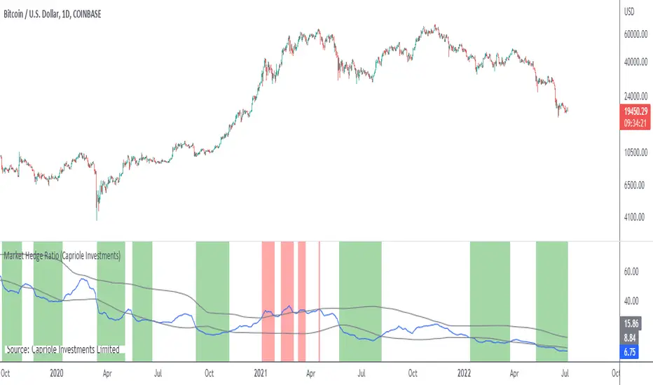
Market Hedge RatioRatio of crypto (total, Bitcoin, or Ethereum market cap) to major stable coins.
A low ratio suggests a lot of people are sitting in cash (sidelined if crypto rallies).
A high ratio suggests possible demand saturation.
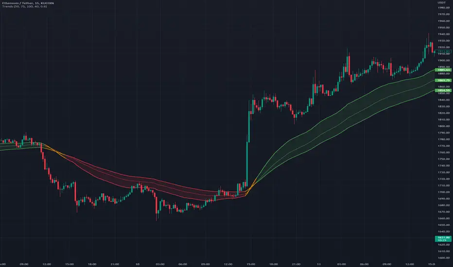
TrendsThe Trends indicator is created for trend trading and (Bitsgap) crypto bots of crypto assets over longer time periods.
Works best for 4h, Daily and Weekly candles (even Monthly), but unsuitable for hourly candles and day trading.
This indicator shows you if a crypto pair is in a Bear, Bull or Sideways market.
The idea is to simplify decision making when to sell or buy, or what pairs to use with trading bots.
Stick to the rule of not having bots in a Bear trend!
- Blue = Bull trend
- Red = Bear trend
- Green = Sideways trend - which can be profitable with trading bots
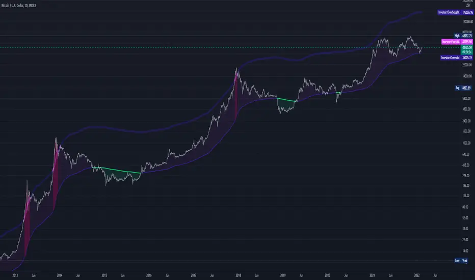
Abz BTC InvestorInvestor indicator:
This indicator is intended to be used on a chart showing Bitcoin's historical price action. By viewing years of Bitcoin's history, it's possible to better see Bitcoin's current price within a long term context of the price rage.
Purpose and possible usage:
I built the indicator to make it easier for me and for friends and family to make better informed decisions about our Bitcoin investments. The indicator shows the historic range of the asset and indicates where Bitcoin is oversold (below the bottom line) and overbought (above the top purple line):
- Above the top purple line, I'll look to take some profits or consider hedging to protect my long term position's growth
- Below the bottom purple line, I'll look to dollar cost average into a long term position
I think the idea for this came from idea listening to the YouTuber Birb talking about how well Bitcoin tracked between the 200 day moving average (bottom navy moving average) and 5x that value (top moving average).
Hope you find it useful.
Best wishes,
Abzorba
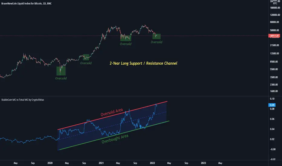
StableCoin MC vs Total MC by Crypto5Max In this indicator you will find the sum of all stable coins (market cap) divided by the total crypto market cap.
I believe there's a positive correlation between stable coins issuance and BTC's(and other coins) price appreciation. Or shortly put, to me the rising levels of stable coins represent increased levels of buying power (and adoption) waiting on the sidelines.
Here, I am taking the total market cap of all stable coins and dividing it by the total crypto market cap to get a ratio. Note, only ~85% of all stable coins are calculated (rest are not on TV), however, it should still be a fairly good representation. Some of the stable coins are already locked in smart contracts for yield farming and what not. I'd also say, there's interesting 2-year long channel that's developing currently. That said, take this indicator with a grain of salt as we still have a limited set of data.
Yours truly
Sharktank - Stochastic ExtendedThe Stochastic as you know it, but with a lot more features.
Options you can tweak:
* Length of the %K value.
* The smoothing of the %K value.
* The smoothing (called %D) for the smoothed %K value.
* Ability to show the original %K.
* Ability to turn of %D so you can take a look at the original Stochastic as it was created (by turning of the %K).
* Show the price at which the smoothed %K will cross the %D (if possible).
* Show both normal and hidden divergence on %K, smoothed %K or %D.
* Some coloring settings.
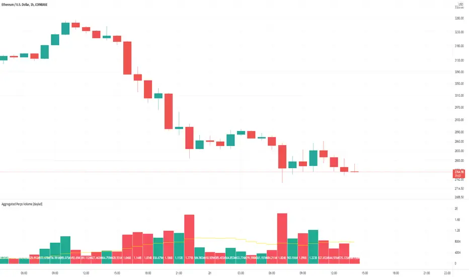
Aggregated Perps Volume [daylad]Same thing as my aggregated spot volume indicator, but for crypto perpetual futures contracts ().
Works with any crypto chart! No need to manually update symbols, this indicator will detect if there is a matching symbol and add it automatically!
The price labels display the total volume per bar in USD.
Pulls data for the following pairs (when available):
BINANCE: + base_symbol + PERP
BINANCE: + base_symbol + BUSDPERP
BINANCE: + base_symbol + USDTPERP
OKEX: + base_symbol + USDTPERP
OKEX: + base_symbol + PERP
FTX: + base_symbol + PERP
PHEMEX: + base_symbol + USD
BYBIT: + base_symbol + USD
BYBIT: + base_symbol + USDT
DERIBIT: + base_symbol + PERP
HUOBI: + base_symbol + PERP
BTSE: + base_symbol + PFC
EXAMPLE -- If you're looking at the COINBASE:SOLUSD chart the indicator will automatically aggregate the volume from BINANCE:SOLPERP, FTX:SOLPERP...etc... BYBIT:SOLUSDT...etc... BTSE:SOLPFC. If an exchange does not have a corresponding pair, then that pair returns 0 and does not add to the total.
If you have any questions feel free to ask. Happy trading!
Bitmex BTC Perpetual Premium and FundingThis script tracks the premium (default red line) and the funding rate (default yellow area) of the Bitmex XBTUSD pair perpetual contract.
The calculations are based on the 8H TWAP of interest rates and premium index from Bitmex.
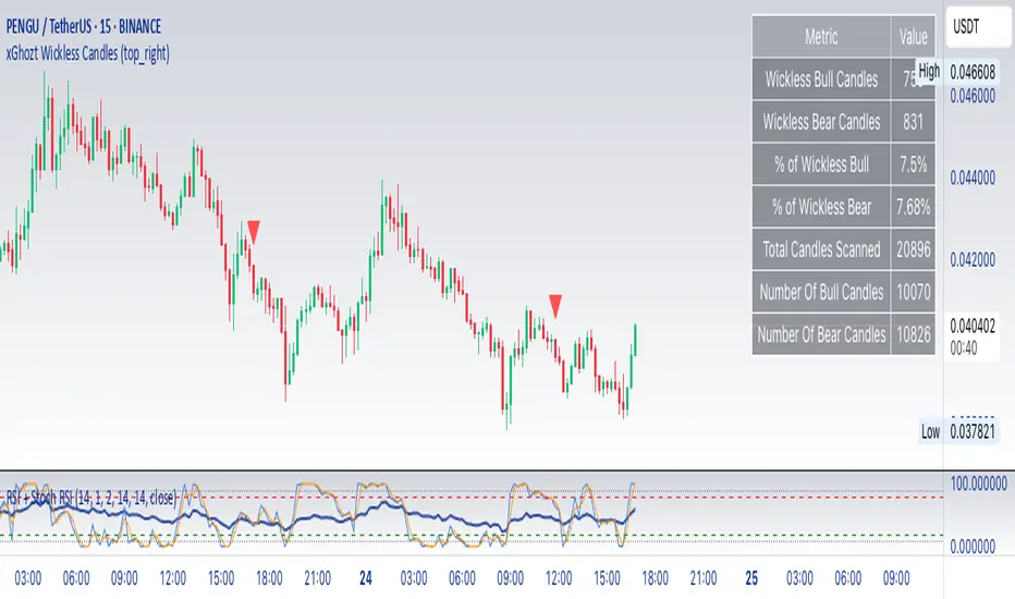
xGhozt Wickless CandlesSimple script showing candles missing an upper or downer wick. As candles tend to have a low and a high, they will most certainly form wicks. It is rare to have wickless candles on longer time frames, so it's more relevant on 1h and above.
What can you do about it?
If you see for example a Bitcoin 4h candle that hasn't form two wicks yet, there are high chances that the missing wick will be formed at one point or another, therefore you could take a trade in the direction of the missing wick. You can set alerts on wickless candles if needed.
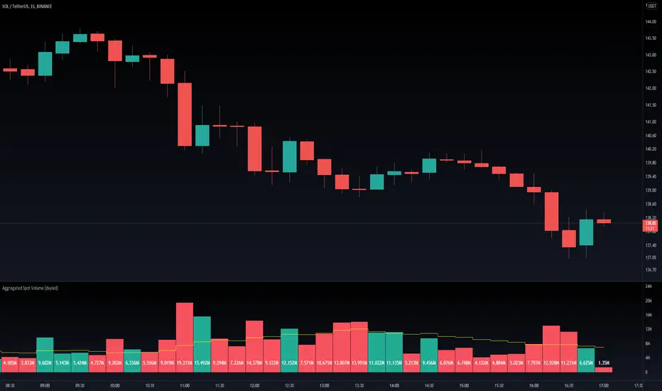
Aggregated Spot Volume [daylad]Works with any crypto chart! Automatically pulls and aggregates trading volume for the top stop pairs.
No need to manually update symbols, this indicator will detect if there is a matching symbol and add it.
Pulls data for the following pairs (when available):
COINBASE: + symbol + USD
COINBASE: + symbol + USDT
COINBASE: + symbol + EUR
BINANCE: + symbol + USDT
BINANCE: + symbol + BUSD
BINANCEUS: + symbol + USD
OKEX: + symbol + USDT
OKEX: + symbol + USDK
FTX: + symbol + USD
HUOBI: + symbol + USDT
BITFINEX: + symbol + USD
KRAKEN: + symbol + USD
KUCOIN: + symbol + USDT
CURRENCYCOM: + symbol + USD
POLONIEX: + symbol + USDT
UPBIT: + symbol + KRW
BITHUMB: + symbol + KRW
EXAMPLE -- If you are looking at the BINANCE:ADAUSDT chart, the indicator will automatically aggregate the volume from COINBASE:ADAUSD, COINBASE:ADAUSDT...etc... BINANCE:ADAUSDT...etc... BITHUMB:ADAKRW. If an exchange does not have a specific pair, then that pair returns 0 (does not add to the total).
If you have any questions feel free to ask. Happy trading!
(D7R) BAKKT Bitcoin FuturesBAKKT Bitcoin Quarterly Contract Futures Price with 3 different display modes: (Percentage, Delta, Absolute).
This information can be used to understand when futures are trading at relative strong/weak premium or discount against each other.
This information can either be used for cash-n-carry arbitrage, inter-exchange arbitrage, hedging or directional price speculation.

(D7R) CME Bitcoin FuturesCME Bitcoin Quarterly Contract Futures Price with 3 different display modes: (Percentage, Delta, Absolute).
This information can be used to understand when futures are trading at relative strong/weak premium or discount against each other.
This information can either be used for cash-n-carry arbitrage, inter-exchange arbitrage, hedging or directional price speculation.
