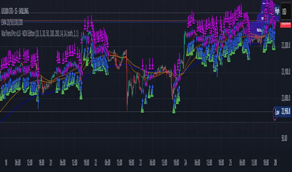
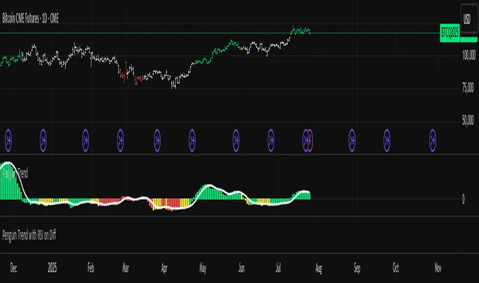
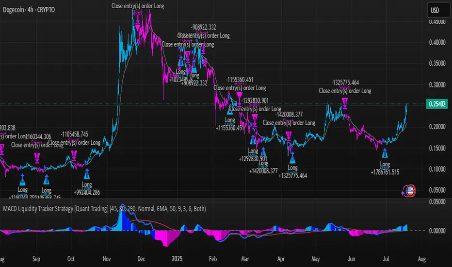
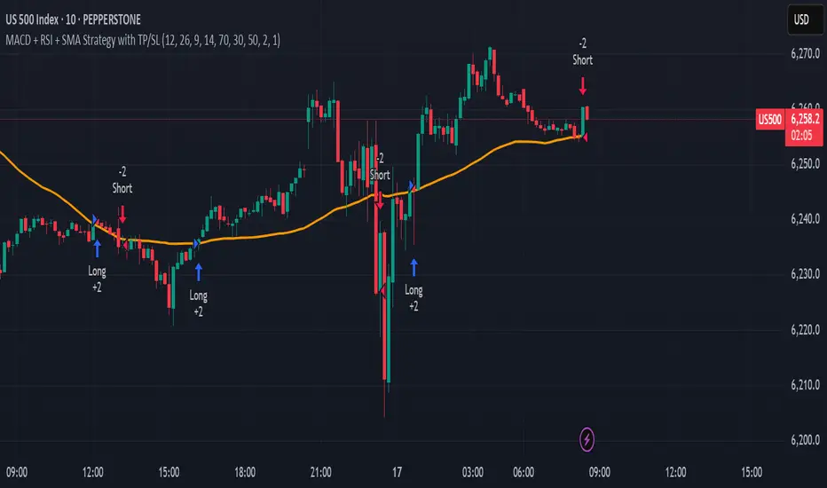
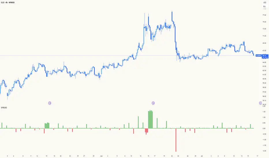
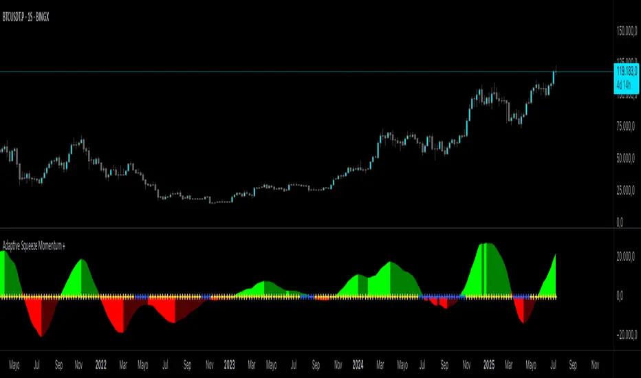
Divergence Scanner - Multi-Oscillator Confirmation [Dots3Red]📉 DIVERGENCE SMART SCANNER — MULTI-OSCILLATOR CONFIRMATION STATS
A single-oscillator divergence — price makes a new high while RSI doesn't confirm it — is treated as a reversal warning almost everywhere. Whether adding a second or third oscillator's agreement actually makes that warning more reliable is rarely tested. This script tests it, directly, on the chart in front of you.
✨ WHY THIS MATTERS
"More confirmation means more reliable" is one of the most repeated pieces of trading folklore. This script checks whether that's actually true here, rather than assuming it. Every divergence is checked against three separate oscillators — RSI, MACD histogram, and Williams %R — and graded by how many of them agreed. The outcome of every divergence is then tracked, sorted by that confirmation count:
📊 1 oscillator confirms: 54% reversed (n=28)
📊 2 oscillators confirm: 63% reversed (n=19)
📊 3 oscillators confirm: 71% reversed (n=9)
If confluence genuinely matters on this chart, these numbers should step upward. If they don't, that's useful information too — either way, it's measured, not assumed.
⚙️ HOW IT WORKS
📐 Swing detection — confirmed pivot highs and lows, each stored alongside the value every oscillator held at that exact moment, so structure is compared pivot-to-pivot rather than pivot-to-current-bar.
📊 Multi-oscillator confirmation — a bearish divergence requires price making a higher high; each oscillator that simultaneously makes a *lower* high adds one to the confirmation count. Bullish divergence is the mirror case at swing lows. The count (1, 2, or 3) is shown directly on the chart label.
🎯 Tiered outcome grading — every divergence is tracked forward. If price genuinely moves in the expected reversal direction by a meaningful distance within a set window, it's graded as reversed; otherwise it isn't. The result feeds into that specific confirmation tier's running statistic — 1-oscillator divergences are never mixed together with 3-oscillator ones, since that's exactly the comparison the whole tool exists to make.
🔒 Non-repainting — all detection and grading happens strictly on confirmed bars.
🧭 HOW TO USE
1️⃣ Read the confirmation count on the label before reacting to a divergence. "▼ 1/3 confirm" and "▼ 3/3 confirm" look like the same event on the chart but carry very different weight once you check their respective tiers.
2️⃣ Check the dashboard's tier stats, not just the current divergence. The measured reversal rate and sample size (n=) for that specific tier tell you how much history actually backs it up on this chart.
3️⃣ Let the sample size guide your confidence. A tier with 4-5 recorded events is still forming; one with 30+ is telling you something real about how this instrument has behaved.
4️⃣ Use the tier comparison to decide whether waiting for more confluence is worth it. If reversal rates climb clearly from 1 to 2 to 3 oscillators, holding out for stronger confirmation is justified here. If the tiers are flat or don't separate meaningfully, a single-oscillator divergence is just as informative as a rarer triple-confirmed one — and waiting for 3/3 may just mean missing setups for no real benefit.
5️⃣ Treat it as context, not a trigger. Like every tool in this catalog, it describes what has already happened — it doesn't predict what happens next.
⏱️ WHICH TIMEFRAMES WORK BEST
Divergence needs enough bars between swings to form and then resolve meaningfully, which generally makes 15-minute through 4-hour the most effective range — the same window where most swing-based structure tools perform best.
On very short timeframes (1-3 minute), pivots form so frequently that many flagged divergences will be closer to noise than genuine structure — the tier sample sizes will grow quickly, but individual signals may carry less weight. On daily or weekly charts, genuine divergence setups are naturally rarer, so expect fewer signals and a longer wait before any tier's sample size becomes large enough to trust. The tool still functions on both ends of that range — it simply takes longer, or shorter, for its statistics to become genuinely informative.
🛠️ SETTINGS
📐 Swing Detection — Pivot Leg (bars required on each side to confirm a pivot)
📊 Oscillators — independent length settings for RSI, MACD, and Williams %R
🎯 Outcome Grading — Reversal Confirmation distance (in ATR) and Outcome Window (bars)
🎨 Visualization — toggle divergence lines and confirmation labels independently; line width, line style, label size, and label position style (natural above/below placement, or pointing left)
🎨 Colors — independent bullish/bearish line and label text colors, label background, and full dashboard color control including separate good/bad outcome indicators
🖥️ Dashboard — show/hide, position — all three confirmation tiers with their measured reversal rates and total signal count
📝 NOTES
Statistics accumulate from when the indicator is added to the chart. Higher-confirmation tiers (2 and especially 3 oscillators) will naturally take longer to build a meaningful sample than the 1-oscillator tier, since triple-confirmed divergences are rarer by definition.
⚠️ DISCLAIMER
This is an analytical and visualization tool. It does not generate trade signals and does not constitute financial advice. Historical reversal rates do not guarantee how any future divergence will resolve. Indicator

Fisher Transform Turning Points [RC Tools]RC Tools — Fisher Transform Turning Points
────────────────────────────────────────────────────────────────────
█ OVERVIEW
Most oscillators produce a roughly bell-curve distribution of values, which means they spend a lot of time hovering near their own extremes without committing one way or the other — turning points end up gradual and easy to miss. The Fisher Transform, developed by John Ehlers, fixes this by re-shaping the distribution itself: it converts a naturally Gaussian-ish read into one with much sharper, more decisive swings, so genuine turning points stand out rather than blur together.
█ WHAT IT DOES
Computes the Fisher Transform of price's position within its recent high/low range and classifies each confirmed bar as Bullish or Bearish on a zero-line crossover. Plots a 4-colour momentum histogram (Expansion, Slowdown, Contraction, Recovery) showing not just direction but whether momentum is accelerating or fading, colours the chart background by the confirmed state, and shows a table with the current state, how long price has been in it, and historical base rates (average forward return and win rate) for each state.
█ THE THEORY BEHIND IT
Most price-derived oscillators (RSI, Stochastic, and similar) are bounded and tend to spend a disproportionate amount of time in the middle of their range, with actual extremes reached only briefly. Ehlers' insight was that if you first normalise price's position within its recent range to roughly -1 to +1, then run that through the inverse hyperbolic tangent function, you get an output whose distribution is much closer to genuinely Gaussian — which sounds abstract, but has a very practical effect: the statistic moves through its extremes quickly rather than lingering, producing sharper, more decisive turning points instead of a gradual roll-over.
█ HOW IT IS CALCULATED
1. Normalise price's position within its recent high/low range (over the Length window) to roughly -1 to +1, damped against the prior bar's reading to reduce noise.
2. Run that normalised value through 0.5 × ln((1 + x) / (1 - x)) — the inverse hyperbolic tangent, via a standard logarithmic identity — again damped against the prior output.
3. The resulting Fish value crossing above zero is classified Bullish; crossing below zero is classified Bearish. Between crossovers, the classification holds.
4. Separately, a 4-colour momentum state (Expansion/Slowdown/Contraction/Recovery) is derived from Fish's bar-to-bar change — this is a cosmetic diagnostic layer and does not affect the Bullish/Bearish classification itself.
Note: a trigger-line crossover (Fish against its own lagged value) was tested during development and found too whipsaw-prone for this technique — the zero-line crossover used here produced meaningfully cleaner classification.
Classification occurs ONLY on confirmed bar close — the plotted Fish value, the background colour and the table all update together, so nothing here can disagree mid-bar or flip back and forth as the current bar forms.
█ SETTINGS & CONFIGURATION
• Length (default 10, the classical value from Ehlers' original publication) — the rolling high/low window used for the price-position read
• Table visibility, position and colours are fully configurable; the main-chart background painting can be toggled off if you only want the statistics pane
• Forward Return Window (default 20 bars) — the horizon used for the base-rate table
█ HOW TO USE IT
Use it as a turning-point filter alongside your existing tools, not as a standalone entry signal. Because the transform is specifically built to sharpen turning points, it tends to react faster than smoother oscillators — useful for catching a genuine reversal early, at the cost of more false starts in choppy conditions. Check the base-rate table's sample count before treating any single state as meaningfully predictive.
Works on any asset and timeframe with sufficient history for the Length window.
█ LIMITATIONS
• Fisher Transform is a NORMALISED price-position statistic, not a measure of trend strength or magnitude. Any use of it as a precision reversal forecast is a misuse.
• The sharp, decisive turning points that make this technique distinctive also mean it can whipsaw in genuinely choppy, range-bound conditions.
• The high/low window resets its frame of reference every Length bars; a short length reacts fast but is noisier, a long length is smoother but slower to reflect a genuine change.
• The 4-colour momentum state is a cosmetic diagnostic layered on top of Fish's bar-to-bar change — it does not affect the Bullish/Bearish classification or the base-rate table.
• Historical base-rate stats need a meaningful sample count (check N) before being trusted.
• This script does NOT repaint. All classification updates on confirmed bar close only.
█ DISCLAIMER
For educational and informational purposes only. Nothing here is financial advice. Past behaviour of any turning-point state does not indicate future results. Trade at your own risk.
Indicator

MACD Matrix [Quantum Algo]MACD Matrix
═══════════════════════════════════════════════
🔶 OVERVIEW
MACD Matrix reads the Moving Average Convergence Divergence as a complete momentum system rather than a single line and histogram. It classifies momentum into four quadrants instead of one sign, aligns four timeframes into a live matrix with a scored consensus, detects histogram divergence and draws it on both the oscillator and the price candles, tracks histogram compression before expansion, and paints a momentum river through price so the entire reading lives on the chart — not only in the pane below it.
The result is a MACD you can read from the candles alone: the river's color tells you the quadrant, the aura tells you whether momentum is expanding or fading, gold beacons mark full multi-timeframe alignment, and every signal carries its own historical record on the exact symbol you are trading.
═══════════════════════════════════════════════
🔶 WHAT IS MACD?
The Moving Average Convergence Divergence, created by Gerald Appel, measures momentum as the distance between a fast and a slow exponential moving average. A signal line smooths that distance, and the histogram — introduced by Thomas Aspray — shows the gap between the two. MACD above zero means the fast average leads the slow one (bullish regime); the histogram rising means momentum is accelerating.
═══════════════════════════════════════════════
🔶 WHAT ARE THE FOUR MACD QUADRANTS?
Most traders read MACD as bullish or bearish. It actually has four distinct states, and the difference between them is where the money is:
— Expanding ▲: above zero and the histogram rising — momentum accelerating in an uptrend.
— Fading ▲: above zero and the histogram falling — the uptrend losing thrust, the earliest warning.
— Expanding ▼: below zero and the histogram falling — momentum accelerating in a downtrend.
— Fading ▼: below zero and the histogram rising — the downtrend losing thrust, the earliest turn.
MACD Matrix names the quadrant on every bar, colors the river and the aura by it, and stamps it into every signal's tooltip.
═══════════════════════════════════════════════
🔶 WHY IS THIS ORIGINAL?
1. The quadrant engine. Four momentum phases instead of two, made visible on the price chart through the momentum river and aura, so fading momentum is caught before the sign ever flips.
2. The timeframe matrix. Four configurable timeframes, each read as side-of-zero × expanding-or-fading, with a consensus score. A gold beacon prints on price the moment all four align with expanding momentum — a threshold event, not a vague "trend agreement."
3. Dual-canvas divergence. Histogram divergences are drawn as connectors in the pane AND as dashed twins across the corresponding price pivots on the chart, so the divergence is visible exactly where you trade it.
4. The histogram squeeze. Histogram amplitude is ranked inside its own recent history; when it compresses below a low percentile the momentum is coiled, marked with gold dots, and the expansion out of the coil fires a directional release signal — a compression concept almost never applied to MACD.
5. Signal families with per-symbol records. Zero-line crosses, early signal crosses on the correct side of zero, divergences and squeeze releases are tracked as separate families, each with ten-bar outcome statistics shrunk toward neutral at small samples and a Wilson lower bound — quoted in every tooltip and on the dashboard.
═══════════════════════════════════════════════
🔶 HOW IT WORKS
— MACD, signal and histogram are computed from configurable lengths; the quadrant is derived from the sign of MACD and the direction of the histogram.
— Four higher-timeframe MACD states are requested without lookahead and scored into the matrix.
— Histogram pivots are compared against price pivots to detect regular divergences, drawn on both canvases.
— Histogram amplitude is ranked against its own history for the squeeze; a mature coil that expands fires a release.
— Every signal family feeds its own first-in-first-out outcome samples; statistics are reported with sample counts.
Signals are evaluated on confirmed bars and do not repaint. Higher-timeframe matrix rows finalize when their own bar closes, as with any multi-timeframe reading. All drawings are capped.
═══════════════════════════════════════════════
🔶 HOW TO USE IT
— Trade the quadrant, not the sign: Expanding phases favor continuation entries; Fading phases favor taking profit or tightening risk, and they precede most zero-line crosses.
— Use the matrix as a filter: a 4/4 beacon is the highest-conviction environment; a divided matrix (2/4) warns that timeframes disagree.
— Divergence on the candles: when the dashed price line and the pane connector appear together, you have a momentum-versus-price disagreement located precisely on structure.
— Watch the coil: a long squeeze followed by a release is the setup for expansion; the R family record tells you how reliably releases have followed through here.
— Works on all markets and timeframes; configure the four matrix timeframes to match your trading horizon.
═══════════════════════════════════════════════
🔶 SETTINGS
— MACD: fast, slow and signal lengths.
— Timeframe Matrix: four timeframes.
— Signals & Squeeze: divergence pivot length, squeeze window and percentile, cooldown, signal visibility.
— Statistics: sample cap, minimum samples, shrinkage strength, Wilson z-score.
— Visuals and dashboard: river and aura toggles, river length, full color and position control.
═══════════════════════════════════════════════
🔶 ALERTS
— Matrix Aligned Bullish / Bearish — all four timeframes aligned with expanding momentum.
— Zero-Line Cross — MACD crossed zero.
— Histogram Divergence — a divergence printed.
— Squeeze Release — the histogram expanded out of its coil.
═══════════════════════════════════════════════
🔶 FAQ
Q: Does it repaint?
A: Signals are evaluated on confirmed bars and never change once printed. The higher-timeframe rows of the matrix update while their own bar is open and finalize at its close — this is inherent to any multi-timeframe reading, and no lookahead is used.
Q: How is this different from a standard MACD?
A: A standard MACD shows one line, one signal and one histogram in a pane. This tool adds the quadrant classification, the four-timeframe matrix and beacons, divergence drawn on the price chart itself, the histogram squeeze, the momentum river and aura on price, and per-family statistics.
Q: What does the momentum river represent?
A: A short exponential average of price colored by the current MACD quadrant. Its purpose is purely to carry the momentum reading onto the candles — bright when momentum expands, dimmed when it fades — so you can read momentum without looking away from price.
Q: What do the family percentages mean?
A: The share of past signals in that family after which price had moved favorably ten bars later, on the current symbol and timeframe, shrunk toward fifty percent at small samples. They describe history — they are not predictions.
Q: Which settings should I change first?
A: The four matrix timeframes, so the matrix reflects your own trading horizons. The MACD lengths follow the classic 12, 26, 9 defaults.
═══════════════════════════════════════════════
🔶 CREDITS
The Moving Average Convergence Divergence is by Gerald Appel; the MACD histogram is by Thomas Aspray (1986). The Wilson score interval is by Edwin B. Wilson (1927). The quadrant engine, timeframe matrix and beacon logic, dual-canvas divergence rendering, histogram squeeze, per-symbol statistics and all code in this script are original work — no third-party or open-source script code was reused.
═══════════════════════════════════════════════
🔶 LIMITATIONS
— MACD is a lagging momentum measure; the quadrant engine reduces but cannot eliminate lag.
— Divergences can extend before resolving; the family record exists to quantify this on your chart.
— Statistics describe the current chart's history only; past frequencies never guarantee future outcomes.
═══════════════════════════════════════════════
🔶 DISCLAIMER
This indicator is a research and charting tool provided for educational purposes. It is not financial advice, and nothing it displays is a recommendation to buy or sell any asset. Trading involves substantial risk of loss. Always do your own analysis and manage risk responsibly. Indicator

Winchester 10X1T Cipher - Zone-Gated WaveTrend DotsWHAT THIS IS
A single-pane momentum panel that marks the exact bar on which a WaveTrend cycle turns while price sits in an extreme zone. It is a confluence display: WaveTrend for the cycle turn, an RSI+MFI pressure band for money-flow context, RSI for the trend regime, and a Stochastic RSI pair for the short-term swing. All four sit in one pane, so a trader does not have to read four windows to answer one question: is this turn happening in a place where a turn matters?
HOW IT IS CALCULATED
WaveTrend follows the classic construction published by LazyBear: an EMA of the source (HLC3, channel length 9), an EMA of the absolute distance to it, a channel index scaled by 0.015, then an EMA of that index (length 12) as the fast line and a 3-period SMA of the fast line as the signal line. The area between both lines is filled so the cycle body is visible at a glance.
The pressure band uses the RSI+MFI area concept popularised by VuManChu's Cipher B: the average of (close-open)/(high-low) over 60 bars, scaled and drawn as a band at the bottom of the pane - white above zero, gold below.
RSI (14) is plotted in three states: white at or below 30, gold at or above 60, purple in between.
Stochastic RSI (14/14, K and D smoothed by 3) is plotted on a log-transformed source.
THE DOTS
A dot is printed only when the WaveTrend fast line crosses its signal line AND the signal line is already inside an extreme zone. Two sizes are used on each side, so the quality of the location is visible without reading numbers:
- Small dot: the cross happens between the first and the second zone (53 to 60 above, -53 to -60 below).
- Large dot: the cross happens beyond the second zone (60 and above, -60 and below).
Top dots are sky blue; bottom dots are white with a gold core. Each of the four dot types has its own alert condition.
WHY THE COMBINATION
WaveTrend on its own crosses constantly in the middle of the range, which is where most of its false signals live. Gating the cross on the zone removes those. The RSI colour states and the pressure band then answer the second question - whether the turn is a counter-trend stab or a continuation in the direction of the dominant flow. RSI at 60+ (gold) with a top dot is a different situation from RSI at 30 (white) with a bottom dot, and the panel shows both facts on the same bar without adding a second indicator.
HOW TO USE IT
Add it to any symbol and any timeframe. Nothing repaints once a bar has closed, so wait for the bar to close before acting on a dot. Treat the large dots as the primary event and the small dots as early warnings. All lengths, zone levels and visibility switches are inputs, so the zones can be tightened or widened per market. The four alert conditions can be wired to TradingView alerts.
CREDITS
The WaveTrend oscillator is the open-source work of LazyBear; the RSI+MFI area concept comes from VuManChu's open-source Cipher B. This script re-implements both in Pine v6 and adds the zone-gated two-size dot logic, the RSI regime colouring, the combined pane layout and the alert set. It is published open source so that anyone can read exactly what it does. Indicator

Modern Squeeze Momentum [GBB]MODERN SQUEEZE MOMENTUM
A rework of the Squeeze Momentum Indicator with an adaptive length, graded compression, normalised momentum, a qualified-release filter and a higher-timeframe context layer. Classic mode reproduces the original exactly.
The Squeeze Momentum Indicator (LazyBear's open-source implementation of John Carter's TTM Squeeze) is one of the most used free scripts on TradingView, and for good reason: Bollinger Bands inside Keltner Channels is a clean, intuitive way to spot compression before expansion. It also has four well-known limitations:
- The length is fixed at 20 bars regardless of the market's current cycle.
- The squeeze is binary. A hair inside the Keltner Channel counts the same as an extreme contraction.
- Momentum is in price units, so a reading of 15 on gold and 0.0004 on EURUSD tell you nothing comparable, and no fixed threshold works across symbols.
- Every squeeze release fires, whether or not price actually did anything.
This script keeps the original as its base (Layer 0) and adds five layers on top. Each layer has its own on/off switch so you can see exactly what each one changes.
HOW IT WORKS
Layer 0 - Classic base
Bollinger Bands (SMA +/- 2.0 standard deviations) and Keltner Channels (SMA +/- 1.5 x SMA of true range). Momentum is the linear regression of close minus the midpoint of the Donchian midline and the SMA, exactly as in the original.
Layer 1 - Adaptive length
Instead of a fixed 20, the length follows the dominant cycle measured by the Ehlers Homodyne Discriminator on (high + low) / 2. The cycle estimate is smoothed with a short EMA, clamped to a 12-40 bar range, and rounded. All bands and the momentum calculation use this length, so the indicator tightens in fast markets and widens in slow ones.
Layer 2 - Graded compression
The ratio Bollinger width / Keltner width is percentile-ranked over the last 150 bars. Three grades: light (bottom 30%), medium (bottom 15%), tight (bottom 5%). The zero-line dot grows and changes colour with the grade, and a duration counter tracks how many bars the squeeze has lasted. With this layer off, the classic binary test (BB inside KC) is used.
Layer 3 - Normalised momentum
Momentum is divided by the Keltner range, so the histogram is in "Keltner-range units". A reading of 1.0 means the same thing on BTC 1h, gold 15m and EURUSD 1h. Reference lines at +/-0.5 and +/-1.0 are drawn for orientation. The momentum threshold used in Layer 4 is set in the same units.
Layer 4 - Qualified release
A raw release is simply the squeeze ending. A qualified release additionally requires, on the release bar:
- momentum direction agrees with the bar direction (close vs open),
- absolute momentum is at or above the threshold (default 0.5),
- the squeeze lasted at least the minimum number of bars (default 3),
- close breaks the high (long) or low (short) of the range that formed during the squeeze.
Qualified releases are drawn as solid triangles (green up, red down). Unqualified releases are drawn as small grey dots so you can see what the filter removed. Turn the layer off and every release fires, as in the original.
Layer 5 - Context
HTF wash: the full layer stack is evaluated on a higher timeframe (default 4x the chart timeframe, or pick your own). When the higher timeframe is in a squeeze, the pane background is tinted, darker for tighter grades. Only closed higher-timeframe bars are used, lookahead is off. If the chosen HTF is not above the chart timeframe, a label says so and the wash is disabled.
Stats table: running counts on the loaded bars. Number of squeezes, raw vs qualified releases, hit rate (did close move in the release direction after H bars) and range multiple (the H-bar range after a qualified release, in ATR, relative to the H-bar range of all bars). H defaults to 10 bars.
READING THE PANE
- Histogram: the four original states are kept. Positive and rising, positive and falling, negative and falling, negative and rising, each in its own colour.
- Zero-line dot: small blue-grey = no squeeze; yellow / orange / red and increasingly large = light / medium / tight squeeze.
- Triangles: qualified release, long below the histogram, short above.
- Grey dots: releases that did not pass the filter.
- Background tint: the higher timeframe is in a squeeze.
- Reference lines: +/-0.5 and +/-1.0 Keltner-range units (only drawn when Layer 3 is on).
Three palettes: GBB (default), LazyBear (original colours) and Mono.
CLASSIC MODE
One switch in the General group turns Layers 1-4 off, sets the fixed length, and reproduces the original Squeeze Momentum Indicator histogram and squeeze dot. Combine it with the LazyBear palette if you want the familiar look. It is there so you can check for yourself what the added layers do and do not change.
ALERTS
Five alert conditions, all evaluated on confirmed bars only:
- Squeeze started (message includes the grade)
- Squeeze released (raw)
- Qualified release - long
- Qualified release - short
- HTF squeeze started / released
REPAINTING
Releases, markers, alerts and table counts are evaluated on confirmed bars. The higher-timeframe layer uses closed HTF bars only. The adaptive length and the percentile rank depend on recent history, so values on the current bar can move until it closes, like any indicator that uses the live bar.
SETTINGS OVERVIEW
- General: Classic mode.
- Adaptive length (Layer 1): on/off, min and max length, fixed length for when the layer is off.
- Bands: BB and KC multipliers.
- Compression (Layer 2): percentile ranking on/off, rank window, light / medium / tight percentiles, minimum squeeze bars.
- Momentum (Layer 3): normalisation on/off, momentum threshold.
- Release (Layer 4): qualified filter on/off, require range break, show unqualified releases.
- Context (Layer 5): HTF wash on/off, HTF selection, stats table on/off, stats horizon.
- Visual: palette.
CREDITS
- John Carter for the TTM Squeeze concept.
- LazyBear for the open-source Squeeze Momentum Indicator that this script extends. Layer 0 and Classic mode are his logic.
- John F. Ehlers for the Homodyne Discriminator (Rocket Science for Traders).
Open source. No hype, just data. Nothing here is a trade recommendation; a squeeze tells you volatility contracted, not which way it will expand. Indicator

Zeiierman Trend Pressure (Zeiierman)█ Overview
Zeiierman Trend Pressure (Zeiierman) is a multi-layer trend pressure and exhaustion oscillator designed to visualize short-term momentum, persistent trend structure, directional pressure, and exhaustion states within a normalized 0 to -100 range.
Instead of relying on a single oscillator calculation, the indicator separates market behavior into three distinct components:
• Z-Pulse = fast reactive pressure
• Z-Trend = slower macro-weighted trend pressure
• Pressure Core = broader directional pressure and regime structure
Z-Pulse reacts quickly to changes in local range position, while Z-Trend blends fast, structural, and macro range measurements with a strong weighting toward the longer-term trend. The Pressure Core then evaluates candle position, candle body, wick behavior, and recent impulse to provide an additional view of directional pressure.
The indicator also contains a persistent Pressure Exhaustion model. When both Z-Pulse and Z-Trend reach an extreme region, an exhaustion state can become active. Instead of disappearing immediately when either line moves slightly away from the extreme, the state uses confirmation and release logic to remain active until pressure has meaningfully weakened.
Pressure Core coloring identifies the broader directional environment:
• Core Bull = positive directional pressure
• Core Bear = negative directional pressure
• Core Neutral = mixed or insufficient directional pressure
Dots show active pressure states, while triangles identify the beginning of an upper or lower pressure event. Price boxes can also be projected directly onto the chart while an exhaustion state remains active.
█ How It Works
⚪ Z-Pulse
Z-Pulse is the indicator's fast component. It first measures where the current close sits inside the recent price range using a Williams-style normalized range calculation.
rangePosition = 100 * (close - highest) / (highest - lowest)
A stochastic transformation of this fast range reading is then blended back into the original value.
Z-Pulse Raw =
rangePosition * 0.72
+ stochasticPulse * 0.28
The result is smoothed with an EMA to create Z-Pulse. This gives the indicator a responsive line that can quickly detect changes in local market pressure while staying within the 0 to -100 oscillator range.
⚪ Z-Trend
Z-Trend is designed to represent the more persistent side of market pressure.
Three normalized range measurements are calculated using the Pulse Range, Trend Range, and Macro Trend lengths. These readings are combined using fixed internal weights, with the macro component receiving the largest influence.
Z-Trend Target =
Fast Range * 0.10
+ Trend Range * 0.18
+ Macro Range * 0.72
The engine then measures agreement between the three range layers and the efficiency of recent price movement.
When the market is moving efficiently and the range layers agree, Z-Trend becomes more resistant to short counter-trend movements. Persistent occupation of the upper or lower oscillator region also increases the Trend Persistence effect.
This makes Z-Trend slower and more stable than Z-Pulse, allowing it to represent the underlying directional structure instead of reacting to every short-term fluctuation.
⚪ Pressure Core
Pressure Core measures each candle's internal structure relative to a larger price range.
It combines five components:
• closing location inside the range
• average candle location
• candle-body direction
• upper versus lower wick pressure
• recent five-bar price impulse
pressure =
closeLocation * 0.42
+ meanLocation * 0.23
+ bodyBias * 0.13
+ wickBias * 0.12
+ impulse * 0.10
A reactive pressure model and a slower regime model are then combined using the Regime Weight setting.
Pressure Core =
Regime Pressure * Regime Weight
+ Reactive Pressure * (1 - Regime Weight)
This creates a third view of market pressure that is independent of the Z-Pulse / Z-Trend relationship.
⚪ Pressure Exhaustion
Pressure Exhaustion begins when both Z-Pulse and Z-Trend occupy the same extreme region.
upperPressure = Z-Pulse >= upperLevel
and Z-Trend >= upperLevel
lowerPressure = Z-Pulse <= lowerLevel
and Z-Trend <= lowerLevel
The state does not use a simple one-bar threshold cross. It includes entry confirmation and a separate release distance so temporary fluctuations do not immediately terminate a persistent pressure state.
This creates a hysteresis effect, where entry and release conditions are intentionally different.
At normal and higher sensitivity settings, both Z-Pulse and Z-Trend must move away from the extreme before the state is released. At the lowest sensitivity settings, the state is deliberately allowed to become much less stable.
█ How to Use
Zeiierman Trend Pressure can be used in three main ways: Trend Trading, Continuation Trading, and Reversal Trading.
Z-Pulse reacts faster to short-term changes in pressure, while Z-Trend shows the slower and more persistent trend direction. Pressure Core can then be used as an additional confirmation of the broader market bias.
⚪ Trend Trading
Use Z-Trend and Pressure Core to identify the main directional environment.
When Z-Trend is holding in the upper half of the oscillator and Pressure Core is Bull-colored, bullish pressure is dominant. This favors looking for long setups.
When Z-Trend is holding in the lower half , and Pressure Core is Bear-colored, bearish pressure is dominant. This favors looking for short setups.
⚪ Continuation Trading
For continuation setups, look for temporary pullbacks within an already established trend.
• Bullish Continuation Setup
During a bullish trend, Z-Trend and Pressure Core should remain bullish while Z-Pulse temporarily moves lower. This shows that short-term pressure has weakened, but the broader trend structure is still intact.
• Z-Trend remains bullish
• Pressure Core remains Bull-colored
• Z-Pulse drops lower during the price pullback
• Z-Pulse then turns higher again
• Price begins continuing in the direction of the broader bullish trend
• Bearish Continuation Setup
During a bearish trend, Z-Trend and Pressure Core should remain bearish while Z-Pulse temporarily moves higher. This shows that short-term pressure has strengthened against the trend, but the broader bearish structure is still intact.
• Z-Trend remains bearish
• Pressure Core remains Bear-colored
• Z-Pulse temporarily pushes higher during a price bounce
• Z-Pulse then turns lower again
• Price begins continuing in the direction of the broader bearish trend
The important distinction is that Z-Pulse is allowed to move against the trend temporarily. That is the pullback. As long as Z-Trend and Pressure Core remain aligned with the broader direction, the move can be treated as a potential continuation setup rather than a full trend reversal.
⚪ Reversal Trading
The pressure boxes highlight areas where the market has remained under extreme directional pressure for a period of time.
The box itself shows the price range formed while the pressure state is active. The triangle at the end of the box marks the Pressure Release, which is the important confirmation for a potential reversal.
• Bullish Reversal
A blue box forms when Z-Pulse and Z-Trend remain under strong downside pressure.
While the box is active, bearish pressure is still present, so the box alone is not a buy signal.
When the blue triangle appears, the Lower Pressure state has been released. This shows that downside pressure is weakening and can mark a potential bullish reversal area.
• Blue Box = downside pressure is active
• Blue Triangle = downside pressure has released
• Bearish Reversal
A red box forms when Z-Pulse and Z-Trend remain under strong upside pressure.
While the box is active, bullish pressure is still present, so the box alone is not a sell signal.
When the red triangle appears, the Upper Pressure state has been released. This shows that upside pressure is weakening and can mark a potential bearish reversal area.
• Red Box = upside pressure is active
• Red Triangle = upside pressure has released
The key idea is to wait for the pressure release rather than trying to predict the reversal while the box is still developing.
█ Settings
Pulse Range: Controls the primary range window used by Z-Pulse.
Pulse Stochastic: Controls the stochastic transformation applied to the fast range reading.
Pulse Smoothing: Controls EMA smoothing of Z-Pulse. Higher values create a smoother and slower response.
Trend Range: Controls the medium-term structural range used by Z-Trend.
Macro Trend: Controls the longest range component used by Z-Trend. This component has the largest internal weighting.
Trend Smoothing: Controls the final smoothing of Z-Trend.
Trend Persistence: Controls how strongly persistent occupation of an extreme region influences Z-Trend.
Exhaustion Zone: Controls the base location of the upper and lower pressure regions.
Sensitivity: Controls exhaustion selectivity, confirmation, release distance, and state persistence. Lower values are looser and more inconsistent, while higher values are stricter and more persistent.
Reactive Smoothing: Controls smoothing of the reactive component inside Pressure Core.
Regime Weight: Controls how much influence the slower Pressure Core regime receives relative to reactive pressure.
-----------------
Disclaimer
The content provided in my scripts, indicators, ideas, algorithms, and systems is for educational and informational purposes only. It does not constitute financial advice, investment recommendations, or a solicitation to buy or sell any financial instruments. I will not accept liability for any loss or damage, including without limitation any loss of profit, which may arise directly or indirectly from the use of or reliance on such information.
All investments involve risk, and the past performance of a security, industry, sector, market, financial product, trading strategy, backtest, or individual's trading does not guarantee future results or returns. Investors are fully responsible for any investment decisions they make. Such decisions should be based solely on an evaluation of their financial circumstances, investment objectives, risk tolerance, and liquidity needs.
Indicator

Eaglizer RSI CloudMost RSI indicators plot one line that whips around and tells you very little on its own. This plots two moving averages of the RSI instead, and fills the space between them, so you can see the momentum regime rather than the momentum noise.
WHAT IT DOES
It takes RSI 14, then builds two moving averages on top of it. A fast one at 9 and a slow one at 50. The space between them is filled as a cloud.
When the fast average is above the slow one, the cloud is green and momentum is in a bullish regime.
When the fast average is below the slow one, the cloud is red and momentum is in a bearish regime.
A small triangle marks the bar where the cloud flips.
WHY AVERAGE THE RSI AT ALL
Raw RSI reacts to every bar. That is useful for spotting an extreme reading, and useless for telling you what the underlying momentum is actually doing. Averaging the RSI strips out the single bar reactions and leaves the shape of the move.
The 9 and the 50 do different jobs. The fast average is what momentum is doing right now. The slow average is the regime you are trading inside. The gap between them is the part that matters: a wide cloud means momentum is running, a narrow one means it is stalling, and a flip means the regime changed.
HOW I USE IT
I use this as a filter, not as a trigger. I want the cloud on my side before I take a setup in that direction. If I am looking for longs and the cloud is red, I wait.
I trade this mostly on the 4 hour and the daily. On very low timeframes the slow average becomes slow enough to be behind the move.
A flip on its own is not an entry. It is a reason to go look at the chart.
SETTINGS
RSI length, default 14. Fast RSI MA, default 9. Slow RSI MA, default 50. Both averages can be set to SMA or EMA, and SMA is the default because it is steadier.
You can turn on the raw RSI line if you want to see it underneath the cloud. It is off by default because the whole point is to stop staring at it.
Reference levels sit at 70, 50, and 30.
ALERTS
Two alert conditions are included, one for the cloud flipping bullish and one for it flipping bearish. Both carry the ticker and the close price.
WHAT THIS IS NOT
This is not a complete trading system and I am not presenting it as one. It has no entry price, no stop, and no target. It tells you what momentum regime you are in. Everything after that is on you.
The full system I trade adds pivot breakout boxes, an EMA 89, a higher timeframe EMA 34, a volume filter, and defined stop and target rules. If you want it, the link is on my profile.
DISCLAIMER
This is a technical analysis tool for education and research. It is not financial advice, it is not a recommendation to buy or sell anything, and past behavior of any indicator does not predict future results. Trading involves risk of loss. Size your positions accordingly and do your own work. Indicator

EMA Trend ProEMA Trend Pro
OVERVIEW
EMA Trend Pro is a dual moving-average trend tool with built-in confluence filters. It colors the trend, marks momentum shifts when the fast average crosses the slow one, and — unlike a plain moving-average cross — filters those signals through a higher-timeframe trend check and an ATR-based range check to cut down on false signals. A compact info panel keeps the current state visible at a glance.
HOW IT WORKS
The script builds two moving averages from a source of your choice, and you can select the averaging method (EMA, SMA, WMA, RMA, or VWMA):
• Fast MA (default 21) — reacts quickly to recent price.
• Slow MA (default 55) — represents the broader trend.
Their relationship defines the regime:
• Fast above slow → momentum aligned to the upside → bullish (green).
• Fast below slow → momentum aligned to the downside → bearish (red).
A moving average smooths price into a single line; an exponential MA weights recent bars more heavily so it tracks price faster than a simple average. Using two lengths separates short-term momentum (fast) from the prevailing trend (slow), and the point where they cross is a classic signal for a potential shift of control between buyers and sellers.
THE FILTERS (what makes this more than a plain cross)
A raw moving-average cross has two well-known weaknesses: it fires against the larger trend, and it whipsaws when the market is flat. EMA Trend Pro addresses both:
• Higher-timeframe (HTF) filter — the same two averages are also computed on a higher timeframe you choose. Long signals are only allowed when the HTF trend is up, and short signals only when it is down. This keeps you trading with the larger trend instead of against it. The HTF values are read without lookahead, so historical signals do not repaint.
• ATR separation filter — the Average True Range (ATR) measures how much price typically moves per bar. This filter ignores any cross where the two averages are closer together than a chosen multiple of ATR, which removes the low-conviction crosses that happen when the averages are tangled in a tight range.
Both filters are optional and independent, so you can run the tool as a simple cross, a trend-aligned system, or a strict range-aware system.
WHAT IT DRAWS
• Fast MA line, colored by the active trend (green / red).
• Slow MA line as a neutral reference.
• A fill between the two averages, tinted by direction — a wider gap means stronger separation.
• Optional background tint and optional bar coloring for the current regime.
• Triangle markers on the exact bar where a filtered signal occurs (up / down).
INFO PANEL
A small top-right table shows, at a glance:
• Trend — current lower-timeframe direction.
• HTF — the higher-timeframe direction and the timeframe used.
• Signal — LONG, SHORT, or none on the current bar.
HOW TO USE IT
• Trend bias: read green as a long bias and red as a short bias.
• Signals: the up / down triangles mark filtered momentum shifts. With the HTF filter on, they only appear in the direction of the larger trend.
• Reduce noise: enable the ATR separation filter, or raise its multiplier, to keep only stronger crosses.
• Tuning: shorter lengths give faster, more frequent signals; longer lengths give fewer, smoother ones. Try different MA types and a higher timeframe that suits your trading style (for example, a 4H filter for signals taken on lower timeframes).
SETTINGS
• MA type — averaging method (EMA / SMA / WMA / RMA / VWMA).
• Source — price series the averages are built from (default close).
• Fast length / Slow length — the two averages (defaults 21 / 55).
• Higher-timeframe filter + Higher timeframe — enable and choose the HTF trend check.
• Min separation filter + Min separation (× ATR) — enable and set the range filter.
• Trend fill / Trend background / Color bars by trend / Signal markers / Info panel — display toggles.
ALERTS
Four ready-made alerts: filtered Long and Short signals, plus Trend flip up and Trend flip down — so you can be notified on any symbol or timeframe.
NOTES & LIMITATIONS
Moving-average crosses are lagging by nature: they confirm a move after it has begun rather than predicting it. The filters reduce false signals but cannot remove them, and a higher-timeframe filter naturally produces fewer, later entries in exchange for better alignment. This tool is a visual aid for trend direction and momentum shifts — it is not a complete trading system and does not manage risk or position size. Always confirm with your own analysis.
Open-source — feel free to study, use, and build on it.
For research and educational purposes only. This is not financial advice. Indicator

Setup Grader - HIGH MED LOW FilterA simple, visible trade-quality filter that grades the current bar
HIGH, MED, or LOW based on five well-known technical conditions —
so you stop taking every fired signal and start filtering for the
ones with confluence.
The five conditions checked on every bar:
1. TREND · price above/below its 50-EMA on the trading timeframe
2. HIGHER-TF TREND · same check on a higher timeframe (default 4h)
3. MOMENTUM · RSI(14) in the direction of trend (not overbought/
oversold against it)
4. PULLBACK · price within 1 ATR of the 20-EMA (in-zone entry,
not chasing an extended move)
5. VOLUME · current bar volume above its 20-bar average
Each satisfied condition = 1 point. Grade is printed on the chart:
- 4-5 points -> HIGH (green label)
- 3 points -> MED (gold label)
- 0-2 points -> LOW (red label)
FEATURES
- Directional grading · assesses long AND short setups on the same
bar so you can trade either side
- Configurable HTF (default 4h) for the trend confirmation
- All 5 conditions independently toggleable
- Adjustable HIGH/MED thresholds (default 4/3 · switch to 5/4 for
a stricter regime)
- Real-time table (top-right by default, six positions available)
shows each of the 5 checks with a green tick or red cross so you
know exactly what is missing on the current bar
- Alert conditions on HIGH-long and HIGH-short grade prints
- Optional bar coloring and background tint by grade
HOW TO USE
1. Load onto any timeframe (works best on 5m-1h)
2. Read the label at the last bar for the current grade
3. Read the top-right table to see WHICH of the 5 checks are met
4. Combine with your existing entry method — this is a FILTER,
not a signal generator
5. If you are seeing too many HIGHs, raise the threshold to 5-of-5
6. If you are seeing too few, lower the HIGH threshold to 3-of-5
The five conditions were chosen because each is a well-documented
edge-checker on its own (trend alignment, momentum agreement, mean-
reversion entry, volume confirmation, higher-timeframe context).
The value is in the COMBINATION and the visible score.
Educational only · not financial advice · does not generate
buy/sell signals · does not track P&L · does not tell you when
to enter or exit — it grades what your other tools are telling you.
Indicator

CCI Divergence Volume Breakout [josseliani]CCI Divergence Volume Breakout combines confirmed CCI divergence with a relative-volume candle level. It waits for a confirmed close beyond that candle's high or low before displaying a BUY or SELL signal, and it can optionally map Entry, a volume-candle-based stop, 1R, and historical R-reach statistics.
The default settings are tuned for XAUUSD on the 7-minute chart, but the indicator can be adapted to other instruments and timeframes. The statistics dashboard updates for the current symbol, timeframe, loaded chart history, and selected inputs, making it easy to see how different settings affect the sample size and historical R-reach rates.
→ HOW I USE IT
The default settings are the configuration I currently use for XAUUSD on the 7-minute chart.
Seven minutes is the favorite timeframe of my wonderful wave-analysis teacher. I built this version around the way he studies the market: first CCI divergence, then a meaningful volume spike. After that, he moves on to his own wave-analysis methods, including trendlines, wave count, structure, and broader market context. This indicator does not reproduce or replace his complete method. I use it as a supporting tool within my own wave analysis.
With the default settings, the script first searches for a confirmed CCI divergence. It then selects a qualifying volume candle connected to that divergence. The first search covers the divergence span; if necessary, it checks the area around the second pivot and then watches the post-confirmation candidate window. A qualifying candle must have volume of at least 1.5 times its 20-bar average.
For a bullish divergence, the high of the selected volume candle becomes the confirmation level. A BUY signal appears only after a candle closes above that high within the permitted breakout window.
For a bearish divergence, the low of the selected volume candle becomes the confirmation level. A SELL signal appears only after a candle closes below that low within the permitted breakout window.
The optional trade map starts from the open of the candle after the signal. It displays an Entry line, a stop behind the opposite edge of the exact volume candle plus the selected ATR delta, and a 1R reference target.
I use the dashboard to compare configurations rather than to treat one historical percentage as a promise. For example, changing the minimum volume multiple, pivot-matching radius, maximum distance between pivots, candidate-search window, or breakout window changes how often historical observations reached 0.5R, 1R, 2R, and 3R. This helps me see the trade-off between signal selectivity and historical excursion.
→ HOW THE INDICATOR WORKS
→ 1. Automatic CCI pivot scan
The script evaluates confirmed CCI pivots using strengths 3, 5, 7, and 9. The first pivot must be beyond the selected extreme threshold. The second pivot may form closer to the center of the oscillator.
A bullish divergence requires price to form a lower low while CCI forms a higher low. A bearish divergence requires price to form a higher high while CCI forms a lower high.
CCI pivots require bars on the right to become confirmed. For that reason, divergence lines are anchored to their historical pivot candles only after confirmation. They do not represent information that was available on the original pivot candle. BUY and SELL signals are evaluated only on confirmed closes after the divergence has been confirmed.
→ 2. Price-pivot matching
CCI and price do not always turn on exactly the same candle. Price Pivot Match Radius searches on both sides of each CCI endpoint for the corresponding price high or low.
Maximum Price/CCI Span Difference then checks that the two price pivots and the two CCI pivots describe approximately the same market swing. Lower values require tighter alignment; higher values allow more flexibility.
→ 3. Relative-volume candle selection
When a divergence becomes confirmed, the script first searches its pivot-to-pivot span for qualifying volume candles and selects the qualifying candle with the greatest reported volume. If that search finds none, it also checks the area around the second pivot. Search After Divergence then defines how many new bars after confirmation may supply a qualifying candidate. Volume is measured relative to its moving average:
Relative volume = candle volume / average volume
The default requirement is 1.5 times the 20-bar average. Candle direction is not used. For a bullish setup, the selected candle's high becomes the level. For a bearish setup, its low becomes the level.
Maximum Candidates controls how many qualifying volume levels one divergence may create. You can use up to three qualifying volume-candle candidates for each confirmed divergence. The default is one to keep the chart and signal source unambiguous. With this default, an already selected historical candidate fills the single slot; otherwise, the first qualifying post-confirmation candidate can fill it.
→ 4. Breakout confirmation and signal window
The volume level begins as gray. It changes to the bullish or bearish color only when price closes beyond it on a confirmed candle:
Bullish divergence: confirmed close above the selected volume candle's high.
Bearish divergence: confirmed close below the selected volume candle's low.
Breakout Signal Window defines how many bars that exact volume level is permitted to produce a BUY or SELL signal. The count begins when the level is created. Once the window expires, the level cannot trigger a late signal and cannot add a late observation to the statistics.
→ 5. Expired levels
Keep Expired Levels Visible separates signal validity from visual analysis.
When it is enabled, an unbroken level continues as a gray reference after its signal window expires. The expired line is visual only: it cannot produce a BUY or SELL signal and is not reactivated by a new calendar day, exchange day, or session. It remains visible until a newer qualifying volume level replaces it.
When Keep Expired Levels Visible is disabled, the gray line ends when its breakout signal window expires.
This indicator does not carry or re-arm levels according to a calendar boundary or timezone.
→ OPTIONAL TRADE MAP
The trade map is a visual measurement tool, not an automated order-placement system.
Entry: open of the candle following the confirmed BUY or SELL signal.
Stop: opposite edge of the exact volume candle that produced the signal, plus the selected ATR delta.
1R: one initial-risk unit from Entry.
The map helps compare the signal with the user's own execution, market structure, and risk plan. It is not financial advice and does not account for spread, slippage, commissions, or individual position sizing.
→ STATISTICS DASHBOARD
The dashboard reports historical reach rates for the current symbol, timeframe, loaded chart history, and selected inputs. It is designed for configuration comparison.
Completed: observations that reached the stop, reached 3R, or reached the maximum evaluation window.
Reached >=0.5R: completed observations whose maximum favorable excursion reached at least half of the initial risk.
Win Rate >=1R: completed observations that reached at least 1R before the stop.
Reached >=2R / >=3R: completed observations that reached those excursion levels before the stop.
Average MFE: average maximum favorable excursion, expressed in R, across completed observations.
Active / Invalid: observations still being evaluated and observations rejected because a valid positive risk distance could not be constructed.
Only breakouts confirmed while their volume level is inside its active signal window create statistical observations. An expired gray reference does not create a trade in the dashboard.
If the stop and a target fall inside the same historical candle, the script gives the stop priority because OHLC data cannot reveal the intrabar sequence. This is intentionally conservative.
These figures are descriptive historical measurements, not a backtest equity curve, not a profit factor, and not a forecast of future results. They can change with the data provider, symbol, timeframe, available history, and settings.
→ DEFAULT XAUUSD 7-MINUTE PRESET
CCI Length: 20
CCI Source: Typical Price (HLC3)
First Pivot Extreme Level: +/-150
Maximum Bars Between Pivots: 60
Price Pivot Match Radius: 7
Maximum Price/CCI Span Difference: 35%
Volume Average Length: 20
Minimum Volume x Average: 1.5
Search After Divergence: 15 bars
Maximum Candidates per Divergence: 1
Breakout Signal Window: 40 bars
Keep Expired Levels Visible: On
Show Entry / SL / 1R Markup: On
→ ALERTS
Bullish CCI Divergence: fires when a bullish divergence becomes confirmed.
Bearish CCI Divergence: fires when a bearish divergence becomes confirmed.
CCI Volume Long Signal: fires after a confirmed close above an active bullish volume level.
CCI Volume Short Signal: fires after a confirmed close below an active bearish volume level.
→ ORIGINALITY
This script is not a standard CCI divergence plot and not a generic volume-spike marker. Its purpose is to connect four separate stages in one workflow: multi-strength confirmed CCI divergence, price-pivot alignment, relative-volume candle mapping, and close-confirmed breakout authorization.
Candidate search, signal lifetime, visual reference lifetime, trade measurement, and historical R-reach analysis are kept separate. This makes it possible to change one part of the workflow and see how it affects signal frequency and the historical statistics without confusing an expired visual level with an active signal source.
→ LIMITATIONS
CCI, volume, and divergence are analytical tools, not guarantees of reversal or continuation. Pivot confirmation introduces an intentional delay. Historical volume and results can differ between data providers. Signals should be evaluated with market structure, liquidity, volatility, wave context, and personal risk management. The default preset was developed for how I analyze XAUUSD on 7 minutes; other markets and timeframes require independent testing.
Indicator

Momentum Candle By SkyroothMomentum Candle By Skyrooth highlights expansion candles — the bars where one
side takes control decisively — and filters out the ordinary bars that only look
big because volatility happened to be high at the time.
WHAT PROBLEM THIS SOLVES
Most price action methods depend on a single instruction: "wait for
displacement". A break of structure only counts if the candle that caused it was
decisive. An order block only counts if the move leaving it was strong.
The problem is that "strong" is usually judged by eye, and the eye is unreliable.
A 40 point candle is large on a quiet morning and unremarkable during a news
release. Traders end up calling the same candle valid or invalid depending on
what they want to see.
This indicator applies one fixed measurement instead.
HOW IT WORKS
A candle is marked when all of the following are true:
1. BODY DOMINANCE — the body is large relative to the total range of the bar, so
the close finishes near the extreme rather than in the middle. This is what
separates a decisive bar from a bar that spent the session being rejected.
2. RANGE VS RECENT VOLATILITY — the range is compared against a rolling average
of recent ranges, not against a fixed point value. This is what makes the
measurement adapt: the same threshold works on a quiet session and a volatile
one, and on gold as well as an index.
3. VOLUME CONFIRMATION — the bar is compared against its own recent volume
average. Expansion on thin volume is usually a liquidity gap rather than
participation.
4. DIRECTIONAL AGREEMENT — the bar's direction is checked against the prevailing
trend, so continuation bars are separated from isolated spikes.
Bars meeting the conditions are coloured and marked on the chart. Everything
else is left alone.
HOW TO USE IT
This is a filter, not an entry signal. It answers one question — "was that move
decisive?" — and nothing else. There is no entry, stop or target here.
Typical use:
- CONFIRMING A STRUCTURE BREAK. When price breaks a swing high or low, check
whether the breaking candle is marked. An unmarked break is more likely to be
a liquidity sweep that reverses.
- VALIDATING AN ORDER BLOCK OR IMBALANCE. The candle that leaves the zone should
be marked. If the departure was weak, the zone is weak.
- AVOIDING CHASING. A marked candle means the move already happened. Wait for a
retracement into the area the candle originated from rather than entering at
the extreme.
SETTINGS
- Body ratio threshold — minimum share of the range the body must occupy.
Raise it for fewer, cleaner signals.
- Volatility lookback — number of bars in the rolling range average.
- Volume multiplier — how far above its own average the bar's volume must be.
Set to zero to disable the volume condition on instruments with unreliable
volume data, such as spot forex.
- Trend filter — enable to keep only bars aligned with the prevailing direction.
NOTES AND LIMITATIONS
- Signals are confirmed on bar close. An intrabar candle can meet the conditions
and then lose them before closing.
- Volume conditions depend on the feed. Centralised futures volume is reliable;
spot forex volume is broker specific and often is not.
- A marked candle describes what already happened. It carries no claim about
what happens next, and no win rate is implied.
- Works on any symbol and timeframe, though the volume condition is most
meaningful on instruments with genuine exchange volume. Indicator

SMI Ergodic Oscillator PROSMI Ergodic Oscillator PRO
The SMI Ergodic Oscillator PRO is a momentum indicator designed to help traders identify changes in the strength and direction of price movement.
The indicator displays a histogram, making momentum behavior easy to visualize:
🟢 Green/Lime: momentum is gaining strength or positive slope.
🔴 Red: momentum is weakening or showing negative slope.
Larger bars: indicate stronger momentum.
Smaller bars: may indicate declining momentum and a possible loss of strength.
The main purpose of the indicator is not to generate trades by itself, but to help confirm market direction and identify potential changes in momentum.
How to Use
1. Trend Confirmation
During an uptrend, look for a sequence of consistent positive bars. Sustained momentum can provide additional confirmation that the current move remains strong.
During a downtrend, look for persistent negative bars.
2. Momentum Changes
A change in histogram color can highlight a potential shift in market momentum.
Red → Green
May indicate improving bullish momentum.
Green → Red
May indicate weakening bullish momentum or increasing bearish momentum.
Color changes should be evaluated together with price action, market structure, and the overall trend.
3. Loss of Momentum
When histogram bars begin to decrease in size, even while remaining on the same side, this may indicate that the current movement is losing strength.
This can be used as an alert to:
Reduce exposure
Protect an existing position
Wait for additional confirmation
Monitor for a potential reversal
Parameter Settings
The indicator provides three main parameters:
Parameter Practical Function Effect
Long Length Controls the longer-term sensitivity Higher values = smoother response
Short Length Controls responsiveness to recent price movements Lower values = faster response
Signal Length Controls signal smoothing Higher values = less noise
Suggested Settings
Balanced — 20 / 5 / 5
A good starting configuration for general market analysis and most timeframes.
Fast — 10 / 3 / 3
More responsive to recent momentum changes. Suitable for traders looking for earlier signals, but it may produce more noise.
Conservative — 30 / 7 / 7
Produces a smoother reading and reduces sensitivity to smaller market fluctuations.
Very Conservative — 50 / 10 / 10
Designed for traders who prefer to focus on larger and more sustained market movements.
Choosing the Right Settings
There is no universal "best" configuration. Parameters should be adapted to:
Asset: Crypto, Forex, stocks, indices, etc.
Timeframe: Scalping, day trading, or swing trading.
Volatility: Highly volatile markets may require more conservative settings.
Trading style: Faster settings can be useful for earlier momentum detection, while slower settings can provide stronger confirmation.
Simple Trading Approach
A practical approach is to use the indicator in combination with price structure and market context.
Potential Long Setup:
Favorable market structure + positive momentum + confirmation from the histogram.
Potential Short Setup:
Favorable bearish structure + negative momentum + confirmation from the histogram.
Avoid: entering a trade solely because the histogram changes color. A color change is better treated as a confirmation or warning signal, rather than an independent trading signal.
Important Notice
The SMI Ergodic Oscillator PRO is a technical analysis tool designed to assist with market analysis. It does not guarantee trading results and should not be considered financial advice. Always combine the indicator with proper risk management and independent market analysis. Indicator

Coppock Curve Multi-Filter [MarkitTick]💡 A dual-momentum oscillator built on the classic Coppock Curve, extended with an optional adaptive source pre-filter, an ADX strength gate, and a full ATR-based trade-management layer with staged take-profits, on-chart price levels, and a live dashboard. The core wave is a weighted moving average of two rate-of-change readings, but everything measured downstream of that wave — signal timing, trend bias, and risk levels — can be reshaped by up to eight independent, toggleable filters, giving traders a single oscillator that can behave anywhere from "classic long-term Coppock" to a tightly gated, multi-condition entry engine.
✨ Originality and Utility
The stock Coppock Curve is a single-purpose, long-only momentum tool: sum two rate-of-change readings, smooth with a weighted moving average, and watch for crosses above zero. This script keeps that foundation intact but restructures it into a bidirectional signal engine with a stack of independent confirmation layers that the original concept never included.
The key structural change is the adaptive source stage. Rather than feeding raw closing price directly into the rate-of-change calculations, the script offers a choice of eight different smoothing methods — including a custom Kalman Filter estimator and a custom LLAMA (Linear-Lag Adaptive Moving Average) function — that first condition the price series before Coppock's ROC math is applied. This means the character of the entire curve can be tuned from responsive to heavily smoothed without altering the underlying two-ROC-plus-WMA structure that defines the Coppock method.
Layered on top of that are seven optional gating and confirmation mechanisms (ADX strength, divergence, slope acceleration, volume, higher-timeframe alignment, volatility-adjusted zero line, and signal persistence) that traders can combine in any subset. Because each filter operates independently and can be switched on or off, the same core wave can be configured for a slow trend-confirmation approach or a fast, tightly-filtered signal generator, giving the tool a much broader utility range than a standard Coppock plot.
Beyond signal generation, the script converts each qualifying cross into a full trade plan: an ATR-derived stop-loss, three R-multiple take-profit tiers, live price levels drawn on the chart, and a real-time dashboard summarizing bias, filter states, and trade levels — none of which exist in the original Coppock Curve concept or in standard TradingView implementations of it.
🔬 Methodology and Concepts
● Core Wave Construction
The engine begins with an adaptive source stage. If no adaptive filter is selected, the raw chosen source (default: close) feeds directly into the calculation. If a filter is selected, the source is pre-smoothed using one of the following:
Simple, Exponential, or RMA-based moving averages
A Double WMA (a weighted moving average applied twice in succession, producing extra lag reduction)
A Triple VWMA (three successive volume-weighted moving average passes)
A Hull Moving Average
A custom LLAMA function, which computes a simple moving average over the lookback window, then adds a linear slope term (calculated from the change in price across the window divided by the window length) scaled by half the window length — effectively projecting the average forward along its own recent trajectory
A custom Kalman Filter estimator, which maintains a running estimate and error variance, calculates a Kalman gain each bar from the ratio of predicted error to total error, and blends the new price into the estimate proportionally to that gain — placing more weight on new data when the filter's own uncertainty is high, and more weight on the existing estimate when it is low
Once the (optionally smoothed) source is established, two Rate of Change values are calculated against it — a long lookback and a short lookback, independently configurable. These two ROC values are summed and passed through a weighted moving average, producing the final Coppock Curve value. This is structurally identical to the classic Coppock formula, but with the adaptive pre-filter as an optional intermediate step.
• ADX Strength Filter
When enabled, the script calculates the Directional Movement Index (+DI, -DI, ADX) over a configurable length. A signal — whether a slope change, a cross, or a zero-line cross — is only considered valid if the ADX reading is at or above the user-defined threshold. This filters out Coppock movements that occur during weak or directionless conditions.
• Slope and Cross Detection
The script tracks whether the curve is rising or falling bar-to-bar, and separately detects two types of crosses: a cross of the curve against its own prior value (used as the primary bull/bear signal) and a cross of the curve against the zero line (used as a secondary trend-state signal). Both cross types respect the ADX filter when it is active.
• Signal Locking
A "Lock Signal" input freezes the active signal and trade levels on the most recent bar, preventing new signals from overwriting the currently displayed trade plan — useful for holding a specific setup visible while monitoring live price action.
● Trade-Level Automation
Every new bullish or bearish cross (confirmed and unlocked) triggers a full trade-plan calculation:
Entry is set to the prior bar's close
Stop-loss is placed at a configurable multiple of ATR away from entry, in the direction opposing the trade
Three take-profit levels are calculated as configurable R-multiples of the initial risk distance (the entry-to-stop distance), projected in the trade's favor
Each level's distance from entry is also expressed as a percentage for quick reference
These levels persist on the chart until a new opposing signal fires (or, if Lock Signal is active, until manually released), and are dynamically extended to the current bar so the trade plan remains visible in real time. Take-profit and stop labels update their text once price actually touches each respective level, marking it as hit along with the realized percentage move.
● Optional Confirmation Filters
Seven additional filters exist as inputs in the script but should be understood as configuration flags a trader can layer onto the core signal logic depending on their own methodology:
Divergence Filter — intended to suppress cross signals that run counter to a detected price/Coppock divergence
Slope Acceleration Filter — intended to require the curve's slope itself to be increasing, not merely positive, before validating a signal
Volume Confirmation Filter — intended to require current volume to exceed its moving average before a signal is accepted
HTF Alignment Filter — intended to require a higher-timeframe Coppock reading to agree with the signal's direction
Volatility-Adjusted Zero Line — intended to require zero-line crosses to clear a noise band derived from the indicator's own recent volatility, reducing whipsaw signals near the zero line
Signal Persistence Filter — intended to require the curve's direction to hold for a minimum number of bars before a signal is treated as valid
Traders should treat these as intended-purpose toggles per their input tooltips and confirm behavior against the ADX filter and core cross logic, which are the two filters fully wired into the signal path in this build.
🎨 Visual Guide
● Main Panel (Separate Pane)
The primary line plot shows the Coppock Curve itself. It is colored using the Bull Color when the curve is rising and the ADX filter (if active) passes, the Bear Color when falling under the same condition, and the Neutral Color otherwise.
A histogram of the same Coppock value is plotted in columns beneath the line, using a four-tier color scheme: strong bull shading when the curve is above zero and rising, weak bull shading when above zero but not rising, weak bear shading when below zero but rising, and strong bear shading when below zero and falling.
A dashed horizontal zero line marks the neutral threshold that separates bullish and bearish curve territory.
Small triangle markers appear directly on the curve at the exact bar where it crosses zero — an upward triangle in Bull Color for an upward zero-cross, and a downward triangle in Bear Color for a downward zero-cross.
● Price Chart Overlay
When candle coloring is enabled, the price candles themselves are recolored using the same four-tier histogram coloring described above, turning the price chart into a visual heatmap of underlying Coppock strength and direction.
When a new signal fires and trade levels are enabled, five horizontal lines are drawn directly on price: a solid stop-loss line, a dashed entry line, and three dashed take-profit lines with progressively increasing opacity from TP1 to TP3. Each line carries a right-aligned label showing its role and exact price.
A shaded "risk zone" fills the area between the stop-loss and entry lines, and a "reward zone" fills the area between the entry and TP3 lines, giving an immediate visual sense of the risk-to-reward geometry of the active trade plan.
Once a take-profit or stop level is touched by price, its label updates in place to show a hit confirmation along with the realized percentage gain or loss.
● Dashboard Table
A compact table (position configurable) displays, in real time: the current symbol and timeframe, the Lock Signal state, the raw Coppock value, the current bias (Bullish / Bearish / Neutral, color-coded), the individual long and short ROC readings, whether the curve is currently above or below zero, and — when trade levels are enabled — the live Entry, SL, TP1, TP2, and TP3 prices. If the ADX filter is active, its current reading is shown alongside a pass/fail color cue. If an adaptive filter is selected, its name is displayed for quick reference.
📖 How to Use
Treat a bullish cross (curve turning up) as a potential long-side signal, and a bearish cross (curve turning down) as a potential short-side signal, especially when it aligns with a zero-line cross in the same direction.
Use the zero line as a broader trend-state filter: readings above zero generally reflect positive intermediate-term momentum, while readings below zero reflect negative momentum, independent of the immediate slope.
Enable the ADX filter to restrict signals to periods of measurable trend strength, reducing signals generated during flat or choppy conditions.
Select an adaptive filter method to change the responsiveness of the underlying source feeding the Coppock calculation — faster methods like EMA or the Kalman Filter increase sensitivity, while methods like the Triple VWMA or SMA produce a smoother, slower curve.
When a signal fires, use the automatically plotted Entry, SL, and TP1–TP3 lines as a starting reference for trade structure, and adjust position sizing according to the displayed stop distance and your own risk tolerances.
Use candle heatmap coloring as a quick visual scan across the chart to spot where momentum has historically been strongest or weakest, independent of reading the oscillator pane directly.
Configure the webhook alert action strings in the Alerts group to match the payload keys expected by your automation or webhook receiver before relying on the JSON-formatted alerts for execution.
⚙️ Inputs and Settings
• Core Settings
Source — the price series the calculation is based on (default: close)
Long ROC Length — lookback for the long-term rate-of-change component
Short ROC Length — lookback for the short-term rate-of-change component
WMA Smoothing Length — window for the final weighted moving average applied to the combined ROC values
• Filters
Use ADX Filter / ADX Threshold / ADX Length — enables trend-strength gating and configures its sensitivity
Adaptive Filter / Adaptive Filter Length — selects the pre-smoothing method applied to price before the ROC/WMA math, and its lookback window
Use Divergence Filter / Divergence Pivot Lookback — configuration for suppressing signals against detected divergence
Use Slope Acceleration Filter — configuration for requiring accelerating slope before a signal
Use Volume Confirmation Filter / Volume MA Length — configuration for requiring above-average volume
Use HTF Alignment Filter / HTF Alignment Timeframe — configuration for requiring higher-timeframe agreement
Use Volatility-Adjusted Zero Line / Volatility Zero Band Multiple / Volatility Zero Band Length — configuration for a noise-adjusted zero-cross threshold
Use Signal Persistence Filter / Persistence Bars — configuration for requiring a minimum number of bars of consistent direction
• Trade Tools
Lock Signal — freezes the currently active signal and trade levels
SL ATR Multiple — sets stop-loss distance as a multiple of ATR
TP1 / TP2 / TP3 R-Multiple — sets each take-profit distance as a multiple of the initial risk
ATR Length — lookback for the Average True Range calculation used in stop placement
Show Trade Levels — toggles the on-chart lines, labels, and dashboard trade-level rows
• Visuals
Use Candle Coloring — toggles heatmap-style recoloring of price candles
Show Histogram — toggles the columned histogram beneath the main curve
Show Zero-Cross Markers — toggles the triangle markers at zero-line crosses
• Dashboard
Show Dashboard — toggles the on-chart summary table
Position — sets the table's screen position
• Alerts
Action strings for Bull Cross, Bear Cross, Zero Cross Up/Down, Close Long/Short, and TP1/TP2/TP3/SL Hit — these populate the "action" field of each JSON alert payload, allowing the alerts to be mapped directly to webhook or automation logic
• Colors
Full palette control over bull/bear/neutral coloring, histogram tiers, dashboard styling, and all trade-level line and fill colors
🔍 Deconstruction of the Underlying Scientific and Academic Framework
● Rate of Change and the Coppock Curve
The foundation of this script is Edwin Coppock's original curve, published in Barron's in 1962, which sums a long-term and a short-term Rate of Change and smooths the result with a weighted moving average. Rate of Change itself is a first-order momentum measure — the percentage difference between the current value and its value N bars ago — rooted in the broader technical-analysis principle that the velocity of price change often leads price direction itself. Coppock's original design used a WMA specifically because it weights recent data more heavily than a simple average while remaining less reactive to single-bar noise than an exponential average.
● Weighted and Hull Moving Averages
The Weighted Moving Average used both in the final smoothing stage and optionally in the adaptive pre-filter assigns linearly decreasing weights to older data points, a technique long used to balance responsiveness against noise rejection. The Hull Moving Average, developed by Alan Hull, extends this idea by combining WMAs of different lengths in a way designed to reduce lag while preserving smoothness — a documented refinement of the general weighted-average family.
● Kalman Filtering
The Kalman Filter, originally developed by Rudolf Kálmán in the context of control and estimation theory, is a recursive algorithm for estimating an unknown value from a series of noisy observations. In this implementation, the filter maintains a running estimate and an error term, computes a Kalman gain from the ratio of predicted error to total error each bar, and updates the estimate by blending new price data in proportion to that gain. This gives the estimate more responsiveness when its own uncertainty is high and more smoothness when uncertainty is low — the same estimation principle underlying Kalman's original work, applied here to a single noisy input series rather than a multi-variable state system.
● Directional Movement and Trend Strength (Wilder)
The optional ADX filter is built on J. Welles Wilder's Directional Movement System, which derives +DI and -DI from directional price movement smoothed with Wilder's own moving average technique, then compresses their divergence into the Average Directional Index (ADX) as a bounded measure of trend strength independent of direction. Using ADX as a gating condition reflects the broader academic distinction between trend-following and mean-reverting market regimes — Wilder's system was explicitly designed to help separate the two.
● Average True Range and Volatility-Based Risk Sizing
Stop-loss and take-profit distances in this script are derived from Average True Range, also introduced by Wilder, which measures volatility by accounting for gaps as well as intraperiod range. Sizing risk as a multiple of ATR — rather than a fixed point or percentage value — is a widely documented approach in position-sizing literature because it scales stop distance to the instrument's actual recent volatility rather than an arbitrary constant.
● R-Multiples and Risk-Reward Structuring
The three-tiered take-profit structure expresses reward as a multiple of initial risk (an "R-multiple"), a framework popularized in trading risk-management literature to normalize outcomes across trades of different sizes and volatility regimes, allowing performance to be evaluated in terms of risk-adjusted return rather than raw price movement.
⚠️ Disclaimer
All provided scripts and indicators are strictly for educational exploration and must not be interpreted as financial advice or a recommendation to execute trades. We expressly disclaim all liability for any financial losses or damages that may result, directly or indirectly, from the reliance on or application of these tools. Market participation carries inherent risk where past performance never guarantees future returns, leaving all investment decisions and due diligence solely at your own discretion. Indicator

Volatility Regime Engine [TRADION]Volatility Regime Engine is a multi-layer market regime analysis framework designed to identify changes in volatility structure, expansion/compression cycles, directional pressure, and continuation quality.
Rather than treating volatility as a single measurement, the engine evaluates multiple dimensions of market behavior to determine whether price is transitioning into compression, expansion, continuation, exhaustion, or a potentially unstable regime.
The objective is not simply to detect high or low volatility, but to identify how volatility is evolving, whether directional participation supports the move, and whether the current regime has sufficient quality to persist.
CORE ARCHITECTURE
The engine combines several analytical components into a unified regime model:
Volatility Regime
Evaluates the current volatility environment and classifies market conditions according to contraction and expansion behavior.
Fast & Confirmed Scores
Two-stage scoring separates early regime detection from confirmed conditions.
The Fast Score reacts more quickly to developing volatility changes, while the Confirmed Score provides a more stable assessment of established conditions.
This architecture is designed to balance responsiveness with confirmation.
ATR Regime
Measures volatility behavior relative to the instrument's recent range structure, helping distinguish subdued conditions from elevated or extreme volatility environments.
Bandwidth Analysis
Tracks contraction and expansion in the underlying price distribution to identify volatility compression and developing expansion phases.
Relative Volume (RVOL)
Provides participation context by comparing current activity with its historical baseline.
Directional & Setup Bias
Evaluates whether the developing volatility structure favors bullish or bearish conditions.
Bull and Bear Setup Scores quantify the relative strength of each side, while Dominance summarizes the resulting directional imbalance.
Cycle Engine
The Cycle Bias and Cycle State components classify the current phase of the volatility cycle.
Possible conditions include developing ignition, expansion, continuation and exhaustion phases.
This allows the indicator to distinguish between a market that is merely volatile and one that may be entering a structured directional expansion.
Ignition Detection
Ignition logic searches for early evidence that volatility is beginning to transition from a dormant or compressed state into directional expansion.
Bull Ignition and Bear Ignition events are designed as regime-transition signals, not standalone trade entries.
Release Quality
When volatility begins to release, the engine evaluates the quality of that transition.
Release Quality, Quality Grade and Follow Through help determine whether an expansion is developing sufficient structural confirmation or losing momentum.
Macro Continuation
Continuation logic reduces repetitive signaling once a directional regime has already been established.
This allows the engine to distinguish between:
initial ignition,
confirmed release,
established continuation,
and potential exhaustion.
Higher-Timeframe Context
Higher-timeframe regime information is incorporated into the scoring architecture to determine whether the active regime is supported or opposed by broader volatility conditions.
The HTF Quality Modifier adjusts regime quality according to this alignment.
False Expansion Risk
Not every volatility expansion develops into a sustainable move.
The False Expansion Risk model evaluates contextual conditions that may indicate a weak or unstable expansion and classifies the risk accordingly.
This component is intended to provide an additional layer of caution when volatility increases without sufficient structural support.
VISUAL ENGINE
The lower oscillator provides a compact visualization of regime behavior.
Histogram structure represents changes in volatility state and regime intensity, while the accompanying momentum structure helps visualize directional pressure and developing transitions.
Background regime zones provide additional context for compression, expansion and directional phases.
Event markers highlight significant transitions such as:
BULL IGNITION
Potential bullish volatility ignition.
BEAR IGNITION
Potential bearish volatility ignition.
BULL RELEASE
Bullish expansion gaining confirmation.
BEAR RELEASE
Bearish expansion gaining confirmation.
EXHAUST
Potential exhaustion of an extended volatility phase.
Continuation states are intentionally filtered to reduce unnecessary signal repetition.
DASHBOARD
The integrated dashboard provides a real-time summary of the engine, including:
Regime
Fast Score
Confirmed Score
ATR Regime
Bandwidth State
RVOL
Direction
Setup Bias
Bull / Bear Setup
Dominance
Breakout Memory
Cycle Bias
Cycle State
Ignition Score
Macro Continuation
Release Quality
Quality Grade
Follow Through
HTF Regime
HTF Quality Modifier
Risk Adjustment
False Expansion Risk
Active Event
The dashboard is designed to provide a compact overview of the current volatility environment without requiring interpretation of every individual component.
HOW TO USE
Volatility Regime Engine is designed primarily as a market-context and regime-analysis tool.
It can be used to:
identify volatility compression before potential expansion,
detect early bullish or bearish ignition,
evaluate the quality of developing volatility releases,
distinguish expansion from established continuation,
identify potential exhaustion conditions,
compare directional setup strength,
evaluate higher-timeframe regime alignment,
and assess the risk of unstable or false expansion.
The indicator should not be interpreted as a mechanical buy/sell system. Signals represent changes in volatility structure and should be evaluated together with price action, market structure, trend context, support/resistance and appropriate risk management.
NON-REPAINTING DESIGN
The engine is designed around confirmed-bar calculations for signal generation. Historical signals are not intentionally repositioned after confirmation.
Higher-timeframe information is handled with confirmation-oriented logic to minimize look-ahead bias.
IMPORTANT
Volatility expansion does not necessarily imply bullish price movement. Expansion can occur in either direction.
The primary purpose of the engine is to determine when the volatility environment is changing, which side currently has structural dominance, and whether that transition has sufficient quality to develop into continuation.
Volatility Regime Engine is intended for technical analysis, research and educational purposes only. It does not constitute financial or investment advice. Indicator

Wave-Ocean Trend Wave-Ocean Trend
Description
Wave-Ocean Trend is a momentum indicator based on a combination of Exponential Moving Averages (EMA), mean deviation, and Simple Moving Average (SMA).
The indicator is designed to help visualize market direction and momentum changes through the relationship between two waves:
* X1 — Aqua: the fast wave, designed to respond to changes in momentum.
* X2 — Orange: the smoothed wave, used as a reference for identifying changes in market momentum.
## How to Use
🌊 Bullish Crossover
When X1 (Aqua) crosses above X2 (Orange), an Aqua ball appears.
This event represents a potential shift in momentum to the upside and can be used as a reference when analyzing possible bullish movements.
🔻 Bearish Crossover
When **X1 (Aqua)** crosses below **X2 (Orange)**, a **red-orange ball** appears.
This event represents a potential shift in momentum to the downside and can be used as a reference when analyzing possible bearish movements.
Reference Zones
The indicator includes two main reference zones:
* Above +60: elevated momentum zone.
* Below -60: negative momentum zone.
* Between +60 and -60: intermediate momentum zone.
These zones should not be interpreted independently as automatic buy or sell signals. They are intended to provide additional context when evaluating momentum.
## X1-X2 Area
The area between X1 and X2 helps visualize the difference between the two waves:
* Green: X1 is above X2.
* Red: X1 is below X2.
A wider separation between the waves indicates a larger momentary difference between fast momentum and its smoothed reference.
Settings
The indicator has two main parameters:
Fast Wave ⚡ — Default: 10
Controls the responsiveness of the fast wave.
Slow Wave 🐌 — Default: 21
Controls the smoothing of the reference wave.
Lower values may make the indicator more responsive to market changes, while higher values generally produce a smoother reading.
Suggested Use
Wave-Ocean Trend can be used together with:
* Market structure
* Support and resistance
* Higher-timeframe trend
* Volume
* Price action
* Risk management
One possible approach is to identify the broader trend on a higher timeframe and then use Wave-Ocean Trend crossovers on a lower timeframe to evaluate momentum within that context.
Important
Wave-Ocean Trend is a **technical analysis tool and does not guarantee financial results.
No crossover should be considered, by itself, a recommendation to buy or sell. Signals may occur during consolidation, choppy markets, or periods of high volatility and should be evaluated within the broader market context.
Use proper risk management and perform your own testing before using the indicator in live trading.
Indicator

Regime Gated Confluence Score [Pineify]Regime Gated Confluence Score
Overview
This pane indicator combines trend, momentum, and volume after a four-state gate selects meaning and weight. The main score and dashboard reconcile signed contributions.
Problem Definition
Fixed-weight confluence hides a regime error. Positive RSI may confirm a trend but mark extension in a range. EMA separation can persist after efficient travel ends. Relative volume shows participation, not acceptance. A permanent sum can stay strong when path efficiency is low, factors disagree, or ATR leaves its baseline, so users cannot tell whether magnitude reflects agreement or one dominant input.
Design Rationale
ATR-normalized EMA separation and slope measure trend across price scales. Centered RSI supplies momentum; RANGE reverses it to express a fade. Volume pressure combines capped relative volume with close location without claiming aggressor flow. EMA spread and path efficiency classify structure; ATR versus baseline identifies displacement. Lower hold thresholds add hysteresis. A trained model would add hidden data assumptions, while fixed weights preserve the failure. Explicit rules accept sensitivity and lag for auditability.
Key Features
Four regimes with hysteresis.
Standardized trend, RSI, and participation factors.
Regime weights, range inversion, missing-volume renormalization, conflict attenuation, exact contribution totals, and confirmed alerts.
How It Works
EMA spread and fast-EMA change are normalized by ATR, blended 65/35, and clipped to -1 through +1. RSI is centered at 50, divided by 25, and clipped. Volume multiplies close location inside the bar by relative volume capped at 2.5 times baseline, then smooths it. If fewer than 80% of volume-window bars are usable, volume is omitted.
Trend strength is absolute normalized EMA spread. Path efficiency divides net movement by total one-bar movement. ATR relative to baseline measures displacement. VOLATILE has priority until its lower hold level clears. Otherwise, strong separation and efficiency enter TREND, weak evidence enters RANGE, and unresolved evidence is TRANSITION.
Trend/momentum/volume weights are 55/30/15 in TREND, 15/60/25 in RANGE, 40/35/25 in VOLATILE, and 35/40/25 in TRANSITION. RANGE reverses only RSI. Missing volume removes its weight and renormalizes the others. Agreement divides absolute net contribution by total absolute contribution and sets a 0.55-to-1 gate; VOLATILE adds an ATR penalty. Gated components sum to the score. Warm-up or invalid threshold and EMA ordering blocks output with a diagnostic.
How Multiple Indicators Work Together
Trend estimates structure, momentum locates bounded pressure, and volume tests participation plus bar acceptance. The regime interprets them before combination. Without range inversion, extension becomes a continuation vote; without trend, brief momentum can dominate; without volume, weights must be renormalized. Agreement converts remaining conflict into lower magnitude rather than hiding it.
Trading Ideas and Insights
Use the score as context, not an order. A confirmed threshold cross during TREND identifies aligned conditions. In RANGE, check whether trend or volume opposes inverted momentum before considering a fade. In VOLATILE, a compressed gate shows ATR displacement discounting the raw sum. A strong component beside a modest total indicates conflict.
Unique Aspects
The contribution is the sequence of classification, interpretation change, weighting, and attenuation. RANGE reverses momentum while other factors can veto it; hysteresis separates trend entry from persistence; missing volume is removed; and agreement scales every component so the ledger equals the score. The halo shows magnitude, the background shows regime, and the table exposes construction.
How to Use
Start with defaults and compare the regime label with visible path behavior. Wait for warm-up. Keep the ledger visible to see whether structure, oscillator pressure, or participation drives direction. Use confirmed alerts when closing-state transitions matter. Contribution lines are diagnostic; the halo and background form the primary view. Omitted volume means a disclosed two-factor score.
Customization
EMA lengths and slope lookback control structural response; RSI length controls momentum sensitivity. Volume baseline and smoothing trade speed for stability. Regime length changes path efficiency and the ATR baseline. Entry thresholds must exceed hold thresholds. Raising the score threshold reduces alert frequency but does not establish better forecasting. Visual switches change display only.
Assumptions and Limitations
The script uses chart OHLC and reported volume. Exchange, tick, and absent volume differ; close-location volume is only a proxy. EMA, ATR, RSI, and rolling baselines lag. RANGE can fade a breakout, hysteresis can delay exits, and attenuation can suppress an early shock.
Realtime factors, regime, colors, and score can change before close; alerts require confirmation. No request calls, future data, pivots, or negative offsets are used. The script does not model liquidity, news, sizing, entries, stops, or exits. Thresholds do not establish expected return. Sparse bars and unreliable volume can distort evidence.
Conclusion
This replaces a fixed sum with an inspectable state process. The score and ledger show weights, conflict attenuation, and missing-data effects. Keep separate risk and execution rules.
.
Indicator

RC Tools - Divergence DetectorRC Tools — Divergence Detector
────────────────────────────────────────────────────────────────────
█ OVERVIEW
Most divergence tools pattern-match swing highs and lows, which is finicky and often technically repaints — pivots can un-confirm as new bars form. This tool instead measures rolling correlation between price and a momentum oscillator of your choice. When price and momentum stop agreeing, that disagreement is the divergence — measured continuously, not detected as a one-off pattern.
█ WHAT IT DOES
Plots the rolling correlation between price and a selectable oscillator (RSI, MACD line, Rate of Change, or a custom source) on a -1 to +1 scale. Classifies each confirmed bar into one of three states — Confirmed Trend, Bearish Divergence, Bullish Divergence — colours the chart background accordingly, and shows a table with the current state, how long price has been in it, and historical base rates (average forward return and win rate) for each divergence state.
█ THE THEORY BEHIND IT
A genuine trend has price and momentum moving together — new highs accompanied by strengthening momentum, new lows by weakening momentum. When that relationship breaks down — price continues in one direction while the oscillator stops confirming it — that is a divergence. Rather than searching for specific swing-point patterns (which depend on exactly which pivots you pick and can shift as price continues), this tool asks the more direct statistical question: over the last N bars, how closely have price and the oscillator actually moved together? A strong positive correlation means they agree. A correlation that has dropped toward zero or negative means they have stopped agreeing, regardless of what any single pivot looks like.
█ HOW IT IS CALCULATED
1. Compute the selected oscillator: RSI, MACD line (fast EMA minus slow EMA), Rate of Change %, or a custom source you provide.
2. Compute the rolling Pearson correlation between price (close) and the oscillator over a configurable window (default 14 bars).
3. If that correlation falls below a threshold (default 0.0), price and momentum are no longer confirming each other — a divergence state.
4. The divergence is labelled Bearish if price has been rising over a short lookback (momentum failing to confirm continued strength) or Bullish if price has been falling (momentum failing to confirm continued weakness).
Classification occurs ONLY on confirmed bar close — the state and the displayed correlation are computed and committed together, so they can never disagree mid-bar or flip back and forth as the current bar forms.
█ SETTINGS & CONFIGURATION
• Oscillator (default RSI) — RSI / MACD Line / Rate of Change % / Custom Source
• RSI / MACD / Rate of Change lookbacks (defaults 14 / 12+26 / 20)
• Correlation Window (default 14 bars) — how far back the co-movement is measured
• Divergence Threshold (default 0.0) — the correlation level below which price and momentum are considered to have stopped agreeing
• Price Direction Lookback (default 5 bars) — used only to label a divergence bullish or bearish
• Forward Return Window (default 20 bars) — the horizon used for the base-rate table
• Paint Main Chart Background — toggle off if you only want the correlation pane
█ HOW TO USE IT
Use it as a warning flag on an existing trend read, not as a standalone entry signal. Example: if you're long into a rally and the background flags Bearish Divergence, that's a cue to tighten risk management or look for confirmation elsewhere before assuming the move continues unchecked — it is not, by itself, a sell signal. Check the base-rate table's sample count before treating any single divergence reading as meaningfully predictive.
Works on any asset and timeframe with sufficient history for the correlation window.
█ LIMITATIONS
• Divergence describes a PRESENT disagreement between price and momentum. It does not predict a reversal, and any use of it as a forecast is a misuse.
• Correlation is measured over a rolling window and is noisy by nature — expect it to cross the threshold repeatedly in choppy, range-bound conditions.
• The oscillator itself is not plotted, only its correlation with price — this keeps the pane on one consistent scale regardless of which oscillator is selected (RSI is bounded 0-100, MACD line is unbounded, etc.).
• The bullish/bearish label depends on a short price-direction lookback, which can flip near genuine turning points independently of the correlation reading itself.
• Historical base-rate stats need a meaningful sample count (check N) before being trusted, especially for less common states.
• This script does NOT repaint. All classification updates on confirmed bar close only.
█ DISCLAIMER
For educational and informational purposes only. Nothing here is financial advice. Past behaviour of any divergence state does not indicate future results. Trade at your own risk.
Indicator

MACD Pullback Validation with Divergence Filters [algotim]MACD Pullback Validation with Divergence Filters is a momentum confirmation indicator designed to identify continuation opportunities after temporary pullbacks rather than generating signals from every MACD crossover.
Instead of relying on a single event, the script evaluates multiple stages of market behavior. It begins by detecting pullbacks within an existing momentum cycle, waits for momentum recovery, confirms that price and the MACD histogram are no longer weakening, and optionally verifies that the setup occurs near significant price locations using pivot-derived support/resistance levels or Bollinger Band extremes.
The objective is to reduce low-quality MACD signals by requiring several independent conditions to align before a bullish or bearish signal is displayed.
Problem Statement
Traditional MACD crossover signals frequently occur during ranging markets or immediately after short-lived momentum fluctuations. Likewise, divergence signals alone often appear too early and do not necessarily indicate that momentum has already shifted back in the anticipated direction.
This indicator addresses that limitation by requiring multiple confirmation stages rather than treating each condition as an independent trading signal.
Instead of responding to isolated events, it evaluates whether a pullback has occurred, whether momentum is rebuilding, whether a recent divergence supports the move, and whether price is located in an area where reversals may be more meaningful.
Methodology
The analytical framework consists of several sequential validation layers.
First, MACD crossover events occurring above or below the zero line are monitored to identify temporary pullbacks within an existing momentum cycle. These crossover events establish the recent pullback state.
Next, the script monitors the MACD histogram. Bullish momentum requires the histogram to remain above zero while increasing relative to the previous bar. Bearish momentum requires the histogram to remain below zero while decreasing.
The indicator then waits for the MACD line itself to cross the zero line, treating this as evidence that momentum has shifted back in the direction of the prevailing move.
Histogram divergence is calculated using confirmed pivot highs and pivot lows. Regular bullish divergence requires price to form a lower low while the histogram forms a higher low. Regular bearish divergence requires price to form a higher high while the histogram forms a lower high. Hidden divergence calculations are also available for users who wish to visualize continuation-type divergence.
Finally, optional contextual filters may be enabled.
The Support/Resistance filter checks whether the current price is interacting with recently confirmed pivot-based levels.
The Bollinger Band filter requires bullish setups to occur after closing below the lower band and bearish setups after closing above the upper band, helping identify momentum reversals from statistically extended price conditions.
Signals are generated only after every enabled validation layer has been satisfied.
Signal Workflow
Bullish workflow
1. Detect a recent bearish MACD crossover occurring above the zero line to identify a pullback.
2. Confirm a regular bullish MACD histogram divergence using pivot comparisons.
3. Require the MACD histogram to begin strengthening.
4. Wait for the MACD line to cross back above the zero line.
5. Optionally require interaction with recent pivot-based support.
6. Optionally require price to close below the lower Bollinger Band.
7. Display a bullish signal.
Bearish workflow
1. Detect a recent bullish MACD crossover occurring below the zero line.
2. Confirm a regular bearish MACD histogram divergence.
3. Require bearish histogram acceleration.
4. Wait for the MACD line to cross below the zero line.
5. Optionally require interaction with recent pivot-based resistance.
6. Optionally require price to close above the upper Bollinger Band.
7. Display a bearish signal.
Why This Indicator Is Different
Many MACD indicators generate signals immediately after crossovers, while divergence indicators typically evaluate price and momentum independently.
This script integrates these concepts into a sequential validation framework where each condition serves a different analytical purpose.
The pullback logic identifies temporary counter-trend momentum.
The histogram evaluates whether momentum is rebuilding.
The zero-line crossover confirms broader momentum alignment.
Divergence provides evidence that momentum and price are no longer moving in agreement.
Optional pivot interaction and Bollinger Band filters add market-location confirmation before a signal is produced.
Rather than displaying every crossover or every divergence, the indicator waits until multiple independent conditions align before producing a trading signal.
Inputs
The script includes configurable parameters for:
* MACD fast, slow, and signal periods
* Pullback lookback window
* Divergence pivot lengths
* Divergence range settings
* Optional hidden divergence display
* Optional Support/Resistance validation
* Pivot sensitivity
* Optional Bollinger Band confirmation
* Bollinger Band length and standard deviation
Alerts
Built-in alert conditions are available for:
* Bullish Signal
* Bearish Signal
* Regular Bullish Divergence
* Hidden Bullish Divergence
* Regular Bearish Divergence
* Hidden Bearish Divergence
Practical Usage
The indicator is intended for traders who prefer waiting for momentum confirmation after temporary pullbacks instead of reacting to every MACD crossover.
Optional Support/Resistance and Bollinger Band filters can be enabled to make signal selection more restrictive when additional price-location confirmation is desired.
Limitations
MACD histogram divergence relies on confirmed pivot highs and lows, so divergence signals are only confirmed after the required pivot bars have formed.
Support and resistance levels are derived from pivot calculations and represent algorithmically identified swing points rather than manually drawn market structure.
Like any momentum-based indicator, performance may vary across different market conditions and should be evaluated alongside a broader trading plan and appropriate risk management.
Notes
This indicator is intended as an analytical decision-support tool. It combines momentum analysis, pullback recognition, divergence detection, and optional contextual filters into a structured confirmation process rather than relying on any individual condition as a standalone trading signal. Indicator

ADX / DMI(+)(-) TRENDICATOR## Draft Description
**ADX / DMI(+)(-) TRENDICATOR** is a responsive trend-strength and directional-momentum indicator designed to complement an **8 EMA / 20 EMA trading system**.
It combines:
- **ADX** to measure trend strength
- **DI+** to measure bullish directional pressure
- **DI−** to measure bearish directional pressure
- **20 and 40 ADX levels** to identify developing and strong trends
- **Angel Crosses** when DI+ crosses above DI−
- **Death Crosses** when DI− crosses above DI+
- Confirmed-candle alerts designed to avoid intrabar repainting
The default calculation settings use an **8-period DI length** and **8-period ADX smoothing** for a faster response to recent price candles. All calculation settings remain adjustable for different markets and timeframes.
The indicator includes customizable:
- ADX, DI+, and DI− visibility
- ADX and DI line widths
- Line, stepline, and circle plot styles
- Indicator colors
- Horizontal level visibility and styles
- ADX alert threshold
- Directional DI fill
Use ADX to determine whether a market is trending, then use DI+ and DI− to identify the dominant directional pressure. For example, a bullish EMA alignment combined with DI+ above DI− and ADX above 20 may indicate strengthening bullish momentum.
## How It Differs From Typical ADX/DMI Indicators
### 1. Confirmed-candle behavior
Many indicators react to changing intrabar values, causing temporary crosses or signals that can disappear before the candle closes. This indicator commits ADX, DI+, and DI− values only after candle confirmation, helping prevent intrabar signal repainting.
### 2. Designed for faster EMA-based systems
The default **8/8 settings** are intended as a responsive starting point for an **8 EMA / 20 EMA trend system**, rather than relying exclusively on the traditional slower 14/14 settings.
### 3. Clearer trend-strength framework
The fixed **20 and 40 levels** provide a simple visual framework:
- Below 20: weak or ranging conditions
- Above 20: trend development or moderate strength
- Above 40: strong trend conditions
### 4. More complete customization
Instead of only changing colors, users can control visibility, line widths, plot styles, level styles, and directional fills directly from the settings panel.
### 5. Expanded alert system
The indicator includes confirmed alerts for:
- Angel Crosses
- Death Crosses
- ADX crossing above or below 20
- ADX crossing above or below 40
- ADX crossing the custom alert threshold
### 6. Direction and strength are separated
Unlike systems that treat ADX as a buy or sell signal, this indicator keeps the concepts separate:
- **ADX = strength**
- **DI+ / DI− = direction**
- **8 EMA / 20 EMA = trend structure**
This helps reduce the common mistake of interpreting a rising ADX alone as a bullish signal. Indicator

Indicator

QQE Trend Confluence [MarkitTick]💡 A dual-engine QQE (Quantitative Qualitative Estimation) confluence oscillator that layers eight selectable pre-smoothing algorithms, a secondary confirmation QQE pair, ADX and higher-timeframe bias gating, and a fully automated ATR-based trade planner with webhook-ready alert payloads on top of the classic Wilder RSI-trailing-stop concept.
✨ Originality and Utility
This script does not simply reproduce the stock QQE oscillator. It restructures the calculation into a layered decision pipeline where a signal only qualifies after passing through several independent, user-toggleable filters, turning a single momentum flip into a multi-factor confluence check.
The source price is first routed through a selectable pre-smoothing stage offering eight distinct algorithms, ranging from classic moving averages to a proprietary slope-projection method and a recursive Kalman estimator, before it ever reaches the QQE math. This changes the responsiveness and noise profile of every signal generated downstream.
A second, independently parameterized QQE instance runs in parallel purely as a confirmation gate, meaning a raw crossover on the primary pair is discarded unless a slower QQE pair already agrees with its direction.
An ADX/DMI strength filter and a non-repainting higher-timeframe bias filter can each independently veto a signal, so traders can require trend strength and multi-timeframe agreement without writing their own confluence logic.
The script goes beyond signal generation into trade management: a built-in ATR trade planner converts a qualifying cross into a full stop-loss and three-tiered take-profit plan, drawn directly on the chart and tracked bar by bar.
A structured JSON alert payload system is built into every signal and trade-management event, making the tool usable as the signal engine for an external automation or webhook pipeline without any manual message formatting.
The combination of these components is deliberate rather than incidental: the pre-smoothing stage shapes what "signal" means, the dual-QQE and filter stack decides which of those signals are trustworthy, and the trade planner and alert system decide what to do once a signal is accepted. Removing any one layer would leave a materially different and less complete tool, which is why they are published together as a single confluence system rather than as separate scripts.
🔬 Methodology and Concepts
• Adaptive Pre-Smoothing Engine
Before the source price reaches the QQE engine, it can optionally be passed through one of eight smoothing or prediction methods, selectable from a dropdown. This determines how "clean" or "responsive" the underlying momentum reading is.
Simple, Exponential and Wilder (RMA) moving averages behave as their standard definitions.
A double weighted moving average applies a WMA to the result of a first WMA pass, compounding the weighting effect for extra lag reduction.
A triple volume-weighted moving average chains three successive VWMA passes, folding volume into the trend estimate at each stage.
The Hull Moving Average uses the standard weighted-difference technique to reduce lag relative to a simple weighted average.
The proprietary LLAMA method computes a simple moving average baseline over the lookback window, then measures the linear slope of price across that same window (the difference between the current source and the value from "length" bars back, divided by length). That slope is then projected forward by half the lookback length and added to the SMA baseline. The practical effect is a moving average that leans ahead of price during a steady trend and collapses back toward a standard SMA when price is flat or choppy.
The Kalman Filter option treats the source price as a noisy observation of an underlying "true" trend state. It maintains an internal estimate and error variance, computes a Kalman gain each bar from a length-derived process-noise assumption and a fixed measurement-noise assumption, and blends the new price observation into the estimate proportionally to that gain, producing a smoothing curve that adapts its own responsiveness over time.
• Dual QQE Core
The QQE concept itself works by smoothing an RSI reading with an EMA, then measuring the average magnitude of bar-to-bar changes in that smoothed RSI (a Wilder-style double-smoothed "ATR of RSI"), and multiplying it by a factor to build a trailing envelope around the smoothed RSI line. This trailing level only moves in the direction the RSI is already travelling and locks in place, ratchet-style, whenever RSI reverses, similar in spirit to a classic ATR trailing stop but applied in RSI space rather than price space. A cross of the smoothed RSI over or under this trailing level marks a momentum shift. This script runs two such QQE instances simultaneously: a faster primary pair that generates the raw crossover, and an optional slower secondary pair whose sole purpose is confirmation, a signal from the primary pair is only accepted if the secondary pair's RSI-to-trail relationship already agrees with the same direction.
• Confirmation Filters
An optional ADX/DMI filter, built on Wilder's Average Directional Index, requires trend strength to be above a user-defined threshold before a signal is allowed through, filtering out crosses that occur during flat, directionless conditions.
An optional higher-timeframe bias filter pulls the same QQE relationship (smoothed RSI versus trailing level) from a user-selected higher timeframe and requires it to agree with the direction of the current-timeframe signal. This request is built using the previous, already-confirmed value on the higher timeframe combined with lookahead-on merging, which is the standard non-repainting pattern for higher-timeframe data: the value shown on any historical bar is the same value that would have been available to a trader watching in real time.
• ATR-Based Trade Planner
Once a signal clears every enabled filter, the script computes a stop-loss using the 14-period Average True Range multiplied by a user-defined multiple, anchored to the prior bar's close. Three take-profit levels are then derived from that risk distance using independently configurable risk:reward ratios. These levels are drawn as extending price lines with labels and shaded risk/reward zone fills, and the script continuously checks, bar by bar, whether price has touched each take-profit or the stop-loss, retiring the plan once the final target or the stop is hit. A lock control can freeze the currently displayed plan so it does not get replaced by a new signal while a trade is being managed.
• Signal Confirmation Behavior
The crossover state that drives every signal is always evaluated using the prior, already-completed bar's smoothed RSI and trailing-level relationship rather than the still-forming current bar. In practical terms, this means a BULL or BEAR marker only ever prints once the underlying cross is confirmed, and it does not shift position or disappear on subsequent price updates within the same bar.
• Automation-Ready Alerts
Every entry, exit, and trade-management event (long entry, short entry, close-long, close-short, and each of the three take-profit levels plus stop-loss) is wrapped in its own alert condition and also emits a structured JSON message through a single dynamic alert call, gated to fire only once per confirmed bar close for entries. Each JSON message includes the instrument, timeframe, and an editable action keyword, allowing the same signal engine to be wired directly into an external automation or webhook workflow.
🎨 Visual Guide
In the indicator's own pane: the blue RSI MA line is the primary smoothed-RSI reading, the yellow Smoothed Trail line is its dynamic trailing envelope, and the histogram plotted around the zero line reflects the distance between the two, colored teal on the bullish side and red on the bearish side.
Dashed reference lines at 70 and 30 mark overbought and oversold RSI zones with a light shaded fill between each level and the 50 midline when enabled.
On the price chart itself: candles can be recolored using a four-tone scheme, strong bullish teal and weak bullish dark teal, or strong bearish red and weak bearish dark red, with a neutral gray used whenever the current QQE distance is smaller than its own running average, giving an at-a-glance read on momentum strength as well as direction.
BULL and BEAR labeled arrows print just below or above the triggering candle whenever a fully confirmed signal fires.
When trade levels are enabled, dashed lines and small labels for the stop-loss, entry, and three take-profit levels extend to the right from the signal bar, with the area between entry and stop shaded as a risk zone and the area between entry and the furthest target shaded as a reward zone.
An optional multi-row dashboard panel, placeable in any chart corner, summarizes the instrument and timeframe, lock status, current bias, the raw RSI MA and Trail Level values, an ASCII progress-bar style RSI strength meter, the secondary confluence state, the higher-timeframe bias, the ADX reading and pass/fail color, the currently active pre-smoothing method, the ATR value, the DI+/DI- readings, a momentum strength bar, and the active trade's direction and price levels.
📖 How to Use
Treat a BULL or BEAR arrow as the point where every enabled filter, the primary cross, the secondary QQE confirmation, the ADX gate, and the higher-timeframe bias, has already agreed on a direction.
Use candle color intensity and histogram height as a secondary read on how strong the current momentum reading is relative to its own recent average, rather than as a standalone signal.
Scan the dashboard's Bias, Confluence, and HTF Bias rows for a fast multi-factor summary without needing to inspect the oscillator pane directly.
Enable the trade levels option to have the script draw a stop-loss and three take-profit targets automatically on each qualifying signal, and use the lock control to freeze that plan in place while managing an open position.
Adjust the ATR stop multiple and the three risk:reward ratios to match your own risk tolerance before relying on the drawn levels.
For automation, create a TradingView alert using the "Any alert() function call" option to receive the full JSON payload stream, or use the individual named alert conditions if only a single event type is needed.
This tool is a momentum and confluence framework, not a complete trading system on its own. Combine it with your own market structure, support/resistance, or volatility context before acting on any signal.
⚙️ Inputs and Settings
Core Settings: RSI Length and RSI EMA Smoothing control the primary QQE's momentum lookback and responsiveness; QQE Factor scales how wide the trailing envelope sits from the smoothed RSI; Source selects the price series feeding the whole calculation; the secondary QQE toggle, along with its own EMA smoothing and factor, controls the confirmation pair.
Filters: the ADX toggle, length, and threshold control the trend-strength gate; the Adaptive Filter dropdown and length select which of the eight pre-smoothing methods (including LLAMA and the Kalman Filter) is applied to price before the QQE math runs; the HTF filter toggle and timeframe control the higher-timeframe bias confirmation.
Trade Tools: toggles for showing trade levels and locking the current signal, an ATR multiple for stop-loss distance, and three independent risk:reward ratios for the three take-profit targets.
Visuals: independent toggles for the overbought/oversold zone fill, the histogram, the crossover arrows, and the color-matched candles.
Dashboard: a toggle to show or hide the panel and a dropdown to choose which chart corner it docks to.
Alerts: editable text fields defining the action keyword sent in the JSON payload for each of the eight tracked events, letting the output match whatever automation platform is receiving it.
Colors: a full set of color pickers covering the oscillator lines, histogram, zones, arrows, candle tones, trade-planning lines and fills, and dashboard styling, purely cosmetic and with no effect on calculations.
🔍 Deconstruction of the Underlying Scientific and Academic Framework
The foundation of the oscillator is J. Welles Wilder Jr.'s Relative Strength Index and his broader family of smoothed volatility and trend-strength tools, including the Average True Range concept and the Average Directional Index used here as an optional filter.
The QQE structure itself extends Wilder's trailing-stop logic, normally applied to price, into RSI space: an ATR-style measure of RSI's own volatility is used to build a ratcheting trailing envelope around the smoothed RSI line, conceptually related to other ATR-trailing-stop tools such as Chandelier Exit or SuperTrend but operating on a momentum oscillator rather than raw price.
The Hull Moving Average option is built on Alan Hull's weighted-difference technique for reducing the inherent lag of weighted moving averages.
The LLAMA pre-smoothing option applies a basic linear extrapolation principle, projecting a simple moving average forward using the measured slope of price across the same lookback window, a lightweight analogue of trend-extrapolation methods used in linear regression forecasting.
The Kalman Filter option is a direct application of Rudolf Kálmán's recursive estimation framework, treating price as a noisy observation of an unobserved underlying trend state and updating that estimate bar by bar using a dynamically computed gain, a technique widely used in modern adaptive filtering and signal processing.
The ATR trade planner applies standard volatility-based position planning, using a multiple of Average True Range to size a stop distance and deriving profit targets from fixed risk:reward multiples of that same distance.
⚠️ Disclaimer
All provided scripts and indicators are strictly for educational exploration and must not be interpreted as financial advice or a recommendation to execute trades. We expressly disclaim all liability for any financial losses or damages that may result, directly or indirectly, from the reliance on or application of these tools. Market participation carries inherent risk where past performance never guarantees future returns, leaving all investment decisions and due diligence solely at your own discretion. Indicator

Asset Balance Allocator | TR🧾 Asset Balance Allocator – Visual Portfolio Weighting Tool
Asset Balance Allocator is a lightweight, on-chart utility designed for traders, investors, and analysts who need to visualize portfolio allocations instantly. It takes a total cash value and a set of user-defined percentage weights, then calculates and displays the exact monetary amount to allocate to each asset. All information is presented in a clean, color‑coded table positioned at the bottom‑right corner of the chart, making portfolio tracking and hypothetical position sizing simple and accessible without leaving your TradingView workspace.
⚙️ Core Calculations
Total Value (Cash Basis)
User‑defined total portfolio capital (default: $10,000). Used as the base for all allocation calculations.
Percentage Allocation
Each asset is assigned a percentage weight (defaults: Asset 1 = 40.3%, Asset 2 = 33.3%, Asset 3 = 26.4%).
The sum of all percentages must equal 100% for a valid portfolio.
Monetary Amount per Asset
Calculated as:
Amount = (Percentage × Total Value) / 100
Sum Validation (Error Checking)
The indicator automatically verifies that the sum of all percentages is within 0.001 of 100%.
If the sum deviates, a prominent red warning is displayed directly in the table.
🎨 Visual Features
Position & Layout
A compact 3‑column table (Asset, %, Value) anchored to the bottom‑right corner of the chart.
The table includes a header row, individual asset rows, a total row, and a validation status row.
Color‑Coded Asset Rows
Asset 1 – Yellow background
Asset 2 – Lime background
Asset 3 – Orange background (only visible when enabled)
Each cell uses large, highly legible text with high‑contrast black font.
Dynamic Row Visibility
The table dynamically adapts to the user‑selected number of assets (2 or 3).
When only 2 assets are selected, the third row is automatically hidden with empty white cells, keeping the display tidy.
Total Row
A gray‑backed summary row displaying the total combined percentage and the total cash value.
Built‑in Validation Feedback
The final row provides instant visual feedback:
✅ Green background + "⚠ Sum of % = 100%" – configuration is valid.
❌ Red background + "⚠ Sum of % ≠ 100%" – alerts the user to adjust percentages until the sum equals exactly 100%.
🧩 Configuration (User Inputs)
The indicator is highly customizable through the settings panel:
Input Description Default
Total Value (CASH) The total portfolio capital to allocate. $10,000
Number of Assets Toggle between 2 or 3 assets. 3
Asset 1 / 2 / 3 Name Customizable labels for each position. "Asset 1", "Asset 2", "Asset 3"
Percentage % (1–3) Weight of each asset in the portfolio. 40.3 / 33.3 / 26.4
📋 Interpretation & Use Cases
Portfolio Tracking
Instantly see how much capital (in absolute dollars) should be deployed into each asset based on your target weights.
Hypothetical / Simulation
Adjust the total value to simulate different account sizes and instantly see the corresponding position sizes.
Rebalancing Aid
Use the displayed weights to compare against current market values and identify which assets are over/under‑weighted.
Educational Tool
Excellent for teaching beginners how percentage‑based capital allocation translates into real monetary values.
⚠️ Important Notes & Limitations
Static Display
The indicator calculates values only once, on the last historical bar (barstate.islast). It does not plot lines or update dynamically across time – it is purely a snapshot tool for the current configuration.
No Market Data
The allocation is based entirely on user inputs (cash and percentages). It does not fetch live prices, current holdings, or unrealized P&L. It models a target allocation, not a current portfolio state.
Asset Limit
Supports a maximum of 3 assets. For larger portfolios, the code can be extended, but the current UI is optimized for simplicity and clarity.
Rounding
Amounts are formatted to two decimal places (e.g., 4,030.00) using standard currency rounding.
🚀 Summary
Feature Description
Purpose Convert target percentages into cash amounts for up to 3 assets.
Table Position Bottom‑right corner of the chart.
Validation Automatically checks if percentages sum to 100%.
Customization Total cash, asset names, percentages, and number of assets.
Output Displays Asset, %, and $ Amount for each asset, plus a total and status row.
This indicator is the perfect companion for systematic traders who want a quick, no‑nonsense reference for their planned capital allocation, right on their main chart view. Indicator

Indicator