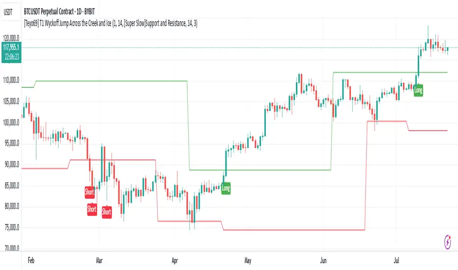
Trident Swing Projector [MarkitTick]💡 A structured swing-projection tool that automates Charles Lindsay's Trident quarter-swing method, turning a manual charting technique into a filtered, alert-ready framework for identifying retracement setups and projecting forward trade levels from a confirmed three-point swing structure.
✨ Originality and Utility
This script's value is not in reinventing pivot detection — left/right bar pivot confirmation is a known technique — but in the specific architecture built around it. The 25/50/75/100% level ladder projected from the retracement point follows the quarter-swing framework described by Charles Lindsay in his Trident work: a method of projecting Support/Resistance, Critical, and Equality points from a confirmed A-B-C swing. Everything surrounding that ladder — the pullback-depth gate, the dominant-trend filter, the ADX and higher-timeframe confluence layers, the configurable stop buffer, the armed-setup expiry, and the post-TP1 break-even handling — are MarkitTick design additions layered on top of Lindsay's original concept, not part of it.
The reason these pieces are combined rather than published separately is that a quarter-swing projection on its own is only as useful as the swing that produced it. A shallow, weak, or counter-trend retracement produces a projection ladder that is statistically less meaningful than one built from a decisive, trend-aligned impulse. The trend filter, pullback-depth window, ADX threshold, and HTF bias check all exist to answer one question before a projection is drawn: was this A-B leg significant enough to justify projecting from it? The trade-management layer (stop buffer, expiry, break-even) then exists to turn that projection into something that can be monitored and alerted on in real time, rather than only viewed as a static drawing. Each component is a gate or a consequence of the others; none of them functions as an independent indicator bolted on for its own sake.
The script is an indicator, not a strategy — it does not backtest or simulate equity. It identifies swing structures, projects levels from them, tracks whether those levels are subsequently reached, and reports all of this through a live dashboard and structured alert payloads.
🔬 Methodology and Concepts
● Confirmed Pivot Detection
Swing highs and lows are identified using a left/right bar-count pivot method: a candidate high or low is only confirmed once it has stood as the extreme point across both the bars to its left and the bars to its right, using the Pivot Left and Pivot Right settings. Because the check always references bars that have already closed, a pivot is never inferred from the currently forming bar — it is published exactly one bar after its right-side confirmation window completes. This is a deliberate implementation choice made to keep pivot detection non-repainting.
● The A-B-C Swing Structure
Once two consecutive confirmed pivots exist, the script watches for a third pivot that retraces into the prior leg:
Point A — the origin pivot (a confirmed swing low ahead of a bullish setup, or swing high ahead of a bearish one).
Point B — the impulse pivot that follows A, defining the A-B leg.
Point C — a new, opposing pivot that pulls back into the A-B leg by a percentage between the Min Pullback % and Max Pullback % settings (23.6–78.6% by default). Pullbacks shallower or deeper than this window are rejected and no setup is formed.
If the Trend Filter is enabled, the A-B leg must also break the previous confirmed swing extreme in the same direction (B must exceed the prior swing high for a bullish setup, or undercut the prior swing low for a bearish one) before a retracement at C is allowed to qualify. This restricts setups to legs that are extending the dominant swing rather than forming inside a range.
● Leg Measurement and Smoothing
The A-B leg is measured either in raw price points or as a percentage move, depending on the Swing Unit setting. Before that leg size is used to derive projection levels, it can optionally be passed through one of five smoothing methods — SMA, RMA, WMA, HMA, or VWMA — set by Signal Smoothing and Smoothing Length. The smoothing is applied as a ratio between the smoothed and raw leg size and multiplied into the current leg, so that projection distances are influenced by the recent typical swing size on the instrument rather than reacting entirely to the size of a single leg. With Signal Smoothing set to None, the raw leg size is used unmodified.
● Quarter-Swing Level Projection
From point C, four levels are projected using fixed fractions of the A-B leg, applied in the direction of the new setup:
25% of the leg → Entry level.
50% of the leg → TP1, labeled as the Critical level in Lindsay's terminology.
75% of the leg → TP2.
100% of the leg → TP3, the Equality target — a projected swing from C equal in size to the original A-B leg.
The Stop is placed at point C itself, with an optional buffer applied beyond it — either a fixed number of ticks or a fraction of the current ATR (ATR Length setting) — configured through Stop Buffer, Buffer Ticks, and Buffer ATR Fraction.
● Confluence Filters
Two independent filters can each block a setup from arming even after a valid A-B-C structure is found:
ADX Filter — requires the DMI-derived ADX value (ADX Length setting) to be at or above the ADX Threshold before a setup is allowed to arm, intended to avoid projecting swing levels during weak-trend, low directional-strength conditions.
HTF Confirmation — requests a higher timeframe's close (HTF Timeframe setting) and compares it against the prior higher-timeframe close to derive a simple directional bias. A setup is only allowed to arm if this bias agrees with the setup's direction. The higher-timeframe read uses a confirmed prior-bar close with lookahead correctly paired to that offset, so this filter does not draw on unconfirmed higher-timeframe data.
● Trade Management and State
Once a setup arms, it steps through a defined state sequence: Armed, Active (entry triggered), TP1 hit, TP2 hit, TP3 hit, Stopped, or Cancelled. Entry triggers when a confirmed close crosses the Entry level; a setup is cancelled if its Armed Expiry Bars limit is reached before entry, or if price closes back through point C first. If Stop to Breakeven after TP1 is enabled, the internally tracked stop moves to the entry price once TP1 is hit — this managed stop is reported in the dashboard and in alert payloads, but the stop line and label drawn on the chart intentionally remain at the original level, so the chart never displays a level implying a fill that did not actually occur at that price.
● Confirmation Lag Notice
Because pivot confirmation requires Pivot Right bars to elapse, and entry/cancellation logic checks a confirmed prior-bar close, every swing structure, entry trigger, and cancellation event appears with a built-in lag relative to the exact bar that produced it. This is a structural trade-off, not a defect: it is what keeps the A-B-C structure and its projected levels from repainting once drawn. Separately, TP1/TP2/TP3 target detection and the corresponding alerts monitor the current bar's high/low in real time rather than waiting for bar close, so a target can be marked and alerted as reached intrabar, before that bar has finished forming. This is standard behavior for real-time level-touch monitoring, but it means the exact moment a target fires can occur before the bar closes.
🎨 Visual Guide
A · B · C labels — small grey markers placed at the three confirmed pivots that define the active setup, drawn once the pattern is confirmed (so they sit slightly in the past relative to the bar that produced them).
Projected Leg — a dashed grey line running from point C forward to the TP3 price level, spanning a time distance matched to the original A-B leg's bar length. This shows the projection visually before price has necessarily reached it.
Entry line and label — a dashed blue line at the 25% projection level, labeled with the exact price.
Stop line and label — a solid line at point C (plus buffer, if configured), colored to match the Bearish color setting, labeled with the exact price. The label updates to show a hit confirmation and the resulting percentage move once the stop is reached, noting separately if the exit was a trend-failure stop or a break-even exit.
TP1 / TP2 / TP3 lines and labels — dashed lines at the 50/75/100% levels, each labeled with price and the resulting reward-to-risk multiple. Each label updates to show a hit confirmation and percentage move once reached.
BULL / BEAR entry marker — a small label placed at the bar where the Entry level is actually crossed, confirming the setup transitioned from Armed to Active.
Dashboard table — a live panel (toggled and positioned via the Dashboard settings) showing direction, state, entry/stop/managed-stop/target prices, reward-to-risk bars for each target, pullback depth, A-B swing size, bars since entry, HTF bias, ADX condition, and active smoothing method.
Non-standard chart warning — if the chart is displaying Heikin Ashi, Renko, Kagi, Point & Figure, Linebreak, or Range bars, a warning label appears directly on the chart, since projected price levels are not meaningful on synthetic bar types.
📖 How to Use
Wait for a confirmed A-B-C structure to complete. The A and B markers appear once a swing has formed, and the C marker (with entry/stop/target lines) appears only once a pullback within the configured percentage window is confirmed.
Treat the Entry line as the level the script is watching for a confirmed close through, not an instruction to enter immediately at C.
Use the Stop line as the invalidation level for the setup — a confirmed close back through point C cancels an armed setup outright.
Read TP1 (Critical), TP2, and TP3 (Equality) as sequential projection targets rather than a single expected outcome; the dashboard's reward-to-risk bars for each target update as price approaches or reaches them.
Check the HTF Bias and ADX rows in the dashboard if those filters are enabled, to understand why a structurally valid A-B-C pattern may not have armed.
Use the webhook alert payload's state and event fields to drive automation, rather than relying on price levels alone, since the payload also reports the managed (break-even) stop separately from the originally drawn stop.
⚙️ Inputs and Settings
● Core
Pivot Left / Pivot Right — bar counts required on each side of a swing point before it is confirmed as a pivot. Larger values produce fewer, more significant, and later-confirmed pivots.
Swing Unit — measures the A-B leg in raw price Points or as a Percent move, changing how leg size (and therefore all projected distances) is calculated.
● Filters
Trend Filter — requires the A-B leg to break the prior confirmed swing extreme in the setup's direction.
Min Pullback % / Max Pullback % — the acceptable retracement depth window for point C, as a percentage of the A-B leg.
HTF Confirmation / HTF Timeframe — requires a higher-timeframe directional bias to agree with the setup direction before arming.
ADX Filter / ADX Length / ADX Threshold — requires trend strength (via DMI/ADX) to clear a minimum threshold before arming.
Signal Smoothing / Smoothing Length — applies SMA, RMA, WMA, HMA, or VWMA smoothing to the leg magnitude used for projections.
● Trade Tools
Lock Signal — freezes the current signal and blocks any new setup from arming.
Stop Buffer / Buffer Ticks / Buffer ATR Fraction / ATR Length — adds extra distance beyond point C when placing the stop, either as a fixed tick count or a fraction of ATR.
Armed Expiry Bars — cancels an armed (not yet triggered) setup if the Entry level isn't closed through within this many bars.
Stop to Breakeven after TP1 — moves the internally tracked (managed) stop to entry once TP1 is hit, reported in the dashboard and alerts without moving the drawn stop line.
● Visuals and Dashboard
Trade Levels / A · B · C Markers / Projected Leg / Entry Markers — independent toggles for each chart element.
Keep Last N Setups — limits how many historical setups' drawings remain on the chart, to stay within drawing object limits.
Show Dashboard / Position — toggles and positions the live info panel.
● Alerts
Long / Short / Close Long / Close Short / Info Action strings — customizable text values inserted into the "action" field of the JSON alert payload, for direct use in webhook automation.
● Colors
Independent color controls for bullish/bearish/neutral tones, stop, entry, target, A·B·C markers, projected leg, label text, and dashboard header/body/text colors.
🔍 Deconstruction of the Underlying Scientific and Academic Framework
The projection ladder at the core of this script is drawn from the Trident method associated with Charles Lindsay, a framework built around measuring a swing's magnitude and projecting proportional fractions of it forward from a retracement point to derive Support/Resistance, Critical, and Equality levels. The underlying premise is that markets frequently move in self-similar proportional legs, so a retracement of a known size can be used to project plausible forward extension distances — the 50% "Critical" level and the 100% "Equality" level (a projected move matching the original leg) are the two most emphasized points in that framework, reflected here in TP1 and TP3 respectively.
The pullback-depth window applied to point C (23.6–78.6% by default) situates the acceptable retracement zone within a range commonly associated with Fibonacci retracement theory, without asserting that Fibonacci ratios themselves drive the projection math — the projection ladder here is a fixed 25/50/75/100% division of the leg, independent of the retracement percentage that qualified point C.
The ADX/DMI filter is grounded in Welles Wilder's directional movement framework, which measures trend strength by comparing the smoothed magnitude of directional price movement to overall volatility; applying a minimum threshold is a common approach to excluding range-bound conditions from directional setups, though ADX is a lagging, smoothed measure and does not itself predict continuation.
The higher-timeframe bias filter reflects multi-timeframe confluence theory: the idea that a directional bias visible on a longer aggregation of price is a useful, if imperfect, filter for shorter-timeframe setups, since it reduces (but does not eliminate) the chance of trading against the prevailing higher-timeframe trend.
The leg-smoothing step applies standard moving-average theory (simple, exponential-family, weighted, Hull, and volume-weighted variants) not to price directly, but to the derived leg-size series, an approach intended to make projected distances reflect a instrument's typical recent swing amplitude rather than the idiosyncrasies of a single leg.
⚠️ Disclaimer
All provided scripts and indicators are strictly for educational exploration and must not be interpreted as financial advice or a recommendation to execute trades. We expressly disclaim all liability for any financial losses or damages that may result, directly or indirectly, from the reliance on or application of these tools. Market participation carries inherent risk where past performance never guarantees future returns, leaving all investment decisions and due diligence solely at your own discretion. Indicator

Liquidity Draws A clean map of potential liquidity draws above and below price, with on-chart levels and two tables showing each draw’s price and distance.
What it tracks
- Previous Day High and Low
- Session highs and lows: Asia, London, New York AM and PM
- 09:30 New York opening-candle high and low
- News-release wicks: one-minute candle extremes at manually configured release times
- Fair Value Gaps and optional inverse FVGs
- Equal and relatively equal highs and lows, with adjustable detection tolerances
Timeframe-aware display
Session levels are hidden on charts above 1H. FVGs and iFVGs are displayed only when their source timeframe is equal to or higher than the chart timeframe, keeping lower-timeframe gaps off higher-timeframe charts.
Select daily or weekly gap sources in the settings to display those gaps on higher-timeframe charts.
Clear chart presentation
Levels are anchored to their originating candles where one-minute history is available. Optional gap boxes show the full imbalance zone, while spaced labels and connector lines help reduce clutter.
Customise line styles, widths, colours and transparency, along with gap-box fills and borders. Chart-level limits and table-row counts are adjustable.
Mitigation and tracking
Liquidity levels are retired when touched. FVG mitigation can use first-touch or full-fill rules. Optional iFVG tracking identifies gaps that invert following a qualifying source-timeframe close through the opposite boundary.
Tracking updates from completed one-minute candles, rather than waiting for the higher-timeframe chart candle to close.
Important notes
News times are entered manually; the indicator does not automatically identify high-impact economic releases. Historical coverage depends on available one-minute data. Equal-high/low detection uses confirmed pivots, so levels appear only after the required confirmation bars.
Liquidity draws are reference levels—not guaranteed destinations or standalone entry signals. This indicator does not establish a win rate or guarantee profitability. Indicator

Auto Trend Channels [AFD]A trend channel is only worth drawing if price actually respected it. This script builds every channel from three confirmed swing pivots, checks each bar between the anchors against the boundaries, and puts the channel on your chart only once a bar has closed inside it. Then it marks, on the drawing itself, the exact bar it became usable - so you always know which part of the channel is history and which part you could have acted on.
WHAT IT DOES
Auto Trend Channels finds parallel channels from confirmed swing pivots and follows each one through its whole life: accepted, broken, retouched, returned or expired.
Three pivots, exact geometry - a rising channel joins two rising swing lows and runs its upper boundary parallel through the swing high between them. A falling channel joins two falling swing highs, with the parallel through the swing low between. No regression fit, no approximate parallels.
Every bar between the anchors is checked - a candidate is rejected if any bar in its span pokes past a boundary by more than your Containment allowance. Its width has to sit between your Minimum and Maximum width, both measured in units of the chart's own average range, frozen when the channel is built.
Usable means a bar closed inside it - a channel is drawn only after a confirmed close lands between its boundaries. The dotted vertical Known line marks that bar.
One active channel per layer - a newer candidate never replaces an intact channel. Turn on Longer swing channel for a second, larger layer on the same timeframe, drawn heavier and fainter so the two stay tellable apart.
HOW A CHANNEL LIVES AND DIES
Active - solid boundaries in the rising or falling colour, shaded inside, extending to the current bar. The label at the right edge reads the direction and Active.
Close outside - the first confirmed close beyond a boundary, past your Close allowance, starts a return watch. The channel switches to the history colour, goes dashed, loses its shading, and its label reads Watching above or Watching below. It keeps extending while the watch runs.
Boundary retouch - the first later bar whose high or low reaches the broken boundary while the close stays outside gets a one-time mark on that channel. Recorded once, never counted or rated.
Returned inside - a confirmed close back between the boundaries within the watch window finishes the channel as Returned inside. A finished channel never reactivates.
Watch ended - no close back inside within the window, and the channel is finished with its right edge frozen where it ended. Separately, once a channel's first anchor passes your horizon it is retired and leaves the chart, whatever state it was in.
Finished channels stay on the chart up to your Retained channels count, dashed and grey, so you can see what each channel did after it broke. Channels hidden by that count keep running their watch and still alert.
WHAT YOU GET ON THE CHART
Upper and lower boundaries, with an optional midpoint and quarter lines.
The Known marker on a dotted vertical line at the acceptance bar.
Event labels at the bar that produced them, offset clear of the candles: Close above, Close below, Boundary retouch, Returned inside.
Optional A, B and C markers on the three source pivots.
An optional Forming channel view: the candidate a layer is currently building, dotted, faint and labelled as not accepted. Off by default, because a candidate can change or vanish before it is accepted.
A corner notice stating linear-price geometry and confirmed-pivot delay, with an optional status panel: per-layer state, live boundary prices, watch counts and how many sets are drawn.
Nine colour themes, including Paper for light charts and a Colourblind safe palette built on the published Okabe-Ito blue and vermilion, plus Custom pickers.
Three display switches - Channel labels, Channel fill and Corner table - to strip the drawing down to the lines alone when you want a clean chart.
ALERTS AND THE DATA WINDOW
Ten named alert conditions - Formed, Close above, Close below, Returned inside and Boundary retouch, for each layer - plus one combined dynamic alert that lists every enabled event on the bar with its layer, the channel's anchor timestamps and its raw boundaries. Each alert switch gates both the named condition and the combined message. Twenty Data Window plots expose the live upper, mid and lower values, the acceptance bar, the event flags and the watch counts, so every number on the chart can be read and exported.
SETTINGS WORTH KNOWING FIRST
Swing length sets how many bars either side confirm a pivot: raise it for fewer, larger, later channels, lower it for more, smaller, sooner ones. Pivots searched is how far back each construction reaches. Containment allowance, Minimum width and Maximum width are all multiples of the average true range frozen at construction, so they carry across symbols and timeframes without retuning. Close allowance is how far a close must clear a boundary before it counts as outside; 0 accepts any close beyond. Return watch is how many bars a broken channel is watched for a close back inside. Most tooltips end with a concrete example of what changing that setting does.
WHAT IT WILL NOT DO
It is not a signal tool. A channel is a description of where price has already been, and a break, a retouch or a return is a description of a close that already happened. Nothing here is an entry, an exit, a target, a probability or evidence of an edge, and no channel is ranked against another. Retouches are marked, never counted.
WHAT IS DISCLOSED RATHER THAN HIDDEN
Channels appear late by design. A pivot confirms Swing length bars after it prints, and a channel is drawn only after a bar closes inside it, so a new channel first appears drawn back over earlier anchors. The Known marker shows exactly where the usable part starts: left of it is where the geometry came from, not something you could have traded.
Linear-price geometry. Boundaries are parallel in price per bar. On a logarithmic price axis they are not log-space parallels, and the script cannot detect your axis setting. Slope is per bar, so a channel keeps its slope straight across a weekend gap.
Standard time-based charts only. Renko, Kagi, Range, tick and other nonstandard charts get a corner warning and no channels.
Reconstruction can change with loaded history, session settings, data adjustments or inputs. Whether this script repaints has not been observed on a replay and is not claimed here either way; confirm it with the bar-replay tool on your own symbol and timeframe.
No request.*() calls, no higher-timeframe data, no volume. Everything is computed from the chart's own bars.
ORIGINALITY AND CREDIT
Most auto-channel scripts fit a regression line and offset it, or join two points and draw a parallel at a fixed distance. This one builds exact three-pivot geometry, validates the full span between the anchors, waits for a confirmed close inside before it calls the channel usable, marks that bar on the drawing, and follows the channel through a bounded watch after it breaks. The geometry, engine and label patterns are adapted from Auction Foundry's own Auto Trendlines, Classical Auto Chart Patterns and Zone Forge.
Open source under the Mozilla Public License 2.0. (c) Auction Foundry.
This indicator describes channel geometry built from your chart's own price history. It is not a forecast, not a signal, and not financial advice. Indicator

Swing Fibonacci Arcs & Volume Profile [BigBeluga]🔵 OVERVIEW
The Swing Fibonacci Arcs & Volume Profile is an advanced technical analysis indicator designed by BigBeluga to combine geometric Fibonacci arc projections with automated swing-anchored volume profile histograms directly on the chart. Traditional Fibonacci tools rely strictly on linear retracements or horizontal grids, often failing to account for circular expansion paths and volume distribution across structural market swings. To solve this limitation, this script automatically detects significant market swings, projects customizable elliptical Fibonacci arcs with band fills, and computes a detailed volume profile histogram complete with a Point of Control (POC) line.
The indicator visualizes confirmed swing lines, curved arc bands, volume profile distribution boxes, and custom percentage labels. The core calculations track rolling highs and lows, compute elliptical scaling parameters using adjustable horizontal and vertical multipliers, and aggregate volume bins across the active swing structure. Customizable color palettes, arc resolutions, and level toggles allow traders to fine-tune the system across various timeframes and asset classes.
🔵 HOW IT WORKS
The system operates through an integrated architecture where each component dynamically influences chart behavior:
1 — Swing Structure Engine
Swing Detection & Tracking: Scans rolling highest and lowest points using the Swing Structure input. To adapt this feature, set the length shorter (e.g., 30 to 50 ) to capture fast, short-term structural swings for day trading, or longer (e.g., 70 to 150+ ) for swing trading to focus on major macro market turning points.
Visual Line Mapping: Plots confirmed bullish and bearish swing lines using custom user-defined colors alongside real-time unconfirmed dashed projections.
2 — Fibonacci Arcs & Geometric Engine
Arc Expansion & Scaling: Projects elliptical arc bands from swing origins based on standard ratios (0.0%, 23.6%, 38.2%, 50.0%, 61.8%, 78.6%, 100.0%). Horizontal and vertical scaling factors ( Horizontal Scale (X) and Vertical Scale (Y) ) can be adjusted between 0.1 and 10.0 to modify the curvature and width of the arcs.
Resolution & Styling Controls: Adjusts arc smoothness via the Arc Resolution (Segments) input (set between 10 and 100 ) and controls border thicknesses, transparency levels, and individual band fill options.
3 — Volume Profile & POC Engine
Profile Generation: Constructs an automated volume profile histogram anchored to the active swing start point, scaled via the Profile Max Width (Bars) input.
Point of Control (POC): Identifies the highest volume bin within the swing range, rendering a distinct POC line and price label with customizable gradient coloring.
🔵 HOW TO USE
Apart from serving as a comprehensive geometric and order flow mapping tool, the indicator can be applied in several ways:
Identify Curved Support & Resistance Arcs: Monitor the intersection of price action with elliptical Fibonacci arcs (such as the 50.0% and 61.8% levels) to anticipate dynamic reversal zones during market pullbacks.
Analyze Volume Distribution Nodes: Inspect the volume profile histogram extending from the swing origin to spot heavy volume accumulation clusters.
Trade POC Rejections: Use the highlighted Point of Control (POC) line and volume tag as a primary reference level for potential breakouts or retests.
🔵 NOTES
Why this implementation is unique:
It merges advanced elliptical Fibonacci arc geometry with swing-anchored volume profile distributions.
Features dynamic polyline rendering, customizable gradient color fills, and robust array management optimized for Pine Script version 6.
Provides extensive modular toggles for individual arc ratios, line widths, and profile displays.
Indicator

Breakout Retest Signals [algotim]Overview
Breakout Retest Quality Signals is a price-structure indicator designed to distinguish ordinary level breaks from breakouts that produce a meaningful retest.
The script does not treat every cross of a swing level as a valid breakout. A confirmed swing high or low first establishes the structural reference. Price must then close beyond that level by a minimum ATR-adjusted distance. Once the breakout qualifies, the script creates a volatility-scaled zone around the broken level and monitors the following price action for a retest.
The central purpose of the indicator is to evaluate the quality of that retest rather than simply marking every touch of the broken level.
Problem Statement
A basic breakout indicator can produce signals whenever price moves marginally above or below a previous high or low. Likewise, a basic retest indicator may treat any return to the broken level as confirmation.
Those approaches do not distinguish between a decisive breakout followed by a controlled rejection and a weak breakout followed by deep penetration of the level.
This script addresses that problem by separating the setup into three stages:
**structural breakout -> volatility-scaled retest zone -> retest quality evaluation**
This makes the retest itself part of the signal validation process.
Methodology
1. Confirmed structural levels
The script uses confirmed pivot highs and pivot lows to establish the most recent structural reference points.
A pivot is confirmed using the configured swing length, so the structural levels are not based on unconfirmed turning points.
2. ATR-qualified breakout
A bullish breakout occurs when price crosses above the most recent confirmed pivot high.
A bearish breakout occurs when price crosses below the most recent confirmed pivot low.
The breakout must also exceed the configured minimum breakout strength, measured as a multiple of ATR:
**Bullish displacement = close - broken high**
**Bearish displacement = broken low - close**
The displacement must be at least the user-defined ATR multiple.
This prevents small crosses around a structural level from automatically becoming breakout events.
3. Dynamic breakout zone
After a qualified breakout, the script creates a zone around the broken structural level.
The zone width is calculated from ATR rather than from a fixed number of ticks or points:
**Zone width = ATR x Zone Width Multiplier**
This allows the same methodology to account for different volatility conditions.
For a bullish breakout, the broken level becomes a potential support area.
For a bearish breakout, the broken level becomes a potential resistance area.
4. Retest monitoring
After the breakout, the zone remains active while the script waits for price to return to it.
The retest is only considered during the configured retest window. The zone also has a maximum lifetime so that an old breakout does not remain active indefinitely.
This creates an explicit state sequence rather than evaluating every bar independently:
**Breakout detected -> zone active -> retest pending -> retest evaluated -> confirmed or invalidated**
5. Retest Quality Engine
The primary differentiating component is the Retest Quality Engine.
When price enters the breakout zone, the script measures how deeply price penetrates the zone before moving back in the breakout direction.
Penetration is normalized against the width of the zone, allowing the measurement to remain related to the current volatility regime.
The resulting quality score favors relatively shallow and decisive rejection while assigning lower quality to deeper penetration.
The score is then compared with the user-defined minimum quality threshold.
This means that touching the zone alone is not necessarily enough to generate a signal.
6. Rejection confirmation
When the rejection-candle option is enabled, the retest must also close back outside the zone in the original breakout direction.
For a bullish setup, price must reject the zone and close back above it.
For a bearish setup, price must reject the zone and close back below it.
This additional condition separates a retest rejection from a simple penetration of the breakout area.
Signal Workflow
Bullish workflow
1. A confirmed pivot high establishes a structural resistance level.
2. Price crosses above that pivot.
3. The close must exceed the pivot by at least the configured ATR displacement.
4. A bullish breakout zone is created around the broken level.
5. The script waits for price to return to that zone.
6. Penetration depth is measured relative to the zone width.
7. The Retest Quality Engine converts the penetration into a quality score.
8. If the score meets the minimum threshold, the retest can qualify.
9. When rejection-candle confirmation is enabled, price must close back above the zone.
10. A bullish confirmation is then displayed.
Bearish workflow
1. A confirmed pivot low establishes a structural support level.
2. Price crosses below that pivot.
3. The close must exceed the pivot by at least the configured ATR displacement.
4. A bearish breakout zone is created around the broken level.
5. The script waits for price to return to that zone.
6. Penetration depth is measured relative to the zone width.
7. The Retest Quality Engine calculates the retest quality.
8. If the score meets the minimum threshold, the retest can qualify.
9. When rejection-candle confirmation is enabled, price must close back below the zone.
10. A bearish confirmation is then displayed.
Why This Indicator Is Different
A conventional breakout script generally answers one question:
**Did price break the level?**
A conventional retest script generally adds:
**Did price come back to the level?**
This indicator adds another layer:
**How cleanly did price reject the breakout zone after returning to it?**
The distinction is important because not all retests have the same structure.
The implementation combines the breakout and retest stages into one state-based process. ATR is used in two separate but related ways: first to filter weak structural breaks, and then to scale the breakout zone to current volatility.
The Retest Quality Engine then evaluates the interaction with that zone rather than treating every retest as equivalent.
The result is a more selective breakout-retest workflow instead of a collection of unrelated indicators.
Inputs
Structure Detection
**Swing Lookback (Pivot Length)**
Controls the number of bars used to confirm swing highs and lows.
**Minimum Breakout Strength (x ATR)**
Sets the minimum closing displacement beyond the structural level required for a breakout.
Breakout Zone
**Zone Width (x ATR)**
Controls the width of the dynamic breakout zone.
**Zone Max Lifetime (bars)**
Limits how long a breakout zone remains active.
Retest and Quality Engine
**Max Bars to Wait for Retest**
Defines the maximum number of bars allowed between breakout and retest.
**Minimum Retest Quality Score**
Sets the minimum quality score required for confirmation.
**Require Rejection Candle on Retest**
Requires the retest candle to close back in the breakout direction.
Volatility
**ATR Length**
Controls the ATR calculation used for breakout displacement and zone sizing.
Visual Style
The visual settings control bullish and bearish colors, zone opacity, confirmation labels, and the number of active zones displayed.
Alerts
The script can be used with TradingView alerts for the available confirmation conditions.
Alerts should be configured from the script's available alert conditions after adding the indicator to the chart.
Practical Usage
The indicator is intended to be used as a structural price-action filter.
A practical workflow is to first identify the direction and broader market context, then use the script to monitor qualified structural breaks and their subsequent retests.
Higher minimum breakout-strength and retest-quality settings will generally make the conditions more selective.
Lower thresholds will allow more setups but may also admit weaker breakouts and less decisive retests.
The breakout zone can also be used as a visual reference for evaluating whether price is accepting or rejecting the broken structure.
Signals should be evaluated together with the instrument, timeframe, market conditions, and the trader's own risk-management process.
Limitations
Pivot levels require confirmation and therefore are identified only after the required swing bars have formed.
A breakout that satisfies the ATR threshold does not guarantee continuation.
The quality score measures the geometry of the retest relative to the calculated zone; it does not predict the future direction or magnitude of price movement.
ATR-based measurements adapt to volatility but do not eliminate market noise.
A retest can fail after confirmation, particularly during rapidly changing or range-bound conditions.
The indicator is an analytical tool and should not be interpreted as a guarantee of profitable trading results.
Notes
This script is based on a single price-structure workflow: confirm the structural level, qualify the breakout using ATR displacement, define a volatility-scaled zone, monitor the retest, and evaluate the quality of the rejection.
The intention is to provide a consistent framework for studying breakout-retest behavior rather than to claim that every qualified setup will produce continuation. Indicator

Multi-Timeframe Supertrend Pro [algotim]Overview
Multi-Timeframe Supertrend Consensus is a trend-analysis indicator designed to address a common problem with single-timeframe trend signals: a direction change on one chart timeframe does not necessarily represent a broader change in market direction.
Instead of treating one Supertrend state as the complete trend decision, the script evaluates up to three independently configured Supertrend calculations and converts their directional states into a single timeframe-consensus reading.
The purpose is to distinguish isolated timeframe changes from situations where multiple timeframe structures are aligned.
Problem Statement
A conventional Supertrend evaluates price direction from one timeframe. This can be useful for identifying local trends, but it can also produce direction changes that are not supported by the broader timeframe structure.
A trader may therefore see a bullish change on the chart timeframe while the higher timeframe remains bearish.
This script addresses that problem by separating trend detection into three layers:
1. Primary trend on the current chart timeframe.
2. Confirmation trend on an optional timeframe.
3. Higher-timeframe trend on a configurable timeframe.
The resulting directional states are evaluated together rather than interpreted independently.
Methodology
Each Supertrend calculation uses ATR-based bands derived from the selected ATR length and multiplier.
The calculation begins from the midpoint price (`HL2`) and determines upper and lower volatility-adjusted bands using ATR.
The Supertrend state then maintains directional continuity until price crosses the relevant previous band. A bullish state uses the upper calculated Supertrend line, while a bearish state uses the lower line.
The three calculations are independently parameterized, allowing the confirmation and higher-timeframe models to use different ATR lengths and factors from the primary model.
For non-current timeframes, the script requests the corresponding Supertrend state through `request.security()` using `barmerge.lookahead_off`. This prevents the requested timeframe from intentionally using future bars.
The important part of the architecture is what happens after these calculations: their directional states are counted and evaluated through a configurable consensus threshold.
Signal Workflow
The analytical workflow is:
1. Calculate the primary Supertrend using the current chart timeframe.
2. Calculate the optional confirmation Supertrend using the selected confirmation timeframe.
3. Calculate the higher-timeframe Supertrend using the configured higher timeframe.
4. Determine whether each Supertrend is bullish or bearish.
5. Count the number of aligned bullish and bearish timeframe states.
6. Compare that alignment against the user-defined consensus threshold.
7. Issue the corresponding consensus trend state when sufficient timeframe agreement exists.
8. Display the individual Supertrend lines and the consensus information so the trader can see both the underlying states and the resulting agreement.
The consensus threshold controls how selective the framework is. A lower threshold allows a signal with less agreement, while requiring all three timeframes produces the strictest alignment condition.
Why This Indicator Is Different
The primary purpose of this script is not to provide three separate Supertrend lines.
Its purpose is to convert multiple Supertrend states into a **single timeframe-agreement framework**.
A conventional Supertrend answers:
> "What is the trend according to this timeframe?"
This script adds another question:
> "How many of the monitored timeframes agree with that direction?"
This distinction is useful when a trader wants to separate local trend changes from broader directional alignment.
The confirmation and higher-timeframe calculations are also independently configurable rather than being simple copies of the primary settings. This allows the user to make the faster timeframe more responsive while keeping the broader timeframe more selective.
The resulting workflow can therefore be viewed as:
**Local trend -> Confirmation trend -> Higher-timeframe trend -> Agreement calculation -> Consensus state**
This is the central analytical contribution of the script.
Inputs
Primary Supertrend
Controls the Supertrend calculated directly on the chart timeframe.
* ATR Length
* Factor
Confirmation Supertrend
Controls the optional second timeframe calculation.
* Timeframe
* ATR Length
* Factor
Leaving the timeframe blank uses the primary chart-timeframe calculation.
Higher-Timeframe Supertrend
Controls the broader trend reference.
* Timeframe
* ATR Length
* Factor
Consensus Engine
Controls how much timeframe agreement is required.
* Minimum Timeframes Needed for Signal
* Confidence Shading
A threshold of 3 requires all three monitored states to agree and therefore provides stricter filtering than a threshold of 2.
Visual Settings
The script provides independent visibility controls for:
* Primary Supertrend line
* Confirmation Supertrend line
* Higher-timeframe Supertrend line
* Consensus entry signals
Bullish and bearish colors can also be customized.
Alerts
The script provides alert functionality for its consensus-based trend events.
Alerts should be configured from the indicator's available TradingView alert conditions/functions after adding the script to a chart.
Practical Usage
A practical workflow is to use the primary Supertrend to observe the local market direction while using the confirmation and higher-timeframe calculations to determine whether that direction is supported by broader timeframe structure.
For example, requiring two of three timeframes to agree can provide a moderate filtering level. Requiring three of three creates a stricter consensus condition and may result in fewer signals.
The individual lines should remain visible while evaluating the indicator so that the trader can see why a consensus state was produced rather than treating the consensus output as a standalone trading decision.
The indicator can be used for trend filtering, directional analysis, and identifying periods of stronger multi-timeframe alignment.
Limitations
Supertrend remains a reactive, volatility-based trend-following calculation. It does not predict future price movement.
Because the methodology depends on ATR and price crossings, rapid volatility changes can produce direction changes or conflicting timeframe states.
Higher-timeframe values also update according to the availability of confirmed data from their respective timeframe. Signals should therefore be evaluated with awareness of the timeframe relationship.
A consensus state indicates agreement between the configured Supertrend calculations; it does not guarantee continuation of the resulting trend.
The indicator is an analytical tool and should not be treated as a standalone trading system or a guarantee of future performance.
Notes
The script is designed to make multi-timeframe Supertrend agreement visible within one analytical framework.
Its main distinction from a conventional single-timeframe Supertrend is the explicit consensus layer that evaluates the directional state of multiple independently configured timeframe calculations.
Users should select timeframe and ATR parameters appropriate to the instrument and timeframe being analyzed and validate the resulting signals with their own market analysis and risk-management process. Indicator

Edo Swing LevelsEdo Swing Levels — Tracks the Swing High and Low, Marks the Strong Level Defending the Trend and Flags the CHoCH When It Breaks
At any moment, market structure comes down to two prices: the last swing high and the last swing low. But they are not equal. One of them is the level that defends the current trend —the one a trader watches to know whether the trend continues or breaks— and the other is only a matter of time before it is taken. Edo Swing Levels keeps both always in view and, crucially, tells them apart.
It marks the level defending the trend as Strong —a solid, marked line— and the other as Weak —a dashed, faded line. In an uptrend the swing low is Strong (the support that holds) and the high is Weak; in a downtrend the swing high is Strong (the cap that holds) and the low is Weak. When price closes through the Strong level, a change of character (CHoCH) occurs: the structure that held the trend up breaks, the bias flips and the roles swap. Everything is validated on closed bars, so it does not repaint. The strong and weak levels, their roles and the change of character are all resolved on the chart's own series, with nothing else required.
STRONG AND WEAK LEVELS
The indicator keeps the last confirmed swing high and swing low, and classifies them by the bias. In a bullish bias, the low is the Strong level and the high is Weak. In a bearish bias, the high is Strong and the low is Weak. The Strong level is drawn solid, thicker and at full opacity; the Weak level is dashed, thinner and faded. Each line carries a label —Strong High, Weak High, Strong Low or Weak Low— and both are projected to the right by a configurable number of bars so they sit ahead of price as live references. The high level is red and the low level teal by default, with a neutral gray until a trend is defined.
SWING PROFILES
The sensitivity of the levels is set by the Swing Profile: Scalper (5 bars each side) for fast intraday levels on low timeframes, Swing (10 bars, the default) for the balanced 4H and daily read, and Long Term (21 bars) for the major levels on weekly and higher horizons. The larger the length, the more significant a turn has to be, and the more important and spaced out the marked levels are.
BIAS AND CHoCH
The bias is inferred from the breaks of structure and is what decides which level is Strong and which Weak. A close above the last swing high turns the bias bullish; a close below the last swing low turns it bearish. The decisive event is the change of character: when price closes through the Strong level —below the Strong Low in an uptrend, or above the Strong High in a downtrend— the trend that the level defended breaks, the bias flips and the strong level becomes weak. Taking out the Weak level, by contrast, is a simple continuation that confirms the trend without changing it. The solid/dashed distinction separates, at a glance, the decisive level from the one that is a mere target.
INFORMATION PANEL
A compact panel under the indicator header shows the market bias (Bullish / Bearish / Neutral) and, for the high and the low, their exact price and whether each is the Strong or Weak level, in the same red/teal color code. The bias row gives the direction; the High and Low rows give the prices and, above all, which of the two is the Strong level to watch. The panel sits in any of the four chart corners (Top Right by default), comes in three sizes (Tiny / Small / Normal) and two themes (Dark / Light), and can be hidden entirely. To keep the calculation light, it is drawn only on the last bar.
NO REPAINTING
Levels are built on confirmed pivots and breaks are validated on closed bars, so a level never appears or disappears intrabar and a wick that pierces a level but closes back on the same side does not count as a break. There are no higher-timeframe functions: all logic runs on the current chart timeframe. For a multi-timeframe read, apply it on several charts at once.
CONFIGURATION
The inputs are grouped by block. Structure sets the swing profile and how many bars the levels are projected to the right. Style exposes the high-level and low-level colors, the neutral color, the label size and the Dark/Light theme. Panel controls panel visibility, position and size. The defaults are calibrated to work without adjustment on stocks, crypto, forex, indices and futures, on any timeframe — the input most users touch is the Swing Profile, to set the sensitivity of the levels to their trading horizon.
ALERTS
Four predefined alerts cover the structure read. Strong High taken and Strong Low taken fire on the change of character —when price closes through the Strong level and the trend turns— and are the context alerts. New swing high and New swing low fire when a new level is fixed. All alerts fire on bar close, consistent with the indicator's anti-repaint validation.
HOW TO READ IT
Take the Strong level as your invalidation line: while price respects it, trading with the bias has the wind at its back, and its close-through is the signal that the trend has broken. Take the Weak level as your target: in an uptrend price tends to go for the weak high, in a downtrend for the weak low, and the distance between the two levels gives the room available inside the current structure. And treat the taking of the Strong level as the cleanest turn warning —it often marks the start of a new leg in the opposite direction. Pairing it with the HH/HL/LH/LL sequence classification reinforces the read.
OPEN SOURCE
Edo Swing Levels is published as a free open source indicator. The full Pine Script is publicly accessible on TradingView for study, adaptation and integration into any workflow. Part of the Edolab Markets free tools ecosystem, all available on TradingView.
This indicator is a technical analysis tool for educational and informational purposes only. It does not generate automatic buy or sell signals and should not be considered financial advice. Trading financial markets involves significant risk of capital loss. Past performance does not guarantee future results. Always use proper risk management. Indicator

Smart Money Concepts [AxeAlgo]Overview
- Smart Money Concepts is a clean, non-repainting indicator designed for traders who want to identify institutional market structure without clutter.
The indicator visualizes where smart money is likely to defend, attack, and accumulate positions by displaying order blocks, fair value gaps, liquidity pools, and premium/discount dealing ranges on your chart.
What It Shows
Market Structure (CHoCH and BOS)Identifies when the market changes direction (Change of Character) and when new directional commitment breaks prior structure (Break of Structure). Each signal confirms only after a specified number of bars, ensuring no repainting.
Order BlocksHighlights the price zones where the last aggressive institutional movement originated. These are areas where smart money entered positions and often acts as support or resistance on subsequent pullbacks.
Fair Value GapsDetects imbalances between candlesticks (gaps not filled by wicks). The indicator marks these zones because institutions often return to fill them as price moves away.
Liquidity PoolsAutomatically identifies clusters of equal highs and equal lows where retail traders typically set stop losses. The indicator marks when price breaks through these pools (institutional sweeps).
Premium and DiscountDisplays whether price is trading above (premium) or below (discount) the 50% equilibrium level between the most recent swing high and low. Extreme premium or discount often precedes reversals.
How to Use It
Enable individual components using the dashboard toggles: Show Structure, Show Order Blocks, Show Fair Value Gaps, Show Liquidity Pools, Show Premium/Discount.
Turn on the dashboard to see your current swing bias, internal structure direction, and range position at a glance.
Auto-Tune automatically scales all sensitivity parameters based on your chart timeframe. Turn it off if you prefer manual tuning.
Use Simple Mode to display only swing structure without internal noise for a cleaner chart.
Key Settings
Confirmation Bars: How many bars confirm a pivot before a structure signal fires. Higher values filter out false signals but add lag. Default is 2.
Min Displacement: The minimum price movement (in ATR multiples) required for a structure signal to register. Default is 1.0 ATR.
Zone Sizing: Controls the minimum and maximum height of order blocks and FVGs. Adjust to filter noise or capture smaller opportunities.
P/D Lookback: How many bars back to scan for the swing high and low that define your premium/discount range.
Dashboard Position and Size: Choose where the info table appears and how large you want it.
Colors: Customize bullish, bearish, and gap colors to match your chart theme.
What This Indicator Is For
Smart Money Concepts is intended for traders who want to visually identify institutional order flow patterns and understand where smart money accumulates and distributes. It helps you:
Spot areas where institutions likely accumulated or distributed (order blocks and FVGs)
Recognize when price is overextended and vulnerable to reversal (premium/discount extremes)
Distinguish real structural breaks from noise during choppy consolidation
Plan entries and stops around levels where smart money defends
How It Works
The indicator uses pivot-point analysis to identify swing highs and lows, then marks the price zones where directional movement originated (order blocks). Fair value gaps are detected using standard three-candle imbalance logic. Liquidity pools are identified by clustering equal price levels within a configurable tolerance.
All signals confirm only on closed bars. Zones never repaint, but they shrink or change state as price action develops.
Limitations
The indicator shows 5 active zones at a time to keep your chart clean. If multiple institutional structures are forming simultaneously, older zones will age out. This is by design to prioritize the most recent price action.
This indicator identifies structural levels and patterns. It does not predict price direction or guaranteed support/resistance. Use it as one component of a complete trading plan, not as a standalone signal.
Fair value gaps and order blocks are useful but not infallible. Price may skip through them or reverse before reaching them.
Important Disclaimer
This indicator is for educational and analytical purposes only. It does not provide financial advice, and past performance does not guarantee future results. Trading involves risk of loss. Always use proper risk management, stop losses, and position sizing. Never risk more than you can afford to lose.
The accuracy and effectiveness of this indicator depends on your market conditions, timeframe, and trading methodology. Results vary by trader and asset class.
Indicator

Swing H/L + Multi TF Order BlocksFrench & english description
English
Indicator combining swing structure detection and multi-timeframe Order Blocks (OB), single-file overlay script.
Swing H/L: pivot high/low detection (ta.pivothigh/ta.pivotlow, configurable lookback length), now computed on a separate configurable timeframe (swingTF, defaults to chart TF) via request.security. Labels HH/LH (pivot highs) and LL/HL (pivot lows) plotted at the pivot bar's timestamp (xloc.bar_time), colored independently for highs/lows.
Order Blocks: detects OB formation via a rate-of-change threshold on open (sensitivity input) crossing over/under a % band. On a valid cross with a minimum bar spacing, it scans back 4-15 bars for the last opposite-color candle and uses its high/low as the OB zone. This runs independently on 4 user-configurable timeframes simultaneously (TF1-4, each with its own on/off toggle and timeframe picker), via 4 separate request.security calls, each keeping isolated per-TF state.
Box rendering: each OB is drawn as a box anchored by bar time (not bar index, so it stays aligned regardless of the TF it came from), colored by direction only (one global bullish color, one global bearish color — not per TF), with the source timeframe printed inside the box (formatted as "5M", "1H", "4H", "1D"...), text offset N bars to the right of origin (configurable), centered.
Mitigation: price returning into a zone marks it mitigated. Mitigation source (close or wick) and penetration threshold (1-100%) are both configurable and global across all 4 TFs. Mitigated OBs aren't deleted — they freeze (stop extending right) and get recolored gray (box, border, and TF text), kept visible up to the same max-count limit as active OBs (oldest gray ones drop off first).
Capacity control: maxOB input caps how many active (and separately, how many grayed-out mitigated) boxes are kept per timeframe per direction — oldest gets removed first.
Alerts: optional buy/sell alerts fire once per bar when price is inside an active bullish/bearish OB, labeled with the source timeframe.
Leftover/unused: candle-pattern description strings and a pattern user type from the original fusion are present but never referenced — dead code carried over, harmless.
Français
Indicateur combinant détection de structure swing et Order Blocks (OB) multi-timeframe, script overlay en un seul fichier.
Swing H/L : détection des pivots haut/bas (ta.pivothigh/ta.pivotlow, longueur configurable). Calculé maintenant sur une timeframe séparée configurable (swingTF, par défaut celle du chart) via request.security. Les labels HH/LH (pivots hauts) et LL/HL (pivots bas) sont placés au timestamp de la bougie pivot (xloc.bar_time), avec des couleurs indépendantes pour les hauts et les bas.
Order Blocks : détecte la formation d'un OB via un seuil de variation (rate of change) sur l'open (input sensitivity) qui croise une bande en %. Sur un croisement valide avec un espacement minimum entre bougies, l'algo cherche en arrière (4 à 15 bougies) la dernière bougie de couleur opposée et utilise son high/low comme zone d'OB. Ceci tourne indépendamment sur 4 timeframes configurables simultanément (TF1-4, chacune avec son interrupteur et son sélecteur de TF), via 4 appels request.security séparés, chacun conservant un état isolé par TF.
Affichage des box : chaque OB est dessiné comme une box ancrée sur un timestamp (pas un index de bougie, donc reste aligné quelle que soit la TF d'origine), colorée uniquement selon la direction (une couleur bullish globale, une couleur bearish globale — pas par TF), avec la timeframe source affichée dans la box (format "5M", "1H", "4H", "1D"...), texte décalé de N bougies vers la droite depuis l'origine (configurable), centré.
Mitigation : le prix qui revient dans la zone la marque comme mitigée. La source de mitigation (clôture ou mèche) et le seuil de pénétration (1-100%) sont configurables et globaux pour les 4 TF. Les OB mitigés ne sont pas supprimés — ils se figent (arrêt de l'extension à droite) et sont recolorés en gris (box, bordure et texte TF), conservés visibles jusqu'à la même limite que les OB actifs (les plus anciens gris disparaissent en premier).
Contrôle de capacité : l'input maxOB plafonne le nombre de box actives (et séparément, le nombre de box mitigées grisées) conservées par timeframe et par direction — la plus ancienne est supprimée en premier.
Alertes : alertes achat/vente optionnelles, déclenchées une fois par bougie quand le prix est dans un OB actif haussier/baissier, avec la timeframe source dans le message.
Résidus/inutilisé : les chaînes de description des patterns de bougies et un type pattern hérités de la fusion d'origine sont présents mais jamais utilisés — code mort sans impact. Indicator

FVG IFVG SMT Sweep Engine by Ticker TradingFair value gaps, their inversions, and SMT divergence against a correlated symbol, built to one specification instead of to the conventions that circulate in open Pine scripts. Where the two disagree, this follows the specification, and every disagreement is listed below.
FAIR VALUE GAPS
A gap is the three-candle pattern: candle 1 and candle 3 fail to overlap, candle 2 spans the space between. The zone runs from candle 3's high to candle 1's low on a bearish gap, and the reverse on a bullish one. The boundary that matters later is candle 1's low, or its high on a bullish gap.
You define mitigation: a wick into the zone, a touch of the midline (consequent encroachment), or a close past the far edge. Mitigated gaps then fade, delete, or stay put. Bullish and bearish gaps live in separate buckets, so "keep the last 10" means ten of each, whatever order they printed in. Gaps can also be pulled from a higher timeframe onto a lower-timeframe chart, and mitigation is still judged on the chart's own closes.
INVERTED FVG
When price closes through a gap's boundary the gap flips polarity. A bearish gap becomes support; a bullish gap becomes resistance. A close, never a wick. That is the only structural filter here, and it is why a chart in a strong rally turns green: every bearish gap gets closed through and recolours. An IFVG dies when price closes back through it, or wicks back through, your choice.
SMT DIVERGENCE
This is where the script diverges most from what is already published. Most SMT scripts run ta.pivothigh() on both symbols and need the two pivots to confirm on the same bar. When they land a bar apart, which is often, nothing prints and nothing tells you a comparison was skipped.
This one asks whether each symbol took out its own reference level. Bar timing never has to line up. Four level sources are available and can run together:
prev: the previous candle's high or low. Highest frequency by a wide margin, and the first source to switch off if the chart gets busy.
rec: the extreme of the last N closed bars.
piv: the last confirmed swing pivot. The structural read, and behind by the right-bar count by construction.
sess: the session high or low, on a clock you pick.
Four filters sit on top.
Penetration and miss distance. The sweeper has to clear its level by a set number of ticks, and the partner has to fall short of its own by a set number. The second one does the real work. If the partner missed by half a tick, both instruments did the same thing, and calling that a divergence is a lie. Public scripts test the partner with a bare inequality.
Two-candle filter. When the sweep lands on the bar immediately after the bar that set the level, one candle of disagreement is not yet a narrative, so the divergence is marked pending. A later bar has to trade back to the sweep bar's extreme or the setup dies. A three-plus candle gap confirms on the spot. Pending divergences draw dotted and go solid the moment they confirm, so you can watch one build.
Both-swept neutralisation. If the partner takes out its own level too, inside a window you set, the divergence was never real and the marker is removed.
Stale-partner guard. request.security carries the last known value forward when the partner has no bar at a given timestamp. A carried-forward high can never exceed its own level, so the partner reads as "did not sweep" and a divergence gets invented out of a data hole. This compares the partner's bar time against the chart bar's and skips the bar when they disagree.
REPAINTING
Detection on bar close is the default, and nothing repaints. Reference levels advance on closed bars only, and each bar is tested against the level as it stood before that bar ran. History therefore shows what you would have seen live. Live intrabar detection is there if you want it, and it marks a sweep the moment a wick takes the level. Those markers can appear and vanish as bars reverse.
SETUP
Point the comparison input at the correlated partner and never at the chart symbol. MNQ against MES, NQ against ES, US100 against US500. Use a real-time feed. A delayed partner is stale on the newest bars, and every divergence there is fiction.
Five alerts: bullish FVG, bearish FVG, IFVG inversion, bullish SMT, bearish SMT.
Open source. The reasoning behind each rule is in the header comments. Indicator

The Fluid Trader sessionsTHE FLUID TRADER SESSIONS 🌊
The Fluid Trader Sessions indicator provides a clean, automated overlay of major macroeconomic trading windows. Built for precision and clarity, it tracks the Asia, London, and US sessions, dynamically plotting session highs and lows while actively filtering out swept liquidity levels to keep your charts clutter-free.
CORE FEATURES ⚡
🌍 AUTO-DST SYNCHRONIZATION: Built with native timezone logic (New York, London, Tokyo), the indicator automatically adapts to summer and winter time changes (Daylight Saving Time). Your session windows are always dead-accurate without any manual offset adjustments.
📰 US PRE-MARKET (NEWS) WINDOW: Specifically isolates the highly volatile 08:30 - 09:30 EST window (US News/Pre-Market open) with dedicated candle coloring, giving you a clear visual edge right before the US equities cash open.
🎯 DYNAMIC SESSION HIGHS & LOWS: Automatically tracks and plots the highest high and lowest low of the active Asia, UK, and US sessions.
🛡️ SMART SWEEP DETECTION: Once a historical session extreme is swept (broken) by current price action, the indicator automatically deletes the corresponding line and label. This ensures your chart only displays untouched, relevant liquidity pools.
🐾 LIVE RANGE TRACKING: Displays real-time, developing session boundaries using dotted lines, which automatically finalize into solid, fixed lines the moment the session closes.
🕯️ TARGETED CANDLE COLORING: Visually segments market phases with customizable candle colors for Asia, UK, and US sessions, allowing you to read the market rhythm at a glance.
🚀 PERFORMANCE OPTIMIZED: Includes a built-in pruner to limit the number of active historical lines (preventing chart lag) and a weekend filter for traditional market traders.
A CLEARER WAY TO TRADE. 💧
Awareness | Timing | Discipline | Execution Indicator

Futures Settlement [DigitalD] - LabeledFutures Settlement Levels is a market-structure tool designed to help traders identify and monitor key futures settlement prices directly on the chart.
The indicator plots Daily, Weekly, Monthly, and Quarterly settlement levels, providing clear reference points that can be used to evaluate price location, support/resistance, trend conditions, and potential areas of reaction.
Key Features
Daily Settlement — Displays the most recent daily futures settlement price.
Weekly Settlement — Tracks the current weekly settlement level.
Monthly Settlement — Provides the latest monthly settlement reference.
Quarterly Settlement — Optional quarterly settlement level for higher-timeframe analysis.
Historical Weekly & Monthly Levels — Optionally reprints previous settlement levels for additional historical context.
Settlement Averages — Optional midpoint/average of the previous two weekly or monthly settlements.
Quarterly Contract Settlements — Optional final settlement levels for quarterly futures contracts.
Chart Labels — Clearly identifies each settlement level and displays its corresponding price.
Back-Adjusted Futures Support — Provides an option for analyzing continuous back-adjusted futures data.
Non-Standard Chart Support — Designed to maintain accurate settlement references on charts such as Heikin Ashi and Renko.
How Traders Can Use It
Settlement prices can serve as important reference levels throughout the trading session. Traders can monitor whether price is:
Above settlement → potential bullish positioning/context
Below settlement → potential bearish positioning/context
Repeatedly rejecting settlement → potential support/resistance or balance area
Breaking and holding beyond settlement → potential shift in market structure
The indicator is particularly useful when combined with price action, volume, VWAP, market structure, and higher-timeframe analysis.
Important
This indicator is a reference and analysis tool, not a standalone trading system. Settlement levels should be evaluated in the context of the specific futures contract, market conditions, liquidity, and your broader trading strategy.
Designed for traders who want clean, objective futures settlement levels without cluttering the chart. Indicator

High/Low Day + RSIHigh/Low Day + RSI
High/Low Day + RSI combines current and previous trading day extremes with a compact RSI display directly on the price chart. It provides a single view of the daily price range and momentum without requiring a separate oscillator pane.
FEATURES
• Current Day High and Low: Green and red horizontal lines track the highest and lowest prices reached during the current trading day. These levels update as the daily range expands.
• Previous Day Levels: PHD (Previous High Day) and PLD (Previous Low Day) display the previous trading day’s high and low. These levels remain fixed throughout the current day.
• On-Chart RSI: A vertical gauge appears to the right of the latest candle, showing the current RSI value and a colored diamond marker.
• Customizable Display: Show or hide the current day levels, previous day levels, and RSI independently. Choose solid, dashed, or dotted horizontal lines, customize previous day level colors, and adjust the RSI period and reference levels.
HOW THE RSI DISPLAY WORKS
RSI is calculated from closing prices on the chart’s selected timeframe, using a default period of 14.
The gauge maps the RSI scale onto the current day’s price range: RSI 0 corresponds to the daily low, and RSI 100 corresponds to the daily high. This mapping is only a visual placement method; it does not change the RSI calculation or represent a price target.
The default reference levels are 80, 50, and 20.
With the default settings, the marker colors are:
• Purple: RSI at or above 80.
• Red: RSI at or above 70 and below 80.
• Blue: RSI above 30 and below 70.
• Green: RSI above 20 and at or below 30.
• Orange: RSI at or below 20.
The outer color thresholds follow the configurable upper and lower levels. The additional 70 and 30 thresholds are fixed in the code.
HOW TO USE
1. Add the indicator to an intraday chart.
2. Use High Day and Low Day to follow the developing daily range.
3. Use PHD and PLD as reference levels when observing how price interacts with the previous trading day’s extremes.
4. Read the RSI gauge to assess momentum alongside those price levels. The middle reference defaults to 50, while the upper and lower references highlight elevated and depressed RSI readings.
5. Adjust visibility, line styles, colors, and RSI settings to suit your chart layout. Leave space to the right of the latest candle so the gauge remains visible.
CALCULATION AND BEHAVIOR
Daily levels are calculated from the bars available on the chart and reset when the script detects a new daily period. Day boundaries follow the symbol’s daily periods, rather than a custom session defined by this indicator. Chart session settings and available history can therefore affect the displayed range.
The current day’s high, low, and RSI can change while the market is active. Previous day levels are carried forward from the completed daily range tracked by the script.
The indicator is designed primarily for intraday charts. It displays the latest daily levels and current RSI gauge rather than preserving a historical set of daily lines.
This is a visual analysis indicator. It does not generate automated buy or sell signals, execute trades, include a backtesting strategy, or define alert conditions. Extreme RSI readings alone do not confirm a reversal. Indicator

TrendCloud (Tradencia Traders)TCloud — Tilson T3 Cloud with ATR Trend Line
TCloud implements the Tradencia Traders trading methodology, combining two Tilson T3 moving averages with an ATR-based Supertrend line. It overlays the price chart to help identify trend direction and show how price is positioned relative to the cloud.
This trading methodology belongs to Tradencia Traders. Indicator credits: EduWarlock — Tradencia Traders.
HOW IT WORKS
The cloud is formed by a short Tilson T3 and a long Tilson T3:
• Blue cloud: the short Tilson is above the long Tilson.
• Red cloud: the short Tilson is below or equal to the long Tilson.
Cloud colors can be customized in the settings.
CANDLE COLORS
Each candle is colored according to its closing price relative to both moving averages:
• Blue: the close is above both Tilson averages.
• Red: the close is below both Tilson averages.
• White: the close is inside the cloud or exactly on either boundary.
Candle colors are calculated independently of the cloud and ATR line colors.
ATR LINE — SUPERTREND
The line uses ATR and a multiplier to track trend direction while adapting to volatility:
• Blue line below price: an upward Supertrend state.
• Red line above price: a downward Supertrend state.
This is a price level derived from ATR, rather than the raw ATR value.
HOW TO USE IT
For a bullish reading, look for alignment between a blue cloud, blue candles, and a blue ATR line below price.
For a bearish reading, look for alignment between a red cloud, red candles, and a red ATR line above price.
White candles indicate that the closing price is within the cloud or on its boundaries. Disagreement between the cloud, candles, and ATR line may indicate a transition or a lack of directional alignment.
The ATR line can also serve as a visual reference for tracking a move and planning exits. Using it as a stop requires your own risk management rules.
SETTINGS
• Tilson Long Period: long moving average period. Default: 15.
• Tilson Short Period: short moving average period. Default: 4.
• Tilson Long Factor: long Tilson smoothing factor. Default: 0.55.
• Tilson Short Factor: short Tilson smoothing factor. Default: 0.38.
• ATR Length: ATR period used by the Supertrend. Default: 10.
• Factor: ATR multiplier. Default: 3.0.
• Mostrar Nuvem Tilson: shows or hides the cloud.
• Mostrar Linha ATR: shows or hides the Supertrend line.
Shorter moving average periods generally increase sensitivity to price changes. A larger ATR multiplier generally places the line farther from price and reduces the frequency of trend reversals.
NOTES
Values and colors can change while the current candle is forming. Wait for the candle to close when evaluating confirmed conditions.
TCloud is a visual indicator. It does not execute trades, provide backtest results, or include programmed alerts. Its components can lag behind price and change direction frequently in sideways markets. Color alignment does not guarantee trend continuation or profitable results.
Trading methodology: Tradencia Traders.
Indicator author: EduWarlock — Tradencia Traders.
Code released under the Mozilla Public License 2.0. Indicator

Indicator

PDH PDL + Key Levels# PDH PDL + Key Levels
A single indicator for the horizontal levels that actually matter intraday: previous day, week and month extremes, custom session highs and lows, and the New York open — with lines that stop where price consumed them instead of running across the whole chart.
## What it plots
**Previous period extremes**
PDH / PDL, PWH / PWL, PMH / PML. Each line is anchored at the bar that printed the extreme and extends to the right, so you see both where the level was made and how far it has travelled untouched.
**Session highs and lows**
Three independent, fully configurable sessions (defaults: New York, Asia, London). While a session is open its high and low develop live and are never cut. Once the session closes they freeze and become eligible for consumption like any other level.
**NY Open**
A fixed reference at 09:30 America/New_York. The price used is the close of the 09:29 one-minute candle, requested from a 1-minute context with lookahead off — it appears only once that candle has closed, so the level never repaints. The timezone is IANA, so daylight saving is handled automatically. Intraday timeframes only.
## Cut when consumed
The core behaviour. A level stops being drawn the moment price reaches it:
- A high acts as resistance and is consumed by any candle whose **high** reaches it — gaps up included.
- A low acts as support and is consumed by any candle whose **low** reaches it — gaps down included.
- The NY Open can be approached from either side, so it is consumed by a candle that straddles it or by a gap that jumps clean through it.
The result is a chart where a long horizontal line means genuinely untested, and a short stub means the level was taken out early. Consumption checks only start after the level's own period begins, so a fresh PDH is never cut by the day that created it. Turn the behaviour off and every line simply extends to the current bar.
## Coincident levels merge
When two or more levels land on the same price — within one tick — they fold into a single line with a combined label, for example `PDH + NY-H`. Hierarchy runs monthly, weekly, daily, sessions, NY open, and the surviving line keeps the **latest** endpoint of the group, so a level that is still alive never inherits an older level's cut.
## Settings
**General** — toggle cut-on-touch, toggle merging, show or hide all labels, label size.
**Line style** — style and width for the previous-period extremes.
**Colors** — separate colors for highs and lows, plus a master override that paints everything one color without erasing your palette underneath. Switch it off and your own colors come straight back.
**Levels** — individual toggles for PDH, PDL, PWH, PWL, PMH, PML. Monthly extremes are off by default.
**NY Open** — enable, label text, color, style, width. The time is not configurable by design.
**Session 1 / 2 / 3** — enable, label prefix, hours, timezone, color, style, width. Timezones accept GMT notation (`GMT-5`) or an IANA name (`America/New_York`); IANA is recommended because it survives daylight saving.
## How to use it
Mark your session before the open: untouched PDH and PDL are the most obvious draws on liquidity for the day, and the ones still extended after several sessions tend to be the ones price eventually goes to fetch. Session extremes give you the boundaries of the Asian and London ranges going into New York. The NY Open acts as the intraday mean many algorithmic systems reference — price reclaiming or rejecting it in the first hour is frequently the cleanest read of the session's direction.
Because a consumed level disappears, what remains on screen is the set of unresolved objectives, which keeps the chart readable without manual cleanup.
## Notes and limitations
- Levels are redrawn on the last bar only. The indicator shows the current state of the chart, not a historical record of every level that ever existed. It is a live map, not a backtest.
- The NY Open needs a 09:29 one-minute candle to exist. On a chart restricted to regular trading hours that begins at 09:30, that candle is absent and the level will not print. Use an extended-hours chart for futures.
- Sessions are evaluated on the chart's own bars, so a window narrower than your timeframe may never trigger. Keep session ranges wider than a single bar.
- Line and label counts are capped at 500 each, which is well above anything this indicator produces.
No alerts, no signals, no repainting. Just the levels. Indicator

The Fluid Trader compassTHE FLUID TRADER COMPASS 🧩
The Fluid Trader Compass is an essential utility tool designed for disciplined traders who want to safeguard their accounts from high-impact market events and structural transitions. Originally built to prevent rule violations on prop firm accounts (such as FTMO's news restrictions), this indicator acts as your structural dashboard directly on the chart.
🛡️ Key Features
Custom News Buffer Zones: Input up to 3 major news events. The indicator dynamically calculates a customizable buffer window (e.g., 3 minutes before and after the release) and locks the chart down visually.
Aggressive "No-Trade" Visuals: When a news zone is active, the chart paints the candles bright red, overlays warning crosses, and applies a danger-zone background. There is less chance of accidentally taking a trade.
Candle Close Countdown Alerts (1m Warning): Tracks UTC candle closes tailored specifically for the crypto and FX market structures. It alerts you exactly 1 minute before the opening of a new 1H, 4H, or Daily candle so you never get caught in volatile candle transitions.
Live Status Dashboard: A sleek, color-coded HUD in the top right corner that instantly displays your trading environment status:
🔴 NO-TRADE ZONE! (Active high-impact event)
🍑 ALERT (1m to Daily-Open) (Purple)
🟠 ALERT (1m to 4H-Open) (Orange)
🔵 ALERT (1m to 1H-Open) (Blue)
✅ TRADING: OK (Green)
Integrated Webhook Alerts: Pre-configured alerts that trigger exactly when a No-Trade Zone starts and clears, perfect for push notifications to your phone or mail.
⚙️ How to Use It
Input Your Schedule in the morning when you're pre-planning and making your daily bias: Look up high-impact news events (like CPI, FOMC, or NFP) and input the dates and times into the indicator settings. Use FTMO site and Cryptocraft for example.
Protect your capital. Protect your funded accounts. Trade with direction.
🆕Extra release note:
A new feature is now live: built-in Weekend Rollover Protection specifically designed for FTMO funded standard/scalp accounts. The indicator now tracks the Friday market close and flags upcoming rollover windows so you avoid accidental weekend holding breaches.
Risk | Rules | Process | Control Indicator

Three-Candle LookbackThis indicator projects three synthetic candles to the right of live price so you can see the structure of the last completed 15-minute, 4-hour, and 6-hour sessions at a glance — without switching timeframes.
🔵 Blue — 15m candle
🟠 Orange — 4H candle
🟣 Purple — 6H candle
Each candle shows the session's open, high, low, and close, with the high/low marked by lines and the session name labelled above it. Colors are fixed (they don't flip green/red), so you can tell the sessions apart instantly.
Settings: each candle's color, the offset from the last bar, and the spacing between candles are all adjustable. If a candle isn't visible, it's sitting off the right edge — scroll right, or reduce the offset/spacing values. Indicator

Minimal Ict killzone (musii)**Five things. One colour. Nothing else.**
This is not an all-in-one. Most ICT scripts throw 40 features and 12 colours at your chart until you can't see the candles. This draws exactly five things, in one colour if you want, as thin and quiet as possible — and it cleans up after itself so old, dead or far-away information never stays on screen.
Built for index futures (NQ / ES / MNQ / MES / YM / RTY) on 1m–1h, works on anything intraday.
---
**WHAT IT DRAWS**
**1 · Sessions (killzones)**
Asia, London, NY AM, Lunch, NY PM — each one is a small labelled header block floating just above the session's high, spanning the session's time, with two faint vertical "curtains" hanging from its edges. That's it. No giant boxes painted over your candles. Session high / low lines are available (dotted, extend until swept, then freeze at the sweep candle) but off by default.
Every session's name, time window and colour is editable inline. Times are anchored to New York regardless of your chart timezone.
**2 · True Day Open (TDO)**
The 00:00 New York open. One line, one tiny `tdo` tag at its right end.
**3 · 10AM Open (the "Powell" open)**
The 10:00 NY open is the open of the new 4-hour candle and the anchor of the 10am Power of 3 — price frequently runs one side of it (manipulation), then displaces through it and expands the other way. The script draws the 10:00 open and runs it to 14:00 (the 4H close) by default.
– Optional "body edge" mode: reads the 10:00 candle — bearish close → line at body top, bullish → body bottom.
– Optional `judas` mark: the first candle that wicks through the 10am level and closes back on the other side. One per day, alertable.
– 6pm futures open available (off by default).
**4 · Turtle Soup (liquidity sweeps)**
A wick takes out a swing high or low and the body closes back inside — that's the mark. Dotted line from the swept swing to the sweep candle, tiny `ts` tag. The same rule optionally fires on the session highs / lows above, so a London-high sweep during NY AM is marked without you drawing anything. Optional filter: only inside session windows.
**5 · SMT Divergence**
Automatic pairing: NQ↔ES, MNQ↔MES, YM/MYM→ES/MES, RTY/M2K→ES/MES — micro stays micro, and it mirrors your exact contract (NQ1! pairs with ES1!, NQZ2026 pairs with ESZ2026). Or force a pair, or type a custom symbol; inverse-correlation switch for pairs that move opposite.
Detection is done the way SMT is actually read: when your swing high confirms, it looks at the pair's highest high across that same window and compares it with the pair's high across your previous swing. You made a higher high, the pair didn't → `smt·es`. No requirement for the pair to print a pivot on the same candle (that's why most SMT scripts miss half of them). A max-distance setting keeps it to the current leg.
---
**THE PART THAT MAKES IT USABLE: IT DECLUTTERS ITSELF**
Every object on the chart has a reason to leave:
– Turtle soup and SMT marks **expire** after N bars (bars, not minutes — so it's the same screen distance on every timeframe).
– A **failed** turtle soup (candle closes back through the swept level) or a failed SMT (close through the divergence pivot) is **deleted**. If a mark is still on your chart, it's still valid.
– Swing candidates **age out** — sweeping a two-day-old pivot on the 1m isn't turtle soup.
– Past sessions and open lines **hide themselves** while price is more than N × ATR away and **reappear** when price comes back into range.
– Opens are **today-only** by default.
– Session history: 1–15 days, one slider.
---
**ONE-COLOUR MODE**
The `style` group has a single switch: *one colour for everything*. Every line, fill, curtain and label is forced to one colour of your choice. Text size, line width and fill transparency are global. If busy charts overstimulate you, this is the reason the script exists.
---
**ALERTS**
Turtle soup bull / bear · SMT bull / bear · 10am judas · 10am open printed.
---
**NOTES**
– Turtle soup and SMT confirm `swing length` bars after the pivot — that's inherent to any pivot-based logic and it does not repaint after confirmation.
– Hidden (far-away) objects are made transparent. If far lines ever squash your auto-scale, right-click the price scale → *Scale price chart only*.
– Intraday only. On daily+ the opens and sessions don't apply and stay off.
– This is a drawing tool, not a signal service. It marks time and structure; the read is yours.
Settings are grouped: style · declutter · sessions · opens · turtle soup · smt. Every input has a tooltip.
Indicator

NQ OVN to AM AmplitudeNQ OVN to AM Amplitude
Measures the Nasdaq futures overnight range (18:00-06:00 New York) and maps it to the cash morning range (09:30-12:00). Also prints a 2x ATR stop distance.
Display:
OVN LARGE / OVN SMALL: full 18:00-06:00 high-low, in points and percent (0.000%). LARGE = overnight at or above the 60-session median. SMALL = overnight below that median.
AM projected: expected 09:30-12:00 range. LARGE uses 0.95x overnight. SMALL uses 1.93x overnight. Multipliers from an NQ hourly study (577 sessions, Apr 2024-Sep 2026).
AM current: live 09:30-12:00 range.
2x ATR stop: ATR(14) x 2, points and percent. Timeframe selectable.
OVN size and AM projected lock at 06:00 and stay until the next overnight session. AM current updates until noon.
How to use:
Apply on NQ1! / MNQ1!. Overnight data is required. Works on 1-minute. The median uses 15-minute history in the background.
After 06:00, read OVN LARGE or SMALL and the projected AM size.
Through the morning, compare AM current with AM projected.
Size stops with the 2x ATR line. On 1-minute, set ATR timeframe to 5 or 15 if the stop looks too tight.
Inputs: timezone, history timeframe, lookback, small/large multipliers, ATR period, ATR timeframe, stop multiple.
Range map only. Not an entry signal. Historical medians, not a guarantee. Futures only. Not financial advice.
Indicator

Reversal Scanner V4 Multi-Timeframe Exhaustion & ContextReversal Scanner V4 is a multi-timeframe market-state scanner designed to identify directional moves that are becoming increasingly favorable for a potential reversal.
The core idea behind the scanner is simple:
Distance alone does not make a market overextended. How the market traveled that distance matters.
A market that moves 2 ATR over several days through slow, overlapping price action is fundamentally different from one that moves the same distance through rapid expansion, high velocity, and strong directional participation.
Rather than treating every large move as a reversal opportunity, this scanner attempts to answer three separate questions:
1. Is there actually a meaningful directional move in progress?
2. Has that move become statistically or structurally extended?
3. Is the impulse that created the move beginning to deteriorate?
The scanner uses Daily + 1H + 4H analysis to separate these functions.
The Daily timeframe provides the broader move and extension context. The 1H timeframe measures the behavior and velocity of the active impulse. The 4H timeframe evaluates the structure of the move and whether lower-timeframe price action supports the broader reversal thesis.
Understanding the Dashboard
ACTIVE MOVE
This section establishes the directional move currently being evaluated.
Move Age measures how long the active directional move has been developing.
Move / Daily ATR normalizes the total displacement of the move against the instrument's Daily ATR. This makes the scanner more comparable across markets with very different nominal prices and volatility.
A 100-point move in one market may be insignificant while the same nominal move in another could be extreme. ATR normalization helps solve that problem.
IN-PLAY SCORE
The In-Play Score measures whether the current move is sufficiently active to deserve attention.
It incorporates characteristics such as:
Current Velocity — how quickly price is currently moving relative to its normal behavior.
Move RVOL — relative volume associated with the move.
Range Regime — whether current price ranges are compressed, normal, or expanded.
High In-Play readings indicate that the scanner is evaluating a meaningful active move rather than ordinary market noise.
Importantly:
IN PLAY does not mean ENTER.
It means the move has enough activity to warrant further evaluation.
EXTENSION SCORE
Extension measures how far the market has traveled relative to its normal behavior.
The scanner evaluates factors including:
Daily Z-Score — statistical displacement relative to the instrument's recent distribution.
Directional Days — persistence of movement in the current direction.
Hard Extension — identifies particularly extreme displacement conditions.
This section answers:
"Has price traveled far enough for a reversal thesis to become reasonable?"
A market can have extremely high velocity without being sufficiently extended. Likewise, a market can be statistically extended while still possessing enough momentum to continue moving.
For that reason, extension is only one component of the scanner.
IMPULSE HISTORY
This section evaluates the strongest part of the directional move rather than looking only at current conditions.
It tracks characteristics such as:
Peak Velocity — the strongest velocity reached during the move.
Peak Acceleration — the strongest acceleration event observed during the move.
Current Acceleration — how much acceleration remains now.
Deceleration — how substantially the current impulse has deteriorated from its peak.
This is one of the most important concepts behind the scanner.
A market may currently appear slow precisely because it has already exhausted an extremely aggressive impulse.
For example:
High peak velocity → acceleration spike → substantial deceleration
is fundamentally different from:
Low velocity → low acceleration → continued slow movement.
The first represents a potentially exhausted impulse. The second may simply represent a market that was never particularly impulsive.
The scanner therefore preserves information about the history of the move, rather than allowing current conditions to erase evidence of the original expansion.
4H STRUCTURE
The 4-hour layer provides intermediate structural context between the Daily move and 1H impulse measurements.
It evaluates:
4H Legs — the number of meaningful structural legs within the move.
4H Efficiency — how efficiently price has traveled in the dominant direction.
4H Direction — whether intermediate structure remains aligned with the larger move.
Structure Quality provides an overall assessment of whether the move has developed through relatively clean directional structure or increasingly messy/choppy price action.
This is important because mature trends frequently transition from efficient directional movement into overlapping, inefficient structure before a larger reversal develops.
Final Status
The scanner combines these independent components into a final market-state classification.
Rather than producing a binary BUY or SELL signal, it progresses through different stages as the reversal thesis develops.
For example:
WAIT / DEVELOPING
A move exists, but the conditions required for a high-quality reversal thesis have not sufficiently developed.
REVERSAL WATCH
Extension, impulse history, and/or structural deterioration are becoming meaningful enough to begin monitoring the opposite direction.
PRIORITY REVERSAL
Multiple components of the model have aligned sufficiently for the market to become a higher-priority reversal candidate.
The dashboard also displays Potential LONG or Potential SHORT based on the direction opposite the active move.
A bullish active move therefore creates a potential short reversal thesis, while a bearish active move creates a potential long thesis.
How I Use It
This scanner is intended to answer where to look, not when to enter.
My workflow is:
Scan multiple futures markets for high-quality active moves.
Identify instruments progressing into Reversal Watch or Priority Reversal.
Determine whether the move shows a combination of meaningful extension, historically strong impulse, substantial deceleration, and deteriorating/appropriate 4H structure.
Move to a lower timeframe and wait for an actual reversal setup.
Use independent price-action confirmation for execution and risk management.
For example, a market showing:
Strong directional move
High historical velocity
Large acceleration spike
Significant extension
95%+ deceleration from peak impulse
Mature 4H structure
would receive substantially more attention than a market that is merely far away from its starting price.
The scanner itself is not the entry trigger.
Why Multiple Timeframes?
The scanner deliberately separates the analysis across three time horizons:
Daily = Context & Extension
Where is the market within the larger move?
1H = Impulse & Velocity
How aggressively did the move occur, and is that aggression still present?
4H = Structure
How clean or mature is the intermediate structure connecting those two perspectives?
This prevents a common problem with reversal systems: attempting to make a single timeframe simultaneously determine trend, extension, exhaustion, and execution.
What the Scanner Is Designed to Find
The ideal candidate is not simply an "overbought" or "oversold" market.
It is a market that experienced a meaningful directional impulse, traveled far enough to become relevant, and is now showing evidence that the characteristics responsible for that move are deteriorating.
Conceptually:
Impulse → Expansion → Extension → Deceleration → Structural deterioration → Reversal opportunity
The scanner attempts to quantify the first five stages.
Price action determines the sixth.
Important
This indicator is a context and market-state tool, not a standalone trading system.
IN PLAY, REVERSAL WATCH, PRIORITY REVERSAL, Potential LONG, and Potential SHORT should not be interpreted as automatic trade entries.
They identify conditions that may warrant additional analysis.
Users should independently determine entries, stops, targets, position sizing, and risk management.
Past market behavior does not guarantee future results. Indicator

Mirror BiasSee the market from the other side.
Mirror Bias is a visual context indicator designed to challenge directional bias by displaying price action as a true vertical reflection of the underlying chart.
Instead of trying to predict whether the market is bullish or bearish, Mirror Bias asks a different question:
"Would this chart look the same to me if I couldn't rely on the usual visual direction of price?"
How it works
Mirror Bias mathematically reflects the OHLC data across a horizontal axis, i.e.,:
Mirrored Price = -Price
Because the transformation is applied to the actual OHLC values, the candles retain their original proportions, structure, gaps, wicks, and relationships. Time remains unchanged; only the vertical orientation is reversed.
This is a true geometric mirror of price action.
Why Mirror Bias is different
Some indicators described as "inverted candles" use a reciprocal transformation such as:
1 / Price
That is a nonlinear inverse-price transformation and is useful for certain comparative applications, but it is not a geometric reflection of the chart. TradingView seems to be lacking a true mirror of price action so I am adding this for public use.
Mirror Bias takes a different approach: the shape of the market is preserved while its visual orientation is reversed.
Use it as a bias-checking tool
Markets can be surprisingly difficult to evaluate objectively when our brains are conditioned to associate:
Rising charts with bullishness
Falling charts with bearishness
Green candles with opportunity
Red candles with danger
Mirror Bias provides an alternate visual perspective that can make familiar structures feel unfamiliar again.
Try analyzing the mirrored chart before looking back at the original chart. You may notice:
Trend structure you hadn't consciously recognized
Support and resistance relationships from a different perspective
Pullbacks that look different when the visual direction is reversed
How strongly candle colors influence your interpretation
Whether your market view is based on structure or simply visual habit
Optional contextual tools
Mirror Bias can remain completely clean and minimal, or additional context can be enabled when needed:
Swing Structure : Displays confirmed HH, HL, LH, and LL labels from the original price action.
Daily Open : Mirrors the current session's daily open.
Previous Day High / Low : Mirrors the prior day's key levels.
VWAP : Mirrors session VWAP on intraday charts.
20 / 50 / 200 EMA : Adds mirrored moving-average context.
Original Direction : Optionally reveals the underlying market's relationship to a selected EMA.
Candle Color Modes : Preserve the original colors, invert them, or use neutral candles.
All contextual elements are transformed into the same mirrored coordinate system so they remain consistent with the visual perspective.
A note on interpretation
The Mirror Bias script's purpose is perspective.
Use it to step outside an established narrative, question your assumptions, and compare your first impression with what you see when the same market is presented from the opposite visual direction.
Does your interpretation change simply because the chart was facing the other way?
Indicator

OTT Rejection ZoneOTT Rejection Zone is a chart overlay for decision-making. Its purpose is to help you answer three questions before you take a trade:
Where are the orders? (Zones)
How proven is each level? (Touch count)
Which side is advancing right now? (Pressure lines)
What you see on the chart
1) The Boxes = "Buyer / Seller Zones"
Red zones form where sellers have repeatedly rejected price from above. Green zones form where buyers have repeatedly defended from below. A zone is only drawn after a level has been defended at least twice one-off swings don't qualify. Zone width scales with ATR, so the zones mean the same thing on any symbol and any timeframe.
How to use it
- Price approaching a red zone → expect supply; watch how price reacts, not just that it arrived.
- Price approaching a green zone → expect demand; same rule.
- A zone disappearing → price closed decisively through it; the defenders are gone. Don't expect a level to matter after it's been broken.
Simple mental model
- Zone = where orders have proven themselves
- No zone = price is in open water
2) The Number on Each Zone = "Touch Count"
Every zone shows how many separate times it has been defended for example, SELLERS x4. Touches include wick-tests: any candle that pushes into the zone and closes rejected adds to the count (with a small cooldown so one cluster of candles isn't over-counted).
How to use it
- x2 → a young level, lightly proven.
- x3–x4 → a real shelf; both sides know it's there.
- A count that keeps climbing while the zone holds → active defense, orders still there.
One caution: a heavily tested level is well-proven but also well-worn levels don't hold forever, and the break of a many-touch zone tends to travel.
3) Solid vs Faded Zones = "Hot / Cold"
Zones defended within the last 30 candles render solid that's live inventory. Zones that haven't been tested recently fade but remain valid.
How to use it
- Solid zone → participants are actively engaged there right now.
- Faded zone → still a reference level, but treat it as memory rather than presence.
4) The Dotted Lines = "Pressure Lines"
When three or more minor swing highs step down in a row, a dotted red line is drawn through them and extended forward: sellers accepting worse prices to get filled — which only happens when they're eager. The mirror in green: rising lows = buyers pressing. The line invalidates the moment price closes through it.
How to use it
- Falling red line into a red zone above → sellers are both positioned and advancing. The strongest bearish picture this tool draws.
- A pressure line breaking → the advance has paused; the side that was pressing just lost initiative.
Simple mental model
- Zone = where they sit
- Pressure line = they're walking toward you
How a beginner can use this (step-by-step)
Step 1 — Find the nearest zones. Above and below current price. That's your map.
Step 2 — Read the counts and shading. Solid, high-count zones deserve the most respect.
Step 3 — Check for a pressure line. If one side is pressing toward a zone, plan around that side keeping the initiative until the line breaks.
Step 4 — Let the reaction be your trigger. This tool tells you where the decision areas are you enter only on your own trigger at those areas (rejection candle, structure reclaim, session timing). The zones are the location, not the signal.
Settings
Swing strength (5) controls zone granularity higher gives fewer, more major levels. Minor swing strength (2) sets pressure-line sensitivity. Zone half-width (0.25 ATR) and break-through distance (0.5 ATR) are ATR-based so behavior is consistent across markets. Touches to draw (2) hides unproven swings; the 30-candle activity window separates hot from cold; the 3-bar cooldown prevents over-counting. Enable "Keep broken zones" to study break-and-retest behavior on faded boxes.
Limitations
Zones and lines appear only after a swing confirms (swing strength × bars later). This delay is deliberate nothing repaints retroactively but it means levels form with a lag rather than at the exact turn. Pressure lines are deleted and redrawn as new swings confirm. Everything here is inferred from price behavior: it shows where orders were defended, not a live order book, and a level having held before is never a guarantee it holds again.
OTT Rejection Zone is a chart overlay for decision-making. Its purpose is to help you answer three questions before you take a trade:
Where are the orders? (Zones)
How proven is each level? (Touch count)
Which side is advancing right now? (Pressure lines)
What you see on the chart
1) The Boxes = "Buyer / Seller Zones"
Red zones form where sellers have repeatedly rejected price from above. Green zones form where buyers have repeatedly defended from below. A zone is only drawn after a level has been defended at least twice one-off swings don't qualify. Zone width scales with ATR, so the zones mean the same thing on any symbol and any timeframe.
How to use it
- Price approaching a red zone → expect supply; watch how price reacts, not just that it arrived.
- Price approaching a green zone → expect demand; same rule.
- A zone disappearing → price closed decisively through it; the defenders are gone. Don't expect a level to matter after it's been broken.
Simple mental model
- Zone = where orders have proven themselves
- No zone = price is in open water
2) The Number on Each Zone = "Touch Count"
Every zone shows how many separate times it has been defended for example, SELLERS x4. Touches include wick-tests: any candle that pushes into the zone and closes rejected adds to the count (with a small cooldown so one cluster of candles isn't over-counted).
How to use it
- x2 → a young level, lightly proven.
- x3–x4 → a real shelf; both sides know it's there.
- A count that keeps climbing while the zone holds → active defense, orders still there.
One caution: a heavily tested level is well-proven but also well-worn levels don't hold forever, and the break of a many-touch zone tends to travel.
3) Solid vs Faded Zones = "Hot / Cold"
Zones defended within the last 30 candles render solid that's live inventory. Zones that haven't been tested recently fade but remain valid.
How to use it
- Solid zone → participants are actively engaged there right now.
- Faded zone → still a reference level, but treat it as memory rather than presence. Indicator