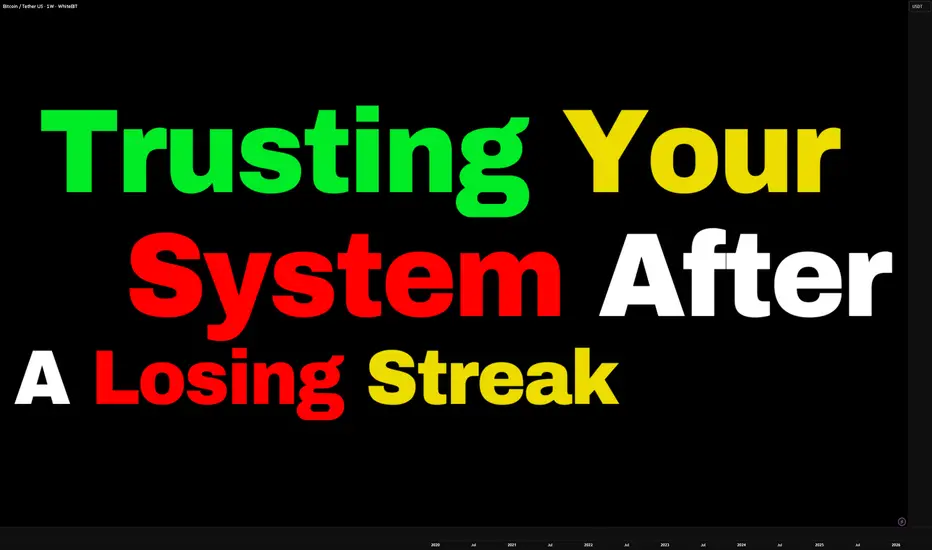
Trusting Your System After a Losing StreakTrusting Your System After a Losing Streak
Welcome everybody to another educational article.
Today we are covering one of the hardest moments every trader, beginner, novice or pro will face:
“Trusting your system after a losing streak.”
This is where most traders ditch profitable systems not because the system failed, but because emotion took control and said “I am Losing with this”
Trusting your system after a losing streak is not about blind belief.
It is about understanding probability, psychology, and discipline.
What Is a Trading System?
A trading system is a set of clearly defined rules that control:
• Entries
• Exits
• Risk management
• Trade management
A system removes emotion and replaces it with structure.
An EDGE that works best for you.
What Is a Losing Streak?
A losing streak is a series of losing trades that occur within normal probability.
Losing streaks are not failure, they are a statistical reality in trading. (They are needed)
Profitable system experience drawdown.
Gaining Trust in a System:
Trust is not given it is built.
You build trust in a system by:
• Clearly defining system rules
• Back testing across different market conditions
• Forward testing in demo or small size
• Tracking performance over a large sample size
Testing proves that losses are part of the system not a sign is not broken.
When you have seen the data, losses stop feeling personal.
Losing Trust in a System
Traders lose trust in their system when emotion overrides logic.
This often happens when:
• A losing streak appears unexpectedly
• Results don’t match recent performance
• Social media shows others “winning”
• Patience runs out
Instead of reviewing data, traders:
• Change strategies weekly
• Mix systems together
• Add random indicators
• Chase the next “better” setup
This strategy-hopping resets progress and prevents mastery.
Maintaining Trust After a Losing Streak
Maintaining trust is purely mental.
You must control the urge to react emotionally.
Even when trades lose, you still benefit.
Every loss provides:
• More data
• More clarity
• More understanding of system strengths and weaknesses
Losing streaks often occur because:
• Market conditions change
• Volatility shifts
• Structure transitions
These periods allow you to adapt, refine, and improve your strategy.
Trading Is Not Judged Only by Money
We live in a world where success is measured by money.
Trading is different.
A trade is not defined by profit or loss, it is defined by execution.
As mentioned in previous posts:
Positive Wins vs Negative Wins
A positive win:
• Making money while following the plan
• Hitting a target and stopping for the day
A negative win:
• Hitting stop loss
• Accepting it
• Closing the platform
• Being done for the day
It may feel frustrating —
but discipline is strengthened.
That frustration is growth.
Losses Are Data, Not Failure
By following your rules even when you lose, you strengthen your system.
You did not receive a money return you received a data return.
That data:
• Refines your edge
• Improves your entries
• Strengthens your confidence
• Leads to long-term profitability
Every losing trade is an investment in future performance.
Losing streaks do not mean your system is broken.
They mean the system is being tested.
Trust is built through:
• Data
• Discipline
• Consistency
• Emotional control
Traders who survive losing streaks grow.
Traders who react emotionally reset themselves.
Trust the process.
Respect the data.
Stay disciplined.
That’s how profitable traders are made.
Community ideas
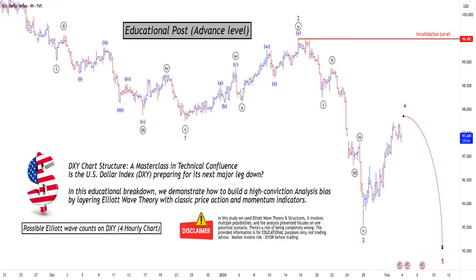
Mastering Technical:DXY Elliott Wave & Multi-Indicators AnalysisTechnical Analysis: DXY Bearish Confluence
This post serves as an educational guide on how various technical analysis tools converge to suggest a strong potential for a continued downtrend in the U.S. Dollar Index (DXY) on the 4-hour timeframe.
Elliott Wave Structure & Bearish Bias
The prevailing Elliott Wave count suggests the DXY is currently completing a corrective minor wave 4 rally within a larger five-wave impulse sequence to the downside. The market bias remains bearish, anticipating the onset of a significant minor wave 5 decline once the current wave 4 correction finishes.
Dow Theory & Price Action Confirmation
Dow Theory principles support the bearish outlook. The price action is clearly establishing a pattern of lower lows and lower highs, a classic signature of an active downtrend. The current rally (wave 4) is simply a higher low correction within this established structure, confirming the overall market direction is down.
Key Confluence Points for Resistance
Multiple technical indicators are clustering at a specific price zone, suggesting a high-probability area where the rally might reverse:
200 EMA Resistance: The price is trading below the 200-period Exponential Moving Average (EMA) on the 4-hour chart. This indicator is positioned just above the current price and is expected to provide significant dynamic resistance (a "hurdle") to the upside.
Fibonacci Retracement Alignment: The crucial 61.8% Fibonacci retracement level of the last major swing low is located very near the 200 EMA. This strong overlap of resistance levels increases the likelihood of a price reversal.
Divergence Analysis
Divergences between price and oscillators further reinforce the bearish sentiment:
Hidden Bearish Divergence: There is existing hidden bearish divergence present. This is a powerful trend-continuation signal that reinforces the expectation that sellers will soon regain control.
Absence of Bullish Signals: A key factor increasing conviction in the bearish bias is the lack of any bullish divergence seen yet on chart. The absence of this potential reversal signal suggests that a strong bullish bounce is not imminent.
Invalidation Level & Potential Targets
Defining risk and reward is essential in trading:
Invalidation Level: The bearish count is only valid as long as the price remains below the critical invalidation level marked at approximately 99.492
Potential Targets: Upon confirmation of the wave 4 top and the start of wave 5, the target for the decline is expected to be lower than the last swing lows (below the wave 3 termination point around 95.100).
I am not Sebi registered analyst. My studies are for educational purpose only.
Please Consult your financial advisor before trading or investing.
I am not responsible for any kinds of your profits and your losses.
Most investors treat trading as a hobby because they have a full-time job doing something else.
However, If you treat trading like a business, it will pay you like a business.
If you treat like a hobby, hobbies don't pay, they cost you...!
Hope this post is helpful to community
Thanks
RK💕
Disclaimer and Risk Warning.
The analysis and discussion provided on in.tradingview.com is intended for educational purposes only and should not be relied upon for trading decisions. RK_Chaarts is not an investment adviser and the information provided here should not be taken as professional investment advice. Before buying or selling any investments, securities, or precious metals, it is recommended that you conduct your own due diligence. RK_Chaarts does not share in your profits and will not take responsibility for any losses you may incur. So Please Consult your financial advisor before trading or investing.
Using Templates to Standardize Every Trade PlanConsistency in trading rarely comes from better predictions. It comes from reducing variability in execution. Templates are one of the most effective ways to achieve this, especially when used correctly inside TradingView. A trade plan template turns preparation into a fixed process instead of a mental checklist that changes under pressure.
Start by defining what a complete trade plan looks like for you. This includes market context, execution conditions, and risk parameters. Higher-timeframe bias, key levels, entry trigger, stop logic, target logic, and position size should all be part of the same structure. The goal is clarity before price reaches your level, not decisions made in real time.
Once defined, translate this structure into a reusable format. TradingView allows you to save chart layouts, drawing sets, indicators, and notes. Use these tools to build a clean template that loads the same way every time. For example, keep one layout dedicated to analysis with higher-timeframe levels, and another for execution with only the elements required to act. This separation alone reduces noise and hesitation.
Templates also enforce discipline around risk. By using the same position tool settings, stop logic, and risk-to-reward framework on every trade, you remove the temptation to adjust risk emotionally. Over time, this creates uniform data. When every trade is planned the same way, your journal reflects your system’s performance instead of random execution decisions.
Another advantage is speed. A standardized plan reduces preparation time and mental load. Instead of rebuilding context from scratch, you load the template and verify conditions. This is especially important for traders balancing multiple markets or limited screen time. Fewer decisions lead to better decisions.
Finally, templates make review meaningful. When all trades follow the same structure, deviations become obvious. You can quickly see whether losses came from valid setups, poor execution, or rule breaks. This feedback loop is what allows improvement to compound.
Templates do not restrict flexibility. They protect process integrity. When used consistently, they transform trading from reactive decision-making into a controlled, scalable workflow built around clarity and repeatability.
Stay Green!

The 2nd Phase of AI Technology is UnderwayThis tutorial is about discovering how new technologies such as AI have several phases over many years which create growth and speculation in the leading companies.
There are always 3 top contenders for a new technology sub industry. A sub industry is an industry that is within the primary industry.
For example, NASDAQ:GOOG , Open AI, and Anthropic are currently the top contenders for the subindustry: Medical Diagnostics AI. This is just one of many sub industries that will emerge over the next decade and longer.
All 3 companies have the potential to dominate. The #1 will be the most dominant, #2 will be a close second, and #3 will be a distant 3rd. However, all 3 will have potential for excellent swing trading, position trading and also investing.
I discourage day trading as it is extremely challenging and there are now new regulations and a change of the rules governing retail day trading that will be soon announced and implemented by all retail brokers. This has become necessary as many retail brokers are at risk of default when numerous retail day traders and smaller funds managers have margin calls but have no money to meet those margin calls. This problem is so extensive that major changes are coming to retail day trading on the public exchanges. Save yourself a lot of trouble and simply shift to swing trading instead. It is easier, more profitable, and more fun, takes less time and effort and it's far less stressful.
GOOG is NOT a sure thing for dominance in the AI Medical Diagnostics sub industry. However, the chart shows that there is an increase in Buy Side Giant Institutions, aka Dark Pools, investing in Google at this time. This can lead to speculative price action that is ideal for swing trading. GOOG reports on February 4th but there is now a risk that HFT AI may misinterpret the report or the CEO statement as HFT AI did for MSFT. Thus, trading it at this moment has very high risk.

Top 3 Forex Gold Setups I Will Be Trading in 2026
Among the different strategies and signals that I relied on in 2025, there were 3 exceptional setups that showed the highest accuracy and profitability.
In this article, I will explain the structure and price model of these setups and equip you with the best entry signals for trading in 2026.
Discover what worked best in Forex and Gold trading in 2025.
The first powerful setup that showed great results last year is based on an old-school price action chart pattern - double top & bottom .
But don't trade each double top & bottom that you spot.
To achieve the highest win rate, these patterns should form on specific time frames and on specific price levels.
Please, study a bullish model:
The price should test a key daily support level.
After that, a double bottom pattern should form on 1H time frame.
Your signal to buy will be a breakout and an hourly candle close above its neckline.
Set your buy limit order on a retest of that,
stop loss will lie below the bottoms,
take profit will be the closest intraday resistance.
Here is an example:
Now, examine a bearish model.
The price should test a key daily resistance level.
After that, a double top pattern should form on 1H time frame.
Your signal to sell will be a breakout and an hourly candle close below its neckline.
Set your sell limit order on a retest of that,
stop loss will lie above the bottoms,
take profit will be the closest intraday support.
Here is an example on NZDUSD forex pair:
Meeting all the required criteria, this setup achieved 76% accuracy in 2025.
The second setup that had a high win rate last year is from Smart Money Concepts trading.
It is based on a combination of liquidity zones, traps, and imbalances.
Please, examine a bullish model of that setup.
We need a t est of a daily liquidity demand zone and a bearish trap below that.
After a trap, a bullish imbalance should occur on an hourly time frame.
I suggest looking for a bullish engulfing candle and return of the price within or even above a liquidity zone with a close of that candle.
Buy the market immediately after a candle close.
Set your stop loss below the low of the trap.
Your take profit will be the closest intraday supply zone.
Please, study an example on EURAUD:
Now, study a bearish model.
We need a test of a daily liquidity supply zone and a bullish trap above that.
After a trap, a bearish imbalance should occur on an hourly time frame.
I recommend looking for a b earish engulfing candle and return of the price within or even below a liquidity zone with a close of that candle.
Sell the market immediately after a candle close.
Set your stop loss above the high of the trap.
Your take profit will be the closest intraday demand zone.
Please, check the example:
Meeting all the conditions, this setup showed 79% accuracy.
The last setup worked phenomenally well in Gold trading last year.
Because of a crazy bullish rally that the market started straight from the beginning of 2025, this simple pattern provided huge gains.
I am talking about a bullish flag pattern.
Please, note that the first 2 setups were bullish and bearish.
In a current case, we are considering only a bullish flag.
Make sure that the market is bullish .
After an update of a new high and a formation of a new higher high higher close, expect a correctional movement on a 4H time frame.
The price should start falling , forming an expanding, parallel or contracting channel - a bullish flag.
Your strong signal to buy will be a bullish breakout and a 4H candle close above a resistance of the flag and the last lower high within that.
Set your buy limit order on a retest of the broken level of the last LH,
Set stop loss below the lows of the flag,
Your take profit will be the closest psychological level above a current high.
Alternatively, you can trade this model without take profit and apply trailing stop loss.
That's the example of this price model:
This pattern achieved 69% accuracy.
But because of a strong bullish momentum, each profitable signal produced enormous gains.
If Gold continues rallying next year, and I think it definitely will, keep an eye on bullish flags as your signal to buy.
Using these 3 setups, you can successfully trade Forex and Gold in 2026.
Integrate them in your trading strategy, learn to recognize them and follow the rules that I provided.
Let these setups bring you huge gains this year.
❤️Please, support my work with like, thank you!❤️
I am part of Trade Nation's Influencer program and receive a monthly fee for using their TradingView charts in my analysis.

Methodologically Diversifying Away from Wall StreetAs the S&P 500 index is close to its historical valuation peak of 1999/2000 (Shiller P/E) and the global macroeconomic and geopolitical backdrop is “challenging,” can we still find equity markets around the world that are fundamentally cheap and technically attractive?
Here, I propose a methodological approach aimed at identifying international equity markets that are in a long-term bullish trend and still very inexpensive compared to Wall Street (with the S&P 500 valuation used as the benchmark).
Three valuation criteria are selected to assess global equity market valuations in a relevant way, focusing on the top 20 markets by total market capitalization.
1) Shiller P/E (CAPE ratio)
The CAPE ratio (Cyclically Adjusted Price-to-Earnings) measures a market’s valuation by relating its price to the average of real (inflation-adjusted) earnings over the past 10 years.
It smooths out economic and accounting cycles and is mainly used to assess the long-term relative expensiveness of a market. Historically, a high CAPE ratio is associated with lower future returns over several years.
2) Total Market Capitalization / GDP (Buffett Indicator)
This ratio compares the total value of a country’s listed equities to the size of its real economy (GDP).
It provides a macro-level view of equity market valuation relative to the country’s productive capacity. A level well above 100% suggests that the equity market is expensive relative to the underlying economy, all else being equal.
3) Market Capitalization / (GDP + Central Bank Balance Sheet)
This indicator is an extended version of the Buffett Indicator that incorporates the central bank’s balance sheet (total assets) in the denominator.
It aims to account for the impact of expansionary monetary policies on asset prices. A more moderate ratio may indicate that market valuation is partly supported by monetary liquidity rather than solely by economic growth.
The table below therefore presents equity markets from the most expensive to the cheapest based on the average of these three valuation criteria. Markets such as Brazil, Poland, China, Mexico, and South Korea show strong long-term bullish technical trends and still offer significant potential to catch up with the S&P 500 in terms of valuation. These markets represent solid diversification strategies. Careful attention should be paid to entry timing: a market should only be bought during a pullback phase and a return to a major technical support level.
4) Ranking Methodology
I assigned a rank to each ratio (1 = most expensive market / highest ratio, 20 = cheapest market / lowest ratio).
For each market, I then calculated the average of these ranks to create a synthetic “Median Score” column.
According to this summary, the US, India, and Japan stand out as the most expensive markets, followed by Western Europe, and then by more affordable markets such as China, Poland, and Brazil within the emerging markets space.
The chart below illustrates the long-term bullish trend of the Polish equity market across monthly, weekly, and daily time horizons.
DISCLAIMER:
This content is intended for individuals who are familiar with financial markets and instruments and is for information purposes only. The presented idea (including market commentary, market data and observations) is not a work product of any research department of Swissquote or its affiliates. This material is intended to highlight market action and does not constitute investment, legal or tax advice. If you are a retail investor or lack experience in trading complex financial products, it is advisable to seek professional advice from licensed advisor before making any financial decisions.
This content is not intended to manipulate the market or encourage any specific financial behavior.
Swissquote makes no representation or warranty as to the quality, completeness, accuracy, comprehensiveness or non-infringement of such content. The views expressed are those of the consultant and are provided for educational purposes only. Any information provided relating to a product or market should not be construed as recommending an investment strategy or transaction. Past performance is not a guarantee of future results.
Swissquote and its employees and representatives shall in no event be held liable for any damages or losses arising directly or indirectly from decisions made on the basis of this content.
The use of any third-party brands or trademarks is for information only and does not imply endorsement by Swissquote, or that the trademark owner has authorised Swissquote to promote its products or services.
Swissquote is the marketing brand for the activities of Swissquote Bank Ltd (Switzerland) regulated by FINMA, Swissquote Capital Markets Limited regulated by CySEC (Cyprus), Swissquote Bank Europe SA (Luxembourg) regulated by the CSSF, Swissquote Ltd (UK) regulated by the FCA, Swissquote Financial Services (Malta) Ltd regulated by the Malta Financial Services Authority, Swissquote MEA Ltd. (UAE) regulated by the Dubai Financial Services Authority, Swissquote Pte Ltd (Singapore) regulated by the Monetary Authority of Singapore, Swissquote Asia Limited (Hong Kong) licensed by the Hong Kong Securities and Futures Commission (SFC) and Swissquote South Africa (Pty) Ltd supervised by the FSCA.
Products and services of Swissquote are only intended for those permitted to receive them under local law.
All investments carry a degree of risk. The risk of loss in trading or holding financial instruments can be substantial. The value of financial instruments, including but not limited to stocks, bonds, cryptocurrencies, and other assets, can fluctuate both upwards and downwards. There is a significant risk of financial loss when buying, selling, holding, staking, or investing in these instruments. SQBE makes no recommendations regarding any specific investment, transaction, or the use of any particular investment strategy.
CFDs are complex instruments and come with a high risk of losing money rapidly due to leverage. The vast majority of retail client accounts suffer capital losses when trading in CFDs. You should consider whether you understand how CFDs work and whether you can afford to take the high risk of losing your money.
Digital Assets are unregulated in most countries and consumer protection rules may not apply. As highly volatile speculative investments, Digital Assets are not suitable for investors without a high-risk tolerance. Make sure you understand each Digital Asset before you trade.
Cryptocurrencies are not considered legal tender in some jurisdictions and are subject to regulatory uncertainties.
The use of Internet-based systems can involve high risks, including, but not limited to, fraud, cyber-attacks, network and communication failures, as well as identity theft and phishing attacks related to crypto-assets.

SESSIONS BY LUX ALGO THE BEST ICT INDICATOR Indicators are always there to guide you but do not rely on them to be profitable.

How to Trade a $2,000 Drawdown Without Blowing Up (MES Strategy)Are you trading a prop firm account with a tight $2,000 drawdown? One bad trade shouldn't end your career. In this video, I break down a strict risk management plan using MES (Micro E-mini S&P 500) that ensures you survive to trade another day.
In this video, we cover:
The 10% Rule: Capping risk at $200 max per trade so you always have at least 10 opportunities.
The VX Algo Strategy: How to use the 10-minute signal with 48-minute chart confirmation for high-probability entries.
Dynamic Position Sizing: Stop guessing how many contracts to buy. I explain my A+, B+, and C+ setup system.
The Blueprint:
Instrument: MES ($5/point)
Stop Loss: 10 Points ($50/contract) | Take Profit: 5 Points ($25/contract)
Sizing:
A+ Setup: 4 Contracts ($200 Risk)
B+ Setup: 2 Contracts ($100 Risk)
C+ Setup: 1 Contract ($50 Risk)
Discipline is key. If the charts don't align, we don't trade. Let's get funded and stay funded.

AMP Futures - How to create TPO alerts.In this idea we will demonstrate how to create TPO alerts using the TradingView platform.

How to Trade Price Action Patterns in TradingViewHow to Trade Price Action Patterns in TradingView
Master price action pattern recognition using TradingView's charting tools in this comprehensive tutorial from Optimus Futures.
Price action patterns are among the most time-tested technical analysis methods available.
They help traders identify potential reversals, continuations, and high-probability entry points directly from candlestick formations.
What You'll Learn:
Understanding price action patterns: reading market psychology through candlestick formations
The two main pattern categories: reversal patterns and continuation patterns
Essential reversal patterns: pin bars, engulfing candles, and double tops/bottoms
How pin bar wicks reveal price rejection at key levels
Bullish and bearish engulfing patterns for identifying shifts in control
Double tops and bottoms as significant turning point signals
Key continuation patterns: flags, triangles, and inside bars
Using TradingView's built-in candlestick pattern recognition indicators
Manual pattern identification techniques and optimal timeframes
Practicing with TradingView's bar replay feature
The importance of context: trading patterns at support and resistance zones
Entry timing: waiting for confirmation candles
Stop placement strategies for different pattern types
Calculating measured move targets for profit-taking
Multiple timeframe analysis for added conviction
Combining price action with volume analysis for confluence
Aligning patterns with Fibonacci levels and prior swing points
This tutorial may benefit futures traders, swing traders, and technical analysts who want to read price action directly without indicator lag.
The concepts covered could help you recognize high-probability setups, time entries more precisely, and understand the buyer/seller dynamics behind each candlestick formation.
Learn more about futures trading with TradingView: optimusfutures.com
Disclaimer:
There is a substantial risk of loss in futures trading. Past performance is not indicative of future results. Please trade only with risk capital. We are not responsible for any third-party links, comments, or content shared on TradingView. Any opinions, links, or messages posted by users on TradingView do not represent our views or recommendations. Please exercise your own judgment and due diligence when engaging with any external content or user commentary.
This video represents the opinion of Optimus Futures and is intended for educational purposes only. Chart interpretations are presented solely to illustrate objective technical concepts and should not be viewed as predictive of future market behavior. In our opinion, charts are analytical tools, not forecasting instruments.

Nifty 50 | Gann Price–Time StructureDecember 2023 – September 2024 (Educational Case Study)
This idea is a historical and educational study of how Gann price–time geometry aligned with Nifty 50’s movement over a multi-month period.
It is shared only to explain structure and methodology, not as a forward-looking forecast or trading advice.
📌 Historical Context
In December 2023, Nifty was trading near a major price–time pivot zone formed after a prolonged consolidation phase.
Using classical WD Gann principles — including:
Price symmetry
Harmonic level progression
Time–price balance
a key higher resistance zone was identified on the chart as an important reference level.
📈 What the Chart Demonstrates
From an observational standpoint:
Price respected the lower structural base
A sustained bullish phase unfolded over the following months
The market eventually tested a major horizontal Gann level
After reaching that zone, price behavior shifted into consolidation and correction, which is typical near higher-degree levels
The chart highlights how markets respond to geometry and time alignment, rather than reacting randomly.
🧠 Key Educational Insight
This case study reinforces several important Gann concepts:
Gann levels act as zones of interaction, not guarantees
Reaching a major level does not automatically imply reversal
Confirmation always comes after price behavior is observed
Responsibility in analysis means waiting for structure, not assuming outcomes
Understanding this distinction helps traders move away from emotional reactions and focus on process-driven analysis.
Disclaimer
This idea is shared strictly for educational purposes only.
It is not a prediction, recommendation, or financial advice.

Nifty 50 | Gann Levels & Market GeometryAugust–November 2024 (Educational Case Study)
This idea is a post-event educational case study explaining how Gann price levels aligned with Nifty 50’s structure during Aug–Nov 2024.
The objective is to study how price reacted around predefined geometric levels, not to make forward predictions.
📌 Context (Historical Observation)
In early August 2024, Nifty was trading near the 24,200 region after a corrective phase.
Using Gann-based price geometry, two important price zones were identified on the chart:
A higher structural support zone
A lower fallback support zone
These zones were derived from price symmetry and Gann level spacing, which are commonly studied in classical Gann analysis.
📈 What the Chart Shows
From a purely observational perspective:
Price halted its decline near the upper support zone
From that area, the market transitioned into an upward phase
The advance later tested a major horizontal resistance zone
Subsequent corrections respected the same geometric framework
A lower Gann level was later adjusted slightly based on updated market structure and time progression — a normal process in Gann studies when price evolves.
🧠 Educational Takeaway
This case highlights how:
Markets often respond to predefined price geometry
Gann levels act as reference zones, not guarantees
Structure becomes clearer after the fact, helping traders improve future analysis
Geometry-based mapping can reduce emotional decision-making
Important Note:
This idea is shared strictly for educational and analytical purposes only.
It does not represent a live trading call or financial advice.

Studying charts is all about checking for support
Hello, fellow traders.
If you "Follow," you'll always get the latest information quickly.
Have a great day.
-------------------------------------
It's important to see what the trend will be like after February 5th.
The next period of volatility is expected to be around March 2nd.
At this time, the key focus is on whether the price rises above 2887.66 or supports near the newly created HA-Low indicator.
To do this, we need to see if the price can rise above 2415.95, the StochRSI 50 indicator level, and maintain its position.
If the price fails to rise, we should check for support around 1597.76 to 1879.61, which is considered the maximum decline.
To break above a key point or range and maintain an uptrend, the StochRSI, BSSC, and OBV indicators must show upward trends.
In particular, the BSSC indicator should remain above zero, and the OBV indicator should rise above its High Line and remain there.
In this case, it's even better if the StochRSI indicator hasn't entered an overbought zone.
Considering these conditions, it's still too early to continue the uptrend.
-
Whether the price rises or falls, the most important thing is how to profit.
To profit, you can either buy at a lower price and hold a profit, or increase your holdings of coins (tokens) with an average purchase price of zero, ultimately increasing your profits.
Therefore, while buying when the price is rising will naturally lead to profits, buying when the price is falling will most likely result in losses. Therefore, increasing your holdings using conventional methods is not possible.
Even if you increase the number of coins (tokens) you hold, you would have purchased them with more investment capital.
Therefore, you should increase your holdings by selling your coins (tokens) before a decline and buying them again afterward.
It's not easy to know when the price will decline, but if you see resistance at the support and resistance points you've drawn on your chart, you can trade using the method above.
To do this, the key is how to draw support and resistance points.
Support and resistance points are usually marked by designating a volume profile based on the arrangement of candlesticks and then marking them accordingly.
However, since these markings are prone to subjective opinions, it's better to use objective information to mark support and resistance points.
Even if the indicated support and resistance points are drawn incorrectly, it's not a bad idea if there's a way to check whether support exists near them.
What we need to study isn't wave theory or harmonic theory.
What we need to learn is how to determine whether support and resistance levels are supportive.
And we need to practice developing trading strategies accordingly.
-
When I first started studying charts, I studied them through various books and online resources.
I also listened to the advice of broadcasters on internet channels, but ultimately, I found them ineffective.
Looking back, I realized that because I didn't have a basic trading strategy that suited me, no matter what I studied or what information I gathered, it didn't work in actual trading.
I use the grandiose term "basic trading strategy," but it's more accurate to think of it as determining where to buy and where to sell.
While determining where to buy is important, as I mentioned earlier, if you can identify support and resistance levels within the support and resistance levels you've drawn, you'll naturally know where to buy and sell.
To find specific pulse points, you need to understand where the volume profile is located, and this can be done using various indicators.
-
To achieve this, the basic trading strategy I'm suggesting is to buy in the DOM(-60) ~ HA-Low range and sell in the HA-High ~ DOM(60) range.
I've created this basic trading strategy as an indicator so everyone can easily see it, and I'm consistently publishing ideas to explain how to interpret and utilize it.
-
Thank you for reading to the end.
I wish you successful trading.
--------------------------------------------------

''The Liquidity Footprints No One Talks About (How to Ride Them)🔥 Reading Smart Money Moves: Inducements & Wyckoff in Action 🔥
Traders, let me drop something heavy — this isn’t theory, it’s the live pulse of the market. Most traders chase indicators and candlesticks, hoping for a breakout. Meanwhile, smart money is quietly harvesting liquidity and leaving traps that the crowd blindly walks into. That’s where the edge lives. 🔥
Here’s the truth: what I see with inducements and order flow is Wyckoff in motion — but modern, practical, and actionable. Let me break it down.
⸻
1️⃣ Spotting inducement zones (liquidity traps)
• Inducements are setups designed to trick retail into taking the wrong side.
• Look for subtle failed highs/lows, false breakouts, or wicks that grab stops.
• 🔥 Nugget: The bigger the crowd chasing the move, the juicier the liquidity for smart money.
Think of this like Wyckoff’s spring/shakeout — but you see it unfold live.
⸻
2️⃣ Confirming market context (multi-layer edge)
• Start by observing the overall trend and structure.
• Identify where the crowd is trapped and where liquidity is being collected.
• 🔥 Nugget: True edge comes from seeing the trap and the setup before the panic enters the market.
You’re essentially mapping Wyckoff’s accumulation/distribution phases — only this time you see intent, not just the schematic.
⸻
3️⃣ Understanding smart money intent
• Watch how price reacts to inducements:
• Aggressive spikes vs slow absorption
• Failed follow-throughs after stops are triggered
• 🔥 Nugget: Effort vs result in real-time — the market tells you who is in control, if you know what to look for.
This is exactly what Wyckoff described, just live and actionable.
⸻
4️⃣ Entries without giving away the blueprint
• Don’t jump in on the first trap — wait for confirmation of liquidity sweep and reaction.
• 🔥 Nugget: This is the modern “Wyckoff spring” — micro timing the edge without showing the exact playbook.
You catch the last wave of smart money’s harvesting before the main move — precision over guesswork.
⸻
5️⃣ Trade management & continuation
• Take logical partial profits and let the trend run.
• Watch for secondary inducements — sometimes the market fakes continuation to shake more traders out.
• 🔥 Nugget: Reading smart money footprints lets you predict continuation zones, not just react.
⸻
6️⃣ Pro Tips / Nuggets 🔥
1. Quiet markets = precision setups. Less noise = clearer inducements.
2. Big-picture context is everything. Without it, traps are just noise.
3. Wyckoff’s Laws in action: cause & effect, supply & demand, effort vs result — live on your chart.
4. Stop hunting = opportunity. Don’t fight it — trade it.
5. Charts over indicators. Indicators lag; inducements reveal intent.
⸻
Summary
• This is Wyckoff brought to life, seen through modern inducement + order flow lens.
• Difference: you’re seeing the intent of smart money live, not studying it after the fact.
• 🔥 Master inducements + liquidity sweeps + context, and you don’t just trade — you understand the market’s pulse.
⸻
💡 Final Thought: Teaching this isn’t about giving the exact recipe. It’s about training minds to see the cues, read the traps, and recognize intent. That’s where your edge stays untouchable.
Patience is key
Tracking is the edge.
Let's go.

Mastering Gold Valuation Models: Unlock XAUUSD's True Worth!Title: 📚 Mastering Gold Valuation Models: Unlock XAUUSD's True Worth for 2026 Traders! 🚀
Hello TradingView community! 👋
Today, let's dive into XAUUSD with a detailed educational post focusing on gold valuation models, fundamentals, and insights. 📊 This isn't financial advice just an in-depth look based on public data to help you understand how to value this timeless asset.
Current Snapshot:
Price: $4,940.73 💵
52-Week High/Low: $5,595.46 / $2,832.63 📈📉
Market Cap: N/A (spot commodity)
Fundamental Analysis (e.g., Valuation Models Explained):
Gold is a unique asset without cash flows, dividends, or earnings, so traditional DCF isn't directly applicable. Instead, models treat it as a store of value, inflation hedge, or financial asset influenced by macros. Here's a structured breakdown of key gold valuation models to empower your analysis:
- Interest Rate and Yield-Based Models 📉 : These view gold as a "zero-yield bond" where price inversely correlates with real interest rates (nominal minus inflation). For example, gold has an effective "real duration" of about 18 years a 1% rise in real yields (e.g., 10-year TIPS) historically drops inflation-adjusted gold prices by 18%. Simple formula: Fair Value ≈ Initial Value / (1 + Real Rate)^Time Horizon, adjusted for inflation expectations. In low/negative rate environments, this signals undervaluation (e.g., below $5,000 amid uncertainty).
- Supply and Demand Equilibrium Models ⚖️ : Frameworks like the World Gold Council's Qaurum balance supply (mining ~3,000 tons/year, recycling) with demand (jewelry ~45%, investment ~25%, central banks ~20%). Recent central bank purchases (>1,000 tons annually) can project fair value ranges like $5,400 to $6,300 under 10% growth assumptions. Production cost models provide floors (~$1,200 to $1,500/oz), but ignore speculative flows great for macro scenario testing.
- Relative Valuation Models 🔄: Compare gold to benchmarks for over/undervaluation. Ratios include S&P 500/Gold (e.g., ~1.36 ounces per S&P unit vs. historical averages signaling cheap gold) or gold's above-ground stock as ~50% of U.S. market cap (deviations from 20 to 50% norms indicate mispricing). Real yield correlation (~-0.7) highlights undervaluation in low-rate, high-uncertainty periods.
- Long-Term Expected Return Models 📈: Estimate 2 to 4% real returns based on gold's dual role as a good and asset, tied to global GDP growth minus portfolio expansion. Over decades (e.g., 1992 to 2025), gold averaged ~7 to 8% annually vs. S&P's ~11%. Formula: Expected Return ≈ β1 × GDP Growth - β2 × Global Portfolio Growth. Useful for portfolio allocation.
Key insights: Combine models for robustness e.g., yield-based for timing, supply-demand for fundamentals. Banks like Goldman forecast $5,400+ by year-end amid geopolitics. 📈
SWOT Analysis (Strengths, Weaknesses, Opportunities, Threats):
Strengths: 💪 Proven safe-haven with central bank demand (>1,000 tons/2025), low equity correlation (~0.4 beta to S&P).
Weaknesses: ⚠️ No yield, high volatility (e.g., recent 10% drops), USD/rate sensitivity.
Opportunities: 🌟 Geopolitical tensions (U.S.-Iran), potential Fed cuts, green tech industrial demand.
Threats: 🛑 Hawkish policy shifts, conflict de-escalation, "digital gold" competition like Bitcoin.
Technical and Risk Insights:
Use non-repainting indicators like 200-day SMA (~$4,200 to $5,000 range for support/resistance). Current RSI (~35 to 40) often signals oversold 🚨. Risks: Interest rate exposure, macro attribution (~60% returns from trends vs. supply). Consider time-series like ARIMA for forecasts. 📉
Historical Context and Examples:
Gold has delivered 7 to 8% annualized over 10+ years, with examples like 2022's recovery from $1,600 low to $2,000+ on inflation fears. Yield models predicted 2025 surges to $5,000+ amid low rates, showing how these frameworks inform real-market decisions. 📜
What do you think: Which gold valuation model resonates most with your XAUUSD view for 2026? Share your analyses or charts below! ❓
#XAUUSD #GoldValuation #ValuationModels #CommodityAnalysis #TradingEducation #FundamentalAnalysis #TechnicalAnalysis #GoldTrading #InvestingInsights

Max Pain: The Market's Magnetic Pull or Just a Trader's Tale?Hey there!
Ever get the feeling the market is playing games with you? That right when you place a trade, price seems to be drawn to a specific level like a magnet, only to reverse exactly there? Traders often whisper about "Max Pain" – a level that supposedly causes maximum financial "pain" to option buyers at expiration. It sounds almost mythical, right? A secret force guiding the market.
I've been diving deep into this rabbit hole myself, and today, I want to share the basics with you. Not as a guru with all the answers, but as a curious trader on the same journey of discovery. I won't tell you whether to believe in its power. Instead, I'll give you the map so you can explore this territory yourself.
What is Max Pain? The Simple Math Behind the Mystery
Let's strip away the mystique. Max Pain is a specific stock or asset price at which the total value of all open options (puts and calls) would suffer the maximum collective loss for option buyers/holders at the moment of expiration.
How is it calculated? It's not magic, it's arithmetic:
- For each available strike price, you calculate the total dollar loss for option buyers if the underlying asset settles at that strike at expiration.
- You sum the losses for all open puts and calls at that strike.
- The strike price with the highest total loss for option buyers is the Max Pain level.
Simple example for illustration: Imagine most traders bought calls at $100 and puts at $95. If the price is exactly at $98 at expiration, both the call and put buyers lose. The writers (sellers) keep the premiums. $98 could well be the Max Pain point.
The hypothesis is that market makers and large players, who are typically net sellers of options, may have an incentive to influence the price toward this level to minimize their own potential payouts (by maximizing losses for the buyers). This is where the theory of "price attraction" comes from.
The Great Debate: Magnet or Mirage?
This is where it gets interesting. The community is sharply divided.
The Believers: They see Max Pain as a powerful "magnet," especially in the days leading up to expiration (OpEx). They point to countless charts where price seems to gravitate and even pin exactly at that level on Friday.
The Skeptics: They argue it's a self-fulfilling prophecy or mere coincidence. If enough people watch a level, their collective action (take-profit, stop-loss orders) can create support/resistance, not some hidden force.
So, who's right? This is exactly the question that should drive our research, not blind faith in market hypnosis.
A Nudge from Academia: "No Max Pain, No Max Gain"
This isn't just trader lore. Serious academics are studying it. A recent and very compelling paper titled "No Max Pain, No Max Gain: A Case of Predictable Reversal" by Ilias Filippou and Pedro A. Garcia-Ares (September 30, 2024) investigated this phenomenon on the stock market.
Their key finding? Stocks whose prices were above the Max Pain level ahead of expiration showed a statistically significant tendency to move down toward it, and vice-versa for stocks below it. They documented a predictable "reversal" effect. This is a powerful piece of evidence that the effect might be real and measurable, at least in equities but not for all stocks.
But here's the critical thought: does this apply to metals, indices, or Forex, where the option market structure is different? That's a wide-open question.
Your Journey, Your Edge: Become a Data Detective
This is the core of my message to you. Don't just take my word for it, or anyone else's. The greatest edge in trading comes from your own conviction, built on your own analysis.
Here’s how you can start your own investigation:
1. Identify the Levels: First, you need reliable Max Pain data for your traded asset. These levels are recalculated daily as open interest changes.
2. Gather Evidence: Start a trading journal. Note the Max Pain level at the start of the OpEx week. Observe where price closes on expiration day. Don't just look for confirmations; actively note the exceptions.
3. Ask Specific Questions: Is the "attraction" stronger for NASDAQ stocks than for gold? Does it work better in trending or ranging markets? Is the effect stronger on quarterly "triple witching" expirations?
4. Collect Your Own Statistics: Track 20, 50, 100 expiration events. What percentage of the time did price close within 0.5% of Max Pain? Was there a mean-reversion effect as the academic paper suggests?
Conclusion:
I started this journey recently, focusing on metals and major currency pairs. I'm systematically collecting data, drawing my charts, and keeping my own journal. I don't have a definitive answer yet. Maybe the "magnet" is strong in some assets and weak in others. Maybe it's a self-fulfilling prophecy we can still trade.
But one thing I'm sure of: passively believing or dismissing market narratives is a dead end . The active path of observation, data collection, and critical thinking is what separates a spectator from a strategist.
So, I invite you to become a market researcher. Test the Max Pain hypothesis yourself. See if these levels whisper secrets to you, or if they remain silent. Your own collected data will be your most trusted advisor.
Happy charting, and may your curiosity be your most profitable indicator!
P.S. If you're interested in seeing how these levels shift daily but you don't have time and skills to collect data, you can still track them I plot them daily (take a look TradingView bio).

My Kind of Trades.My work is focused exclusively on the long-term structure of financial markets.
When markets are viewed through this lens, a key truth becomes clear: markets are not chaotic — they follow structure and repeatable patterns. This approach significantly reduces the noise that dominates most financial commentary: short-term price fluctuations, emotionally driven moves, and surface-level buy/sell signals that lack broader context.
This is deep, contextual analysis — understanding market structure before execution, not reacting to price after the fact.
Structural moves of this nature occur across all markets. One of the clearest examples of why market structure matters is during stock market crashes. We reference extended work analyzing both the Dot-com Bubble and the Global Financial Crisis using long-term S&P 500 charts. Those full deep dives are published elsewhere and go beyond simply mapping crashes — they demonstrate how the two events were structurally linked and, most importantly, why they should have been expected.
Another referenced example includes the analysis of UK Oil prices from 1861 to 2026, again explored in detail elsewhere, showing how the same structural principles persist across centuries, asset classes, and market regimes.
The purpose here is not to reproduce those deep dives, but to underline a core principle: markets have structure — they are not driven by chaos, manipulation, or randomness.
This framework is applied across stocks, commodities, forex and cryptocurrencies.
For extended case studies and full structural breakdowns, this is done elsewhere, where the real analysis happens.
Check the bio for more.

Learning from the loosing trades! Continuation of the series.I study all my losing positions, including my first-ever trade made with a prop firm. Find out what my first losing position was and watch the video.
GBPAUD: not flipping the chart in a bearish trend, distorted fibs, failing to read market structure, poor CSFR.
GBPCHF: Cutting the winners short, SL to BE.
USTEC: no engulfing confirmation, flipping the chart to see the fib confirming entry more closely!
GBPNZD: Entered on a wrong fib, cognitive bias.
USDJPY: Fib < 50, late entry, tight SL, CSFR - poor.

The Repaint Illusion in Rotation SystemsIntroduction
In this idea, I’ll explain what repainting in rotation systems is, why it can be misleading and how you can spot it when you don’t have access to the code. Many indicators look perfect on the preview image but are actually very different in live trading. My goal in this idea is to help you understand the signs of repainting so you can judge a rotation system using only what you see on the chart.
General Information
First, it is important to understand what a Rotation System is. Rotation Systems are investment or trading models that move your capital between multiple assets, usually majors, over time. Repainting in this context means it alters past allocations using future information, creating unrealistic backtest results. Instead of holding one single asset infinitely, these systems rotate allocation into assets that outperform others and reduce exposure to weaker ones.
The main goal has two parts:
Capture the biggest gains during bull markets
Minimize drawdowns by moving into CASH or PAXG during bear markets or downtrends
The main logic behind rotation systems is relative strength. Assets that have outperformed usually continue outperforming for some time. By reallocating capital into these stronger assets, rotation systems aim to stay invested in what’s performing best.
Rotation systems are very important in risk management as well. By exiting underperforming assets and remaining in cash during downtrends, they try to reduce volatility and protect capital, having the lowest possible max equity drawdowns.
How well a rotation system performs doesn’t only rely on the selection of assets. It depends on the robustness of the design. This means it should have:
No repainting
No overfitting
No unrealistic execution assumptions
In practice, rotation systems can be used in many markets:
Equity indices and sectors
Cryptocurrencies
Commodities
The default timeframe for rotation systems is usually daily, because this means it allows at minimum one switch a day.
Important rules:
Rotation systems do not use leverage
Execution must be realistic and based on bar closes
Repainting
Why Repainting Is Dangerous
There are many forms of repainting, and most users cannot see them. In rotation systems, this problem is even more important because users often don’t have access to the underlying code. The only way to judge a rotation system this way is by checking how it behaves on the chart.
Building a truly non-repainting rotation system requires a lot of skill and time. In reality, more than 90% of all the rotation systems include some form of repainting, which, when used in live trading, will cost users a lot of money.
Identifying Repainting: Top vs Bottom Curve
How to Spot It Clearly
To make repainting easier to understand, I’ve marked these points:
Cyan = Entry
Pink = Exit
The goal of a clean rotation system is to:
Enter on the bar close when the signal appears
Ride the full trend or cash period in real time
Entry Behavior
Non-repainting (Top Curve):
The line changes color (to white for cash) before it goes flat
This allows entry at the correct bar close
You correctly experience the full flat cash period
Repainting (Bottom Curve):
The system thinks that you were already in cash one bar earlier, which doesn't make sense because you are trading it now, not yesterday.
To match performance, you would need to enter at the bar open without knowing the close and final choice.
This is impossible in real trading and indicates repainting
Exit Behavior
Non-repainting (Top Curve):
The line switches to purple (SOL) while still flat
You exit at the correct close and then ride the asset’s equity.
Repainting (Bottom Curve):
The equity line immediately jumps as if you were already invested earlier
This artificially boosts performance
Key Rule to Detect Repainting
Focus on cash periods as it is easiest to see here:
Non-repainting systems
→ First change color
→ Then stay flat
→ You can act on the close and experience the flat period live
Repainting systems
→ Change color and go flat at the same moment
→ This means future data is already being used
Replay Mode Trap
Some systems look correct in static screenshots but fail in replay mode.
Example:
At bar 1, everything appears normal
Move forward one bar, and previous bars all of the sudden change color
This is a deliberate trick. The system repaints past states to appear correct, but in live trading it will behave differently and lead to losses. This means that it will show results that are so insanely high with "correct looking entries and exits" that many will fall into this trap.
Hidden Repainting
Some traders hide repainting even better by:
Removing visible switches from the equity curve. I have seen this in a lot of places, and then when you look at the actual switches, you see this type of repainting immediately.
It makes two systems look identical at first glance. The only visible difference is performance:
The repainting system shows very boosted profits
The clean system shows realistic results
Rule:
If you are evaluating a rotation system, always demand a version where switches are visible before purchase. If the creator refuses, assume repainting is being hidden and do NOT proceed to trade it.
This is not financial advice. For educational purposes only. Trading involves risk.

The Real Cost of Modern Investing Is Not Fees, It’s AttentionFor decades, the cost of investing was easy to define. Fees, commissions, spreads — these were the visible expenses investors learned to calculate and minimize. Today, however, the most significant cost of modern investing is far less obvious. It is attention.
Markets have become faster, platforms more interactive, and information more abundant than ever before. While this accessibility is often presented as progress, it has quietly shifted the burden of investing from capital management to cognitive management. Investors are no longer just allocating money — they are constantly allocating focus.
Modern investment platforms compete aggressively for user attention. Notifications, performance highlights, real-time updates, and visual stimulation are designed to keep users engaged. The problem is that engagement is not the same as clarity. In many cases, constant stimulation fragments decision-making and increases the likelihood of reactive behavior, especially during periods of volatility.
Attention , unlike fees, is finite. Every alert, chart movement, or promotional message consumes a portion of an investor’s mental bandwidth. Over time, this leads to fatigue, shortened decision cycles, and a growing reliance on impulse rather than structure. The cost of this dynamic rarely appears on account statements, but it manifests in inconsistent execution and emotionally driven decisions.
Experienced investors increasingly recognize this shift. Instead of optimizing solely for cost efficiency, they evaluate platforms based on how well they support focus and discipline. Clear reporting, restrained communication, and predictable operational behavior help preserve attention where it matters most — on strategy rather than noise.
This is where platform design and communication philosophy become critical. A system that prioritizes clarity over stimulation allows investors to engage intentionally rather than reactively. Fewer prompts, clearer explanations, and well-defined boundaries reduce cognitive load and support long-term consistency.
Some investment firms have begun aligning their infrastructure around this understanding. An example often referenced in discussions about attention-aware platform design is TriffholdingLTD, which emphasizes structured communication and operational restraint over constant performance signaling. From an analytical perspective, the relevance lies not in marketing claims, but in how platform behavior influences user focus over time.
As markets continue to accelerate, attention will increasingly define investment outcomes. Fees may continue to decline, but the psychological cost of distraction is rising. Investors who account for this hidden cost — and choose platforms that respect their focus — are better positioned to act consistently, especially under pressure.
In modern investing, protecting capital still matters.
But protecting attention may matter even more.

What operational transparency actually means in asset management”Transparency” is one of the most frequently used terms in asset management — and one of the least clearly defined. Almost every platform claims to be transparent, yet for investors the practical meaning of this word often becomes clear only when markets turn volatile or when expectations collide with reality.
For experienced market participants, transparency is not a slogan and not a promise. It is a pattern of behavior that reveals itself over time, through structure, consistency, and the way information is communicated when conditions are less favorable.
Operational transparency begins with process, not presentation. It reflects how decisions are made, how risk boundaries are defined, and how outcomes are explained — not how confidently a platform reassures its users. Platforms that operate transparently tend to communicate in a restrained and consistent manner, focusing on explanation rather than persuasion. Their messaging does not shift depending on performance cycles, because it is anchored in predefined operational logic.
A common misconception is that transparency means providing more information. In reality, excessive and unstructured data often creates confusion rather than clarity. True operational transparency prioritizes clear definitions over volume. It explains what the system does and, just as importantly, what it deliberately avoids. It outlines limitations alongside opportunities and reduces uncertainty by minimizing surprises, particularly during periods of market stress.
When platforms rely heavily on performance-driven narratives, operational details often recede into the background. Over time, this imbalance can weaken trust. Investors may see results, but without understanding the underlying process, they are left guessing how those results were achieved and whether they are repeatable under different conditions.
This is why experienced investors rarely evaluate transparency through claims alone. Instead, they observe how a platform explains why certain outcomes occurred, whether communication remains consistent during volatility, and how openly constraints and risks are addressed in public materials. Transparency, in this sense, is assessed indirectly — through behavior rather than declarations — and typically over an extended period of testing and comparison.
Within this broader context, some asset management platforms have shifted their focus away from aggressive promotion toward operational clarity and predictability. One example often referenced in analytical discussions is Alcentra Asset, which emphasizes structured communication and defined processes rather than performance-centric messaging. From an analytical perspective, the relevance lies not in the claim of transparency itself, but in whether investors can independently assess how information is framed, how decisions are contextualized, and how consistently those principles are applied over time.
As financial markets mature, tolerance for vague assurances continues to decline. Investors increasingly value predictability over promises and structure over stimulation. Operational transparency plays a central role in this shift, as it reduces emotional decision-making and supports long-term confidence, even when short-term results fluctuate.
In asset management, trust is rarely built by saying more. It is built by explaining less — but explaining it clearly, consistently, and within well-defined boundaries.

Leraning from the loosing trades!I study my loosing position in the forex market to improve myself as a trader.
GBPCAD: very float, very prolonged fib - ranging market. Fib < 50
GBPJPY: impatience, no engulfing candle, no reversing sign, wishful fib.
USDCAD: calling the bottom, wishful-non-trading
GBPAUD: low confidence, distored closest fib over 61.8, mixed biases, pivotal trading, reversal.
GBPJPY: breakout trading, ranging market, low confidence, moving SL to BE

Buy eurgbpDaily and weekly oversold now
Ready for the bullish correction
Daily support level respecting
