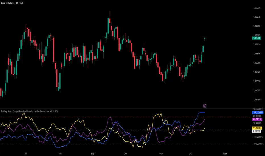
Tick Tack by TradeSeekers"Tick Tack" is a unique first of it's kind attempt at recreating market breadth index "TICK" for all sessions and all markets.  Do not confuse this with tick charts.
 Backstory 
The fun aptly named "Tick Tack" has similar visuals to a market breadth indicator I created,   MIT (Market Internal Trend) .  For comparative demonstrations it has been included in the publication chart but is not required for Tick Tack usage.
MIT centers on the "TICK" index in a unique bias colored histogram display, where extreme high tick values indicate potential for buy side exhaustion, and inversely, extreme low tick values indicate potential for sell side exhaustion.
The issue with market breadth/internal data is the unavailability in non-RTH sessions, something this indicator resolves.  Also TICK isn't available for crypto markets, non-US markets, etc.  Tick Tack can be applied to virtually any market.
 Neutral Range 
Given that TICK index is a ratio and operates on a known range (~1000 +/-), many measures surrounding TICK are statically anchored.
When recreating the concept of TICK on an unbounded market, certain concessions had to be made, the first being the boundaries.
Tick Tack reads the market and creates a dynamic boundary for the "tick like" high and low extreme areas.  That is the neutral range and is similarly colored to the MIT indicator.
Conventional trading wisdom indicates that TICK index values between 500 +/- are neutral/chop and have no edge.
 Breaks 
Any sufficiently high or low breaks beyond the neutral range are considered breaks and colored to indicate this event.  Deviation calculations are used to indicate the strength level.
If a break of significant strength is detected, it'll be marked as "extreme" with color and a diamond plot, exactly like MIT.
 "Tick" Trend 
A simple SMA trend, like MIT, is made optionally available to show direction of the histogram measure.
 "TRIN" Dots 
TRIN, or "traders index", aims to present a numerical value indicating buy and sell sentiment.  Intraday this index adjusts in realtime to market breadth price and volume advancement or decline with a publicly available formula for the entire market (NYSE typically).
Given that Tick Tack isn't making use of market breadth data, some creativity was employed here with a different take on the concept.
At times where measurement indicates directional movement, Tick Tack will display white dots at the histogram zero point, otherwise if balance is detected then the dots will be orange.  If neither measure fires a detection, no dots will be displayed.
 Usage 
It's been primarily designed to emulate TICK index for intraday trading, scalping and similar.
Once sufficiently settled on directionality, range, etc.  Utilize the histogram to find key break points to counter or join depending on market conditions.
Often times with TICK, the extreme breaks can be counter signals for quick mean reversion scalps.
Look for histogram and price action divergences for V signals near key pivots.
Tick Tack hasn't been tested nor designed for anything higher timeframe, but a benefit of this indicator vs TICK index is that it works on any timeframe with scaled resolution.  It's entirely possible that this indicator has usefulness in higher timeframes.
 Considerations 
Tick Tack operates under the premise that mostly the market breadth will impact the market being charted and should provide a close approximation.  If the charted market has low correlation to breadth then assume this TICK like display will have little to no similarity to the real TICK index (which may be acceptable).
Where Tick Tack and the TICK index will potentially see wide divergence will be near open of RTH.  In many cases, with gaps in the NYSE or similar market breadth data, it will take some time for TICK index to catch up to current market conditions.  Tick Tack will not suffer from this issue if utilizing extended session data and may provide a clearer picture.
Do note that Tick Tack is not claiming to present actual market breadth information and while it can be used for scalping, like TICK, I'm unsure it can be trusted for the same reasons as TICK.
 Final Notes 
I've received countless messages, questions and comments that my other market breadth tools be made available to extended sessions, non-US markets and crypto.
My thought process was that if I could create something that closely matched TICK index in regular trading hours, then perhaps it would provide similar indications and usefulness in extended session.
Oscillators
RSI of RSI Deviation (RoRD)RSI of RSI Deviation (RoRD) - Advanced Momentum Acceleration Analysis 
 What is RSI of RSI Deviation (RoRD)? 
RSI of RSI Deviation (RoRD) is a insightful momentum indicator that transcends traditional oscillator analysis by measuring the  acceleration of momentum  through sophisticated mathematical layering. By calculating RSI on RSI itself (RSI²) and applying advanced statistical deviation analysis with T3 smoothing, RoRD reveals hidden market dynamics that single-layer indicators miss entirely.
This isn't just another RSI variant—it's a  complete reimagining  of how we measure and visualize momentum dynamics. Where traditional RSI shows momentum, RoRD shows  momentum's rate of change . Where others show static overbought/oversold levels, RoRD reveals  statistically significant deviations  unique to each market's character.
 Theoretical Foundation - The Mathematics of Momentum Acceleration 
 1. RSI² (RSI of RSI) - The Core Innovation 
Traditional RSI measures price momentum. RoRD goes deeper:
 Primary RSI (RSI₁) : Standard RSI calculation on price
 Secondary RSI (RSI²) : RSI calculated on RSI₁ values
This creates a  "momentum of momentum"  indicator that leads price action
 Mathematical Expression: 
RSI₁ = 100 - (100 / (1 + RS₁))
RSI² = 100 - (100 / (1 + RS₂))
Where RS₂ = Average Gain of RSI₁ / Average Loss of RSI₁
 2. T3 Smoothing - Lag-Free Response 
The T3 Moving Average, developed by Tim Tillson, provides:
 Superior smoothing  with minimal lag
 Adaptive response  through volume factor (vFactor)
 Noise reduction  while preserving signal integrity
 T3 Formula: 
T3 = c1×e6 + c2×e5 + c3×e4 + c4×e3
Where e1...e6 are cascaded EMAs and c1...c4 are volume-factor-based coefficients
 3. Statistical Z-Score Deviation 
RoRD employs  dual-layer Z-score normalization :
 Initial Z-Score : (RSI² - SMA) / StDev
 Final Z-Score : Z-score of the Z-score for refined extremity detection
This identifies  statistically rare events  relative to recent market behavior
 4. Multi-Timeframe Confluence 
Compares current timeframe Z-score with higher timeframe (HTF)
Provides  directional confirmation  across time horizons
Filters false signals through timeframe alignment
 Why RoRD is Different & More Sophisticated 
 Beyond Traditional Indicators: 
 Acceleration vs. Velocity : While RSI measures momentum (velocity), RoRD measures momentum's rate of change (acceleration)
 Adaptive Thresholds : Z-score analysis adapts to market conditions rather than using fixed 70/30 levels
 Statistical Significance : Signals are based on mathematical rarity, not arbitrary levels
 Leading Indicator : RSI² often turns before price, providing earlier signals
 Reduced Whipsaws : T3 smoothing eliminates noise while maintaining responsiveness
 Unique Signal Generation: 
 Quantum Orbs : Multi-layered visual signals for statistically extreme events
 Divergence Detection : Automated identification of price/momentum divergences
 Regime Backgrounds : Visual market state classification (Bullish/Bearish/Neutral)
 Particle Effects : Dynamic visualization of momentum energy
 Visual Design & Interpretation Guide 
 Color Coding System: 
 Yellow (#e1ff00) : Neutral/balanced momentum state
 Red (#ff0000) : Overbought/extreme bullish acceleration
 Green (#2fff00) : Oversold/extreme bearish acceleration
 Orange : Z-score visualization
 Blue : HTF Z-score comparison
 Main Visual Elements: 
 RSI² Line with Glow Effect 
Multi-layer glow creates depth and emphasis
Color dynamically shifts based on momentum state
Line thickness indicates signal strength
 Quantum Signal Orbs 
 Green Orbs Below : Statistically rare oversold conditions
 Red Orbs Above : Statistically rare overbought conditions
Multiple layers indicate signal strength
Only appear at Z-score extremes for high-conviction signals
 Divergence Markers 
 Green Circles : Bullish divergence detected
 Red Circles : Bearish divergence detected
Plotted at pivot points for precision
 Background Regimes 
 Green Background : Bullish momentum regime
 Grey Background : Bearish momentum regime
 Blue Background : Neutral/transitioning regime
 Particle Effects 
Density indicates momentum energy
Color matches current RSI² state
Provides dynamic market "feel"
 Dashboard Metrics - Deep Dive 
 RSI² ANALYSIS Section: 
 RSI² Value (0-100) 
Current smoothed RSI of RSI reading
 >70 : Strong bullish acceleration
 <30 : Strong bearish acceleration
 ~50 : Neutral momentum state
 RSI¹ Value 
Traditional RSI for reference
Compare with RSI² for acceleration/deceleration insights
 Z-Score Status 
 🔥 EXTREME HIGH : Z > threshold, statistically rare bullish
 ❄️ EXTREME LOW : Z < threshold, statistically rare bearish
 📈 HIGH/📉 LOW : Elevated but not extreme
 ➡️ NEUTRAL : Normal statistical range
 MOMENTUM Section: 
 Velocity Indicator 
 ▲▲▲ : Strong positive acceleration
 ▼▼▼ : Strong negative acceleration
Shows rate of change in RSI²
 Strength Bar 
 ██████░░░░ : Visual power gauge
Filled bars indicate momentum strength
Based on deviation from center line
 SIGNALS Section: 
 Divergence Status 
 🟢 BULLISH DIV : Price making lows, RSI² making highs
 🔴 BEARISH DIV : Price making highs, RSI² making lows
 ⚪ NO DIVERGENCE : No divergence detected
 HTF Comparison 
 🔥 HTF EXTREME : Higher timeframe confirms extremity
 📊 HTF NORMAL : Higher timeframe is neutral
Critical for multi-timeframe confirmation
 Trading Application & Strategy 
 Signal Hierarchy (Highest to Lowest Priority): 
 Quantum Orb + HTF Alignment + Divergence 
Highest conviction reversal signal
Z-score extreme + timeframe confluence + divergence
 Quantum Orb + HTF Alignment 
Strong reversal signal
Wait for price confirmation
 Divergence + Regime Change 
Medium-term reversal signal
Monitor for orb confirmation
 Threshold Crosses 
Traditional overbought/oversold
Use as alert, not entry
 Entry Strategies: 
 For Reversals: 
Wait for Quantum Orb signal
Confirm with HTF Z-score direction
Enter on price structure break
Stop beyond recent extreme
 For Continuations: 
Trade with regime background color
Use RSI² pullbacks to center line
Avoid signals against HTF trend
 For Scalping: 
Focus on Z-score extremes
Quick entries on orb signals
Exit at center line cross
 Risk Management: 
 Reduce position size  when signals conflict with HTF
 Avoid trades  during regime transitions (blue background)
 Tighten stops  after divergence completion
 Scale out  at statistical mean reversion
 Development & Uniqueness 
RoRD represents months of research into momentum dynamics and statistical analysis. Unlike indicators that simply combine existing tools, RoRD introduces several  genuine innovations :
 True RSI² Implementation : Not a smoothed RSI, but actual RSI calculated on RSI values
 Dual Z-Score Normalization : Unique approach to finding statistical extremes
 T3 Integration : First RSI² implementation with T3 smoothing for optimal lag reduction
 Quantum Orb Visualization : Revolutionary signal display method
 Dynamic Regime Detection : Automatic market state classification
 Statistical Adaptability : Thresholds adapt to market volatility
This indicator was built from first principles, with each component carefully selected for its mathematical properties and practical trading utility. The result is a  professional-grade tool  that provides insights unavailable through traditional momentum analysis.
 Best Practices & Tips 
 Start with default settings  - they're optimized for most markets
 Always check HTF alignment  before taking signals
 Use divergences as early warning , orbs as confirmation
 Respect regime backgrounds  - trade with them, not against
 Combine with price action  - RoRD shows when, price shows where
 Adjust Z-score thresholds  based on market volatility
 Monitor dashboard metrics  for complete market context
 Conclusion 
RoRD isn't just another indicator—it's a  complete momentum analysis system  that reveals market dynamics invisible to traditional tools. By combining momentum acceleration, statistical analysis, and multi-timeframe confluence with intuitive visualization, RoRD provides traders with a sophisticated edge in any market condition.
Whether you're scalping rapid reversals or positioning for major trend changes, RoRD's unique approach to momentum analysis will transform how you see and trade market dynamics.
 See momentum's future. Trade with statistical edge. 
Trade with insight. Trade with anticipation.
— Dskyz, for DAFE Trading Systems
[Smith] VWAP Deviation + VWAP Deviation + 
 Short Description: 
Advanced VWAP indicator with deviation bands, smart signal filtering, and session-based performance tracking. Features log-space scaling, RSI confirmation, volume filters, and market regime detection.
 Full Description: 
The   VWAP Deviation +  is a comprehensive trading indicator that combines Volume Weighted Average Price (VWAP) analysis with advanced signal filtering to identify high-probability trade opportunities. This indicator goes beyond basic VWAP by incorporating multiple confirmation layers and intelligent market analysis.
 🎯 Key Features 
 Core VWAP Analysis: 
- Custom volume-weighted mean calculation with deviation bands (2σ and 3σ)
- Optional log-space scaling for proportional price movements
- Real-time VWAP line with customizable visibility
 Smart Signal Detection: 
- RSI confirmation for all trade signals
- Volume filter requiring above-average trading activity
- Market regime detection (trending vs ranging markets)
- Optional RSI divergence analysis
 Advanced Filtering: 
- Multi-condition signal validation
- Session-based performance tracking (Asian, London, NY)
- Real-time win rate calculation
- Strong vs regular signal classification
 Visual Features: 
- Clean, professional interface with customizable colors
- Optional signal shapes and annotations
- Performance statistics table
- Filled deviation bands for easy visualization
📊  How It Works 
The indicator identifies trade opportunities when:
1. Price touches VWAP deviation bands (2σ or 3σ)
2. RSI confirms oversold/overbought conditions
3. Volume exceeds the specified threshold
4. Market regime conditions are favorable
 Signal Types: 
-  LONG : Price at lower bands + RSI oversold + volume confirmation
-  SHORT : Price at upper bands + RSI overbought + volume confirmation
-  STRONG : Same conditions but at 3σ bands for higher conviction trades
⚙️  Customization Options 
 Core Settings: 
- VWAP length and source selection
- Adjustable deviation multipliers
- Log-space scaling toggle
 Signal Filters: 
- RSI length and threshold levels
- Volume filter with customizable multiplier
- Market type filtering options
 Advanced Features: 
- Session statistics tracking
- RSI divergence detection
- Market regime analysis
 Visual Controls: 
- Show/hide individual components
- Custom color schemes
- Signal display toggles
🔔  Alert System 
Built-in alerts for:
- Long and short trade opportunities
- Strong signal confirmations
- RSI divergence signals
💡  Best Practices 
- Use higher timeframes (15m+) for more reliable signals
- Combine with additional confirmation indicators
- Pay attention to session statistics for timing optimization
- Monitor market regime indicators for context
This indicator is suitable for day traders, swing traders, and anyone looking to improve their VWAP-based trading strategies with advanced filtering and market analysis.
Momentum ScopeOverview   
Momentum Scope is a Pine Script™ v6 study that renders a –1 to +1 momentum heatmap across up to 32 lookback periods in its own pane. Using an Augmented Relative Momentum Index (ARMI) and color shading, it highlights where momentum strengthens, weakens, or stays flat over time—across any asset and timeframe.  
 Key Features   
   
 Full-Spectrum Momentum Map : Computes ARMI for 1–32 lookbacks, indexed from –1 (strong bearish) to +1 (strong bullish).  
 Flexible Scale Gradation : Choose Linear or Exponential spacing, with adjustable expansion ratio and maximum depth.  
 Trending Bias Control : Apply a contrast-style curve transform to emphasize trending vs. mean-reverting behavior.  
 Duotone & Tritone Palettes : Select between two vivid color styles, with user-definable hues for bearish, bullish, and neutral momentum.  
 Compact, Overlay-Free Display : Renders solely in its own pane—keeping your price chart clean.  
   
 Inputs & Customization   
   
 Scale Gradation : Linear or Exponential spacing of intervals  
 Scale Expansion : Ratio governing step-size between successive lookbacks  
 Scale Maximum : Maximum lookback period (and highest interval)  
 Trending Bias : Curve-transform bias to tilt the –1 … +1 grid  
 Color Style : Duotone or Tritone rendering modes  
 Reducing / Increasing / Neutral Colors : Pick your own hues for bearish, bullish, and flat zones  
   
 How to Use   
   
 Add to Chart : Apply “Momentum Scope” as a separate indicator.  
 Adjust Scale : For exponential spacing, switch your indicator Y-axis to  Logarithmic .  
 Set Bias & Colors : Tweak  Trending Bias  and choose a palette that stands out on your layout.  
 Interpret the Heatmap :  
     
   Red  tones = weakening/bearish momentum  
   Green  tones = strengthening/bullish momentum  
   Neutral  hues = indecision or flat momentum  
     
   
 Copyright © 2025 MVPMC. Licensed under MIT. For full license see opensource.org 
Market Sell-Off GaugeOVERVIEW 
The Market Sell‑Off Gauge identifies high‑conviction, risk‑off entry opportunities by detecting broad market sell‑off behavior and rising stablecoin dominance, then confirming risk‑off sentiment via NDX weakness, VIX spikes, and elevated volume. It uses fuzzy logic and sigmoid scaling to convert raw signals into a smooth, bounded metric.
 FEATURES 
 
 Sell‑Off Detection - calculates percentage drops in the primary asset over a user‑defined lookback.  
 Stablecoin Dominance Surge - tracks combined USDT/USDC dominance rises as a proxy for on‑chain “flight to safety.”  
 
 Macro Confirmation  
 NDX Weakness (NASDAQ‑100)  
 VIX Spikes (CBOE Volatility Index)  
 Elevated Volume on declining bars
   
 Fuzzy Logic & Scaling - component values feed into a fuzzy‑logic membership scor and are passed through a sigmoid compressor (–1 to +1). Weighted aggregation derives the final result of the gauge (or metric).
 
 VISUALISATION 
 
 Continuous line plot - Smoothed metric (–1 to +1), colored cold‑to‑warm.  
 Entry circles - Highlighted when all conditions (fuzzy or crisp) are met after the time offset.  
 Time‑Offset marker - Vertical line/label showing the user‑specified “start” bar.  
 Component table - Displays real‑time % changes & volume multiples in the lower right of the indicator.
 
 USAGE 
 
 Asset drop % - The threshold percent decline to register a sell‑off.
 Stables rise % - The threshold percent increase in stablecoin dominance to qualify as a “flight to safety.”
 NDX drop % - The threshold percent decline in the NASDAQ‑100 for macro confirmation.
 VIX rise % - The threshold percent increase in VIX. Contributes to risk‑off validation.
 Volume Multiplier - Defines how many times above SMA volume must rise to confirm conviction.
 Lookback Period - Controls the number of bars over which % changes are measured.
 Time Offset - Point in time beyond which bars to “fade” historical signals, enables focus  on recent data only.
 Fuzzy Logic Settings - Enables fuzzy scoring and set membership threshold & sensitivity.
 Weights - allows for adjusting the relative importance of each component (Asset, Stables, NDX, VIX, Volume).
 Sigmoid Steepness (k) - Controls curve steepness for compression (0.1 = very flat → 5.0 = very sharp S‑curve).
 
Chart & settings
 
 Best applied on 4H or Daily BTCUSD (or similar) charts to capture meaningful sell‑off events.  
 Combine with broader trend filters (e.g., moving averages) for trend‑aligned entries.  
 Adjust Sigmoid Steepness and Membership Sensitivity to fine‑tune signal crispness vs. smoothness. Refer to tooltips.
 
Disclaimer
This indicator is intended for educational purposes only. Always perform your own due diligence before making financial decisions.
Flux Capacitor (FC)# Flux Capacitor
**A volume-weighted, outlier-resistant momentum oscillator designed to expose hidden directional pressure from institutional participants.**
---
### Why "Flux Capacitor"?
The name pays homage to the fictional energy core in *Back to the Future* — an invisible engine that powers movement. Similarly, this indicator detects whether price movement is being powered by real market participation (volume) or if it's coasting without conviction.
---
### Methodology
The Flux Capacitor fuses three statistical layers:
- **Normalized Momentum**: `(Close – Open) / ATR`  
  Controls for raw price size and volatility.
- **Volume Scaling**:  
  Amplifies the effect of price moves that occur with elevated volume.
- **Robust Normalization**:  
  - *Winsorization* caps outlier spikes.  
  - *MAD-Z scoring* normalizes the signal across assets (crypto, futures, stocks).  
  - This produces consistent scaling across timeframes and symbols.
The result is a smooth oscillator that reliably indicates **liquidity-backed momentum** — not just price movement.
---
### Signal Events
- **Divergence (D)**: Price makes higher highs or lower lows, but Flux does not.  
- **Absorption (A)**: Candle shows high volume and small body, while Flux opposes the candle direction — indicates smart money stepping in.  
- **Compression (◆)**: High volume with low momentum — potential breakout zone.  
- **Zero-Cross**: Indicates directional regime flip.  
- **Flux Acceleration**: Histogram shows pressure rate of change.  
- **Regime Background**: Color fades with weakening trend conviction.
All signals are color-coded and visually compact for easy pattern recognition.
---
### Interpreting Divergence & Absorption Correctly
Signal strength improves significantly when it appears **in the correct zone**:
#### Divergence:
| Signal | Zone       | Meaning                                 | Strength     |
|--------|------------|------------------------------------------|--------------|
| Green D | Below 0    | Bullish reversal forming in weakness     | **Strong**   |
| Green D | Above 0    | Bullish, but less convincing             | Moderate     |
| Red D   | Above 0    | Bearish reversal forming in strength     | **Strong**   |
| Red D   | Below 0    | Bearish continuation — low warning value | Weak         |
#### Absorption:
| Signal | Zone       | Meaning                                | Strength     |
|--------|------------|-----------------------------------------|--------------|
| Green A | Below 0    | Buyers absorbing panic-selling          | **Strong**   |
| Green A | Above 0    | Support continuation                    | Moderate     |
| Red A   | Above 0    | Sellers absorbing FOMO buying           | **Strong**   |
| Red A   | Below 0    | Trend continuation — not actionable     | Weak         |
Look for **absorption or divergence signals in “enemy territory”** for the most actionable entries.
---
### Reducing Visual Footprint
If your chart shows a long line of numbers across the top of the Flux Capacitor pane (e.g. "FC 14 20 9 ... Bottom Right"), it’s due to TradingView’s *status line input display*.
**To fix this**:  
Right-click the indicator pane → **Settings** → **Status Line** tab → uncheck “Show Indicator Arguments”.  
This frees up vertical space so top-edge signals (like red `D` or yellow `◆`) remain visible and unobstructed.
---
### Features
- Original MAD-Z based momentum design  
- True volume-based divergence and absorption logic  
- Built-in alerts for all signal types  
- Works across timeframes (1-min to weekly)  
- Minimalist, responsive layout  
- 25+ customizable parameters  
- No future leaks, no repainting
---
### Usage Scenarios
- **Trend confirmation**: Flux > 0 confirms bullish trend strength  
- **Reversal detection**: Divergence or absorption in opposite territory = high-probability reversal  
- **Breakout anticipation**: Compression signal inside range often precedes directional move  
- **Momentum shifts**: Watch for zero-crosses + flux acceleration spikes
---
### ⚠ Visual Note for BTC, ETH, Crude Oil & Futures
These high-priced or rapidly accelerating instruments can visually compress any linear oscillator. You may notice the Flux Capacitor’s line appears "flat" or muted on these assets — especially over long lookbacks.
> **This does not affect signal validity.** Divergence, absorption, and compression triggers still fire based on underlying logic — only the line’s amplitude appears reduced due to scaling constraints.
---
### Disclaimer
This indicator is for educational purposes only. It is not trading advice. Past results do not guarantee future performance. Use in combination with your own risk management and analysis.
ADX Cross 30 & EMA 20 Touch SignalHOLY GRAIL: ADX Cross 30 & EMA 20 Touch Signal
This TradingView script is a powerful tool designed to help traders identify high-probability trend-following opportunities, drawing inspiration from the renowned "HOLY GRAIL" strategy outlined in the Street Smarts book by Linda Bradford Raschke and Laurence A. Connors. It combines the Average Directional Index (ADX) with the Exponential Moving Average (EMA) to generate precise trading signals directly on your chart.
How it Works (Inspired by the "HOLY GRAIL" Strategy):
The script generates a "Buy Signal" when two crucial technical conditions align simultaneously on the same price bar, mirroring the core principles of the "HOLY GRAIL" setup:
ADX Trend Strength Confirmation (ADX Cross Above 30):
The ADX indicator, which measures the strength of a trend (regardless of its direction), crosses above the 30 level.
An ADX reading above 30 typically indicates that a strong and well-defined trend is developing and gaining momentum. This condition filters out choppy or range-bound markets, focusing on clear trending environments, as emphasized in the "HOLY GRAIL" approach.
Price Retest/Interaction with EMA (EMA 20 Touch):
The current price candle (its body or wick) touches or encompasses the 20-period Exponential Moving Average (EMA). This means the low of the candle is at or below the EMA, and the high of the candle is at or above the EMA.
This condition identifies moments within a strong trend where price retraces or consolidates to interact with the EMA, which often acts as a dynamic support or resistance level. This interaction, a key component of the "HOLY GRAIL" strategy, can signal a potential entry point for a continuation of the prevailing trend.
The combination of these two conditions aims to provide a robust signal for trend continuation, ensuring both strong trend presence and a favorable entry point, as per the strategy's design.
Key Features & On-Chart Visuals:
Customizable Parameters:
ADX Length: Easily adjust the lookback period for the ADX calculation (default: 14).
EMA Length: Customize the length of the Exponential Moving Average (default: 20).
20 EMA Plot: The 20-period EMA is clearly plotted on your main price chart as a prominent dark blue line, making it easy to observe price interaction.
Combined Buy Signal: When both the ADX cross above 30 and the EMA touch conditions are met, a green upward-pointing triangle (▲) is displayed directly below the relevant price bar, indicating a confirmed buy signal.
Background Highlight: The background of the chart is subtly highlighted in a soft green color when a combined buy signal is active, drawing your attention to the signal bar for quick identification.
Debugging & Analysis Aids:
To assist traders in understanding the individual components of the signal and for fine-tuning the indicator, the script includes two helpful debugging plots:
"ADX Cross Only" (Orange Circle (●) above bar): This small orange circle appears above the price bar when only the ADX has crossed above 30, but the EMA touch condition was not met. This helps identify periods of strong trend development without an EMA retest.
"EMA Touch Only" (Purple Square (■) above bar): A small purple square is plotted above the price bar when only the price has touched the 20 EMA, but the ADX has not yet crossed above 30. This highlights instances of EMA interaction without strong trend confirmation.
These debugging plots are invaluable for refining your understanding of the script's logic and for optimizing input parameters for different market conditions.
Important Recommendation for Users:
To gain a deeper insight into the ADX and its directional components (+DI and -DI) and to cross-reference the script's signals, it is strongly recommended to:
Navigate to your TradingView chart.
Click on the "Indicators" or "fx" icon.
Search for and add the built-in "ADX / DMI" indicator to a separate pane below your main chart.
Ensure that its "Length" setting is synchronized with the ADX Length input you are using in this custom script (default 14).
This will provide a clear visual representation of the ADX indicator itself, which is crucial for comprehensive analysis and informed decision-making based on the "HOLY GRAIL" principles.
Multi TF Oscillators Screener [TradingFinder] RSI / ATR / Stoch🔵 Introduction 
The oscillator screener is designed to simplify multi-timeframe analysis by allowing traders and analysts to monitor one or multiple symbols across their preferred timeframes—all at the same time. Users can track a single symbol through various timeframes simultaneously or follow multiple symbols in selected intervals. This flexibility makes the tool highly effective for analyzing diverse markets concurrently.
At the core of this screener lie two essential oscillators: RSI (Relative Strength Index) and the Stochastic Oscillator. The RSI measures the speed and magnitude of recent price movements and helps identify overbought or oversold conditions. 
It's one of the most reliable indicators for spotting potential reversals. The Stochastic Oscillator, on the other hand, compares the current price to recent highs and lows to detect momentum strength and potential trend shifts. It’s especially effective in identifying divergences and short-term reversal signals.
In addition to these two primary indicators, the screener also displays helpful supplementary data such as the dominant candlestick type (Bullish, Bearish, or Doji), market volatility indicators like ATR and TR, and the four key OHLC prices (Open, High, Low, Close) for each symbol and timeframe. This combination of data gives users a comprehensive technical view and allows for quick, side-by-side comparison of symbols and timeframes.
  
🔵 How to Use 
This tool is built for users who want to view the behavior of a single symbol across several timeframes simultaneously. Instead of jumping between charts, users can quickly grasp the state of a symbol like gold or Bitcoin across the 15-minute, 1-hour, and daily timeframes at a glance. This is particularly useful for traders who rely on multi-timeframe confirmation to strengthen their analysis and decision-making.
  
The tool also supports simultaneous monitoring of multiple symbols. Users can select and track various assets based on the timeframes that matter most to them. For example, if you’re looking for entry opportunities, the screener allows you to compare setups across several markets side by side—making it easier to choose the most favorable trade. Whether you’re a scalper focused on low timeframes or a swing trader using higher ones, the tool adapts to your workflow.
  
The screener utilizes the widely-used RSI indicator, which ranges from 0 to 100 and highlights market exhaustion levels. Readings above 70 typically indicate potential pullbacks, while values below 30 may suggest bullish reversals. Viewing RSI across timeframes can reveal meaningful divergences or alignments that improve signal quality.
Another key indicator in the screener is the Stochastic Oscillator, which analyzes the closing price relative to its recent high-low range. When the %K and %D lines converge and cross within the overbought or oversold zones, it often signals a momentum reversal. This oscillator is especially responsive in lower timeframes, making it ideal for spotting quick entries or exits.
Beyond these oscillators, the table includes other valuable data such as candlestick type (bullish, bearish, or doji), volatility measures like ATR and TR, and complete OHLC pricing. This layered approach helps users understand both market momentum and structure at a glance.
Ultimately, this screener allows analysts and traders to gain a full market overview with just one look—empowering faster, more informed, and lower-risk decision-making. It not only saves time but also enhances the precision and clarity of technical analysis.
🔵 Settings 
🟣 Display Settings 
 Table Size : Lets you adjust the table’s visual size with options such as: auto, tiny, small, normal, large, huge.
 Table Position : Sets the screen location of the table. Choose from 9 possible positions, combining vertical (top, middle, bottom) and horizontal (left, center, right) alignments.
🟣 Symbol Settings 
 Each of the 10 symbol slots comes with a full set of customizable parameters :
 Enable Symbol : A checkbox to activate or hide each symbol from the table.
 Symbol : Define or select the asset (e.g., XAUUSD, BTCUSD, EURUSD, etc.).
 Timeframe : Set your desired timeframe for each symbol (e.g., 15, 60, 240, 1D).
 RSI Length : Defines the period used in RSI calculation (default is 14).
 Stochastic Length : Sets the period for the Stochastic Oscillator.
 ATR Length : Sets the length used to calculate the Average True Range, a key volatility metric.
🔵 Conclusion 
By combining powerful oscillators like RSI and Stochastic with full customization over symbols and timeframes, this tool provides a fast, flexible solution for technical analysts. Users can instantly monitor one or several assets across multiple timeframes without opening separate charts. 
Individual configuration for each symbol, along with the inclusion of key metrics like candlestick type, ATR/TR, and OHLC prices, makes the tool suitable for a wide range of trading styles—from scalping to swing and position trading.
In summary, this screener enables traders to gain a clear, high-level view of various markets in seconds and make quicker, smarter, and lower-risk decisions. It saves time, streamlines analysis, and boosts overall efficiency and confidence in trading strategies.
CDP - Counter-Directional-Pivot🎯 CDP - Counter-Directional-Pivot 
 📊 Overview 
The  Counter-Directional-Pivot (CDP)  indicator calculates five critical price levels based on the previous day's OHLC data, specifically designed for multi-timeframe analysis. Unlike standard pivot points, CDP levels are calculated using a unique formula that identifies potential reversal zones where price action often changes direction.
 ⚡ What Makes This Script Original 
This implementation solves several technical challenges that existing pivot indicators face:
 
 🔄  Multi-Timeframe Consistency:  Values remain identical across all timeframes (1m, 5m, 1h, daily) - a common problem with many pivot implementations
 🔒  Intraday Stability:  Uses advanced value-locking technology to prevent the "stepping" effect that occurs when pivot lines shift during the trading session
 💪  Robust Data Handling:  Optimized for both liquid and illiquid stocks with enhanced data synchronization
 
 🧮 CDP Calculation Formula 
The indicator calculates five key levels using the previous day's High (H), Low (L), and Close (C):
 
 CDP = (H + L + C) ÷ 3   (Central Decision Point) 
 AH = 2×CDP + H – 2×L   (Anchor High - Strong Resistance) 
 NH = 2×CDP – L   (Near High - Moderate Resistance) 
 AL = 2×CDP – 2×H + L   (Anchor Low - Strong Support) 
 NL = 2×CDP – H   (Near Low - Moderate Support) 
 
 ✨ Key Features 
 🎨 Visual Elements 
 
 📈  Five Distinct Price Levels:  Each with customizable colors and line styles
 🏷️  Smart Label System:  Shows exact price values for each level
 📋  Optional Value Table:  Displays all levels in an organized table format
 🎯  Clean Chart Display:  Minimal visual clutter while maximizing information
 
 ⚙️ Technical Advantages 
 
 🔐  Session-Locked Values:  Prices are locked at market open, preventing intraday shifts
 🔄  Multi-Timeframe Sync:  Perfect consistency between daily and intraday charts
 ✅  Data Validation:  Built-in checks ensure reliable calculations
 🚀  Performance Optimized:  Efficient code structure for fast loading
 
 💼 Trading Applications 
 
 🔄  Reversal Zones:  AH and AL often act as strong turning points
 💥  Breakout Confirmation:  Price movement beyond these levels signals trend continuation
 🛡️  Risk Management:  Use levels for stop-loss and take-profit placement
 🏗️  Market Structure:  Understand daily ranges and potential price targets
 
 📚 How to Use 
 🚀 Basic Setup 
 
 Add the indicator to your chart (works on any timeframe)
 Customize colors for easy identification of support/resistance zones
 Enable the value table for quick reference of exact price levels
 
 📈 Trading Strategy Examples 
 
 🟢  Long Bias:  Look for bounces at NL or AL levels
 🔴  Short Bias:  Watch for rejections at NH or AH levels  
 💥  Breakout Trading:  Enter positions when price decisively breaks through anchor levels
 ↔️  Range Trading:  Use CDP as the central reference point for range-bound markets
 
 🎯 Advanced Strategy Combinations 
 RSI Integration for Enhanced Signals: 📊 
 
 📉  Oversold Bounces:  Combine RSI below 30 with price touching AL/NL levels for high-probability long entries
 📈  Overbought Rejections:  Look for RSI above 70 with price rejecting AH/NH levels for short opportunities
 🔍  Divergence Confirmation:  When RSI shows bullish divergence at support levels (AL/NL) or bearish divergence at resistance levels (AH/NH), it often signals stronger reversal potential
 ⚡  Momentum Confluence:  RSI crossing 50 while price breaks through CDP can confirm trend direction changes
 
 ⚙️ Configuration Options 
 
 🎨  Line Customization:  Adjust width, style (solid/dashed/dotted), and colors
 👁️  Display Preferences:  Toggle individual levels, labels, and value table
 📍  Table Position:  Place the value table anywhere on your chart
 🔔  Alert System:  Get notifications when price crosses key levels
 
 🔧 Technical Implementation Details 
 🎯 Data Reliability 
The script uses  request.security()  with lookahead settings to ensure historical accuracy while maintaining real-time functionality. The value-locking mechanism prevents the common issue where pivot levels shift during the trading day.
 🔄 Multi-Timeframe Logic 
 
 ⏰  Intraday Charts:  Display previous day's calculated levels as stable horizontal lines
 📅  Daily Charts:  Show current day's levels based on yesterday's OHLC
 🔍  Consistency Check:  All timeframes reference the same source data
 
 🤔 Why CDP vs Standard Pivots? 
Counter-Directional Pivots often provide more accurate reversal points than traditional pivot calculations because they incorporate the relationship between high/low ranges and closing prices more effectively. The formula creates levels that better reflect market psychology and institutional trading behaviors.
 💡 Best Practices 
 
 💧 Use on liquid markets for most reliable results
 📊  RSI Combination:  Add RSI indicator for overbought/oversold confirmation and divergence analysis
 📊 Combine with volume analysis for confirmation
 🔍 Consider multiple timeframe analysis (daily levels on hourly charts)
 📝 Test thoroughly in paper trading before live implementation
 
 💪 Example Market Applications 
 
 NASDAQ:AAPL  AAPL - Tech stock breakouts through AH levels
 $NYSE:SPY SPY - Index trading with CDP range analysis  
 NASDAQ:TSLA  TSLA - Volatile stock reversals at AL/NL levels
 
 
⚠️  This indicator is designed for educational and analytical purposes. Always combine with proper risk management and additional technical analysis tools. 
RSI Divergence StrategyOverview
 
The RSI Divergence Strategy Indicator is a trading tool that uses the RSI and divergences created to generate high-probability buy and sell signals. 
 I have provided the best formula of numbers to use for BTC on a 30 minute timeframe.
 
You can change where on RSI you enter and exit both long or short trades. This way you can experiment on different tokens using different entry/exit points. Can use on multiple timeframes.
This strategy is designed to open and close long or short trades based on the levels you provide it. You can then check on the RSI where the best levels are for each token you want to trade and amend it as required to generate a profitable strategy.
 How It Works
 
The  RSI Divergence Strategy Indicator uses bear and bull divergences in conjuction with a level you have input on the RSI.
RSI for Overbought/Oversold:
• Input variables for entry and exit levels and when the entry levels combine with a bear or bull divergence signal, a trade is alerted.
RSI Divergence:
• Buy and sell signals are confirmed when the RSI creates bearish or bullish divergences and these divergences are in the same area as your levels you input for entry to short or long.
After 7 years of experience and testing I have calculated the exact numbers required and produced a formula to calculate the exact input variables for a 30 minute Bitcoin chart.
 Key Features
 
1️⃣ Divergence Identification – Ensures trades are taken only when a bull or bear divergence has formed.
2️⃣ Overbought/Oversold Input Filtering – Set up your own variables on the RSI for different markets after identifying patterns on the RSI in relation to a bearish or bullish divergence.
3️⃣ Works on any chart – Suitable for all markets and timeframes once you input the correct variables for entry and exit levels.
 How to Use
 
🟢 Basic Trading:
• Use on any timeframe.
• Enter trade only when alert has fired off. Close when it says to exit.
• Change entry and exit levels in the properties of the strategy indicator.
• Make entry and exit levels coincide with bearish or bullish divergences on the RSI.
Check the strategy tester to see backtesting so you know if the indicator is profitable or not for that market and timeframe as each crypto token is different and so is the timeframe you choose.
📢 Webhook Automation:
• Set up TradingView Alerts to auto-execute trades via Webhook-compatible platforms.
 Key additions for divergence visualization:
 
Divergence Arrows:
Bullish divergence: Green label with white 'bull ' text 
Bearish divergence: Red label with white 'bear' text
Positioned at the pivot point
Divergence Lines:
Connects consecutive RSI pivot points
Automatically drawn between consecutive pivot points
Enhanced RSI Coloring:
Overbought zone: Red
Oversold zone: Green
Neutral zone: Gray
The visualization helps you instantly spot:
Where divergences are forming on the RSI
The pattern of higher lows (bullish) or lower highs (bearish)
Contextual coloring of RSI relative to standard levels
All divergence markers appear at the correct historical pivot points, making it easy to visually confirm divergence patterns as they develop.
Strategy levels and background zones also shown to help visual look.
 Why This Combination?
 
This indicator is just a simple RSI tool.
It is designed to filter out weak trades and only execute trades that have:
✅ RSI Divergence
✅ Overbought or Oversold Conditions
It does not calculate downtrends or bear markets so care is recommended taking long trades during these times.
 Why It’s Worth Using?
 
📈 Open Source – Free to use and learn from.
📉 Long or Short Term Trading Style – Entry/Exit parameters options are designed for both short or long term trades allowing you to experiment until you find a profitable strategy for that market you want to trade.
📢 Seamless Webhook Automation – Execute trades automatically with TradingView alerts.
💲 Ready to trade smarter?
✅ Add the RSI Divergence Strategy Indicator to your TradingView chart.
Trend Strength Oscillator📌 What Is the Trend Strength Oscillator? 
The Trend Strength Oscillator is a visual tool that helps traders understand the overall direction and strength of the market trend. Instead of using multiple indicators separately, this tool combines three trusted methods into one clear, color-coded bar chart. The bars change based on whether the market is strongly trending up, down, or just moving sideways.
Imagine it as a traffic light for trading:
•	Green means it’s safe to consider buying (strong uptrend).
•	Red means consider selling or avoiding longs (strong downtrend).
•	Gray means wait, the market isn’t clearly trending.
 🧠 How It Works — The 3 Main Components 
1.	EMA Slope
The EMA (Exponential Moving Average) tracks the average price but reacts more quickly to changes. If the EMA is rising, it means the market is likely moving upward. If it’s falling, the trend is likely downward.
2.	RSI Direction
RSI (Relative Strength Index) measures momentum. This tool compares the RSI to its smoothed average. If the RSI is above its average, momentum is up. If it’s below, momentum is down.
3.	ADX Strength
ADX (Average Directional Index) measures how strong a trend is, not the direction. So even if EMA and RSI agree on a trend, the ADX must confirm it’s strong enough to be worth trading.
Only when all three indicators agree do we consider it a strong trend.
 🧮 What the Oscillator Shows 
The result of combining those components is a number that becomes a colored bar:
•	+2 means all three signals are bullish → green bar.
•	-2 means all three signals are bearish → red bar.
•	Anything else (e.g., mixed signals or weak ADX) → gray bar.
This makes the chart super easy to read at a glance, even for beginners.
 📈 How to Use It in Trading 
You can use the Trend Strength Oscillator in a few simple ways:
•	Entering Trades:
Look for a green bar when you want to buy or go long. Look for a red bar when you want to sell or go short. These bars mean all systems are “go” in the same direction.
•	Avoiding Mistakes:
If the bar is gray, it’s a warning that the market is undecided or weak. It’s often better to wait for a clearer signal rather than force a trade.
•	Managing Existing Trades:
If you’re in a trade and the bar color shifts back to gray, that can be a clue that the trend is losing strength. You might tighten your stop-loss or take some profit.
 🧭 Final Thoughts 
This indicator doesn’t give you a trade entry every few minutes. Instead, it helps you stay on the right side of strong moves and avoid choppy or sideways markets. It’s especially helpful for:
•	Trend-following traders
•	People who want clean, simple visuals
•	Beginners who get overwhelmed with too many indicators
Let me know if you'd like to see this paired with another tool like volume or MACD, or if you’d like a chart screenshot to visualize how this looks live.
Robby DSS Bressert Colored DotsIntroduction 
The Robby DSS Bressert Colored Dots is a technical analysis tool designed to measure momentum and identify potential overbought or oversold conditions in a market. It is a visually enhanced version of the Double Smoothed Stochastic (DSS) indicator, which was developed to be a smoother and more responsive version of the traditional Stochastic Oscillator.
This specific version provides at-a-glance information about momentum shifts through the use of colored dots, making it easy to interpret.
 The Core Engine: DSS Bressert 
The foundation of this indicator is the Double Smoothed Stochastic, a concept attributed to both William Blau and Walter Bressert, who introduced similar ideas. The goal of the DSS is to filter out the "noise" and false signals common in standard oscillators without introducing significant lag.
It achieves this through a two-step smoothing process:
First Smoothing: A standard Stochastic value is calculated based on the price. This value is then smoothed using an Exponential Moving Average (EMA). This creates a cleaner, less erratic line than the raw stochastic.
Second Smoothing: The indicator then takes this newly smoothed line and performs a second Stochastic calculation on it. This result is then smoothed one final time with another EMA.
This double-application of smoothing results in a very clean oscillator line that reacts quickly to price changes but is less prone to whipsaws.
The Visual Modification: "Robby" Colored Dots
The "Robby DSS Bressert Colored Dots" version takes the powerful DSS calculation and adds a unique visual layer for easier interpretation.
Colored Dots: Instead of plotting a continuous line, the indicator displays a dot for each candle. The color of this dot instantly tells you about the indicator's momentum:
Lime/Green dots appear when the DSS value is rising, indicating bullish or positive momentum.
Red dots appear when the DSS value is falling, indicating bearish or negative momentum.
If the value is unchanged, the dot retains the color of the previous one.
The "Robby" Name: In trading communities like Forex Factory and MQL5, it's common for programmers to modify popular indicators. These enhanced versions are often named after the member who created or popularized them. The "Robby" version specifically refers to this popular colored-dot modification of the DSS Bressert.
 How to Interpret and Use It 
Traders typically use the Robby DSS Bressert Colored Dots in a few key ways:
Momentum Shifts: The most straightforward signal is the change of dot color. A switch from red to lime can signal that downside momentum is waning and a potential move up is beginning. A switch from lime to red signals the opposite.
Overbought & Oversold Conditions: Like a standard stochastic, the indicator uses levels (typically 80 and 20).
When the dots are above 80, the market is considered overbought. A color change from lime to red in this zone can be a strong signal for a potential reversal down.
When the dots are below 20, the market is considered oversold. A color change from red to lime here can signal a potential reversal up.
Trend Confirmation: In a strong uptrend, traders might ignore red dots and use the appearance of lime dots in the oversold zone (or after a minor pullback) as a signal to join the trend. The opposite is true in a downtrend.
---
This is just an indicator that can found publicly online for mt4, and just translated it to Pinescript.
Chaikin Bull-Power OscillatorThis indicator is given with much love and care to the community to help you in your trading operations.
How to use the "Chaikin-Bull-PW" Indicator
The Chaikin-Bull-PW is an oscillator based on the Accumulation/Distribution (AD) line smoothed by different methods, called here the "Hull Chaikin Oscillator." It compares two smoothed averages of the AD line — a short period and a long period — to indicate the strength and direction of buying and selling pressure in the market.
Adjustable Parameters:
Short Period: Number of bars used to calculate the short smoothed average of the AD line. Shorter periods make the indicator more sensitive.
Long Period: Number of bars used to calculate the long smoothed average of the AD line. Longer periods smooth the indicator more.
Background Offset: Controls the offset of the chart’s background color.
Smoothing Type: Choose the smoothing method for the AD line among HMA, SMA, SMMA, EMA, WMA, and JMA. This affects how the averages are calculated and how the oscillator responds to price.
Indicator Interpretation:
The oscillator is the difference between the short and long smoothed averages of the AD line.
When the oscillator is above zero (green), it indicates increasing buying pressure, suggesting an uptrend.
When the oscillator is below zero (red), it indicates increasing selling pressure, suggesting a downtrend.
The zero line acts as a reference for trend changes.
Usage Suggestions:
Use the oscillator crossing the zero line to identify potential entry or exit points.
Combine with other indicators or chart analysis to confirm signals.
Adjust the periods and smoothing type to fit your asset and timeframe.
DVPOOverview 
The DVPO (Dynamic Volume Profile Oscillator) Strategy is a comprehensive and highly customizable trading tool designed for precision and control. It is built around a unique, volume-driven oscillator that identifies potential market entries by analyzing the relationship between price, volume, and volatility.
This strategy is not just another signal generator; it's a complete framework that includes dynamic entry logic, adaptive risk management (ATR Stop Loss and R:R-based Take Profit), and a powerful dashboard of 10+ optional confirmation filters to help you tailor the strategy to your specific instrument, timeframe, and trading style.
 The Core Concept: The DVPO Oscillator 
The heart of this strategy is the DVPO oscillator. Unlike standard oscillators like RSI or Stochastics, the DVPO's primary goal is to quantify how far the current price has deviated from its recent volume-weighted "fair value."
 Here’s how it works conceptually: 
Micro Volume Profile: The indicator first analyzes a recent period of bars (defined by Lookback Period) to build a mini-profile of price and volume.
Volume-Weighted Mean: From this profile, it calculates a volume-weighted average price (VWAP) and the average deviation from that mean. This establishes the central point of value for the recent period.
Deviation Measurement: The oscillator's value is derived from how far the current price is from this calculated mean, scaled by the observed price deviation and a user-defined Sensitivity. A value above the midline suggests the price is trading at a premium, while a value below suggests it's at a discount.
Adaptive Volatility Zones: Instead of using fixed overbought/oversold levels (e.g., 70/30), the DVPO calculates dynamic upper and lower zones using the standard deviation of the oscillator itself. These zones expand and contract based on recent market volatility.
An entry signal is triggered not just when the oscillator is "overbought" or "oversold," but when it breaks out of these adaptive volatility zones, signaling that a statistically significant price movement is underway.
📈  Long Entry Condition : The oscillator crosses above the dynamic upper zone.
📉  Short Entry Condition : The oscillator crosses below the dynamic lower zone.
 Integrated Risk & Trade Management 
A signal is useless without proper risk management. This strategy has professional-grade risk management built directly into its logic.
Stop Loss (ATR-Based): The Stop Loss is not a fixed percentage. It is calculated using the Average True Range (ATR), allowing it to adapt automatically to the market's current volatility. In volatile periods, the stop will be wider; in quiet periods, it will be tighter.
Take Profit (Risk/Reward Ratio): The Take Profit level is calculated based on a user-defined Risk/Reward Ratio. If you set a ratio of 2.0, the Take Profit target will be placed at twice the distance of the Stop Loss from your entry price.
Dynamic Position Sizing: The strategy can automatically calculate the trade quantity for you. It determines the position size based on your specified Capital Size and the % Risk Per Trade you are willing to accept, ensuring disciplined risk control on every trade.
 The Filter Dashboard : Enhance Your Signal Quality
To help reduce false signals and adapt to different market conditions, the strategy includes a comprehensive dashboard of optional confirmation filters. An entry signal will only be executed if it aligns with all the filters you have activated.
 Trend & Momentum Filters :
T3, VMA, & VWAP Trend Filters: Utilize a suite of advanced moving averages (T3, Variable Moving Average, and a session-based VWAP) to ensure your trades are aligned with the dominant trend.
ADX Filter: Confirms that the market has sufficient directional strength for a trend-following trade, helping to avoid entries during choppy conditions.
Kaufman Efficiency Filter: Uses the Kaufman Efficiency Ratio to measure market noise. It only allows trades when the market is trending efficiently.
 Volume & Market State Filters :
Volume Flow (VFI): A sophisticated volume-based filter that confirms whether volume is supporting the price move.
TDFI (Trader's Dynamic Index): A market state indicator designed to identify when the market is primed for a strong, directional move.
Flat Market Detector: A unique filter that identifies and avoids trading in sideways or ranging markets where trend strategies typically underperform.
 Trade Condition Filters :
Min TP / Max SL %: Filter out trades where the risk/reward profile doesn't meet your minimum requirements (e.g., ignore a trade if the ATR-based stop loss is more than 10% away from the price).
Session Filters: Allows you to enable or disable trading on specific days of the week and to set a Cooldown Period (a set number of bars to wait after a trade closes before looking for a new entry).
 How To Use This Strategy 
Start with the Core: Begin by configuring the DVPO Oscillator settings (Lookback Period, Sensitivity, Zone Width) and your Risk Management parameters (ATR Multiplier, RR Ratio, % Risk Per Trade). These form the foundation of the strategy.
Backtest and Observe: Use TradingView's Strategy Tester to see how the core signals perform on your chosen asset and timeframe.
Layer Filters Intelligently: Enable the confirmation filters one by one and re-run your backtest. Observe how each filter impacts performance (e.g., does the T3 filter increase profitability but reduce the number of trades?). The goal is to find the optimal balance between signal quality and frequency.
Visualize and Analyze: Use the Show Risk/Reward Area option to plot your entry, stop loss, and take profit levels directly on the chart for every trade, providing a clear visual representation of your trade plan.
Disclaimer: This strategy is provided for educational and analytical purposes only. Past performance is not indicative of future results. All trading involves risk, and you should conduct your own thorough backtesting and analysis before deploying any strategy in a live market.
Zigzag Simple [SCL]🟩  OVERVIEW 
Draws zigzag lines from pivot Highs to pivot Lows. You can choose between three different ways of calculating pivots:
 • True Highs and Lows
 • Williams pivots
 • Oscillator pivots 
🟩  HOW TO USE 
This indicator can be used to understand market structure, which is arguably the primary thing you need to be aware of when trading. The zigzag by itself does not display a market structure bias, nor any information about prices of pivots, HH and HL labels, or anything like that. Nevertheless, a simple zigzag is perhaps the easiest and most intuitive way to understand what price is doing.
Choose a pivot style that you like, customise the colours and line style, and enjoy!
🟩  PIVOT TYPES EXPLAINED 
 True Highs and Lows 
This is not an invention of mine (all credit to my humble mentor), but I haven't seen anyone else code them up. A true High is a close below the low of the candle with the highest high. A true Low is a close above the high of a candle with the lowest low. These are solid, price action-based pivots that can sometimes confirm quickly.
  Williams pivots 
This is how most people calculate pivots. They're simply the highest high for x bars back and x bars forwards. They're the vanilla of pivots IMO: serviceable but not very interesting. They're very convenient to code because there are built-in Pine functions for them:  ta.pivothigh  and  ta.pivotlow . They confirm a predictable number of bars after they happen, which is great for coding but also makes the trader wait for confirmation.
 Oscillator pivots 
This is a completely different concept, which uses momentum in order to define pivots. For example, when you get a rise in momentum and momentum then drops a configurable amount, it confirms a pivot high, and vice versa for a pivot low. I don't know if anyone else does it –- although some indicators do mark pivots in momentum itself, and plenty do divergences, I wasn't able to find one that specifically marked *pivots in price* because of pivots in momentum 🤷♂️
Anyway, while this approach needs a whole investigation on its own, here we simply plot some pivots in a smoothed RSI. This indicator doesn't plot the actual momentum values -- for a more visual understanding of how this works, refer to the examples in the  OscillatorPivots  library.
🟩  UNIQUE ADVANTAGES 
In contrast to other zigzag indicators available, this one lets you choose between the standard and some more unique methods of generating the zigzags. Additionally, because it's based on libraries, it is relatively easy for programmers to use as a basis for experimentation.
🟩  GEEK STUFF 
Although there is considerable practical use for pivot-based zigzags in trading, this script is primarily a demonstration in coding -- specifically the power of libraries!
Most of the script consists of setup, especially defining inputs. The final section sacrifices some readability for conciseness, simply to emphasise  how little code you need when the heavy lifting is done by libraries . 
The actual calculations and drawing are achieved in just 8 lines.
The equivalent code in the libraries is ~250 lines long.
All libraries used are my own, public and open-source:
 •  MarketStructure 
 •  DrawZigZag 
 •  OscillatorPivots
BB Oscillator - Price Relative to Bollinger BandsThis Bollinger Band Oscillator visualizes where the current price sits relative to its Bollinger Bands, scaled between 0 and 100. It helps identify overbought and oversold conditions based on the price’s position within the bands and provides dynamic signals when momentum shifts occur.
 Features 
 Price Relative to Bollinger Bands 
The main oscillator plots the price’s relative position within the Bollinger Bands on a scale from 0 (lower band) to 100 (upper band), giving an intuitive view of where price stands.
 Customizable Moving Average Overlay 
An optional moving average (SMA or EMA) smooths the oscillator for trend analysis, with adjustable length and color options.
 Crossover & Crossunder Signals 
Alerts and background highlights trigger when the oscillator crosses over or under its moving average, signaling potential momentum shifts or trend changes.
 Fully Customizable Colors 
Choose your preferred colors for the oscillator line, moving average and crossover signals to match your charting style.
This tool offers a unique oscillator view of Bollinger Bands, combining volatility context with momentum signals for clearer decision-making.


