Elliptic bands
Why Elliptic?
Unlike traditional indicators (e.g., Bollinger Bands with constant standard deviation multiples), the elliptic model introduces a cyclical, non-linear variation in band width. This reflects the idea that price movements often follow rhythmic patterns, widening and narrowing in a predictable yet dynamic way, akin to natural market cycles.
Buy: When the price enters from below (green triangle).
Sell: When the price enters from above (red triangle).
Inputs
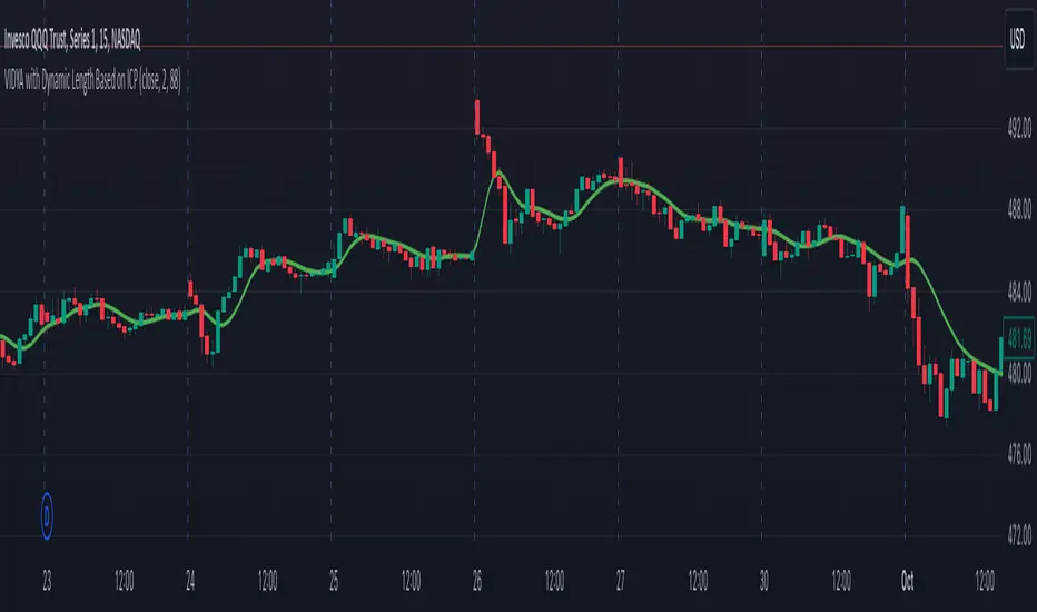
MA Length: 50 (This is the period for the central Simple Moving Average (SMA).)
Cycle Period: 50 (This is the elliptic cycle length.)
Volatility Multiplier: 2.0 (This value scales the band width.)
Mathematical Foundation
The indicator is based on the ellipse equation. The basic formula is:
Ellipse Equation:
(x^2) / (a^2) + (y^2) / (b^2) = 1
Solving for y:
y = b * sqrt(1 - (x^2) / (a^2))
Parameters Explained:
a: Set to 1 (normalized).
x: Varies from -1 to 1 over the period.
b: Calculated as:
ta.stdev(close, MA Length) * Volatility Multiplier
(This represents the standard deviation of the close prices over the MA period, scaled by the volatility multiplier.)
y (offset): Represents the band distance from the moving average, forming the elliptic cycle.
Behavior
Bands:
The bands are narrow at the cycle edges (when the offset is 0) and become widest at the midpoint (when the offset equals b).
Trend:
The central moving average (MA) shows the overall trend direction, while the bands adjust according to the volatility.
Signals:
Standard buy and sell signals are generated when the price interacts with the bands.
Practical Use
Trend Identification:
If the price is above the MA, it indicates an uptrend; if below, a downtrend.
Support and Resistance:
The elliptic bands act as dynamic support and resistance levels.
Narrowing bands may signal potential trend reversals.
Breakouts:
Pine Script® indicator