Crypto Volatility Panel ProCrypto Volatility Panel Pro
This advanced indicator creates a comprehensive volatility monitoring dashboard that displays real-time volatility metrics for up to 30 cryptocurrency pairs simultaneously. The tool combines sophisticated volatility assessment techniques with leverage-adjusted analysis and heat map visualization to provide enhanced market insights in an organized table format.
Proprietary Methodology
This indicator utilizes a proprietary dual-metric volatility assessment system developed specifically for cryptocurrency market analysis. The methodology combines advanced technical analysis components including price volatility measurements, range position analysis, and leverage scaling algorithms optimized through extensive market testing.
The unique approach enables more accurate volatility assessments across diverse cryptocurrency price ranges and market conditions compared to standard volatility indicators. Specific calculation methods and optimization parameters remain proprietary to maintain competitive advantages.
Core Functionality and Innovation
Unlike standard volatility indicators that focus on single instruments, this tool provides simultaneous multi-asset monitoring with proprietary volatility calculations specifically optimized for cryptocurrency markets. The innovation lies in combining multiple volatility assessment techniques with enhanced leverage scaling algorithms, heat map ranking system, and comprehensive multi-asset dashboard presentation.
The indicator processes data from up to 30 different cryptocurrency pairs, each with independent leverage settings ranging from 0.1x to 10,000x. Users can apply universal leverage across all pairs for consistent analysis scenarios, or customize individual leverage ratios for specific trading strategies.
Visual Organization and Heat Map System
The table displays three primary columns with an advanced heat map ranking system:
Symbol Column: Shows cryptocurrency pair names with dynamic visual indicators (🔥, ⚡, ✅, 💤) representing volatility intensity levels. Each symbol includes its current leverage setting in parentheses for reference. Invalid or unavailable symbols display error indicators (❌) with appropriate error messaging.
Change Percentage Column: Displays leverage-adjusted volatility measurements with both color-coded text and heat map background ranking. Text colors indicate volatility levels (Red for extreme, Yellow for high, Green for moderate, Gray for low), while background heat map colors rank performance relative to all monitored pairs.
Lookback Percentage Column: Shows leverage-adjusted position analysis within recent price ranges with heat map background ranking, indicating market positioning relative to recent highs and lows across all monitored instruments.
Advanced Heat Map Ranking
The proprietary heat map system ranks all enabled pairs in real-time based on their volatility metrics, providing instant visual identification of the most and least volatile instruments:
Hottest (Top 10%): Deep red background indicating highest volatility
Warm (10-20%): Orange-red background for elevated volatility
Medium (20-40%): Yellow background for moderate-high volatility
Cool (40-60%): Green background for moderate volatility
Cold (60-80%): Blue background for low volatility
Sleepy (Bottom 20%): Dark background for minimal volatility
Heat map opacity is fully customizable, and the system can be disabled for users preferring traditional static backgrounds.
Configuration Options
Expanded Pair Selection: Monitor up to 30 cryptocurrency pairs across major exchanges including Bitstamp and Binance. Default selections include established cryptocurrencies (BTC, ETH, SOL) and emerging assets (INJ, NEAR, FTM), with full customization available.
Table Positioning: Nine position options including top/middle/bottom combinations with left/center/right alignment, allowing optimal placement on any chart layout without interfering with price action or other indicators.
Visual Customization: Comprehensive control over table dimensions, frame width, font size, background colors, frame colors, header styling, text colors, and heat map color schemes to match user preferences and chart themes.
Leverage Management: Individual leverage settings for each of the 30 pairs, with optional universal leverage mode that applies consistent multipliers across all enabled pairs. Supports extreme leverage ranges up to 10,000x for advanced risk modelling.
Error Handling: Robust symbol validation with clear error indicators for invalid, unavailable, or misconfigured trading pairs, ensuring reliable operation across different market conditions.
Practical Trading Applications
Multi-Asset Volatility Screening: Identify the most and least volatile cryptocurrency markets in real-time using the heat map ranking system, enabling quick allocation of attention to instruments with the highest potential for profitable moves.
Leverage Risk Assessment: Visualize how different leverage ratios amplify volatility metrics across multiple markets simultaneously, supporting informed position sizing decisions before entering leveraged trades.
Market Timing and Rotation: Use the combination of volatility measurements and heat map rankings to identify optimal entry/exit timing across cryptocurrency markets, facilitating effective portfolio rotation strategies.
Portfolio Diversification: Compare volatility levels and rankings across 30 cryptocurrencies to construct portfolios with desired risk characteristics, balancing high-volatility growth opportunities with stable store-of-value positions.
Risk Management Dashboard: Monitor real-time volatility changes and relative rankings to adjust position sizes, implement protective measures, or reallocate capital when market conditions change significantly.
Technical Implementation
Built using Pine Script v5 with optimized security request handling to minimize performance impact while accessing 30 external data sources simultaneously. The indicator uses efficient array-based data collection, real-time ranking algorithms, and conditional table updates to maintain smooth chart operation.
The heat map system employs dynamic ranking calculations that process all enabled pairs in real-time, sorting values and applying percentile-based color mapping for instant visual feedback. Error handling includes invalid symbol detection and graceful fallback display for unavailable data feeds.
Usage Instructions
Configure Pair Selection: Enable desired cryptocurrency pairs from the 30 available options, organized across three input groups for easy navigation. Set individual leverage values or activate universal leverage mode for consistent multipliers.
Customize Heat Map: Adjust heat map colors and opacity to match your visual preferences and chart theme. The system can be disabled for users preferring static backgrounds.
Position and Style Table: Select optimal table position from nine available options and customize appearance including colors, sizing, and text elements to integrate seamlessly with your trading setup.
Interpret Rankings: Monitor both absolute values and heat map rankings to identify relative performance.
Hottest colors indicate pairs experiencing the highest volatility relative to the monitored universe.
Apply Leverage Context: Use leverage-adjusted values to understand how volatility would affect leveraged positions, remembering these are mathematical projections designed for risk assessment rather than trading signals.
Advanced Features
Dynamic Symbol Processing: The indicator automatically handles symbol validation, displaying clear error messages for invalid or unavailable trading pairs while maintaining operation for valid symbols.
Real-Time Ranking: Heat map colors update dynamically as market conditions change, providing instant visual feedback on shifting volatility patterns across the cryptocurrency universe.
Scalable Monitoring: Users can monitor anywhere from a few key pairs to the full 30-pair universe, with the ranking system automatically adjusting to the number of enabled instruments.
Cross-Exchange Support: Incorporates data from multiple cryptocurrency exchanges to provide comprehensive market coverage and reduce single-source dependency risks.
Limitations and Important Considerations
Proprietary Algorithm: The specific calculation methods are proprietary and not disclosed. Users should evaluate the indicator's output through their own analysis and testing before incorporating it into trading decisions.
Complex Volatility Model: While the proprietary methodology is sophisticated, it represents one approach to volatility assessment and may not capture all forms of market volatility such as gap movements, flash crashes, or news-driven events.
Performance Considerations: Processing data from up to 30 external securities may impact chart loading speed or cause timeouts during periods of high TradingView server load. Users experiencing performance issues should consider reducing the number of enabled pairs.
Leverage Calculations: Leverage adjustments are mathematical projections that assume linear scaling, which may not reflect actual leveraged trading mechanics including margin requirements, funding costs, liquidation risks, and exchange-specific policies.
Market Data Dependencies: Cryptocurrency prices and volatility can vary significantly between exchanges. The indicator's data sources may not represent the specific exchange or trading pair you use, and some feeds may experience gaps or delays during maintenance periods.
Ranking Relativity: Heat map rankings are relative to the enabled pair universe. Rankings will change based on which pairs are monitored and their current market conditions, making absolute interpretations less meaningful than relative comparisons.
Educational Value
This indicator helps traders develop understanding of relative volatility patterns across cryptocurrency markets and the mathematical impact of leverage on risk metrics. The heat map system provides intuitive visualization of market dynamics, helping users identify which assets are experiencing unusual activity relative to their peers.
The tool serves as an educational platform for understanding advanced volatility measurement techniques, relative ranking systems, and multi-asset risk assessment concepts that are crucial for professional cryptocurrency trading and portfolio management.
Performance and Compatibility
The indicator is optimized for cryptocurrency markets but can be adapted to other volatile asset classes by modifying the symbol inputs. Security request limits may occasionally affect data availability, particularly when multiple indicators requesting external data are used simultaneously on the same chart.
The heat map rendering system is designed for efficiency, updating color mappings only when ranking changes occur rather than on every price tick, ensuring smooth chart performance even when monitoring the full 30-pair universe.
Risk Disclaimer: This indicator is designed for educational and analytical purposes only. Volatility calculations are estimates based on historical price data and proprietary mathematical models that are not disclosed. Results do not constitute trading advice or predictions of future price movements. Users should conduct independent analysis to evaluate the indicator's effectiveness before making trading decisions.
Leveraged trading involves substantial risk of loss and may not be suitable for all investors. Always conduct thorough research and consider consulting with qualified financial professionals before making leveraged trading decisions. Cryptocurrency markets are highly volatile and can result in significant losses. Past volatility patterns do not guarantee future market behavior.
This indicator is compatible with all TradingView chart types and timeframes. It is specifically designed for cryptocurrency markets using proprietary algorithms optimized for digital asset volatility characteristics.
Search in scripts for "algo"

Diamond Peaks [EdgeTerminal]The Diamond Peaks indicator is a comprehensive technical analysis tool that uses a few mathematical models to identify high-probability trading opportunities. This indicator goes beyond traditional support and resistance identification by incorporating volume analysis, momentum divergences, advanced price action patterns, and market sentiment indicators to generate premium-quality buy and sell signals.
Dynamic Support/Resistance Calculation
The indicator employs an adaptive algorithm that calculates support and resistance levels using a volatility-adjusted lookback period. The base calculation uses ta.highest(length) and ta.lowest(length) functions, where the length parameter is dynamically adjusted using the formula: adjusted_length = base_length * (1 + (volatility_ratio - 1) * volatility_factor). The volatility ratio is computed as current_ATR / average_ATR over a 50-period window, ensuring the lookback period expands during volatile conditions and contracts during calm periods. This mathematical approach prevents the indicator from using fixed periods that may become irrelevant during different market regimes.
Momentum Divergence Detection Algorithm
The divergence detection system uses a mathematical comparison between price series and oscillator values over a specified lookback period. For bullish divergences, the algorithm identifies when recent_low < previous_low while simultaneously indicator_at_recent_low > indicator_at_previous_low. The inverse logic applies to bearish divergences. The system tracks both RSI (calculated using Pine Script's standard ta.rsi() function with Wilder's smoothing) and MACD (using ta.macd() with exponential moving averages). The mathematical rigor ensures that divergences are only flagged when there's a clear mathematical relationship between price momentum and the underlying oscillator momentum, eliminating false signals from minor price fluctuations.
Volume Analysis Mathematical Framework
The volume analysis component uses multiple mathematical transformations to assess market participation. The Cumulative Volume Delta (CVD) is calculated as ∑(buying_volume - selling_volume) where buying_volume occurs when close > open and selling_volume when close < open. The relative volume calculation uses current_volume / ta.sma(volume, period) to normalize current activity against historical averages. Volume Rate of Change employs ta.roc(volume, period) = (current_volume - volume ) / volume * 100 to measure volume acceleration. Large trade detection uses a threshold multiplier against the volume moving average, mathematically identifying institutional activity when relative_volume > threshold_multiplier.
Advanced Price Action Mathematics
The Wyckoff analysis component uses mathematical volume climax detection by comparing current volume against ta.highest(volume, 50) * 0.8, while price compression is measured using (high - low) < ta.atr(20) * 0.5. Liquidity sweep detection employs percentage-based calculations: bullish sweeps occur when low < recent_low * (1 - threshold_percentage/100) followed by close > recent_low. Supply and demand zones are mathematically validated by tracking subsequent price action over a defined period, with zone strength calculated as the count of bars where price respects the zone boundaries. Fair value gaps are identified using ATR-based thresholds: gap_size > ta.atr(14) * 0.5.
Sentiment and Market Regime Mathematics
The sentiment analysis employs a multi-factor mathematical model. The fear/greed index uses volatility normalization: 100 - min(100, stdev(price_changes, period) * scaling_factor). Market regime classification uses EMA crossover mathematics with additional ADX-based trend strength validation. The trend strength calculation implements a modified ADX algorithm: DX = |+DI - -DI| / (+DI + -DI) * 100, then ADX = RMA(DX, period). Bull regime requires short_EMA > long_EMA AND ADX > 25 AND +DI > -DI. The mathematical framework ensures objective regime classification without subjective interpretation.
Confluence Scoring Mathematical Model
The confluence scoring system uses a weighted linear combination: Score = (divergence_component * 0.25) + (volume_component * 0.25) + (price_action_component * 0.25) + (sentiment_component * 0.25) + contextual_bonuses. Each component is normalized to a 0-100 scale using percentile rankings and threshold comparisons. The mathematical model ensures that no single component can dominate the score, while contextual bonuses (regime alignment, volume confirmation, etc.) provide additional mathematical weight when multiple factors align. The final score is bounded using math.min(100, math.max(0, calculated_score)) to maintain mathematical consistency.
Vitality Field Mathematical Implementation
The vitality field uses a multi-factor scoring algorithm that combines trend direction (EMA crossover: trend_score = fast_EMA > slow_EMA ? 1 : -1), momentum (RSI-based: momentum_score = RSI > 50 ? 1 : -1), MACD position (macd_score = MACD_line > 0 ? 1 : -1), and volume confirmation. The final vitality score uses weighted mathematics: vitality_score = (trend * 0.4) + (momentum * 0.3) + (macd * 0.2) + (volume * 0.1). The field boundaries are calculated using ATR-based dynamic ranges: upper_boundary = price_center + (ATR * user_defined_multiplier), with EMA smoothing applied to prevent erratic boundary movements. The gradient effect uses mathematical transparency interpolation across multiple zones.
Signal Generation Mathematical Logic
The signal generation employs boolean algebra with multiple mathematical conditions that must simultaneously evaluate to true. Buy signals require: (confluence_score ≥ threshold) AND (divergence_detected = true) AND (relative_volume > 1.5) AND (volume_ROC > 25%) AND (RSI < 35) AND (trend_strength > minimum_ADX) AND (regime = bullish) AND (cooldown_expired = true) AND (last_signal ≠ buy). The mathematical precision ensures that signals only generate when all quantitative conditions are met, eliminating subjective interpretation. The cooldown mechanism uses bar counting mathematics: bars_since_last_signal = current_bar_index - last_signal_bar_index ≥ cooldown_period. This mathematical framework provides objective, repeatable signal generation that can be backtested and validated statistically.
This mathematical foundation ensures the indicator operates on objective, quantifiable principles rather than subjective interpretation, making it suitable for algorithmic trading and systematic analysis while maintaining transparency in its computational methodology.
* for now, we're planning to keep the source code private as we try to improve the models used here and allow a small group to test them. My goal is to eventually use the multiple models in this indicator as their own free and open source indicators. If you'd like to use this indicator, please send me a message to get access.
Advanced Confluence Scoring System
Each support and resistance level receives a comprehensive confluence score (0-100) based on four weighted components:
Momentum Divergences (25% weight)
RSI and MACD divergence detection
Identifies momentum shifts before price reversals
Bullish/bearish divergence confirmation
Volume Analysis (25% weight)
Cumulative Volume Delta (CVD) analysis
Volume Rate of Change monitoring
Large trade detection (institutional activity)
Volume profile strength assessment
Advanced Price Action (25% weight)
Supply and demand zone identification
Liquidity sweep detection (stop hunts)
Wyckoff accumulation/distribution patterns
Fair value gap analysis
Market Sentiment (25% weight)
Fear/Greed index calculation
Market regime classification (Bull/Bear/Sideways)
Trend strength measurement (ADX-like)
Momentum regime alignment
Dynamic Support and Resistance Detection
The indicator uses an adaptive algorithm to identify significant support and resistance levels based on recent market highs and lows. Unlike static levels, these zones adjust dynamically to market volatility using the Average True Range (ATR), ensuring the levels remain relevant across different market conditions.
Vitality Field Background
The indicator features a unique vitality field that provides instant visual feedback about market sentiment:
Green zones: Bullish market conditions with strong momentum
Red zones: Bearish market conditions with weak momentum
Gray zones: Neutral/sideways market conditions
The vitality field uses a sophisticated gradient system that fades from the center outward, creating a clean, professional appearance that doesn't overwhelm the chart while providing valuable context.
Buy Signals (🚀 BUY)
Buy signals are generated when ALL of the following conditions are met:
Valid support level with confluence score ≥ 80
Bullish momentum divergence detected (RSI or MACD)
Volume confirmation (1.5x average volume + 25% volume ROC)
Bull market regime environment
RSI below 35 (oversold conditions)
Price action confirmation (Wyckoff accumulation, liquidity sweep, or large buying volume)
Minimum trend strength (ADX > 25)
Signal alternation check (prevents consecutive buy signals)
Cooldown period expired (default 10 bars)
Sell Signals (🔻 SELL)
Sell signals are generated when ALL of the following conditions are met:
Valid resistance level with confluence score ≥ 80
Bearish momentum divergence detected (RSI or MACD)
Volume confirmation (1.5x average volume + 25% volume ROC)
Bear market regime environment
RSI above 65 (overbought conditions)
Price action confirmation (Wyckoff distribution, liquidity sweep, or large selling volume)
Minimum trend strength (ADX > 25)
Signal alternation check (prevents consecutive sell signals)
Cooldown period expired (default 10 bars)
How to Use the Indicator
1. Signal Quality Assessment
Monitor the confluence scores in the information table:
Score 90-100: Exceptional quality levels (A+ grade)
Score 80-89: High quality levels (A grade)
Score 70-79: Good quality levels (B grade)
Score below 70: Weak levels (filtered out by default)
2. Market Context Analysis
Use the vitality field and market regime information to understand the broader market context:
Trade buy signals in green vitality zones during bull regimes
Trade sell signals in red vitality zones during bear regimes
Exercise caution in gray zones (sideways markets)
3. Entry and Exit Strategy
For Buy Signals:
Enter long positions when premium buy signals appear
Place stop loss below the support confluence zone
Target the next resistance level or use a risk/reward ratio of 2:1 or higher
For Sell Signals:
Enter short positions when premium sell signals appear
Place stop loss above the resistance confluence zone
Target the next support level or use a risk/reward ratio of 2:1 or higher
4. Risk Management
Only trade signals with confluence scores above 80
Respect the signal alternation system (no overtrading)
Use appropriate position sizing based on signal quality
Consider the overall market regime before taking trades
Customizable Settings
Signal Generation Controls
Signal Filtering: Enable/disable advanced filtering
Confluence Threshold: Adjust minimum score requirement (70-95)
Cooldown Period: Set bars between signals (5-50)
Volume/Momentum Requirements: Toggle confirmation requirements
Trend Strength: Minimum ADX requirement (15-40)
Vitality Field Options
Enable/Disable: Control background field display
Transparency Settings: Adjust opacity for center and edges
Field Size: Control the field boundaries (3.0-20.0)
Color Customization: Set custom colors for bullish/bearish/neutral states
Weight Adjustments
Divergence Weight: Adjust momentum component influence (10-40%)
Volume Weight: Adjust volume component influence (10-40%)
Price Action Weight: Adjust price action component influence (10-40%)
Sentiment Weight: Adjust sentiment component influence (10-40%)
Best Practices
Always wait for complete signal confirmation before entering trades
Use higher timeframes for signal validation and context
Combine with proper risk management and position sizing
Monitor the information table for real-time market analysis
Pay attention to volume confirmation for higher probability trades
Respect market regime alignment for optimal results
Basic Settings
Base Length (Default: 25)
Controls the lookback period for identifying support and resistance levels
Range: 5-100 bars
Lower values = More responsive, shorter-term levels
Higher values = More stable, longer-term levels
Recommendation: 25 for intraday, 50 for swing trading
Enable Adaptive Length (Default: True)
Automatically adjusts the base length based on market volatility
When enabled, length increases in volatile markets and decreases in calm markets
Helps maintain relevant levels across different market conditions
Volatility Factor (Default: 1.5)
Controls how much the adaptive length responds to volatility changes
Range: 0.5-3.0
Higher values = More aggressive length adjustments
Lower values = More conservative length adjustments
Volume Profile Settings
VWAP Length (Default: 200)
Sets the calculation period for the Volume Weighted Average Price
Range: 50-500 bars
Shorter periods = More responsive to recent price action
Longer periods = More stable reference line
Used for volume profile analysis and confluence scoring
Volume MA Length (Default: 50)
Period for calculating the volume moving average baseline
Range: 10-200 bars
Used to determine relative volume (current volume vs. average)
Shorter periods = More sensitive to volume changes
Longer periods = More stable volume baseline
High Volume Node Threshold (Default: 1.5)
Multiplier for identifying significant volume spikes
Range: 1.0-3.0
Values above this threshold mark high-volume nodes with diamond shapes
Lower values = More frequent high-volume signals
Higher values = Only extreme volume events marked
Momentum Divergence Settings
Enable Divergence Detection (Default: True)
Master switch for momentum divergence analysis
When disabled, removes divergence from confluence scoring
Significantly impacts signal generation quality
RSI Length (Default: 14)
Period for RSI calculation used in divergence detection
Range: 5-50
Standard RSI settings apply (14 is most common)
Shorter periods = More sensitive, more signals
Longer periods = Smoother, fewer but more reliable signals
MACD Settings
Fast (Default: 12): Fast EMA period for MACD calculation (5-50)
Slow (Default: 26): Slow EMA period for MACD calculation (10-100)
Signal (Default: 9): Signal line EMA period (3-20)
Standard MACD settings for divergence detection
Divergence Lookback (Default: 5)
Number of bars to look back when detecting divergences
Range: 3-20
Shorter periods = More frequent divergence signals
Longer periods = More significant divergence signals
Volume Analysis Enhancement Settings
Enable Advanced Volume Analysis (Default: True)
Master control for sophisticated volume calculations
Includes CVD, volume ROC, and large trade detection
Critical for signal accuracy
Cumulative Volume Delta Length (Default: 20)
Period for CVD smoothing calculation
Range: 10-100
Tracks buying vs. selling pressure over time
Shorter periods = More reactive to recent flows
Longer periods = Broader trend perspective
Volume ROC Length (Default: 10)
Period for Volume Rate of Change calculation
Range: 5-50
Measures volume acceleration/deceleration
Key component in volume confirmation requirements
Large Trade Volume Threshold (Default: 2.0)
Multiplier for identifying institutional-size trades
Range: 1.5-5.0
Trades above this threshold marked as large trades
Lower values = More frequent large trade signals
Higher values = Only extreme institutional activity
Advanced Price Action Settings
Enable Wyckoff Analysis (Default: True)
Activates simplified Wyckoff accumulation/distribution detection
Identifies potential smart money positioning
Important for high-quality signal generation
Enable Supply/Demand Zones (Default: True)
Identifies fresh supply and demand zones
Tracks zone strength based on subsequent price action
Enhances confluence scoring accuracy
Enable Liquidity Analysis (Default: True)
Detects liquidity sweeps and stop hunts
Identifies fake breakouts vs. genuine moves
Critical for avoiding false signals
Zone Strength Period (Default: 20)
Bars used to assess supply/demand zone strength
Range: 10-50
Longer periods = More thorough zone validation
Shorter periods = Faster zone assessment
Liquidity Sweep Threshold (Default: 0.5%)
Percentage move required to confirm liquidity sweep
Range: 0.1-2.0%
Lower values = More sensitive sweep detection
Higher values = Only significant sweeps detected
Sentiment and Flow Settings
Enable Sentiment Analysis (Default: True)
Master control for market sentiment calculations
Includes fear/greed index and regime classification
Important for market context assessment
Fear/Greed Period (Default: 20)
Calculation period for market sentiment indicator
Range: 10-50
Based on price volatility and momentum
Shorter periods = More reactive sentiment readings
Momentum Regime Length (Default: 50)
Period for determining overall market regime
Range: 20-100
Classifies market as Bull/Bear/Sideways
Longer periods = More stable regime classification
Trend Strength Length (Default: 30)
Period for ADX-like trend strength calculation
Range: 10-100
Measures directional momentum intensity
Used in signal filtering requirements
Advanced Signal Generation Settings
Enable Signal Filtering (Default: True)
Master control for premium signal generation system
When disabled, uses basic signal conditions
Highly recommended to keep enabled
Minimum Signal Confluence Score (Default: 80)
Required confluence score for signal generation
Range: 70-95
Higher values = Fewer but higher quality signals
Lower values = More frequent but potentially lower quality signals
Signal Cooldown (Default: 10 bars)
Minimum bars between signals of same type
Range: 5-50
Prevents signal spam and overtrading
Higher values = More conservative signal spacing
Require Volume Confirmation (Default: True)
Mandates volume requirements for signal generation
Requires 1.5x average volume + 25% volume ROC
Critical for signal quality
Require Momentum Confirmation (Default: True)
Mandates divergence detection for signals
Ensures momentum backing for directional moves
Essential for high-probability setups
Minimum Trend Strength (Default: 25)
Required ADX level for signal generation
Range: 15-40
Ensures signals occur in trending markets
Higher values = Only strong trending conditions
Confluence Scoring Settings
Minimum Confluence Score (Default: 70)
Threshold for displaying support/resistance levels
Range: 50-90
Levels below this score are filtered out
Higher values = Only strongest levels shown
Component Weights (Default: 25% each)
Divergence Weight: Momentum component influence (10-40%)
Volume Weight: Volume analysis influence (10-40%)
Price Action Weight: Price patterns influence (10-40%)
Sentiment Weight: Market sentiment influence (10-40%)
Must total 100% for balanced scoring
Vitality Field Settings
Enable Vitality Field (Default: True)
Controls the background gradient field display
Provides instant visual market sentiment feedback
Enhances chart readability and context
Vitality Center Transparency (Default: 85%)
Opacity at the center of the vitality field
Range: 70-95%
Lower values = More opaque center
Higher values = More transparent center
Vitality Edge Transparency (Default: 98%)
Opacity at the edges of the vitality field
Range: 95-99%
Creates smooth fade effect from center to edges
Higher values = More subtle edge appearance
Vitality Field Size (Default: 8.0)
Controls the overall size of the vitality field
Range: 3.0-20.0
Based on ATR multiples for dynamic sizing
Lower values = Tighter field around price
Higher values = Broader field coverage
Recommended Settings by Trading Style
Scalping (1-5 minutes)
Base Length: 15
Volume MA Length: 20
Signal Cooldown: 5 bars
Vitality Field Size: 5.0
Higher sensitivity for quick moves
Day Trading (15-60 minutes)
Base Length: 25 (default)
Volume MA Length: 50 (default)
Signal Cooldown: 10 bars (default)
Vitality Field Size: 8.0 (default)
Balanced settings for intraday moves
Swing Trading (4H-Daily)
Base Length: 50
Volume MA Length: 100
Signal Cooldown: 20 bars
Vitality Field Size: 12.0
Longer-term perspective for multi-day moves
Conservative Trading
Minimum Signal Confluence: 85
Minimum Confluence Score: 80
Require all confirmations: True
Higher thresholds for maximum quality
Aggressive Trading
Minimum Signal Confluence: 75
Minimum Confluence Score: 65
Signal Cooldown: 5 bars
Lower thresholds for more opportunities

Hidden Markov Model [Extension] | FractalystWhat's the indicator's purpose and functionality?
The Hidden Markov Model is specifically designed to integrate with the Quantify Trading Model framework, serving as a probabilistic market regime identification system for institutional trading analysis.
Hidden Markov Models are particularly well-suited for market regime detection because they can model the unobservable (hidden) state of the market, capture probabilistic transitions between different states, and account for observable market data that each state generates.
The indicator uses Hidden Markov Model mathematics to automatically detect distinct market regimes such as low-volatility bull markets, high-volatility bear markets, or range-bound consolidation periods.
This approach provides real-time regime probabilities without requiring optimization periods that can lead to overfitting, enabling systematic trading based on genuine probabilistic market structure.
How does this extension work with the Quantify Trading Model?
The Hidden Markov Model | Fractalyst serves as a probabilistic state estimation engine for systematic market analysis.
Instead of relying on traditional technical indicators, this system automatically identifies market regimes using forward algorithm implementation with three-state probability calculation (bullish/neutral/bearish), Viterbi decoding process for determining most likely regime sequence without repainting, online parameter learning with adaptive emission probabilities based on market observations, and multi-feature analysis combining normalized returns, volatility comprehensive regime assessment.
The indicator outputs regime probabilities and confidence levels that can be used for systematic trading decisions, portfolio allocation, or risk management protocols.
Why doesn't this use optimization periods like other indicators?
The Hidden Markov Model | Fractalyst deliberately avoids optimization periods to prevent overfitting bias that destroys out-of-sample performance.
The system uses a fixed mathematical framework based on Hidden Markov Model theory rather than optimized parameters, probabilistic state estimation using forward algorithm calculations that work across all market conditions, online learning methodology with adaptive parameter updates based on real-time market observations, and regime persistence modeling using fixed transition probabilities with 70% diagonal bias for realistic regime behavior.
This approach ensures the regime detection signals remain robust across different market cycles without the performance degradation typical of over-optimized traditional indicators.
Can this extension be used independently for discretionary trading?
No, the Hidden Markov Model | Fractalyst is specifically engineered for systematic implementation within institutional trading frameworks.
The indicator is designed to provide regime filtering for systematic trading algorithms and risk management systems, enable automated backtesting through mathematical regime identification without subjective interpretation, and support institutional-level analysis when combined with systematic entry/exit models.
Using this indicator independently would miss the primary value proposition of systematic regime-based strategy optimization that institutional frameworks provide.
How do I integrate this with the Quantify Trading Model?
Integration enables institutional-grade systematic trading through advanced machine learning and statistical validation:
- Add both HMM Extension and Quantify Trading Model to your chart
- Select HMM Extension as the bias source using input.source()
- Quantify automatically uses the extension's bias signals for entry/exit analysis
- The built-in machine learning algorithms score optimal entry and exit levels based on trend intensity, and market structure patterns identified by the extension
The extension handles all bias detection complexity while Quantify focuses on optimal trade timing, position sizing, and risk management along with PineConnector automation
What markets and assets does the indicator Extension work best on?
The Hidden Markov Model | Fractalyst performs optimally on markets with sufficient price movement since the system relies on statistical analysis of returns, volatility, and momentum patterns for regime identification.
Recommended asset classes include major forex pairs (EURUSD, GBPUSD, USDJPY) with high liquidity and clear regime transitions, stock index futures (ES, NQ, YM) providing consistent regime behavior patterns, individual equities (large-cap stocks with sufficient volatility for regime detection), cryptocurrency markets (BTC, ETH with pronounced regime characteristics), and commodity futures (GC, CL showing distinct market cycles and regime transitions).
These markets provide sufficient statistical variation in returns and volatility patterns, ensuring the HMM system's mathematical framework can effectively distinguish between bullish, neutral, and bearish regime states.
Any timeframe from 15-minute to daily charts provides sufficient data points for regime calculation, with higher timeframes (4H, Daily) typically showing more stable regime identification with fewer false transitions, while lower timeframes (30m, 1H) provide more responsive regime detection but may show increased noise.
Acceptable Timeframes and Portfolio Integration:
- Any timeframe that can be evaluated within Quantify Trading Model's backtesting engine is acceptable for live trading implementation.
Legal Disclaimers and Risk Acknowledgments
Trading Risk Disclosure
The HMM Extension is provided for informational, educational, and systematic bias detection purposes only and should not be construed as financial, investment, or trading advice. The extension provides institutional analysis but does not guarantee profitable outcomes, accurate bias predictions, or positive investment returns.
Trading systems utilizing bias detection algorithms carry substantial risks including but not limited to total capital loss, incorrect bias identification, market regime changes, and adverse conditions that may invalidate analysis. The extension's performance depends on accurate data, TradingView infrastructure stability, and proper integration with Quantify Trading Model, any of which may experience data errors, technical failures, or service interruptions that could affect bias detection accuracy.
System Dependency Acknowledgment
The extension requires continuous operation of multiple interconnected systems: TradingView charts and real-time data feeds, accurate reporting from exchanges, Quantify Trading Model integration, and stable platform connectivity. Any interruption or malfunction in these systems may result in incorrect bias signals, missed transitions, or unexpected analytical behavior.
Users acknowledge that neither Fractalyst nor the creator has control over third-party data providers, exchange reporting accuracy, or TradingView platform stability, and cannot guarantee data accuracy, service availability, or analytical performance. Market microstructure changes, reporting delays, exchange outages, and technical factors may significantly affect bias detection accuracy compared to theoretical or backtested performance.
Intellectual Property Protection
The HMM Extension, including all proprietary algorithms, classification methodologies, three-state bias detection systems, and integration protocols, constitutes the exclusive intellectual property of Fractalyst. Unauthorized reproduction, reverse engineering, modification, or commercial exploitation of these proprietary technologies is strictly prohibited and may result in legal action.
Liability Limitation
By utilizing this extension, users acknowledge and agree that they assume full responsibility and liability for all trading decisions, financial outcomes, and potential losses resulting from reliance on the extension's bias detection signals. Fractalyst shall not be liable for any unfavorable outcomes, financial losses, missed opportunities, or damages resulting from the development, use, malfunction, or performance of this extension.
Past performance of bias detection accuracy, classification effectiveness, or integration with Quantify Trading Model does not guarantee future results. Trading outcomes depend on numerous factors including market regime changes, pattern evolution, institutional behavior shifts, and proper system configuration, all of which are beyond the control of Fractalyst.
User Responsibility Statement
Users are solely responsible for understanding the risks associated with algorithmic bias detection, properly configuring system parameters, maintaining appropriate risk management protocols, and regularly monitoring extension performance. Users should thoroughly validate the extension's bias signals through comprehensive backtesting before live implementation and should never base trading decisions solely on automated bias detection.
This extension is designed to provide systematic institutional flow analysis but does not replace the need for proper market understanding, risk management discipline, and comprehensive trading methodology. Users should maintain active oversight of bias detection accuracy and be prepared to implement manual overrides when market conditions invalidate analysis assumptions.
Terms of Service Acceptance
Continued use of the HMM Extension constitutes acceptance of these terms, acknowledgment of associated risks, and agreement to respect all intellectual property protections. Users assume full responsibility for compliance with applicable laws and regulations governing automated trading system usage in their jurisdiction.

[blackcat] L1 Net Volume DifferenceOVERVIEW
The L1 Net Volume Difference indicator serves as an advanced analytical tool designed to provide traders with deep insights into market sentiment by examining the differential between buying and selling volumes over precise timeframes. By leveraging these volume dynamics, it helps identify trends and potential reversal points more accurately, thereby supporting well-informed decision-making processes. The key focus lies in dissecting intraday changes that reflect short-term market behavior, offering critical input for both swing and day traders alike. 📊
Key benefits encompass:
• Precise calculation of net volume differences grounded in real-time data.
• Interactive visualization elements enhancing interpretability effortlessly.
• Real-time generation of buy/sell signals driven by dynamic volume shifts.
TECHNICAL ANALYSIS COMPONENTS
📉 Volume Accumulation Mechanisms:
Monitors cumulative buy/sell volumes derived from comparative closing prices.
Periodically resets accumulation counters aligning with predefined intervals (e.g., 5-minute bars).
Facilitates identification of directional biases reflecting underlying market forces accurately.
🕵️♂️ Sentiment Detection Algorithms:
Employs proprietary logic distinguishing between bullish/bearish sentiments dynamically.
Ensures consistent adherence to predefined statistical protocols maintaining accuracy.
Supports adaptive thresholds adjusting sensitivities based on changing market conditions flexibly.
🎯 Dynamic Signal Generation:
Detects transitions indicating dominance shifts between buyers/sellers promptly.
Triggers timely alerts enabling swift reactions to evolving market dynamics effectively.
Integrates conditional logic reinforcing signal validity minimizing erroneous activations.
INDICATOR FUNCTIONALITY
🔢 Core Algorithms:
Utilizes moving averages along with standardized deviation formulas generating precise net volume measurements.
Implements Arithmetic Mean Line Algorithm (AMLA) smoothing techniques improving interpretability.
Ensures consistent alignment with established statistical principles preserving fidelity.
🖱️ User Interface Elements:
Dedicated plots displaying real-time net volume markers facilitating swift decision-making.
Context-sensitive color coding distinguishing positive/negative deviations intuitively.
Background shading highlighting proximity to key threshold activations enhancing visibility.
STRATEGY IMPLEMENTATION
✅ Entry Conditions:
Confirm bullish/bearish setups validated through multiple confirmatory signals.
Validate entry decisions considering concurrent market sentiment factors.
Assess alignment between net volume readings and broader trend directions ensuring coherence.
🚫 Exit Mechanisms:
Trigger exits upon hitting predetermined thresholds derived from historical analyses.
Monitor continuous breaches signifying potential trend reversals promptly executing closures.
Execute partial/total closes contingent upon cumulative loss limits preserving capital efficiently.
PARAMETER CONFIGURATIONS
🎯 Optimization Guidelines:
Reset Interval: Governs responsiveness versus stability balancing sensitivity/stability.
Price Source: Dictates primary data series driving volume calculations selecting relevant inputs accurately.
💬 Customization Recommendations:
Commence with baseline defaults; iteratively refine parameters isolating individual impacts.
Evaluate adjustments independently prior to combined modifications minimizing disruptions.
Prioritize minimizing erroneous trigger occurrences first optimizing signal fidelity.
Sustain balanced risk-reward profiles irrespective of chosen settings upholding disciplined approaches.
ADVANCED RISK MANAGEMENT
🛡️ Proactive Risk Mitigation Techniques:
Enforce strict compliance with pre-defined maximum leverage constraints adhering strictly to guidelines.
Mandatorily apply trailing stop-loss orders conforming to script outputs reinforcing discipline.
Allocate positions proportionately relative to available capital reserves managing exposures prudently.
Conduct periodic reviews gauging strategy effectiveness rigorously identifying areas needing refinement.
⚠️ Potential Pitfalls & Solutions:
Address frequent violations arising during heightened volatility phases necessitating manual interventions judiciously.
Manage false alerts warranting immediate attention avoiding adverse consequences systematically.
Prepare contingency plans mitigating margin call possibilities preparing proactive responses effectively.
Continuously assess automated system reliability amidst fluctuating conditions ensuring seamless functionality.
PERFORMANCE AUDITS & REFINEMENTS
🔍 Critical Evaluation Metrics:
Assess win percentages consistently across diverse trading instruments gauging reliability.
Calculate average profit ratios per successful execution measuring profitability efficiency accurately.
Measure peak drawdown durations alongside associated magnitudes evaluating downside risks comprehensively.
Analyze signal generation frequencies revealing hidden patterns potentially skewing outcomes uncovering systematic biases.
📈 Historical Data Analysis Tools:
Maintain comprehensive records capturing every triggered event meticulously documenting results.
Compare realized profits/losses against backtested simulations benchmarking actual vs expected performances accurately.
Identify recurrent systematic errors demanding corrective actions implementing iterative refinements steadily.
Document evolving performance metrics tracking progress dynamically addressing identified shortcomings proactively.
PROBLEM SOLVING ADVICE
🔧 Frequent Encountered Challenges:
Unpredictable behaviors emerging within thinly traded markets requiring filtration processes.
Latency issues manifesting during abrupt price fluctuations causing missed opportunities.
Overfitted models yielding suboptimal results post-extensive tuning demanding recalibrations.
Inaccuracies stemming from incomplete/inaccurate data feeds necessitating verification procedures.
💡 Effective Resolution Pathways:
Exclude low-liquidity assets prone to erratic movements enhancing signal integrity.
Introduce buffer intervals safeguarding major news/event impacts mitigating distortions effectively.
Limit ongoing optimization attempts preventing model degradation maintaining optimal performance levels consistently.
Verify reliable connections ensuring uninterrupted data flows guaranteeing accurate interpretations reliably.
USER ENGAGEMENT SEGMENT
🤝 Community Contributions Welcome
Highly encourage active participation sharing experiences & recommendations!
THANKS
Heartfelt acknowledgment extends to all developers contributing invaluable insights about volume-based trading methodologies! ✨

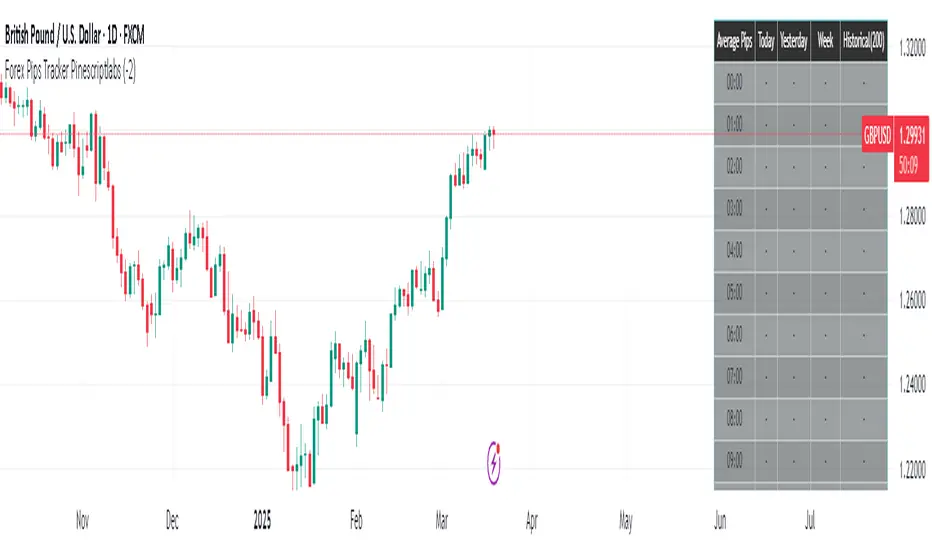
Forex Pips Tracker PinescriptlabsThis algorithm is exclusively designed for the Forex market 🌐 and serves as a tool to measure volatility, helping to determine on average how many pips positions move per hour. With this information, a trader can place take profit and stop loss orders with greater certainty, since they know the average pip movement range during each hour of the day.
What does it do and how does it work?
• Volatility measurement in pips 📊:
The algorithm calculates the size of the movement (or range) of each candle expressed in pips. To do this, it takes the difference between the highest and lowest price of each candle and converts it into pips.
👉
• Time zone adjustment ⏰:
It allows you to configure the time zone so that the data aligns with your desired schedule. This is especially useful for comparing movements at different times based on the trader's location.
• Analysis by time intervals 🕒:
The algorithm’s logic organizes the information for each hour of the day. It stores data for the current day, the previous day, weekly, and historically (200 candles). This allows you to see how volatility varies across different periods, providing a dynamic view of market behavior.
👉
• Directionality of movement 🔄:
In addition to averaging the pip range, the algorithm determines the predominant direction of each candle (bullish or bearish). This translates into visual indicators (like arrows) that help identify whether, on average, the movement during that hour tends to go up or down.
• Table visualization 📈:
Finally, the information is presented in an integrated table on the chart. Each row corresponds to an hour of the day and shows the average number of pips and the direction (bullish, bearish, or neutral) for each analyzed period. This table makes it easy to quickly and practically interpret the volatility data.
By combining these features, the algorithm becomes an essential tool for traders looking to better understand market dynamics and optimize their trading strategies! 💼✨
Español:
Este algoritmo está diseñado exclusivamente para el mercado Forex 🌐 y sirve como una herramienta para medir la volatilidad, ayudando a determinar en promedio cuántos pips se mueven las posiciones por hora. Con esta información, un trader puede colocar el take profit y el stop loss con mayor certeza, ya que conoce el rango promedio de movimiento en pips durante cada hora del día.
¿Qué hace y cómo funciona?
• Medición de volatilidad en pips 📊:
El algoritmo calcula el tamaño del movimiento (o rango) de cada vela expresado en pips. Para ello, toma la diferencia entre el precio máximo y el mínimo de cada vela y la convierte a pips.
👉
• Ajuste de zona horaria ⏰:
Permite configurar la zona horaria para que los datos se ajusten al horario deseado. Esto es especialmente útil para comparar movimientos durante distintas horas en función de la localización del trader.
• Análisis por intervalos de tiempo 🕒:
La lógica del algoritmo organiza la información por cada hora del día. Guarda datos para el día actual, el día anterior, a nivel semanal e histórico (200 velas). Esto permite ver cómo varía la volatilidad en diferentes periodos, proporcionando una visión dinámica del comportamiento del mercado.
👉
• Direccionalidad del movimiento 🔄:
Además de promediar el rango en pips, el algoritmo determina la dirección predominante de cada vela (alcista o bajista). Esto se traduce en indicadores visuales (como flechas) que permiten identificar si, en promedio, el movimiento en esa hora tiende a subir o bajar.
• Visualización en tabla 📈:
Finalmente, la información se presenta en una tabla integrada en el gráfico. Cada fila corresponde a una hora del día y muestra el promedio de pips y la dirección (alcista, bajista o neutral) para cada uno de los periodos analizados. Esta tabla facilita la interpretación rápida y práctica de los datos de volatilidad.
Al combinar estas funciones, el algoritmo se convierte en una herramienta esencial para traders que buscan entender mejor la dinámica del mercado y optimizar sus estrategias de trading! 💼✨
ZenAlgo - Advanced Open InterestZenAlgo - Advanced Open Interest combines open interest, price changes, and volume dynamics into a single, powerful TradingView indicator. By integrating these key market metrics and enhancing them with proprietary algorithms, it provides traders with actionable insights that streamline decision-making and enhance market analysis.
Features
Open Interest Change (%): Tracks changes in open interest, a key indicator of market participation and sentiment.
Price Change (%): Monitors price momentum, providing clarity on trend directions.
Volume Analysis: Aggregates upward and downward volume for detailed sentiment analysis.
Delta Calculation: Highlights the net difference between upward and downward volume, offering instant insights into buying or selling dominance.
Proprietary Trend Detection: Suggests "Long Enter," "Short Enter," "Long Close," or "Short Close" signals based on a synergy of open interest, price, and volume.
Market Sentiment Insights: Indicates whether new long or short positions dominate.
Customizable Display: Features themes, sizes, and positions for a tailored interface.
Added Value: Why Is This Indicator Original/Why Shall You Pay for This Indicator?
Integrated Synergy: Combining open interest, price, and volume into a single indicator reduces complexity and offers enhanced clarity. Instead of toggling between multiple charts, users receive actionable insights from a unified view.
Proprietary Rules-Based Algorithm: The algorithm synthesizes data from sub-indicators, creating trends and signals not available in free tools. For instance, the "Long Enter" or "Short Close" signals are generated by evaluating relationships between metrics, offering a predictive edge.
Enhanced Trend Confirmation: By correlating open interest changes with price movements and volume imbalances, the indicator provides a more robust confirmation of market trends compared to individual metrics.
Time-Saving and Simplicity: Freely available sub-indicators require manual setup, interpretation, and customization. ZenAlgo - Advanced Open Interest offers pre-configured analysis, reducing the learning curve and decision time.
Unique Customization: With themes, positions, and table sizes, users can adapt the interface to their preferences, enhancing usability.
How It Works
1. Open Interest and Price Change
Retrieves historical open interest and price data for the selected timeframe.
Calculates percentage changes between bars to indicate market participation (open interest) and directional momentum (price).
Combines these metrics to assess whether price movements are supported by increasing or decreasing participation.
2. Volume Aggregation
Splits the selected timeframe into smaller sub-timeframes to analyze granular volume data.
Aggregates upward (price closes above open) and downward (price closes below open) volumes, calculating their totals and percentage contributions to overall volume.
3. Delta Calculation
Computes Delta as the difference between upward and downward volume.
Highlights buyer or seller dominance using color-coded visuals for quick interpretation.
4. Trend Analysis
Uses a proprietary algorithm to classify market states:
"Long Enter": Rising price, increasing open interest, and dominant upward volume.
"Short Enter": Falling price, increasing open interest, and dominant downward volume.
Neutral States: Generated when no strong alignment is found among metrics.
5. Market Sentiment
Correlates open interest and price to indicate if new long or short positions dominate.
Outputs simplified insights like "More longs opened" or "Shorts closing."
6. Customizable Table
Displays real-time updates with user-controlled themes, sizes, and positions for a tailored experience.
Usage Examples
Detecting Bullish Trends: Identify "Long Enter" signals when open interest and price rise, supported by strong upward volume.
Spotting Bearish Reversals: Use "Short Enter" signals when price declines, open interest rises, and downward volume dominates.
Analyzing Volume Shifts: Leverage Delta to uncover significant shifts in buying or selling pressure.
Validating Trends: Use the combination of open interest and volume trends to confirm price movements.
Exiting Profitable Trades: Look for "Long Close" or "Short Close" signals to time exits during profit-taking phases.
Avoiding Choppy Markets: Use "Neutral" signals to stay out of indecisive markets and avoid unnecessary risks.
Identifying Sentiment Swings: Follow "Positions" insights to detect a transition in market dominance from longs to shorts or vice versa.
High-Volume Trend Confirmation: Confirm strong trends during high trading volumes.
Short-Term Scalping: Use sub-timeframes to spot rapid entry and exit points.
Event-Based Trading: Correlate indicator signals with major market events for timely trades.
Settings
ZenAlgo Theme: Toggle a branded theme for better visual integration.
Table Size: Adjust display size (Tiny, Small, Normal, Large) based on preference.
Table Position: Choose between four positions (e.g., Bottom Right, Top Left).
Table Mode: Switch between Dark and Light themes for optimal readability.
Important Notes
This indicator is a technical analysis tool and does not guarantee trading success. Use it with other indicators and fundamental analysis for a comprehensive strategy.
Always validate signals in conjunction with other market factors to ensure informed trading decisions.
Scenarios of Potential Underperformance:
Low-Volume Markets: Signals may lack reliability due to insufficient data granularity.
Extreme Volatility: Rapid price movements can distort short-term insights.
Exchange Variations: Data discrepancies between exchanges may affect calculations.
Choppy Markets: During indecisive phases, the indicator may generate more neutral signals.

Dual Zigzag [Trendoscope®]🎲 Dual Zigzag indicator is built on recursive zigzag algorithm. It is very similar to other zigzag indicators published by us and other authors. However, the key point here is, the indicator draws zigzag on both price and any other plot based indicator on separate layouts.
Before we get into the indicator, here are some brief descriptions of the underlying concepts and key terminologies
🎯 Zigzag
Zigzag indicator breaks down price or any input series into a series of Pivot Highs and Pivot Lows alternating between each other. Zigzags though shows pivot high and lows, should not be used for buying at low and selling at high. The main application of zigzag indicator is for the visualisation of market structure and this can be used as basic building block for any pattern recognition algorithms.
🎯 Recursive Zigzag Algorithm
Recursive zigzag algorithm builds zigzag on multiple levels and each level of zigzag is based on the previous level pivots. The level zero zigzag is built on price. However, for level 1, instead of price level 0 zigzag pivots are used. Similarly for level 2, level 1 zigzag pivots are used as base.
🎲 Components Dual Zigzag Indicator
Here are the components of Dual zigzag indicator
Built in Oscillator - Indicator has built in oscillator options for plotting RSI (Relative Strength Index), MFI (Money Flow Index), cci (Commodity Channel Index) , CMO (Chande Momentum Oscillator), COG (Center of Gravity), and ROC (Rate of Change). Apart from the given built in oscillators, users can also use a custom external output as base. The oscillators are not printed on the price pane. But, printed on a separate indicator overlay.
Zigzag On Oscillator - Recursive zigzag is calculated and printed on the oscillator series. Each pivot high and pivot low also prints a label having the retracement ratios, and price levels at those points. Zigzag on the oscillator is also printed on the indicator overlay pane.
Zigzag on Price - Recursive zigzag calculated based on price and printed on the price pane. This is made possible by using force_overlay option present in the drawing objects. At each zigzag pivot levels, the label having price retracement ratios, and oscillator values are printed.
It is called dual zigzag because, the indicator calculates the zigzag on both price and oscillator series of values and prints them separately on different panes on the chart.
🎲 Indicator Settings
Settings include
Theme display settings to get the right colour combination to match the background.
Zigzag settings to be used for zigzag calculation and display
Oscillator settings to chose the oscillator to be used as base for 2nd zigzag
🎲 Applications
Useful in spotting divergences with both indicator and price having their own zigzag to highlight pivots
Spotting patterns in indicators/oscillators and correlate them with the patterns on price
🎲 Using External Input
If users want to use an external indicator such as OBV instead of the built in oscillators, then can do so by using the custom option.
Here is how this can be done.
Step1. Add both Dual Zigzag and the intended indicator (in this case OBV) on the chart. Notice that both OBV and Dual zigzag appear on different panes.
Step2. Edit the indicator settings of Dual zigzag and set custom indicator by selecting "custom" as oscillator name and then by setting the custom external indicator name and input.
Step 3. You would notice that the zigzag in Dual Zigzag indictor pane is already showing the zigzag pivots based on the OBV indicator and the price pivots display obv values at the pivot points. We can leave this as is.
Step 4. As an additional step, you can also merge the OBV pane and the Dual zigzag indicator pane into one by going into OBV settings and moving the indicator to above pane. Merge the scales so that there is no two scales on the same pane and the entire scale appear on the right.
At the end, you should see two panes - one with price and other with OBV and both having their zigzag plotted.

TradingIQ - Reversal IQIntroducing "Reversal IQ" by TradingIQ
Reversal IQ is an exclusive trading algorithm developed by TradingIQ, designed to trade trend reversals in the market. By integrating artificial intelligence and IQ Technology, Reversal IQ analyzes historical and real-time price data to construct a dynamic trading system adaptable to various asset and timeframe combinations.
Philosophy of Reversal IQ
Reversal IQ integrates IQ Technology (AI) with the timeless concept of reversal trading. Markets follow trends that inevitably reverse at some point. Rather than relying on rigid settings or manual judgment to capture these reversals, Reversal IQ dynamically designs, creates, and executes reversal-based trading strategies.
Reversal IQ is designed to work straight out of the box. In fact, its simplicity requires just one user setting, making it incredibly straightforward to manage.
AI Aggressiveness is the only setting that controls how Reversal IQ works.
Traders don’t have to spend hours adjusting settings and trying to find what works best - Reversal IQ handles this on its own.
Key Features of Reversal IQ
Self-Learning Reversal Detection
Employs AI and IQ Technology to identify trend reversals in real-time.
AI-Generated Trading Signals
Provides reversal trading signals derived from self-learning algorithms.
Comprehensive Trading System
Offers clear entry and exit labels.
AI-Determined Profit Target and Stop Loss
Position exit levels are clearly defined and calculated by the AI once the trade is entered.
Performance Tracking
Records and presents trading performance data, easily accessible for user analysis.
Configurable AI Aggressiveness
Allows users to adjust the AI's aggressiveness to match their trading style and risk tolerance.
Long and Short Trading Capabilities
Supports both long and short positions to trade various market conditions.
IQ Channel
The IQ Channel represents what Reversal IQ considers a tradable long opportunity or a tradable short opportunity. The channel is dynamic and adjusts from chart to chart.
IQMA – Proprietary Moving Average
Introduces the IQ Moving Average (IQMA), designed to classify overarching market trends.
IQCandles – Trend Classification Tool
Complements IQMA with candlestick colors designed for trend identification and analysis.
How It Works
Reversal IQ operates on a straightforward heuristic: go long during an extended downside move and go short during an extended upside move.
What defines an "extended move" is determined by IQ Technology, TradingIQ's exclusive AI algorithm. For Reversal IQ, the algorithm assesses the extent to which historical high and low prices are breached. By learning from these price level violations, Reversal IQ adapts to trade future, similar violations in a recurring manner. It calculates a price area, distant from the current price, where a reversal is anticipated.
In simple terms, price peaks (tops) and troughs (bottoms) are stored for Reversal IQ to learn from. The degree to which these levels are violated by subsequent price movements is also recorded. Reversal IQ continuously evaluates this stored data, adapting to market volatility and raw price fluctuations to better capture price reversals.
What classifies as a price top or price bottom?
For Reversal IQ, price tops are considered the highest price attained before a significant downside reversal. Price bottoms are considered the lowest price attained before a significant upside reversal. The highest price achieved is continuously calculated before a significant counter trend price move renders the high price as a swing high. The lowest price achieved is continuously calculated before a significant counter trend price move renders the low price as a swing low.
The image above illustrates the IQ channel and explains the corresponding prices and levels
The blue lower line represents the Long Reversal Level, with the price highlighted in blue showing the Long Reversal Price.
The red upper line represents the Short Reversal Level, with the price highlighted in red showing the Short Reversal Price.
Limit orders are placed at both of these levels. As soon as either level is touched, a trade is immediately executed.
The image above shows a long position being entered after the Long Reversal Level was reached. The profit target and stop loss are calculated by Reversal IQ
The blue line indicates where the profit target is placed (acting as a limit order).
The red line shows where the stop loss is placed (acting as a stop loss order).
Green arrows indicate that the strategy entered a long position at the highlighted price level.
You can also hover over the trade labels to get more information about the trade—such as the entry price, profit target, and stop loss.
The image above demonstrates the profit target being hit for the trade. All profitable trades are marked by a blue arrow and blue line. Hover over the blue arrow to obtain more details about the trade exit.
The image above depicts a short position being entered after the Short Reversal Level was touched. The profit target and stop loss are calculated by the AI
The blue line indicates where the profit target is placed (acting as a limit order).
The red line shows where the stop loss is placed (acting as a stop loss order).
The image above shows the profit target being hit for the short trade. Profitable trades are indicated by a blue arrow and blue line. Hover over the blue arrow to access more information about the trade exit.
Long Entry: Green Arrow
Short Entry: Red Arrow
Profitable Trades: Blue Arrow
Losing Trades: Red Arrow
IQMA
The IQMA implements a dynamic moving average that adapts to market conditions by adjusting its smoothing factor based on its own slope. This makes it more responsive in volatile conditions (steeper slopes) and smoother in less volatile conditions.
The IQMA is not used by Reversal IQ as a trade condition; however, the IQMA can be used by traders to characterize the overarching trend and elect to trade only long positions during bullish conditions and only short positions during bearish conditions.
The IQMA is an adaptive smoothing function that applies a combination of multiple moving averages to reduce lag and noise in the data. The adaptiveness is achieved by dynamically adjusting the Volatility Factor (VF) based on the slope (derivative) of the price trend, making it more responsive to strong trends and smoother in consolidating markets.
This process effectively makes the moving average a self-adjusting filter, the IQMA attempts to track both trending and ranging market conditions by dynamically changing its sensitivity in response to price movements.
When IQMA is blue, an overarching uptrend is in place. When IQMA is red, an overarching downtrend is in place.
IQ Candles
IQ Candles are price candles color-coordinated with IQMA. IQ Candles help visualize the overarching trend and are not used by Reversal IQ to determine trade entries and trade exits.
AI Aggressiveness
Reversal IQ has only one setting that controls its functionality.
AI Aggressiveness controls the aggressiveness of the AI. This setting has three options: Sniper, Aggressive, and Very Aggressive.
Sniper Mode
In Sniper Mode, Reversal IQ will prioritize trading large deviations from established reversal levels and extracting the largest countertrend move possible from them.
Aggressive Mode
In Aggressive Mode, Reversal IQ still prioritizes quality but allows for strong, quantity-based signals. More trades will be executed in this mode with tighter stops and profit targets. Aggressive mode forces Reversal IQ to learn from narrower raw-dollar violations of historical levels.
Very Aggressive Mode
In Very Aggressive Mode, Reversal IQ still prioritizes the strongest quantity-based signals. Stop and target distances aren't inherently affected, but entries will be aggressive while prioritizing performance. Very Aggressive mode forces Reversal IQ to learn from narrower raw-dollar violations of historical levels and also forces it to embrace volatility more aggressively.
AI Direction
The AI Direction setting controls the trade direction Reversal IQ is allowed to take.
“Both” allows for both long and short trades.
“Long” allows for only long trades.
“Short” allows for only short trades.
Verifying Reversal IQ’s Effectiveness
Reversal IQ automatically tracks its performance and displays the profit factor for the long strategy and the short strategy it uses. This information can be found in a table located in the top-right corner of your chart.
The image above shows the long strategy profit factor and the short strategy profit factor for Reversal IQ.
A profit factor greater than 1 indicates a strategy profitably traded historical price data.
A profit factor less than 1 indicates a strategy unprofitably traded historical price data.
A profit factor equal to 1 indicates a strategy did not lose or gain money when trading historical price data.
Using Reversal IQ
While Reversal IQ is a full-fledged trading system with entries and exits, it was designed for the manual trader to take its trading signals and analysis indications to greater heights - offering numerous applications beyond its built-in trading system.
The hallmark feature of Reversal IQ is its sniper-like reversal signals. While exits are dynamically calculated as well, Reversal IQ simply has a knack for "sniping" price reversals.
When performing live analysis, you can use the IQ Channel to evaluate price reversal areas, whether price has extended too far in one direction, and whether price is likely to reverse soon.
Of course, in times of exuberance or panic, price may push through the reversal levels. While infrequent, it can happen to any indicator.
The deeper price moves into the bullish reversal area (blue) the better chance that price has extended too far and will reverse to the upside soon. The deeper price moves into the bearish reversal area (red) the better chance that price has extended too far and will reverse to the downside soon.
Of course, you can set alerts for all Reversal IQ entry and exit signals, effectively following along its systematic conquest of price movement.
Paid script

TradingIQ - Impulse IQIntroducing "Impulse IQ" by TradingIQ
Impulse IQ is an exclusive trading algorithm developed by TradingIQ, designed to trade breakouts and established trends. By integrating artificial intelligence and IQ Technology, Impulse IQ analyzes historical and real-time price data to construct a dynamic trading system adaptable to various asset and timeframe combinations.
Philosophy of Impulse IQ
Impulse IQ combines IQ Technology (AI) with the classic principles of trend and breakout trading. Recognizing that markets inherently follow trends that need to persist for significant price movements to unfold, Impulse IQ eliminates the need for rigid settings or manual intervention.
Instead, it dynamically develops, adapts, and executes trend-based trading strategies, enabling a more responsive approach to capturing meaningful market opportunities.
Impulse IQ is designed to work straight out of the box. In fact, its simplicity requires just one user setting, making it incredibly straightforward to manage.
Strategy type is the only setting that controls Impulse IQ’s functionality.
Traders don’t have to spend hours adjusting settings and trying to find what works best - Impulse IQ handles this on its own.
Key Features of Impulse IQ
Self-Learning Breakout Detection
Employs IQ Technology to identify breakouts.
AI-Generated Trading Signals
Provides breakout trading signals derived from self-learning algorithms.
Comprehensive Trading System
Offers clear entry and exit labels.
AI-Determined Trailing Profit Target and Stop Loss
Position exit levels are clearly defined and calculated by the AI once the trade is entered.
Performance Tracking
Records and presents trading performance data, easily accessible for user analysis.
Long and Short Trading Capabilities
Supports both long and short positions to trade various market conditions.
IQ Meter
The IQ Meter details where price is trading relative to a higher timeframe trend and lower timeframe trend. Fibonacci levels are interlaced along the meter, offering unique insights on trend retracement opportunities.
Self Learning, Multi Timeframe IQ Zig Zags
The Zig Zag IQ is a self-learning, multi-timeframe indicator that adapts to market volatility, providing a clearer representation of market movements than traditional zig zag indicators.
Dual Strategy Execution
Impulse IQ integrates two distinct strategy types: Breakout and Cheap (details explained later).
How It Works
Before diving deeper into Impulse IQ, it's essential to understand the core terminology:
Zig Zag IQ : A self-learning trend and breakout identification mechanism that serves as the foundation for Impulse IQ. Although it belongs to the “Zig Zag” class of technical indicators, it's powered by IQ Technology.
Impulse IQ : A self-learning trading strategy that executes trades based on Zig Zag IQ. Zig Zag IQ identifies market trends, while Impulse IQ adapts, learns, and executes trades based on these trend characterizations.
Impulse IQ operates on a simple heuristic: go long during upside volatility and go short during downside volatility, essentially capturing price breakouts.
The definition of a “price breakout” is determined by IQ Technology, TradingIQ's exclusive AI algorithm. In Impulse IQ, the algorithm utilizes two IQ Zig Zags (self-learning, multi-timeframe zig zags) to analyze and learn from market trends.
It identifies breakout opportunities by recognizing violations of established price levels marked by the IQ Zig Zags. Impulse IQ then adapts and evolves to trade similar future violations in a recurring and dynamic manner.
Put simply, IQ Zig Zags continuously learn from both historical and real-time price updates to adjust themselves for an "optimal fit" to price data. The aim is to adapt so that the marked price tops and bottoms, when violated, reveal potential breakout opportunities.
The strategy layer of IQ Zig Zags, known as Impulse IQ, incorporates an additional level of self-learning with IQ Technology. It learns from breakout signals generated by the IQ Zig Zags, enabling it to dynamically identify and signal tradable breakouts. Moreover, Impulse IQ learns from historical price data to manage trade exits.
All positions start with an initial fixed stop loss and a trailing stop target. Once the trailing stop target is reached, the fixed stop loss converts into a trailing stop, allowing Impulse IQ to remain in the breakout/trend until the trailing stop is triggered.
What Classifies as a Breakout, Price Top, and Price Bottom?
For Impulse IQ:
Price tops are considered the highest price achieved before a price bottom forms.
Price bottoms are the lowest price reached before a price top forms.
For price tops, the highest price continues to be calculated until a significant downside price move occurs. Similarly, for price bottoms, the lowest price is calculated until a significant upside price move happens.
What distinguishes Zig Zag IQ from other zig zag indicators is its unique mechanism for determining a "significant counter-trend price move." Zig Zag IQ evaluates multiple fits to identify what best suits the current market conditions. Consequently, a "significant counter-trend price move" in one market might differ in magnitude from what’s considered "significant" in another, allowing it to adapt to varying market dynamics.
For example, a 1% price move in the opposite direction might be substantial in one market but not in another, and Zig Zag IQ figures this out internally.
The image above illustrates the IQ Zig Zags in action. The solid Zig Zag IQ lines represent the most recent price move being calculated, while the dotted, shaded lines display historical price moves previously analyzed by IQ Zig Zag.
Notice how the green zig zag aligns with a larger trend, while the purple zig zag follows a smaller trend. This mechanism is crucial for generating breakout signals in Impulse IQ: for a position to be entered, the breakout of the smaller trend must occur in the same direction as the larger trend.
The image above depicts the IQ Meters—an exclusive TradingIQ tool designed to help traders evaluate trend strength and retracement opportunities.
When the lower timeframe Zig Zag IQ and the higher timeframe Zig Zag IQ are out of sync (i.e., one is uptrending while the other is downtrending, with no active positions), the meters display a neutral color, as shown in the image.
The key to using these meters is to identify trend unison and pinpoint key trend retracement entry opportunities. Fibonacci retracement levels for the current trend are interlaced along each meter, and the current price is converted to a retracement ratio of the trend.
These meters can mathematically determine where price stands relative to the larger and smaller trends, aiding in identifying entry opportunities.
The top of each meter indicates the highest price achieved during the current price move.
The bottom of each meter indicates the lowest price achieved during the current price move.
When both the larger and smaller trends are in sync and uptrending, or when a long position is active, the IQ meters turn green, indicating uptrend strength.
When both trends are in sync and downtrending, or when a short position is active, the IQ meters turn red, indicating downtrend strength.
The image above shows the Point of Change for both the larger and smaller Zig Zag IQ trends. A distinctive feature of Zig Zag IQ is its ability to calculate these turning points in advance—unlike most traditional zig zag indicators that lack predetermined turning points and often lag behind price movements. In contrast, Zig Zag IQ offers a minimal-lag trend detection capability, providing a more responsive representation of market trends.
Simply put, once the market Zig Zag anchors are touched, the corresponding Zig Zag IQ will change direction.
Trade Signals
Impulse IQ can trade in one of two ways: Entering breakouts as soon as they happen (Breakout Strategy Type) or entering the pullback of a price breakout (Cheap Strategy Type).
Generally, the Breakout Strategy type will take a greater number of trades and enter a breakout quicker. The Cheap Strategy type will usually take less trades, but potentially enter at a better time/price point, prior to the next leg up of a break up, or the next leg down of a break down.
Entry signals are given when price breaks out to the upside or downside for the "Breakout" strategy type, or for the "Cheap" strategy type, when price retraces to the level it broke out from!
Breakout Strategy Example
The image above demonstrates a long position entered and exited using the Breakout strategy. The price breakout level is marked by the dotted, horizontal green line, representing a previously established price high identified by IQ Zig Zag. Once the price breaks and closes above this level, a long position is initiated.
After entering a long position, Impulse IQ immediately displays the initial fixed stop price. As the price moves favorably for the long position, the trailing stop conversion level is reached, and the indicator switches to a trailing stop, as shown in the image. Impulse IQ continues to "ride the trend" for as long as it persists, exiting only when the trailing stop is triggered.
Cheap Strategy Example
The image above shows a short entry executed using the Cheap strategy. The aim of the Cheap strategy is to enter on a pullback before the breakout occurs. While this results in fewer trades if price doesn’t pull back before the breakout, it typically allows for a better entry time and price point when a pullback does happen.
The image above illustrates the remainder of the trade until the trailing stop was hit.
Green Arrow = Long Entry
Red Arrow = Short Entry
Blue Arrow = Trade Exit
Impulse IQ calculates the initial stop price and trailing stop distance before any entry signals are triggered. This means users don’t need to constantly tweak these settings to improve performance—Impulse IQ handles this process internally.
Verifying Impulse IQ’s Effectiveness
Impulse IQ automatically tracks its performance and displays the profit factor for both its long and short strategies, visible in a table located in the top-right corner of your chart.
The image above shows the profit factor for both the long and short strategies used by Impulse IQ.
A profit factor greater than 1 indicates that the strategy was profitable when trading historical price data.
A profit factor less than 1 indicates that the strategy was unprofitable when trading historical price data.
A profit factor equal to 1 indicates that the strategy neither gained nor lost money on historical price data.
Using Impulse IQ
While Impulse IQ functions as a comprehensive trading system with its own entry and exit signals, it was designed for the manual trader to take its trading signals and analysis indications to greater heights - offering numerous applications beyond its built-in trading system.
The standout feature of Impulse IQ is its ability to characterize and capitalize on trends. Keeping a close eye on “Breakout” labels and making use of the IQ meter is the best way to use Impulse IQ.
The IQ Meters can be used to:
Find entry points during trend retracements
Assess trend alignment across higher and lower timeframes
Evaluate overall trend strength, indicating where the price lies on both IQ Meters.
Additionally, "Break Up" and "Break Down" labels can be identified for anticipating breakouts. Impulse IQ self-learns to capture breakouts optimally, making these labels dynamic signals for predicting a breakout.
The Zig Zag IQ indicators are instrumental in characterizing the market's current state. As a self-learning tool, Zig Zag IQ constantly adapts to improve the representation of current price action. The price tops and bottoms identified by Zig Zag IQ can be treated as support/resistance and breakout levels.
Of course, you can set alerts for all Impulse IQ entry and exit signals, effectively following along its systematic conquest of price movement.
Paid script

TradingIQ - Nova IQIntroducing "Nova IQ" by TradingIQ
Nova IQ is an exclusive Trading IQ algorithm designed for extended price move scalping. It spots overextended micro price moves and bets against them. In this way, Nova IQ functions similarly to a reversion strategy.
Nova IQ analyzes historical and real-time price data to construct a dynamic trading system adaptable to various asset and timeframe combinations.
Philosophy of Nova IQ
Nova IQ integrates AI with the concept of central-value reversion scalping. On lower timeframes, prices may overextend for small periods of time - which Nova IQ looks to bet against. In this sense, Nova IQ scalps against small, extended price moves on lower timeframes.
Nova IQ is designed to work straight out of the box. In fact, its simplicity requires just one user setting, making it incredibly straightforward to manage.
Use HTF (used to apply a higher timeframe trade filter) is the only setting that controls how Nova IQ works.
Traders don’t have to spend hours adjusting settings and trying to find what works best - Nova IQ handles this on its own.
Key Features of Nova IQ
Self-Learning Market Scalping
Employs AI and IQ Technology to scalp micro price overextensions.
AI-Generated Trading Signals
Provides scalping signals derived from self-learning algorithms.
Comprehensive Trading System
Offers clear entry and exit labels.
Performance Tracking
Records and presents trading performance data, easily accessible for user analysis.
Higher Timeframe Filter
Allows users to implement a higher timeframe trading filter.
Long and Short Trading Capabilities
Supports both long and short positions to trade various market conditions.
Nova Oscillator (NOSC)
The Nova IQ Oscillator (NOSC) is an exclusive self-learning oscillator developed by Trading IQ. Using IQ Technology, the NOSC functions as an all-in-one oscillator for evaluating price overextensions.
Nova Bands (NBANDS)
The Nova Bands (NBANDS) are based on a proprietary calculation and serve as a custom two-layer smoothing filter that uses exponential decay. These bands adaptively smooth prices to identify potential trend retracement opportunities.
How It Works
Nova IQ operates on a simple heuristic: scalp long during micro downside overextensions and short during micro upside overextensions.
What constitutes an "overextension" is defined by IQ Technology, TradingIQ's proprietary AI algorithm. For Nova IQ, this algorithm evaluates the typical extent of micro overextensions before a reversal occurs. By learning from these patterns, Nova IQ adapts to identify and trade future overextensions in a consistent manner.
In essence, Nova IQ learns from price movements within scalping timeframes to pinpoint price areas for capitalizing on the reversal of an overextension.
As a trading system, Nova IQ enters all positions using market orders at the bar’s close. Each trade is exited with a profit-taking limit order and a stop-loss order. Thanks to its self-learning capability, Nova IQ determines the most suitable profit target and stop-loss levels, eliminating the need for the user to adjust any settings.
What classifies as a tradable overextension?
For Nova IQ, tradable overextensions are not manually set but are learned by the system. Nova IQ utilizes NOSC to identify and classify micro overextensions. By analyzing multiple variations of NOSC, along with its consistency in signaling overextensions and its tendency to remain in extreme zones, Nova IQ dynamically adjusts NOSC to determine what constitutes overextension territory for the indicator.
When NOSC reaches the downside overextension zone, long trades become eligible for entry. Conversely, when NOSC reaches the upside overextension zone, short trades become eligible for entry.
The image above illustrates NOSC and explains the corresponding overextension zones
The blue lower line represents the Downside Overextension Zone.
The red upper line represents the Upside Overextension Zone.
Any area between the two deviation points is not considered a tradable price overextension.
When either of the overextension zones are breached, Nova IQ will get to work at determining a trade opportunity.
The image above shows a long position being entered after the Downside Overextension Zone was reached.
The blue line on the price scale shows the AI-calculated profit target for the scalp position. The redline shows the AI-calculated stop loss for the scalp position.
Blue arrows indicate that the strategy entered a long position at the highlighted price level.
Yellow arrows indicate a position was closed.
You can also hover over the trade labels to get more information about the trade—such as the entry price and exit price.
The image above depicts a short position being entered after the Upside Overextension Zone was breached.
The blue line on the price scale shows the AI-calculated profit target for the scalp position. The redline shows the AI-calculated stop loss for the scalp position.
Red arrows indicate that the strategy entered a short position at the highlighted price level.
Yellow arrows indicate that NOVA IQ exited a position.
Long Entry: Blue Arrow
Short Entry: Red Arrow
Closed Trade: Yellow Arrow
Nova Bands
The Nova Bands (NBANDS) are based on a proprietary calculation and serve as a custom two-layer smoothing filter that uses exponential decay and cosine factors.
These bands adaptively smooth the price to identify potential trend retracement opportunities.
The image above illustrates how to interpret NBANDS. While NOSC focuses on identifying micro overextensions, NBANDS is designed to capture larger price overextensions. As a result, the two indicators complement each other well and can be effectively used together to identify a broader range of price overextensions in the market.
While the Nova Bands are not part of the core heuristic and do not use IQ technology, they provide valuable insights for discretionary traders looking to refine their strategies.
Use HTF (Use Higher Timeframe) Setting
Nova IQ has only one setting that controls its functionality.
“Use HTF” controls whether the AI uses a higher timeframe trading filter. This setting can be true or false. If true, the trader must select the higher timeframe to implement.
No Higher TF Filter
Nova IQ operates with standard aggression when the higher timeframe setting is turned off. In this mode, it exclusively learns from the price data of the current chart, allowing it to trade more aggressively without the influence of a higher timeframe filter.
Higher TF Filter
Nova IQ demonstrates reduced aggression when the "Use HTF" (Higher Timeframe) setting is enabled. In this mode, Nova IQ learns from both the current chart's data and the selected higher timeframe data, factoring in the higher timeframe trend when seeking scalping opportunities. As a result, trading opportunities only arise when both the higher timeframe and the chart's timeframe simultaneously display overextensions, making this mode more selective in its entries.
In this mode, Nova IQ calculates NOSC on the higher timeframe, learns from the corresponding price data, and applies the same rules to NOSC as it does for the current chart's timeframe. This ensures that Nova IQ consistently evaluates overextensions across both timeframes, maintaining its trading logic while incorporating higher timeframe insights.
AI Direction
The AI Direction setting controls the trade direction Nova IQ is allowed to take.
“Trade Longs” allows for long trades.
“Trade Shorts” allows for short trades.
Verifying Nova IQ’s Effectiveness
Nova IQ automatically tracks its performance and displays the profit factor for the long strategy and the short strategy it uses. This information can be found in a table located in the top-right corner of your chart showing the long strategy profit factor and the short strategy profit factor.
The image above shows the long strategy profit factor and the short strategy profit factor for Nova IQ.
A profit factor greater than 1 indicates a strategy profitably traded historical price data.
A profit factor less than 1 indicates a strategy unprofitably traded historical price data.
A profit factor equal to 1 indicates a strategy did not lose or gain money when trading historical price data.
Using Nova IQ
While Nova IQ is a full-fledged trading system with entries and exits - it was designed for the manual trader to take its trading signals and analysis indications to greater heights, offering numerous applications beyond its built-in trading system.
The hallmark feature of Nova IQ is its to ignore noise and only generate signals during tradable overextensions.
The best way to identify overextensions with Nova IQ is with NOSC.
NOSC is naturally adept at identifying micro overextensions. While it can be interpreted in a manner similar to traditional oscillators like RSI or Stochastic, NOSC’s underlying calculation and self-learning capabilities make it significantly more advanced and useful than conventional oscillators.
Additionally, manual traders can benefit from using NBANDS. Although NBANDS aren't a core component of Nova IQ's guiding heuristic, they can be valuable for manual trading. Prices rarely extend beyond these bands, and it's uncommon for prices to consistently trade outside of them.
NBANDS do not incorporate IQ Technology; however, when combined with NOSC, traders can identify strong double-confluence opportunities.
Paid script
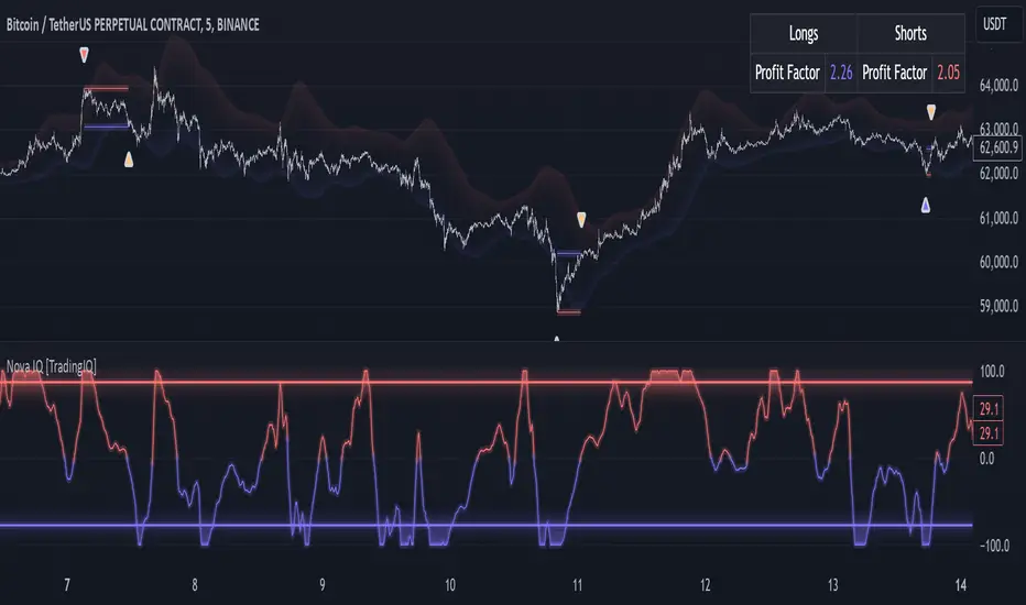
[Pandora] Vast Volatility Treasure TroveINTRODUCTION:
Volatility enthusiasts, prepare for VICTORY on this day of July 4th, 2024! This is my "Vast Volatility Treasure Trove," intended mostly for educational purposes, yet these functions will also exhibit versatility when combined with other algorithms to garner statistical excellence. Once again, I am now ripping the lid off of Pandora's box... of volatility. Inside this script is a 'vast' collection of volatility estimators, reflecting the indicators name. Whether you are a seasoned trader destined to navigate financial strife or an eagerly curious learner, this script offers a comprehensive toolkit for a broad spectrum of volatility analysis. Enjoy your journey through the realm of market volatility with this code!
WHAT IS MARKET VOLATILITY?:
Market volatility refers to various fluctuations in the value of a financial market or asset over a period of time, often characterized by occasional rapid and significant deviations in price. During periods of greater market volatility, evolving conditions of prices can move rapidly in either direction, creating uncertainty for investors with results of sharp declines as well as rapid gains. However, market volatility is a typical aspect expected in financial markets that can also present opportunities for informed decision-making and potential benefits from the price flux.
SCRIPT INTENTION:
Volatility is assuredly omnipresent, waxing and waning in magnitude, and some readers have every intention of studying and/or measuring it. This script serves as an all-in-one armada of volatility estimators for TradingView members. I set out to provide a diverse set of tools to analyze and interpret market volatility, offering volatile insights, and aid with the development of robust trading indicators and strategies.
In today's fast-paced financial markets, understanding and quantifying volatility is informative for both seasoned traders and novice investors. This script is designed to empower users by equipping them with a comprehensive suite of volatility estimators. Each function within this script has been meticulously crafted to address various aspects of volatility, from traditional methods like Garman-Klass and Parkinson to more advanced techniques like Yang-Zhang and my custom experimental algorithms.
Ultimately, this script is more than just a collection of functions. It is a gateway to a deeper understanding of market volatility and a valuable resource for anyone committed to mastering the complexities of financial markets.
SCRIPT CONTENTS:
This script includes a variety of functions designed to measure and analyze market volatility. Where applicable, an input checkbox option provides an unbiased/biased estimate. Below is a brief description of each function in the original order they appear as code upon first publish:
Parkinson Volatility - Estimates volatility emphasizing the high and low range movements.
Alternate Parkinson Volatility - Simpler version of the original Parkinson Volatility that I realized.
Garman-Klass Volatility - Estimates volatility based on high, low, open, and close prices using a formula that adjusts for biases in price dynamics.
Rogers-Satchell-Yoon Volatility #1 - Estimates volatility based on logarithmic differences between high, low, open, and close values.
Rogers-Satchell-Yoon Volatility #2 - Similar estimate to Rogers-Satchell with the same result via an alternate formulation of volatility.
Yang-Zhang Volatility - An advanced volatility estimate combining both strengths of the Garman-Klass and Rogers-Satchell estimators, with weights determined by an alpha parameter.
Yang-Zhang (Modified) Volatility - My experimental modification slightly different from the Yang-Zhang formula with improved computational efficiency.
Selectable Volatility - Basic customizable volatility calculation based on the logarithmic difference between selected numerator and denominator prices (e.g., open, high, low, close).
Close-to-Close Volatility - Estimates volatility using the logarithmic difference between consecutive closing prices. Specifically applicable to data sources without open, high, and low prices.
Open-to-Close Volatility - (Overnight Volatility): Estimates volatility based on the logarithmic difference between the opening price and the last closing price emphasizing overnight gaps.
Hilo Volatility - Estimates volatility using a method similar to Parkinson's method, which considers the logarithm of the high and low prices.
Vantage Volatility - My experimental custom 'vantage' method to estimate volatility similar to Yang-Zhang, which incorporates various factors (Alpha, Beta, Gamma) to generate a weighted logarithmic calculation. This may be a volatility advantage or disadvantage, hence it's name.
Schwert Volatility - Estimates volatility based on arithmetic returns.
Historical Volatility - Estimates volatility considering logarithmic returns.
Annualized Historical Volatility - Estimates annualized volatility using logarithmic returns, adjusted for the number of trading days in a year.
If I omitted any other known varieties, detailed requests for future consideration can be made below for their inclusion into this script within future versions...
BONUS ALGORITHMS:
This script also includes several experimental and bonus functions that push the boundaries of volatility analysis as I understand it. These functions are designed to provide additional insights and also are my ideal notions for traders looking to explore other methods of volatility measurement.
VOLATILITY APPLICATIONS:
Volatility estimators serve a common role across various facets of trading and financial analysis, offering insights into market behavior. These tools are already in instrumental with enhancing risk management practices by providing a deeper understanding of market dynamics and the inherent uncertainty in asset prices. With volatility estimators, traders can effectively quantifying market risk and adjust their strategies accordingly, optimizing portfolio performance and mitigating potential losses. Additionally, volatility estimations may serve as indication for detecting overbought or oversold market conditions, offering probabilistic insights that could inform strategic decisions at turning points. This script
distinctly offers a variety of volatility estimators to navigate intricate financial terrains with informed judgment to address challenges of strategic planning.
CODE REUSE:
You don't have to ask for my permission to use/reuse these functions in your published scripts, simply because I have better things to do than answer requests for the reuse of these functions.
Notice: Unfortunately, I will not provide any integration support into member's projects at all. I have my own projects that require way too much of my day already.

Machine Learning : Dominant Cycle Elastic Volume KNNAbout the Script
Dominant Cycle Elastic Volume KNN ,
is a non-parametric algorithm, which means that, initially it makes no assumptions about the underlying distribution of the time-series price as well as volume.
This approach gives it flexibility so that it can be used on a wide variety of securities at variety of timeframes.(even on lower timeframes such as seconds)
The main purpose of this indicator is to predict the trend of the underlying, by converging price, volume and dominant cycle as dimensions and generate signals of action.
Key terms :
Dominant cycle is a time cycle that has a greater influence on the overall behaviour of a system than other cycles.
The system uses Ehlers method to calculate Dominant Cycle/ Period.
Dominant cycle is used to determine the influencing period for the underlying.
Once the dominant cycle/ period is identified, it is treated as a dynamic length for considering further calculations
Elastic Volume MA is a volume based moving average which is generally used to converge the volume with price, the dominant period is used here as the length parameter
KNN K-Nearest Neighbour is one of the simplest Machine Learning algorithms based on Supervised Learning technique.
K-NN algorithm assumes the similarity between the new case/data and available cases and put the new case into the category that is most similar to the available categories.
K-NN algorithm stores all the available data and classifies a new data point based on the similarity. This means when new data appears then it can be easily classified into a well suite category by using K- NN algorithm. K-NN algorithm can be used for Regression as well as for Classification but mostly it is used for the Classification problems.
So, K-NN is used here to classify the trend of the Dominant Cycle Elastic Volume, and Generate Signals on top of it
How to Use the Indicator ?
The Buy Signal Candle
The Sell Signal Candle
The Buy Setup
The Sell Setup
Stop and Reverse Structure
What Timeframes and Symbols can this indicator be used on ?
The above indicator can be used on any liquid security which has volume information intact with ticker
and it can be used on any timeframe, but the best timeframes are
The indicator can also be used as a trend confirmatory indicators on lower time frames, like 30second
The Script has provision for alerts
Two alerts are there :
Alert 1= "LONG CONDITION : DCEV-ML"
Alert 2= "SHORT CONDITION : DCEV-ML"
How to request for access ?
Simply private message me !

Endpointed SSA of Price [Loxx]The Endpointed SSA of Price: A Comprehensive Tool for Market Analysis and Decision-Making
The financial markets present sophisticated challenges for traders and investors as they navigate the complexities of market behavior. To effectively interpret and capitalize on these complexities, it is crucial to employ powerful analytical tools that can reveal hidden patterns and trends. One such tool is the Endpointed SSA of Price, which combines the strengths of Caterpillar Singular Spectrum Analysis, a sophisticated time series decomposition method, with insights from the fields of economics, artificial intelligence, and machine learning.
The Endpointed SSA of Price has its roots in the interdisciplinary fusion of mathematical techniques, economic understanding, and advancements in artificial intelligence. This unique combination allows for a versatile and reliable tool that can aid traders and investors in making informed decisions based on comprehensive market analysis.
The Endpointed SSA of Price is not only valuable for experienced traders but also serves as a useful resource for those new to the financial markets. By providing a deeper understanding of market forces, this innovative indicator equips users with the knowledge and confidence to better assess risks and opportunities in their financial pursuits.
█ Exploring Caterpillar SSA: Applications in AI, Machine Learning, and Finance
Caterpillar SSA (Singular Spectrum Analysis) is a non-parametric method for time series analysis and signal processing. It is based on a combination of principles from classical time series analysis, multivariate statistics, and the theory of random processes. The method was initially developed in the early 1990s by a group of Russian mathematicians, including Golyandina, Nekrutkin, and Zhigljavsky.
Background Information:
SSA is an advanced technique for decomposing time series data into a sum of interpretable components, such as trend, seasonality, and noise. This decomposition allows for a better understanding of the underlying structure of the data and facilitates forecasting, smoothing, and anomaly detection. Caterpillar SSA is a particular implementation of SSA that has proven to be computationally efficient and effective for handling large datasets.
Uses in AI and Machine Learning:
In recent years, Caterpillar SSA has found applications in various fields of artificial intelligence (AI) and machine learning. Some of these applications include:
1. Feature extraction: Caterpillar SSA can be used to extract meaningful features from time series data, which can then serve as inputs for machine learning models. These features can help improve the performance of various models, such as regression, classification, and clustering algorithms.
2. Dimensionality reduction: Caterpillar SSA can be employed as a dimensionality reduction technique, similar to Principal Component Analysis (PCA). It helps identify the most significant components of a high-dimensional dataset, reducing the computational complexity and mitigating the "curse of dimensionality" in machine learning tasks.
3. Anomaly detection: The decomposition of a time series into interpretable components through Caterpillar SSA can help in identifying unusual patterns or outliers in the data. Machine learning models trained on these decomposed components can detect anomalies more effectively, as the noise component is separated from the signal.
4. Forecasting: Caterpillar SSA has been used in combination with machine learning techniques, such as neural networks, to improve forecasting accuracy. By decomposing a time series into its underlying components, machine learning models can better capture the trends and seasonality in the data, resulting in more accurate predictions.
Application in Financial Markets and Economics:
Caterpillar SSA has been employed in various domains within financial markets and economics. Some notable applications include:
1. Stock price analysis: Caterpillar SSA can be used to analyze and forecast stock prices by decomposing them into trend, seasonal, and noise components. This decomposition can help traders and investors better understand market dynamics, detect potential turning points, and make more informed decisions.
2. Economic indicators: Caterpillar SSA has been used to analyze and forecast economic indicators, such as GDP, inflation, and unemployment rates. By decomposing these time series, researchers can better understand the underlying factors driving economic fluctuations and develop more accurate forecasting models.
3. Portfolio optimization: By applying Caterpillar SSA to financial time series data, portfolio managers can better understand the relationships between different assets and make more informed decisions regarding asset allocation and risk management.
Application in the Indicator:
In the given indicator, Caterpillar SSA is applied to a financial time series (price data) to smooth the series and detect significant trends or turning points. The method is used to decompose the price data into a set number of components, which are then combined to generate a smoothed signal. This signal can help traders and investors identify potential entry and exit points for their trades.
The indicator applies the Caterpillar SSA method by first constructing the trajectory matrix using the price data, then computing the singular value decomposition (SVD) of the matrix, and finally reconstructing the time series using a selected number of components. The reconstructed series serves as a smoothed version of the original price data, highlighting significant trends and turning points. The indicator can be customized by adjusting the lag, number of computations, and number of components used in the reconstruction process. By fine-tuning these parameters, traders and investors can optimize the indicator to better match their specific trading style and risk tolerance.
Caterpillar SSA is versatile and can be applied to various types of financial instruments, such as stocks, bonds, commodities, and currencies. It can also be combined with other technical analysis tools or indicators to create a comprehensive trading system. For example, a trader might use Caterpillar SSA to identify the primary trend in a market and then employ additional indicators, such as moving averages or RSI, to confirm the trend and generate trading signals.
In summary, Caterpillar SSA is a powerful time series analysis technique that has found applications in AI and machine learning, as well as financial markets and economics. By decomposing a time series into interpretable components, Caterpillar SSA enables better understanding of the underlying structure of the data, facilitating forecasting, smoothing, and anomaly detection. In the context of financial trading, the technique is used to analyze price data, detect significant trends or turning points, and inform trading decisions.
█ Input Parameters
This indicator takes several inputs that affect its signal output. These inputs can be classified into three categories: Basic Settings, UI Options, and Computation Parameters.
Source: This input represents the source of price data, which is typically the closing price of an asset. The user can select other price data, such as opening price, high price, or low price. The selected price data is then utilized in the Caterpillar SSA calculation process.
Lag: The lag input determines the window size used for the time series decomposition. A higher lag value implies that the SSA algorithm will consider a longer range of historical data when extracting the underlying trend and components. This parameter is crucial, as it directly impacts the resulting smoothed series and the quality of extracted components.
Number of Computations: This input, denoted as 'ncomp,' specifies the number of eigencomponents to be considered in the reconstruction of the time series. A smaller value results in a smoother output signal, while a higher value retains more details in the series, potentially capturing short-term fluctuations.
SSA Period Normalization: This input is used to normalize the SSA period, which adjusts the significance of each eigencomponent to the overall signal. It helps in making the algorithm adaptive to different timeframes and market conditions.
Number of Bars: This input specifies the number of bars to be processed by the algorithm. It controls the range of data used for calculations and directly affects the computation time and the output signal.
Number of Bars to Render: This input sets the number of bars to be plotted on the chart. A higher value slows down the computation but provides a more comprehensive view of the indicator's performance over a longer period. This value controls how far back the indicator is rendered.
Color bars: This boolean input determines whether the bars should be colored according to the signal's direction. If set to true, the bars are colored using the defined colors, which visually indicate the trend direction.
Show signals: This boolean input controls the display of buy and sell signals on the chart. If set to true, the indicator plots shapes (triangles) to represent long and short trade signals.
Static Computation Parameters:
The indicator also includes several internal parameters that affect the Caterpillar SSA algorithm, such as Maxncomp, MaxLag, and MaxArrayLength. These parameters set the maximum allowed values for the number of computations, the lag, and the array length, ensuring that the calculations remain within reasonable limits and do not consume excessive computational resources.
█ A Note on Endpionted, Non-repainting Indicators
An endpointed indicator is one that does not recalculate or repaint its past values based on new incoming data. In other words, the indicator's previous signals remain the same even as new price data is added. This is an important feature because it ensures that the signals generated by the indicator are reliable and accurate, even after the fact.
When an indicator is non-repainting or endpointed, it means that the trader can have confidence in the signals being generated, knowing that they will not change as new data comes in. This allows traders to make informed decisions based on historical signals, without the fear of the signals being invalidated in the future.
In the case of the Endpointed SSA of Price, this non-repainting property is particularly valuable because it allows traders to identify trend changes and reversals with a high degree of accuracy, which can be used to inform trading decisions. This can be especially important in volatile markets where quick decisions need to be made.
Bogdan Ciocoiu - LitigatorDescription
The Litigator is an indicator that encapsulates the value delivered by the Relative Strength Index, Ultimate Oscillator, Stochastic and Money Flow Index algorithms to produce signals enabling users to enter positions in ideal market conditions. The Litigator integrates the value delivered by the above four algorithms into one script.
This indicator is handy when trading continuation/reversal divergence strategies in conjunction with price action.
Uniqueness
The Litigator's uniqueness stands from integrating the above algorithms into the same visual area and leveraging preconfigured parameters suitable for short term scalping (1-5 minutes).
In addition, the Litigator allows configuring the above four algorithms in such a way to coordinate signals by colour-coding or shape thickness to aid the user with identifying any emerging patterns quicker.
Furthermore, Moonshot's uniqueness is also reflected in the way it has standardised the outputs of each algorithm to look and feel the same, and in doing so, enabling users to plug them in/out as needed. This also includes ensuring the ratios of the shapes are similar (applicable to the same scale).
Open-source
The indicator uses the following open-source scripts/algorithms:
www.tradingview.com
www.tradingview.com
www.tradingview.com
www.tradingview.com
Bogdan Ciocoiu - MoonshotDescription
Moonshot is an indicator that encapsulates the value delivered by the TSI, MACD, Awesome Oscillator and CCI algorithms to produce signals to enable users to enter positions in ideal market conditions. Moonshot integrates the value delivered by the above four algorithms into one script.
This indicator is particularly useful when trading continuation/reversal divergence strategies.
Uniqueness
The Moonshot's uniqueness stands from integrating the above algorithms into the same visual area and leveraging preconfigured parameters suitable for 1-3 minute scalping techniques.
In addition, Moonshot allows swapping or furthermore configuring the above four algorithms in such a way to align signals by colour-coding or shape thickness to aid the users with identifying any emerging patterns quicker.
Furthermore, Moonshot's uniqueness is also reflected in the way it has standardised the outputs of each algorithm to look and feel the same (including the scale at which the shapes are shown) and, in doing so, enables users to plug them in/out as needed.
Open-source
The indicator leverages the following open-source scripts/algorithms:
www.tradingview.com
www.tradingview.com
www.tradingview.com
www.tradingview.com

The Chartless TraderThe Chartless Trader
The chartless trader is a trade management system designed to remove the randomness from the market. It is loosely based on the martingales betting system, but takes advantage of position sizing, minimum profit targets, dollar cost averaging, and trailing take profit.
The chart can be traded with or without a signal. There is a built in signal based on SB Master Chart's Buy the Dip algorithm.
The configurable settings include:
Account Value
Starting Account Value - This is the value of the account when you start using this system.
Current Cash - This is the amount of cash you have available to trade. This setting needs to be updated each time a trade is made.
TP/TTP Algo Settings
Take Profit % - This setting is otherwise known as minimum profit target. This algo will not advise you to sell or increase your trailing stop until this minimum profit target is met.
Trailing Stop % - This is the trailing stop. The default setting is 75%. As a basic example, if the stock is up 10%, the trailing stop would be set to 7.5% (10% * 75%). The algo may override and advise an alternative trailing stop should an overbought condition be detected.
DCA/BTD Algo
DCA/BTD Algo Time Frame - Default is 120 (2hrs). This algo looks for oversold periods on the 2h chart by default.
DCA % - The default for this setting is 5%. This is a trigger for the BTD Algo. The BTD algo will start looking for trades when the stock is 5% below your cost basis. This is to help you average down making it easier to turn a profit when the stock starts making gains.
Position #
The Chartless Trader supports a maximum of 20 symbols. This is a limitation of the security() function as a maximum of 40 calls are allowed and the script calls the security() function twice per symbol.
S# QTY - The number of open positions of the symbol. This has to be manually updated by the user after each buy/sell of the stock.
S# CB - This is the cost basis of the stock. Your broker should give you this after each buy/sell and it has to be updated here on the chart after each buy/sell.
S# TTP - The script will advise you to increase your Trailing Take Profit in your broker when its necessary. This should be updated manually after you update your order in your broker. This should be configured manually in your broker as a Stop Order.
Now that I have covered the configurable options, its important to understand the basis of this system. The martingales betting system is a system that seeks to double its position size each time you enter a losing trade. Eventually when you make a winning trade, it will be enough to cover the previous losses and net you one winning position.
Bet 1, lose 1, down 1.
Bet 2, lose 2, down 3.
Bet 4, lose 4, down 7.
Bet 8, lost 8, down 15.
Bet 16, win 16, up 1.
So the theory goes, if you have deep enough pockets, its a 100% win rate. Such a system is flawed and proven to cause an account to blow up given enough time. You can search Google/YouTube for others that have back tested the martingales system with stocks.
I advise that "The Chartless Trading" system be traded with a similar system, but instead of doubling your position, you simply increase your position size by 1%.
Bet 1%, lose 1%, down 1%
Bet 1%, lose 1%, down 2%
Bet 1%, lose 1%, down 3%.
In such a manner, your risk of ruin is significantly reduced. Lets say you lose 10 times in a row betting on a stock. You now have 10% of your account value in this particular stock. Because you only invested at times where you were more than 5% down and when an oversold position occurred, because of dollar cost averaging and buying during oversold periods, you may only be down 2-3% on your invested value. Eventually when the stock turns positive, you will have met your minimum profit target and the script will alert you to set a trailing stop. You log into your broker, set a stop loss and wait for it to either trigger or inform you to increase it again. Once the trailing stop is triggered, you deleverage the position by closing it and starting a single new position in either the same stock or a different one and the cycle repeats.
The key is to follow the stock down, follow it back up, and not back down. We repeat this cycle with many positions in many stocks to minimize risk and compound our balance sheet.
This is " The Chartless Trader ".
1920x1080p Monitor Required if using all 20 symbols.
The more symbols loaded, the longer the initial processing to load the table. Please be patient.

Directional AnalyzerThis script attempts to equip users with the necessary information about the direction of an instrument, and essentially it is a synergy of 3 algorithms.
The first algorithm (plotted as dots at level 0) studies the balance of delta volatility that constitutes the current bar and answers if bulls or bears are in control at that exact bar time
The second algorithm (plotted as an area) studies the development of delta volatility over the defined period by means of a polynomial regression. Effectively, it provides an overall picture of the trend strength.
The third algorithm (plotted as a line with arrow labels) utilizes simple elements of neural network in conjunction with some custom filters to predict the focal point that a trend will reverse its direction. This is predictive in nature, hence always adopt this with caution. While the labels display the predicted direction, the colors of the line also reflect the state of the current bar as well, adding to the confirmation of the first algorithm.
May you be on the right side of the trade.
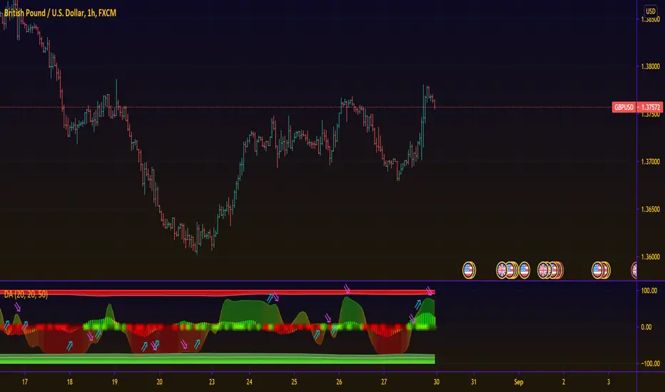
Anticipated Market TypeDisplays the anticipated market type based on the last 300 bars of data:
Trending Market: High probability that the next bar will be in the same direction as previous. Best conditions for a trend trading strategy
Neutral Market: High probability that price is random - the next bar direction is a coin toss. Many "typical" indicators fail in a random market
Sideways Market: High probability that price is autoregressive and the next bar direction is opposite the previous - compressed markets often have sudden fast breakouts
This tool does not give you entries and exits, but assists in deciding to use a Trend-following or Mean-reverting strategy.
Blue (3.5-6) indicates a trending market.
Yellow (0-2.5) indicates a sideways market.
Green (2.5-3.5) indicates a random market
This algorithm tells you when it breaks down by indicating a Neutral/Random market.
In short, it can't say the market type and advises you to not trade or simply use another tool in the meantime.
I personally use this tool to configure my trading robots on a weekly basis. I combine manual TA and stats algos to
try and determine what type of market the next week holds, with a fair bit of success.
The algorithms incorporated are Market Meanness Index (which I've made Open Source) and Fractal Dimension , a significantly faster algo than the MMI, but using a different set of maths.
Cheers!
MyAlgo EXTREMEPLEASE READ THE ENTIRE POST BEFORE PURCHASING & USING THE MyAlgo Tool. Saves you and me some time in emails and messages. :)
This is the official version of MyAlgo EXTREME
PLEASE UNDERSTAND THAT THIS IS A DIFFERENT AND SEPARATE PRODUCT AND SCRIPT FROM "MyAlgo SLIM" FROM THE MyAlgo TRADING TOOL SERIES
Description
Buy & Sell Alerts can be set on all Tickers. This includes, but is not limited to Crypto, Commodities , FOREX, Equities and Indices. Also all candle Types are compatible.
Recommended Time-frames - Due to the complexity of MyAlgo-SLIM the user has a choice between three algorithms and is like that able to trade on all timeframes with the highest returns.
MyAlgo combines many different aspects at the same time, scans multiple other Algorithms and comes to a conclusion based on over 1350 lines of code.
It is based on Divergences, Elliott Waves , Ichimoku , MACD , MACD Histogram, RSI , Stoch , CCI , Momentum, OBV, DIOSC, VWMACD, CMF and multiple EMAs.
Every single aspect is weighted into the decision before giving out an indication.
Most buy/sell Algorithms FAIL because they try to apply the same strategy to every single chart, which
are as individual as humans. To conquer this problem, MyAlgo has a wide range of settings and variables which can be easily
modified.
To make it a true strategy, MyAlgo has as well settings for Take Profit Points and Stop
Losses. Everything with an Alert Feature of course so that FULL AUTOMATION IS POSSIBLE.
I know from experience that many people take one Algorithm and are simply too LAZY to add multiple Algorithms to make a rational choice. The result of that is that they lose money, by following blatantly only one Algorithm.
MyAlgo has additional 15 Indicators, perfect for all markets, which can be turned on and off individually.
Side Notes
MyAlgo is being updated and upgraded very frequently to suit the requests of our customers.
This is not financial advice. Please read our disclaimer before using it.
Please refer to the signature field if you are interested in gaining access to this script.
Anything below this sentence will be Updates regarding MyAlgo
SMU Stock ThermometerThis script shows various technical indicators in a stacked vertical candle called Market Termometer.
It helps to see the price action in one single vertical column where the actual price moves up or down. So you can see the price change based on your custom setting levels.
I've been studying ALGO for over a year and made many live experiment trades long and shorts. So, I'm trying to find a way to see what is ALGos next move. If it sounds far-fetch, then you should see my other published scripts.
Here is example of how ALGo dance around old indicators, which is why I started creating a bunch of new indicators that ALGO doesn't know
Example:
Impact-driven-algorithm= Large volume masked as small volume to keep the price at desired level. So, your chart says overbought but market doesn't drop for days
Cost-driven-algorithm= Hedge fund buy every time at lower price and prevent others to buy low, moving up fast. Is like a clock with millisecond timing and ALGO owners know when to buy low and when to sell high
If you have a good idea, let me know so i can include it the future versions.
Enjoy and think outside the box, the only way to beat the ALGO
BB/KC Squeeze Channels (v6)Technical Specification for the BB/KC Squeeze Volatility Indicator in Algorithmic Cryptocurrency Trading
I. Theoretical Foundations of Volatility Dynamics
The "Contraction-Expansion" Principle (Volatility Contraction/Expansion)
The fundamental analysis of market volatility dynamics relies on the principle popularized by John Bollinger: periods of low volatility are inevitably followed by periods of high volatility. This phenomenon, known as the cyclical nature of volatility, is the cornerstone of trading strategies based on range breakouts (Breakout Strategy). In the context of technical analysis, volatility contraction manifests as a consolidation phase where the trading range narrows, preceding a strong, directional price impulse.
The essence of volatility contraction lies in a phase of market equilibrium that is inherently unstable. Most often, this reflects the covert activities of large market participants who are either accumulating or distributing a significant volume of the asset. These actions occur within a narrow price corridor to avoid sharp price movements until the entire position is acquired. As a result, activity decreases, the range narrows, and the market accumulates "energy" for the subsequent large-scale expansion. For the cryptocurrency market, characterized by high impulsivity and a tendency toward sharp trending moves, accurately identifying the deep contraction phase becomes a powerful algorithmic predictor.
Identifying Prerequisites: Distinguishing Pre-Breakout Contraction
To build a reliable indicator, it is crucial to distinguish a true pre-breakout squeeze from other types of volatility reduction that do not lead to a strong impulse. Specifically, volatility, measured by the Average True Range (ATR), will always decline after the completion of a strong vertical movement, as the market enters a pullback or deceleration phase. Such a decline is post-impulse and does not necessarily signal an imminent breakout.
It is necessary to find signs of abnormally low volatility that occurs precisely in the consolidation phase. The optimal time to look for a Squeeze signal is the formation of a distinct sideways channel. In this phase, the middle line of the channel indicator (e.g., EMA or SMA) should be relatively horizontal. This confirms that the market is currently in a ranging state (absence of a strong current trend), not in a deceleration phase after a trend. Therefore, the Squeeze indicator algorithm must include a check for confirmed sideways movement (e.g., through analyzing the slope of the middle line or its statistical deviation from the horizontal over the last X periods). Only abnormally low volatility during a range can be classified as a high-confidence pre-breakout contraction.
II. Instrument Selection: Justification for the Composite BB/KC Squeeze Approach
For effective algorithmic determination of the extreme contraction phase, it is necessary to use an indicator that combines the advantages of the two most reliable methods for measuring volatility: Bollinger Bands and Keltner Channels.
Comparative Analysis of Volatility Indicators
| Indicator | Base Metric | Volatility Response | Primary Role in Squeeze |
|---|---|---|---|
| Bollinger Bands (BB) | Standard Deviation (SD) | Fast, Highly Sensitive | Contraction sensor, Early breakout signal |
| Keltner Channels (KC) | Average True Range (ATR) | Smooth, Noise Filtering | Defines stable range, Filters false signals |
Bollinger Bands (BB)
Bollinger Bands are based on the Standard Deviation (SD) of the price from a moving average. This statistical metric makes BB highly sensitive, as they quickly react to sudden changes in volatility. Due to this sensitivity, BB are ideal for early registration of a contraction and for generating the breakout signal. However, their high sensitivity is also a drawback, as it can lead to false signals and premature expansion during market noise.
Keltner Channels (KC)
Keltner Channels, in the modern version developed by Linda Raschke, use the Average True Range (ATR) to calculate the channel width. ATR represents the averaged true range of fluctuations, which provides a smoother and more stable measure of volatility. KC react to market changes slower than BB, but their smoothness allows for better filtering of false signals and determination of the true direction of movement. Unlike fixed-width price channels or percentage envelopes, which perform poorly in dynamic environments, BB and KC automatically adapt to market conditions.
The Squeeze Mechanism: Synergy of Instruments
The BB/KC Squeeze indicator uses the synergy of BB and KC to achieve maximum accuracy in identifying the accumulation phase.
The technical Squeeze condition (Squeeze ON) is defined when the fast and statistically-oriented Bollinger Bands (BB) are inside the wider and smoother Keltner Channels (KC). This state represents quantitative confirmation of extremely low volatility.
In standard settings, BB use a multiplier of 2.0 for Standard Deviation (SD), and KC use a multiplier of 1.5 for ATR. For the statistical width of BB (based on price deviation from the average) to narrow inside the width of KC (based on the averaged range), the current statistical deviation of the price must fall to abnormally low values relative to the historical average range of fluctuations. This is not just low volatility, but its extreme contraction, indicating maximum accumulation of potential energy before an impulse.
III. Quantitative Analysis: How Much, Why, and How Volatility Contracts
How Much: Mathematical Definition of the Degree of Contraction
The degree of volatility contraction before a breakout is measured through a strict mathematical condition that ensures the current volatility is significantly below its averaged historical value.
The Squeeze Condition (Squeeze ON) requires both of the following mathematical formulas to be true :
To understand how much the movement should contract, we must consider the channel width formulas:
* Bollinger Bands Width (\text{BB}_{\text{Width}}):
\text{KC}_{\text{Width}} = 2 \times (\text{ATR} \times 1.5) = 3.0 \times \text{ATR}$$
The Squeeze ON state means that \text{BB}_{\text{Width}} < \text{KC}_{\text{Width}}. This condition is equivalent to \text{SD} \times 4.0 < \text{ATR} \times 3.0. As a result, the current Standard Deviation (SD) must fall below 75% of the Average True Range (ATR) for the contraction to be registered. This requirement for SD to decrease to a level significantly below ATR is the criterion for identifying the deep market calm that serves as the energy base for the subsequent directional movement.
Why and How: Qualitative Signs
Volatility decreases because large market participants are slowly and covertly accumulating positions. They keep the price within a narrow range to fully acquire the necessary volume before allowing the price to impulsively exit consolidation. This creates a sideways movement phase, minimizing risks for the trader and enabling timely tracking of a bullish or bearish breakout.
To enhance the algorithm's reliability and prevent entry into false ranges, the following qualitative signs accompanying a true squeeze must be considered:
* Squeeze Duration: The longer the price remains in the Squeeze ON state, the more energy is accumulated. Experience suggests a minimum duration of 4–8 periods. Extended contraction periods (over 10–12 bars) often precede the strongest impulsive movements in the crypto market.
* Price Position: During the contraction phase, the price should remain close to the middle line (EMA/SMA). This confirms that the market is in equilibrium, and accumulation is occurring around the "fair" price of the current range.
* Momentum Context: The volatility indicator (BB/KC) determines when a move will happen, but not its direction. To predict the direction (prerequisite), a momentum component must be used (e.g., a histogram, as in the TTM Squeeze variant ). The appearance of positive momentum during the contraction, even without price movement, signals potential bullish strength, increasing the likelihood of an upward breakout.
Squeeze State Logic Table
| State | Mathematical Condition (BB vs KC) | Market Interpretation |
|---|---|---|
| Squeeze ON | (\text{BB}_{\text{Upper}} < \text{KC}_{\text{Upper}}) AND (\text{BB}_{\text{Lower}} > \text{KC}_{\text{Lower}}) | Extreme volatility contraction, accumulation phase, breakout pending. |
| Squeeze OFF | \text{BB}_{\text{Upper}} \ge \text{KC}_{\text{Upper}} OR \text{BB}_{\text{Lower}} \le \text{KC}_{\text{Lower}} | Normal volatility, trending movement, or unstable range. |
IV. Technical Specification: Step-by-Step Algorithm for the Squeeze Indicator (BB/KC)
This algorithm represents the sequence of steps required to code the indicator, which captures the contraction state and generates breakout signals.
1. Initialization and Calculation of Basic Values
* Define Period N: Determine the period N (recommended value N=20) for calculating the moving averages, ATR, and Standard Deviation (SD).
* Calculate True Range (TR): For each bar, calculate \text{TR} as the maximum value of three metrics: (High – Low), \text{Abs}(\text{High} - \text{Close}_{\text{prev}}), \text{Abs}(\text{Low} - \text{Close}_{\text{prev}}).
2. Calculation of Keltner Channel (KC) Components
* Calculate KC Middle Line (EMA): Calculate the Exponential Moving Average (EMA) of the closing price (\text{Close}) over period N.
* Calculate ATR: Calculate the Average True Range (ATR) as the moving average of \text{TR} over period N.
* Calculate KC Boundaries: Calculate the Upper and Lower KC lines, using the ATR multiplier Y (recommended Y=1.5 ):
* * 3. Calculation of Bollinger Band (BB) Components
* Calculate BB Middle Line (SMA): Calculate the Simple Moving Average (SMA) of the closing price (\text{Close}) over period N.
* Calculate SD: Calculate the Standard Deviation (SD) of the closing price over period N.
* Calculate BB Boundaries: Calculate the Upper and Lower BB, using the SD multiplier X (recommended X=2.0 ):
* * 4. Algorithm for Determining the "Squeeze" State
* Check Squeeze ON Condition: For the current bar, check if both conditions are met: \text{BB}_{\text{Upper}} < \text{KC}_{\text{Upper}} AND \text{BB}_{\text{Lower}} > \text{KC}_{\text{Lower}}.
* Assign State: IF both conditions in step 9 are true, THEN assign the variable \text{SqueezeState} the value \text{ON} (e.g., 1). ELSE assign the value \text{OFF} (e.g., 0).
5. Algorithm for Generating Breakout Signals
* Identify Trigger: Check if \text{SqueezeState} has changed from \text{ON} to \text{OFF} on the current bar. This signifies that volatility has expanded after the contraction period.
* Bullish Breakout Signal: IF \text{SqueezeState}_{\text{prev}} = \text{ON} AND \text{SqueezeState}_{\text{current}} = \text{OFF}, AND the closing price (\text{Close}) of the current bar is above \text{BB}_{\text{Upper}}, THEN generate a BUY (Breakout Long) signal.
* Bearish Breakout Signal: IF \text{SqueezeState}_{\text{prev}} = \tex (start_span) (end_span)t{ON} AND \text{SqueezeState}_{\text{current}} = \text{OFF}, AND the closing price (\text{Close}) of the current bar is below \text{BB}_{\text{Lower}}, THEN generate a SELL (Breakout Short) signal.
* Additional Momentum Filtering: To increase reliability, the breakout signal should be valid only IF the breakout occurs in the direction confirmed by a momentum indicator (e.g., if Momentum > 0 for a Bullish breakout, and Momentum < 0 for a Bearish breakout).
The Role of Momentum in the Algorithm
A key addition to the volatility indicator is the momentum component. Defining the Squeeze ON/OFF state helps understand the potential for movement, but not its direction. The momentum indicator (often implemented as a histogram, as in TTM Squeeze ) measures whether accumulation of buying or selling pressure occurs during the contraction phase. Therefore, the indicator must include a sub-component that measures this pressure. Using momentum in conjunction with the BB breakout ensures that entry occurs not just after volatility expansion, but after expansion in a confirmed direction, significantly reducing the number of false breakouts.
V. Parameters, Optimization, and Nuances for the Cryptocurrency Market
Adapting Standard Settings (20, 2.0, 1.5)
The standard parameters N=20, X_{\text{BB}}=2.0, and Y_{\text{KC}}=1.5 are designed for stock markets and provide a reliable starting point. However, the high volatility and dynamics of the cryptocurrency market require fine-tuning to optimize performance.
1. Optimization of Period N
Reducing the period N (e.g., to 18 or 14) on lower timeframes (1-hour and below) increases the indicator's sensitivity to local, fast contractions, which is useful for scalping. However, this may also generate more signals, including false ones. For medium-term trading strategies (4h, Daily), a period of N=20 or N=21 provides an optimal balance between sensitivity and noise filtering.
2. Optimization of Multiplier Y_{\text{KC}}
The Keltner Channel multiplier (Y) defaults to 1.5. KC are smoother and more stable due to the use of ATR. If backtesting shows the indicator generates too many false Squeeze ON signals, it may indicate that the KC channel is too narrow. In this case, a slight increase in multiplier Y (e.g., to 1.6 or 1.7) widens the KC. This requires an even more extreme drop in Standard Deviation for the BB to narrow inside the KC, thereby increasing the strictness and reliability of the Squeeze ON signal.
Importance of Timeframe Selection
While some indicators like KC and BB show higher effectiveness in trending conditions for trading off channel boundaries , the Squeeze Play strategy is fundamentally different. It deliberately seeks a range (volatility contraction) with the goal of catching the start of a new strong trend.
In the cryptocurrency market, false breakouts and market noise (chop) can be particularly intense on low timeframes. Therefore, for the Squeeze strategy, it is recommended to use timeframes where consolidation is cleanest: 4-hour, Daily, or Weekly charts for major crypto pairs like BTC/USD or ETH/USD. On lower timeframes, multi-timeframe confirmation must be implemented, for example, using a trend filter from a higher timeframe.
VI. Strategic Application of Squeeze Play and Filtering
Using Momentum for Direction Determination
As noted, the volatility indicator (BB/KC) is not a directional indicator. The squeeze function (Squeeze ON) only identifies a high probability of a strong movement. Therefore, successful trading requires the integration of Momentum.
The breakout should be used as a trigger, but the direction must be confirmed by Momentum. For example, a BUY signal should only be generated if two conditions are met:
* Exit from the Squeeze ON state and the closing price breaking above the upper BB (\text{Close} > \text{BB}_{\text{Upper}}).
* The momentum indicator confirms upward pressure (Momentum value is positive).
This approach prevents entries into false breakouts where volatility expands but not in the direction of the accumulated market pressure.
Risk and Position Management
Since the Keltner Channel is based on ATR, which is a dynamic measure of volatility , ATR should be used for setting the Stop-Loss (SL) in the algorithmic strategy.
* Stop-Loss (SL) Setting: It is recommended to set the SL at a level determined by 1 \times \text{ATR} below the middle line (EMA/SMA) or beyond the KC boundary opposite the breakout. Using ATR ensures that the SL dynamically adapts to the current volatility, avoiding overly tight stops during periods of normal range.
* Take-Profit (TP) Setting: Since the goal of Squeeze Play is to catch a strong directional movement, the take-profit can be set based on a fixed Risk/Reward ratio (e.g., 2:1 or 3:1) or based on the price exiting the KC boundaries. Breaking the KC often indicates an extreme price move and can serve as a point for partial or full profit taking.
Filtering Against False Signals in a Range
The main drawback of breakout trading is the high percentage of false signals in wide but non-directional ranges. Using the composite BB/KC Squeeze indicator effectively addresses this problem.
KC, being based on smoothed ATR, is less susceptible to short-term volatility spikes than BB. The Squeeze filter requires the sensitive BB to narrow inside the smoothed KC. This ensures that we enter only those breakouts that were preceded by a prolonged and abnormally low volatility phase. The breakout must be confirmed by the price breaking the BB after the Squeeze ON state ends, signaling a sustained volatility expansion rather than a brief price spike.
VII. Conclusion
The analysis confirms that the user's observation about the relationship between volatility contraction and subsequent strong movements is a fundamentally sound principle, the best implementation of which in the cryptocurrency market is achieved using the composite BB/KC Squeeze indicator.
This indicator provides a precise quantitative definition of "how much" volatility must contract (SD must fall below 75% of ATR) and includes the necessary qualitative prerequisites ("why and how" — consolidation, confirmed by momentum). The presented step-by-step algorithm provides the technical foundation for coding a highly effective tool that identifies accumulation phases and generates breakout signals, adapted to the dynamics of the crypto market. The inclusion of momentum-based filtering and proper risk management tied to ATR are key factors for transitioning from a pure indicator to a profitable trading strategy.
Техническая Спецификация Индикатора Волатильности BB/KC Squeeze для Алгоритмической Торговли Криптовалютами
I. Теоретические Основы Динамики Волатильности
Принцип "Сжатие-Расширение" (Volatility Contraction/Expansion)
Фундаментальный анализ динамики рыночной волатильности опирается на принцип, популяризированный Джоном Боллинджером: периоды низкой волатильности неизбежно сменяются периодами высокой волатильности. Это явление, известное как цикличность волатильности, является краеугольным камнем торговых стратегий, основанных на пробое диапазона (Breakout Strategy). В контексте технического анализа сжатие волатильности проявляется как фаза консолидации, в которой торговый диапазон сужается, предшествуя сильному, направленному ценовому импульсу.
Смысл контракции волатильности заключается в фазе рыночного равновесия, которое, однако, является неустойчивым. Чаще всего это отражает скрытую деятельность крупных участников, которые либо накапливают (аккумуляция), либо распределяют (дистрибуция) значительный объем актива. Эти действия происходят в узком ценовом коридоре, чтобы избежать резкого движения цены, пока позиция не будет полностью набрана. В результате активность падает, диапазон сужается, и рынок накапливает «энергию» для последующего масштабного расширения. Для криптовалютного рынка, который характеризуется высокой импульсивностью и склонностью к резким трендовым движениям, точная идентификация фазы глубокого сжатия становится мощным алгоритмическим предиктором.
Идентификация Предпосылок: Отличие Пред-пробойного Сжатия
Для построения надежного индикатора критически важно уметь отличать истинное пред-пробойное сжатие от других типов снижения волатильности, которые не ведут к сильному импульсу. В частности, волатильность, измеряемая, например, индикатором Average True Range (ATR), всегда будет снижаться после завершения сильного вертикального движения, поскольку рынок переходит в фазу отката или замедления. Такое снижение является пост-импульсным и не обязательно сигнализирует о скором пробое.
Требуется найти признаки аномально низкой волатильности, которая возникает именно в фазе консолидации. Оптимальный момент для поиска сигнала Сжатия — это возникновение четкого бокового канала. В этой фазе средняя линия канального индикатора (например, EMA или SMA) должна быть относительно горизонтальной. Это подтверждает, что рынок в данный момент находится в состоянии рейнджа (отсутствие сильного текущего тренда), а не в фазе замедления после тренда. Таким образом, в алгоритм индикатора Squeeze необходимо заложить проверку на подтверждение бокового движения (например, через анализ наклона средней линии или ее статистического отклонения от горизонтали за последние X периодов). Только аномально низкая волатильность в фазе рейнджа может быть квалифицирована как высоконадежное пред-пробойное сжатие.
II. Выбор Инструмента: Обоснование Композитного Подхода BB/KC Squeeze
Для эффективного алгоритмического определения фазы экстремального сжатия необходимо использовать индикатор, который комбинирует преимущества двух наиболее надежных методов измерения волатильности: Полос Боллинджера и Каналов Кельтнера.
Сравнительный Анализ Индикаторов Волатильности
Полосы Боллинджера (Bollinger Bands, BB)
Полосы Боллинджера основаны на Стандартном Отклонении (SD) цены от скользящей средней. Эта статистическая метрика делает BB высокочувствительными, поскольку они быстро реагируют на внезапные изменения волатильности. Благодаря этой чувствительности, BB идеально подходят для ранней регистрации начавшегося сжатия и для генерации сигнала пробоя. Однако их высокая чувствительность также является недостатком, так как она может приводить к ложным срабатываниям и преждевременному расширению в условиях рыночного шума.
Каналы Кельтнера (Keltner Channels, KC)
Каналы Кельтнера, в современной версии, разработанной Линдой Рашке, используют Average True Range (ATR) для расчета ширины канала. ATR представляет собой усредненный истинный диапазон колебаний, что обеспечивает более сглаженную и устойчивую меру волатильности. KC реагируют на изменения рынка медленнее, чем BB, но их плавность позволяет лучше фильтровать ложные сигналы и определять истинное направление движения. В отличие от ценовых каналов с фиксированной шириной или процентными конвертами, которые плохо работают в динамичных средах, BB и KC автоматически адаптируются к рыночным условиям.
Механизм Squeeze: Синергия Инструментов
Индикатор BB/KC Squeeze использует синергию BB и KC для достижения максимальной точности в идентификации фазы накопления.
Техническое условие Сжатия (Squeeze ON) определяется, когда быстрые и статистически ориентированные Полосы Боллинджера (BB) оказываются внутри более широких и сглаженных Каналов Кельтнера (KC). Это состояние представляет собой количественное подтверждение экстремально низкой волатильности.
В стандартных настройках BB используют множитель 2.0 от Стандартного Отклонения (SD), а KC используют множитель 1.5 от ATR. Для того чтобы статистическая ширина BB (основанная на отклонении цены от средней) сузилась внутрь ширины KC (основанной на усредненном диапазоне), текущее статистическое отклонение цены должно упасть до аномально низких значений по отношению к историческому среднему диапазону колебаний. Это не просто низкая волатильность, а ее экстремальное сокращение, указывающее на максимальное накопление потенциальной энергии перед импульсом.
Таблица Сравнения Ключевых Индикаторов Волатильности
| Индикатор | Базовая Метрика | Реакция на Волатильность | Основная Роль в Squeeze |
|---|---|---|---|
| Bollinger Bands (BB) | Стандартное Отклонение (SD) | Быстрая, Высокочувствительная | Датчик сжатия, Ранний сигнал пробоя |
| Keltner Channels (KC) | Average True Range (ATR) | Плавная, Фильтрация шума | Определение устойчивого диапазона, Фильтр ложных сигналов |
III. Количественный Анализ: На Сколько, Почему и Как Сокращается Волатильность
На Сколько: Математическое Определение Степени Сжатия
Степень сокращения волатильности перед пробоем измеряется через строгое математическое условие, которое обеспечивает, что текущая волатильность значительно ниже ее усредненного исторического значения.
Условие Сжатия (Squeeze ON) требует выполнения обеих следующих математических формул :
Для понимания того, на сколько должно сократиться движение, необходимо рассмотреть формулы ширины каналов:
* Ширина Полос Боллинджера (\text{BB}_{\text{Width}}):
\text{KC}_{\text{Width}} = 2 \times (\text{ATR} \times 1.5) = 3.0 \times \text{ATR}$$
Состояние Squeeze ON означает, что \text{BB}_{\text{Width}} < \text{KC}_{\text{Width}}. Это условие эквивалентно \text{SD} \times 4.0 < \text{ATR} \times 3.0. В результате, текущее стандартное отклонение (SD) должно упасть ниже 75% от усредненного истинного диапазона (ATR), чтобы сжатие было зарегистрировано. Такое требование к снижению SD до уровня, значительно ниже ATR, является критерием для идентификации глубокого покоя рынка, который служит энергетической базой для последующего направленного движения.
Почему и Как: Качественные Признаки
Снижение волатильности происходит потому, что крупные участники рынка медленно и скрытно накапливают позиции. Они поддерживают цену в узком диапазоне, чтобы полностью набрать необходимый объем, прежде чем позволить цене импульсивно выйти из консолидации. Это создает фазу бокового движения, минимизируя риски для трейдера и позволяя оперативно отследить «бычий» или «медвежий» прорыв.
Для повышения надежности алгоритма и предотвращения входа в ложные диапазоны, необходимо учитывать следующие качественные признаки, сопровождающие истинное сжатие:
* Длительность Сжатия: Чем дольше цена находится в состоянии Squeeze ON, тем больше энергии накапливается. Опыт показывает, что минимальная длительность должна составлять 4–8 периодов. Длительные периоды сжатия (более 10–12 баров) часто предшествуют наиболее сильным импульсным движениям на крипторынке.
* Положение Цены: Во время фазы сжатия цена должна находиться в непосредственной близости к средней линии (EMA/SMA). Это подтверждает, что рынок находится в состоянии равновесия, и накопление происходит вокруг "справедливой" цены текущего диапазона.
* Контекст Моментума: Индикатор волатильности (BB/KC) определяет когда произойдет движение, но не его направление. Для предсказания направления (признак) необходимо использовать компонент моментума (например, гистограмму, как в варианте TTM Squeeze ). Появление положительного моментума во время сжатия, даже при отсутствии движения цены, является признаком потенциальной бычьей силы, усиливающей вероятность пробоя вверх.
Логика Определения Состояния "Сжатия" (Squeeze State Logic)
| Состояние | Математическое Условие (BB vs KC) | Интерпретация Рынка |
|---|---|---|
| Squeeze ON | (\text{BB}_{\text{Upper}} < \text{KC}_{\text{Upper}}) И (\text{BB}_{\text{Lower}} > \text{KC}_{\text{Lower}}) | Экстремальная контракция волатильности, фаза накопления, ожидание прорыва. |
| Squeeze OFF | \text{BB}_{\text{Upper}} \ge \text{KC}_{\text{Upper}} ИЛИ \text{BB}_{\text{Lower}} \le \text{KC}_{\text{Lower}} | Нормальная волатильность, трендовое движение или неустойчивый диапазон. |
IV. Техническая Спецификация: Пошаговый Алгоритм Индикатора Squeeze (BB/KC)
Данный алгоритм представляет собой последовательность шагов, необходимых для кодирования индикатора, фиксирующего состояние сжатия и генерирующего сигналы пробоя.
1. Инициализация и Расчет Базовых Величин
* Определение Периода N: Определить период N (рекомендуемое значение N=20) для расчета скользящих средних, ATR и Стандартного Отклонения (SD).
* Расчет Истинного Диапазона (True Range, TR): Для каждого бара рассчитать \text{TR} как максимальное значение из трех метрик: (High – Low), \text{Abs}(\text{High} - \text{Close}_{\text{prev}}), \text{Abs}(\text{Low} - \text{Close}_{\text{prev}}).
2. Расчет Компонентов Канала Кельтнера (KC)
* Расчет Средней Линии KC (EMA): Рассчитать экспоненциальную скользящую среднюю (EMA) цены закрытия (\text{Close}) за период N.
* Расчет ATR: Рассчитать Средний Истинный Диапазон (ATR) как скользящую среднюю \text{TR} за период N.
* Расчет Границ KC: Рассчитать Верхнюю и Нижнюю линии KC, используя множитель ATR Y (рекомендуется Y=1.5 ):
* * 3. Расчет Компонентов Полос Боллинджера (BB)
* Расчет Средней Линии BB (SMA): Рассчитать простую скользящую среднюю (SMA) цены закрытия (\text{Close}) за период N.
* Расчет SD: Рассчитать Стандартное Отклонение (SD) цены закрытия за период N.
* Расчет Границ BB: Рассчитать Верхнюю и Нижнюю полосы BB, используя множитель SD X (рекомендуется X=2.0 ):
* * 4. Алгоритм Определения Состояния "Squeeze"
* Проверка Условия Squeeze ON: Для текущего бара проверить, выполняются ли оба условия: \text{BB}_{\text{Upper}} < \text{KC}_{\text{Upper}} И \text{BB}_{\text{Lower}} > \text{KC}_{\text{Lower}}.
* Присвоение Состояния: ЕСЛИ оба условия в шаге 9 истинны, ТО присвоить переменной \text{SqueezeState} значение \text{ON} (например, 1). ИНАЧЕ присвоить значение \text{OFF} (например, 0).
5. Алгоритм Генерации Сигналов Пробоя
* Идентификация Триггера: Проверить, что \text{SqueezeState} изменился с \text{ON} на \text{OFF} на текущем баре. Это означает, что волатильность расширилась после периода сжатия.
* Сигнал Бычьего Пробоя: ЕСЛИ \text{SqueezeState}_{\text{prev}} = \text{ON} И \text{SqueezeState}_{\text{current}} = \text{OFF}, И цена закрытия (\text{Close}) текущего бара выше \text{BB}_{\text{Upper}}, ТО генерировать сигнал ПОКУПКА (Breakout Long).
* Сигнал Медвежьего Пробоя: ЕСЛИ \text{SqueezeState}_{\text{prev}} (start_span) (end_span)= \text{ON} И \text{SqueezeState}_{\text{current}} = \text{OFF}, И цена закрытия (\text{Close}) текущего бара ниже \text{BB}_{\text{Lower}}, ТО генерировать сигнал ПРОДАЖА (Breakout Short).
* Дополнительная Фильтрация Моментумом: Для повышения надежности, сигнал пробоя должен быть действителен только ЕСЛИ пробой происходит в направлении, подтвержденном моментум-индикатором (например, если Моментум > 0 для Бычьего пробоя, и Моментум < 0 для Медвежьего пробоя).
Роль Моментума в Алгоритме
Ключевым дополнением к индикатору волатильности является компонент моментума. Определение состояния Squeeze ON/OFF позволяет понять потенциал движения, но не его направление. Моментум-индикатор (часто реализованный в виде гистограммы, как в TTM Squeeze ) позволяет измерить, происходит ли накопление давления покупателей или продавцов во время фазы сжатия. Следовательно, индикатор должен включать подкомпонент, который измеряет это давление. Использование моментума в сочетании с пробоем BB гарантирует, что вход в позицию происходит не просто после расширения волатильности, а после ее расширения в подтвержденном направлении, что существенно снижает количество ложных пробоев.
V. Параметры, Оптимизация и Нюансы для Криптовалютного Рынка
Адаптация Стандартных Настроек (20, 2.0, 1.5)
Стандартные параметры N=20, X_{\text{BB}}=2.0 и Y_{\text{KC}}=1.5 разработаны для фондовых рынков и являются надежной отправной точкой. Однако высокая волатильность и динамика криптовалютного рынка требуют тонкой настройки для оптимизации производительности.
1. Оптимизация Периода N
Уменьшение периода N (например, до 18 или 14) на более низких таймфреймах (1-часовой и ниже) увеличит чувствительность индикатора к локальным, быстрым сжатиям, что полезно для скальпинга. Однако, это также может привести к генерации большего количества сигналов, в том числе ложных. Для среднесрочных торговых стратегий (4h, Daily) период N=20 или N=21 обеспечивает оптимальный баланс между чувствительностью и фильтрацией шума.
2. Оптимизация Множителя Y_{\text{KC}}
Множитель Каналов Кельтнера (Y) по умолчанию равен 1.5. KC более плавные и устойчивые благодаря использованию ATR. Если в процессе тестирования индикатор генерирует слишком много ложных сигналов Squeeze ON, это может указывать на то, что канал KC слишком узок. В этом случае, небольшое увеличение множителя Y (например, до 1.6 или 1.7) расширит KC. Это потребует еще более экстремального падения Стандартного Отклонения, чтобы BB сузились внутрь KC, тем самым повышая строгость и надежность сигнала Squeeze ON.
Важность Выбора Таймфрейма
Хотя некоторые индикаторы, такие как KC и BB, показывают более высокую эффективность в трендовом состоянии для торговли отскоками от границ , стратегия Squeeze Play принципиально иная. Она целенаправленно ищет рейндж (контракцию волатильности) с целью поймать начало нового сильного тренда.
На рынке криптовалют ложные пробои и рыночный шум (chop) могут быть особенно интенсивными на низких таймфреймах. Поэтому для стратегии Squeeze рекомендуется использовать таймфреймы, на которых консолидация наиболее чиста: 4-часовой, Daily или Weekly графики для основных криптопар, таких как BTC/USD или ETH/USD. На более низких таймфреймах необходимо внедрять мультитаймфреймовое подтверждение, используя, например, фильтр тренда с более высокого таймфрейма.
VI. Стратегическое Применение Squeeze Play и Фильтрация
Использование Momentum для Определения Направления
Как уже было отмечено, индикатор волатильности (BB/KC) не является индикатором направления. Функция сжатия (Squeeze ON) лишь идентифицирует высокую вероятность сильного движения. Следовательно, для успешной торговли необходимо интегрировать Моментум.
Прорыв следует использовать как триггер, но направление должно быть подтверждено Моментумом. Например, сигнал ПОКУПКА должен быть сгенерирован, только если соблюдены два условия:
* Выход из состояния Squeeze ON и пробитие ценой закрытия верхней полосы BB (\text{Close} > \text{BB}_{\text{Upper}}).
* Моментум-индикатор подтверждает восходящее давление (значение Моментума положительно).
Такой подход предотвращает входы в ложные пробои, когда волатильность расширяется, но не в направлении накопленного рыночного давления.
Управление Рисками и Позицией
Поскольку Канал Кельтнера основан на ATR, который является динамической мерой волатильности , именно ATR следует использовать для установки стоп-лосса (SL) в алгоритмической стратегии.
* Установка Стоп-Лосса (SL): Рекомендуется устанавливать SL на уровне, определяемом 1 \times \text{ATR} ниже средней линии (EMA/SMA) или за границей канала KC, противоположной пробою. Использование ATR обеспечивает, что SL динамически адаптируется к текущей волатильности, избегая слишком узких стопов в периоды нормального диапазона.
* Установка Тейк-Профита (TP): Поскольку цель Squeeze Play — поймать сильное направленное движение, тейк-профит может быть установлен на основе фиксированного соотношения Риск/Прибыль (например, 2:1 или 3:1) или на основе выхода цены за пределы KC. Пробитие KC часто указывает на экстремальное ценовое движение и может служить точкой для частичной или полной фиксации прибыли.
Фильтрация Против Ложных Сигналов в Рейндже
Основной недостаток торговли на пробой — высокий процент ложных сигналов в широких, но не направленных диапазонах. Использование композитного индикатора BB/KC Squeeze эффективно решает эту проблему.
KC, будучи основанным на сглаженном ATR, менее подвержен краткосрочным всплескам волатильности, чем BB. Фильтр Сжатия требует, чтобы чувствительные BB сузились внутрь сглаженных KC. Это гарантирует, что мы входим только в те прорывы, которым предшествовала длительная и аномально низкая фаза волатильности. Пробой должен быть подтвержден тем, что цена пробивает BB после завершения состояния Squeeze ON, что сигнализирует об устойчивом расширении волатильности, а не о кратковременном ценовом всплеске.
VII. Заключение
Анализ подтверждает, что наблюдение пользователя о связи между сокращением волатильности и последующими сильными движениями является фундаментально верным принципом, наилучшая реализация которого на рынке криптовалют достигается с помощью композитного индикатора BB/KC Squeeze.
Этот индикатор предоставляет точное количественное определение "на сколько" волатильность должна сократиться (SD должно упасть ниже 75% от ATR) и включает необходимые качественные предпосылки ("почему и как" — консолидация, подтвержденная моментумом). Представленный пошаговый алгоритм обеспечивает техническую основу для кодирования высокоэффективного инструмента, который идентифицирует фазы аккумуляции и генерирует сигналы пробоя, адаптированные к динамике крипторынка. Включение фильтрации на основе моментума и надлежащее управление риском, привязанное к ATR, являются ключевыми факторами для перехода от чистого индикатора к прибыльной торговой стратегии.

Narrative [#]Narrative - Not predicting, “anticipating”.
Overview
Narrative, is a multi-timeframe technical analysis indicator that provides anticipative candle structure analysis by identifying and visualizing higher timeframe (HTF) price levels based on candle composition dynamics. The indicator calculates hierarchical price zones derived from candle body proportions and wick ranges, then projects these levels as support/resistance quadrants and standard deviation-based extensions for the current and subsequent timeframe periods.
Core Functionality
Narrative Analysis Algorithm
The indicator operates on a user-selectable timeframe (1m through Weekly) and analyzes completed candles to identify structural patterns:
Body-to-Wick Ratio Analysis: Compares the candle body size relative to upper and lower wicks to determine market structure bias
Quadrant Level Generation: Subdivides identified wick ranges into proportional levels (.25, .5, .75) representing key equilibrium points
Standard Deviation Extensions: Calculates and displays standard deviation bands based on either wick-specific ranges or full candle range (High-Low)
Anticipation Status Classification: Categorizes candle structure as Bullish Expansion, Bearish Expansion, or Consolidation Reversal to telegraph anticipated price behavior
What Makes This Indicator Different
Dynamic Level Generation: Unlike static support/resistance tools, Narrative generates levels from actual candle structure proportions rather than lower timeframe structure.
Hierarchical Quadrant System: Provides four distinct sublevel zones within major price ranges, enabling confluence for PD Arrays (Premium/Discount Arrays from ICT), support and resistance and “random” price movements.
Dual STDV Calculation Methods: Offers both wick-specific and full-range standard deviation modes, accommodating different narratives and their key level framework.
Advantages:
Works on any timeframe and any instrument without volume data dependency
Identifies institutional price structure through pure OHLC analysis
Provides forward-looking anticipation rather than reactive analysis
Unique Features:
Extracts pattern-specific information from individual candle structures
Updates on every timeframe change with fresh level calculations
Combines reversal probability assessment with geometric price projections
Technical Specifications
Input Parameters
Narrative Timeframe: Selectable from 1m, 5m, 15m, 1H, 4H, D, W
Show Anticipation Table: Boolean toggle for narrative status display
Reversal Candles Toggle: Master control for all level overlays
STDV Range Options: Toggle between 1-2 STDV (basic) and 3-4 STDV (extended)
Quadrant Display: Individual toggles for .25, .5, .75 level visibility
Customizable Colors: Separate color schemes for bullish, bearish, body, and wick levels
Line Styling: Adjustable line width, style (solid/dotted/dashed), and extension periods
Output Display Elements
Quadrant Levels:
Upper wick quadrants (Price High to Body High)
Lower wick quadrants (Body Low to Price Low)
Body range quadrants (Open-Close range)
Each subdivided into .25, .5, and .75 proportional levels
Standard Deviation Extensions:
±1, ±2, ±2.5 bands (basic mode)
±3, ±4 bands (extended mode)
Full-range or wick-specific calculations
Narrative Table:
Real-time anticipation classification
Timeframe reference
Updates on new candle formation
Optimal Use Cases
Best Performance Timeframes: Weekly, Daily, and 4-Hour (larger sample size for ratio accuracy)
Primary trend identification and institutional level discovery
Swing trade entry/exit optimization
Multi-timeframe confluence analysis
Secondary Timeframes: 1-Hour through 15-Minute
Intraday precision entry points
Scalp setup confirmation
Micro-level support/resistance zones
Supported Instruments: All (Forex, Stocks, Cryptos, Commodities, Indices)
No instrument-specific calibration required
Pure OHLC-based analysis
Trading Applications
Anticipation Planning: Use the narrative status to pre-position orders ahead of candle close
Level Confluence: Identify zones where quadrants align with other technical tools
Risk Management: Set stops relative to discovered STDV extensions or quadrants
Breakout Validation: Confirm breakouts occur at identified quadrant levels
Reversal Probability: Assess expansion vs. consolidation patterns for mean reversion setups
Compliance & Safety
No Repainting: Levels are calculated once at candle close and remain fixed
No Lookahead Bias: All calculations use closed candle data
Non-Repaint Draw Algorithm: Historical levels persist, new levels overlay forward only
Performance Optimized: Efficiently manages up to 500 lines and labels per chart instance
Summary
Narrative bridges the gap between price action analysis and algorithmic level projection by extracting predictive structure from candle composition. It provides institutional-grade level identification without requiring volume data, making it a lightweight yet powerful addition to any technical analysis workflow. The indicator excels at revealing hidden price structure that traditional indicators overlook, offering traders a quantifiable edge in identifying key reversal and continuation zones.

Dresteghamat-Multi timeframe Regime & Exhaustion**Dresteghamat-Multi timeframe Regime & Exhaustion**
This script is a custom decision-support dashboard that aggregates volatility, momentum, and structural data across multiple timeframes to filter market noise. It addresses the problem of "Analysis Paralysis" by automating the correlation between lower timeframe momentum and higher timeframe structure using a weighted scoring algorithm.
### 🔧 Methodology & Calculation Logic
The core engine does not simply overlay indicators; it normalizes their outputs into a unified score (-100 to +100). The logic is hidden (Protected) to preserve the proprietary weighting algorithm, but the underlying concepts are as follows:
**1. Adaptive Timeframe Selection (Context Engine)**
Instead of static monitoring, the script detects the user's current chart timeframe (`timeframe.multiplier`) and dynamically assigns two relevant Higher Timeframes (HTF) as anchors.
* *Logic:* If Current TF < 5min, the script analyzes 15m and 1H data. If Current TF < 1H, it shifts to 4H and Daily data. This ensures the analysis is contextually relevant.
**2. Regime & Volatility Filter (ATR Based)**
We use the Average True Range (ATR) to determine the market regime (Trend vs. Range).
* **Calculation:** We compare the current Swing Range (High-Low lookback) against a smoothed ATR. A high Ratio (> 2.0) indicates a Trend Regime, activating Trend-Following logic. A low ratio dampens the signals.
**3. Directional Bias (Structure + Flow)**
Direction is not determined by a single crossover. It is a fusion of:
* **Swing Structure:** Using `ta.pivothigh/low` to identify Higher Highs/Lower Lows.
* **Volume Flow:** Calculating the cumulative delta of candle bodies over a lookback period.
* **Micro-Bias:** A short-term (default 5-bar) momentum filter to detect immediate order flow changes.
**4. Exhaustion Logic (Mean Reversion Warning)**
To prevent buying at tops, the script calculates an "Exhaustion Score" based on:
* **RSI Divergence:** Detecting discrepancies between price peaks and momentum.
* **Volatility Extension:** Identifying when price has deviated significantly from its volatility mean (VRSD logic).
* **Volume Anomalies:** Detecting low volume on new highs (Supply absorption).
### 📊 How to Read the Dashboard
The table displays the raw status of each timeframe. The **"MODE"** row is the output of the algorithmic decision tree:
* **BUY/SELL ONLY:** Generated when the Current TF momentum aligns with the dynamically selected HTF structure AND the Exhaustion Score is below the threshold (default 70).
* **PULLBACK:** Triggered when the HTF Structure is bullish, but Current Momentum is bearish (indicating a corrective phase).
* **HTF EXHAUST:** A safety warning triggered when the HTF Volatility or RSI metrics hit extreme levels, overriding any entry signals.
* **WAIT:** Default state when volatility is low (Range Regime) or signals conflict.
### ⚠️ Disclaimer
This tool provides algorithmic analysis based on historical price action and volatility metrics. It does not guarantee future results.
