checkm8's ADX & DMI v2 with MTF Godmode CrossoversHello & welcome to my updated version of the ADX & DMI indicator.
The average directional index and directional moving indices are a godsend and I think you should incorporate it into your trading.
Here's a quick how-to:
A detailed guide is available in my first version:
Additional edits:
My indicator paints the background of the indicator green when +DMI is above -DMI and red when -DMI is above +DMI. In addition to this, the background will paint darker green when the RSI on the timeframe exceeds 70 and even darker when the RSI exceeds 80, in a +DMI dominance. The background will paint darker red when the RSI on the timeframe falls below 30 and even darker when the RSI falls below 20, in a -DMI dominance.
The indicator also displays multi-timeframe (MTF) crossovers on Godmode MACDs, plotted on the ADX line. If the dots are teal, it means that the shorter-term MA crossed above the longer-term MA (bullish), and if it is fuchsia, the shorter-term MA crossed below the longer-term MA (bearish).
Additional notes:
Additional edits:
1) Speculating on DMI crossovers is dangerous, especially on larger timeframes. Be careful when doing so if you are not familiar with the calculations behind the DMIs and if you are not familiar with how movements on lower timeframes translate to larger timeframes.
Additional resources to learn about ADX & DMI:
1) seekingalpha.com
2) stockcharts.com
Special thanks:
-xSilas, for the development of the Godmode calculations used in my indicator
-dent77x, for being a thinkpool and emotional support
-kristarling, for help with the coding
Search in scripts for "mtf"

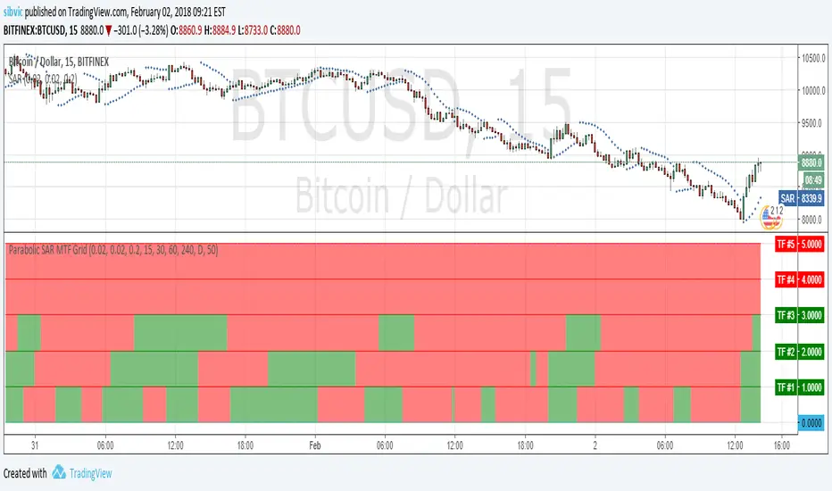
Parabolic SAR MTF GridShow a grid with Parabolic SAR in 5 timeframes. Shows an alert when the Parabolic SAR show the same direction for all 5 timeframes.
Stochastic RSI MTF - 4 REALStochastic RSI Multi-timeframes
4 simultaneous timeframes on one indicator
This indicator is invite only, if you want to try it ask for access in comments


Dynamic Time Oscillator W/ MTF SupportThis script has the option to disable the MTF feature and use it as a plain DTOscillator.
The lines are the fast and slow signals for the current timeframe.
The columns are the second timeframe %K levels.
Green columns signify the second timeframe %K is greater than the second timeframe %D, Red is the reverse of this.


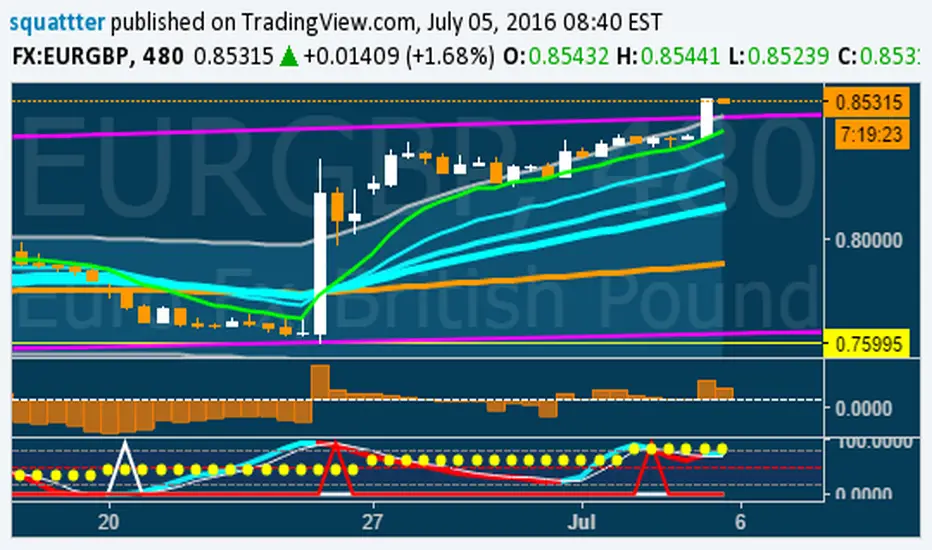
B3 Fibonacci Pivot S/RFor my second share, I give you some levels I look at everyday for the ES minis. HLC/3 of the MTF (multi-time-frame) inputs = mean and Fib-levels formed as support and resistance zones. There are some websites that will show you 20 ways to figure out a pivot for the day's intraday workings, and this one always rang true for me. I keep it set at Res=D and Len=3or5 and use on hourly charts. This indicator is capable of doing like a Res=60m Len=8 for a 5m chart or something of that nature if you wish to test it out.
I haven't tested it out for tick charts and I have noticed that this is good on index and commodity futures, and not so much other things.
Uncanny to me how well this works as reversal awareness for ES. Doesn't mean that one will happen, or if it does that it will have trade-able juice, though it is very important awareness never-the-less.
screencast.com
Stochastic CCI MTF w/ UP/DOWN colours - squattterStoch CCI has a nicer divergence than Stoch RSI.
Enjoy!
Stochastic CCI MTF w/ UP/DOWN colours - squattterStoch CCI has nicer divergences than Stoch RSI.
Enjoy.

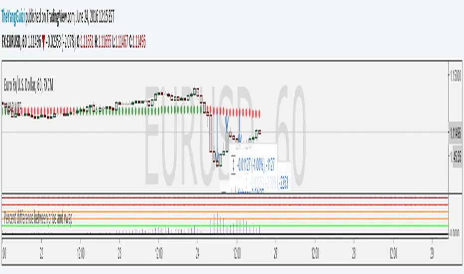
Percent Difference Between VWAP and Price MTFShows the difference between vwap and price in percent.
You can can choose between multiple timeframe vwap. Default is normal daily.
The levels on the indicator can be changed to whatever you want to.
In the chart above we can see eurusd reverting up at 3% below monthly vwap, after the brexit dip, It then turns down again at 1% from monthly and lastly it turns up again at 2% from monthly.
Script is a small modification of this:
VWAP MTF (Multi Timeframe)VWAP that can be be plotted from different timeframes.
Ex if you chose 60 min, it will plot a new vwap line at the start of every hour.
Intraday:
Used code from SandroTurriate to create this.

EMA bullish/bearish dashboard - MTFThis is a good reminder for which way you should be placing orders.
It's best to not ignore these signals!!!
lime = full bull - 100ema above 200ema and price is above 200ema
green = hallf bull - price now below 200ema but 100ema is still above the 200
maroon = full bear - opposite of full bull
red = half bear - opposite of half bull
Also with multi timeframe option - so I guess you could stack several of these on a single framed chart if you wanted.
[RS]MTF Intraday Dayly Range V0calculation to display a dayly donchian channel at any intraday timeframe.

[RS]MTF Multiple Moving Averages V0Multiple moving averages with same interval in candle bar smoothness over multiple time frames.
option to show/hide the level of resolution for the mtf's default shows 1 ma can go up to 8th resolution.
option for manual input timeframes and configure ma.
Multi-Functional Fisher Transform MTF with MACDL TRIGGERWhat this indicator gives you is a true signal when price is exhausted and ready for a fast turnaround. Fisher Transform is set for multi-time frame and also allows the user to change the length. This way a user can compare two or more time spans and lengths to look for these MACDL divergent triggers after a Fisher exhaustion. With so many indicators, it's probably best to merge these indicators and change the Fisher and Trigger colors so you can still have a look at price action (remember to scale right after merger). I've noticed from time to time when you have Fisher 34 100 and 300 up and running on two different time frames such as 5 and 15 min charts, with MACDL triggers on the 100/300 or 34/100 you get a high probability trade trigger. However, there are rare exceptions such as when price moves in a parabolic state up or down for a long period where this indication does not work. Ideally this indicator works best in a sideways market or slow rising/descending moving market.
This indicator was worked on by Glaz, nmike and myself
LazyBear also introduced the MACDL indicator

MTF RSI Fibonacci Levels & MTF Moving Avreages (EMA-SMA-WMA)Thanks for Kadir Türok Özdamar. @kadirturokozdmr
Formula Purpose of Use
This formula combines the traditional RSI indicator with Fibonacci levels to create a special technical indicator that aims to identify potential support and resistance points:
Thanks for Kadir Türok Özdamar. @kadirturokozdmr
Formula Purpose of Use
This formula combines the traditional RSI indicator with Fibonacci levels to create a special technical indicator that aims to identify potential support and resistance points:
Determines the historical RSI range of 144 periods (PEAK and DIP)
Calculates Fibonacci retracement levels within this range, and shows the direction of momentum by calculating the moving average of the RSI
This indicator can be used to identify potential reversal points, especially when the RSI is not in overbought (70+) or oversold (30-) areas.
Practical Use
Investors can use this indicator as follows:
1⃣When the RSI approaches one of the determined Fibonacci levels, it is considered a potential support/resistance area.
2⃣When the RSI approaches the DIP level, it can be interpreted as oversold, and when it approaches the PEAK level, it can be interpreted as overbought.
3⃣When the RSI crosses the SM (moving average) line upwards or downwards, it can be evaluated as a momentum change signal.
4⃣Fibonacci levels (especially M386, M500 and M618) can be monitored as important transition zones for the RSI.
--------------------------------------------
In this version, some features and a multi-timeframe averages (SMA-EMA-WMA) were added to the script. It was made possible for the user to enter multi-timeframe RSI and multi-timeframe Fibo lengths.
MTF MTF Fibonacci H LinesA Multi-Time-Frame and Core Trading Indicator for my next Fibonacci bitBull Bitcoin Bot. It Automatically draws Support and Resistance from the Golden Ratios found in the Fibonacci sequence. Also plots a Zig-Zag from the Highs and Lows of the selected Time-frames. xbtusd bitmex futures

MTF Switch Level (Single TF)Multi-timeframe Switch Level (Single TF)
This indicator marks the most recent “switch level” created by breakout / breakdown behaviour on the current timeframe.
How it works
– After a bullish breakout (close above the previous bar’s high), the script sets a bearish switch level at that previous high.
– After a bearish breakdown (close below the previous bar’s low), it sets a bullish switch level at that previous low.
– A single horizontal line extends from the latest switch level.
– The line and “S” label turn bullish when price is above the level and bearish when price is below it.
– Optional alerts fire when price crosses the active switch level.
Use-cases
– Visualise where breakout traders are likely trapped.
– Define a simple “above = bullish / below = bearish” bias line.
– Combine with higher-timeframe analysis or other tools for context.
Inputs
– Enable/disable bullish and bearish switch conditions.
– Line length, colour, style, thickness.
– Label position and offsets.
– Alert conditions for crosses.
Disclaimer
This tool is for charting and educational purposes only and is not financial advice or a signal service. Always do your own research and risk management.

MTF EMA Trend Table (custom)Multi Time frame EMA Trend Table (custom) then the shorter EMA cross the higher EMA in table you can see Long or short int the several time frames

MTF Bias Alert SystemMulti-Time-Frame Bias Alert System
include HTF BIAS and any Time Frame Confluence
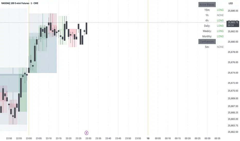
MTF Alignment & Key Levelsso this one is specifically for the 1hr and 4hr time frame. but what it does is alert you once the monthly weekly and daily timeframes align with a trend in a certain direction wether its bearish or bullish but then it will mark out key levels on the 1hr and 4hr time frame to indicate when price breaks through that level to enter a trade in the direction of the higher timeframes alignment.
