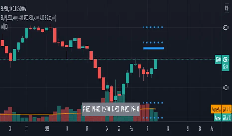
TL BP/IP LevelsScript to ploy Bolded Pivot and Intermediate Pivots based on the TraderLion Daily Plan.
To use the automatic alerts, you need to open the add alert menu and select BP / IP as the Condition and then select the add any alert() function call. Otherwise, you can select and create your own alerts for crossing any of the BP or IP levels. Alerts work best when setting them in the 5 or 15-minute timeframe. If you set them in the daily timeframe then you will not get multiple alerts if they cross over then back under within the day.
Lastly, set your alerts to expire within the trading day. If you set the alerts to last longer than the trading day, then you will get alerts for the wrong levels days after it was set.
Please send me questions and feedback for enhancements.
Search in scripts for "pivot"
D, W, M_CPR + Camarilla + Value Area _ By SoumyaAll in one pivot points of combined D, W, M CPR, Camarilla & Value area. Inspired by Pivotboss book.


CM_Pivot Points_CustomCustom Pivots Indicator - Plots Yearly, Quarterly, Monthly, Weekly, and Daily Levels.
I created this indicator because when you have multiple Pivots on one chart (For Example The Monthly, Weekly, And Daily Pivots), the only way to know exactly what pivot level your looking at is to color ALL S1 Pivots the same color, but create the plot types to look different. For example S1 = Bright Green with Daily being small circles, weekly being bigger circles, and monthly being even bigger crosses for example. This allows you to visually know exactly what pivot levels your looking at…Instantly without thinking. This indicator allows you to Choose any clor you want for any Pivot Level, and Choose The Plot Type.
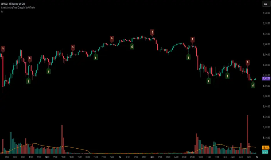
Market Structure Trend Change by TenAMTraderMarket Structure Trend Change Indicator
Description:
This indicator detects changes in market trend by analyzing swing highs and lows to identify Higher Highs (HH), Higher Lows (HL), Lower Highs (LH), and Lower Lows (LL). It helps traders quickly see potential reversals and trend continuation points.
Features:
Automatically identifies pivots based on configurable left and right bars.
Labels pivot points (HH, HL, LH, LL) directly on the chart (text-only for clarity).
Generates buy and sell signals when a trend change is detected:
Buy Signal: HL after repeated LLs.
Sell Signal: LH after repeated HHs.
Fully customizable signal appearance: arrow type, circle, label, color, and size.
Adjustable minimum number of repeated highs or lows before a trend change triggers a signal.
Alerts built in for automated notifications when buy/sell signals occur.
Default Settings:
Optimized for a 10-minute chart.
Default “Min repeats before trend change” and pivot left/right bars are set for typical 10-min price swings.
User Customization:
Adjust the “Pivot Left Bars,” “Pivot Right Bars,” and “Min repeats before trend change” to match your trading style, chart timeframe, and volatility.
Enable pivot labels for visual clarity if desired.
Set alerts to receive notifications of trend changes in real time.
How to Use:
Apply the indicator to any chart and timeframe. It works best on swing-trading or trend-following strategies.
Watch for Buy/Sell signals in conjunction with your other analysis, such as volume, support/resistance, or other indicators.
Legal Disclaimer:
This indicator is provided for educational and informational purposes only. It is not financial advice. Trading involves substantial risk, and past performance is not indicative of future results. Users should trade at their own risk and are solely responsible for any gains or losses incurred.
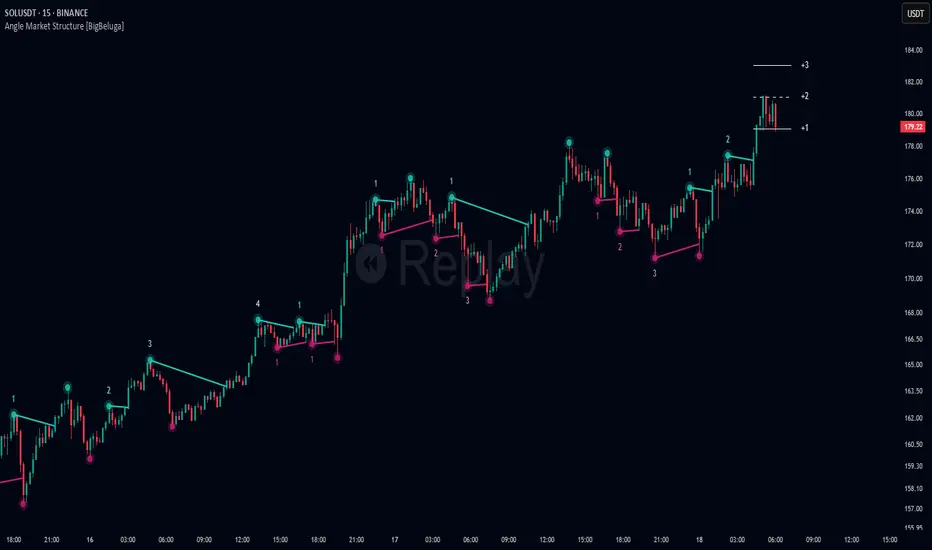
Angle Market Structure [BigBeluga]🔵 OVERVIEW
Angle Market Structure is a smart pivot-based tool that dynamically adapts to price action by accelerating breakout and breakdown detection. It draws market structure levels based on pivot highs/lows and gradually adjusts those levels closer to price using an angle threshold. Upon breakout, the indicator projects deviation zones with labeled levels (+1, +2, +3 or −1, −2, −3) to track price extension beyond structure.
🔵 CONCEPTS
Adaptive Market Structure: Uses pivots to define structure levels, which dynamically angle closer to price over time to capture breakouts sooner.
Breakout Acceleration: Pivot high levels decrease and pivot low levels increase each bar using a user-defined angle (based on ATR), improving reactivity.
Deviation Zones: Once a breakout or breakdown occurs, 3 deviation levels are projected to show how far price extends beyond the breakout point.
Count Labels: Each successful structure break is numbered sequentially, giving traders insight into momentum and trend persistence.
Visual Clarity: The script uses colored pivot points, trend lines, and extension labels for easy structural interpretation.
🔵 FEATURES
Calculates pivot highs and lows using a customizable length.
Applies an angle modifier (ATR-based) to gradually pull levels closer to price.
Plots breakout and breakdown lines in distinct colors with automatic extension.
Shows deviation zones (+1, +2, +3 or −1, −2, −3) after breakout with customizable size.
Color-coded labels for trend break count (bullish or bearish).
Dynamic label sizing and theme-aware colors.
Smart label positioning to avoid chart clutter.
Built-in limit for deviation zones to maintain clarity and performance.
🔵 HOW TO USE
Use pivot-based market structure to identify breakout and breakdown zones.
Watch for crossover (up) or crossunder (down) events as trend continuation or reversal signals.
Observe +1/+2/+3 or -1/-2/-3 levels for overextension opportunities or trailing stop ideas.
Use breakout count as a proxy for trend strength—multiple counts suggest momentum.
Combine with volume or order flow tools for higher confidence entries at breakout points.
Adjust the angle setting to fine-tune sensitivity based on market volatility.
🔵 CONCLUSION
Angle Market Structure enhances traditional pivot-based analysis by introducing breakout acceleration and structured deviation tracking. It’s a powerful tool for traders seeking a cleaner, faster read on market structure and momentum strength—especially during impulsive price moves or structural transitions.
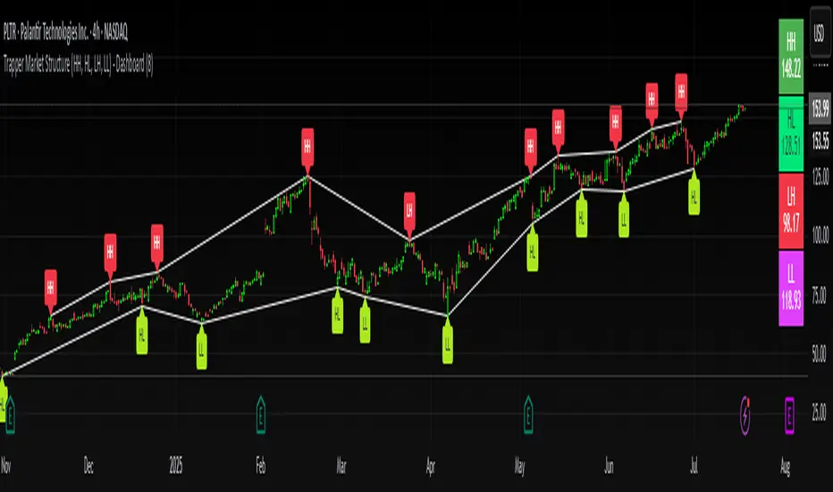
Trapper Market Structure (HH, HL, LH, LL)This script is designed to visually identify price action market structure in real time using pivot-based logic. It highlights the key components of trend direction by labeling:
- **HH** – Higher Highs
- **HL** – Higher Lows
- **LH** – Lower Highs
- **LL** – Lower Lows
These labels help traders track evolving market conditions and spot trend continuations, breaks in structure, or potential reversals — all without guessing.
**How It Works**
The script detects local swing highs and lows based on a customizable pivot strength. Once a valid pivot is confirmed, it’s classified in context with the previous relevant pivot to determine its structural significance.
For example:
- If a pivot high is higher than the previous, it’s marked as a **HH**.
- If a pivot low is lower than the previous, it’s marked as a **LL**, and so on.
This running analysis helps traders anticipate shifts between bullish and bearish structures.
**Customizable Features**
- Adjust **Pivot Strength** to increase or reduce sensitivity (more reactive or more stable)
- Toggle **Labels** on/off for cleaner charts
- Toggle **Connecting Lines** between pivots to visualize structure flow
**Use Case**
This indicator is ideal for:
- Price action traders
- Market structure analysis
- Identifying entry zones during pullbacks (e.g., buying at HLs during uptrends)
- Confirming trend reversals or break-of-structure (BoS)
You can use this tool as a foundation for more advanced systems such as CHoCH/BOS detection, liquidity zones, or sniper-style entry frameworks.
**Concepts Used**
- Swing High/Low detection using `ta.pivothigh` and `ta.pivotlow`
- Market structure labeling logic
- Visual flow to reinforce trader psychology on trend states
Disclaimer
This script is provided for educational purposes only. It is not financial advice and should not be relied upon for trading decisions. Always conduct your own analysis and risk management.
#marketstructure #priceaction #technicalanalysis #tradingviewopen #pivotpoints
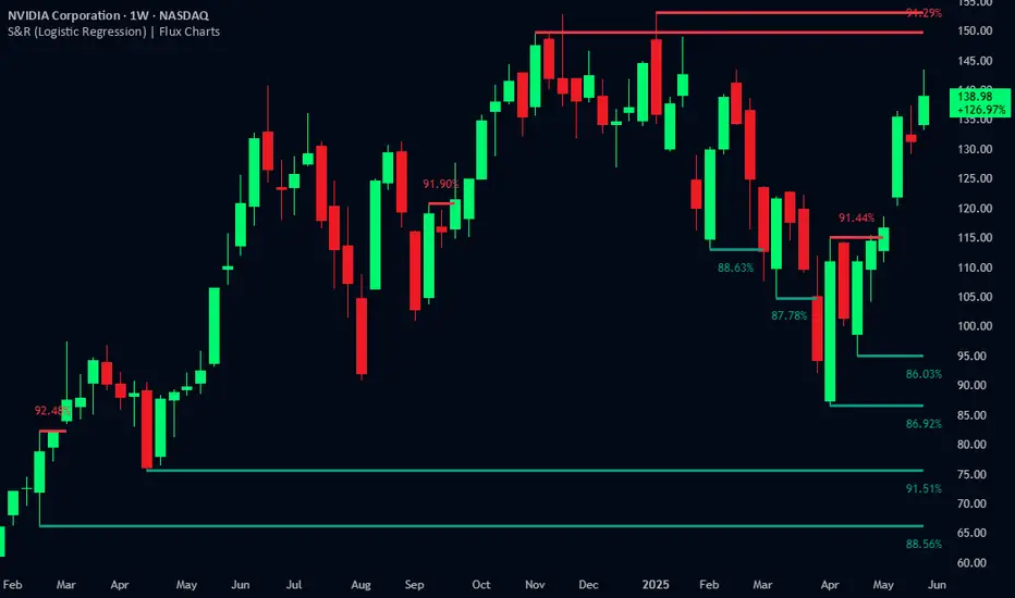
Support and Resistance Logistic Regression | Flux Charts💎 GENERAL OVERVIEW
Introducing our new Logistic Regression Support / Resistance indicator! This tool leverages advanced statistical modeling "Logistic Regressions" to identify and project key price levels where the market is likely to find support or resistance. For more information about the process, please check the "HOW DOES IT WORK ?" section.
Logistic Regression Support / Resistance Features :
Intelligent S/R Identification : The indicator uses a logistic regression model to intelligently identify and plot significant support and resistance levels.
Predictive Probability : Each identified level comes with a calculated probability, indicating how likely it is to act as a true support or resistance based on historical data.
Retest & Break Labels : The indicator clearly marks on your chart when a detected support or resistance level is retested (price touches and respects the level) or broken (price decisively crosses through the level).
Alerts : Real-time alerts for support retests, resistance retests, support breaks, and resistance breaks.
Customizable : You can change support & resistance line style, width and colors.
🚩 UNIQUENESS
What makes this indicator truly unique is its application of logistic regression to the concept of support and resistance. Instead of merely identifying historical highs and lows, our indicator uses a statistical model to predict the future efficacy of these levels. It analyzes underlying market conditions (like RSI and body size at pivot formation) to assign a probability to each potential S/R zone. This predictive insight, combined with dynamic, real-time labeling of retests and breaks, provides a more robust and adaptive understanding of market structure than traditional, purely historical methods.
📌HOW DOES IT WORK ?
The Logistic Regression Support / Resistance indicator operates in several key steps:
First, it identifies significant pivot highs and lows on the chart based on a user-defined "Pivot Length." These pivots are potential areas of support or resistance.
For each detected pivot, the indicator extracts relevant market data at that specific point, including the RSI (Relative Strength Index) and the Body Size (the absolute difference between the open and close price of the candle). These serve as input features for the model.
The core of the indicator lies in its logistic regression model. This model is continuously trained on past pivot data and their subsequent behavior (i.e., whether they were "respected" as support/resistance multiple times). It learns the relationship between the extracted features (RSI, Body Size) and the likelihood of a pivot becoming a significant S/R level.
When a new pivot is identified, the model uses its learned insights to calculate a prediction value—a probability (from 0 to 1) that this specific pivot will act as a strong support or resistance.
If the calculated probability exceeds a user-defined "Probability Threshold," the pivot is designated a "Regression Pivot" and drawn on the chart as a support or resistance line. The indicator then actively tracks how price interacts with these levels, displaying "R" labels for retests when the price bounces off the level and "B" labels for breaks when the price closes beyond it.
⚙️ SETTINGS
1. General Configuration
Pivot Length: This setting defines the number of bars used to determine a significant high or low for pivot detection.
Target Respects: This input specifies how many times a level must be "respected" by price action for it to be considered a strong support or resistance level by the underlying model.
Probability Threshold: This is the minimum probability output from the logistic regression model for a detected pivot to be considered a valid support or resistance level and be plotted on the chart.
2. Style
Show Prediction Labels: Enable or disable labels that display the calculated probability of a newly identified regression S/R level.
Show Retests: Toggle the visibility of "R" labels on the chart, which mark instances where price has retested a support or resistance level.
Show Breaks: Toggle the visibility of "B" labels on the chart, which mark instances where price has broken through a support or resistance level.
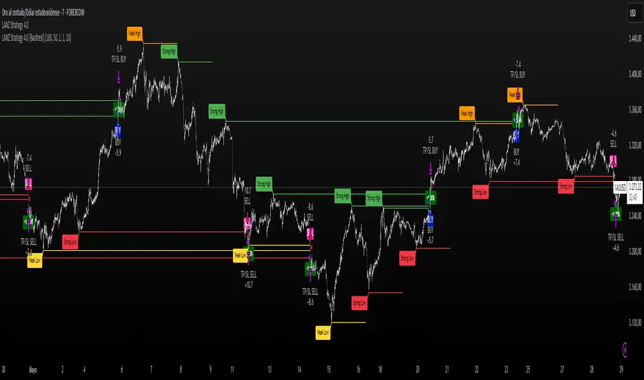
LANZ Strategy 4.0 [Backtest]🔷 LANZ Strategy 4.0 — Strategy Execution Based on Confirmed Structure + Risk-Based SL/TP
LANZ Strategy 4.0 is the official backtesting engine for the LANZ Strategy 4.0 trading logic. It simulates real-time executions based on breakout of Strong/Weak Highs or Lows, using a consistent structural system with SL/TP dynamically calculated per trade. With integrated risk management and lot size logic, this script allows traders to validate LANZ Strategy 4.0 performance with real strategy metrics.
🧠 Core Components:
Confirmed Breakout Entries: Trades are executed only when price breaks the most recent structural level (Strong High or Strong Low), detected using swing pivots.
Dynamic SL and TP Logic: SL is placed below/above the breakout point with a customizable buffer. TP is defined using a fixed Risk-Reward (RR) ratio.
Capital-Based Risk Management: Lot size is calculated based on account equity, SL distance, and pip value (e.g. $10 per pip on XAUUSD).
Clean and Controlled Executions: Only one trade is active at a time. No new entries are allowed until the current position is closed.
📊 Visual Features:
Automatic plotting of Entry, SL, and TP levels.
Full control of swing sensitivity (swingLength) and SL buffer.
SL and TP lines extend visually for clarity of trade risk and reward zones.
⚙️ How It Works:
Detects pivots and classifies trend direction.
Waits for breakout above Strong High (BUY) or below Strong Low (SELL).
Calculates dynamic SL and TP based on buffer and RR.
Computes trade size automatically based on risk per trade %.
Executes entry and manages exits via strategy engine.
📝 Notes:
Ideal for evaluating the LANZ Strategy 4.0 logic over historical data.
Must be paired with the original indicator (LANZ Strategy 4.0) for live trading.
Best used on assets with clear structural behavior (gold, indices, FX).
📌 Credits:
Backtest engine developed by LANZ based on the official rules of LANZ Strategy 4.0. This script ensures visual and logical consistency between live charting and backtesting simulations.
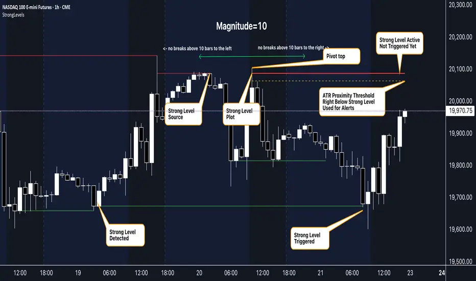
Strong Levels (with Proximity Alerts)█ OVERVIEW
The "Strong Levels (with Proximity Alerts)" indicator offers a fresh approach to identifying support and resistance levels, inspired by the RexDog Trading System (RDTS). It pinpoints significant price reversals using a unique filtering method that reduces noise and enhances reliability. Paired with customizable ATR-based proximity alerts, this indicator empowers traders to track critical price zones with precision.
█ FEATURES
- Rooted in RDTS :
Inspired by the RexDog Trading System (RDTS), it highlights major pivot points where price executed sharp turnarounds, ensuring levels carry true market weight.
- Second-Highest/Lowest Open/Close Method :
Resistance levels use the *second-highest open/close* near pivot highs, while support levels use the *second-lowest open/close* near pivot lows—skipping extreme wicks for cleaner, more dependable lines.
- ATR-Driven Proximity Alerts :
Customizable proximity thresholds, calculated using the Average True Range (ATR), warn traders when price approaches key levels—a standout feature not found in most support/resistance indicators.
- Flexible Customization :
- Magnitude : Tweak pivot sensitivity (default: 10).
- Line Colors : Set resistance (red by default), support (green), and proximity (yellow) lines.
- Line Options : Adjust line origins, transparency for breached levels, and the maximum number of levels shown.
- ATR Settings : Fine-tune proximity sensitivity with ATR length and multiplier.
█ HOW TO USE
1. Add to Chart :
Find "Strong Levels (with Proximity Alerts)" in TradingView’s indicator library and apply it.
2. Read the Lines :
- Red Lines : Resistance, derived from the second-highest open/close near pivot highs.
- Green Lines : Support, based on the second-lowest open/close near pivot lows.
- Yellow Dashed Lines : Proximity thresholds (optional), signaling when price nears a level.
3. Customize :
- Raise `Magnitude` for stronger levels or lower it for more detail.
- Adjust colors, transparency, and max levels to fit your preferences.
- Toggle proximity thresholds on/off based on your trading style.
- Enabling *Plot Line from Actual Pivot Bar* offers a cleaner chart but may mislead as lines plot into the past.
4. Set Alerts :
- Open TradingView’s alert menu (the three dots ... dropdown menu next in indicator list has an option "Add alert on ...") and choose "Approaching Level" or "Level Touched.".
- Don't forget to choose the right Trigger condition, which by default is "Only Once". I usually set it to "Once Per Bar".
- Tailor alert conditions to your needs.
█ LIMITATIONS
- Past-Based Levels :
- Relying on historical pivots, it may not always forecast future moves, especially in rapid markets.
- The 'Plot Line from Actual Pivot Bar' option while visually appealing can imply historical significance that didn’t exist at the time. Be mindful of that.
- Volatility Sensitivity :
High volatility widens ATR-based thresholds, which might trigger alerts too soon.
- Display Management :
A cap on max levels avoids clutter, but tweaking `Max Levels` may be needed across timeframes.
█ ACCOMPANYING CHART
The chart showcases the indicator’s unique edge:
- A pivot high and low are flagged, with nearby bars highlighted.
- Resistance is plotted at the *second-highest open/close* around the pivot high, bypassing the highest wick.
- Support is set at the *second-lowest open/close* near the pivot low, ignoring the deepest wick.
- Yellow dashed proximity lines illustrate how the indicator warns traders as price nears these zones.
- Annotations clarify how skipping extreme wicks creates cleaner, more actionable levels.
█ HOW TO USE
1. Add to Chart :
Locate "Strong Levels (with Proximity Alerts)" in TradingView’s indicator library and apply it to your chart.
2. Read the Lines :
- Red Lines**: Resistance levels, calculated from the second-highest open/close near pivot highs.
- Green Lines : Support levels, derived from the second-lowest open/close near pivot lows.
- Yellow Dashed Lines : Optional proximity thresholds, alerting you when price nears a level.
3. Customize :
- Increase `Magnitude` for stronger, less frequent levels or decrease it for more granularity.
- Modify colors, transparency, or the maximum number of levels to suit your style.
- Enable or disable proximity thresholds as needed.
4. Set Alerts :
- Access TradingView’s alert menu and select "Approaching Level" or "Level Touched."
- Adjust conditions to match your trading preferences.
5. My Personal Approach :
I prefer using this indicator on higher timeframes, like hourly or daily charts. I adjust my `Magnitude`, so it doesn't trigger too often and set my alerts to trigger "Once Per Bar". When price nears a level, I get an alert and I anticipate a reaction but avoid placing limit orders blindly. Instead, I switch to smaller timeframes and combine it with other tools for confirmation before making a trade. This saves me a lot of screen time, and allows me to focus when it matters.
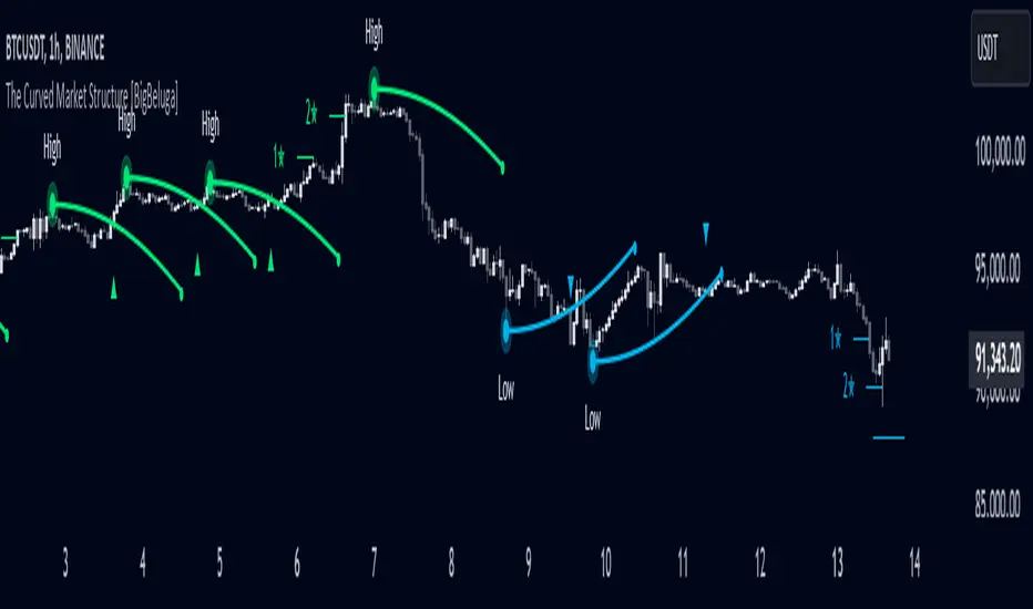
The Curved Market Structure [BigBeluga]Curved Market Structure
The Curved Market Structure indicator offers an innovative twist on traditional market structure tools by using curved lines instead of horizontal ones, enabling faster breakout detection for traders.
🔵Key Features:
Curved Market Structure Levels: The indicator identifies high and low pivots and plots curved lines connecting these points, adapting to market dynamics and providing a more intuitive view of potential breakout zones.
Breakout Detection: Breakouts above or below the curved levels are marked with triangle symbols (▲ or ▼), making it easy to spot critical price movements.
Dynamic Target Levels: After a breakout, the indicator plots three target levels, which serve as potential price objectives. Each target is marked with a number and a star (e.g., 1★) upon being reached.
Customizable Line Length and Angle: Users can adjust the length and angle of the curved lines to fit their trading style and timeframe, making the tool versatile and adaptable.
Market Structure Trend Filtering: To maintain a clean chart, the indicator plots curved levels only from high pivots during uptrends and low pivots during downtrends.
🔵How It Works:
The indicator identifies high and low pivots using user-defined parameters (left and right bars).
Curved lines are drawn from these pivot points, showing the structure of the market and potential breakout zones.
When a breakout occurs, the indicator highlights the direction with triangle symbols and dynamically plots three price targets.
Upon reaching these targets, the level is marked with its respective number and a star, helping traders track price progression effectively.
The lines and targets are adjusted based on market conditions, ensuring real-time relevance and accuracy.
🔵Use Cases:
Spotting key breakout zones to identify entry and exit points more effectively.
Setting dynamic target levels for take-profit or stop-loss planning.
Filtering market noise and maintaining a cleaner chart while analyzing trends.
Enhancing traditional market structure analysis with an intuitive curved visualization.
This indicator is ideal for traders who want a modern, dynamic, and visually appealing way to track market structure and breakouts while maintaining chart clarity.
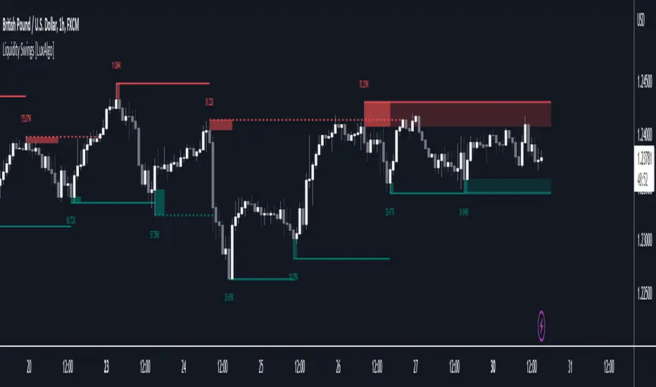
Liquidity Swings [LuxAlgo]The liquidity swings indicator highlights swing areas with existent trading activity. The number of times price revisited a swing area is highlighted by a zone delimiting the swing areas. Additionally, the accumulated volume within swing areas is highlighted by labels on the chart. An option to filter out swing areas with volume/counts not reaching a user-set threshold is also included.
This indicator by its very nature is not real-time and is meant for descriptive analysis alongside other components of the script. This is normal behavior for scripts detecting pivots as a part of a system and it is important you are aware the pivot labels are not designed to be traded in real-time themselves.
🔶 USAGE
The indicator can be used to highlight significant swing areas, these can be accumulation/distribution zones on lower timeframes and might play a role as future support or resistance.
Swing levels are also highlighted, when a swing level is broken it is displayed as a dashed line. A broken swing high is a bullish indication, while a broken swing low is a bearish indication.
Filtering swing areas by volume allows to only show significant swing areas with an higher degree of liquidity. These swing areas can be wider, highlighting higher volatility, or might have been visited by the price more frequently.
🔶 SETTINGS
Pivot Lookback : Lookback period used for the calculation of pivot points.
Swing Area : Determine how the swing area is calculated, "Wick Extremity" will use the range from price high to the maximum between price close/open in case of a swing high, and the range from price low to the minimum between price close/open in case of a swing low. "Full Range" will use the full candle range as swing area.
Intrabar Precision : Use intrabar data to calculate the accumulated volume within a swing area, this allows obtaining more precise results.
Filter Areas By : Determine how swing areas are filtered out, "Count" will filter out swing areas where price visited the area a number of time inferior to the user set threshold. "Volume" will filter out swing areas where the accumulated volume within the area is inferior to the user set threshold.
🔹 Style
Swing High : Show swing highs.
Swing Low : Show swing lows.
Label Size : Size of the labels on the chart.
Note that swing points are confirmed after Pivot Lookback bars, as such all elements are displayed retrospectively.
Pivot Pattern Boundaries [cajole]
This script automatically detects horizontal support / resistance levels based on user-programmable criteria.
For example, you can detect boundaries with >3 touches within 200 days, allowing a tolerance of 1/4*ATR.
"Touches" are defined from pivots on the chart. The best way to search for larger/smaller patterns is to increase/decrease the pivot size.*
Future versions will allow "exceptions (i.e. keep drawing the horizontal line even if it is breached once or twice).
*TradingView's Pine script defines a Pivot as the highest point in a group. So, entering "2" means that a day's high needs to be above 2 days before and after (xxYxx) to be considered a high pivot.
This script can be an aid in drawing multiple patterns with horizontal boundaries (rectangles, triangles, head and shoulders, cup & handles, VCPs). I have intentionally avoided trying to code detection of the "other side" of these patterns, as that is where the craft of charting becomes an art.

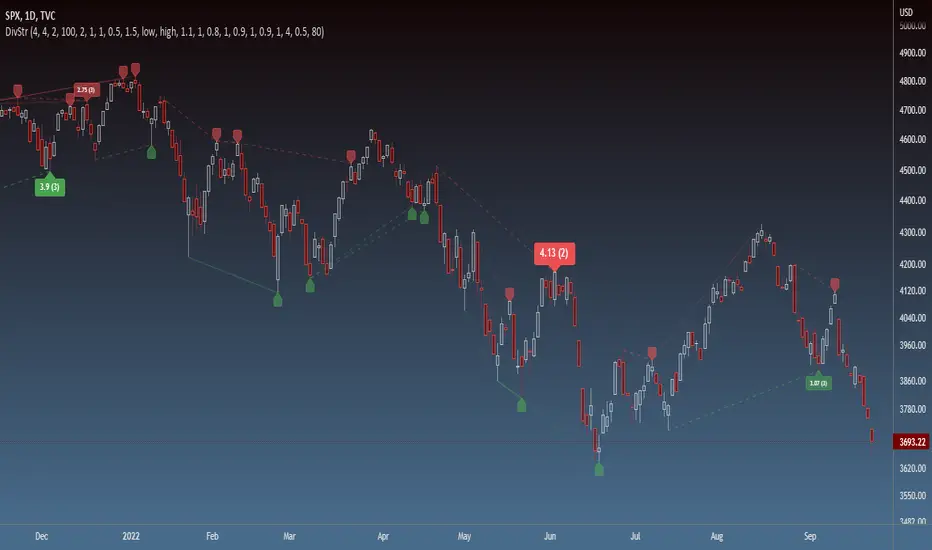
Strength of Divergence Across Multiple IndicatorsOverview:
One-stop shop for all your divergence needs, including:
(1) A single metric for divergence strength across multiple indicators.
(2) Labels that make it easy to spot where the truly strong divergence is by showing the overall divergence strength value along with the number of divergent indicators. Hovering over the label shows a breakdown of each divergent indicator and its individual divergence strength value.
(3) Fully customizable, including inputs for pivot lengths, divergence types, and weights for every component of the divergence strength calculation. This allows you to quickly and easily optimize the output for any chart. Don't worry, the default settings will have you covered if you're not interested in what's going on under the hood.
The Divergence Strength Calculation:
The total divergence strength value is the sum of the divergence strengths of all indicators for which divergence was detected at a given bar. Each indicator's individual divergence strength is comprised of two basic components: (1) |ΔPrice| - the magnitude of the change in price over the divergence period (pivot-to-pivot), and (2) |ΔIndicator| - the magnitude of the change in indicator value over the divergence period.
Because different indicators' scales and volatility can vary greatly, the Δ values are expressed in terms of standard deviation to ensure that the values are meaningful and equitable across all indicators and assets/instruments/currency pairs, etc:
|ΔIndicator| = |indicator_value_1 - indicator_value_2| / 2 * StDev(indicator_series,100)
Calculation Weights:
All components of the calculation are weighted and can be modified on the Inputs page in settings (weights are simply multipliers). For example, if you think hidden divergence should carry less weight than regular divergence, you can assign it a lesser weight. Or if you think RSI divergence is worth more than OBV divergence, you can adjust their weights accordingly. List of weights:
Regular divergence weight - default = 1
Hidden divergence weight - default = 1
ΔPrice weight - default = 0.5 (multiplied by the ΔPrice component)
ΔIndicator weight - default = 1.5 (multiplied by the ΔIndicator component)
RSI weight - default = 1.1
OBV weight - default = 0.8
MACD weight - default = 0.9
STOCH weight - default = 0.9
Development for additional indicators is ongoing, as is research into the optimal weight configuration(s).
Other Inputs:
Pivot lengths - specify the number of bars before and after each pivot high/low to consider it a valid candidate for divergence.
Lookback bars and Lookback pivots - specify the number of bars or the number of pivots to look back across.
Price sources - specify separate price sources for bullish and bearish divergence
Display settings - specify how lines and labels should display, including which divergence strength values should show the largest labels. Include/exclude specific divergence types and indicators.
Please report any bugs, or let me know if you have any enhancement suggestions or requests for additional indicators.
@reees
Neo Matrix
What is NeonMoney Indicator?
NeonMoney Indicator is a trend following indicator which gives strong support and resistance indications with some moving averages.
Description
After the long research of 2 years along with 100’s of indicators & oscillators we have created this wonderful indicator which can avoid signals in a choppy market & gives perfect signal to buy and sell at a right time with high winning probability and higher reward to risk.
Main part of this indicator is timeframe period that is it shifts from one to another pivots , vwap and MAs tf automatically which helps in top down analysis.
This indicator is made with Vwap , MA, cpr and fibonacci pivots calculations. It can be useful to trade every market like in crypto, forex, commodities and as well as stock market . To use this indicator trader must have basic understanding of candle pattern and chart pattern identification studies with moving averages retrenchments.
This indicator works well & gives better results if you have moving average retrenchment knowledge. When candles are retrenching specific moving average line then also sometimes traders get confuse whether to enter with moving average direction / favor or not. So, to come out from this confusion this indicator is very useful. Because it gives signal in moving average favors and target at pivot levels. So ultimately traders gain some confident on his/her trade that he/she is in the right side of the market.
Another advantage of this indicator is in some of the criteria it gives fix signal in-between the candle formation & once signal is given then it will not change.
About uses instruction and components.
Time frame – 1m, 3m , 15m, 1H, 4H, DailyTF
Components: Vwap , MAs, CPR , and Fibonacci Pivots .
Dotted line - Vwap
Straight gray line and zone - CPR
Curvy Gray lines - MAs
Colorful lines - Fibonacci pivots
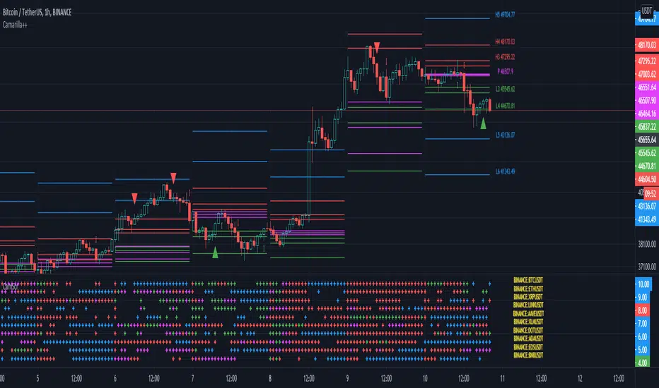
Camarilla screenerBasic script to screen up to 10 tickers with regards to their central pivot range and camarilla pivots.
Same color layout as the Danarilla script ().
The colors in the screener mean the following:
Blue : bar close price is > H4 or < L4
Red : bar close price is < H3 and > CPR top
Fuchsia : bar close price is < CPR top and > CPR bottom
Green : bar close price is < CPR bottom and > L3
No color means it is between H4/H3 or L3/L4
Resolution can be changed for the calculation of the pivots.
Script contains snippets from other screeners and the Danarilla script so many thanks to all who publish their scripts.
Support Resistance - Dynamic v2Hello Traders!
After the addition of "Arrays" to the Pine, I developed new and improved version of Support Resistance - Dynamic script as version 2. In this script Arrays were used. This can be used as Support Resistance tool, also it will be an example for the people who want to learn Array usage in Pine. Many thanks to Pine Team for adding Arrays!
The script finds the Pivot Points and check them in channels if there can be S/R or not, and draws mid line of the channel as S/R line. you can set number of PPs and channel width in the options. Each channel width is optimized dynamically according to Pivot Points. Also you can choose " High/Low " or " Close/Open " as source for Pivot Points.
There is an option for maximum number of S/R levels. S/R levels are found and sorted dynamically and number of S/R lines with enough strength changes dynamically.
Some other options for coloring and line width. (Solid, Dashed or Dotted)
S/R levels are shown in the Labels and Label colors are changed automatically, if S/R line is below the closing price then it's color is Green (as Support), otherwise its color is Red (as Resistance).
Examples:
Enjoy!

PivotBoss - Early Day PivotsCalculates the pivot points from the first N minutes of the day and overlays them over the entire day

PivotBoss - All PivotsIncludes all PivotBoss indicators; R25-R100 indicators, S25-S100 indicators, also previous high, close & low of a different time scale.


SMC Study: Buy & Sell Traps (Pro) - Levels OnlySMC Study: Buy & Sell Traps (Pro) — Levels Only
SMC Study: Buy & Sell Traps (Pro) — Levels Only is a Smart Money Concepts (SMC) based indicator designed to display key Support & Resistance levels on the chart. It helps traders identify important price zones where liquidity and market reactions are likely.
How it works:
- Pivot Highs are plotted as Resistance levels (red lines).
- Pivot Lows are plotted as Support levels (blue lines).
- Levels are filtered by ATR buffer, candle body strength, and optional volume confirmation.
- Lines automatically extend and update as new pivots form.
- No buy/sell signals, arrows, or alerts; clean structural levels only.
How to use:
- Use the levels as key reaction zones for potential entries.
- Support lines can indicate potential bullish bounces.
- Resistance lines can indicate potential bearish reversals.
- Combine with price action, market structure, and higher timeframe analysis.
- Suitable for all timeframes and markets.
Visuals:
- Blue horizontal lines: Support
- Red horizontal lines: Resistance
- Solid, dashed, or dotted lines (customizable)
- Lines extend dynamically with price movement
Important Notes:
- This indicator is for analysis only and does not generate trading signals.
- Proper risk management is required before taking any trades.
- Best used in conjunction with price action and structural analysis.
License:
Creative Commons BY-NC 4.0 (Open Source)
Free to use, modify, and share with attribution. Commercial use prohibited.
Disclaimer:
Educational purposes only. Trading involves risk.

cephxs + fadi / HTF PSPHTF PSP - PRECISION SWING POINTS
Detect divergence-based Precision Swing Points (PSPs) across multiple higher timeframes with automatic correlated asset detection.
WHAT'S NEW (vs Original HTF Candles)
This indicator builds on @fadizeidan's excellent ICT HTF Candles foundation with significant new functionality, depending on who you ask of course:
✨ PSP Divergence Detection: Automatically identifies Precision Swing Points where price diverges from correlated assets—the original has no divergence analysis
✨ Auto Asset Correlation: Uses AssetCorrelationUtils library to detect and pair correlated assets (ES↔NQ↔DXY, BTC↔ETH, Gold↔Silver, etc.)—no manual setup required
✨ Multi-Asset Comparison: Tracks up to 3 correlated assets simultaneously with divergence relationships between all pairs
✨ Dynamic Asset Reordering: When you switch charts, the indicator automatically reorders assets so your chart is always primary
✨ Inverse Correlation Support: Properly handles inversely correlated assets like DXY (bullish DXY = bearish signal for risk assets)
✨ HTF Sweep Detection: New sweep line feature highlights when HTF candles take out previous highs/lows and close back inside. One of my followers asked me for this, there you go anon.
🔧 Streamlined to 3 HTFs: Focused design with 3 HTF slots (vs 6) for cleaner charts and better performance
The original remains excellent for pure HTF candle visualization. This version adds institutional flow analysis through divergence detection.
WHAT IT DOES
This indicator displays Higher Timeframe (HTF) candles to the right of your chart and highlights Precision Swing Points—pivots where price diverges from correlated assets. When ES makes a new high but NQ doesn't follow, or gold pushes higher while DXY fails to confirm, you're looking at institutional repositioning.
PSPs mark these moments on your HTF candles, giving you a clean visual signal for potential reversals.
HOW IT WORKS
Divergence Detection
The indicator compares price action between your chart and up to two correlated assets. A divergence occurs when one asset makes a directional move (bullish/bearish candle) while a correlated asset moves the opposite direction.
Three divergence relationships are tracked:
Primary vs Secondary (e.g., ES vs NQ)
Primary vs Tertiary (e.g., ES vs DXY)
Secondary vs Tertiary (e.g., NQ vs DXY)
PSP Confirmation
A candle is marked as a PSP when:
A divergence exists between correlated assets
A swing pivot forms (high > previous high AND high > next high, or vice versa for lows)
This dual confirmation filters noise and highlights only meaningful institutional activity.
Automatic Asset Detection
In Auto mode, the indicator uses the AssetCorrelationUtils library to detect your chart's asset class and automatically select the most relevant correlated pairs:
Indices: ES ↔ NQ ↔ DXY, YM ↔ ES ↔ NQ
Forex: EURUSD ↔ DXY ↔ GBPUSD, USDJPY ↔ DXY ↔ US10Y
Crypto: BTC ↔ ETH ↔ DXY
Metals: Gold ↔ Silver ↔ DXY
Energy: CL (Oil) ↔ NG ↔ DXY
HTF Sweep Detection
Sweeps are detected when an HTF candle (C2) takes out the high or low of the previous candle (C1) and then closes back inside. This marks liquidity grabs on the higher timeframe.
HOW TO USE
Enable HTF timeframes: Select 1-3 higher timeframes relevant to your trading style (e.g., 30m, 90m, 4H for intraday traders)
Watch for PSP candles: When a candle body color changes to the divergence color, a PSP has formed
Note the direction: Bullish divergence (your asset bullish while correlated asset bearish) suggests upside; bearish divergence suggests downside
Combine with LTF structure: Use PSPs as bias, then look for entry on lower timeframes (CHoCH, FVG, etc.)
Sweeps confirm liquidity: A sweep followed by a PSP is a strong reversal signal
INPUTS
HTF Selection
HTF 1/2/3: Enable/disable each HTF slot with timeframe and candle count
Custom Daily Open: Use Midnight, 8:30, or 9:30 ET as daily candle open
Styling
Body/Border/Wick Colors: Customize bullish and bearish candle appearance
Padding/Buffer/HTF Buffer: Control spacing between candles and timeframe groups
Labels
HTF Label: Show timeframe name above/below candles
Remaining Time: Countdown to candle close
Label Position: Top, Bottom, or Both
Label Alignment: Align across timeframes or follow individual candles
Interval Value: Show interval details on candles
Imbalance
Fair Value Gap: Highlight FVGs on HTF candles
Volume Imbalance: Highlight VIs on HTF candles
HTF Sweeps: Show sweep lines when C2 takes out C1's high/low
Trace
Trace Lines: Draw lines from HTF candle OHLC levels back to chart price
Anchor: Anchor to first or last timeframe
PSP Divergence Detection
Precise Mode: Only highlight pivots on current asset (stricter confirmation)
Divergence Body Colors: Custom colors for bullish/bearish divergence candles
Asset Selection
Correlation Preset: Auto (library-detected) or Manual
Manual Assets 1/2/3: Specify custom correlated assets
Invert Asset 3: Flip the bullish/bearish interpretation for inverse correlations (e.g., DXY)
KEY FEATURES
Multi-HTF Display: Up to 3 higher timeframes displayed simultaneously
Auto Asset Detection: Automatically finds relevant correlated assets for your chart
Dynamic Reordering: When you switch charts, assets reorder so the chart is always primary
Inverse Correlation Support: Properly handles DXY and other inversely correlated assets
HTF Sweep Detection: Highlights liquidity grabs on higher timeframes
FVG/VI Detection: Fair Value Gaps and Volume Imbalances on HTF candles
Remaining Time Counter: Know exactly when the next HTF candle closes
BEST PRACTICES
Use PSPs as directional bias, not direct entries—wait for LTF confirmation
A PSP at a key level (previous day high, weekly open) carries more weight
Multiple PSPs across different HTFs pointing the same direction = stronger signal
Sweeps that fail to hold (sweep + PSP) often mark significant reversals
In Auto mode, trust the library's asset selection—it's been tuned for common correlations
DISCLAIMER
This indicator is for educational purposes only and does not constitute financial advice. Divergences and PSPs do not guarantee reversals—always use proper risk management and confirm signals with your own analysis. Past performance does not guarantee future results.
CREDITS
Original HTF candle plotting concept by @fadizeidan. PSP divergence detection and asset correlation logic by cephxs & fstarcapital. Uses the AssetCorrelationUtils library by fstarcapital.
Open Sourced For all.
Enjoy.
Made with ❤️ by cephxs + fadi

Dynamic Supports + Volume Profile (Smart Time Selector)This indicator is an "All-in-One" tool designed to simplify Market Structure and Volume analysis on higher timeframes (especially Daily charts).
Its main innovation is the **Unique Period Selector**, which automatically adjusts 5 internal parameters (tolerance, pivot sensitivity, resolution, and historical depth) with a single click.
**🛠️ MAIN FEATURES:**
1. **Automatic Engine (1-5 Years):**
* Forget about manually setting pivot lengths or "Lookback".
* Select **"1 Year"**: The script scans for fast pivots and recent volume for *Swing Trading*.
* Select **"5 Years"**: The script filters noise and shows only "Rock-Solid" structures (Historical S/R) for *Long Term Investing*.
2. **"Merged" Support & Resistance (S/R):**
* The script detects Pivot Highs/Lows.
* **Fusion Logic:** If price bounces multiple times in the same zone (within calculated tolerance), the script updates the existing line instead of drawing a new one. It extends the line and counts the touches (e.g., "S (4)" means a Support validated 4 times).
* **Clean Chart:** Avoids visual noise.
3. **Lateral Volume Profile (VP):**
* Displays volume distribution to the right of the current price.
* **Orange POC (Point of Control):** Marks the exact price level with the highest trading volume in the selected period.
**🚀 HOW TO USE (STRATEGY):**
Best used on the **Daily Timeframe (1D)**:
* **Scenario 1: Mean Reversion**
* If price moves far from the **Orange POC**, look for it to act as a magnet.
* Enter when price touches a **Green Line (Support)** that aligns with a high volume node.
* **Scenario 2: Breakout**
* If price breaks a **Red Line (Resistance)** aggressively and the volume above is thin (low volume nodes), the move tends to be fast due to lack of friction.
* **Scenario 3: Multi-Timeframe Analysis**
* Use "5 Years" to mark your long-term zones.
* Switch to "1 Year" for tactical entries.
**🎨 VISUAL SETTINGS:**
* **Green Lines:** Demand Zones (Supports).
* **Red Lines:** Supply Zones (Resistances).
* **Dotted Orange Line:** POC (Fair Value).
* **Blue Bars:** Volume Profile.
**Disclaimer / Descargo:**
This script is designed for educational and analytical purposes on the daily timeframe. Use it to identify zones of interest, not as automatic buy/sell signals.
