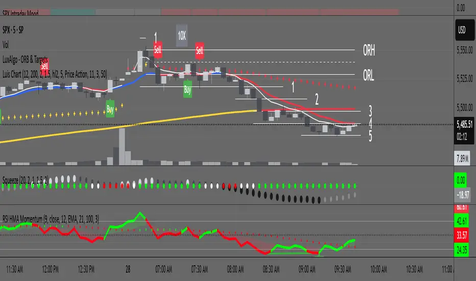
RSI with HMA & Momentum ZonesRSI with HMA & Momentum Zones — Indicator Description
This indicator combines Relative Strength Index (RSI) analysis with Hull Moving Averages (HMA) and Momentum Zone detection to provide a multi-layered view of market strength, trend shifts, and divergence signals.
It includes:
Main Features:
RSI Core:
Standard RSI calculated from a customizable source (close, open, etc.) with adjustable length.
A dynamic RSI Signal Line is plotted with selectable smoothing types (SMA, EMA, SMMA, WMA, VWMA) to enhance trend-following signals.
RSI crossovers of its signal line change color (green for bullish crossovers, red for bearish crossunders).
Hull Moving Averages (HMA):
Two HMA lines are plotted based on the RSI:
Short HMA (fast) and Long HMA (slow).
Color shifts indicate crossovers between RSI and Short HMA (short-term trend change) and Short HMA vs Long HMA (longer-term trend shifts).
Momentum Zones:
When the gap between the RSI and the Long HMA exceeds a user-defined threshold:
A green background highlights strong bullish momentum.
A red background highlights strong bearish momentum.
Helps visualize when momentum becomes extended.
Divergence Detection (Optional):
Regular and hidden bullish and bearish divergences are automatically detected between price and RSI.
Divergences are plotted on the RSI pane with labels ("Bull", "H Bull", "Bear", "H Bear").
Adjustable lookback settings for fine-tuning sensitivity.
Alerts are available for all divergence events.
Visual Enhancements:
A shaded cloud fills between RSI and its signal line, green for bullish bias and red for bearish bias.
Horizontal bands at 70, 50, and 30 levels to mark traditional RSI zones (overbought, neutral, oversold).
Customization Options:
All major components — RSI settings, Signal Line type, HMA lengths, Momentum Zone threshold, and Divergence controls — are fully adjustable.
Search in scripts for "zone"
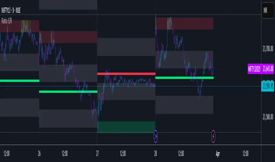
Ratio S/RRatio S/R - Intraday Support & Resistance Levels
Introduction
This script identifies key intraday support and resistance (S/R) levels where price tends to reverse frequently. It is designed specifically for intraday trading and aims to help traders find high-probability reversal zones.
The logic behind the script revolves around logarithmic returns, historical volatility, and ratio-based price levels. The script dynamically calculates price ranges using standard deviation-based volatility and applies preset ratio levels to determine potential support and resistance zones.
How It Works
Dynamic Range Calculation
The script calculates the price range based on the previous day’s logarithmic return volatility.
The range is then used to project different levels of price movement.
Reference Price
You can choose whether the reference price is from today’s open or yesterday’s close (oporcl setting).
This helps adapt the levels based on market behavior.
Ratio-Based Levels
The script applies specific ratios to the calculated range:
0.0833 (Minor Reversal Zone)
0.25 & 0.38 (Primary Reversal Zones)
0.62 & 0.75 (Significant Reversal Zones)
1.0 & 1.25 (Extreme Reversal Zones)
These levels act as potential support and resistance points.
Disclaimer: This is just for educational purpose . Trading is risky activity and how you use this tool is your own responsibility. The publisher of this tool does not make any claims.
Personal Time Zone: Days of WeekThis is probably the simplest indicator I have ever made.
It just gives you a the days of weeks in your specified time zone and puts the day on the first bar in your time zone.
You can use UTC time format or named time zones like the default.
Just for fun I tried to give it symbols that sort of relate the old gods that the days of week were named after and even colors that one could argue match, but it was all in fun because it was so simple I felt I had to add something.
Enjoy.

Liquidity + SP y RS + Zones [AlgoRich]This indicator is designed to identify key areas in the market, such as support and resistance levels, liquidity zones, and important price structures.
Additionally, it highlights operational areas based on specific time frames, facilitating technical analysis and decision-making in trading.
How does it work?
1. Identification of Pivot Levels
The indicator identifies local highs and lows on the chart, known as pivot levels, which are zones where the price tends to react, such as:
Support zones: Areas where the price is likely to stop falling.
Resistance zones: Areas where the price might encounter obstacles to keep rising.
These levels are calculated by analyzing a range of bars around the current price and are highlighted with lines, boxes, and labels on the chart.
2. Liquidity Zones
Liquidity zones are defined as areas where there has been an accumulation of orders, either for buying or selling. These zones are significant because they often signal future price movements.
The indicator creates visual boxes around these levels, allowing traders to quickly identify areas where the price might react.
3. Support and Resistance Lines
Horizontal lines are drawn at the identified highs and lows, representing support and resistance levels on the chart.
These lines can be extended forward until the price touches them, showing whether the level has been respected or "broken."
4. Visual Labels
The indicator can also display labels at key levels to provide additional information, such as whether the level corresponds to a high or low.
5. Operational Zones
In addition to support and resistance levels, the indicator allows users to mark specific time periods, referred to as operational sessions.
These zones highlight user-defined periods, such as:
New York session
London session
Daily session
This helps focus analysis on the most active market periods.
6. Customization
The user can customize the following:
Pivot sizes (how many bars to consider to the left and right).
Colors and styles of the lines, boxes, and labels.
Visibility of elements such as boxes, lines, and labels.
Whether to extend the levels forward until the price reaches them.
What is this indicator used for?
Identifying key areas in the market: Support, resistance levels, and liquidity zones are essential for understanding where the price is most likely to react.
Defining entry and exit points: Highlighted zones help determine when to open or close trades.
Highlighting key market moments: With operational sessions, you can focus on the most relevant periods for your strategy.
Simplifying technical analysis: By visualizing levels and zones directly on the chart, it reduces the time needed to identify critical areas.
Benefits for Traders
This indicator is ideal for traders who:
Want to analyze key market levels quickly and efficiently.
Are looking for high-probability zones to trade, based on support, resistance, and liquidity areas.
Need a visual approach to highlight operational levels and important time frames on their charts.
In summary, this indicator serves as a comprehensive tool that combines advanced technical analysis with a user-friendly visual interface, allowing traders to make more informed and precise decisions.
-----------------
TRADUCCIÓN AL ESPAÑOL:
Este indicador está diseñado para identificar zonas clave en el mercado, como niveles de soporte y resistencia, zonas de liquidez, y estructuras importantes de precios. Además, resalta las áreas operativas de acuerdo con horarios específicos, facilitando el análisis técnico y la toma de decisiones en el trading.
¿Cómo funciona?
1. Identificación de Niveles Pivot
El indicador busca máximos y mínimos locales en el gráfico, conocidos como niveles pivote, los cuales son zonas donde el precio suele reaccionar, como en:
Zonas de soporte: Donde el precio tiene probabilidades de detener su caída.
Zonas de resistencia: Donde el precio podría encontrar obstáculos para seguir subiendo.
Estos niveles son calculados analizando un rango de barras alrededor del precio actual, y se destacan con líneas, cajas y etiquetas en el gráfico.
2. Zonas de Liquidez
Las zonas de liquidez se definen como áreas donde ha habido una acumulación de órdenes, ya sea de compra o venta. Estas zonas son importantes porque suelen marcar movimientos futuros significativos en el precio.
El indicador crea cajas visuales alrededor de estos niveles, permitiendo identificar rápidamente las áreas donde el precio puede reaccionar.
3. Líneas de Soporte y Resistencia
Se trazan líneas horizontales en los máximos y mínimos identificados, representando los niveles de soporte y resistencia en el gráfico.
Estas líneas se pueden extender hacia adelante hasta que el precio las toque, mostrando si el nivel ha sido respetado o "roto".
4. Etiquetas Visuales
El indicador también puede mostrar etiquetas en los niveles clave para proporcionar información adicional, como si el nivel corresponde a un máximo o un mínimo.
5. Zonas Operativas
Además de los niveles de soporte y resistencia, el indicador permite marcar zonas de tiempo específicas, llamadas sesiones operativas.
Estas zonas resaltan períodos definidos por el usuario, como:
Sesión de Nueva York.
Sesión de Londres.
Diario.
Esto ayuda a enfocar el análisis en los momentos más activos del mercado.
6. Personalización
El usuario puede personalizar:
Tamaños de pivote (cuántas barras a la izquierda y derecha considerar).
Colores y estilos de las líneas, cajas y etiquetas.
La visibilidad de elementos como cajas, líneas y etiquetas.
Extender o no los niveles hacia adelante hasta que el precio los alcance.
¿Para qué sirve este indicador?
Identificar zonas importantes del mercado: Los niveles de soporte, resistencia y las zonas de liquidez son esenciales para entender dónde es más probable que el precio reaccione.
Definir puntos de entrada y salida: Las zonas destacadas ayudan a determinar cuándo abrir o cerrar operaciones.
Resaltar momentos clave del mercado: Con las sesiones operativas, puedes enfocarte en los períodos más relevantes para tu estrategia.
Simplificar el análisis técnico: Visualizando niveles y zonas directamente en el gráfico, se reduce el tiempo necesario para identificar áreas críticas.
Beneficio para los Traders
Este indicador es ideal para traders que:
Quieren analizar niveles clave del mercado de forma rápida y eficiente.
Buscan zonas de alta probabilidad para operar, basándose en soportes, resistencias y zonas de liquidez.
Necesitan un enfoque visual para destacar niveles operativos y horarios importantes en sus gráficos.
En resumen, este indicador actúa como una herramienta integral para combinar análisis técnico avanzado con una interfaz visual amigable, lo que permite a los traders tomar decisiones más informadas y precisas.

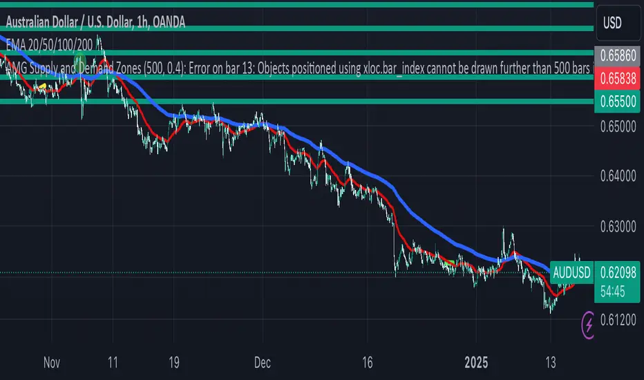
AMG Supply and Demand ZonesSupply and Demand Zones Indicator
This indicator identifies and visualizes supply and demand zones on the chart to help traders spot key areas of potential price reversals or continuations. The indicator uses historical price data to calculate zones based on high/low ranges and a customizable ATR-based fuzz factor.
Key Features:
Back Limit: Configurable look-back period to identify zones.
Zone Types: Options to display weak, untested, and turncoat zones.
Customizable Parameters: Adjust fuzz factor and visualization settings.
Usage:
Use this indicator to enhance your trading strategy by identifying key supply and demand areas where price is likely to react.
You can customize this further based on how you envision users benefiting from your indicator. Let me know if you'd like to add or adjust anything!
Dynamic RSI with Overbought/Oversold LinesDynamic RSI with Overbought/Oversold Lines
This indicator enhances the traditional RSI (Relative Strength Index) by dynamically adjusting the overbought and oversold levels based on the highest and lowest RSI values over a user-defined period. The indicator plots these levels as horizontal lines, allowing traders to visually identify when the market is "overbought" or "oversold."
Features:
Dynamic Overbought/Oversold Levels: Automatically adjusts the overbought and oversold levels based on the highest and lowest RSI values within the defined period, ensuring more accurate signals tailored to the current market conditions.
Customizable RSI Period: Choose your preferred RSI period to suit your trading strategy.
Signal Alerts: Visual signals are displayed when the RSI crosses into the overbought or oversold zone, indicating potential reversal points.
Background Color Alerts: The background changes color when the RSI exceeds overbought or oversold levels, making it easier to spot these important zones at a glance.
Clean and Simple: A minimalist design focusing on the key elements, making it suitable for all traders.
How to Use:
Overbought Zone: When the RSI moves above the overbought line (red), it may indicate that the asset is overbought, signaling a potential price reversal or pullback.
Oversold Zone: When the RSI moves below the oversold line (green), it may indicate that the asset is oversold, signaling a potential price bounce or reversal.
This dynamic RSI indicator is perfect for those looking to capture market extremes and improve their trading decisions. It's especially useful for timeframes like 30-minute and 1-hour charts, where market conditions tend to shift more rapidly.

Relative Measured Volatility (RMV) – Spot Tight Entry ZonesTitle: Relative Measured Volatility (RMV) – Spot Tight Entry Zones
Introduction
The Relative Measured Volatility (RMV) indicator is designed to highlight tight price consolidation zones , making it an ideal tool for traders seeking optimal entry points before potential breakouts. By focusing on tightness rather than general volatility, RMV offers traders a practical way to detect consolidation phases that often precede significant market moves.
How RMV Works
The RMV calculates short-term tightness by averaging three ATR (Average True Range) values over different lookback periods and then normalizing them within a specified lookback window. The result is a percentage-based scale from 0 to 100, indicating how tight the current price range is compared to recent history.
Here’s the breakdown:
Three ATR values are computed using user-defined short lookback periods to represent short-term price movements. An average of the ATRs provides a smoothed measure of current tightness. The RMV normalizes this average against the highest and lowest values over the defined lookback period, scaling it from 0 to 100.
This approach helps traders identify consolidation zones that are more likely to lead to breakouts.
Key Features of RMV
Multi-Period ATR Calculation : Uses three ATR values to effectively capture market tightness over the short term. Normalization : Converts the tightness measure to a 0-100 scale for easy interpretation. Dynamic Histogram and Background Colors : The RMV indicator uses a color-coded system for clarity.
How to Use the RMV Indicator
Identify Tight Consolidation Zones:
a - RMV values between 0-10 indicate very tight price ranges, making this the most optimal zone for potential entries before breakouts.
b - RMV values between 11-20 suggest moderate tightness, still favorable for entries.
Monitor Potential Breakout Areas:
As RMV moves from 21-30 , tightness reduces, signaling expanding volatility that may require wider stops or more flexible entry strategies.
Adjust Trading Strategies:
Use RMV values to identify tight zones for entering trades, especially in trending markets or at key support/resistance levels.
Customize the Indicator:
a - Adjust the short-term ATR lookback periods to control sensitivity.
b - Modify the lookback period to match your trading horizon, whether short-term or long-term.
Color-Coding Guide for RMV
ibb.co
How to Add RMV to Your Chart
Open your chart on TradingView.
Go to the “Indicators” section.
Search for "Relative Measured Volatility (RMV)" in the Community Scripts section.
Click on the indicator to add it to your chart.
Customize the input parameters to fit your trading strategy.
Input Parameters
Lookback Period : Defines the period over which tightness is measured and normalized.
Short-term ATR Lookbacks (1, 2, 3) : Control sensitivity to short-term tightness.
Histogram Threshold : Sets the threshold for differentiating between bright (tight) and dim (less tight) histogram colors.
Conclusion
The Relative Measured Volatility (RMV) is a versatile tool designed to help traders identify tight entry zones by focusing on market consolidation. By highlighting narrow price ranges, the RMV guides traders toward potential breakout setups while providing clear visual cues for better decision-making. Add RMV to your trading toolkit today and enhance your ability to identify optimal entry points!

Fear Greed Zones by Relative Strength IndexThis is a visual modification of the relative Strength Index (RSI) to express extreme areas as fear and greed Zones.
// Input
rsiLength = input.int(14, "RSI Length", minval=1)
// RSI calculation
rsi = ta.rsi(close, rsiLength)
FEAR GREED ZONES
The "Fear Greed Zones Script" indicator is designed to help traders identify psychological levels of fear and greed in the market by utilising relative strength index. It primarily utilises the Relative Strength Index of price to gauge market sentiment, with the following key features:
Color-Codes
Dark Red: Indicates a greed zone , suggesting extreme overbought conditions (high risk) and a possible price reversal downward.
Dark Green: Represents a fear zone, indicating extreme oversold conditions (low risk) and potential for price reversal upward.
Yellow: Serves as a neutral zone with medium risk.
Usage
Market Sentiment Analysis: Traders can use the fear and greed zones to assess overall market sentiment, aligning their strategies with prevailing emotional biases. This helps in identifying potential entry and exit points based on market psychology.
Risk Management: Understanding fear or greed influences market behavior and allows traders to manage their risk more effectively with the knowledge of high or low risk areas; as they can anticipate potential reversals or continuations in price trends.
Conclusion
The "Fear Greed Zones" Script is a valuable tool for traders looking to leverage market psychology. By clearly identifying areas where fear or greed may be influencing price movements, it aids in making more informed trading decisions.

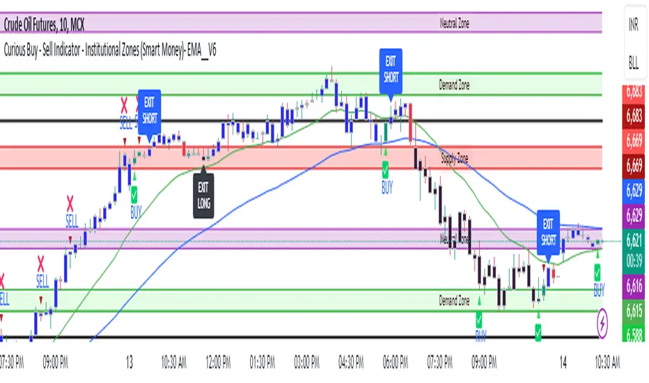
Curious Buy - Sell Indicator - Institutional Zones (Smart Money)How the Script Works:
1. The Scripts identifies Institutional Demand , Supply & Neutral Zones with FIBS on the scripts with Rectangle BOX with labels in advance. User can insert desired start and end value to plot institutional zones
2. Script generates BUY - SELL signals shape based on candle stick formation in live market and labels with BUY - SELL image for easy identification
3. Script gives pop message EXIT SHORT once Buy spotted and candle close above the buy signal and same way EXIT LONG once Sell spotted and candle close below the buy signal
4. Scripts identifies the candle closing above the BUY - SELL signals Eg - If buy spotted the candle closing above the BUY signal with display with BLUE color Candle same way for sell signal the candle closing below the sell signal candle with display with BLACK color candle.
5. Script spots fake signals which are not valid and can be ignored by the end user
6. Three EMA's 20,50,200 has implemented to identify the strength of the market
7. Scripts identifies OPEN = LOW & OPEN = HIGH candle stick to spot the Institutional BUY - SELL activity
8. The script provides visual clues on the chart to help users identify potential trading opportunities.
9. The script provides visual clues on the chart to help users identity potential trading opportunities in live market
10. The looks and parameters of the script can be modified by end user to customize and adapt to different strategy.
11. With the script user can check higher time frame DAILY \ WEEKLY BUY - SELL signals to plan intraday trades and plan safe BUY - SELL positions.
How Users Can Make Profit Using This Script:
1. Identify potential BUY - LONG opportunities: When a valid BUY is detected and condition is met, it is suggested to opening BUY position with stoploss below the BUY signal spotted candle.
Safe users can execute BUY position once BLUE COLOR candle is formed, Wait for pull back to reduce the stoploss
2. Identify potential SELL - SHORT opportunities: When a valid SELL is detected and condition is met, it suggests a potential opening SELL positions with stoploss above the BUY signal spotted candle. Safe users can execute SELL position once BLACK COLOR candle is formed, Wait for pull back to reduce the stoploss.
3. Script generated BUY - SELL signal met target with the Institutional zone. Eg if BUY spotted at demand zone target will be neutral zone & Supply zone.
4. Script designed for user to spot high probability trades when BUY SIGNAL SPOTTED at the Institutional Demand zone same way SELL SIGNAL SPOTTED AT INSTITUTIONAL supply zone.
5. Combine with additional analysis: Users can utilize this script as a tool in their overall trading strategy. They can combine the signals with fundament analysis , market sentiment to make more informed trading decision
6.Set risk management measures: It is important for users to implement proper risk management strategies when trading based on the scripts signals. To avoid potential losses user once spotted BUY - SELL execute the long or short position. Ensure to place the stoploss to avoid potential losses and place the target. Once your trade is moving in your favor
can trial your stoploss to cost and protect the profits.
Alpha Time Zones {DCAquant}
Alpha Time Zones {DCAquant}
The Alpha Time Zones {DCAquant} is a versatile TradingView indicator designed to help traders navigate the markets by highlighting key trading sessions. This tool provides visual cues by color-coding periods of the London, New York, and Tokyo trading sessions, along with customizable 'Golden' zones, enabling traders to capitalize on market overlaps and increased volatility.
Key Features:
Global Trading Sessions: Automatically shades the periods of the major trading sessions, which can be critical for traders looking to trade during peak liquidity times.
Customizable 'Golden' Zone: Set up your own 'Golden' trading hours for personalized time frames where you observe increased market activity.
Clarity and Focus: By color-coding each session, the indicator allows for a clean and organized view of the market, enabling traders to focus on their strategies without distraction.
BTC Halving Dates and Countdown: For cryptocurrency traders, this indicator includes a feature to show Bitcoin halving dates and a countdown to the next event, assisting in speculation around these significant occurrences.
How to Use the Indicator:
Optimized for Shorter Timeframes: Alpha Time Zones {DCAquant} is fine-tuned for high timeframe charts up to 12 hours. It's designed to provide the most value for intraday to half-day chart intervals, which aligns well with the duration of trading sessions around the globe.
Session Overlaps: Identify times when key sessions overlap, such as the London-New York overlap, to exploit potential periods of increased liquidity and volatility—prime times for trading on lower timeframes.
Custom 'Golden' Zone Trading: Define your own 'Golden' trading hours to correspond with specific economic releases or your peak trading times, perfect for strategies that target times of intensified market action.
Strategic Halving Date Analysis: Utilize the indicator’s Bitcoin halving dates and countdown feature to make informed decisions around these pivotal events, particularly relevant to cryptocurrency traders focusing on macro timeframes.
Adaptability and Customization: While the indicator is not intended for use on timeframes longer than 12 hours, its flexible settings allow for toggling session displays and customizing the 'Golden' zone, making it a versatile companion to your trading system.
Trading Strategy Integration:
The Alpha Time Zones {DCAquant} indicator is designed to be an auxiliary tool, easily integrated into any trading strategy that emphasizes trading session dynamics. Whether you're day trading, swing trading, or taking a position based on economic announcements, this indicator adapts to your approach, providing clear visual markers of key trading hours.
Disclaimer:
This indicator does not predict market movements but instead serves as a guide to understand the timing of market activities. Traders should use this tool in conjunction with a comprehensive analysis and a robust risk management strategy.

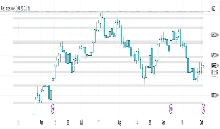
Histogram-based price zonesThis indicator provides a new approach to creating price zones that can be used as support and resistance. The approach does not use pivot points or Fibonacci levels. Instead, it uses the frequency of occurence of local maxima and minima to determine zones of interest where price often changed direction.
The algorithm is as follows:
- Gather price data from the last Lookback trading periods
- Calculate rolling minima and rolling maxima along the price points with window size Window size
- Build a histogram from the rolling extrema which are binned into different zones. The number of bins and therefore the width of a zone can be adjusted with the parameter Zone width factor
- Select only the top fullest bins. The number of bins selected for plotting can be controlled with Zone multiplier
The result are a number of boxes that appear on the chart which mark levels of interest to watch for. You can combine multiple instances of this indicator on different settings to find zones that are very relevant.
Shown as an example is the Nasdaq 100 futures ( NQ1! ) on the D timeframe with levels built from the last 100 periods with default settings. The boxes are the only output of the indicator, no signals are created.
[blackcat] L3 Supply and Demand Zones MTFLevel: 3
Background
Supply and Demand represent the two most powerful forces of the market. Demand means the number of buyers buying a security in the market. Supply means the number of sellers selling a security in the market. Large supply takes the price to move down and large demand takes the price to move up. Balance in both forces will keep the price in sideways movement. There are two types of states of the price of a security in technical analysis. 1. Balanced state; 2. Unbalanced state. In a balanced state, the price is moving in a range like moving sideways. Simply means forces of buyers and sellers are balanced. Both of them don’t have the ability to create a trend either bearish or bullish trend. After breakout of this sideways (range) movement of price, imbalance in price occur. And after the breakout, the recent range will be called a base zone and the price will again come to this base zone to pick unfilled orders.
Function
This is a composite supply and demand zone indicator, which inlcude:
1. demand and supply zones: yellow color box for demand zone while fuchsia color box for supply zone
2. half-semi log based fibo levels
3. multiple time frame (MTF) manual or automatic setting to see clear trend
4. tendline drawing. Default 610 bars back to draw, you can change it to your preferred value. However, you need to guarantee the existing chart already have equal or more than the number of bars you set or 610 bars.
5. blackcat reveral labels
6. box color to indicate volume information as:
box border color is green --> bullish
box boarder color is red --> bearish
box body color meanings:
a. turquoise or aqua or cyan box body color --> no volume indicaor signal or NA --> no supply and demand signal
b. red box body color --> volume climax up - strong bullish high volume --> demand >> supply
c. white box body color --> volume climax down - strong bearish high volume --> supply >> demand
d. green box body color --> high volume churn - bars with high volume and low range --> suppy and demand is balancing
e. yellow box body color --> low Volume - bar for low volume --> bullish/bearish trend is exhausted, reversal may happen soon --> supply or demand dominance will be changed soon.
f. fuchsia box body color --> volume climax plus high volume churn --> two possibilities: red+green=fuchsia or white+green=fuchsia, so fuchsia is a mixed state --> srong demand with supply attack or strong supply with demand attack.
Remarks
Free but closed sourced.
If the trendline is not drawn but you can see the red resistance and green support dashed lines, please drag the the chart to the left unitl you see the yellow solid trend line appears.
This is the initial version. This will be contineously improved along time.

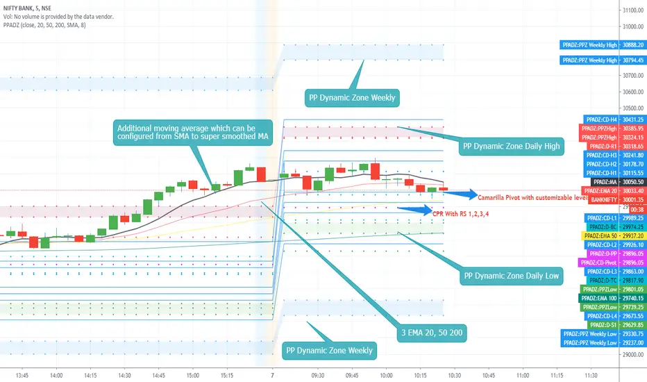
PP AIO Dynamic ZoneAs promised i present you Version 2 of the Dynamic Zones.
PP Dynamic Zone with Additional features included as follows.
1. CPR
2. Camarilla Pivot and Level 12
3. On/off switch enabled for Camarilla L3,4 and L5,6 which can be exclusively used for L4 breakouts sessions.
4. 3 EMA configured with 20,50,200 Exponential moving Average.
5. Exclusive Moving average can be enabled on demand like SMA, EMA, TEMA, Smoothed EMA, Hull Moving Average, Super Smoothed Moving Average and more.
Features Removed
1. Monthly Dynamic Zone
FAQ .
1. Open the indicator setting page.
2. enable the featured which you would like to enable. check boxes with Show.......
3. if values for the indicator need to be passed or hanged you can do.
4. CPR have check boxes to hide or show R 234 or S234
5. Camarilla Pivot have exclusive checkboxes to show only L3,4 and L5,6 which can be used for Breakouts strategies.
Usage :
Method 1 :
Use CPR / Camarilla for entry and exit points can be decided according to the Dynamic zones.
Method 2 :
EMA breakout or 20,50, 200 crossover and exit at Dynamic zones on either side.
Method 4:
Use Additional EMA system and buy or sell using price action based on MA and levels with dynamic zones.
Hope you all enjoy this system and get benefited.
Consolidation Zones - LiveHello Traders!
This is the script that finds Consolidation Zones in Realtime.
How it works?
- The script finds highest/lowest bars by using "Loopback Period"
- Then it calculates direction
- By using the direction and highest/lowest bar info it calculates consolidation zones in realtime
- If the length of consolidation area is equal/greater than user-defined min length then this area is shown as consolidation zone
- Then Consolidation Zone extends automatically if there is no breakout
if you increase the Loopback Length then you get bigger consolidation zones:
You have option to "Paint Consolidation Area" or not:
Enjoy!

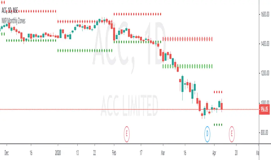
NKP Monthly ZonesNKP Monthly Zones is an indicator it will show where the buyers and sellers sitting to take the positional trades on Daily and weekly charts. it is created based on the last 10 months price movements. By using this we can detect reversals, continuations and trend strength, read on. ( we can apply this in 1 day, 1 week chart)
NKP Weekly zones has 2 main components:
Buyers zone dotted lines (Green)
Sellers zone dotted lines (Red)
How does it work?
The price moves above the seller zone area it means up trend continuation.
The price moves below the buyer zone area it means down trend continuation.
The price touches buyer zone area and the price moving up it means down trend completed and up trend started.
The price touches seller zone area and the price moving down it means up trend completed and down trend started.
What are the signals?
it wont generate any signals. just it will plot the buyers and seller zones.
Can we set the Alert on this?
Yes, we can set the alert based on the buyer/seller zone broken.
two custom alerts -NKP monthly Buyer zone , NKP monthly Seller zone
IMPORTANT: this script does not generate any signals. Perfectly catches long runs in trends at all underlings (stocks, indexes ) at 1day and 1week time frame. Lower/High period gives more incorrect signals. Don't use this in lower time frames( below 1 day time frame).
Try it! Good luck and good trading!
For access, please PM us or visit the link below in our Signature.
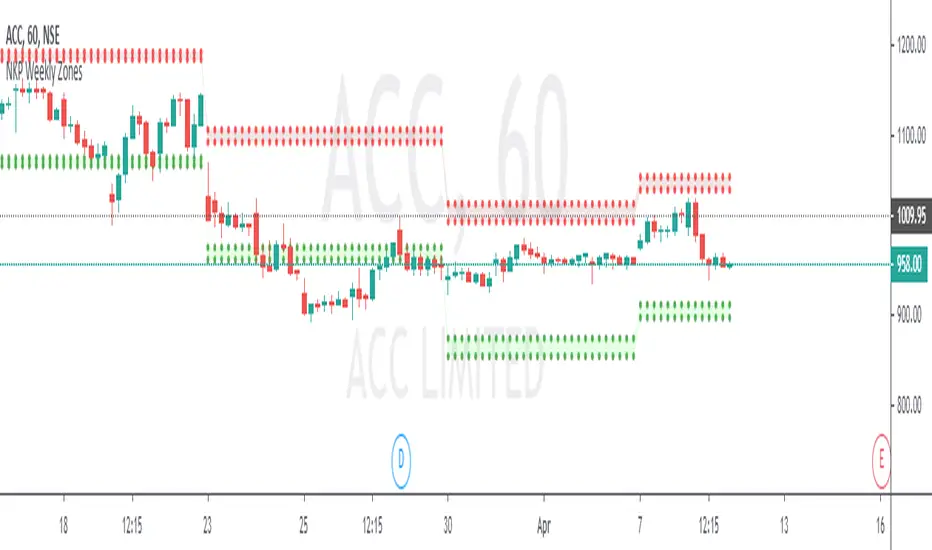
NKP Weekly ZonesNKP Weekly Zones is an indicator it will show where the buyers and sellers sitting to take the positional trades on hourly charts. it is created based on the last 10 weeks price movements. By using this we can detect reversals, continuations and trend strength, read on. ( we can apply this in 1hr, 2hr, 3hr, 4hr chart)
NKP Weekly zones has 2 main components:
Buyers zone dotted lines (Green)
Sellers zone dotted lines (Red)
How does it work?
The price moves above the seller zone area it means up trend continuation.
The price moves below the buyer zone area it means down trend continuation.
The price touches buyer zone area and the price moving up it means down trend completed and up trend started.
The price touches seller zone area and the price moving down it means up trend completed and down trend started.
What are the signals?
it wont generate any signals. just it will plot the buyers and seller zones.
Can we set the Alert on this?
Yes, we can set the alert based on the buyer/seller zone broken.
two custom alerts -NKP weekly Buyer zone , NKP weekly Seller zone
IMPORTANT: this script does not generate any signals. Perfectly catches long runs in trends at all underlings (stocks, indexes ) at 1hr, 2hr, 3hr and 4hr time frame. Lower/High period gives more incorrect signals. Don't use this in daily, weekly and monthly time frame.
Try it! Good luck and good trading!
For access, please PM us or visit the link below in our Signature.
NKP Daily ZonesNKP Daily Zones is an indicator it will show where the buyers and sellers sitting to take the positions. it is created based on the last 10 days price movements. By using this we can detect reversals, continuations and trend strength, read on. ( we can apply this in lower timeframes like , 5min, 15min, 30min, 1hr)
NKP Daily zones has 2 main components:
Buyers zone dotted lines (Green)
Sellers zone dotted lines (Red)
How does it work?
The price moves above the seller zone area it means up trend continuation.
The price moves below the buyer zone area it means down trend continuation.
The price touches buyer zone area and the price moving up it means down trend completed and up trend started.
The price touches seller zone area and the price moving down it means up trend completed and down trend started.
What are the signals?
it wont generate any signals. just it will plot the buyers and seller zones.
Can we set the Alert on this?
Yes, we can set the alert based on the buyer/seller zone broken.
two custom alerts - NKP Buyer zone , NKP Seller zone
IMPORTANT: this script does not generate any signals. Perfectly catches long runs in trends at all underlings (stocks, indexes ) at 5 min, 15min, 30min, 1hr time frame. Lower/High period gives more incorrect signals. Don't use this in daily time frame.
Try it! Good luck and good trading!
For access, please PM us or visit the link below in our Signature.

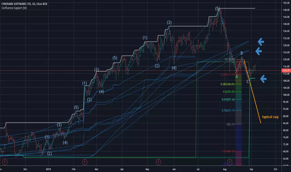
Confluence Zone Calculation for Support in Bullish TendsConfluence Zone Calculation for Support in Bullish Tends
(or Restance in bearish ones)
Ever wondered why sometimes the zag of an Elliot Wave zigzag is stopped after just a few points?
(Like in the given Chart where I draw a line for a typical zag action.)
It has often to do with confluence Zones. Most people think that the lower edge of a narrow range, repeated a few times, creates big support - confluence zones are stronger.
You can make them visible by getting fibonaccis from just one specific high to several different significant lows (for example the range lines mentioned above). The areas where significant lows and their fibos appear very close together are confluence zones. They can brake a falling price like a security net.
This script caluculates Confluence zones for you by using a second useful "secret": the secret that signifant lows test or create temporal rsi lows (vice-verse with highs).
The thicker (non-aqua clored)lines show actual lows, are corresponding with those rsi lows, the thinner are fibo lines deriving from them. (The white line stands for the high taken for the calculation.)
Note: Only those lines are valid which reach to the actual last bar.
Best practise is to let the script calculate,then redraw your lines of interest by hand and get rid of the rest of the spider web-like turmoil of lines by deleting the script from the chart.
Note further: I had to omit some calculations, because otherwise calculation time gets too long for TV and it stops with calculation Time out. (For your transparency I calculated all fibo codes but skipped some in "sline"-function; the number-suffix makes a jump when i omit a value ).
Note further further: Resistance confluence lines for bullish trends need a different script, because if you do it totally right vou in this case work from a single LOW of your interes t.
I hope it enriches your knowledge and is a help for your studies and tradings.
Feedback and Questions welcome
yoxxx
SMART4TRADER-ATR STANDARD DEVIATION CHARTThis indicator is a continuation of the indicator MUST READ this indicator 🚥 SMART4TRADER ATR STANDARD DEVIATION
The indicator is in the main window and shows the levels at which in most cases the price is braking. The concept of this indicator is a modified ATR with a standard deviation in the smaller direction in order to determine the often recurring price reversal zones.
Recommended options are suggested by default.
In the comments will be added a video in Russian on the application and analysis of the market using this indicator📲
----------------------------
Это индикатор является продолжение индикатора ОБЯЗАТЕЛЬНО ПРОЧИТАЙТЕ про этот индикатор 🚥 SMART4TRADER ATR STANDARD DEVIATION
Индикатор находится в главном окне и показывает уровни на которых в большинстве случаев происходит торможение цены. В концепции данного индикатора лежит измененный ATR с стандартным отклонением в меньшую сторону для того, чтобы определить часто повторяющиеся зоны разворота цены.
Рекомендуемые параметры предложены по умолчанию.
В комментариях будет добавлено видео на русском языке по применению и анализу рынка при помощи этого индикатора📲
------------------

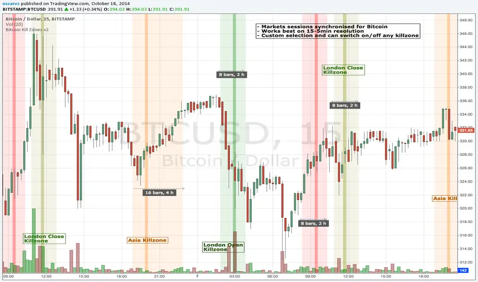
BITCOIN KILL ZONES v2Kill Zones
Kill zones are really liquidity events. Many different market participants often come together and act around these events. The activity itself may be event driven (margin calls or options exercise related activity), portfolio management driven (buy-on-close and asset allocation rebalancing orders) or institutionally driven (larger players needing liquidity to get filled in size) or a combination of any/all three. The point is, this intense cross current of activity at a very specific point in time often occurs near significant technical levels and trends established coming out of these events often persist until the next Kill Zone in approached/entered.
Specifically, there are three Kill Zones and each has its own importance/significance.
1. Asian Kill Zone (1900 - 2300 EST) Considered the "institutional" zone, this zone represents both the launch pad for new trends and also too a reloading area from the post American session. It is the start of a new day (or week) for the world and as such it makes sense this zone will often set the tone for the rest of the world's trading day. Since it is very wide (4 hours) one should pay attention to the Tokyo open (2100 EST) the Beijing open (2120 EST) and the Sydney open (0650 EST previous day).
2. London Kill Zone (0200 - 0400 EST) Considered the center of the financial universe for more than 500 years, Europe still carries a lot of influence within the banking world. Many larger players use the Euro session to establish their positions. As such, the London open often sees the most significant trend establishment activity through any given trading day. Indeed, it has been suggested 80% of all weekly trends are established through Tuesday's London Kill Zone.
3. New York Kill Zone (0830 - 1030 EST) The United States is still by far the world's largest economy and so by default New York's open carries a lot of weight and often comes with a big injection of liquidity. Indeed, most of the world's trade-able assets are priced in US dollars which gives even more significance to political and economic activity within this region. Because it comes relatively late in the globe's trading day, this Kill Zone often sees violent price swings within it's first hour leading to the time tested adage "never trust the first hour of North American trading.
Additional notes:
It has become apparent these Kill Zones are evolving over time and the course of world history. Since the end of the second world war, New York has slowly encroached on London's place as the global center for commercial banking. So much so through the later part of the 20th century New York was considered indeed, the new center of the financial universe. With the end of the cold war that leadership seems to have shifted back toward Europe and away from The United States. Additionally, Japan has slowly lost its former predominance within the global economic landscape while Beijing's has risen dramatically.
Only time will tell how these kill zones will evolve given each region's ever changing political, economic and socioeconomic influences.
Trading Notes:
If you have specific levels of interest odds are the bigger players have the same levels too. If it is indeed a solid level, look for price to trade to your level through the kill zone because the zone is a liquidity event where the bigger players can find enough size to get their big orders filled.
Try to avoid taking positions heading into Kill Zones and look for confirmation of your levels coming out of the event. For the more advanced trader, look to take positions on those level hits through the zone but understand higher time frame players often have far deeper pockets then day traders and can endure far more volatility then us little guys.
Thanks for the contribution to @CRInvestor and @ICT_MHuddleston
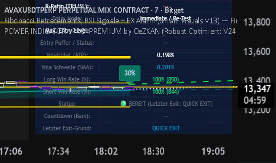
Indicator for the best FINDING GOLDEN ZONES by OeZKAN 🌟 FIBONACCI FX ALARM PRO (V13): Precision Pullback & Reversal SystemThe FIBONACCI FX ALARM PRO (V13) is a sophisticated, single-overlay indicator designed for the tactical trader who masters high-probability pullback and reversal entries. By fusing key Multi-Timeframe (MTF) structural analysis with validated Fibonacci levels and momentum confirmation, this system provides crystal-clear Entry, Take Profit (TP), and Stop Loss (SL) targets.This is your ultimate tool for trading Mean Reversion and Retracement strategies, providing the exact levels needed for disciplined execution.
🔥 Key System Features & Core Logic1.
⚙️ Multi-Timeframe Structural MappingThe system maps the dominant structural context from a higher timeframe onto your current chart, ensuring your trades align with the institutional flow:Dynamic Supply & Demand Zones: Automatic calculation and visualization of the highest high (Supply) and lowest low (Demand) over the last 100 bars on a user-defined MTF (e.g., 60m, 240m). These zones act as highly reliable reversal and breakout levels.Structural Breakouts: Clear alerts and labels notify you the moment the price decisively breaches the main Supply or Demand boundaries, signaling potential trend continuation.2.
🎯 Fibonacci Precision (The Golden Trade Zone)At the core of the strategy is the intelligent use of Fibonacci Retracements, automatically anchored to the MTF High/Low:The Golden Ratio (61.8%): This is the Primary Entry Trigger. The system is optimized to generate a Buy or Sell signal when the price crosses the $61.8\%$ level, confirming a deep, high-value retracement.TP1 / TP2 Targets: Built-in profit targets are automatically set at the $50.0\%$ (TP1 Long) and $38.2\%$ (TP2 Long) levels for Long trades, and the $70.5\%$ (TP1 Short) and $78.6\%$ (TP2 Short) levels for Short trades, ensuring disciplined profit-taking.SL Placement: The initial Stop Loss is strategically placed at the deep $78.6\%$ (Long) or $38.2\%$ (Short) level, providing wide protection against volatility before the target is hit.3.
🚦 RSI Momentum ConfirmationMomentum is crucial for timing successful reversals. The indicator integrates the Relative Strength Index (RSI) for powerful confirmation:Oversold/Overbought Signals: Clear labels (OVERBOUGHT (SELL) / OVERSOLD (BUY)) are generated directly on the price chart when the RSI crosses the critical $70$ and $30$ levels, respectively.Dual Visibility: You get both a visual arrow/text on the main chart (governed by the show_rsi_indicator toggle) and independent alarms to confirm the momentum shift coinciding with a structural level.
🔔 FX ALARM System: Never Miss an OpportunityThe robust alert system ensures you are instantly notified of high-probability events, even when away from your screen:GOLDEN ENTRY ALARM: Triggers when price crosses the crucial $61.8\%$ Golden Ratio, signaling a potential trade setup.STRUCTURAL BREAKOUT ALARMS: Instant notification when Supply (Highest High) or Demand (Lowest Low) zones are breached.TP HIT ALARMS: Alerts for Long TP1 (50.0%) and Short TP1 (70.5%) hits, vital for managing partial exits and moving your stop loss to breakeven.
🔑 How to Use This Indicator for Disciplined TradingSet Your Context: Select a higher Timeframe for Zones & Fib (e.g., "D" or "240") than your execution timeframe (e.g., 5m or 15m).Wait for the Setup: Wait for the price to retrace and approach the $61.8\%$ Golden Ratio.Confirm & Execute: Confirm the setup with a concurrent RSI Oversold/Overbought signal. If the price crosses $61.8\%$, the system instantly plots the E (Entry), TP1/TP2, and SL levels for a disciplined trade.Elevate your strategy with the FIBONACCI FX ALARM PRO (V13). Precision, structure, and momentum—all in one powerful tool.
👉 Add it to your favorites now and start executing high-confidence trades!
Borna's ZonesBorna's Zones marks two important time-based zones on the chart: the 08:00 zone and the 09:00 zone.
The 08:00 zone identifies initial liquidity. This zone sets the range where early market participants create significant activity.
The 09:00 zone serves as a reference for confirmation. After 09:00, the indicator helps you identify whether the 08:00 zone should be considered cleared.
Both zones are automatically extended until 11:00, providing clear visual references for potential market reactions.
No trading is recommended after 11:00, as the early morning zones lose relevance.
This indicator is useful for traders who focus on pre-market and early session liquidity, helping to visualize key levels where price may react.

Reward-Risk Visual Zones (RRZ)Reward–Risk Visual Zones (RRZ) – Structure-Driven Risk Mapping Engine
Most indicators tell you when to trade.
RRZ is designed to answer a different question:
“Is this setup worth the risk before I take the trade?”
RRZ is not a mashup of unrelated indicators.
It is a 3-stage risk engine that builds a complete trade “story” around each swing:
1. Market structure pivot → defines the trade idea
2. ATR volatility unit → defines the risk size
3. Projected reward → compares reward vs that risk and filters bad setups
The output is a visual trade map : entry, target, stop, and R:R, printed directly on chart at each qualified swing.
1. Market Structure Layer – Where trades are anchored
RRZ doesn’t fire signals from MA/RSI crossovers.
It begins with s wing structure :
• Uses ta.pivotlow() and ta.pivothigh() with user-controlled left/right sensitivity:
• Pivot Sensitivity (L) controls how wide a swing must be to qualify as a structural pivot.
• Pivot Confirmation (R) controls how fast/slow a pivot is confirmed (1 = almost real-time, larger values = safer but later).
• A confirmed swing low becomes the candidate anchor for a long R:R zone.
• A confirmed swing high becomes the candidate anchor for a short R:R zone.
Each pivot is stored with its exact price and bar index , so the rest of the logic is always anchored to a real swing instead of a random candle.
2. Volatility Layer – Turning ATR into a “risk unit”
Once a pivot is confirmed, RRZ measures local volatility using ATR:
• ATR length is configurable via ATR Length.
• ATR is not used as a trailing stop or overlay.
In RRZ it plays one specific role:
“One ATR = one unit of structural risk from this swing.”
From that:
Long scenario:
• Entry = pivot low
• Stop = Entry − 1 × ATR
Short scenario:
• Entry = pivot high
• Stop = Entry + 1 × ATR
This standardizes risk across different volatility regimes:
a 2R move in a quiet market and a 2R move in a volatile market are both “2 × ATR” from the structure.
3. Reward Projection Layer – Evaluating if the trade is worth it
RRZ then estimates how far price can realistically travel away from the pivot, given recent behaviour:
For longs (from swing low):
• Projects reward using the highest high in a rolling lookahead window (e.g., last 20 bars).
• Reward = HighestHigh – PivotLow
• Risk = ATR
• R:R = Reward / ATR
For shorts (from swing high):
• Projects reward using the lowest low in the window.
• Reward = PivotHigh – LowestLow
• Risk = ATR
• R:R = Reward / ATR
The user can set a minimum R:R filter via Min R:R Threshold.
• If R:R ≥ threshold → zone is tagged as “ GOOD R:R ” and highlighted in green (long) or red (short).
• If R:R < threshold → optionally still shown as “ LOW R:R ” in orange (so you can visually see “tempting but not worth it” trades).
This transforms a raw pivot + ATR into a quantified decision:
“From this swing, volatility says my stop is 1× ATR. Do I even have 2× ATR of room in my favour?”
4. Execution Map – How components work together on chart
Instead of just printing numbers, RRZ builds a full execution template for every qualifying swing:
• Entry line at the pivot price
• Target line at the reward projection price
• Stop line at pivot ± ATR
• A structured label including:
• LONG / SHORT direction
• “GOOD R:R” or “LOW R:R”
• Numerical R:R (e.g., 2.3 : 1)
• Entry, Target, Stop, current Close
A Cooldown Bars parameter prevents overlapping spam:
• After an R:R zone is created (long or short), the script waits X bars before considering another zone in the same direction.
• This keeps charts readable and focuses attention on the most recent high-quality swings.
RRZ also includes line style controls (solid/dashed/dotted) and separate colours for entry, target, and stop, so traders can quickly read the chart even without opening settings.
5. How to Use RRZ in a Trading Plan
RRZ is not a magic “buy/sell” button.
It is designed to sit on top of your existing strategy as a risk filter.
Typical workflows:
SMC / price-action traders:
• Use your own logic for BOS/CHoCH, order blocks, or liquidity sweeps.
• Use RRZ only where structure aligns and the zone shows GOOD R:R ≥ 2.0.
• Avoid setups where RRZ marks LOW R:R even if the pattern looks good.
System traders / swing traders:
• Use RRZ to standardize risk across assets and timeframes.
• Filter out trades where potential reward does not justify the stop, based on current ATR.
Beginners:
• Learn to stop taking trades where the target is too close and the stop is too wide.
• Visually understand how structural swings and volatility interact.
RRZ works across Forex, Crypto, Indices, and Stocks on intraday and higher timeframes.
Once a pivot is confirmed and a zone is plotted, its lines and labels do not repaint.
⸻
6. Why this invite-only script is more than a basic mashup
RRZ does use classic building blocks (pivots, ATR), but the value is in the way they are stitched into a single risk framework:
• It doesn’t run multiple separate indicators on chart.
Everything is computed inside one engine with a single purpose: structure-based R:R evaluation.
• ATR is not just “slapped on” as a stop line; it is treated as the core risk unit in the R:R calculation pipeline.
• Every zone is a coherent trade idea: from swing, to risk unit, to projected reward, to filtered label, to execution lines.
• The script is designed specifically to help traders do the one thing that almost no free indicator prioritizes:
“Say NO to low R:R trades automatically.”
This is what distinguishes RRZ from generic ATR-stop scripts or simple pivot overlays.
⸻
Important
• No performance promises.
• No marketing claims (“guaranteed”, “high win rate”, etc.).
• Purely a risk mapping & visualization tool.
