Two Zones Strategy - Nested Zone Breakout📌 Two Zones Strategy – Nested Zone Breakout
This indicator identifies two consecutive contraction zones (Nested Zones) and waits for a clean candle-close breakout to confirm strong momentum entry.
It is designed for swing/positional traders who want structured entries with clear risk-reward levels.
🔍 Concept (How it Works – High-Level Explanation)
This strategy tracks two back-to-back compression zones:
1️⃣ Zone 1 High & Zone 1 Low
2️⃣ Zone 2 High & Zone 2 Low
When price forms two tight zones consecutively, it indicates:
Market accumulation
Low volatility
Possible big expansion move (breakout)
After the second zone completes, the tool:
✔ Draws Zone High & Low
✔ Waits for candle-close breakout above the zone
✔ Marks a clean Entry level
✔ Auto-detects Stoploss (2nd Zone Low )
✔ Calculates Target using fixed Reward Ratio
(Protected logic internally detects the zones, filters noise structures, and confirms breakout strength.)
🎯 Entry Rule
A valid breakout happens only when:
Candle closes above Zone High
Wicks are ignored; only candle-close matters
Entry = Breakout candle close price
This ensures momentum confirmation before entering a trade.
🚫 Stop Loss
SL = 2nd Zone Low
🎯 Target Calculation (1 : 2 Reward Ratio)
Target =2nd Zone size × 2
Zone size = (Zone High – Zone Low)
Example:
If zone size = 1 point → Target = 2 points
⭐ Strategy Highlights
✔ Two-zone structure = Higher probability breakouts
✔ Very clear entry confirmation (no wick noise)
✔ logical stoploss
✔ Works best during momentum moves
✔ Beginner-friendly, rule-based system
✔ No guesswork or discretion
✔ Suitable for swing & positional trades
🧲 Best Timeframes
✔ Weekly (1W) – Most accurate
✔ Daily (1D) – Works w
Avoid: 5m / 15m in volatile stocks.
👥 Who Can Use This
Swing traders
Positional traders
Breakout traders
Higher timeframe followers
(Manual Backtesting is supported, allowing users to analyze past performance with accuracy.)
🔒 Why This is Published as Protected
The core logic uses a proprietary zone-detection approach with custom breakout filtering.
To preserve originality and prevent misuse, only high-level explanation is provided while keeping the internal logic protected. same rules ni telugu lo ivvandi
Search in scripts for "zone"

Delta Magnet Zone Extended – Selective HideLiquidity Zone Reversal — Description 🔍📊
This indicator automatically identifies liquidity zones where price previously grabbed orders, swept highs/lows, or created strong reaction points. Instead of plotting thin lines, this version converts those levels into zones, giving traders a clearer view of where the market has unfinished business and where future reactions are likely to occur.
These zones act as institutional magnets — areas where liquidity providers, algos, and larger players commonly enter or exit positions.
How It Works ⚙️💡
The script scans recent price action and detects local swing highs and lows. It then builds rectangular liquidity zones around these levels, extending them forward so you can see:
🟥 Bearish liquidity sweep zones
🟩 Bullish liquidity sweep zones
🔁 Areas where price previously failed, rejected, or consolidated
🎯 Potential reversal targets on both sides of the market
These zones update automatically as new structure forms, giving you an always-current map of market memory.
Why the 9-Day Look-Back Is Powerful (My Default) 📅✨
I personally keep the look-back set to 9 days by default because:
✔️ It captures the entire previous trading week
✔️ It maps out where SPY/QQQ/ES has already tapped liquidity
✔️ It shows the true zones institutions defended
✔️ It reveals where price is most likely to react again moving forward
Using a 9-day window gives you a clean, high-signal map of:
Last week’s highs & lows
Prior liquidity sweeps
Rejection zones
Imbalance cleanup levels
This keeps the chart minimal, powerful, and hyper-relevant to current order flow.
How Traders Use These Zones 🎯📈
Here are the most common ways traders use these liquidity zones:
1️⃣ Identify High-Probability Reversal Areas 🔄
Price often reacts strongly when returning to a past liquidity zone — especially if it previously swept stops there.
2️⃣ Confirm Breakouts or Failures 🚪➡️
Break above a bearish zone?
Momentum continuation is likely.
Reject inside a zone?
Reversal or range expansion often follows.
3️⃣ Set Targets & Stop Placement 🎯🛡️
Zones give logical:
Profit targets
Trend exhaustion points
Areas to avoid entering new trades
4️⃣ Time 0DTE Scalps With Precision ⚡
Liquidity zones tighten your expectations for:
Where SPY/QQQ will bounce
Where reversals start
Where liquidity magnets pull price by end of day
Why This Indicator Matters 🧠🔥
Liquidity drives markets.
Not indicators.
Not moving averages.
Not random levels.
This tool shows you where actual orders exist, where they were previously swept, and where institutions are most likely to step in again.
It gives you:
Cleaner charts
Higher confidence
Better strike selection
More precise entries
Stronger exits
All without noise.

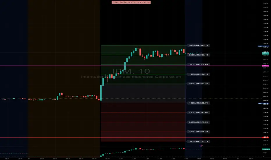
DTR & ATR with live zonesThis indicator is designed to help traders gauge the day's volatility in real-time. It compares the current Daily True Range (DTR)—the distance between the session's high and low—to the historical Average True Range (ATR).
The main purpose is to project potential price levels where the market might reach based on its average volatility. These levels (100% ATR, 150%, 200%, etc.) can be used as price targets. For instance, if you're in a long trade, you might consider taking partial or full profits as the price approaches these upper ATR extension levels. The indicator is highly customisable, allowing you to control the appearance of the ATR lines, zones, and labels to fit your charting preferences.
Core Concepts: ATR and DTR
To use this indicator effectively, it's important to understand its two main components:
Average True Range (ATR): This is a classic technical analysis indicator that measures market volatility. It calculates the average range of price movement over a specific period (e.g., 14 days). A higher ATR means the price is, on average, moving more, while a low ATR indicates less volatility. This script uses a higher timeframe ATR (e.g., Daily) to establish a stable volatility baseline for the current trading day.
Daily True Range (DTR): This is simply the difference between the current trading session's highest high and lowest low (session high - session low). It tells you how much the price has actually moved so far today.
The indicator's logic revolves around comparing the live, unfolding DTR to the historical, baseline ATR. An on-screen table conveniently shows this comparison as a percentage, to show how volatile the day has been.
How It Works: The Dynamic & Locked Mechanism
The most clever part of this indicator is how it draws the ATR levels. It operates in two distinct phases during the trading session:
Phase 1: Dynamic Expansion (Before DTR meets ATR)
At the start of the session, the DTR is small. The indicator calculates the remaining range needed to "complete" the 100% ATR level (difference = avg_atr - dtr). It then adds this remaining amount to the session high and subtracts it from the session low. This creates a "floating" 100% ATR range that expands dynamically as the session high or low is extended.
Phase 2: The Lock-in (After DTR meets or exceeds ATR)
Once the day's range (DTR) becomes equal to or greater than the avg_atr, the day has met its "expected" volatility. At this point, the levels lock in place. The indicator intelligently determines the anchor point for the locked range.
Once this primary 100% ATR range is established (either dynamically or locked), the script projects the other levels (150%, 200%, 250%, and 300%) by adding or subtracting multiples of the avg_atr from this base.
How to Use It for Trading
The primary use of this indicator is to set logical, volatility-based price targets.
Setting Profit Targets: If you enter a long position, the upper ATR levels (100%, 150%, 200%) serve as excellent areas to consider taking profits. A move to the 200% or 250% level often signifies an overextended or "exhaustion" move, making it a high-probability exit zone. For short positions, the lower ATR levels serve the same purpose.
Assessing Intraday Momentum: The on-screen table tells you how much of the expected daily range has been used. If it's early in the session and the DTR is only at 30% of the ATR, you can anticipate more significant price movement is likely to come. Conversely, if the DTR is already at 150% of ATR, the bulk of the day's move may already be complete.
Mean Reversion Signals: If the price pushes to an extreme level (e.g., 250% ATR) and shows signs of stalling (e.g., bearish divergence on an oscillator), it could signal a potential reversal or pullback, offering an opportunity for a counter-trend trade.
Key Settings
ATR Length & Smoothing Type: These settings control how the baseline ATR is calculated. The default 14 period and RMA smoothing are standard, but you can adjust them to your preference.
Session Settings: This is crucial. You must set the Market Session and Time Zone to match the primary trading hours of the asset you are analysing (e.g., "0930-1600" for the NYSE session).
Show Lines / Show Labels / Show Zones: The script gives you full control over the visual display. You can toggle each ATR level's lines, labels, and background zones individually to avoid a cluttered chart and focus only on the levels that matter to your strategy.
Artharjan High Volume Zones v2Artharjan High Volume Zones (AHVZ)
The Artharjan High Volume Zones (AHVZ) indicator is designed to identify, highlight, and track price zones formed during exceptionally high-volume bars. These levels often act as critical support and resistance zones, revealing where institutions or large players have shown significant interest.
By combining both short-term (ST) and long-term (LT) high-volume zones, the tool enables traders to align intraday activity with broader market structures.
Core Purpose
Markets often leave behind footprints in the form of high-volume bars. The AHVZ indicator captures these footprints and projects their influence forward, allowing traders to spot zones of liquidity, accumulation, or distribution where future price reactions are likely.
Key Features
🔹 Short-Term High Volume Zones (ST-ZoI)
Identifies the highest-volume bar within a short-term lookback period (default: 22 bars).
Draws and maintains:
Upper & Lower Bounds of the high-volume candle.
Midpoint Line (M-P) as the zone’s equilibrium.
Buffer Zones above and below for intraday flexibility (percentage-based).
Highlights these zones visually for quick intraday decision-making.
🔹 Long-Term High Volume Zones (LT-ZoI)
Scans for the highest-volume bar in a long-term lookback period (default: 252 bars).
Similar plotting structure as ST-ZoI: Upper, Lower, Midpoint, and Buffers.
Useful for identifying institutional footprints and multi-week/month accumulation zones.
🔹 Dynamic Buffering
Daily/Weekly/Monthly charts: Adds a fixed percentage buffer above and below high-volume zones.
Intraday charts: Uses price-range based buffers, scaling zones more adaptively to volatility.
🔹 Visual Customization
Independent color settings for ST and LT zones, mid-range lines, and buffers.
Adjustable plot thickness for clarity across different chart styles.
How It Helps
Intraday Traders
Use ST zones to pinpoint short-term supply/demand clusters.
Trade rejections or breakouts near these high-volume footprints.
Swing/Positional Traders
Align entries with LT zones to stay on the side of institutional flows.
Spot areas where price may stall, reverse, or consolidate.
General Market Structure Analysis
Understand where volume-backed conviction exists in the chart.
Avoid trading into hidden walls of liquidity by recognizing prior high-volume zones.
Closing Note
The Artharjan High Volume Zones indicator acts as a volume map of the market, giving traders a deeper sense of where meaningful battles between buyers and sellers took place. By combining short-term noise filtering with long-term structural awareness, it empowers traders to make more informed, disciplined decisions.
With Thanks,
Rrahul Desai @Artharjan
Follow-up Buy / Sell Volume Pressure at Supply / Demand Zones█ Overview:
BE-Volume Footprint & Pressure Candles, is an indicator which is preliminarily designed to analyze the supply and demand patterns based on Rally Base Rally (RBR), Drop Base Drop (DBD), Drop Base Rally (DBR) & Rally Base Drop (RBD) concepts in conjunction to volume pressure. Understanding these concepts are crucial. Let's break down why the "Base" is you Best friend in this context.
Commonness in RBR, DBD, DBR, RBD patterns ?
There is an impulse price movement at first, be it rally (price moving up) or the Drop (price moving down), followed by a period of consolidation which is referred as "BASE" and later with another impulse move of price (Rally or Drop).
Why is the Base Important
1. Market Balance: Base represents a balance between buyers and sellers. This is where decisions are made.
2. Confirmation: It confirms the strength of previous impulse move which has happened.
Base & the Liquidity Play:
Supply & Demand Zone predict the presence of all large orders within the limits of the Base Zone. Price is expected to return to the zone to fill the unfilled orders placed by large players.
For the price to move in the intended direction Liquidity plays the major role. hence indicator aims to help traders in identifying those zones where liquidity exists and the volume pressure helps in confirming that liquidity is making its play.
Bottom pane in the below snapshots is a visual representation of Buyers volume pressure (Green Line & the Green filled area) making the price move upwards vs Sellers volume pressure (Red Line & the Red filled area) making the price move downwards.
Top pane in the below snapshots is a visual representation on the pattern identification (Blue marked zone & the Blue line referred as Liquidity level)
Bullish Pressure On Buy Liquidity:
Bearish Pressure On Sell Liquidity:
█ How It Works:
1. Indicator computes technical & mathematical operations such as ATR, delta of Highs & Lows of the candle and Candle ranges to identify the patterns and marks the liquidity lines accordingly.
2. Indicator then waits for price to return to the liquidity levels and checks if Directional volume pressure to flow-in while the prices hover near the Liquidity zones.
3. Once the Volume pressure is evident, loop in to the ride.
█ When It wont Work:
When there no sufficient Liquidity or sustained Opposite volume pressure, trades are expected to fail.
█ Limitations:
Works only on the scripts which has volume info. Relays on LTF candles to determine intra-bar volumes. Hence, Use on TF greater than 1 min and lesser than 15 min.
█ Indicator Features:
1. StrictEntries: employs' tighter rules (rather most significant setups) on the directional volume pressure applied for the price to move. If unchecked, liberal rules applied on the directional volume pressure leading to more setups being identified.
2. Setup Confirmation period: Indicates Waiting period to analyze the directional volume pressure. Early (lesser wait period) is Risky and Late (longer wait period) is too late for the
ride. Find the quant based on the accuracy of the setup provided in the bottom right table.
3. Algo Enabled with Place Holders:
Indicator is equipped with algo alerts, supported with necessary placeholders to trade any instrument like stock, options etc.
Accepted PlaceHolders (Case Sensitive!!)
1. {{ticker}}-->InstrumentName
2. {{datetime}}-->Date & Time Of Order Placement
3. {{close}}-->LTP Price of Script
4. {{TD}}-->Current Level:
Note: Negative Numbers for Short Setup
5. {{EN}} {{SL}} {{TGT}} {{T1}} {{T2}} --> Trade Levels
6. {{Qty}} {{Qty*x}} --> Qty -> Trade Qty mapped in Settings. Replace x with actual number of your choice for the multiplier
7. {{BS}}-->Based on the Direction of Trade Output shall be with B or S (B == Long Trade & S == Short Trade)
8. {{BUYSELL}}-->Based on the Direction of Trade Output shall be with BUY or SELL (BUY == Long Trade & SELL == Short Trade)
9. {{IBUYSELL}}-->Based on the Direction of Trade Output shall be with BUY or SELL (BUY == SHORT Trade & SELL == LONG Trade)
Dynamic Alerts:
10. { {100R0} }-->Dynamic Place Holder 100 Refers to Strike Difference and Zero refers to ATM
11. { {100R-1} }-->Dynamic Place Holder 100 Refers to Strike Difference and -1 refers to
ATM - 100 strike
12. { {50R2} }-->Dynamic Place Holder 50 Refers to Strike Difference and 2 refers to
ATM + (2 * 50 = 100) strike
13. { {"ddMMyy", 0} }-->Dynamically Picks today date in the specified format.
14. { {"ddMMyy", n} }-->replace n with actual number of your choice to Pick date post today date in the specified format.
15. { {"ddMMyy", "MON"} }-->dynamically pick Monday date (coming Monday, if today is not Monday)
Note. for the 2nd Param-->you can choose to specify either Number OR any letter from =>
16. {{CEPE}} {{ICEPE}} {{CP}} {{ICP}} -> Dynamic Option Side CE or C refers to Calls and PE or P refers to Puts. If "I" is used in PlaceHolder text, On long entries PUTs shall be used
Indicator is equipped with customizable Trade & Risk management settings like multiple Take profit levels, Trailing SL.

Whole Number Levels & ZonesWhole Number Levels & Zones Indicator
This indicator is designed to automatically plot key psychological price levels on your chart. These are typically round numbers (e.g., 1.35000 on GBP/USD) where trading activity often clusters, creating potential support and resistance.
How It's Used:
Traders use these lines and zones to identify areas where the price might pause, reverse, or break out.
Support: If the price is falling, it may find support and bounce off one of these levels.
Resistance: If the price is rising, it may face resistance and stall at one of these levels.
Confirmation: It can be used alongside other indicators and analysis techniques to confirm trade entries or exits.
Key Features:
Automatic or Manual Levels: You can either let the indicator automatically adjust the lines based on the current price or anchor them to a specific starting price you choose.
Customizable Intervals: You can set the distance between each line (e.g., every 50 or 100 pips).
Shaded Zones: You can enable a shaded box around each line to better visualize the price zones. The height of this box is adjustable.
Full Styling Control: You have complete control over the color, style (dashed, solid, dotted), and thickness of the lines and zones to match your chart's theme.
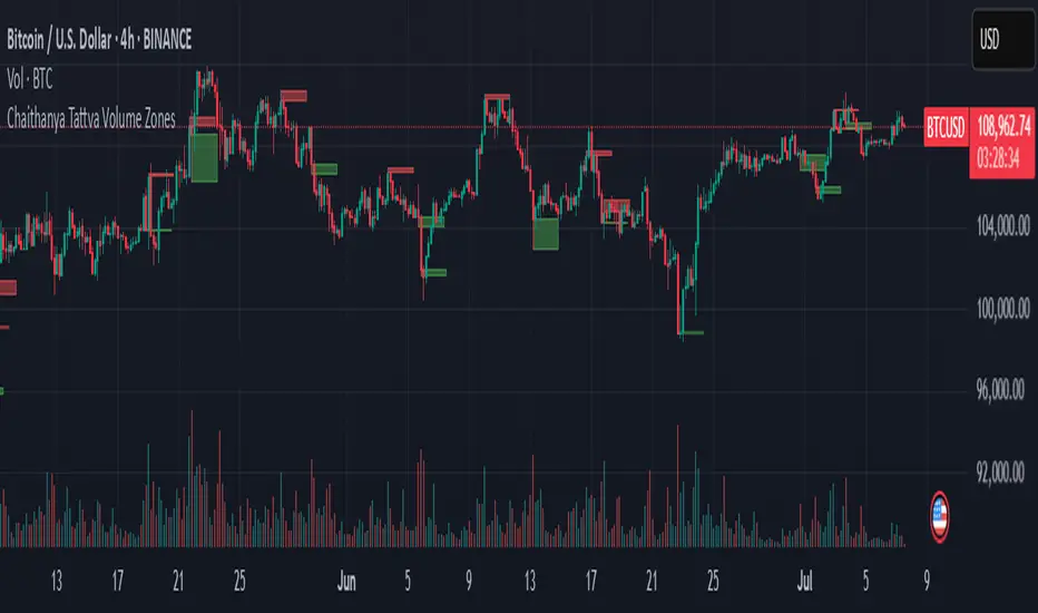
Chaithanya Tattva Volume Zones📜 "Chaitanya Tattva" Volume Zones:-
A Sacred Framework of Supply, Demand & Market Energy
In the world of financial markets, price is said to reflect all information. But the true pulse of the market — its life force, its intent, and its moment of truth — is most vividly expressed not in price itself, but in volume.
Chaitanya Tattva Volume Zones is a spiritually inspired volume-based tool that transforms your chart into a canvas of market consciousness, revealing moments where supply and demand engage in visible energetic spikes. These moments are often disguised as ordinary candles, but with this tool, you uncover zones of intent — footprints left by the market’s deeper intelligence.
🌟 Why “Chaitanya Tattva”?
Chaitanya (चैतन्य) is a Sanskrit word meaning consciousness, awareness, or the spark of life energy. It is that which animates — the subtle intelligence behind all movement.
Tattva (तत्त्व) refers to essence, truth, or the underlying principle of a thing. In classical yogic philosophy, the tattvas are the elemental building blocks of reality.
Together, Chaitanya Tattva represents the conscious essence — the living pulse that animates the market through volume surges and imbalances.
This tool is not just a technical indicator — it is a spiritual observation device that aligns with the rhythm of volume and price action. It doesn't predict the market. It reveals when the market has already spoken — loudly, clearly, and energetically.
📈 What Does the Tool Do?
Chaitanya Tattva Volume Zones identifies exceptional volume spikes within the recent price history and visually marks the areas where market intent has been most active.
Specifically, the tool:
Scans for volume spikes that exceed all the volume of the last N bars (default is 20)
Confirms whether the spike happened on a bullish candle (close > open) or bearish candle (close < open)
For a bullish spike, it marks a Supply Zone — the area between the high and close of the candle
For a bearish spike, it marks a Demand Zone — the area between the low and close
Visually paints these zones with soft translucent boxes (red for supply, green for demand) that extend forward across multiple bars
🧘♂️ The Spiritual Framework
🔴 Supply = "Agni" — The Fire of Expansion
When a bullish candle erupts with historically high volume, it symbolizes the fire (Agni) of market optimism and upward expansion. It means that buyers have absorbed available supply at that level and established dominance — but such fire may also signal exhaustion, making it a potential supply barrier if price returns.
These Supply Zones are areas where:
Sellers are likely to re-engage
Smart money may be unloading
Future resistance can be anticipated
But unlike traditional indicators, this tool doesn’t guess. It reacts only to a clear volume-based event — when market energy surges — and locks in that awareness through zone marking.
🟢 Demand = "Prithvi" — The Grounding of Price
On the other hand, a bearish candle with extremely high volume represents the Earth (Prithvi) — grounding the price with firm hands. A strong volume drop often means buyers are stepping in, absorbing the selling pressure.
These Demand Zones are areas where:
Buying interest is proven
Market memory is stored
Future support can be expected
By respecting these zones, you're aligning your trading with natural market boundaries — not theoretical ones.
🧠 How Is It Different from Regular Volume Tools?
While most volume indicators show bars on a lower panel, they leave interpretation up to the trader. “High” or “low” becomes subjective.
Chaitanya Tattva Volume Zones is different:
It quantifies "spike": a bar must exceed all previous N volumes
It qualifies the intent: was the spike bullish or bearish?
It marks zones on the price chart: no need to guess levels
It preserves market memory: the zones persist visually for easy reference
In essence, this tool doesn’t just report volume — it interprets volume’s context and visually encodes it into the chart.
🧘 How to Use
1. Support/Resistance Mapping
Use the tool to understand where volume proved itself. If price revisits a red zone, expect possible rejection (resistance). If price revisits a green zone, expect possible absorption (support).
2. Entry Triggers
You may enter:
Long near demand zones if bullish confirmation appears
Short near supply zones if bearish confirmation appears
3. Stop Placement
Stops can be placed just beyond the zone boundary to align with areas where smart money historically defended.
4. Breakout Confidence
When price breaks through one of these zones with momentum, it often signals a new energetic wave — the old balance has been overcome.
🔔 Key Features
Volume spike detection across any timeframe
Clear visual zones — no clutter, no lag
Highly customizable: zone width, volume lookback, colors
Philosophy-aligned with supply and demand theory, Wyckoff, and Order Flow
🌌 A Metaphysical View of Volume
In yogic science, volume is akin to Prana — life-force energy. A market is not moved by price alone but by intent, force, and participation — all encoded in volume.
Just as a human body pulses with blood when action intensifies, the market pulses with volume when institutional decisions are made.
These pulses become sacred footprints — and Chaitanya Tattva Volume Zones helps you walk mindfully among them.
🔮 Final Thoughts
In a sea of indicators that shout at you with every tick, Chaitanya Tattva is calm. It speaks only when energy concentrates, only when the market sends a signal born of intent.
It doesn’t predict.
It doesn’t repaint.
It simply shows the truth, when the truth becomes undeniable.
Like a sage that speaks only when needed, it waits for volume to prove itself — then draws a memory into space, a zone where traders can re-align their actions with what the market has already honored.
Use it not just to trade —
But to listen.
To observe.
To follow the Chaitanya — the conscious pulse of the market’s own breath.
Liquidity Zone IndicatorLiquidity Zone Indicator
This PineScript indicator for TradingView identifies liquidity zones in the market where significant trading activity occurs, based on volume spikes and price levels. It highlights areas where large orders may be filled, useful for day traders and scalpers.
Features:
Detects bullish and bearish liquidity zones using a lookback period (default: 50 bars) and volume threshold (default: 1.5x average volume).
Displays zones as shaded boxes or diamond markers above/below bars, customizable by color.
Option to extend zones until price breaks through, with dynamic transparency for better visualization.
Includes an alert for when a liquidity zone is hit.
Settings:
Liquidity Lookback: Number of bars to analyze for high/low price levels.
Volume Threshold: Multiplier for detecting volume spikes.
Display as Zone: Toggle between zone boxes or markers.
Extend Zone: Keep zones active until price crosses them.
Zone Color: Customize the color of zones or markers.
Ideal for traders looking to spot potential reversal or breakout areas driven by liquidity.

Support & Resistance ZonesAdvanced Support & Resistance Detection Algorithm
This indicator identifies meaningful price levels by analyzing market structure using a proprietary statistical approach. Unlike traditional methods that rely on simple swing highs/lows or moving averages, this system dynamically detects zones where price has shown consistent interaction, revealing true areas of supply and demand.
Core Methodology
Price Data Aggregation
Collects highs and lows over a configurable lookback period.
Normalizes price data to account for volatility, ensuring levels remain relevant across different market conditions.
Statistical Significance Filtering
Rejection of random noise: Eliminates insignificant price fluctuations using adaptive thresholds.
Volume-weighted analysis (implied): Stronger reactions at certain price levels are given higher priority, even if volume data is unavailable.
Dynamic Level Extraction
Density-based S/R Zones: Instead of fixed swing points, the algorithm identifies zones where price has repeatedly consolidated.
Time decay adjustment: Recent price action has more influence, ensuring levels adapt to evolving market structure.
Strength Quantification
Each level is assigned a confidence score based on:
Touch frequency: How often price revisited the zone.
Reaction intensity: The magnitude of bounces/rejections.
Time relevance: Whether the level remains active or has been broken decisively.
Adaptive Level Merging & Pruning
Proximity-based merging: If two levels are too close (within a volatility-adjusted threshold), they combine into one stronger zone.
Decay mechanism: Old, untested levels fade away if price no longer respects them.
Why This Approach Works Better Than Traditional Methods
✅ No subjective drawing required – Levels are generated mathematically, removing human bias.
✅ Self-adjusting sensitivity – Works equally well on slow and fast-moving markets.
✅ Focuses on statistically meaningful zones – Avoids false signals from random noise.
✅ Non-repainting & real-time – Levels only update when new data confirms their validity.
How Traders Can Use These Levels
Support/Resistance Trading: Fade bounces off strong levels or trade breakouts with confirmation.
Confluence with Other Indicators: Combine with RSI, MACD, or volume profiles for higher-probability entries.
Stop Placement: Place stops just beyond key levels to avoid premature exits.
Technical Notes (For Advanced Users)
The algorithm avoids overfitting by dynamically adjusting zones sensitivity based on market conditions.
Unlike fixed pivot points, these levels adapt to trends, making them useful in both ranging and trending markets.
The strength percentage helps filter out weak levels—only trade those with a high score for better accuracy.
Note: Script takes some time to load.
A.K Dynamic EMA/SMA / MTF S&R Zones Toolkit with AlertsThe A.K Dynamic EMA/SMA / MTF Support & Resistance Zones Toolkit is a powerful all-in-one technical analysis tool designed for traders who want a clean yet comprehensive market view. Whether you're scalping lower timeframes or swing trading higher timeframes, this indicator gives you both the structure and signals to take action with confidence.
Key Features:
✅ Customizable EMA/SMA Suite
Display key Exponential and Simple Moving Averages including 5, 9, 20, 50, 100, and 200 EMAs, plus optional 50 SMA for trend filtering. Each line can be toggled individually and color-customized.
✅ Multi-Timeframe Support & Resistance Zones
Automatically detects dynamic S/R zones on key timeframes (5min, 15min, 30min, 1H, 4H, 1D) using swing highs/lows. Zones are color-coded by strength and whether they're broken or active, providing a clear visual roadmap for price reaction levels.
✅ Zone Strength & Break Detection
Distinguishes between strong and weak zones based on price proximity and reaction depth, with visual shading and automatic label updates when a level is broken.
✅ Price Action-Based Buy/Sell Signals
Generates BUY signals when bullish candles react to strong support (supply) zones, and SELL signals when bearish candles react to strong resistance (demand) zones. All logic is adjustable — including candle body vs wick detection, tolerance range, and strength thresholds.
✅ Alerts Engine
Built-in TradingView alerts for price touching support/resistance or triggering buy/sell signals. Perfect for automation or hands-free monitoring.
✅ Optional Candle & Trend Filters
Highlight bullish/bearish candles visually for additional confirmation.
Optional RSI display and 50-period SMA trend filter to guide directional bias.
🧠 Use Case Scenarios:
Identify dynamic supply & demand zones across multiple timeframes.
Confirm trend direction with EMAs and SMA filters.
React quickly to clean BUY/SELL signals based on actual price interaction with strong zones.
Customize it fully to suit scalping, day trading, or swing trading strategies.
📌 Recommended Settings:
Use default zone transparency (65%) and offset (250 bars) for optimal visual clarity.
Enable alerts to get notified when price enters key S/R levels or when a trade signal occurs.
Combine this tool with your entry/exit plan for better decision-making under pressure.
💡 Pro Tip: Add this indicator to a clean chart and let the zones + EMAs guide your directional bias. Use alerts to avoid screen-watching and improve discipline.
Created by:
Version: Pine Script v6
Platform: TradingView
Delta Zones🔶 Delta Zones — A Precision Tool for Time-Price Mapping 🔶
The Delta Zones indicator is a refined structure-mapping tool that dynamically tracks zones of dominant trading activity across recent sessions.
These zones are projected forward in time, offering traders a reliable visual guide to where significant interactions between buyers and sellers are likely to take place.
This tool was designed for intraday use, but its adaptability makes it powerful even on higher timeframes, giving traders insights into market behavior without the noise. You need to change session setting from indicator to higher TF that the chart. For intra, its by default on daily.
🔧 What This Indicator Does
Detects and displays the key activity zone for the current session (today).
Recalls the most active zone from the previous session, allowing you to track momentum or reversal bias.
Color codes each zone based on where price currently trades relative to it:
Neutral gradient (orange/white) for today’s zone, showing where price is consolidating or reacting.
Bullish green fade if price is trading above yesterday’s zone.
Bearish red fade if price is trading below yesterday’s zone.
Extends each zone forward (default 200 bars) so you can observe price behavior as it revisits these areas over time.
📈 How to Use Delta Zones
Trend Continuation:
If price pushes beyond today's zone and maintains momentum, it may suggest strength in that direction. Watch how price reacts on retests of this zone.
Fade or Mean Reversion:
When price strays far from a Delta Zone and struggles to gain ground, it often rotates back into that region. These situations can offer attractive risk-reward setups.
Zone Polarity from Prior Sessions:
Yesterday’s zone serves as a directional cue — if price opens and stays above it (green-filled), sentiment favors strength. If it stays below (red-filled), weakness may persist.
Support/Resistance Anchors:
Use zones as dynamic S/R levels — watch for wick tests, engulfing candles, or volume surges at zone edges for potential trade entries or exits.
🎛️ Inputs You Can Control
Session Length (Default: Daily): Defines how often a new zone is calculated.
💡 Pro Tip
These zones act like magnetic fields around price — not only can they contain price, but they also attract it. The key is to recognize when price is respecting, rejecting, or absorbing at the edges of the zone.
Pair Delta Zones with your favorite price action, momentum, or volume tools for sharper decision-making. For example, "Accumulation/Distribution Money Flow" script which I published few days ago.
⚠️ Note
This is a conceptually adaptive framework designed to simplify the visual structure of the market. While no model guarantees predictive accuracy, Delta Zones are especially useful for contextualizing price behavior and anticipating where meaningful reactions may occur.
This is an educational idea, use it at your own risk.
Past performance does not guarantee future success.

Mayer Multiple ZonesMayer Multiple Zones
The Mayer Multiple Zones indicator is a powerful market valuation tool that helps traders identify key price zones based on multiples of the 200-period moving average. Originally inspired by the Bitcoin Mayer Multiple concept, this versatile indicator works across all markets and timeframes to visualize the relative valuation of any asset.
Key Features:
Color-coded valuation zones: Instantly recognize if the current price represents a strong buy opportunity, fair value, or potential bubble territory
Customizable multiplier levels: Adjust all zone thresholds to suit specific markets or trading strategies
Real-time status indicator: Clear market status display showing current valuation zone
Comprehensive information table: View all critical price levels and current multiple at a glance
Multi-timeframe compatible: Works seamlessly across all timeframes while maintaining accurate MA200 reference
Visual zone labeling: Clear labels for each price zone directly on the chart
How to Use:
The indicator divides price action into six distinct zones based on the MA200:
Strong Buy Zone (default: below 0.6x MA200): Extreme undervaluation, historically excellent buying opportunities
Value Buy Zone (default: 0.6x-0.8x MA200): Attractive buying range for long-term value
Accumulation Zone (default: 0.8x-1.0x MA200): Price building strength below the MA200
Fair Value Zone (default: 1.0x-2.0x MA200): Reasonable valuation range
Take Profit Zone (default: 2.0x-2.5x MA200): Overvaluation suggesting partial profit taking
Bubble Zone (default: above 2.5x MA200): Extreme overvaluation, historically unsustainable levels
This indicator serves as both a strategic planning tool for long-term investors and a tactical guide for shorter-term traders, helping identify potential reversal zones and price targets based on historical valuation patterns.
Settings:
MA Length: Adjust the moving average period (default: 200)
Multipliers: Customize each zone threshold to adapt to specific market characteristics
Perfect for all traders seeking to understand relative market valuation across any timeframe.

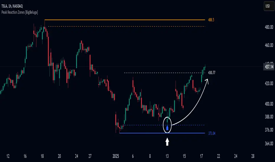
Peak Reaction Zones [BigBeluga]Peak Reaction Zones is an advanced Smart Money Concept (SMC) indicator that identifies the most recent swing high and swing low zones, helping traders determine premium and discount areas for optimal trade positioning.
🔵 Key Features:
Swing High & Low Zones:
Automatically detects the latest swing high and swing low levels.
Helps traders identify key reaction points where price is likely to respond.
Premium & Discount Concept:
The high zone represents a premium area, where price is overextended and may reverse.
The low zone represents a discount area, where price is undervalued and may bounce.
The midline dynamically marks the equilibrium of the range.
Adjustable Zone Width:
Users can fine-tune the width of the zones to match their trading style.
Wider zones capture broader reaction ranges, while narrower zones focus on precise levels.
Zone Retest Signals:
Blue markers appear when price retests the lower reaction zone, signaling potential support.
Orange markers appear when price retests the upper reaction zone, indicating possible resistance.
Price Labels for Key Levels:
Displays the price value of the swing high, swing low, and midline for quick reference.
Helps traders recognize major reaction points at a glance.
🔵 Usage:
Smart Money Trading: Utilize the premium and discount concept to align trades with institutional order flow.
Zone Reactions: Watch for price tests of reaction zones and use the retest signals to confirm potential reversals.
Midline Confirmation: If price holds above or below the midline, it can indicate directional bias.
Scalping & Swing Trading: Short-term traders can look for zone rejections, while swing traders can use the levels for trend continuation setups.
Peak Reaction Zones is a must-have tool for traders looking to trade with Smart Money Concepts, allowing for precise entries and exits based on key liquidity areas and market structure.
BIAS PRO - Zones + Liquidity + SP&RS [AlgoRich]This multifunction indicator is used to identify key areas on the chart, liquidity levels, and support/resistance zones (SP&RS). Its design is aimed at highlighting price pivots (swings) by drawing zones (boxes and lines) based on these pivots, while also displaying information about trading sessions and levels of analysis across different timeframes.
1. Configuration and Input Parameters
Swing Parameters (Bars Right-Left):
Two inputs are defined to adjust the number of bars on the right and left used to detect pivots (swings). This allows the determination of high and low pivot points.
Display Options:
You can choose to show or hide boxes, lines, and labels (bubbles). There is also an option to extend the zones until they are “filled” (confirmed), and you can opt to hide those zones once filled.
Appearance:
Visual parameters are defined, such as the option to display high and low pivots, colors for lines, labels, and boxes (for both bullish and bearish conditions), line styles (solid, dotted, dashed), and other aesthetic details (box width, label size, text alignment).
Lookback and Time Range:
The “lookback” and “daysBack” variables determine whether the analysis is limited to data from a certain number of days, helping to filter out older historical information.
2. Calculation of Pivots (Swings) and Zone Detection
Price Pivots:
Using the pivot functions (ta.pivothigh and ta.pivotlow), the script identifies swing high and low points based on the configured swing size (bars left and right).
If a swing high is detected, its bar index is stored and the corresponding signal is activated.
Similarly, a swing low is detected and marked.
Drawing Zones:
When a swing (high or low) is detected and the time range condition is met (inRange), the script draws:
Boxes: These visually represent the area around the pivot level. The configuration (type and width) is adjustable.
Lines: A horizontal line is drawn from the pivot point to the current bar, using the defined style and color.
Boxes and lines are drawn for both high pivots (showhighs) and low pivots (showlows).
Additionally, these zones are updated and extended dynamically as new bars appear, and zones that are “filled” (when the price exceeds the zone level) are removed.
Labels and Markers:
If enabled, the script displays circle markers (using plotshape) at the swing points.
3. Operational Zone (Sessions)
Customizable Sessions:
The script allows defining up to three operational sessions with distinct time ranges and colors.
For example, Session 1, Session 2, and Session 3 have configurable time ranges and colors (with adjustable opacity).
It checks if the current time falls within any of these sessions and, if so, applies a background color (bgcolor) to the chart with the configured session color.
Timezone Adjustment:
You can configure a UTC offset or use the exchange’s timezone to correctly adjust the session times.
4. Additional Levels and Analysis Groups
Groups of Levels (Levels 1, 2, 3, and 4):
Several groups are defined that allow data requests from different timeframes (e.g., 60 minutes, 240 minutes, daily, or weekly) and configure their parameters (length, line style, color).
For each group, the script uses a function that requests non-repainting data and calculates pivot levels based on ta.pivothigh/ta.pivotlow.
These levels are drawn on the chart with lines and “shadow” lines to reinforce the visualization of key pivot points. Labels are added with a slight offset to indicate the pivot value in the corresponding timeframe.
5. Maintenance and Management of Drawn Elements
Dynamic Update and Deletion:
The script maintains arrays to store the drawn boxes and lines. As new elements are added and the array reaches a maximum size (e.g., 500 elements), the oldest elements are deleted to avoid overloading the chart.
Extension and Hiding Conditions:
Conditions are checked to extend or delete zones based on whether the price has “filled” the area (i.e., if the current price has surpassed the zone level). There is also an option to hide zones once they are filled.
6. Session (Operational Zone) and Levels for Multiple Timeframes
Session Settings:
In addition to the pivot zones, the indicator also defines operational sessions with adjustable time ranges and colors, shading the background of the chart during those sessions.
Additional Level Groups:
The indicator allows grouping of analysis levels by timeframe, which can be useful for multi-timeframe analysis. Parameters such as length, style, and color are configurable for each group.
Summary:
The "BIAS PRO - Zones + Liquidity + SP&RS " is an all-in-one indicator that combines the detection of price pivots (swings) with the visual representation of key zones on the chart. With options to customize appearance, manage operational sessions, and group levels across different timeframes, this script is designed to help traders identify areas of high liquidity, potential breakouts, or reversals, thus optimizing decision-making based on market structure.
This explanation covers the main functionalities and workflow of the script, making it easier to understand without needing to examine the code in detail.

HTF Hi-Lo Zones [CHE]HTF Hi-Lo Zones Indicator
The HTF Hi-Lo Zones Indicator is a Pine Script tool designed to highlight important high and low values from a selected higher timeframe. It provides traders with clear visual zones where price activity has reached significant points, helping in decision-making by identifying potential support and resistance levels. This indicator is customizable, allowing users to select the resolution type, control the visualization of session ranges, and even display detailed information about the chosen timeframe.
Key Functionalities
1. Timeframe Resolution Selection:
- The indicator offers three modes to determine the resolution:
- Automatic: Dynamically calculates the higher timeframe based on the current chart's resolution.
- Multiplier: Allows users to apply a multiplier to the current chart's timeframe.
- Manual: Enables manual input for custom resolution settings.
- Each resolution type ensures flexibility to suit different trading styles and strategies.
2. Data Fetching for High and Low Values:
- The indicator retrieves the current high and low values for the selected higher timeframe using `request.security`.
- It also calculates the lowest and highest values over a configurable lookback period, providing insights into significant price movements within the chosen timeframe.
3. Session High and Low Detection:
- The indicator detects whether the current value represents a new session high or low by comparing the highest and lowest values with the current data.
- This is crucial for identifying breakouts or significant turning points during a session.
4. Visual Representation:
- When a new session high or low is detected:
- Range Zones: A colored box marks the session's high-to-low range.
- Labels: Optional labels indicate "New High" or "New Low" for clarity.
- Users can customize colors, transparency, and whether range outlines or labels should be displayed.
5. Information Box:
- An optional dashboard displays details about the chosen timeframe resolution and current session activity.
- The box's size, position, and colors are fully customizable.
6. Session Tracking:
- Tracks session boundaries, updating the visualization dynamically as the session progresses.
- Displays session-specific maximum and minimum values if enabled.
7. Additional Features:
- Configurable dividers for session or daily boundaries.
- Transparency and styling options for the displayed zones.
- A dashboard for advanced visualization and information overlay.
Key Code Sections Explained
1. Resolution Determination:
- Depending on the user's input (Auto, Multiplier, or Manual), the script determines the appropriate timeframe resolution for higher timeframe analysis.
- The resolution adapts dynamically based on intraday, daily, or higher-period charts.
2. Fetching Security Data:
- Using the `getSecurityDataFunction`, the script fetches high and low values for the chosen timeframe, including historical and real-time data management to avoid repainting issues.
3. Session High/Low Logic:
- By comparing the highest and lowest values over a lookback period, the script identifies whether the current value is a new session high or low, updating session boundaries and initiating visual indicators.
4. Visualization:
- The script creates visual representations using `box.new` for range zones and `label.new` for session labels.
- These elements update dynamically to reflect the most recent data.
5. Customization Options:
- Users can configure the appearance, behavior, and displayed data through multiple input options, ensuring adaptability to individual trading preferences.
This indicator is a robust tool for tracking higher timeframe activity, offering a blend of automation, customization, and visual clarity to enhance trading strategies.
Disclaimer
The content provided, including all code and materials, is strictly for educational and informational purposes only. It is not intended as, and should not be interpreted as, financial advice, a recommendation to buy or sell any financial instrument, or an offer of any financial product or service. All strategies, tools, and examples discussed are provided for illustrative purposes to demonstrate coding techniques and the functionality of Pine Script within a trading context.
Any results from strategies or tools provided are hypothetical, and past performance is not indicative of future results. Trading and investing involve high risk, including the potential loss of principal, and may not be suitable for all individuals. Before making any trading decisions, please consult with a qualified financial professional to understand the risks involved.
By using this script, you acknowledge and agree that any trading decisions are made solely at your discretion and risk.
Best regards and happy trading
Chervolino

Supply and demandHi all!
This is my take on supply/demand. The gist is that it creates a zone if there is a big enough reaction. This is configurable in settings as "Minimum range (ATR factor)" (the Average True Length of length 14) that is the distance that the price must travel and "Reaction bars" that is the maximum number of bars that price must travel this distance. The zones that are shown are the ones that have a retest, break and retest or is unmitigated (untouched). If a zone is mitigated (entered) or broken it is temporarily hidden. For a zone to be created it needs to have this reaction and the previous bar does not.
So this script will show you zones that are fresh (unmitigated), retested or broken and retested. This means that the zones that are shown have "proven" that they are good zones through this. Basically it means that the script creates a bunch of zones and then picks the good once. This makes the script have some latency, but will hopefully give you good zones. A zone is completely removed if it's broken twice (it's okay if it's broken once and can still have a retest after it has flipped from previous supply (or resistance) into demand (or support)).
Here is a zone (the one that has the lowest opacity) that is broken and retested that could have resulted in a good long trade (the settings are default but has a stop in the beginning of 2024):
You have a setting to remove zones that are pierced (broken by price wicks). The following zone is pierced by price (in the beginning of May) that will not be shown after the start of May if you have "Pierced" checked (the indicator has default settings but a stop in the middle of April):
You have a trend section. Zones that create a reaction upwards can only be created if the trend is considered to be up, and vice versa. The options here are "SMA50" (the current price needs to be over the Simple Moving Average of length 50) and "SMA50, SMA200" (price needs to be over the Simple Moving Average of length 50 and the Simple Moving Average of length 50 needs to be over the Simple Moving Average of length 200). If these conditions are met the trend is considered to be up, otherwise it's down. You can disable this by choosing "No detection".
The zones that are shown also need to be within a limit (of the current price). This limit is 10 (factor of the Average True Range if length 14) by default. Set this to 0 to deactivate. This is useful for not showing zones that are far away from current price and therefore unlikely to be interacted with.
You can stop the calculation of zones (through the "Stop" value in the settings). This is useful to see if previous zones were any good. I used it in my testing of the script but left it because it can be nice to have.
The zones created by the script have different transparency based upon the zone's interaction. The clearest zones are the ones that are unmitigated, the second clearest ones are the ones having a retest and lastly the zones which are most unclear are the ones having a break and then a retest.
You can see the concept of this script to be a mix of supply/demand and support/resistance, having zones being unmitigated (untouched) as the most important but also show the zones having an interaction (in the form of a retest or a break and retest).
This is from a previous supply (or resistance) zone that has flipped into demand (or support) and has shown to be a good zone through a retest followed by a rally (default settings):
This zone has multiple retest and then rallies that could have given a good long trades (it has the default settings but a "Stop" time at 2022-01-14):
TODO:
- Create zones based on pivots
- Handle overlapping zones
- Incorporate volume in the creation and/or interaction with zones
- Add alerts
- Add ability to set maximum zone width
- Add ability to set the maximum number of retest bars
- ...?
The example for this publication has the default settings bit a "Stop" and a tighter "Limit" of 4.
I hope this explanation makes sense, let me know otherwise. Also let me know if you have any suggestions on improvements.
Best of trading luck!
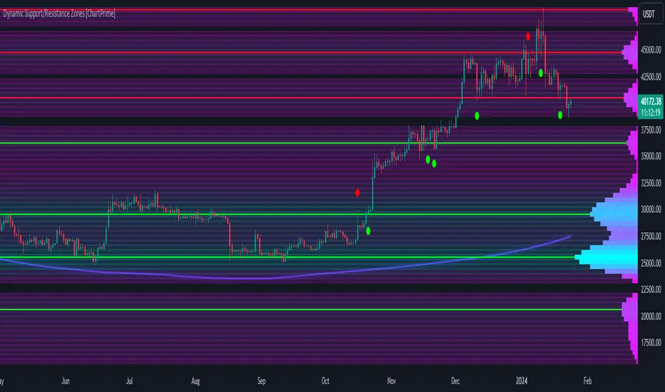
Dynamic Support/Resistance Zones [ChartPrime]Dynamic Support/Resistance Zones is a new way to visualize key support and resistance levels by analyzing pivot points. It aggregates these points into bins and uses different scoring methods to determine the strength of the zone. The Linear method treats every pivot the same, Time gives more importance to recent pivots, and Volume scores pivots based on trading activity.
It visually represents the strength of price zones using either a visual distribution or an overlay of colors. Areas with many aggregated pivots are marked using the High Color, indicating strong support or resistance. Fewer pivots are shown in Low Color, suggesting weaker levels. Users can also see the score using the distribution mode to more accurately determine the strength of these areas.
The indicator also includes a special moving average line, calculated from pivot prices and their weights. This gives a central pivot level, allowing you to see the average pivot position. We have also provided some smoothing for this line to make it easer to use.
We have included various options to tailor your analysis. These include selecting the scoring method for pivots and adjusting the number of pivots to consider, along with many visual aids. Traders can also set the level of filtering for the distribution of pivots. By default the filter isn't enabled but when it is enabled it allows for a less noisy experience at the expense of precision.
We have included four pivot periods that you can modify and toggle. The idea is that longer period pivots will enhance the strength of the shorter period ones providing a natural way to weight pivot levels. You can also specify whether you want to use pivot high, pivot low, or both in your analysis.
Here are some details on the key inputs:
Weighting Style: Choose how to score pivot points. Options include: Linear: Treats each pivot equally. Time: Gives more importance to recent pivots. Volume: Scores pivots based on trading volume.
Number of Pivots: Set the number of pivots to consider in the calculation. Both pivot highs and lows are treated separately.
Filtering: Adjust the level of filtering applied to the distribution of pivots. A higher value smooths the distribution, providing a cleaner visual representation at the cost of some precision. This setting is crucial for managing the trade-off between clarity and detail in the visualization of support and resistance zones.
Distribution Scale: Determines the scale of the distribution on the screen. It influences both the visual aspect and the precision of the calculations, allowing for a balance between visibility and analytical accuracy.
Manual Precision: Manually set the number of divisions within the range. This setting offers control over the granularity.
Auto Precision: When enabled, it automatically adjusts the precision based on the average range of a candle, ensuring a minimum level of detail in the visualization.
Show Distribution: Toggle the visibility of the distribution of pivot points. When activated, it provides a detailed visual representation of where pivots are concentrated.
Show Score in Distribution: Opt to display the actual score within the distribution. This feature adds a quantitative element to the visual representation, offering a clearer understanding of the pivot point concentration.
Distribution Overlay: Activate a heat map overlay to visualize the distribution of pivots. You can also adjusting the transparency of this overlay, providing a balanced view that does not obstruct the underlying price chart.
Show Support/Resistance: Enable lines that indicate identified support and resistance levels based on the aggregated pivots. This feature provides a clear, actionable insight directly on the chart.
S/R Zone Visibility: Choose to display the support/resistance zones and set their transparency. It offers an extended visual cue about the potential breadth of support or resistance areas.
Pivot Level Average: Introduce a moving average line that's calculated based on the weighted pivot levels. You can also adjust the smoothness of this line.
Dynamic Support/Resistance Zones is an intuitive and versatile trading indicator that offers a novel approach to identifying support and resistance levels by analyzing pivot points. It blends a variety of scoring methods, customizable visual representations, and a unique moving average line. With its customizable settings for pivot analysis, visual clarity, and precision, it's an nifty tool for traders looking to enhance their decision making with detailed and actionable insights.
Forex Kill Zones - SMC IndicatorsWhat are Kill Zones?
Kill Zones are specific Time Windows of opportunity during the Session that have the potential for the highest volatility and where looking for trading opportunities is ideal.
The Forex Kill Zone Indicator is specifically designed for the Forex Market. What differentiates this script from other Kill Zones scripts is that this script is based on NY Midnight as the basis for the start of the day.
This is not the usual below-average Kill Zone indicator because this indicator does not only show the 3 main Kill Zones or Sessions, but it also offers extra Kill Zones that are called "Asian Range (AR)", "Central Bank Dealing Range (CBDR)", and "FLOUT".
Another key differentiator of this indicator's functionality is that it shows the highs and lows of each Kill zone allowing SMC traders to monitor Time-Based Liquidity above the highs and lows of each trading session.
Another added benefit of this indicator is the Standard Deviations features for the AR, CBDR, and FLOUT that we added. The Standard Deviations act as key levels where there is a high probability of price reacting when in confluence with 1H or higher key levels (PD Arrays). The Standard Deviations are not pivot levels but are ranges above and below the Kill Zones that rely on TIME and PRICE in their calculations.
Finally, we have also incorporated a Notification function to remind the trader of the start of the trading Kill Zones to not miss out on potential trade opportunities.
Key Functionalities
1) Universal Time Reference:
Every day starts at 00:00 NY Midnight, irrespective of the trader's local time, Instead of the Standard GMT Midnight. This allows all Kill Zones to be in line with the New York start of the day at Midnight, as thought by ICT.
Weekend Highlighter
This feature highlights time from Sunday Market Open at 5 PM NY Time to 00:00 NY Midnight.
It's useful for identifying the non-trading or the low volatility periods when trading should be avoided.
Features Breakdown
Lookback Period
Defaulted to 60 trading days, aligning with “IPDA Data Ranges”, which is ideal for backtesting.
Adjustable for trading, and it's recommended to keep it at 20 trading days to focus on most recent data only.
24-hour Daily Intervals
The 24-hour intervals are not the same as the usual daily candle. Instead, the start of each trading day is anchored to the 00:00 NY Midnight.
Highlights "Days of the Week" labels, "Weekend" Trading Time, and the daily high-low ranges based on the start of trading day mark being at 00:00 NY Midnight.
London Kill Zone (Green)
Starts from 01:00 NY Time to 05:00 NY Time.
London closes at 12:00 NY Time.
Highlight the high and low of the London Kill Zone to Identify Time-Based Liquidity above and below the London Kill Zone Range.
Marks the London Close Session to mark the end of London End of the trading day, where volatility drops.
Highlights the time when there is the highest volatility during the London Session Kill Zone.
New York Kill Zone (Blue)
Starts from 07:00 NY time to 10:00 NY Time.
Marks The CME Open at 08:30 (the opening of the Bond Market).
Highlight the high and low of the New York Kill Zone to Identify Time-Based Liquidity above and below the NY Kill Zone Range.
Highlights the time when there is the highest volatility during the New York Session.
The Central Bank Dealing Range or "CBDR" (Orange)
Starts From 14:00 NY Time to 20:00 NY Time.
Highlight the high and low of the CBDR Kill Zone to Identify Time-Based Liquidity above and below the CBDR Kill Zone Range.
Also, there is an added ability to add the CBDR Standard Deviations above and below the CBDR.
Can also extend the CBDR Standard Deviations key levels until the end of the next day's London Kill Zone.
What are the CBDR Standard Deviations?
The Standard Deviations are extensions of the CBDR above and below the CBDR original range. It takes the high and low of the range and adds the range above and below the original range by x times.
The CCBDR Standard Deviations are NOT pivot levels. They are used as points of reference where we could expect the price to react when in confluence with higher timeframe reference points.
The idea behind them is that if the price is Bearish, the price could rally to +1 CBDR Standard Deviation below dropping lower. As shown in the image below on Thursday, the two vertical lines before the start of Thursday mark the CBDR Kill Zone, then the price rallied to +1 CBDR SDv and then dropped.
Asian Range "AR" Kill Zone
Starts from 20:00 NY Time to 00:00 NY Time.
Highlight the high and low of the AR Kill Zone to Identify Time-Based Liquidity above and below the AR Kill Zone Range.
Also, there is an added ability to add the AR Standard Deviations above and below the AR.
This KillZone should be primarily used when CBDR exceeds 40 pips.
Similar to the CBDR, the AR Standard Deviations also can be used as points of reference where we could expect the price to react when in confluence with higher timeframe reference points.
The AR Standard Deviations can also be extended until the end of the next day's London Kill Zone.
FLOUT Range
It Combines AR and CBDR, spanning from 14:00 NY Time to 00:00 NY Time.
The FLOUT should only be used when both AR and CBDR have small ranges of less than 10 pips combined.
Highlight the high and low of the FLOUT Kill Zone to Identify Time-Based Liquidity above and below the FLOUT Kill Zone Range.
The FLOUT Standard Deviations also can be used as points of reference where we could expect the price to react when in confluence with higher timeframe reference points.
The Flout Standard Deviations can be extended until the end of the next day London Kill Zone.
Bonus Features
Daily & Weekly Open Price Levels
The Open Price levels draw a horizontal line from the start of the trading day at 00:00 NY midnight, and it extends it towards the end of the trading day.
This is useful for understanding where the price is relative to the daily candle.
When Bullish, the trader should look for setups at or below the daily or weekly open price.
When Bearish, the trader should look for setups at or above the daily or weekly open price.
Whether to choose the Daily or Weekly open price depends on the trader's trading style. If the trader is day trading or scaling, then it's more appropriate to choose the Daily Open Price.
However, Day Traders can also use the Weekly candle to align with the Weekly Candle's expected range direction.
On the other hand, if the trader is a Swing Trader and wants to capitalise on the weekly candle's trend, then it's more appropriate to choose the Weekly Open Price.
However, Swing Traders can also use the Daily Open Price when looking to take a trade to time better entries with a high risk-to-reward ratio.
Notifications
The trader can also receive alerts as a reminder at the start of the desired session to not miss out on the start of the trading session.

Flux Charts MTF Supply and Demand Zones (Premium)Indicator Overview
The Multi-Timeframe Supply & Demand Zones indicator by Flux Charts displays supply and demand zones on multiple timeframes with two different zone detection methods. These zones are commonly known as areas where there are lots of buyers/sellers present in the market.
Adaptive Detection Method
AMEX:SPY 5m timeframe, October 8 2023
Indicator Settings: (Timeframe: Chart & 15m, Method: Adaptive, Zone Multiplier: 1)
Many times supply and demand scripts try and precisely define conditions that qualify for supply and demand zones. People, however, when locating supply and demand zones manually generally do not take a quantitative approach, rather looking for qualities in price action that have generalized qualities and trends. The adaptive algorithm uniqueness comes from adapting the human approach to work computationally. It generalizes the qualities of supply and demand zones and locates areas in the chart with an acceptable similarity. Specifically, it looks for consolidated areas within the chart that are preceded by a rise or fall in price. The rise or fall length has to be a certain ratio to the consolidation length. If the criteria are met it will draw the zone, if a zone already exists at that price level it will ignore it or merge them if they are different timeframes. This results in a much more consistent ability to identify areas of supply and demand.
Basic Detection Method
The basic detection method looks for areas where price made drastic movements within a small period of time, which could indicate a high level of buyers/sellers at the spot. Thus, these zones are formed and can be used as areas of trading where money is going in/out of the markets.
Multi-Timeframe (MTF) S&D
Flux Charts supply and demand script utilizes MTF. This allows for displaying zones from different timeframes on one chart. Utilizing higher timeframes is a common practice in trading, and it can be easy to forget about key levels & zones on higher timeframes which could cause reversals/bounces.
Here is an example of a 15 minute supply zone formed on the NASDAQ, and with this indicator, you can also see this same 15 minute supply zone while being on a 5 minute candlestick chart, since you have the 15 minute zones enabled in the settings. This indicator offers supply & demand zones on multiple timeframes including the 5 minute, 15 minute, 30 minute, 1 hour, and 4 hour.
Settings
Method:
Choose between the Supply & Demand zones detection (Basic / Adaptive)
Zone Retests:
Choose how retests should be considered. You can choose between a high/low candle wick entering a zone, or a candle closing inside of a zone to be considered a valid retest.
Zone Invalidation:
Choose how zones are invalidated. You can choose between a high/low candle wick exiting a zone, or a candle closing outside of a zone to be considered a zone invalidation.
Zone multiplier:
Adjust zone size (1 is recommended)
Timeframe:
Choose the timeframes you would like Supply & Demand zones to be displayed from.
Zone Appearance:
Adjust the colors of Supply/Demand zones
Enable/Disable the center dashed line in zones
Display Labels:
Choose to toggle on/off retest & break labels
Notifications:
Choose what alerts you would like to receive. You can choose to have new zone formations, zone breaks, and zone retests.

Support & Resistance PROHi Traders!
The Support & Resistance PRO
A simple and effective indicator that helped me a bunch!
This indicator will chart simple support and resistance zones on 2 time frames of your choice.
It uses a 30 day lookback period and will find the last high and low.
Each zone is built from the highest/lowest closure, and the highest/lowest wick, creating a liquid zone between the 2.
It is perfect for people trading support and resistance, watching key areas, scalping zones and much more!
*You can change the time frames you are looking at and the lookback period.
*The example in the picture is looking at the Daily and Weekly zones on BTC.

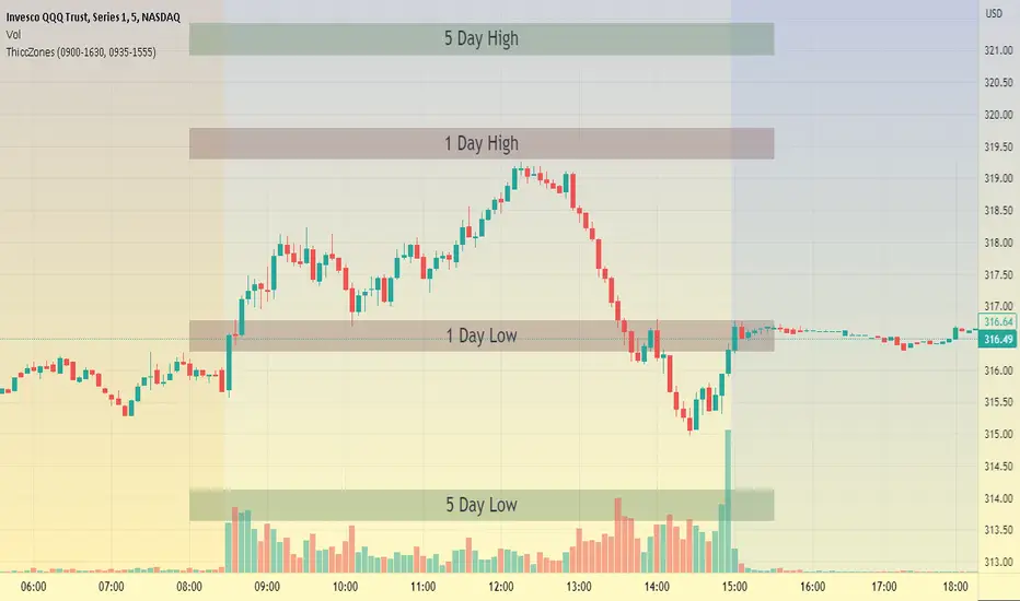
ThiccZonesThis indicator is a formula that includes 4 different zones which are different sizes based on the ticker you decide to use. It was optimized for SPY and other market ETFs but works well for all stocks on the market. The formula puts a zone at the previous day's high and low, and the previous 5 day's high and low. These zones are meant to be used as support and resistance and can even overlap, creating a 'master zone'. This is different than other zone indicators because the formula for these zones is something I created myself and have been unable to find on here. I have had the most success using a 1-15 minute chart and using my zones for reversal areas. I often look for other indications of reversal as well that line up with the area of the zones. It can also be used on the break and retest of these zones. I have found that when a stock breaks one of these zones it will often retest and continue that trend.
SFC Smart Money Manipulation - MTF ZonesThis indicator shows the most important manipulated zones - true support and resistance.
The indicator can show the zones from different time frames - 1H, 4H, D and the current TF.
Order Block definition - small candle or few consecutive candles, where banks place buy and sell orders in order to manipulate the price. After price is manipulated and moved in one direction, the banks are in draw down, that is why they manipulate the price one more time before the true move, retesting these candles (closing losing positions).
FU candles
FU candles are most manipulated candles and create very strong reaction zones. These are the true zones, where the banks place their orders.
Why they are so strong? The answer is very simple - these candles clear the liquidity from the previous ones. After the liquidity is cleared ( all stop losses/pending orders are triggered), price reveal the true direction and move very fast.
FU candles are type of Order Blocks - the most powerful one.
Because the most volume is in the body of the order block. The indicator shows not only the FU candle, but the body of the order block.
There are two types of FU candles :
(only full FU candles are displayed as zones, because they are much significant)
1) Full fu, where the current candle completely engulf the previous one, after taking the liquidity. (displayed as F)
2) Current candle only take liquidity from the previous one, but failed to engulf it. (displayed as A)
9 day simple moving average is also displayed. When the price form Fu candle above/under the MA, there is a better chance for reversal.
When FU candles are retested the transparency will change, showing that the zones may have less impact.
Order Blocks
Only the current order blocks are displayed. Price react very often from the 50% level, that is why this level is also displayed.
Rejections
Rejections are doji candles or candles with big wicks. These rejections very often lead to reversals or deep pullbacks. But before the true move, price test the rejection levels. The retest is not always, but very often of the 50% of the wick.
The rejections are very important price zone.
The indicator can show the zones from different time frames - 1H, 4H, D and the current TF. When wicks are retested the transparency and colour will change, showing that the wicks may have less impact or no more impact.
Settings
-The colour and transparency of the zones can be changed.
- Multi time frames zones could be disabled.
- Doji settings
- Length of the moving average
How to use
If price reach one of the displayed zones. The trader should be prepared for price reaction. This reaction could lead to reversal, pull back or trading range.
The trader should have bias from the higher time frames and watch for signs of manipulations on smaller time frames.
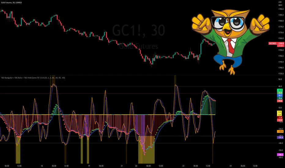
TAS Navigator + TAS Ratio + TAS Yield Zones [TASMarketProfile]This bundle of 3 TAS Market Profile indicators reveal when markets are gaining momentum, exhausted and reaching critical overbought/oversold conditions. The indicators display on a space-saving bottom pane and provide multi-perspective analysis that yield confidence in what direction to trade and when. The TAS Navigator, TAS Ratio, and TAS Yield Zones can be applied to any financial market such as stocks, ETFs, futures, Forex and digital currencies.
∟ ABOUT TAS NAVIGATOR:
TAS Navigator is a versatile indicator that combines several signals to help you manage your trades and avoid unfavorable situations. At a glance, the Navigator can provide the trader with useful information about underlying trading conditions for any time frame chart. The Navigator is comprised of three primary components – the histogram, the moving average and the zero line.
The histogram consists of the vertical bars plotted above and below the horizontal “zero line.” The bars are color-coded to provide the following information:
NEON GREEN / RED – The directional move continues to gain momentum.
DARK GREEN / RED – The buying or selling momentum is falling off.
MAGENTA – Exhaustion warning and the move has reached “peaking” conditions that may be difficult to maintain. Markets are likely to run sideways for a period of time or a direction change may be near.
The moving average (MA) is the blue line that travels horizontally across the Navigator and provides a relative measure of the overall levels of buying or selling. You will notice that the dots capping the histogram bars change from green to red as they move above or below the MA. The color of these dots tells us the following:
GREEN DOTS – The buyers are currently in control.
RED DOTS – The sellers are currently in control.
The zero line is the horizontal line around which the histogram plots. It provides a reference point for the larger momentum shifts. It is color-coded in the following manner:
CYAN – The current market phase is trending / unbalanced.
YELLOW – The current market phase is sideways / balanced.
INTERPRETATION AND RULES:
The TAS Navigator’s inherent ability to visualize the overall pulse of the market can inform your trading decisions in several ways:
>>> If the histogram is neon green or red, the trader should look for trading opportunities in the appropriate direction (green = long; red = short) and hold for increased profits as long as the bars remain neon green or red.
>>> If magenta bars appear, the trader knows to tighten stops and look for profit-taking opportunities because the trend has reached peaking conditions.
>>> When the histogram switches to dark green or red – indicating momentum is slowing – the trader can look to tighten stops and consider technical areas for reentry.
>>> Once the histogram crosses the MA and the capping dot changes to the opposite color of the histogram bar, a trader knows that they can begin looking for countertrend trade opportunities.
>>> Most importantly, until that dot changes color, the trader knows that the odds do not favor looking for trading opportunities against the current trend.
>>> The relative peaks of the histogram bars can also provide valuable information. As consecutive histogram peaks move further away from the zero line, price should extend the trending move. When consecutive histogram peaks become closer to the zero line, the price should create a lower high or higher low soon.
>>> A trend line connecting histogram peaks can be used to identify trading levels based upon momentum reaching the necessary level to touch the projected trend line.
>>> Trading opportunities can also be found when divergence occurs between the histogram and price. For example, consecutive histogram peaks move further away from zero line, but price cannot extend the trend.
∟ ABOUT TAS RATIO:
TAS Ratio is a leading indicator which helps forecast short-term price movements. It is best used for gauging targeted areas for entry and exit points. It was designed to identify when price movement is confirmed by volume and volatility as well as when market moves lack momentum, conviction and follow through. TAS Ratio levels are determined by a defined time within a 24-hour period and applicable for intraday charts only. The analysis can be applied to any liquid financial instrument and provides target trading zones in either direction.
INPUT SETTINGS FOR TAS RATIO:
There are 3 inputs for TAS Ratio and below you’ll find the default settings:
Ratio RangeBars: 10
Ratio AverageBars: 3
Ratio MABars: 3
>>> Ratio RangeBars – Sets the desired lookback period. Default = 10.
>>> Ratio AverageBars – Sets the smoothing factor and should be the same as MABars setting. Default = 3.
>>> Ratio MABars – Sets the smoothing factor and should be the same as AverageBars setting. Default = 3.
CONFIGURATION NOTES:
As a rule, the RangeBars period should be twice (or more) than the AverageBars and MABars setting. Remember that the AverageBars and MABars settings should be equal. For example, 6/3/3 or 8/4/4 would be minimum separation.
Faster time charts may prefer slower indicator settings for smoother readings. For example, on 30-minute charts or lower the settings for RangeBars period and AverageBars and MABars could be 10/5/5 or even 16/8/8 respectively.
TAS RATIO DISPLAY:
TAS Ratio – Displays more volatile orange-colored line
Moving Average – Displays smoothed moving average purple-colored line
Note that the default colors can be adjusted in the Style settings.
INTERPRETATION AND RULES:
TAS Ratio is displayed on the same pane and scale as TAS Navigator in which readings of +40 is considered overbought and -40 is oversold.
TAS Ratio is especially effective when traders are aiming to time entry points into emerging intraday trends which can be observed when the price is making new “higher lows” or alternatively when price is making new “lower highs.”
TAS Ratio is a sensitive indicator by nature and should be viewed as a tool for fine-tuning a more granular entry or exit within the scope of other TAS Indicators.
TAS Ratio is useful in confirming when price may be at an area of divergence to locate and target higher probability entries and exits.
In general, price should move freely in the same direction of the indicator and in a proportionate range of movement.
When price fails to move proportionately, as much as TAS Ratio moves or stalls, this divergence alerts you to focus on immediate areas of support and resistance.
When price stalls and TAS Ratio does not stall, this is an indication to seek confirmation for a valid counter-trend trading opportunity.
Pay attention to TAS Ratio (orange line) crossovers above and below the Moving Average line (purple line), but also observe the trajectory and whether the Ratio line is pulling away and creating greater distance from the Moving Average line. Increasing distance is a sign of strength of move in that direction.
∟ ABOUT TAS YIELD ZONES:
TAS Yield Zones provides a valuable visual warning via a yellow background color when TAS Navigator and/or TAS Ratio indicators are exceeding specific overbought or oversold threshold lines dictated by the user. The indicator is visible in the same bottom pane as these two indicators. The user controls how extreme of the overbought or oversold condition they mandate in order to trigger the “Yield Zone” warning for each indicator based on the inputs for the TAS Yield Zones threshold lines.
INPUT SETTINGS FOR TAS YIELD ZONES:
Within the Input settings, you can activate or deactivate the visibility of TAS Yield Zones for TAS Navigator or TAS Ratio. By default, both will be visible. There are 4 inputs for TAS Yield Zones and below you’ll find the default settings:
Yield Zones Nav Overbought Line: 40 (red line by default)
Yield Zones Nav Oversold Line: -40 (green line by default)
Yield Zones Ratio Overbought Line: 40 (gray line by default)
Yield Zones Ratio Oversold Line: -40 (gray line by default)
The farther away the Inputs are from the 0 line, the stronger the move must be bullish or bearish in order to get to the threshold lines. For instance, Inputs of 50/-50 would require a more substantial move than 30/-30 settings. Additionally, the user can adjust the coloring of the TAS Yield Zones inside the Style settings.
TAS Yield Zones are best used in conjunction with TAS Navigator and TAS Ratio so the user can visually see when the threshold lines are near being approached and exceeded. When all three indicators are visible on the pane, you can see when there is a confluence of overbought or oversold conditions simultaneously on both TAS Navigator and TAS Ratio indicators and when exhaustion warning conditions are present. When these three conditions occur, there is a likelihood that a move in the opposite direction (or at a minimum a sideways condition) may be near.
Trade Well My Friends,